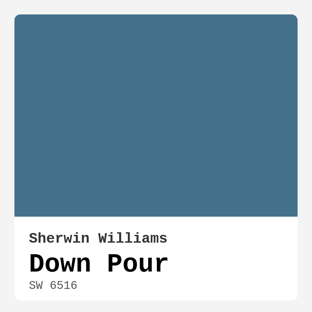
Color Preview & Key Details
| HEX Code | #43718B |
| RGB | 67, 113, 139 |
| LRV | 24% |
| Undertone | Blue |
| Finish Options | Eggshell, Matte, Satin |
Picture this: You’re standing in your living room, staring at the walls, trying to envision a fresh look that speaks to your style and sets the mood you desire. You want something that evokes a sense of calm, a serene backdrop that feels both inviting and restful. That’s where Down Pour by Sherwin Williams comes into play. With its enchanting blue hue, this color captures the essence of a soft rain shower—refreshing, tranquil, and full of life.
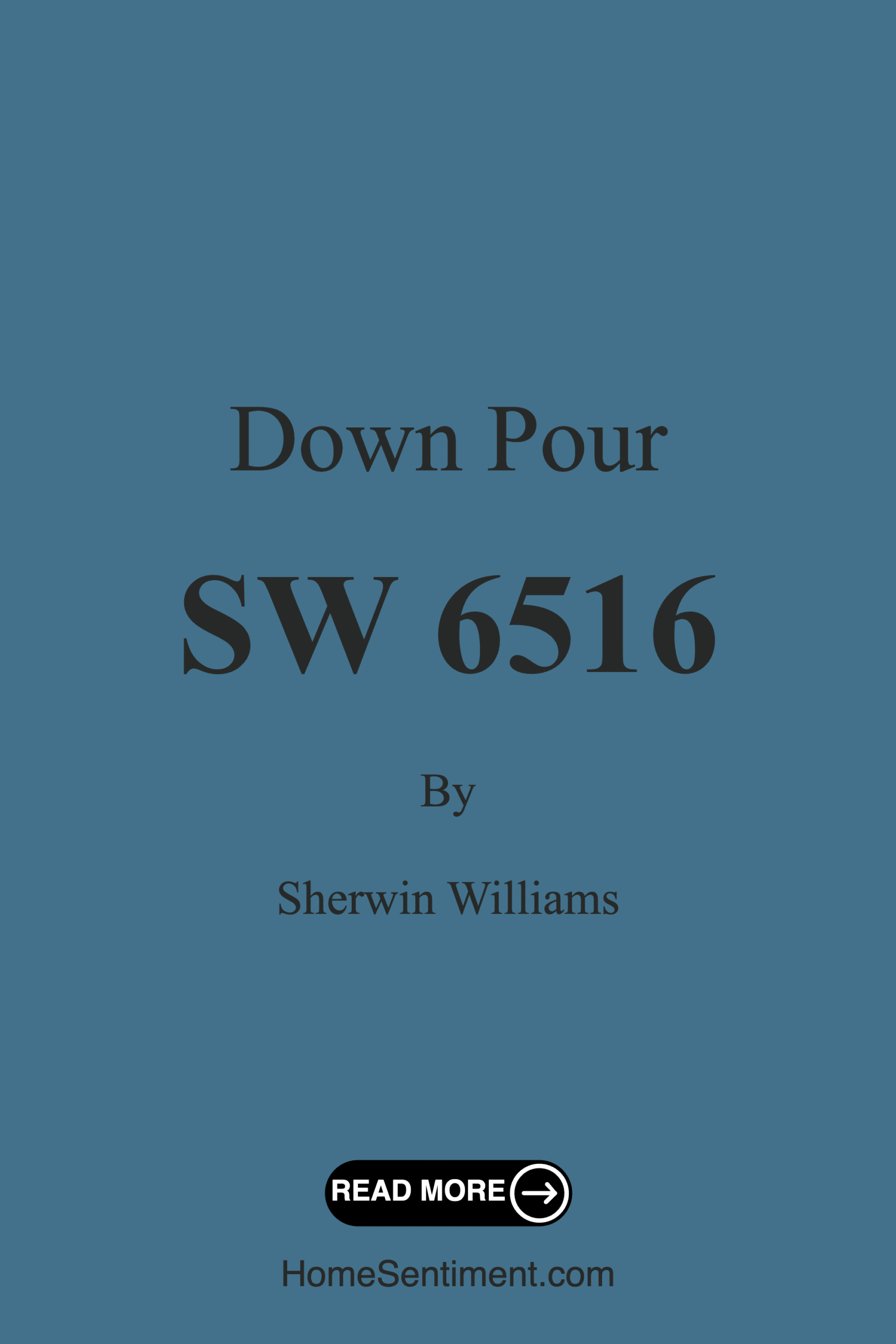
Let’s dive into why Down Pour, with its color code SW 6516, might just be the perfect fit for your home. This isn’t just any blue; it’s a cool, muted shade that leans slightly dark, making it a versatile choice for various décor styles, from coastal to modern, farmhouse to Scandinavian.
One of the standout features of Down Pour is its calming nature. The color has a light reflectance value (LRV) of 24%, which means it absorbs more light than it reflects. This quality creates a cozy atmosphere, perfect for intimate spaces where you want to unwind after a long day. Imagine wrapping yourself in the soft embrace of this color in your bedroom or bathroom, creating a soothing retreat that feels like an escape from the hustle and bustle of everyday life.
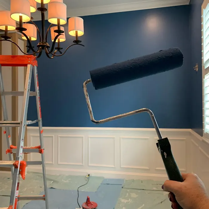
When applying Down Pour, you’ll find it offers a smooth finish—whether you’re rolling it on or using a brush. Its beginner-friendly formula flows effortlessly without streaking, making your DIY project a breeze. Plus, the paint is touch-up friendly, so you won’t have to worry about those little nicks and scratches that come with everyday life. And for those who love to keep their walls looking pristine, Down Pour is wipeable and washable, resisting scuffs and stains with ease.
Now, let’s talk about lighting because it can drastically affect how Down Pour appears in your space. In natural light, it radiates a soft glow, brightening up the room without feeling overwhelming. However, in low light, it can appear darker, so if you’re considering this color for smaller or dimly lit spaces, make sure your area has adequate natural light. Pair it with bright whites or lighter accents to maximize that uplifting effect and ensure the room feels open and airy.
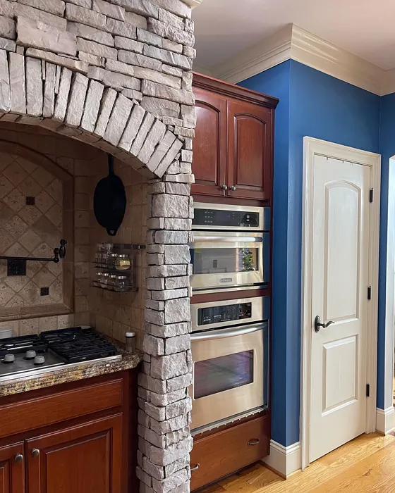
Down Pour’s versatility doesn’t stop at its application and lighting capabilities. It pairs beautifully with a range of complementary shades. You might find it looks stunning next to crisp whites like White Dove or even wood trims, creating a balanced look that’s both sophisticated and warm. On the other hand, if you want to explore a bolder palette, consider pairing it with deeper, richer colors. The contrast can create a dramatic yet harmonious effect, perfect for a feature wall.
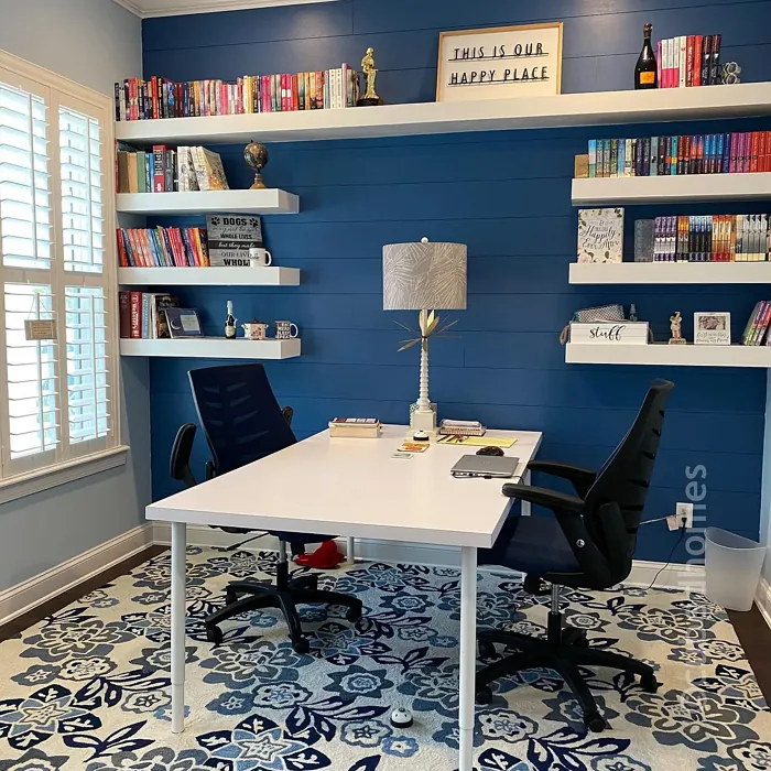
When it comes to decorating with Down Pour, think about the mood you want to create. This color is ideal for spaces that require a sense of calm and restfulness, such as bedrooms and home offices. Imagine a serene blue wall behind your bed, creating a peaceful sanctuary for sleep. Or picture a cozy home office where the cool tones of Down Pour inspire creativity without overwhelming your senses.
For more communal spaces like living rooms, Down Pour can set a tranquil atmosphere that encourages conversation and relaxation. It works beautifully as an accent wall too, giving your space that extra pop without fully committing to a darker hue throughout the entire room.
Now, while there are so many benefits to using Down Pour, it’s also essential to consider a couple of potential downsides. As mentioned, its darker nature can sometimes make a room feel smaller if not paired with the right lighting and lighter accents. So, if you’re considering using it in a small space, it’s crucial to ensure that there’s enough light to allow the color to breathe.
Additionally, while Down Pour is durable and holds up well in high-traffic areas, applying a protective topcoat can enhance its longevity even further. This is especially a good idea for hallways or family rooms that see a lot of activity.
If you’re curious about how to incorporate Down Pour into your home, consider using it in conjunction with lighter shades like SW 9150 or SW 7607 for a layered effect. These lighter colors can add dimension while maintaining a cohesive look. Conversely, try to contrast it with bolder colors like SW 7635 or SW 7077 for a more modern vibe.
Down Pour is not just a color; it’s a feeling. It invites you to slow down and appreciate your surroundings. Imagine walking into a room painted in this soothing blue and feeling an immediate sense of tranquility wash over you. It’s a hue that can elevate your space, making it a designer favorite for good reason.
In conclusion, whether you’re revamping your living room, refreshing your bedroom, or creating a calming home office, Down Pour is a fantastic choice. It’s versatile, easy to apply, and provides a sophisticated backdrop that can adapt to various styles and settings. So go ahead, embrace the refreshing beauty of Down Pour. You’re not just choosing a color; you’re inviting a mood into your home. And remember, always test the paint in your space first to see how it interacts with your lighting and existing décor. Happy painting!
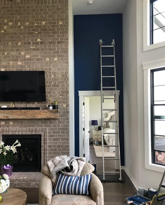
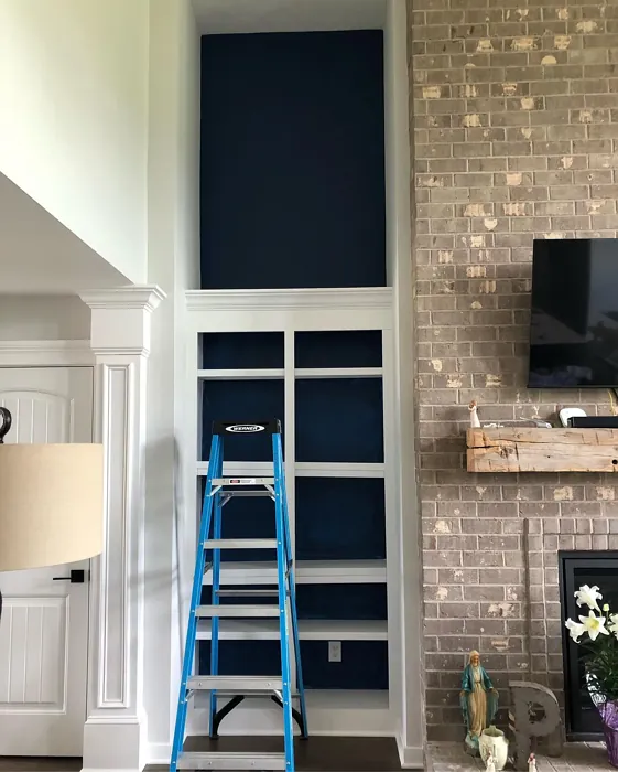
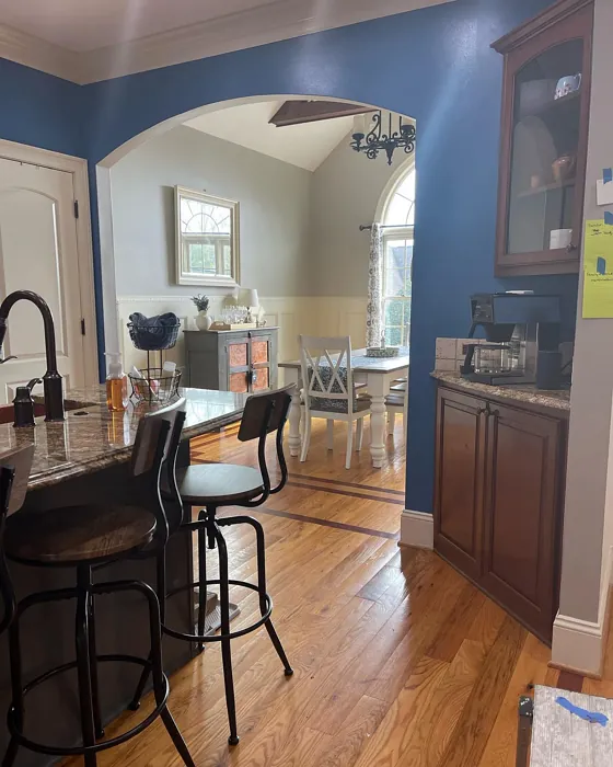
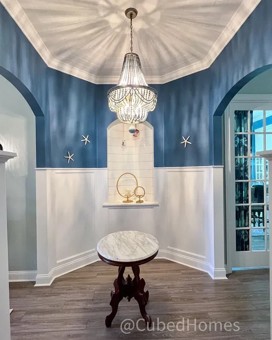
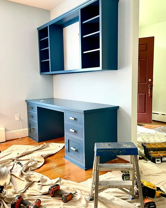
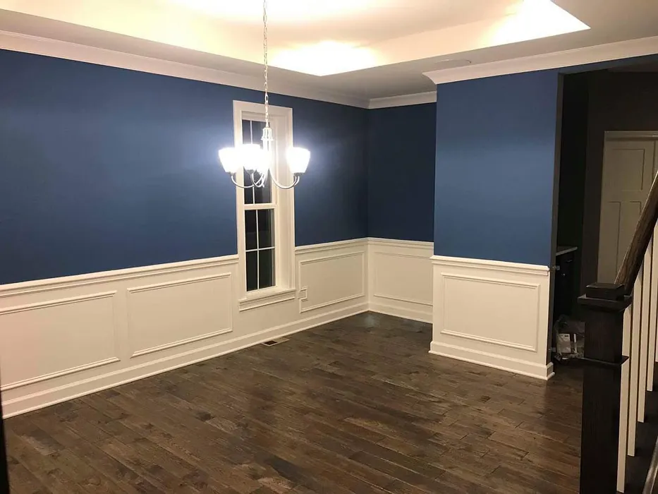
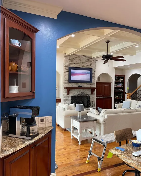
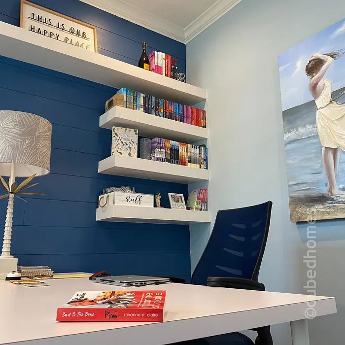
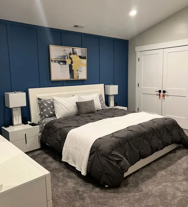
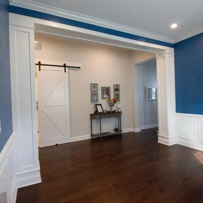
Real Room Photo of Down Pour SW 6516
Undertones of Down Pour ?
The undertones of Down Pour are a key aspect of its character, leaning towards Blue. These subtle underlying hues are what give the color its depth and complexity. For example, a gray with a blue undertone will feel cooler and more modern, while one with a brown undertone will feel warmer and more traditional. It’s essential to test this paint in your home and observe it next to your existing furniture, flooring, and decor to see how these undertones interact and reveal themselves throughout the day.
HEX value: #43718B
RGB code: 67, 113, 139
Is Down Pour Cool or Warm?
Down Pour is considered a cool paint color. This characteristic plays a huge role in the overall feel of a room. Cool colors, like this one, tend to create a cozy, inviting, and energetic atmosphere, making them great for social spaces like living rooms and dining rooms. In contrast, warm colors often evoke a sense of calm and serenity, which is why they are popular in bedrooms and bathrooms. The coolth of Down Pour means it will pair beautifully with corresponding decor elements.
Understanding Color Properties and Interior Design Tips
Hue refers to a specific position on the color wheel, measured in degrees from 0 to 360. Each degree represents a different pure color:
- 0° represents red
- 120° represents green
- 240° represents blue
Saturation describes the intensity or purity of a color and is expressed as a percentage:
- At 0%, the color appears completely desaturated—essentially a shade of gray
- At 100%, the color is at its most vivid and vibrant
Lightness indicates how light or dark a color is, also expressed as a percentage:
- 0% lightness results in black
- 100% lightness results in white
Using Warm Colors in Interior Design
Warm hues—such as reds, oranges, yellows, warm beiges, and greiges—are excellent choices for creating inviting and energetic spaces. These colors are particularly well-suited for:
- Kitchens, living rooms, and bathrooms, where warmth enhances comfort and sociability
- Large rooms, where warm tones can help reduce the sense of emptiness and make the space feel more intimate
For example:
- Warm beige shades provide a cozy, inviting atmosphere, ideal for living rooms, bedrooms, and hallways.
- Warm greige (a mix of beige and gray) offers the warmth of beige with the modern appeal of gray, making it a versatile backdrop for dining areas, bedrooms, and living spaces.
However, be mindful when using warm light tones in rooms with limited natural light. These shades may appear muted or even take on an unpleasant yellowish tint. To avoid a dull or flat appearance:
- Add depth by incorporating richer tones like deep greens, charcoal, or chocolate brown
- Use textured elements such as curtains, rugs, or cushions to bring dimension to the space
Pro Tip: Achieving Harmony with Warm and Cool Color Balance
To create a well-balanced and visually interesting interior, mix warm and cool tones strategically. This contrast adds depth and harmony to your design.
- If your walls feature warm hues, introduce cool-colored accents such as blue or green furniture, artwork, or accessories to create contrast.
- For a polished look, consider using a complementary color scheme, which pairs colors opposite each other on the color wheel (e.g., red with green, orange with blue).
This thoughtful mix not only enhances visual appeal but also creates a space that feels both dynamic and cohesive.
Light Temperature Affects on Down Pour
Natural Light
Natural daylight changes in color temperature as the sun moves across the sky. At sunrise and sunset, the light tends to have a warm, golden tone with a color temperature around 2000 Kelvin (K). As the day progresses and the sun rises higher, the light becomes cooler and more neutral. Around midday, especially when the sky is clear, natural light typically reaches its peak brightness and shifts to a cooler tone, ranging from 5500 to 6500 Kelvin. This midday light is close to what we perceive as pure white or daylight-balanced light.
These shifts in natural light can significantly influence how colors appear in a space, which is why designers often consider both the time of day and the orientation of windows when planning interior color schemes.
Artificial Light
When choosing artificial lighting, pay close attention to the color temperature, measured in Kelvin (K). This determines how warm or cool the light will appear. Lower temperatures, around 2700K, give off a warm, yellow glow often used in living rooms or bedrooms. Higher temperatures, above 5000K, create a cool, bluish light similar to daylight, commonly used in kitchens, offices, or task areas.
Use the slider to see how lighting temperature can affect the appearance of a surface or color throughout a space.


4800K
LRV of Down Pour
The Light Reflectance Value (LRV) of Down Pour is 24%, which places it in the Medium Dark category. This means it reflects very little light. Understanding a paint’s LRV is crucial for predicting how it will look in your space. A higher LRV indicates a lighter color that reflects more light, making rooms feel larger and brighter. A lower LRV signifies a darker color that absorbs more light, creating a cozier, more intimate atmosphere. Always consider the natural and artificial lighting in your room when selecting a paint color based on its LRV.
Detailed Review of Down Pour
Additional Paint Characteristics
Ideal Rooms
Bathroom, Bedroom, Entryway, Home Office, Living Room
Decor Styles
Coastal, Farmhouse, Modern, Scandinavian
Coverage
Good (1–2 Coats), Touch-Up Friendly
Ease of Application
Beginner Friendly, Brush Smooth, Roller-Ready
Washability
Washable, Wipeable
VOC Level
Low VOC
Best Use
Accent Wall, Bedroom, Home Office, Interior Walls
Room Suitability
Bathroom, Bedroom, Home Office, Living Room
Tone Tag
Airy, Balanced, Cool, Muted
Finish Type
Eggshell, Matte, Satin
Paint Performance
Easy Touch-Up, Low Odor, Quick Drying, Scuff Resistant
Use Cases
Best for Low Light Rooms, Best for Small Spaces, Designer Favorite
Mood
Calm, Inviting, Restful
Trim Pairing
Complements Cool Trim, Good with Wood Trim, Pairs with White Dove
If you’re searching for a paint color that embodies serenity, Down Pour is a fantastic pick. This soft, muted blue leans slightly cool, making it ideal for spaces that aim for a calm ambiance. It works wonders in bedrooms and bathrooms, creating a soothing retreat. The application process is a breeze, with smooth coverage that ensures even results. Whether you’re using a roller or a brush, you’ll appreciate how well it flows without streaking. Plus, its washability means you won’t need to worry too much about everyday stains, making it practical for family homes. Overall, Down Pour is a sophisticated choice that balances style and functionality effortlessly.
Pros & Cons of SW 6516 Down Pour
Pros
Cons
Colors that go with Sherwin Williams Down Pour
FAQ on SW 6516 Down Pour
Can Down Pour be used in small spaces?
Absolutely! Down Pour can work beautifully in small spaces, giving them an open and airy feel. However, it’s important to ensure that the area has adequate natural light, as the color can read a bit darker in dim conditions. Pair it with bright whites or lighter accents to maximize its uplifting effect.
How does Down Pour perform in high-traffic areas?
Down Pour holds up well in high-traffic areas, thanks to its wipeable surface. It resists scuffs and stains, making it a practical choice for hallways, entryways, or family rooms. Just keep in mind that while it’s durable, applying a protective topcoat can enhance its longevity even further.
Comparisons Down Pour with other colors
Down Pour SW 6516 vs Naval SW 6244
| Attribute | Down Pour SW 6516 | Naval SW 6244 |
|---|---|---|
| Color Name | Down Pour SW 6516 | Naval SW 6244 |
| Color | ||
| Hue | Blue | Blue |
| Brightness | Dark | Dark |
| RGB | 67, 113, 139 | 47, 61, 76 |
| LRV | 24% | 4% |
| Finish Type | Eggshell, Matte, Satin | Matte, Satin, Semi-Gloss |
| Finish Options | Eggshell, Matte, Satin | Matte, Satin, Semi-Gloss |
| Ideal Rooms | Bathroom, Bedroom, Entryway, Home Office, Living Room | Bedroom, Dining Room, Hallway, Home Office, Living Room |
| Decor Styles | Coastal, Farmhouse, Modern, Scandinavian | Coastal, Industrial, Minimalist, Modern, Traditional |
| Coverage | Good (1–2 Coats), Touch-Up Friendly | Good (1–2 Coats), Self-Priming |
| Ease of Application | Beginner Friendly, Brush Smooth, Roller-Ready | Beginner Friendly, Brush Smooth, Roller-Ready |
| Washability | Washable, Wipeable | Highly Washable, Washable |
| Room Suitability | Bathroom, Bedroom, Home Office, Living Room | Bedroom, Dining Room, Entryway, Home Office, Living Room |
| Tone | Airy, Balanced, Cool, Muted | Cool, Deep, Moody |
| Paint Performance | Easy Touch-Up, Low Odor, Quick Drying, Scuff Resistant | Easy Touch-Up, High Coverage, Low Odor, Scuff Resistant |
Down Pour SW 6516 vs Sea Serpent SW 7615
| Attribute | Down Pour SW 6516 | Sea Serpent SW 7615 |
|---|---|---|
| Color Name | Down Pour SW 6516 | Sea Serpent SW 7615 |
| Color | ||
| Hue | Blue | Blue |
| Brightness | Dark | Dark |
| RGB | 67, 113, 139 | 62, 75, 84 |
| LRV | 24% | 12% |
| Finish Type | Eggshell, Matte, Satin | Eggshell, Matte, Satin |
| Finish Options | Eggshell, Matte, Satin | Eggshell, Matte, Satin |
| Ideal Rooms | Bathroom, Bedroom, Entryway, Home Office, Living Room | Bathroom, Bedroom, Home Office, Living Room |
| Decor Styles | Coastal, Farmhouse, Modern, Scandinavian | Coastal, Farmhouse, Industrial, Modern |
| Coverage | Good (1–2 Coats), Touch-Up Friendly | Good (1–2 Coats), Touch-Up Friendly |
| Ease of Application | Beginner Friendly, Brush Smooth, Roller-Ready | Beginner Friendly, Brush Smooth, Roller-Ready |
| Washability | Washable, Wipeable | Highly Washable, Washable |
| Room Suitability | Bathroom, Bedroom, Home Office, Living Room | Bathroom, Bedroom, Home Office, Living Room |
| Tone | Airy, Balanced, Cool, Muted | Cool, Deep, Moody |
| Paint Performance | Easy Touch-Up, Low Odor, Quick Drying, Scuff Resistant | Easy Touch-Up, High Coverage, Low Odor |
Down Pour SW 6516 vs Rain Cloud SW 9639
| Attribute | Down Pour SW 6516 | Rain Cloud SW 9639 |
|---|---|---|
| Color Name | Down Pour SW 6516 | Rain Cloud SW 9639 |
| Color | ||
| Hue | Blue | Blue |
| Brightness | Dark | Dark |
| RGB | 67, 113, 139 | 83, 97, 104 |
| LRV | 24% | 30% |
| Finish Type | Eggshell, Matte, Satin | Eggshell, Matte, Satin |
| Finish Options | Eggshell, Matte, Satin | Eggshell, Matte, Satin |
| Ideal Rooms | Bathroom, Bedroom, Entryway, Home Office, Living Room | Bedroom, Dining Room, Home Office, Living Room |
| Decor Styles | Coastal, Farmhouse, Modern, Scandinavian | Coastal, Contemporary, Minimalist, Scandinavian |
| Coverage | Good (1–2 Coats), Touch-Up Friendly | Good (1–2 Coats), Touch-Up Friendly |
| Ease of Application | Beginner Friendly, Brush Smooth, Roller-Ready | Beginner Friendly, Brush Smooth, Roller-Ready |
| Washability | Washable, Wipeable | Highly Washable, Washable |
| Room Suitability | Bathroom, Bedroom, Home Office, Living Room | Bedroom, Home Office, Living Room |
| Tone | Airy, Balanced, Cool, Muted | Balanced, Cool, Muted |
| Paint Performance | Easy Touch-Up, Low Odor, Quick Drying, Scuff Resistant | Easy Touch-Up, Fade Resistant, Low Odor |
Down Pour SW 6516 vs Indigo Batik SW 7602
| Attribute | Down Pour SW 6516 | Indigo Batik SW 7602 |
|---|---|---|
| Color Name | Down Pour SW 6516 | Indigo Batik SW 7602 |
| Color | ||
| Hue | Blue | Blue |
| Brightness | Dark | Dark |
| RGB | 67, 113, 139 | 62, 80, 99 |
| LRV | 24% | 10% |
| Finish Type | Eggshell, Matte, Satin | Matte, Satin |
| Finish Options | Eggshell, Matte, Satin | Eggshell, Flat, Matte, Satin |
| Ideal Rooms | Bathroom, Bedroom, Entryway, Home Office, Living Room | Bedroom, Dining Room, Home Office, Living Room |
| Decor Styles | Coastal, Farmhouse, Modern, Scandinavian | Bohemian, Coastal, Contemporary, Modern |
| Coverage | Good (1–2 Coats), Touch-Up Friendly | Good (1–2 Coats), Touch-Up Friendly |
| Ease of Application | Beginner Friendly, Brush Smooth, Roller-Ready | Brush Smooth, Fast-Drying, Roller-Ready |
| Washability | Washable, Wipeable | Scrubbable, Washable, Wipeable |
| Room Suitability | Bathroom, Bedroom, Home Office, Living Room | Bedroom, Dining Room, Home Office, Living Room |
| Tone | Airy, Balanced, Cool, Muted | Cool, Deep, Moody |
| Paint Performance | Easy Touch-Up, Low Odor, Quick Drying, Scuff Resistant | Easy Touch-Up, High Coverage, Low Odor, Quick Drying |
Down Pour SW 6516 vs Sea Mariner SW 9640
| Attribute | Down Pour SW 6516 | Sea Mariner SW 9640 |
|---|---|---|
| Color Name | Down Pour SW 6516 | Sea Mariner SW 9640 |
| Color | ||
| Hue | Blue | Blue |
| Brightness | Dark | Dark |
| RGB | 67, 113, 139 | 67, 74, 84 |
| LRV | 24% | 6% |
| Finish Type | Eggshell, Matte, Satin | Eggshell, Matte, Satin |
| Finish Options | Eggshell, Matte, Satin | Eggshell, Matte, Satin |
| Ideal Rooms | Bathroom, Bedroom, Entryway, Home Office, Living Room | Bedroom, Dining Room, Hallway, Home Office, Living Room |
| Decor Styles | Coastal, Farmhouse, Modern, Scandinavian | Coastal, Industrial, Minimalist, Modern |
| Coverage | Good (1–2 Coats), Touch-Up Friendly | Good (1–2 Coats) |
| Ease of Application | Beginner Friendly, Brush Smooth, Roller-Ready | Beginner Friendly, Brush Smooth, Roller-Ready |
| Washability | Washable, Wipeable | Scrubbable, Washable |
| Room Suitability | Bathroom, Bedroom, Home Office, Living Room | Bedroom, Dining Room, Home Office, Living Room |
| Tone | Airy, Balanced, Cool, Muted | Cool, Deep, Moody |
| Paint Performance | Easy Touch-Up, Low Odor, Quick Drying, Scuff Resistant | Easy Touch-Up, Low Odor, Quick Drying |
Down Pour SW 6516 vs Still Water SW 6223
| Attribute | Down Pour SW 6516 | Still Water SW 6223 |
|---|---|---|
| Color Name | Down Pour SW 6516 | Still Water SW 6223 |
| Color | ||
| Hue | Blue | Blue |
| Brightness | Dark | Dark |
| RGB | 67, 113, 139 | 74, 93, 95 |
| LRV | 24% | 48% |
| Finish Type | Eggshell, Matte, Satin | Eggshell, Matte, Satin |
| Finish Options | Eggshell, Matte, Satin | Eggshell, Matte, Satin |
| Ideal Rooms | Bathroom, Bedroom, Entryway, Home Office, Living Room | Bedroom, Dining Room, Home Office, Living Room, Nursery |
| Decor Styles | Coastal, Farmhouse, Modern, Scandinavian | Coastal, Contemporary, Farmhouse, Modern, Rustic |
| Coverage | Good (1–2 Coats), Touch-Up Friendly | Good (1–2 Coats), Touch-Up Friendly |
| Ease of Application | Beginner Friendly, Brush Smooth, Roller-Ready | Beginner Friendly, Brush Smooth, Roller-Ready |
| Washability | Washable, Wipeable | Highly Washable, Washable |
| Room Suitability | Bathroom, Bedroom, Home Office, Living Room | Bedroom, Dining Room, Home Office, Living Room |
| Tone | Airy, Balanced, Cool, Muted | Cool, Earthy, Muted |
| Paint Performance | Easy Touch-Up, Low Odor, Quick Drying, Scuff Resistant | Easy Touch-Up, Fade Resistant, Low Odor |
Down Pour SW 6516 vs Waterloo SW 9141
| Attribute | Down Pour SW 6516 | Waterloo SW 9141 |
|---|---|---|
| Color Name | Down Pour SW 6516 | Waterloo SW 9141 |
| Color | ||
| Hue | Blue | Blue |
| Brightness | Dark | Dark |
| RGB | 67, 113, 139 | 83, 104, 114 |
| LRV | 24% | 12% |
| Finish Type | Eggshell, Matte, Satin | Matte, Satin |
| Finish Options | Eggshell, Matte, Satin | Matte, Satin, Semi-Gloss |
| Ideal Rooms | Bathroom, Bedroom, Entryway, Home Office, Living Room | Bedroom, Dining Room, Hallway, Home Office, Living Room |
| Decor Styles | Coastal, Farmhouse, Modern, Scandinavian | Coastal, Industrial, Modern, Rustic |
| Coverage | Good (1–2 Coats), Touch-Up Friendly | Good (1–2 Coats), Touch-Up Friendly |
| Ease of Application | Beginner Friendly, Brush Smooth, Roller-Ready | Brush Smooth, Fast-Drying, Roller-Ready |
| Washability | Washable, Wipeable | Scrubbable, Washable |
| Room Suitability | Bathroom, Bedroom, Home Office, Living Room | Bedroom, Dining Room, Home Office, Living Room |
| Tone | Airy, Balanced, Cool, Muted | Balanced, Cool, Muted |
| Paint Performance | Easy Touch-Up, Low Odor, Quick Drying, Scuff Resistant | Easy Touch-Up, Fade Resistant, Low Odor, Quick Drying |
Down Pour SW 6516 vs Smoky Blue SW 7604
| Attribute | Down Pour SW 6516 | Smoky Blue SW 7604 |
|---|---|---|
| Color Name | Down Pour SW 6516 | Smoky Blue SW 7604 |
| Color | ||
| Hue | Blue | Blue |
| Brightness | Dark | Dark |
| RGB | 67, 113, 139 | 89, 110, 121 |
| LRV | 24% | 15% |
| Finish Type | Eggshell, Matte, Satin | Eggshell, Matte, Satin |
| Finish Options | Eggshell, Matte, Satin | Eggshell, Matte, Satin |
| Ideal Rooms | Bathroom, Bedroom, Entryway, Home Office, Living Room | Bathroom, Bedroom, Home Office, Kitchen, Living Room |
| Decor Styles | Coastal, Farmhouse, Modern, Scandinavian | Coastal, Modern, Scandinavian, Transitional |
| Coverage | Good (1–2 Coats), Touch-Up Friendly | Good (1–2 Coats), Touch-Up Friendly |
| Ease of Application | Beginner Friendly, Brush Smooth, Roller-Ready | Beginner Friendly, Brush Smooth, Roller-Ready |
| Washability | Washable, Wipeable | Highly Washable, Washable |
| Room Suitability | Bathroom, Bedroom, Home Office, Living Room | Bathroom, Bedroom, Home Office, Living Room |
| Tone | Airy, Balanced, Cool, Muted | Cool, Dusty, Muted |
| Paint Performance | Easy Touch-Up, Low Odor, Quick Drying, Scuff Resistant | High Coverage, Low Odor, Quick Drying |
Down Pour SW 6516 vs Needlepoint Navy SW 0032
| Attribute | Down Pour SW 6516 | Needlepoint Navy SW 0032 |
|---|---|---|
| Color Name | Down Pour SW 6516 | Needlepoint Navy SW 0032 |
| Color | ||
| Hue | Blue | Blue |
| Brightness | Dark | Dark |
| RGB | 67, 113, 139 | 84, 102, 112 |
| LRV | 24% | 4% |
| Finish Type | Eggshell, Matte, Satin | Matte, Satin, Semi-Gloss |
| Finish Options | Eggshell, Matte, Satin | Matte, Satin, Semi-Gloss |
| Ideal Rooms | Bathroom, Bedroom, Entryway, Home Office, Living Room | Bedroom, Dining Room, Entryway, Home Office, Living Room |
| Decor Styles | Coastal, Farmhouse, Modern, Scandinavian | Coastal, Contemporary, Modern Farmhouse, Nautical, Traditional |
| Coverage | Good (1–2 Coats), Touch-Up Friendly | Good (1–2 Coats), Touch-Up Friendly |
| Ease of Application | Beginner Friendly, Brush Smooth, Roller-Ready | Beginner Friendly, Brush Smooth, Fast-Drying, Roller-Ready |
| Washability | Washable, Wipeable | Scrubbable, Washable |
| Room Suitability | Bathroom, Bedroom, Home Office, Living Room | Bedroom, Dining Room, Home Office, Living Room |
| Tone | Airy, Balanced, Cool, Muted | Cool, Deep, Muted |
| Paint Performance | Easy Touch-Up, Low Odor, Quick Drying, Scuff Resistant | Easy Touch-Up, High Coverage, Low Odor, Quick Drying, Stain Resistant |
Down Pour SW 6516 vs Riverway SW 6222
| Attribute | Down Pour SW 6516 | Riverway SW 6222 |
|---|---|---|
| Color Name | Down Pour SW 6516 | Riverway SW 6222 |
| Color | ||
| Hue | Blue | Blue |
| Brightness | Dark | Dark |
| RGB | 67, 113, 139 | 93, 114, 116 |
| LRV | 24% | 24% |
| Finish Type | Eggshell, Matte, Satin | Eggshell, Satin |
| Finish Options | Eggshell, Matte, Satin | Eggshell, Matte, Satin |
| Ideal Rooms | Bathroom, Bedroom, Entryway, Home Office, Living Room | Bathroom, Bedroom, Dining Room, Home Office, Living Room |
| Decor Styles | Coastal, Farmhouse, Modern, Scandinavian | Coastal, Contemporary, Eclectic, Modern, Rustic |
| Coverage | Good (1–2 Coats), Touch-Up Friendly | Good (1–2 Coats), Touch-Up Friendly |
| Ease of Application | Beginner Friendly, Brush Smooth, Roller-Ready | Beginner Friendly, Brush Smooth, Fast-Drying, Low Splatter, Roller-Ready |
| Washability | Washable, Wipeable | Highly Washable, Washable |
| Room Suitability | Bathroom, Bedroom, Home Office, Living Room | Bathroom, Bedroom, Home Office, Living Room |
| Tone | Airy, Balanced, Cool, Muted | Balanced, Cool, Muted |
| Paint Performance | Easy Touch-Up, Low Odor, Quick Drying, Scuff Resistant | Easy Touch-Up, High Coverage, Low Odor, Quick Drying |
Official Page of Sherwin Williams Down Pour SW 6516