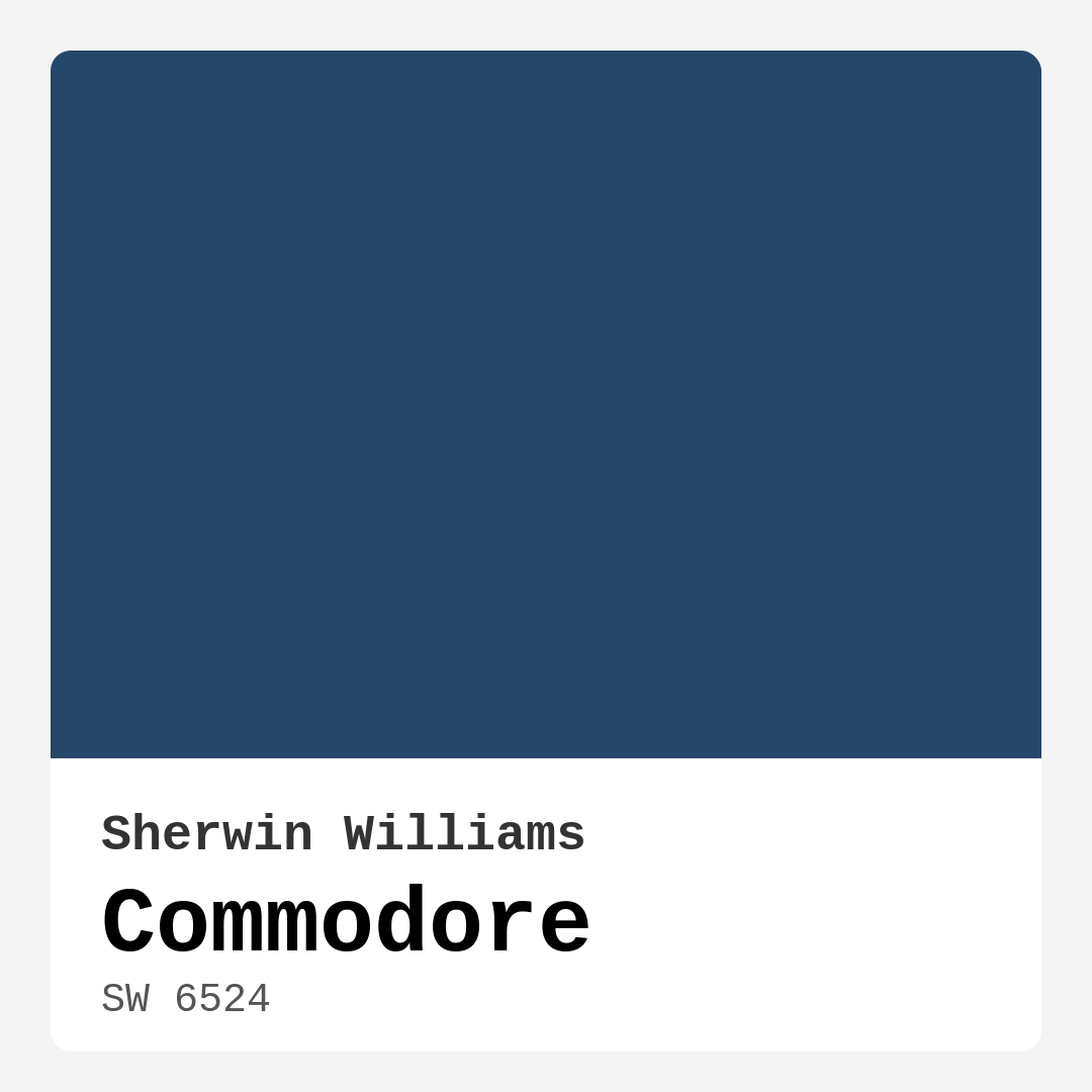
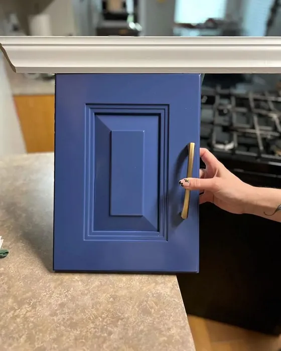
Color Preview & Key Details
| HEX Code | #25476A |
| RGB | 37, 71, 106 |
| LRV | 15% |
| Undertone | Blue |
| Finish Options | Eggshell, Satin, Semi-Gloss |
Imagine transforming your living space into a serene retreat, a sanctuary where you can unwind after a long day. What if I told you that the right paint color could help you achieve that dreamy atmosphere? Let’s dive into the beauty and versatility of Commodore—a striking blue from Sherwin Williams that embodies sophistication and calmness, reminiscent of the vast sea and expansive sky.
Commodore, with its color code SW 6524, showcases a rich, deep blue that’s perfect for creating a sense of depth in any room. Its hex code #25476A gives it a unique and inviting presence without overwhelming your space. If you’re thinking about adding this hue to your home, you’re looking at a color that not only stands out but also complements various decor styles beautifully.
When applying Commodore, you’ll notice that it goes on smoothly, providing excellent coverage with just one or two coats. This makes it incredibly beginner-friendly and a favorite among DIY enthusiasts. Whether you’re a seasoned pro or just starting your painting journey, you’ll appreciate how easy it is to achieve a flawless finish with this color. Plus, with its washability and scrub resistance, it’s practical for high-traffic areas, ensuring that your walls maintain their stunning look over time.
Now, let’s talk about the mood Commodore can create. This color leans toward the cool side of the spectrum, evoking a sense of tranquility and calm. It’s an excellent choice for spaces where you want to relax, such as a bedroom or home office. Imagine curling up with a good book in a room drenched in this inviting hue, or hosting intimate dinners where the calming backdrop enhances the overall ambiance.
However, it’s essential to consider how this color interacts with the lighting in your home. With a Light Reflectance Value (LRV) of 15%, Commodore reflects very little light. It can appear lighter during the day, almost like a soft navy, but at night, it deepens into a cozy, moody tone that wraps you in warmth. Thus, keep in mind that in smaller spaces, it might feel a bit darker. If you’re working with a compact room, consider pairing it with lighter decor or strategic lighting to keep the space feeling open and inviting. Accent walls or even using Commodore on furniture pieces can allow you to incorporate this rich color without overwhelming the room.
Speaking of pairing, this color shines when combined with other shades. Commodore’s undertones lean toward blue, which opens up a world of complementary colors. You could create stunning contrasts with warm oranges or pair it with lighter shades like SW 6531 to soften the overall look. For a crisp, clean finish, consider white trim such as White Dove—this will help the deep blue pop, giving your space a polished feel. Wood trims also work beautifully, adding warmth and character to the room.
Commodore is incredibly versatile; it suits various decor styles ranging from coastal and nautical to modern and classic. Whether you’re creating a beach-inspired retreat with soft whites and sandy tones or embracing a more contemporary look with sleek furniture and metallic accents, this deep blue can adapt beautifully. In a modern farmhouse setting, Commodore adds a touch of elegance while still feeling relaxed and inviting.
Let’s not forget the finishes available for this color. Commodore comes in eggshell, satin, and semi-gloss. Each finish offers a different sheen level to cater to your personal style and room requirements. Eggshell is a fantastic choice for a subtle sheen that’s easy to clean, while satin provides a bit more gloss for durability. If you’re looking for a finish that withstands wear and tear, semi-gloss is ideal for areas that need extra washability, like kitchens or bathrooms.
While there are numerous pros to choosing Commodore, it’s essential to be aware of its potential drawbacks. The darker tone may not suit everyone’s taste, especially if you prefer warmer shades. It requires careful color pairing to avoid a heavy feeling in your space. If you’re unsure about committing to such a deep color, testing it out in a small area or through accent pieces can be a wise approach. This way, you can gauge how it interacts with your existing decor before making a larger commitment.
As you consider Commodore for your home, remember it’s more than just a color; it’s a feeling. It creates a calm and inviting atmosphere that can transform everyday living into something special. The depth of this blue encourages relaxation and serenity, making it a perfect choice for your living room, bedroom, or even a dining room where you want to foster connection and warmth.
In terms of performance, Commodore stands out with its high coverage and ease of touch-up. It’s fade-resistant, ensuring that the rich color remains vibrant over time. And with a low VOC (volatile organic compounds) level, you can feel good about your choice, knowing it’s better for your indoor air quality. This is especially important for families with children or pets, where safety is a priority.
As you embark on your painting project, take the time to test Commodore in your space. Observe how it looks at different times of the day, how it interacts with your existing furnishings, and how it makes you feel. Color is an emotional experience, and finding the right one can turn a house into a home.
In conclusion, Commodore is more than just a paint color; it’s a sophisticated choice that brings a touch of elegance to any room. Whether you want to create a tranquil bedroom, an inspiring home office, or a welcoming living room, this deep blue will serve you beautifully. With its versatility, ease of application, and stunning aesthetic, Commodore could be the perfect hue to elevate your space. So, grab your paintbrush and get ready to transform your home with this captivating color!
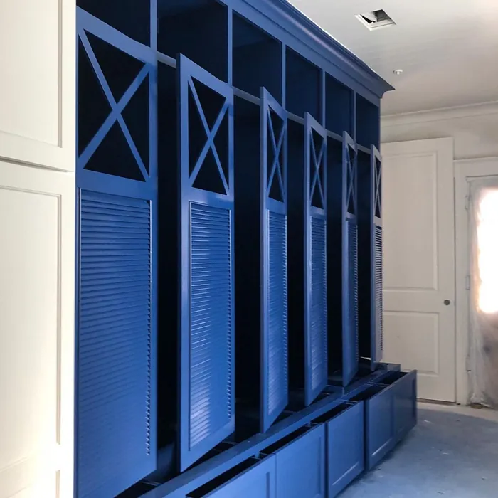
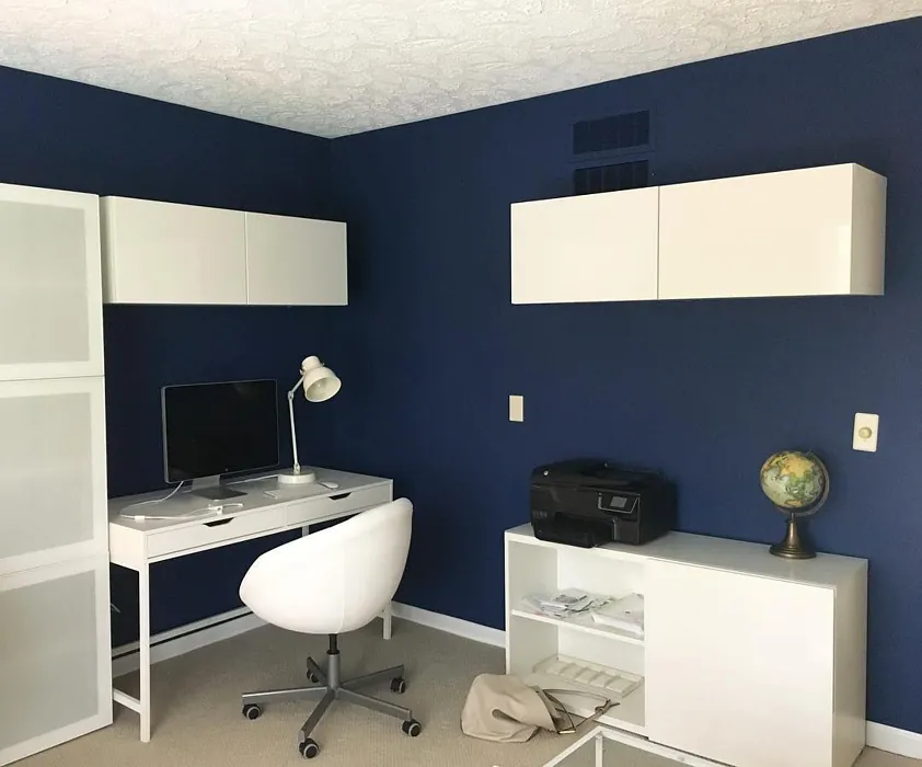
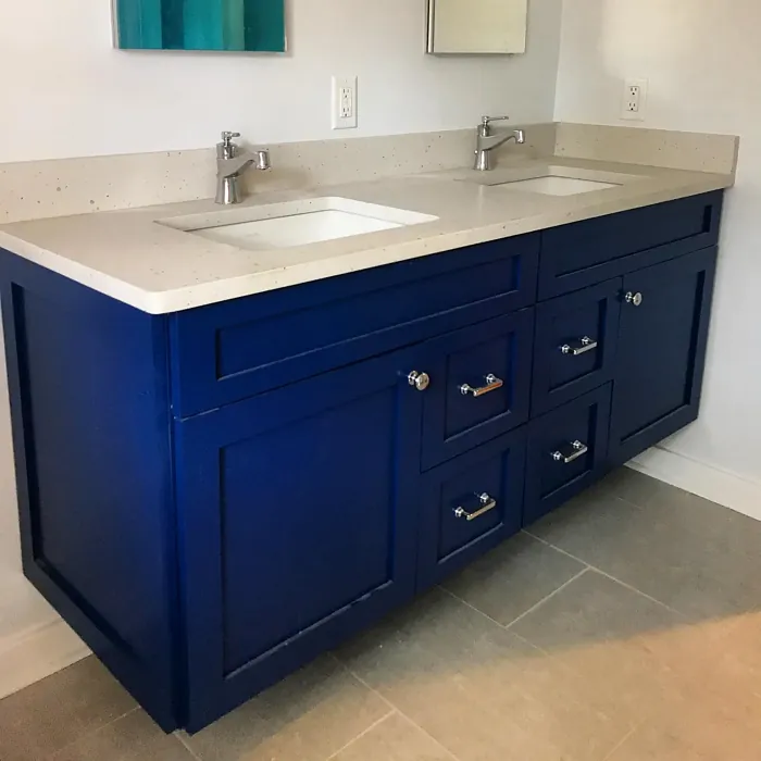
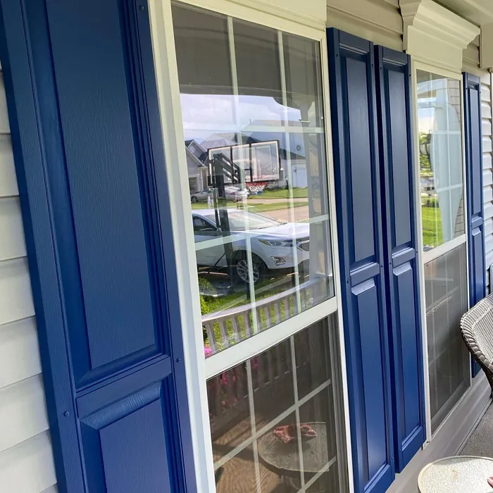
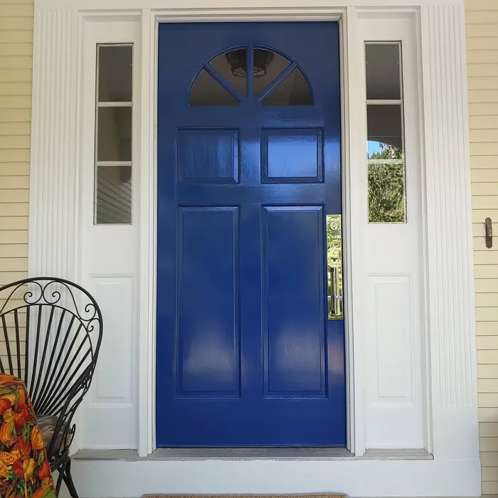
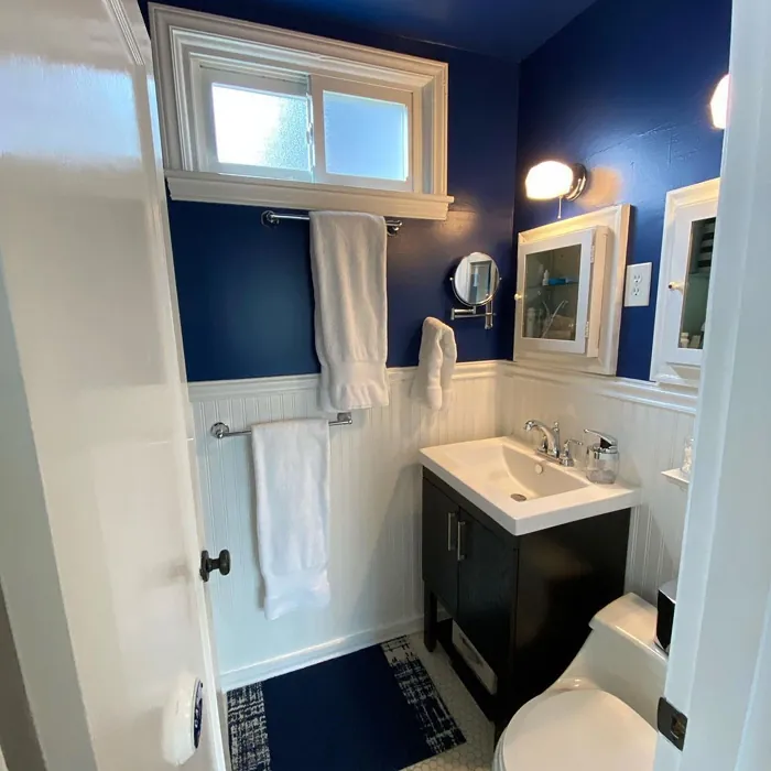
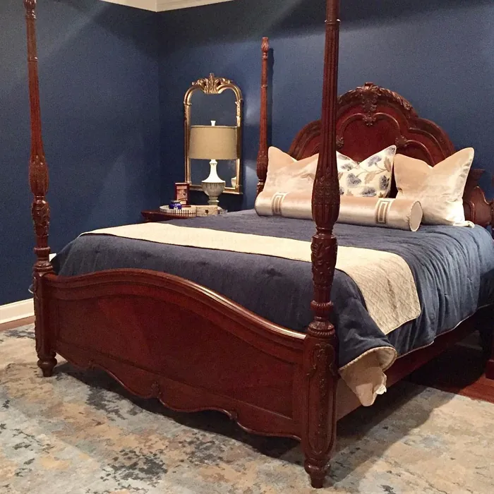
Real Room Photo of Commodore SW 6524
Undertones of Commodore ?
The undertones of Commodore are a key aspect of its character, leaning towards Blue. These subtle underlying hues are what give the color its depth and complexity. For example, a gray with a blue undertone will feel cooler and more modern, while one with a brown undertone will feel warmer and more traditional. It’s essential to test this paint in your home and observe it next to your existing furniture, flooring, and decor to see how these undertones interact and reveal themselves throughout the day.
HEX value: #25476A
RGB code: 37, 71, 106
Is Commodore Cool or Warm?
This color leans towards the cool side of the spectrum, giving it a refreshing and calming vibe. Ideal for spaces where you want to unwind, Commodore can also be used strategically in rooms needing a bit more energy without being too overwhelming.
Understanding Color Properties and Interior Design Tips
Hue refers to a specific position on the color wheel, measured in degrees from 0 to 360. Each degree represents a different pure color:
- 0° represents red
- 120° represents green
- 240° represents blue
Saturation describes the intensity or purity of a color and is expressed as a percentage:
- At 0%, the color appears completely desaturated—essentially a shade of gray
- At 100%, the color is at its most vivid and vibrant
Lightness indicates how light or dark a color is, also expressed as a percentage:
- 0% lightness results in black
- 100% lightness results in white
Using Warm Colors in Interior Design
Warm hues—such as reds, oranges, yellows, warm beiges, and greiges—are excellent choices for creating inviting and energetic spaces. These colors are particularly well-suited for:
- Kitchens, living rooms, and bathrooms, where warmth enhances comfort and sociability
- Large rooms, where warm tones can help reduce the sense of emptiness and make the space feel more intimate
For example:
- Warm beige shades provide a cozy, inviting atmosphere, ideal for living rooms, bedrooms, and hallways.
- Warm greige (a mix of beige and gray) offers the warmth of beige with the modern appeal of gray, making it a versatile backdrop for dining areas, bedrooms, and living spaces.
However, be mindful when using warm light tones in rooms with limited natural light. These shades may appear muted or even take on an unpleasant yellowish tint. To avoid a dull or flat appearance:
- Add depth by incorporating richer tones like deep greens, charcoal, or chocolate brown
- Use textured elements such as curtains, rugs, or cushions to bring dimension to the space
Pro Tip: Achieving Harmony with Warm and Cool Color Balance
To create a well-balanced and visually interesting interior, mix warm and cool tones strategically. This contrast adds depth and harmony to your design.
- If your walls feature warm hues, introduce cool-colored accents such as blue or green furniture, artwork, or accessories to create contrast.
- For a polished look, consider using a complementary color scheme, which pairs colors opposite each other on the color wheel (e.g., red with green, orange with blue).
This thoughtful mix not only enhances visual appeal but also creates a space that feels both dynamic and cohesive.
Light Temperature Affects on Commodore
Natural Light
Natural daylight changes in color temperature as the sun moves across the sky. At sunrise and sunset, the light tends to have a warm, golden tone with a color temperature around 2000 Kelvin (K). As the day progresses and the sun rises higher, the light becomes cooler and more neutral. Around midday, especially when the sky is clear, natural light typically reaches its peak brightness and shifts to a cooler tone, ranging from 5500 to 6500 Kelvin. This midday light is close to what we perceive as pure white or daylight-balanced light.
These shifts in natural light can significantly influence how colors appear in a space, which is why designers often consider both the time of day and the orientation of windows when planning interior color schemes.
Artificial Light
When choosing artificial lighting, pay close attention to the color temperature, measured in Kelvin (K). This determines how warm or cool the light will appear. Lower temperatures, around 2700K, give off a warm, yellow glow often used in living rooms or bedrooms. Higher temperatures, above 5000K, create a cool, bluish light similar to daylight, commonly used in kitchens, offices, or task areas.
Use the slider to see how lighting temperature can affect the appearance of a surface or color throughout a space.


4800K
LRV of Commodore
The Light Reflectance Value (LRV) of Commodore is 15%, which places it in the Medium Dark category. This means it reflects very little light. Understanding a paint’s LRV is crucial for predicting how it will look in your space. A higher LRV indicates a lighter color that reflects more light, making rooms feel larger and brighter. A lower LRV signifies a darker color that absorbs more light, creating a cozier, more intimate atmosphere. Always consider the natural and artificial lighting in your room when selecting a paint color based on its LRV.
Detailed Review of Commodore
Additional Paint Characteristics
Ideal Rooms
Bedroom, Dining Room, Hallway, Home Office, Living Room
Decor Styles
Classic, Coastal, Modern, Nautical, Transitional
Coverage
Good (1–2 Coats)
Ease of Application
Beginner Friendly, Brush Smooth, Roller-Ready
Washability
Scrubbable, Stain Resistant, Washable
VOC Level
Low VOC
Best Use
Accent Wall, Interior Walls, Trim
Room Suitability
Bedroom, Dining Room, Home Office, Living Room
Tone Tag
Cool, Deep, Sophisticated
Finish Type
Eggshell, Satin, Semi-Gloss
Paint Performance
Easy Touch-Up, Fade Resistant, High Coverage
Use Cases
Best for Modern Farmhouse, Best for Rentals, Classic Favorite
Mood
Calm, Inviting, Sophisticated
Trim Pairing
Complements Cool Trim, Good with Wood Trim, Pairs with White Dove
Commodore truly shines when it comes to versatility and depth. This paint not only brings a sense of tranquility but also pairs beautifully with a variety of decor styles, from coastal to modern. Its ability to adapt to both bright and dim lighting conditions enhances its appeal, allowing it to create a different mood depending on the time of day. When applied, it goes on smoothly and provides excellent coverage, typically requiring only one to two coats for a flawless finish. This makes it a fantastic choice for both DIY enthusiasts and professionals alike, as it simplifies the painting process while delivering stunning results.
Pros & Cons of SW 6524 Commodore
Pros
Cons
Colors that go with Sherwin Williams Commodore
FAQ on SW 6524 Commodore
What types of finishes are available for Commodore?
Commodore is available in several finishes, including eggshell, satin, and semi-gloss. Each finish offers a different sheen level, allowing you to choose the right one based on your room’s needs and your personal style. Eggshell is great for a subtle sheen, satin provides a bit more gloss for durability, and semi-gloss is perfect for areas that require extra washability, such as kitchens and bathrooms.
Can I use Commodore in a small room?
While Commodore can work in a small room, it’s important to consider the amount of natural light the space receives. Its darker tone might make a small room feel even cozier or potentially cramped. To counteract this, consider pairing it with lighter decor or strategic lighting to keep the space feeling open and inviting. Accent walls or using it on furniture pieces can also be a great way to incorporate this rich color without overwhelming the room.
Comparisons Commodore with other colors
Commodore SW 6524 vs Naval SW 6244
| Attribute | Commodore SW 6524 | Naval SW 6244 |
|---|---|---|
| Color Name | Commodore SW 6524 | Naval SW 6244 |
| Color | ||
| Hue | Blue | Blue |
| Brightness | Dark | Dark |
| RGB | 37, 71, 106 | 47, 61, 76 |
| LRV | 15% | 4% |
| Finish Type | Eggshell, Satin, Semi-Gloss | Matte, Satin, Semi-Gloss |
| Finish Options | Eggshell, Satin, Semi-Gloss | Matte, Satin, Semi-Gloss |
| Ideal Rooms | Bedroom, Dining Room, Hallway, Home Office, Living Room | Bedroom, Dining Room, Hallway, Home Office, Living Room |
| Decor Styles | Classic, Coastal, Modern, Nautical, Transitional | Coastal, Industrial, Minimalist, Modern, Traditional |
| Coverage | Good (1–2 Coats) | Good (1–2 Coats), Self-Priming |
| Ease of Application | Beginner Friendly, Brush Smooth, Roller-Ready | Beginner Friendly, Brush Smooth, Roller-Ready |
| Washability | Scrubbable, Stain Resistant, Washable | Highly Washable, Washable |
| Room Suitability | Bedroom, Dining Room, Home Office, Living Room | Bedroom, Dining Room, Entryway, Home Office, Living Room |
| Tone | Cool, Deep, Sophisticated | Cool, Deep, Moody |
| Paint Performance | Easy Touch-Up, Fade Resistant, High Coverage | Easy Touch-Up, High Coverage, Low Odor, Scuff Resistant |
Commodore SW 6524 vs Sea Serpent SW 7615
| Attribute | Commodore SW 6524 | Sea Serpent SW 7615 |
|---|---|---|
| Color Name | Commodore SW 6524 | Sea Serpent SW 7615 |
| Color | ||
| Hue | Blue | Blue |
| Brightness | Dark | Dark |
| RGB | 37, 71, 106 | 62, 75, 84 |
| LRV | 15% | 12% |
| Finish Type | Eggshell, Satin, Semi-Gloss | Eggshell, Matte, Satin |
| Finish Options | Eggshell, Satin, Semi-Gloss | Eggshell, Matte, Satin |
| Ideal Rooms | Bedroom, Dining Room, Hallway, Home Office, Living Room | Bathroom, Bedroom, Home Office, Living Room |
| Decor Styles | Classic, Coastal, Modern, Nautical, Transitional | Coastal, Farmhouse, Industrial, Modern |
| Coverage | Good (1–2 Coats) | Good (1–2 Coats), Touch-Up Friendly |
| Ease of Application | Beginner Friendly, Brush Smooth, Roller-Ready | Beginner Friendly, Brush Smooth, Roller-Ready |
| Washability | Scrubbable, Stain Resistant, Washable | Highly Washable, Washable |
| Room Suitability | Bedroom, Dining Room, Home Office, Living Room | Bathroom, Bedroom, Home Office, Living Room |
| Tone | Cool, Deep, Sophisticated | Cool, Deep, Moody |
| Paint Performance | Easy Touch-Up, Fade Resistant, High Coverage | Easy Touch-Up, High Coverage, Low Odor |
Commodore SW 6524 vs Rain Cloud SW 9639
| Attribute | Commodore SW 6524 | Rain Cloud SW 9639 |
|---|---|---|
| Color Name | Commodore SW 6524 | Rain Cloud SW 9639 |
| Color | ||
| Hue | Blue | Blue |
| Brightness | Dark | Dark |
| RGB | 37, 71, 106 | 83, 97, 104 |
| LRV | 15% | 30% |
| Finish Type | Eggshell, Satin, Semi-Gloss | Eggshell, Matte, Satin |
| Finish Options | Eggshell, Satin, Semi-Gloss | Eggshell, Matte, Satin |
| Ideal Rooms | Bedroom, Dining Room, Hallway, Home Office, Living Room | Bedroom, Dining Room, Home Office, Living Room |
| Decor Styles | Classic, Coastal, Modern, Nautical, Transitional | Coastal, Contemporary, Minimalist, Scandinavian |
| Coverage | Good (1–2 Coats) | Good (1–2 Coats), Touch-Up Friendly |
| Ease of Application | Beginner Friendly, Brush Smooth, Roller-Ready | Beginner Friendly, Brush Smooth, Roller-Ready |
| Washability | Scrubbable, Stain Resistant, Washable | Highly Washable, Washable |
| Room Suitability | Bedroom, Dining Room, Home Office, Living Room | Bedroom, Home Office, Living Room |
| Tone | Cool, Deep, Sophisticated | Balanced, Cool, Muted |
| Paint Performance | Easy Touch-Up, Fade Resistant, High Coverage | Easy Touch-Up, Fade Resistant, Low Odor |
Commodore SW 6524 vs Indigo Batik SW 7602
| Attribute | Commodore SW 6524 | Indigo Batik SW 7602 |
|---|---|---|
| Color Name | Commodore SW 6524 | Indigo Batik SW 7602 |
| Color | ||
| Hue | Blue | Blue |
| Brightness | Dark | Dark |
| RGB | 37, 71, 106 | 62, 80, 99 |
| LRV | 15% | 10% |
| Finish Type | Eggshell, Satin, Semi-Gloss | Matte, Satin |
| Finish Options | Eggshell, Satin, Semi-Gloss | Eggshell, Flat, Matte, Satin |
| Ideal Rooms | Bedroom, Dining Room, Hallway, Home Office, Living Room | Bedroom, Dining Room, Home Office, Living Room |
| Decor Styles | Classic, Coastal, Modern, Nautical, Transitional | Bohemian, Coastal, Contemporary, Modern |
| Coverage | Good (1–2 Coats) | Good (1–2 Coats), Touch-Up Friendly |
| Ease of Application | Beginner Friendly, Brush Smooth, Roller-Ready | Brush Smooth, Fast-Drying, Roller-Ready |
| Washability | Scrubbable, Stain Resistant, Washable | Scrubbable, Washable, Wipeable |
| Room Suitability | Bedroom, Dining Room, Home Office, Living Room | Bedroom, Dining Room, Home Office, Living Room |
| Tone | Cool, Deep, Sophisticated | Cool, Deep, Moody |
| Paint Performance | Easy Touch-Up, Fade Resistant, High Coverage | Easy Touch-Up, High Coverage, Low Odor, Quick Drying |
Commodore SW 6524 vs Sea Mariner SW 9640
| Attribute | Commodore SW 6524 | Sea Mariner SW 9640 |
|---|---|---|
| Color Name | Commodore SW 6524 | Sea Mariner SW 9640 |
| Color | ||
| Hue | Blue | Blue |
| Brightness | Dark | Dark |
| RGB | 37, 71, 106 | 67, 74, 84 |
| LRV | 15% | 6% |
| Finish Type | Eggshell, Satin, Semi-Gloss | Eggshell, Matte, Satin |
| Finish Options | Eggshell, Satin, Semi-Gloss | Eggshell, Matte, Satin |
| Ideal Rooms | Bedroom, Dining Room, Hallway, Home Office, Living Room | Bedroom, Dining Room, Hallway, Home Office, Living Room |
| Decor Styles | Classic, Coastal, Modern, Nautical, Transitional | Coastal, Industrial, Minimalist, Modern |
| Coverage | Good (1–2 Coats) | Good (1–2 Coats) |
| Ease of Application | Beginner Friendly, Brush Smooth, Roller-Ready | Beginner Friendly, Brush Smooth, Roller-Ready |
| Washability | Scrubbable, Stain Resistant, Washable | Scrubbable, Washable |
| Room Suitability | Bedroom, Dining Room, Home Office, Living Room | Bedroom, Dining Room, Home Office, Living Room |
| Tone | Cool, Deep, Sophisticated | Cool, Deep, Moody |
| Paint Performance | Easy Touch-Up, Fade Resistant, High Coverage | Easy Touch-Up, Low Odor, Quick Drying |
Commodore SW 6524 vs Still Water SW 6223
| Attribute | Commodore SW 6524 | Still Water SW 6223 |
|---|---|---|
| Color Name | Commodore SW 6524 | Still Water SW 6223 |
| Color | ||
| Hue | Blue | Blue |
| Brightness | Dark | Dark |
| RGB | 37, 71, 106 | 74, 93, 95 |
| LRV | 15% | 48% |
| Finish Type | Eggshell, Satin, Semi-Gloss | Eggshell, Matte, Satin |
| Finish Options | Eggshell, Satin, Semi-Gloss | Eggshell, Matte, Satin |
| Ideal Rooms | Bedroom, Dining Room, Hallway, Home Office, Living Room | Bedroom, Dining Room, Home Office, Living Room, Nursery |
| Decor Styles | Classic, Coastal, Modern, Nautical, Transitional | Coastal, Contemporary, Farmhouse, Modern, Rustic |
| Coverage | Good (1–2 Coats) | Good (1–2 Coats), Touch-Up Friendly |
| Ease of Application | Beginner Friendly, Brush Smooth, Roller-Ready | Beginner Friendly, Brush Smooth, Roller-Ready |
| Washability | Scrubbable, Stain Resistant, Washable | Highly Washable, Washable |
| Room Suitability | Bedroom, Dining Room, Home Office, Living Room | Bedroom, Dining Room, Home Office, Living Room |
| Tone | Cool, Deep, Sophisticated | Cool, Earthy, Muted |
| Paint Performance | Easy Touch-Up, Fade Resistant, High Coverage | Easy Touch-Up, Fade Resistant, Low Odor |
Commodore SW 6524 vs Waterloo SW 9141
| Attribute | Commodore SW 6524 | Waterloo SW 9141 |
|---|---|---|
| Color Name | Commodore SW 6524 | Waterloo SW 9141 |
| Color | ||
| Hue | Blue | Blue |
| Brightness | Dark | Dark |
| RGB | 37, 71, 106 | 83, 104, 114 |
| LRV | 15% | 12% |
| Finish Type | Eggshell, Satin, Semi-Gloss | Matte, Satin |
| Finish Options | Eggshell, Satin, Semi-Gloss | Matte, Satin, Semi-Gloss |
| Ideal Rooms | Bedroom, Dining Room, Hallway, Home Office, Living Room | Bedroom, Dining Room, Hallway, Home Office, Living Room |
| Decor Styles | Classic, Coastal, Modern, Nautical, Transitional | Coastal, Industrial, Modern, Rustic |
| Coverage | Good (1–2 Coats) | Good (1–2 Coats), Touch-Up Friendly |
| Ease of Application | Beginner Friendly, Brush Smooth, Roller-Ready | Brush Smooth, Fast-Drying, Roller-Ready |
| Washability | Scrubbable, Stain Resistant, Washable | Scrubbable, Washable |
| Room Suitability | Bedroom, Dining Room, Home Office, Living Room | Bedroom, Dining Room, Home Office, Living Room |
| Tone | Cool, Deep, Sophisticated | Balanced, Cool, Muted |
| Paint Performance | Easy Touch-Up, Fade Resistant, High Coverage | Easy Touch-Up, Fade Resistant, Low Odor, Quick Drying |
Commodore SW 6524 vs Smoky Blue SW 7604
| Attribute | Commodore SW 6524 | Smoky Blue SW 7604 |
|---|---|---|
| Color Name | Commodore SW 6524 | Smoky Blue SW 7604 |
| Color | ||
| Hue | Blue | Blue |
| Brightness | Dark | Dark |
| RGB | 37, 71, 106 | 89, 110, 121 |
| LRV | 15% | 15% |
| Finish Type | Eggshell, Satin, Semi-Gloss | Eggshell, Matte, Satin |
| Finish Options | Eggshell, Satin, Semi-Gloss | Eggshell, Matte, Satin |
| Ideal Rooms | Bedroom, Dining Room, Hallway, Home Office, Living Room | Bathroom, Bedroom, Home Office, Kitchen, Living Room |
| Decor Styles | Classic, Coastal, Modern, Nautical, Transitional | Coastal, Modern, Scandinavian, Transitional |
| Coverage | Good (1–2 Coats) | Good (1–2 Coats), Touch-Up Friendly |
| Ease of Application | Beginner Friendly, Brush Smooth, Roller-Ready | Beginner Friendly, Brush Smooth, Roller-Ready |
| Washability | Scrubbable, Stain Resistant, Washable | Highly Washable, Washable |
| Room Suitability | Bedroom, Dining Room, Home Office, Living Room | Bathroom, Bedroom, Home Office, Living Room |
| Tone | Cool, Deep, Sophisticated | Cool, Dusty, Muted |
| Paint Performance | Easy Touch-Up, Fade Resistant, High Coverage | High Coverage, Low Odor, Quick Drying |
Commodore SW 6524 vs Needlepoint Navy SW 0032
| Attribute | Commodore SW 6524 | Needlepoint Navy SW 0032 |
|---|---|---|
| Color Name | Commodore SW 6524 | Needlepoint Navy SW 0032 |
| Color | ||
| Hue | Blue | Blue |
| Brightness | Dark | Dark |
| RGB | 37, 71, 106 | 84, 102, 112 |
| LRV | 15% | 4% |
| Finish Type | Eggshell, Satin, Semi-Gloss | Matte, Satin, Semi-Gloss |
| Finish Options | Eggshell, Satin, Semi-Gloss | Matte, Satin, Semi-Gloss |
| Ideal Rooms | Bedroom, Dining Room, Hallway, Home Office, Living Room | Bedroom, Dining Room, Entryway, Home Office, Living Room |
| Decor Styles | Classic, Coastal, Modern, Nautical, Transitional | Coastal, Contemporary, Modern Farmhouse, Nautical, Traditional |
| Coverage | Good (1–2 Coats) | Good (1–2 Coats), Touch-Up Friendly |
| Ease of Application | Beginner Friendly, Brush Smooth, Roller-Ready | Beginner Friendly, Brush Smooth, Fast-Drying, Roller-Ready |
| Washability | Scrubbable, Stain Resistant, Washable | Scrubbable, Washable |
| Room Suitability | Bedroom, Dining Room, Home Office, Living Room | Bedroom, Dining Room, Home Office, Living Room |
| Tone | Cool, Deep, Sophisticated | Cool, Deep, Muted |
| Paint Performance | Easy Touch-Up, Fade Resistant, High Coverage | Easy Touch-Up, High Coverage, Low Odor, Quick Drying, Stain Resistant |
Commodore SW 6524 vs Riverway SW 6222
| Attribute | Commodore SW 6524 | Riverway SW 6222 |
|---|---|---|
| Color Name | Commodore SW 6524 | Riverway SW 6222 |
| Color | ||
| Hue | Blue | Blue |
| Brightness | Dark | Dark |
| RGB | 37, 71, 106 | 93, 114, 116 |
| LRV | 15% | 24% |
| Finish Type | Eggshell, Satin, Semi-Gloss | Eggshell, Satin |
| Finish Options | Eggshell, Satin, Semi-Gloss | Eggshell, Matte, Satin |
| Ideal Rooms | Bedroom, Dining Room, Hallway, Home Office, Living Room | Bathroom, Bedroom, Dining Room, Home Office, Living Room |
| Decor Styles | Classic, Coastal, Modern, Nautical, Transitional | Coastal, Contemporary, Eclectic, Modern, Rustic |
| Coverage | Good (1–2 Coats) | Good (1–2 Coats), Touch-Up Friendly |
| Ease of Application | Beginner Friendly, Brush Smooth, Roller-Ready | Beginner Friendly, Brush Smooth, Fast-Drying, Low Splatter, Roller-Ready |
| Washability | Scrubbable, Stain Resistant, Washable | Highly Washable, Washable |
| Room Suitability | Bedroom, Dining Room, Home Office, Living Room | Bathroom, Bedroom, Home Office, Living Room |
| Tone | Cool, Deep, Sophisticated | Balanced, Cool, Muted |
| Paint Performance | Easy Touch-Up, Fade Resistant, High Coverage | Easy Touch-Up, High Coverage, Low Odor, Quick Drying |
Official Page of Sherwin Williams Commodore SW 6524