Color Preview & Key Details
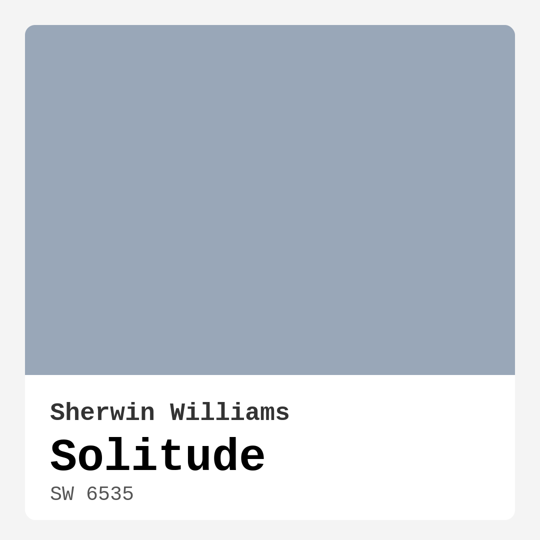
| HEX Code | #99A7B8 |
| RGB | 153, 167, 184 |
| LRV | 66% |
| Undertone | Blue |
| Finish Options | Eggshell, Matte, Satin |
Imagine stepping into a space where you can feel your shoulders drop and your breath become a little deeper. That’s the magic of Solitude, a paint color that whispers tranquility and invites you to unwind. With its gentle blend of blue and gray undertones, Solitude is more than just a color; it’s a mood, a feeling, and a transformative element for your home.
When considering a paint color, it’s essential to understand its personality. Solitude, with the color code SW 6535 from Sherwin Williams, reflects a high amount of light thanks to its 66% Light Reflectance Value (LRV). This means even in a cozy room, it manages to keep the atmosphere bright and airy. It’s a medium hue that strikes just the right balance, making it versatile across various decor styles, from modern to coastal, Scandinavian, and minimalist.
You might be wondering about its application. Fear not—Solitude is beginner-friendly! It rolls on smoothly and dries quickly, allowing you to transform your space in no time. Plus, it has a washable, stain-resistant formula that stands up to the demands of daily life, making it an excellent choice for high-traffic areas. If you’re concerned about maintaining that fresh look, consider opting for a satin finish in those busy spots for added durability.
Now, let’s chat about how to incorporate Solitude into your home. Imagine painting your bedroom in this serene hue; it can act as a calming backdrop that encourages relaxation after a long day. Picture waking up in a room bathed in this gentle blue, where natural light dances off the walls, creating a sense of openness and peace. It’s perfect for a nursery as well, providing a soft, inviting atmosphere for your little one.
But don’t stop there. Solitude is wonderfully adaptable for living rooms and home offices too. Whether you’re hosting friends or working from home, this color can create a backdrop that’s both sophisticated and comforting. The muted, airy tone pairs beautifully with crisp whites, natural wood tones, and even deeper hues like navy or emerald green for a contrast that can really elevate your space.
When thinking about color pairings, Solitude shines next to whites like Pure White, making for a crisp and clean look. It also harmonizes with soft natural woods, enhancing its calming effect. For a more monochromatic palette, consider using lighter or darker shades of blue or gray to create depth and interest while keeping the overall feel cohesive.
It’s important to note the subtle undertones of Solitude. Leaning towards the cool side, the blue undertones give this color its depth and complexity. Depending on your existing furniture and decor, these undertones can shift gently throughout the day, revealing different aspects of the color. Testing Solitude in your space is vital; observe how it interacts with your lighting, furnishings, and flooring to ensure it complements your vision perfectly.
Lighting plays a significant role in how Solitude will appear in your home. In natural light, it can feel lighter and more ethereal, while in dimmer settings, it takes on a subdued, tranquil tone. This adaptability can be a game changer, especially in rooms that experience varying light throughout the day.
One of the standout features of this paint is its ability to create spaces that feel both spacious and intimate. Whether you’re painting an accent wall or refreshing an entire room, Solitude can help to redefine the atmosphere of your home. Its matte and eggshell finishes offer a soft, inviting texture that not only looks beautiful but also feels warm and welcoming.
While Solitude has many pros, let’s not ignore the few considerations. In smaller spaces, it may appear darker, which could make the room feel more confined. Proper lighting becomes essential here. If you love the color but are worried about how it might affect a smaller room, try experimenting with brighter light fixtures or using it in conjunction with lighter accents to help balance the space.
As you embark on your painting journey, remember that Solitude is not just a color—it’s a thoughtful choice that reflects your desire for a calm and restful environment. Whether you’re sprucing up a rental, prepping your home for sale, or just wanting to create a designer-inspired look, this hue is a fantastic option that can elevate your interiors.
When embarking on your painting project, consider the overall mood you want to create. Solitude exudes calmness, making it ideal for spaces designed for relaxation and focus. You can enhance its tranquil vibe by incorporating soft textures and natural elements into your decor, like plush throws, wooden furniture, and light fabrics.
In summary, Solitude is an enchanting color that gracefully balances warmth and coolness, making it a versatile choice for any room in your home. It’s a designer favorite for a reason—its ability to create serene and inviting spaces is truly unmatched. So, if you’re looking to refresh your home’s ambiance and invite a sense of peace into your life, Solitude might just be the perfect shade for you.
As you contemplate your next project, take a moment to envision how Solitude can transform your space into an oasis of calm. You deserve a home that reflects your style and provides a sanctuary from the outside world. With Solitude on your walls, you might just find that perfect blend of beauty and tranquility. Happy painting!

Real Room Photo of Solitude SW 6535

Undertones of Solitude ?
The undertones of Solitude are a key aspect of its character, leaning towards Blue. These subtle underlying hues are what give the color its depth and complexity. For example, a gray with a blue undertone will feel cooler and more modern, while one with a brown undertone will feel warmer and more traditional. It’s essential to test this paint in your home and observe it next to your existing furniture, flooring, and decor to see how these undertones interact and reveal themselves throughout the day.
HEX value: #99A7B8
RGB code: 153, 167, 184
Is Solitude Cool or Warm?
Solitude leans toward the cool spectrum, making it ideal for creating serene and restful spaces.
Understanding Color Properties and Interior Design Tips
Hue refers to a specific position on the color wheel, measured in degrees from 0 to 360. Each degree represents a different pure color:
- 0° represents red
- 120° represents green
- 240° represents blue
Saturation describes the intensity or purity of a color and is expressed as a percentage:
- At 0%, the color appears completely desaturated—essentially a shade of gray
- At 100%, the color is at its most vivid and vibrant
Lightness indicates how light or dark a color is, also expressed as a percentage:
- 0% lightness results in black
- 100% lightness results in white
Using Warm Colors in Interior Design
Warm hues—such as reds, oranges, yellows, warm beiges, and greiges—are excellent choices for creating inviting and energetic spaces. These colors are particularly well-suited for:
- Kitchens, living rooms, and bathrooms, where warmth enhances comfort and sociability
- Large rooms, where warm tones can help reduce the sense of emptiness and make the space feel more intimate
For example:
- Warm beige shades provide a cozy, inviting atmosphere, ideal for living rooms, bedrooms, and hallways.
- Warm greige (a mix of beige and gray) offers the warmth of beige with the modern appeal of gray, making it a versatile backdrop for dining areas, bedrooms, and living spaces.
However, be mindful when using warm light tones in rooms with limited natural light. These shades may appear muted or even take on an unpleasant yellowish tint. To avoid a dull or flat appearance:
- Add depth by incorporating richer tones like deep greens, charcoal, or chocolate brown
- Use textured elements such as curtains, rugs, or cushions to bring dimension to the space
Pro Tip: Achieving Harmony with Warm and Cool Color Balance
To create a well-balanced and visually interesting interior, mix warm and cool tones strategically. This contrast adds depth and harmony to your design.
- If your walls feature warm hues, introduce cool-colored accents such as blue or green furniture, artwork, or accessories to create contrast.
- For a polished look, consider using a complementary color scheme, which pairs colors opposite each other on the color wheel (e.g., red with green, orange with blue).
This thoughtful mix not only enhances visual appeal but also creates a space that feels both dynamic and cohesive.

Light Temperature Affects on Solitude
Natural Light
Natural daylight changes in color temperature as the sun moves across the sky. At sunrise and sunset, the light tends to have a warm, golden tone with a color temperature around 2000 Kelvin (K). As the day progresses and the sun rises higher, the light becomes cooler and more neutral. Around midday, especially when the sky is clear, natural light typically reaches its peak brightness and shifts to a cooler tone, ranging from 5500 to 6500 Kelvin. This midday light is close to what we perceive as pure white or daylight-balanced light.
These shifts in natural light can significantly influence how colors appear in a space, which is why designers often consider both the time of day and the orientation of windows when planning interior color schemes.
Artificial Light
When choosing artificial lighting, pay close attention to the color temperature, measured in Kelvin (K). This determines how warm or cool the light will appear. Lower temperatures, around 2700K, give off a warm, yellow glow often used in living rooms or bedrooms. Higher temperatures, above 5000K, create a cool, bluish light similar to daylight, commonly used in kitchens, offices, or task areas.
Use the slider to see how lighting temperature can affect the appearance of a surface or color throughout a space.


4800K
LRV of Solitude
The Light Reflectance Value (LRV) of Solitude is 66%, which places it in the Light category. This means it Reflects a high amount of light. Understanding a paint’s LRV is crucial for predicting how it will look in your space. A higher LRV indicates a lighter color that reflects more light, making rooms feel larger and brighter. A lower LRV signifies a darker color that absorbs more light, creating a cozier, more intimate atmosphere. Always consider the natural and artificial lighting in your room when selecting a paint color based on its LRV.
Detailed Review of Solitude
Additional Paint Characteristics
Ideal Rooms
Bedroom, Dining Room, Home Office, Living Room, Nursery
Decor Styles
Coastal, Minimalist, Modern, Scandinavian
Coverage
Good (1–2 Coats), Touch-Up Friendly
Ease of Application
Beginner Friendly, Fast-Drying, Roller-Ready
Washability
Stain Resistant, Washable
VOC Level
Eco-Certified, Low VOC
Best Use
Accent Wall, Bedroom, Interior Walls
Room Suitability
Bedroom, Home Office, Living Room, Nursery
Tone Tag
Airy, Balanced, Cool, Muted
Finish Type
Eggshell, Matte
Paint Performance
Easy Touch-Up, High Coverage, Low Odor
Use Cases
Best for Low Light Rooms, Best for Rentals, Best for Selling Your Home, Designer Favorite
Mood
Calm, Inviting, Restful
Trim Pairing
Complements Cool Trim, Good with Wood Trim, Pairs with White Dove
Solitude is a truly enchanting color that beautifully balances warmth and coolness, making it extremely versatile across different decor styles. When applied, it brings a breath of fresh air into your space, creating an atmosphere that feels both spacious and intimate. One of the standout features of this paint is its ability to shift gently with the changing light throughout the day, revealing different facets of its personality. Whether you’re painting a nursery, a cozy living room, or a tranquil bedroom, Solitude provides a calming backdrop that encourages relaxation. Its matte finish feels soft and inviting, ensuring that your walls not only look great but also feel warm and welcoming. It pairs effortlessly with various trim colors, especially whites and natural wood tones, enhancing its soft elegance.
Pros & Cons of SW 6535 Solitude
Pros
Cons
Colors that go with Sherwin Williams Solitude
FAQ on SW 6535 Solitude
Can Solitude be used in high-traffic areas?
Yes, Solitude can be used in high-traffic areas, though it’s essential to ensure the surface is well-prepared. Its washable and stain-resistant properties allow for easy maintenance. However, if the area experiences extreme wear and tear, consider adding a satin finish for extra durability.
What colors pair well with Solitude?
Solitude pairs beautifully with crisp whites like Pure White, soft natural woods, and even deeper hues like navy or emerald green for a striking contrast. For a more monochromatic palette, consider using lighter or darker shades of blue or gray to create depth and interest.
Comparisons Solitude with other colors
Solitude SW 6535 vs Dutch Tile Blue SW 0031
| Attribute | Solitude SW 6535 | Dutch Tile Blue SW 0031 |
|---|---|---|
| Color Name | Solitude SW 6535 | Dutch Tile Blue SW 0031 |
| Color | ||
| Hue | Blue | Blue |
| Brightness | Medium | Medium |
| RGB | 153, 167, 184 | 154, 171, 171 |
| LRV | 66% | 24% |
| Finish Type | Eggshell, Matte | Eggshell, Matte, Satin |
| Finish Options | Eggshell, Matte, Satin | Eggshell, Flat, Matte, Satin |
| Ideal Rooms | Bedroom, Dining Room, Home Office, Living Room, Nursery | Bathroom, Bedroom, Dining Room, Hallway, Home Office, Kitchen, Living Room |
| Decor Styles | Coastal, Minimalist, Modern, Scandinavian | Coastal, Modern Farmhouse, Scandinavian, Traditional, Transitional |
| Coverage | Good (1–2 Coats), Touch-Up Friendly | Good (1–2 Coats) |
| Ease of Application | Beginner Friendly, Fast-Drying, Roller-Ready | Beginner Friendly, Brush Smooth, Fast-Drying, Roller-Ready |
| Washability | Stain Resistant, Washable | Highly Washable, Washable |
| Room Suitability | Bedroom, Home Office, Living Room, Nursery | Bathroom, Bedroom, Dining Room, Kitchen, Living Room |
| Tone | Airy, Balanced, Cool, Muted | Balanced, Cool, Muted |
| Paint Performance | Easy Touch-Up, High Coverage, Low Odor | Easy Touch-Up, High Coverage, Low Odor, Quick Drying |
Solitude SW 6535 vs Debonair SW 9139
| Attribute | Solitude SW 6535 | Debonair SW 9139 |
|---|---|---|
| Color Name | Solitude SW 6535 | Debonair SW 9139 |
| Color | ||
| Hue | Blue | Blue |
| Brightness | Medium | Medium |
| RGB | 153, 167, 184 | 144, 160, 166 |
| LRV | 66% | 30% |
| Finish Type | Eggshell, Matte | Eggshell, Matte, Satin |
| Finish Options | Eggshell, Matte, Satin | Eggshell, Matte, Satin |
| Ideal Rooms | Bedroom, Dining Room, Home Office, Living Room, Nursery | Bedroom, Dining Room, Home Office, Living Room |
| Decor Styles | Coastal, Minimalist, Modern, Scandinavian | Coastal, Industrial, Modern, Transitional |
| Coverage | Good (1–2 Coats), Touch-Up Friendly | Good (1–2 Coats) |
| Ease of Application | Beginner Friendly, Fast-Drying, Roller-Ready | Beginner Friendly, Brush Smooth, Roller-Ready |
| Washability | Stain Resistant, Washable | Washable, Wipeable |
| Room Suitability | Bedroom, Home Office, Living Room, Nursery | Bedroom, Dining Room, Home Office, Living Room |
| Tone | Airy, Balanced, Cool, Muted | Balanced, Cool, Muted |
| Paint Performance | Easy Touch-Up, High Coverage, Low Odor | Easy Touch-Up, Low Odor, Quick Drying |
Solitude SW 6535 vs Stardew SW 9138
| Attribute | Solitude SW 6535 | Stardew SW 9138 |
|---|---|---|
| Color Name | Solitude SW 6535 | Stardew SW 9138 |
| Color | ||
| Hue | Blue | Blue |
| Brightness | Medium | Medium |
| RGB | 153, 167, 184 | 166, 178, 181 |
| LRV | 66% | 30% |
| Finish Type | Eggshell, Matte | Eggshell, Satin |
| Finish Options | Eggshell, Matte, Satin | Eggshell, Matte, Satin |
| Ideal Rooms | Bedroom, Dining Room, Home Office, Living Room, Nursery | Bathroom, Bedroom, Home Office, Living Room, Nursery |
| Decor Styles | Coastal, Minimalist, Modern, Scandinavian | Coastal, Farmhouse, Modern, Scandinavian |
| Coverage | Good (1–2 Coats), Touch-Up Friendly | Good (1–2 Coats) |
| Ease of Application | Beginner Friendly, Fast-Drying, Roller-Ready | Beginner Friendly, Brush Smooth, Roller-Ready |
| Washability | Stain Resistant, Washable | Highly Washable, Washable, Wipeable |
| Room Suitability | Bedroom, Home Office, Living Room, Nursery | Bathroom, Bedroom, Home Office, Living Room |
| Tone | Airy, Balanced, Cool, Muted | Calm, Cool, Muted |
| Paint Performance | Easy Touch-Up, High Coverage, Low Odor | Easy Touch-Up, High Coverage, Low Odor |
Solitude SW 6535 vs Niebla Azul SW 9137
| Attribute | Solitude SW 6535 | Niebla Azul SW 9137 |
|---|---|---|
| Color Name | Solitude SW 6535 | Niebla Azul SW 9137 |
| Color | ||
| Hue | Blue | Blue |
| Brightness | Medium | Medium |
| RGB | 153, 167, 184 | 182, 195, 196 |
| LRV | 66% | 48% |
| Finish Type | Eggshell, Matte | Eggshell, Matte, Satin |
| Finish Options | Eggshell, Matte, Satin | Eggshell, Matte, Satin |
| Ideal Rooms | Bedroom, Dining Room, Home Office, Living Room, Nursery | Bedroom, Home Office, Living Room, Nursery |
| Decor Styles | Coastal, Minimalist, Modern, Scandinavian | Coastal, Modern, Scandinavian, Transitional |
| Coverage | Good (1–2 Coats), Touch-Up Friendly | Good (1–2 Coats), Touch-Up Friendly |
| Ease of Application | Beginner Friendly, Fast-Drying, Roller-Ready | Beginner Friendly, Brush Smooth, Roller-Ready |
| Washability | Stain Resistant, Washable | Highly Washable, Washable |
| Room Suitability | Bedroom, Home Office, Living Room, Nursery | Bedroom, Home Office, Living Room, Nursery |
| Tone | Airy, Balanced, Cool, Muted | Airy, Cool, Muted |
| Paint Performance | Easy Touch-Up, High Coverage, Low Odor | Easy Touch-Up, Fade Resistant, Low Odor, Scuff Resistant |
Solitude SW 6535 vs Rain SW 6219
| Attribute | Solitude SW 6535 | Rain SW 6219 |
|---|---|---|
| Color Name | Solitude SW 6535 | Rain SW 6219 |
| Color | ||
| Hue | Blue | Blue |
| Brightness | Medium | Medium |
| RGB | 153, 167, 184 | 171, 190, 191 |
| LRV | 66% | 50% |
| Finish Type | Eggshell, Matte | Eggshell, Matte, Satin |
| Finish Options | Eggshell, Matte, Satin | Eggshell, Matte, Satin |
| Ideal Rooms | Bedroom, Dining Room, Home Office, Living Room, Nursery | Bathroom, Bedroom, Home Office, Living Room, Nursery |
| Decor Styles | Coastal, Minimalist, Modern, Scandinavian | Coastal, Minimalist, Modern, Scandinavian, Transitional |
| Coverage | Good (1–2 Coats), Touch-Up Friendly | Good (1–2 Coats), Touch-Up Friendly |
| Ease of Application | Beginner Friendly, Fast-Drying, Roller-Ready | Beginner Friendly, Brush Smooth, Fast-Drying, Roller-Ready |
| Washability | Stain Resistant, Washable | Scrubbable, Stain Resistant, Washable |
| Room Suitability | Bedroom, Home Office, Living Room, Nursery | Bathroom, Bedroom, Home Office, Living Room, Nursery |
| Tone | Airy, Balanced, Cool, Muted | Balanced, Cool, Muted |
| Paint Performance | Easy Touch-Up, High Coverage, Low Odor | Easy Touch-Up, Low Odor, Quick Drying, Stain Resistant |
Solitude SW 6535 vs Morning at Sea SW 9634
| Attribute | Solitude SW 6535 | Morning at Sea SW 9634 |
|---|---|---|
| Color Name | Solitude SW 6535 | Morning at Sea SW 9634 |
| Color | ||
| Hue | Blue | Blue |
| Brightness | Medium | Medium |
| RGB | 153, 167, 184 | 130, 151, 155 |
| LRV | 66% | 50% |
| Finish Type | Eggshell, Matte | Eggshell, Matte |
| Finish Options | Eggshell, Matte, Satin | Eggshell, Matte, Satin |
| Ideal Rooms | Bedroom, Dining Room, Home Office, Living Room, Nursery | Bathroom, Bedroom, Home Office, Living Room |
| Decor Styles | Coastal, Minimalist, Modern, Scandinavian | Coastal, Minimalist, Modern, Scandinavian |
| Coverage | Good (1–2 Coats), Touch-Up Friendly | Good (1–2 Coats), Touch-Up Friendly |
| Ease of Application | Beginner Friendly, Fast-Drying, Roller-Ready | Beginner Friendly, Brush Smooth, Roller-Ready |
| Washability | Stain Resistant, Washable | Washable, Wipeable |
| Room Suitability | Bedroom, Home Office, Living Room, Nursery | Bathroom, Bedroom, Home Office, Living Room |
| Tone | Airy, Balanced, Cool, Muted | Airy, Cool, Muted |
| Paint Performance | Easy Touch-Up, High Coverage, Low Odor | Easy Touch-Up, Fade Resistant, Low Odor |
Solitude SW 6535 vs Sleepy Blue SW 6225
| Attribute | Solitude SW 6535 | Sleepy Blue SW 6225 |
|---|---|---|
| Color Name | Solitude SW 6535 | Sleepy Blue SW 6225 |
| Color | ||
| Hue | Blue | Blue |
| Brightness | Medium | Medium |
| RGB | 153, 167, 184 | 188, 203, 206 |
| LRV | 66% | 50% |
| Finish Type | Eggshell, Matte | Eggshell, Matte, Satin |
| Finish Options | Eggshell, Matte, Satin | Eggshell, Matte, Satin |
| Ideal Rooms | Bedroom, Dining Room, Home Office, Living Room, Nursery | Bedroom, Home Office, Living Room, Nursery |
| Decor Styles | Coastal, Minimalist, Modern, Scandinavian | Coastal, Minimalist, Modern Farmhouse, Scandinavian |
| Coverage | Good (1–2 Coats), Touch-Up Friendly | Good (1–2 Coats) |
| Ease of Application | Beginner Friendly, Fast-Drying, Roller-Ready | Beginner Friendly, Brush Smooth, Fast-Drying, Roller-Ready |
| Washability | Stain Resistant, Washable | Highly Washable, Washable |
| Room Suitability | Bedroom, Home Office, Living Room, Nursery | Bedroom, Home Office, Living Room, Nursery |
| Tone | Airy, Balanced, Cool, Muted | Airy, Cool, Muted |
| Paint Performance | Easy Touch-Up, High Coverage, Low Odor | Easy Touch-Up, Low Odor, Quick Drying, Scuff Resistant |
Solitude SW 6535 vs Lakeside SW 9683
| Attribute | Solitude SW 6535 | Lakeside SW 9683 |
|---|---|---|
| Color Name | Solitude SW 6535 | Lakeside SW 9683 |
| Color | ||
| Hue | Blue | Blue |
| Brightness | Medium | Medium |
| RGB | 153, 167, 184 | 173, 184, 192 |
| LRV | 66% | 24% |
| Finish Type | Eggshell, Matte | Eggshell, Matte, Satin |
| Finish Options | Eggshell, Matte, Satin | Eggshell, Matte, Satin |
| Ideal Rooms | Bedroom, Dining Room, Home Office, Living Room, Nursery | Bathroom, Bedroom, Home Office, Living Room |
| Decor Styles | Coastal, Minimalist, Modern, Scandinavian | Coastal, Minimalist, Modern, Rustic |
| Coverage | Good (1–2 Coats), Touch-Up Friendly | Good (1–2 Coats) |
| Ease of Application | Beginner Friendly, Fast-Drying, Roller-Ready | Beginner Friendly, Brush Smooth, Roller-Ready |
| Washability | Stain Resistant, Washable | Scrubbable, Washable |
| Room Suitability | Bedroom, Home Office, Living Room, Nursery | Bathroom, Bedroom, Home Office, Living Room |
| Tone | Airy, Balanced, Cool, Muted | Balanced, Cool, Muted |
| Paint Performance | Easy Touch-Up, High Coverage, Low Odor | Easy Touch-Up, Fade Resistant, High Coverage, Low Odor |
Solitude SW 6535 vs Upward SW 6239
| Attribute | Solitude SW 6535 | Upward SW 6239 |
|---|---|---|
| Color Name | Solitude SW 6535 | Upward SW 6239 |
| Color | ||
| Hue | Blue | Blue |
| Brightness | Medium | Medium |
| RGB | 153, 167, 184 | 191, 201, 208 |
| LRV | 66% | 75% |
| Finish Type | Eggshell, Matte | Eggshell, Satin |
| Finish Options | Eggshell, Matte, Satin | Eggshell, Flat, Satin |
| Ideal Rooms | Bedroom, Dining Room, Home Office, Living Room, Nursery | Bedroom, Dining Room, Home Office, Living Room, Nursery |
| Decor Styles | Coastal, Minimalist, Modern, Scandinavian | Coastal, Minimalist, Modern, Scandinavian |
| Coverage | Good (1–2 Coats), Touch-Up Friendly | Good (1–2 Coats), Touch-Up Friendly |
| Ease of Application | Beginner Friendly, Fast-Drying, Roller-Ready | Beginner Friendly, Brush Smooth, Fast-Drying, Roller-Ready |
| Washability | Stain Resistant, Washable | Washable, Wipeable |
| Room Suitability | Bedroom, Home Office, Living Room, Nursery | Bedroom, Home Office, Living Room, Nursery |
| Tone | Airy, Balanced, Cool, Muted | Cool, Crisp, Muted |
| Paint Performance | Easy Touch-Up, High Coverage, Low Odor | High Coverage, Low Odor, Quick Drying |
Solitude SW 6535 vs Aleutian SW 6241
| Attribute | Solitude SW 6535 | Aleutian SW 6241 |
|---|---|---|
| Color Name | Solitude SW 6535 | Aleutian SW 6241 |
| Color | ||
| Hue | Blue | Blue |
| Brightness | Medium | Medium |
| RGB | 153, 167, 184 | 152, 169, 183 |
| LRV | 66% | 24% |
| Finish Type | Eggshell, Matte | Eggshell, Matte, Satin |
| Finish Options | Eggshell, Matte, Satin | Eggshell, Matte, Satin |
| Ideal Rooms | Bedroom, Dining Room, Home Office, Living Room, Nursery | Bathroom, Bedroom, Home Office, Kitchen, Living Room, Nursery |
| Decor Styles | Coastal, Minimalist, Modern, Scandinavian | Coastal, Minimalist, Modern, Scandinavian, Transitional |
| Coverage | Good (1–2 Coats), Touch-Up Friendly | Good (1–2 Coats), Touch-Up Friendly |
| Ease of Application | Beginner Friendly, Fast-Drying, Roller-Ready | Beginner Friendly, Brush Smooth, Fast-Drying, Roller-Ready |
| Washability | Stain Resistant, Washable | Scrubbable, Stain Resistant, Washable |
| Room Suitability | Bedroom, Home Office, Living Room, Nursery | Bathroom, Bedroom, Home Office, Living Room, Nursery |
| Tone | Airy, Balanced, Cool, Muted | Airy, Balanced, Cool, Muted |
| Paint Performance | Easy Touch-Up, High Coverage, Low Odor | Easy Touch-Up, Fade Resistant, Low Odor, Quick Drying |
Official Page of Sherwin Williams Solitude SW 6535