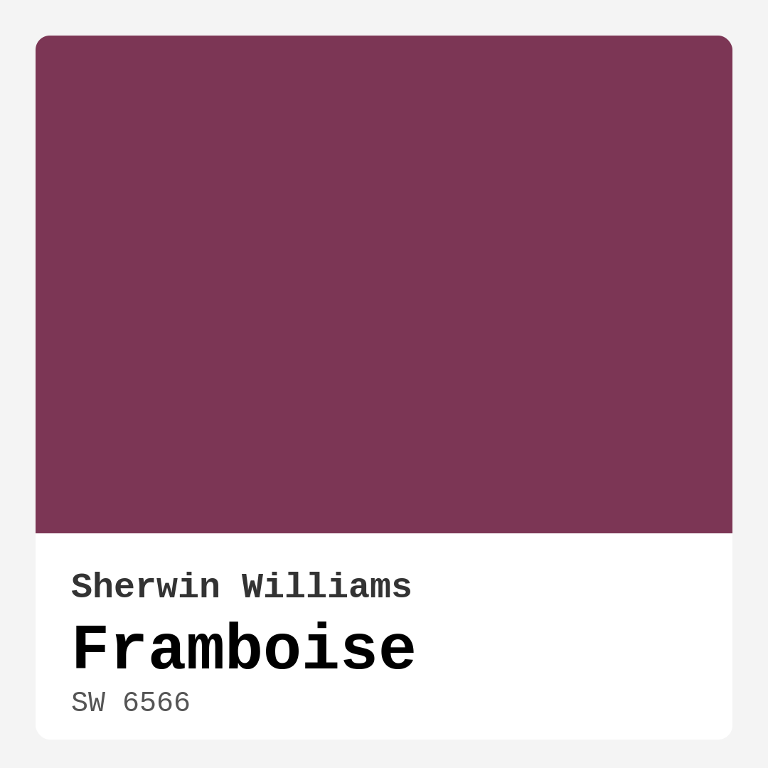
Color Preview & Key Details
| HEX Code | #7C3655 |
| RGB | 124, 54, 85 |
| LRV | 6% |
| Undertone | Red |
| Finish Options | Matte, Satin, Semi-Gloss |
Imagine stepping into a room that immediately wraps you in warmth, inviting you to sink into the plush furniture and relax. You might think that kind of ambiance comes from a well-placed sofa or the perfect lighting, but often, it starts with the right paint color. That’s where Framboise from Sherwin Williams comes into play, a captivating hue that can transform your space into a cozy, sophisticated haven.
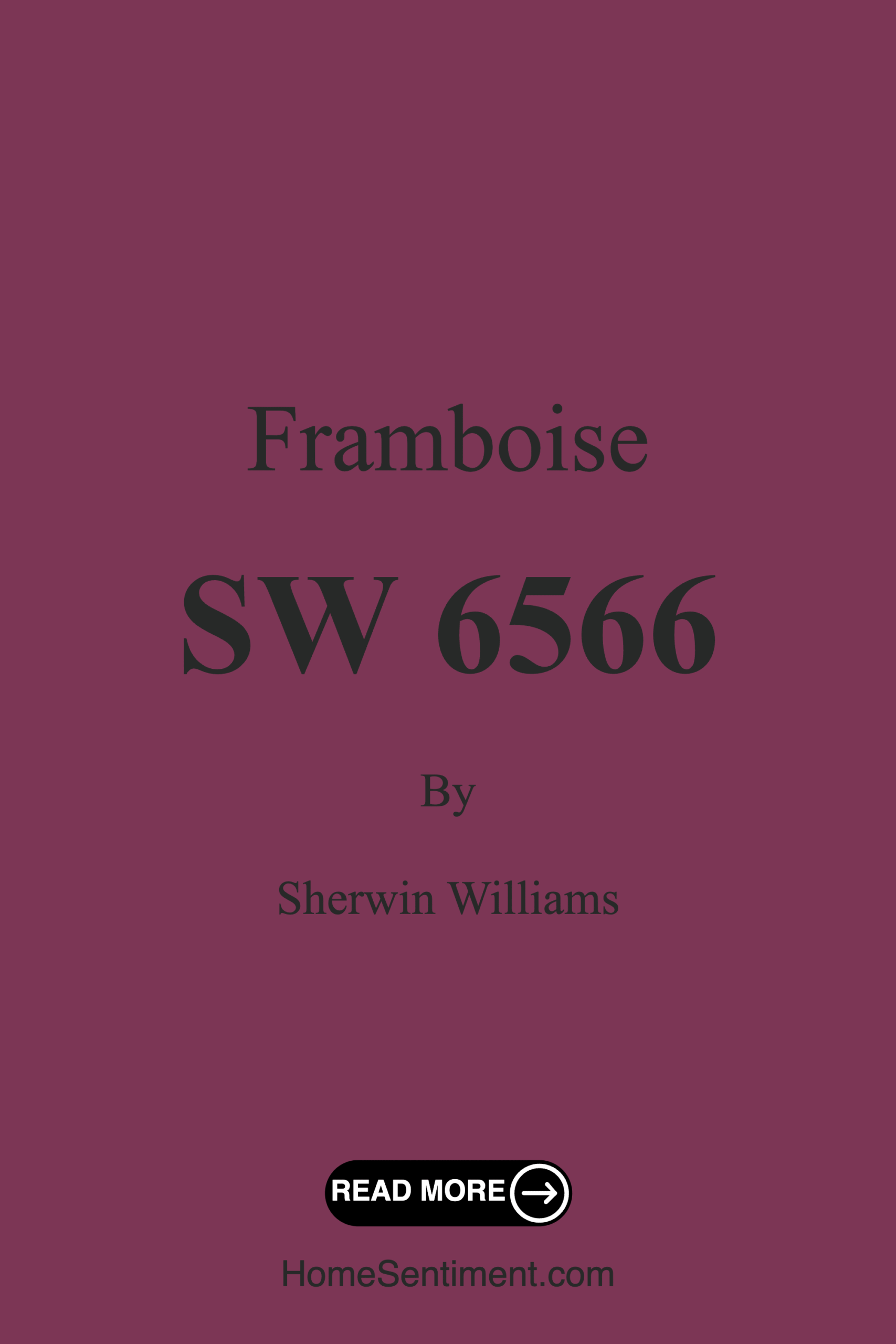
Framboise, with its rich berry essence, is like a delicious ripe raspberry plucked straight from the vine. The color code, SW 6566, hints at its bold personality. It’s a deep, warm purple that leans toward red, which brings an undeniable vibrancy without overwhelming your senses. If you’re looking to make a statement, whether it’s an accent wall or an entire room, Framboise has got you covered.
One of the most striking aspects of this color is its versatility. It fits beautifully into a range of decor styles—think modern, eclectic, bohemian, or contemporary. Whether you’re decorating a living room that needs a splash of excitement or a cozy bedroom retreat, Framboise can elevate your space with ease. It pairs wonderfully with both light and dark furnishings, creating a dynamic contrast that keeps your decor interesting.
When considering a paint color, it’s essential to think about how it interacts with light. Framboise has a low Light Reflectance Value (LRV) of just 6%. This means it absorbs light rather than reflecting it, which is perfect for creating an intimate and cozy atmosphere. In bright light, you’ll notice its vibrant berry undertones coming alive, while in softer lighting, it takes on a romantic, subdued quality. It’s all about how you want your space to feel, and Framboise can adapt to suit your vision.
Now, let’s talk about application. If you’re a DIY enthusiast or even just a beginner, you’ll appreciate how user-friendly Framboise is. It glides on smoothly, providing excellent coverage—most projects only require one to two coats for a flawless finish. Plus, it’s touch-up friendly, which is a big win when life happens and your walls inevitably see a little wear and tear.
And don’t worry about maintenance; Framboise is highly washable, making it easy to clean up any scuffs or marks. With its low VOC and eco-certified properties, you can feel good about using this paint in your home, knowing it’s a safe choice for your family and the environment.
While Framboise is a fantastic choice, there are a couple of things to keep in mind. Because it’s quite dark, it can feel overwhelming in smaller spaces. If you’re contemplating using it in a cozy nook, consider pairing it with lighter decor elements to keep things balanced. Additionally, you’ll want to carefully consider your lighting options. Natural light can enhance its beauty, but in dim spaces, it could feel too heavy.
If you’re wondering where this beautiful color shines the brightest, think about the spaces where you entertain and unwind. It’s perfect for living rooms, bedrooms, dining rooms, and even your home office. The coziness it provides can make those spaces feel more inviting and sophisticated, encouraging relaxation and conversation.
When it comes to finishes, Framboise is available in Matte, Satin, and Semi-Gloss. Each finish offers a unique look and feel, so consider your room’s purpose when making a selection. A matte finish delivers a soft, understated vibe, while satin and semi-gloss add a touch of elegance that reflects light beautifully.
Complementary colors are crucial in creating a cohesive look, and Framboise pairs well with a variety of shades. For instance, crisp whites like White Dove can create a striking contrast, while brass fixtures can add a touch of warmth and sophistication. If you’re feeling adventurous, consider pairing it with other rich shades like SW 9657, SW 2847, or even lighter shades like SW 6293 for a dynamic palette that excites the eye.
When decor shopping, keep in mind that Framboise’s warm undertones will enhance the coziness of textiles, furniture, and decor elements. Picture a soft cream sofa or warm wood accents next to a Framboise wall. The synergy between these elements can take your interior to a whole new level of comfort.
Many of my clients have fallen in love with Framboise for its bold yet inviting presence. It’s not just a color; it’s an experience that can completely change the feel of your home. Imagine hosting friends in a dining room painted in this warm berry hue, the walls embracing you while you share laughter and stories over dinner. Or envision a tranquil bedroom where Framboise sets the stage for restful nights and serene mornings, perfectly complemented by soft linens and warm lighting.
If you’re ready to take the plunge into the world of rich colors, Framboise is a fantastic choice that promises to elevate your home’s aesthetic. Remember, paint is one of the most effective ways to express your style and create the mood you desire. So why not let Framboise wrap your home in warmth and sophistication?
As you embark on your painting journey, take the time to test Framboise in your space. Observe how it interacts with your existing decor and lighting throughout the day. This small step can make a significant difference in ensuring you choose the perfect shade for your unique environment.
In the end, remember that Framboise is more than just a paint color; it’s an invitation to create a space that feels distinctly yours. So roll up your sleeves, grab that brush, and let Framboise transform your walls into a canvas of warmth, vibrancy, and elegance. Your home deserves to reflect your personality, and with Framboise, you’re one step closer to achieving that dream.
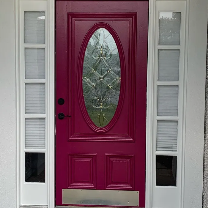
Real Room Photo of Framboise SW 6566


Undertones of Framboise ?
The undertones of Framboise are a key aspect of its character, leaning towards Red. These subtle underlying hues are what give the color its depth and complexity. For example, a gray with a blue undertone will feel cooler and more modern, while one with a brown undertone will feel warmer and more traditional. It’s essential to test this paint in your home and observe it next to your existing furniture, flooring, and decor to see how these undertones interact and reveal themselves throughout the day.
HEX value: #7C3655
RGB code: 124, 54, 85
Is Framboise Cool or Warm?
Framboise is considered a warm paint color. This characteristic plays a huge role in the overall feel of a room. Warm colors, like this one, tend to create a cozy, inviting, and energetic atmosphere, making them great for social spaces like living rooms and dining rooms. In contrast, cool colors often evoke a sense of calm and serenity, which is why they are popular in bedrooms and bathrooms. The warmth of Framboise means it will pair beautifully with corresponding decor elements.
Understanding Color Properties and Interior Design Tips
Hue refers to a specific position on the color wheel, measured in degrees from 0 to 360. Each degree represents a different pure color:
- 0° represents red
- 120° represents green
- 240° represents blue
Saturation describes the intensity or purity of a color and is expressed as a percentage:
- At 0%, the color appears completely desaturated—essentially a shade of gray
- At 100%, the color is at its most vivid and vibrant
Lightness indicates how light or dark a color is, also expressed as a percentage:
- 0% lightness results in black
- 100% lightness results in white
Using Warm Colors in Interior Design
Warm hues—such as reds, oranges, yellows, warm beiges, and greiges—are excellent choices for creating inviting and energetic spaces. These colors are particularly well-suited for:
- Kitchens, living rooms, and bathrooms, where warmth enhances comfort and sociability
- Large rooms, where warm tones can help reduce the sense of emptiness and make the space feel more intimate
For example:
- Warm beige shades provide a cozy, inviting atmosphere, ideal for living rooms, bedrooms, and hallways.
- Warm greige (a mix of beige and gray) offers the warmth of beige with the modern appeal of gray, making it a versatile backdrop for dining areas, bedrooms, and living spaces.
However, be mindful when using warm light tones in rooms with limited natural light. These shades may appear muted or even take on an unpleasant yellowish tint. To avoid a dull or flat appearance:
- Add depth by incorporating richer tones like deep greens, charcoal, or chocolate brown
- Use textured elements such as curtains, rugs, or cushions to bring dimension to the space
Pro Tip: Achieving Harmony with Warm and Cool Color Balance
To create a well-balanced and visually interesting interior, mix warm and cool tones strategically. This contrast adds depth and harmony to your design.
- If your walls feature warm hues, introduce cool-colored accents such as blue or green furniture, artwork, or accessories to create contrast.
- For a polished look, consider using a complementary color scheme, which pairs colors opposite each other on the color wheel (e.g., red with green, orange with blue).
This thoughtful mix not only enhances visual appeal but also creates a space that feels both dynamic and cohesive.
Light Temperature Affects on Framboise
Natural Light
Natural daylight changes in color temperature as the sun moves across the sky. At sunrise and sunset, the light tends to have a warm, golden tone with a color temperature around 2000 Kelvin (K). As the day progresses and the sun rises higher, the light becomes cooler and more neutral. Around midday, especially when the sky is clear, natural light typically reaches its peak brightness and shifts to a cooler tone, ranging from 5500 to 6500 Kelvin. This midday light is close to what we perceive as pure white or daylight-balanced light.
These shifts in natural light can significantly influence how colors appear in a space, which is why designers often consider both the time of day and the orientation of windows when planning interior color schemes.
Artificial Light
When choosing artificial lighting, pay close attention to the color temperature, measured in Kelvin (K). This determines how warm or cool the light will appear. Lower temperatures, around 2700K, give off a warm, yellow glow often used in living rooms or bedrooms. Higher temperatures, above 5000K, create a cool, bluish light similar to daylight, commonly used in kitchens, offices, or task areas.
Use the slider to see how lighting temperature can affect the appearance of a surface or color throughout a space.


4800K
LRV of Framboise
The Light Reflectance Value (LRV) of Framboise is 6%, which places it in the Dark colors category. This means it does not reflect light. Understanding a paint’s LRV is crucial for predicting how it will look in your space. A higher LRV indicates a lighter color that reflects more light, making rooms feel larger and brighter. A lower LRV signifies a darker color that absorbs more light, creating a cozier, more intimate atmosphere. Always consider the natural and artificial lighting in your room when selecting a paint color based on its LRV.
Detailed Review of Framboise
Additional Paint Characteristics
Ideal Rooms
Bedroom, Dining Room, Home Office, Living Room
Decor Styles
Bohemian, Contemporary, Eclectic, Modern
Coverage
Good (1–2 Coats), Touch-Up Friendly
Ease of Application
Beginner Friendly, Brush Smooth, Fast-Drying, Roller-Ready
Washability
Highly Washable, Washable
VOC Level
Eco-Certified, Low VOC
Best Use
Accent Wall, Furniture, Interior Walls, Trim
Room Suitability
Bedroom, Dining Room, Home Office, Living Room
Tone Tag
Bold, Deep, Warm
Finish Type
Matte, Satin, Semi-Gloss
Paint Performance
Easy Touch-Up, High Coverage, Low Odor, Quick Drying
Use Cases
Best for Modern Farmhouse, Best for Rentals, Classic Favorite, Designer Favorite
Mood
Cozy, Inviting, Sophisticated
Trim Pairing
Complements Brass Fixtures, Pairs with White Dove, Works with Warm Trim
Framboise stands out as an exceptional paint choice for anyone looking to infuse their home with a rich, berry-inspired hue. The depth of color is striking, making it an ideal candidate for accent walls or even entire rooms, depending on your desired aesthetic. It’s versatile enough to pair beautifully with both light and dark furnishings, creating a dynamic contrast that can elevate your decor.
In terms of application, Framboise glides on smoothly and provides excellent coverage, often requiring just one to two coats for a flawless finish. Whether you’re a DIY novice or a seasoned pro, you’ll appreciate how easily this paint adheres to various surfaces. Plus, its touch-up friendly nature means you won’t have to worry about mismatched spots when life happens. Overall, Framboise is not just a color; it’s an experience that can transform your space into a warm and inviting haven.
Pros & Cons of SW 6566 Framboise
Pros
Cons
Colors that go with Sherwin Williams Framboise
FAQ on SW 6566 Framboise
What types of finishes are available for Framboise?
Framboise is offered in several finishes, including Matte, Satin, and Semi-Gloss. Each finish provides a unique look and feel, allowing you to choose the best option for your space. Matte finishes offer a soft, understated look, while Satin and Semi-Gloss provide a bit more shine, reflecting light and adding a touch of elegance. Consider your room’s lighting and purpose when selecting a finish.
Is Framboise suitable for exterior use?
While Framboise can be used for exterior applications, it’s best reserved for sheltered areas where it won’t be directly exposed to harsh weather conditions. The color could fade over time with constant sun exposure, so if you’re looking for a long-lasting exterior solution, consider using it for doors, trims, or covered porches instead. Always check the product specifications to ensure optimal performance for outdoor use.
Comparisons Framboise with other colors
Framboise SW 6566 vs Exclusive Plum SW 6263
| Attribute | Framboise SW 6566 | Exclusive Plum SW 6263 |
|---|---|---|
| Color Name | Framboise SW 6566 | Exclusive Plum SW 6263 |
| Color | ||
| Hue | Purple | Purple |
| Brightness | Dark | Dark |
| RGB | 124, 54, 85 | 115, 111, 120 |
| LRV | 6% | 15% |
| Finish Type | Matte, Satin, Semi-Gloss | Eggshell, Matte, Satin |
| Finish Options | Matte, Satin, Semi-Gloss | Eggshell, Matte, Satin |
| Ideal Rooms | Bedroom, Dining Room, Home Office, Living Room | Bedroom, Dining Room, Home Office, Living Room |
| Decor Styles | Bohemian, Contemporary, Eclectic, Modern | Contemporary, Eclectic, Modern, Traditional |
| Coverage | Good (1–2 Coats), Touch-Up Friendly | Good (1–2 Coats), Touch-Up Friendly |
| Ease of Application | Beginner Friendly, Brush Smooth, Fast-Drying, Roller-Ready | Beginner Friendly, Brush Smooth, Fast-Drying, Roller-Ready |
| Washability | Highly Washable, Washable | Washable, Wipeable |
| Room Suitability | Bedroom, Dining Room, Home Office, Living Room | Bedroom, Dining Room, Home Office, Living Room |
| Tone | Bold, Deep, Warm | Deep, Dusty, Warm |
| Paint Performance | Easy Touch-Up, High Coverage, Low Odor, Quick Drying | Easy Touch-Up, High Coverage, Low Odor |
Framboise SW 6566 vs Blackberry SW 7577
| Attribute | Framboise SW 6566 | Blackberry SW 7577 |
|---|---|---|
| Color Name | Framboise SW 6566 | Blackberry SW 7577 |
| Color | ||
| Hue | Purple | Purple |
| Brightness | Dark | Dark |
| RGB | 124, 54, 85 | 83, 54, 64 |
| LRV | 6% | 5% |
| Finish Type | Matte, Satin, Semi-Gloss | Eggshell, Matte |
| Finish Options | Matte, Satin, Semi-Gloss | Eggshell, Matte, Satin |
| Ideal Rooms | Bedroom, Dining Room, Home Office, Living Room | Bedroom, Dining Room, Home Office, Living Room |
| Decor Styles | Bohemian, Contemporary, Eclectic, Modern | Bohemian, Contemporary, Modern, Rustic |
| Coverage | Good (1–2 Coats), Touch-Up Friendly | Good (1–2 Coats), Touch-Up Friendly |
| Ease of Application | Beginner Friendly, Brush Smooth, Fast-Drying, Roller-Ready | Beginner Friendly, Brush Smooth, Roller-Ready |
| Washability | Highly Washable, Washable | Washable, Wipeable |
| Room Suitability | Bedroom, Dining Room, Home Office, Living Room | Bedroom, Dining Room, Home Office, Living Room |
| Tone | Bold, Deep, Warm | Deep, Moody, Warm |
| Paint Performance | Easy Touch-Up, High Coverage, Low Odor, Quick Drying | Easy Touch-Up, High Coverage, Low Odor |
Framboise SW 6566 vs Expressive Plum SW 6271
| Attribute | Framboise SW 6566 | Expressive Plum SW 6271 |
|---|---|---|
| Color Name | Framboise SW 6566 | Expressive Plum SW 6271 |
| Color | ||
| Hue | Purple | Purple |
| Brightness | Dark | Dark |
| RGB | 124, 54, 85 | 105, 92, 98 |
| LRV | 6% | 15% |
| Finish Type | Matte, Satin, Semi-Gloss | Eggshell, Matte, Satin |
| Finish Options | Matte, Satin, Semi-Gloss | Eggshell, Matte, Satin |
| Ideal Rooms | Bedroom, Dining Room, Home Office, Living Room | Bedroom, Dining Room, Home Office, Living Room |
| Decor Styles | Bohemian, Contemporary, Eclectic, Modern | Eclectic, Modern, Traditional, Transitional |
| Coverage | Good (1–2 Coats), Touch-Up Friendly | Good (1–2 Coats) |
| Ease of Application | Beginner Friendly, Brush Smooth, Fast-Drying, Roller-Ready | Beginner Friendly, Brush Smooth, Roller-Ready |
| Washability | Highly Washable, Washable | Washable, Wipeable |
| Room Suitability | Bedroom, Dining Room, Home Office, Living Room | Bedroom, Dining Room, Home Office, Living Room |
| Tone | Bold, Deep, Warm | Deep, Muted, Warm |
| Paint Performance | Easy Touch-Up, High Coverage, Low Odor, Quick Drying | Easy Touch-Up, High Coverage, Low Odor |
Framboise SW 6566 vs Plum Brown SW 6272
| Attribute | Framboise SW 6566 | Plum Brown SW 6272 |
|---|---|---|
| Color Name | Framboise SW 6566 | Plum Brown SW 6272 |
| Color | ||
| Hue | Purple | Purple |
| Brightness | Dark | Dark |
| RGB | 124, 54, 85 | 78, 66, 71 |
| LRV | 6% | 6% |
| Finish Type | Matte, Satin, Semi-Gloss | Eggshell, Matte, Satin |
| Finish Options | Matte, Satin, Semi-Gloss | Eggshell, Matte, Satin |
| Ideal Rooms | Bedroom, Dining Room, Home Office, Living Room | Bedroom, Dining Room, Home Office, Living Room |
| Decor Styles | Bohemian, Contemporary, Eclectic, Modern | Eclectic, Modern, Rustic, Traditional |
| Coverage | Good (1–2 Coats), Touch-Up Friendly | Good (1–2 Coats), Touch-Up Friendly |
| Ease of Application | Beginner Friendly, Brush Smooth, Fast-Drying, Roller-Ready | Beginner Friendly, Brush Smooth, Roller-Ready |
| Washability | Highly Washable, Washable | Washable, Wipeable |
| Room Suitability | Bedroom, Dining Room, Home Office, Living Room | Bedroom, Dining Room, Home Office, Living Room |
| Tone | Bold, Deep, Warm | Deep, Earthy, Warm |
| Paint Performance | Easy Touch-Up, High Coverage, Low Odor, Quick Drying | Easy Touch-Up, High Coverage, Low Odor |
Framboise SW 6566 vs Soulmate SW 6270
| Attribute | Framboise SW 6566 | Soulmate SW 6270 |
|---|---|---|
| Color Name | Framboise SW 6566 | Soulmate SW 6270 |
| Color | ||
| Hue | Purple | Purple |
| Brightness | Dark | Dark |
| RGB | 124, 54, 85 | 133, 119, 123 |
| LRV | 6% | 24% |
| Finish Type | Matte, Satin, Semi-Gloss | Eggshell, Matte, Satin |
| Finish Options | Matte, Satin, Semi-Gloss | Eggshell, Matte, Satin |
| Ideal Rooms | Bedroom, Dining Room, Home Office, Living Room | Bedroom, Hallway, Home Office, Living Room |
| Decor Styles | Bohemian, Contemporary, Eclectic, Modern | Bohemian, Modern, Rustic, Transitional |
| Coverage | Good (1–2 Coats), Touch-Up Friendly | Good (1–2 Coats), Touch-Up Friendly |
| Ease of Application | Beginner Friendly, Brush Smooth, Fast-Drying, Roller-Ready | Beginner Friendly, Brush Smooth, Roller-Ready |
| Washability | Highly Washable, Washable | Washable, Wipeable |
| Room Suitability | Bedroom, Dining Room, Home Office, Living Room | Bedroom, Hallway, Home Office, Living Room |
| Tone | Bold, Deep, Warm | Earthy, Muted, Warm |
| Paint Performance | Easy Touch-Up, High Coverage, Low Odor, Quick Drying | Easy Touch-Up, Low Odor, Quick Drying |
Framboise SW 6566 vs Quixotic Plum SW 6265
| Attribute | Framboise SW 6566 | Quixotic Plum SW 6265 |
|---|---|---|
| Color Name | Framboise SW 6566 | Quixotic Plum SW 6265 |
| Color | ||
| Hue | Purple | Purple |
| Brightness | Dark | Dark |
| RGB | 124, 54, 85 | 74, 70, 83 |
| LRV | 6% | 12% |
| Finish Type | Matte, Satin, Semi-Gloss | Eggshell, Matte, Satin |
| Finish Options | Matte, Satin, Semi-Gloss | Eggshell, Matte, Satin |
| Ideal Rooms | Bedroom, Dining Room, Home Office, Living Room | Bedroom, Dining Room, Home Office, Living Room |
| Decor Styles | Bohemian, Contemporary, Eclectic, Modern | Bohemian, Contemporary, Eclectic, Modern, Traditional |
| Coverage | Good (1–2 Coats), Touch-Up Friendly | Good (1–2 Coats), Touch-Up Friendly |
| Ease of Application | Beginner Friendly, Brush Smooth, Fast-Drying, Roller-Ready | Brush Smooth, Fast-Drying, Roller-Ready |
| Washability | Highly Washable, Washable | Highly Washable, Washable |
| Room Suitability | Bedroom, Dining Room, Home Office, Living Room | Bedroom, Dining Room, Home Office, Living Room |
| Tone | Bold, Deep, Warm | Deep, Moody, Warm |
| Paint Performance | Easy Touch-Up, High Coverage, Low Odor, Quick Drying | High Coverage, Low Odor, Scuff Resistant |
Framboise SW 6566 vs Midnight SW 6264
| Attribute | Framboise SW 6566 | Midnight SW 6264 |
|---|---|---|
| Color Name | Framboise SW 6566 | Midnight SW 6264 |
| Color | ||
| Hue | Purple | Purple |
| Brightness | Dark | Dark |
| RGB | 124, 54, 85 | 93, 89, 98 |
| LRV | 6% | 6% |
| Finish Type | Matte, Satin, Semi-Gloss | Eggshell, Matte, Satin |
| Finish Options | Matte, Satin, Semi-Gloss | Eggshell, Matte, Satin |
| Ideal Rooms | Bedroom, Dining Room, Home Office, Living Room | Bedroom, Dining Room, Hallway, Home Office, Living Room |
| Decor Styles | Bohemian, Contemporary, Eclectic, Modern | Bohemian, Contemporary, Industrial, Modern |
| Coverage | Good (1–2 Coats), Touch-Up Friendly | Good (1–2 Coats), High Hide, Touch-Up Friendly |
| Ease of Application | Beginner Friendly, Brush Smooth, Fast-Drying, Roller-Ready | Beginner Friendly, Brush Smooth, Roller-Ready |
| Washability | Highly Washable, Washable | Scrubbable, Stain Resistant, Washable |
| Room Suitability | Bedroom, Dining Room, Home Office, Living Room | Bedroom, Dining Room, Home Office, Living Room |
| Tone | Bold, Deep, Warm | Balanced, Deep, Moody |
| Paint Performance | Easy Touch-Up, High Coverage, Low Odor, Quick Drying | Easy Touch-Up, Long Lasting, Low Odor, Scuff Resistant |
Framboise SW 6566 vs Poetry Plum SW 6019
| Attribute | Framboise SW 6566 | Poetry Plum SW 6019 |
|---|---|---|
| Color Name | Framboise SW 6566 | Poetry Plum SW 6019 |
| Color | ||
| Hue | Purple | Purple |
| Brightness | Dark | Dark |
| RGB | 124, 54, 85 | 111, 92, 95 |
| LRV | 6% | 10% |
| Finish Type | Matte, Satin, Semi-Gloss | Eggshell, Matte, Satin |
| Finish Options | Matte, Satin, Semi-Gloss | Eggshell, Matte, Satin |
| Ideal Rooms | Bedroom, Dining Room, Home Office, Living Room | Bedroom, Dining Room, Home Office, Living Room |
| Decor Styles | Bohemian, Contemporary, Eclectic, Modern | Bohemian, Modern, Rustic, Transitional |
| Coverage | Good (1–2 Coats), Touch-Up Friendly | Good (1–2 Coats), Touch-Up Friendly |
| Ease of Application | Beginner Friendly, Brush Smooth, Fast-Drying, Roller-Ready | Beginner Friendly, Brush Smooth, Roller-Ready |
| Washability | Highly Washable, Washable | Highly Washable, Washable |
| Room Suitability | Bedroom, Dining Room, Home Office, Living Room | Bedroom, Dining Room, Home Office, Living Room |
| Tone | Bold, Deep, Warm | Deep, Muted, Warm |
| Paint Performance | Easy Touch-Up, High Coverage, Low Odor, Quick Drying | Easy Touch-Up, High Coverage, Low Odor |
Framboise SW 6566 vs Mature Grape SW 6286
| Attribute | Framboise SW 6566 | Mature Grape SW 6286 |
|---|---|---|
| Color Name | Framboise SW 6566 | Mature Grape SW 6286 |
| Color | ||
| Hue | Purple | Purple |
| Brightness | Dark | Dark |
| RGB | 124, 54, 85 | 95, 63, 84 |
| LRV | 6% | 15% |
| Finish Type | Matte, Satin, Semi-Gloss | Eggshell, Matte, Satin |
| Finish Options | Matte, Satin, Semi-Gloss | Eggshell, Matte, Satin |
| Ideal Rooms | Bedroom, Dining Room, Home Office, Living Room | Bedroom, Dining Room, Home Office, Living Room |
| Decor Styles | Bohemian, Contemporary, Eclectic, Modern | Art Deco, Bohemian, Modern, Rustic |
| Coverage | Good (1–2 Coats), Touch-Up Friendly | Good (1–2 Coats), Touch-Up Friendly |
| Ease of Application | Beginner Friendly, Brush Smooth, Fast-Drying, Roller-Ready | Brush Smooth, Fast-Drying, Roller-Ready |
| Washability | Highly Washable, Washable | Stain Resistant, Washable, Wipeable |
| Room Suitability | Bedroom, Dining Room, Home Office, Living Room | Bedroom, Dining Room, Home Office, Living Room |
| Tone | Bold, Deep, Warm | Deep, Earthy, Warm |
| Paint Performance | Easy Touch-Up, High Coverage, Low Odor, Quick Drying | Easy Touch-Up, Low Odor, Stain Resistant |
Framboise SW 6566 vs Patchwork Plum SW 0022
| Attribute | Framboise SW 6566 | Patchwork Plum SW 0022 |
|---|---|---|
| Color Name | Framboise SW 6566 | Patchwork Plum SW 0022 |
| Color | ||
| Hue | Purple | Purple |
| Brightness | Dark | Dark |
| RGB | 124, 54, 85 | 126, 105, 106 |
| LRV | 6% | 10% |
| Finish Type | Matte, Satin, Semi-Gloss | Eggshell, Matte, Satin |
| Finish Options | Matte, Satin, Semi-Gloss | Eggshell, Matte, Satin |
| Ideal Rooms | Bedroom, Dining Room, Home Office, Living Room | Bedroom, Dining Room, Home Office, Living Room |
| Decor Styles | Bohemian, Contemporary, Eclectic, Modern | Eclectic, Modern Farmhouse, Rustic, Transitional |
| Coverage | Good (1–2 Coats), Touch-Up Friendly | Good (1–2 Coats), Touch-Up Friendly |
| Ease of Application | Beginner Friendly, Brush Smooth, Fast-Drying, Roller-Ready | Beginner Friendly, Brush Smooth, Roll-Ready |
| Washability | Highly Washable, Washable | Washable, Wipeable |
| Room Suitability | Bedroom, Dining Room, Home Office, Living Room | Bedroom, Dining Room, Home Office, Living Room |
| Tone | Bold, Deep, Warm | Earthy, Muted, Warm |
| Paint Performance | Easy Touch-Up, High Coverage, Low Odor, Quick Drying | Easy Touch-Up, Fade Resistant, Low Odor |
Official Page of Sherwin Williams Framboise SW 6566