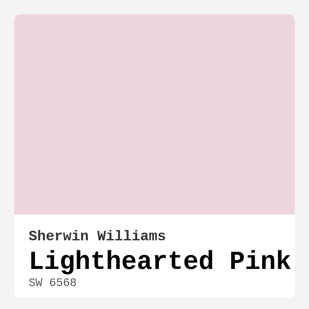
Color Preview & Key Details
| HEX Code | #EDD5DD |
| RGB | 237, 213, 221 |
| LRV | 75% |
| Undertone | Red |
| Finish Options | Eggshell, Matte, Satin |
Imagine stepping into your home and being enveloped by a sense of warmth and tranquility. The walls are painted in a soft, soothing hue that instantly lifts your spirits and puts a smile on your face. That’s the magic of Lighthearted Pink, Sherwin Williams’ enchanting shade that can transform any space into a cozy haven.
Lighthearted Pink (SW 6568) is more than just a color; it’s an experience waiting to unfold in your home. With a light reflectance value (LRV) of 75%, this delightful pink reflects a high amount of light, making it perfect for brightening up any room. The gentle undertones of red add depth and warmth, creating an inviting atmosphere that beckons you to relax and unwind.
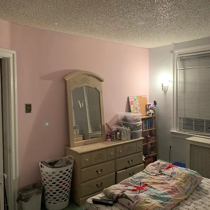
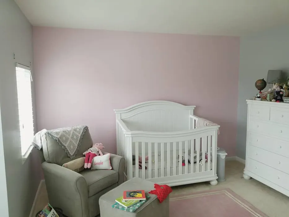
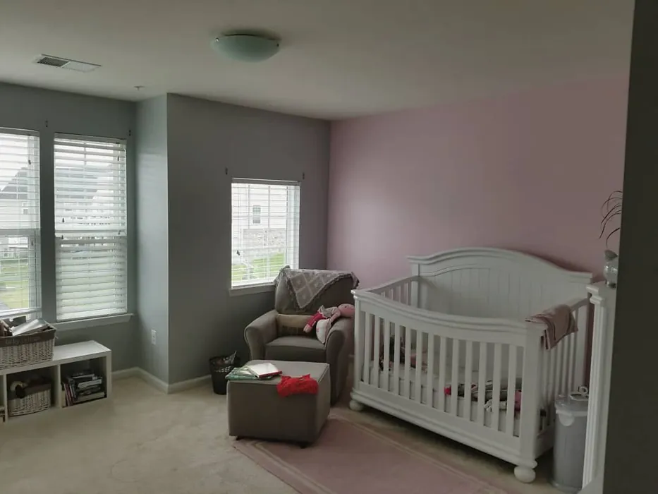
This hue is particularly suited for spaces where comfort is key. Think of a nursery filled with love, a cozy bedroom that encourages restful nights, or a living room where friends gather and memories are made. The versatility of Lighthearted Pink is truly remarkable, complementing modern, cottage, transitional, and Scandinavian decor styles effortlessly.
When you’re considering a new paint color, one of the most important factors is how it interacts with the lighting in your home. In natural light, Lighthearted Pink radiates a warm glow, enhancing the airy feeling of the room. Under artificial lighting, it maintains its soft elegance, never feeling harsh or overpowering. It’s that perfect shade that adapts beautifully to your environment, making it ideal for various lighting conditions.
Now, let’s talk about application. You don’t need to be a professional painter to achieve a stunning finish with Lighthearted Pink. It’s beginner-friendly and roller-ready, ensuring a smooth application. You’ll find that one to two coats usually do the trick, providing excellent coverage without the hassle. Plus, it’s fast-drying and highly washable, perfect for busy households.
But, you might be wondering, “Can I use Lighthearted Pink in small spaces?” Absolutely! Its light and airy quality can make a room feel more open and inviting. When painted on the walls, it creates an illusion of depth, transforming cozy corners into welcoming retreats. Just make sure your lighting complements the color to keep its fresh appearance.
Pairing Lighthearted Pink with other colors opens a world of possibilities. It looks stunning alongside soft whites or creams, creating a harmonious and balanced look. If you want to introduce a bolder contrast, consider deep blues or greens; they work beautifully to balance the warmth of Lighthearted Pink. The key is to play with contrasts while ensuring a cohesive decor scheme. For example, think about using White Dove for trim, which pairs beautifully and enhances the overall warmth.
As you explore the complementary shades, you’ll discover an array of options that can elevate your design. Colors like SW 6224 or SW 0016 bring a refreshing contrast, while deeper hues like SW 2847 or SW 0017 can create a striking visual interest. You might even want to experiment with textures and finishes. Whether you choose a matte or eggshell finish, Lighthearted Pink will bring a touch of elegance, enhancing the overall feel of your space.
One of the most attractive features of Lighthearted Pink is its ability to create a calming atmosphere. Whether you’re painting your home office, where you need to focus, or a nursery that requires a soothing touch, this color does wonders for the mood. It’s cozy and inviting, making it a designer favorite for those looking to create a restful environment.
However, it’s essential to consider a couple of potential challenges. In rooms with limited natural light, Lighthearted Pink may appear softer and more muted, which can add to its charm but might not be everyone’s cup of tea. Additionally, careful color pairing is crucial to avoid clashing with other elements in your decor. Testing the paint in your space will help you see how it interacts with your existing furniture and flooring throughout the day.
When it comes to durability, Lighthearted Pink shines in low-traffic areas. While it’s not the most durable option for high-traffic zones, its washability allows for easy touch-ups, making it practical in homes where little ones or pets roam freely.
If you’re looking for lighter shades, consider SW 6561 or SW 6562, which maintain that airy quality while adding a different dimension. On the flip side, darker shades can be introduced for accents or trims, creating a stunning contrast that draws the eye.
So, is Lighthearted Pink the right choice for you? If you’re aiming for a serene, inviting atmosphere, then the answer is likely a resounding yes. Its warm, pastel tone can breathe life into any space, making it feel more vibrant and welcoming.
To wrap it all up, Lighthearted Pink is a radiant choice for anyone looking to create a beautiful, personalized interior. Its versatility allows it to shine in various settings, from nurseries to cozy living rooms. The ease of application and incredible washability make it a practical choice for everyday living. Just remember to consider your lighting and the existing decor to make the most of this enchanting hue.
So go ahead, take the plunge with Lighthearted Pink. Your home deserves a touch of warmth and joy, and this delightful shade is just the ticket. Whether you’re a seasoned designer or a first-time painter, you’ll find that this color invites creativity, comfort, and a sense of peace into your space. Happy painting!
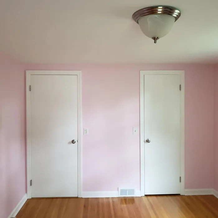
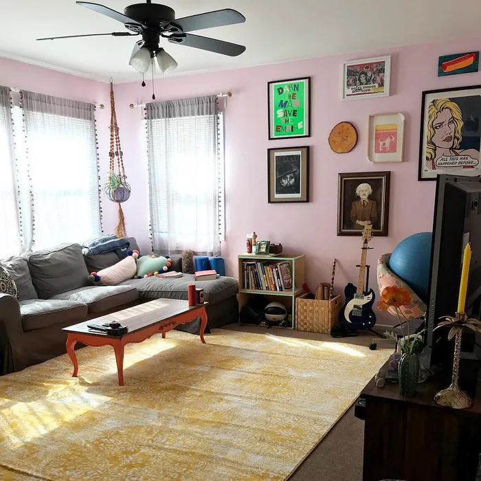
Real Room Photo of Lighthearted Pink SW 6568
Undertones of Lighthearted Pink ?
The undertones of Lighthearted Pink are a key aspect of its character, leaning towards Red. These subtle underlying hues are what give the color its depth and complexity. For example, a gray with a blue undertone will feel cooler and more modern, while one with a brown undertone will feel warmer and more traditional. It’s essential to test this paint in your home and observe it next to your existing furniture, flooring, and decor to see how these undertones interact and reveal themselves throughout the day.
HEX value: #EDD5DD
RGB code: 237, 213, 221
Is Lighthearted Pink Cool or Warm?
This paint leans warm, adding a gentle glow to rooms and enhancing warmth in decor.
Understanding Color Properties and Interior Design Tips
Hue refers to a specific position on the color wheel, measured in degrees from 0 to 360. Each degree represents a different pure color:
- 0° represents red
- 120° represents green
- 240° represents blue
Saturation describes the intensity or purity of a color and is expressed as a percentage:
- At 0%, the color appears completely desaturated—essentially a shade of gray
- At 100%, the color is at its most vivid and vibrant
Lightness indicates how light or dark a color is, also expressed as a percentage:
- 0% lightness results in black
- 100% lightness results in white
Using Warm Colors in Interior Design
Warm hues—such as reds, oranges, yellows, warm beiges, and greiges—are excellent choices for creating inviting and energetic spaces. These colors are particularly well-suited for:
- Kitchens, living rooms, and bathrooms, where warmth enhances comfort and sociability
- Large rooms, where warm tones can help reduce the sense of emptiness and make the space feel more intimate
For example:
- Warm beige shades provide a cozy, inviting atmosphere, ideal for living rooms, bedrooms, and hallways.
- Warm greige (a mix of beige and gray) offers the warmth of beige with the modern appeal of gray, making it a versatile backdrop for dining areas, bedrooms, and living spaces.
However, be mindful when using warm light tones in rooms with limited natural light. These shades may appear muted or even take on an unpleasant yellowish tint. To avoid a dull or flat appearance:
- Add depth by incorporating richer tones like deep greens, charcoal, or chocolate brown
- Use textured elements such as curtains, rugs, or cushions to bring dimension to the space
Pro Tip: Achieving Harmony with Warm and Cool Color Balance
To create a well-balanced and visually interesting interior, mix warm and cool tones strategically. This contrast adds depth and harmony to your design.
- If your walls feature warm hues, introduce cool-colored accents such as blue or green furniture, artwork, or accessories to create contrast.
- For a polished look, consider using a complementary color scheme, which pairs colors opposite each other on the color wheel (e.g., red with green, orange with blue).
This thoughtful mix not only enhances visual appeal but also creates a space that feels both dynamic and cohesive.
Light Temperature Affects on Lighthearted Pink
Natural Light
Natural daylight changes in color temperature as the sun moves across the sky. At sunrise and sunset, the light tends to have a warm, golden tone with a color temperature around 2000 Kelvin (K). As the day progresses and the sun rises higher, the light becomes cooler and more neutral. Around midday, especially when the sky is clear, natural light typically reaches its peak brightness and shifts to a cooler tone, ranging from 5500 to 6500 Kelvin. This midday light is close to what we perceive as pure white or daylight-balanced light.
These shifts in natural light can significantly influence how colors appear in a space, which is why designers often consider both the time of day and the orientation of windows when planning interior color schemes.
Artificial Light
When choosing artificial lighting, pay close attention to the color temperature, measured in Kelvin (K). This determines how warm or cool the light will appear. Lower temperatures, around 2700K, give off a warm, yellow glow often used in living rooms or bedrooms. Higher temperatures, above 5000K, create a cool, bluish light similar to daylight, commonly used in kitchens, offices, or task areas.
Use the slider to see how lighting temperature can affect the appearance of a surface or color throughout a space.


4800K
LRV of Lighthearted Pink
The Light Reflectance Value (LRV) of Lighthearted Pink is 75%, which places it in the Light category. This means it Reflects a high amount of light. Understanding a paint’s LRV is crucial for predicting how it will look in your space. A higher LRV indicates a lighter color that reflects more light, making rooms feel larger and brighter. A lower LRV signifies a darker color that absorbs more light, creating a cozier, more intimate atmosphere. Always consider the natural and artificial lighting in your room when selecting a paint color based on its LRV.
Detailed Review of Lighthearted Pink
Additional Paint Characteristics
Ideal Rooms
Bedroom, Home Office, Living Room, Nursery
Decor Styles
Cottage, Modern, Scandinavian, Transitional
Coverage
Good (1–2 Coats), Touch-Up Friendly
Ease of Application
Beginner Friendly, Brush Smooth, Fast-Drying, Roller-Ready
Washability
Highly Washable, Washable
VOC Level
Low VOC
Best Use
Accent Wall, Bedroom, Interior Walls, Nursery
Room Suitability
Bedroom, Home Office, Living Room, Nursery
Tone Tag
Airy, Pastel, Warm
Finish Type
Eggshell, Matte
Paint Performance
Easy Touch-Up, High Coverage, Low Odor
Use Cases
Best for Rentals, Best for Small Spaces, Designer Favorite
Mood
Cozy, Inviting, Restful
Trim Pairing
Complements Brass Fixtures, Matches Pure White, Pairs with White Dove
Lighthearted Pink is more than just a color; it’s an experience. Its delicate shade brings a lovely, airy feel to rooms, making it perfect for spaces where relaxation is key. Whether you’re painting a nursery or your living room, this color can easily transform your space into a tranquil retreat. The subtle pink undertones complement a variety of decor styles from modern to vintage, allowing for endless creativity.
Application is relatively straightforward, and with good coverage, you’ll find that one to two coats usually do the trick. It pairs beautifully with both light and dark trim, enhancing its versatility. Just keep in mind that in spaces with limited natural light, the color may appear softer and more muted, which can add to its charm. Overall, Lighthearted Pink is a fantastic choice if you’re aiming for a serene and inviting atmosphere in your home.
Pros & Cons of SW 6568 Lighthearted Pink
Pros
Cons
Colors that go with Sherwin Williams Lighthearted Pink
FAQ on SW 6568 Lighthearted Pink
Can Lighthearted Pink be used in small spaces?
Absolutely! Lighthearted Pink is a fantastic choice for small spaces. Its light, airy quality can make a room feel more open and inviting. When applied to the walls, it can create an illusion of depth, making even the coziest corners feel spacious and cheerful. Just ensure that your lighting complements the color to maintain its fresh appearance.
How does Lighthearted Pink pair with other colors?
Lighthearted Pink pairs beautifully with a variety of colors. For a harmonious look, consider pairing it with soft whites or creams for trim. If you want a bolder contrast, it works well with deep blues or greens. The key is to balance the warmth of Lighthearted Pink with cooler tones or neutrals to create a cohesive and inviting decor scheme.
Comparisons Lighthearted Pink with other colors
Lighthearted Pink SW 6568 vs Malted Milk SW 6057
| Attribute | Lighthearted Pink SW 6568 | Malted Milk SW 6057 |
|---|---|---|
| Color Name | Lighthearted Pink SW 6568 | Malted Milk SW 6057 |
| Color | ||
| Hue | Pink | Pink |
| Brightness | Light | Light |
| RGB | 237, 213, 221 | 222, 202, 189 |
| LRV | 75% | 74% |
| Finish Type | Eggshell, Matte | Eggshell, Satin |
| Finish Options | Eggshell, Matte, Satin | Eggshell, Matte, Satin |
| Ideal Rooms | Bedroom, Home Office, Living Room, Nursery | Bedroom, Dining Room, Kitchen, Living Room, Nursery |
| Decor Styles | Cottage, Modern, Scandinavian, Transitional | Coastal, Farmhouse, Modern, Scandinavian, Transitional |
| Coverage | Good (1–2 Coats), Touch-Up Friendly | Good (1–2 Coats), Touch-Up Friendly |
| Ease of Application | Beginner Friendly, Brush Smooth, Fast-Drying, Roller-Ready | Beginner Friendly, Brush Smooth, Fast-Drying, Roller-Ready |
| Washability | Highly Washable, Washable | Washable, Wipeable |
| Room Suitability | Bedroom, Home Office, Living Room, Nursery | Bedroom, Dining Room, Kitchen, Living Room, Nursery |
| Tone | Airy, Pastel, Warm | Creamy, Neutral, Warm |
| Paint Performance | Easy Touch-Up, High Coverage, Low Odor | High Coverage, Low Odor, Quick Drying |
Lighthearted Pink SW 6568 vs Intimate White SW 6322
| Attribute | Lighthearted Pink SW 6568 | Intimate White SW 6322 |
|---|---|---|
| Color Name | Lighthearted Pink SW 6568 | Intimate White SW 6322 |
| Color | ||
| Hue | Pink | Pink |
| Brightness | Light | Light |
| RGB | 237, 213, 221 | 240, 225, 216 |
| LRV | 75% | 75% |
| Finish Type | Eggshell, Matte | Eggshell, Matte, Satin |
| Finish Options | Eggshell, Matte, Satin | Eggshell, Matte, Satin |
| Ideal Rooms | Bedroom, Home Office, Living Room, Nursery | Bedroom, Hallway, Home Office, Living Room, Nursery |
| Decor Styles | Cottage, Modern, Scandinavian, Transitional | Farmhouse, Minimalist, Modern, Traditional |
| Coverage | Good (1–2 Coats), Touch-Up Friendly | Good (1–2 Coats) |
| Ease of Application | Beginner Friendly, Brush Smooth, Fast-Drying, Roller-Ready | Beginner Friendly, Brush Smooth, Roller-Ready |
| Washability | Highly Washable, Washable | Highly Washable, Washable |
| Room Suitability | Bedroom, Home Office, Living Room, Nursery | Bedroom, Hallway, Living Room, Nursery |
| Tone | Airy, Pastel, Warm | Creamy, Muted, Warm |
| Paint Performance | Easy Touch-Up, High Coverage, Low Odor | Easy Touch-Up, Fade Resistant, Low Odor |
Lighthearted Pink SW 6568 vs Abalone Shell SW 6050
| Attribute | Lighthearted Pink SW 6568 | Abalone Shell SW 6050 |
|---|---|---|
| Color Name | Lighthearted Pink SW 6568 | Abalone Shell SW 6050 |
| Color | ||
| Hue | Pink | Pink |
| Brightness | Light | Light |
| RGB | 237, 213, 221 | 219, 199, 189 |
| LRV | 75% | 30% |
| Finish Type | Eggshell, Matte | Eggshell, Matte, Satin |
| Finish Options | Eggshell, Matte, Satin | Eggshell, Matte, Satin |
| Ideal Rooms | Bedroom, Home Office, Living Room, Nursery | Bedroom, Dining Room, Home Office, Living Room |
| Decor Styles | Cottage, Modern, Scandinavian, Transitional | Coastal, Farmhouse, Minimalist, Modern, Traditional |
| Coverage | Good (1–2 Coats), Touch-Up Friendly | Good (1–2 Coats), Touch-Up Friendly |
| Ease of Application | Beginner Friendly, Brush Smooth, Fast-Drying, Roller-Ready | Beginner Friendly, Brush Smooth, Fast-Drying, Roller-Ready |
| Washability | Highly Washable, Washable | Washable, Wipeable |
| Room Suitability | Bedroom, Home Office, Living Room, Nursery | Bedroom, Dining Room, Home Office, Living Room |
| Tone | Airy, Pastel, Warm | Balanced, Muted, Warm |
| Paint Performance | Easy Touch-Up, High Coverage, Low Odor | Easy Touch-Up, Fade Resistant, Low Odor, Quick Drying |
Lighthearted Pink SW 6568 vs White Truffle SW 6029
| Attribute | Lighthearted Pink SW 6568 | White Truffle SW 6029 |
|---|---|---|
| Color Name | Lighthearted Pink SW 6568 | White Truffle SW 6029 |
| Color | ||
| Hue | Pink | Pink |
| Brightness | Light | Light |
| RGB | 237, 213, 221 | 215, 200, 194 |
| LRV | 75% | 48% |
| Finish Type | Eggshell, Matte | Eggshell, Satin |
| Finish Options | Eggshell, Matte, Satin | Eggshell, Flat, Matte, Satin |
| Ideal Rooms | Bedroom, Home Office, Living Room, Nursery | Bedroom, Dining Room, Hallway, Kitchen, Living Room |
| Decor Styles | Cottage, Modern, Scandinavian, Transitional | Eclectic, Farmhouse, Modern, Traditional |
| Coverage | Good (1–2 Coats), Touch-Up Friendly | Good (1–2 Coats), Touch-Up Friendly |
| Ease of Application | Beginner Friendly, Brush Smooth, Fast-Drying, Roller-Ready | Beginner Friendly, Brush Smooth, Roller-Ready |
| Washability | Highly Washable, Washable | Washable, Wipeable |
| Room Suitability | Bedroom, Home Office, Living Room, Nursery | Bedroom, Dining Room, Hallway, Living Room |
| Tone | Airy, Pastel, Warm | Earthy, Neutral, Warm |
| Paint Performance | Easy Touch-Up, High Coverage, Low Odor | Easy Touch-Up, Low Odor, Scuff Resistant |
Lighthearted Pink SW 6568 vs Faint Coral SW 6329
| Attribute | Lighthearted Pink SW 6568 | Faint Coral SW 6329 |
|---|---|---|
| Color Name | Lighthearted Pink SW 6568 | Faint Coral SW 6329 |
| Color | ||
| Hue | Pink | Pink |
| Brightness | Light | Light |
| RGB | 237, 213, 221 | 238, 222, 213 |
| LRV | 75% | 66% |
| Finish Type | Eggshell, Matte | Eggshell, Matte, Satin |
| Finish Options | Eggshell, Matte, Satin | Eggshell, Matte, Satin |
| Ideal Rooms | Bedroom, Home Office, Living Room, Nursery | Bedroom, Dining Room, Hallway, Living Room, Nursery |
| Decor Styles | Cottage, Modern, Scandinavian, Transitional | Bohemian, Coastal, Modern Farmhouse, Scandinavian, Vintage |
| Coverage | Good (1–2 Coats), Touch-Up Friendly | Good (1–2 Coats), Touch-Up Friendly |
| Ease of Application | Beginner Friendly, Brush Smooth, Fast-Drying, Roller-Ready | Beginner Friendly, Brush Smooth, Fast-Drying, Roller-Ready |
| Washability | Highly Washable, Washable | Washable, Wipeable |
| Room Suitability | Bedroom, Home Office, Living Room, Nursery | Bedroom, Dining Room, Hallway, Living Room, Nursery |
| Tone | Airy, Pastel, Warm | Airy, Muted, Pastel, Warm |
| Paint Performance | Easy Touch-Up, High Coverage, Low Odor | Easy Touch-Up, Low Odor, Quick Drying |
Lighthearted Pink SW 6568 vs Romance SW 6323
| Attribute | Lighthearted Pink SW 6568 | Romance SW 6323 |
|---|---|---|
| Color Name | Lighthearted Pink SW 6568 | Romance SW 6323 |
| Color | ||
| Hue | Pink | Pink |
| Brightness | Light | Light |
| RGB | 237, 213, 221 | 235, 207, 195 |
| LRV | 75% | 69% |
| Finish Type | Eggshell, Matte | Eggshell, Matte |
| Finish Options | Eggshell, Matte, Satin | Eggshell, Flat, Matte, Satin |
| Ideal Rooms | Bedroom, Home Office, Living Room, Nursery | Bedroom, Dining Room, Living Room, Nursery |
| Decor Styles | Cottage, Modern, Scandinavian, Transitional | Bohemian, Modern, Shabby Chic, Vintage |
| Coverage | Good (1–2 Coats), Touch-Up Friendly | Good (1–2 Coats), Touch-Up Friendly |
| Ease of Application | Beginner Friendly, Brush Smooth, Fast-Drying, Roller-Ready | Beginner Friendly, Brush Smooth, Fast-Drying, Roller-Ready |
| Washability | Highly Washable, Washable | Washable, Wipeable |
| Room Suitability | Bedroom, Home Office, Living Room, Nursery | Bedroom, Dining Room, Living Room, Nursery |
| Tone | Airy, Pastel, Warm | Pastel, Soft, Warm |
| Paint Performance | Easy Touch-Up, High Coverage, Low Odor | Easy Touch-Up, Low Odor, Quick Drying |
Lighthearted Pink SW 6568 vs Innocence SW 6302
| Attribute | Lighthearted Pink SW 6568 | Innocence SW 6302 |
|---|---|---|
| Color Name | Lighthearted Pink SW 6568 | Innocence SW 6302 |
| Color | ||
| Hue | Pink | Pink |
| Brightness | Light | Light |
| RGB | 237, 213, 221 | 235, 209, 207 |
| LRV | 75% | 75% |
| Finish Type | Eggshell, Matte | Eggshell, Matte |
| Finish Options | Eggshell, Matte, Satin | Eggshell, Matte, Satin |
| Ideal Rooms | Bedroom, Home Office, Living Room, Nursery | Bedroom, Dining Room, Living Room, Nursery |
| Decor Styles | Cottage, Modern, Scandinavian, Transitional | Bohemian, Modern Farmhouse, Scandinavian, Shabby Chic |
| Coverage | Good (1–2 Coats), Touch-Up Friendly | Good (1–2 Coats), Touch-Up Friendly |
| Ease of Application | Beginner Friendly, Brush Smooth, Fast-Drying, Roller-Ready | Beginner Friendly, Brush Smooth, Roller-Ready |
| Washability | Highly Washable, Washable | Washable, Wipeable |
| Room Suitability | Bedroom, Home Office, Living Room, Nursery | Bedroom, Dining Room, Living Room, Nursery |
| Tone | Airy, Pastel, Warm | Pastel, Soft, Warm |
| Paint Performance | Easy Touch-Up, High Coverage, Low Odor | Easy Touch-Up, Fade Resistant, Low Odor |
Lighthearted Pink SW 6568 vs Angelic SW 6602
| Attribute | Lighthearted Pink SW 6568 | Angelic SW 6602 |
|---|---|---|
| Color Name | Lighthearted Pink SW 6568 | Angelic SW 6602 |
| Color | ||
| Hue | Pink | Pink |
| Brightness | Light | Light |
| RGB | 237, 213, 221 | 242, 220, 215 |
| LRV | 75% | 75% |
| Finish Type | Eggshell, Matte | Eggshell, Satin |
| Finish Options | Eggshell, Matte, Satin | Eggshell, Flat, Matte, Satin |
| Ideal Rooms | Bedroom, Home Office, Living Room, Nursery | Bedroom, Dining Room, Home Office, Living Room, Nursery |
| Decor Styles | Cottage, Modern, Scandinavian, Transitional | Bohemian, Farmhouse, Modern, Transitional |
| Coverage | Good (1–2 Coats), Touch-Up Friendly | Good (1–2 Coats), Touch-Up Friendly |
| Ease of Application | Beginner Friendly, Brush Smooth, Fast-Drying, Roller-Ready | Beginner Friendly, Brush Smooth, Roller-Ready |
| Washability | Highly Washable, Washable | Washable, Wipeable |
| Room Suitability | Bedroom, Home Office, Living Room, Nursery | Bedroom, Home Office, Living Room, Nursery |
| Tone | Airy, Pastel, Warm | Airy, Pastel, Warm |
| Paint Performance | Easy Touch-Up, High Coverage, Low Odor | Easy Touch-Up, Fade Resistant, Low Odor |
Lighthearted Pink SW 6568 vs Rosy Outlook SW 6316
| Attribute | Lighthearted Pink SW 6568 | Rosy Outlook SW 6316 |
|---|---|---|
| Color Name | Lighthearted Pink SW 6568 | Rosy Outlook SW 6316 |
| Color | ||
| Hue | Pink | Pink |
| Brightness | Light | Light |
| RGB | 237, 213, 221 | 235, 206, 203 |
| LRV | 75% | 45% |
| Finish Type | Eggshell, Matte | Eggshell, Matte, Satin |
| Finish Options | Eggshell, Matte, Satin | Eggshell, Matte, Satin |
| Ideal Rooms | Bedroom, Home Office, Living Room, Nursery | Bedroom, Home Office, Living Room, Nursery |
| Decor Styles | Cottage, Modern, Scandinavian, Transitional | Bohemian, Cottage, Modern, Traditional |
| Coverage | Good (1–2 Coats), Touch-Up Friendly | Good (1–2 Coats), Touch-Up Friendly |
| Ease of Application | Beginner Friendly, Brush Smooth, Fast-Drying, Roller-Ready | Beginner Friendly, Brush Smooth, Roller-Ready |
| Washability | Highly Washable, Washable | Scuff Resistant, Washable, Wipeable |
| Room Suitability | Bedroom, Home Office, Living Room, Nursery | Bedroom, Home Office, Living Room, Nursery |
| Tone | Airy, Pastel, Warm | Muted, Pastel, Warm |
| Paint Performance | Easy Touch-Up, High Coverage, Low Odor | High Coverage, Low Odor, Quick Drying |
Lighthearted Pink SW 6568 vs Demure SW 6295
| Attribute | Lighthearted Pink SW 6568 | Demure SW 6295 |
|---|---|---|
| Color Name | Lighthearted Pink SW 6568 | Demure SW 6295 |
| Color | ||
| Hue | Pink | Pink |
| Brightness | Light | Light |
| RGB | 237, 213, 221 | 232, 212, 213 |
| LRV | 75% | 50% |
| Finish Type | Eggshell, Matte | Eggshell, Matte |
| Finish Options | Eggshell, Matte, Satin | Eggshell, Matte, Satin |
| Ideal Rooms | Bedroom, Home Office, Living Room, Nursery | Bedroom, Home Office, Living Room, Nursery |
| Decor Styles | Cottage, Modern, Scandinavian, Transitional | Minimalist, Modern, Shabby Chic, Transitional |
| Coverage | Good (1–2 Coats), Touch-Up Friendly | Good (1–2 Coats), Touch-Up Friendly |
| Ease of Application | Beginner Friendly, Brush Smooth, Fast-Drying, Roller-Ready | Beginner Friendly, Brush Smooth, Roller-Ready |
| Washability | Highly Washable, Washable | Washable, Wipeable |
| Room Suitability | Bedroom, Home Office, Living Room, Nursery | Bedroom, Home Office, Living Room, Nursery |
| Tone | Airy, Pastel, Warm | Muted, Pastel, Warm |
| Paint Performance | Easy Touch-Up, High Coverage, Low Odor | Easy Touch-Up, Low Odor, Quick Drying |
Official Page of Sherwin Williams Lighthearted Pink SW 6568