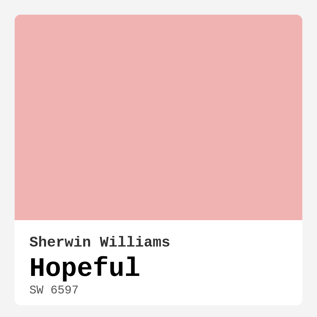
Color Preview & Key Details
| HEX Code | #F0B3B2 |
| RGB | 240, 179, 178 |
| LRV | 64% |
| Undertone | Red |
| Finish Options | Eggshell, Matte, Satin |
Imagine stepping into a room that instantly wraps you in warmth, a gentle embrace that makes you feel at home. That’s the magic of color, and today, let’s dive into one that beautifully embodies those comforting vibes: Hopeful by Sherwin Williams. This soft, blush-toned hue isn’t just a paint color; it’s an invitation to create a serene and uplifting environment.
Hopeful, with its color code SW 6597, sits snugly in the pink family. Its medium brightness and light reflectance value of 64% mean that it reflects a moderate amount of light, making it suitable for a variety of spaces. If you’re looking to refresh a room or simply add a touch of positivity, Hopeful is a fantastic option. It embodies a delicate balance of pink and beige, ensuring that every stroke on your wall feels inviting.
This color is incredibly versatile, fitting seamlessly into different decor styles, from modern and farmhouse to bohemian and transitional. Whether you’re redesigning your living room, sprucing up a cozy bedroom, or crafting a cheerful nursery, Hopeful shines through. It’s not just about aesthetics; it’s also about how a color can influence your mood and elevate your space.
When applying Hopeful, you’ll find it beginner-friendly. The paint glides effortlessly onto walls and ceilings, with coverage typically requiring just one or two coats. It’s also touch-up friendly, so if you ever need to fix a small area, it won’t become an eyesore. Plus, it’s wipeable and washable, making it a practical choice for homes with kids or pets. Just keep in mind that in high-traffic areas, you might want to apply a protective topcoat. This will help maintain its beauty and resist scuffs and marks.
One of the standout features of Hopeful is how it adapts to different lighting conditions. In natural light, it radiates warmth and comfort. As the sun sets and artificial lighting takes over, it maintains its sophisticated charm. This adaptability is essential if you’re working with open-concept spaces where light can change dramatically throughout the day.
Let’s talk about undertones because they play a crucial role in how a paint color feels. Hopeful has a subtle red undertone that adds depth and complexity. This is essential to consider when you’re placing the color next to existing furniture, flooring, or decor. Colors can look different in varying light, so it’s best to test it in your space before fully committing.
Pairing Hopeful with the right trim can enhance its warmth without overwhelming it. For a classic look, consider using White Dove or Pure White. These crisp whites will provide a fresh contrast that highlights the softness of Hopeful. If you want to add a touch of coziness, warm wood trims or brass fixtures can create a lovely, inviting feel.
In addition to its aesthetic appeal, Hopeful is also a designer favorite for its practical attributes. It’s low in VOCs, making it a healthier choice for your home, and it has a pleasant, low odor, which is a plus when you’re painting. The finishes available—matte, eggshell, and satin—allow you to choose the perfect sheen for your space.
When considering where to use Hopeful, think about the mood you want to create. Its warm, muted pastel tones make it ideal for spaces designed for relaxation, like bedrooms and nurseries. You could also use it in a home office to inspire creativity and positivity. The cozy, inviting vibe of Hopeful helps create a restful atmosphere that encourages productivity and tranquility.
For those who enjoy a bit of color harmony, you’ll love how Hopeful pairs with other shades. Think about complementing it with colors like SW 6494 or SW 6501 for a layered look that feels cohesive. If you’re feeling bolder, consider pairing it with deeper shades like SW 6604 for a beautiful contrast that still feels inviting.
While it’s true that Hopeful might require two coats for full coverage, the results are undeniably worth it. The gentle blush tone creates a soft, airy feel in bright light, while in dimmer settings, it becomes a deeper, more romantic hue. This versatility makes it an excellent choice for those who love a dynamic space that changes with the light.
As you contemplate using Hopeful, think about your unique style and how you want your space to feel. It’s not just about color; it’s about creating an atmosphere that resonates with you. Hopeful is a warm and inviting hue, perfect for fostering a sense of comfort and welcome. It can transform a simple room into a sanctuary, a place where you can unwind and feel at ease.
If you’re ready to take the plunge, grab a sample of Hopeful and see how it interacts with your existing decor. Observe how it changes throughout the day, how it plays with your furniture and accessories. You’ll likely find that it’s not just a color; it’s a mood enhancer that invites joy and tranquility into your home.
In conclusion, whether you’re looking to refresh a room or create a serene environment, Hopeful by Sherwin Williams might just be the perfect choice. Its soft, blush tones, adaptability to light, and compatibility with various decor styles make it a versatile option for any home. So, go ahead, explore this lovely hue, and let it add a touch of optimism to your space. After all, your home should be a reflection of you, filled with colors that inspire and uplift.
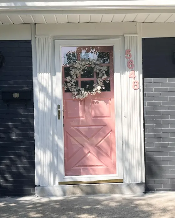
Real Room Photo of Hopeful SW 6597
Undertones of Hopeful ?
The undertones of Hopeful are a key aspect of its character, leaning towards Red. These subtle underlying hues are what give the color its depth and complexity. For example, a gray with a blue undertone will feel cooler and more modern, while one with a brown undertone will feel warmer and more traditional. It’s essential to test this paint in your home and observe it next to your existing furniture, flooring, and decor to see how these undertones interact and reveal themselves throughout the day.
HEX value: #F0B3B2
RGB code: 240, 179, 178
Is Hopeful Cool or Warm?
Hopeful is decidedly warm, with its blush tones creating a cozy atmosphere. It’s ideal for spaces where you want to foster a sense of comfort and welcome.
Understanding Color Properties and Interior Design Tips
Hue refers to a specific position on the color wheel, measured in degrees from 0 to 360. Each degree represents a different pure color:
- 0° represents red
- 120° represents green
- 240° represents blue
Saturation describes the intensity or purity of a color and is expressed as a percentage:
- At 0%, the color appears completely desaturated—essentially a shade of gray
- At 100%, the color is at its most vivid and vibrant
Lightness indicates how light or dark a color is, also expressed as a percentage:
- 0% lightness results in black
- 100% lightness results in white
Using Warm Colors in Interior Design
Warm hues—such as reds, oranges, yellows, warm beiges, and greiges—are excellent choices for creating inviting and energetic spaces. These colors are particularly well-suited for:
- Kitchens, living rooms, and bathrooms, where warmth enhances comfort and sociability
- Large rooms, where warm tones can help reduce the sense of emptiness and make the space feel more intimate
For example:
- Warm beige shades provide a cozy, inviting atmosphere, ideal for living rooms, bedrooms, and hallways.
- Warm greige (a mix of beige and gray) offers the warmth of beige with the modern appeal of gray, making it a versatile backdrop for dining areas, bedrooms, and living spaces.
However, be mindful when using warm light tones in rooms with limited natural light. These shades may appear muted or even take on an unpleasant yellowish tint. To avoid a dull or flat appearance:
- Add depth by incorporating richer tones like deep greens, charcoal, or chocolate brown
- Use textured elements such as curtains, rugs, or cushions to bring dimension to the space
Pro Tip: Achieving Harmony with Warm and Cool Color Balance
To create a well-balanced and visually interesting interior, mix warm and cool tones strategically. This contrast adds depth and harmony to your design.
- If your walls feature warm hues, introduce cool-colored accents such as blue or green furniture, artwork, or accessories to create contrast.
- For a polished look, consider using a complementary color scheme, which pairs colors opposite each other on the color wheel (e.g., red with green, orange with blue).
This thoughtful mix not only enhances visual appeal but also creates a space that feels both dynamic and cohesive.
Light Temperature Affects on Hopeful
Natural Light
Natural daylight changes in color temperature as the sun moves across the sky. At sunrise and sunset, the light tends to have a warm, golden tone with a color temperature around 2000 Kelvin (K). As the day progresses and the sun rises higher, the light becomes cooler and more neutral. Around midday, especially when the sky is clear, natural light typically reaches its peak brightness and shifts to a cooler tone, ranging from 5500 to 6500 Kelvin. This midday light is close to what we perceive as pure white or daylight-balanced light.
These shifts in natural light can significantly influence how colors appear in a space, which is why designers often consider both the time of day and the orientation of windows when planning interior color schemes.
Artificial Light
When choosing artificial lighting, pay close attention to the color temperature, measured in Kelvin (K). This determines how warm or cool the light will appear. Lower temperatures, around 2700K, give off a warm, yellow glow often used in living rooms or bedrooms. Higher temperatures, above 5000K, create a cool, bluish light similar to daylight, commonly used in kitchens, offices, or task areas.
Use the slider to see how lighting temperature can affect the appearance of a surface or color throughout a space.


4800K
LRV of Hopeful
The Light Reflectance Value (LRV) of Hopeful is 64%, which places it in the Medium category. This means it Reflects a moderate amount of light. Understanding a paint’s LRV is crucial for predicting how it will look in your space. A higher LRV indicates a lighter color that reflects more light, making rooms feel larger and brighter. A lower LRV signifies a darker color that absorbs more light, creating a cozier, more intimate atmosphere. Always consider the natural and artificial lighting in your room when selecting a paint color based on its LRV.
Detailed Review of Hopeful
Additional Paint Characteristics
Ideal Rooms
Bedroom, Home Office, Living Room, Nursery
Decor Styles
Bohemian, Farmhouse, Modern, Transitional
Coverage
Good (1–2 Coats), Touch-Up Friendly
Ease of Application
Beginner Friendly, Brush Smooth, Roller-Ready
Washability
Washable, Wipeable
VOC Level
Low VOC
Best Use
Accent Wall, Bedroom, Interior Walls, Nursery
Room Suitability
Bedroom, Home Office, Living Room, Nursery
Tone Tag
Muted, Pastel, Warm
Finish Type
Eggshell, Matte, Satin
Paint Performance
Easy Touch-Up, High Coverage, Low Odor
Use Cases
Best for Rentals, Best for Small Spaces, Designer Favorite
Mood
Cozy, Inviting, Restful
Trim Pairing
Complements Brass Fixtures, Good with Wood Trim, Pairs with White Dove
Hopeful is a delightful choice for anyone looking to infuse their space with warmth and positivity. The color’s soft blush tone is incredibly versatile, making it suitable for various settings, from cozy bedrooms to lively nurseries. The application process is straightforward, as it glides smoothly on walls and ceilings, requiring only one or two coats for full coverage. Once dried, it offers a subtle sheen that enhances its elegant appearance without being overpowering.
One of the standout features of Hopeful is its ability to adapt to different lighting conditions. In natural light, it radiates warmth, while in artificial lighting, it maintains its sophisticated charm. This makes it an excellent option for open-concept spaces where light can vary significantly. Overall, Hopeful is not just a paint color; it’s a mood-enhancer that invites joy and tranquility into your home.
Pros & Cons of SW 6597 Hopeful
Pros
Cons
Colors that go with Sherwin Williams Hopeful
FAQ on SW 6597 Hopeful
Can I use Hopeful in a high-traffic area?
While Hopeful is a lovely choice for many rooms, it’s best to exercise caution in high-traffic areas. The paint is wipeable and washable; however, for spaces that see a lot of wear, consider applying a protective clear coat to ensure durability. This will help maintain the color’s beauty while resisting scuffs and marks.
What trim colors work well with Hopeful?
Hopeful pairs beautifully with a range of trim colors. For a classic look, consider using White Dove or Pure White. If you’re feeling adventurous, try pairing it with brass fixtures or warm wood trim for a cozy, inviting feel. The key is to choose colors that enhance Hopeful’s warmth without overwhelming it.
Comparisons Hopeful with other colors
Hopeful SW 6597 vs Realist Beige SW 6078
| Attribute | Hopeful SW 6597 | Realist Beige SW 6078 |
|---|---|---|
| Color Name | Hopeful SW 6597 | Realist Beige SW 6078 |
| Color | ||
| Hue | Pink | Pink |
| Brightness | Medium | Medium |
| RGB | 240, 179, 178 | 211, 200, 189 |
| LRV | 64% | 34% |
| Finish Type | Eggshell, Matte, Satin | Eggshell, Matte, Satin |
| Finish Options | Eggshell, Matte, Satin | Eggshell, Matte, Satin |
| Ideal Rooms | Bedroom, Home Office, Living Room, Nursery | Bedroom, Dining Room, Entryway, Home Office, Kitchen, Living Room |
| Decor Styles | Bohemian, Farmhouse, Modern, Transitional | Contemporary, Minimalist, Modern Farmhouse, Rustic, Traditional |
| Coverage | Good (1–2 Coats), Touch-Up Friendly | Good (1–2 Coats), Touch-Up Friendly |
| Ease of Application | Beginner Friendly, Brush Smooth, Roller-Ready | Beginner Friendly, Brush Smooth, Fast-Drying, Roller-Ready |
| Washability | Washable, Wipeable | Washable, Wipeable |
| Room Suitability | Bedroom, Home Office, Living Room, Nursery | Bedroom, Dining Room, Home Office, Kitchen, Living Room |
| Tone | Muted, Pastel, Warm | Earthy, Neutral, Warm |
| Paint Performance | Easy Touch-Up, High Coverage, Low Odor | High Coverage, Low Odor, Quick Drying |
Hopeful SW 6597 vs Rosaline Pearl SW 9077
| Attribute | Hopeful SW 6597 | Rosaline Pearl SW 9077 |
|---|---|---|
| Color Name | Hopeful SW 6597 | Rosaline Pearl SW 9077 |
| Color | ||
| Hue | Pink | Pink |
| Brightness | Medium | Medium |
| RGB | 240, 179, 178 | 163, 136, 135 |
| LRV | 64% | 69% |
| Finish Type | Eggshell, Matte, Satin | Eggshell, Matte |
| Finish Options | Eggshell, Matte, Satin | Eggshell, Matte, Satin |
| Ideal Rooms | Bedroom, Home Office, Living Room, Nursery | Bedroom, Dining Room, Home Office, Living Room |
| Decor Styles | Bohemian, Farmhouse, Modern, Transitional | Bohemian, Contemporary, Modern, Transitional |
| Coverage | Good (1–2 Coats), Touch-Up Friendly | Good (1–2 Coats) |
| Ease of Application | Beginner Friendly, Brush Smooth, Roller-Ready | Beginner Friendly, Brush Smooth, Fast-Drying, Roller-Ready |
| Washability | Washable, Wipeable | Washable, Wipeable |
| Room Suitability | Bedroom, Home Office, Living Room, Nursery | Bedroom, Dining Room, Home Office, Living Room |
| Tone | Muted, Pastel, Warm | Dusty, Muted, Warm |
| Paint Performance | Easy Touch-Up, High Coverage, Low Odor | Easy Touch-Up, Fade Resistant, Low Odor |
Hopeful SW 6597 vs Cabbage Rose SW 0003
| Attribute | Hopeful SW 6597 | Cabbage Rose SW 0003 |
|---|---|---|
| Color Name | Hopeful SW 6597 | Cabbage Rose SW 0003 |
| Color | ||
| Hue | Pink | Pink |
| Brightness | Medium | Medium |
| RGB | 240, 179, 178 | 197, 159, 145 |
| LRV | 64% | 15% |
| Finish Type | Eggshell, Matte, Satin | Eggshell, Matte, Satin |
| Finish Options | Eggshell, Matte, Satin | Eggshell, Matte, Satin |
| Ideal Rooms | Bedroom, Home Office, Living Room, Nursery | Bedroom, Dining Room, Hallway, Living Room, Nursery |
| Decor Styles | Bohemian, Farmhouse, Modern, Transitional | Cottage, Modern Farmhouse, Romantic, Shabby Chic, Vintage |
| Coverage | Good (1–2 Coats), Touch-Up Friendly | Good (1–2 Coats), Touch-Up Friendly |
| Ease of Application | Beginner Friendly, Brush Smooth, Roller-Ready | Beginner Friendly, Brush Smooth, Roller-Ready |
| Washability | Washable, Wipeable | Washable, Wipeable |
| Room Suitability | Bedroom, Home Office, Living Room, Nursery | Bedroom, Dining Room, Hallway, Living Room, Nursery |
| Tone | Muted, Pastel, Warm | Earthy, Muted, Warm |
| Paint Performance | Easy Touch-Up, High Coverage, Low Odor | Easy Touch-Up, Low Odor |
Hopeful SW 6597 vs Sashay Sand SW 6051
| Attribute | Hopeful SW 6597 | Sashay Sand SW 6051 |
|---|---|---|
| Color Name | Hopeful SW 6597 | Sashay Sand SW 6051 |
| Color | ||
| Hue | Pink | Pink |
| Brightness | Medium | Medium |
| RGB | 240, 179, 178 | 207, 180, 168 |
| LRV | 64% | 64% |
| Finish Type | Eggshell, Matte, Satin | Eggshell, Matte, Satin |
| Finish Options | Eggshell, Matte, Satin | Eggshell, Matte, Satin |
| Ideal Rooms | Bedroom, Home Office, Living Room, Nursery | Bedroom, Dining Room, Home Office, Kitchen, Living Room |
| Decor Styles | Bohemian, Farmhouse, Modern, Transitional | Bohemian, Contemporary, Modern Farmhouse, Scandinavian, Transitional |
| Coverage | Good (1–2 Coats), Touch-Up Friendly | Good (1–2 Coats), Touch-Up Friendly |
| Ease of Application | Beginner Friendly, Brush Smooth, Roller-Ready | Beginner Friendly, Fast-Drying, Roller-Ready |
| Washability | Washable, Wipeable | Highly Washable, Washable |
| Room Suitability | Bedroom, Home Office, Living Room, Nursery | Bedroom, Dining Room, Home Office, Kitchen, Living Room |
| Tone | Muted, Pastel, Warm | Earthy, Muted, Warm |
| Paint Performance | Easy Touch-Up, High Coverage, Low Odor | Easy Touch-Up, Low Odor, Quick Drying, Scuff Resistant |
Hopeful SW 6597 vs Touch of Sand SW 9085
| Attribute | Hopeful SW 6597 | Touch of Sand SW 9085 |
|---|---|---|
| Color Name | Hopeful SW 6597 | Touch of Sand SW 9085 |
| Color | ||
| Hue | Pink | Pink |
| Brightness | Medium | Medium |
| RGB | 240, 179, 178 | 213, 199, 186 |
| LRV | 64% | 66% |
| Finish Type | Eggshell, Matte, Satin | Eggshell, Matte, Satin |
| Finish Options | Eggshell, Matte, Satin | Eggshell, Matte, Satin |
| Ideal Rooms | Bedroom, Home Office, Living Room, Nursery | Bathroom, Bedroom, Dining Room, Home Office, Kitchen, Living Room |
| Decor Styles | Bohemian, Farmhouse, Modern, Transitional | Bohemian, Coastal, Contemporary, Modern Farmhouse, Rustic |
| Coverage | Good (1–2 Coats), Touch-Up Friendly | Good (1–2 Coats), Touch-Up Friendly |
| Ease of Application | Beginner Friendly, Brush Smooth, Roller-Ready | Beginner Friendly, Brush Smooth, Fast-Drying, Roller-Ready |
| Washability | Washable, Wipeable | Washable, Wipeable |
| Room Suitability | Bedroom, Home Office, Living Room, Nursery | Bathroom, Bedroom, Dining Room, Home Office, Kitchen, Living Room |
| Tone | Muted, Pastel, Warm | Earthy, Muted, Neutral, Warm |
| Paint Performance | Easy Touch-Up, High Coverage, Low Odor | Easy Touch-Up, Low Odor, Quick Drying, Scuff Resistant |
Hopeful SW 6597 vs Pink Shadow SW 0070
| Attribute | Hopeful SW 6597 | Pink Shadow SW 0070 |
|---|---|---|
| Color Name | Hopeful SW 6597 | Pink Shadow SW 0070 |
| Color | ||
| Hue | Pink | Pink |
| Brightness | Medium | Medium |
| RGB | 240, 179, 178 | 222, 195, 185 |
| LRV | 64% | 45% |
| Finish Type | Eggshell, Matte, Satin | Eggshell, Matte, Satin |
| Finish Options | Eggshell, Matte, Satin | Eggshell, Matte, Satin |
| Ideal Rooms | Bedroom, Home Office, Living Room, Nursery | Bedroom, Dining Room, Home Office, Living Room, Nursery |
| Decor Styles | Bohemian, Farmhouse, Modern, Transitional | Bohemian, Minimalist, Modern Farmhouse, Scandinavian, Traditional |
| Coverage | Good (1–2 Coats), Touch-Up Friendly | Good (1–2 Coats) |
| Ease of Application | Beginner Friendly, Brush Smooth, Roller-Ready | Beginner Friendly, Brush Smooth, Fast-Drying, Roller-Ready |
| Washability | Washable, Wipeable | Washable, Wipeable |
| Room Suitability | Bedroom, Home Office, Living Room, Nursery | Bedroom, Dining Room, Living Room, Nursery |
| Tone | Muted, Pastel, Warm | Muted, Pastel, Warm |
| Paint Performance | Easy Touch-Up, High Coverage, Low Odor | Easy Touch-Up, High Coverage, Low Odor |
Hopeful SW 6597 vs Hushed Auburn SW 9080
| Attribute | Hopeful SW 6597 | Hushed Auburn SW 9080 |
|---|---|---|
| Color Name | Hopeful SW 6597 | Hushed Auburn SW 9080 |
| Color | ||
| Hue | Pink | Pink |
| Brightness | Medium | Medium |
| RGB | 240, 179, 178 | 168, 133, 122 |
| LRV | 64% | 12% |
| Finish Type | Eggshell, Matte, Satin | Eggshell, Matte, Satin |
| Finish Options | Eggshell, Matte, Satin | Eggshell, Matte, Satin |
| Ideal Rooms | Bedroom, Home Office, Living Room, Nursery | Bedroom, Dining Room, Home Office, Living Room |
| Decor Styles | Bohemian, Farmhouse, Modern, Transitional | Contemporary, Modern Farmhouse, Rustic, Transitional |
| Coverage | Good (1–2 Coats), Touch-Up Friendly | Good (1–2 Coats), Touch-Up Friendly |
| Ease of Application | Beginner Friendly, Brush Smooth, Roller-Ready | Beginner Friendly, Brush Smooth, Fast-Drying, Roller-Ready |
| Washability | Washable, Wipeable | Washable, Wipeable |
| Room Suitability | Bedroom, Home Office, Living Room, Nursery | Bedroom, Dining Room, Home Office, Living Room |
| Tone | Muted, Pastel, Warm | Earthy, Muted, Warm |
| Paint Performance | Easy Touch-Up, High Coverage, Low Odor | Easy Touch-Up, High Coverage, Low Odor |
Hopeful SW 6597 vs Likeable Sand SW 6058
| Attribute | Hopeful SW 6597 | Likeable Sand SW 6058 |
|---|---|---|
| Color Name | Hopeful SW 6597 | Likeable Sand SW 6058 |
| Color | ||
| Hue | Pink | Pink |
| Brightness | Medium | Medium |
| RGB | 240, 179, 178 | 209, 183, 168 |
| LRV | 64% | 61% |
| Finish Type | Eggshell, Matte, Satin | Eggshell, Matte, Satin |
| Finish Options | Eggshell, Matte, Satin | Eggshell, Matte, Satin |
| Ideal Rooms | Bedroom, Home Office, Living Room, Nursery | Bedroom, Dining Room, Home Office, Kitchen, Living Room |
| Decor Styles | Bohemian, Farmhouse, Modern, Transitional | Bohemian, Coastal, Contemporary, Modern Farmhouse, Rustic |
| Coverage | Good (1–2 Coats), Touch-Up Friendly | Good (1–2 Coats), Touch-Up Friendly |
| Ease of Application | Beginner Friendly, Brush Smooth, Roller-Ready | Beginner Friendly, Brush Smooth, Fast-Drying, Roller-Ready |
| Washability | Washable, Wipeable | Washable, Wipeable |
| Room Suitability | Bedroom, Home Office, Living Room, Nursery | Bedroom, Dining Room, Home Office, Kitchen, Living Room |
| Tone | Muted, Pastel, Warm | Earthy, Muted, Warm |
| Paint Performance | Easy Touch-Up, High Coverage, Low Odor | Easy Touch-Up, Low Odor, Quick Drying |
Hopeful SW 6597 vs Glamour SW 6031
| Attribute | Hopeful SW 6597 | Glamour SW 6031 |
|---|---|---|
| Color Name | Hopeful SW 6597 | Glamour SW 6031 |
| Color | ||
| Hue | Pink | Pink |
| Brightness | Medium | Medium |
| RGB | 240, 179, 178 | 182, 160, 154 |
| LRV | 64% | 30% |
| Finish Type | Eggshell, Matte, Satin | Eggshell, Matte, Satin |
| Finish Options | Eggshell, Matte, Satin | Eggshell, Matte, Satin |
| Ideal Rooms | Bedroom, Home Office, Living Room, Nursery | Bedroom, Dining Room, Home Office, Living Room |
| Decor Styles | Bohemian, Farmhouse, Modern, Transitional | Bohemian, Classic, Modern, Transitional |
| Coverage | Good (1–2 Coats), Touch-Up Friendly | Good (1–2 Coats) |
| Ease of Application | Beginner Friendly, Brush Smooth, Roller-Ready | Beginner Friendly, Brush Smooth, Fast-Drying, Roller-Ready |
| Washability | Washable, Wipeable | Scrubbable, Washable |
| Room Suitability | Bedroom, Home Office, Living Room, Nursery | Bedroom, Dining Room, Home Office, Living Room |
| Tone | Muted, Pastel, Warm | Balanced, Neutral, Warm |
| Paint Performance | Easy Touch-Up, High Coverage, Low Odor | Easy Touch-Up, Low Odor, Quick Drying |
Hopeful SW 6597 vs Temperate Taupe SW 6037
| Attribute | Hopeful SW 6597 | Temperate Taupe SW 6037 |
|---|---|---|
| Color Name | Hopeful SW 6597 | Temperate Taupe SW 6037 |
| Color | ||
| Hue | Pink | Pink |
| Brightness | Medium | Medium |
| RGB | 240, 179, 178 | 191, 177, 170 |
| LRV | 64% | 34% |
| Finish Type | Eggshell, Matte, Satin | Eggshell, Matte, Satin |
| Finish Options | Eggshell, Matte, Satin | Eggshell, Matte, Satin |
| Ideal Rooms | Bedroom, Home Office, Living Room, Nursery | Bedroom, Dining Room, Home Office, Kitchen, Living Room |
| Decor Styles | Bohemian, Farmhouse, Modern, Transitional | Bohemian, Modern Farmhouse, Rustic, Transitional |
| Coverage | Good (1–2 Coats), Touch-Up Friendly | Good (1–2 Coats), Touch-Up Friendly |
| Ease of Application | Beginner Friendly, Brush Smooth, Roller-Ready | Beginner Friendly, Brush Smooth, Fast-Drying, Roller-Ready |
| Washability | Washable, Wipeable | Highly Washable, Washable |
| Room Suitability | Bedroom, Home Office, Living Room, Nursery | Bedroom, Dining Room, Home Office, Living Room |
| Tone | Muted, Pastel, Warm | Earthy, Neutral, Warm |
| Paint Performance | Easy Touch-Up, High Coverage, Low Odor | Long Lasting, Low Odor, Quick Drying, Scuff Resistant |
Official Page of Sherwin Williams Hopeful SW 6597