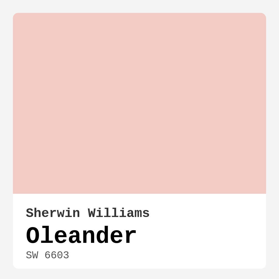
Color Preview & Key Details
| HEX Code | #F2CCC5 |
| RGB | 242, 204, 197 |
| LRV | 24% |
| Undertone | Red |
| Finish Options | Eggshell, Matte, Satin |
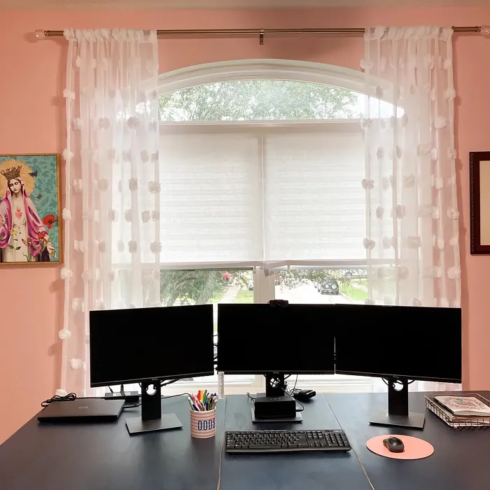
Imagine walking into a room that instantly wraps you in warmth, a gentle embrace that feels both calming and inviting. That’s the magic of Sherwin Williams’ Oleander (SW 6603). This soft, muted pink hue isn’t just a color; it’s an experience, a sensation that transforms spaces into tranquil sanctuaries. Whether you’re considering a makeover for your bedroom, living room, or even a cozy nursery, Oleander could be the perfect choice to breathe life into your interiors.
Let’s dive into what makes this shade so special. Oleander draws inspiration from the delicate hues of blooming flowers, bringing a touch of nature indoors. Its lightness and warmth create an atmosphere that feels personal and serene, making it ideal for spaces where comfort is key. Imagine curling up with a book in a bedroom painted Oleander, or hosting a cozy dinner in a dining room that radiates warmth and elegance. It’s a versatile choice that can suit various decor styles, from modern and farmhouse to bohemian and transitional.
When it comes to application, you’ll be pleased to know that Oleander is beginner-friendly. The paint goes on smoothly, whether you’re using a roller or a brush. Most homeowners find that it covers well, typically requiring just one or two coats for a rich finish, which means less time painting and more time enjoying your beautiful new space. Plus, with available finishes like matte, eggshell, and satin, you can choose the perfect texture that complements your vision.
The soothing warmth of Oleander comes from its red undertones, which give it depth and complexity. This subtle hint of red is what makes Oleander feel cozy without being overwhelming. However, it’s essential to consider how this undertone interacts with your existing decor. The key is to test the color in your space. Observe how it looks against your furniture and flooring throughout the day as the light shifts. In bright environments, Oleander reveals its vibrant, cheerful side, while in dimmer settings, it takes on a softer, more muted quality that still feels inviting.
With a Light Reflectance Value (LRV) of 24%, Oleander falls into the medium dark category, meaning it absorbs a bit more light than lighter shades. This characteristic can create a snug atmosphere, perfect for intimate spaces. However, always keep in mind the natural and artificial lighting conditions in your room. The color will play differently depending on how much light it receives, so it’s wise to observe it at various times before making your final decision.
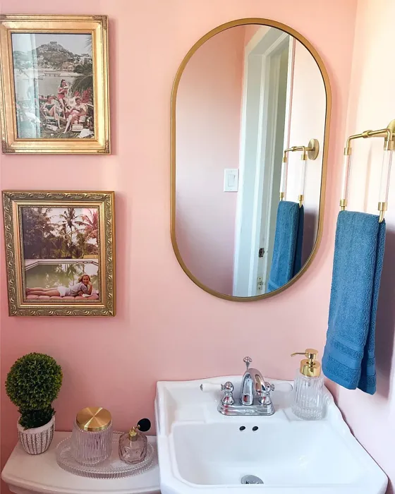
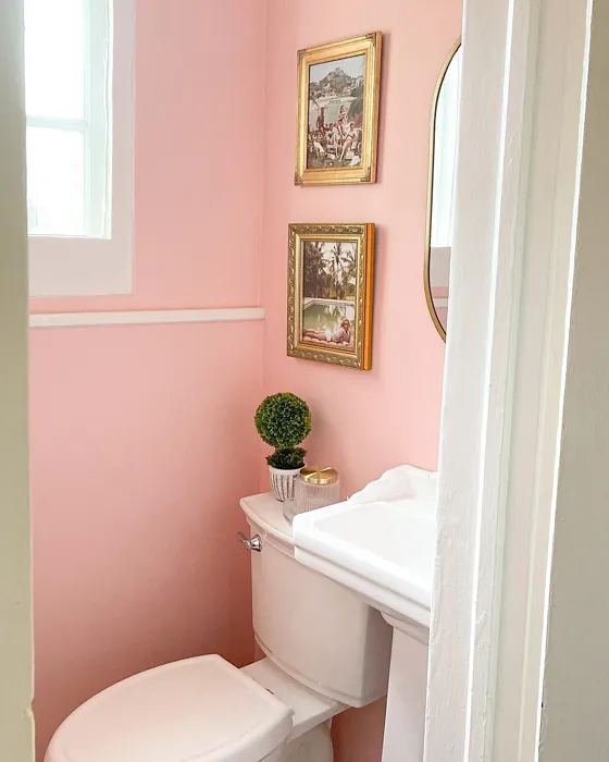
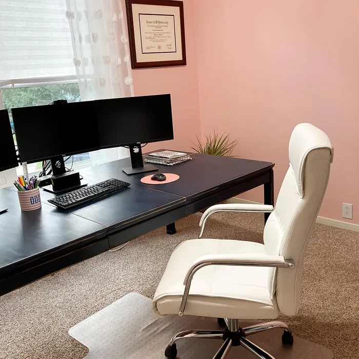
As for the rooms where Oleander shines brightest, think bedrooms, living rooms, nurseries, and dining areas. In a bedroom, it can create a tranquil haven, promoting relaxation and restful sleep. In a living room, it invites conversation and warmth, making guests feel immediately at home. When used in a nursery, it offers a gentle, nurturing environment for your little one. Even in a dining room, Oleander adds a touch of sophistication while still feeling cozy.
Now, let’s chat about pairing this lovely hue with other colors. While Oleander is stunning on its own, it can also be beautifully complemented by a variety of shades. Consider pairing it with crisp whites like White Dove for trim and accents, which can add a fresh contrast against the softness of Oleander. Warm brass fixtures can enhance the inviting feel, while natural wood tones can ground the space and add a rustic charm. If you’re looking for bolder accents, consider deeper hues like SW 9675 or SW 6497, which can create a striking visual impact without clashing with Oleander’s warmth.
One of the biggest advantages of Oleander is its versatility when it comes to decor styles. It fits seamlessly into modern spaces, where it can serve as a soft backdrop to contemporary furniture. In a farmhouse setting, it can enhance the rustic charm, creating a balance between comfort and elegance. For bohemian aesthetics, Oleander can act as a canvas for eclectic patterns and textures, allowing your decor to shine. Even in transitional spaces that blend traditional and modern elements, this hue can serve as a beautiful bridge, making the room feel cohesive.
Of course, no color is without its considerations. Some may find Oleander’s softness a bit too delicate, particularly in larger, more open spaces. It’s crucial to ensure that this gentle shade aligns with your overall vision for the space. Additionally, when using Oleander, be mindful of color pairings to avoid clashes. The goal is to create a harmonious environment, so take the time to experiment with different accents and decor items before settling on your final palette.
If you’re worried about using Oleander in a small room, rest assured that it can actually work wonders. Its soft tone can make a small space feel warm and inviting without overwhelming it. Just remember, natural light plays a significant role in how this color is perceived, so consider how much light your space receives. With the right accents, Oleander can create an airy feel, even in the coziest corners of your home.
When it comes to durability, Oleander is a reliable choice. It’s designed to withstand everyday wear, making it suitable for a variety of settings. While it might not be the best option for high-traffic areas—where you’d want something more robust—it’s still wipeable and washable, making maintenance a breeze. So, if you’re using it in a bedroom or living area, you can rest easy knowing it will stand the test of time.
In summary, Oleander (SW 6603) is more than just a pretty pink. It’s a warm, inviting hue that can elevate your space into a peaceful retreat. Its versatility across decor styles, ease of application, and ability to create a calming atmosphere make it a designer favorite. Whether you’re looking to refresh a single room or makeover your entire home, this color could be the key to unlocking the inviting vibe you desire. So, grab a sample, test it in your space, and see how Oleander can transform your home into a sanctuary of style and comfort.
Real Room Photo of Oleander SW 6603
Undertones of Oleander ?
The undertones of Oleander are a key aspect of its character, leaning towards Red. These subtle underlying hues are what give the color its depth and complexity. For example, a gray with a blue undertone will feel cooler and more modern, while one with a brown undertone will feel warmer and more traditional. It’s essential to test this paint in your home and observe it next to your existing furniture, flooring, and decor to see how these undertones interact and reveal themselves throughout the day.
HEX value: #F2CCC5
RGB code: 242, 204, 197
Is Oleander Cool or Warm?
Oleander leans towards the warm side of the spectrum, creating a comforting and inviting atmosphere. Its warmth can soften stark spaces and make them feel more intimate and welcoming.
Understanding Color Properties and Interior Design Tips
Hue refers to a specific position on the color wheel, measured in degrees from 0 to 360. Each degree represents a different pure color:
- 0° represents red
- 120° represents green
- 240° represents blue
Saturation describes the intensity or purity of a color and is expressed as a percentage:
- At 0%, the color appears completely desaturated—essentially a shade of gray
- At 100%, the color is at its most vivid and vibrant
Lightness indicates how light or dark a color is, also expressed as a percentage:
- 0% lightness results in black
- 100% lightness results in white
Using Warm Colors in Interior Design
Warm hues—such as reds, oranges, yellows, warm beiges, and greiges—are excellent choices for creating inviting and energetic spaces. These colors are particularly well-suited for:
- Kitchens, living rooms, and bathrooms, where warmth enhances comfort and sociability
- Large rooms, where warm tones can help reduce the sense of emptiness and make the space feel more intimate
For example:
- Warm beige shades provide a cozy, inviting atmosphere, ideal for living rooms, bedrooms, and hallways.
- Warm greige (a mix of beige and gray) offers the warmth of beige with the modern appeal of gray, making it a versatile backdrop for dining areas, bedrooms, and living spaces.
However, be mindful when using warm light tones in rooms with limited natural light. These shades may appear muted or even take on an unpleasant yellowish tint. To avoid a dull or flat appearance:
- Add depth by incorporating richer tones like deep greens, charcoal, or chocolate brown
- Use textured elements such as curtains, rugs, or cushions to bring dimension to the space
Pro Tip: Achieving Harmony with Warm and Cool Color Balance
To create a well-balanced and visually interesting interior, mix warm and cool tones strategically. This contrast adds depth and harmony to your design.
- If your walls feature warm hues, introduce cool-colored accents such as blue or green furniture, artwork, or accessories to create contrast.
- For a polished look, consider using a complementary color scheme, which pairs colors opposite each other on the color wheel (e.g., red with green, orange with blue).
This thoughtful mix not only enhances visual appeal but also creates a space that feels both dynamic and cohesive.
Light Temperature Affects on Oleander
Natural Light
Natural daylight changes in color temperature as the sun moves across the sky. At sunrise and sunset, the light tends to have a warm, golden tone with a color temperature around 2000 Kelvin (K). As the day progresses and the sun rises higher, the light becomes cooler and more neutral. Around midday, especially when the sky is clear, natural light typically reaches its peak brightness and shifts to a cooler tone, ranging from 5500 to 6500 Kelvin. This midday light is close to what we perceive as pure white or daylight-balanced light.
These shifts in natural light can significantly influence how colors appear in a space, which is why designers often consider both the time of day and the orientation of windows when planning interior color schemes.
Artificial Light
When choosing artificial lighting, pay close attention to the color temperature, measured in Kelvin (K). This determines how warm or cool the light will appear. Lower temperatures, around 2700K, give off a warm, yellow glow often used in living rooms or bedrooms. Higher temperatures, above 5000K, create a cool, bluish light similar to daylight, commonly used in kitchens, offices, or task areas.
Use the slider to see how lighting temperature can affect the appearance of a surface or color throughout a space.


4800K
LRV of Oleander
The Light Reflectance Value (LRV) of Oleander is 24%, which places it in the Medium Dark category. This means it reflects very little light. Understanding a paint’s LRV is crucial for predicting how it will look in your space. A higher LRV indicates a lighter color that reflects more light, making rooms feel larger and brighter. A lower LRV signifies a darker color that absorbs more light, creating a cozier, more intimate atmosphere. Always consider the natural and artificial lighting in your room when selecting a paint color based on its LRV.
Detailed Review of Oleander
Additional Paint Characteristics
Ideal Rooms
Bedroom, Dining Room, Living Room, Nursery
Decor Styles
Bohemian, Farmhouse, Modern, Transitional
Coverage
Good (1–2 Coats), Touch-Up Friendly
Ease of Application
Beginner Friendly, Brush Smooth, Roller-Ready
Washability
Washable, Wipeable
VOC Level
Low VOC, Ultra Low VOC
Best Use
Accent Wall, Interior Walls, Nursery
Room Suitability
Bedroom, Dining Room, Living Room, Nursery
Tone Tag
Muted, Pastel, Warm
Finish Type
Eggshell, Matte
Paint Performance
Easy Touch-Up, Low Odor, Scuff Resistant
Use Cases
Best for Rentals, Best for Small Spaces, Designer Favorite
Mood
Calm, Cozy, Inviting
Trim Pairing
Complements Brass Fixtures, Good with Wood Trim, Pairs with White Dove
Oleander is a stunning choice for anyone looking to infuse their space with a gentle warmth. This paint’s soft pink hue can transform a room into a sanctuary, offering a calming vibe that feels both refreshing and welcoming. It works beautifully in various decor styles, from modern minimalist to cozy farmhouse aesthetics. The application is a breeze, with a smooth finish that leaves a sophisticated matte or eggshell look, depending on your choice. Plus, it covers well, usually needing just one or two coats for full richness. This makes it a practical option for busy homeowners who want great results without the hassle.
Pros & Cons of SW 6603 Oleander
Pros
Cons
Colors that go with Sherwin Williams Oleander
FAQ on SW 6603 Oleander
Can I use Oleander in a small room?
Absolutely! Oleander’s soft pink tone can make small rooms feel warm and inviting without overwhelming the space. When paired with the right accents, it can create an airy feel that opens up the room visually. Just be mindful of natural light, as it will enhance the color and help it feel more spacious.
Is Oleander suitable for high-traffic areas?
While Oleander is beautiful, it’s best suited for spaces like bedrooms or living rooms rather than high-traffic areas. Its washability makes it easy to clean, but you might want to consider a more durable finish or color for frequently used spaces, as it may show wear over time.
Comparisons Oleander with other colors
Oleander SW 6603 vs Malted Milk SW 6057
| Attribute | Oleander SW 6603 | Malted Milk SW 6057 |
|---|---|---|
| Color Name | Oleander SW 6603 | Malted Milk SW 6057 |
| Color | ||
| Hue | Pink | Pink |
| Brightness | Light | Light |
| RGB | 242, 204, 197 | 222, 202, 189 |
| LRV | 24% | 74% |
| Finish Type | Eggshell, Matte | Eggshell, Satin |
| Finish Options | Eggshell, Matte, Satin | Eggshell, Matte, Satin |
| Ideal Rooms | Bedroom, Dining Room, Living Room, Nursery | Bedroom, Dining Room, Kitchen, Living Room, Nursery |
| Decor Styles | Bohemian, Farmhouse, Modern, Transitional | Coastal, Farmhouse, Modern, Scandinavian, Transitional |
| Coverage | Good (1–2 Coats), Touch-Up Friendly | Good (1–2 Coats), Touch-Up Friendly |
| Ease of Application | Beginner Friendly, Brush Smooth, Roller-Ready | Beginner Friendly, Brush Smooth, Fast-Drying, Roller-Ready |
| Washability | Washable, Wipeable | Washable, Wipeable |
| Room Suitability | Bedroom, Dining Room, Living Room, Nursery | Bedroom, Dining Room, Kitchen, Living Room, Nursery |
| Tone | Muted, Pastel, Warm | Creamy, Neutral, Warm |
| Paint Performance | Easy Touch-Up, Low Odor, Scuff Resistant | High Coverage, Low Odor, Quick Drying |
Oleander SW 6603 vs Intimate White SW 6322
| Attribute | Oleander SW 6603 | Intimate White SW 6322 |
|---|---|---|
| Color Name | Oleander SW 6603 | Intimate White SW 6322 |
| Color | ||
| Hue | Pink | Pink |
| Brightness | Light | Light |
| RGB | 242, 204, 197 | 240, 225, 216 |
| LRV | 24% | 75% |
| Finish Type | Eggshell, Matte | Eggshell, Matte, Satin |
| Finish Options | Eggshell, Matte, Satin | Eggshell, Matte, Satin |
| Ideal Rooms | Bedroom, Dining Room, Living Room, Nursery | Bedroom, Hallway, Home Office, Living Room, Nursery |
| Decor Styles | Bohemian, Farmhouse, Modern, Transitional | Farmhouse, Minimalist, Modern, Traditional |
| Coverage | Good (1–2 Coats), Touch-Up Friendly | Good (1–2 Coats) |
| Ease of Application | Beginner Friendly, Brush Smooth, Roller-Ready | Beginner Friendly, Brush Smooth, Roller-Ready |
| Washability | Washable, Wipeable | Highly Washable, Washable |
| Room Suitability | Bedroom, Dining Room, Living Room, Nursery | Bedroom, Hallway, Living Room, Nursery |
| Tone | Muted, Pastel, Warm | Creamy, Muted, Warm |
| Paint Performance | Easy Touch-Up, Low Odor, Scuff Resistant | Easy Touch-Up, Fade Resistant, Low Odor |
Oleander SW 6603 vs Abalone Shell SW 6050
| Attribute | Oleander SW 6603 | Abalone Shell SW 6050 |
|---|---|---|
| Color Name | Oleander SW 6603 | Abalone Shell SW 6050 |
| Color | ||
| Hue | Pink | Pink |
| Brightness | Light | Light |
| RGB | 242, 204, 197 | 219, 199, 189 |
| LRV | 24% | 30% |
| Finish Type | Eggshell, Matte | Eggshell, Matte, Satin |
| Finish Options | Eggshell, Matte, Satin | Eggshell, Matte, Satin |
| Ideal Rooms | Bedroom, Dining Room, Living Room, Nursery | Bedroom, Dining Room, Home Office, Living Room |
| Decor Styles | Bohemian, Farmhouse, Modern, Transitional | Coastal, Farmhouse, Minimalist, Modern, Traditional |
| Coverage | Good (1–2 Coats), Touch-Up Friendly | Good (1–2 Coats), Touch-Up Friendly |
| Ease of Application | Beginner Friendly, Brush Smooth, Roller-Ready | Beginner Friendly, Brush Smooth, Fast-Drying, Roller-Ready |
| Washability | Washable, Wipeable | Washable, Wipeable |
| Room Suitability | Bedroom, Dining Room, Living Room, Nursery | Bedroom, Dining Room, Home Office, Living Room |
| Tone | Muted, Pastel, Warm | Balanced, Muted, Warm |
| Paint Performance | Easy Touch-Up, Low Odor, Scuff Resistant | Easy Touch-Up, Fade Resistant, Low Odor, Quick Drying |
Oleander SW 6603 vs White Truffle SW 6029
| Attribute | Oleander SW 6603 | White Truffle SW 6029 |
|---|---|---|
| Color Name | Oleander SW 6603 | White Truffle SW 6029 |
| Color | ||
| Hue | Pink | Pink |
| Brightness | Light | Light |
| RGB | 242, 204, 197 | 215, 200, 194 |
| LRV | 24% | 48% |
| Finish Type | Eggshell, Matte | Eggshell, Satin |
| Finish Options | Eggshell, Matte, Satin | Eggshell, Flat, Matte, Satin |
| Ideal Rooms | Bedroom, Dining Room, Living Room, Nursery | Bedroom, Dining Room, Hallway, Kitchen, Living Room |
| Decor Styles | Bohemian, Farmhouse, Modern, Transitional | Eclectic, Farmhouse, Modern, Traditional |
| Coverage | Good (1–2 Coats), Touch-Up Friendly | Good (1–2 Coats), Touch-Up Friendly |
| Ease of Application | Beginner Friendly, Brush Smooth, Roller-Ready | Beginner Friendly, Brush Smooth, Roller-Ready |
| Washability | Washable, Wipeable | Washable, Wipeable |
| Room Suitability | Bedroom, Dining Room, Living Room, Nursery | Bedroom, Dining Room, Hallway, Living Room |
| Tone | Muted, Pastel, Warm | Earthy, Neutral, Warm |
| Paint Performance | Easy Touch-Up, Low Odor, Scuff Resistant | Easy Touch-Up, Low Odor, Scuff Resistant |
Oleander SW 6603 vs Faint Coral SW 6329
| Attribute | Oleander SW 6603 | Faint Coral SW 6329 |
|---|---|---|
| Color Name | Oleander SW 6603 | Faint Coral SW 6329 |
| Color | ||
| Hue | Pink | Pink |
| Brightness | Light | Light |
| RGB | 242, 204, 197 | 238, 222, 213 |
| LRV | 24% | 66% |
| Finish Type | Eggshell, Matte | Eggshell, Matte, Satin |
| Finish Options | Eggshell, Matte, Satin | Eggshell, Matte, Satin |
| Ideal Rooms | Bedroom, Dining Room, Living Room, Nursery | Bedroom, Dining Room, Hallway, Living Room, Nursery |
| Decor Styles | Bohemian, Farmhouse, Modern, Transitional | Bohemian, Coastal, Modern Farmhouse, Scandinavian, Vintage |
| Coverage | Good (1–2 Coats), Touch-Up Friendly | Good (1–2 Coats), Touch-Up Friendly |
| Ease of Application | Beginner Friendly, Brush Smooth, Roller-Ready | Beginner Friendly, Brush Smooth, Fast-Drying, Roller-Ready |
| Washability | Washable, Wipeable | Washable, Wipeable |
| Room Suitability | Bedroom, Dining Room, Living Room, Nursery | Bedroom, Dining Room, Hallway, Living Room, Nursery |
| Tone | Muted, Pastel, Warm | Airy, Muted, Pastel, Warm |
| Paint Performance | Easy Touch-Up, Low Odor, Scuff Resistant | Easy Touch-Up, Low Odor, Quick Drying |
Oleander SW 6603 vs Romance SW 6323
| Attribute | Oleander SW 6603 | Romance SW 6323 |
|---|---|---|
| Color Name | Oleander SW 6603 | Romance SW 6323 |
| Color | ||
| Hue | Pink | Pink |
| Brightness | Light | Light |
| RGB | 242, 204, 197 | 235, 207, 195 |
| LRV | 24% | 69% |
| Finish Type | Eggshell, Matte | Eggshell, Matte |
| Finish Options | Eggshell, Matte, Satin | Eggshell, Flat, Matte, Satin |
| Ideal Rooms | Bedroom, Dining Room, Living Room, Nursery | Bedroom, Dining Room, Living Room, Nursery |
| Decor Styles | Bohemian, Farmhouse, Modern, Transitional | Bohemian, Modern, Shabby Chic, Vintage |
| Coverage | Good (1–2 Coats), Touch-Up Friendly | Good (1–2 Coats), Touch-Up Friendly |
| Ease of Application | Beginner Friendly, Brush Smooth, Roller-Ready | Beginner Friendly, Brush Smooth, Fast-Drying, Roller-Ready |
| Washability | Washable, Wipeable | Washable, Wipeable |
| Room Suitability | Bedroom, Dining Room, Living Room, Nursery | Bedroom, Dining Room, Living Room, Nursery |
| Tone | Muted, Pastel, Warm | Pastel, Soft, Warm |
| Paint Performance | Easy Touch-Up, Low Odor, Scuff Resistant | Easy Touch-Up, Low Odor, Quick Drying |
Oleander SW 6603 vs Innocence SW 6302
| Attribute | Oleander SW 6603 | Innocence SW 6302 |
|---|---|---|
| Color Name | Oleander SW 6603 | Innocence SW 6302 |
| Color | ||
| Hue | Pink | Pink |
| Brightness | Light | Light |
| RGB | 242, 204, 197 | 235, 209, 207 |
| LRV | 24% | 75% |
| Finish Type | Eggshell, Matte | Eggshell, Matte |
| Finish Options | Eggshell, Matte, Satin | Eggshell, Matte, Satin |
| Ideal Rooms | Bedroom, Dining Room, Living Room, Nursery | Bedroom, Dining Room, Living Room, Nursery |
| Decor Styles | Bohemian, Farmhouse, Modern, Transitional | Bohemian, Modern Farmhouse, Scandinavian, Shabby Chic |
| Coverage | Good (1–2 Coats), Touch-Up Friendly | Good (1–2 Coats), Touch-Up Friendly |
| Ease of Application | Beginner Friendly, Brush Smooth, Roller-Ready | Beginner Friendly, Brush Smooth, Roller-Ready |
| Washability | Washable, Wipeable | Washable, Wipeable |
| Room Suitability | Bedroom, Dining Room, Living Room, Nursery | Bedroom, Dining Room, Living Room, Nursery |
| Tone | Muted, Pastel, Warm | Pastel, Soft, Warm |
| Paint Performance | Easy Touch-Up, Low Odor, Scuff Resistant | Easy Touch-Up, Fade Resistant, Low Odor |
Oleander SW 6603 vs Angelic SW 6602
| Attribute | Oleander SW 6603 | Angelic SW 6602 |
|---|---|---|
| Color Name | Oleander SW 6603 | Angelic SW 6602 |
| Color | ||
| Hue | Pink | Pink |
| Brightness | Light | Light |
| RGB | 242, 204, 197 | 242, 220, 215 |
| LRV | 24% | 75% |
| Finish Type | Eggshell, Matte | Eggshell, Satin |
| Finish Options | Eggshell, Matte, Satin | Eggshell, Flat, Matte, Satin |
| Ideal Rooms | Bedroom, Dining Room, Living Room, Nursery | Bedroom, Dining Room, Home Office, Living Room, Nursery |
| Decor Styles | Bohemian, Farmhouse, Modern, Transitional | Bohemian, Farmhouse, Modern, Transitional |
| Coverage | Good (1–2 Coats), Touch-Up Friendly | Good (1–2 Coats), Touch-Up Friendly |
| Ease of Application | Beginner Friendly, Brush Smooth, Roller-Ready | Beginner Friendly, Brush Smooth, Roller-Ready |
| Washability | Washable, Wipeable | Washable, Wipeable |
| Room Suitability | Bedroom, Dining Room, Living Room, Nursery | Bedroom, Home Office, Living Room, Nursery |
| Tone | Muted, Pastel, Warm | Airy, Pastel, Warm |
| Paint Performance | Easy Touch-Up, Low Odor, Scuff Resistant | Easy Touch-Up, Fade Resistant, Low Odor |
Oleander SW 6603 vs Rosy Outlook SW 6316
| Attribute | Oleander SW 6603 | Rosy Outlook SW 6316 |
|---|---|---|
| Color Name | Oleander SW 6603 | Rosy Outlook SW 6316 |
| Color | ||
| Hue | Pink | Pink |
| Brightness | Light | Light |
| RGB | 242, 204, 197 | 235, 206, 203 |
| LRV | 24% | 45% |
| Finish Type | Eggshell, Matte | Eggshell, Matte, Satin |
| Finish Options | Eggshell, Matte, Satin | Eggshell, Matte, Satin |
| Ideal Rooms | Bedroom, Dining Room, Living Room, Nursery | Bedroom, Home Office, Living Room, Nursery |
| Decor Styles | Bohemian, Farmhouse, Modern, Transitional | Bohemian, Cottage, Modern, Traditional |
| Coverage | Good (1–2 Coats), Touch-Up Friendly | Good (1–2 Coats), Touch-Up Friendly |
| Ease of Application | Beginner Friendly, Brush Smooth, Roller-Ready | Beginner Friendly, Brush Smooth, Roller-Ready |
| Washability | Washable, Wipeable | Scuff Resistant, Washable, Wipeable |
| Room Suitability | Bedroom, Dining Room, Living Room, Nursery | Bedroom, Home Office, Living Room, Nursery |
| Tone | Muted, Pastel, Warm | Muted, Pastel, Warm |
| Paint Performance | Easy Touch-Up, Low Odor, Scuff Resistant | High Coverage, Low Odor, Quick Drying |
Oleander SW 6603 vs Demure SW 6295
| Attribute | Oleander SW 6603 | Demure SW 6295 |
|---|---|---|
| Color Name | Oleander SW 6603 | Demure SW 6295 |
| Color | ||
| Hue | Pink | Pink |
| Brightness | Light | Light |
| RGB | 242, 204, 197 | 232, 212, 213 |
| LRV | 24% | 50% |
| Finish Type | Eggshell, Matte | Eggshell, Matte |
| Finish Options | Eggshell, Matte, Satin | Eggshell, Matte, Satin |
| Ideal Rooms | Bedroom, Dining Room, Living Room, Nursery | Bedroom, Home Office, Living Room, Nursery |
| Decor Styles | Bohemian, Farmhouse, Modern, Transitional | Minimalist, Modern, Shabby Chic, Transitional |
| Coverage | Good (1–2 Coats), Touch-Up Friendly | Good (1–2 Coats), Touch-Up Friendly |
| Ease of Application | Beginner Friendly, Brush Smooth, Roller-Ready | Beginner Friendly, Brush Smooth, Roller-Ready |
| Washability | Washable, Wipeable | Washable, Wipeable |
| Room Suitability | Bedroom, Dining Room, Living Room, Nursery | Bedroom, Home Office, Living Room, Nursery |
| Tone | Muted, Pastel, Warm | Muted, Pastel, Warm |
| Paint Performance | Easy Touch-Up, Low Odor, Scuff Resistant | Easy Touch-Up, Low Odor, Quick Drying |
Official Page of Sherwin Williams Oleander SW 6603