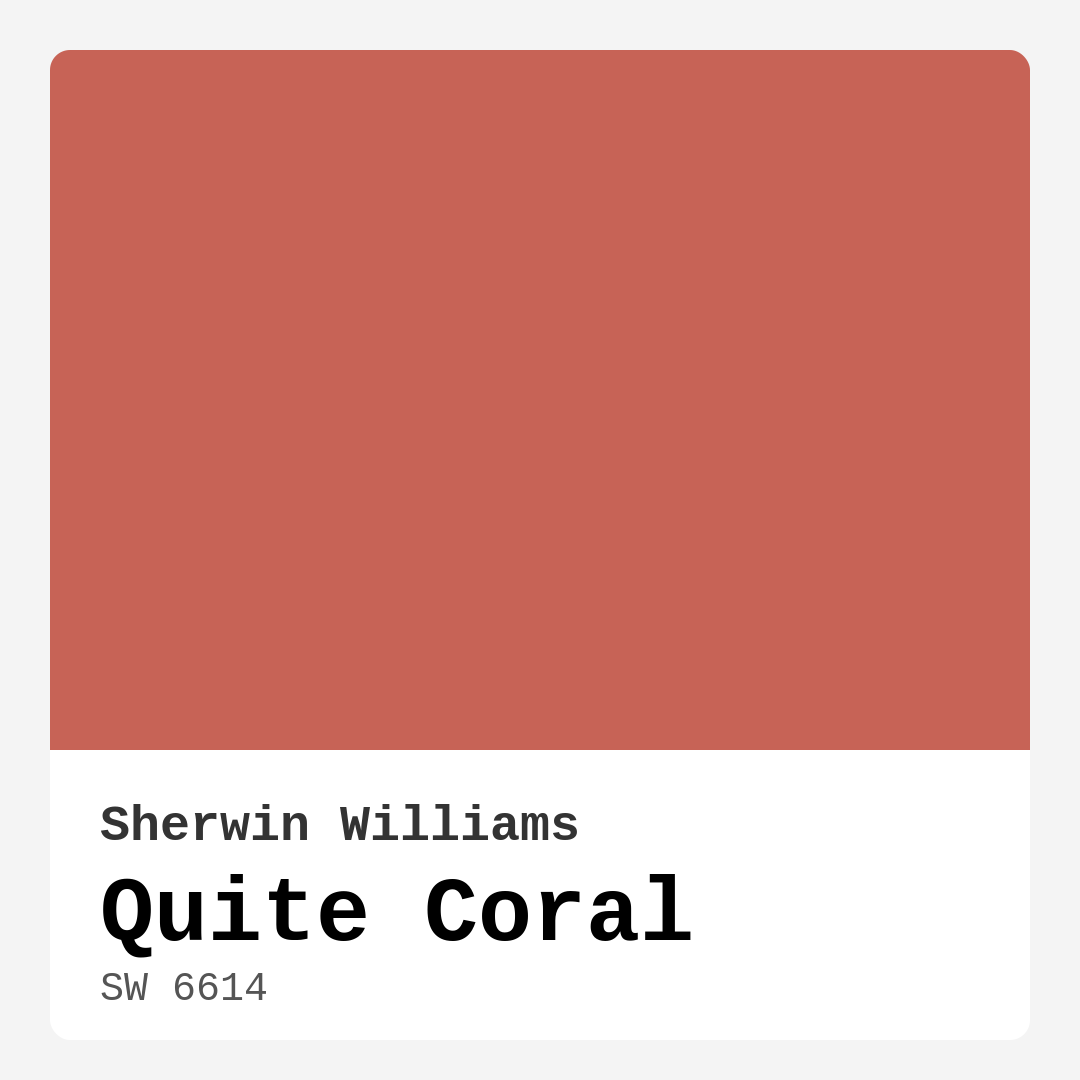
Color Preview & Key Details
| HEX Code | #C76356 |
| RGB | 199, 99, 86 |
| LRV | 75% |
| Undertone | Red |
| Finish Options | Flat, Satin, Semi-Gloss |
Picture this: you walk into your living room after a long day, and the walls greet you with a warm, inviting hue that instantly lifts your spirits. This is the magic of Quite Coral, a vibrant paint color from Sherwin Williams. It’s not just about aesthetics; it’s about creating a space that feels like home, a space that reflects your personality and warmth. So, let’s dive into what makes Quite Coral such a standout choice for your next home project.
Quite Coral, with its charming blend of coral and earthy undertones, is a shade that radiates energy and warmth. This warm red hue has a hex code of #C76356 and an RGB value of 199, 99, 86. With a Light Reflectance Value (LRV) of 75%, this color reflects a generous amount of light, making it ideal for various rooms in your home. When you apply Quite Coral, you’re not just painting walls; you’re infusing your space with life and inviting warmth.
One of the best things about Quite Coral is its versatility. Whether you’re looking to refresh your living room, bedroom, kitchen, dining room, or entryway, this color fits beautifully into a range of decor styles. Its vibrant yet earthy quality makes it an excellent choice for coastal, bohemian, modern, eclectic, and tropical aesthetics. You’ll find that it pairs well with a variety of other colors, giving you the freedom to mix and match with ease.
Thinking about where to use Quite Coral? Let’s explore that. For living rooms, this color can create a cozy and inviting atmosphere that’s perfect for hosting friends and family. In a bedroom, it can evoke a sense of warmth that wraps around you like a comforting hug. When used in the kitchen or dining room, Quite Coral can spark joy and energy, making meals feel more festive. Even in an entryway, it sets a cheerful tone, welcoming you home with open arms.
Now, you might be wondering about the application process. The good news is that Quite Coral is incredibly beginner-friendly. Whether you’re using a roller or a brush, you’ll find that it goes on smoothly and dries quickly. It requires only one to two coats for good coverage, making your project efficient without sacrificing quality. Plus, it’s touch-up friendly, which means any minor mishaps can be easily fixed, so you don’t have to stress about perfection.
When it comes to durability, Quite Coral is highly washable, making it an excellent choice for high-traffic areas. With its low VOC level, it’s also a healthier choice for your home, ensuring that you’re not compromising air quality while beautifying your space. If you have kids or pets, you’ll appreciate this aspect even more. You can wipe off any smudges or stains without a second thought.
Let’s discuss color pairings because how Quite Coral interacts with other shades can truly elevate your design. For a fresh and airy look, consider combining Quite Coral with soft whites or light greys. This will allow the coral to pop while maintaining a balanced feel to the room. If you’re feeling adventurous, deep navy blue or teal can create a stunning contrast that adds depth and sophistication. Earthy tones like olive green or sandy beige can complement Quite Coral beautifully, enhancing its warmth while grounding the overall look.
You might be concerned about using Quite Coral in smaller spaces. Rest assured, this color can work wonders even in compact areas. Its warm undertones help make a room feel more inviting, and with the right balance of natural light, it can brighten up any nook. If you’re thinking about using it in a small room, consider pairing it with lighter accents to maintain an open and airy feel.
The undertones of Quite Coral are also worth noting. Leaning toward red, these subtle shades give the color its depth and complexity. When testing it in your home, observe how it interacts with your existing furniture and decor. The way light plays off its undertones can change its appearance throughout the day, making it crucial to evaluate it in various lighting conditions before making a final decision.
Speaking of light, the effect of natural light on Quite Coral can be quite transformative. In bright rooms, it bursts with vibrancy, while in dimmer settings, it softens into a cozy, muted tone, perfect for creating a relaxed ambiance. This adaptability makes Quite Coral an ideal candidate for open-concept layouts, where lighting can vary from one area to another.
As you embark on your painting journey, remember that selecting a color is just the beginning. Think about the finishes you want to use. Quite Coral comes in flat, satin, and semi-gloss options. Satin or semi-gloss finishes can be particularly effective in kitchens and dining areas, as they provide a bit of sheen that’s easy to clean while still maintaining that cozy vibe.
Lastly, consider the trim and furniture that will accompany your walls. Quite Coral pairs beautifully with classic white trim or even cool trim colors. If you have wood trim, it complements that warmth in a way that feels both natural and sophisticated.
In conclusion, Quite Coral is more than just a paint color; it’s an experience waiting to transform your space. Its warm, inviting hue can energize and comfort, creating a home that reflects your style and personality. Whether you choose to embrace it fully across a room or use it as an accent, Quite Coral promises to deliver a touch of joy and warmth to your home. So, why wait? Dive into the world of color and let Quite Coral bring your spaces to life!
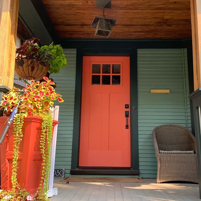
Real Room Photo of Quite Coral SW 6614
Undertones of Quite Coral ?
The undertones of Quite Coral are a key aspect of its character, leaning towards Red. These subtle underlying hues are what give the color its depth and complexity. For example, a gray with a blue undertone will feel cooler and more modern, while one with a brown undertone will feel warmer and more traditional. It’s essential to test this paint in your home and observe it next to your existing furniture, flooring, and decor to see how these undertones interact and reveal themselves throughout the day.
HEX value: #C76356
RGB code: 199, 99, 86
Is Quite Coral Cool or Warm?
Quite Coral is considered a warm paint color. This characteristic plays a huge role in the overall feel of a room. Warm colors, like this one, tend to create a cozy, inviting, and energetic atmosphere, making them great for social spaces like living rooms and dining rooms. In contrast, cool colors often evoke a sense of calm and serenity, which is why they are popular in bedrooms and bathrooms. The warmth of Quite Coral means it will pair beautifully with corresponding decor elements.
Understanding Color Properties and Interior Design Tips
Hue refers to a specific position on the color wheel, measured in degrees from 0 to 360. Each degree represents a different pure color:
- 0° represents red
- 120° represents green
- 240° represents blue
Saturation describes the intensity or purity of a color and is expressed as a percentage:
- At 0%, the color appears completely desaturated—essentially a shade of gray
- At 100%, the color is at its most vivid and vibrant
Lightness indicates how light or dark a color is, also expressed as a percentage:
- 0% lightness results in black
- 100% lightness results in white
Using Warm Colors in Interior Design
Warm hues—such as reds, oranges, yellows, warm beiges, and greiges—are excellent choices for creating inviting and energetic spaces. These colors are particularly well-suited for:
- Kitchens, living rooms, and bathrooms, where warmth enhances comfort and sociability
- Large rooms, where warm tones can help reduce the sense of emptiness and make the space feel more intimate
For example:
- Warm beige shades provide a cozy, inviting atmosphere, ideal for living rooms, bedrooms, and hallways.
- Warm greige (a mix of beige and gray) offers the warmth of beige with the modern appeal of gray, making it a versatile backdrop for dining areas, bedrooms, and living spaces.
However, be mindful when using warm light tones in rooms with limited natural light. These shades may appear muted or even take on an unpleasant yellowish tint. To avoid a dull or flat appearance:
- Add depth by incorporating richer tones like deep greens, charcoal, or chocolate brown
- Use textured elements such as curtains, rugs, or cushions to bring dimension to the space
Pro Tip: Achieving Harmony with Warm and Cool Color Balance
To create a well-balanced and visually interesting interior, mix warm and cool tones strategically. This contrast adds depth and harmony to your design.
- If your walls feature warm hues, introduce cool-colored accents such as blue or green furniture, artwork, or accessories to create contrast.
- For a polished look, consider using a complementary color scheme, which pairs colors opposite each other on the color wheel (e.g., red with green, orange with blue).
This thoughtful mix not only enhances visual appeal but also creates a space that feels both dynamic and cohesive.
Light Temperature Affects on Quite Coral
Natural Light
Natural daylight changes in color temperature as the sun moves across the sky. At sunrise and sunset, the light tends to have a warm, golden tone with a color temperature around 2000 Kelvin (K). As the day progresses and the sun rises higher, the light becomes cooler and more neutral. Around midday, especially when the sky is clear, natural light typically reaches its peak brightness and shifts to a cooler tone, ranging from 5500 to 6500 Kelvin. This midday light is close to what we perceive as pure white or daylight-balanced light.
These shifts in natural light can significantly influence how colors appear in a space, which is why designers often consider both the time of day and the orientation of windows when planning interior color schemes.
Artificial Light
When choosing artificial lighting, pay close attention to the color temperature, measured in Kelvin (K). This determines how warm or cool the light will appear. Lower temperatures, around 2700K, give off a warm, yellow glow often used in living rooms or bedrooms. Higher temperatures, above 5000K, create a cool, bluish light similar to daylight, commonly used in kitchens, offices, or task areas.
Use the slider to see how lighting temperature can affect the appearance of a surface or color throughout a space.


4800K
LRV of Quite Coral
The Light Reflectance Value (LRV) of Quite Coral is 75%, which places it in the Light category. This means it Reflects a high amount of light. Understanding a paint’s LRV is crucial for predicting how it will look in your space. A higher LRV indicates a lighter color that reflects more light, making rooms feel larger and brighter. A lower LRV signifies a darker color that absorbs more light, creating a cozier, more intimate atmosphere. Always consider the natural and artificial lighting in your room when selecting a paint color based on its LRV.
Detailed Review of Quite Coral
Additional Paint Characteristics
Ideal Rooms
Bedroom, Dining Room, Entryway, Kitchen, Living Room
Decor Styles
Bohemian, Coastal, Eclectic, Modern, Tropical
Coverage
Good (1–2 Coats), Touch-Up Friendly
Ease of Application
Beginner Friendly, Brush Smooth, Fast-Drying, Roller-Ready
Washability
Highly Washable, Washable, Wipeable
VOC Level
Low VOC
Best Use
Accent Wall, Furniture, Interior Walls
Room Suitability
Bedroom, Dining Room, Entryway, Kitchen, Living Room
Tone Tag
Bold, Earthy, Warm
Finish Type
Satin, Semi-Gloss
Paint Performance
Easy Touch-Up, High Coverage, Low Odor, Quick Drying
Use Cases
Best for Open Concept, Best for Rentals, Best for Small Spaces, Designer Favorite
Mood
Cozy, Energizing, Inviting
Trim Pairing
Complements Cool Trim, Good with Wood Trim, Pairs with White Dove
Quite Coral is more than just a color; it’s an experience. When applied, this shade brings a lively yet cozy atmosphere to any room. Its warm undertones make it versatile, allowing it to pair beautifully with both light and dark furniture. The application process is straightforward, and it achieves a stunning finish that can elevate the overall aesthetic of your space. Whether used as an accent wall or throughout a room, Quite Coral radiates warmth and charm. Just remember, the lighting can affect how this color appears, so it’s wise to test it in different areas before making a final decision. Overall, Quite Coral is a fantastic choice for anyone looking to infuse their home with personality and warmth.
Pros & Cons of SW 6614 Quite Coral
Pros
Cons
Colors that go with Sherwin Williams Quite Coral
FAQ on SW 6614 Quite Coral
Can Quite Coral be used in small spaces?
Absolutely! Quite Coral can work wonders in small spaces, as its warm undertones can make a room feel more inviting. Just be mindful of natural light; it can brighten up the space and prevent it from feeling too enclosed. If you’re using it in a smaller area, consider pairing it with lighter accents to create balance.
What colors pair well with Quite Coral?
Quite Coral pairs beautifully with a variety of colors. For a fresh look, combine it with soft whites or light greys. If you’re feeling bold, try navy blue or deep teal for contrast. Earthy tones like olive green or sandy beige can also complement Quite Coral nicely, enhancing its warm vibe while keeping the overall look grounded.
Comparisons Quite Coral with other colors
Quite Coral SW 6614 vs Cavern Clay SW 7701
| Attribute | Quite Coral SW 6614 | Cavern Clay SW 7701 |
|---|---|---|
| Color Name | Quite Coral SW 6614 | Cavern Clay SW 7701 |
| Color | ||
| Hue | Red | Red |
| Brightness | Dark | Dark |
| RGB | 199, 99, 86 | 172, 107, 83 |
| LRV | 75% | 30% |
| Finish Type | Satin, Semi-Gloss | Eggshell, Matte, Satin |
| Finish Options | Flat, Satin, Semi-Gloss | Eggshell, Matte, Satin |
| Ideal Rooms | Bedroom, Dining Room, Entryway, Kitchen, Living Room | Bedroom, Dining Room, Home Office, Kitchen, Living Room |
| Decor Styles | Bohemian, Coastal, Eclectic, Modern, Tropical | Bohemian, Contemporary, Modern Farmhouse, Rustic, Transitional |
| Coverage | Good (1–2 Coats), Touch-Up Friendly | Good (1–2 Coats), Touch-Up Friendly |
| Ease of Application | Beginner Friendly, Brush Smooth, Fast-Drying, Roller-Ready | Beginner Friendly, Brush Smooth, Roller-Ready |
| Washability | Highly Washable, Washable, Wipeable | Washable, Wipeable |
| Room Suitability | Bedroom, Dining Room, Entryway, Kitchen, Living Room | Bedroom, Dining Room, Home Office, Kitchen, Living Room |
| Tone | Bold, Earthy, Warm | Earthy, Muted, Warm |
| Paint Performance | Easy Touch-Up, High Coverage, Low Odor, Quick Drying | Easy Touch-Up, Low Odor, Scuff Resistant |
Quite Coral SW 6614 vs Burgundy SW 6300
| Attribute | Quite Coral SW 6614 | Burgundy SW 6300 |
|---|---|---|
| Color Name | Quite Coral SW 6614 | Burgundy SW 6300 |
| Color | ||
| Hue | Red | Red |
| Brightness | Dark | Dark |
| RGB | 199, 99, 86 | 99, 51, 62 |
| LRV | 75% | 6% |
| Finish Type | Satin, Semi-Gloss | Eggshell, Matte, Satin |
| Finish Options | Flat, Satin, Semi-Gloss | Eggshell, Matte, Satin |
| Ideal Rooms | Bedroom, Dining Room, Entryway, Kitchen, Living Room | Bedroom, Dining Room, Home Office, Living Room |
| Decor Styles | Bohemian, Coastal, Eclectic, Modern, Tropical | Contemporary, Rustic, Traditional, Vintage |
| Coverage | Good (1–2 Coats), Touch-Up Friendly | Good (1–2 Coats), Touch-Up Friendly |
| Ease of Application | Beginner Friendly, Brush Smooth, Fast-Drying, Roller-Ready | Beginner Friendly, Brush Smooth, Fast-Drying, Roller-Ready |
| Washability | Highly Washable, Washable, Wipeable | Washable, Wipeable |
| Room Suitability | Bedroom, Dining Room, Entryway, Kitchen, Living Room | Bedroom, Dining Room, Home Office, Living Room |
| Tone | Bold, Earthy, Warm | Bold, Deep, Warm |
| Paint Performance | Easy Touch-Up, High Coverage, Low Odor, Quick Drying | High Coverage, Low Odor, Quick Drying |
Quite Coral SW 6614 vs Rookwood Red SW 2802
| Attribute | Quite Coral SW 6614 | Rookwood Red SW 2802 |
|---|---|---|
| Color Name | Quite Coral SW 6614 | Rookwood Red SW 2802 |
| Color | ||
| Hue | Red | Red |
| Brightness | Dark | Dark |
| RGB | 199, 99, 86 | 98, 47, 45 |
| LRV | 75% | 6% |
| Finish Type | Satin, Semi-Gloss | Eggshell, Matte, Satin |
| Finish Options | Flat, Satin, Semi-Gloss | Eggshell, Matte, Satin |
| Ideal Rooms | Bedroom, Dining Room, Entryway, Kitchen, Living Room | Bedroom, Dining Room, Home Office, Living Room |
| Decor Styles | Bohemian, Coastal, Eclectic, Modern, Tropical | Arts and Crafts, Modern Farmhouse, Rustic, Traditional |
| Coverage | Good (1–2 Coats), Touch-Up Friendly | Good (1–2 Coats), Touch-Up Friendly |
| Ease of Application | Beginner Friendly, Brush Smooth, Fast-Drying, Roller-Ready | Beginner Friendly, Brush Smooth, Fast-Drying, Roller-Ready |
| Washability | Highly Washable, Washable, Wipeable | Washable, Wipeable |
| Room Suitability | Bedroom, Dining Room, Entryway, Kitchen, Living Room | Bedroom, Dining Room, Living Room |
| Tone | Bold, Earthy, Warm | Deep, Earthy, Warm |
| Paint Performance | Easy Touch-Up, High Coverage, Low Odor, Quick Drying | Easy Touch-Up, High Coverage, Low Odor |
Quite Coral SW 6614 vs Spiced Cider SW 7702
| Attribute | Quite Coral SW 6614 | Spiced Cider SW 7702 |
|---|---|---|
| Color Name | Quite Coral SW 6614 | Spiced Cider SW 7702 |
| Color | ||
| Hue | Red | Red |
| Brightness | Dark | Dark |
| RGB | 199, 99, 86 | 176, 120, 92 |
| LRV | 75% | 20% |
| Finish Type | Satin, Semi-Gloss | Eggshell, Satin |
| Finish Options | Flat, Satin, Semi-Gloss | Eggshell, Satin, Semi-Gloss |
| Ideal Rooms | Bedroom, Dining Room, Entryway, Kitchen, Living Room | Bedroom, Dining Room, Kitchen, Living Room |
| Decor Styles | Bohemian, Coastal, Eclectic, Modern, Tropical | Modern Farmhouse, Rustic, Traditional, Transitional |
| Coverage | Good (1–2 Coats), Touch-Up Friendly | Good (1–2 Coats), Touch-Up Friendly |
| Ease of Application | Beginner Friendly, Brush Smooth, Fast-Drying, Roller-Ready | Beginner Friendly, Brush Smooth, Roller-Ready |
| Washability | Highly Washable, Washable, Wipeable | Scrubbable, Washable |
| Room Suitability | Bedroom, Dining Room, Entryway, Kitchen, Living Room | Bedroom, Dining Room, Kitchen, Living Room |
| Tone | Bold, Earthy, Warm | Earthy, Inviting, Warm |
| Paint Performance | Easy Touch-Up, High Coverage, Low Odor, Quick Drying | Easy Touch-Up, High Coverage, Low Odor |
Quite Coral SW 6614 vs Carnelian SW 7580
| Attribute | Quite Coral SW 6614 | Carnelian SW 7580 |
|---|---|---|
| Color Name | Quite Coral SW 6614 | Carnelian SW 7580 |
| Color | ||
| Hue | Red | Red |
| Brightness | Dark | Dark |
| RGB | 199, 99, 86 | 87, 62, 62 |
| LRV | 75% | 20% |
| Finish Type | Satin, Semi-Gloss | Eggshell, Satin |
| Finish Options | Flat, Satin, Semi-Gloss | Eggshell, Matte, Satin |
| Ideal Rooms | Bedroom, Dining Room, Entryway, Kitchen, Living Room | Bedroom, Dining Room, Hallway, Home Office, Living Room |
| Decor Styles | Bohemian, Coastal, Eclectic, Modern, Tropical | Bohemian, Modern Farmhouse, Rustic, Traditional |
| Coverage | Good (1–2 Coats), Touch-Up Friendly | Good (1–2 Coats), Touch-Up Friendly |
| Ease of Application | Beginner Friendly, Brush Smooth, Fast-Drying, Roller-Ready | Beginner Friendly, Brush Smooth, Fast-Drying, Roller-Ready |
| Washability | Highly Washable, Washable, Wipeable | Washable, Wipeable |
| Room Suitability | Bedroom, Dining Room, Entryway, Kitchen, Living Room | Bedroom, Dining Room, Home Office, Living Room |
| Tone | Bold, Earthy, Warm | Deep, Earthy, Warm |
| Paint Performance | Easy Touch-Up, High Coverage, Low Odor, Quick Drying | Easy Touch-Up, Low Odor, Quick Drying |
Quite Coral SW 6614 vs Sommelier SW 7595
| Attribute | Quite Coral SW 6614 | Sommelier SW 7595 |
|---|---|---|
| Color Name | Quite Coral SW 6614 | Sommelier SW 7595 |
| Color | ||
| Hue | Red | Red |
| Brightness | Dark | Dark |
| RGB | 199, 99, 86 | 93, 55, 54 |
| LRV | 75% | 6% |
| Finish Type | Satin, Semi-Gloss | Eggshell, Matte, Satin |
| Finish Options | Flat, Satin, Semi-Gloss | Eggshell, Matte, Satin |
| Ideal Rooms | Bedroom, Dining Room, Entryway, Kitchen, Living Room | Bedroom, Dining Room, Home Office, Living Room |
| Decor Styles | Bohemian, Coastal, Eclectic, Modern, Tropical | Modern, Rustic, Traditional, Transitional |
| Coverage | Good (1–2 Coats), Touch-Up Friendly | Good (1–2 Coats), Touch-Up Friendly |
| Ease of Application | Beginner Friendly, Brush Smooth, Fast-Drying, Roller-Ready | Brush Smooth, Fast-Drying, Low Splatter, Roller-Ready |
| Washability | Highly Washable, Washable, Wipeable | Washable, Wipeable |
| Room Suitability | Bedroom, Dining Room, Entryway, Kitchen, Living Room | Bedroom, Dining Room, Home Office, Living Room |
| Tone | Bold, Earthy, Warm | Deep, Earthy, Warm |
| Paint Performance | Easy Touch-Up, High Coverage, Low Odor, Quick Drying | Easy Touch-Up, High Coverage, Low Odor, Scuff Resistant |
Quite Coral SW 6614 vs Sun Dried Tomato SW 7585
| Attribute | Quite Coral SW 6614 | Sun Dried Tomato SW 7585 |
|---|---|---|
| Color Name | Quite Coral SW 6614 | Sun Dried Tomato SW 7585 |
| Color | ||
| Hue | Red | Red |
| Brightness | Dark | Dark |
| RGB | 199, 99, 86 | 105, 43, 43 |
| LRV | 75% | 20% |
| Finish Type | Satin, Semi-Gloss | Matte, Satin, Semi-Gloss |
| Finish Options | Flat, Satin, Semi-Gloss | Matte, Satin, Semi-Gloss |
| Ideal Rooms | Bedroom, Dining Room, Entryway, Kitchen, Living Room | Dining Room, Home Office, Kitchen, Living Room |
| Decor Styles | Bohemian, Coastal, Eclectic, Modern, Tropical | Industrial, Mediterranean, Modern Farmhouse, Rustic |
| Coverage | Good (1–2 Coats), Touch-Up Friendly | Good (1–2 Coats), Touch-Up Friendly |
| Ease of Application | Beginner Friendly, Brush Smooth, Fast-Drying, Roller-Ready | Beginner Friendly, Brush Smooth, Roller-Ready |
| Washability | Highly Washable, Washable, Wipeable | Washable, Wipeable |
| Room Suitability | Bedroom, Dining Room, Entryway, Kitchen, Living Room | Dining Room, Home Office, Kitchen, Living Room |
| Tone | Bold, Earthy, Warm | Bold, Earthy, Warm |
| Paint Performance | Easy Touch-Up, High Coverage, Low Odor, Quick Drying | Easy Touch-Up, High Coverage, Low Odor |
Quite Coral SW 6614 vs Rustic Red SW 7593
| Attribute | Quite Coral SW 6614 | Rustic Red SW 7593 |
|---|---|---|
| Color Name | Quite Coral SW 6614 | Rustic Red SW 7593 |
| Color | ||
| Hue | Red | Red |
| Brightness | Dark | Dark |
| RGB | 199, 99, 86 | 112, 50, 41 |
| LRV | 75% | 12% |
| Finish Type | Satin, Semi-Gloss | Matte, Satin |
| Finish Options | Flat, Satin, Semi-Gloss | Matte, Satin, Semi-Gloss |
| Ideal Rooms | Bedroom, Dining Room, Entryway, Kitchen, Living Room | Bedroom, Dining Room, Hallway, Living Room |
| Decor Styles | Bohemian, Coastal, Eclectic, Modern, Tropical | Country, Farmhouse, Rustic, Traditional |
| Coverage | Good (1–2 Coats), Touch-Up Friendly | Good (1–2 Coats) |
| Ease of Application | Beginner Friendly, Brush Smooth, Fast-Drying, Roller-Ready | Beginner Friendly, Brush Smooth, Fast-Drying, Roller-Ready |
| Washability | Highly Washable, Washable, Wipeable | Washable, Wipeable |
| Room Suitability | Bedroom, Dining Room, Entryway, Kitchen, Living Room | Bedroom, Dining Room, Living Room |
| Tone | Bold, Earthy, Warm | Deep, Earthy, Warm |
| Paint Performance | Easy Touch-Up, High Coverage, Low Odor, Quick Drying | Easy Touch-Up, Low Odor, Quick Drying |
Quite Coral SW 6614 vs Roycroft Copper Red SW 2839
| Attribute | Quite Coral SW 6614 | Roycroft Copper Red SW 2839 |
|---|---|---|
| Color Name | Quite Coral SW 6614 | Roycroft Copper Red SW 2839 |
| Color | ||
| Hue | Red | Red |
| Brightness | Dark | Dark |
| RGB | 199, 99, 86 | 123, 55, 40 |
| LRV | 75% | 12% |
| Finish Type | Satin, Semi-Gloss | Matte, Satin, Semi-Gloss |
| Finish Options | Flat, Satin, Semi-Gloss | Matte, Satin, Semi-Gloss |
| Ideal Rooms | Bedroom, Dining Room, Entryway, Kitchen, Living Room | Bedroom, Dining Room, Entryway, Home Office, Living Room |
| Decor Styles | Bohemian, Coastal, Eclectic, Modern, Tropical | Arts and Crafts, Eclectic, Farmhouse, Rustic, Traditional |
| Coverage | Good (1–2 Coats), Touch-Up Friendly | Good (1–2 Coats), Touch-Up Friendly |
| Ease of Application | Beginner Friendly, Brush Smooth, Fast-Drying, Roller-Ready | Beginner Friendly, Brush Smooth, Roller-Ready |
| Washability | Highly Washable, Washable, Wipeable | Stain Resistant, Washable |
| Room Suitability | Bedroom, Dining Room, Entryway, Kitchen, Living Room | Bedroom, Dining Room, Entryway, Home Office, Living Room |
| Tone | Bold, Earthy, Warm | Deep, Earthy, Warm |
| Paint Performance | Easy Touch-Up, High Coverage, Low Odor, Quick Drying | Easy Touch-Up, High Coverage, Low Odor |
Quite Coral SW 6614 vs Rookwood Dark Red SW 2801
| Attribute | Quite Coral SW 6614 | Rookwood Dark Red SW 2801 |
|---|---|---|
| Color Name | Quite Coral SW 6614 | Rookwood Dark Red SW 2801 |
| Color | ||
| Hue | Red | Red |
| Brightness | Dark | Dark |
| RGB | 199, 99, 86 | 75, 41, 41 |
| LRV | 75% | 6% |
| Finish Type | Satin, Semi-Gloss | Matte, Satin, Semi-Gloss |
| Finish Options | Flat, Satin, Semi-Gloss | Matte, Satin, Semi-Gloss |
| Ideal Rooms | Bedroom, Dining Room, Entryway, Kitchen, Living Room | Bedroom, Dining Room, Home Office, Living Room |
| Decor Styles | Bohemian, Coastal, Eclectic, Modern, Tropical | Farmhouse, Modern, Rustic, Traditional |
| Coverage | Good (1–2 Coats), Touch-Up Friendly | Good (1–2 Coats) |
| Ease of Application | Beginner Friendly, Brush Smooth, Fast-Drying, Roller-Ready | Beginner Friendly, Brush Smooth, Roller-Ready |
| Washability | Highly Washable, Washable, Wipeable | Highly Washable, Washable |
| Room Suitability | Bedroom, Dining Room, Entryway, Kitchen, Living Room | Bedroom, Dining Room, Home Office, Living Room |
| Tone | Bold, Earthy, Warm | Deep, Earthy, Warm |
| Paint Performance | Easy Touch-Up, High Coverage, Low Odor, Quick Drying | Easy Touch-Up, High Coverage, Low Odor |
Official Page of Sherwin Williams Quite Coral SW 6614