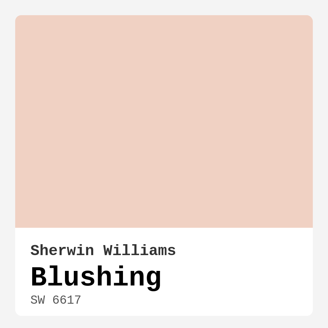
Color Preview & Key Details
| HEX Code | #F0D1C3 |
| RGB | 240, 209, 195 |
| LRV | 69% |
| Undertone | Red |
| Finish Options | Eggshell, Matte, Satin, Semi-Gloss |
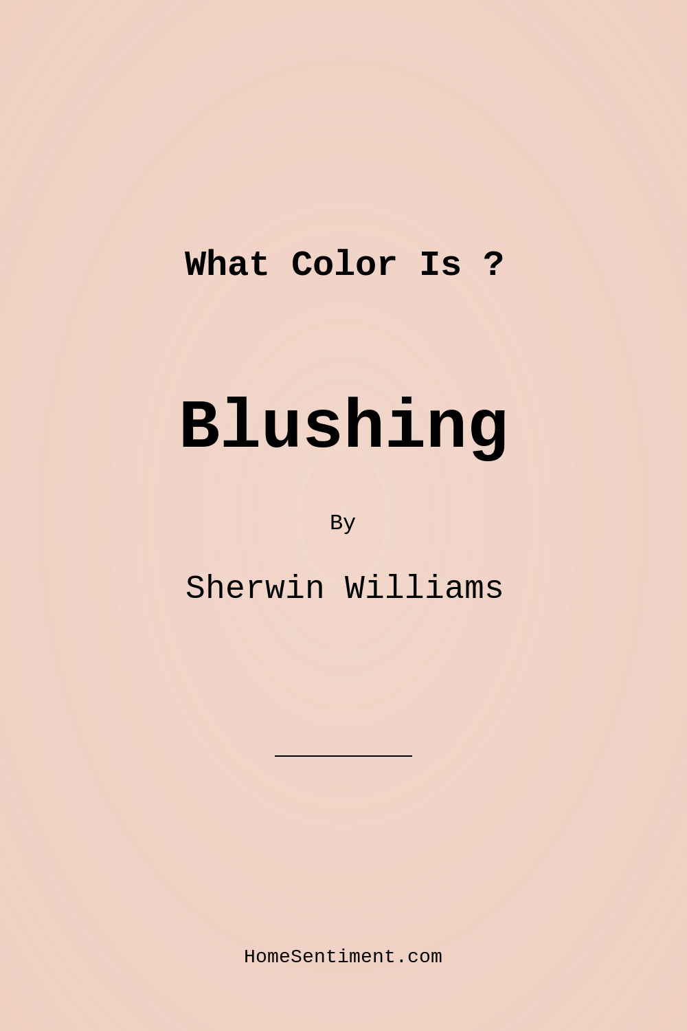
Imagine stepping into a room that instantly wraps you in warmth and comfort, a space that feels inviting yet elegant. That’s the magic of the color Blushing from Sherwin Williams. With its delicate and soft hue, reminiscent of a gentle blush on skin, Blushing (SW 6617) is a peachy pink that effortlessly elevates any interior.
Choosing the right paint color can sometimes feel overwhelming. With so many options out there, it’s essential to find one that resonates with your personal taste and the ambiance you want to create. Blushing stands out as a versatile choice, making it a favorite among homeowners and designers alike. It’s a hue that invites you to explore its possibilities and see how it can transform your space.
When you think of Blushing, envision a warm and cozy atmosphere. This color’s warmth comes from its subtle red undertones, which give it depth while maintaining a light and airy feel. With a Light Reflectance Value (LRV) of 69%, it reflects a significant amount of light, creating an uplifting vibe. This quality is especially beneficial in spaces that don’t receive a lot of natural light, as it can brighten things up and make them feel more inviting.
One of the most appealing aspects of Blushing is how adaptable it is. It fits beautifully into a variety of decor styles, whether you lean towards modern, farmhouse, bohemian, or traditional aesthetics. The warmth of Blushing pairs wonderfully with both light and dark furnishings, making it easy to incorporate into your existing decor. Picture it in a cozy bedroom, creating a serene sanctuary where you can unwind after a long day, or in a dining room, setting the perfect backdrop for family gatherings and intimate dinners.
If you’re considering Blushing for your living room, you’re in for a treat. This color fosters an inviting atmosphere, making it perfect for entertaining guests or simply enjoying a quiet evening at home. For a touch of contrast, consider pairing it with white or cool-toned trims. This combination allows Blushing to shine while providing a fresh and modern edge.
Now, let’s talk about application. If you’re a DIY enthusiast or just starting, you’ll appreciate that Blushing is beginner-friendly. It applies smoothly and has excellent coverage, typically needing just one or two coats for a vibrant finish. Plus, it dries quickly, which is a significant advantage if you’re eager to see your transformation come to life.
In terms of finishes, Blushing offers a range of options—eggshell, satin, matte, and semi-gloss—allowing you to select the sheen that best fits your vision. An eggshell finish is perfect for high-traffic areas, as it’s durable and easy to clean. If you’re looking for something softer, a matte finish could create that serene, elegant vibe in your bedroom or dining area. On the other hand, satin and semi-gloss finishes can add a bit of sophistication, especially in spaces where you want a touch of shine.
While Blushing is undeniably warm and inviting, it’s worth noting that it may not be the best fit for every space. In very small or dark rooms, it can feel overwhelming. If you’re considering it for such areas, balance is key. Pairing it with lighter trims and accents can alleviate any heaviness and create a more harmonious look.
The washability of Blushing is another factor that enhances its appeal. It’s highly washable, so you don’t have to worry about scuffs or stains ruining your beautifully painted walls. This is especially important in homes with kids or pets, where walls are often subjected to wear and tear.
As with any color, understanding its undertones is crucial. Blushing’s red undertones are what bring it to life, adding warmth and a touch of complexity. When testing this paint in your home, observe how these undertones interact with your existing decor and the natural light throughout the day. It can be fascinating to see how a color can shift and change based on its surroundings.
Blushing is often compared to other shades like Peachy Keen, Blush Pink, and Coral Delight. These equivalent colors share a similar warmth and charm but may differ slightly in saturation or brightness. If you’re looking for something a bit different, exploring these shades might yield a similar vibe while allowing for a distinctive twist.
When it comes to décor, Blushing can be paired with a variety of complementary shades. Consider teaming it with greens to create a fresh, balanced look or deeper hues for a more dramatic effect. Colors like SW 6504, SW 9058, and SW 9146 work beautifully alongside Blushing, amplifying its warmth and creating a cohesive palette.
Blushing isn’t just about aesthetics; it also contributes to the mood of your space. The cozy, inviting feel it brings can transform a house into a home, making it a designer favorite for nurseries and bedrooms alike. The soft pastel tone evokes a sense of calm, perfect for creating restful environments.
Whether you’re painting an entire room or just an accent wall, Blushing is an excellent choice. Its versatility and charm make it suitable for a variety of spaces, from living rooms to dining areas and even nurseries. The color invites comfort and relaxation, fostering an atmosphere where you can truly unwind.
In conclusion, Blushing by Sherwin Williams is more than just a paint color; it’s an experience waiting to unfold in your home. With its warm undertones, excellent coverage, and adaptability across styles, it’s a hue that can elevate your interior design game. Take the plunge, and let Blushing transform your space into a welcoming retreat that feels distinctly yours. After all, your home should reflect your personality, and with a color like Blushing, it’s easy to create a space that’s both beautiful and inviting.
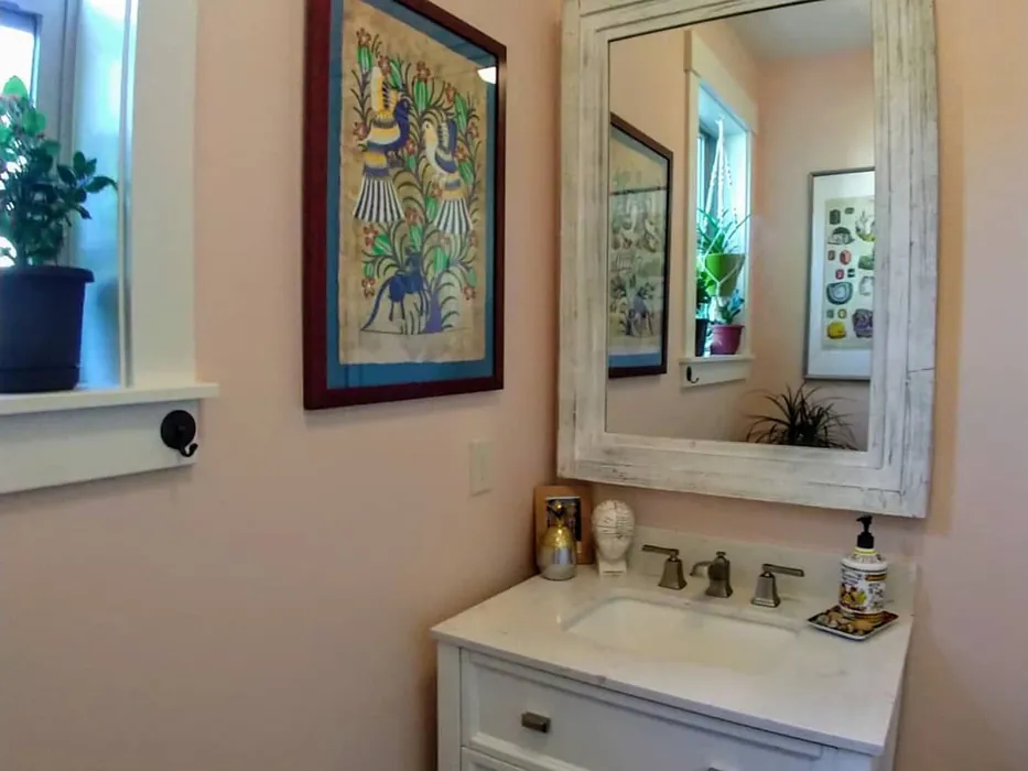
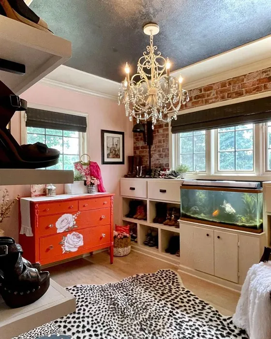
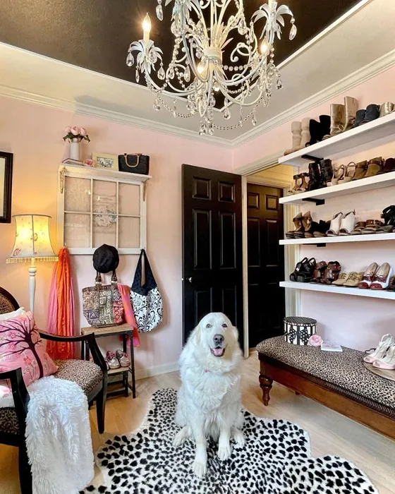
Real Room Photo of Blushing SW 6617

Undertones of Blushing ?
The undertones of Blushing are a key aspect of its character, leaning towards Red. These subtle underlying hues are what give the color its depth and complexity. For example, a gray with a blue undertone will feel cooler and more modern, while one with a brown undertone will feel warmer and more traditional. It’s essential to test this paint in your home and observe it next to your existing furniture, flooring, and decor to see how these undertones interact and reveal themselves throughout the day.
HEX value: #F0D1C3
RGB code: 240, 209, 195
Is Blushing Cool or Warm?
Blushing is undeniably warm, radiating a gentle warmth that makes spaces feel inviting and comfortable.
Understanding Color Properties and Interior Design Tips
Hue refers to a specific position on the color wheel, measured in degrees from 0 to 360. Each degree represents a different pure color:
- 0° represents red
- 120° represents green
- 240° represents blue
Saturation describes the intensity or purity of a color and is expressed as a percentage:
- At 0%, the color appears completely desaturated—essentially a shade of gray
- At 100%, the color is at its most vivid and vibrant
Lightness indicates how light or dark a color is, also expressed as a percentage:
- 0% lightness results in black
- 100% lightness results in white
Using Warm Colors in Interior Design
Warm hues—such as reds, oranges, yellows, warm beiges, and greiges—are excellent choices for creating inviting and energetic spaces. These colors are particularly well-suited for:
- Kitchens, living rooms, and bathrooms, where warmth enhances comfort and sociability
- Large rooms, where warm tones can help reduce the sense of emptiness and make the space feel more intimate
For example:
- Warm beige shades provide a cozy, inviting atmosphere, ideal for living rooms, bedrooms, and hallways.
- Warm greige (a mix of beige and gray) offers the warmth of beige with the modern appeal of gray, making it a versatile backdrop for dining areas, bedrooms, and living spaces.
However, be mindful when using warm light tones in rooms with limited natural light. These shades may appear muted or even take on an unpleasant yellowish tint. To avoid a dull or flat appearance:
- Add depth by incorporating richer tones like deep greens, charcoal, or chocolate brown
- Use textured elements such as curtains, rugs, or cushions to bring dimension to the space
Pro Tip: Achieving Harmony with Warm and Cool Color Balance
To create a well-balanced and visually interesting interior, mix warm and cool tones strategically. This contrast adds depth and harmony to your design.
- If your walls feature warm hues, introduce cool-colored accents such as blue or green furniture, artwork, or accessories to create contrast.
- For a polished look, consider using a complementary color scheme, which pairs colors opposite each other on the color wheel (e.g., red with green, orange with blue).
This thoughtful mix not only enhances visual appeal but also creates a space that feels both dynamic and cohesive.
Light Temperature Affects on Blushing
Natural Light
Natural daylight changes in color temperature as the sun moves across the sky. At sunrise and sunset, the light tends to have a warm, golden tone with a color temperature around 2000 Kelvin (K). As the day progresses and the sun rises higher, the light becomes cooler and more neutral. Around midday, especially when the sky is clear, natural light typically reaches its peak brightness and shifts to a cooler tone, ranging from 5500 to 6500 Kelvin. This midday light is close to what we perceive as pure white or daylight-balanced light.
These shifts in natural light can significantly influence how colors appear in a space, which is why designers often consider both the time of day and the orientation of windows when planning interior color schemes.
Artificial Light
When choosing artificial lighting, pay close attention to the color temperature, measured in Kelvin (K). This determines how warm or cool the light will appear. Lower temperatures, around 2700K, give off a warm, yellow glow often used in living rooms or bedrooms. Higher temperatures, above 5000K, create a cool, bluish light similar to daylight, commonly used in kitchens, offices, or task areas.
Use the slider to see how lighting temperature can affect the appearance of a surface or color throughout a space.


4800K
LRV of Blushing
The Light Reflectance Value (LRV) of Blushing is 69%, which places it in the Light category. This means it Reflects a high amount of light. Understanding a paint’s LRV is crucial for predicting how it will look in your space. A higher LRV indicates a lighter color that reflects more light, making rooms feel larger and brighter. A lower LRV signifies a darker color that absorbs more light, creating a cozier, more intimate atmosphere. Always consider the natural and artificial lighting in your room when selecting a paint color based on its LRV.
Detailed Review of Blushing
Additional Paint Characteristics
Ideal Rooms
Bedroom, Dining Room, Living Room, Nursery
Decor Styles
Bohemian, Farmhouse, Modern, Traditional
Coverage
Good (1–2 Coats)
Ease of Application
Beginner Friendly, Brush Smooth, Fast-Drying, Roller-Ready
Washability
Highly Washable, Washable, Wipeable
VOC Level
Low VOC, Ultra Low VOC
Best Use
Accent Wall, Bedroom, Interior Walls, Nursery
Room Suitability
Bedroom, Dining Room, Living Room, Nursery
Tone Tag
Creamy, Pastel, Warm
Finish Type
Eggshell, Matte, Satin
Paint Performance
Easy Touch-Up, High Coverage, Low Odor, Quick Drying
Use Cases
Best for Rentals, Best for Small Spaces, Designer Favorite
Mood
Cozy, Inviting, Restful
Trim Pairing
Complements Cool Trim, Pairs with White Dove, Works with Warm Trim
Blushing is a delightful paint choice that effortlessly enhances your home’s aesthetic. Its warm undertone pairs beautifully with both light and dark furnishings, making it highly versatile. Whether you’re aiming for a cozy bedroom or a charming living room, this color can transform any space into a personal retreat. The application process is smooth, thanks to its excellent coverage; you’ll likely only need one or two coats for a vibrant finish. Plus, it stands up well against wear, ensuring your walls stay looking fresh and lovely for years to come.
Pros & Cons of SW 6617 Blushing
Pros
Cons
Colors that go with Sherwin Williams Blushing
FAQ on SW 6617 Blushing
What types of finishes are available for Blushing?
Blushing comes in several finishes, including eggshell, satin, and matte. Each finish offers a different level of sheen, allowing you to choose based on your preference and the specific room’s needs. For example, an eggshell finish is great for high-traffic areas due to its durability, while a matte finish can create a softer, more elegant look in a bedroom or dining area. If you’re looking for something with a bit more shine, the satin or semi-gloss options can add a touch of sophistication.
Is Blushing suitable for all rooms?
Yes, Blushing is quite versatile and can be used in various rooms, including living rooms, bedrooms, nurseries, and dining areas. Its warm tone promotes relaxation and comfort, making it an excellent choice for spaces where you want to unwind. However, it’s important to consider the size of the room and the amount of natural light it receives. In smaller or darker spaces, Blushing might feel a bit heavy, so pairing it with lighter trim or accents can help balance the overall look.
Comparisons Blushing with other colors
Blushing SW 6617 vs Malted Milk SW 6057
| Attribute | Blushing SW 6617 | Malted Milk SW 6057 |
|---|---|---|
| Color Name | Blushing SW 6617 | Malted Milk SW 6057 |
| Color | ||
| Hue | Pink | Pink |
| Brightness | Light | Light |
| RGB | 240, 209, 195 | 222, 202, 189 |
| LRV | 69% | 74% |
| Finish Type | Eggshell, Matte, Satin | Eggshell, Satin |
| Finish Options | Eggshell, Matte, Satin, Semi-Gloss | Eggshell, Matte, Satin |
| Ideal Rooms | Bedroom, Dining Room, Living Room, Nursery | Bedroom, Dining Room, Kitchen, Living Room, Nursery |
| Decor Styles | Bohemian, Farmhouse, Modern, Traditional | Coastal, Farmhouse, Modern, Scandinavian, Transitional |
| Coverage | Good (1–2 Coats) | Good (1–2 Coats), Touch-Up Friendly |
| Ease of Application | Beginner Friendly, Brush Smooth, Fast-Drying, Roller-Ready | Beginner Friendly, Brush Smooth, Fast-Drying, Roller-Ready |
| Washability | Highly Washable, Washable, Wipeable | Washable, Wipeable |
| Room Suitability | Bedroom, Dining Room, Living Room, Nursery | Bedroom, Dining Room, Kitchen, Living Room, Nursery |
| Tone | Creamy, Pastel, Warm | Creamy, Neutral, Warm |
| Paint Performance | Easy Touch-Up, High Coverage, Low Odor, Quick Drying | High Coverage, Low Odor, Quick Drying |
Blushing SW 6617 vs Intimate White SW 6322
| Attribute | Blushing SW 6617 | Intimate White SW 6322 |
|---|---|---|
| Color Name | Blushing SW 6617 | Intimate White SW 6322 |
| Color | ||
| Hue | Pink | Pink |
| Brightness | Light | Light |
| RGB | 240, 209, 195 | 240, 225, 216 |
| LRV | 69% | 75% |
| Finish Type | Eggshell, Matte, Satin | Eggshell, Matte, Satin |
| Finish Options | Eggshell, Matte, Satin, Semi-Gloss | Eggshell, Matte, Satin |
| Ideal Rooms | Bedroom, Dining Room, Living Room, Nursery | Bedroom, Hallway, Home Office, Living Room, Nursery |
| Decor Styles | Bohemian, Farmhouse, Modern, Traditional | Farmhouse, Minimalist, Modern, Traditional |
| Coverage | Good (1–2 Coats) | Good (1–2 Coats) |
| Ease of Application | Beginner Friendly, Brush Smooth, Fast-Drying, Roller-Ready | Beginner Friendly, Brush Smooth, Roller-Ready |
| Washability | Highly Washable, Washable, Wipeable | Highly Washable, Washable |
| Room Suitability | Bedroom, Dining Room, Living Room, Nursery | Bedroom, Hallway, Living Room, Nursery |
| Tone | Creamy, Pastel, Warm | Creamy, Muted, Warm |
| Paint Performance | Easy Touch-Up, High Coverage, Low Odor, Quick Drying | Easy Touch-Up, Fade Resistant, Low Odor |
Blushing SW 6617 vs Abalone Shell SW 6050
| Attribute | Blushing SW 6617 | Abalone Shell SW 6050 |
|---|---|---|
| Color Name | Blushing SW 6617 | Abalone Shell SW 6050 |
| Color | ||
| Hue | Pink | Pink |
| Brightness | Light | Light |
| RGB | 240, 209, 195 | 219, 199, 189 |
| LRV | 69% | 30% |
| Finish Type | Eggshell, Matte, Satin | Eggshell, Matte, Satin |
| Finish Options | Eggshell, Matte, Satin, Semi-Gloss | Eggshell, Matte, Satin |
| Ideal Rooms | Bedroom, Dining Room, Living Room, Nursery | Bedroom, Dining Room, Home Office, Living Room |
| Decor Styles | Bohemian, Farmhouse, Modern, Traditional | Coastal, Farmhouse, Minimalist, Modern, Traditional |
| Coverage | Good (1–2 Coats) | Good (1–2 Coats), Touch-Up Friendly |
| Ease of Application | Beginner Friendly, Brush Smooth, Fast-Drying, Roller-Ready | Beginner Friendly, Brush Smooth, Fast-Drying, Roller-Ready |
| Washability | Highly Washable, Washable, Wipeable | Washable, Wipeable |
| Room Suitability | Bedroom, Dining Room, Living Room, Nursery | Bedroom, Dining Room, Home Office, Living Room |
| Tone | Creamy, Pastel, Warm | Balanced, Muted, Warm |
| Paint Performance | Easy Touch-Up, High Coverage, Low Odor, Quick Drying | Easy Touch-Up, Fade Resistant, Low Odor, Quick Drying |
Blushing SW 6617 vs White Truffle SW 6029
| Attribute | Blushing SW 6617 | White Truffle SW 6029 |
|---|---|---|
| Color Name | Blushing SW 6617 | White Truffle SW 6029 |
| Color | ||
| Hue | Pink | Pink |
| Brightness | Light | Light |
| RGB | 240, 209, 195 | 215, 200, 194 |
| LRV | 69% | 48% |
| Finish Type | Eggshell, Matte, Satin | Eggshell, Satin |
| Finish Options | Eggshell, Matte, Satin, Semi-Gloss | Eggshell, Flat, Matte, Satin |
| Ideal Rooms | Bedroom, Dining Room, Living Room, Nursery | Bedroom, Dining Room, Hallway, Kitchen, Living Room |
| Decor Styles | Bohemian, Farmhouse, Modern, Traditional | Eclectic, Farmhouse, Modern, Traditional |
| Coverage | Good (1–2 Coats) | Good (1–2 Coats), Touch-Up Friendly |
| Ease of Application | Beginner Friendly, Brush Smooth, Fast-Drying, Roller-Ready | Beginner Friendly, Brush Smooth, Roller-Ready |
| Washability | Highly Washable, Washable, Wipeable | Washable, Wipeable |
| Room Suitability | Bedroom, Dining Room, Living Room, Nursery | Bedroom, Dining Room, Hallway, Living Room |
| Tone | Creamy, Pastel, Warm | Earthy, Neutral, Warm |
| Paint Performance | Easy Touch-Up, High Coverage, Low Odor, Quick Drying | Easy Touch-Up, Low Odor, Scuff Resistant |
Blushing SW 6617 vs Faint Coral SW 6329
| Attribute | Blushing SW 6617 | Faint Coral SW 6329 |
|---|---|---|
| Color Name | Blushing SW 6617 | Faint Coral SW 6329 |
| Color | ||
| Hue | Pink | Pink |
| Brightness | Light | Light |
| RGB | 240, 209, 195 | 238, 222, 213 |
| LRV | 69% | 66% |
| Finish Type | Eggshell, Matte, Satin | Eggshell, Matte, Satin |
| Finish Options | Eggshell, Matte, Satin, Semi-Gloss | Eggshell, Matte, Satin |
| Ideal Rooms | Bedroom, Dining Room, Living Room, Nursery | Bedroom, Dining Room, Hallway, Living Room, Nursery |
| Decor Styles | Bohemian, Farmhouse, Modern, Traditional | Bohemian, Coastal, Modern Farmhouse, Scandinavian, Vintage |
| Coverage | Good (1–2 Coats) | Good (1–2 Coats), Touch-Up Friendly |
| Ease of Application | Beginner Friendly, Brush Smooth, Fast-Drying, Roller-Ready | Beginner Friendly, Brush Smooth, Fast-Drying, Roller-Ready |
| Washability | Highly Washable, Washable, Wipeable | Washable, Wipeable |
| Room Suitability | Bedroom, Dining Room, Living Room, Nursery | Bedroom, Dining Room, Hallway, Living Room, Nursery |
| Tone | Creamy, Pastel, Warm | Airy, Muted, Pastel, Warm |
| Paint Performance | Easy Touch-Up, High Coverage, Low Odor, Quick Drying | Easy Touch-Up, Low Odor, Quick Drying |
Blushing SW 6617 vs Romance SW 6323
| Attribute | Blushing SW 6617 | Romance SW 6323 |
|---|---|---|
| Color Name | Blushing SW 6617 | Romance SW 6323 |
| Color | ||
| Hue | Pink | Pink |
| Brightness | Light | Light |
| RGB | 240, 209, 195 | 235, 207, 195 |
| LRV | 69% | 69% |
| Finish Type | Eggshell, Matte, Satin | Eggshell, Matte |
| Finish Options | Eggshell, Matte, Satin, Semi-Gloss | Eggshell, Flat, Matte, Satin |
| Ideal Rooms | Bedroom, Dining Room, Living Room, Nursery | Bedroom, Dining Room, Living Room, Nursery |
| Decor Styles | Bohemian, Farmhouse, Modern, Traditional | Bohemian, Modern, Shabby Chic, Vintage |
| Coverage | Good (1–2 Coats) | Good (1–2 Coats), Touch-Up Friendly |
| Ease of Application | Beginner Friendly, Brush Smooth, Fast-Drying, Roller-Ready | Beginner Friendly, Brush Smooth, Fast-Drying, Roller-Ready |
| Washability | Highly Washable, Washable, Wipeable | Washable, Wipeable |
| Room Suitability | Bedroom, Dining Room, Living Room, Nursery | Bedroom, Dining Room, Living Room, Nursery |
| Tone | Creamy, Pastel, Warm | Pastel, Soft, Warm |
| Paint Performance | Easy Touch-Up, High Coverage, Low Odor, Quick Drying | Easy Touch-Up, Low Odor, Quick Drying |
Blushing SW 6617 vs Innocence SW 6302
| Attribute | Blushing SW 6617 | Innocence SW 6302 |
|---|---|---|
| Color Name | Blushing SW 6617 | Innocence SW 6302 |
| Color | ||
| Hue | Pink | Pink |
| Brightness | Light | Light |
| RGB | 240, 209, 195 | 235, 209, 207 |
| LRV | 69% | 75% |
| Finish Type | Eggshell, Matte, Satin | Eggshell, Matte |
| Finish Options | Eggshell, Matte, Satin, Semi-Gloss | Eggshell, Matte, Satin |
| Ideal Rooms | Bedroom, Dining Room, Living Room, Nursery | Bedroom, Dining Room, Living Room, Nursery |
| Decor Styles | Bohemian, Farmhouse, Modern, Traditional | Bohemian, Modern Farmhouse, Scandinavian, Shabby Chic |
| Coverage | Good (1–2 Coats) | Good (1–2 Coats), Touch-Up Friendly |
| Ease of Application | Beginner Friendly, Brush Smooth, Fast-Drying, Roller-Ready | Beginner Friendly, Brush Smooth, Roller-Ready |
| Washability | Highly Washable, Washable, Wipeable | Washable, Wipeable |
| Room Suitability | Bedroom, Dining Room, Living Room, Nursery | Bedroom, Dining Room, Living Room, Nursery |
| Tone | Creamy, Pastel, Warm | Pastel, Soft, Warm |
| Paint Performance | Easy Touch-Up, High Coverage, Low Odor, Quick Drying | Easy Touch-Up, Fade Resistant, Low Odor |
Blushing SW 6617 vs Angelic SW 6602
| Attribute | Blushing SW 6617 | Angelic SW 6602 |
|---|---|---|
| Color Name | Blushing SW 6617 | Angelic SW 6602 |
| Color | ||
| Hue | Pink | Pink |
| Brightness | Light | Light |
| RGB | 240, 209, 195 | 242, 220, 215 |
| LRV | 69% | 75% |
| Finish Type | Eggshell, Matte, Satin | Eggshell, Satin |
| Finish Options | Eggshell, Matte, Satin, Semi-Gloss | Eggshell, Flat, Matte, Satin |
| Ideal Rooms | Bedroom, Dining Room, Living Room, Nursery | Bedroom, Dining Room, Home Office, Living Room, Nursery |
| Decor Styles | Bohemian, Farmhouse, Modern, Traditional | Bohemian, Farmhouse, Modern, Transitional |
| Coverage | Good (1–2 Coats) | Good (1–2 Coats), Touch-Up Friendly |
| Ease of Application | Beginner Friendly, Brush Smooth, Fast-Drying, Roller-Ready | Beginner Friendly, Brush Smooth, Roller-Ready |
| Washability | Highly Washable, Washable, Wipeable | Washable, Wipeable |
| Room Suitability | Bedroom, Dining Room, Living Room, Nursery | Bedroom, Home Office, Living Room, Nursery |
| Tone | Creamy, Pastel, Warm | Airy, Pastel, Warm |
| Paint Performance | Easy Touch-Up, High Coverage, Low Odor, Quick Drying | Easy Touch-Up, Fade Resistant, Low Odor |
Blushing SW 6617 vs Rosy Outlook SW 6316
| Attribute | Blushing SW 6617 | Rosy Outlook SW 6316 |
|---|---|---|
| Color Name | Blushing SW 6617 | Rosy Outlook SW 6316 |
| Color | ||
| Hue | Pink | Pink |
| Brightness | Light | Light |
| RGB | 240, 209, 195 | 235, 206, 203 |
| LRV | 69% | 45% |
| Finish Type | Eggshell, Matte, Satin | Eggshell, Matte, Satin |
| Finish Options | Eggshell, Matte, Satin, Semi-Gloss | Eggshell, Matte, Satin |
| Ideal Rooms | Bedroom, Dining Room, Living Room, Nursery | Bedroom, Home Office, Living Room, Nursery |
| Decor Styles | Bohemian, Farmhouse, Modern, Traditional | Bohemian, Cottage, Modern, Traditional |
| Coverage | Good (1–2 Coats) | Good (1–2 Coats), Touch-Up Friendly |
| Ease of Application | Beginner Friendly, Brush Smooth, Fast-Drying, Roller-Ready | Beginner Friendly, Brush Smooth, Roller-Ready |
| Washability | Highly Washable, Washable, Wipeable | Scuff Resistant, Washable, Wipeable |
| Room Suitability | Bedroom, Dining Room, Living Room, Nursery | Bedroom, Home Office, Living Room, Nursery |
| Tone | Creamy, Pastel, Warm | Muted, Pastel, Warm |
| Paint Performance | Easy Touch-Up, High Coverage, Low Odor, Quick Drying | High Coverage, Low Odor, Quick Drying |
Blushing SW 6617 vs Demure SW 6295
| Attribute | Blushing SW 6617 | Demure SW 6295 |
|---|---|---|
| Color Name | Blushing SW 6617 | Demure SW 6295 |
| Color | ||
| Hue | Pink | Pink |
| Brightness | Light | Light |
| RGB | 240, 209, 195 | 232, 212, 213 |
| LRV | 69% | 50% |
| Finish Type | Eggshell, Matte, Satin | Eggshell, Matte |
| Finish Options | Eggshell, Matte, Satin, Semi-Gloss | Eggshell, Matte, Satin |
| Ideal Rooms | Bedroom, Dining Room, Living Room, Nursery | Bedroom, Home Office, Living Room, Nursery |
| Decor Styles | Bohemian, Farmhouse, Modern, Traditional | Minimalist, Modern, Shabby Chic, Transitional |
| Coverage | Good (1–2 Coats) | Good (1–2 Coats), Touch-Up Friendly |
| Ease of Application | Beginner Friendly, Brush Smooth, Fast-Drying, Roller-Ready | Beginner Friendly, Brush Smooth, Roller-Ready |
| Washability | Highly Washable, Washable, Wipeable | Washable, Wipeable |
| Room Suitability | Bedroom, Dining Room, Living Room, Nursery | Bedroom, Home Office, Living Room, Nursery |
| Tone | Creamy, Pastel, Warm | Muted, Pastel, Warm |
| Paint Performance | Easy Touch-Up, High Coverage, Low Odor, Quick Drying | Easy Touch-Up, Low Odor, Quick Drying |
Official Page of Sherwin Williams Blushing SW 6617