Color Preview & Key Details
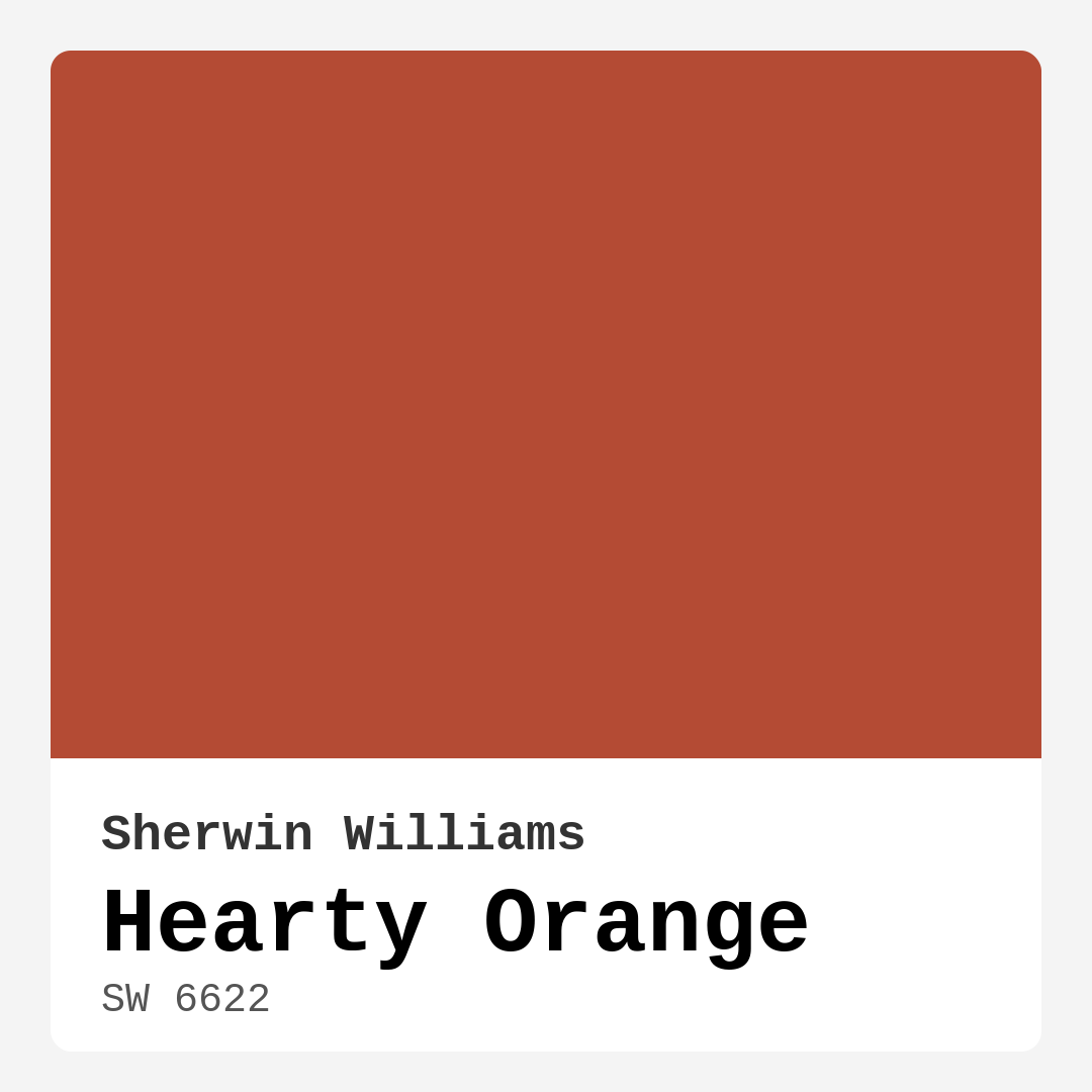
| HEX Code | #B44B34 |
| RGB | 180, 75, 52 |
| LRV | 30% |
| Undertone | Red |
| Finish Options | Eggshell, Satin, Semi-Gloss |
Imagine walking into a space that instantly wraps you in warmth, making you feel right at home. That’s the magic of Hearty Orange, a captivating hue from Sherwin Williams that combines energy and coziness in a single stroke. This vibrant, earthy tone isn’t just a color; it’s an invitation to create a cozy atmosphere that makes every room feel welcoming and alive.
Hearty Orange, with its rich red undertones and a hex code of #B44B34, stands as a confident choice for homeowners looking to infuse their interiors with personality. The color boasts a medium-dark Light Reflectance Value (LRV) of 30%, meaning it absorbs rather than reflects light, creating intimate, snug spaces. But don’t let that deter you; it’s all about how you balance it within your design.
When you think of ideal rooms for Hearty Orange, your mind might wander to the heart of the home—the kitchen. This bold hue can transform your culinary space into a lively hub where family and friends gather. A kitchen painted in Hearty Orange feels inviting, encouraging conversations over meals and laughter over coffee. It also shines beautifully in living areas, dining rooms, and even home offices, fostering an energizing yet cozy vibe that enhances productivity while remaining warm and inviting.
Now, let’s dive deeper into why Hearty Orange shines as a versatile choice across various decor styles. Whether you’re channeling a modern, rustic, bohemian, or eclectic look, this shade adapts beautifully. Its warmth pairs exquisitely with natural elements, making it a favorite for rustic designs that incorporate wood, leather, and rich textiles. If you’re leaning toward a more modern aesthetic, consider using Hearty Orange as an accent wall, where it can add a pop of color without overwhelming your space.
And let’s talk about practicality. The application process for Hearty Orange is beginner-friendly. You can achieve a smooth, professional finish with ease, whether you’re using a brush or roller. It’s designed for good coverage, usually requiring 1 to 2 coats for optimal results. So, if you’re thinking about tackling a weekend project, this paint is perfect for you. Plus, it’s touch-up friendly, making maintenance a breeze.
Another perk is its washability. Life happens—spills, fingerprints, and the occasional scuff. With Hearty Orange, you don’t have to worry. It’s scrubbable and easy to clean, ensuring that your walls look fresh and vibrant for years to come. And for those of you conscious about the environment, you’ll appreciate that Hearty Orange is low in VOCs and eco-certified, making it a responsible choice for your home.
However, like any color, it’s essential to consider its potential downsides. In smaller spaces, Hearty Orange can feel a bit overpowering if not balanced with lighter furnishings or accents. If you’re keen on using it in a compact room, think about incorporating lighter tones in your decor to keep the space feeling open and bright. Additionally, while it does work well in various rooms, it might not be the best fit for overly bright or naturally well-lit spaces, as it can darken the ambiance.
When it comes to finishing touches, think about the finishes you choose. Hearty Orange looks stunning in eggshell or satin finishes, which enhance its warmth without introducing too much gloss. Semi-gloss finishes can be a great option for trim and accents, creating a striking contrast that maintains the inviting feel of the color.
Now, let’s explore how Hearty Orange interacts with lighting. Under natural light, this color truly comes alive. It reflects a richness that imbues your space with cheerfulness and vibrancy. However, under artificial lighting, it deepens, adding an element of sophistication that can transform your evening gatherings into something special.
If you’re curious about complementary colors, you have plenty of options. Hearty Orange pairs beautifully with shades like White Dove, which can help brighten the space while maintaining a clean and cohesive look. It also complements brass fixtures and natural wood trim, grounding the vibrant hue with earthy elements that enhance its warmth.
As you consider incorporating Hearty Orange into your home, think about its undertones. The red undertones give this color depth and complexity, making it essential to test it in your space. Observe how it interacts with your existing furniture and decor throughout the day. You might find that it shifts in appearance as natural light changes, revealing new aspects of its character.
For those of you with an eye toward trends, Hearty Orange sits comfortably alongside popular colors like Burnt Sienna and Terra Cotta. These shades evoke a sense of nostalgia and warmth, making them perfect for creating a comforting environment that feels like a retreat from the world outside.
In summary, Hearty Orange is more than just a paint color; it’s a powerful tool for creating inviting and energizing spaces. It encourages warmth, conversation, and connection, making it a standout choice for various rooms in your home. Whether you’re planning an accent wall or considering a full room makeover, this hue offers a beautiful backdrop for your life’s moments.
So, grab that sample, paint a swatch on your wall, and see how Hearty Orange transforms your space. You might just fall in love with the warmth and vibrancy it brings into your home, making every moment spent there feel a little more special. With the right balance and thoughtful application, this color could very well be the heart of your home.

Save this color to your Pinterest board to revisit when planning your room.
Real Room Photo of Hearty Orange SW 6622


Real rooms painted with Hearty Orange SW 6622 by Sherwin Williams. Lighting and photography can affect how colors appear — always test a sample swatch in your own space.
Undertones of Hearty Orange ?
The undertones of Hearty Orange are a key aspect of its character, leaning towards Red. These subtle underlying hues are what give the color its depth and complexity. For example, a gray with a blue undertone will feel cooler and more modern, while one with a brown undertone will feel warmer and more traditional. It’s essential to test this paint in your home and observe it next to your existing furniture, flooring, and decor to see how these undertones interact and reveal themselves throughout the day.
HEX value: #B44B34
RGB code: 180, 75, 52
Is Hearty Orange Cool or Warm?
Hearty Orange is considered a warm paint color. This characteristic plays a huge role in the overall feel of a room. Warm colors, like this one, tend to create a cozy, inviting, and energetic atmosphere, making them great for social spaces like living rooms and dining rooms. In contrast, cool colors often evoke a sense of calm and serenity, which is why they are popular in bedrooms and bathrooms. The warmth of Hearty Orange means it will pair beautifully with corresponding decor elements.
Understanding Color Properties and Interior Design Tips
Hue refers to a specific position on the color wheel, measured in degrees from 0 to 360. Each degree represents a different pure color:
- 0° represents red
- 120° represents green
- 240° represents blue
Saturation describes the intensity or purity of a color and is expressed as a percentage:
- At 0%, the color appears completely desaturated—essentially a shade of gray
- At 100%, the color is at its most vivid and vibrant
Lightness indicates how light or dark a color is, also expressed as a percentage:
- 0% lightness results in black
- 100% lightness results in white
Using Warm Colors in Interior Design
Warm hues—such as reds, oranges, yellows, warm beiges, and greiges—are excellent choices for creating inviting and energetic spaces. These colors are particularly well-suited for:
- Kitchens, living rooms, and bathrooms, where warmth enhances comfort and sociability
- Large rooms, where warm tones can help reduce the sense of emptiness and make the space feel more intimate
For example:
- Warm beige shades provide a cozy, inviting atmosphere, ideal for living rooms, bedrooms, and hallways.
- Warm greige (a mix of beige and gray) offers the warmth of beige with the modern appeal of gray, making it a versatile backdrop for dining areas, bedrooms, and living spaces.
However, be mindful when using warm light tones in rooms with limited natural light. These shades may appear muted or even take on an unpleasant yellowish tint. To avoid a dull or flat appearance:
- Add depth by incorporating richer tones like deep greens, charcoal, or chocolate brown
- Use textured elements such as curtains, rugs, or cushions to bring dimension to the space
Pro Tip: Achieving Harmony with Warm and Cool Color Balance
To create a well-balanced and visually interesting interior, mix warm and cool tones strategically. This contrast adds depth and harmony to your design.
- If your walls feature warm hues, introduce cool-colored accents such as blue or green furniture, artwork, or accessories to create contrast.
- For a polished look, consider using a complementary color scheme, which pairs colors opposite each other on the color wheel (e.g., red with green, orange with blue).
This thoughtful mix not only enhances visual appeal but also creates a space that feels both dynamic and cohesive.

Save this color to your Pinterest board to revisit when planning your room.
Light Temperature Affects on Hearty Orange
Natural Light
Natural daylight changes in color temperature as the sun moves across the sky. At sunrise and sunset, the light tends to have a warm, golden tone with a color temperature around 2000 Kelvin (K). As the day progresses and the sun rises higher, the light becomes cooler and more neutral. Around midday, especially when the sky is clear, natural light typically reaches its peak brightness and shifts to a cooler tone, ranging from 5500 to 6500 Kelvin. This midday light is close to what we perceive as pure white or daylight-balanced light.
These shifts in natural light can significantly influence how colors appear in a space, which is why designers often consider both the time of day and the orientation of windows when planning interior color schemes.
Explore how this color transforms from sunrise through sunset as natural light changes throughout the day. Use the slider to simulate morning light, midday brightness, and warm afternoon tones.
North-facing rooms stay cooler throughout the day and benefit from warmer paint tones to compensate. South-facing rooms receive more direct sunlight, making even deeper shades more workable. East-facing rooms get bright morning light that fades by afternoon, while west-facing rooms glow warmly in the evening.
Artificial Light
When choosing artificial lighting, pay close attention to the color temperature, measured in Kelvin (K). This determines how warm or cool the light will appear. Lower temperatures, around 2700K, give off a warm, yellow glow often used in living rooms or bedrooms. Higher temperatures, above 5000K, create a cool, bluish light similar to daylight, commonly used in kitchens, offices, or task areas.
Use the slider to see how lighting temperature can affect the appearance of a surface or color throughout a space.
See how this color looks under different artificial light temperatures — from warm candlelight (2000K) to cool daylight (7000K). Move the slider to simulate your room's lighting conditions.


4800K
Keep in mind that natural light from windows, the warmth of lamps, and overhead lighting all affect how this color reads on your walls at different times of day. Always observe a sample swatch in your actual space before purchasing.
LRV of Hearty Orange
The Light Reflectance Value (LRV) of Hearty Orange is 30%, which places it in the Medium Dark category. This means it reflects very little light. Understanding a paint’s LRV is crucial for predicting how it will look in your space. A higher LRV indicates a lighter color that reflects more light, making rooms feel larger and brighter. A lower LRV signifies a darker color that absorbs more light, creating a cozier, more intimate atmosphere. Always consider the natural and artificial lighting in your room when selecting a paint color based on its LRV.
Detailed Review of Hearty Orange
Additional Paint Characteristics
Ideal Rooms
Dining Room, Entryway, Home Office, Kitchen, Living Room
Decor Styles
Bohemian, Eclectic, Modern, Rustic, Traditional
Coverage
Good (1–2 Coats), Touch-Up Friendly
Ease of Application
Beginner Friendly, Brush Smooth, Roller-Ready
Washability
Scrubbable, Washable
VOC Level
Eco-Certified, Low VOC
Best Use
Accent Wall, Furniture, Interior Walls
Room Suitability
Dining Room, Entryway, Home Office, Kitchen, Living Room
Tone Tag
Bold, Earthy, Warm
Finish Type
Eggshell, Satin, Semi-Gloss
Paint Performance
Easy Touch-Up, High Coverage, Low Odor
Use Cases
Best for Modern Farmhouse, Best for Rentals, Designer Favorite
Mood
Cozy, Energizing, Inviting
Trim Pairing
Complements Brass Fixtures, Good with Wood Trim, Pairs with White Dove
Hearty Orange is an exceptional choice for those looking to infuse their space with warmth and vibrancy. This color stands out without overwhelming, making it ideal for accent walls or entire rooms. Whether you’re aiming for a cozy kitchen or an inviting living room, this shade works beautifully in various decor styles, from rustic to modern. The application process is smooth, allowing for even coverage and a professional finish. Just keep in mind that while it offers good coverage, you may want to do two coats for the best results. Overall, Hearty Orange is a delightful option that brings life to your home.
Pros & Cons of SW 6622 Hearty Orange
Pros
Cons
Colors that go with Sherwin Williams Hearty Orange
FAQ on SW 6622 Hearty Orange
Is Hearty Orange suitable for small rooms?
Hearty Orange can be used in small rooms, but it’s essential to balance it with lighter furnishings or accents to prevent the space from feeling too enclosed. Consider using it as an accent wall or pairing it with lighter colors to keep the room feeling open and inviting.
What finishes work best with Hearty Orange?
Hearty Orange looks fantastic in eggshell or satin finishes, as these options enhance its warmth without being too glossy. Semi-gloss can be used for trim and accents to create a striking contrast, while maintaining the overall warmth of the color.
Comparisons Hearty Orange with other colors
Hearty Orange SW 6622 vs Cavern Clay SW 7701
| Attribute | Hearty Orange SW 6622 | Cavern Clay SW 7701 |
|---|---|---|
| Color Name | Hearty Orange SW 6622 | Cavern Clay SW 7701 |
| Color | ||
| Hue | Red | Red |
| Brightness | Dark | Dark |
| RGB | 180, 75, 52 | 172, 107, 83 |
| LRV | 30% | 30% |
| Finish Type | Eggshell, Satin, Semi-Gloss | Eggshell, Matte, Satin |
| Finish Options | Eggshell, Satin, Semi-Gloss | Eggshell, Matte, Satin |
| Ideal Rooms | Dining Room, Entryway, Home Office, Kitchen, Living Room | Bedroom, Dining Room, Home Office, Kitchen, Living Room |
| Decor Styles | Bohemian, Eclectic, Modern, Rustic, Traditional | Bohemian, Contemporary, Modern Farmhouse, Rustic, Transitional |
| Coverage | Good (1–2 Coats), Touch-Up Friendly | Good (1–2 Coats), Touch-Up Friendly |
| Ease of Application | Beginner Friendly, Brush Smooth, Roller-Ready | Beginner Friendly, Brush Smooth, Roller-Ready |
| Washability | Scrubbable, Washable | Washable, Wipeable |
| Room Suitability | Dining Room, Entryway, Home Office, Kitchen, Living Room | Bedroom, Dining Room, Home Office, Kitchen, Living Room |
| Tone | Bold, Earthy, Warm | Earthy, Muted, Warm |
| Paint Performance | Easy Touch-Up, High Coverage, Low Odor | Easy Touch-Up, Low Odor, Scuff Resistant |
Lighting conditions, wall orientation, and surrounding decor can significantly affect how these colors appear in your space. Always test a sample swatch before committing to a full application.
Hearty Orange SW 6622 vs Burgundy SW 6300
| Attribute | Hearty Orange SW 6622 | Burgundy SW 6300 |
|---|---|---|
| Color Name | Hearty Orange SW 6622 | Burgundy SW 6300 |
| Color | ||
| Hue | Red | Red |
| Brightness | Dark | Dark |
| RGB | 180, 75, 52 | 99, 51, 62 |
| LRV | 30% | 6% |
| Finish Type | Eggshell, Satin, Semi-Gloss | Eggshell, Matte, Satin |
| Finish Options | Eggshell, Satin, Semi-Gloss | Eggshell, Matte, Satin |
| Ideal Rooms | Dining Room, Entryway, Home Office, Kitchen, Living Room | Bedroom, Dining Room, Home Office, Living Room |
| Decor Styles | Bohemian, Eclectic, Modern, Rustic, Traditional | Contemporary, Rustic, Traditional, Vintage |
| Coverage | Good (1–2 Coats), Touch-Up Friendly | Good (1–2 Coats), Touch-Up Friendly |
| Ease of Application | Beginner Friendly, Brush Smooth, Roller-Ready | Beginner Friendly, Brush Smooth, Fast-Drying, Roller-Ready |
| Washability | Scrubbable, Washable | Washable, Wipeable |
| Room Suitability | Dining Room, Entryway, Home Office, Kitchen, Living Room | Bedroom, Dining Room, Home Office, Living Room |
| Tone | Bold, Earthy, Warm | Bold, Deep, Warm |
| Paint Performance | Easy Touch-Up, High Coverage, Low Odor | High Coverage, Low Odor, Quick Drying |
Lighting conditions, wall orientation, and surrounding decor can significantly affect how these colors appear in your space. Always test a sample swatch before committing to a full application.
Hearty Orange SW 6622 vs Rookwood Red SW 2802
| Attribute | Hearty Orange SW 6622 | Rookwood Red SW 2802 |
|---|---|---|
| Color Name | Hearty Orange SW 6622 | Rookwood Red SW 2802 |
| Color | ||
| Hue | Red | Red |
| Brightness | Dark | Dark |
| RGB | 180, 75, 52 | 98, 47, 45 |
| LRV | 30% | 6% |
| Finish Type | Eggshell, Satin, Semi-Gloss | Eggshell, Matte, Satin |
| Finish Options | Eggshell, Satin, Semi-Gloss | Eggshell, Matte, Satin |
| Ideal Rooms | Dining Room, Entryway, Home Office, Kitchen, Living Room | Bedroom, Dining Room, Home Office, Living Room |
| Decor Styles | Bohemian, Eclectic, Modern, Rustic, Traditional | Arts and Crafts, Modern Farmhouse, Rustic, Traditional |
| Coverage | Good (1–2 Coats), Touch-Up Friendly | Good (1–2 Coats), Touch-Up Friendly |
| Ease of Application | Beginner Friendly, Brush Smooth, Roller-Ready | Beginner Friendly, Brush Smooth, Fast-Drying, Roller-Ready |
| Washability | Scrubbable, Washable | Washable, Wipeable |
| Room Suitability | Dining Room, Entryway, Home Office, Kitchen, Living Room | Bedroom, Dining Room, Living Room |
| Tone | Bold, Earthy, Warm | Deep, Earthy, Warm |
| Paint Performance | Easy Touch-Up, High Coverage, Low Odor | Easy Touch-Up, High Coverage, Low Odor |
Lighting conditions, wall orientation, and surrounding decor can significantly affect how these colors appear in your space. Always test a sample swatch before committing to a full application.
Hearty Orange SW 6622 vs Spiced Cider SW 7702
| Attribute | Hearty Orange SW 6622 | Spiced Cider SW 7702 |
|---|---|---|
| Color Name | Hearty Orange SW 6622 | Spiced Cider SW 7702 |
| Color | ||
| Hue | Red | Red |
| Brightness | Dark | Dark |
| RGB | 180, 75, 52 | 176, 120, 92 |
| LRV | 30% | 20% |
| Finish Type | Eggshell, Satin, Semi-Gloss | Eggshell, Satin |
| Finish Options | Eggshell, Satin, Semi-Gloss | Eggshell, Satin, Semi-Gloss |
| Ideal Rooms | Dining Room, Entryway, Home Office, Kitchen, Living Room | Bedroom, Dining Room, Kitchen, Living Room |
| Decor Styles | Bohemian, Eclectic, Modern, Rustic, Traditional | Modern Farmhouse, Rustic, Traditional, Transitional |
| Coverage | Good (1–2 Coats), Touch-Up Friendly | Good (1–2 Coats), Touch-Up Friendly |
| Ease of Application | Beginner Friendly, Brush Smooth, Roller-Ready | Beginner Friendly, Brush Smooth, Roller-Ready |
| Washability | Scrubbable, Washable | Scrubbable, Washable |
| Room Suitability | Dining Room, Entryway, Home Office, Kitchen, Living Room | Bedroom, Dining Room, Kitchen, Living Room |
| Tone | Bold, Earthy, Warm | Earthy, Inviting, Warm |
| Paint Performance | Easy Touch-Up, High Coverage, Low Odor | Easy Touch-Up, High Coverage, Low Odor |
Lighting conditions, wall orientation, and surrounding decor can significantly affect how these colors appear in your space. Always test a sample swatch before committing to a full application.
Hearty Orange SW 6622 vs Carnelian SW 7580
| Attribute | Hearty Orange SW 6622 | Carnelian SW 7580 |
|---|---|---|
| Color Name | Hearty Orange SW 6622 | Carnelian SW 7580 |
| Color | ||
| Hue | Red | Red |
| Brightness | Dark | Dark |
| RGB | 180, 75, 52 | 87, 62, 62 |
| LRV | 30% | 20% |
| Finish Type | Eggshell, Satin, Semi-Gloss | Eggshell, Satin |
| Finish Options | Eggshell, Satin, Semi-Gloss | Eggshell, Matte, Satin |
| Ideal Rooms | Dining Room, Entryway, Home Office, Kitchen, Living Room | Bedroom, Dining Room, Hallway, Home Office, Living Room |
| Decor Styles | Bohemian, Eclectic, Modern, Rustic, Traditional | Bohemian, Modern Farmhouse, Rustic, Traditional |
| Coverage | Good (1–2 Coats), Touch-Up Friendly | Good (1–2 Coats), Touch-Up Friendly |
| Ease of Application | Beginner Friendly, Brush Smooth, Roller-Ready | Beginner Friendly, Brush Smooth, Fast-Drying, Roller-Ready |
| Washability | Scrubbable, Washable | Washable, Wipeable |
| Room Suitability | Dining Room, Entryway, Home Office, Kitchen, Living Room | Bedroom, Dining Room, Home Office, Living Room |
| Tone | Bold, Earthy, Warm | Deep, Earthy, Warm |
| Paint Performance | Easy Touch-Up, High Coverage, Low Odor | Easy Touch-Up, Low Odor, Quick Drying |
Lighting conditions, wall orientation, and surrounding decor can significantly affect how these colors appear in your space. Always test a sample swatch before committing to a full application.
Hearty Orange SW 6622 vs Sommelier SW 7595
| Attribute | Hearty Orange SW 6622 | Sommelier SW 7595 |
|---|---|---|
| Color Name | Hearty Orange SW 6622 | Sommelier SW 7595 |
| Color | ||
| Hue | Red | Red |
| Brightness | Dark | Dark |
| RGB | 180, 75, 52 | 93, 55, 54 |
| LRV | 30% | 6% |
| Finish Type | Eggshell, Satin, Semi-Gloss | Eggshell, Matte, Satin |
| Finish Options | Eggshell, Satin, Semi-Gloss | Eggshell, Matte, Satin |
| Ideal Rooms | Dining Room, Entryway, Home Office, Kitchen, Living Room | Bedroom, Dining Room, Home Office, Living Room |
| Decor Styles | Bohemian, Eclectic, Modern, Rustic, Traditional | Modern, Rustic, Traditional, Transitional |
| Coverage | Good (1–2 Coats), Touch-Up Friendly | Good (1–2 Coats), Touch-Up Friendly |
| Ease of Application | Beginner Friendly, Brush Smooth, Roller-Ready | Brush Smooth, Fast-Drying, Low Splatter, Roller-Ready |
| Washability | Scrubbable, Washable | Washable, Wipeable |
| Room Suitability | Dining Room, Entryway, Home Office, Kitchen, Living Room | Bedroom, Dining Room, Home Office, Living Room |
| Tone | Bold, Earthy, Warm | Deep, Earthy, Warm |
| Paint Performance | Easy Touch-Up, High Coverage, Low Odor | Easy Touch-Up, High Coverage, Low Odor, Scuff Resistant |
Lighting conditions, wall orientation, and surrounding decor can significantly affect how these colors appear in your space. Always test a sample swatch before committing to a full application.
Hearty Orange SW 6622 vs Sun Dried Tomato SW 7585
| Attribute | Hearty Orange SW 6622 | Sun Dried Tomato SW 7585 |
|---|---|---|
| Color Name | Hearty Orange SW 6622 | Sun Dried Tomato SW 7585 |
| Color | ||
| Hue | Red | Red |
| Brightness | Dark | Dark |
| RGB | 180, 75, 52 | 105, 43, 43 |
| LRV | 30% | 20% |
| Finish Type | Eggshell, Satin, Semi-Gloss | Matte, Satin, Semi-Gloss |
| Finish Options | Eggshell, Satin, Semi-Gloss | Matte, Satin, Semi-Gloss |
| Ideal Rooms | Dining Room, Entryway, Home Office, Kitchen, Living Room | Dining Room, Home Office, Kitchen, Living Room |
| Decor Styles | Bohemian, Eclectic, Modern, Rustic, Traditional | Industrial, Mediterranean, Modern Farmhouse, Rustic |
| Coverage | Good (1–2 Coats), Touch-Up Friendly | Good (1–2 Coats), Touch-Up Friendly |
| Ease of Application | Beginner Friendly, Brush Smooth, Roller-Ready | Beginner Friendly, Brush Smooth, Roller-Ready |
| Washability | Scrubbable, Washable | Washable, Wipeable |
| Room Suitability | Dining Room, Entryway, Home Office, Kitchen, Living Room | Dining Room, Home Office, Kitchen, Living Room |
| Tone | Bold, Earthy, Warm | Bold, Earthy, Warm |
| Paint Performance | Easy Touch-Up, High Coverage, Low Odor | Easy Touch-Up, High Coverage, Low Odor |
Lighting conditions, wall orientation, and surrounding decor can significantly affect how these colors appear in your space. Always test a sample swatch before committing to a full application.
Hearty Orange SW 6622 vs Rustic Red SW 7593
| Attribute | Hearty Orange SW 6622 | Rustic Red SW 7593 |
|---|---|---|
| Color Name | Hearty Orange SW 6622 | Rustic Red SW 7593 |
| Color | ||
| Hue | Red | Red |
| Brightness | Dark | Dark |
| RGB | 180, 75, 52 | 112, 50, 41 |
| LRV | 30% | 12% |
| Finish Type | Eggshell, Satin, Semi-Gloss | Matte, Satin |
| Finish Options | Eggshell, Satin, Semi-Gloss | Matte, Satin, Semi-Gloss |
| Ideal Rooms | Dining Room, Entryway, Home Office, Kitchen, Living Room | Bedroom, Dining Room, Hallway, Living Room |
| Decor Styles | Bohemian, Eclectic, Modern, Rustic, Traditional | Country, Farmhouse, Rustic, Traditional |
| Coverage | Good (1–2 Coats), Touch-Up Friendly | Good (1–2 Coats) |
| Ease of Application | Beginner Friendly, Brush Smooth, Roller-Ready | Beginner Friendly, Brush Smooth, Fast-Drying, Roller-Ready |
| Washability | Scrubbable, Washable | Washable, Wipeable |
| Room Suitability | Dining Room, Entryway, Home Office, Kitchen, Living Room | Bedroom, Dining Room, Living Room |
| Tone | Bold, Earthy, Warm | Deep, Earthy, Warm |
| Paint Performance | Easy Touch-Up, High Coverage, Low Odor | Easy Touch-Up, Low Odor, Quick Drying |
Lighting conditions, wall orientation, and surrounding decor can significantly affect how these colors appear in your space. Always test a sample swatch before committing to a full application.
Hearty Orange SW 6622 vs Roycroft Copper Red SW 2839
| Attribute | Hearty Orange SW 6622 | Roycroft Copper Red SW 2839 |
|---|---|---|
| Color Name | Hearty Orange SW 6622 | Roycroft Copper Red SW 2839 |
| Color | ||
| Hue | Red | Red |
| Brightness | Dark | Dark |
| RGB | 180, 75, 52 | 123, 55, 40 |
| LRV | 30% | 12% |
| Finish Type | Eggshell, Satin, Semi-Gloss | Matte, Satin, Semi-Gloss |
| Finish Options | Eggshell, Satin, Semi-Gloss | Matte, Satin, Semi-Gloss |
| Ideal Rooms | Dining Room, Entryway, Home Office, Kitchen, Living Room | Bedroom, Dining Room, Entryway, Home Office, Living Room |
| Decor Styles | Bohemian, Eclectic, Modern, Rustic, Traditional | Arts and Crafts, Eclectic, Farmhouse, Rustic, Traditional |
| Coverage | Good (1–2 Coats), Touch-Up Friendly | Good (1–2 Coats), Touch-Up Friendly |
| Ease of Application | Beginner Friendly, Brush Smooth, Roller-Ready | Beginner Friendly, Brush Smooth, Roller-Ready |
| Washability | Scrubbable, Washable | Stain Resistant, Washable |
| Room Suitability | Dining Room, Entryway, Home Office, Kitchen, Living Room | Bedroom, Dining Room, Entryway, Home Office, Living Room |
| Tone | Bold, Earthy, Warm | Deep, Earthy, Warm |
| Paint Performance | Easy Touch-Up, High Coverage, Low Odor | Easy Touch-Up, High Coverage, Low Odor |
Lighting conditions, wall orientation, and surrounding decor can significantly affect how these colors appear in your space. Always test a sample swatch before committing to a full application.
Hearty Orange SW 6622 vs Rookwood Dark Red SW 2801
| Attribute | Hearty Orange SW 6622 | Rookwood Dark Red SW 2801 |
|---|---|---|
| Color Name | Hearty Orange SW 6622 | Rookwood Dark Red SW 2801 |
| Color | ||
| Hue | Red | Red |
| Brightness | Dark | Dark |
| RGB | 180, 75, 52 | 75, 41, 41 |
| LRV | 30% | 6% |
| Finish Type | Eggshell, Satin, Semi-Gloss | Matte, Satin, Semi-Gloss |
| Finish Options | Eggshell, Satin, Semi-Gloss | Matte, Satin, Semi-Gloss |
| Ideal Rooms | Dining Room, Entryway, Home Office, Kitchen, Living Room | Bedroom, Dining Room, Home Office, Living Room |
| Decor Styles | Bohemian, Eclectic, Modern, Rustic, Traditional | Farmhouse, Modern, Rustic, Traditional |
| Coverage | Good (1–2 Coats), Touch-Up Friendly | Good (1–2 Coats) |
| Ease of Application | Beginner Friendly, Brush Smooth, Roller-Ready | Beginner Friendly, Brush Smooth, Roller-Ready |
| Washability | Scrubbable, Washable | Highly Washable, Washable |
| Room Suitability | Dining Room, Entryway, Home Office, Kitchen, Living Room | Bedroom, Dining Room, Home Office, Living Room |
| Tone | Bold, Earthy, Warm | Deep, Earthy, Warm |
| Paint Performance | Easy Touch-Up, High Coverage, Low Odor | Easy Touch-Up, High Coverage, Low Odor |
Lighting conditions, wall orientation, and surrounding decor can significantly affect how these colors appear in your space. Always test a sample swatch before committing to a full application.
Official Page of Sherwin Williams Hearty Orange SW 6622