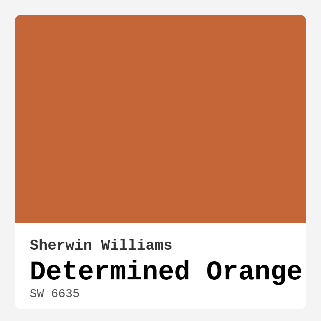
Color Preview & Key Details
| HEX Code | #C56639 |
| RGB | 197, 102, 57 |
| LRV | 30% |
| Undertone | Red |
| Finish Options | Matte, Satin, Semi-Gloss |
Picture this: You walk into a room and feel an immediate wave of warmth enveloping you, a sense of comfort and creativity sparking in the air. This isn’t just a well-furnished space; it’s the result of a carefully chosen paint color that transforms the atmosphere. Have you ever considered the impact of color on your home? Let’s talk about a stunning hue that could be a game-changer in your interior design journey: Determined Orange by Sherwin Williams.
Determined Orange, with its vibrant, earthy tone, is like a warm embrace in a bottle. Its color code, SW 6635, captures the essence of rich burnt orange, a hue that radiates enthusiasm and creativity. Imagine infusing your living space with a color that invites energy and conversation. This paint isn’t just a bold statement; it’s an invitation to gather, share stories, and create memories.
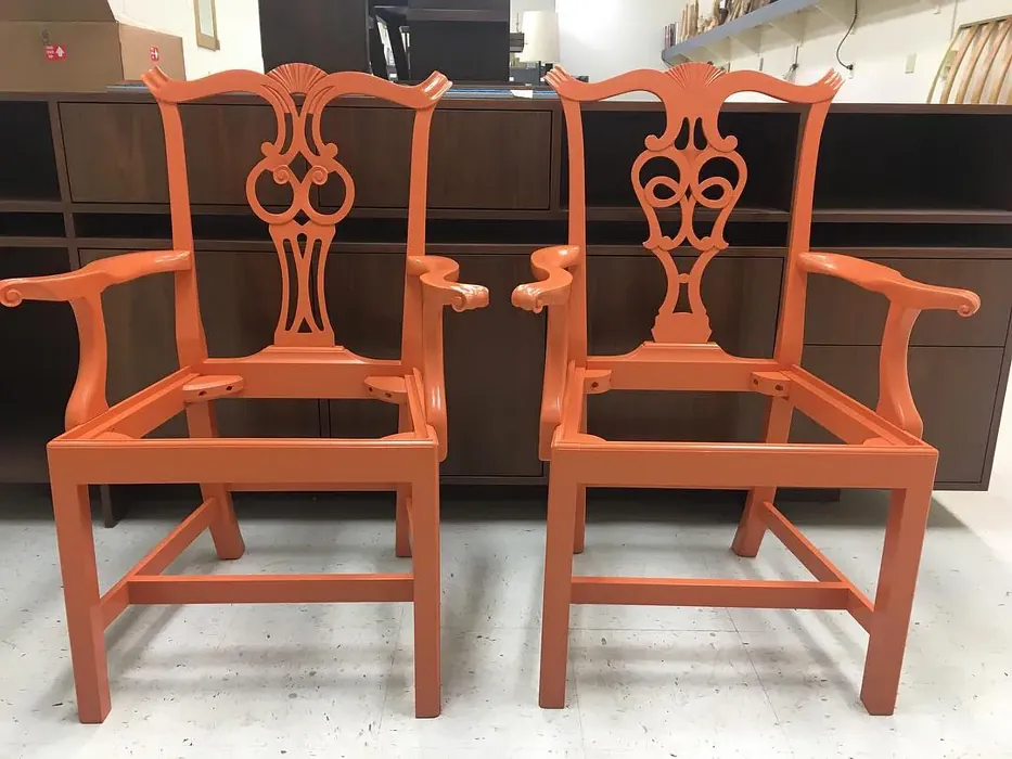
One of the standout features of Determined Orange is its versatility. Whether you’re leaning toward a modern aesthetic or embracing rustic charm, this color fits beautifully into various decor styles. It shines in open spaces, making it ideal for living rooms and dining rooms where you want to foster a lively atmosphere. Its warm undertones invite you to relax, making it perfect for spaces where you want to feel at home.
Now, let’s talk practicalities. The Light Reflectance Value (LRV) of Determined Orange is 30%. This means it reflects very little light, creating an intimate and cozy atmosphere. If you’re considering it for smaller rooms, keep in mind that it might darken the space a bit. However, with the right balance—perhaps lighter furnishings or ample natural light—it can add a vibrant touch without being overwhelming. Using it as an accent wall can be a great way to introduce this color without committing to an entire room.
Applying Determined Orange is a breeze, which is a blessing for DIY enthusiasts. It’s beginner-friendly, rolling on smoothly and drying quickly. You’ll appreciate its good coverage, often requiring just one or two coats for a rich finish. Plus, the low VOC formulation means you can paint without worrying about strong odors lingering in your home.
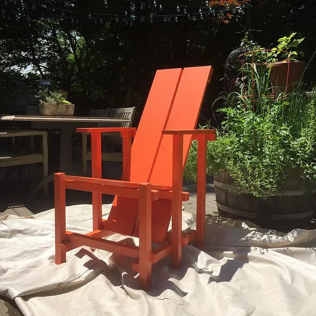
While this paint is designed primarily for interior use, it could also find a place outdoors if you consult with a paint expert first. After all, your exterior should be just as inviting as your interior! The washability factor is another added bonus; it’s wipeable and washable, making it practical for high-traffic areas like kitchens and dining rooms.
When considering complementary shades, think about pairing Determined Orange with whites, creams, or earthy tones. A crisp white trim, like White Dove, can provide a beautiful contrast, allowing the warmth of the orange to pop. Accent pieces in brass or warm wood tones will harmonize beautifully, enhancing that inviting vibe.
To help visualize how Determined Orange can transform your space, consider it in various settings. In a living room, it can create a vibrant backdrop for gatherings, while in a dining room, it becomes a feast for the eyes, promoting an atmosphere of joy and togetherness. Picture this hue in a home office, where its energizing qualities can boost creativity and productivity.
Now, let’s dive into the emotional impact of color. The warm, earthy tones of Determined Orange evoke feelings of comfort and coziness. It’s a color that says, “Welcome home.” Whether you’re curling up with a book or hosting friends for dinner, this hue will encourage connection and conversation. It’s especially effective in spaces designed for gathering, like kitchens and dining areas, where the warmth invites everyone to linger a little longer.
But it’s essential to test this paint in your home to see how it interacts with your existing decor. Every room has its unique lighting and furniture that can influence how a color appears. Under natural light, Determined Orange radiates a lively glow, while under artificial light, it retains its warmth, making the atmosphere inviting at any time of day.
You might wonder how it stacks up against other colors. There are lighter shades like SW 6628 and SW 6643 that can complement it beautifully if you’re looking to create a gradient effect or add layers of depth to your space. On the darker end, shades like SW 7709 can provide a dramatic contrast that enhances the vibrancy of Determined Orange.
For those concerned about the nuances of color, let’s address the undertones. Determined Orange leans toward red, which contributes to its warmth and richness. Understanding this characteristic is crucial when pairing it with other colors. For example, it combines beautifully with greens for a refreshing contrast, or with neutral tones for a more understated elegance.
Now, let’s touch on some frequently asked questions. Can Determined Orange be used in small rooms? Absolutely! As mentioned earlier, using it sparingly on an accent wall or balancing it with lighter colors can maintain that cozy yet vibrant feel.
What about its use on the exterior? While primarily designed for interiors, it could work outside, but I recommend consulting a paint expert to ensure it meets the necessary weatherproof standards.
As you think about your upcoming home project, consider how Determined Orange can make a statement in your home. Whether you’re looking to energize a space, create an inviting atmosphere, or simply embrace a bold color choice, this hue could be the answer.
In conclusion, Determined Orange is much more than just a color; it’s a mood, a feeling, and an experience. It captures the essence of warmth and energy, making it perfect for spaces where life happens. So, are you ready to invite this vibrant hue into your home? The transformation awaits!
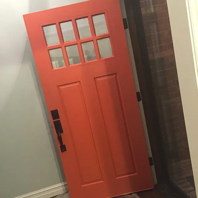
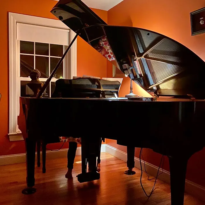
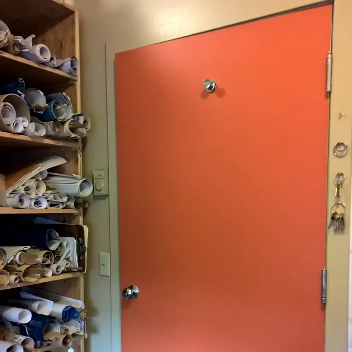
Real Room Photo of Determined Orange SW 6635

Undertones of Determined Orange ?
The undertones of Determined Orange are a key aspect of its character, leaning towards Red. These subtle underlying hues are what give the color its depth and complexity. For example, a gray with a blue undertone will feel cooler and more modern, while one with a brown undertone will feel warmer and more traditional. It’s essential to test this paint in your home and observe it next to your existing furniture, flooring, and decor to see how these undertones interact and reveal themselves throughout the day.
HEX value: #C56639
RGB code: 197, 102, 57
Is Determined Orange Cool or Warm?
Determined Orange is considered a warm paint color. This characteristic plays a huge role in the overall feel of a room. Warm colors, like this one, tend to create a cozy, inviting, and energetic atmosphere, making them great for social spaces like living rooms and dining rooms. In contrast, cool colors often evoke a sense of calm and serenity, which is why they are popular in bedrooms and bathrooms. The warmth of Determined Orange means it will pair beautifully with corresponding decor elements.
Understanding Color Properties and Interior Design Tips
Hue refers to a specific position on the color wheel, measured in degrees from 0 to 360. Each degree represents a different pure color:
- 0° represents red
- 120° represents green
- 240° represents blue
Saturation describes the intensity or purity of a color and is expressed as a percentage:
- At 0%, the color appears completely desaturated—essentially a shade of gray
- At 100%, the color is at its most vivid and vibrant
Lightness indicates how light or dark a color is, also expressed as a percentage:
- 0% lightness results in black
- 100% lightness results in white
Using Warm Colors in Interior Design
Warm hues—such as reds, oranges, yellows, warm beiges, and greiges—are excellent choices for creating inviting and energetic spaces. These colors are particularly well-suited for:
- Kitchens, living rooms, and bathrooms, where warmth enhances comfort and sociability
- Large rooms, where warm tones can help reduce the sense of emptiness and make the space feel more intimate
For example:
- Warm beige shades provide a cozy, inviting atmosphere, ideal for living rooms, bedrooms, and hallways.
- Warm greige (a mix of beige and gray) offers the warmth of beige with the modern appeal of gray, making it a versatile backdrop for dining areas, bedrooms, and living spaces.
However, be mindful when using warm light tones in rooms with limited natural light. These shades may appear muted or even take on an unpleasant yellowish tint. To avoid a dull or flat appearance:
- Add depth by incorporating richer tones like deep greens, charcoal, or chocolate brown
- Use textured elements such as curtains, rugs, or cushions to bring dimension to the space
Pro Tip: Achieving Harmony with Warm and Cool Color Balance
To create a well-balanced and visually interesting interior, mix warm and cool tones strategically. This contrast adds depth and harmony to your design.
- If your walls feature warm hues, introduce cool-colored accents such as blue or green furniture, artwork, or accessories to create contrast.
- For a polished look, consider using a complementary color scheme, which pairs colors opposite each other on the color wheel (e.g., red with green, orange with blue).
This thoughtful mix not only enhances visual appeal but also creates a space that feels both dynamic and cohesive.
Light Temperature Affects on Determined Orange
Natural Light
Natural daylight changes in color temperature as the sun moves across the sky. At sunrise and sunset, the light tends to have a warm, golden tone with a color temperature around 2000 Kelvin (K). As the day progresses and the sun rises higher, the light becomes cooler and more neutral. Around midday, especially when the sky is clear, natural light typically reaches its peak brightness and shifts to a cooler tone, ranging from 5500 to 6500 Kelvin. This midday light is close to what we perceive as pure white or daylight-balanced light.
These shifts in natural light can significantly influence how colors appear in a space, which is why designers often consider both the time of day and the orientation of windows when planning interior color schemes.
Artificial Light
When choosing artificial lighting, pay close attention to the color temperature, measured in Kelvin (K). This determines how warm or cool the light will appear. Lower temperatures, around 2700K, give off a warm, yellow glow often used in living rooms or bedrooms. Higher temperatures, above 5000K, create a cool, bluish light similar to daylight, commonly used in kitchens, offices, or task areas.
Use the slider to see how lighting temperature can affect the appearance of a surface or color throughout a space.


4800K
LRV of Determined Orange
The Light Reflectance Value (LRV) of Determined Orange is 30%, which places it in the Medium Dark category. This means it reflects very little light. Understanding a paint’s LRV is crucial for predicting how it will look in your space. A higher LRV indicates a lighter color that reflects more light, making rooms feel larger and brighter. A lower LRV signifies a darker color that absorbs more light, creating a cozier, more intimate atmosphere. Always consider the natural and artificial lighting in your room when selecting a paint color based on its LRV.
Detailed Review of Determined Orange
Additional Paint Characteristics
Ideal Rooms
Dining Room, Entryway, Home Office, Kitchen, Living Room
Decor Styles
Bohemian, Industrial, Modern, Rustic
Coverage
Good (1–2 Coats), Touch-Up Friendly
Ease of Application
Beginner Friendly, Brush Smooth, Fast-Drying, Roller-Ready
Washability
Washable, Wipeable
VOC Level
Low VOC, Ultra Low VOC
Best Use
Accent Wall, Furniture, Interior Walls
Room Suitability
Dining Room, Home Office, Kitchen, Living Room
Tone Tag
Bold, Earthy, Warm
Finish Type
Matte, Satin, Semi-Gloss
Paint Performance
High Coverage, Low Odor, Quick Drying
Use Cases
Best for Open Concept, Best for Small Spaces, Designer Favorite
Mood
Cozy, Energizing, Inviting
Trim Pairing
Complements Brass Fixtures, Pairs with White Dove, Works with Warm Trim
Determined Orange is an eye-catching choice that perfectly balances warmth and vibrancy. It’s particularly effective in open spaces where you want to create a lively atmosphere. The paint applies smoothly and dries evenly, which is great for DIY enthusiasts. While it can be used in various decor styles from modern to rustic, it shines brightest in spaces designed for gathering, like dining rooms and kitchens.
One of the standout features of this paint is its ability to adapt to changing light conditions, making it feel fresh throughout the day. However, be mindful of the intensity; in smaller rooms, it might feel a bit overwhelming. Overall, if you’re looking to energize your home with a color that’s both inviting and bold, Determined Orange is a solid pick.
Pros & Cons of SW 6635 Determined Orange
Pros
Cons
Colors that go with Sherwin Williams Determined Orange
FAQ on SW 6635 Determined Orange
Can Determined Orange be used in small rooms?
Yes, Determined Orange can be used in small rooms, but it’s important to balance it with lighter colors or ample natural light to avoid overwhelming the space. Using it as an accent wall can also help maintain a cozy yet vibrant atmosphere.
Is this paint suitable for exterior use?
Determined Orange is primarily designed for interior use. While it could be used on exterior surfaces, it’s best to consult with a paint expert or review the specific formulation to ensure it meets weatherproof standards.
Comparisons Determined Orange with other colors
Determined Orange SW 6635 vs Cavern Clay SW 7701
| Attribute | Determined Orange SW 6635 | Cavern Clay SW 7701 |
|---|---|---|
| Color Name | Determined Orange SW 6635 | Cavern Clay SW 7701 |
| Color | ||
| Hue | Red | Red |
| Brightness | Dark | Dark |
| RGB | 197, 102, 57 | 172, 107, 83 |
| LRV | 30% | 30% |
| Finish Type | Matte, Satin, Semi-Gloss | Eggshell, Matte, Satin |
| Finish Options | Matte, Satin, Semi-Gloss | Eggshell, Matte, Satin |
| Ideal Rooms | Dining Room, Entryway, Home Office, Kitchen, Living Room | Bedroom, Dining Room, Home Office, Kitchen, Living Room |
| Decor Styles | Bohemian, Industrial, Modern, Rustic | Bohemian, Contemporary, Modern Farmhouse, Rustic, Transitional |
| Coverage | Good (1–2 Coats), Touch-Up Friendly | Good (1–2 Coats), Touch-Up Friendly |
| Ease of Application | Beginner Friendly, Brush Smooth, Fast-Drying, Roller-Ready | Beginner Friendly, Brush Smooth, Roller-Ready |
| Washability | Washable, Wipeable | Washable, Wipeable |
| Room Suitability | Dining Room, Home Office, Kitchen, Living Room | Bedroom, Dining Room, Home Office, Kitchen, Living Room |
| Tone | Bold, Earthy, Warm | Earthy, Muted, Warm |
| Paint Performance | High Coverage, Low Odor, Quick Drying | Easy Touch-Up, Low Odor, Scuff Resistant |
Determined Orange SW 6635 vs Burgundy SW 6300
| Attribute | Determined Orange SW 6635 | Burgundy SW 6300 |
|---|---|---|
| Color Name | Determined Orange SW 6635 | Burgundy SW 6300 |
| Color | ||
| Hue | Red | Red |
| Brightness | Dark | Dark |
| RGB | 197, 102, 57 | 99, 51, 62 |
| LRV | 30% | 6% |
| Finish Type | Matte, Satin, Semi-Gloss | Eggshell, Matte, Satin |
| Finish Options | Matte, Satin, Semi-Gloss | Eggshell, Matte, Satin |
| Ideal Rooms | Dining Room, Entryway, Home Office, Kitchen, Living Room | Bedroom, Dining Room, Home Office, Living Room |
| Decor Styles | Bohemian, Industrial, Modern, Rustic | Contemporary, Rustic, Traditional, Vintage |
| Coverage | Good (1–2 Coats), Touch-Up Friendly | Good (1–2 Coats), Touch-Up Friendly |
| Ease of Application | Beginner Friendly, Brush Smooth, Fast-Drying, Roller-Ready | Beginner Friendly, Brush Smooth, Fast-Drying, Roller-Ready |
| Washability | Washable, Wipeable | Washable, Wipeable |
| Room Suitability | Dining Room, Home Office, Kitchen, Living Room | Bedroom, Dining Room, Home Office, Living Room |
| Tone | Bold, Earthy, Warm | Bold, Deep, Warm |
| Paint Performance | High Coverage, Low Odor, Quick Drying | High Coverage, Low Odor, Quick Drying |
Determined Orange SW 6635 vs Rookwood Red SW 2802
| Attribute | Determined Orange SW 6635 | Rookwood Red SW 2802 |
|---|---|---|
| Color Name | Determined Orange SW 6635 | Rookwood Red SW 2802 |
| Color | ||
| Hue | Red | Red |
| Brightness | Dark | Dark |
| RGB | 197, 102, 57 | 98, 47, 45 |
| LRV | 30% | 6% |
| Finish Type | Matte, Satin, Semi-Gloss | Eggshell, Matte, Satin |
| Finish Options | Matte, Satin, Semi-Gloss | Eggshell, Matte, Satin |
| Ideal Rooms | Dining Room, Entryway, Home Office, Kitchen, Living Room | Bedroom, Dining Room, Home Office, Living Room |
| Decor Styles | Bohemian, Industrial, Modern, Rustic | Arts and Crafts, Modern Farmhouse, Rustic, Traditional |
| Coverage | Good (1–2 Coats), Touch-Up Friendly | Good (1–2 Coats), Touch-Up Friendly |
| Ease of Application | Beginner Friendly, Brush Smooth, Fast-Drying, Roller-Ready | Beginner Friendly, Brush Smooth, Fast-Drying, Roller-Ready |
| Washability | Washable, Wipeable | Washable, Wipeable |
| Room Suitability | Dining Room, Home Office, Kitchen, Living Room | Bedroom, Dining Room, Living Room |
| Tone | Bold, Earthy, Warm | Deep, Earthy, Warm |
| Paint Performance | High Coverage, Low Odor, Quick Drying | Easy Touch-Up, High Coverage, Low Odor |
Determined Orange SW 6635 vs Spiced Cider SW 7702
| Attribute | Determined Orange SW 6635 | Spiced Cider SW 7702 |
|---|---|---|
| Color Name | Determined Orange SW 6635 | Spiced Cider SW 7702 |
| Color | ||
| Hue | Red | Red |
| Brightness | Dark | Dark |
| RGB | 197, 102, 57 | 176, 120, 92 |
| LRV | 30% | 20% |
| Finish Type | Matte, Satin, Semi-Gloss | Eggshell, Satin |
| Finish Options | Matte, Satin, Semi-Gloss | Eggshell, Satin, Semi-Gloss |
| Ideal Rooms | Dining Room, Entryway, Home Office, Kitchen, Living Room | Bedroom, Dining Room, Kitchen, Living Room |
| Decor Styles | Bohemian, Industrial, Modern, Rustic | Modern Farmhouse, Rustic, Traditional, Transitional |
| Coverage | Good (1–2 Coats), Touch-Up Friendly | Good (1–2 Coats), Touch-Up Friendly |
| Ease of Application | Beginner Friendly, Brush Smooth, Fast-Drying, Roller-Ready | Beginner Friendly, Brush Smooth, Roller-Ready |
| Washability | Washable, Wipeable | Scrubbable, Washable |
| Room Suitability | Dining Room, Home Office, Kitchen, Living Room | Bedroom, Dining Room, Kitchen, Living Room |
| Tone | Bold, Earthy, Warm | Earthy, Inviting, Warm |
| Paint Performance | High Coverage, Low Odor, Quick Drying | Easy Touch-Up, High Coverage, Low Odor |
Determined Orange SW 6635 vs Carnelian SW 7580
| Attribute | Determined Orange SW 6635 | Carnelian SW 7580 |
|---|---|---|
| Color Name | Determined Orange SW 6635 | Carnelian SW 7580 |
| Color | ||
| Hue | Red | Red |
| Brightness | Dark | Dark |
| RGB | 197, 102, 57 | 87, 62, 62 |
| LRV | 30% | 20% |
| Finish Type | Matte, Satin, Semi-Gloss | Eggshell, Satin |
| Finish Options | Matte, Satin, Semi-Gloss | Eggshell, Matte, Satin |
| Ideal Rooms | Dining Room, Entryway, Home Office, Kitchen, Living Room | Bedroom, Dining Room, Hallway, Home Office, Living Room |
| Decor Styles | Bohemian, Industrial, Modern, Rustic | Bohemian, Modern Farmhouse, Rustic, Traditional |
| Coverage | Good (1–2 Coats), Touch-Up Friendly | Good (1–2 Coats), Touch-Up Friendly |
| Ease of Application | Beginner Friendly, Brush Smooth, Fast-Drying, Roller-Ready | Beginner Friendly, Brush Smooth, Fast-Drying, Roller-Ready |
| Washability | Washable, Wipeable | Washable, Wipeable |
| Room Suitability | Dining Room, Home Office, Kitchen, Living Room | Bedroom, Dining Room, Home Office, Living Room |
| Tone | Bold, Earthy, Warm | Deep, Earthy, Warm |
| Paint Performance | High Coverage, Low Odor, Quick Drying | Easy Touch-Up, Low Odor, Quick Drying |
Determined Orange SW 6635 vs Sommelier SW 7595
| Attribute | Determined Orange SW 6635 | Sommelier SW 7595 |
|---|---|---|
| Color Name | Determined Orange SW 6635 | Sommelier SW 7595 |
| Color | ||
| Hue | Red | Red |
| Brightness | Dark | Dark |
| RGB | 197, 102, 57 | 93, 55, 54 |
| LRV | 30% | 6% |
| Finish Type | Matte, Satin, Semi-Gloss | Eggshell, Matte, Satin |
| Finish Options | Matte, Satin, Semi-Gloss | Eggshell, Matte, Satin |
| Ideal Rooms | Dining Room, Entryway, Home Office, Kitchen, Living Room | Bedroom, Dining Room, Home Office, Living Room |
| Decor Styles | Bohemian, Industrial, Modern, Rustic | Modern, Rustic, Traditional, Transitional |
| Coverage | Good (1–2 Coats), Touch-Up Friendly | Good (1–2 Coats), Touch-Up Friendly |
| Ease of Application | Beginner Friendly, Brush Smooth, Fast-Drying, Roller-Ready | Brush Smooth, Fast-Drying, Low Splatter, Roller-Ready |
| Washability | Washable, Wipeable | Washable, Wipeable |
| Room Suitability | Dining Room, Home Office, Kitchen, Living Room | Bedroom, Dining Room, Home Office, Living Room |
| Tone | Bold, Earthy, Warm | Deep, Earthy, Warm |
| Paint Performance | High Coverage, Low Odor, Quick Drying | Easy Touch-Up, High Coverage, Low Odor, Scuff Resistant |
Determined Orange SW 6635 vs Sun Dried Tomato SW 7585
| Attribute | Determined Orange SW 6635 | Sun Dried Tomato SW 7585 |
|---|---|---|
| Color Name | Determined Orange SW 6635 | Sun Dried Tomato SW 7585 |
| Color | ||
| Hue | Red | Red |
| Brightness | Dark | Dark |
| RGB | 197, 102, 57 | 105, 43, 43 |
| LRV | 30% | 20% |
| Finish Type | Matte, Satin, Semi-Gloss | Matte, Satin, Semi-Gloss |
| Finish Options | Matte, Satin, Semi-Gloss | Matte, Satin, Semi-Gloss |
| Ideal Rooms | Dining Room, Entryway, Home Office, Kitchen, Living Room | Dining Room, Home Office, Kitchen, Living Room |
| Decor Styles | Bohemian, Industrial, Modern, Rustic | Industrial, Mediterranean, Modern Farmhouse, Rustic |
| Coverage | Good (1–2 Coats), Touch-Up Friendly | Good (1–2 Coats), Touch-Up Friendly |
| Ease of Application | Beginner Friendly, Brush Smooth, Fast-Drying, Roller-Ready | Beginner Friendly, Brush Smooth, Roller-Ready |
| Washability | Washable, Wipeable | Washable, Wipeable |
| Room Suitability | Dining Room, Home Office, Kitchen, Living Room | Dining Room, Home Office, Kitchen, Living Room |
| Tone | Bold, Earthy, Warm | Bold, Earthy, Warm |
| Paint Performance | High Coverage, Low Odor, Quick Drying | Easy Touch-Up, High Coverage, Low Odor |
Determined Orange SW 6635 vs Rustic Red SW 7593
| Attribute | Determined Orange SW 6635 | Rustic Red SW 7593 |
|---|---|---|
| Color Name | Determined Orange SW 6635 | Rustic Red SW 7593 |
| Color | ||
| Hue | Red | Red |
| Brightness | Dark | Dark |
| RGB | 197, 102, 57 | 112, 50, 41 |
| LRV | 30% | 12% |
| Finish Type | Matte, Satin, Semi-Gloss | Matte, Satin |
| Finish Options | Matte, Satin, Semi-Gloss | Matte, Satin, Semi-Gloss |
| Ideal Rooms | Dining Room, Entryway, Home Office, Kitchen, Living Room | Bedroom, Dining Room, Hallway, Living Room |
| Decor Styles | Bohemian, Industrial, Modern, Rustic | Country, Farmhouse, Rustic, Traditional |
| Coverage | Good (1–2 Coats), Touch-Up Friendly | Good (1–2 Coats) |
| Ease of Application | Beginner Friendly, Brush Smooth, Fast-Drying, Roller-Ready | Beginner Friendly, Brush Smooth, Fast-Drying, Roller-Ready |
| Washability | Washable, Wipeable | Washable, Wipeable |
| Room Suitability | Dining Room, Home Office, Kitchen, Living Room | Bedroom, Dining Room, Living Room |
| Tone | Bold, Earthy, Warm | Deep, Earthy, Warm |
| Paint Performance | High Coverage, Low Odor, Quick Drying | Easy Touch-Up, Low Odor, Quick Drying |
Determined Orange SW 6635 vs Roycroft Copper Red SW 2839
| Attribute | Determined Orange SW 6635 | Roycroft Copper Red SW 2839 |
|---|---|---|
| Color Name | Determined Orange SW 6635 | Roycroft Copper Red SW 2839 |
| Color | ||
| Hue | Red | Red |
| Brightness | Dark | Dark |
| RGB | 197, 102, 57 | 123, 55, 40 |
| LRV | 30% | 12% |
| Finish Type | Matte, Satin, Semi-Gloss | Matte, Satin, Semi-Gloss |
| Finish Options | Matte, Satin, Semi-Gloss | Matte, Satin, Semi-Gloss |
| Ideal Rooms | Dining Room, Entryway, Home Office, Kitchen, Living Room | Bedroom, Dining Room, Entryway, Home Office, Living Room |
| Decor Styles | Bohemian, Industrial, Modern, Rustic | Arts and Crafts, Eclectic, Farmhouse, Rustic, Traditional |
| Coverage | Good (1–2 Coats), Touch-Up Friendly | Good (1–2 Coats), Touch-Up Friendly |
| Ease of Application | Beginner Friendly, Brush Smooth, Fast-Drying, Roller-Ready | Beginner Friendly, Brush Smooth, Roller-Ready |
| Washability | Washable, Wipeable | Stain Resistant, Washable |
| Room Suitability | Dining Room, Home Office, Kitchen, Living Room | Bedroom, Dining Room, Entryway, Home Office, Living Room |
| Tone | Bold, Earthy, Warm | Deep, Earthy, Warm |
| Paint Performance | High Coverage, Low Odor, Quick Drying | Easy Touch-Up, High Coverage, Low Odor |
Determined Orange SW 6635 vs Rookwood Dark Red SW 2801
| Attribute | Determined Orange SW 6635 | Rookwood Dark Red SW 2801 |
|---|---|---|
| Color Name | Determined Orange SW 6635 | Rookwood Dark Red SW 2801 |
| Color | ||
| Hue | Red | Red |
| Brightness | Dark | Dark |
| RGB | 197, 102, 57 | 75, 41, 41 |
| LRV | 30% | 6% |
| Finish Type | Matte, Satin, Semi-Gloss | Matte, Satin, Semi-Gloss |
| Finish Options | Matte, Satin, Semi-Gloss | Matte, Satin, Semi-Gloss |
| Ideal Rooms | Dining Room, Entryway, Home Office, Kitchen, Living Room | Bedroom, Dining Room, Home Office, Living Room |
| Decor Styles | Bohemian, Industrial, Modern, Rustic | Farmhouse, Modern, Rustic, Traditional |
| Coverage | Good (1–2 Coats), Touch-Up Friendly | Good (1–2 Coats) |
| Ease of Application | Beginner Friendly, Brush Smooth, Fast-Drying, Roller-Ready | Beginner Friendly, Brush Smooth, Roller-Ready |
| Washability | Washable, Wipeable | Highly Washable, Washable |
| Room Suitability | Dining Room, Home Office, Kitchen, Living Room | Bedroom, Dining Room, Home Office, Living Room |
| Tone | Bold, Earthy, Warm | Deep, Earthy, Warm |
| Paint Performance | High Coverage, Low Odor, Quick Drying | Easy Touch-Up, High Coverage, Low Odor |
Official Page of Sherwin Williams Determined Orange SW 6635