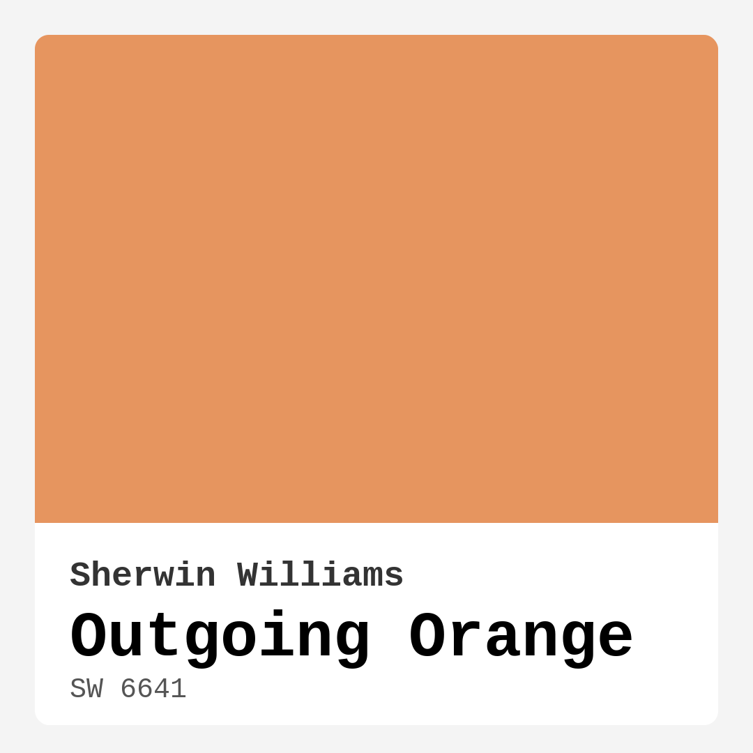
Color Preview & Key Details
| HEX Code | #E6955F |
| RGB | 230, 149, 95 |
| LRV | 45% |
| Undertone | Red |
| Finish Options | Eggshell, Flat, Satin, Semi-Gloss |
Imagine walking into a room that instantly lifts your spirits, where the walls seem to radiate warmth and energy, inviting you to linger just a little longer. This is the magic of Outgoing Orange by Sherwin Williams. A color that doesn’t just decorate a space but instead transforms it, Outgoing Orange is perfect for homeowners eager to infuse their interiors with personality without overwhelming the senses.
Outgoing Orange, with its vibrant medium brightness and beautiful red undertones, is a playful yet sophisticated choice for many spaces in your home. It’s like a burst of sunshine on a cloudy day—no wonder it’s often seen as a go-to for creating cheerful atmospheres. The hex code #E6955F captures this delightful hue, offering a glimpse into the warmth it brings.
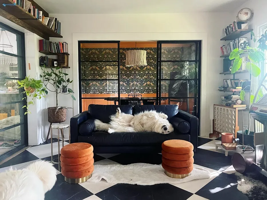
One of the many beauties of Outgoing Orange is its versatility. Whether you’re painting a cozy entryway, an inviting dining room, or a lively kitchen, this color adapts beautifully to various decor styles. It shines in modern, eclectic, and bohemian decors alike, making it a favorite among those who love to play with textures and patterns. Imagine pairing an Outgoing Orange accent wall with a collection of eclectic artwork or a statement piece of furniture—now that’s a conversation starter!
But let’s get practical. One of the key advantages of Outgoing Orange is its excellent coverage. Most homeowners can achieve a beautiful finish with just one or two coats, and its beginner-friendly application means you can dive right into your DIY project without feeling intimidated. The paint is smooth and fast-drying, allowing you to see the transformation quickly, which is always a thrill during any home improvement project. And with its low VOC levels, you won’t have to worry about strong odors lingering in your space.
Now, you might be wondering how this vibrant color interacts with light. Outgoing Orange boasts a Light Reflectance Value (LRV) of 45%. This means it reflects a moderate amount of light, helping create a cozy yet vibrant ambiance. In natural light, this shade is bright and lively, enhancing the overall energy of your space. Under artificial light, it softens slightly, maintaining that inviting atmosphere while offering a cozy feel.
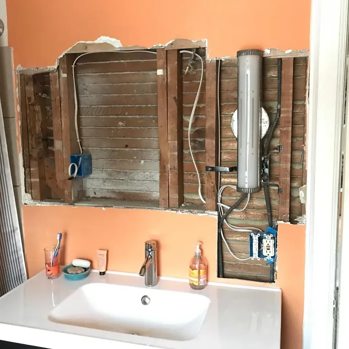
If you’re considering this color for smaller spaces, go for it! Outgoing Orange can work wonders in a compact room. Its warm tones can make a small area feel more inviting and cozy. Just be mindful of the lighting; in well-lit spaces, it adds warmth without feeling too overwhelming. Balance it with lighter furniture and decor to keep the area feeling open and airy.
When it comes to pairing colors, Outgoing Orange plays well with others. Think about using it alongside crisp whites or creamy trims. Shades like White Dove or Simply White create a fresh contrast that allows the warmth of Outgoing Orange to shine without competing for attention. Wooden trims also complement this shade beautifully, introducing a natural element that enhances the overall warmth of the room.
If you’re looking for inspiration, consider how Outgoing Orange would look across various spaces. In the dining room, it can create a vibrant backdrop for gatherings, encouraging conversation and connection among family and friends. In the living room, it becomes a warm and inviting canvas that welcomes relaxation and comfort. You could even use it in an open-concept space, where it seamlessly ties different areas together, enhancing the flow of your home.
The undertones of Outgoing Orange are a crucial aspect of its character. Leaning toward red, these subtle hues give the color depth and complexity. The way it interacts with your existing furniture and decor can change throughout the day, so testing the paint in your own space is essential. Observe how it looks in different lighting conditions; this will help you see how those undertones reveal themselves and how they harmonize with your room’s overall aesthetic.
One important thing to keep in mind is that while Outgoing Orange is a joyful, energizing color, it might not be to everyone’s taste. Its brightness can be a bit too bold for some, especially in large quantities. If you’re unsure, consider using it as an accent color instead. Maybe a feature wall in your living room or a statement back wall in your kitchen. This way, you can enjoy all the positive vibes without feeling overwhelmed.
In terms of lighter and darker shade options, if you love Outgoing Orange but want to explore variants, colors like SW 6633 or SW 6655 can offer different dimensions of warmth. And if you decide to go slightly darker, shades like SW 6885 or SW 6886 still stay within the warm family, ensuring continuity in your design.
Applying Outgoing Orange is not just about paint; it’s about crafting a mood. This color radiates positivity and energy, making it perfect for spaces where you want to foster connection and warmth. Whether you’re hosting a dinner party, enjoying a family game night, or just curling up with a good book, Outgoing Orange enhances those moments, creating a backdrop that feels alive and joyful.
As you finalize your color choice, remember that paint is just one part of the equation. Think about how furniture, lighting, and decor will interact with Outgoing Orange. An array of textures and complementary colors will elevate your design even further, creating a layered, rich environment that feels uniquely yours.
So, if you’re ready to embrace a refreshing take on color in your home, Outgoing Orange could be the vibrant choice that inspires joy and energy in your space. With its warm and inviting nature, striking the perfect balance between lively and sophisticated, it’s a color that promises to brighten your home and your mood. Take the plunge and let this cheerful hue become a defining feature of your beautiful interior. You won’t regret it!
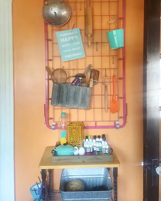
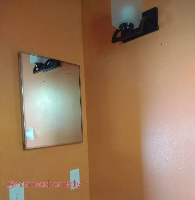
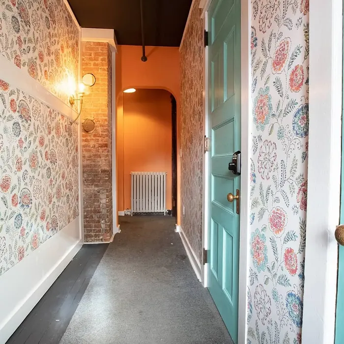
Real Room Photo of Outgoing Orange SW 6641

Undertones of Outgoing Orange ?
The undertones of Outgoing Orange are a key aspect of its character, leaning towards Red. These subtle underlying hues are what give the color its depth and complexity. For example, a gray with a blue undertone will feel cooler and more modern, while one with a brown undertone will feel warmer and more traditional. It’s essential to test this paint in your home and observe it next to your existing furniture, flooring, and decor to see how these undertones interact and reveal themselves throughout the day.
HEX value: #E6955F
RGB code: 230, 149, 95
Is Outgoing Orange Cool or Warm?
Outgoing Orange is a warm color that radiates positivity and energy. Its warmth makes it perfect for creating inviting spaces that feel cozy and welcoming, ideal for family gatherings or cozy evenings at home.
Understanding Color Properties and Interior Design Tips
Hue refers to a specific position on the color wheel, measured in degrees from 0 to 360. Each degree represents a different pure color:
- 0° represents red
- 120° represents green
- 240° represents blue
Saturation describes the intensity or purity of a color and is expressed as a percentage:
- At 0%, the color appears completely desaturated—essentially a shade of gray
- At 100%, the color is at its most vivid and vibrant
Lightness indicates how light or dark a color is, also expressed as a percentage:
- 0% lightness results in black
- 100% lightness results in white
Using Warm Colors in Interior Design
Warm hues—such as reds, oranges, yellows, warm beiges, and greiges—are excellent choices for creating inviting and energetic spaces. These colors are particularly well-suited for:
- Kitchens, living rooms, and bathrooms, where warmth enhances comfort and sociability
- Large rooms, where warm tones can help reduce the sense of emptiness and make the space feel more intimate
For example:
- Warm beige shades provide a cozy, inviting atmosphere, ideal for living rooms, bedrooms, and hallways.
- Warm greige (a mix of beige and gray) offers the warmth of beige with the modern appeal of gray, making it a versatile backdrop for dining areas, bedrooms, and living spaces.
However, be mindful when using warm light tones in rooms with limited natural light. These shades may appear muted or even take on an unpleasant yellowish tint. To avoid a dull or flat appearance:
- Add depth by incorporating richer tones like deep greens, charcoal, or chocolate brown
- Use textured elements such as curtains, rugs, or cushions to bring dimension to the space
Pro Tip: Achieving Harmony with Warm and Cool Color Balance
To create a well-balanced and visually interesting interior, mix warm and cool tones strategically. This contrast adds depth and harmony to your design.
- If your walls feature warm hues, introduce cool-colored accents such as blue or green furniture, artwork, or accessories to create contrast.
- For a polished look, consider using a complementary color scheme, which pairs colors opposite each other on the color wheel (e.g., red with green, orange with blue).
This thoughtful mix not only enhances visual appeal but also creates a space that feels both dynamic and cohesive.
Light Temperature Affects on Outgoing Orange
Natural Light
Natural daylight changes in color temperature as the sun moves across the sky. At sunrise and sunset, the light tends to have a warm, golden tone with a color temperature around 2000 Kelvin (K). As the day progresses and the sun rises higher, the light becomes cooler and more neutral. Around midday, especially when the sky is clear, natural light typically reaches its peak brightness and shifts to a cooler tone, ranging from 5500 to 6500 Kelvin. This midday light is close to what we perceive as pure white or daylight-balanced light.
These shifts in natural light can significantly influence how colors appear in a space, which is why designers often consider both the time of day and the orientation of windows when planning interior color schemes.
Artificial Light
When choosing artificial lighting, pay close attention to the color temperature, measured in Kelvin (K). This determines how warm or cool the light will appear. Lower temperatures, around 2700K, give off a warm, yellow glow often used in living rooms or bedrooms. Higher temperatures, above 5000K, create a cool, bluish light similar to daylight, commonly used in kitchens, offices, or task areas.
Use the slider to see how lighting temperature can affect the appearance of a surface or color throughout a space.


4800K
LRV of Outgoing Orange
The Light Reflectance Value (LRV) of Outgoing Orange is 45%, which places it in the Medium category. This means it Reflects a moderate amount of light. Understanding a paint’s LRV is crucial for predicting how it will look in your space. A higher LRV indicates a lighter color that reflects more light, making rooms feel larger and brighter. A lower LRV signifies a darker color that absorbs more light, creating a cozier, more intimate atmosphere. Always consider the natural and artificial lighting in your room when selecting a paint color based on its LRV.
Detailed Review of Outgoing Orange
Additional Paint Characteristics
Ideal Rooms
Dining Room, Entryway, Kitchen, Living Room
Decor Styles
Bohemian, Eclectic, Modern, Transitional
Coverage
Good (1–2 Coats), Touch-Up Friendly
Ease of Application
Beginner Friendly, Brush Smooth, Fast-Drying, Roller-Ready
Washability
Highly Washable, Washable
VOC Level
Low VOC
Best Use
Accent Wall, Interior Walls, Open Concept Spaces
Room Suitability
Dining Room, Entryway, Kitchen, Living Room
Tone Tag
Bold, Warm
Finish Type
Satin, Semi-Gloss
Paint Performance
High Coverage, Low Odor, Quick Drying
Use Cases
Best for Modern Farmhouse, Best for Open Concept
Mood
Energizing, Inviting
Trim Pairing
Complements Wood Trim, Pairs with White Dove
Outgoing Orange is a refreshing take on traditional orange shades. It has a soft, approachable quality that makes it versatile for various applications. Whether you’re painting an accent wall or a whole room, this color brings a sense of joy and warmth. The paint flows smoothly during application, providing even coverage with just a couple of coats. It’s excellent for spaces where you want to encourage conversation and connection, like living rooms or dining areas. Plus, it pairs beautifully with both light and dark furnishings, making it a great choice for any decor style. Overall, Outgoing Orange is a wonderful choice for anyone looking to brighten up their home with a lively yet sophisticated color.
Pros & Cons of SW 6641 Outgoing Orange
Pros
Cons
Colors that go with Sherwin Williams Outgoing Orange
FAQ on SW 6641 Outgoing Orange
Can Outgoing Orange be used in small spaces?
Absolutely! Outgoing Orange can be a fantastic choice for small spaces. Its warm tones can make a small room feel more inviting and cozy. Just be mindful of using it in well-lit areas to ensure it doesn’t feel too overwhelming. Pair it with lighter furniture and decor to balance the warmth and keep the space feeling open.
What trim colors work best with Outgoing Orange?
Outgoing Orange pairs beautifully with white or cream trims. Consider using shades like White Dove or Simply White to create a fresh and clean contrast. Additionally, wooden trims work well, adding a natural element that complements the warmth of the orange.
Comparisons Outgoing Orange with other colors
Outgoing Orange SW 6641 vs Coral Clay SW 9005
| Attribute | Outgoing Orange SW 6641 | Coral Clay SW 9005 |
|---|---|---|
| Color Name | Outgoing Orange SW 6641 | Coral Clay SW 9005 |
| Color | ||
| Hue | Red | Red |
| Brightness | Medium | Medium |
| RGB | 230, 149, 95 | 191, 121, 110 |
| LRV | 45% | 6% |
| Finish Type | Satin, Semi-Gloss | Eggshell, Matte, Satin |
| Finish Options | Eggshell, Flat, Satin, Semi-Gloss | Eggshell, Matte, Satin |
| Ideal Rooms | Dining Room, Entryway, Kitchen, Living Room | Bedroom, Dining Room, Home Office, Living Room |
| Decor Styles | Bohemian, Eclectic, Modern, Transitional | Bohemian, Coastal, Modern Farmhouse, Rustic |
| Coverage | Good (1–2 Coats), Touch-Up Friendly | Good (1–2 Coats) |
| Ease of Application | Beginner Friendly, Brush Smooth, Fast-Drying, Roller-Ready | Beginner Friendly, Brush Smooth, Roller-Ready |
| Washability | Highly Washable, Washable | Washable, Wipeable |
| Room Suitability | Dining Room, Entryway, Kitchen, Living Room | Bedroom, Dining Room, Home Office, Living Room |
| Tone | Bold, Warm | Earthy, Muted, Warm |
| Paint Performance | High Coverage, Low Odor, Quick Drying | Easy Touch-Up, High Coverage, Low Odor |
Outgoing Orange SW 6641 vs Baked Clay SW 6340
| Attribute | Outgoing Orange SW 6641 | Baked Clay SW 6340 |
|---|---|---|
| Color Name | Outgoing Orange SW 6641 | Baked Clay SW 6340 |
| Color | ||
| Hue | Red | Red |
| Brightness | Medium | Medium |
| RGB | 230, 149, 95 | 193, 120, 92 |
| LRV | 45% | 30% |
| Finish Type | Satin, Semi-Gloss | Matte, Satin |
| Finish Options | Eggshell, Flat, Satin, Semi-Gloss | Eggshell, Matte, Satin |
| Ideal Rooms | Dining Room, Entryway, Kitchen, Living Room | Bedroom, Dining Room, Entryway, Home Office, Kitchen, Living Room |
| Decor Styles | Bohemian, Eclectic, Modern, Transitional | Bohemian, Mediterranean, Modern Farmhouse, Rustic, Transitional |
| Coverage | Good (1–2 Coats), Touch-Up Friendly | Good (1–2 Coats), Touch-Up Friendly |
| Ease of Application | Beginner Friendly, Brush Smooth, Fast-Drying, Roller-Ready | Beginner Friendly, Brush Smooth, Fast-Drying, Roller-Ready |
| Washability | Highly Washable, Washable | Washable, Wipeable |
| Room Suitability | Dining Room, Entryway, Kitchen, Living Room | Bedroom, Dining Room, Entryway, Home Office, Living Room |
| Tone | Bold, Warm | Earthy, Muted, Warm |
| Paint Performance | High Coverage, Low Odor, Quick Drying | Easy Touch-Up, Low Odor, Quick Drying |
Outgoing Orange SW 6641 vs Mellow Mauve SW 0039
| Attribute | Outgoing Orange SW 6641 | Mellow Mauve SW 0039 |
|---|---|---|
| Color Name | Outgoing Orange SW 6641 | Mellow Mauve SW 0039 |
| Color | ||
| Hue | Red | Red |
| Brightness | Medium | Medium |
| RGB | 230, 149, 95 | 196, 149, 122 |
| LRV | 45% | 24% |
| Finish Type | Satin, Semi-Gloss | Eggshell, Matte, Satin |
| Finish Options | Eggshell, Flat, Satin, Semi-Gloss | Eggshell, Matte, Satin |
| Ideal Rooms | Dining Room, Entryway, Kitchen, Living Room | Bedroom, Dining Room, Kitchen, Living Room, Nursery |
| Decor Styles | Bohemian, Eclectic, Modern, Transitional | Bohemian, Modern, Rustic, Traditional |
| Coverage | Good (1–2 Coats), Touch-Up Friendly | Good (1–2 Coats), Touch-Up Friendly |
| Ease of Application | Beginner Friendly, Brush Smooth, Fast-Drying, Roller-Ready | Beginner Friendly, Brush Smooth, Roller-Ready |
| Washability | Highly Washable, Washable | Scrubbable, Washable, Wipeable |
| Room Suitability | Dining Room, Entryway, Kitchen, Living Room | Bedroom, Dining Room, Living Room, Nursery |
| Tone | Bold, Warm | Dusty, Earthy, Muted, Warm |
| Paint Performance | High Coverage, Low Odor, Quick Drying | Easy Touch-Up, Low Odor, Quick Drying |
Outgoing Orange SW 6641 vs Chivalry Copper SW 6353
| Attribute | Outgoing Orange SW 6641 | Chivalry Copper SW 6353 |
|---|---|---|
| Color Name | Outgoing Orange SW 6641 | Chivalry Copper SW 6353 |
| Color | ||
| Hue | Red | Red |
| Brightness | Medium | Medium |
| RGB | 230, 149, 95 | 212, 150, 110 |
| LRV | 45% | 24% |
| Finish Type | Satin, Semi-Gloss | Eggshell, Satin |
| Finish Options | Eggshell, Flat, Satin, Semi-Gloss | Eggshell, Satin, Semi-Gloss |
| Ideal Rooms | Dining Room, Entryway, Kitchen, Living Room | Bedroom, Dining Room, Entryway, Home Office, Living Room |
| Decor Styles | Bohemian, Eclectic, Modern, Transitional | Farmhouse, Modern, Rustic, Transitional |
| Coverage | Good (1–2 Coats), Touch-Up Friendly | Good (1–2 Coats), Touch-Up Friendly |
| Ease of Application | Beginner Friendly, Brush Smooth, Fast-Drying, Roller-Ready | Beginner Friendly, Brush Smooth, Fast-Drying, Roller-Ready |
| Washability | Highly Washable, Washable | Washable, Wipeable |
| Room Suitability | Dining Room, Entryway, Kitchen, Living Room | Bedroom, Dining Room, Home Office, Living Room |
| Tone | Bold, Warm | Earthy, Muted, Warm |
| Paint Performance | High Coverage, Low Odor, Quick Drying | Easy Touch-Up, High Coverage, Low Odor, Quick Drying |
Outgoing Orange SW 6641 vs Windswept Canyon SW 9010
| Attribute | Outgoing Orange SW 6641 | Windswept Canyon SW 9010 |
|---|---|---|
| Color Name | Outgoing Orange SW 6641 | Windswept Canyon SW 9010 |
| Color | ||
| Hue | Red | Red |
| Brightness | Medium | Medium |
| RGB | 230, 149, 95 | 219, 164, 128 |
| LRV | 45% | 0% |
| Finish Type | Satin, Semi-Gloss | Eggshell, Matte, Satin |
| Finish Options | Eggshell, Flat, Satin, Semi-Gloss | Eggshell, Matte, Satin |
| Ideal Rooms | Dining Room, Entryway, Kitchen, Living Room | Bedroom, Dining Room, Home Office, Kitchen, Living Room |
| Decor Styles | Bohemian, Eclectic, Modern, Transitional | Bohemian, Coastal, Modern Farmhouse, Rustic, Transitional |
| Coverage | Good (1–2 Coats), Touch-Up Friendly | Good (1–2 Coats) |
| Ease of Application | Beginner Friendly, Brush Smooth, Fast-Drying, Roller-Ready | Beginner Friendly, Brush Smooth, Fast-Drying, Roller-Ready |
| Washability | Highly Washable, Washable | Highly Washable, Washable |
| Room Suitability | Dining Room, Entryway, Kitchen, Living Room | Bedroom, Dining Room, Home Office, Kitchen, Living Room |
| Tone | Bold, Warm | Earthy, Muted, Warm |
| Paint Performance | High Coverage, Low Odor, Quick Drying | High Coverage, Low Odor, Quick Drying |
Outgoing Orange SW 6641 vs Navel SW 6887
| Attribute | Outgoing Orange SW 6641 | Navel SW 6887 |
|---|---|---|
| Color Name | Outgoing Orange SW 6641 | Navel SW 6887 |
| Color | ||
| Hue | Red | Red |
| Brightness | Medium | Medium |
| RGB | 230, 149, 95 | 236, 132, 48 |
| LRV | 45% | 4% |
| Finish Type | Satin, Semi-Gloss | Satin, Semi-Gloss |
| Finish Options | Eggshell, Flat, Satin, Semi-Gloss | Eggshell, Satin, Semi-Gloss |
| Ideal Rooms | Dining Room, Entryway, Kitchen, Living Room | Dining Room, Entryway, Home Office, Kitchen, Living Room |
| Decor Styles | Bohemian, Eclectic, Modern, Transitional | Bohemian, Contemporary, Modern, Rustic |
| Coverage | Good (1–2 Coats), Touch-Up Friendly | Good (1–2 Coats), Touch-Up Friendly |
| Ease of Application | Beginner Friendly, Brush Smooth, Fast-Drying, Roller-Ready | Beginner Friendly, Brush Smooth, Fast-Drying, Roller-Ready |
| Washability | Highly Washable, Washable | Washable, Wipeable |
| Room Suitability | Dining Room, Entryway, Kitchen, Living Room | Dining Room, Home Office, Kitchen, Living Room |
| Tone | Bold, Warm | Bold, Earthy, Warm |
| Paint Performance | High Coverage, Low Odor, Quick Drying | Low Odor, Quick Drying, Scuff Resistant |
Outgoing Orange SW 6641 vs Invigorate SW 6886
| Attribute | Outgoing Orange SW 6641 | Invigorate SW 6886 |
|---|---|---|
| Color Name | Outgoing Orange SW 6641 | Invigorate SW 6886 |
| Color | ||
| Hue | Red | Red |
| Brightness | Medium | Medium |
| RGB | 230, 149, 95 | 228, 114, 55 |
| LRV | 45% | 40% |
| Finish Type | Satin, Semi-Gloss | Satin, Semi-Gloss |
| Finish Options | Eggshell, Flat, Satin, Semi-Gloss | Matte, Satin, Semi-Gloss |
| Ideal Rooms | Dining Room, Entryway, Kitchen, Living Room | Dining Room, Entryway, Home Office, Kitchen, Living Room |
| Decor Styles | Bohemian, Eclectic, Modern, Transitional | Bohemian, Eclectic, Modern, Transitional |
| Coverage | Good (1–2 Coats), Touch-Up Friendly | Good (1–2 Coats), Touch-Up Friendly |
| Ease of Application | Beginner Friendly, Brush Smooth, Fast-Drying, Roller-Ready | Beginner Friendly, Brush Smooth, Fast-Drying, Roller-Ready |
| Washability | Highly Washable, Washable | Highly Washable, Washable |
| Room Suitability | Dining Room, Entryway, Kitchen, Living Room | Dining Room, Home Office, Kitchen, Living Room |
| Tone | Bold, Warm | Bold, Earthy, Warm |
| Paint Performance | High Coverage, Low Odor, Quick Drying | Easy Touch-Up, High Coverage, Low Odor, Quick Drying |
Outgoing Orange SW 6641 vs Knockout Orange SW 6885
| Attribute | Outgoing Orange SW 6641 | Knockout Orange SW 6885 |
|---|---|---|
| Color Name | Outgoing Orange SW 6641 | Knockout Orange SW 6885 |
| Color | ||
| Hue | Red | Red |
| Brightness | Medium | Medium |
| RGB | 230, 149, 95 | 225, 111, 62 |
| LRV | 45% | 45% |
| Finish Type | Satin, Semi-Gloss | Matte, Satin, Semi-Gloss |
| Finish Options | Eggshell, Flat, Satin, Semi-Gloss | Matte, Satin, Semi-Gloss |
| Ideal Rooms | Dining Room, Entryway, Kitchen, Living Room | Dining Room, Home Office, Kids Room, Kitchen, Living Room |
| Decor Styles | Bohemian, Eclectic, Modern, Transitional | Contemporary, Eclectic, Industrial, Modern, Transitional |
| Coverage | Good (1–2 Coats), Touch-Up Friendly | Good (1–2 Coats), High Hide, Touch-Up Friendly |
| Ease of Application | Beginner Friendly, Brush Smooth, Fast-Drying, Roller-Ready | Beginner Friendly, Brush Smooth, Fast-Drying, Low Splatter, Roller-Ready |
| Washability | Highly Washable, Washable | Scrubbable, Stain Resistant, Washable |
| Room Suitability | Dining Room, Entryway, Kitchen, Living Room | Dining Room, Entryway, Kids Room, Kitchen, Living Room |
| Tone | Bold, Warm | Bold, Inviting, Warm |
| Paint Performance | High Coverage, Low Odor, Quick Drying | Easy Touch-Up, High Coverage, Long Lasting, Scuff Resistant |
Outgoing Orange SW 6641 vs Autumnal SW 6361
| Attribute | Outgoing Orange SW 6641 | Autumnal SW 6361 |
|---|---|---|
| Color Name | Outgoing Orange SW 6641 | Autumnal SW 6361 |
| Color | ||
| Hue | Red | Red |
| Brightness | Medium | Medium |
| RGB | 230, 149, 95 | 205, 140, 93 |
| LRV | 45% | 24% |
| Finish Type | Satin, Semi-Gloss | Eggshell, Matte |
| Finish Options | Eggshell, Flat, Satin, Semi-Gloss | Eggshell, Flat, Matte, Satin |
| Ideal Rooms | Dining Room, Entryway, Kitchen, Living Room | Bedroom, Dining Room, Home Office, Living Room |
| Decor Styles | Bohemian, Eclectic, Modern, Transitional | Bohemian, Modern Farmhouse, Rustic, Traditional |
| Coverage | Good (1–2 Coats), Touch-Up Friendly | Good (1–2 Coats) |
| Ease of Application | Beginner Friendly, Brush Smooth, Fast-Drying, Roller-Ready | Beginner Friendly, Brush Smooth, Fast-Drying, Roller-Ready |
| Washability | Highly Washable, Washable | Washable, Wipeable |
| Room Suitability | Dining Room, Entryway, Kitchen, Living Room | Bedroom, Dining Room, Home Office, Living Room |
| Tone | Bold, Warm | Earthy, Muted, Warm |
| Paint Performance | High Coverage, Low Odor, Quick Drying | Easy Touch-Up, Low Odor, Quick Drying |
Outgoing Orange SW 6641 vs English Ochre CW-290
| Attribute | Outgoing Orange SW 6641 | English Ochre CW-290 |
|---|---|---|
| Color Name | Outgoing Orange SW 6641 | English Ochre CW-290 |
| Color | ||
| Hue | Red | Red |
| Brightness | Medium | Medium |
| RGB | 230, 149, 95 | 189, 125, 72 |
| LRV | 45% | 26.32% |
| Finish Type | Satin, Semi-Gloss | Eggshell, Satin |
| Finish Options | Eggshell, Flat, Satin, Semi-Gloss | Eggshell, Flat, Matte, Satin |
| Ideal Rooms | Dining Room, Entryway, Kitchen, Living Room | Bedroom, Dining Room, Entryway, Home Office, Living Room |
| Decor Styles | Bohemian, Eclectic, Modern, Transitional | Bohemian, Contemporary, Farmhouse, Rustic, Traditional |
| Coverage | Good (1–2 Coats), Touch-Up Friendly | Good (1–2 Coats), Touch-Up Friendly |
| Ease of Application | Beginner Friendly, Brush Smooth, Fast-Drying, Roller-Ready | Beginner Friendly, Brush Smooth, Roller-Ready |
| Washability | Highly Washable, Washable | Washable, Wipeable |
| Room Suitability | Dining Room, Entryway, Kitchen, Living Room | Bedroom, Dining Room, Entryway, Home Office, Living Room |
| Tone | Bold, Warm | Earthy, Muted, Warm |
| Paint Performance | High Coverage, Low Odor, Quick Drying | Easy Touch-Up, High Coverage, Low Odor |
Official Page of Sherwin Williams Outgoing Orange SW 6641