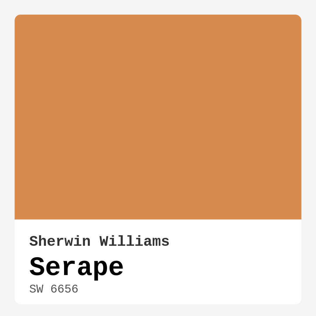
Color Preview & Key Details
| HEX Code | #D88B4D |
| RGB | 216, 139, 77 |
| LRV | 25% |
| Undertone | Red |
| Finish Options | Matte, Satin, Semi-Gloss |
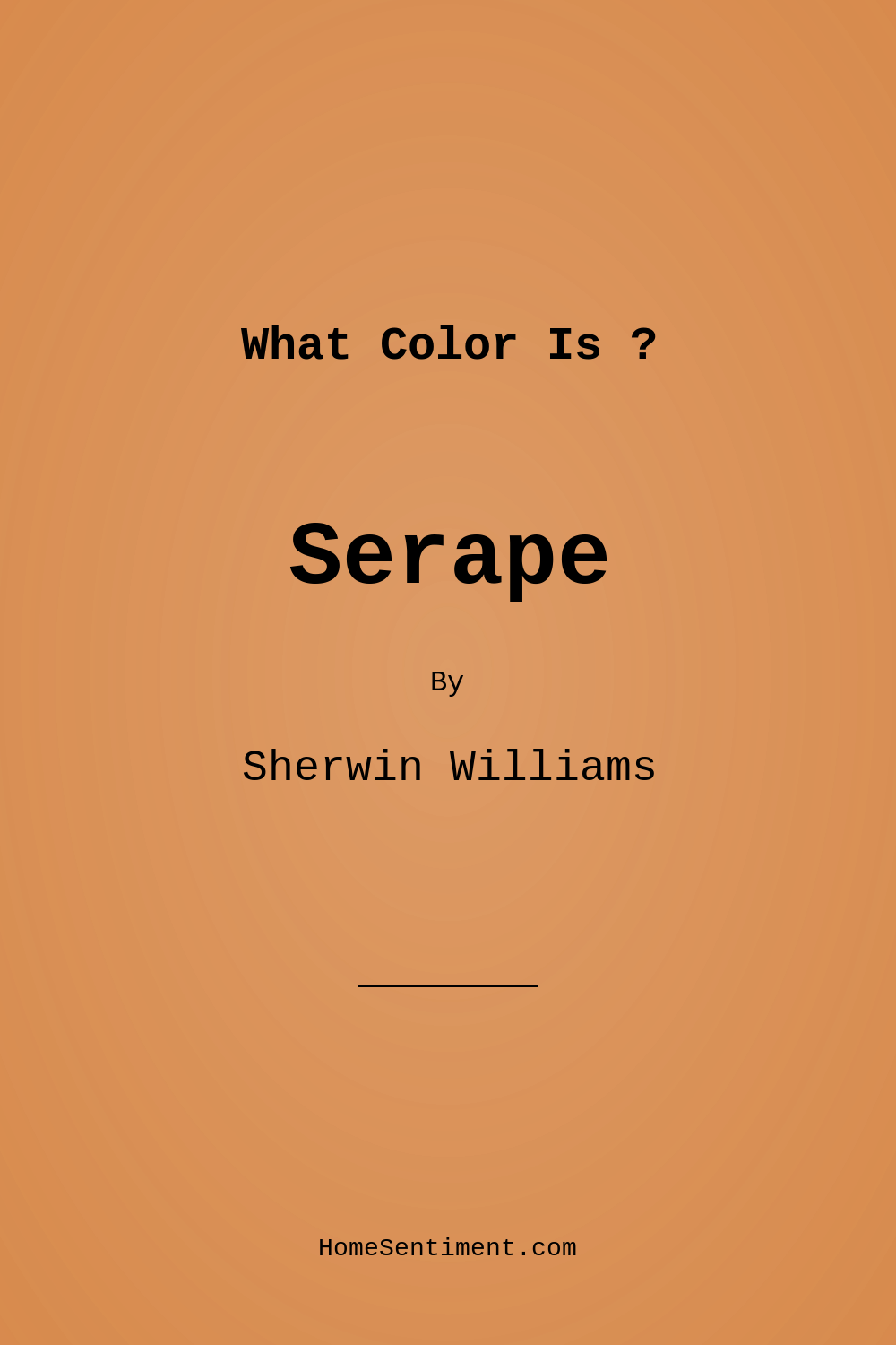
Imagine stepping into a space that feels warm and inviting, like a cozy hug at the end of a long day. That’s the magic of Sherwin-Williams’ Serape. This rich, earthy hue instantly transports you to the sun-drenched landscapes of the Southwest, offering a blend of comfort and approachability that can transform any room in your home. Whether you’re in the midst of a renovation or just looking to refresh your space, let’s dive into why Serape might just be the perfect color choice for your project.
Serape, with its color code SW 6656, is a warm golden-brown that strikes a beautiful balance between earthy and vibrant. It’s a medium shade, reflecting very little light with a Light Reflectance Value (LRV) of 25%. This means it creates an intimate atmosphere, perfect for spaces where you want to relax and unwind. While it exudes warmth, be mindful that in dim lighting, it can take on a deeper, more subdued tone. But don’t worry; that just adds to its cozy allure, especially during those quiet evenings at home.
One of the standout features of Serape is its versatility. This color isn’t just for one style; it seamlessly adapts to various décor themes. Whether you’re leaning into a bohemian vibe, embracing Southwestern accents, or opting for a modern rustic look, Serape can harmonize beautifully with your vision. Imagine it as an accent wall in your living room, breathing life into your space while allowing your favorite art pieces to pop. Or picture it in your home office, inviting creativity and warmth to fuel your productivity.
The application process for Serape is a breeze, making it a great choice for DIY enthusiasts or anyone looking to refresh their space with minimal fuss. It’s roller-ready and brush smooth, meaning you won’t struggle with an uneven finish. In fact, the coverage is excellent, typically requiring just one to two coats for full vibrancy. Plus, it’s low VOC and eco-certified, which is fantastic for maintaining a healthier home environment. You can feel good about bringing this rich color into your home without worrying about harmful emissions.
Now, let’s talk about the undertones. Serape has a subtle red undertone that adds depth and complexity to its character. This warmth is what makes it feel inviting and cozy. If you have existing furniture or decor, testing Serape in your space is essential. Observe how it interacts with your lighting throughout the day; it may surprise you with its evolving nature.
When considering where to use Serape, the possibilities are expansive. It’s ideal for living rooms, bedrooms, dining rooms, and even home offices. Its inviting hue makes it a fantastic choice for creating cozy nooks or warm gathering spaces. If you’re decorating a small room, fear not! Serape can work wonders there too. With its warm undertones, it creates a cozy feel, making the space inviting rather than cramped. Just be mindful of the natural light; in bright areas, it can brighten up the room, while in dim light, it brings an intimate charm.
Serape pairs beautifully with a range of complementary colors. Consider matching it with soft whites like White Dove for trim to create a clean contrast that enhances the richness of the hue. Brass fixtures can add a touch of glam, while natural wood tones will resonate with the earthy qualities of Serape, tying together your design elements harmoniously.
If you’re feeling adventurous, you might also explore using Serape on furniture or cabinetry. Imagine a rustic side table or a home office desk finished in this warm hue, offering a comforting focal point. Its washability and wipeable nature mean that it’s practical for high-traffic areas, ensuring your surfaces remain looking fresh with minimal effort.
However, as with any paint color, it’s essential to consider the lighting in your space. The beauty of Serape can shine under bright, natural light, where it radiates a golden warmth, creating an inviting atmosphere. In contrast, it can appear darker in low light, so if you’re painting a room that doesn’t receive much sunlight, it might be wise to test it alongside lighter accents to keep the space feeling balanced.
If you’re looking for inspiration, think about the mood you want to evoke. Serape brings a cozy, inviting vibe to any room, making it perfect for family gatherings or quiet evenings with a good book. The subtle depth of the color can brighten a darker room while grounding a light, airy space, giving you the best of both worlds.
As you explore your options, consider the finishes available for Serape. Whether you prefer a matte, satin, or semi-gloss finish, each option offers a unique look and feel that can enhance the overall aesthetic of your room. Matte provides a soft, understated elegance, while semi-gloss can add a bit of shine and durability, especially in high-use areas.
In summary, Serape is a powerful contender for anyone looking to add warmth and character to their home. Its earthy, warm tone makes it versatile enough to work across various decor styles while offering a cozy ambiance that feels just right. With its ease of application and practical benefits, Serape might just be the transformative element your space has been waiting for.
So, are you ready to embrace the warmth of Serape in your home? Whether as a bold accent wall or a soothing backdrop for your sanctuary, this color can help you create the inviting atmosphere you’ve always desired. Give it a try, and watch as your space evolves into a warm and welcoming haven that reflects your unique style.
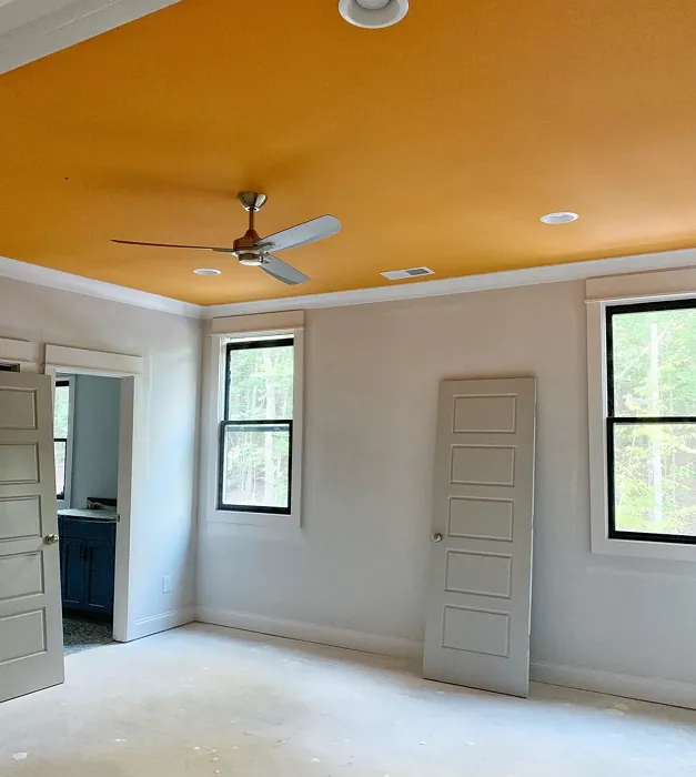
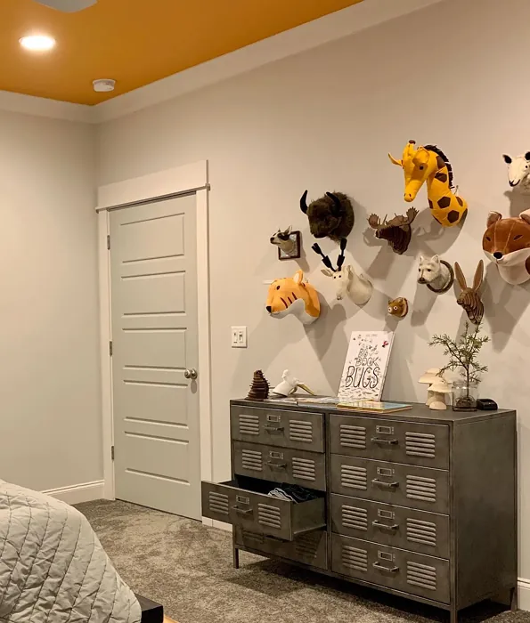
Real Room Photo of Serape SW 6656
Undertones of Serape ?
The undertones of Serape are a key aspect of its character, leaning towards Red. These subtle underlying hues are what give the color its depth and complexity. For example, a gray with a blue undertone will feel cooler and more modern, while one with a brown undertone will feel warmer and more traditional. It’s essential to test this paint in your home and observe it next to your existing furniture, flooring, and decor to see how these undertones interact and reveal themselves throughout the day.
HEX value: #D88B4D
RGB code: 216, 139, 77
Is Serape Cool or Warm?
Serape leans decidedly warm, making it perfect for creating inviting spaces. Its golden-brown hue radiates warmth, fostering a welcoming atmosphere. If you’re looking to add some cozy vibes to your home, Serape is an excellent choice.
Understanding Color Properties and Interior Design Tips
Hue refers to a specific position on the color wheel, measured in degrees from 0 to 360. Each degree represents a different pure color:
- 0° represents red
- 120° represents green
- 240° represents blue
Saturation describes the intensity or purity of a color and is expressed as a percentage:
- At 0%, the color appears completely desaturated—essentially a shade of gray
- At 100%, the color is at its most vivid and vibrant
Lightness indicates how light or dark a color is, also expressed as a percentage:
- 0% lightness results in black
- 100% lightness results in white
Using Warm Colors in Interior Design
Warm hues—such as reds, oranges, yellows, warm beiges, and greiges—are excellent choices for creating inviting and energetic spaces. These colors are particularly well-suited for:
- Kitchens, living rooms, and bathrooms, where warmth enhances comfort and sociability
- Large rooms, where warm tones can help reduce the sense of emptiness and make the space feel more intimate
For example:
- Warm beige shades provide a cozy, inviting atmosphere, ideal for living rooms, bedrooms, and hallways.
- Warm greige (a mix of beige and gray) offers the warmth of beige with the modern appeal of gray, making it a versatile backdrop for dining areas, bedrooms, and living spaces.
However, be mindful when using warm light tones in rooms with limited natural light. These shades may appear muted or even take on an unpleasant yellowish tint. To avoid a dull or flat appearance:
- Add depth by incorporating richer tones like deep greens, charcoal, or chocolate brown
- Use textured elements such as curtains, rugs, or cushions to bring dimension to the space
Pro Tip: Achieving Harmony with Warm and Cool Color Balance
To create a well-balanced and visually interesting interior, mix warm and cool tones strategically. This contrast adds depth and harmony to your design.
- If your walls feature warm hues, introduce cool-colored accents such as blue or green furniture, artwork, or accessories to create contrast.
- For a polished look, consider using a complementary color scheme, which pairs colors opposite each other on the color wheel (e.g., red with green, orange with blue).
This thoughtful mix not only enhances visual appeal but also creates a space that feels both dynamic and cohesive.
Light Temperature Affects on Serape
Natural Light
Natural daylight changes in color temperature as the sun moves across the sky. At sunrise and sunset, the light tends to have a warm, golden tone with a color temperature around 2000 Kelvin (K). As the day progresses and the sun rises higher, the light becomes cooler and more neutral. Around midday, especially when the sky is clear, natural light typically reaches its peak brightness and shifts to a cooler tone, ranging from 5500 to 6500 Kelvin. This midday light is close to what we perceive as pure white or daylight-balanced light.
These shifts in natural light can significantly influence how colors appear in a space, which is why designers often consider both the time of day and the orientation of windows when planning interior color schemes.
Artificial Light
When choosing artificial lighting, pay close attention to the color temperature, measured in Kelvin (K). This determines how warm or cool the light will appear. Lower temperatures, around 2700K, give off a warm, yellow glow often used in living rooms or bedrooms. Higher temperatures, above 5000K, create a cool, bluish light similar to daylight, commonly used in kitchens, offices, or task areas.
Use the slider to see how lighting temperature can affect the appearance of a surface or color throughout a space.


4800K
LRV of Serape
The Light Reflectance Value (LRV) of Serape is 25%, which places it in the Medium Dark category. This means it reflects very little light. Understanding a paint’s LRV is crucial for predicting how it will look in your space. A higher LRV indicates a lighter color that reflects more light, making rooms feel larger and brighter. A lower LRV signifies a darker color that absorbs more light, creating a cozier, more intimate atmosphere. Always consider the natural and artificial lighting in your room when selecting a paint color based on its LRV.
Detailed Review of Serape
Additional Paint Characteristics
Ideal Rooms
Bedroom, Dining Room, Home Office, Living Room, Nursery
Decor Styles
Bohemian, Contemporary, Modern Rustic, Southwestern
Coverage
Good (1–2 Coats), Touch-Up Friendly
Ease of Application
Beginner Friendly, Brush Smooth, Fast-Drying, Roller-Ready
Washability
Washable, Wipeable
VOC Level
Eco-Certified, Low VOC
Best Use
Accent Wall, Furniture, Interior Walls
Room Suitability
Bedroom, Dining Room, Home Office, Living Room
Tone Tag
Earthy, Inviting, Warm
Finish Type
Matte, Satin, Semi-Gloss
Paint Performance
Easy Touch-Up, High Coverage, Low Odor, Quick Drying
Use Cases
Best for Modern Farmhouse, Best for Small Spaces, Designer Favorite
Mood
Cozy, Inviting, Warm
Trim Pairing
Complements Brass Fixtures, Pairs with White Dove, Works with Warm Trim
Serape stands out with its warm undertones, making it a versatile choice for various spaces. It beautifully complements natural materials like wood and stone, enhancing the cozy feel of your interiors. Applying Serape is a breeze; it glides on smoothly, providing excellent coverage and a rich finish that can transform any room. Whether you’re painting an accent wall or refreshing all four, this color delivers a sophisticated yet inviting look. The subtle depth of Serape can brighten up a darker room while also grounding a light, airy space. It’s a fantastic option for those seeking warmth without overwhelming boldness. Overall, Serape is a strong contender for anyone wanting to add warmth and character to their home.
Pros & Cons of SW 6656 Serape
Pros
Cons
Colors that go with Sherwin Williams Serape
FAQ on SW 6656 Serape
Can I use Serape in a small room?
Absolutely! Serape can work wonders in small rooms. Its warm undertones can create a cozy feel, making the space feel inviting rather than cramped. Just be mindful of the lighting; in bright areas, it can brighten up the room, while in dim light, it can add a touch of intimacy.
Is Serape suitable for exterior use?
Yes, Serape is suitable for exterior use, especially on porches and patio furniture. Its warm tone adds character and blends well with natural surroundings. Just ensure that you choose a quality exterior paint that can withstand the elements while delivering that beautiful Serape hue.
Comparisons Serape with other colors
Serape SW 6656 vs Hearts of Palm SW 6415
| Attribute | Serape SW 6656 | Hearts of Palm SW 6415 |
|---|---|---|
| Color Name | Serape SW 6656 | Hearts of Palm SW 6415 |
| Color | ||
| Hue | Yellow | Yellow |
| Brightness | Medium | Medium |
| RGB | 216, 139, 77 | 207, 194, 145 |
| LRV | 25% | 75% |
| Finish Type | Matte, Satin, Semi-Gloss | Eggshell, Matte, Satin |
| Finish Options | Matte, Satin, Semi-Gloss | Eggshell, Matte, Satin |
| Ideal Rooms | Bedroom, Dining Room, Home Office, Living Room, Nursery | Bathroom, Bedroom, Dining Room, Home Office, Kitchen, Living Room |
| Decor Styles | Bohemian, Contemporary, Modern Rustic, Southwestern | Bohemian, Coastal, Eclectic, Modern Farmhouse, Tropical |
| Coverage | Good (1–2 Coats), Touch-Up Friendly | Good (1–2 Coats), Touch-Up Friendly |
| Ease of Application | Beginner Friendly, Brush Smooth, Fast-Drying, Roller-Ready | Beginner Friendly, Brush Smooth, Roller-Ready |
| Washability | Washable, Wipeable | Scrubbable, Washable |
| Room Suitability | Bedroom, Dining Room, Home Office, Living Room | Bathroom, Bedroom, Dining Room, Home Office, Kitchen, Living Room |
| Tone | Earthy, Inviting, Warm | Earthy, Muted, Warm |
| Paint Performance | Easy Touch-Up, High Coverage, Low Odor, Quick Drying | Easy Touch-Up, Low Odor, Scuff Resistant |
Serape SW 6656 vs Blonde SW 6128
| Attribute | Serape SW 6656 | Blonde SW 6128 |
|---|---|---|
| Color Name | Serape SW 6656 | Blonde SW 6128 |
| Color | ||
| Hue | Yellow | Yellow |
| Brightness | Medium | Medium |
| RGB | 216, 139, 77 | 220, 189, 146 |
| LRV | 25% | 64% |
| Finish Type | Matte, Satin, Semi-Gloss | Eggshell, Satin |
| Finish Options | Matte, Satin, Semi-Gloss | Eggshell, Matte, Satin |
| Ideal Rooms | Bedroom, Dining Room, Home Office, Living Room, Nursery | Bedroom, Dining Room, Home Office, Kitchen, Living Room |
| Decor Styles | Bohemian, Contemporary, Modern Rustic, Southwestern | Bohemian, Coastal, Modern Farmhouse, Scandinavian, Transitional |
| Coverage | Good (1–2 Coats), Touch-Up Friendly | Good (1–2 Coats), Touch-Up Friendly |
| Ease of Application | Beginner Friendly, Brush Smooth, Fast-Drying, Roller-Ready | Beginner Friendly, Fast-Drying, Roller-Ready |
| Washability | Washable, Wipeable | Highly Washable, Washable |
| Room Suitability | Bedroom, Dining Room, Home Office, Living Room | Bedroom, Dining Room, Home Office, Kitchen, Living Room, Nursery |
| Tone | Earthy, Inviting, Warm | Earthy, Neutral, Warm |
| Paint Performance | Easy Touch-Up, High Coverage, Low Odor, Quick Drying | Easy Touch-Up, Fade Resistant, Low Odor, Quick Drying |
Serape SW 6656 vs Ruskin Room Green SW 0042
| Attribute | Serape SW 6656 | Ruskin Room Green SW 0042 |
|---|---|---|
| Color Name | Serape SW 6656 | Ruskin Room Green SW 0042 |
| Color | ||
| Hue | Yellow | Yellow |
| Brightness | Medium | Medium |
| RGB | 216, 139, 77 | 172, 161, 125 |
| LRV | 25% | 24% |
| Finish Type | Matte, Satin, Semi-Gloss | Eggshell, Matte |
| Finish Options | Matte, Satin, Semi-Gloss | Eggshell, Flat, Matte, Satin |
| Ideal Rooms | Bedroom, Dining Room, Home Office, Living Room, Nursery | Bedroom, Dining Room, Home Office, Living Room |
| Decor Styles | Bohemian, Contemporary, Modern Rustic, Southwestern | Farmhouse, Modern, Rustic, Traditional |
| Coverage | Good (1–2 Coats), Touch-Up Friendly | Good (1–2 Coats), Touch-Up Friendly |
| Ease of Application | Beginner Friendly, Brush Smooth, Fast-Drying, Roller-Ready | Beginner Friendly, Brush Smooth, Roller-Ready |
| Washability | Washable, Wipeable | Scrubbable, Washable |
| Room Suitability | Bedroom, Dining Room, Home Office, Living Room | Bedroom, Dining Room, Home Office, Living Room |
| Tone | Earthy, Inviting, Warm | Earthy, Muted, Warm |
| Paint Performance | Easy Touch-Up, High Coverage, Low Odor, Quick Drying | Easy Touch-Up, High Coverage, Low Odor |
Serape SW 6656 vs Bosc Pear SW 6390
| Attribute | Serape SW 6656 | Bosc Pear SW 6390 |
|---|---|---|
| Color Name | Serape SW 6656 | Bosc Pear SW 6390 |
| Color | ||
| Hue | Yellow | Yellow |
| Brightness | Medium | Medium |
| RGB | 216, 139, 77 | 192, 144, 86 |
| LRV | 25% | 60% |
| Finish Type | Matte, Satin, Semi-Gloss | Satin, Semi-Gloss |
| Finish Options | Matte, Satin, Semi-Gloss | Flat, Satin, Semi-Gloss |
| Ideal Rooms | Bedroom, Dining Room, Home Office, Living Room, Nursery | Bedroom, Dining Room, Home Office, Kitchen, Living Room |
| Decor Styles | Bohemian, Contemporary, Modern Rustic, Southwestern | Modern Farmhouse, Rustic, Traditional, Transitional |
| Coverage | Good (1–2 Coats), Touch-Up Friendly | Good (1–2 Coats) |
| Ease of Application | Beginner Friendly, Brush Smooth, Fast-Drying, Roller-Ready | Beginner Friendly, Brush Smooth, Fast-Drying, Roller-Ready |
| Washability | Washable, Wipeable | Highly Washable, Washable |
| Room Suitability | Bedroom, Dining Room, Home Office, Living Room | Bedroom, Dining Room, Home Office, Living Room |
| Tone | Earthy, Inviting, Warm | Balanced, Earthy, Warm |
| Paint Performance | Easy Touch-Up, High Coverage, Low Odor, Quick Drying | Easy Touch-Up, High Coverage, Low Odor, Quick Drying |
Serape SW 6656 vs Lemongrass SW 7732
| Attribute | Serape SW 6656 | Lemongrass SW 7732 |
|---|---|---|
| Color Name | Serape SW 6656 | Lemongrass SW 7732 |
| Color | ||
| Hue | Yellow | Yellow |
| Brightness | Medium | Medium |
| RGB | 216, 139, 77 | 200, 189, 152 |
| LRV | 25% | 48% |
| Finish Type | Matte, Satin, Semi-Gloss | Eggshell, Matte, Satin |
| Finish Options | Matte, Satin, Semi-Gloss | Eggshell, Matte, Satin |
| Ideal Rooms | Bedroom, Dining Room, Home Office, Living Room, Nursery | Bathroom, Bedroom, Home Office, Kitchen, Living Room, Nursery |
| Decor Styles | Bohemian, Contemporary, Modern Rustic, Southwestern | Bohemian, Modern Farmhouse, Scandinavian, Transitional |
| Coverage | Good (1–2 Coats), Touch-Up Friendly | Good (1–2 Coats) |
| Ease of Application | Beginner Friendly, Brush Smooth, Fast-Drying, Roller-Ready | Beginner Friendly, Brush Smooth, Roller-Ready |
| Washability | Washable, Wipeable | Highly Washable, Washable |
| Room Suitability | Bedroom, Dining Room, Home Office, Living Room | Bedroom, Home Office, Kitchen, Living Room |
| Tone | Earthy, Inviting, Warm | Earthy, Muted, Warm |
| Paint Performance | Easy Touch-Up, High Coverage, Low Odor, Quick Drying | Easy Touch-Up, Low Odor, Scuff Resistant |
Serape SW 6656 vs Garden Sage SW 7736
| Attribute | Serape SW 6656 | Garden Sage SW 7736 |
|---|---|---|
| Color Name | Serape SW 6656 | Garden Sage SW 7736 |
| Color | ||
| Hue | Yellow | Yellow |
| Brightness | Medium | Medium |
| RGB | 216, 139, 77 | 177, 165, 132 |
| LRV | 25% | 24% |
| Finish Type | Matte, Satin, Semi-Gloss | Eggshell, Matte, Satin |
| Finish Options | Matte, Satin, Semi-Gloss | Eggshell, Matte, Satin |
| Ideal Rooms | Bedroom, Dining Room, Home Office, Living Room, Nursery | Bedroom, Dining Room, Home Office, Kitchen, Living Room, Nursery |
| Decor Styles | Bohemian, Contemporary, Modern Rustic, Southwestern | Bohemian, Cottage, Minimalist, Modern Farmhouse, Traditional |
| Coverage | Good (1–2 Coats), Touch-Up Friendly | Good (1–2 Coats), Touch-Up Friendly |
| Ease of Application | Beginner Friendly, Brush Smooth, Fast-Drying, Roller-Ready | Beginner Friendly, Brush Smooth, Roller-Ready |
| Washability | Washable, Wipeable | Highly Washable, Washable |
| Room Suitability | Bedroom, Dining Room, Home Office, Living Room | Bedroom, Dining Room, Home Office, Kitchen, Living Room |
| Tone | Earthy, Inviting, Warm | Balanced, Earthy, Muted, Warm |
| Paint Performance | Easy Touch-Up, High Coverage, Low Odor, Quick Drying | Easy Touch-Up, Fade Resistant, Low Odor |
Serape SW 6656 vs Tassel SW 6369
| Attribute | Serape SW 6656 | Tassel SW 6369 |
|---|---|---|
| Color Name | Serape SW 6656 | Tassel SW 6369 |
| Color | ||
| Hue | Yellow | Yellow |
| Brightness | Medium | Medium |
| RGB | 216, 139, 77 | 198, 136, 74 |
| LRV | 25% | 45% |
| Finish Type | Matte, Satin, Semi-Gloss | Matte, Satin |
| Finish Options | Matte, Satin, Semi-Gloss | Matte, Satin, Semi-Gloss |
| Ideal Rooms | Bedroom, Dining Room, Home Office, Living Room, Nursery | Bedroom, Dining Room, Home Office, Living Room |
| Decor Styles | Bohemian, Contemporary, Modern Rustic, Southwestern | Bohemian, Modern Farmhouse, Rustic, Transitional |
| Coverage | Good (1–2 Coats), Touch-Up Friendly | Good (1–2 Coats) |
| Ease of Application | Beginner Friendly, Brush Smooth, Fast-Drying, Roller-Ready | Beginner Friendly, Brush Smooth, Fast-Drying, Roller-Ready |
| Washability | Washable, Wipeable | Scrubbable, Washable |
| Room Suitability | Bedroom, Dining Room, Home Office, Living Room | Bedroom, Dining Room, Home Office, Living Room |
| Tone | Earthy, Inviting, Warm | Earthy, Inviting, Warm |
| Paint Performance | Easy Touch-Up, High Coverage, Low Odor, Quick Drying | Easy Touch-Up, Low Odor, Quick Drying, Scuff Resistant |
Serape SW 6656 vs Sunflower SW 6678
| Attribute | Serape SW 6656 | Sunflower SW 6678 |
|---|---|---|
| Color Name | Serape SW 6656 | Sunflower SW 6678 |
| Color | ||
| Hue | Yellow | Yellow |
| Brightness | Medium | Medium |
| RGB | 216, 139, 77 | 227, 154, 51 |
| LRV | 25% | 75% |
| Finish Type | Matte, Satin, Semi-Gloss | Eggshell, Satin |
| Finish Options | Matte, Satin, Semi-Gloss | Eggshell, Satin, Semi-Gloss |
| Ideal Rooms | Bedroom, Dining Room, Home Office, Living Room, Nursery | Dining Room, Entryway, Home Office, Kitchen, Living Room |
| Decor Styles | Bohemian, Contemporary, Modern Rustic, Southwestern | Bohemian, Eclectic, Modern Farmhouse, Traditional |
| Coverage | Good (1–2 Coats), Touch-Up Friendly | Good (1–2 Coats), Touch-Up Friendly |
| Ease of Application | Beginner Friendly, Brush Smooth, Fast-Drying, Roller-Ready | Beginner Friendly, Brush Smooth, Fast-Drying, Roller-Ready |
| Washability | Washable, Wipeable | Highly Washable, Washable |
| Room Suitability | Bedroom, Dining Room, Home Office, Living Room | Dining Room, Entryway, Kitchen, Living Room |
| Tone | Earthy, Inviting, Warm | Bold, Earthy, Warm |
| Paint Performance | Easy Touch-Up, High Coverage, Low Odor, Quick Drying | Fade Resistant, High Coverage, Quick Drying |
Serape SW 6656 vs Bee's Wax SW 7682
| Attribute | Serape SW 6656 | Bee's Wax SW 7682 |
|---|---|---|
| Color Name | Serape SW 6656 | Bee's Wax SW 7682 |
| Color | ||
| Hue | Yellow | Yellow |
| Brightness | Medium | Medium |
| RGB | 216, 139, 77 | 234, 191, 134 |
| LRV | 25% | 50% |
| Finish Type | Matte, Satin, Semi-Gloss | Eggshell, Matte, Satin |
| Finish Options | Matte, Satin, Semi-Gloss | Eggshell, Matte, Satin |
| Ideal Rooms | Bedroom, Dining Room, Home Office, Living Room, Nursery | Bedroom, Dining Room, Entryway, Kitchen, Living Room |
| Decor Styles | Bohemian, Contemporary, Modern Rustic, Southwestern | Bohemian, Coastal, Modern Farmhouse, Traditional, Transitional |
| Coverage | Good (1–2 Coats), Touch-Up Friendly | Good (1–2 Coats), Touch-Up Friendly |
| Ease of Application | Beginner Friendly, Brush Smooth, Fast-Drying, Roller-Ready | Beginner Friendly, Brush Smooth, Roller-Ready |
| Washability | Washable, Wipeable | Washable, Wipeable |
| Room Suitability | Bedroom, Dining Room, Home Office, Living Room | Bedroom, Dining Room, Entryway, Kitchen, Living Room |
| Tone | Earthy, Inviting, Warm | Creamy, Earthy, Warm |
| Paint Performance | Easy Touch-Up, High Coverage, Low Odor, Quick Drying | Easy Touch-Up, High Coverage, Low Odor |
Serape SW 6656 vs Downing Straw SW 2813
| Attribute | Serape SW 6656 | Downing Straw SW 2813 |
|---|---|---|
| Color Name | Serape SW 6656 | Downing Straw SW 2813 |
| Color | ||
| Hue | Yellow | Yellow |
| Brightness | Medium | Medium |
| RGB | 216, 139, 77 | 202, 171, 125 |
| LRV | 25% | 48% |
| Finish Type | Matte, Satin, Semi-Gloss | Eggshell, Matte, Satin |
| Finish Options | Matte, Satin, Semi-Gloss | Eggshell, Matte, Satin |
| Ideal Rooms | Bedroom, Dining Room, Home Office, Living Room, Nursery | Bedroom, Dining Room, Home Office, Kitchen, Living Room |
| Decor Styles | Bohemian, Contemporary, Modern Rustic, Southwestern | Contemporary, Eclectic, Modern Farmhouse, Rustic, Traditional |
| Coverage | Good (1–2 Coats), Touch-Up Friendly | Good (1–2 Coats), Touch-Up Friendly |
| Ease of Application | Beginner Friendly, Brush Smooth, Fast-Drying, Roller-Ready | Beginner Friendly, Brush Smooth, Roller-Ready |
| Washability | Washable, Wipeable | Washable, Wipeable |
| Room Suitability | Bedroom, Dining Room, Home Office, Living Room | Bedroom, Dining Room, Home Office, Kitchen, Living Room |
| Tone | Earthy, Inviting, Warm | Earthy, Muted, Warm |
| Paint Performance | Easy Touch-Up, High Coverage, Low Odor, Quick Drying | Easy Touch-Up, High Coverage, Low Odor |
Official Page of Sherwin Williams Serape SW 6656