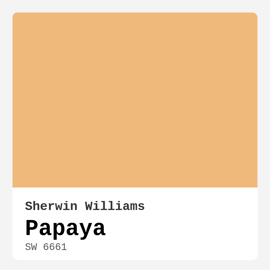
Color Preview & Key Details
| HEX Code | #EFB97B |
| RGB | 239, 185, 123 |
| LRV | 75% |
| Undertone | Red |
| Finish Options | Eggshell, Flat, Satin, Semi-Gloss |
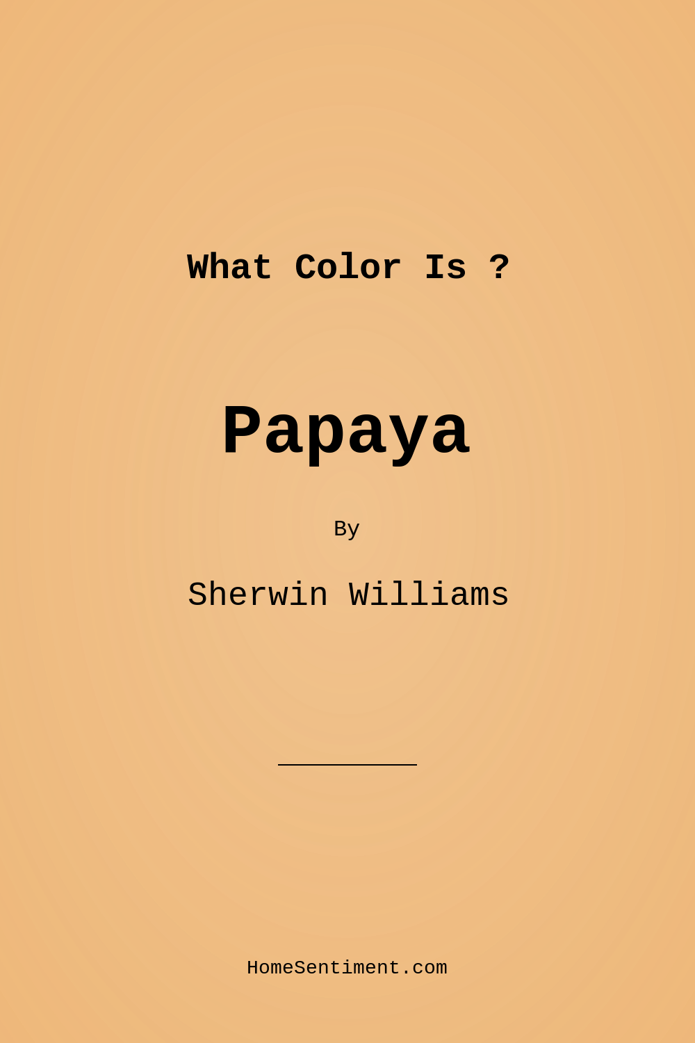
Imagine stepping into a room that instantly uplifts your spirits, fills you with warmth, and creates a comforting atmosphere. That’s precisely the magic of Sherwin Williams’ Papaya (SW 6661). This vibrant orange hue, reminiscent of ripe tropical fruit, is more than just a color; it’s a lifestyle choice for those looking to create inviting and energizing spaces.
Papaya is a warm, medium-bright shade with soft peachy undertones that can illuminate your home while adding a touch of sophistication. With an impressive Light Reflectance Value (LRV) of 75%, it reflects a substantial amount of light, making it perfect for areas where you want to feel relaxed yet invigorated. Whether you’re revamping your living room, kitchen, or home office, Papaya can breathe life into your decor.
One of the first things you’ll appreciate about Papaya is its versatility. It effortlessly complements a variety of decorating styles, from coastal and modern farmhouse to bohemian and tropical. This adaptability means you can confidently use it in different rooms and find ways to incorporate it into your overall design scheme. Imagine a cozy bedroom with Papaya walls, where the color wraps around you like a warm embrace, or a cheerful kitchen that feels alive with this energizing hue.
When it comes to application, Papaya is beginner-friendly. It’s designed for easy application, whether you’re rolling or brushing. The paint goes on smoothly and dries quickly, allowing you to enjoy your freshly painted space without the long waiting times often associated with home projects. And with its washable finish, cleanup is a breeze, meaning you can maintain that inviting look without too much hassle.
However, it’s important to note that while Papaya is beautiful, it may require two coats for full coverage, especially if you’re painting over darker colors. Always take the time to test it in your specific lighting conditions as it can appear different depending on the environment. In bright, natural light, it reveals a lively vibrancy that lifts your spirits. In dim lighting, it softens, creating a serene and calming ambiance.
Speaking of lighting, understanding how Papaya interacts with light is essential for achieving the best results. In sunnier spaces, the color shines brightly, making rooms feel expansive and cheerful. Conversely, in darker areas, it can take on a more muted tone, which can be perfect for creating a cozy nook. To truly appreciate Papaya’s character, consider testing it next to your existing decor. Observe how it looks against your furniture and flooring throughout the day as natural light changes.
The undertones of Papaya lean towards red, adding depth and complexity to this warm hue. This subtle characteristic is what distinguishes Papaya from other shades in the orange family. Because of this warmth, it pairs beautifully with whites and brass fixtures, creating a sophisticated yet inviting look. Imagine Papaya walls next to crisp white trim or brass accents, enhancing the overall elegance of your space.
If you’re wondering where Papaya fits best in your home, consider the living room, kitchen, bedroom, or even a home office. It can serve as a stunning backdrop for family gatherings, a cheerful atmosphere for cooking, or a serene environment for working from home. In open spaces, this color can add a sense of airiness without overwhelming the senses.
For those interested in trends, Papaya is a designer favorite, especially for modern farmhouse styles. It easily complements earthy elements like wood and wicker, harmonizing with nature-inspired decor. Picture a cozy modern farmhouse where Papaya acts as a warm hug against the backdrop of rustic wood beams and vintage furnishings. It’s a match made in heaven.
If you’re considering Papaya for an accent wall, it can create a striking focal point that draws the eye without being overpowering. Pair it with lighter shades for a balanced look or mix it with darker accents to create a dramatic effect. It works beautifully with shades like SW 6230 or SW 6960 for a more muted palette, while also standing out against bolder choices.
While the pros of Papaya are plentiful — its warm, inviting nature, versatility across decor styles, and ease of application — it does have a few considerations. As mentioned, it might not suit everyone’s taste, and its boldness can be a bit much for some. Additionally, because it can appear differently under varying light conditions, always make sure to test it in the space you’re considering.
If you’re working on a rental or thinking about selling your home, Papaya can be an excellent choice to make spaces feel more inviting and fresh. It’s a color that potential buyers can imagine themselves living in, instantly creating a connection to the space.
When it comes to pairing colors, think about how Papaya interacts with others. For a cohesive look, consider using it alongside lighter tones or pairing it with complementary blues. This contrast can add a vibrant freshness, making your space feel dynamic and alive. Warm neutrals work wonderfully as well, softening the overall look while allowing Papaya to take center stage.
Ultimately, choosing Papaya means inviting a warm, cozy, and cheerful energy into your home. It’s a color that welcomes you in, creating an atmosphere that feels both uplifting and soothing. So, as you stand at the crossroads of color selection, consider Papaya — it might just be the perfect hue to transform your space into a haven of warmth and style.
Don’t forget to grab a sample and paint a small swatch on your wall before committing. This will give you the best sense of how it interacts with your specific lighting and decor. After all, the best part about color is seeing how it can bring your vision to life in ways you might not have initially envisioned. Happy decorating!
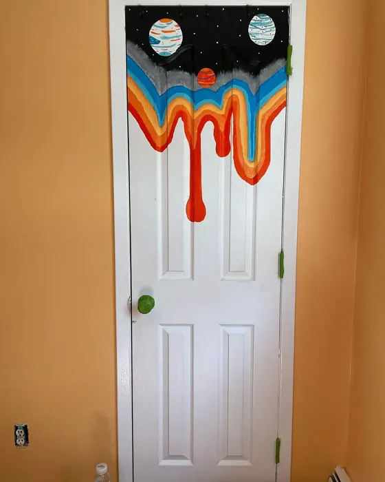
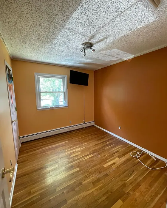
Real Room Photo of Papaya SW 6661
Undertones of Papaya ?
The undertones of Papaya are a key aspect of its character, leaning towards Red. These subtle underlying hues are what give the color its depth and complexity. For example, a gray with a blue undertone will feel cooler and more modern, while one with a brown undertone will feel warmer and more traditional. It’s essential to test this paint in your home and observe it next to your existing furniture, flooring, and decor to see how these undertones interact and reveal themselves throughout the day.
HEX value: #EFB97B
RGB code: 239, 185, 123
Is Papaya Cool or Warm?
Papaya is decidedly warm, making it perfect for cozy settings. Its warmth invites you in, creating a comfortable environment that feels both uplifting and soothing.
Understanding Color Properties and Interior Design Tips
Hue refers to a specific position on the color wheel, measured in degrees from 0 to 360. Each degree represents a different pure color:
- 0° represents red
- 120° represents green
- 240° represents blue
Saturation describes the intensity or purity of a color and is expressed as a percentage:
- At 0%, the color appears completely desaturated—essentially a shade of gray
- At 100%, the color is at its most vivid and vibrant
Lightness indicates how light or dark a color is, also expressed as a percentage:
- 0% lightness results in black
- 100% lightness results in white
Using Warm Colors in Interior Design
Warm hues—such as reds, oranges, yellows, warm beiges, and greiges—are excellent choices for creating inviting and energetic spaces. These colors are particularly well-suited for:
- Kitchens, living rooms, and bathrooms, where warmth enhances comfort and sociability
- Large rooms, where warm tones can help reduce the sense of emptiness and make the space feel more intimate
For example:
- Warm beige shades provide a cozy, inviting atmosphere, ideal for living rooms, bedrooms, and hallways.
- Warm greige (a mix of beige and gray) offers the warmth of beige with the modern appeal of gray, making it a versatile backdrop for dining areas, bedrooms, and living spaces.
However, be mindful when using warm light tones in rooms with limited natural light. These shades may appear muted or even take on an unpleasant yellowish tint. To avoid a dull or flat appearance:
- Add depth by incorporating richer tones like deep greens, charcoal, or chocolate brown
- Use textured elements such as curtains, rugs, or cushions to bring dimension to the space
Pro Tip: Achieving Harmony with Warm and Cool Color Balance
To create a well-balanced and visually interesting interior, mix warm and cool tones strategically. This contrast adds depth and harmony to your design.
- If your walls feature warm hues, introduce cool-colored accents such as blue or green furniture, artwork, or accessories to create contrast.
- For a polished look, consider using a complementary color scheme, which pairs colors opposite each other on the color wheel (e.g., red with green, orange with blue).
This thoughtful mix not only enhances visual appeal but also creates a space that feels both dynamic and cohesive.
Light Temperature Affects on Papaya
Natural Light
Natural daylight changes in color temperature as the sun moves across the sky. At sunrise and sunset, the light tends to have a warm, golden tone with a color temperature around 2000 Kelvin (K). As the day progresses and the sun rises higher, the light becomes cooler and more neutral. Around midday, especially when the sky is clear, natural light typically reaches its peak brightness and shifts to a cooler tone, ranging from 5500 to 6500 Kelvin. This midday light is close to what we perceive as pure white or daylight-balanced light.
These shifts in natural light can significantly influence how colors appear in a space, which is why designers often consider both the time of day and the orientation of windows when planning interior color schemes.
Artificial Light
When choosing artificial lighting, pay close attention to the color temperature, measured in Kelvin (K). This determines how warm or cool the light will appear. Lower temperatures, around 2700K, give off a warm, yellow glow often used in living rooms or bedrooms. Higher temperatures, above 5000K, create a cool, bluish light similar to daylight, commonly used in kitchens, offices, or task areas.
Use the slider to see how lighting temperature can affect the appearance of a surface or color throughout a space.


4800K
LRV of Papaya
The Light Reflectance Value (LRV) of Papaya is 75%, which places it in the Light category. This means it Reflects a high amount of light. Understanding a paint’s LRV is crucial for predicting how it will look in your space. A higher LRV indicates a lighter color that reflects more light, making rooms feel larger and brighter. A lower LRV signifies a darker color that absorbs more light, creating a cozier, more intimate atmosphere. Always consider the natural and artificial lighting in your room when selecting a paint color based on its LRV.
Detailed Review of Papaya
Additional Paint Characteristics
Ideal Rooms
Bedroom, Dining Room, Home Office, Kitchen, Living Room
Decor Styles
Bohemian, Coastal, Modern Farmhouse, Tropical
Coverage
Good (1–2 Coats)
Ease of Application
Beginner Friendly, Brush Smooth, Fast-Drying, Roller-Ready
Washability
Highly Washable, Washable, Wipeable
VOC Level
Low VOC
Best Use
Accent Wall, Furniture, Interior Walls
Room Suitability
Bedroom, Home Office, Kitchen, Living Room
Tone Tag
Earthy, Inviting, Warm
Finish Type
Eggshell, Satin, Semi-Gloss
Paint Performance
High Coverage, Low Odor, Quick Drying
Use Cases
Best for Modern Farmhouse, Best for Rentals, Best for Selling Your Home, Designer Favorite
Mood
Cozy, Energizing, Inviting
Trim Pairing
Complements Brass Fixtures, Pairs with White Dove, Works with Warm Trim
Papaya is more than just a pretty color; it’s a versatile choice that can enhance various decor styles. The warm, inviting shade works beautifully in open spaces, adding a sense of airiness without overwhelming the senses. It’s particularly effective in rooms flooded with natural light, where it can truly shine without appearing too bold. However, if you’re working in a dimly lit area, consider pairing it with bright accents or whites to balance the warmth. Overall, Papaya is a delightful hue that breathes life into any room. It’s perfect for those looking to create a welcoming atmosphere.
Pros & Cons of SW 6661 Papaya
Pros
Cons
Colors that go with Sherwin Williams Papaya
FAQ on SW 6661 Papaya
How does Papaya perform in different lighting?
Papaya is quite adaptive when it comes to lighting. In bright, natural light, it exudes a lively and vibrant feel, making it perfect for areas that receive ample sunlight. Conversely, in dim light, the color softens, creating a more subdued atmosphere. It’s advisable to test the color in your specific lighting conditions to see how it interacts with your space.
Is Papaya suitable for outdoor use?
While Papaya is primarily designed for indoor applications, it can be used on covered outdoor spaces like patios or porches. Just ensure you select a suitable exterior paint finish to withstand the elements if you choose to use it outside. For full outdoor exposure, consider using a more durable, weather-resistant color.
Comparisons Papaya with other colors
Papaya SW 6661 vs Hearts of Palm SW 6415
| Attribute | Papaya SW 6661 | Hearts of Palm SW 6415 |
|---|---|---|
| Color Name | Papaya SW 6661 | Hearts of Palm SW 6415 |
| Color | ||
| Hue | Yellow | Yellow |
| Brightness | Medium | Medium |
| RGB | 239, 185, 123 | 207, 194, 145 |
| LRV | 75% | 75% |
| Finish Type | Eggshell, Satin, Semi-Gloss | Eggshell, Matte, Satin |
| Finish Options | Eggshell, Flat, Satin, Semi-Gloss | Eggshell, Matte, Satin |
| Ideal Rooms | Bedroom, Dining Room, Home Office, Kitchen, Living Room | Bathroom, Bedroom, Dining Room, Home Office, Kitchen, Living Room |
| Decor Styles | Bohemian, Coastal, Modern Farmhouse, Tropical | Bohemian, Coastal, Eclectic, Modern Farmhouse, Tropical |
| Coverage | Good (1–2 Coats) | Good (1–2 Coats), Touch-Up Friendly |
| Ease of Application | Beginner Friendly, Brush Smooth, Fast-Drying, Roller-Ready | Beginner Friendly, Brush Smooth, Roller-Ready |
| Washability | Highly Washable, Washable, Wipeable | Scrubbable, Washable |
| Room Suitability | Bedroom, Home Office, Kitchen, Living Room | Bathroom, Bedroom, Dining Room, Home Office, Kitchen, Living Room |
| Tone | Earthy, Inviting, Warm | Earthy, Muted, Warm |
| Paint Performance | High Coverage, Low Odor, Quick Drying | Easy Touch-Up, Low Odor, Scuff Resistant |
Papaya SW 6661 vs Blonde SW 6128
| Attribute | Papaya SW 6661 | Blonde SW 6128 |
|---|---|---|
| Color Name | Papaya SW 6661 | Blonde SW 6128 |
| Color | ||
| Hue | Yellow | Yellow |
| Brightness | Medium | Medium |
| RGB | 239, 185, 123 | 220, 189, 146 |
| LRV | 75% | 64% |
| Finish Type | Eggshell, Satin, Semi-Gloss | Eggshell, Satin |
| Finish Options | Eggshell, Flat, Satin, Semi-Gloss | Eggshell, Matte, Satin |
| Ideal Rooms | Bedroom, Dining Room, Home Office, Kitchen, Living Room | Bedroom, Dining Room, Home Office, Kitchen, Living Room |
| Decor Styles | Bohemian, Coastal, Modern Farmhouse, Tropical | Bohemian, Coastal, Modern Farmhouse, Scandinavian, Transitional |
| Coverage | Good (1–2 Coats) | Good (1–2 Coats), Touch-Up Friendly |
| Ease of Application | Beginner Friendly, Brush Smooth, Fast-Drying, Roller-Ready | Beginner Friendly, Fast-Drying, Roller-Ready |
| Washability | Highly Washable, Washable, Wipeable | Highly Washable, Washable |
| Room Suitability | Bedroom, Home Office, Kitchen, Living Room | Bedroom, Dining Room, Home Office, Kitchen, Living Room, Nursery |
| Tone | Earthy, Inviting, Warm | Earthy, Neutral, Warm |
| Paint Performance | High Coverage, Low Odor, Quick Drying | Easy Touch-Up, Fade Resistant, Low Odor, Quick Drying |
Papaya SW 6661 vs Ruskin Room Green SW 0042
| Attribute | Papaya SW 6661 | Ruskin Room Green SW 0042 |
|---|---|---|
| Color Name | Papaya SW 6661 | Ruskin Room Green SW 0042 |
| Color | ||
| Hue | Yellow | Yellow |
| Brightness | Medium | Medium |
| RGB | 239, 185, 123 | 172, 161, 125 |
| LRV | 75% | 24% |
| Finish Type | Eggshell, Satin, Semi-Gloss | Eggshell, Matte |
| Finish Options | Eggshell, Flat, Satin, Semi-Gloss | Eggshell, Flat, Matte, Satin |
| Ideal Rooms | Bedroom, Dining Room, Home Office, Kitchen, Living Room | Bedroom, Dining Room, Home Office, Living Room |
| Decor Styles | Bohemian, Coastal, Modern Farmhouse, Tropical | Farmhouse, Modern, Rustic, Traditional |
| Coverage | Good (1–2 Coats) | Good (1–2 Coats), Touch-Up Friendly |
| Ease of Application | Beginner Friendly, Brush Smooth, Fast-Drying, Roller-Ready | Beginner Friendly, Brush Smooth, Roller-Ready |
| Washability | Highly Washable, Washable, Wipeable | Scrubbable, Washable |
| Room Suitability | Bedroom, Home Office, Kitchen, Living Room | Bedroom, Dining Room, Home Office, Living Room |
| Tone | Earthy, Inviting, Warm | Earthy, Muted, Warm |
| Paint Performance | High Coverage, Low Odor, Quick Drying | Easy Touch-Up, High Coverage, Low Odor |
Papaya SW 6661 vs Bosc Pear SW 6390
| Attribute | Papaya SW 6661 | Bosc Pear SW 6390 |
|---|---|---|
| Color Name | Papaya SW 6661 | Bosc Pear SW 6390 |
| Color | ||
| Hue | Yellow | Yellow |
| Brightness | Medium | Medium |
| RGB | 239, 185, 123 | 192, 144, 86 |
| LRV | 75% | 60% |
| Finish Type | Eggshell, Satin, Semi-Gloss | Satin, Semi-Gloss |
| Finish Options | Eggshell, Flat, Satin, Semi-Gloss | Flat, Satin, Semi-Gloss |
| Ideal Rooms | Bedroom, Dining Room, Home Office, Kitchen, Living Room | Bedroom, Dining Room, Home Office, Kitchen, Living Room |
| Decor Styles | Bohemian, Coastal, Modern Farmhouse, Tropical | Modern Farmhouse, Rustic, Traditional, Transitional |
| Coverage | Good (1–2 Coats) | Good (1–2 Coats) |
| Ease of Application | Beginner Friendly, Brush Smooth, Fast-Drying, Roller-Ready | Beginner Friendly, Brush Smooth, Fast-Drying, Roller-Ready |
| Washability | Highly Washable, Washable, Wipeable | Highly Washable, Washable |
| Room Suitability | Bedroom, Home Office, Kitchen, Living Room | Bedroom, Dining Room, Home Office, Living Room |
| Tone | Earthy, Inviting, Warm | Balanced, Earthy, Warm |
| Paint Performance | High Coverage, Low Odor, Quick Drying | Easy Touch-Up, High Coverage, Low Odor, Quick Drying |
Papaya SW 6661 vs Lemongrass SW 7732
| Attribute | Papaya SW 6661 | Lemongrass SW 7732 |
|---|---|---|
| Color Name | Papaya SW 6661 | Lemongrass SW 7732 |
| Color | ||
| Hue | Yellow | Yellow |
| Brightness | Medium | Medium |
| RGB | 239, 185, 123 | 200, 189, 152 |
| LRV | 75% | 48% |
| Finish Type | Eggshell, Satin, Semi-Gloss | Eggshell, Matte, Satin |
| Finish Options | Eggshell, Flat, Satin, Semi-Gloss | Eggshell, Matte, Satin |
| Ideal Rooms | Bedroom, Dining Room, Home Office, Kitchen, Living Room | Bathroom, Bedroom, Home Office, Kitchen, Living Room, Nursery |
| Decor Styles | Bohemian, Coastal, Modern Farmhouse, Tropical | Bohemian, Modern Farmhouse, Scandinavian, Transitional |
| Coverage | Good (1–2 Coats) | Good (1–2 Coats) |
| Ease of Application | Beginner Friendly, Brush Smooth, Fast-Drying, Roller-Ready | Beginner Friendly, Brush Smooth, Roller-Ready |
| Washability | Highly Washable, Washable, Wipeable | Highly Washable, Washable |
| Room Suitability | Bedroom, Home Office, Kitchen, Living Room | Bedroom, Home Office, Kitchen, Living Room |
| Tone | Earthy, Inviting, Warm | Earthy, Muted, Warm |
| Paint Performance | High Coverage, Low Odor, Quick Drying | Easy Touch-Up, Low Odor, Scuff Resistant |
Papaya SW 6661 vs Garden Sage SW 7736
| Attribute | Papaya SW 6661 | Garden Sage SW 7736 |
|---|---|---|
| Color Name | Papaya SW 6661 | Garden Sage SW 7736 |
| Color | ||
| Hue | Yellow | Yellow |
| Brightness | Medium | Medium |
| RGB | 239, 185, 123 | 177, 165, 132 |
| LRV | 75% | 24% |
| Finish Type | Eggshell, Satin, Semi-Gloss | Eggshell, Matte, Satin |
| Finish Options | Eggshell, Flat, Satin, Semi-Gloss | Eggshell, Matte, Satin |
| Ideal Rooms | Bedroom, Dining Room, Home Office, Kitchen, Living Room | Bedroom, Dining Room, Home Office, Kitchen, Living Room, Nursery |
| Decor Styles | Bohemian, Coastal, Modern Farmhouse, Tropical | Bohemian, Cottage, Minimalist, Modern Farmhouse, Traditional |
| Coverage | Good (1–2 Coats) | Good (1–2 Coats), Touch-Up Friendly |
| Ease of Application | Beginner Friendly, Brush Smooth, Fast-Drying, Roller-Ready | Beginner Friendly, Brush Smooth, Roller-Ready |
| Washability | Highly Washable, Washable, Wipeable | Highly Washable, Washable |
| Room Suitability | Bedroom, Home Office, Kitchen, Living Room | Bedroom, Dining Room, Home Office, Kitchen, Living Room |
| Tone | Earthy, Inviting, Warm | Balanced, Earthy, Muted, Warm |
| Paint Performance | High Coverage, Low Odor, Quick Drying | Easy Touch-Up, Fade Resistant, Low Odor |
Papaya SW 6661 vs Tassel SW 6369
| Attribute | Papaya SW 6661 | Tassel SW 6369 |
|---|---|---|
| Color Name | Papaya SW 6661 | Tassel SW 6369 |
| Color | ||
| Hue | Yellow | Yellow |
| Brightness | Medium | Medium |
| RGB | 239, 185, 123 | 198, 136, 74 |
| LRV | 75% | 45% |
| Finish Type | Eggshell, Satin, Semi-Gloss | Matte, Satin |
| Finish Options | Eggshell, Flat, Satin, Semi-Gloss | Matte, Satin, Semi-Gloss |
| Ideal Rooms | Bedroom, Dining Room, Home Office, Kitchen, Living Room | Bedroom, Dining Room, Home Office, Living Room |
| Decor Styles | Bohemian, Coastal, Modern Farmhouse, Tropical | Bohemian, Modern Farmhouse, Rustic, Transitional |
| Coverage | Good (1–2 Coats) | Good (1–2 Coats) |
| Ease of Application | Beginner Friendly, Brush Smooth, Fast-Drying, Roller-Ready | Beginner Friendly, Brush Smooth, Fast-Drying, Roller-Ready |
| Washability | Highly Washable, Washable, Wipeable | Scrubbable, Washable |
| Room Suitability | Bedroom, Home Office, Kitchen, Living Room | Bedroom, Dining Room, Home Office, Living Room |
| Tone | Earthy, Inviting, Warm | Earthy, Inviting, Warm |
| Paint Performance | High Coverage, Low Odor, Quick Drying | Easy Touch-Up, Low Odor, Quick Drying, Scuff Resistant |
Papaya SW 6661 vs Sunflower SW 6678
| Attribute | Papaya SW 6661 | Sunflower SW 6678 |
|---|---|---|
| Color Name | Papaya SW 6661 | Sunflower SW 6678 |
| Color | ||
| Hue | Yellow | Yellow |
| Brightness | Medium | Medium |
| RGB | 239, 185, 123 | 227, 154, 51 |
| LRV | 75% | 75% |
| Finish Type | Eggshell, Satin, Semi-Gloss | Eggshell, Satin |
| Finish Options | Eggshell, Flat, Satin, Semi-Gloss | Eggshell, Satin, Semi-Gloss |
| Ideal Rooms | Bedroom, Dining Room, Home Office, Kitchen, Living Room | Dining Room, Entryway, Home Office, Kitchen, Living Room |
| Decor Styles | Bohemian, Coastal, Modern Farmhouse, Tropical | Bohemian, Eclectic, Modern Farmhouse, Traditional |
| Coverage | Good (1–2 Coats) | Good (1–2 Coats), Touch-Up Friendly |
| Ease of Application | Beginner Friendly, Brush Smooth, Fast-Drying, Roller-Ready | Beginner Friendly, Brush Smooth, Fast-Drying, Roller-Ready |
| Washability | Highly Washable, Washable, Wipeable | Highly Washable, Washable |
| Room Suitability | Bedroom, Home Office, Kitchen, Living Room | Dining Room, Entryway, Kitchen, Living Room |
| Tone | Earthy, Inviting, Warm | Bold, Earthy, Warm |
| Paint Performance | High Coverage, Low Odor, Quick Drying | Fade Resistant, High Coverage, Quick Drying |
Papaya SW 6661 vs Bee's Wax SW 7682
| Attribute | Papaya SW 6661 | Bee's Wax SW 7682 |
|---|---|---|
| Color Name | Papaya SW 6661 | Bee's Wax SW 7682 |
| Color | ||
| Hue | Yellow | Yellow |
| Brightness | Medium | Medium |
| RGB | 239, 185, 123 | 234, 191, 134 |
| LRV | 75% | 50% |
| Finish Type | Eggshell, Satin, Semi-Gloss | Eggshell, Matte, Satin |
| Finish Options | Eggshell, Flat, Satin, Semi-Gloss | Eggshell, Matte, Satin |
| Ideal Rooms | Bedroom, Dining Room, Home Office, Kitchen, Living Room | Bedroom, Dining Room, Entryway, Kitchen, Living Room |
| Decor Styles | Bohemian, Coastal, Modern Farmhouse, Tropical | Bohemian, Coastal, Modern Farmhouse, Traditional, Transitional |
| Coverage | Good (1–2 Coats) | Good (1–2 Coats), Touch-Up Friendly |
| Ease of Application | Beginner Friendly, Brush Smooth, Fast-Drying, Roller-Ready | Beginner Friendly, Brush Smooth, Roller-Ready |
| Washability | Highly Washable, Washable, Wipeable | Washable, Wipeable |
| Room Suitability | Bedroom, Home Office, Kitchen, Living Room | Bedroom, Dining Room, Entryway, Kitchen, Living Room |
| Tone | Earthy, Inviting, Warm | Creamy, Earthy, Warm |
| Paint Performance | High Coverage, Low Odor, Quick Drying | Easy Touch-Up, High Coverage, Low Odor |
Papaya SW 6661 vs Downing Straw SW 2813
| Attribute | Papaya SW 6661 | Downing Straw SW 2813 |
|---|---|---|
| Color Name | Papaya SW 6661 | Downing Straw SW 2813 |
| Color | ||
| Hue | Yellow | Yellow |
| Brightness | Medium | Medium |
| RGB | 239, 185, 123 | 202, 171, 125 |
| LRV | 75% | 48% |
| Finish Type | Eggshell, Satin, Semi-Gloss | Eggshell, Matte, Satin |
| Finish Options | Eggshell, Flat, Satin, Semi-Gloss | Eggshell, Matte, Satin |
| Ideal Rooms | Bedroom, Dining Room, Home Office, Kitchen, Living Room | Bedroom, Dining Room, Home Office, Kitchen, Living Room |
| Decor Styles | Bohemian, Coastal, Modern Farmhouse, Tropical | Contemporary, Eclectic, Modern Farmhouse, Rustic, Traditional |
| Coverage | Good (1–2 Coats) | Good (1–2 Coats), Touch-Up Friendly |
| Ease of Application | Beginner Friendly, Brush Smooth, Fast-Drying, Roller-Ready | Beginner Friendly, Brush Smooth, Roller-Ready |
| Washability | Highly Washable, Washable, Wipeable | Washable, Wipeable |
| Room Suitability | Bedroom, Home Office, Kitchen, Living Room | Bedroom, Dining Room, Home Office, Kitchen, Living Room |
| Tone | Earthy, Inviting, Warm | Earthy, Muted, Warm |
| Paint Performance | High Coverage, Low Odor, Quick Drying | Easy Touch-Up, High Coverage, Low Odor |
Official Page of Sherwin Williams Papaya SW 6661