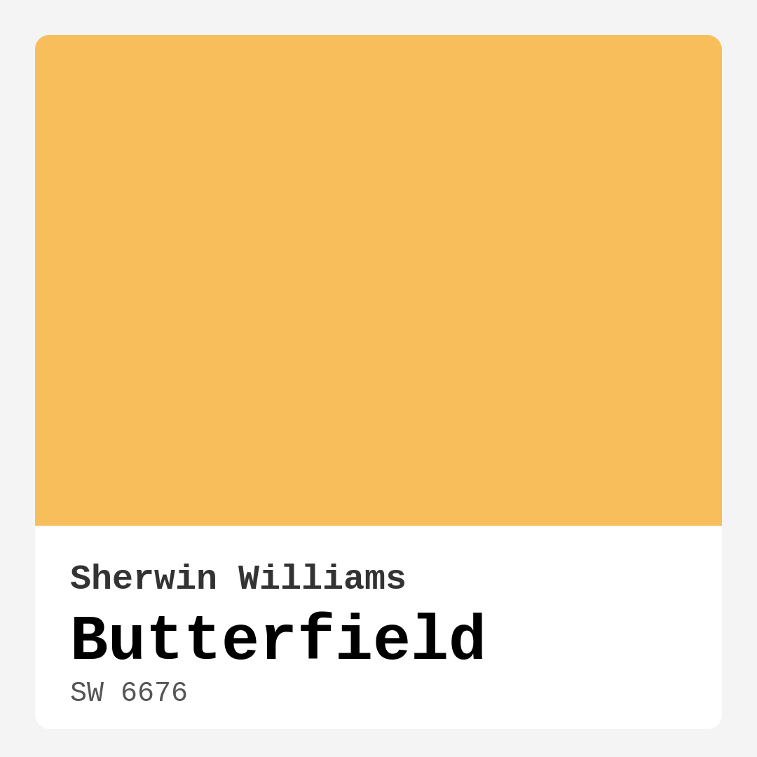
Color Preview & Key Details
| HEX Code | #F7BE5B |
| RGB | 247, 190, 91 |
| LRV | 75% |
| Undertone | Red |
| Finish Options | Eggshell, Matte, Satin |
Imagine walking into a room bathed in warmth, where the golden light seems to wrap around you like a cozy blanket. That’s the magic of Butterfield from Sherwin Williams. This paint color, with its inviting and cheerful hue, instantly brightens up a space, making it feel more open and welcoming. If you’ve been contemplating a change in your home, Butterfield could be just the transformation you’re seeking.
Butterfield, with its color code SW 6676, is a stunning medium yellow that embodies the essence of sunshine. Its warm undertones create a vibrant atmosphere that can infuse life into any area, making it an ideal choice for those who want to cultivate a cozy and cheerful environment. With an LRV of 75%, Butterfield reflects a significant amount of light, which means it can help spaces feel larger and more airy.
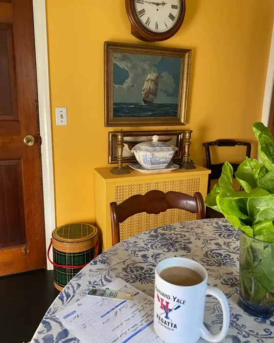
Let’s talk about where Butterfield shines best. Picture it in your living room, creating a heartwarming space where family and friends gather. You could also consider it for your kitchen, transforming it into a cheerful hub that inspires culinary creativity. In the dining room, it encourages warmth during shared meals, making every bite taste just a little sweeter. Even in a bedroom, Butterfield can create a soothing retreat, inviting relaxation while still keeping a bright and uplifting vibe.
One of the most wonderful aspects of Butterfield is its versatility. It seamlessly fits into numerous decor styles, from modern farmhouse to transitional and even coastal designs. This adaptability makes it a homeowner’s dream. You can pair it with rustic wood accents for that charming farmhouse feel, or mix it with soft blues and whites for a breezy coastal atmosphere. Think about how it interacts with your existing furniture and decor—its warm undertone can beautifully complement a range of colors.
Now, let’s address the application process. Whether you’re a seasoned DIYer or a first-timer, Butterfield’s ease of application makes it friendly for everyone. It goes on smoothly and typically requires just one to two coats for full coverage. This means less time painting and more time enjoying your freshly transformed space. Plus, its touch-up friendly nature ensures that you won’t have to worry about mismatched patches over time, a common concern for many homeowners.
You might wonder how Butterfield holds up in high-traffic areas. The good news is that it’s washability and durable finish make it suitable for busy zones in your home. While it may not be the most scuff-resistant option out there, regular cleaning will keep it looking fresh. If you’re really concerned about wear and tear, adding an extra layer of protective finish can enhance its longevity, especially in places like hallways or family rooms.
When it comes to pairing Butterfield with other colors, the possibilities are endless. You might consider complementary shades like soft blues or earthy greens, which can create a beautiful contrast that enhances the warmth of Butterfield. For a more monochromatic look, lighter shades from Sherwin Williams, such as SW 9665 or SW 6897, can create a layered effect that adds depth to your space. On the other hand, deeper shades such as SW 6898 or SW 6904 can help ground the room and create a sophisticated balance.
Before you commit to Butterfield, it’s essential to test it in your home. Colors can look very different depending on the lighting, time of day, and surrounding decor. Its warm undertones lean towards red, so you’ll want to see how it interacts with your existing colors and furnishings. I always recommend painting a small section and observing it throughout the day to see how it changes with the light.
Speaking of light, Butterfield truly shines in natural light. It reflects that warm golden hue, creating an uplifting atmosphere. Under artificial lighting, it maintains its warmth, which is fantastic for transitioning your space from day to night. This adaptability makes it a reliable choice for any room in the house, whether it’s a bright, sunlit living room or a cozy, dimly lit bedroom in the evening.
The washability of Butterfield is another appealing feature. Life can get messy, especially in homes with kids or pets. Fortunately, this paint is both wipeable and washable, which means you can tackle those inevitable smudges and spills without fear. Keeping your walls looking fresh will be a breeze, allowing you to focus on what truly matters—enjoying your beautifully decorated space.
The emotional impact of color cannot be understated. Butterfield exudes a cozy, inviting vibe that encourages connection and relaxation. It’s the kind of hue that makes you want to curl up with a good book or gather around the dinner table with loved ones. This mood-enhancing quality is one of the reasons why Butterfield has quickly become a favorite among both homeowners and designers alike.
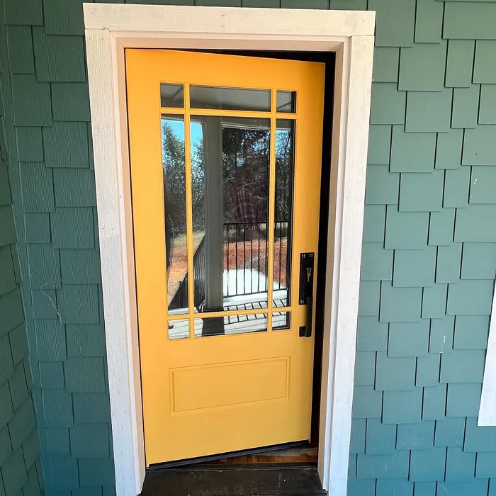
If you’re considering Butterfield for an exterior project, it’s possible, but it requires some additional preparation. While primarily designed for interiors, this color can work outside with the right primer and a protective topcoat. Just keep in mind that exposure to the elements may alter its appearance over time.
In summary, Butterfield is more than just a pretty color—it’s a thoughtful choice that can enhance your home and your life. Its warm, inviting nature makes it perfect for creating cozy spaces where memories are made. With its ease of application, versatility across decor styles, and ability to brighten any room, it’s no wonder that Butterfield is making waves in the world of home design. So, if you’re ready to bring some sunshine into your life, give Butterfield a try. Embrace the warmth, and let this beautiful hue transform your space into a haven of comfort and joy.
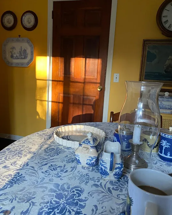
Real Room Photo of Butterfield SW 6676
Undertones of Butterfield ?
The undertones of Butterfield are a key aspect of its character, leaning towards Red. These subtle underlying hues are what give the color its depth and complexity. For example, a gray with a blue undertone will feel cooler and more modern, while one with a brown undertone will feel warmer and more traditional. It’s essential to test this paint in your home and observe it next to your existing furniture, flooring, and decor to see how these undertones interact and reveal themselves throughout the day.
HEX value: #F7BE5B
RGB code: 247, 190, 91
Is Butterfield Cool or Warm?
Butterfield leans decidedly warm, radiating a sense of comfort and cheer. This warmth makes it particularly suitable for spaces where you want to foster connection and relaxation.
Understanding Color Properties and Interior Design Tips
Hue refers to a specific position on the color wheel, measured in degrees from 0 to 360. Each degree represents a different pure color:
- 0° represents red
- 120° represents green
- 240° represents blue
Saturation describes the intensity or purity of a color and is expressed as a percentage:
- At 0%, the color appears completely desaturated—essentially a shade of gray
- At 100%, the color is at its most vivid and vibrant
Lightness indicates how light or dark a color is, also expressed as a percentage:
- 0% lightness results in black
- 100% lightness results in white
Using Warm Colors in Interior Design
Warm hues—such as reds, oranges, yellows, warm beiges, and greiges—are excellent choices for creating inviting and energetic spaces. These colors are particularly well-suited for:
- Kitchens, living rooms, and bathrooms, where warmth enhances comfort and sociability
- Large rooms, where warm tones can help reduce the sense of emptiness and make the space feel more intimate
For example:
- Warm beige shades provide a cozy, inviting atmosphere, ideal for living rooms, bedrooms, and hallways.
- Warm greige (a mix of beige and gray) offers the warmth of beige with the modern appeal of gray, making it a versatile backdrop for dining areas, bedrooms, and living spaces.
However, be mindful when using warm light tones in rooms with limited natural light. These shades may appear muted or even take on an unpleasant yellowish tint. To avoid a dull or flat appearance:
- Add depth by incorporating richer tones like deep greens, charcoal, or chocolate brown
- Use textured elements such as curtains, rugs, or cushions to bring dimension to the space
Pro Tip: Achieving Harmony with Warm and Cool Color Balance
To create a well-balanced and visually interesting interior, mix warm and cool tones strategically. This contrast adds depth and harmony to your design.
- If your walls feature warm hues, introduce cool-colored accents such as blue or green furniture, artwork, or accessories to create contrast.
- For a polished look, consider using a complementary color scheme, which pairs colors opposite each other on the color wheel (e.g., red with green, orange with blue).
This thoughtful mix not only enhances visual appeal but also creates a space that feels both dynamic and cohesive.
Light Temperature Affects on Butterfield
Natural Light
Natural daylight changes in color temperature as the sun moves across the sky. At sunrise and sunset, the light tends to have a warm, golden tone with a color temperature around 2000 Kelvin (K). As the day progresses and the sun rises higher, the light becomes cooler and more neutral. Around midday, especially when the sky is clear, natural light typically reaches its peak brightness and shifts to a cooler tone, ranging from 5500 to 6500 Kelvin. This midday light is close to what we perceive as pure white or daylight-balanced light.
These shifts in natural light can significantly influence how colors appear in a space, which is why designers often consider both the time of day and the orientation of windows when planning interior color schemes.
Artificial Light
When choosing artificial lighting, pay close attention to the color temperature, measured in Kelvin (K). This determines how warm or cool the light will appear. Lower temperatures, around 2700K, give off a warm, yellow glow often used in living rooms or bedrooms. Higher temperatures, above 5000K, create a cool, bluish light similar to daylight, commonly used in kitchens, offices, or task areas.
Use the slider to see how lighting temperature can affect the appearance of a surface or color throughout a space.


4800K
LRV of Butterfield
The Light Reflectance Value (LRV) of Butterfield is 75%, which places it in the Light category. This means it Reflects a high amount of light. Understanding a paint’s LRV is crucial for predicting how it will look in your space. A higher LRV indicates a lighter color that reflects more light, making rooms feel larger and brighter. A lower LRV signifies a darker color that absorbs more light, creating a cozier, more intimate atmosphere. Always consider the natural and artificial lighting in your room when selecting a paint color based on its LRV.
Detailed Review of Butterfield
Additional Paint Characteristics
Ideal Rooms
Bedroom, Dining Room, Home Office, Kitchen, Living Room
Decor Styles
Bohemian, Coastal, Modern Farmhouse, Transitional
Coverage
Good (1–2 Coats), Touch-Up Friendly
Ease of Application
Beginner Friendly, Fast-Drying, Roller-Ready
Washability
Washable, Wipeable
VOC Level
Low VOC
Best Use
Accent Wall, Interior Walls, Trim
Room Suitability
Bedroom, Dining Room, Kitchen, Living Room
Tone Tag
Creamy, Earthy, Warm
Finish Type
Eggshell, Satin
Paint Performance
Easy Touch-Up, Fade Resistant, Low Odor, Quick Drying
Use Cases
Best for Small Spaces, Classic Favorite, Designer Favorite
Mood
Brightening, Cozy, Inviting
Trim Pairing
Complements Brass Fixtures, Pairs with White Dove, Works with Warm Trim
Butterfield has quickly become a favorite among homeowners and decorators alike. Its beautiful golden tone can effectively transform spaces, making them feel larger and more inviting. When applied, it boasts a smooth finish that enhances the room’s natural light, creating a bright, optimistic vibe. The paint goes on easily, requiring only one to two coats for complete coverage, which is a huge plus for DIYers. Additionally, its touch-up friendliness means you won’t have to worry about mismatched patches over time. Whether you’re painting an accent wall or refreshing an entire room, Butterfield delivers reliable performance and an eye-catching finish.
Pros & Cons of SW 6676 Butterfield
Pros
Cons
Colors that go with Sherwin Williams Butterfield
FAQ on SW 6676 Butterfield
How does Butterfield perform in high-traffic areas?
Butterfield is a solid choice for high-traffic areas due to its washability and durable finish. While it’s not the most scuff-resistant option available, regular cleaning will keep it looking fresh. For spaces that experience more wear and tear, consider an extra layer of a protective finish to enhance its longevity.
Is Butterfield suitable for exterior use?
While Butterfield is primarily designed for interior applications, it can be used for exterior projects with proper preparation and a suitable exterior primer. Just keep in mind that exposure to the elements may alter its appearance over time, so consider a protective topcoat for outdoor applications.
Comparisons Butterfield with other colors
Butterfield SW 6676 vs Hearts of Palm SW 6415
| Attribute | Butterfield SW 6676 | Hearts of Palm SW 6415 |
|---|---|---|
| Color Name | Butterfield SW 6676 | Hearts of Palm SW 6415 |
| Color | ||
| Hue | Yellow | Yellow |
| Brightness | Medium | Medium |
| RGB | 247, 190, 91 | 207, 194, 145 |
| LRV | 75% | 75% |
| Finish Type | Eggshell, Satin | Eggshell, Matte, Satin |
| Finish Options | Eggshell, Matte, Satin | Eggshell, Matte, Satin |
| Ideal Rooms | Bedroom, Dining Room, Home Office, Kitchen, Living Room | Bathroom, Bedroom, Dining Room, Home Office, Kitchen, Living Room |
| Decor Styles | Bohemian, Coastal, Modern Farmhouse, Transitional | Bohemian, Coastal, Eclectic, Modern Farmhouse, Tropical |
| Coverage | Good (1–2 Coats), Touch-Up Friendly | Good (1–2 Coats), Touch-Up Friendly |
| Ease of Application | Beginner Friendly, Fast-Drying, Roller-Ready | Beginner Friendly, Brush Smooth, Roller-Ready |
| Washability | Washable, Wipeable | Scrubbable, Washable |
| Room Suitability | Bedroom, Dining Room, Kitchen, Living Room | Bathroom, Bedroom, Dining Room, Home Office, Kitchen, Living Room |
| Tone | Creamy, Earthy, Warm | Earthy, Muted, Warm |
| Paint Performance | Easy Touch-Up, Fade Resistant, Low Odor, Quick Drying | Easy Touch-Up, Low Odor, Scuff Resistant |
Butterfield SW 6676 vs Blonde SW 6128
| Attribute | Butterfield SW 6676 | Blonde SW 6128 |
|---|---|---|
| Color Name | Butterfield SW 6676 | Blonde SW 6128 |
| Color | ||
| Hue | Yellow | Yellow |
| Brightness | Medium | Medium |
| RGB | 247, 190, 91 | 220, 189, 146 |
| LRV | 75% | 64% |
| Finish Type | Eggshell, Satin | Eggshell, Satin |
| Finish Options | Eggshell, Matte, Satin | Eggshell, Matte, Satin |
| Ideal Rooms | Bedroom, Dining Room, Home Office, Kitchen, Living Room | Bedroom, Dining Room, Home Office, Kitchen, Living Room |
| Decor Styles | Bohemian, Coastal, Modern Farmhouse, Transitional | Bohemian, Coastal, Modern Farmhouse, Scandinavian, Transitional |
| Coverage | Good (1–2 Coats), Touch-Up Friendly | Good (1–2 Coats), Touch-Up Friendly |
| Ease of Application | Beginner Friendly, Fast-Drying, Roller-Ready | Beginner Friendly, Fast-Drying, Roller-Ready |
| Washability | Washable, Wipeable | Highly Washable, Washable |
| Room Suitability | Bedroom, Dining Room, Kitchen, Living Room | Bedroom, Dining Room, Home Office, Kitchen, Living Room, Nursery |
| Tone | Creamy, Earthy, Warm | Earthy, Neutral, Warm |
| Paint Performance | Easy Touch-Up, Fade Resistant, Low Odor, Quick Drying | Easy Touch-Up, Fade Resistant, Low Odor, Quick Drying |
Butterfield SW 6676 vs Ruskin Room Green SW 0042
| Attribute | Butterfield SW 6676 | Ruskin Room Green SW 0042 |
|---|---|---|
| Color Name | Butterfield SW 6676 | Ruskin Room Green SW 0042 |
| Color | ||
| Hue | Yellow | Yellow |
| Brightness | Medium | Medium |
| RGB | 247, 190, 91 | 172, 161, 125 |
| LRV | 75% | 24% |
| Finish Type | Eggshell, Satin | Eggshell, Matte |
| Finish Options | Eggshell, Matte, Satin | Eggshell, Flat, Matte, Satin |
| Ideal Rooms | Bedroom, Dining Room, Home Office, Kitchen, Living Room | Bedroom, Dining Room, Home Office, Living Room |
| Decor Styles | Bohemian, Coastal, Modern Farmhouse, Transitional | Farmhouse, Modern, Rustic, Traditional |
| Coverage | Good (1–2 Coats), Touch-Up Friendly | Good (1–2 Coats), Touch-Up Friendly |
| Ease of Application | Beginner Friendly, Fast-Drying, Roller-Ready | Beginner Friendly, Brush Smooth, Roller-Ready |
| Washability | Washable, Wipeable | Scrubbable, Washable |
| Room Suitability | Bedroom, Dining Room, Kitchen, Living Room | Bedroom, Dining Room, Home Office, Living Room |
| Tone | Creamy, Earthy, Warm | Earthy, Muted, Warm |
| Paint Performance | Easy Touch-Up, Fade Resistant, Low Odor, Quick Drying | Easy Touch-Up, High Coverage, Low Odor |
Butterfield SW 6676 vs Bosc Pear SW 6390
| Attribute | Butterfield SW 6676 | Bosc Pear SW 6390 |
|---|---|---|
| Color Name | Butterfield SW 6676 | Bosc Pear SW 6390 |
| Color | ||
| Hue | Yellow | Yellow |
| Brightness | Medium | Medium |
| RGB | 247, 190, 91 | 192, 144, 86 |
| LRV | 75% | 60% |
| Finish Type | Eggshell, Satin | Satin, Semi-Gloss |
| Finish Options | Eggshell, Matte, Satin | Flat, Satin, Semi-Gloss |
| Ideal Rooms | Bedroom, Dining Room, Home Office, Kitchen, Living Room | Bedroom, Dining Room, Home Office, Kitchen, Living Room |
| Decor Styles | Bohemian, Coastal, Modern Farmhouse, Transitional | Modern Farmhouse, Rustic, Traditional, Transitional |
| Coverage | Good (1–2 Coats), Touch-Up Friendly | Good (1–2 Coats) |
| Ease of Application | Beginner Friendly, Fast-Drying, Roller-Ready | Beginner Friendly, Brush Smooth, Fast-Drying, Roller-Ready |
| Washability | Washable, Wipeable | Highly Washable, Washable |
| Room Suitability | Bedroom, Dining Room, Kitchen, Living Room | Bedroom, Dining Room, Home Office, Living Room |
| Tone | Creamy, Earthy, Warm | Balanced, Earthy, Warm |
| Paint Performance | Easy Touch-Up, Fade Resistant, Low Odor, Quick Drying | Easy Touch-Up, High Coverage, Low Odor, Quick Drying |
Butterfield SW 6676 vs Lemongrass SW 7732
| Attribute | Butterfield SW 6676 | Lemongrass SW 7732 |
|---|---|---|
| Color Name | Butterfield SW 6676 | Lemongrass SW 7732 |
| Color | ||
| Hue | Yellow | Yellow |
| Brightness | Medium | Medium |
| RGB | 247, 190, 91 | 200, 189, 152 |
| LRV | 75% | 48% |
| Finish Type | Eggshell, Satin | Eggshell, Matte, Satin |
| Finish Options | Eggshell, Matte, Satin | Eggshell, Matte, Satin |
| Ideal Rooms | Bedroom, Dining Room, Home Office, Kitchen, Living Room | Bathroom, Bedroom, Home Office, Kitchen, Living Room, Nursery |
| Decor Styles | Bohemian, Coastal, Modern Farmhouse, Transitional | Bohemian, Modern Farmhouse, Scandinavian, Transitional |
| Coverage | Good (1–2 Coats), Touch-Up Friendly | Good (1–2 Coats) |
| Ease of Application | Beginner Friendly, Fast-Drying, Roller-Ready | Beginner Friendly, Brush Smooth, Roller-Ready |
| Washability | Washable, Wipeable | Highly Washable, Washable |
| Room Suitability | Bedroom, Dining Room, Kitchen, Living Room | Bedroom, Home Office, Kitchen, Living Room |
| Tone | Creamy, Earthy, Warm | Earthy, Muted, Warm |
| Paint Performance | Easy Touch-Up, Fade Resistant, Low Odor, Quick Drying | Easy Touch-Up, Low Odor, Scuff Resistant |
Butterfield SW 6676 vs Garden Sage SW 7736
| Attribute | Butterfield SW 6676 | Garden Sage SW 7736 |
|---|---|---|
| Color Name | Butterfield SW 6676 | Garden Sage SW 7736 |
| Color | ||
| Hue | Yellow | Yellow |
| Brightness | Medium | Medium |
| RGB | 247, 190, 91 | 177, 165, 132 |
| LRV | 75% | 24% |
| Finish Type | Eggshell, Satin | Eggshell, Matte, Satin |
| Finish Options | Eggshell, Matte, Satin | Eggshell, Matte, Satin |
| Ideal Rooms | Bedroom, Dining Room, Home Office, Kitchen, Living Room | Bedroom, Dining Room, Home Office, Kitchen, Living Room, Nursery |
| Decor Styles | Bohemian, Coastal, Modern Farmhouse, Transitional | Bohemian, Cottage, Minimalist, Modern Farmhouse, Traditional |
| Coverage | Good (1–2 Coats), Touch-Up Friendly | Good (1–2 Coats), Touch-Up Friendly |
| Ease of Application | Beginner Friendly, Fast-Drying, Roller-Ready | Beginner Friendly, Brush Smooth, Roller-Ready |
| Washability | Washable, Wipeable | Highly Washable, Washable |
| Room Suitability | Bedroom, Dining Room, Kitchen, Living Room | Bedroom, Dining Room, Home Office, Kitchen, Living Room |
| Tone | Creamy, Earthy, Warm | Balanced, Earthy, Muted, Warm |
| Paint Performance | Easy Touch-Up, Fade Resistant, Low Odor, Quick Drying | Easy Touch-Up, Fade Resistant, Low Odor |
Butterfield SW 6676 vs Tassel SW 6369
| Attribute | Butterfield SW 6676 | Tassel SW 6369 |
|---|---|---|
| Color Name | Butterfield SW 6676 | Tassel SW 6369 |
| Color | ||
| Hue | Yellow | Yellow |
| Brightness | Medium | Medium |
| RGB | 247, 190, 91 | 198, 136, 74 |
| LRV | 75% | 45% |
| Finish Type | Eggshell, Satin | Matte, Satin |
| Finish Options | Eggshell, Matte, Satin | Matte, Satin, Semi-Gloss |
| Ideal Rooms | Bedroom, Dining Room, Home Office, Kitchen, Living Room | Bedroom, Dining Room, Home Office, Living Room |
| Decor Styles | Bohemian, Coastal, Modern Farmhouse, Transitional | Bohemian, Modern Farmhouse, Rustic, Transitional |
| Coverage | Good (1–2 Coats), Touch-Up Friendly | Good (1–2 Coats) |
| Ease of Application | Beginner Friendly, Fast-Drying, Roller-Ready | Beginner Friendly, Brush Smooth, Fast-Drying, Roller-Ready |
| Washability | Washable, Wipeable | Scrubbable, Washable |
| Room Suitability | Bedroom, Dining Room, Kitchen, Living Room | Bedroom, Dining Room, Home Office, Living Room |
| Tone | Creamy, Earthy, Warm | Earthy, Inviting, Warm |
| Paint Performance | Easy Touch-Up, Fade Resistant, Low Odor, Quick Drying | Easy Touch-Up, Low Odor, Quick Drying, Scuff Resistant |
Butterfield SW 6676 vs Sunflower SW 6678
| Attribute | Butterfield SW 6676 | Sunflower SW 6678 |
|---|---|---|
| Color Name | Butterfield SW 6676 | Sunflower SW 6678 |
| Color | ||
| Hue | Yellow | Yellow |
| Brightness | Medium | Medium |
| RGB | 247, 190, 91 | 227, 154, 51 |
| LRV | 75% | 75% |
| Finish Type | Eggshell, Satin | Eggshell, Satin |
| Finish Options | Eggshell, Matte, Satin | Eggshell, Satin, Semi-Gloss |
| Ideal Rooms | Bedroom, Dining Room, Home Office, Kitchen, Living Room | Dining Room, Entryway, Home Office, Kitchen, Living Room |
| Decor Styles | Bohemian, Coastal, Modern Farmhouse, Transitional | Bohemian, Eclectic, Modern Farmhouse, Traditional |
| Coverage | Good (1–2 Coats), Touch-Up Friendly | Good (1–2 Coats), Touch-Up Friendly |
| Ease of Application | Beginner Friendly, Fast-Drying, Roller-Ready | Beginner Friendly, Brush Smooth, Fast-Drying, Roller-Ready |
| Washability | Washable, Wipeable | Highly Washable, Washable |
| Room Suitability | Bedroom, Dining Room, Kitchen, Living Room | Dining Room, Entryway, Kitchen, Living Room |
| Tone | Creamy, Earthy, Warm | Bold, Earthy, Warm |
| Paint Performance | Easy Touch-Up, Fade Resistant, Low Odor, Quick Drying | Fade Resistant, High Coverage, Quick Drying |
Butterfield SW 6676 vs Bee's Wax SW 7682
| Attribute | Butterfield SW 6676 | Bee's Wax SW 7682 |
|---|---|---|
| Color Name | Butterfield SW 6676 | Bee's Wax SW 7682 |
| Color | ||
| Hue | Yellow | Yellow |
| Brightness | Medium | Medium |
| RGB | 247, 190, 91 | 234, 191, 134 |
| LRV | 75% | 50% |
| Finish Type | Eggshell, Satin | Eggshell, Matte, Satin |
| Finish Options | Eggshell, Matte, Satin | Eggshell, Matte, Satin |
| Ideal Rooms | Bedroom, Dining Room, Home Office, Kitchen, Living Room | Bedroom, Dining Room, Entryway, Kitchen, Living Room |
| Decor Styles | Bohemian, Coastal, Modern Farmhouse, Transitional | Bohemian, Coastal, Modern Farmhouse, Traditional, Transitional |
| Coverage | Good (1–2 Coats), Touch-Up Friendly | Good (1–2 Coats), Touch-Up Friendly |
| Ease of Application | Beginner Friendly, Fast-Drying, Roller-Ready | Beginner Friendly, Brush Smooth, Roller-Ready |
| Washability | Washable, Wipeable | Washable, Wipeable |
| Room Suitability | Bedroom, Dining Room, Kitchen, Living Room | Bedroom, Dining Room, Entryway, Kitchen, Living Room |
| Tone | Creamy, Earthy, Warm | Creamy, Earthy, Warm |
| Paint Performance | Easy Touch-Up, Fade Resistant, Low Odor, Quick Drying | Easy Touch-Up, High Coverage, Low Odor |
Butterfield SW 6676 vs Downing Straw SW 2813
| Attribute | Butterfield SW 6676 | Downing Straw SW 2813 |
|---|---|---|
| Color Name | Butterfield SW 6676 | Downing Straw SW 2813 |
| Color | ||
| Hue | Yellow | Yellow |
| Brightness | Medium | Medium |
| RGB | 247, 190, 91 | 202, 171, 125 |
| LRV | 75% | 48% |
| Finish Type | Eggshell, Satin | Eggshell, Matte, Satin |
| Finish Options | Eggshell, Matte, Satin | Eggshell, Matte, Satin |
| Ideal Rooms | Bedroom, Dining Room, Home Office, Kitchen, Living Room | Bedroom, Dining Room, Home Office, Kitchen, Living Room |
| Decor Styles | Bohemian, Coastal, Modern Farmhouse, Transitional | Contemporary, Eclectic, Modern Farmhouse, Rustic, Traditional |
| Coverage | Good (1–2 Coats), Touch-Up Friendly | Good (1–2 Coats), Touch-Up Friendly |
| Ease of Application | Beginner Friendly, Fast-Drying, Roller-Ready | Beginner Friendly, Brush Smooth, Roller-Ready |
| Washability | Washable, Wipeable | Washable, Wipeable |
| Room Suitability | Bedroom, Dining Room, Kitchen, Living Room | Bedroom, Dining Room, Home Office, Kitchen, Living Room |
| Tone | Creamy, Earthy, Warm | Earthy, Muted, Warm |
| Paint Performance | Easy Touch-Up, Fade Resistant, Low Odor, Quick Drying | Easy Touch-Up, High Coverage, Low Odor |
Official Page of Sherwin Williams Butterfield SW 6676