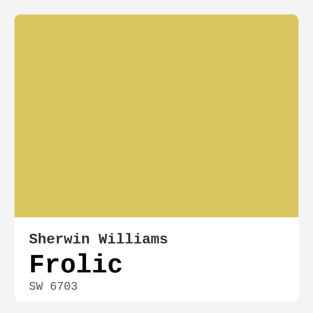
Color Preview & Key Details
| HEX Code | #D9C661 |
| RGB | 217, 198, 97 |
| LRV | 75% |
| Undertone | Yellow |
| Finish Options | Eggshell, Satin, Semi-Gloss |
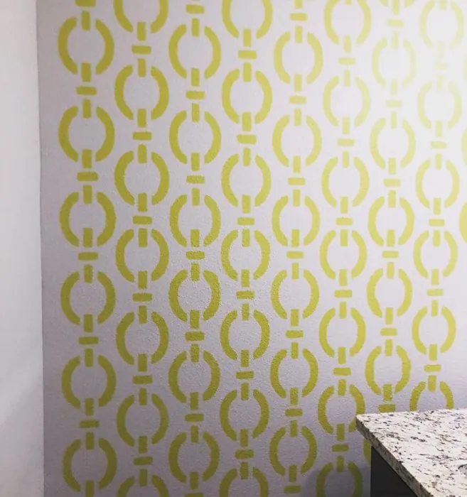
Imagine walking into a room that instantly lifts your spirits and makes you feel at home. That’s the magic of color, and today, I want to introduce you to a charming hue that embodies joy and warmth: Sherwin Williams’ Frolic (SW 6703). This delightful shade of yellow is more than just paint—it’s a mood enhancer, a conversation starter, and a versatile choice for any space in your home.
Frolic is a medium, warm yellow that radiates positivity. With an LRV of 75%, it reflects a significant amount of light, making your rooms feel larger and more inviting. What’s truly special about Frolic is its soft undertones, which allow it to melt seamlessly into various decor styles—from modern farmhouse to eclectic. It’s not just a color; it’s a feeling, an experience, and when you use it in your home, you’re inviting a sense of cheer and warmth.
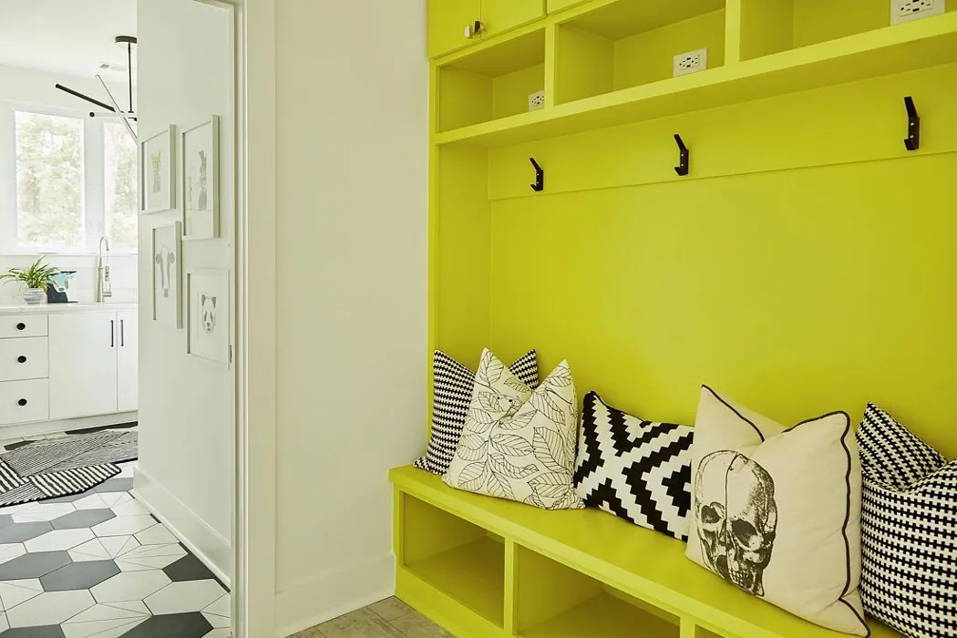
Picture this: you’re in your living room, and the sun is streaming through the windows, casting a golden glow over the walls painted in Frolic. The atmosphere feels bright and lively, perfect for gatherings with family and friends. This hue works exceptionally well in spaces where you want to create a lively and welcoming environment, such as kitchens and dining rooms. However, it also brings a cozy vibe to bedrooms and nurseries, making them feel safe and nurturing.
When considering Frolic for your home, it’s essential to think about lighting. This color thrives in natural light, where it truly comes alive and enhances the warmth of any room. In dimmer settings, it may soften a bit but still maintains that cheerful essence. If your room is on the smaller side, be mindful that Frolic can appear quite vibrant, so pairing it with ample lighting or using it as an accent can create a balanced look without overwhelming the space.
Frolic’s versatility is one of its standout features. It pairs beautifully with a variety of decor styles. For a modern farmhouse look, consider complementing it with rustic wood accents and white trim, perhaps something like Benjamin Moore’s ‘White Dove.’ The contrast will elevate the joyful nature of Frolic, keeping your space fresh and light. If you lean more towards a coastal vibe, pairing Frolic with soft blues or sandy beiges can create a serene and inviting atmosphere reminiscent of sunny beach days.
In terms of application, Frolic is beginner-friendly, making it an excellent choice for DIY enthusiasts. It’s smooth to apply, whether you’re using a brush or roller, and typically requires just one or two coats for full coverage on most surfaces. Plus, with its low VOC formulation, you can breathe easy as you paint, knowing you’re making a healthier choice for your home environment.
Maintenance is another strong suit for Frolic. The paint is washable and scrubbable, which means you can keep those walls looking fresh with minimal effort. This makes it a fantastic choice for high-traffic areas like hallways or kitchens, where scuffs and stains are more likely. Just remember to choose a finish that suits the wear and tear of each space—eggshell or satin finishes provide good durability while enhancing the paint’s cheerful character.
Now, let’s talk about complementary colors. Frolic works beautifully with shades like SW 6813, SW 6537, or even deeper hues for some contrast. Using a bolder accent color can make the cheerful yellow pop even more, creating a dynamic and eye-catching aesthetic. If you’re feeling adventurous, you could even explore darker shades like SW 6917 or SW 6818 for furniture pieces to create depth and interest against the lighter walls.
One of the potential downsides to Frolic is that, in smaller or dimly lit spaces, it may come across as too bright or intense. If you’re concerned about that, consider using it on an accent wall or as a backdrop for artwork or shelving. This way, you can enjoy its warmth without letting it overwhelm the room.
As you think about using Frolic in your home, take some time to test it in your space. Colors can shift based on the surrounding light and furnishings, so it’s wise to sample before committing. Observe how it interacts with your existing furniture and decor throughout the day, as its warm yellow undertones will reveal themselves in different lights.
Frolic isn’t just about looks; it’s about creating a mood. With its brightening, inviting, and cozy nature, it’s an ideal choice for anyone looking to enhance their living space. It invites laughter, conversation, and warmth—everything you’d want in a home.
As you embark on your painting project, consider what you want to achieve in your space. Do you want a vibrant kitchen where the family gathers? A serene nursery that feels nurturing and safe? Or perhaps a lively dining room that encourages joyful meals? Frolic can be your answer.
In conclusion, Frolic by Sherwin Williams is a color that stands out not just for its aesthetic appeal but for the emotional response it elicits. Whether you’re looking to create an inviting atmosphere in your living spaces or simply want to brighten up your day, Frolic is a versatile and cheerful choice. So grab that paintbrush, and get ready to transform your home into a haven of warmth and joy. You’ll be amazed at how one color can change the entire vibe of your space. Happy painting!
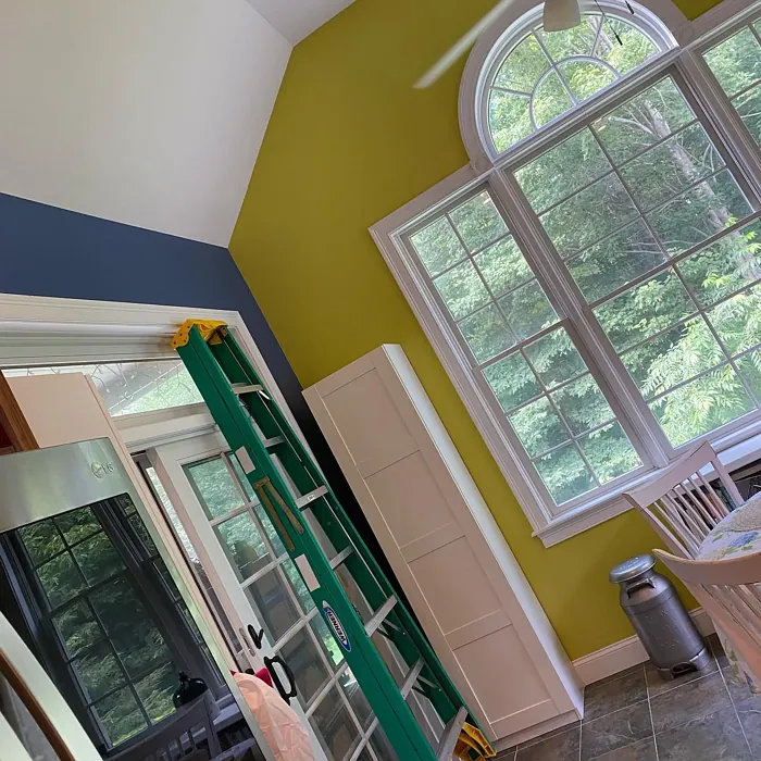
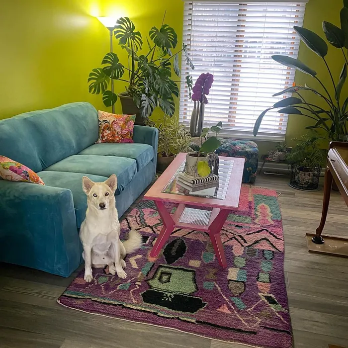
Real Room Photo of Frolic SW 6703
Undertones of Frolic ?
The undertones of Frolic are a key aspect of its character, leaning towards Yellow. These subtle underlying hues are what give the color its depth and complexity. For example, a gray with a blue undertone will feel cooler and more modern, while one with a brown undertone will feel warmer and more traditional. It’s essential to test this paint in your home and observe it next to your existing furniture, flooring, and decor to see how these undertones interact and reveal themselves throughout the day.
HEX value: #D9C661
RGB code: 217, 198, 97
Is Frolic Cool or Warm?
This color leans warm, but the slight green undertone adds a unique balance, allowing it to adapt beautifully to different lighting situations. It feels sunny and inviting without being overly intense.
Understanding Color Properties and Interior Design Tips
Hue refers to a specific position on the color wheel, measured in degrees from 0 to 360. Each degree represents a different pure color:
- 0° represents red
- 120° represents green
- 240° represents blue
Saturation describes the intensity or purity of a color and is expressed as a percentage:
- At 0%, the color appears completely desaturated—essentially a shade of gray
- At 100%, the color is at its most vivid and vibrant
Lightness indicates how light or dark a color is, also expressed as a percentage:
- 0% lightness results in black
- 100% lightness results in white
Using Warm Colors in Interior Design
Warm hues—such as reds, oranges, yellows, warm beiges, and greiges—are excellent choices for creating inviting and energetic spaces. These colors are particularly well-suited for:
- Kitchens, living rooms, and bathrooms, where warmth enhances comfort and sociability
- Large rooms, where warm tones can help reduce the sense of emptiness and make the space feel more intimate
For example:
- Warm beige shades provide a cozy, inviting atmosphere, ideal for living rooms, bedrooms, and hallways.
- Warm greige (a mix of beige and gray) offers the warmth of beige with the modern appeal of gray, making it a versatile backdrop for dining areas, bedrooms, and living spaces.
However, be mindful when using warm light tones in rooms with limited natural light. These shades may appear muted or even take on an unpleasant yellowish tint. To avoid a dull or flat appearance:
- Add depth by incorporating richer tones like deep greens, charcoal, or chocolate brown
- Use textured elements such as curtains, rugs, or cushions to bring dimension to the space
Pro Tip: Achieving Harmony with Warm and Cool Color Balance
To create a well-balanced and visually interesting interior, mix warm and cool tones strategically. This contrast adds depth and harmony to your design.
- If your walls feature warm hues, introduce cool-colored accents such as blue or green furniture, artwork, or accessories to create contrast.
- For a polished look, consider using a complementary color scheme, which pairs colors opposite each other on the color wheel (e.g., red with green, orange with blue).
This thoughtful mix not only enhances visual appeal but also creates a space that feels both dynamic and cohesive.
Light Temperature Affects on Frolic
Natural Light
Natural daylight changes in color temperature as the sun moves across the sky. At sunrise and sunset, the light tends to have a warm, golden tone with a color temperature around 2000 Kelvin (K). As the day progresses and the sun rises higher, the light becomes cooler and more neutral. Around midday, especially when the sky is clear, natural light typically reaches its peak brightness and shifts to a cooler tone, ranging from 5500 to 6500 Kelvin. This midday light is close to what we perceive as pure white or daylight-balanced light.
These shifts in natural light can significantly influence how colors appear in a space, which is why designers often consider both the time of day and the orientation of windows when planning interior color schemes.
Artificial Light
When choosing artificial lighting, pay close attention to the color temperature, measured in Kelvin (K). This determines how warm or cool the light will appear. Lower temperatures, around 2700K, give off a warm, yellow glow often used in living rooms or bedrooms. Higher temperatures, above 5000K, create a cool, bluish light similar to daylight, commonly used in kitchens, offices, or task areas.
Use the slider to see how lighting temperature can affect the appearance of a surface or color throughout a space.


4800K
LRV of Frolic
The Light Reflectance Value (LRV) of Frolic is 75%, which places it in the Light category. This means it Reflects a high amount of light. Understanding a paint’s LRV is crucial for predicting how it will look in your space. A higher LRV indicates a lighter color that reflects more light, making rooms feel larger and brighter. A lower LRV signifies a darker color that absorbs more light, creating a cozier, more intimate atmosphere. Always consider the natural and artificial lighting in your room when selecting a paint color based on its LRV.
Detailed Review of Frolic
Additional Paint Characteristics
Ideal Rooms
Bedroom, Dining Room, Hallway, Kitchen, Living Room, Nursery
Decor Styles
Bohemian, Coastal, Eclectic, Modern Farmhouse, Traditional
Coverage
Good (1–2 Coats), Touch-Up Friendly
Ease of Application
Beginner Friendly, Brush Smooth, Fast-Drying, Roller-Ready
Washability
Scrubbable, Washable
VOC Level
Low VOC
Best Use
Accent Wall, Furniture, Interior Walls
Room Suitability
Bedroom, Dining Room, Kitchen, Living Room, Nursery
Tone Tag
Crisp, Earthy, Warm
Finish Type
Eggshell, Satin
Paint Performance
Easy Touch-Up, High Coverage, Low Odor, Quick Drying
Use Cases
Best for Modern Farmhouse, Best for Rentals, Best for Small Spaces, Designer Favorite
Mood
Brightening, Cozy, Inviting
Trim Pairing
Complements Cool Trim, Pairs with White Dove, Works with Warm Trim
Frolic is a standout choice for anyone looking to inject some warmth into their interiors. The hue is reminiscent of sunny days, making it great for spaces where you gather with family and friends. The application is smooth, and most users find that it covers well with just one or two coats, depending on the surface. It’s particularly effective in kitchens and living areas where you want to create a lively atmosphere. Additionally, its versatility means it can pair beautifully with a range of decor styles—from modern to traditional. Just be mindful of the light it receives; it can shift in tone depending on the time of day, making it a dynamic choice for any room.
Pros & Cons of SW 6703 Frolic
Pros
Cons
Colors that go with Sherwin Williams Frolic
FAQ on SW 6703 Frolic
Can Frolic be used in high-traffic areas?
Absolutely! Frolic’s durable finish and washability make it a great choice for high-traffic areas like hallways or entryways. Just ensure you choose a finish that suits the wear and tear of the space, such as eggshell or satin for added durability.
What trim colors pair well with Frolic?
Frolic pairs beautifully with white trims, especially shades like White Dove or Simply White. This contrast will highlight the cheerful nature of the color while keeping the overall look fresh and light.
Comparisons Frolic with other colors
Frolic SW 6703 vs Hearts of Palm SW 6415
| Attribute | Frolic SW 6703 | Hearts of Palm SW 6415 |
|---|---|---|
| Color Name | Frolic SW 6703 | Hearts of Palm SW 6415 |
| Color | ||
| Hue | Yellow | Yellow |
| Brightness | Medium | Medium |
| RGB | 217, 198, 97 | 207, 194, 145 |
| LRV | 75% | 75% |
| Finish Type | Eggshell, Satin | Eggshell, Matte, Satin |
| Finish Options | Eggshell, Satin, Semi-Gloss | Eggshell, Matte, Satin |
| Ideal Rooms | Bedroom, Dining Room, Hallway, Kitchen, Living Room, Nursery | Bathroom, Bedroom, Dining Room, Home Office, Kitchen, Living Room |
| Decor Styles | Bohemian, Coastal, Eclectic, Modern Farmhouse, Traditional | Bohemian, Coastal, Eclectic, Modern Farmhouse, Tropical |
| Coverage | Good (1–2 Coats), Touch-Up Friendly | Good (1–2 Coats), Touch-Up Friendly |
| Ease of Application | Beginner Friendly, Brush Smooth, Fast-Drying, Roller-Ready | Beginner Friendly, Brush Smooth, Roller-Ready |
| Washability | Scrubbable, Washable | Scrubbable, Washable |
| Room Suitability | Bedroom, Dining Room, Kitchen, Living Room, Nursery | Bathroom, Bedroom, Dining Room, Home Office, Kitchen, Living Room |
| Tone | Crisp, Earthy, Warm | Earthy, Muted, Warm |
| Paint Performance | Easy Touch-Up, High Coverage, Low Odor, Quick Drying | Easy Touch-Up, Low Odor, Scuff Resistant |
Frolic SW 6703 vs Blonde SW 6128
| Attribute | Frolic SW 6703 | Blonde SW 6128 |
|---|---|---|
| Color Name | Frolic SW 6703 | Blonde SW 6128 |
| Color | ||
| Hue | Yellow | Yellow |
| Brightness | Medium | Medium |
| RGB | 217, 198, 97 | 220, 189, 146 |
| LRV | 75% | 64% |
| Finish Type | Eggshell, Satin | Eggshell, Satin |
| Finish Options | Eggshell, Satin, Semi-Gloss | Eggshell, Matte, Satin |
| Ideal Rooms | Bedroom, Dining Room, Hallway, Kitchen, Living Room, Nursery | Bedroom, Dining Room, Home Office, Kitchen, Living Room |
| Decor Styles | Bohemian, Coastal, Eclectic, Modern Farmhouse, Traditional | Bohemian, Coastal, Modern Farmhouse, Scandinavian, Transitional |
| Coverage | Good (1–2 Coats), Touch-Up Friendly | Good (1–2 Coats), Touch-Up Friendly |
| Ease of Application | Beginner Friendly, Brush Smooth, Fast-Drying, Roller-Ready | Beginner Friendly, Fast-Drying, Roller-Ready |
| Washability | Scrubbable, Washable | Highly Washable, Washable |
| Room Suitability | Bedroom, Dining Room, Kitchen, Living Room, Nursery | Bedroom, Dining Room, Home Office, Kitchen, Living Room, Nursery |
| Tone | Crisp, Earthy, Warm | Earthy, Neutral, Warm |
| Paint Performance | Easy Touch-Up, High Coverage, Low Odor, Quick Drying | Easy Touch-Up, Fade Resistant, Low Odor, Quick Drying |
Frolic SW 6703 vs Ruskin Room Green SW 0042
| Attribute | Frolic SW 6703 | Ruskin Room Green SW 0042 |
|---|---|---|
| Color Name | Frolic SW 6703 | Ruskin Room Green SW 0042 |
| Color | ||
| Hue | Yellow | Yellow |
| Brightness | Medium | Medium |
| RGB | 217, 198, 97 | 172, 161, 125 |
| LRV | 75% | 24% |
| Finish Type | Eggshell, Satin | Eggshell, Matte |
| Finish Options | Eggshell, Satin, Semi-Gloss | Eggshell, Flat, Matte, Satin |
| Ideal Rooms | Bedroom, Dining Room, Hallway, Kitchen, Living Room, Nursery | Bedroom, Dining Room, Home Office, Living Room |
| Decor Styles | Bohemian, Coastal, Eclectic, Modern Farmhouse, Traditional | Farmhouse, Modern, Rustic, Traditional |
| Coverage | Good (1–2 Coats), Touch-Up Friendly | Good (1–2 Coats), Touch-Up Friendly |
| Ease of Application | Beginner Friendly, Brush Smooth, Fast-Drying, Roller-Ready | Beginner Friendly, Brush Smooth, Roller-Ready |
| Washability | Scrubbable, Washable | Scrubbable, Washable |
| Room Suitability | Bedroom, Dining Room, Kitchen, Living Room, Nursery | Bedroom, Dining Room, Home Office, Living Room |
| Tone | Crisp, Earthy, Warm | Earthy, Muted, Warm |
| Paint Performance | Easy Touch-Up, High Coverage, Low Odor, Quick Drying | Easy Touch-Up, High Coverage, Low Odor |
Frolic SW 6703 vs Bosc Pear SW 6390
| Attribute | Frolic SW 6703 | Bosc Pear SW 6390 |
|---|---|---|
| Color Name | Frolic SW 6703 | Bosc Pear SW 6390 |
| Color | ||
| Hue | Yellow | Yellow |
| Brightness | Medium | Medium |
| RGB | 217, 198, 97 | 192, 144, 86 |
| LRV | 75% | 60% |
| Finish Type | Eggshell, Satin | Satin, Semi-Gloss |
| Finish Options | Eggshell, Satin, Semi-Gloss | Flat, Satin, Semi-Gloss |
| Ideal Rooms | Bedroom, Dining Room, Hallway, Kitchen, Living Room, Nursery | Bedroom, Dining Room, Home Office, Kitchen, Living Room |
| Decor Styles | Bohemian, Coastal, Eclectic, Modern Farmhouse, Traditional | Modern Farmhouse, Rustic, Traditional, Transitional |
| Coverage | Good (1–2 Coats), Touch-Up Friendly | Good (1–2 Coats) |
| Ease of Application | Beginner Friendly, Brush Smooth, Fast-Drying, Roller-Ready | Beginner Friendly, Brush Smooth, Fast-Drying, Roller-Ready |
| Washability | Scrubbable, Washable | Highly Washable, Washable |
| Room Suitability | Bedroom, Dining Room, Kitchen, Living Room, Nursery | Bedroom, Dining Room, Home Office, Living Room |
| Tone | Crisp, Earthy, Warm | Balanced, Earthy, Warm |
| Paint Performance | Easy Touch-Up, High Coverage, Low Odor, Quick Drying | Easy Touch-Up, High Coverage, Low Odor, Quick Drying |
Frolic SW 6703 vs Lemongrass SW 7732
| Attribute | Frolic SW 6703 | Lemongrass SW 7732 |
|---|---|---|
| Color Name | Frolic SW 6703 | Lemongrass SW 7732 |
| Color | ||
| Hue | Yellow | Yellow |
| Brightness | Medium | Medium |
| RGB | 217, 198, 97 | 200, 189, 152 |
| LRV | 75% | 48% |
| Finish Type | Eggshell, Satin | Eggshell, Matte, Satin |
| Finish Options | Eggshell, Satin, Semi-Gloss | Eggshell, Matte, Satin |
| Ideal Rooms | Bedroom, Dining Room, Hallway, Kitchen, Living Room, Nursery | Bathroom, Bedroom, Home Office, Kitchen, Living Room, Nursery |
| Decor Styles | Bohemian, Coastal, Eclectic, Modern Farmhouse, Traditional | Bohemian, Modern Farmhouse, Scandinavian, Transitional |
| Coverage | Good (1–2 Coats), Touch-Up Friendly | Good (1–2 Coats) |
| Ease of Application | Beginner Friendly, Brush Smooth, Fast-Drying, Roller-Ready | Beginner Friendly, Brush Smooth, Roller-Ready |
| Washability | Scrubbable, Washable | Highly Washable, Washable |
| Room Suitability | Bedroom, Dining Room, Kitchen, Living Room, Nursery | Bedroom, Home Office, Kitchen, Living Room |
| Tone | Crisp, Earthy, Warm | Earthy, Muted, Warm |
| Paint Performance | Easy Touch-Up, High Coverage, Low Odor, Quick Drying | Easy Touch-Up, Low Odor, Scuff Resistant |
Frolic SW 6703 vs Garden Sage SW 7736
| Attribute | Frolic SW 6703 | Garden Sage SW 7736 |
|---|---|---|
| Color Name | Frolic SW 6703 | Garden Sage SW 7736 |
| Color | ||
| Hue | Yellow | Yellow |
| Brightness | Medium | Medium |
| RGB | 217, 198, 97 | 177, 165, 132 |
| LRV | 75% | 24% |
| Finish Type | Eggshell, Satin | Eggshell, Matte, Satin |
| Finish Options | Eggshell, Satin, Semi-Gloss | Eggshell, Matte, Satin |
| Ideal Rooms | Bedroom, Dining Room, Hallway, Kitchen, Living Room, Nursery | Bedroom, Dining Room, Home Office, Kitchen, Living Room, Nursery |
| Decor Styles | Bohemian, Coastal, Eclectic, Modern Farmhouse, Traditional | Bohemian, Cottage, Minimalist, Modern Farmhouse, Traditional |
| Coverage | Good (1–2 Coats), Touch-Up Friendly | Good (1–2 Coats), Touch-Up Friendly |
| Ease of Application | Beginner Friendly, Brush Smooth, Fast-Drying, Roller-Ready | Beginner Friendly, Brush Smooth, Roller-Ready |
| Washability | Scrubbable, Washable | Highly Washable, Washable |
| Room Suitability | Bedroom, Dining Room, Kitchen, Living Room, Nursery | Bedroom, Dining Room, Home Office, Kitchen, Living Room |
| Tone | Crisp, Earthy, Warm | Balanced, Earthy, Muted, Warm |
| Paint Performance | Easy Touch-Up, High Coverage, Low Odor, Quick Drying | Easy Touch-Up, Fade Resistant, Low Odor |
Frolic SW 6703 vs Tassel SW 6369
| Attribute | Frolic SW 6703 | Tassel SW 6369 |
|---|---|---|
| Color Name | Frolic SW 6703 | Tassel SW 6369 |
| Color | ||
| Hue | Yellow | Yellow |
| Brightness | Medium | Medium |
| RGB | 217, 198, 97 | 198, 136, 74 |
| LRV | 75% | 45% |
| Finish Type | Eggshell, Satin | Matte, Satin |
| Finish Options | Eggshell, Satin, Semi-Gloss | Matte, Satin, Semi-Gloss |
| Ideal Rooms | Bedroom, Dining Room, Hallway, Kitchen, Living Room, Nursery | Bedroom, Dining Room, Home Office, Living Room |
| Decor Styles | Bohemian, Coastal, Eclectic, Modern Farmhouse, Traditional | Bohemian, Modern Farmhouse, Rustic, Transitional |
| Coverage | Good (1–2 Coats), Touch-Up Friendly | Good (1–2 Coats) |
| Ease of Application | Beginner Friendly, Brush Smooth, Fast-Drying, Roller-Ready | Beginner Friendly, Brush Smooth, Fast-Drying, Roller-Ready |
| Washability | Scrubbable, Washable | Scrubbable, Washable |
| Room Suitability | Bedroom, Dining Room, Kitchen, Living Room, Nursery | Bedroom, Dining Room, Home Office, Living Room |
| Tone | Crisp, Earthy, Warm | Earthy, Inviting, Warm |
| Paint Performance | Easy Touch-Up, High Coverage, Low Odor, Quick Drying | Easy Touch-Up, Low Odor, Quick Drying, Scuff Resistant |
Frolic SW 6703 vs Sunflower SW 6678
| Attribute | Frolic SW 6703 | Sunflower SW 6678 |
|---|---|---|
| Color Name | Frolic SW 6703 | Sunflower SW 6678 |
| Color | ||
| Hue | Yellow | Yellow |
| Brightness | Medium | Medium |
| RGB | 217, 198, 97 | 227, 154, 51 |
| LRV | 75% | 75% |
| Finish Type | Eggshell, Satin | Eggshell, Satin |
| Finish Options | Eggshell, Satin, Semi-Gloss | Eggshell, Satin, Semi-Gloss |
| Ideal Rooms | Bedroom, Dining Room, Hallway, Kitchen, Living Room, Nursery | Dining Room, Entryway, Home Office, Kitchen, Living Room |
| Decor Styles | Bohemian, Coastal, Eclectic, Modern Farmhouse, Traditional | Bohemian, Eclectic, Modern Farmhouse, Traditional |
| Coverage | Good (1–2 Coats), Touch-Up Friendly | Good (1–2 Coats), Touch-Up Friendly |
| Ease of Application | Beginner Friendly, Brush Smooth, Fast-Drying, Roller-Ready | Beginner Friendly, Brush Smooth, Fast-Drying, Roller-Ready |
| Washability | Scrubbable, Washable | Highly Washable, Washable |
| Room Suitability | Bedroom, Dining Room, Kitchen, Living Room, Nursery | Dining Room, Entryway, Kitchen, Living Room |
| Tone | Crisp, Earthy, Warm | Bold, Earthy, Warm |
| Paint Performance | Easy Touch-Up, High Coverage, Low Odor, Quick Drying | Fade Resistant, High Coverage, Quick Drying |
Frolic SW 6703 vs Bee's Wax SW 7682
| Attribute | Frolic SW 6703 | Bee's Wax SW 7682 |
|---|---|---|
| Color Name | Frolic SW 6703 | Bee's Wax SW 7682 |
| Color | ||
| Hue | Yellow | Yellow |
| Brightness | Medium | Medium |
| RGB | 217, 198, 97 | 234, 191, 134 |
| LRV | 75% | 50% |
| Finish Type | Eggshell, Satin | Eggshell, Matte, Satin |
| Finish Options | Eggshell, Satin, Semi-Gloss | Eggshell, Matte, Satin |
| Ideal Rooms | Bedroom, Dining Room, Hallway, Kitchen, Living Room, Nursery | Bedroom, Dining Room, Entryway, Kitchen, Living Room |
| Decor Styles | Bohemian, Coastal, Eclectic, Modern Farmhouse, Traditional | Bohemian, Coastal, Modern Farmhouse, Traditional, Transitional |
| Coverage | Good (1–2 Coats), Touch-Up Friendly | Good (1–2 Coats), Touch-Up Friendly |
| Ease of Application | Beginner Friendly, Brush Smooth, Fast-Drying, Roller-Ready | Beginner Friendly, Brush Smooth, Roller-Ready |
| Washability | Scrubbable, Washable | Washable, Wipeable |
| Room Suitability | Bedroom, Dining Room, Kitchen, Living Room, Nursery | Bedroom, Dining Room, Entryway, Kitchen, Living Room |
| Tone | Crisp, Earthy, Warm | Creamy, Earthy, Warm |
| Paint Performance | Easy Touch-Up, High Coverage, Low Odor, Quick Drying | Easy Touch-Up, High Coverage, Low Odor |
Frolic SW 6703 vs Downing Straw SW 2813
| Attribute | Frolic SW 6703 | Downing Straw SW 2813 |
|---|---|---|
| Color Name | Frolic SW 6703 | Downing Straw SW 2813 |
| Color | ||
| Hue | Yellow | Yellow |
| Brightness | Medium | Medium |
| RGB | 217, 198, 97 | 202, 171, 125 |
| LRV | 75% | 48% |
| Finish Type | Eggshell, Satin | Eggshell, Matte, Satin |
| Finish Options | Eggshell, Satin, Semi-Gloss | Eggshell, Matte, Satin |
| Ideal Rooms | Bedroom, Dining Room, Hallway, Kitchen, Living Room, Nursery | Bedroom, Dining Room, Home Office, Kitchen, Living Room |
| Decor Styles | Bohemian, Coastal, Eclectic, Modern Farmhouse, Traditional | Contemporary, Eclectic, Modern Farmhouse, Rustic, Traditional |
| Coverage | Good (1–2 Coats), Touch-Up Friendly | Good (1–2 Coats), Touch-Up Friendly |
| Ease of Application | Beginner Friendly, Brush Smooth, Fast-Drying, Roller-Ready | Beginner Friendly, Brush Smooth, Roller-Ready |
| Washability | Scrubbable, Washable | Washable, Wipeable |
| Room Suitability | Bedroom, Dining Room, Kitchen, Living Room, Nursery | Bedroom, Dining Room, Home Office, Kitchen, Living Room |
| Tone | Crisp, Earthy, Warm | Earthy, Muted, Warm |
| Paint Performance | Easy Touch-Up, High Coverage, Low Odor, Quick Drying | Easy Touch-Up, High Coverage, Low Odor |
Official Page of Sherwin Williams Frolic SW 6703