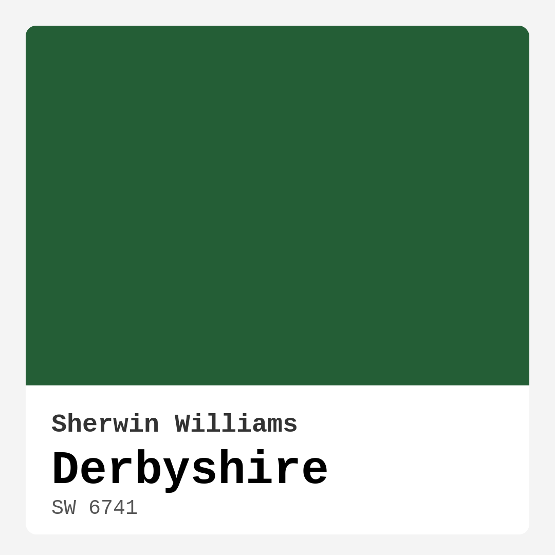
Color Preview & Key Details
| HEX Code | #245E36 |
| RGB | 36, 94, 54 |
| LRV | 45% |
| Undertone | Green |
| Finish Options | Eggshell, Matte, Satin |
Have you ever walked into a room and felt instantly transported to a serene landscape, where the vibrant hues of nature wrap around you like a warm embrace? That’s the magic of color in home design, and today, I want to introduce you to a captivating shade that captures that essence perfectly: Derbyshire by Sherwin Williams.
Derbyshire, with its rich, deep green tone, is a delightful choice for homeowners looking to create an inviting and cozy atmosphere in their spaces. This hue, designated as SW 6741, boasts an earthy depth that mirrors the lush greenery of the English countryside. Picture yourself sipping tea in a sun-drenched living room, surrounded by the calming influence of nature. That’s the kind of tranquility Derbyshire can bring to your home.
Let’s dive into what makes this color so special. The first thing to note is its hue tag—green—with an LRV (Light Reflectance Value) of 45%. This places Derbyshire in the medium category, meaning it reflects a moderate amount of light. You can expect it to brighten a space without making it feel sterile. The warmth in Derbyshire’s undertone adds to its inviting charm, creating a cozy environment perfect for any gathering.
One of the fantastic aspects of Derbyshire is its versatility. Whether you’re aiming for a modern farmhouse aesthetic, a rustic retreat, or a contemporary vibe, this shade can effortlessly blend into various decor styles. It works beautifully in a living room, bedroom, dining room, or even a home office. Imagine creating a serene workspace that inspires creativity and focus; Derbyshire can help achieve that.
When thinking about color pairings, Derbyshire shines alongside natural materials. It beautifully complements wood and stone, enhancing their textures and tones. For a fresh take, consider pairing it with soft whites, like Benjamin Moore’s White Dove. This combination can create a striking contrast that highlights Derbyshire’s richness while maintaining a light, airy feel.
In terms of application, Derbyshire is incredibly user-friendly, making it a great choice for DIY enthusiasts. You can opt for a matte finish for a soft, velvety look or a satin finish for a subtle sheen. Either way, this paint provides excellent coverage with just one to two coats, saving you time and effort. It’s also low in VOCs, which means you’re contributing to healthier indoor air quality—always a plus for homes filled with family.
Now, you might be wondering how Derbyshire performs under different lighting conditions. In bright, natural light, it reveals its vibrant green tones, adding life and energy to any space. However, in dimmer lighting, it takes on a more muted, calming presence, perfect for creating a restful retreat in your bedroom or a cozy nook in your living room. This adaptability makes it an excellent candidate for various rooms in your home.
Of course, it’s important to consider the potential downsides. While Derbyshire is a stunning color, its darker shade can sometimes make smaller spaces feel a bit closed in. If you’re working with a tight area, think about using it as an accent wall to bring depth without overwhelming the room. Also, keep in mind that darker paints may require touch-ups, especially in high-traffic areas. With a little care, these minor maintenance tasks will keep your space looking fresh.
Another consideration is how Derbyshire interacts with sunlight over time. While it holds its rich hue well, some darker shades can fade if exposed to direct sunlight for prolonged periods. If your space receives a lot of natural light, you might want to think about using window treatments to protect your walls.
For those interested in complementary shades, consider colors like SW 6826 or SW 9076. These colors can work beautifully alongside Derbyshire, either as accents or in adjoining spaces, creating a harmonious flow throughout your home.
When it comes to applying Derbyshire, a little preparation goes a long way. Start with a clean surface, and utilize high-quality brushes or rollers for an even finish. If you’re tackling a larger area, a roller will speed up the process, while a brush is great for edges and corners. Always remember to test a small patch first. This way, you can see how the color interacts with your room’s lighting before committing to the whole wall.
Now, let’s talk about how to style with Derbyshire. It pairs beautifully with various decor elements. Think about incorporating brass fixtures or soft textiles in neutral shades to create a warm, inviting space. If you’ve got a penchant for plants, the green of Derbyshire will provide a perfect backdrop for your greenery, allowing those delightful pops of color to shine.
Ultimately, Derbyshire is more than just a paint color; it’s a mood enhancer. It brings a grounding quality that can make any house feel like a home. Its cozy, inviting nature makes it an ideal choice for social spaces, like living rooms and dining rooms, where family and friends come together.
If you’re ready to embrace the beauty of Derbyshire in your home, take the plunge! Whether it’s an entire room or just a feature wall, this color can transform your space into a sanctuary that reflects your unique style and personality. So, grab that paintbrush and get ready to create something beautiful. After all, your home is a canvas, and Derbyshire is the perfect color to start painting your story.
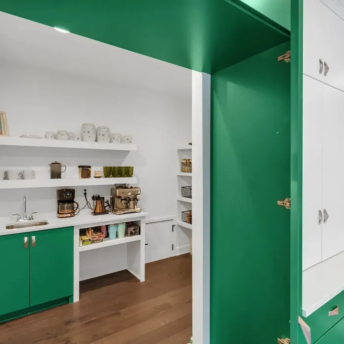
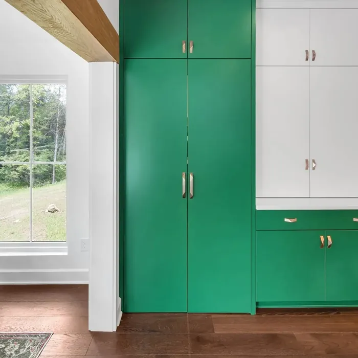
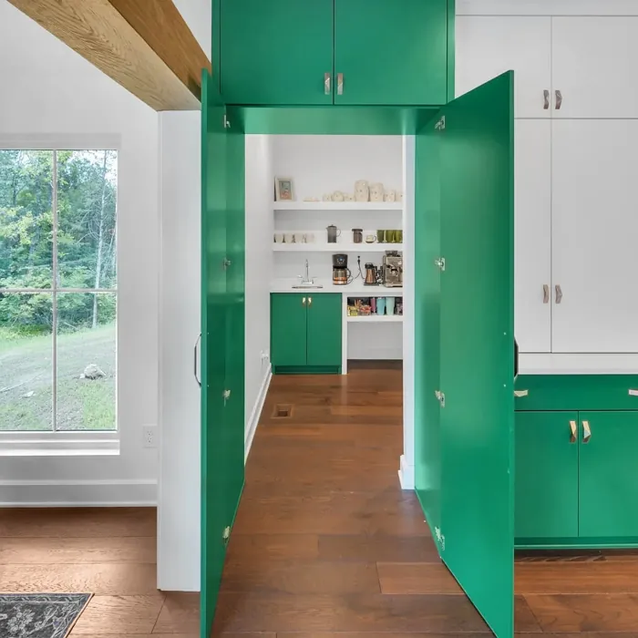
Real Room Photo of Derbyshire SW 6741

Undertones of Derbyshire ?
The undertones of Derbyshire are a key aspect of its character, leaning towards Green. These subtle underlying hues are what give the color its depth and complexity. For example, a gray with a blue undertone will feel cooler and more modern, while one with a brown undertone will feel warmer and more traditional. It’s essential to test this paint in your home and observe it next to your existing furniture, flooring, and decor to see how these undertones interact and reveal themselves throughout the day.
HEX value: #245E36
RGB code: 36, 94, 54
Is Derbyshire Cool or Warm?
Derbyshire is considered a warm paint color. This characteristic plays a huge role in the overall feel of a room. Warm colors, like this one, tend to create a cozy, inviting, and energetic atmosphere, making them great for social spaces like living rooms and dining rooms. In contrast, cool colors often evoke a sense of calm and serenity, which is why they are popular in bedrooms and bathrooms. The warmth of Derbyshire means it will pair beautifully with corresponding decor elements.
Understanding Color Properties and Interior Design Tips
Hue refers to a specific position on the color wheel, measured in degrees from 0 to 360. Each degree represents a different pure color:
- 0° represents red
- 120° represents green
- 240° represents blue
Saturation describes the intensity or purity of a color and is expressed as a percentage:
- At 0%, the color appears completely desaturated—essentially a shade of gray
- At 100%, the color is at its most vivid and vibrant
Lightness indicates how light or dark a color is, also expressed as a percentage:
- 0% lightness results in black
- 100% lightness results in white
Using Warm Colors in Interior Design
Warm hues—such as reds, oranges, yellows, warm beiges, and greiges—are excellent choices for creating inviting and energetic spaces. These colors are particularly well-suited for:
- Kitchens, living rooms, and bathrooms, where warmth enhances comfort and sociability
- Large rooms, where warm tones can help reduce the sense of emptiness and make the space feel more intimate
For example:
- Warm beige shades provide a cozy, inviting atmosphere, ideal for living rooms, bedrooms, and hallways.
- Warm greige (a mix of beige and gray) offers the warmth of beige with the modern appeal of gray, making it a versatile backdrop for dining areas, bedrooms, and living spaces.
However, be mindful when using warm light tones in rooms with limited natural light. These shades may appear muted or even take on an unpleasant yellowish tint. To avoid a dull or flat appearance:
- Add depth by incorporating richer tones like deep greens, charcoal, or chocolate brown
- Use textured elements such as curtains, rugs, or cushions to bring dimension to the space
Pro Tip: Achieving Harmony with Warm and Cool Color Balance
To create a well-balanced and visually interesting interior, mix warm and cool tones strategically. This contrast adds depth and harmony to your design.
- If your walls feature warm hues, introduce cool-colored accents such as blue or green furniture, artwork, or accessories to create contrast.
- For a polished look, consider using a complementary color scheme, which pairs colors opposite each other on the color wheel (e.g., red with green, orange with blue).
This thoughtful mix not only enhances visual appeal but also creates a space that feels both dynamic and cohesive.
Light Temperature Affects on Derbyshire
Natural Light
Natural daylight changes in color temperature as the sun moves across the sky. At sunrise and sunset, the light tends to have a warm, golden tone with a color temperature around 2000 Kelvin (K). As the day progresses and the sun rises higher, the light becomes cooler and more neutral. Around midday, especially when the sky is clear, natural light typically reaches its peak brightness and shifts to a cooler tone, ranging from 5500 to 6500 Kelvin. This midday light is close to what we perceive as pure white or daylight-balanced light.
These shifts in natural light can significantly influence how colors appear in a space, which is why designers often consider both the time of day and the orientation of windows when planning interior color schemes.
Artificial Light
When choosing artificial lighting, pay close attention to the color temperature, measured in Kelvin (K). This determines how warm or cool the light will appear. Lower temperatures, around 2700K, give off a warm, yellow glow often used in living rooms or bedrooms. Higher temperatures, above 5000K, create a cool, bluish light similar to daylight, commonly used in kitchens, offices, or task areas.
Use the slider to see how lighting temperature can affect the appearance of a surface or color throughout a space.


4800K
LRV of Derbyshire
The Light Reflectance Value (LRV) of Derbyshire is 45%, which places it in the Medium category. This means it Reflects a moderate amount of light. Understanding a paint’s LRV is crucial for predicting how it will look in your space. A higher LRV indicates a lighter color that reflects more light, making rooms feel larger and brighter. A lower LRV signifies a darker color that absorbs more light, creating a cozier, more intimate atmosphere. Always consider the natural and artificial lighting in your room when selecting a paint color based on its LRV.
Detailed Review of Derbyshire
Additional Paint Characteristics
Ideal Rooms
Bedroom, Dining Room, Home Office, Living Room
Decor Styles
Contemporary, Farmhouse, Modern, Rustic, Traditional
Coverage
Good (1–2 Coats)
Ease of Application
Beginner Friendly, Brush Smooth, Roller-Ready
Washability
Washable, Wipeable
VOC Level
Low VOC
Best Use
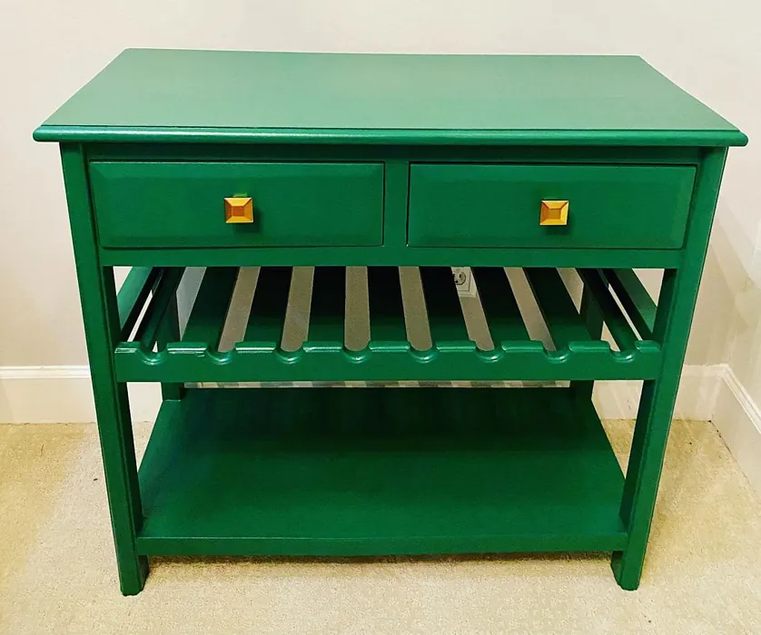
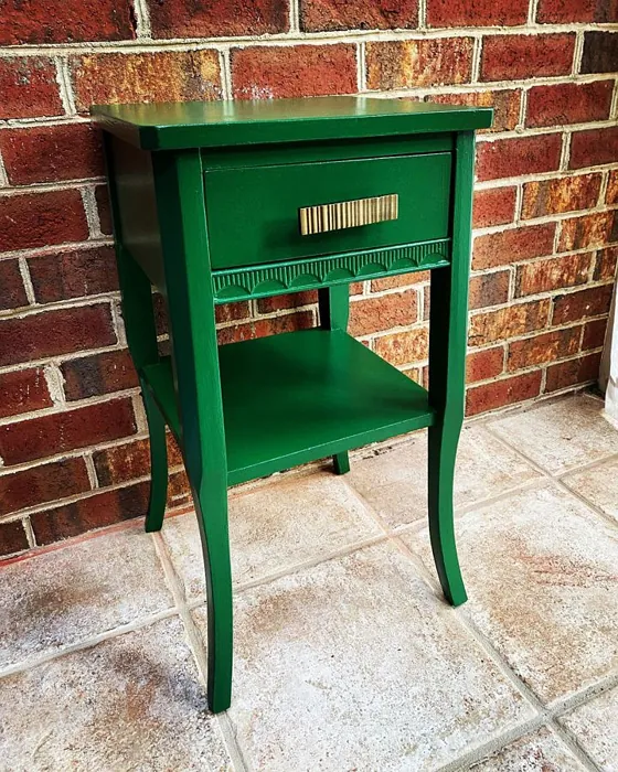
Accent Wall, Furniture, Interior Walls
Room Suitability
Bedroom, Dining Room, Home Office, Living Room
Tone Tag
Deep, Earthy, Warm
Finish Type
Matte, Satin
Paint Performance
Easy Touch-Up, High Coverage, Low Odor
Use Cases
Best for Modern Farmhouse, Best for Open Concept, Best for Small Spaces
Mood
Cozy, Grounding, Inviting
Trim Pairing
Complements Brass Fixtures, Good with Wood Trim, Pairs with White Dove
Derbyshire truly stands out with its unique blend of depth and warmth. This color can transform a room, providing a cozy yet sophisticated ambiance. Whether you’re looking to create a tranquil retreat in your bedroom or an inviting space in your living room, Derbyshire delivers. It pairs beautifully with natural materials like wood and stone, enhancing the overall aesthetic of your home. The matte finish option offers a soft appearance, while satin adds a subtle sheen, making it versatile for different settings. It’s also great for accent walls, which can add a dramatic flair without overwhelming the space. Overall, Derbyshire is a stunning choice for anyone wanting to bring a touch of the outdoors inside.
Pros & Cons of SW 6741 Derbyshire
Pros
Cons
Colors that go with Sherwin Williams Derbyshire
FAQ on SW 6741 Derbyshire
What is the best way to apply Derbyshire?
To achieve the best results with Derbyshire, start with a clean surface. Use a high-quality brush or roller for application. If you’re working on a larger area, consider using a roller for faster coverage and a brush for edges and corners. For optimal finish, two coats are recommended, allowing adequate drying time between layers. Always test a small patch first to ensure you’re satisfied with the color in your specific lighting conditions.
How does Derbyshire perform in different lighting?
Derbyshire is quite versatile in various lighting scenarios. In bright natural light, it showcases its vibrant green tones beautifully, adding life to the space. However, in lower light, it can appear more muted and calming, perfect for creating a relaxing environment. This adaptability means it can work well in a variety of rooms, enhancing the atmosphere wherever it’s applied. It’s always a good idea to sample the paint on your walls before fully committing, as the lighting in your space can affect how the color looks.
Comparisons Derbyshire with other colors
Derbyshire SW 6741 vs Dried Thyme SW 6186
| Attribute | Derbyshire SW 6741 | Dried Thyme SW 6186 |
|---|---|---|
| Color Name | Derbyshire SW 6741 | Dried Thyme SW 6186 |
| Color | ||
| Hue | Green | Green |
| Brightness | Dark | Dark |
| RGB | 36, 94, 54 | 123, 128, 112 |
| LRV | 45% | 24% |
| Finish Type | Matte, Satin | Eggshell, Satin |
| Finish Options | Eggshell, Matte, Satin | Eggshell, Matte, Satin |
| Ideal Rooms | Bedroom, Dining Room, Home Office, Living Room | Bathroom, Bedroom, Dining Room, Entryway, Home Office, Kitchen, Living Room |
| Decor Styles | Contemporary, Farmhouse, Modern, Rustic, Traditional | Bohemian, Industrial, Minimalist, Modern Farmhouse, Rustic |
| Coverage | Good (1–2 Coats) | Good (1–2 Coats), Touch-Up Friendly |
| Ease of Application | Beginner Friendly, Brush Smooth, Roller-Ready | Beginner Friendly, Brush Smooth, Roller-Ready |
| Washability | Washable, Wipeable | Washable, Wipeable |
| Room Suitability | Bedroom, Dining Room, Home Office, Living Room | Bathroom, Bedroom, Dining Room, Home Office, Kitchen, Living Room |
| Tone | Deep, Earthy, Warm | Cool, Earthy, Muted |
| Paint Performance | Easy Touch-Up, High Coverage, Low Odor | Easy Touch-Up, Low Odor, Scuff Resistant |
Derbyshire SW 6741 vs Retreat SW 6207
| Attribute | Derbyshire SW 6741 | Retreat SW 6207 |
|---|---|---|
| Color Name | Derbyshire SW 6741 | Retreat SW 6207 |
| Color | ||
| Hue | Green | Green |
| Brightness | Dark | Dark |
| RGB | 36, 94, 54 | 122, 128, 118 |
| LRV | 45% | 30% |
| Finish Type | Matte, Satin | Eggshell, Matte, Satin |
| Finish Options | Eggshell, Matte, Satin | Eggshell, Matte, Satin |
| Ideal Rooms | Bedroom, Dining Room, Home Office, Living Room | Bathroom, Bedroom, Home Office, Kitchen, Living Room |
| Decor Styles | Contemporary, Farmhouse, Modern, Rustic, Traditional | Minimalist, Modern, Rustic, Transitional |
| Coverage | Good (1–2 Coats) | Good (1–2 Coats), Touch-Up Friendly |
| Ease of Application | Beginner Friendly, Brush Smooth, Roller-Ready | Beginner Friendly, Brush Smooth, Roller-Ready |
| Washability | Washable, Wipeable | Washable, Wipeable |
| Room Suitability | Bedroom, Dining Room, Home Office, Living Room | Bathroom, Bedroom, Home Office, Living Room |
| Tone | Deep, Earthy, Warm | Cool, Earthy, Muted |
| Paint Performance | Easy Touch-Up, High Coverage, Low Odor | Easy Touch-Up, Low Odor, Scuff Resistant |
Derbyshire SW 6741 vs Rosemary SW 6187
| Attribute | Derbyshire SW 6741 | Rosemary SW 6187 |
|---|---|---|
| Color Name | Derbyshire SW 6741 | Rosemary SW 6187 |
| Color | ||
| Hue | Green | Green |
| Brightness | Dark | Dark |
| RGB | 36, 94, 54 | 100, 105, 92 |
| LRV | 45% | 45% |
| Finish Type | Matte, Satin | Eggshell, Matte, Satin |
| Finish Options | Eggshell, Matte, Satin | Eggshell, Matte, Satin |
| Ideal Rooms | Bedroom, Dining Room, Home Office, Living Room | Bedroom, Dining Room, Hallway, Home Office, Living Room |
| Decor Styles | Contemporary, Farmhouse, Modern, Rustic, Traditional | Bohemian, Coastal, Modern Farmhouse, Rustic |
| Coverage | Good (1–2 Coats) | Good (1–2 Coats), Touch-Up Friendly |
| Ease of Application | Beginner Friendly, Brush Smooth, Roller-Ready | Beginner Friendly, Brush Smooth, Roller-Ready |
| Washability | Washable, Wipeable | Washable, Wipeable |
| Room Suitability | Bedroom, Dining Room, Home Office, Living Room | Bedroom, Dining Room, Home Office, Living Room |
| Tone | Deep, Earthy, Warm | Earthy, Muted, Warm |
| Paint Performance | Easy Touch-Up, High Coverage, Low Odor | Fade Resistant, Low Odor, Quick Drying, Stain Resistant |
Derbyshire SW 6741 vs Basil SW 6194
| Attribute | Derbyshire SW 6741 | Basil SW 6194 |
|---|---|---|
| Color Name | Derbyshire SW 6741 | Basil SW 6194 |
| Color | ||
| Hue | Green | Green |
| Brightness | Dark | Dark |
| RGB | 36, 94, 54 | 98, 110, 96 |
| LRV | 45% | 12% |
| Finish Type | Matte, Satin | Eggshell, Matte, Satin |
| Finish Options | Eggshell, Matte, Satin | Eggshell, Matte, Satin |
| Ideal Rooms | Bedroom, Dining Room, Home Office, Living Room | Bathroom, Bedroom, Dining Room, Home Office, Kitchen, Living Room |
| Decor Styles | Contemporary, Farmhouse, Modern, Rustic, Traditional | Bohemian, Contemporary, Modern Farmhouse, Rustic, Transitional |
| Coverage | Good (1–2 Coats) | Good (1–2 Coats), Touch-Up Friendly |
| Ease of Application | Beginner Friendly, Brush Smooth, Roller-Ready | Beginner Friendly, Brush Smooth, Fast-Drying, Roller-Ready |
| Washability | Washable, Wipeable | Washable, Wipeable |
| Room Suitability | Bedroom, Dining Room, Home Office, Living Room | Bathroom, Bedroom, Dining Room, Kitchen, Living Room |
| Tone | Deep, Earthy, Warm | Earthy, Muted, Warm |
| Paint Performance | Easy Touch-Up, High Coverage, Low Odor | Easy Touch-Up, Low Odor, Quick Drying |
Derbyshire SW 6741 vs Artichoke SW 6179
| Attribute | Derbyshire SW 6741 | Artichoke SW 6179 |
|---|---|---|
| Color Name | Derbyshire SW 6741 | Artichoke SW 6179 |
| Color | ||
| Hue | Green | Green |
| Brightness | Dark | Dark |
| RGB | 36, 94, 54 | 127, 130, 102 |
| LRV | 45% | 24% |
| Finish Type | Matte, Satin | Eggshell, Matte, Satin |
| Finish Options | Eggshell, Matte, Satin | Eggshell, Matte, Satin |
| Ideal Rooms | Bedroom, Dining Room, Home Office, Living Room | Bedroom, Dining Room, Home Office, Living Room |
| Decor Styles | Contemporary, Farmhouse, Modern, Rustic, Traditional | Eclectic, Modern Farmhouse, Rustic, Transitional |
| Coverage | Good (1–2 Coats) | Good (1–2 Coats), Touch-Up Friendly |
| Ease of Application | Beginner Friendly, Brush Smooth, Roller-Ready | Beginner Friendly, Brush Smooth, Fast-Drying, Roller-Ready |
| Washability | Washable, Wipeable | Washable, Wipeable |
| Room Suitability | Bedroom, Dining Room, Home Office, Living Room | Bedroom, Dining Room, Home Office, Living Room |
| Tone | Deep, Earthy, Warm | Earthy, Muted, Warm |
| Paint Performance | Easy Touch-Up, High Coverage, Low Odor | Easy Touch-Up, High Coverage, Low Odor |
Derbyshire SW 6741 vs Shade-Grown SW 6188
| Attribute | Derbyshire SW 6741 | Shade-Grown SW 6188 |
|---|---|---|
| Color Name | Derbyshire SW 6741 | Shade-Grown SW 6188 |
| Color | ||
| Hue | Green | Green |
| Brightness | Dark | Dark |
| RGB | 36, 94, 54 | 78, 81, 71 |
| LRV | 45% | 24% |
| Finish Type | Matte, Satin | Eggshell, Satin |
| Finish Options | Eggshell, Matte, Satin | Eggshell, Flat, Satin |
| Ideal Rooms | Bedroom, Dining Room, Home Office, Living Room | Bedroom, Dining Room, Home Office, Living Room |
| Decor Styles | Contemporary, Farmhouse, Modern, Rustic, Traditional | Bohemian, Modern, Rustic, Scandinavian |
| Coverage | Good (1–2 Coats) | Good (1–2 Coats), Touch-Up Friendly |
| Ease of Application | Beginner Friendly, Brush Smooth, Roller-Ready | Beginner Friendly, Brush Smooth, Fast-Drying, Roller-Ready |
| Washability | Washable, Wipeable | Highly Washable, Washable |
| Room Suitability | Bedroom, Dining Room, Home Office, Living Room | Bedroom, Dining Room, Home Office, Living Room |
| Tone | Deep, Earthy, Warm | Deep, Earthy, Muted |
| Paint Performance | Easy Touch-Up, High Coverage, Low Odor | Easy Touch-Up, High Coverage, Low Odor, Scuff Resistant |
Derbyshire SW 6741 vs Foxhall Green SW 9184
| Attribute | Derbyshire SW 6741 | Foxhall Green SW 9184 |
|---|---|---|
| Color Name | Derbyshire SW 6741 | Foxhall Green SW 9184 |
| Color | ||
| Hue | Green | Green |
| Brightness | Dark | Dark |
| RGB | 36, 94, 54 | 69, 75, 64 |
| LRV | 45% | 12% |
| Finish Type | Matte, Satin | Eggshell, Matte, Satin |
| Finish Options | Eggshell, Matte, Satin | Eggshell, Matte, Satin |
| Ideal Rooms | Bedroom, Dining Room, Home Office, Living Room | Bedroom, Dining Room, Home Office, Living Room |
| Decor Styles | Contemporary, Farmhouse, Modern, Rustic, Traditional | Contemporary, Modern Farmhouse, Rustic, Traditional |
| Coverage | Good (1–2 Coats) | Good (1–2 Coats), Touch-Up Friendly |
| Ease of Application | Beginner Friendly, Brush Smooth, Roller-Ready | Beginner Friendly, Brush Smooth, Fast-Drying, Roller-Ready |
| Washability | Washable, Wipeable | Washable, Wipeable |
| Room Suitability | Bedroom, Dining Room, Home Office, Living Room | Bedroom, Dining Room, Home Office, Living Room |
| Tone | Deep, Earthy, Warm | Balanced, Deep, Earthy, Muted |
| Paint Performance | Easy Touch-Up, High Coverage, Low Odor | Easy Touch-Up, Fade Resistant, Low Odor, Quick Drying |
Derbyshire SW 6741 vs Pewter Green SW 6208
| Attribute | Derbyshire SW 6741 | Pewter Green SW 6208 |
|---|---|---|
| Color Name | Derbyshire SW 6741 | Pewter Green SW 6208 |
| Color | ||
| Hue | Green | Green |
| Brightness | Dark | Dark |
| RGB | 36, 94, 54 | 94, 98, 89 |
| LRV | 45% | 24% |
| Finish Type | Matte, Satin | Eggshell, Matte, Satin |
| Finish Options | Eggshell, Matte, Satin | Eggshell, Matte, Satin |
| Ideal Rooms | Bedroom, Dining Room, Home Office, Living Room | Bedroom, Dining Room, Entryway, Home Office, Living Room |
| Decor Styles | Contemporary, Farmhouse, Modern, Rustic, Traditional | Contemporary, Modern Farmhouse, Rustic, Scandinavian, Traditional |
| Coverage | Good (1–2 Coats) | Good (1–2 Coats), Touch-Up Friendly |
| Ease of Application | Beginner Friendly, Brush Smooth, Roller-Ready | Beginner Friendly, Brush Smooth, Fast-Drying, Roller-Ready |
| Washability | Washable, Wipeable | Highly Washable, Washable, Wipeable |
| Room Suitability | Bedroom, Dining Room, Home Office, Living Room | Bathroom, Bedroom, Dining Room, Kitchen, Living Room |
| Tone | Deep, Earthy, Warm | Balanced, Cool, Earthy, Muted |
| Paint Performance | Easy Touch-Up, High Coverage, Low Odor | Easy Touch-Up, Fade Resistant, Low Odor, Quick Drying |
Derbyshire SW 6741 vs Rookwood Dark Green SW 2816
| Attribute | Derbyshire SW 6741 | Rookwood Dark Green SW 2816 |
|---|---|---|
| Color Name | Derbyshire SW 6741 | Rookwood Dark Green SW 2816 |
| Color | ||
| Hue | Green | Green |
| Brightness | Dark | Dark |
| RGB | 36, 94, 54 | 86, 92, 74 |
| LRV | 45% | 6% |
| Finish Type | Matte, Satin | Eggshell, Matte, Satin |
| Finish Options | Eggshell, Matte, Satin | Eggshell, Matte, Satin |
| Ideal Rooms | Bedroom, Dining Room, Home Office, Living Room | Bedroom, Dining Room, Home Office, Kitchen, Living Room |
| Decor Styles | Contemporary, Farmhouse, Modern, Rustic, Traditional | Contemporary, Modern Farmhouse, Rustic, Traditional |
| Coverage | Good (1–2 Coats) | Good (1–2 Coats), Touch-Up Friendly |
| Ease of Application | Beginner Friendly, Brush Smooth, Roller-Ready | Beginner Friendly, Brush Smooth, Roller-Ready |
| Washability | Washable, Wipeable | Washable, Wipeable |
| Room Suitability | Bedroom, Dining Room, Home Office, Living Room | Bedroom, Dining Room, Home Office, Living Room |
| Tone | Deep, Earthy, Warm | Deep, Earthy, Warm |
| Paint Performance | Easy Touch-Up, High Coverage, Low Odor | Easy Touch-Up, High Coverage, Low Odor, Scuff Resistant |
Derbyshire SW 6741 vs Ripe Olive SW 6209
| Attribute | Derbyshire SW 6741 | Ripe Olive SW 6209 |
|---|---|---|
| Color Name | Derbyshire SW 6741 | Ripe Olive SW 6209 |
| Color | ||
| Hue | Green | Green |
| Brightness | Dark | Dark |
| RGB | 36, 94, 54 | 68, 72, 61 |
| LRV | 45% | 15% |
| Finish Type | Matte, Satin | Eggshell, Matte |
| Finish Options | Eggshell, Matte, Satin | Eggshell, Matte, Satin |
| Ideal Rooms | Bedroom, Dining Room, Home Office, Living Room | Bedroom, Dining Room, Home Office, Living Room |
| Decor Styles | Contemporary, Farmhouse, Modern, Rustic, Traditional | Bohemian, Industrial, Modern Farmhouse, Rustic |
| Coverage | Good (1–2 Coats) | Good (1–2 Coats) |
| Ease of Application | Beginner Friendly, Brush Smooth, Roller-Ready | Beginner Friendly, Brush Smooth, Roller-Ready |
| Washability | Washable, Wipeable | Highly Washable, Washable |
| Room Suitability | Bedroom, Dining Room, Home Office, Living Room | Bedroom, Dining Room, Home Office, Living Room |
| Tone | Deep, Earthy, Warm | Deep, Earthy, Muted |
| Paint Performance | Easy Touch-Up, High Coverage, Low Odor | Easy Touch-Up, High Coverage, Low Odor |
Official Page of Sherwin Williams Derbyshire SW 6741