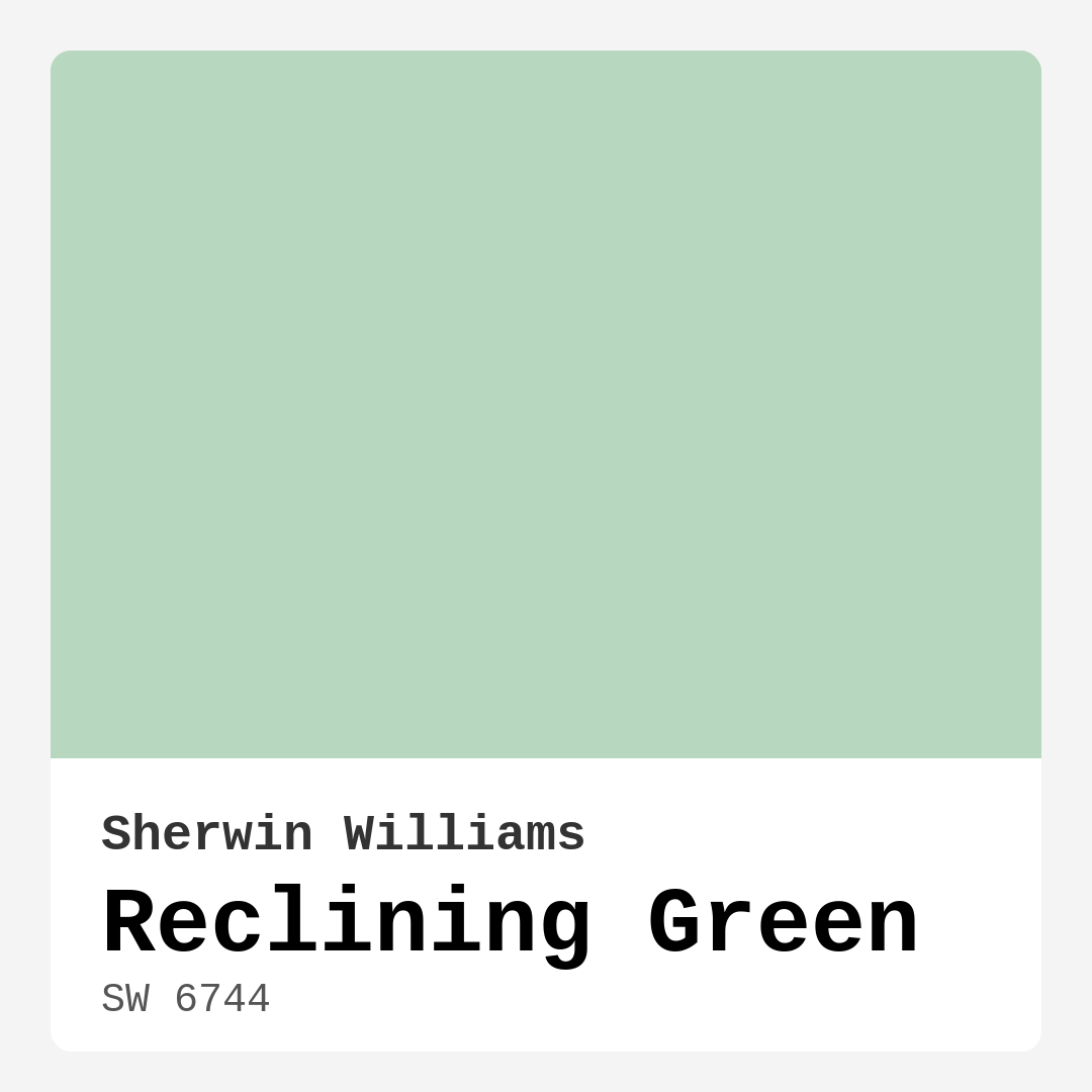
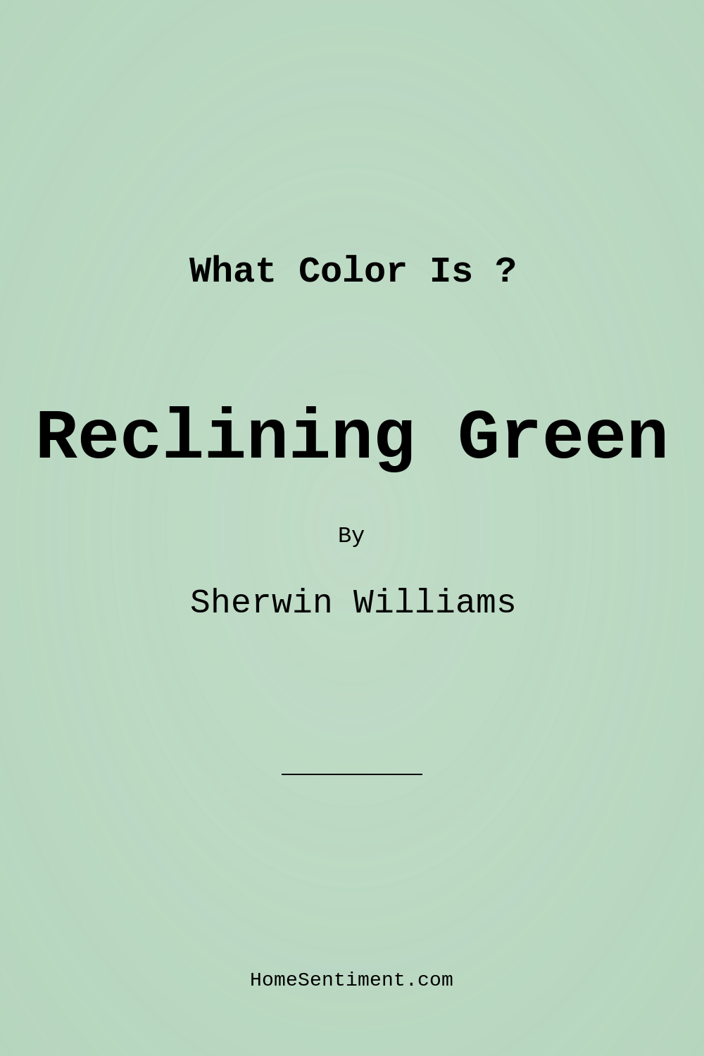
Color Preview & Key Details
| HEX Code | #B7D7BF |
| RGB | 183, 215, 191 |
| LRV | 24% |
| Undertone | Green |
| Finish Options | Eggshell, Matte, Satin, Semi-Gloss |
Imagine stepping into a room that instantly wraps you in comfort, as if you’re being embraced by nature itself. That serene feeling is exactly what you get with Reclining Green from Sherwin Williams, a soft, muted green that breathes tranquility into any space. This color is like a breath of fresh air, bringing in elements of the outdoors and creating a calming atmosphere that’s perfect for relaxing after a long day.
Reclining Green (SW 6744) is a light hue with an LRV of 24%, making it a medium dark option on the spectrum. It reflects very little light, which means it can create an intimate and cozy environment, especially in larger rooms. In spaces flooded with natural light, it exudes a vibrant energy, while in dimmer settings, it turns into a muted, calming backdrop. I’ve seen how colors can transform a room, and Reclining Green certainly shines in that regard.
One of the standout features of Reclining Green is its versatility. It’s suitable for a variety of rooms, whether you’re considering it for a tranquil bedroom, a cozy living room, or even a serene nursery. It adapts beautifully to different decor styles, from modern farmhouse to coastal vibes. This is partly due to its subtle undertones, which lean slightly cool but possess enough warmth to maintain a balanced atmosphere. It can easily be paired with warmer wood tones or crisp whites, making it a favorite among homeowners and designers alike.
When it comes to practical application, Reclining Green is incredibly beginner-friendly. The formula applies smoothly, whether you prefer to roll or brush it on. Plus, it dries quickly and features a low odor, which is always a plus when you’re working on a project at home. If you’re a DIY enthusiast, you’ll appreciate how easy it is to achieve a professional look with just one or two coats. Touch-ups are a breeze, and the paint is highly washable, making it perfect for those family areas that see a lot of action.
Let’s talk finishes for a moment. The choice of finish can significantly affect how Reclining Green appears in your space. For a soft sheen that’s easy to clean, eggshell or satin finishes are ideal. They enhance the color without overwhelming it, providing a subtle glow. If you’re after a more rustic vibe, a matte finish could work wonderfully, allowing the paint to settle into a calming backdrop. However, do keep in mind that gloss finishes will reflect more light and can brighten the overall look, while matte will offer a more muted appearance.
Reclining Green thrives in spaces where you want to create a sense of peace and relaxation. It’s perfect for home offices where concentration is key, or in bathrooms for a spa-like retreat. It pairs beautifully with white trim, and if you’re considering brass fixtures, you’ll find that they complement this color splendidly. The cool undertones can balance out the warmth of wood trim, creating a harmonious blend that feels inviting.
Now, let’s address some common concerns about using this color. One question I often hear is whether Reclining Green is suitable for small spaces. The answer is a resounding yes! Its light reflectance can create the illusion of a larger area, making small rooms feel airy and open. However, if your space lacks natural light, it’s wise to pair this color with lighter decor elements to maintain that open feel.
While Reclining Green has many virtues, it’s also good to be aware of its limitations. In spaces where light is scarce, this color can appear more muted, which might not be what you want if you’re aiming for a lively atmosphere. It’s crucial to test the paint in your space—observe how it interacts with your existing furniture and decor under different lighting conditions throughout the day.
When considering complementary shades, Reclining Green works beautifully with other soft greens like SW 6738, as well as warmer whites and soft grays. The combination can create a serene palette that feels cohesive and inviting. If you’re looking to go a bit bolder, darker shades like SW 9076 or SW 6284 can add depth and contrast, making your design truly pop.
Let’s not forget about the mood this color sets. Reclining Green evokes feelings of calm and serenity, perfect for creating a restful environment. It invites you to relax, unwind, and enjoy your space, making it an excellent choice for bedrooms and living areas.
In terms of overall performance, Reclining Green is a designer favorite, especially for those who want to create beautiful interiors without the hassle. It’s not only aesthetically pleasing but also practical—easy to apply, clean, and maintain. With low VOC levels and eco-certification, you can feel good about using it in your home.
As you embark on your painting project, keep Reclining Green in mind. Its soft, earthy tone can enhance your home’s aesthetic in ways you might not have imagined. Whether you’re refreshing a single room or tackling a larger renovation, this paint color can serve as a beautiful backdrop, allowing your decor to shine while also creating an inviting atmosphere.
So, are you ready to embrace the tranquility that Reclining Green offers? It’s more than just a color; it’s a lifestyle choice that enhances your wellbeing and brings a natural touch indoors. The next time you find yourself contemplating a paint color for your home, remember the calming influence of Reclining Green—it might just be the perfect fit for your serene sanctuary.
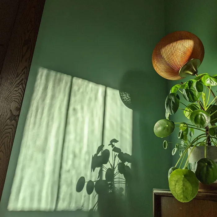
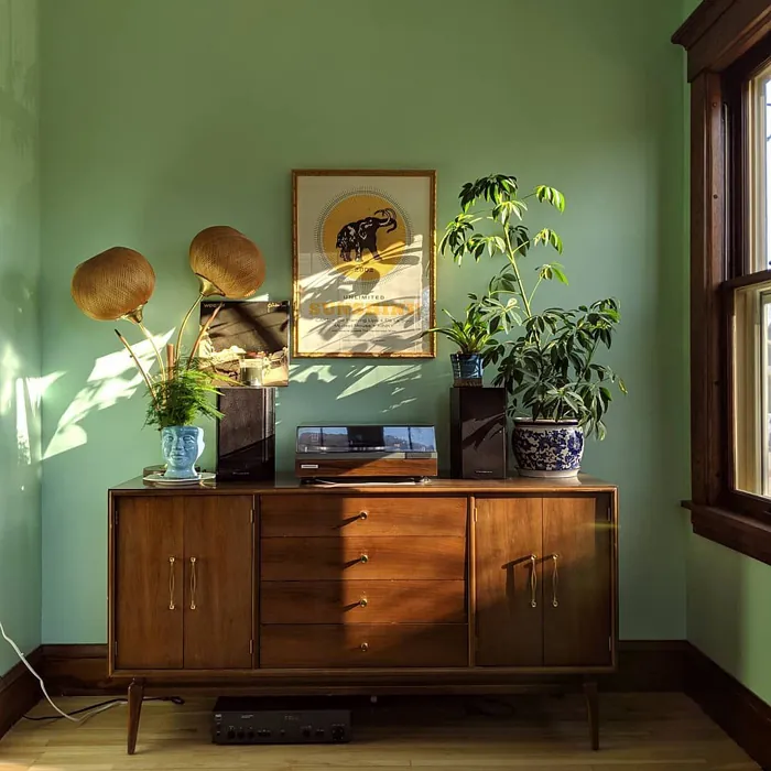
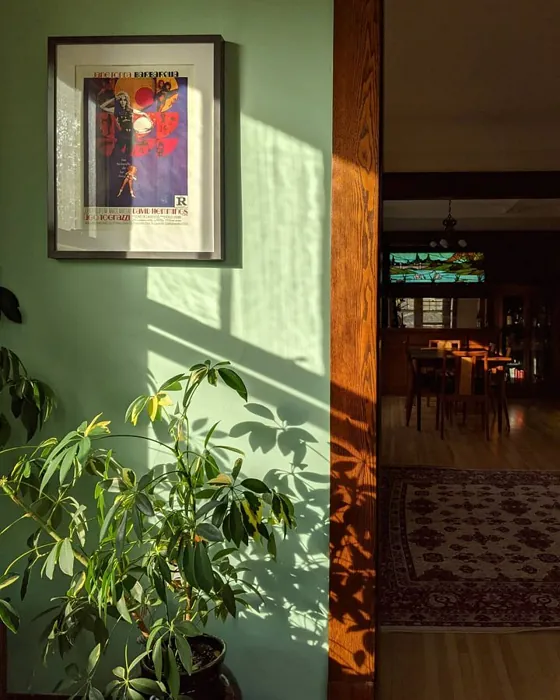
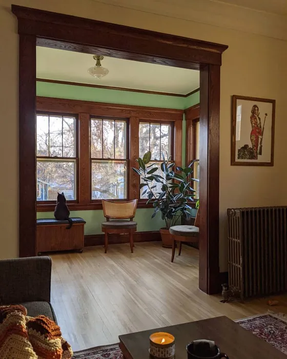
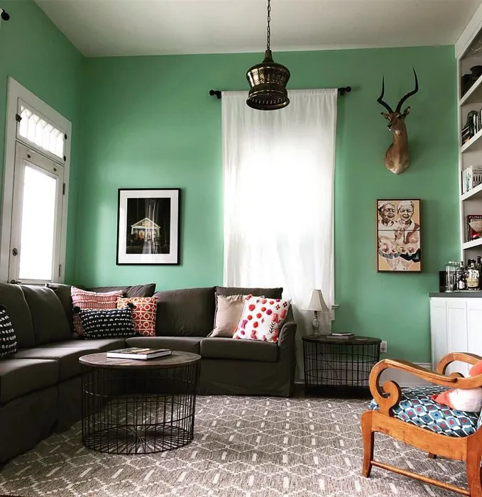
Real Room Photo of Reclining Green SW 6744
Undertones of Reclining Green ?
The undertones of Reclining Green are a key aspect of its character, leaning towards Green. These subtle underlying hues are what give the color its depth and complexity. For example, a gray with a blue undertone will feel cooler and more modern, while one with a brown undertone will feel warmer and more traditional. It’s essential to test this paint in your home and observe it next to your existing furniture, flooring, and decor to see how these undertones interact and reveal themselves throughout the day.
HEX value: #B7D7BF
RGB code: 183, 215, 191
Is Reclining Green Cool or Warm?
This shade leans towards the cool side but possesses enough warmth to create a balanced atmosphere. It’s ideal for spaces where you want to feel relaxed without sacrificing style.
Understanding Color Properties and Interior Design Tips
Hue refers to a specific position on the color wheel, measured in degrees from 0 to 360. Each degree represents a different pure color:
- 0° represents red
- 120° represents green
- 240° represents blue
Saturation describes the intensity or purity of a color and is expressed as a percentage:
- At 0%, the color appears completely desaturated—essentially a shade of gray
- At 100%, the color is at its most vivid and vibrant
Lightness indicates how light or dark a color is, also expressed as a percentage:
- 0% lightness results in black
- 100% lightness results in white
Using Warm Colors in Interior Design
Warm hues—such as reds, oranges, yellows, warm beiges, and greiges—are excellent choices for creating inviting and energetic spaces. These colors are particularly well-suited for:
- Kitchens, living rooms, and bathrooms, where warmth enhances comfort and sociability
- Large rooms, where warm tones can help reduce the sense of emptiness and make the space feel more intimate
For example:
- Warm beige shades provide a cozy, inviting atmosphere, ideal for living rooms, bedrooms, and hallways.
- Warm greige (a mix of beige and gray) offers the warmth of beige with the modern appeal of gray, making it a versatile backdrop for dining areas, bedrooms, and living spaces.
However, be mindful when using warm light tones in rooms with limited natural light. These shades may appear muted or even take on an unpleasant yellowish tint. To avoid a dull or flat appearance:
- Add depth by incorporating richer tones like deep greens, charcoal, or chocolate brown
- Use textured elements such as curtains, rugs, or cushions to bring dimension to the space
Pro Tip: Achieving Harmony with Warm and Cool Color Balance
To create a well-balanced and visually interesting interior, mix warm and cool tones strategically. This contrast adds depth and harmony to your design.
- If your walls feature warm hues, introduce cool-colored accents such as blue or green furniture, artwork, or accessories to create contrast.
- For a polished look, consider using a complementary color scheme, which pairs colors opposite each other on the color wheel (e.g., red with green, orange with blue).
This thoughtful mix not only enhances visual appeal but also creates a space that feels both dynamic and cohesive.
Light Temperature Affects on Reclining Green
Natural Light
Natural daylight changes in color temperature as the sun moves across the sky. At sunrise and sunset, the light tends to have a warm, golden tone with a color temperature around 2000 Kelvin (K). As the day progresses and the sun rises higher, the light becomes cooler and more neutral. Around midday, especially when the sky is clear, natural light typically reaches its peak brightness and shifts to a cooler tone, ranging from 5500 to 6500 Kelvin. This midday light is close to what we perceive as pure white or daylight-balanced light.
These shifts in natural light can significantly influence how colors appear in a space, which is why designers often consider both the time of day and the orientation of windows when planning interior color schemes.
Artificial Light
When choosing artificial lighting, pay close attention to the color temperature, measured in Kelvin (K). This determines how warm or cool the light will appear. Lower temperatures, around 2700K, give off a warm, yellow glow often used in living rooms or bedrooms. Higher temperatures, above 5000K, create a cool, bluish light similar to daylight, commonly used in kitchens, offices, or task areas.
Use the slider to see how lighting temperature can affect the appearance of a surface or color throughout a space.


4800K
LRV of Reclining Green
The Light Reflectance Value (LRV) of Reclining Green is 24%, which places it in the Medium Dark category. This means it reflects very little light. Understanding a paint’s LRV is crucial for predicting how it will look in your space. A higher LRV indicates a lighter color that reflects more light, making rooms feel larger and brighter. A lower LRV signifies a darker color that absorbs more light, creating a cozier, more intimate atmosphere. Always consider the natural and artificial lighting in your room when selecting a paint color based on its LRV.
Detailed Review of Reclining Green
Additional Paint Characteristics
Ideal Rooms
Bathroom, Bedroom, Home Office, Living Room, Nursery
Decor Styles
Bohemian, Coastal, Modern Farmhouse, Scandinavian, Transitional
Coverage
Good (1–2 Coats), Touch-Up Friendly
Ease of Application
Beginner Friendly, Brush Smooth, Fast-Drying, Roller-Ready
Washability
Highly Washable, Washable
VOC Level
Eco-Certified, Low VOC
Best Use
Accent Wall, Furniture, Interior Walls, Trim
Room Suitability
Bathroom, Bedroom, Home Office, Living Room, Nursery
Tone Tag
Balanced, Cool, Earthy, Muted
Finish Type
Eggshell, Matte, Satin
Paint Performance
Easy Touch-Up, Low Odor, Quick Drying, Scuff Resistant
Use Cases
Best for Low Light Rooms, Best for Modern Farmhouse, Best for Rentals, Designer Favorite
Mood
Calm, Inviting, Restful
Trim Pairing
Complements Brass Fixtures, Good with Wood Trim, Pairs with White Dove
Reclining Green is a delightful color that effortlessly bridges the gap between tranquility and style. Its soft, muted tone is reminiscent of lush foliage, perfect for those looking to enhance their living spaces with a natural vibe. This paint performs impressively in various settings, from cozy bedrooms to airy living rooms. Users will appreciate its ability to adapt to different lighting conditions, often appearing more vibrant in natural light while maintaining its softness in dimmer environments.
Application is a breeze, making it suitable for beginners and seasoned DIYers alike. The finish options, particularly eggshell and satin, provide a subtle sheen that enhances its calming characteristics without overwhelming the senses. Additionally, it’s easy to clean, making it a practical choice for family spaces. Overall, Reclining Green is a versatile, stylish choice that can elevate your home’s aesthetic effortlessly.
Pros & Cons of SW 6744 Reclining Green
Pros
Cons
Colors that go with Sherwin Williams Reclining Green
FAQ on SW 6744 Reclining Green
What type of finish should I choose for Reclining Green?
Choosing the right finish for Reclining Green depends on the room and desired look. For living rooms and bedrooms, an eggshell or satin finish can provide a soft sheen that’s easy to clean and maintain. If you’re looking for a more rustic vibe, a matte finish could be ideal. Keep in mind that gloss finishes will reflect more light and can make the color appear brighter, while matte finishes will give a more muted appearance. Consider your lighting and personal preferences to select the best option.
Is Reclining Green suitable for small spaces?
Absolutely! Reclining Green can actually work wonders in small spaces. Its light reflectance helps to open up the area, making it feel more spacious and airy. The calming nature of this green hue adds a serene touch, encouraging a sense of peace and spaciousness. Just be mindful of lighting—if the room lacks natural light, the color may appear darker, so pairing it with lighter decor elements can help maintain that open feel.
Comparisons Reclining Green with other colors
Reclining Green SW 6744 vs Sea Salt SW 6204
| Attribute | Reclining Green SW 6744 | Sea Salt SW 6204 |
|---|---|---|
| Color Name | Reclining Green SW 6744 | Sea Salt SW 6204 |
| Color | ||
| Hue | Green | Green |
| Brightness | Light | Light |
| RGB | 183, 215, 191 | 205, 210, 202 |
| LRV | 24% | 64% |
| Finish Type | Eggshell, Matte, Satin | Eggshell, Satin |
| Finish Options | Eggshell, Matte, Satin, Semi-Gloss | Eggshell, Matte, Satin |
| Ideal Rooms | Bathroom, Bedroom, Home Office, Living Room, Nursery | Bathroom, Bedroom, Hallway, Kitchen, Living Room |
| Decor Styles | Bohemian, Coastal, Modern Farmhouse, Scandinavian, Transitional | Coastal, Minimalist, Modern Farmhouse, Scandinavian, Traditional |
| Coverage | Good (1–2 Coats), Touch-Up Friendly | Good (1–2 Coats), Touch-Up Friendly |
| Ease of Application | Beginner Friendly, Brush Smooth, Fast-Drying, Roller-Ready | Beginner Friendly, Brush Smooth, Fast-Drying, Roller-Ready |
| Washability | Highly Washable, Washable | Highly Washable, Washable |
| Room Suitability | Bathroom, Bedroom, Home Office, Living Room, Nursery | Bathroom, Bedroom, Hallway, Kitchen, Living Room |
| Tone | Balanced, Cool, Earthy, Muted | Airy, Balanced, Cool, Muted |
| Paint Performance | Easy Touch-Up, Low Odor, Quick Drying, Scuff Resistant | Easy Touch-Up, High Coverage, Low Odor, Quick Drying |
Reclining Green SW 6744 vs Liveable Green SW 6176
| Attribute | Reclining Green SW 6744 | Liveable Green SW 6176 |
|---|---|---|
| Color Name | Reclining Green SW 6744 | Liveable Green SW 6176 |
| Color | ||
| Hue | Green | Green |
| Brightness | Light | Light |
| RGB | 183, 215, 191 | 206, 206, 189 |
| LRV | 24% | 30% |
| Finish Type | Eggshell, Matte, Satin | Eggshell, Matte, Satin |
| Finish Options | Eggshell, Matte, Satin, Semi-Gloss | Eggshell, Matte, Satin |
| Ideal Rooms | Bathroom, Bedroom, Home Office, Living Room, Nursery | Bedroom, Home Office, Kitchen, Living Room, Nursery |
| Decor Styles | Bohemian, Coastal, Modern Farmhouse, Scandinavian, Transitional | Contemporary, Modern Farmhouse, Rustic, Scandi |
| Coverage | Good (1–2 Coats), Touch-Up Friendly | Good (1–2 Coats), Touch-Up Friendly |
| Ease of Application | Beginner Friendly, Brush Smooth, Fast-Drying, Roller-Ready | Beginner Friendly, Brush Smooth, Roller-Ready |
| Washability | Highly Washable, Washable | Highly Washable, Washable |
| Room Suitability | Bathroom, Bedroom, Home Office, Living Room, Nursery | Bedroom, Home Office, Living Room, Nursery |
| Tone | Balanced, Cool, Earthy, Muted | Balanced, Earthy, Muted |
| Paint Performance | Easy Touch-Up, Low Odor, Quick Drying, Scuff Resistant | Easy Touch-Up, High Coverage, Low Odor |
Reclining Green SW 6744 vs Rainwashed SW 6211
| Attribute | Reclining Green SW 6744 | Rainwashed SW 6211 |
|---|---|---|
| Color Name | Reclining Green SW 6744 | Rainwashed SW 6211 |
| Color | ||
| Hue | Green | Green |
| Brightness | Light | Light |
| RGB | 183, 215, 191 | 194, 205, 197 |
| LRV | 24% | 60% |
| Finish Type | Eggshell, Matte, Satin | Eggshell, Matte, Satin |
| Finish Options | Eggshell, Matte, Satin, Semi-Gloss | Eggshell, Matte, Satin |
| Ideal Rooms | Bathroom, Bedroom, Home Office, Living Room, Nursery | Bathroom, Bedroom, Home Office, Living Room, Nursery |
| Decor Styles | Bohemian, Coastal, Modern Farmhouse, Scandinavian, Transitional | Coastal, Farmhouse, Minimalist, Modern, Transitional |
| Coverage | Good (1–2 Coats), Touch-Up Friendly | Good (1–2 Coats), Touch-Up Friendly |
| Ease of Application | Beginner Friendly, Brush Smooth, Fast-Drying, Roller-Ready | Beginner Friendly, Brush Smooth, Fast-Drying, Roller-Ready |
| Washability | Highly Washable, Washable | Washable, Wipeable |
| Room Suitability | Bathroom, Bedroom, Home Office, Living Room, Nursery | Bathroom, Bedroom, Home Office, Living Room, Nursery |
| Tone | Balanced, Cool, Earthy, Muted | Balanced, Cool, Muted |
| Paint Performance | Easy Touch-Up, Low Odor, Quick Drying, Scuff Resistant | Easy Touch-Up, High Coverage, Low Odor |
Reclining Green SW 6744 vs Filmy Green SW 6190
| Attribute | Reclining Green SW 6744 | Filmy Green SW 6190 |
|---|---|---|
| Color Name | Reclining Green SW 6744 | Filmy Green SW 6190 |
| Color | ||
| Hue | Green | Green |
| Brightness | Light | Light |
| RGB | 183, 215, 191 | 209, 211, 199 |
| LRV | 24% | 50% |
| Finish Type | Eggshell, Matte, Satin | Eggshell, Matte, Satin |
| Finish Options | Eggshell, Matte, Satin, Semi-Gloss | Eggshell, Matte, Satin |
| Ideal Rooms | Bathroom, Bedroom, Home Office, Living Room, Nursery | Bedroom, Home Office, Living Room, Nursery |
| Decor Styles | Bohemian, Coastal, Modern Farmhouse, Scandinavian, Transitional | Bohemian, Minimalist, Modern Farmhouse, Scandinavian |
| Coverage | Good (1–2 Coats), Touch-Up Friendly | Good (1–2 Coats) |
| Ease of Application | Beginner Friendly, Brush Smooth, Fast-Drying, Roller-Ready | Beginner Friendly, Brush Smooth, Roller-Ready |
| Washability | Highly Washable, Washable | Washable, Wipeable |
| Room Suitability | Bathroom, Bedroom, Home Office, Living Room, Nursery | Bedroom, Home Office, Living Room, Nursery |
| Tone | Balanced, Cool, Earthy, Muted | Calm, Earthy, Muted |
| Paint Performance | Easy Touch-Up, Low Odor, Quick Drying, Scuff Resistant | Easy Touch-Up, Low Odor, Quick Drying |
Reclining Green SW 6744 vs Slow Green SW 6456
| Attribute | Reclining Green SW 6744 | Slow Green SW 6456 |
|---|---|---|
| Color Name | Reclining Green SW 6744 | Slow Green SW 6456 |
| Color | ||
| Hue | Green | Green |
| Brightness | Light | Light |
| RGB | 183, 215, 191 | 198, 213, 201 |
| LRV | 24% | 48% |
| Finish Type | Eggshell, Matte, Satin | Eggshell, Matte, Satin |
| Finish Options | Eggshell, Matte, Satin, Semi-Gloss | Eggshell, Matte, Satin |
| Ideal Rooms | Bathroom, Bedroom, Home Office, Living Room, Nursery | Bedroom, Dining Room, Home Office, Living Room, Nursery |
| Decor Styles | Bohemian, Coastal, Modern Farmhouse, Scandinavian, Transitional | Coastal, Farmhouse, Modern, Rustic, Scandinavian |
| Coverage | Good (1–2 Coats), Touch-Up Friendly | Good (1–2 Coats), Touch-Up Friendly |
| Ease of Application | Beginner Friendly, Brush Smooth, Fast-Drying, Roller-Ready | Beginner Friendly, Brush Smooth, Roller-Ready |
| Washability | Highly Washable, Washable | Highly Washable, Washable |
| Room Suitability | Bathroom, Bedroom, Home Office, Living Room, Nursery | Bedroom, Dining Room, Entryway, Home Office, Living Room, Nursery |
| Tone | Balanced, Cool, Earthy, Muted | Balanced, Earthy, Muted |
| Paint Performance | Easy Touch-Up, Low Odor, Quick Drying, Scuff Resistant | Easy Touch-Up, Fade Resistant, Low Odor |
Reclining Green SW 6744 vs Acanthus SW 0029
| Attribute | Reclining Green SW 6744 | Acanthus SW 0029 |
|---|---|---|
| Color Name | Reclining Green SW 6744 | Acanthus SW 0029 |
| Color | ||
| Hue | Green | Green |
| Brightness | Light | Light |
| RGB | 183, 215, 191 | 205, 205, 180 |
| LRV | 24% | 10% |
| Finish Type | Eggshell, Matte, Satin | Eggshell, Matte, Satin |
| Finish Options | Eggshell, Matte, Satin, Semi-Gloss | Eggshell, Matte, Satin |
| Ideal Rooms | Bathroom, Bedroom, Home Office, Living Room, Nursery | Bedroom, Dining Room, Home Office, Kitchen, Living Room |
| Decor Styles | Bohemian, Coastal, Modern Farmhouse, Scandinavian, Transitional | Eclectic, Farmhouse, Modern, Traditional |
| Coverage | Good (1–2 Coats), Touch-Up Friendly | Good (1–2 Coats) |
| Ease of Application | Beginner Friendly, Brush Smooth, Fast-Drying, Roller-Ready | Beginner Friendly, Brush Smooth, Fast-Drying, Roller-Ready |
| Washability | Highly Washable, Washable | Highly Washable, Stain Resistant, Washable |
| Room Suitability | Bathroom, Bedroom, Home Office, Living Room, Nursery | Bedroom, Dining Room, Home Office, Living Room |
| Tone | Balanced, Cool, Earthy, Muted | Balanced, Earthy, Muted |
| Paint Performance | Easy Touch-Up, Low Odor, Quick Drying, Scuff Resistant | Easy Touch-Up, Low Odor, Quick Drying, Scuff Resistant |
Reclining Green SW 6744 vs Topiary Tint SW 6449
| Attribute | Reclining Green SW 6744 | Topiary Tint SW 6449 |
|---|---|---|
| Color Name | Reclining Green SW 6744 | Topiary Tint SW 6449 |
| Color | ||
| Hue | Green | Green |
| Brightness | Light | Light |
| RGB | 183, 215, 191 | 200, 216, 196 |
| LRV | 24% | 30% |
| Finish Type | Eggshell, Matte, Satin | Eggshell, Matte, Satin |
| Finish Options | Eggshell, Matte, Satin, Semi-Gloss | Eggshell, Matte, Satin |
| Ideal Rooms | Bathroom, Bedroom, Home Office, Living Room, Nursery | Bathroom, Bedroom, Dining Room, Home Office, Kitchen, Living Room |
| Decor Styles | Bohemian, Coastal, Modern Farmhouse, Scandinavian, Transitional | Bohemian, Coastal, Eclectic, Modern Farmhouse, Transitional |
| Coverage | Good (1–2 Coats), Touch-Up Friendly | Good (1–2 Coats), Touch-Up Friendly |
| Ease of Application | Beginner Friendly, Brush Smooth, Fast-Drying, Roller-Ready | Beginner Friendly, Brush Smooth, Fast-Drying, Roller-Ready |
| Washability | Highly Washable, Washable | Scuff Resistant, Washable |
| Room Suitability | Bathroom, Bedroom, Home Office, Living Room, Nursery | Bathroom, Bedroom, Dining Room, Kitchen, Living Room |
| Tone | Balanced, Cool, Earthy, Muted | Balanced, Calm, Earthy, Muted |
| Paint Performance | Easy Touch-Up, Low Odor, Quick Drying, Scuff Resistant | Easy Touch-Up, Low Odor, Quick Drying, Stain Resistant |
Reclining Green SW 6744 vs Waterscape SW 6470
| Attribute | Reclining Green SW 6744 | Waterscape SW 6470 |
|---|---|---|
| Color Name | Reclining Green SW 6744 | Waterscape SW 6470 |
| Color | ||
| Hue | Green | Green |
| Brightness | Light | Light |
| RGB | 183, 215, 191 | 191, 210, 201 |
| LRV | 24% | 50% |
| Finish Type | Eggshell, Matte, Satin | Eggshell, Matte |
| Finish Options | Eggshell, Matte, Satin, Semi-Gloss | Eggshell, Matte, Satin |
| Ideal Rooms | Bathroom, Bedroom, Home Office, Living Room, Nursery | Bathroom, Bedroom, Home Office, Kitchen, Living Room |
| Decor Styles | Bohemian, Coastal, Modern Farmhouse, Scandinavian, Transitional | Coastal, Minimalist, Modern, Scandinavian |
| Coverage | Good (1–2 Coats), Touch-Up Friendly | Good (1–2 Coats) |
| Ease of Application | Beginner Friendly, Brush Smooth, Fast-Drying, Roller-Ready | Beginner Friendly, Brush Smooth, Roller-Ready |
| Washability | Highly Washable, Washable | Highly Washable, Washable |
| Room Suitability | Bathroom, Bedroom, Home Office, Living Room, Nursery | Bathroom, Bedroom, Home Office, Living Room |
| Tone | Balanced, Cool, Earthy, Muted | Airy, Cool, Muted |
| Paint Performance | Easy Touch-Up, Low Odor, Quick Drying, Scuff Resistant | Easy Touch-Up, Low Odor, Quick Drying |
Reclining Green SW 6744 vs Bonsai Tint SW 6436
| Attribute | Reclining Green SW 6744 | Bonsai Tint SW 6436 |
|---|---|---|
| Color Name | Reclining Green SW 6744 | Bonsai Tint SW 6436 |
| Color | ||
| Hue | Green | Green |
| Brightness | Light | Light |
| RGB | 183, 215, 191 | 197, 209, 178 |
| LRV | 24% | 64% |
| Finish Type | Eggshell, Matte, Satin | Eggshell, Matte |
| Finish Options | Eggshell, Matte, Satin, Semi-Gloss | Eggshell, Matte, Satin |
| Ideal Rooms | Bathroom, Bedroom, Home Office, Living Room, Nursery | Bedroom, Home Office, Living Room, Nursery |
| Decor Styles | Bohemian, Coastal, Modern Farmhouse, Scandinavian, Transitional | Bohemian, Minimalist, Modern, Scandinavian |
| Coverage | Good (1–2 Coats), Touch-Up Friendly | Good (1–2 Coats) |
| Ease of Application | Beginner Friendly, Brush Smooth, Fast-Drying, Roller-Ready | Beginner Friendly, Brush Smooth, Roller-Ready |
| Washability | Highly Washable, Washable | Washable, Wipeable |
| Room Suitability | Bathroom, Bedroom, Home Office, Living Room, Nursery | Bedroom, Home Office, Living Room, Nursery |
| Tone | Balanced, Cool, Earthy, Muted | Calm, Earthy, Muted |
| Paint Performance | Easy Touch-Up, Low Odor, Quick Drying, Scuff Resistant | Easy Touch-Up, Fade Resistant, Low Odor |
Reclining Green SW 6744 vs Gratifying Green SW 6435
| Attribute | Reclining Green SW 6744 | Gratifying Green SW 6435 |
|---|---|---|
| Color Name | Reclining Green SW 6744 | Gratifying Green SW 6435 |
| Color | ||
| Hue | Green | Green |
| Brightness | Light | Light |
| RGB | 183, 215, 191 | 218, 226, 205 |
| LRV | 24% | 30% |
| Finish Type | Eggshell, Matte, Satin | Eggshell, Matte, Satin |
| Finish Options | Eggshell, Matte, Satin, Semi-Gloss | Eggshell, Matte, Satin |
| Ideal Rooms | Bathroom, Bedroom, Home Office, Living Room, Nursery | Bedroom, Dining Room, Home Office, Living Room, Nursery |
| Decor Styles | Bohemian, Coastal, Modern Farmhouse, Scandinavian, Transitional | Bohemian, Coastal, Minimalist, Modern Farmhouse |
| Coverage | Good (1–2 Coats), Touch-Up Friendly | Good (1–2 Coats), Touch-Up Friendly |
| Ease of Application | Beginner Friendly, Brush Smooth, Fast-Drying, Roller-Ready | Beginner Friendly, Brush Smooth, Roller-Ready |
| Washability | Highly Washable, Washable | Washable, Wipeable |
| Room Suitability | Bathroom, Bedroom, Home Office, Living Room, Nursery | Bedroom, Home Office, Living Room, Nursery |
| Tone | Balanced, Cool, Earthy, Muted | Earthy, Muted, Warm |
| Paint Performance | Easy Touch-Up, Low Odor, Quick Drying, Scuff Resistant | Easy Touch-Up, Low Odor, Quick Drying |
Official Page of Sherwin Williams Reclining Green SW 6744