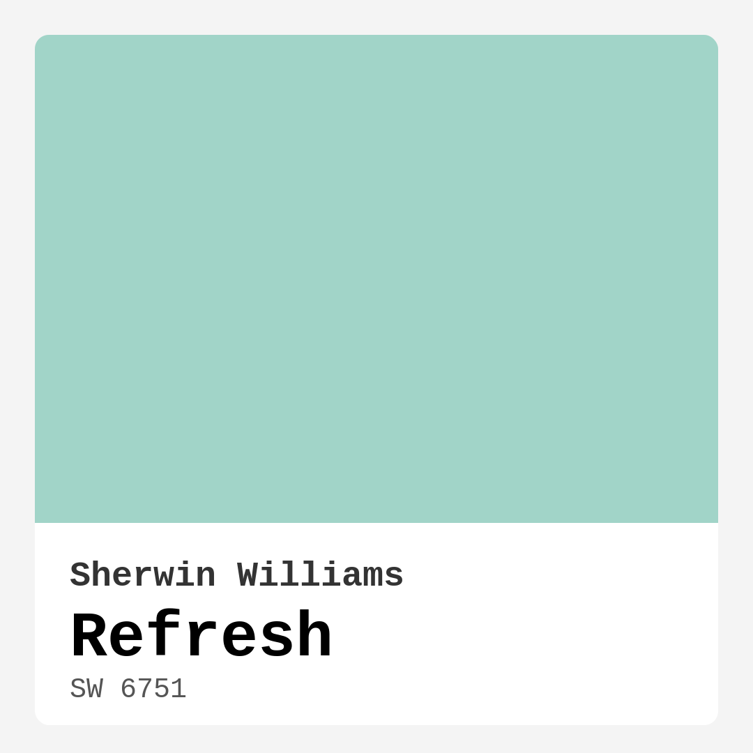
Color Preview & Key Details
| HEX Code | #A1D4C8 |
| RGB | 161, 212, 200 |
| LRV | 66% |
| Undertone | Green |
| Finish Options | Eggshell, Matte, Satin |
Imagine stepping into a room that instantly envelops you in serenity, as if you’ve just taken a deep breath by the ocean. That’s the magic of Refresh, a captivating paint color by Sherwin Williams. With a soft, soothing hue reminiscent of tranquil waters, Refresh is more than just a color; it’s an experience, a lifestyle choice that can transform any space into a peaceful retreat.
This lovely shade, designated as SW 6751, falls under the blue color family but carries a delicate green undertone that gives it a unique depth. Picture yourself in a cozy living room or a serene bathroom, surrounded by walls washed in this gentle hue. It invites calmness and tranquility, making it ideal for spaces where relaxation is key.
The brightness of Refresh sits at a medium level, reflecting a generous amount of light with a Light Reflectance Value (LRV) of 66%. This means it’s not just a pretty color; it actively works to make your spaces feel larger and more open. Whether you’re painting a small hallway or a spacious living room, you’ll find that Refresh beautifully enhances natural light, creating an airy, inviting atmosphere.
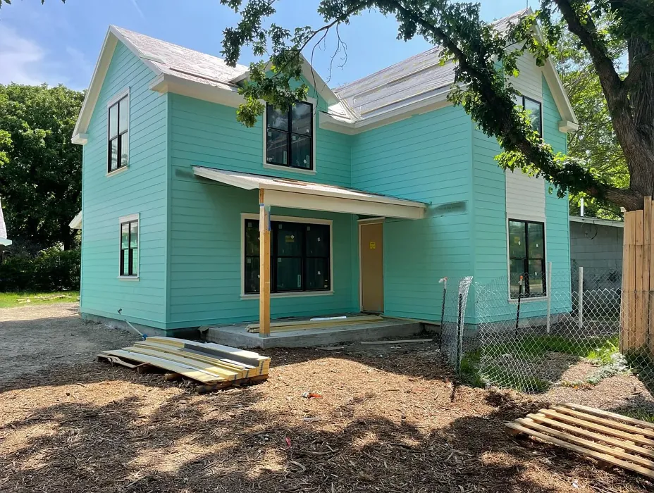
One of the best parts about Refresh is its versatility. It fits seamlessly into various decor styles, from modern to coastal, Scandinavian to minimalist. If you’re in the middle of a design project, think about how this color can serve as a backdrop for your furniture and decor. It pairs wonderfully with both warm and cool accents, so you can let your creativity run wild.
When it comes to application, you’ll find Refresh to be beginner-friendly. It goes on smoothly, whether you’re using a roller or a brush, making it a fantastic option for those who might be new to DIY painting. For optimal coverage, most folks find that one to two coats do the trick. On pre-primed surfaces, you might even get away with just a single coat, but always testing a small area first is a smart move.
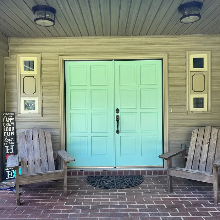
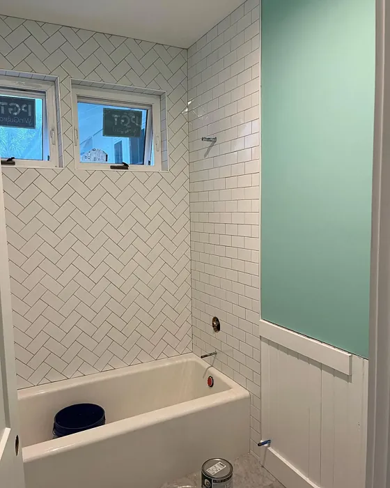
Now, let’s talk about where Refresh shines—literally and figuratively. It’s perfect for living rooms, bedrooms, and bathrooms. Imagine waking up in a bedroom washed in this calming color, or enjoying a hot bath in a bathroom that feels like a spa retreat. It’s also suitable for high-moisture areas, making it a practical choice for kitchens and bathrooms, especially when paired with a good primer. Its washability means it’ll maintain that fresh look over time, which is a significant bonus in spaces that see a lot of activity.
You may wonder about the color’s undertone. Refresh leans towards the cool side of the spectrum, which can harmonize beautifully with other cooler hues. However, it’s versatile enough to balance out warmer tones, too. When considering how it pairs with existing furniture or flooring, keep in mind that the green undertone may shift slightly depending on the light in your space. Testing the paint in different lighting throughout the day will give you a better understanding of how it interacts in your home.
Speaking of lighting, Refresh truly comes alive in natural light. It creates a bright, open feel that can significantly enhance smaller areas. Under artificial lighting, it maintains its serene character without overwhelming the room. This adaptability makes it a designer favorite, especially for those looking to craft a calm, inviting space.
Now, if you’re thinking about complementary colors, you’re in for a treat. Refresh pairs beautifully with shades like White Dove for trim, and it complements brass fixtures magnificently. Whether you’re going for a classic look or something more modern, you’ll find that this color opens up a world of possibilities. Consider accenting it with deeper blues or warm earthy tones to create a layered, sophisticated palette.
However, like any color, Refresh has its nuances. In overly bright spaces, it might not shine as brightly as you’d hope, and it requires precise pairing with other colors to avoid clashing. So, take the time to experiment with swatches and combinations before making a commitment.
As you think about your paint project, consider that Refresh is not just a color; it’s a mood. It brings calm and restfulness, making it a perfect choice for spaces designed for relaxation and rejuvenation. It’s not just about the color itself; it’s about how it makes you feel.
In terms of maintenance, Refresh stands out for its durability. It’s low odor, quick drying, and scuff-resistant, which means you can enjoy your freshly painted walls without worrying about immediate wear and tear. And with its low VOC content, you’re making an environmentally friendly choice that benefits both your home and the planet.
In conclusion, if you’re looking to create a serene, inviting atmosphere in your home, Refresh by Sherwin Williams is an excellent choice. With its calming presence and versatile application, it can elevate any space into a tranquil retreat. So grab that paintbrush and start your journey toward a more peaceful home. Remember, your walls can tell a story—let them tell one of calm and beauty with Refresh.
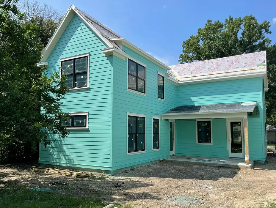
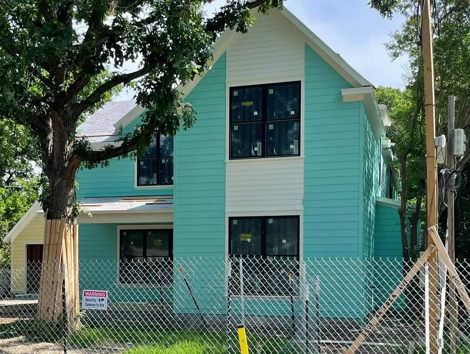
Real Room Photo of Refresh SW 6751
Undertones of Refresh ?
The undertones of Refresh are a key aspect of its character, leaning towards Green. These subtle underlying hues are what give the color its depth and complexity. For example, a gray with a blue undertone will feel cooler and more modern, while one with a brown undertone will feel warmer and more traditional. It’s essential to test this paint in your home and observe it next to your existing furniture, flooring, and decor to see how these undertones interact and reveal themselves throughout the day.
HEX value: #A1D4C8
RGB code: 161, 212, 200
Is Refresh Cool or Warm?
This color leans towards the cool side of the spectrum, making it perfect for spaces that benefit from a calming influence. It harmonizes beautifully with cooler hues, yet it can also balance warmer tones, making it adaptable for different decor styles.
Understanding Color Properties and Interior Design Tips
Hue refers to a specific position on the color wheel, measured in degrees from 0 to 360. Each degree represents a different pure color:
- 0° represents red
- 120° represents green
- 240° represents blue
Saturation describes the intensity or purity of a color and is expressed as a percentage:
- At 0%, the color appears completely desaturated—essentially a shade of gray
- At 100%, the color is at its most vivid and vibrant
Lightness indicates how light or dark a color is, also expressed as a percentage:
- 0% lightness results in black
- 100% lightness results in white
Using Warm Colors in Interior Design
Warm hues—such as reds, oranges, yellows, warm beiges, and greiges—are excellent choices for creating inviting and energetic spaces. These colors are particularly well-suited for:
- Kitchens, living rooms, and bathrooms, where warmth enhances comfort and sociability
- Large rooms, where warm tones can help reduce the sense of emptiness and make the space feel more intimate
For example:
- Warm beige shades provide a cozy, inviting atmosphere, ideal for living rooms, bedrooms, and hallways.
- Warm greige (a mix of beige and gray) offers the warmth of beige with the modern appeal of gray, making it a versatile backdrop for dining areas, bedrooms, and living spaces.
However, be mindful when using warm light tones in rooms with limited natural light. These shades may appear muted or even take on an unpleasant yellowish tint. To avoid a dull or flat appearance:
- Add depth by incorporating richer tones like deep greens, charcoal, or chocolate brown
- Use textured elements such as curtains, rugs, or cushions to bring dimension to the space
Pro Tip: Achieving Harmony with Warm and Cool Color Balance
To create a well-balanced and visually interesting interior, mix warm and cool tones strategically. This contrast adds depth and harmony to your design.
- If your walls feature warm hues, introduce cool-colored accents such as blue or green furniture, artwork, or accessories to create contrast.
- For a polished look, consider using a complementary color scheme, which pairs colors opposite each other on the color wheel (e.g., red with green, orange with blue).
This thoughtful mix not only enhances visual appeal but also creates a space that feels both dynamic and cohesive.
Light Temperature Affects on Refresh
Natural Light
Natural daylight changes in color temperature as the sun moves across the sky. At sunrise and sunset, the light tends to have a warm, golden tone with a color temperature around 2000 Kelvin (K). As the day progresses and the sun rises higher, the light becomes cooler and more neutral. Around midday, especially when the sky is clear, natural light typically reaches its peak brightness and shifts to a cooler tone, ranging from 5500 to 6500 Kelvin. This midday light is close to what we perceive as pure white or daylight-balanced light.
These shifts in natural light can significantly influence how colors appear in a space, which is why designers often consider both the time of day and the orientation of windows when planning interior color schemes.
Artificial Light
When choosing artificial lighting, pay close attention to the color temperature, measured in Kelvin (K). This determines how warm or cool the light will appear. Lower temperatures, around 2700K, give off a warm, yellow glow often used in living rooms or bedrooms. Higher temperatures, above 5000K, create a cool, bluish light similar to daylight, commonly used in kitchens, offices, or task areas.
Use the slider to see how lighting temperature can affect the appearance of a surface or color throughout a space.


4800K
LRV of Refresh
The Light Reflectance Value (LRV) of Refresh is 66%, which places it in the Light category. This means it Reflects a high amount of light. Understanding a paint’s LRV is crucial for predicting how it will look in your space. A higher LRV indicates a lighter color that reflects more light, making rooms feel larger and brighter. A lower LRV signifies a darker color that absorbs more light, creating a cozier, more intimate atmosphere. Always consider the natural and artificial lighting in your room when selecting a paint color based on its LRV.
Detailed Review of Refresh
Additional Paint Characteristics
Ideal Rooms
Bathroom, Bedroom, Hallway, Kitchen, Living Room
Decor Styles
Coastal, Minimalist, Modern, Scandinavian
Coverage
Good (1–2 Coats), Touch-Up Friendly
Ease of Application
Beginner Friendly, Brush Smooth, Roller-Ready
Washability
Highly Washable, Washable
VOC Level
Eco-Certified, Low VOC
Best Use
Accent Wall, Bathroom, Interior Walls, Living Room
Room Suitability
Bathroom, Bedroom, Living Room
Tone Tag
Airy, Cool, Muted
Finish Type
Eggshell, Satin
Paint Performance
Low Odor, Quick Drying, Scuff Resistant
Use Cases
Best for Low Light Rooms, Best for Small Spaces, Designer Favorite
Mood
Calm, Inviting, Restful
Trim Pairing
Complements Brass Fixtures, Pairs with White Dove, Works with Warm Trim
Refresh’s calming presence makes it a fantastic choice for various interior spaces. This hue, with its delicate balance between green and blue, provides a serene backdrop that enhances natural light. Whether you’re updating a cozy bedroom or revitalizing a bathroom, this paint works wonders. Its application is smooth, yielding a professional finish that rarely requires more than two coats. Additionally, it pairs beautifully with both warm and cool accents, adding versatility to your decor choices. The finish options range from eggshell to satin, allowing you to choose the right sheen for your space. Overall, Refresh proves to be a reliable option for anyone looking to create a peaceful ambiance.
Pros & Cons of SW 6751 Refresh
Pros
Cons
Colors that go with Sherwin Williams Refresh
FAQ on SW 6751 Refresh
How many coats of Refresh should I apply?
For optimal coverage, it’s recommended to apply Refresh in one to two coats. Most users find that one coat is sufficient on pre-primed surfaces, but a second coat may be necessary for deeper hues or less prepared surfaces. Always test a small area first to determine the best application for your specific walls.
Can Refresh be used in high-moisture areas?
Yes, Refresh is suitable for high-moisture areas like bathrooms and kitchens, especially when paired with a good primer and appropriate finish options. Its washability helps maintain its fresh look over time, making it a practical choice for these spaces.
Comparisons Refresh with other colors
Refresh SW 6751 vs Dutch Tile Blue SW 0031
| Attribute | Refresh SW 6751 | Dutch Tile Blue SW 0031 |
|---|---|---|
| Color Name | Refresh SW 6751 | Dutch Tile Blue SW 0031 |
| Color | ||
| Hue | Blue | Blue |
| Brightness | Medium | Medium |
| RGB | 161, 212, 200 | 154, 171, 171 |
| LRV | 66% | 24% |
| Finish Type | Eggshell, Satin | Eggshell, Matte, Satin |
| Finish Options | Eggshell, Matte, Satin | Eggshell, Flat, Matte, Satin |
| Ideal Rooms | Bathroom, Bedroom, Hallway, Kitchen, Living Room | Bathroom, Bedroom, Dining Room, Hallway, Home Office, Kitchen, Living Room |
| Decor Styles | Coastal, Minimalist, Modern, Scandinavian | Coastal, Modern Farmhouse, Scandinavian, Traditional, Transitional |
| Coverage | Good (1–2 Coats), Touch-Up Friendly | Good (1–2 Coats) |
| Ease of Application | Beginner Friendly, Brush Smooth, Roller-Ready | Beginner Friendly, Brush Smooth, Fast-Drying, Roller-Ready |
| Washability | Highly Washable, Washable | Highly Washable, Washable |
| Room Suitability | Bathroom, Bedroom, Living Room | Bathroom, Bedroom, Dining Room, Kitchen, Living Room |
| Tone | Airy, Cool, Muted | Balanced, Cool, Muted |
| Paint Performance | Low Odor, Quick Drying, Scuff Resistant | Easy Touch-Up, High Coverage, Low Odor, Quick Drying |
Refresh SW 6751 vs Debonair SW 9139
| Attribute | Refresh SW 6751 | Debonair SW 9139 |
|---|---|---|
| Color Name | Refresh SW 6751 | Debonair SW 9139 |
| Color | ||
| Hue | Blue | Blue |
| Brightness | Medium | Medium |
| RGB | 161, 212, 200 | 144, 160, 166 |
| LRV | 66% | 30% |
| Finish Type | Eggshell, Satin | Eggshell, Matte, Satin |
| Finish Options | Eggshell, Matte, Satin | Eggshell, Matte, Satin |
| Ideal Rooms | Bathroom, Bedroom, Hallway, Kitchen, Living Room | Bedroom, Dining Room, Home Office, Living Room |
| Decor Styles | Coastal, Minimalist, Modern, Scandinavian | Coastal, Industrial, Modern, Transitional |
| Coverage | Good (1–2 Coats), Touch-Up Friendly | Good (1–2 Coats) |
| Ease of Application | Beginner Friendly, Brush Smooth, Roller-Ready | Beginner Friendly, Brush Smooth, Roller-Ready |
| Washability | Highly Washable, Washable | Washable, Wipeable |
| Room Suitability | Bathroom, Bedroom, Living Room | Bedroom, Dining Room, Home Office, Living Room |
| Tone | Airy, Cool, Muted | Balanced, Cool, Muted |
| Paint Performance | Low Odor, Quick Drying, Scuff Resistant | Easy Touch-Up, Low Odor, Quick Drying |
Refresh SW 6751 vs Stardew SW 9138
| Attribute | Refresh SW 6751 | Stardew SW 9138 |
|---|---|---|
| Color Name | Refresh SW 6751 | Stardew SW 9138 |
| Color | ||
| Hue | Blue | Blue |
| Brightness | Medium | Medium |
| RGB | 161, 212, 200 | 166, 178, 181 |
| LRV | 66% | 30% |
| Finish Type | Eggshell, Satin | Eggshell, Satin |
| Finish Options | Eggshell, Matte, Satin | Eggshell, Matte, Satin |
| Ideal Rooms | Bathroom, Bedroom, Hallway, Kitchen, Living Room | Bathroom, Bedroom, Home Office, Living Room, Nursery |
| Decor Styles | Coastal, Minimalist, Modern, Scandinavian | Coastal, Farmhouse, Modern, Scandinavian |
| Coverage | Good (1–2 Coats), Touch-Up Friendly | Good (1–2 Coats) |
| Ease of Application | Beginner Friendly, Brush Smooth, Roller-Ready | Beginner Friendly, Brush Smooth, Roller-Ready |
| Washability | Highly Washable, Washable | Highly Washable, Washable, Wipeable |
| Room Suitability | Bathroom, Bedroom, Living Room | Bathroom, Bedroom, Home Office, Living Room |
| Tone | Airy, Cool, Muted | Calm, Cool, Muted |
| Paint Performance | Low Odor, Quick Drying, Scuff Resistant | Easy Touch-Up, High Coverage, Low Odor |
Refresh SW 6751 vs Niebla Azul SW 9137
| Attribute | Refresh SW 6751 | Niebla Azul SW 9137 |
|---|---|---|
| Color Name | Refresh SW 6751 | Niebla Azul SW 9137 |
| Color | ||
| Hue | Blue | Blue |
| Brightness | Medium | Medium |
| RGB | 161, 212, 200 | 182, 195, 196 |
| LRV | 66% | 48% |
| Finish Type | Eggshell, Satin | Eggshell, Matte, Satin |
| Finish Options | Eggshell, Matte, Satin | Eggshell, Matte, Satin |
| Ideal Rooms | Bathroom, Bedroom, Hallway, Kitchen, Living Room | Bedroom, Home Office, Living Room, Nursery |
| Decor Styles | Coastal, Minimalist, Modern, Scandinavian | Coastal, Modern, Scandinavian, Transitional |
| Coverage | Good (1–2 Coats), Touch-Up Friendly | Good (1–2 Coats), Touch-Up Friendly |
| Ease of Application | Beginner Friendly, Brush Smooth, Roller-Ready | Beginner Friendly, Brush Smooth, Roller-Ready |
| Washability | Highly Washable, Washable | Highly Washable, Washable |
| Room Suitability | Bathroom, Bedroom, Living Room | Bedroom, Home Office, Living Room, Nursery |
| Tone | Airy, Cool, Muted | Airy, Cool, Muted |
| Paint Performance | Low Odor, Quick Drying, Scuff Resistant | Easy Touch-Up, Fade Resistant, Low Odor, Scuff Resistant |
Refresh SW 6751 vs Rain SW 6219
| Attribute | Refresh SW 6751 | Rain SW 6219 |
|---|---|---|
| Color Name | Refresh SW 6751 | Rain SW 6219 |
| Color | ||
| Hue | Blue | Blue |
| Brightness | Medium | Medium |
| RGB | 161, 212, 200 | 171, 190, 191 |
| LRV | 66% | 50% |
| Finish Type | Eggshell, Satin | Eggshell, Matte, Satin |
| Finish Options | Eggshell, Matte, Satin | Eggshell, Matte, Satin |
| Ideal Rooms | Bathroom, Bedroom, Hallway, Kitchen, Living Room | Bathroom, Bedroom, Home Office, Living Room, Nursery |
| Decor Styles | Coastal, Minimalist, Modern, Scandinavian | Coastal, Minimalist, Modern, Scandinavian, Transitional |
| Coverage | Good (1–2 Coats), Touch-Up Friendly | Good (1–2 Coats), Touch-Up Friendly |
| Ease of Application | Beginner Friendly, Brush Smooth, Roller-Ready | Beginner Friendly, Brush Smooth, Fast-Drying, Roller-Ready |
| Washability | Highly Washable, Washable | Scrubbable, Stain Resistant, Washable |
| Room Suitability | Bathroom, Bedroom, Living Room | Bathroom, Bedroom, Home Office, Living Room, Nursery |
| Tone | Airy, Cool, Muted | Balanced, Cool, Muted |
| Paint Performance | Low Odor, Quick Drying, Scuff Resistant | Easy Touch-Up, Low Odor, Quick Drying, Stain Resistant |
Refresh SW 6751 vs Morning at Sea SW 9634
| Attribute | Refresh SW 6751 | Morning at Sea SW 9634 |
|---|---|---|
| Color Name | Refresh SW 6751 | Morning at Sea SW 9634 |
| Color | ||
| Hue | Blue | Blue |
| Brightness | Medium | Medium |
| RGB | 161, 212, 200 | 130, 151, 155 |
| LRV | 66% | 50% |
| Finish Type | Eggshell, Satin | Eggshell, Matte |
| Finish Options | Eggshell, Matte, Satin | Eggshell, Matte, Satin |
| Ideal Rooms | Bathroom, Bedroom, Hallway, Kitchen, Living Room | Bathroom, Bedroom, Home Office, Living Room |
| Decor Styles | Coastal, Minimalist, Modern, Scandinavian | Coastal, Minimalist, Modern, Scandinavian |
| Coverage | Good (1–2 Coats), Touch-Up Friendly | Good (1–2 Coats), Touch-Up Friendly |
| Ease of Application | Beginner Friendly, Brush Smooth, Roller-Ready | Beginner Friendly, Brush Smooth, Roller-Ready |
| Washability | Highly Washable, Washable | Washable, Wipeable |
| Room Suitability | Bathroom, Bedroom, Living Room | Bathroom, Bedroom, Home Office, Living Room |
| Tone | Airy, Cool, Muted | Airy, Cool, Muted |
| Paint Performance | Low Odor, Quick Drying, Scuff Resistant | Easy Touch-Up, Fade Resistant, Low Odor |
Refresh SW 6751 vs Sleepy Blue SW 6225
| Attribute | Refresh SW 6751 | Sleepy Blue SW 6225 |
|---|---|---|
| Color Name | Refresh SW 6751 | Sleepy Blue SW 6225 |
| Color | ||
| Hue | Blue | Blue |
| Brightness | Medium | Medium |
| RGB | 161, 212, 200 | 188, 203, 206 |
| LRV | 66% | 50% |
| Finish Type | Eggshell, Satin | Eggshell, Matte, Satin |
| Finish Options | Eggshell, Matte, Satin | Eggshell, Matte, Satin |
| Ideal Rooms | Bathroom, Bedroom, Hallway, Kitchen, Living Room | Bedroom, Home Office, Living Room, Nursery |
| Decor Styles | Coastal, Minimalist, Modern, Scandinavian | Coastal, Minimalist, Modern Farmhouse, Scandinavian |
| Coverage | Good (1–2 Coats), Touch-Up Friendly | Good (1–2 Coats) |
| Ease of Application | Beginner Friendly, Brush Smooth, Roller-Ready | Beginner Friendly, Brush Smooth, Fast-Drying, Roller-Ready |
| Washability | Highly Washable, Washable | Highly Washable, Washable |
| Room Suitability | Bathroom, Bedroom, Living Room | Bedroom, Home Office, Living Room, Nursery |
| Tone | Airy, Cool, Muted | Airy, Cool, Muted |
| Paint Performance | Low Odor, Quick Drying, Scuff Resistant | Easy Touch-Up, Low Odor, Quick Drying, Scuff Resistant |
Refresh SW 6751 vs Lakeside SW 9683
| Attribute | Refresh SW 6751 | Lakeside SW 9683 |
|---|---|---|
| Color Name | Refresh SW 6751 | Lakeside SW 9683 |
| Color | ||
| Hue | Blue | Blue |
| Brightness | Medium | Medium |
| RGB | 161, 212, 200 | 173, 184, 192 |
| LRV | 66% | 24% |
| Finish Type | Eggshell, Satin | Eggshell, Matte, Satin |
| Finish Options | Eggshell, Matte, Satin | Eggshell, Matte, Satin |
| Ideal Rooms | Bathroom, Bedroom, Hallway, Kitchen, Living Room | Bathroom, Bedroom, Home Office, Living Room |
| Decor Styles | Coastal, Minimalist, Modern, Scandinavian | Coastal, Minimalist, Modern, Rustic |
| Coverage | Good (1–2 Coats), Touch-Up Friendly | Good (1–2 Coats) |
| Ease of Application | Beginner Friendly, Brush Smooth, Roller-Ready | Beginner Friendly, Brush Smooth, Roller-Ready |
| Washability | Highly Washable, Washable | Scrubbable, Washable |
| Room Suitability | Bathroom, Bedroom, Living Room | Bathroom, Bedroom, Home Office, Living Room |
| Tone | Airy, Cool, Muted | Balanced, Cool, Muted |
| Paint Performance | Low Odor, Quick Drying, Scuff Resistant | Easy Touch-Up, Fade Resistant, High Coverage, Low Odor |
Refresh SW 6751 vs Upward SW 6239
| Attribute | Refresh SW 6751 | Upward SW 6239 |
|---|---|---|
| Color Name | Refresh SW 6751 | Upward SW 6239 |
| Color | ||
| Hue | Blue | Blue |
| Brightness | Medium | Medium |
| RGB | 161, 212, 200 | 191, 201, 208 |
| LRV | 66% | 75% |
| Finish Type | Eggshell, Satin | Eggshell, Satin |
| Finish Options | Eggshell, Matte, Satin | Eggshell, Flat, Satin |
| Ideal Rooms | Bathroom, Bedroom, Hallway, Kitchen, Living Room | Bedroom, Dining Room, Home Office, Living Room, Nursery |
| Decor Styles | Coastal, Minimalist, Modern, Scandinavian | Coastal, Minimalist, Modern, Scandinavian |
| Coverage | Good (1–2 Coats), Touch-Up Friendly | Good (1–2 Coats), Touch-Up Friendly |
| Ease of Application | Beginner Friendly, Brush Smooth, Roller-Ready | Beginner Friendly, Brush Smooth, Fast-Drying, Roller-Ready |
| Washability | Highly Washable, Washable | Washable, Wipeable |
| Room Suitability | Bathroom, Bedroom, Living Room | Bedroom, Home Office, Living Room, Nursery |
| Tone | Airy, Cool, Muted | Cool, Crisp, Muted |
| Paint Performance | Low Odor, Quick Drying, Scuff Resistant | High Coverage, Low Odor, Quick Drying |
Refresh SW 6751 vs Aleutian SW 6241
| Attribute | Refresh SW 6751 | Aleutian SW 6241 |
|---|---|---|
| Color Name | Refresh SW 6751 | Aleutian SW 6241 |
| Color | ||
| Hue | Blue | Blue |
| Brightness | Medium | Medium |
| RGB | 161, 212, 200 | 152, 169, 183 |
| LRV | 66% | 24% |
| Finish Type | Eggshell, Satin | Eggshell, Matte, Satin |
| Finish Options | Eggshell, Matte, Satin | Eggshell, Matte, Satin |
| Ideal Rooms | Bathroom, Bedroom, Hallway, Kitchen, Living Room | Bathroom, Bedroom, Home Office, Kitchen, Living Room, Nursery |
| Decor Styles | Coastal, Minimalist, Modern, Scandinavian | Coastal, Minimalist, Modern, Scandinavian, Transitional |
| Coverage | Good (1–2 Coats), Touch-Up Friendly | Good (1–2 Coats), Touch-Up Friendly |
| Ease of Application | Beginner Friendly, Brush Smooth, Roller-Ready | Beginner Friendly, Brush Smooth, Fast-Drying, Roller-Ready |
| Washability | Highly Washable, Washable | Scrubbable, Stain Resistant, Washable |
| Room Suitability | Bathroom, Bedroom, Living Room | Bathroom, Bedroom, Home Office, Living Room, Nursery |
| Tone | Airy, Cool, Muted | Airy, Balanced, Cool, Muted |
| Paint Performance | Low Odor, Quick Drying, Scuff Resistant | Easy Touch-Up, Fade Resistant, Low Odor, Quick Drying |
Official Page of Sherwin Williams Refresh SW 6751