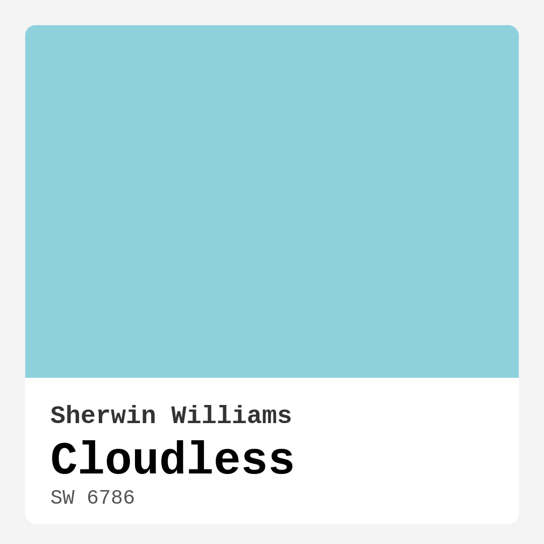
Color Preview & Key Details
| HEX Code | #8FD0DD |
| RGB | 143, 208, 221 |
| LRV | 66% |
| Undertone | Blue |
| Finish Options | Eggshell, Satin |
Imagine walking into a room that instantly makes you feel at ease, a space that seems to breathe tranquility and calmness. This is exactly what you get with Sherwin Williams’ Cloudless (SW 6786). This refreshing, soft blue is like a clear sky on a perfect day, and it has the power to transform any room into a serene oasis.
Cloudless is not just a color; it’s a mood lifter. The gentle blue tone creates an inviting atmosphere, making it the perfect choice for spaces where relaxation is key, such as bedrooms, bathrooms, and even home offices. You know that feeling when you step into a room and instantly feel lighter? That’s the magic of Cloudless.
One of the standout features of this color is its high Light Reflectance Value (LRV) of 66%. This means it reflects a significant amount of light, helping to brighten your spaces. Whether you’re in a room filled with natural light or relying on artificial lighting, Cloudless maintains its cheerful demeanor. In natural light, it gives off a soft glow that enhances the openness of any room. Artificial light might slightly shift its appearance, but it generally retains that crisp, fresh vibe.
When you paint with Cloudless, you’ll notice how smoothly it goes on. You’ll find it easy to apply, whether you’re using a brush or a roller, and it dries quickly, allowing you to get on with your life without waiting around. Plus, it’s touch-up friendly, which is a definite bonus for anyone tackling home projects.
Let’s talk about the versatility of Cloudless. It harmonizes beautifully with a variety of decor styles, from modern and coastal to Scandinavian and minimalist. If you’re looking to create a serene environment, this color is a fantastic choice. It works wonders in a nursery, providing a calming backdrop for little ones, while in a living room, it can create an airy and inviting space for family gatherings.
Now, you might wonder what trim colors pair best with Cloudless. White trim is a classic choice, particularly options like White Dove or Simply White. These crisp whites create a clean contrast that enhances the freshness of Cloudless, making it pop. For those who want a touch of warmth, consider wood trim. The natural tones can add an inviting touch to the coolness of the blue, creating a balanced and harmonious look.
However, every color has its pros and cons. While Cloudless is a gorgeous shade, it’s essential to consider the specific needs of your space. Being a lighter color, it may require two coats for full coverage, especially if you’re painting over a darker hue. It’s also worth noting that in overly dark spaces, Cloudless might not shine as bright without the help of some brighter accents. Additionally, lighter shades can show dirt more quickly, so keep that in mind in high-traffic areas.
If you’re thinking about using Cloudless in a more demanding area, like a hallway or living room, consider pairing it with darker accents or rich textures to create visual interest. Darker shades from the Sherwin Williams palette, like SW 6785 or SW 6949, can complement Cloudless beautifully, enhancing its refreshing quality while adding depth to your decor.
The undertones of Cloudless lean towards cool blue, which is another reason it’s such a popular choice. This subtle underlying hue gives the color its depth and complexity. It’s essential to test it in your home, however, as the interaction with your existing furniture, flooring, and decor can significantly impact how the color is perceived throughout the day. Cloudless works particularly well with both warm and cool accents, providing an elegant balance to your decor.
Speaking of which, let’s not forget about its practical characteristics. With a low VOC (Volatile Organic Compounds) level, Cloudless is a healthier choice for your indoor air quality, making it ideal for families with children or anyone sensitive to odors. Plus, it’s washable and wipeable, which means keeping your walls looking fresh is a breeze.
So, what about those high-traffic areas? While Cloudless is indeed a stunning soft blue that works well in many spaces, it’s best suited for those that don’t experience heavy wear and tear. If you love the color but need something more durable for busy zones, consider using it as an accent rather than the main wall color.
You might also be pondering how to incorporate Cloudless into your existing decor. Think about adding complementary shades like SW 6006 or SW 6032 to create depth and layering in your design. Soft teals or aqua mist can provide a beautiful backdrop, especially if you’re aiming for a coastal or serene vibe.
If you’re on the fence about committing to Cloudless, you might want to explore its lighter shades, such as SW 6785 or SW 6792. These can offer a similar feel while still maintaining that airy essence. Conversely, if you’re looking to add contrast, darker shades like SW 9078 or SW 6006 can provide that visual interest you might be seeking.
In conclusion, Cloudless is more than just a pretty color; it’s an invitation to create a peaceful and inviting home. Whether you’re painting a nursery, refreshing your living room, or designing a tranquil bathroom, this hue has the versatility to suit your needs. With its calming qualities, ease of application, and ability to enhance light, Cloudless can help you achieve the serene atmosphere you desire.
So go ahead, grab that paintbrush and bring a piece of the sky into your home. With Cloudless, you’re not just painting walls; you’re creating a sanctuary.
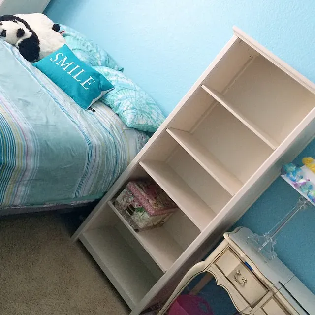
Real Room Photo of Cloudless SW 6786

Undertones of Cloudless ?
The undertones of Cloudless are a key aspect of its character, leaning towards Blue. These subtle underlying hues are what give the color its depth and complexity. For example, a gray with a blue undertone will feel cooler and more modern, while one with a brown undertone will feel warmer and more traditional. It’s essential to test this paint in your home and observe it next to your existing furniture, flooring, and decor to see how these undertones interact and reveal themselves throughout the day.
HEX value: #8FD0DD
RGB code: 143, 208, 221
Is Cloudless Cool or Warm?
Cloudless is predominantly cool-toned, making it ideal for spaces that benefit from a tranquil ambiance. It works well with both warm and cool accents, providing a balanced feel to your decor.
Understanding Color Properties and Interior Design Tips
Hue refers to a specific position on the color wheel, measured in degrees from 0 to 360. Each degree represents a different pure color:
- 0° represents red
- 120° represents green
- 240° represents blue
Saturation describes the intensity or purity of a color and is expressed as a percentage:
- At 0%, the color appears completely desaturated—essentially a shade of gray
- At 100%, the color is at its most vivid and vibrant
Lightness indicates how light or dark a color is, also expressed as a percentage:
- 0% lightness results in black
- 100% lightness results in white
Using Warm Colors in Interior Design
Warm hues—such as reds, oranges, yellows, warm beiges, and greiges—are excellent choices for creating inviting and energetic spaces. These colors are particularly well-suited for:
- Kitchens, living rooms, and bathrooms, where warmth enhances comfort and sociability
- Large rooms, where warm tones can help reduce the sense of emptiness and make the space feel more intimate
For example:
- Warm beige shades provide a cozy, inviting atmosphere, ideal for living rooms, bedrooms, and hallways.
- Warm greige (a mix of beige and gray) offers the warmth of beige with the modern appeal of gray, making it a versatile backdrop for dining areas, bedrooms, and living spaces.
However, be mindful when using warm light tones in rooms with limited natural light. These shades may appear muted or even take on an unpleasant yellowish tint. To avoid a dull or flat appearance:
- Add depth by incorporating richer tones like deep greens, charcoal, or chocolate brown
- Use textured elements such as curtains, rugs, or cushions to bring dimension to the space
Pro Tip: Achieving Harmony with Warm and Cool Color Balance
To create a well-balanced and visually interesting interior, mix warm and cool tones strategically. This contrast adds depth and harmony to your design.
- If your walls feature warm hues, introduce cool-colored accents such as blue or green furniture, artwork, or accessories to create contrast.
- For a polished look, consider using a complementary color scheme, which pairs colors opposite each other on the color wheel (e.g., red with green, orange with blue).
This thoughtful mix not only enhances visual appeal but also creates a space that feels both dynamic and cohesive.
Light Temperature Affects on Cloudless
Natural Light
Natural daylight changes in color temperature as the sun moves across the sky. At sunrise and sunset, the light tends to have a warm, golden tone with a color temperature around 2000 Kelvin (K). As the day progresses and the sun rises higher, the light becomes cooler and more neutral. Around midday, especially when the sky is clear, natural light typically reaches its peak brightness and shifts to a cooler tone, ranging from 5500 to 6500 Kelvin. This midday light is close to what we perceive as pure white or daylight-balanced light.
These shifts in natural light can significantly influence how colors appear in a space, which is why designers often consider both the time of day and the orientation of windows when planning interior color schemes.
Artificial Light
When choosing artificial lighting, pay close attention to the color temperature, measured in Kelvin (K). This determines how warm or cool the light will appear. Lower temperatures, around 2700K, give off a warm, yellow glow often used in living rooms or bedrooms. Higher temperatures, above 5000K, create a cool, bluish light similar to daylight, commonly used in kitchens, offices, or task areas.
Use the slider to see how lighting temperature can affect the appearance of a surface or color throughout a space.


4800K
LRV of Cloudless
The Light Reflectance Value (LRV) of Cloudless is 66%, which places it in the Light category. This means it Reflects a high amount of light. Understanding a paint’s LRV is crucial for predicting how it will look in your space. A higher LRV indicates a lighter color that reflects more light, making rooms feel larger and brighter. A lower LRV signifies a darker color that absorbs more light, creating a cozier, more intimate atmosphere. Always consider the natural and artificial lighting in your room when selecting a paint color based on its LRV.
Detailed Review of Cloudless
Additional Paint Characteristics
Ideal Rooms
Bathroom, Bedroom, Hallway, Home Office, Living Room, Nursery
Decor Styles
Coastal, Minimalist, Modern, Scandinavian, Transitional
Coverage
Good (1–2 Coats), Touch-Up Friendly
Ease of Application
Beginner Friendly, Brush Smooth, Fast-Drying, Roller-Ready
Washability
Washable, Wipeable
VOC Level
Low VOC
Best Use
Accent Wall, Bedroom, Interior Walls, Living Room, Nursery
Room Suitability
Bathroom, Bedroom, Home Office, Living Room, Nursery
Tone Tag
Airy, Cool, Crisp
Finish Type
Eggshell, Satin
Paint Performance
Easy Touch-Up, Low Odor, Quick Drying
Use Cases
Best for Low Light Rooms, Best for Rentals, Classic Favorite, Designer Favorite
Mood
Brightening, Calm, Inviting
Trim Pairing
Complements Brass Fixtures, Pairs with White Dove, Works with Warm Trim
Cloudless is more than just a pretty color; it’s a mood lifter. The gentle blue tone creates an inviting atmosphere, making it a fantastic choice for spaces where relaxation is key, like bedrooms and bathrooms. When applied, it goes on smoothly and dries to a soft egg-shell finish that reflects light beautifully, enhancing the space’s openness. It pairs wonderfully with white trim, accentuating its freshness and providing a crisp contrast. However, if you’re looking for a bold statement, you might want to combine it with darker accents or rich textures. Overall, Cloudless is an excellent option for those who want to bring a little piece of the sky indoors.
Pros & Cons of SW 6786 Cloudless
Pros
Cons
Colors that go with Sherwin Williams Cloudless
FAQ on SW 6786 Cloudless
Can Cloudless be used in high-traffic areas?
While Cloudless is a beautiful soft blue that works well in many spaces, it’s best suited for areas that don’t experience heavy wear and tear. For high-traffic areas, consider using it in combination with a more durable finish or in accents to maintain its pristine look.
What trim colors pair best with Cloudless?
Cloudless pairs beautifully with white trim, especially options like White Dove or Simply White. These crisp whites create a clean contrast and enhance the freshness of Cloudless. For a bit more warmth, you might also consider wood trim, which can add a natural and inviting touch.
Comparisons Cloudless with other colors
Cloudless SW 6786 vs Dutch Tile Blue SW 0031
| Attribute | Cloudless SW 6786 | Dutch Tile Blue SW 0031 |
|---|---|---|
| Color Name | Cloudless SW 6786 | Dutch Tile Blue SW 0031 |
| Color | ||
| Hue | Blue | Blue |
| Brightness | Medium | Medium |
| RGB | 143, 208, 221 | 154, 171, 171 |
| LRV | 66% | 24% |
| Finish Type | Eggshell, Satin | Eggshell, Matte, Satin |
| Finish Options | Eggshell, Satin | Eggshell, Flat, Matte, Satin |
| Ideal Rooms | Bathroom, Bedroom, Hallway, Home Office, Living Room, Nursery | Bathroom, Bedroom, Dining Room, Hallway, Home Office, Kitchen, Living Room |
| Decor Styles | Coastal, Minimalist, Modern, Scandinavian, Transitional | Coastal, Modern Farmhouse, Scandinavian, Traditional, Transitional |
| Coverage | Good (1–2 Coats), Touch-Up Friendly | Good (1–2 Coats) |
| Ease of Application | Beginner Friendly, Brush Smooth, Fast-Drying, Roller-Ready | Beginner Friendly, Brush Smooth, Fast-Drying, Roller-Ready |
| Washability | Washable, Wipeable | Highly Washable, Washable |
| Room Suitability | Bathroom, Bedroom, Home Office, Living Room, Nursery | Bathroom, Bedroom, Dining Room, Kitchen, Living Room |
| Tone | Airy, Cool, Crisp | Balanced, Cool, Muted |
| Paint Performance | Easy Touch-Up, Low Odor, Quick Drying | Easy Touch-Up, High Coverage, Low Odor, Quick Drying |
Cloudless SW 6786 vs Debonair SW 9139
| Attribute | Cloudless SW 6786 | Debonair SW 9139 |
|---|---|---|
| Color Name | Cloudless SW 6786 | Debonair SW 9139 |
| Color | ||
| Hue | Blue | Blue |
| Brightness | Medium | Medium |
| RGB | 143, 208, 221 | 144, 160, 166 |
| LRV | 66% | 30% |
| Finish Type | Eggshell, Satin | Eggshell, Matte, Satin |
| Finish Options | Eggshell, Satin | Eggshell, Matte, Satin |
| Ideal Rooms | Bathroom, Bedroom, Hallway, Home Office, Living Room, Nursery | Bedroom, Dining Room, Home Office, Living Room |
| Decor Styles | Coastal, Minimalist, Modern, Scandinavian, Transitional | Coastal, Industrial, Modern, Transitional |
| Coverage | Good (1–2 Coats), Touch-Up Friendly | Good (1–2 Coats) |
| Ease of Application | Beginner Friendly, Brush Smooth, Fast-Drying, Roller-Ready | Beginner Friendly, Brush Smooth, Roller-Ready |
| Washability | Washable, Wipeable | Washable, Wipeable |
| Room Suitability | Bathroom, Bedroom, Home Office, Living Room, Nursery | Bedroom, Dining Room, Home Office, Living Room |
| Tone | Airy, Cool, Crisp | Balanced, Cool, Muted |
| Paint Performance | Easy Touch-Up, Low Odor, Quick Drying | Easy Touch-Up, Low Odor, Quick Drying |
Cloudless SW 6786 vs Stardew SW 9138
| Attribute | Cloudless SW 6786 | Stardew SW 9138 |
|---|---|---|
| Color Name | Cloudless SW 6786 | Stardew SW 9138 |
| Color | ||
| Hue | Blue | Blue |
| Brightness | Medium | Medium |
| RGB | 143, 208, 221 | 166, 178, 181 |
| LRV | 66% | 30% |
| Finish Type | Eggshell, Satin | Eggshell, Satin |
| Finish Options | Eggshell, Satin | Eggshell, Matte, Satin |
| Ideal Rooms | Bathroom, Bedroom, Hallway, Home Office, Living Room, Nursery | Bathroom, Bedroom, Home Office, Living Room, Nursery |
| Decor Styles | Coastal, Minimalist, Modern, Scandinavian, Transitional | Coastal, Farmhouse, Modern, Scandinavian |
| Coverage | Good (1–2 Coats), Touch-Up Friendly | Good (1–2 Coats) |
| Ease of Application | Beginner Friendly, Brush Smooth, Fast-Drying, Roller-Ready | Beginner Friendly, Brush Smooth, Roller-Ready |
| Washability | Washable, Wipeable | Highly Washable, Washable, Wipeable |
| Room Suitability | Bathroom, Bedroom, Home Office, Living Room, Nursery | Bathroom, Bedroom, Home Office, Living Room |
| Tone | Airy, Cool, Crisp | Calm, Cool, Muted |
| Paint Performance | Easy Touch-Up, Low Odor, Quick Drying | Easy Touch-Up, High Coverage, Low Odor |
Cloudless SW 6786 vs Niebla Azul SW 9137
| Attribute | Cloudless SW 6786 | Niebla Azul SW 9137 |
|---|---|---|
| Color Name | Cloudless SW 6786 | Niebla Azul SW 9137 |
| Color | ||
| Hue | Blue | Blue |
| Brightness | Medium | Medium |
| RGB | 143, 208, 221 | 182, 195, 196 |
| LRV | 66% | 48% |
| Finish Type | Eggshell, Satin | Eggshell, Matte, Satin |
| Finish Options | Eggshell, Satin | Eggshell, Matte, Satin |
| Ideal Rooms | Bathroom, Bedroom, Hallway, Home Office, Living Room, Nursery | Bedroom, Home Office, Living Room, Nursery |
| Decor Styles | Coastal, Minimalist, Modern, Scandinavian, Transitional | Coastal, Modern, Scandinavian, Transitional |
| Coverage | Good (1–2 Coats), Touch-Up Friendly | Good (1–2 Coats), Touch-Up Friendly |
| Ease of Application | Beginner Friendly, Brush Smooth, Fast-Drying, Roller-Ready | Beginner Friendly, Brush Smooth, Roller-Ready |
| Washability | Washable, Wipeable | Highly Washable, Washable |
| Room Suitability | Bathroom, Bedroom, Home Office, Living Room, Nursery | Bedroom, Home Office, Living Room, Nursery |
| Tone | Airy, Cool, Crisp | Airy, Cool, Muted |
| Paint Performance | Easy Touch-Up, Low Odor, Quick Drying | Easy Touch-Up, Fade Resistant, Low Odor, Scuff Resistant |
Cloudless SW 6786 vs Rain SW 6219
| Attribute | Cloudless SW 6786 | Rain SW 6219 |
|---|---|---|
| Color Name | Cloudless SW 6786 | Rain SW 6219 |
| Color | ||
| Hue | Blue | Blue |
| Brightness | Medium | Medium |
| RGB | 143, 208, 221 | 171, 190, 191 |
| LRV | 66% | 50% |
| Finish Type | Eggshell, Satin | Eggshell, Matte, Satin |
| Finish Options | Eggshell, Satin | Eggshell, Matte, Satin |
| Ideal Rooms | Bathroom, Bedroom, Hallway, Home Office, Living Room, Nursery | Bathroom, Bedroom, Home Office, Living Room, Nursery |
| Decor Styles | Coastal, Minimalist, Modern, Scandinavian, Transitional | Coastal, Minimalist, Modern, Scandinavian, Transitional |
| Coverage | Good (1–2 Coats), Touch-Up Friendly | Good (1–2 Coats), Touch-Up Friendly |
| Ease of Application | Beginner Friendly, Brush Smooth, Fast-Drying, Roller-Ready | Beginner Friendly, Brush Smooth, Fast-Drying, Roller-Ready |
| Washability | Washable, Wipeable | Scrubbable, Stain Resistant, Washable |
| Room Suitability | Bathroom, Bedroom, Home Office, Living Room, Nursery | Bathroom, Bedroom, Home Office, Living Room, Nursery |
| Tone | Airy, Cool, Crisp | Balanced, Cool, Muted |
| Paint Performance | Easy Touch-Up, Low Odor, Quick Drying | Easy Touch-Up, Low Odor, Quick Drying, Stain Resistant |
Cloudless SW 6786 vs Morning at Sea SW 9634
| Attribute | Cloudless SW 6786 | Morning at Sea SW 9634 |
|---|---|---|
| Color Name | Cloudless SW 6786 | Morning at Sea SW 9634 |
| Color | ||
| Hue | Blue | Blue |
| Brightness | Medium | Medium |
| RGB | 143, 208, 221 | 130, 151, 155 |
| LRV | 66% | 50% |
| Finish Type | Eggshell, Satin | Eggshell, Matte |
| Finish Options | Eggshell, Satin | Eggshell, Matte, Satin |
| Ideal Rooms | Bathroom, Bedroom, Hallway, Home Office, Living Room, Nursery | Bathroom, Bedroom, Home Office, Living Room |
| Decor Styles | Coastal, Minimalist, Modern, Scandinavian, Transitional | Coastal, Minimalist, Modern, Scandinavian |
| Coverage | Good (1–2 Coats), Touch-Up Friendly | Good (1–2 Coats), Touch-Up Friendly |
| Ease of Application | Beginner Friendly, Brush Smooth, Fast-Drying, Roller-Ready | Beginner Friendly, Brush Smooth, Roller-Ready |
| Washability | Washable, Wipeable | Washable, Wipeable |
| Room Suitability | Bathroom, Bedroom, Home Office, Living Room, Nursery | Bathroom, Bedroom, Home Office, Living Room |
| Tone | Airy, Cool, Crisp | Airy, Cool, Muted |
| Paint Performance | Easy Touch-Up, Low Odor, Quick Drying | Easy Touch-Up, Fade Resistant, Low Odor |
Cloudless SW 6786 vs Sleepy Blue SW 6225
| Attribute | Cloudless SW 6786 | Sleepy Blue SW 6225 |
|---|---|---|
| Color Name | Cloudless SW 6786 | Sleepy Blue SW 6225 |
| Color | ||
| Hue | Blue | Blue |
| Brightness | Medium | Medium |
| RGB | 143, 208, 221 | 188, 203, 206 |
| LRV | 66% | 50% |
| Finish Type | Eggshell, Satin | Eggshell, Matte, Satin |
| Finish Options | Eggshell, Satin | Eggshell, Matte, Satin |
| Ideal Rooms | Bathroom, Bedroom, Hallway, Home Office, Living Room, Nursery | Bedroom, Home Office, Living Room, Nursery |
| Decor Styles | Coastal, Minimalist, Modern, Scandinavian, Transitional | Coastal, Minimalist, Modern Farmhouse, Scandinavian |
| Coverage | Good (1–2 Coats), Touch-Up Friendly | Good (1–2 Coats) |
| Ease of Application | Beginner Friendly, Brush Smooth, Fast-Drying, Roller-Ready | Beginner Friendly, Brush Smooth, Fast-Drying, Roller-Ready |
| Washability | Washable, Wipeable | Highly Washable, Washable |
| Room Suitability | Bathroom, Bedroom, Home Office, Living Room, Nursery | Bedroom, Home Office, Living Room, Nursery |
| Tone | Airy, Cool, Crisp | Airy, Cool, Muted |
| Paint Performance | Easy Touch-Up, Low Odor, Quick Drying | Easy Touch-Up, Low Odor, Quick Drying, Scuff Resistant |
Cloudless SW 6786 vs Lakeside SW 9683
| Attribute | Cloudless SW 6786 | Lakeside SW 9683 |
|---|---|---|
| Color Name | Cloudless SW 6786 | Lakeside SW 9683 |
| Color | ||
| Hue | Blue | Blue |
| Brightness | Medium | Medium |
| RGB | 143, 208, 221 | 173, 184, 192 |
| LRV | 66% | 24% |
| Finish Type | Eggshell, Satin | Eggshell, Matte, Satin |
| Finish Options | Eggshell, Satin | Eggshell, Matte, Satin |
| Ideal Rooms | Bathroom, Bedroom, Hallway, Home Office, Living Room, Nursery | Bathroom, Bedroom, Home Office, Living Room |
| Decor Styles | Coastal, Minimalist, Modern, Scandinavian, Transitional | Coastal, Minimalist, Modern, Rustic |
| Coverage | Good (1–2 Coats), Touch-Up Friendly | Good (1–2 Coats) |
| Ease of Application | Beginner Friendly, Brush Smooth, Fast-Drying, Roller-Ready | Beginner Friendly, Brush Smooth, Roller-Ready |
| Washability | Washable, Wipeable | Scrubbable, Washable |
| Room Suitability | Bathroom, Bedroom, Home Office, Living Room, Nursery | Bathroom, Bedroom, Home Office, Living Room |
| Tone | Airy, Cool, Crisp | Balanced, Cool, Muted |
| Paint Performance | Easy Touch-Up, Low Odor, Quick Drying | Easy Touch-Up, Fade Resistant, High Coverage, Low Odor |
Cloudless SW 6786 vs Upward SW 6239
| Attribute | Cloudless SW 6786 | Upward SW 6239 |
|---|---|---|
| Color Name | Cloudless SW 6786 | Upward SW 6239 |
| Color | ||
| Hue | Blue | Blue |
| Brightness | Medium | Medium |
| RGB | 143, 208, 221 | 191, 201, 208 |
| LRV | 66% | 75% |
| Finish Type | Eggshell, Satin | Eggshell, Satin |
| Finish Options | Eggshell, Satin | Eggshell, Flat, Satin |
| Ideal Rooms | Bathroom, Bedroom, Hallway, Home Office, Living Room, Nursery | Bedroom, Dining Room, Home Office, Living Room, Nursery |
| Decor Styles | Coastal, Minimalist, Modern, Scandinavian, Transitional | Coastal, Minimalist, Modern, Scandinavian |
| Coverage | Good (1–2 Coats), Touch-Up Friendly | Good (1–2 Coats), Touch-Up Friendly |
| Ease of Application | Beginner Friendly, Brush Smooth, Fast-Drying, Roller-Ready | Beginner Friendly, Brush Smooth, Fast-Drying, Roller-Ready |
| Washability | Washable, Wipeable | Washable, Wipeable |
| Room Suitability | Bathroom, Bedroom, Home Office, Living Room, Nursery | Bedroom, Home Office, Living Room, Nursery |
| Tone | Airy, Cool, Crisp | Cool, Crisp, Muted |
| Paint Performance | Easy Touch-Up, Low Odor, Quick Drying | High Coverage, Low Odor, Quick Drying |
Cloudless SW 6786 vs Aleutian SW 6241
| Attribute | Cloudless SW 6786 | Aleutian SW 6241 |
|---|---|---|
| Color Name | Cloudless SW 6786 | Aleutian SW 6241 |
| Color | ||
| Hue | Blue | Blue |
| Brightness | Medium | Medium |
| RGB | 143, 208, 221 | 152, 169, 183 |
| LRV | 66% | 24% |
| Finish Type | Eggshell, Satin | Eggshell, Matte, Satin |
| Finish Options | Eggshell, Satin | Eggshell, Matte, Satin |
| Ideal Rooms | Bathroom, Bedroom, Hallway, Home Office, Living Room, Nursery | Bathroom, Bedroom, Home Office, Kitchen, Living Room, Nursery |
| Decor Styles | Coastal, Minimalist, Modern, Scandinavian, Transitional | Coastal, Minimalist, Modern, Scandinavian, Transitional |
| Coverage | Good (1–2 Coats), Touch-Up Friendly | Good (1–2 Coats), Touch-Up Friendly |
| Ease of Application | Beginner Friendly, Brush Smooth, Fast-Drying, Roller-Ready | Beginner Friendly, Brush Smooth, Fast-Drying, Roller-Ready |
| Washability | Washable, Wipeable | Scrubbable, Stain Resistant, Washable |
| Room Suitability | Bathroom, Bedroom, Home Office, Living Room, Nursery | Bathroom, Bedroom, Home Office, Living Room, Nursery |
| Tone | Airy, Cool, Crisp | Airy, Balanced, Cool, Muted |
| Paint Performance | Easy Touch-Up, Low Odor, Quick Drying | Easy Touch-Up, Fade Resistant, Low Odor, Quick Drying |
Official Page of Sherwin Williams Cloudless SW 6786