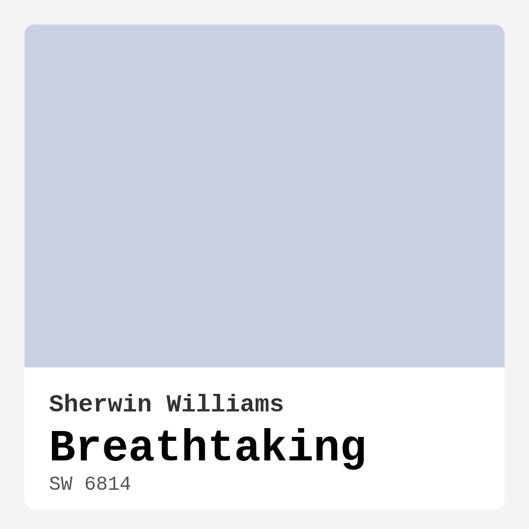
Color Preview & Key Details
| HEX Code | #C7D1E2 |
| RGB | 199, 209, 226 |
| LRV | 45% |
| Undertone | Blue |
| Finish Options | Eggshell, Matte, Satin |
Imagine stepping into a room that instantly calms your mind, wrapping you in a sense of tranquility as you take in the soft, airy hues surrounding you. This is the magic of Sherwin Williams’ paint color Breathtaking (SW 6814). Its gentle blue tone, with subtle undertones of blue, is like a breath of fresh air for any space, making it a top choice for those who yearn to create a serene retreat in their home.
Breathtaking isn’t just about aesthetics; it’s about the experience it brings to your environment. Envision your living room transformed into a cozy haven where you can unwind after a long day, or a nursery that evokes peace and comfort for your little one. This color’s versatility makes it suitable for various rooms, including living rooms, bedrooms, home offices, and nurseries.
With an LRV (Light Reflectance Value) of 45%, Breathtaking reflects a moderate amount of light, helping to brighten up your space without being overpowering. It beautifully enhances natural light, creating a light and airy feel that can make even the smallest of rooms feel expansive. In bright daylight, the color softens, exuding an inviting charm, while in dimmer conditions, it maintains a cozy vibe that feels just right for relaxation.
Its cool undertones lend a refreshing quality, making it ideal for spaces where you want to foster a calm atmosphere. When paired with white trims, like White Dove or Simply White, Breathtaking creates a crisp, clean look that is both modern and timeless. These combinations allow for endless design possibilities, whether you lean towards a coastal, Scandinavian, or transitional decor style.
One of the most appealing aspects of Breathtaking is its ease of application. Whether you’re a seasoned DIYer or a beginner, you’ll find that this paint goes on smoothly with minimal splatter. It’s roller-ready and brush-friendly, making the application process a breeze. And with its quick-drying nature, you won’t be left waiting too long to enjoy your newly painted space.
Now, let’s talk about practicalities. Breathtaking is highly washable and has a low VOC level, making it a safe choice for your home. Its durability means it can withstand the occasional wipe-down, which is perfect for any room where life happens—say, a nursery or home office. However, be mindful that it may require a second coat for full coverage, especially in lower light conditions where its cooler tones might be more pronounced.
When it comes to decorating with Breathtaking, think about how the color interacts with your existing furnishings and accessories. Its soft hue can make a room feel larger and airier, making it an excellent option for smaller spaces. Consider adding complementary shades like SW 6038 or SW 7077 to enhance the overall aesthetic. These colors can provide a beautiful contrast without overshadowing the calming effect of Breathtaking.
If you’re leaning towards a more layered look, darker shades like SW 6968 or SW 7635 can create depth and interest. This strategy works particularly well in larger rooms, where you can use Breathtaking on the walls and incorporate bolder hues in accents, furniture, or art pieces.
If you’re in a rental and want to personalize your space without making permanent changes, Breathtaking is a fantastic option due to its easy application and touch-up friendliness. You can create an accent wall that adds character without overwhelming the room or even paint furniture pieces for a fresh, updated look.
Of course, I always recommend testing a small patch of the paint in your home before committing to it fully. Colors can react differently based on the lighting in your space, and seeing Breathtaking beside your existing decor will help you understand its undertones better. This thoughtful approach will ensure that you’re thrilled with your choice once the entire room is complete.
In high-traffic areas, while Breathtaking can be used, consider applying a protective topcoat to enhance its durability. This way, you won’t have to worry as much about scuffs or marks, especially if you’re painting a family room or hallway.
When it comes to mood, Breathtaking creates a calm, inviting atmosphere that is simply restful. It’s the kind of color that makes you feel at home, fostering an environment where you can relax, recharge, or focus on work.
As you think about your upcoming project, remember that Breathtaking offers more than just a beautiful color. It’s an experience—a way to transform your home into a tranquil sanctuary that reflects your personal style. With its soft, cool tones and versatility, you’re sure to create a space that you’ll love for years to come.
So, are you ready to breathe new life into your home with Breathtaking? Whether you’re looking to paint an entire room or create an accent wall, this shade has the capacity to elevate your space while providing that much-needed sense of calm. Embrace the beauty and serenity it brings, and watch as your home transforms into a beautifully cohesive retreat that’s uniquely yours.

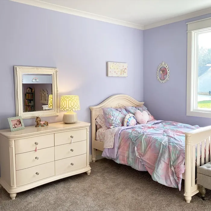
Real Room Photo of Breathtaking SW 6814
Undertones of Breathtaking ?
The undertones of Breathtaking are a key aspect of its character, leaning towards Blue. These subtle underlying hues are what give the color its depth and complexity. For example, a gray with a blue undertone will feel cooler and more modern, while one with a brown undertone will feel warmer and more traditional. It’s essential to test this paint in your home and observe it next to your existing furniture, flooring, and decor to see how these undertones interact and reveal themselves throughout the day.
HEX value: #C7D1E2
RGB code: 199, 209, 226
Is Breathtaking Cool or Warm?
This paint leans cool, making it an excellent choice for creating refreshing and tranquil environments.
Understanding Color Properties and Interior Design Tips
Hue refers to a specific position on the color wheel, measured in degrees from 0 to 360. Each degree represents a different pure color:
- 0° represents red
- 120° represents green
- 240° represents blue
Saturation describes the intensity or purity of a color and is expressed as a percentage:
- At 0%, the color appears completely desaturated—essentially a shade of gray
- At 100%, the color is at its most vivid and vibrant
Lightness indicates how light or dark a color is, also expressed as a percentage:
- 0% lightness results in black
- 100% lightness results in white
Using Warm Colors in Interior Design
Warm hues—such as reds, oranges, yellows, warm beiges, and greiges—are excellent choices for creating inviting and energetic spaces. These colors are particularly well-suited for:
- Kitchens, living rooms, and bathrooms, where warmth enhances comfort and sociability
- Large rooms, where warm tones can help reduce the sense of emptiness and make the space feel more intimate
For example:
- Warm beige shades provide a cozy, inviting atmosphere, ideal for living rooms, bedrooms, and hallways.
- Warm greige (a mix of beige and gray) offers the warmth of beige with the modern appeal of gray, making it a versatile backdrop for dining areas, bedrooms, and living spaces.
However, be mindful when using warm light tones in rooms with limited natural light. These shades may appear muted or even take on an unpleasant yellowish tint. To avoid a dull or flat appearance:
- Add depth by incorporating richer tones like deep greens, charcoal, or chocolate brown
- Use textured elements such as curtains, rugs, or cushions to bring dimension to the space
Pro Tip: Achieving Harmony with Warm and Cool Color Balance
To create a well-balanced and visually interesting interior, mix warm and cool tones strategically. This contrast adds depth and harmony to your design.
- If your walls feature warm hues, introduce cool-colored accents such as blue or green furniture, artwork, or accessories to create contrast.
- For a polished look, consider using a complementary color scheme, which pairs colors opposite each other on the color wheel (e.g., red with green, orange with blue).
This thoughtful mix not only enhances visual appeal but also creates a space that feels both dynamic and cohesive.
Light Temperature Affects on Breathtaking
Natural Light
Natural daylight changes in color temperature as the sun moves across the sky. At sunrise and sunset, the light tends to have a warm, golden tone with a color temperature around 2000 Kelvin (K). As the day progresses and the sun rises higher, the light becomes cooler and more neutral. Around midday, especially when the sky is clear, natural light typically reaches its peak brightness and shifts to a cooler tone, ranging from 5500 to 6500 Kelvin. This midday light is close to what we perceive as pure white or daylight-balanced light.
These shifts in natural light can significantly influence how colors appear in a space, which is why designers often consider both the time of day and the orientation of windows when planning interior color schemes.
Artificial Light
When choosing artificial lighting, pay close attention to the color temperature, measured in Kelvin (K). This determines how warm or cool the light will appear. Lower temperatures, around 2700K, give off a warm, yellow glow often used in living rooms or bedrooms. Higher temperatures, above 5000K, create a cool, bluish light similar to daylight, commonly used in kitchens, offices, or task areas.
Use the slider to see how lighting temperature can affect the appearance of a surface or color throughout a space.


4800K
LRV of Breathtaking
The Light Reflectance Value (LRV) of Breathtaking is 45%, which places it in the Medium category. This means it Reflects a moderate amount of light. Understanding a paint’s LRV is crucial for predicting how it will look in your space. A higher LRV indicates a lighter color that reflects more light, making rooms feel larger and brighter. A lower LRV signifies a darker color that absorbs more light, creating a cozier, more intimate atmosphere. Always consider the natural and artificial lighting in your room when selecting a paint color based on its LRV.
Detailed Review of Breathtaking
Additional Paint Characteristics
Ideal Rooms
Bedroom, Home Office, Living Room, Nursery
Decor Styles
Coastal, Modern, Scandinavian, Transitional
Coverage
Good (1–2 Coats), Touch-Up Friendly
Ease of Application
Beginner Friendly, Brush Smooth, Fast-Drying, Roller-Ready
Washability
Highly Washable, Washable
VOC Level
Low VOC
Best Use
Accent Wall, Furniture, Interior Walls
Room Suitability
Bedroom, Home Office, Living Room, Nursery
Tone Tag
Airy, Cool, Soft
Finish Type
Eggshell, Matte, Satin
Paint Performance
Easy Touch-Up, Fade Resistant, Low Odor, Quick Drying
Use Cases
Best for Rentals, Best for Small Spaces, Designer Favorite
Mood
Calm, Inviting, Restful
Trim Pairing
Matches Pure White, Pairs with White Dove
Breathtaking offers a unique blend of serenity and sophistication, making it an excellent choice for various rooms in your home. Its soft blue tone is reminiscent of clear skies, helping to create a calm atmosphere ideal for relaxation or focused work. When applied, it spreads smoothly, providing a beautiful finish that enhances the natural light in your space. The color pairs well with whites and light neutrals, allowing for versatile decor combinations. Many users appreciate how this shade can make a room feel larger and more open, perfect for small spaces or areas where you want a light and airy feel. Overall, Breathtaking is not just visually appealing; it’s designed to elevate your living experience.
Pros & Cons of SW 6814 Breathtaking
Pros
Cons
Colors that go with Sherwin Williams Breathtaking
FAQ on SW 6814 Breathtaking
Can Breathtaking be used in high-traffic areas?
While Breathtaking is a lovely choice for various spaces, it’s best suited for areas that aren’t subject to heavy wear and tear, like bedrooms and living rooms. For high-traffic areas, consider adding a protective topcoat to enhance durability and washability.
What trim colors pair well with Breathtaking?
Breathtaking pairs beautifully with white trims like White Dove or Simply White, creating a clean and fresh look. It also complements warm wood tones, adding an organic touch to your decor.
Comparisons Breathtaking with other colors
Breathtaking SW 6814 vs Silver Peony SW 6547
| Attribute | Breathtaking SW 6814 | Silver Peony SW 6547 |
|---|---|---|
| Color Name | Breathtaking SW 6814 | Silver Peony SW 6547 |
| Color | ||
| Hue | Purple | Purple |
| Brightness | Light | Light |
| RGB | 199, 209, 226 | 218, 214, 219 |
| LRV | 45% | 69% |
| Finish Type | Eggshell, Matte, Satin | Eggshell, Matte |
| Finish Options | Eggshell, Matte, Satin | Eggshell, Matte, Satin |
| Ideal Rooms | Bedroom, Home Office, Living Room, Nursery | Bedroom, Home Office, Kitchen, Living Room, Nursery |
| Decor Styles | Coastal, Modern, Scandinavian, Transitional | Minimalist, Modern, Scandinavian, Transitional |
| Coverage | Good (1–2 Coats), Touch-Up Friendly | Good (1–2 Coats), Touch-Up Friendly |
| Ease of Application | Beginner Friendly, Brush Smooth, Fast-Drying, Roller-Ready | Beginner Friendly, Brush Smooth, Roller-Ready |
| Washability | Highly Washable, Washable | Washable, Wipeable |
| Room Suitability | Bedroom, Home Office, Living Room, Nursery | Bedroom, Home Office, Living Room, Nursery |
| Tone | Airy, Cool, Soft | Airy, Balanced, Cool, Muted |
| Paint Performance | Easy Touch-Up, Fade Resistant, Low Odor, Quick Drying | Easy Touch-Up, Fade Resistant, High Coverage, Low Odor |
Breathtaking SW 6814 vs Starry Night SW 6540
| Attribute | Breathtaking SW 6814 | Starry Night SW 6540 |
|---|---|---|
| Color Name | Breathtaking SW 6814 | Starry Night SW 6540 |
| Color | ||
| Hue | Purple | Purple |
| Brightness | Light | Light |
| RGB | 199, 209, 226 | 214, 217, 222 |
| LRV | 45% | 6% |
| Finish Type | Eggshell, Matte, Satin | Eggshell, Matte, Satin |
| Finish Options | Eggshell, Matte, Satin | Eggshell, Matte, Satin |
| Ideal Rooms | Bedroom, Home Office, Living Room, Nursery | Bedroom, Dining Room, Home Office, Living Room, Nursery |
| Decor Styles | Coastal, Modern, Scandinavian, Transitional | Minimalist, Modern, Scandinavian, Transitional |
| Coverage | Good (1–2 Coats), Touch-Up Friendly | Good (1–2 Coats), Touch-Up Friendly |
| Ease of Application | Beginner Friendly, Brush Smooth, Fast-Drying, Roller-Ready | Beginner Friendly, Brush Smooth, Roller-Ready |
| Washability | Highly Washable, Washable | Highly Washable, Washable |
| Room Suitability | Bedroom, Home Office, Living Room, Nursery | Bedroom, Home Office, Living Room, Nursery |
| Tone | Airy, Cool, Soft | Balanced, Cool, Muted |
| Paint Performance | Easy Touch-Up, Fade Resistant, Low Odor, Quick Drying | Easy Touch-Up, Low Odor, Quick Drying |
Breathtaking SW 6814 vs Inspired Lilac SW 6820
| Attribute | Breathtaking SW 6814 | Inspired Lilac SW 6820 |
|---|---|---|
| Color Name | Breathtaking SW 6814 | Inspired Lilac SW 6820 |
| Color | ||
| Hue | Purple | Purple |
| Brightness | Light | Light |
| RGB | 199, 209, 226 | 223, 217, 228 |
| LRV | 45% | 30% |
| Finish Type | Eggshell, Matte, Satin | Eggshell, Matte, Satin |
| Finish Options | Eggshell, Matte, Satin | Eggshell, Matte, Satin |
| Ideal Rooms | Bedroom, Home Office, Living Room, Nursery | Bedroom, Hallway, Living Room, Nursery |
| Decor Styles | Coastal, Modern, Scandinavian, Transitional | Bohemian, Cottage, Modern, Transitional |
| Coverage | Good (1–2 Coats), Touch-Up Friendly | Good (1–2 Coats) |
| Ease of Application | Beginner Friendly, Brush Smooth, Fast-Drying, Roller-Ready | Beginner Friendly, Brush Smooth, Roller-Ready |
| Washability | Highly Washable, Washable | Washable, Wipeable |
| Room Suitability | Bedroom, Home Office, Living Room, Nursery | Bedroom, Hallway, Living Room, Nursery |
| Tone | Airy, Cool, Soft | Cool, Muted, Pastel |
| Paint Performance | Easy Touch-Up, Fade Resistant, Low Odor, Quick Drying | Easy Touch-Up, Low Odor, Quick Drying |
Breathtaking SW 6814 vs Lite Lavender SW 6554
| Attribute | Breathtaking SW 6814 | Lite Lavender SW 6554 |
|---|---|---|
| Color Name | Breathtaking SW 6814 | Lite Lavender SW 6554 |
| Color | ||
| Hue | Purple | Purple |
| Brightness | Light | Light |
| RGB | 199, 209, 226 | 224, 218, 223 |
| LRV | 45% | 66% |
| Finish Type | Eggshell, Matte, Satin | Eggshell, Matte, Satin |
| Finish Options | Eggshell, Matte, Satin | Eggshell, Matte, Satin |
| Ideal Rooms | Bedroom, Home Office, Living Room, Nursery | Bedroom, Dining Room, Home Office, Living Room, Nursery |
| Decor Styles | Coastal, Modern, Scandinavian, Transitional | Bohemian, Farmhouse, Modern, Scandinavian |
| Coverage | Good (1–2 Coats), Touch-Up Friendly | Good (1–2 Coats), Touch-Up Friendly |
| Ease of Application | Beginner Friendly, Brush Smooth, Fast-Drying, Roller-Ready | Beginner Friendly, Brush Smooth, Fast-Drying, Roller-Ready |
| Washability | Highly Washable, Washable | Washable, Wipeable |
| Room Suitability | Bedroom, Home Office, Living Room, Nursery | Bedroom, Home Office, Living Room, Nursery |
| Tone | Airy, Cool, Soft | Airy, Cool, Pastel |
| Paint Performance | Easy Touch-Up, Fade Resistant, Low Odor, Quick Drying | Easy Touch-Up, High Coverage, Low Odor, Quick Drying |
Breathtaking SW 6814 vs Individual White SW 6008
| Attribute | Breathtaking SW 6814 | Individual White SW 6008 |
|---|---|---|
| Color Name | Breathtaking SW 6814 | Individual White SW 6008 |
| Color | ||
| Hue | Purple | Purple |
| Brightness | Light | Light |
| RGB | 199, 209, 226 | 212, 205, 202 |
| LRV | 45% | 82% |
| Finish Type | Eggshell, Matte, Satin | Eggshell, Matte |
| Finish Options | Eggshell, Matte, Satin | Eggshell, Matte, Satin |
| Ideal Rooms | Bedroom, Home Office, Living Room, Nursery | Bedroom, Dining Room, Hallway, Home Office, Kitchen, Living Room |
| Decor Styles | Coastal, Modern, Scandinavian, Transitional | Farmhouse, Minimalist, Modern, Scandinavian |
| Coverage | Good (1–2 Coats), Touch-Up Friendly | Good (1–2 Coats) |
| Ease of Application | Beginner Friendly, Brush Smooth, Fast-Drying, Roller-Ready | Beginner Friendly, Brush Smooth, Fast-Drying, Roller-Ready |
| Washability | Highly Washable, Washable | Highly Washable, Washable |
| Room Suitability | Bedroom, Home Office, Living Room, Nursery | Bedroom, Dining Room, Home Office, Living Room |
| Tone | Airy, Cool, Soft | Balanced, Cool, Muted |
| Paint Performance | Easy Touch-Up, Fade Resistant, Low Odor, Quick Drying | Easy Touch-Up, Low Odor, Quick Drying, Scuff Resistant |
Breathtaking SW 6814 vs Elation SW 6827
| Attribute | Breathtaking SW 6814 | Elation SW 6827 |
|---|---|---|
| Color Name | Breathtaking SW 6814 | Elation SW 6827 |
| Color | ||
| Hue | Purple | Purple |
| Brightness | Light | Light |
| RGB | 199, 209, 226 | 223, 220, 229 |
| LRV | 45% | 66% |
| Finish Type | Eggshell, Matte, Satin | Matte, Satin |
| Finish Options | Eggshell, Matte, Satin | Matte, Satin |
| Ideal Rooms | Bedroom, Home Office, Living Room, Nursery | Bedroom, Home Office, Kitchen, Living Room |
| Decor Styles | Coastal, Modern, Scandinavian, Transitional | Minimalist, Modern, Scandinavian, Transitional |
| Coverage | Good (1–2 Coats), Touch-Up Friendly | Good (1–2 Coats) |
| Ease of Application | Beginner Friendly, Brush Smooth, Fast-Drying, Roller-Ready | Beginner Friendly, Brush Smooth, Fast-Drying, Roller-Ready |
| Washability | Highly Washable, Washable | Washable, Wipeable |
| Room Suitability | Bedroom, Home Office, Living Room, Nursery | Bedroom, Home Office, Living Room, Nursery |
| Tone | Airy, Cool, Soft | Muted, Neutral, Warm |
| Paint Performance | Easy Touch-Up, Fade Resistant, Low Odor, Quick Drying | High Coverage, Low Odor, Quick Drying |
Breathtaking SW 6814 vs Euphoric Lilac SW 6835
| Attribute | Breathtaking SW 6814 | Euphoric Lilac SW 6835 |
|---|---|---|
| Color Name | Breathtaking SW 6814 | Euphoric Lilac SW 6835 |
| Color | ||
| Hue | Purple | Purple |
| Brightness | Light | Light |
| RGB | 199, 209, 226 | 218, 199, 218 |
| LRV | 45% | 24% |
| Finish Type | Eggshell, Matte, Satin | Eggshell, Satin |
| Finish Options | Eggshell, Matte, Satin | Eggshell, Flat, Satin |
| Ideal Rooms | Bedroom, Home Office, Living Room, Nursery | Bedroom, Hallway, Living Room, Nursery |
| Decor Styles | Coastal, Modern, Scandinavian, Transitional | Bohemian, Modern, Scandinavian, Transitional |
| Coverage | Good (1–2 Coats), Touch-Up Friendly | Good (1–2 Coats), Touch-Up Friendly |
| Ease of Application | Beginner Friendly, Brush Smooth, Fast-Drying, Roller-Ready | Beginner Friendly, Brush Smooth, Fast-Drying, Roller-Ready |
| Washability | Highly Washable, Washable | Washable, Wipeable |
| Room Suitability | Bedroom, Home Office, Living Room, Nursery | Bedroom, Hallway, Living Room, Nursery |
| Tone | Airy, Cool, Soft | Airy, Cool, Muted, Pastel |
| Paint Performance | Easy Touch-Up, Fade Resistant, Low Odor, Quick Drying | Easy Touch-Up, Low Odor, Quick Drying |
Breathtaking SW 6814 vs Rhapsody Lilac SW 6828
| Attribute | Breathtaking SW 6814 | Rhapsody Lilac SW 6828 |
|---|---|---|
| Color Name | Breathtaking SW 6814 | Rhapsody Lilac SW 6828 |
| Color | ||
| Hue | Purple | Purple |
| Brightness | Light | Light |
| RGB | 199, 209, 226 | 210, 200, 221 |
| LRV | 45% | 24% |
| Finish Type | Eggshell, Matte, Satin | Eggshell, Matte, Satin |
| Finish Options | Eggshell, Matte, Satin | Eggshell, Matte, Satin |
| Ideal Rooms | Bedroom, Home Office, Living Room, Nursery | Bedroom, Home Office, Living Room, Nursery |
| Decor Styles | Coastal, Modern, Scandinavian, Transitional | Bohemian, Modern, Scandinavian, Vintage |
| Coverage | Good (1–2 Coats), Touch-Up Friendly | Good (1–2 Coats), Touch-Up Friendly |
| Ease of Application | Beginner Friendly, Brush Smooth, Fast-Drying, Roller-Ready | Beginner Friendly, Brush Smooth, Roller-Ready |
| Washability | Highly Washable, Washable | Washable, Wipeable |
| Room Suitability | Bedroom, Home Office, Living Room, Nursery | Bedroom, Home Office, Living Room, Nursery |
| Tone | Airy, Cool, Soft | Cool, Muted, Pastel |
| Paint Performance | Easy Touch-Up, Fade Resistant, Low Odor, Quick Drying | Easy Touch-Up, High Coverage, Low Odor |
Breathtaking SW 6814 vs Joyful Lilac SW 6972
| Attribute | Breathtaking SW 6814 | Joyful Lilac SW 6972 |
|---|---|---|
| Color Name | Breathtaking SW 6814 | Joyful Lilac SW 6972 |
| Color | ||
| Hue | Purple | Purple |
| Brightness | Light | Light |
| RGB | 199, 209, 226 | 228, 212, 226 |
| LRV | 45% | 30% |
| Finish Type | Eggshell, Matte, Satin | Eggshell, Matte |
| Finish Options | Eggshell, Matte, Satin | Eggshell, Matte, Satin |
| Ideal Rooms | Bedroom, Home Office, Living Room, Nursery | Bedroom, Home Office, Living Room, Nursery |
| Decor Styles | Coastal, Modern, Scandinavian, Transitional | Bohemian, Modern, Scandinavian, Vintage |
| Coverage | Good (1–2 Coats), Touch-Up Friendly | Good (1–2 Coats) |
| Ease of Application | Beginner Friendly, Brush Smooth, Fast-Drying, Roller-Ready | Beginner Friendly, Brush Smooth, Fast-Drying, Roller-Ready |
| Washability | Highly Washable, Washable | Highly Washable, Washable |
| Room Suitability | Bedroom, Home Office, Living Room, Nursery | Bedroom, Home Office, Living Room, Nursery |
| Tone | Airy, Cool, Soft | Muted, Pastel, Warm |
| Paint Performance | Easy Touch-Up, Fade Resistant, Low Odor, Quick Drying | Easy Touch-Up, Low Odor, Quick Drying |
Breathtaking SW 6814 vs Hint of Violet 2114-60
| Attribute | Breathtaking SW 6814 | Hint of Violet 2114-60 |
|---|---|---|
| Color Name | Breathtaking SW 6814 | Hint of Violet 2114-60 |
| Color | ||
| Hue | Purple | Purple |
| Brightness | Light | Light |
| RGB | 199, 209, 226 | 220, 212, 211 |
| LRV | 45% | 66.18% |
| Finish Type | Eggshell, Matte, Satin | Eggshell, Matte |
| Finish Options | Eggshell, Matte, Satin | Eggshell, Matte, Satin |
| Ideal Rooms | Bedroom, Home Office, Living Room, Nursery | Bedroom, Home Office, Living Room, Nursery |
| Decor Styles | Coastal, Modern, Scandinavian, Transitional | Minimalist, Modern, Scandinavian, Transitional |
| Coverage | Good (1–2 Coats), Touch-Up Friendly | Good (1–2 Coats), Touch-Up Friendly |
| Ease of Application | Beginner Friendly, Brush Smooth, Fast-Drying, Roller-Ready | Beginner Friendly, Brush Smooth, Roller-Ready |
| Washability | Highly Washable, Washable | Washable, Wipeable |
| Room Suitability | Bedroom, Home Office, Living Room, Nursery | Bedroom, Home Office, Living Room, Nursery |
| Tone | Airy, Cool, Soft | Muted, Pastel, Warm |
| Paint Performance | Easy Touch-Up, Fade Resistant, Low Odor, Quick Drying | Easy Touch-Up, Low Odor, Quick Drying |
Official Page of Sherwin Williams Breathtaking SW 6814