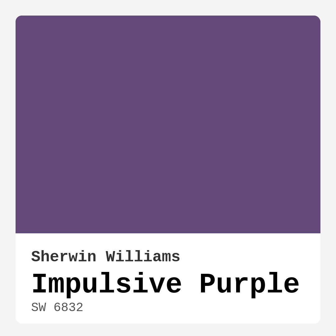
Color Preview & Key Details
| HEX Code | #624977 |
| RGB | 98, 73, 119 |
| LRV | 15% |
| Undertone | Purple |
| Finish Options | Matte, Satin, Semi-Gloss |
Imagine walking into a room that immediately envelops you in warmth and elegance, creating a sense of coziness and sophistication all at once. That’s the magic of Impulsive Purple from Sherwin Williams. With its rich, muted tones, this captivating hue is like a delicious dessert—inviting, layered, and just a little indulgent. If you’re considering adding a touch of this gorgeous purple to your home, let’s dive into everything you need to know to make an informed decision.
Impulsive Purple (SW 6832) strikes the perfect balance between whimsy and elegance. It’s a bold choice that invites curiosity while maintaining a sophisticated edge. The warmth of this paint color makes it incredibly versatile, suitable for both contemporary and traditional spaces. Imagine it on the walls of a cozy living room, a serene bedroom, or a stylish home office. This color can easily transform your space into something truly special.
Let’s talk about its characteristics. With an LRV of 15%, Impulsive Purple reflects very little light, which means it absorbs more, creating an intimate atmosphere. This is ideal for spaces where you want to cultivate a sense of warmth and comfort. However, it’s essential to consider how much natural light your room receives. In bright rooms, you’ll see the true beauty of the color, while in dimmer settings, it can take on a deeper, moodier vibe. This dual nature makes it perfect for both energetic gatherings and quiet evenings at home.
Applying Impulsive Purple is a breeze. With a beginner-friendly formula, you’ll find that it glides smoothly from brush to wall, offering excellent coverage with just one or two coats. Whether you’re using a roller or a brush, the application is fast-drying and yields a beautiful finish that highlights the color’s depth. It’s touch-up friendly, so if life happens and you need to fix a small area, you won’t have to stress about matching the color perfectly.
Now, let’s explore how this color interacts with other hues. Impulsive Purple is surprisingly versatile, making it easy to pair with various colors to create the exact mood or style you’re after. For a modern, chic look, consider pairing it with crisp whites or soft grays. These shades will enhance the elegance of Impulsive Purple, allowing it to stand out without feeling overwhelming. If you’re leaning towards a warmer vibe, earthy tones like terracotta or muted yellows work beautifully. For a bold statement, experiment with jewel tones like teal or mustard.
You might be wondering if Impulsive Purple works in smaller rooms. While it can add depth and character to compact spaces, it’s crucial to use it thoughtfully. Lighter furnishings and ample lighting can help prevent the room from feeling too dark. Consider using it as an accent wall rather than covering all four walls to maintain an open feel. This way, you can enjoy the richness of the color without overwhelming the space.
When it comes to decor styles, Impulsive Purple shines in modern, eclectic, bohemian, and transitional settings. Its boldness can enhance a modern design, while its warmth can complement a cozy bohemian aesthetic. Imagine how stunning it would look paired with brass fixtures or white trim. The contrast will add a layer of sophistication, making your space truly unique.
Now, let’s touch on the practical aspects. Impulsive Purple is low VOC, meaning it’s a healthier choice for indoor air quality. Plus, it’s highly washable, ensuring that any accidental spills or marks can be cleaned with ease. This durability makes it an excellent choice for high-traffic areas or homes with children and pets.
As you consider where to use Impulsive Purple, think about its ideal rooms: living room, bedroom, home office, and dining room. Each area will reflect the color differently, but all will benefit from its inviting and sophisticated aura. It can serve as a beautiful backdrop for family gatherings or a serene setting for late-night reading sessions.
Don’t forget to consider the undertones of this paint. Impulsive Purple leans towards a warm purple, which adds to its inviting character. Testing it in your home is essential, as colors can vary based on your existing furnishings and lighting. By seeing it next to your furniture and flooring, you’ll better understand how it interacts with your space throughout the day.
In conclusion, Impulsive Purple is more than just a paint color; it’s a transformative experience. Its depth and warmth invite you to create a space that reflects your personality while maintaining an air of sophistication. Whether you’re looking to make a statement with an accent wall or envelop an entire room in elegance, this color offers the perfect solution. With its ease of application, versatility, and stunning aesthetic, Impulsive Purple is a designer favorite for a reason. So, are you ready to let this captivating hue bring a new level of charm and warmth to your home?

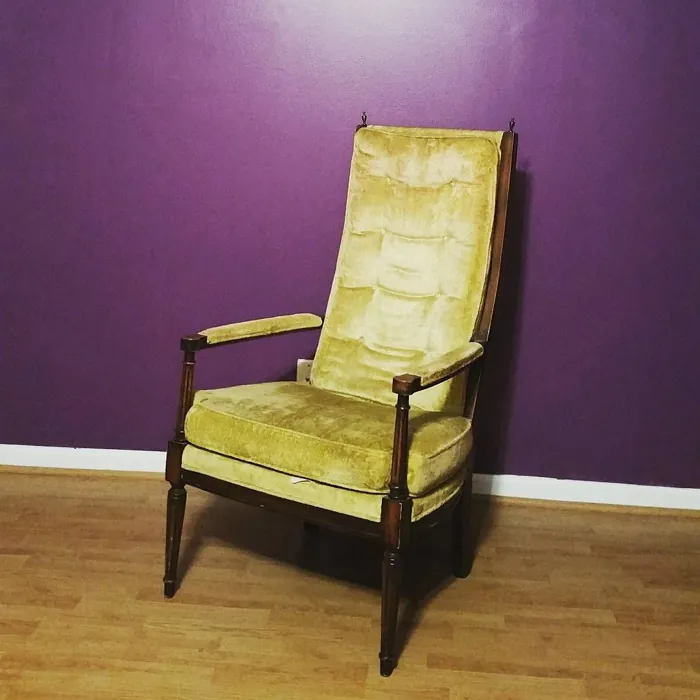
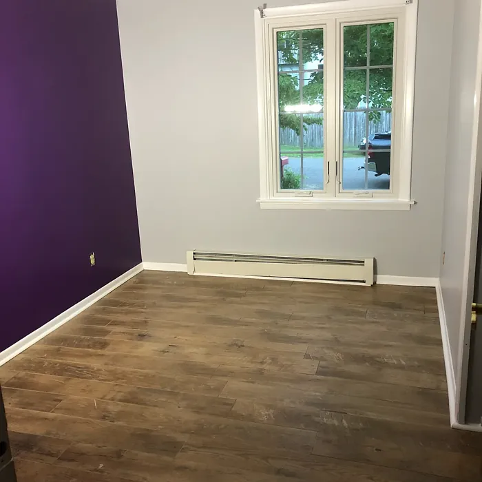
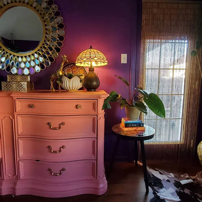
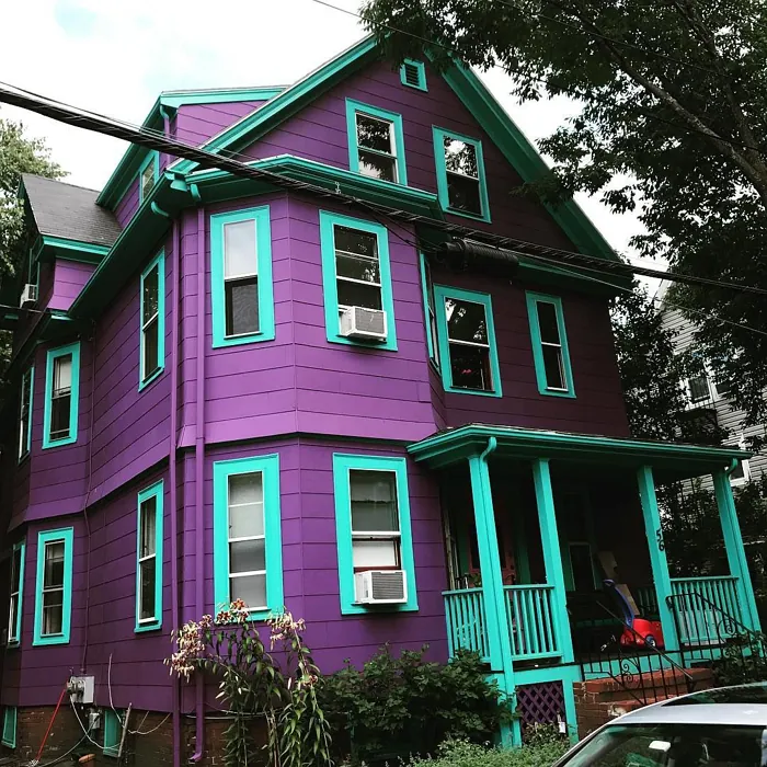
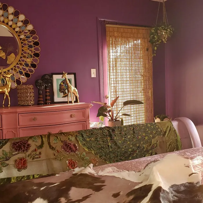
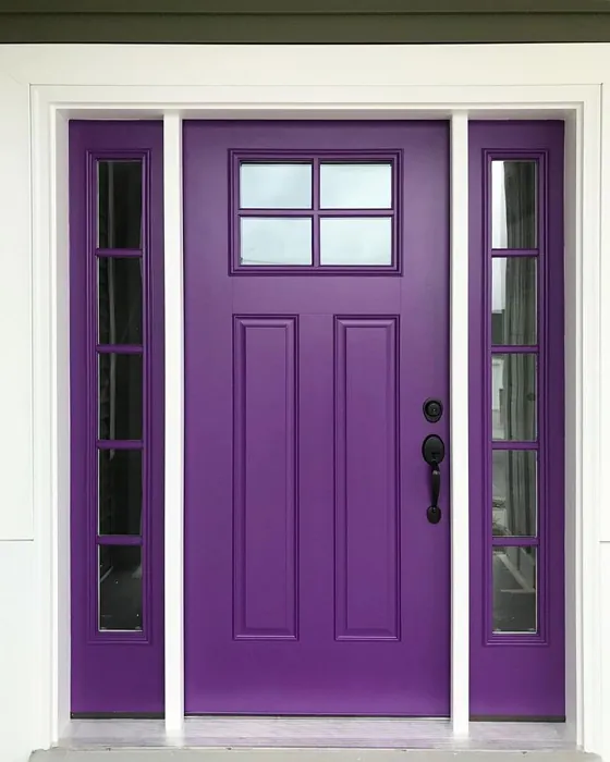
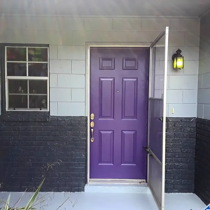
Real Room Photo of Impulsive Purple SW 6832
Undertones of Impulsive Purple ?
The undertones of Impulsive Purple are a key aspect of its character, leaning towards Purple. These subtle underlying hues are what give the color its depth and complexity. For example, a gray with a blue undertone will feel cooler and more modern, while one with a brown undertone will feel warmer and more traditional. It’s essential to test this paint in your home and observe it next to your existing furniture, flooring, and decor to see how these undertones interact and reveal themselves throughout the day.
HEX value: #624977
RGB code: 98, 73, 119
Is Impulsive Purple Cool or Warm?
Impulsive Purple is considered a warm paint color. This characteristic plays a huge role in the overall feel of a room. Warm colors, like this one, tend to create a cozy, inviting, and energetic atmosphere, making them great for social spaces like living rooms and dining rooms. In contrast, cool colors often evoke a sense of calm and serenity, which is why they are popular in bedrooms and bathrooms. The warmth of Impulsive Purple means it will pair beautifully with corresponding decor elements.
Understanding Color Properties and Interior Design Tips
Hue refers to a specific position on the color wheel, measured in degrees from 0 to 360. Each degree represents a different pure color:
- 0° represents red
- 120° represents green
- 240° represents blue
Saturation describes the intensity or purity of a color and is expressed as a percentage:
- At 0%, the color appears completely desaturated—essentially a shade of gray
- At 100%, the color is at its most vivid and vibrant
Lightness indicates how light or dark a color is, also expressed as a percentage:
- 0% lightness results in black
- 100% lightness results in white
Using Warm Colors in Interior Design
Warm hues—such as reds, oranges, yellows, warm beiges, and greiges—are excellent choices for creating inviting and energetic spaces. These colors are particularly well-suited for:
- Kitchens, living rooms, and bathrooms, where warmth enhances comfort and sociability
- Large rooms, where warm tones can help reduce the sense of emptiness and make the space feel more intimate
For example:
- Warm beige shades provide a cozy, inviting atmosphere, ideal for living rooms, bedrooms, and hallways.
- Warm greige (a mix of beige and gray) offers the warmth of beige with the modern appeal of gray, making it a versatile backdrop for dining areas, bedrooms, and living spaces.
However, be mindful when using warm light tones in rooms with limited natural light. These shades may appear muted or even take on an unpleasant yellowish tint. To avoid a dull or flat appearance:
- Add depth by incorporating richer tones like deep greens, charcoal, or chocolate brown
- Use textured elements such as curtains, rugs, or cushions to bring dimension to the space
Pro Tip: Achieving Harmony with Warm and Cool Color Balance
To create a well-balanced and visually interesting interior, mix warm and cool tones strategically. This contrast adds depth and harmony to your design.
- If your walls feature warm hues, introduce cool-colored accents such as blue or green furniture, artwork, or accessories to create contrast.
- For a polished look, consider using a complementary color scheme, which pairs colors opposite each other on the color wheel (e.g., red with green, orange with blue).
This thoughtful mix not only enhances visual appeal but also creates a space that feels both dynamic and cohesive.
Light Temperature Affects on Impulsive Purple
Natural Light
Natural daylight changes in color temperature as the sun moves across the sky. At sunrise and sunset, the light tends to have a warm, golden tone with a color temperature around 2000 Kelvin (K). As the day progresses and the sun rises higher, the light becomes cooler and more neutral. Around midday, especially when the sky is clear, natural light typically reaches its peak brightness and shifts to a cooler tone, ranging from 5500 to 6500 Kelvin. This midday light is close to what we perceive as pure white or daylight-balanced light.
These shifts in natural light can significantly influence how colors appear in a space, which is why designers often consider both the time of day and the orientation of windows when planning interior color schemes.
Artificial Light
When choosing artificial lighting, pay close attention to the color temperature, measured in Kelvin (K). This determines how warm or cool the light will appear. Lower temperatures, around 2700K, give off a warm, yellow glow often used in living rooms or bedrooms. Higher temperatures, above 5000K, create a cool, bluish light similar to daylight, commonly used in kitchens, offices, or task areas.
Use the slider to see how lighting temperature can affect the appearance of a surface or color throughout a space.


4800K
LRV of Impulsive Purple
The Light Reflectance Value (LRV) of Impulsive Purple is 15%, which places it in the Medium Dark category. This means it reflects very little light. Understanding a paint’s LRV is crucial for predicting how it will look in your space. A higher LRV indicates a lighter color that reflects more light, making rooms feel larger and brighter. A lower LRV signifies a darker color that absorbs more light, creating a cozier, more intimate atmosphere. Always consider the natural and artificial lighting in your room when selecting a paint color based on its LRV.
Detailed Review of Impulsive Purple
Additional Paint Characteristics
Ideal Rooms
Bedroom, Dining Room, Home Office, Living Room
Decor Styles
Bohemian, Eclectic, Modern, Transitional
Coverage
Good (1–2 Coats), Touch-Up Friendly
Ease of Application
Beginner Friendly, Brush Smooth, Fast-Drying, Roller-Ready
Washability
Highly Washable, Washable
VOC Level
Low VOC, Ultra Low VOC
Best Use
Accent Wall, Furniture, Interior Walls
Room Suitability
Bedroom, Dining Room, Home Office, Living Room
Tone Tag
Bold, Deep, Moody
Finish Type
Matte, Satin
Paint Performance
High Coverage, Low Odor, Quick Drying
Use Cases
Best for Open Concept, Best for Small Spaces, Designer Favorite
Mood
Cozy, Inviting, Sophisticated
Trim Pairing
Complements Brass Fixtures, Matches Pure White, Pairs with White Dove
Applying Impulsive Purple is a delightful experience. The paint flows smoothly from brush to wall, offering excellent coverage right from the first coat. It dries to an elegant finish that highlights the color’s depth, making it a favorite for accent walls or entire rooms. Whether you’re using a roller or a brush, you’ll find it easy to achieve a consistent look. The color’s versatility allows it to blend beautifully with various decor styles, from modern minimalism to cozy bohemian. Just keep in mind that for the best results, applying two coats is recommended for the most vibrant finish, especially in larger spaces. Overall, this paint promises not just a color but a transformative experience for any room.
Pros & Cons of SW 6832 Impulsive Purple
Pros
Cons
Colors that go with Sherwin Williams Impulsive Purple
FAQ on SW 6832 Impulsive Purple
Can Impulsive Purple work in small rooms?
While Impulsive Purple can add depth and personality to smaller spaces, it’s essential to use it thoughtfully. Opt for lighter furnishings and ample lighting to prevent the room from feeling too dark. Consider using it as an accent wall rather than covering all four walls to maintain an open feel. This way, you can enjoy the richness of the color without overwhelming the space.
How does Impulsive Purple pair with other colors?
Impulsive Purple is remarkably versatile and can be paired with various colors. For a chic look, pair it with crisp whites or soft grays for a modern touch. If you’re seeking warmth, earthy tones like terracotta or muted yellows work beautifully. This color can also complement bold colors like teal or mustard for a more eclectic style. Experimentation is key, so try different combinations to find what resonates with your space.
Comparisons Impulsive Purple with other colors
Impulsive Purple SW 6832 vs Exclusive Plum SW 6263
| Attribute | Impulsive Purple SW 6832 | Exclusive Plum SW 6263 |
|---|---|---|
| Color Name | Impulsive Purple SW 6832 | Exclusive Plum SW 6263 |
| Color | ||
| Hue | Purple | Purple |
| Brightness | Dark | Dark |
| RGB | 98, 73, 119 | 115, 111, 120 |
| LRV | 15% | 15% |
| Finish Type | Matte, Satin | Eggshell, Matte, Satin |
| Finish Options | Matte, Satin, Semi-Gloss | Eggshell, Matte, Satin |
| Ideal Rooms | Bedroom, Dining Room, Home Office, Living Room | Bedroom, Dining Room, Home Office, Living Room |
| Decor Styles | Bohemian, Eclectic, Modern, Transitional | Contemporary, Eclectic, Modern, Traditional |
| Coverage | Good (1–2 Coats), Touch-Up Friendly | Good (1–2 Coats), Touch-Up Friendly |
| Ease of Application | Beginner Friendly, Brush Smooth, Fast-Drying, Roller-Ready | Beginner Friendly, Brush Smooth, Fast-Drying, Roller-Ready |
| Washability | Highly Washable, Washable | Washable, Wipeable |
| Room Suitability | Bedroom, Dining Room, Home Office, Living Room | Bedroom, Dining Room, Home Office, Living Room |
| Tone | Bold, Deep, Moody | Deep, Dusty, Warm |
| Paint Performance | High Coverage, Low Odor, Quick Drying | Easy Touch-Up, High Coverage, Low Odor |
Impulsive Purple SW 6832 vs Blackberry SW 7577
| Attribute | Impulsive Purple SW 6832 | Blackberry SW 7577 |
|---|---|---|
| Color Name | Impulsive Purple SW 6832 | Blackberry SW 7577 |
| Color | ||
| Hue | Purple | Purple |
| Brightness | Dark | Dark |
| RGB | 98, 73, 119 | 83, 54, 64 |
| LRV | 15% | 5% |
| Finish Type | Matte, Satin | Eggshell, Matte |
| Finish Options | Matte, Satin, Semi-Gloss | Eggshell, Matte, Satin |
| Ideal Rooms | Bedroom, Dining Room, Home Office, Living Room | Bedroom, Dining Room, Home Office, Living Room |
| Decor Styles | Bohemian, Eclectic, Modern, Transitional | Bohemian, Contemporary, Modern, Rustic |
| Coverage | Good (1–2 Coats), Touch-Up Friendly | Good (1–2 Coats), Touch-Up Friendly |
| Ease of Application | Beginner Friendly, Brush Smooth, Fast-Drying, Roller-Ready | Beginner Friendly, Brush Smooth, Roller-Ready |
| Washability | Highly Washable, Washable | Washable, Wipeable |
| Room Suitability | Bedroom, Dining Room, Home Office, Living Room | Bedroom, Dining Room, Home Office, Living Room |
| Tone | Bold, Deep, Moody | Deep, Moody, Warm |
| Paint Performance | High Coverage, Low Odor, Quick Drying | Easy Touch-Up, High Coverage, Low Odor |
Impulsive Purple SW 6832 vs Expressive Plum SW 6271
| Attribute | Impulsive Purple SW 6832 | Expressive Plum SW 6271 |
|---|---|---|
| Color Name | Impulsive Purple SW 6832 | Expressive Plum SW 6271 |
| Color | ||
| Hue | Purple | Purple |
| Brightness | Dark | Dark |
| RGB | 98, 73, 119 | 105, 92, 98 |
| LRV | 15% | 15% |
| Finish Type | Matte, Satin | Eggshell, Matte, Satin |
| Finish Options | Matte, Satin, Semi-Gloss | Eggshell, Matte, Satin |
| Ideal Rooms | Bedroom, Dining Room, Home Office, Living Room | Bedroom, Dining Room, Home Office, Living Room |
| Decor Styles | Bohemian, Eclectic, Modern, Transitional | Eclectic, Modern, Traditional, Transitional |
| Coverage | Good (1–2 Coats), Touch-Up Friendly | Good (1–2 Coats) |
| Ease of Application | Beginner Friendly, Brush Smooth, Fast-Drying, Roller-Ready | Beginner Friendly, Brush Smooth, Roller-Ready |
| Washability | Highly Washable, Washable | Washable, Wipeable |
| Room Suitability | Bedroom, Dining Room, Home Office, Living Room | Bedroom, Dining Room, Home Office, Living Room |
| Tone | Bold, Deep, Moody | Deep, Muted, Warm |
| Paint Performance | High Coverage, Low Odor, Quick Drying | Easy Touch-Up, High Coverage, Low Odor |
Impulsive Purple SW 6832 vs Plum Brown SW 6272
| Attribute | Impulsive Purple SW 6832 | Plum Brown SW 6272 |
|---|---|---|
| Color Name | Impulsive Purple SW 6832 | Plum Brown SW 6272 |
| Color | ||
| Hue | Purple | Purple |
| Brightness | Dark | Dark |
| RGB | 98, 73, 119 | 78, 66, 71 |
| LRV | 15% | 6% |
| Finish Type | Matte, Satin | Eggshell, Matte, Satin |
| Finish Options | Matte, Satin, Semi-Gloss | Eggshell, Matte, Satin |
| Ideal Rooms | Bedroom, Dining Room, Home Office, Living Room | Bedroom, Dining Room, Home Office, Living Room |
| Decor Styles | Bohemian, Eclectic, Modern, Transitional | Eclectic, Modern, Rustic, Traditional |
| Coverage | Good (1–2 Coats), Touch-Up Friendly | Good (1–2 Coats), Touch-Up Friendly |
| Ease of Application | Beginner Friendly, Brush Smooth, Fast-Drying, Roller-Ready | Beginner Friendly, Brush Smooth, Roller-Ready |
| Washability | Highly Washable, Washable | Washable, Wipeable |
| Room Suitability | Bedroom, Dining Room, Home Office, Living Room | Bedroom, Dining Room, Home Office, Living Room |
| Tone | Bold, Deep, Moody | Deep, Earthy, Warm |
| Paint Performance | High Coverage, Low Odor, Quick Drying | Easy Touch-Up, High Coverage, Low Odor |
Impulsive Purple SW 6832 vs Soulmate SW 6270
| Attribute | Impulsive Purple SW 6832 | Soulmate SW 6270 |
|---|---|---|
| Color Name | Impulsive Purple SW 6832 | Soulmate SW 6270 |
| Color | ||
| Hue | Purple | Purple |
| Brightness | Dark | Dark |
| RGB | 98, 73, 119 | 133, 119, 123 |
| LRV | 15% | 24% |
| Finish Type | Matte, Satin | Eggshell, Matte, Satin |
| Finish Options | Matte, Satin, Semi-Gloss | Eggshell, Matte, Satin |
| Ideal Rooms | Bedroom, Dining Room, Home Office, Living Room | Bedroom, Hallway, Home Office, Living Room |
| Decor Styles | Bohemian, Eclectic, Modern, Transitional | Bohemian, Modern, Rustic, Transitional |
| Coverage | Good (1–2 Coats), Touch-Up Friendly | Good (1–2 Coats), Touch-Up Friendly |
| Ease of Application | Beginner Friendly, Brush Smooth, Fast-Drying, Roller-Ready | Beginner Friendly, Brush Smooth, Roller-Ready |
| Washability | Highly Washable, Washable | Washable, Wipeable |
| Room Suitability | Bedroom, Dining Room, Home Office, Living Room | Bedroom, Hallway, Home Office, Living Room |
| Tone | Bold, Deep, Moody | Earthy, Muted, Warm |
| Paint Performance | High Coverage, Low Odor, Quick Drying | Easy Touch-Up, Low Odor, Quick Drying |
Impulsive Purple SW 6832 vs Quixotic Plum SW 6265
| Attribute | Impulsive Purple SW 6832 | Quixotic Plum SW 6265 |
|---|---|---|
| Color Name | Impulsive Purple SW 6832 | Quixotic Plum SW 6265 |
| Color | ||
| Hue | Purple | Purple |
| Brightness | Dark | Dark |
| RGB | 98, 73, 119 | 74, 70, 83 |
| LRV | 15% | 12% |
| Finish Type | Matte, Satin | Eggshell, Matte, Satin |
| Finish Options | Matte, Satin, Semi-Gloss | Eggshell, Matte, Satin |
| Ideal Rooms | Bedroom, Dining Room, Home Office, Living Room | Bedroom, Dining Room, Home Office, Living Room |
| Decor Styles | Bohemian, Eclectic, Modern, Transitional | Bohemian, Contemporary, Eclectic, Modern, Traditional |
| Coverage | Good (1–2 Coats), Touch-Up Friendly | Good (1–2 Coats), Touch-Up Friendly |
| Ease of Application | Beginner Friendly, Brush Smooth, Fast-Drying, Roller-Ready | Brush Smooth, Fast-Drying, Roller-Ready |
| Washability | Highly Washable, Washable | Highly Washable, Washable |
| Room Suitability | Bedroom, Dining Room, Home Office, Living Room | Bedroom, Dining Room, Home Office, Living Room |
| Tone | Bold, Deep, Moody | Deep, Moody, Warm |
| Paint Performance | High Coverage, Low Odor, Quick Drying | High Coverage, Low Odor, Scuff Resistant |
Impulsive Purple SW 6832 vs Midnight SW 6264
| Attribute | Impulsive Purple SW 6832 | Midnight SW 6264 |
|---|---|---|
| Color Name | Impulsive Purple SW 6832 | Midnight SW 6264 |
| Color | ||
| Hue | Purple | Purple |
| Brightness | Dark | Dark |
| RGB | 98, 73, 119 | 93, 89, 98 |
| LRV | 15% | 6% |
| Finish Type | Matte, Satin | Eggshell, Matte, Satin |
| Finish Options | Matte, Satin, Semi-Gloss | Eggshell, Matte, Satin |
| Ideal Rooms | Bedroom, Dining Room, Home Office, Living Room | Bedroom, Dining Room, Hallway, Home Office, Living Room |
| Decor Styles | Bohemian, Eclectic, Modern, Transitional | Bohemian, Contemporary, Industrial, Modern |
| Coverage | Good (1–2 Coats), Touch-Up Friendly | Good (1–2 Coats), High Hide, Touch-Up Friendly |
| Ease of Application | Beginner Friendly, Brush Smooth, Fast-Drying, Roller-Ready | Beginner Friendly, Brush Smooth, Roller-Ready |
| Washability | Highly Washable, Washable | Scrubbable, Stain Resistant, Washable |
| Room Suitability | Bedroom, Dining Room, Home Office, Living Room | Bedroom, Dining Room, Home Office, Living Room |
| Tone | Bold, Deep, Moody | Balanced, Deep, Moody |
| Paint Performance | High Coverage, Low Odor, Quick Drying | Easy Touch-Up, Long Lasting, Low Odor, Scuff Resistant |
Impulsive Purple SW 6832 vs Framboise SW 6566
| Attribute | Impulsive Purple SW 6832 | Framboise SW 6566 |
|---|---|---|
| Color Name | Impulsive Purple SW 6832 | Framboise SW 6566 |
| Color | ||
| Hue | Purple | Purple |
| Brightness | Dark | Dark |
| RGB | 98, 73, 119 | 124, 54, 85 |
| LRV | 15% | 6% |
| Finish Type | Matte, Satin | Matte, Satin, Semi-Gloss |
| Finish Options | Matte, Satin, Semi-Gloss | Matte, Satin, Semi-Gloss |
| Ideal Rooms | Bedroom, Dining Room, Home Office, Living Room | Bedroom, Dining Room, Home Office, Living Room |
| Decor Styles | Bohemian, Eclectic, Modern, Transitional | Bohemian, Contemporary, Eclectic, Modern |
| Coverage | Good (1–2 Coats), Touch-Up Friendly | Good (1–2 Coats), Touch-Up Friendly |
| Ease of Application | Beginner Friendly, Brush Smooth, Fast-Drying, Roller-Ready | Beginner Friendly, Brush Smooth, Fast-Drying, Roller-Ready |
| Washability | Highly Washable, Washable | Highly Washable, Washable |
| Room Suitability | Bedroom, Dining Room, Home Office, Living Room | Bedroom, Dining Room, Home Office, Living Room |
| Tone | Bold, Deep, Moody | Bold, Deep, Warm |
| Paint Performance | High Coverage, Low Odor, Quick Drying | Easy Touch-Up, High Coverage, Low Odor, Quick Drying |
Impulsive Purple SW 6832 vs Poetry Plum SW 6019
| Attribute | Impulsive Purple SW 6832 | Poetry Plum SW 6019 |
|---|---|---|
| Color Name | Impulsive Purple SW 6832 | Poetry Plum SW 6019 |
| Color | ||
| Hue | Purple | Purple |
| Brightness | Dark | Dark |
| RGB | 98, 73, 119 | 111, 92, 95 |
| LRV | 15% | 10% |
| Finish Type | Matte, Satin | Eggshell, Matte, Satin |
| Finish Options | Matte, Satin, Semi-Gloss | Eggshell, Matte, Satin |
| Ideal Rooms | Bedroom, Dining Room, Home Office, Living Room | Bedroom, Dining Room, Home Office, Living Room |
| Decor Styles | Bohemian, Eclectic, Modern, Transitional | Bohemian, Modern, Rustic, Transitional |
| Coverage | Good (1–2 Coats), Touch-Up Friendly | Good (1–2 Coats), Touch-Up Friendly |
| Ease of Application | Beginner Friendly, Brush Smooth, Fast-Drying, Roller-Ready | Beginner Friendly, Brush Smooth, Roller-Ready |
| Washability | Highly Washable, Washable | Highly Washable, Washable |
| Room Suitability | Bedroom, Dining Room, Home Office, Living Room | Bedroom, Dining Room, Home Office, Living Room |
| Tone | Bold, Deep, Moody | Deep, Muted, Warm |
| Paint Performance | High Coverage, Low Odor, Quick Drying | Easy Touch-Up, High Coverage, Low Odor |
Impulsive Purple SW 6832 vs Mature Grape SW 6286
| Attribute | Impulsive Purple SW 6832 | Mature Grape SW 6286 |
|---|---|---|
| Color Name | Impulsive Purple SW 6832 | Mature Grape SW 6286 |
| Color | ||
| Hue | Purple | Purple |
| Brightness | Dark | Dark |
| RGB | 98, 73, 119 | 95, 63, 84 |
| LRV | 15% | 15% |
| Finish Type | Matte, Satin | Eggshell, Matte, Satin |
| Finish Options | Matte, Satin, Semi-Gloss | Eggshell, Matte, Satin |
| Ideal Rooms | Bedroom, Dining Room, Home Office, Living Room | Bedroom, Dining Room, Home Office, Living Room |
| Decor Styles | Bohemian, Eclectic, Modern, Transitional | Art Deco, Bohemian, Modern, Rustic |
| Coverage | Good (1–2 Coats), Touch-Up Friendly | Good (1–2 Coats), Touch-Up Friendly |
| Ease of Application | Beginner Friendly, Brush Smooth, Fast-Drying, Roller-Ready | Brush Smooth, Fast-Drying, Roller-Ready |
| Washability | Highly Washable, Washable | Stain Resistant, Washable, Wipeable |
| Room Suitability | Bedroom, Dining Room, Home Office, Living Room | Bedroom, Dining Room, Home Office, Living Room |
| Tone | Bold, Deep, Moody | Deep, Earthy, Warm |
| Paint Performance | High Coverage, Low Odor, Quick Drying | Easy Touch-Up, Low Odor, Stain Resistant |
Official Page of Sherwin Williams Impulsive Purple SW 6832