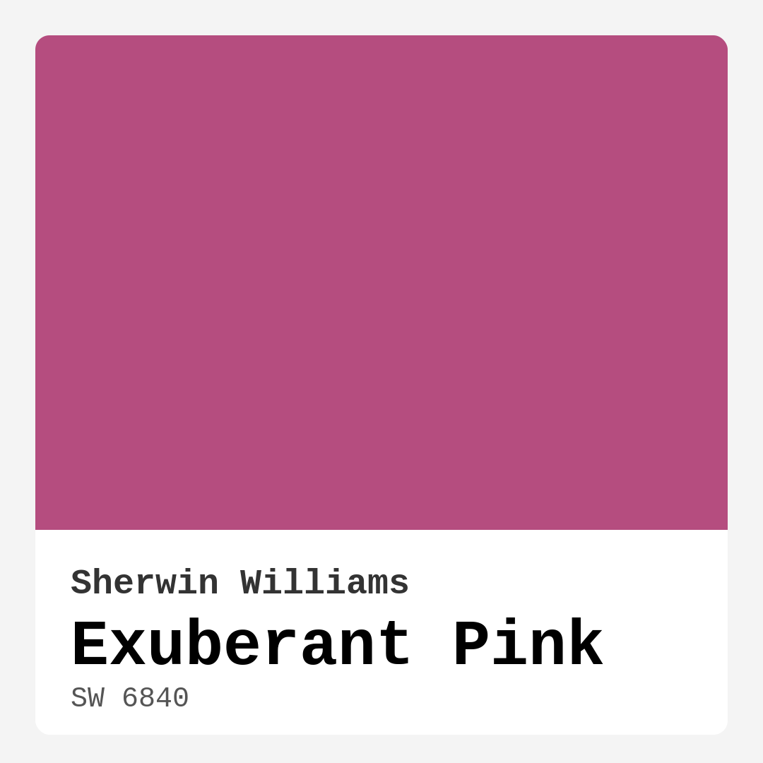
Color Preview & Key Details
| HEX Code | #B54D7F |
| RGB | 181, 77, 127 |
| LRV | 36% |
| Undertone | Red |
| Finish Options | Matte, Satin, Semi-Gloss |
Picture this: you walk into a room, and it instantly feels alive. That’s the magic of color. Today, let’s dive deep into a shade that can breathe joy and warmth into your space—Exuberant Pink by Sherwin Williams. This vibrant hue isn’t just a color; it’s an experience waiting to unfold in your home.
Exuberant Pink, with its luscious hex code #B54D7F and RGB values of 181, 77, and 127, is a bold choice that whispers sophistication while shouting playfulness. It’s not just about painting walls; it’s about setting a mood, establishing a vibe, and creating an inviting atmosphere that draws people in.
You might wonder what makes this color so special. For starters, it’s a warm pink, leaning into red undertones that provide a sense of depth and richness. This warmth creates a cozy, energetic environment, making it ideal for spaces like living rooms and nurseries where you want to foster connection and comfort. The light reflectance value (LRV) of 36% means it subtly balances brightness without overwhelming the senses. It reflects a moderate amount of light, giving off an inviting glow during the day while maintaining its integrity in dim lighting.
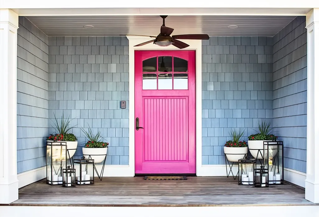
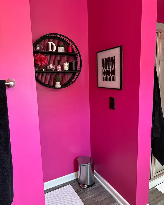
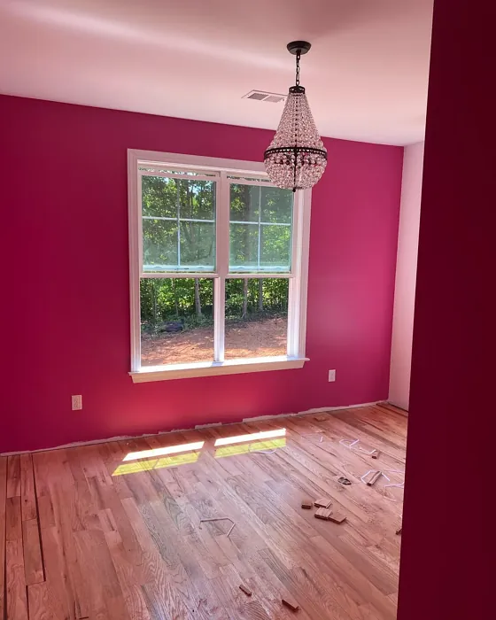
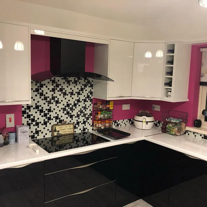
But let’s get specific—where can you use Exuberant Pink? Its versatility is one of its standout features. You’ll find it shining in living rooms, dining areas, bedrooms, and even kids’ rooms. Imagine an accent wall in a cozy corner, or perhaps a playful touch in a nursery that makes every moment feel special. It’s perfect for those looking to add a pop of color without losing the overall harmony of their decor.
While using such a vibrant hue can be intimidating, the application process is actually pretty straightforward. Exuberant Pink comes in various finishes—matte, satin, and semi-gloss—allowing you to customize the ambiance of your room. A matte finish offers a soft, elegant touch, while semi-gloss can add a little shine and durability, especially in high-traffic areas like kitchens or hallways.
One of the beauties of this color is how it interacts with other hues. Pair it with complementary shades like soft whites or warm neutral tones to create a balanced look. For instance, White Dove trim works beautifully with Exuberant Pink, enhancing its vibrancy while keeping the atmosphere airy. If you’re feeling adventurous, consider gold or brass fixtures to add a touch of elegance that beautifully contrasts with the warmth of the pink.
Now, let’s talk about practicality. Exuberant Pink is a designer favorite not just for its aesthetic appeal, but also for its performance. It’s low in VOCs, which means you won’t be overwhelmed by strong odors during application. Plus, it’s quick-drying and touch-up friendly, making it beginner-friendly for those who might be new to painting. Coverage is good with just one to two coats, though keep in mind that it may require a bit more for full opacity, especially on darker walls.
You might be asking yourself, can I really use Exuberant Pink in a small room? Absolutely! While it’s bold, this shade can create a cozy and inviting atmosphere even in compact spaces. The key is to be mindful of lighting. Pair it with lighter accents, white furnishings, or soft decor that allows the pink to shine without closing in the space. This approach can turn a small bedroom or nursery into a delightful retreat.
As with any bold color, it’s essential to test it out in your home. Observe how it behaves with your existing furniture and decor throughout the day. You might be surprised at how the undertones shift with different lighting, revealing new layers and dimensions. In the morning sun, it may appear more vibrant, while in the evening, it can take on a warmer, softer quality, creating an intimate atmosphere.
If you’re still on the fence about using Exuberant Pink, think about the mood you want to create. This color exudes energy, warmth, and coziness. It’s perfect for social spaces where you want to invite conversation and laughter. Whether you’re hosting a dinner party or curling up with a good book, this shade will enhance the experience.
And let’s not forget about its washability. Exuberant Pink is not just for show; it’s functional too. It’s wipeable and washable, making it a practical choice for areas that may see some wear and tear, like dining rooms or playrooms. Plus, it’s fade-resistant, ensuring that your vibrant walls will continue to inspire for years to come.
So, whether you’re updating a child’s room, wanting to add flair to your living area, or creating a chic dining space, Exuberant Pink is the perfect partner. With its playful yet sophisticated charm, it brings life to any room while maintaining the elegance needed for a polished look.
In conclusion, if you’re ready to infuse your home with a burst of color, Exuberant Pink is calling your name. It’s more than just a paint color; it’s a joyful addition to your space. Embrace the exuberance, enjoy the warmth, and let your home reflect your unique style. With the right application, thoughtful pairings, and a little creativity, you can transform any area into a vibrant haven that feels both welcoming and invigorating. So go ahead, take the leap into color and let Exuberant Pink brighten your day!
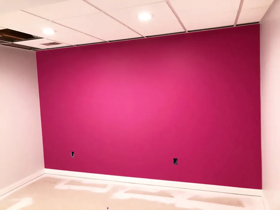
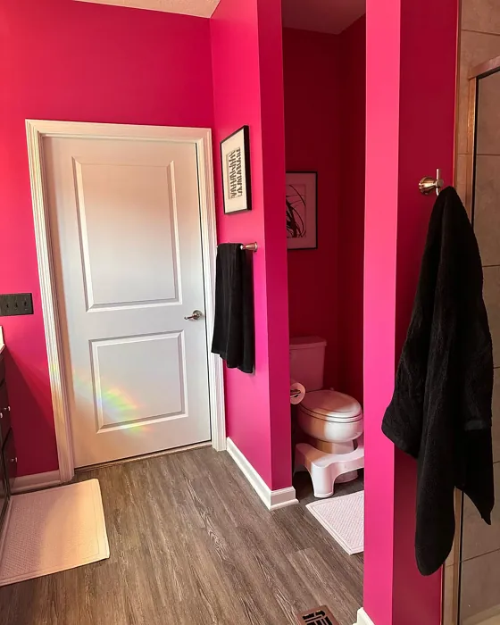
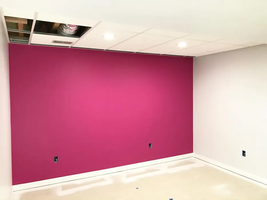
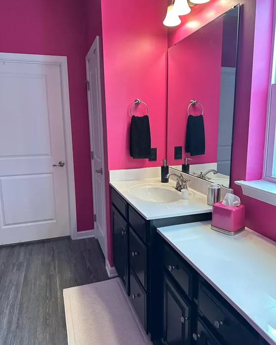
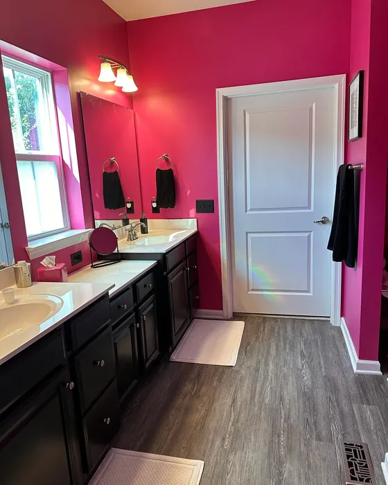
Real Room Photo of Exuberant Pink SW 6840
Undertones of Exuberant Pink ?
The undertones of Exuberant Pink are a key aspect of its character, leaning towards Red. These subtle underlying hues are what give the color its depth and complexity. For example, a gray with a blue undertone will feel cooler and more modern, while one with a brown undertone will feel warmer and more traditional. It’s essential to test this paint in your home and observe it next to your existing furniture, flooring, and decor to see how these undertones interact and reveal themselves throughout the day.
HEX value: #B54D7F
RGB code: 181, 77, 127
Is Exuberant Pink Cool or Warm?
Exuberant Pink is considered a warm paint color. This characteristic plays a huge role in the overall feel of a room. Warm colors, like this one, tend to create a cozy, inviting, and energetic atmosphere, making them great for social spaces like living rooms and dining rooms. In contrast, cool colors often evoke a sense of calm and serenity, which is why they are popular in bedrooms and bathrooms. The warmth of Exuberant Pink means it will pair beautifully with corresponding decor elements.
Understanding Color Properties and Interior Design Tips
Hue refers to a specific position on the color wheel, measured in degrees from 0 to 360. Each degree represents a different pure color:
- 0° represents red
- 120° represents green
- 240° represents blue
Saturation describes the intensity or purity of a color and is expressed as a percentage:
- At 0%, the color appears completely desaturated—essentially a shade of gray
- At 100%, the color is at its most vivid and vibrant
Lightness indicates how light or dark a color is, also expressed as a percentage:
- 0% lightness results in black
- 100% lightness results in white
Using Warm Colors in Interior Design
Warm hues—such as reds, oranges, yellows, warm beiges, and greiges—are excellent choices for creating inviting and energetic spaces. These colors are particularly well-suited for:
- Kitchens, living rooms, and bathrooms, where warmth enhances comfort and sociability
- Large rooms, where warm tones can help reduce the sense of emptiness and make the space feel more intimate
For example:
- Warm beige shades provide a cozy, inviting atmosphere, ideal for living rooms, bedrooms, and hallways.
- Warm greige (a mix of beige and gray) offers the warmth of beige with the modern appeal of gray, making it a versatile backdrop for dining areas, bedrooms, and living spaces.
However, be mindful when using warm light tones in rooms with limited natural light. These shades may appear muted or even take on an unpleasant yellowish tint. To avoid a dull or flat appearance:
- Add depth by incorporating richer tones like deep greens, charcoal, or chocolate brown
- Use textured elements such as curtains, rugs, or cushions to bring dimension to the space
Pro Tip: Achieving Harmony with Warm and Cool Color Balance
To create a well-balanced and visually interesting interior, mix warm and cool tones strategically. This contrast adds depth and harmony to your design.
- If your walls feature warm hues, introduce cool-colored accents such as blue or green furniture, artwork, or accessories to create contrast.
- For a polished look, consider using a complementary color scheme, which pairs colors opposite each other on the color wheel (e.g., red with green, orange with blue).
This thoughtful mix not only enhances visual appeal but also creates a space that feels both dynamic and cohesive.
Light Temperature Affects on Exuberant Pink
Natural Light
Natural daylight changes in color temperature as the sun moves across the sky. At sunrise and sunset, the light tends to have a warm, golden tone with a color temperature around 2000 Kelvin (K). As the day progresses and the sun rises higher, the light becomes cooler and more neutral. Around midday, especially when the sky is clear, natural light typically reaches its peak brightness and shifts to a cooler tone, ranging from 5500 to 6500 Kelvin. This midday light is close to what we perceive as pure white or daylight-balanced light.
These shifts in natural light can significantly influence how colors appear in a space, which is why designers often consider both the time of day and the orientation of windows when planning interior color schemes.
Artificial Light
When choosing artificial lighting, pay close attention to the color temperature, measured in Kelvin (K). This determines how warm or cool the light will appear. Lower temperatures, around 2700K, give off a warm, yellow glow often used in living rooms or bedrooms. Higher temperatures, above 5000K, create a cool, bluish light similar to daylight, commonly used in kitchens, offices, or task areas.
Use the slider to see how lighting temperature can affect the appearance of a surface or color throughout a space.


4800K
LRV of Exuberant Pink
The Light Reflectance Value (LRV) of Exuberant Pink is 36%, which places it in the Medium category. This means it Reflects a moderate amount of light. Understanding a paint’s LRV is crucial for predicting how it will look in your space. A higher LRV indicates a lighter color that reflects more light, making rooms feel larger and brighter. A lower LRV signifies a darker color that absorbs more light, creating a cozier, more intimate atmosphere. Always consider the natural and artificial lighting in your room when selecting a paint color based on its LRV.
Detailed Review of Exuberant Pink
Additional Paint Characteristics
Ideal Rooms
Bedroom, Dining Room, Kids Room, Living Room, Nursery
Decor Styles
Bohemian, Contemporary, Eclectic, Modern, Vintage
Coverage
Good (1–2 Coats), Touch-Up Friendly
Ease of Application
Beginner Friendly, Brush Smooth, Fast-Drying, Roller-Ready
Washability
Washable, Wipeable
VOC Level
Low VOC
Best Use
Accent Wall, Furniture, Interior Walls, Small Spaces
Room Suitability
Bedroom, Dining Room, Kids Room, Living Room, Nursery
Tone Tag
Bold, Bright, Warm
Finish Type
Matte, Satin, Semi-Gloss
Paint Performance
Easy Touch-Up, Fade Resistant, Low Odor, Quick Drying
Use Cases
Best for Small Spaces, Designer Favorite, Trending in 2025
Mood
Cozy, Energizing, Inviting
Trim Pairing
Complements Brass Fixtures, Pairs with White Dove, Works with Warm Trim
Exuberant Pink (#B54D7F) is more than just a color; it’s an experience. When applied, it radiates vibrancy and warmth, creating an inviting atmosphere that draws people in. This paint works wonders in both large, open spaces and cozy corners, making it incredibly versatile. Whether you’re updating a child’s room or adding a touch of flair to your living area, this hue adapts beautifully. The application process is straightforward, and the finish can vary from soft matte to a glossy sheen, depending on your preference. It’s perfect for those who want a pop of color without overwhelming their decor. Just be mindful that brighter shades like this might require a couple of coats for full opacity, but the end result is absolutely worth it.
Pros & Cons of SW 6840 Exuberant Pink
Pros
Cons
Colors that go with Sherwin Williams Exuberant Pink
FAQ on SW 6840 Exuberant Pink
Can I use Exuberant Pink in a small room?
Absolutely! While Exuberant Pink is a bold color, it can create a cozy and inviting atmosphere in smaller spaces. Just be mindful of the lighting and consider pairing it with lighter accents to keep the room from feeling too closed in. Using white or light-colored furnishings can help balance the vibrancy of the pink, making it a charming choice for a small bedroom or nursery.
What finishes are available for Exuberant Pink?
Exuberant Pink comes in several finishes, including matte, satin, and semi-gloss. Each finish offers a different look and feel, allowing you to choose based on the desired ambiance of your space. A matte finish gives a soft, elegant feel, while semi-gloss can add a touch of shine, making it suitable for areas that need durability, like kitchens or hallways.
Comparisons Exuberant Pink with other colors
Exuberant Pink SW 6840 vs Reddened Earth SW 6053
| Attribute | Exuberant Pink SW 6840 | Reddened Earth SW 6053 |
|---|---|---|
| Color Name | Exuberant Pink SW 6840 | Reddened Earth SW 6053 |
| Color | ||
| Hue | Pink | Pink |
| Brightness | Dark | Dark |
| RGB | 181, 77, 127 | 156, 110, 99 |
| LRV | 36% | 20% |
| Finish Type | Matte, Satin, Semi-Gloss | Eggshell, Flat, Matte |
| Finish Options | Matte, Satin, Semi-Gloss | Eggshell, Flat, Matte, Satin |
| Ideal Rooms | Bedroom, Dining Room, Kids Room, Living Room, Nursery | Bedroom, Dining Room, Home Office, Living Room, Nursery |
| Decor Styles | Bohemian, Contemporary, Eclectic, Modern, Vintage | Bohemian, Mid-Century Modern, Modern Farmhouse, Rustic |
| Coverage | Good (1–2 Coats), Touch-Up Friendly | Good (1–2 Coats), Touch-Up Friendly |
| Ease of Application | Beginner Friendly, Brush Smooth, Fast-Drying, Roller-Ready | Beginner Friendly, Brush Smooth, Roller-Ready |
| Washability | Washable, Wipeable | Washable, Wipeable |
| Room Suitability | Bedroom, Dining Room, Kids Room, Living Room, Nursery | Bedroom, Dining Room, Home Office, Living Room |
| Tone | Bold, Bright, Warm | Earthy, Muted, Warm |
| Paint Performance | Easy Touch-Up, Fade Resistant, Low Odor, Quick Drying | High Coverage, Low Odor, Quick Drying, Scuff Resistant |
Exuberant Pink SW 6840 vs Berry Bush SW 6292
| Attribute | Exuberant Pink SW 6840 | Berry Bush SW 6292 |
|---|---|---|
| Color Name | Exuberant Pink SW 6840 | Berry Bush SW 6292 |
| Color | ||
| Hue | Pink | Pink |
| Brightness | Dark | Dark |
| RGB | 181, 77, 127 | 141, 88, 105 |
| LRV | 36% | 12% |
| Finish Type | Matte, Satin, Semi-Gloss | Matte, Satin, Semi-Gloss |
| Finish Options | Matte, Satin, Semi-Gloss | Matte, Satin, Semi-Gloss |
| Ideal Rooms | Bedroom, Dining Room, Kids Room, Living Room, Nursery | Bedroom, Dining Room, Home Office, Living Room |
| Decor Styles | Bohemian, Contemporary, Eclectic, Modern, Vintage | Eclectic, Modern, Rustic, Transitional |
| Coverage | Good (1–2 Coats), Touch-Up Friendly | Good (1–2 Coats), Touch-Up Friendly |
| Ease of Application | Beginner Friendly, Brush Smooth, Fast-Drying, Roller-Ready | Brush Smooth, Fast-Drying, Roller-Ready |
| Washability | Washable, Wipeable | Washable, Wipeable |
| Room Suitability | Bedroom, Dining Room, Kids Room, Living Room, Nursery | Bedroom, Dining Room, Home Office, Living Room |
| Tone | Bold, Bright, Warm | Deep, Muted, Warm |
| Paint Performance | Easy Touch-Up, Fade Resistant, Low Odor, Quick Drying | Easy Touch-Up, Low Odor, Quick Drying |
Exuberant Pink SW 6840 vs Renwick Heather SW 2818
| Attribute | Exuberant Pink SW 6840 | Renwick Heather SW 2818 |
|---|---|---|
| Color Name | Exuberant Pink SW 6840 | Renwick Heather SW 2818 |
| Color | ||
| Hue | Pink | Pink |
| Brightness | Dark | Dark |
| RGB | 181, 77, 127 | 139, 125, 123 |
| LRV | 36% | 24% |
| Finish Type | Matte, Satin, Semi-Gloss | Eggshell, Satin |
| Finish Options | Matte, Satin, Semi-Gloss | Eggshell, Matte, Satin |
| Ideal Rooms | Bedroom, Dining Room, Kids Room, Living Room, Nursery | Bedroom, Dining Room, Entryway, Home Office, Living Room |
| Decor Styles | Bohemian, Contemporary, Eclectic, Modern, Vintage | Bohemian, Contemporary, Modern Farmhouse, Rustic, Transitional |
| Coverage | Good (1–2 Coats), Touch-Up Friendly | Good (1–2 Coats), Touch-Up Friendly |
| Ease of Application | Beginner Friendly, Brush Smooth, Fast-Drying, Roller-Ready | Beginner Friendly, Brush Smooth, Roller-Ready |
| Washability | Washable, Wipeable | Washable, Wipeable |
| Room Suitability | Bedroom, Dining Room, Kids Room, Living Room, Nursery | Bedroom, Dining Room, Entryway, Home Office, Living Room |
| Tone | Bold, Bright, Warm | Earthy, Muted, Warm |
| Paint Performance | Easy Touch-Up, Fade Resistant, Low Odor, Quick Drying | Easy Touch-Up, High Coverage, Low Odor |
Exuberant Pink SW 6840 vs Somerville Red HC-62
| Attribute | Exuberant Pink SW 6840 | Somerville Red HC-62 |
|---|---|---|
| Color Name | Exuberant Pink SW 6840 | Somerville Red HC-62 |
| Color | ||
| Hue | Pink | Pink |
| Brightness | Dark | Dark |
| RGB | 181, 77, 127 | 154, 109, 107 |
| LRV | 36% | 19.43% |
| Finish Type | Matte, Satin, Semi-Gloss | Eggshell, Satin, Semi-Gloss |
| Finish Options | Matte, Satin, Semi-Gloss | Eggshell, Satin, Semi-Gloss |
| Ideal Rooms | Bedroom, Dining Room, Kids Room, Living Room, Nursery | Bedroom, Dining Room, Home Office, Living Room |
| Decor Styles | Bohemian, Contemporary, Eclectic, Modern, Vintage | Industrial, Modern, Rustic, Traditional |
| Coverage | Good (1–2 Coats), Touch-Up Friendly | Good (1–2 Coats), High Hide |
| Ease of Application | Beginner Friendly, Brush Smooth, Fast-Drying, Roller-Ready | Beginner Friendly, Brush Smooth, Fast-Drying, Low Splatter, Roller-Ready |
| Washability | Washable, Wipeable | Highly Washable, Stain Resistant, Washable |
| Room Suitability | Bedroom, Dining Room, Kids Room, Living Room, Nursery | Bedroom, Dining Room, Living Room |
| Tone | Bold, Bright, Warm | Dusty, Earthy, Muted, Warm |
| Paint Performance | Easy Touch-Up, Fade Resistant, Low Odor, Quick Drying | Fade Resistant, High Coverage, Low Odor, Quick Drying |
Exuberant Pink SW 6840 vs Peony 2079-30
| Attribute | Exuberant Pink SW 6840 | Peony 2079-30 |
|---|---|---|
| Color Name | Exuberant Pink SW 6840 | Peony 2079-30 |
| Color | ||
| Hue | Pink | Pink |
| Brightness | Dark | Dark |
| RGB | 181, 77, 127 | 200, 68, 112 |
| LRV | 36% | 18.55% |
| Finish Type | Matte, Satin, Semi-Gloss | Eggshell, Matte, Satin, Semi-Gloss |
| Finish Options | Matte, Satin, Semi-Gloss | Eggshell, Matte, Satin, Semi-Gloss |
| Ideal Rooms | Bedroom, Dining Room, Kids Room, Living Room, Nursery | Bedroom, Dining Room, Home Office, Kids Room, Living Room |
| Decor Styles | Bohemian, Contemporary, Eclectic, Modern, Vintage | Bohemian, Eclectic, Glam, Modern |
| Coverage | Good (1–2 Coats), Touch-Up Friendly | Good (1–2 Coats), Self-Priming, Touch-Up Friendly |
| Ease of Application | Beginner Friendly, Brush Smooth, Fast-Drying, Roller-Ready | Beginner Friendly, Brush Smooth, Fast-Drying, Low Splatter, Roller-Ready |
| Washability | Washable, Wipeable | Stain Resistant, Washable, Wipeable |
| Room Suitability | Bedroom, Dining Room, Kids Room, Living Room, Nursery | Bedroom, Dining Room, Kids Room, Living Room |
| Tone | Bold, Bright, Warm | Bold, Inviting, Warm |
| Paint Performance | Easy Touch-Up, Fade Resistant, Low Odor, Quick Drying | Fade Resistant, High Coverage, Low Odor, Quick Drying |
Exuberant Pink SW 6840 vs Café Ole 2098-40
| Attribute | Exuberant Pink SW 6840 | Café Ole 2098-40 |
|---|---|---|
| Color Name | Exuberant Pink SW 6840 | Café Ole 2098-40 |
| Color | ||
| Hue | Pink | Pink |
| Brightness | Dark | Dark |
| RGB | 181, 77, 127 | 155, 125, 115 |
| LRV | 36% | 23.78% |
| Finish Type | Matte, Satin, Semi-Gloss | Eggshell, Matte, Satin |
| Finish Options | Matte, Satin, Semi-Gloss | Eggshell, Matte, Satin |
| Ideal Rooms | Bedroom, Dining Room, Kids Room, Living Room, Nursery | Bedroom, Dining Room, Entryway, Home Office, Living Room |
| Decor Styles | Bohemian, Contemporary, Eclectic, Modern, Vintage | Bohemian, Modern Farmhouse, Rustic |
| Coverage | Good (1–2 Coats), Touch-Up Friendly | Good (1–2 Coats), Self-Priming |
| Ease of Application | Beginner Friendly, Brush Smooth, Fast-Drying, Roller-Ready | Brush Smooth, Fast-Drying, Low Splatter, Roller-Ready |
| Washability | Washable, Wipeable | Stain Resistant, Washable, Wipeable |
| Room Suitability | Bedroom, Dining Room, Kids Room, Living Room, Nursery | Bedroom, Dining Room, Living Room |
| Tone | Bold, Bright, Warm | Cozy, Earthy, Muted, Warm |
| Paint Performance | Easy Touch-Up, Fade Resistant, Low Odor, Quick Drying | High Coverage, Low Odor, Quick Drying, Stain Resistant |
Official Page of Sherwin Williams Exuberant Pink SW 6840