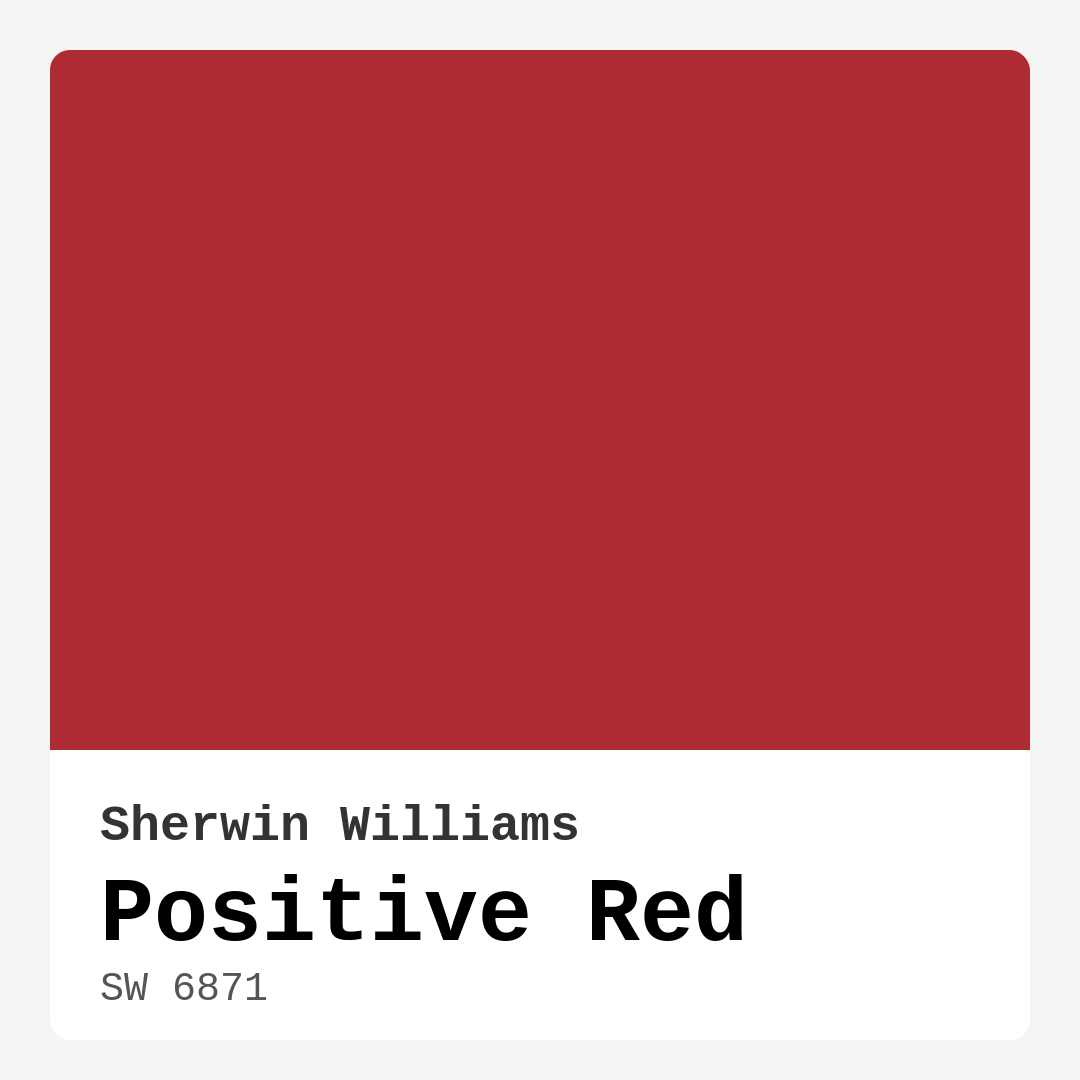
Color Preview & Key Details
| HEX Code | #AD2C34 |
| RGB | 173, 44, 52 |
| LRV | 12% |
| Undertone | Red |
| Finish Options | Matte, Satin, Semi-Gloss |
Imagine stepping into a space that instantly envelops you in warmth, energy, and character. That’s the magic of Positive Red by Sherwin Williams. It’s not just a color; it’s an experience waiting to unfold in your home. As a passionate home designer, I can’t help but get excited when discussing this vibrant hue. If you’re considering adding a bold splash of red to your interiors, let’s dive into what makes Positive Red the perfect choice for your next project.
Positive Red (SW 6871) is more than a simple red; it’s a deep crimson with a rich, inviting warmth. With an RGB value of 173, 44, 52, this color brings a sense of passion and enthusiasm to any room. Its hex code, #AD2C34, encapsulates that boldness perfectly. The moment you see it, you feel a surge of energy, making it ideal for spaces where you want to inspire conversation and creativity.
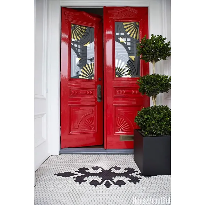
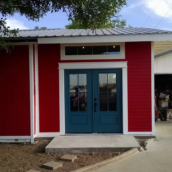
This color shines in several rooms of your home. Whether it’s the living room, dining room, or even a home office, Positive Red can transform these spaces into vibrant hubs of activity. It’s particularly effective in entryways, greeting guests with a warm embrace that sets the tone for your entire home.
Now, let’s talk about the practicality of working with Positive Red. The Light Reflectance Value (LRV) sits at 12%, categorizing it as a dark color. This means it won’t reflect much light and will absorb it instead. If you’re thinking about using it, consider how lighting plays a role in your space. In a well-lit room, Positive Red showcases its vibrant character beautifully. However, in dimly lit areas, it may appear even darker, so it’s essential to test it in your specific environment.
Positive Red is a warm color, and that warmth creates an inviting atmosphere. It pairs beautifully with other warm tones and can even complement rustic decor elements. If you lean towards a more modern or eclectic style, don’t worry—this color adapts nicely. You can achieve a chic look with sleek furniture or create a cozy farmhouse vibe with rustic accents. The key is to harmonize it with the right furnishings and decor, so it doesn’t overwhelm the space.
One of the best aspects of Positive Red is its versatility in finish options. You can choose from matte, satin, or semi-gloss, depending on the look you want to achieve. A matte finish gives a soft, contemporary feel, while satin or semi-gloss can add a touch of elegance and sophistication. The finish you choose can completely alter the mood of the room, so think about the ambiance you want.
Application is a breeze, making it beginner-friendly. You can achieve good coverage with just one or two coats, which is a significant advantage for those who might feel intimidated by bold colors. Its washability means that maintaining a fresh look is easy, allowing you to enjoy the warmth of this color without constant worry about scuffs or stains.
However, it’s worth mentioning a few considerations. In smaller rooms, Positive Red can feel overwhelming. If you love this color but worry about it dominating a compact space, consider using it as an accent wall. This approach lets you enjoy the vibrancy without feeling cramped. Pairing it with lighter furniture can also help balance the intensity, creating a visually stunning environment.
When it comes to complementary shades, Positive Red works well with a variety of colors. For a harmonious palette, consider pairing it with soft neutrals like White Dove or Pure White for trim. It also looks fantastic against brass fixtures, which can add a touch of elegance and warmth. If you’re feeling adventurous, explore greens—like Sherwin Williams’ SW 6477 or SW 6229—for an eye-catching contrast. This creates a vibrant dynamic that can make your space feel lively and full of character.
Positive Red is excellent for accent walls or as a backdrop in open spaces where it can bring drama without being overpowering. Imagine a warm dining room with Positive Red on one wall, creating a cozy gathering spot for friends and family. The color encourages interaction, making your home a place where laughter and conversation flow freely.
As we look ahead to trends in 2025, it’s clear that bold colors like Positive Red are making a comeback. Homeowners are increasingly drawn to lively hues that express personality and warmth, moving away from the minimalist palettes that have dominated in recent years. Positive Red is poised to be a favorite, positioning itself as a timeless choice that transcends fleeting trends.
In summary, Positive Red by Sherwin Williams is not just a paint color; it’s a bold statement that brings warmth, energy, and a captivating charm to your home. From its rich hue to its versatile applications, this color is perfect for anyone looking to infuse their space with personality and vibrancy. Whether you’re decorating a contemporary living room or a rustic dining area, Positive Red can elevate your design and create a welcoming atmosphere.
As you consider this color for your next project, remember to take into account the size of your space, the lighting, and how it interacts with existing decor. With a little thoughtful planning, you can harness the power of Positive Red to create a stunning environment that feels uniquely yours. Embrace the warmth and energy it offers, and watch your home transform into a vibrant haven. Happy decorating!

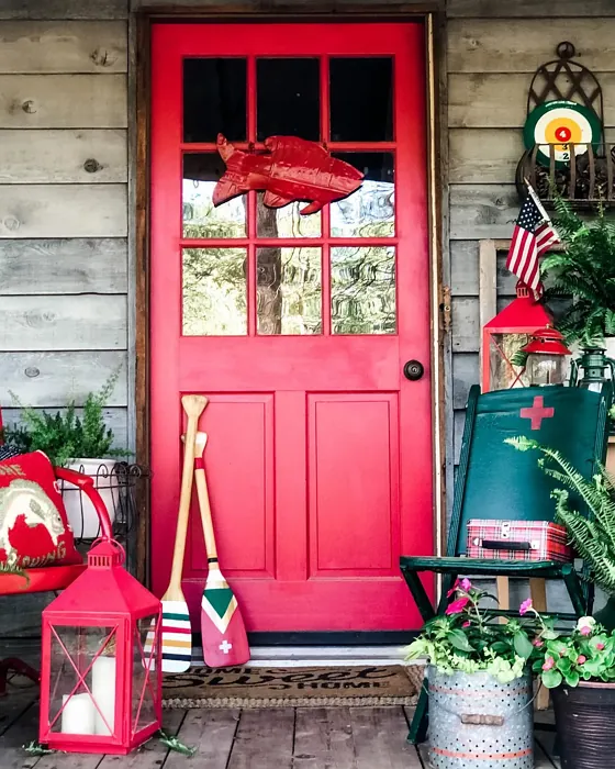
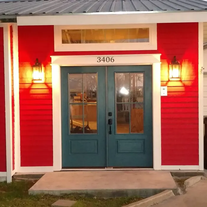
Real Room Photo of Positive Red SW 6871

Undertones of Positive Red ?
The undertones of Positive Red are a key aspect of its character, leaning towards Red. These subtle underlying hues are what give the color its depth and complexity. For example, a gray with a blue undertone will feel cooler and more modern, while one with a brown undertone will feel warmer and more traditional. It’s essential to test this paint in your home and observe it next to your existing furniture, flooring, and decor to see how these undertones interact and reveal themselves throughout the day.
HEX value: #AD2C34
RGB code: 173, 44, 52
Is Positive Red Cool or Warm?
Positive Red is considered a warm paint color. This characteristic plays a huge role in the overall feel of a room. Warm colors, like this one, tend to create a cozy, inviting, and energetic atmosphere, making them great for social spaces like living rooms and dining rooms. In contrast, cool colors often evoke a sense of calm and serenity, which is why they are popular in bedrooms and bathrooms. The warmth of Positive Red means it will pair beautifully with corresponding decor elements.
Understanding Color Properties and Interior Design Tips
Hue refers to a specific position on the color wheel, measured in degrees from 0 to 360. Each degree represents a different pure color:
- 0° represents red
- 120° represents green
- 240° represents blue
Saturation describes the intensity or purity of a color and is expressed as a percentage:
- At 0%, the color appears completely desaturated—essentially a shade of gray
- At 100%, the color is at its most vivid and vibrant
Lightness indicates how light or dark a color is, also expressed as a percentage:
- 0% lightness results in black
- 100% lightness results in white
Using Warm Colors in Interior Design
Warm hues—such as reds, oranges, yellows, warm beiges, and greiges—are excellent choices for creating inviting and energetic spaces. These colors are particularly well-suited for:
- Kitchens, living rooms, and bathrooms, where warmth enhances comfort and sociability
- Large rooms, where warm tones can help reduce the sense of emptiness and make the space feel more intimate
For example:
- Warm beige shades provide a cozy, inviting atmosphere, ideal for living rooms, bedrooms, and hallways.
- Warm greige (a mix of beige and gray) offers the warmth of beige with the modern appeal of gray, making it a versatile backdrop for dining areas, bedrooms, and living spaces.
However, be mindful when using warm light tones in rooms with limited natural light. These shades may appear muted or even take on an unpleasant yellowish tint. To avoid a dull or flat appearance:
- Add depth by incorporating richer tones like deep greens, charcoal, or chocolate brown
- Use textured elements such as curtains, rugs, or cushions to bring dimension to the space
Pro Tip: Achieving Harmony with Warm and Cool Color Balance
To create a well-balanced and visually interesting interior, mix warm and cool tones strategically. This contrast adds depth and harmony to your design.
- If your walls feature warm hues, introduce cool-colored accents such as blue or green furniture, artwork, or accessories to create contrast.
- For a polished look, consider using a complementary color scheme, which pairs colors opposite each other on the color wheel (e.g., red with green, orange with blue).
This thoughtful mix not only enhances visual appeal but also creates a space that feels both dynamic and cohesive.
Light Temperature Affects on Positive Red
Natural Light
Natural daylight changes in color temperature as the sun moves across the sky. At sunrise and sunset, the light tends to have a warm, golden tone with a color temperature around 2000 Kelvin (K). As the day progresses and the sun rises higher, the light becomes cooler and more neutral. Around midday, especially when the sky is clear, natural light typically reaches its peak brightness and shifts to a cooler tone, ranging from 5500 to 6500 Kelvin. This midday light is close to what we perceive as pure white or daylight-balanced light.
These shifts in natural light can significantly influence how colors appear in a space, which is why designers often consider both the time of day and the orientation of windows when planning interior color schemes.
Artificial Light
When choosing artificial lighting, pay close attention to the color temperature, measured in Kelvin (K). This determines how warm or cool the light will appear. Lower temperatures, around 2700K, give off a warm, yellow glow often used in living rooms or bedrooms. Higher temperatures, above 5000K, create a cool, bluish light similar to daylight, commonly used in kitchens, offices, or task areas.
Use the slider to see how lighting temperature can affect the appearance of a surface or color throughout a space.


4800K
LRV of Positive Red
The Light Reflectance Value (LRV) of Positive Red is 12%, which places it in the Dark colors category. This means it does not reflect light. Understanding a paint’s LRV is crucial for predicting how it will look in your space. A higher LRV indicates a lighter color that reflects more light, making rooms feel larger and brighter. A lower LRV signifies a darker color that absorbs more light, creating a cozier, more intimate atmosphere. Always consider the natural and artificial lighting in your room when selecting a paint color based on its LRV.
Detailed Review of Positive Red
Additional Paint Characteristics
Ideal Rooms
Dining Room, Entryway, Home Office, Living Room
Decor Styles
Contemporary, Eclectic, Modern, Rustic
Coverage
Good (1–2 Coats)
Ease of Application
Beginner Friendly, Brush Smooth, Roller-Ready
Washability
Highly Washable, Washable
VOC Level
Low VOC
Best Use
Accent Wall, Furniture, Interior Walls
Room Suitability
Dining Room, Entryway, Home Office, Living Room
Tone Tag
Bold, Deep, Warm
Finish Type
Matte, Satin, Semi-Gloss
Paint Performance
Easy Touch-Up, High Coverage, Stain Resistant
Use Cases
Best for Rentals, Best for Selling Your Home, Trending in 2025
Mood
Energizing, Inviting, Warm
Trim Pairing
Complements Brass Fixtures, Matches Pure White, Pairs with White Dove
Positive Red is more than just a color; it’s an experience. Its rich, inviting tone can transform walls into a lively canvas that sparks conversation and creativity. When applied, it tends to maintain a consistent finish, whether you choose matte or satin. This versatility allows it to blend seamlessly with various decor styles—from modern to rustic—while providing a warm ambiance. For the best results, you’ll find that applying two coats yields a vibrant depth that truly embodies the essence of the color. It’s an excellent choice for accent walls or as a backdrop in open spaces, bringing a touch of drama without overwhelming the senses. However, keep in mind that the intensity of Positive Red may require careful consideration of the room’s lighting and adjacent colors to achieve a harmonious look.
Pros & Cons of SW 6871 Positive Red
Pros
Cons
Colors that go with Sherwin Williams Positive Red
FAQ on SW 6871 Positive Red
Is Positive Red suitable for small spaces?
While Positive Red is a vibrant and bold choice, it can be overwhelming in very small spaces. If you love the color, consider using it as an accent wall rather than covering all four walls. This way, you can enjoy its warmth without it feeling too heavy or cramped. Pairing it with lighter furniture and decor can also help to balance the intensity.
How does Positive Red work with different decor styles?
Positive Red is incredibly versatile. It pairs well with both modern and rustic styles, making it a fantastic choice for eclectic decor. Whether you’re aiming for a chic contemporary look or a cozy farmhouse vibe, this color can adapt beautifully. Just ensure to complement it with furnishings and accents that harmonize with its bold nature, such as neutral tones or warm wood finishes.
Comparisons Positive Red with other colors
Positive Red SW 6871 vs Cavern Clay SW 7701
| Attribute | Positive Red SW 6871 | Cavern Clay SW 7701 |
|---|---|---|
| Color Name | Positive Red SW 6871 | Cavern Clay SW 7701 |
| Color | ||
| Hue | Red | Red |
| Brightness | Dark | Dark |
| RGB | 173, 44, 52 | 172, 107, 83 |
| LRV | 12% | 30% |
| Finish Type | Matte, Satin, Semi-Gloss | Eggshell, Matte, Satin |
| Finish Options | Matte, Satin, Semi-Gloss | Eggshell, Matte, Satin |
| Ideal Rooms | Dining Room, Entryway, Home Office, Living Room | Bedroom, Dining Room, Home Office, Kitchen, Living Room |
| Decor Styles | Contemporary, Eclectic, Modern, Rustic | Bohemian, Contemporary, Modern Farmhouse, Rustic, Transitional |
| Coverage | Good (1–2 Coats) | Good (1–2 Coats), Touch-Up Friendly |
| Ease of Application | Beginner Friendly, Brush Smooth, Roller-Ready | Beginner Friendly, Brush Smooth, Roller-Ready |
| Washability | Highly Washable, Washable | Washable, Wipeable |
| Room Suitability | Dining Room, Entryway, Home Office, Living Room | Bedroom, Dining Room, Home Office, Kitchen, Living Room |
| Tone | Bold, Deep, Warm | Earthy, Muted, Warm |
| Paint Performance | Easy Touch-Up, High Coverage, Stain Resistant | Easy Touch-Up, Low Odor, Scuff Resistant |
Positive Red SW 6871 vs Burgundy SW 6300
| Attribute | Positive Red SW 6871 | Burgundy SW 6300 |
|---|---|---|
| Color Name | Positive Red SW 6871 | Burgundy SW 6300 |
| Color | ||
| Hue | Red | Red |
| Brightness | Dark | Dark |
| RGB | 173, 44, 52 | 99, 51, 62 |
| LRV | 12% | 6% |
| Finish Type | Matte, Satin, Semi-Gloss | Eggshell, Matte, Satin |
| Finish Options | Matte, Satin, Semi-Gloss | Eggshell, Matte, Satin |
| Ideal Rooms | Dining Room, Entryway, Home Office, Living Room | Bedroom, Dining Room, Home Office, Living Room |
| Decor Styles | Contemporary, Eclectic, Modern, Rustic | Contemporary, Rustic, Traditional, Vintage |
| Coverage | Good (1–2 Coats) | Good (1–2 Coats), Touch-Up Friendly |
| Ease of Application | Beginner Friendly, Brush Smooth, Roller-Ready | Beginner Friendly, Brush Smooth, Fast-Drying, Roller-Ready |
| Washability | Highly Washable, Washable | Washable, Wipeable |
| Room Suitability | Dining Room, Entryway, Home Office, Living Room | Bedroom, Dining Room, Home Office, Living Room |
| Tone | Bold, Deep, Warm | Bold, Deep, Warm |
| Paint Performance | Easy Touch-Up, High Coverage, Stain Resistant | High Coverage, Low Odor, Quick Drying |
Positive Red SW 6871 vs Rookwood Red SW 2802
| Attribute | Positive Red SW 6871 | Rookwood Red SW 2802 |
|---|---|---|
| Color Name | Positive Red SW 6871 | Rookwood Red SW 2802 |
| Color | ||
| Hue | Red | Red |
| Brightness | Dark | Dark |
| RGB | 173, 44, 52 | 98, 47, 45 |
| LRV | 12% | 6% |
| Finish Type | Matte, Satin, Semi-Gloss | Eggshell, Matte, Satin |
| Finish Options | Matte, Satin, Semi-Gloss | Eggshell, Matte, Satin |
| Ideal Rooms | Dining Room, Entryway, Home Office, Living Room | Bedroom, Dining Room, Home Office, Living Room |
| Decor Styles | Contemporary, Eclectic, Modern, Rustic | Arts and Crafts, Modern Farmhouse, Rustic, Traditional |
| Coverage | Good (1–2 Coats) | Good (1–2 Coats), Touch-Up Friendly |
| Ease of Application | Beginner Friendly, Brush Smooth, Roller-Ready | Beginner Friendly, Brush Smooth, Fast-Drying, Roller-Ready |
| Washability | Highly Washable, Washable | Washable, Wipeable |
| Room Suitability | Dining Room, Entryway, Home Office, Living Room | Bedroom, Dining Room, Living Room |
| Tone | Bold, Deep, Warm | Deep, Earthy, Warm |
| Paint Performance | Easy Touch-Up, High Coverage, Stain Resistant | Easy Touch-Up, High Coverage, Low Odor |
Positive Red SW 6871 vs Spiced Cider SW 7702
| Attribute | Positive Red SW 6871 | Spiced Cider SW 7702 |
|---|---|---|
| Color Name | Positive Red SW 6871 | Spiced Cider SW 7702 |
| Color | ||
| Hue | Red | Red |
| Brightness | Dark | Dark |
| RGB | 173, 44, 52 | 176, 120, 92 |
| LRV | 12% | 20% |
| Finish Type | Matte, Satin, Semi-Gloss | Eggshell, Satin |
| Finish Options | Matte, Satin, Semi-Gloss | Eggshell, Satin, Semi-Gloss |
| Ideal Rooms | Dining Room, Entryway, Home Office, Living Room | Bedroom, Dining Room, Kitchen, Living Room |
| Decor Styles | Contemporary, Eclectic, Modern, Rustic | Modern Farmhouse, Rustic, Traditional, Transitional |
| Coverage | Good (1–2 Coats) | Good (1–2 Coats), Touch-Up Friendly |
| Ease of Application | Beginner Friendly, Brush Smooth, Roller-Ready | Beginner Friendly, Brush Smooth, Roller-Ready |
| Washability | Highly Washable, Washable | Scrubbable, Washable |
| Room Suitability | Dining Room, Entryway, Home Office, Living Room | Bedroom, Dining Room, Kitchen, Living Room |
| Tone | Bold, Deep, Warm | Earthy, Inviting, Warm |
| Paint Performance | Easy Touch-Up, High Coverage, Stain Resistant | Easy Touch-Up, High Coverage, Low Odor |
Positive Red SW 6871 vs Carnelian SW 7580
| Attribute | Positive Red SW 6871 | Carnelian SW 7580 |
|---|---|---|
| Color Name | Positive Red SW 6871 | Carnelian SW 7580 |
| Color | ||
| Hue | Red | Red |
| Brightness | Dark | Dark |
| RGB | 173, 44, 52 | 87, 62, 62 |
| LRV | 12% | 20% |
| Finish Type | Matte, Satin, Semi-Gloss | Eggshell, Satin |
| Finish Options | Matte, Satin, Semi-Gloss | Eggshell, Matte, Satin |
| Ideal Rooms | Dining Room, Entryway, Home Office, Living Room | Bedroom, Dining Room, Hallway, Home Office, Living Room |
| Decor Styles | Contemporary, Eclectic, Modern, Rustic | Bohemian, Modern Farmhouse, Rustic, Traditional |
| Coverage | Good (1–2 Coats) | Good (1–2 Coats), Touch-Up Friendly |
| Ease of Application | Beginner Friendly, Brush Smooth, Roller-Ready | Beginner Friendly, Brush Smooth, Fast-Drying, Roller-Ready |
| Washability | Highly Washable, Washable | Washable, Wipeable |
| Room Suitability | Dining Room, Entryway, Home Office, Living Room | Bedroom, Dining Room, Home Office, Living Room |
| Tone | Bold, Deep, Warm | Deep, Earthy, Warm |
| Paint Performance | Easy Touch-Up, High Coverage, Stain Resistant | Easy Touch-Up, Low Odor, Quick Drying |
Positive Red SW 6871 vs Sommelier SW 7595
| Attribute | Positive Red SW 6871 | Sommelier SW 7595 |
|---|---|---|
| Color Name | Positive Red SW 6871 | Sommelier SW 7595 |
| Color | ||
| Hue | Red | Red |
| Brightness | Dark | Dark |
| RGB | 173, 44, 52 | 93, 55, 54 |
| LRV | 12% | 6% |
| Finish Type | Matte, Satin, Semi-Gloss | Eggshell, Matte, Satin |
| Finish Options | Matte, Satin, Semi-Gloss | Eggshell, Matte, Satin |
| Ideal Rooms | Dining Room, Entryway, Home Office, Living Room | Bedroom, Dining Room, Home Office, Living Room |
| Decor Styles | Contemporary, Eclectic, Modern, Rustic | Modern, Rustic, Traditional, Transitional |
| Coverage | Good (1–2 Coats) | Good (1–2 Coats), Touch-Up Friendly |
| Ease of Application | Beginner Friendly, Brush Smooth, Roller-Ready | Brush Smooth, Fast-Drying, Low Splatter, Roller-Ready |
| Washability | Highly Washable, Washable | Washable, Wipeable |
| Room Suitability | Dining Room, Entryway, Home Office, Living Room | Bedroom, Dining Room, Home Office, Living Room |
| Tone | Bold, Deep, Warm | Deep, Earthy, Warm |
| Paint Performance | Easy Touch-Up, High Coverage, Stain Resistant | Easy Touch-Up, High Coverage, Low Odor, Scuff Resistant |
Positive Red SW 6871 vs Sun Dried Tomato SW 7585
| Attribute | Positive Red SW 6871 | Sun Dried Tomato SW 7585 |
|---|---|---|
| Color Name | Positive Red SW 6871 | Sun Dried Tomato SW 7585 |
| Color | ||
| Hue | Red | Red |
| Brightness | Dark | Dark |
| RGB | 173, 44, 52 | 105, 43, 43 |
| LRV | 12% | 20% |
| Finish Type | Matte, Satin, Semi-Gloss | Matte, Satin, Semi-Gloss |
| Finish Options | Matte, Satin, Semi-Gloss | Matte, Satin, Semi-Gloss |
| Ideal Rooms | Dining Room, Entryway, Home Office, Living Room | Dining Room, Home Office, Kitchen, Living Room |
| Decor Styles | Contemporary, Eclectic, Modern, Rustic | Industrial, Mediterranean, Modern Farmhouse, Rustic |
| Coverage | Good (1–2 Coats) | Good (1–2 Coats), Touch-Up Friendly |
| Ease of Application | Beginner Friendly, Brush Smooth, Roller-Ready | Beginner Friendly, Brush Smooth, Roller-Ready |
| Washability | Highly Washable, Washable | Washable, Wipeable |
| Room Suitability | Dining Room, Entryway, Home Office, Living Room | Dining Room, Home Office, Kitchen, Living Room |
| Tone | Bold, Deep, Warm | Bold, Earthy, Warm |
| Paint Performance | Easy Touch-Up, High Coverage, Stain Resistant | Easy Touch-Up, High Coverage, Low Odor |
Positive Red SW 6871 vs Rustic Red SW 7593
| Attribute | Positive Red SW 6871 | Rustic Red SW 7593 |
|---|---|---|
| Color Name | Positive Red SW 6871 | Rustic Red SW 7593 |
| Color | ||
| Hue | Red | Red |
| Brightness | Dark | Dark |
| RGB | 173, 44, 52 | 112, 50, 41 |
| LRV | 12% | 12% |
| Finish Type | Matte, Satin, Semi-Gloss | Matte, Satin |
| Finish Options | Matte, Satin, Semi-Gloss | Matte, Satin, Semi-Gloss |
| Ideal Rooms | Dining Room, Entryway, Home Office, Living Room | Bedroom, Dining Room, Hallway, Living Room |
| Decor Styles | Contemporary, Eclectic, Modern, Rustic | Country, Farmhouse, Rustic, Traditional |
| Coverage | Good (1–2 Coats) | Good (1–2 Coats) |
| Ease of Application | Beginner Friendly, Brush Smooth, Roller-Ready | Beginner Friendly, Brush Smooth, Fast-Drying, Roller-Ready |
| Washability | Highly Washable, Washable | Washable, Wipeable |
| Room Suitability | Dining Room, Entryway, Home Office, Living Room | Bedroom, Dining Room, Living Room |
| Tone | Bold, Deep, Warm | Deep, Earthy, Warm |
| Paint Performance | Easy Touch-Up, High Coverage, Stain Resistant | Easy Touch-Up, Low Odor, Quick Drying |
Positive Red SW 6871 vs Roycroft Copper Red SW 2839
| Attribute | Positive Red SW 6871 | Roycroft Copper Red SW 2839 |
|---|---|---|
| Color Name | Positive Red SW 6871 | Roycroft Copper Red SW 2839 |
| Color | ||
| Hue | Red | Red |
| Brightness | Dark | Dark |
| RGB | 173, 44, 52 | 123, 55, 40 |
| LRV | 12% | 12% |
| Finish Type | Matte, Satin, Semi-Gloss | Matte, Satin, Semi-Gloss |
| Finish Options | Matte, Satin, Semi-Gloss | Matte, Satin, Semi-Gloss |
| Ideal Rooms | Dining Room, Entryway, Home Office, Living Room | Bedroom, Dining Room, Entryway, Home Office, Living Room |
| Decor Styles | Contemporary, Eclectic, Modern, Rustic | Arts and Crafts, Eclectic, Farmhouse, Rustic, Traditional |
| Coverage | Good (1–2 Coats) | Good (1–2 Coats), Touch-Up Friendly |
| Ease of Application | Beginner Friendly, Brush Smooth, Roller-Ready | Beginner Friendly, Brush Smooth, Roller-Ready |
| Washability | Highly Washable, Washable | Stain Resistant, Washable |
| Room Suitability | Dining Room, Entryway, Home Office, Living Room | Bedroom, Dining Room, Entryway, Home Office, Living Room |
| Tone | Bold, Deep, Warm | Deep, Earthy, Warm |
| Paint Performance | Easy Touch-Up, High Coverage, Stain Resistant | Easy Touch-Up, High Coverage, Low Odor |
Positive Red SW 6871 vs Rookwood Dark Red SW 2801
| Attribute | Positive Red SW 6871 | Rookwood Dark Red SW 2801 |
|---|---|---|
| Color Name | Positive Red SW 6871 | Rookwood Dark Red SW 2801 |
| Color | ||
| Hue | Red | Red |
| Brightness | Dark | Dark |
| RGB | 173, 44, 52 | 75, 41, 41 |
| LRV | 12% | 6% |
| Finish Type | Matte, Satin, Semi-Gloss | Matte, Satin, Semi-Gloss |
| Finish Options | Matte, Satin, Semi-Gloss | Matte, Satin, Semi-Gloss |
| Ideal Rooms | Dining Room, Entryway, Home Office, Living Room | Bedroom, Dining Room, Home Office, Living Room |
| Decor Styles | Contemporary, Eclectic, Modern, Rustic | Farmhouse, Modern, Rustic, Traditional |
| Coverage | Good (1–2 Coats) | Good (1–2 Coats) |
| Ease of Application | Beginner Friendly, Brush Smooth, Roller-Ready | Beginner Friendly, Brush Smooth, Roller-Ready |
| Washability | Highly Washable, Washable | Highly Washable, Washable |
| Room Suitability | Dining Room, Entryway, Home Office, Living Room | Bedroom, Dining Room, Home Office, Living Room |
| Tone | Bold, Deep, Warm | Deep, Earthy, Warm |
| Paint Performance | Easy Touch-Up, High Coverage, Stain Resistant | Easy Touch-Up, High Coverage, Low Odor |
Official Page of Sherwin Williams Positive Red SW 6871