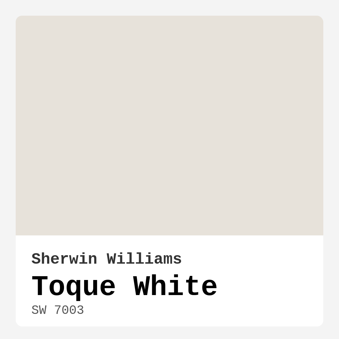
Color Preview & Key Details
| HEX Code | #E7E2DA |
| RGB | 231, 226, 218 |
| LRV | 75% |
| Undertone | Red |
| Finish Options | Eggshell, Matte, Satin |
Imagine walking into a room that instantly wraps you in a gentle embrace, making you feel calm and at ease. This is the magic of Toque White, a color that transforms spaces into serene sanctuaries. As an expert home designer, I’ve seen firsthand how the right paint can change the entire atmosphere of your home, and Toque White is one of those shades that does it effortlessly.
Toque White, with its color code SW 7003 from Sherwin Williams, is a soft, muted off-white that leans into greige territory. It’s like that perfect cup of coffee with just the right amount of cream—subtle, warm, and incredibly inviting. With an impressive Light Reflectance Value (LRV) of 75%, it reflects a high amount of light, making it ideal for both bright and cozy settings. Its undertone, which tilts toward red, adds a layer of warmth that can soften any space.
This color is perfect for a multitude of rooms in your home. Whether you’re considering your living room, bedroom, kitchen, bathroom, or dining room, Toque White can serve as a beautiful backdrop that enhances the natural light streaming in, giving every corner of your home a touch of sophistication.
One of the most appealing aspects of Toque White is its versatility. It fits seamlessly into various decor styles, from modern farmhouse to coastal, minimalist, and transitional designs. It doesn’t impose itself; rather, it complements the other elements in your space, allowing your furniture and decor to shine. If you’re thinking about a room refresh, ask yourself: What vibe do I want to create? If you desire a cozy, calm haven, this shade might just be your answer.
Practicality is another strong suit of Toque White. The application process is beginner-friendly, which is a blessing if you’re planning to take on a DIY project. It goes on smoothly with both rollers and brushes, ensuring an even finish that dries quickly. That’s right—no more waiting around for hours! Plus, it’s washable and wipeable, making maintenance a breeze, especially in high-traffic areas like kitchens and bathrooms where splashes are inevitable.
But let’s be real: no paint is perfect. While Toque White is incredibly appealing, it does have a couple of considerations. First, depending on the surface being painted, you might need two coats for full coverage. Also, while it’s lovely and soft, it can show marks in high-traffic areas, so if you have little ones or pets, be mindful of this. It’s not the best choice for very dark rooms, as it may struggle to brighten up spaces lacking natural light.
When thinking about finishes, the best choice often hinges on the room. For living areas and bedrooms, an eggshell or satin finish can enhance the warmth while maintaining durability. In kitchens and bathrooms, a satin or semi-gloss finish provides the necessary washability and moisture resistance. If you’re considering a more matte aesthetic, Toque White is also an excellent option for ceilings or as an accent wall, adding a touch of depth.
In terms of color compatibility, Toque White shines alongside a variety of shades. It pairs beautifully with whites like Sherwin-Williams’ White Dove, creating a clean and cohesive look. Brass fixtures pop against this warm backdrop, adding a touch of elegance and sophistication. For accent colors, consider using complementary hues like SW 9639 and SW 9640. These deep, rich tones can bring a delightful contrast that keeps the atmosphere inviting yet dynamic.
Testing Toque White in your space is essential because lighting plays a crucial role in how the color will ultimately appear. In natural light, you’ll appreciate how it softly glows, elevating the overall ambiance. Under artificial light, it still holds charm without feeling too stark or clinical. This adaptability makes it a great choice for open concept spaces where lighting may vary from room to room.
Let’s talk about the emotional impact of color. Toque White evokes a sense of calm and coziness. It’s perfect for creating a peaceful retreat where you can unwind after a long day. When you walk into a room painted with Toque White, you’re greeted with a soothing ambiance that makes you want to stay and linger.
In terms of trends, Toque White is a designer favorite, especially for modern farmhouse aesthetics. It gives that inviting, lived-in feel while maintaining a polished look. If you’re designing a space with a small footprint, this shade can help make it feel larger and more open. It’s a smart choice for those looking to create a bright yet warm environment without overwhelming brightness.
Remember to consider the undertones with Toque White. The subtle red undertones can bring warmth to spaces that lean too cool or stark. It’s all about balance, and this shade helps achieve just that. Make sure to test it against your existing furniture and decor to see how it interacts with other elements in your room.
Toque White is not just a paint color; it’s an invitation to create a beautiful, personalized space that reflects your style. It’s a choice that speaks of elegance and sophistication while offering practicality and warmth. Whether you’re painting an accent wall or refreshing an entire room, Toque White can help you achieve the serene, inviting atmosphere you desire.
So, as you ponder your next project, take a moment to consider Toque White. It might just be the perfect solution to elevate your home’s aesthetic, creating a calm retreat that feels both modern and timeless. Embrace the beauty of soft whites and let your home shine with the understated elegance that only Toque White can provide.
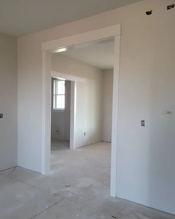
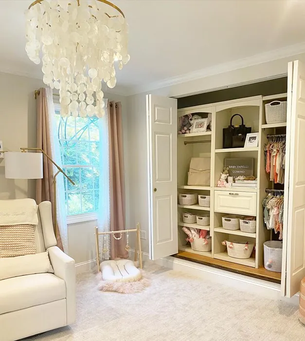
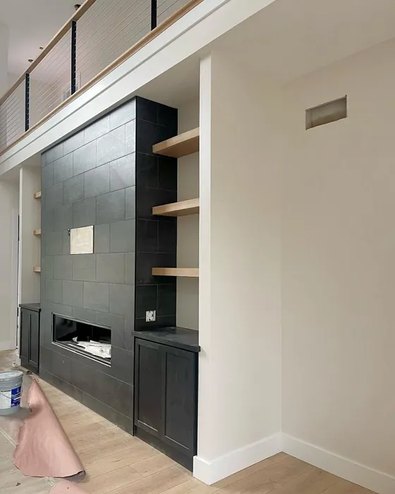
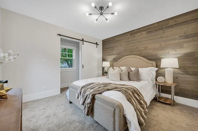
Real Room Photo of Toque White SW 7003


Undertones of Toque White ?
The undertones of Toque White are a key aspect of its character, leaning towards Red. These subtle underlying hues are what give the color its depth and complexity. For example, a gray with a blue undertone will feel cooler and more modern, while one with a brown undertone will feel warmer and more traditional. It’s essential to test this paint in your home and observe it next to your existing furniture, flooring, and decor to see how these undertones interact and reveal themselves throughout the day.
HEX value: #E7E2DA
RGB code: 231, 226, 218
Is Toque White Cool or Warm?
This shade is predominantly warm, bringing a gentle, soothing vibe that can soften the look of any room. It’s perfect for those who appreciate a more inviting atmosphere without overwhelming brightness.
Understanding Color Properties and Interior Design Tips
Hue refers to a specific position on the color wheel, measured in degrees from 0 to 360. Each degree represents a different pure color:
- 0° represents red
- 120° represents green
- 240° represents blue
Saturation describes the intensity or purity of a color and is expressed as a percentage:
- At 0%, the color appears completely desaturated—essentially a shade of gray
- At 100%, the color is at its most vivid and vibrant
Lightness indicates how light or dark a color is, also expressed as a percentage:
- 0% lightness results in black
- 100% lightness results in white
Using Warm Colors in Interior Design
Warm hues—such as reds, oranges, yellows, warm beiges, and greiges—are excellent choices for creating inviting and energetic spaces. These colors are particularly well-suited for:
- Kitchens, living rooms, and bathrooms, where warmth enhances comfort and sociability
- Large rooms, where warm tones can help reduce the sense of emptiness and make the space feel more intimate
For example:
- Warm beige shades provide a cozy, inviting atmosphere, ideal for living rooms, bedrooms, and hallways.
- Warm greige (a mix of beige and gray) offers the warmth of beige with the modern appeal of gray, making it a versatile backdrop for dining areas, bedrooms, and living spaces.
However, be mindful when using warm light tones in rooms with limited natural light. These shades may appear muted or even take on an unpleasant yellowish tint. To avoid a dull or flat appearance:
- Add depth by incorporating richer tones like deep greens, charcoal, or chocolate brown
- Use textured elements such as curtains, rugs, or cushions to bring dimension to the space
Pro Tip: Achieving Harmony with Warm and Cool Color Balance
To create a well-balanced and visually interesting interior, mix warm and cool tones strategically. This contrast adds depth and harmony to your design.
- If your walls feature warm hues, introduce cool-colored accents such as blue or green furniture, artwork, or accessories to create contrast.
- For a polished look, consider using a complementary color scheme, which pairs colors opposite each other on the color wheel (e.g., red with green, orange with blue).
This thoughtful mix not only enhances visual appeal but also creates a space that feels both dynamic and cohesive.

Light Temperature Affects on Toque White
Natural Light
Natural daylight changes in color temperature as the sun moves across the sky. At sunrise and sunset, the light tends to have a warm, golden tone with a color temperature around 2000 Kelvin (K). As the day progresses and the sun rises higher, the light becomes cooler and more neutral. Around midday, especially when the sky is clear, natural light typically reaches its peak brightness and shifts to a cooler tone, ranging from 5500 to 6500 Kelvin. This midday light is close to what we perceive as pure white or daylight-balanced light.
These shifts in natural light can significantly influence how colors appear in a space, which is why designers often consider both the time of day and the orientation of windows when planning interior color schemes.
Artificial Light
When choosing artificial lighting, pay close attention to the color temperature, measured in Kelvin (K). This determines how warm or cool the light will appear. Lower temperatures, around 2700K, give off a warm, yellow glow often used in living rooms or bedrooms. Higher temperatures, above 5000K, create a cool, bluish light similar to daylight, commonly used in kitchens, offices, or task areas.
Use the slider to see how lighting temperature can affect the appearance of a surface or color throughout a space.


4800K
LRV of Toque White
The Light Reflectance Value (LRV) of Toque White is 75%, which places it in the Light category. This means it Reflects a high amount of light. Understanding a paint’s LRV is crucial for predicting how it will look in your space. A higher LRV indicates a lighter color that reflects more light, making rooms feel larger and brighter. A lower LRV signifies a darker color that absorbs more light, creating a cozier, more intimate atmosphere. Always consider the natural and artificial lighting in your room when selecting a paint color based on its LRV.
Detailed Review of Toque White
Additional Paint Characteristics
Ideal Rooms
Bathroom, Bedroom, Dining Room, Home Office, Kitchen, Living Room
Decor Styles
Coastal, Minimalist, Modern Farmhouse, Transitional
Coverage
Good (1–2 Coats), Touch-Up Friendly
Ease of Application
Beginner Friendly, Brush Smooth, Roller-Ready
Washability
Washable, Wipeable
VOC Level
Eco-Certified, Low VOC
Best Use
Accent Wall, Ceiling, Interior Walls
Room Suitability
Bathroom, Bedroom, Dining Room, Kitchen, Living Room
Tone Tag
Neutral, Soft, Warm
Finish Type
Eggshell, Matte, Satin
Paint Performance
Easy Touch-Up, High Coverage, Low Odor, Quick Drying
Use Cases
Best for Modern Farmhouse, Best for Small Spaces, Designer Favorite
Mood
Calm, Cozy, Inviting
Trim Pairing
Complements Brass Fixtures, Pairs with White Dove, Works with Warm Trim
Toque White is a stunning choice for anyone looking to brighten up their home without introducing harshness. Its delicate balance of warmth and neutrality allows it to work beautifully in various lighting conditions. In natural light, you’ll notice a soft glow that uplifts any room, while in artificial light, it retains its charm without feeling too stark. One of the standout features is its ability to blend seamlessly with both bold and muted decor elements, making it a dependable choice for accent walls or open concept spaces. When applying, you’ll find it glides on smoothly and dries evenly, providing a satisfying finish that enhances the overall aesthetic of your home.
Pros & Cons of SW 7003 Toque White
Pros
Cons
Colors that go with Sherwin Williams Toque White
FAQ on SW 7003 Toque White
What is the best finish for Toque White?
The best finish for Toque White often depends on the room’s usage. For living areas and bedrooms, an eggshell or satin finish is recommended as it offers a subtle sheen that enhances the paint’s warmth while being durable enough for cleaning. In kitchens and bathrooms, a satin or semi-gloss finish will provide added washability and moisture resistance, making it perfect for high-humidity environments. If you’re looking for a more matte look, consider using it on ceilings or as an accent wall to create depth.
How does Toque White compare to other whites?
Toque White stands out among other whites due to its warm undertones, which can transform spaces into a cozy retreat. Unlike cooler whites that can feel stark and clinical, Toque White’s softness makes it versatile and inviting. It compares favorably to colors like Benjamin Moore’s White Dove, which also carries warmth but may lean more towards a creamier finish. Ultimately, the choice depends on the lighting and other colors in your home, but Toque White is an excellent choice for creating a harmonious flow.
Comparisons Toque White with other colors
Toque White SW 7003 vs Gossamer Veil SW 9165
| Attribute | Toque White SW 7003 | Gossamer Veil SW 9165 |
|---|---|---|
| Color Name | Toque White SW 7003 | Gossamer Veil SW 9165 |
| Color | ||
| Hue | Greige | Greige |
| Brightness | Light | Light |
| RGB | 231, 226, 218 | 211, 206, 196 |
| LRV | 75% | 75% |
| Finish Type | Eggshell, Matte, Satin | Eggshell, Matte |
| Finish Options | Eggshell, Matte, Satin | Eggshell, Matte, Satin |
| Ideal Rooms | Bathroom, Bedroom, Dining Room, Home Office, Kitchen, Living Room | Bedroom, Dining Room, Entryway, Home Office, Kitchen, Living Room |
| Decor Styles | Coastal, Minimalist, Modern Farmhouse, Transitional | Coastal, Farmhouse, Modern, Scandinavian, Transitional |
| Coverage | Good (1–2 Coats), Touch-Up Friendly | Good (1–2 Coats), Touch-Up Friendly |
| Ease of Application | Beginner Friendly, Brush Smooth, Roller-Ready | Beginner Friendly, Brush Smooth, Fast-Drying, Roller-Ready |
| Washability | Washable, Wipeable | Washable, Wipeable |
| Room Suitability | Bathroom, Bedroom, Dining Room, Kitchen, Living Room | Bathroom, Bedroom, Dining Room, Home Office, Living Room |
| Tone | Neutral, Soft, Warm | Airy, Balanced, Muted, Warm |
| Paint Performance | Easy Touch-Up, High Coverage, Low Odor, Quick Drying | Easy Touch-Up, High Coverage, Low Odor, Quick Drying |
Toque White SW 7003 vs Heron Plume SW 6070
| Attribute | Toque White SW 7003 | Heron Plume SW 6070 |
|---|---|---|
| Color Name | Toque White SW 7003 | Heron Plume SW 6070 |
| Color | ||
| Hue | Greige | Greige |
| Brightness | Light | Light |
| RGB | 231, 226, 218 | 229, 225, 216 |
| LRV | 75% | 30% |
| Finish Type | Eggshell, Matte, Satin | Eggshell, Matte, Satin |
| Finish Options | Eggshell, Matte, Satin | Eggshell, Matte, Satin |
| Ideal Rooms | Bathroom, Bedroom, Dining Room, Home Office, Kitchen, Living Room | Bedroom, Dining Room, Home Office, Living Room |
| Decor Styles | Coastal, Minimalist, Modern Farmhouse, Transitional | Coastal, Modern, Scandinavian, Transitional |
| Coverage | Good (1–2 Coats), Touch-Up Friendly | Good (1–2 Coats) |
| Ease of Application | Beginner Friendly, Brush Smooth, Roller-Ready | Beginner Friendly, Brush Smooth, Fast-Drying, Roller-Ready |
| Washability | Washable, Wipeable | Washable, Wipeable |
| Room Suitability | Bathroom, Bedroom, Dining Room, Kitchen, Living Room | Bedroom, Dining Room, Home Office, Living Room |
| Tone | Neutral, Soft, Warm | Balanced, Muted, Neutral, Warm |
| Paint Performance | Easy Touch-Up, High Coverage, Low Odor, Quick Drying | Easy Touch-Up, Low Odor, Quick Drying |
Toque White SW 7003 vs Sedate Gray SW 6169
| Attribute | Toque White SW 7003 | Sedate Gray SW 6169 |
|---|---|---|
| Color Name | Toque White SW 7003 | Sedate Gray SW 6169 |
| Color | ||
| Hue | Greige | Greige |
| Brightness | Light | Light |
| RGB | 231, 226, 218 | 209, 205, 191 |
| LRV | 75% | 24% |
| Finish Type | Eggshell, Matte, Satin | Eggshell, Matte, Satin |
| Finish Options | Eggshell, Matte, Satin | Eggshell, Flat, Matte, Satin |
| Ideal Rooms | Bathroom, Bedroom, Dining Room, Home Office, Kitchen, Living Room | Bedroom, Dining Room, Home Office, Living Room |
| Decor Styles | Coastal, Minimalist, Modern Farmhouse, Transitional | Farmhouse, Minimalist, Modern, Scandinavian |
| Coverage | Good (1–2 Coats), Touch-Up Friendly | Good (1–2 Coats) |
| Ease of Application | Beginner Friendly, Brush Smooth, Roller-Ready | Beginner Friendly, Brush Smooth, Roller-Ready |
| Washability | Washable, Wipeable | Scrubbable, Washable |
| Room Suitability | Bathroom, Bedroom, Dining Room, Kitchen, Living Room | Bedroom, Entryway, Home Office, Living Room |
| Tone | Neutral, Soft, Warm | Balanced, Muted, Neutral |
| Paint Performance | Easy Touch-Up, High Coverage, Low Odor, Quick Drying | Easy Touch-Up, High Coverage, Low Odor |
Toque White SW 7003 vs Pale Oak OC-20
| Attribute | Toque White SW 7003 | Pale Oak OC-20 |
|---|---|---|
| Color Name | Toque White SW 7003 | Pale Oak OC-20 |
| Color | ||
| Hue | Greige | Greige |
| Brightness | Light | Light |
| RGB | 231, 226, 218 | 223, 218, 206 |
| LRV | 75% | 68.64% |
| Finish Type | Eggshell, Matte, Satin | Eggshell, Matte, Satin |
| Finish Options | Eggshell, Matte, Satin | Eggshell, Matte, Satin |
| Ideal Rooms | Bathroom, Bedroom, Dining Room, Home Office, Kitchen, Living Room | Bedroom, Dining Room, Home Office, Living Room, Nursery |
| Decor Styles | Coastal, Minimalist, Modern Farmhouse, Transitional | Coastal, Modern Farmhouse, Scandinavian, Traditional, Transitional |
| Coverage | Good (1–2 Coats), Touch-Up Friendly | Good (1–2 Coats), Touch-Up Friendly |
| Ease of Application | Beginner Friendly, Brush Smooth, Roller-Ready | Beginner Friendly, Brush Smooth, Roller-Ready |
| Washability | Washable, Wipeable | Scrubbable, Washable |
| Room Suitability | Bathroom, Bedroom, Dining Room, Kitchen, Living Room | Bedroom, Dining Room, Home Office, Living Room, Nursery |
| Tone | Neutral, Soft, Warm | Creamy, Muted, Neutral, Warm |
| Paint Performance | Easy Touch-Up, High Coverage, Low Odor, Quick Drying | High Coverage, Low Odor, Quick Drying |
Toque White SW 7003 vs Natural Cream OC-14
| Attribute | Toque White SW 7003 | Natural Cream OC-14 |
|---|---|---|
| Color Name | Toque White SW 7003 | Natural Cream OC-14 |
| Color | ||
| Hue | Greige | Greige |
| Brightness | Light | Light |
| RGB | 231, 226, 218 | 218, 213, 198 |
| LRV | 75% | 64.78% |
| Finish Type | Eggshell, Matte, Satin | Eggshell, Matte, Satin |
| Finish Options | Eggshell, Matte, Satin | Eggshell, Matte, Satin |
| Ideal Rooms | Bathroom, Bedroom, Dining Room, Home Office, Kitchen, Living Room | Bathroom, Bedroom, Hallway, Home Office, Kitchen, Living Room |
| Decor Styles | Coastal, Minimalist, Modern Farmhouse, Transitional | Minimalist, Modern Farmhouse, Rustic, Scandinavian, Transitional |
| Coverage | Good (1–2 Coats), Touch-Up Friendly | Good (1–2 Coats), Touch-Up Friendly |
| Ease of Application | Beginner Friendly, Brush Smooth, Roller-Ready | Beginner Friendly, Brush Smooth, Fast-Drying, Roller-Ready |
| Washability | Washable, Wipeable | Highly Washable, Washable |
| Room Suitability | Bathroom, Bedroom, Dining Room, Kitchen, Living Room | Bedroom, Entryway, Home Office, Kitchen, Living Room |
| Tone | Neutral, Soft, Warm | Creamy, Earthy, Warm |
| Paint Performance | Easy Touch-Up, High Coverage, Low Odor, Quick Drying | Easy Touch-Up, Low Odor, Quick Drying |
Toque White SW 7003 vs Ballet White OC-9
| Attribute | Toque White SW 7003 | Ballet White OC-9 |
|---|---|---|
| Color Name | Toque White SW 7003 | Ballet White OC-9 |
| Color | ||
| Hue | Greige | Greige |
| Brightness | Light | Light |
| RGB | 231, 226, 218 | 229, 224, 208 |
| LRV | 75% | 71.97% |
| Finish Type | Eggshell, Matte, Satin | Eggshell, Matte |
| Finish Options | Eggshell, Matte, Satin | Eggshell, Matte, Satin |
| Ideal Rooms | Bathroom, Bedroom, Dining Room, Home Office, Kitchen, Living Room | Bedroom, Dining Room, Home Office, Kitchen, Living Room |
| Decor Styles | Coastal, Minimalist, Modern Farmhouse, Transitional | Farmhouse, Minimalist, Modern, Scandinavian, Traditional |
| Coverage | Good (1–2 Coats), Touch-Up Friendly | Good (1–2 Coats), Touch-Up Friendly |
| Ease of Application | Beginner Friendly, Brush Smooth, Roller-Ready | Beginner Friendly, Brush Smooth, Fast-Drying, Roller-Ready |
| Washability | Washable, Wipeable | Washable, Wipeable |
| Room Suitability | Bathroom, Bedroom, Dining Room, Kitchen, Living Room | Bedroom, Dining Room, Home Office, Kitchen, Living Room |
| Tone | Neutral, Soft, Warm | Creamy, Muted, Warm |
| Paint Performance | Easy Touch-Up, High Coverage, Low Odor, Quick Drying | Easy Touch-Up, Low Odor, Quick Drying |
Toque White SW 7003 vs Elmira White HC-84
| Attribute | Toque White SW 7003 | Elmira White HC-84 |
|---|---|---|
| Color Name | Toque White SW 7003 | Elmira White HC-84 |
| Color | ||
| Hue | Greige | Greige |
| Brightness | Light | Light |
| RGB | 231, 226, 218 | 219, 211, 195 |
| LRV | 75% | 64.67% |
| Finish Type | Eggshell, Matte, Satin | Eggshell, Matte, Satin |
| Finish Options | Eggshell, Matte, Satin | Eggshell, Matte, Satin |
| Ideal Rooms | Bathroom, Bedroom, Dining Room, Home Office, Kitchen, Living Room | Bathroom, Bedroom, Dining Room, Home Office, Kitchen, Living Room |
| Decor Styles | Coastal, Minimalist, Modern Farmhouse, Transitional | Coastal, Modern Farmhouse, Scandinavian, Traditional, Transitional |
| Coverage | Good (1–2 Coats), Touch-Up Friendly | Good (1–2 Coats) |
| Ease of Application | Beginner Friendly, Brush Smooth, Roller-Ready | Beginner Friendly, Brush Smooth, Fast-Drying, Roller-Ready |
| Washability | Washable, Wipeable | Highly Washable, Washable |
| Room Suitability | Bathroom, Bedroom, Dining Room, Kitchen, Living Room | Bathroom, Bedroom, Dining Room, Kitchen, Living Room |
| Tone | Neutral, Soft, Warm | Creamy, Neutral, Warm |
| Paint Performance | Easy Touch-Up, High Coverage, Low Odor, Quick Drying | High Coverage, Low Odor, Quick Drying |
Toque White SW 7003 vs Feather Down OC-6
| Attribute | Toque White SW 7003 | Feather Down OC-6 |
|---|---|---|
| Color Name | Toque White SW 7003 | Feather Down OC-6 |
| Color | ||
| Hue | Greige | Greige |
| Brightness | Light | Light |
| RGB | 231, 226, 218 | 230, 224, 207 |
| LRV | 75% | 73.16% |
| Finish Type | Eggshell, Matte, Satin | Eggshell, Matte, Satin |
| Finish Options | Eggshell, Matte, Satin | Eggshell, Matte, Satin |
| Ideal Rooms | Bathroom, Bedroom, Dining Room, Home Office, Kitchen, Living Room | Bedroom, Dining Room, Home Office, Living Room, Nursery |
| Decor Styles | Coastal, Minimalist, Modern Farmhouse, Transitional | Contemporary, Farmhouse, Scandinavian, Traditional |
| Coverage | Good (1–2 Coats), Touch-Up Friendly | Good (1–2 Coats) |
| Ease of Application | Beginner Friendly, Brush Smooth, Roller-Ready | Beginner Friendly, Brush Smooth, Roller-Ready |
| Washability | Washable, Wipeable | Washable, Wipeable |
| Room Suitability | Bathroom, Bedroom, Dining Room, Kitchen, Living Room | Bedroom, Dining Room, Living Room, Nursery |
| Tone | Neutral, Soft, Warm | Creamy, Neutral, Warm |
| Paint Performance | Easy Touch-Up, High Coverage, Low Odor, Quick Drying | Easy Touch-Up, High Coverage, Low Odor |
Toque White SW 7003 vs Natural Linen 966
| Attribute | Toque White SW 7003 | Natural Linen 966 |
|---|---|---|
| Color Name | Toque White SW 7003 | Natural Linen 966 |
| Color | ||
| Hue | Greige | Greige |
| Brightness | Light | Light |
| RGB | 231, 226, 218 | 215, 205, 183 |
| LRV | 75% | 59.84% |
| Finish Type | Eggshell, Matte, Satin | Eggshell, Matte, Satin |
| Finish Options | Eggshell, Matte, Satin | Eggshell, Matte, Satin |
| Ideal Rooms | Bathroom, Bedroom, Dining Room, Home Office, Kitchen, Living Room | Bedroom, Dining Room, Home Office, Kitchen, Living Room |
| Decor Styles | Coastal, Minimalist, Modern Farmhouse, Transitional | Coastal, Minimalist, Modern Farmhouse, Rustic, Traditional |
| Coverage | Good (1–2 Coats), Touch-Up Friendly | Good (1–2 Coats), Touch-Up Friendly |
| Ease of Application | Beginner Friendly, Brush Smooth, Roller-Ready | Beginner Friendly, Brush Smooth, Fast-Drying, Roller-Ready |
| Washability | Washable, Wipeable | Highly Washable, Washable, Wipeable |
| Room Suitability | Bathroom, Bedroom, Dining Room, Kitchen, Living Room | Bedroom, Dining Room, Home Office, Living Room, Nursery |
| Tone | Neutral, Soft, Warm | Earthy, Neutral, Warm |
| Paint Performance | Easy Touch-Up, High Coverage, Low Odor, Quick Drying | Easy Touch-Up, High Coverage, Low Odor, Quick Drying |
Toque White SW 7003 vs Jute AF-80
| Attribute | Toque White SW 7003 | Jute AF-80 |
|---|---|---|
| Color Name | Toque White SW 7003 | Jute AF-80 |
| Color | ||
| Hue | Greige | Greige |
| Brightness | Light | Light |
| RGB | 231, 226, 218 | 217, 210, 190 |
| LRV | 75% | 63.30% |
| Finish Type | Eggshell, Matte, Satin | Eggshell, Matte, Satin |
| Finish Options | Eggshell, Matte, Satin | Eggshell, Matte, Satin |
| Ideal Rooms | Bathroom, Bedroom, Dining Room, Home Office, Kitchen, Living Room | Bedroom, Dining Room, Home Office, Living Room, Nursery |
| Decor Styles | Coastal, Minimalist, Modern Farmhouse, Transitional | Bohemian, Eclectic, Modern Farmhouse, Scandinavian, Traditional |
| Coverage | Good (1–2 Coats), Touch-Up Friendly | Good (1–2 Coats), Touch-Up Friendly |
| Ease of Application | Beginner Friendly, Brush Smooth, Roller-Ready | Beginner Friendly, Brush Smooth, Fast-Drying, Roller-Ready |
| Washability | Washable, Wipeable | Washable, Wipeable |
| Room Suitability | Bathroom, Bedroom, Dining Room, Kitchen, Living Room | Bedroom, Dining Room, Home Office, Living Room, Nursery |
| Tone | Neutral, Soft, Warm | Earthy, Neutral, Warm |
| Paint Performance | Easy Touch-Up, High Coverage, Low Odor, Quick Drying | Easy Touch-Up, Low Odor, Quick Drying |
Official Page of Sherwin Williams Toque White SW 7003