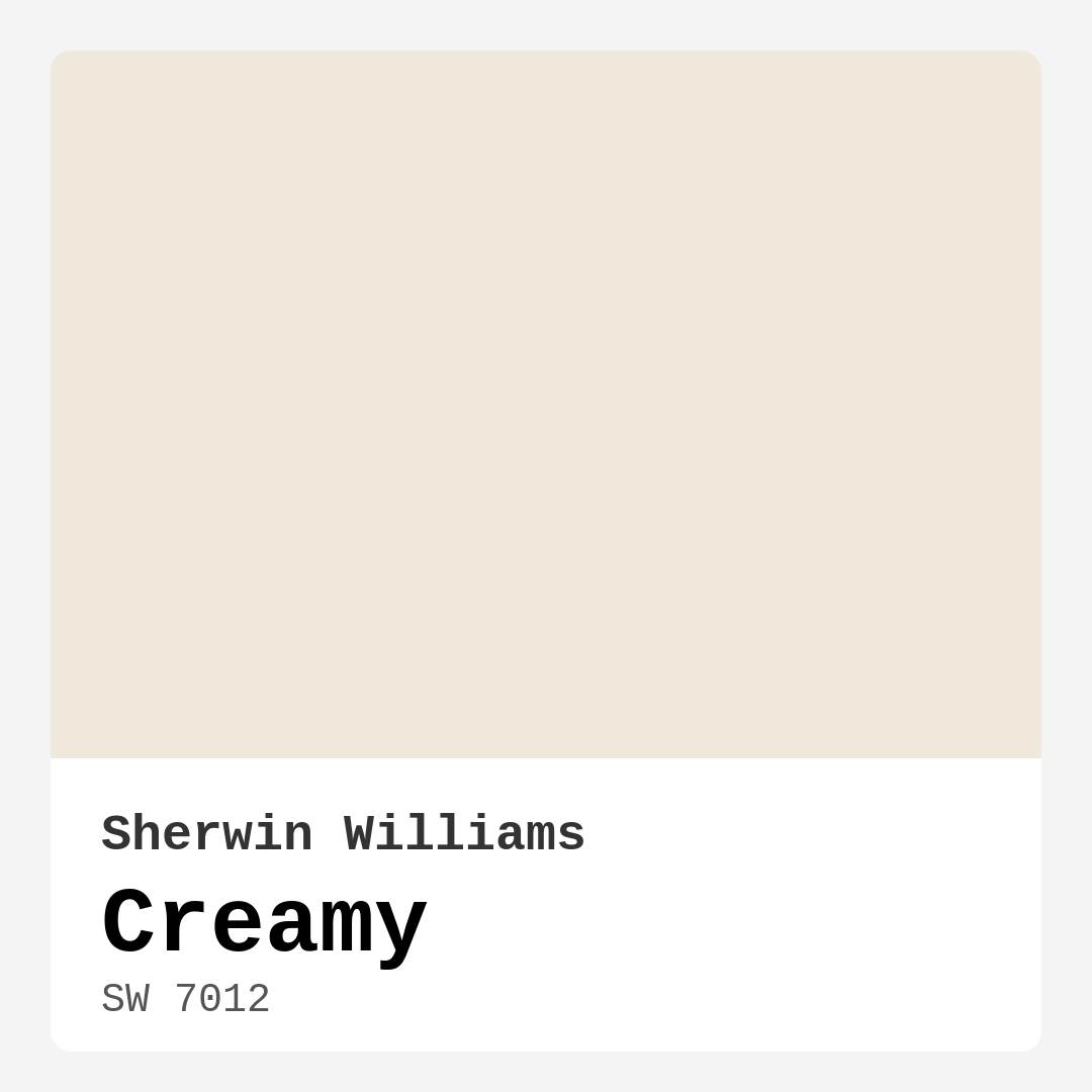
Color Preview & Key Details
| HEX Code | #EFE8DB |
| RGB | 239, 232, 219 |
| LRV | 75% |
| Undertone | Red |
| Finish Options | Eggshell, Flat, Satin |
Imagine walking into a room that envelops you in warmth and comfort, a space where the colors create a soothing backdrop for your daily life. One such color that brings this dream to life is Sherwin Williams’ Creamy (SW 7012). This delightful hue has a way of transforming a room, making it feel both inviting and elegant. As an expert in home design, I can confidently say that Creamy is a fantastic choice for anyone looking to enhance their space with a touch of sophistication and comfort.
Creamy embodies a soft, warm beige that leans towards the red undertone, giving it a unique depth that can elevate any interior. With a Light Reflectance Value (LRV) of 75%, this color reflects a high amount of light, making it perfect for brightening up a space. Whether you’re working on a cozy bedroom, a lively kitchen, or an elegant dining room, Creamy adapts beautifully to different lighting conditions, allowing it to shine in both natural and artificial light.
One of the best features of Creamy is its versatility. This warm neutral pairs effortlessly with various decor styles, from modern farmhouse to traditional, minimalist, and contemporary designs. Picture it as a backdrop to your favorite art pieces, or how it can enhance the textures of rustic wood and soft fabrics. It’s a color that won’t overpower your space but will instead complement your personal style.
Let’s talk about application. If you’re a DIY enthusiast or a beginner painter, Creamy is a dream to work with. It’s beginner-friendly, fast-drying, and low splatter, which means you can tackle your painting project without the fear of a messy cleanup. Most homeowners report that it provides good coverage with just one or two coats, making your painting journey a lot smoother and quicker. Plus, its washability means that you can wipe away the occasional smudge without losing that beautiful finish.
However, like any paint color, Creamy does have its considerations. In high-traffic areas, you might find that it requires a few touch-ups over time. While it’s certainly durable, keep an eye on wear and tear, especially in hallways or family rooms. Opting for a satin finish can enhance its durability, making it a great option for spaces that see a lot of movement.
When it comes to pairing Creamy with other colors, the options are virtually endless. For a classic look, try pairing it with crisp white tones like White Dove or Simply White for your trim. This combination creates a fresh, clean aesthetic that feels timeless. If you’re looking to add a bit of drama, consider deep blues or rich greens that can create a stunning contrast against the warmth of Creamy. Light wood tones and brass fixtures also beautifully enhance its inviting nature, adding a layer of elegance to your space.
To really understand how Creamy works within your home, I highly recommend testing it out in your space. Observe how the undertones interact with your existing furniture and decor. This is where the magic happens. The red undertone can shift in different lighting, revealing its complex character throughout the day. Under natural light, Creamy delivers a soft glow that brightens the room, while artificial lighting can lend it a cozier feel, perfect for those warm evenings spent with friends or family.
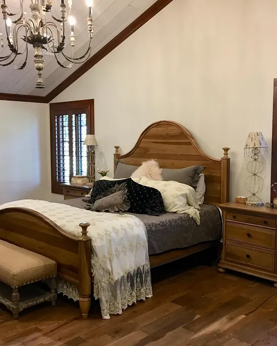
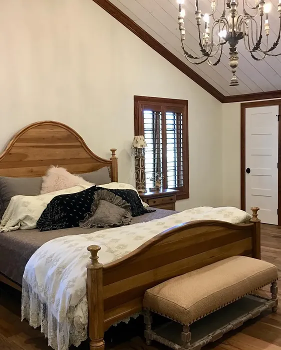
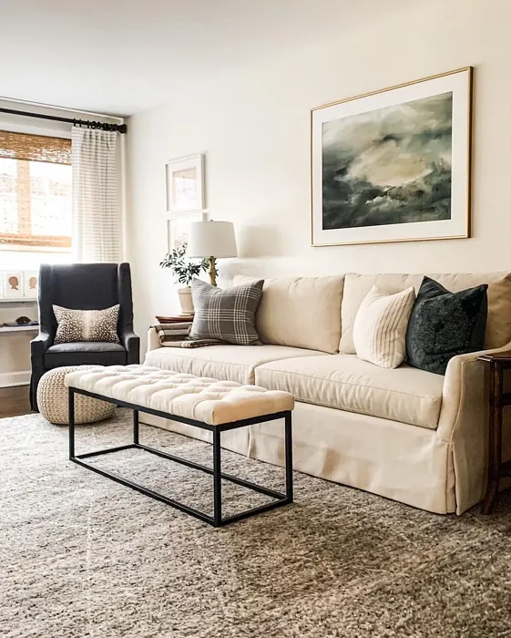
In terms of mood, Creamy excels at creating a cozy, inviting atmosphere. It’s a color that welcomes you home and encourages relaxation. Whether you choose to paint an entire room or use it as an accent wall, it provides a calming backdrop that allows other colors and textures to pop. Imagine a living room painted in Creamy, adorned with plush textiles and vibrant art; the result is a space where you can unwind and feel at ease.
For those of you considering rentals or temporary spaces, Creamy is a classic choice that appeals to a wide audience. It’s a color that not only enhances your space but also has universal appeal, making it a fantastic option if you’re thinking about resale value down the line.
Let’s not forget about the practical side of things. Creamy is low in VOCs, which means it’s a healthier choice for your indoor environment. Plus, with its quick-drying capabilities, you can refresh your space without the long wait times that come with more complex paint jobs.
As you consider your options, remember that Creamy works wonderfully as a trim color as well. Pair it with darker shades for a striking contrast, or keep it light and airy for a seamless flow throughout your home. If you’re looking for complementary colors, options like SW 9640, SW 6540, and SW 6543 can create beautiful palettes that play nicely with Creamy.
In summary, Sherwin Williams’ Creamy (SW 7012) is more than just a paint color; it’s an invitation to create a home that feels warm, welcoming, and full of personal style. Whether you’re a seasoned designer or a first-time homeowner looking to refresh your space, this color is a fantastic choice that offers both beauty and practicality. So grab that paintbrush, roll up your sleeves, and let Creamy transform your home into a cozy oasis that you and your loved ones will cherish for years to come.
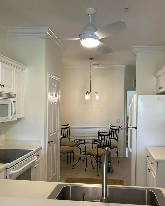
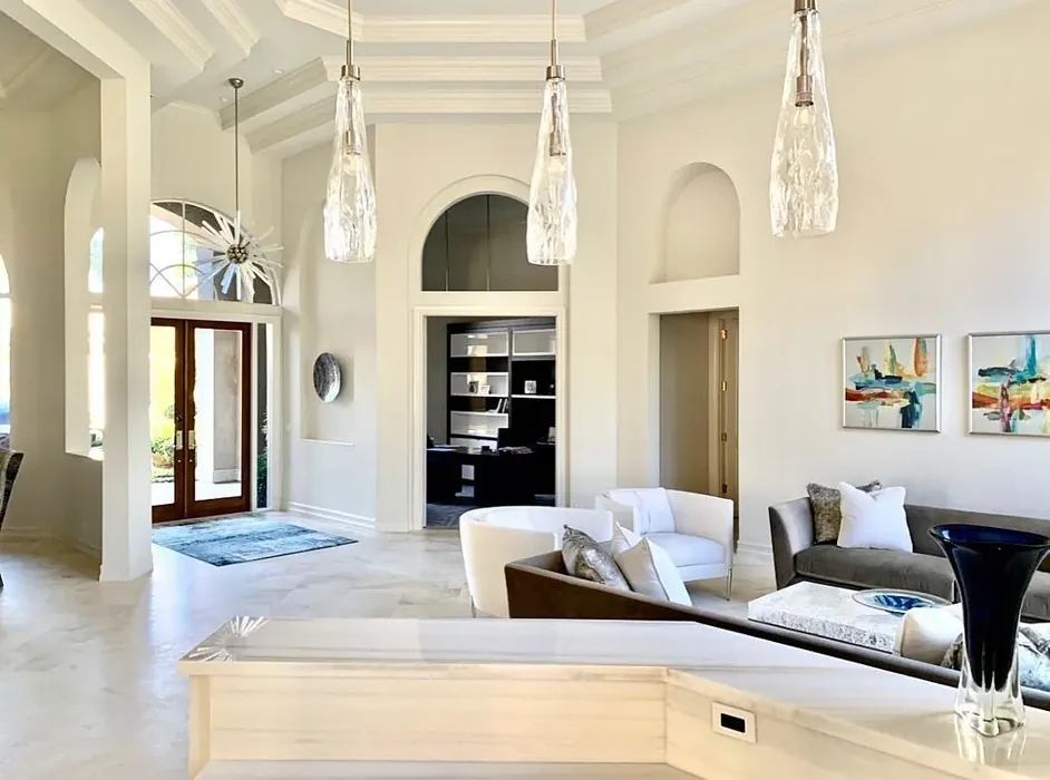
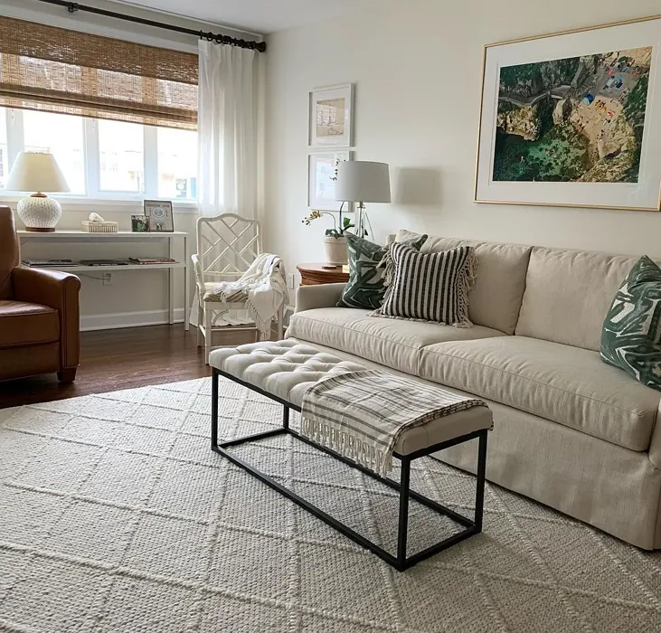
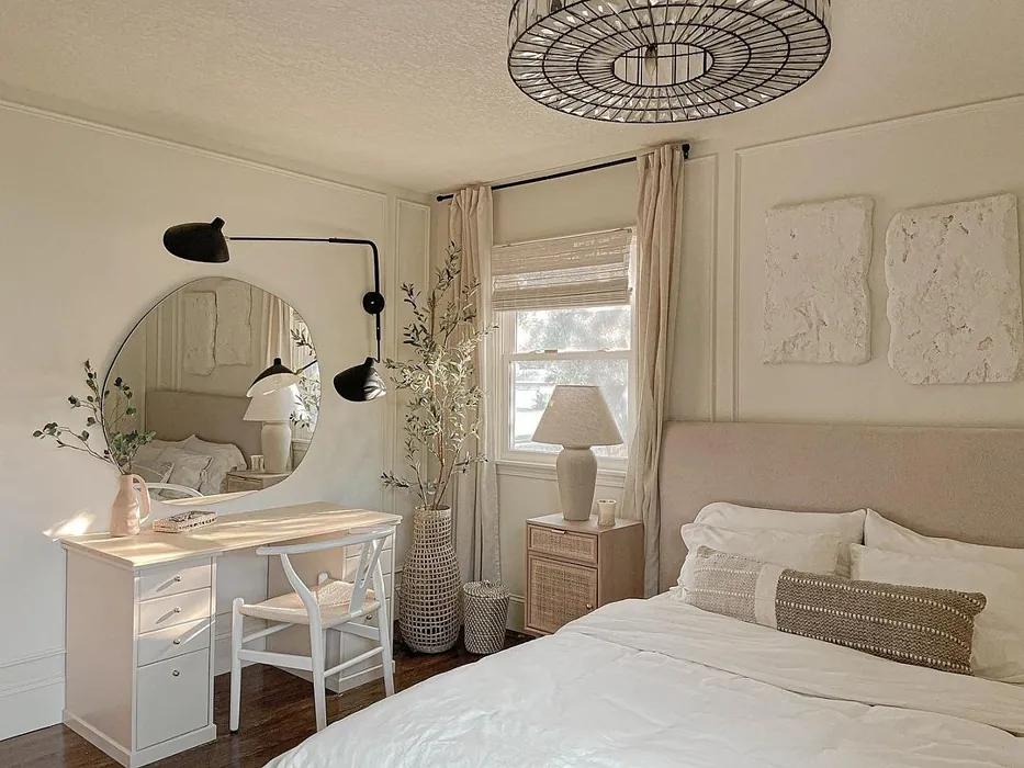
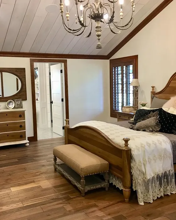
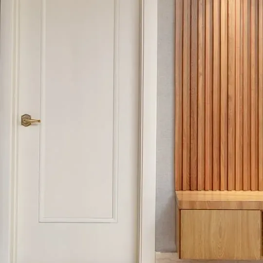
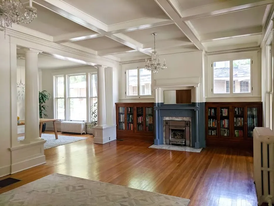
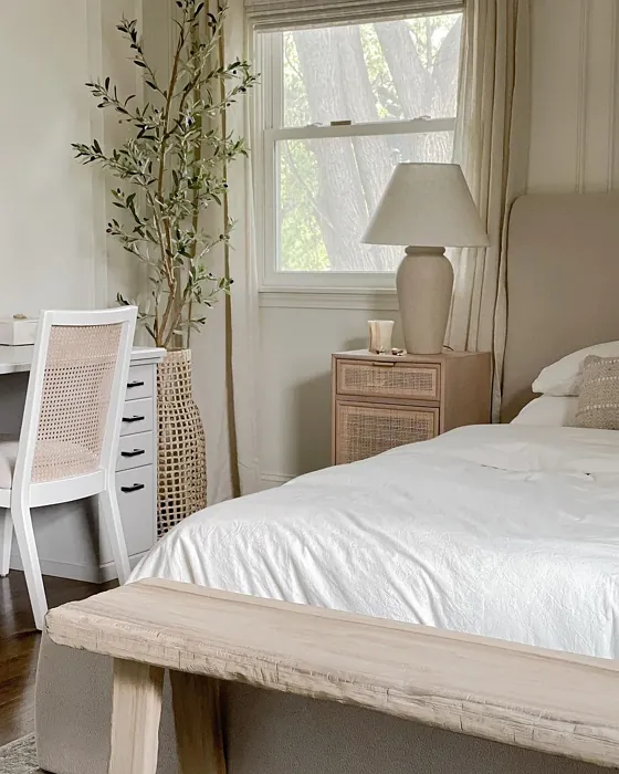
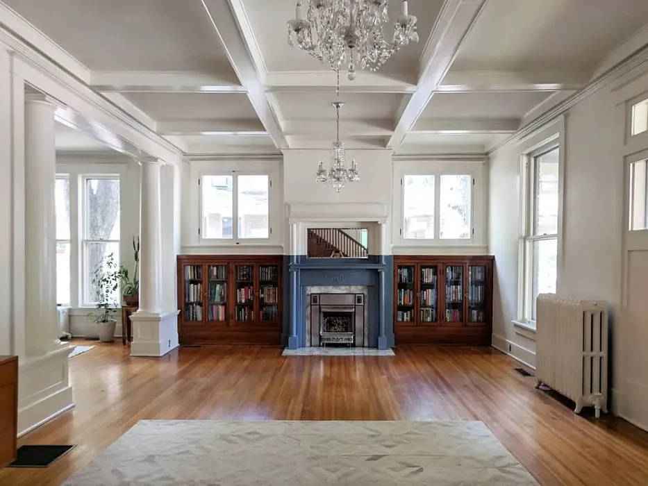
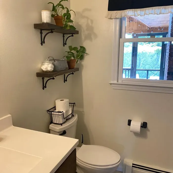
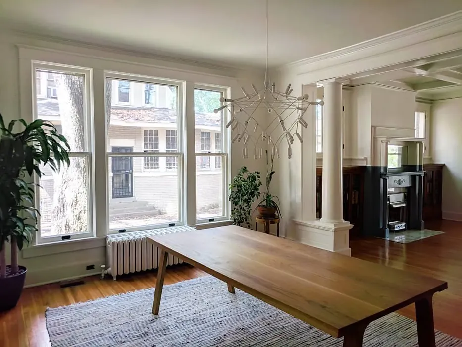
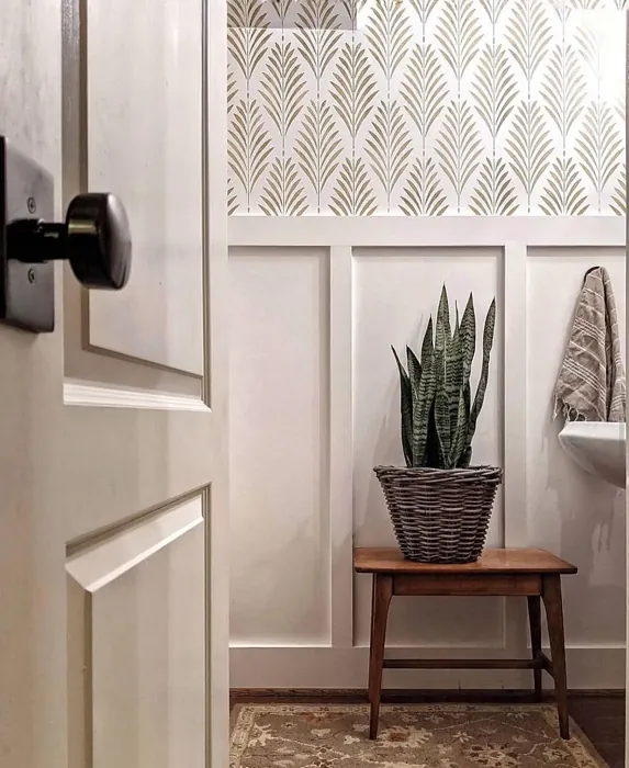
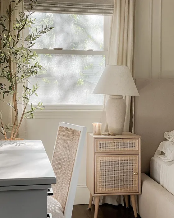
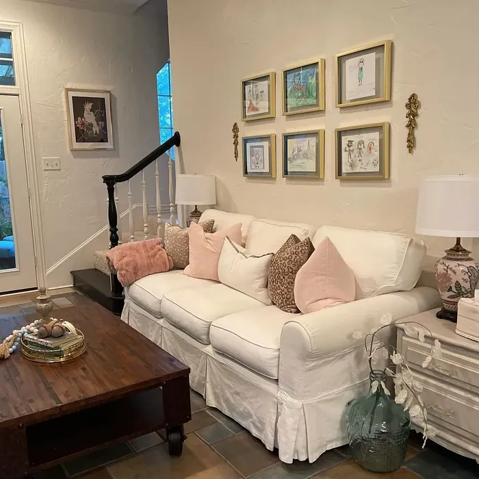
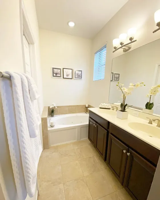
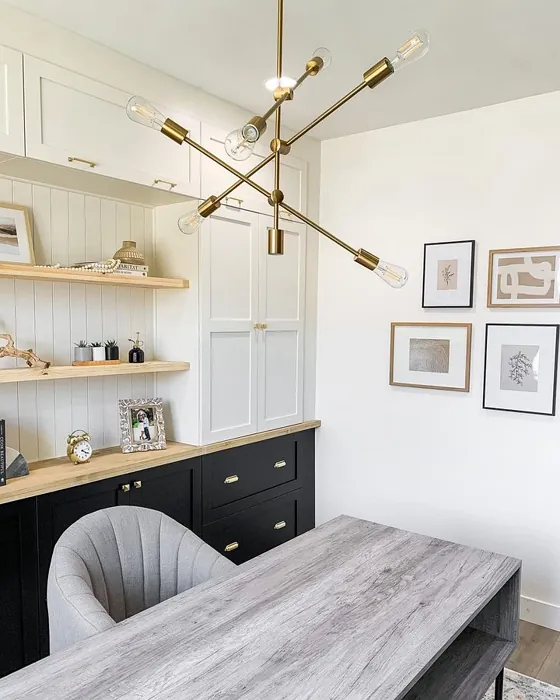
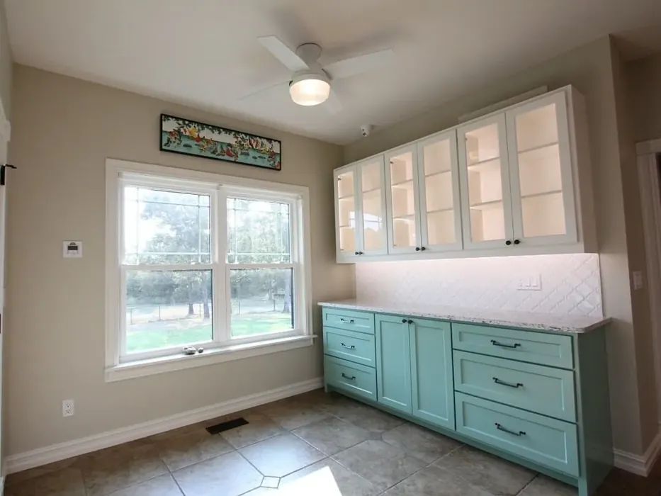
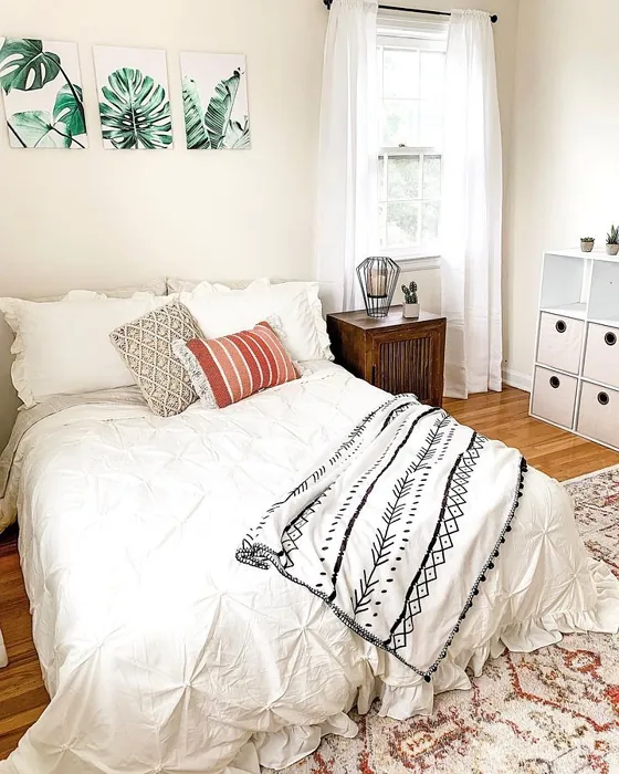
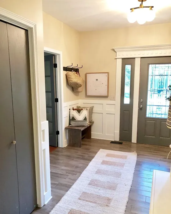
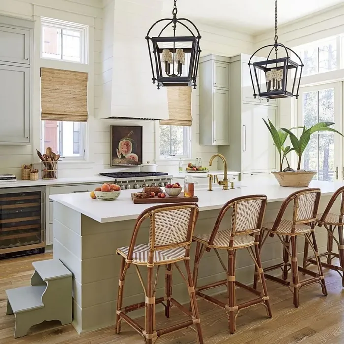
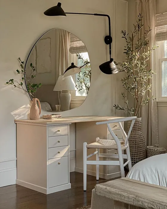
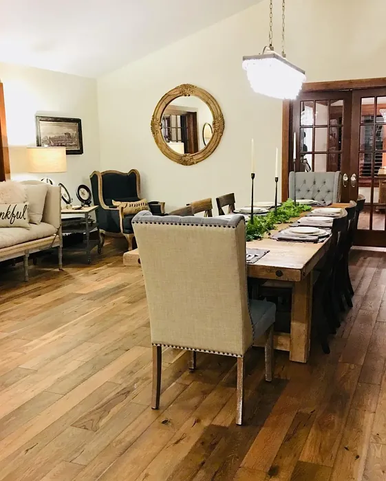
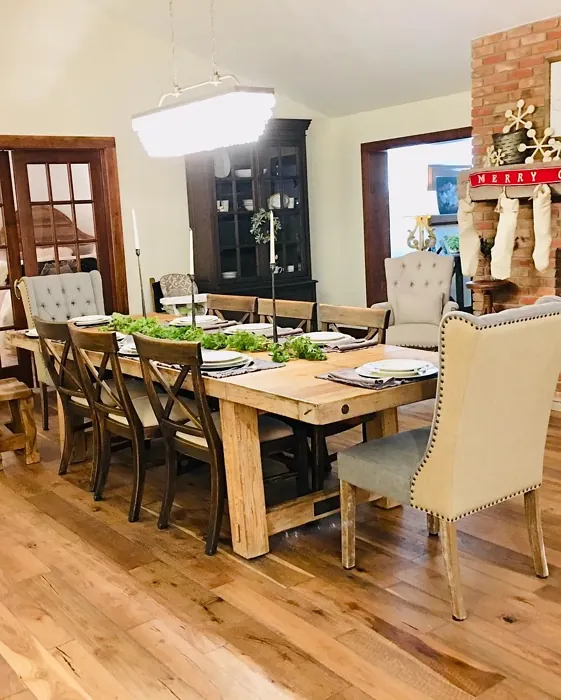
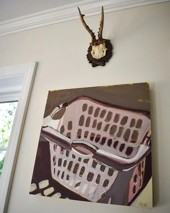
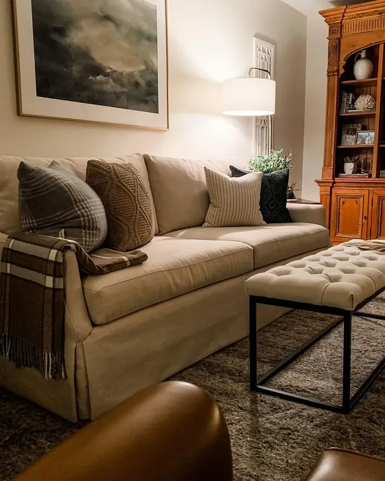
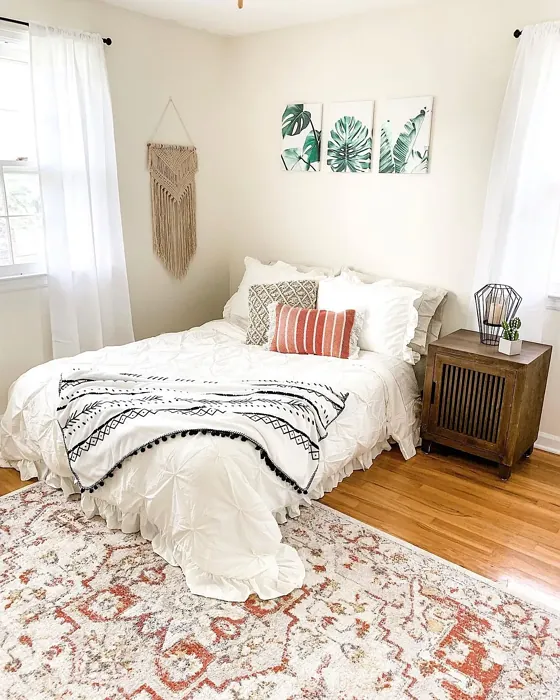
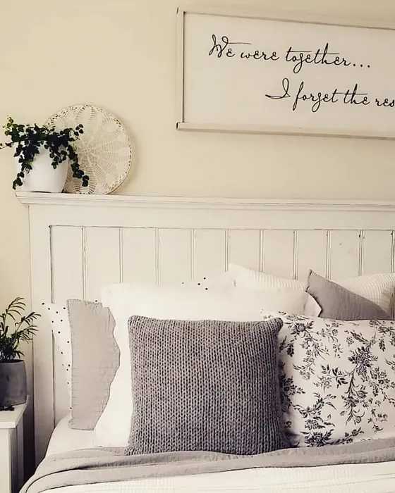
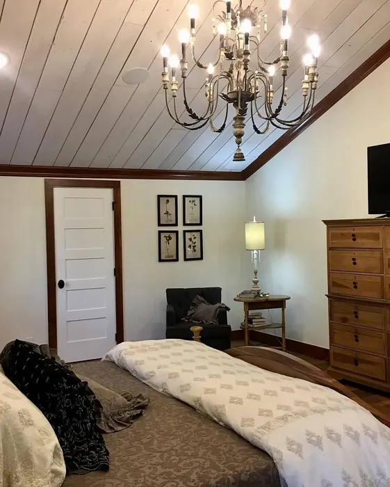
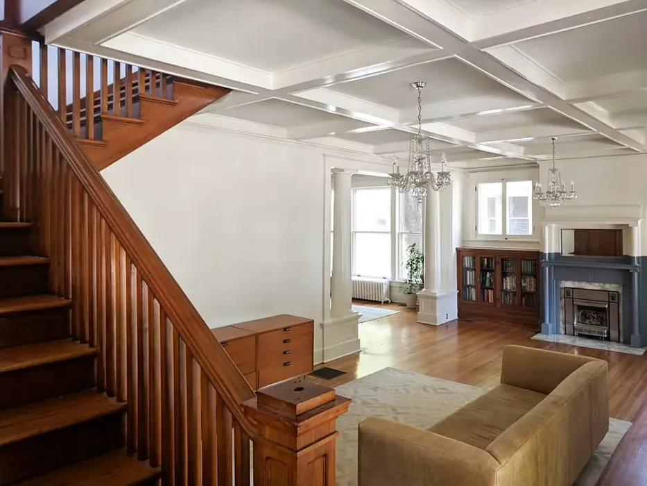
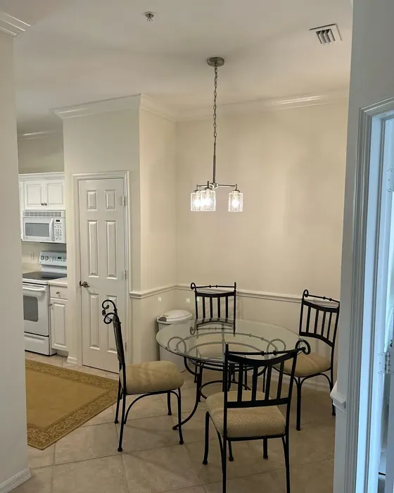
Real Room Photo of Creamy SW 7012


Undertones of Creamy ?
The undertones of Creamy are a key aspect of its character, leaning towards Red. These subtle underlying hues are what give the color its depth and complexity. For example, a gray with a blue undertone will feel cooler and more modern, while one with a brown undertone will feel warmer and more traditional. It’s essential to test this paint in your home and observe it next to your existing furniture, flooring, and decor to see how these undertones interact and reveal themselves throughout the day.
HEX value: #EFE8DB
RGB code: 239, 232, 219
Is Creamy Cool or Warm?
Creamy is predominantly warm, making it a fantastic choice for spaces where you want to create a sense of comfort and approachability. Its warmth can brighten up a room, especially in areas with natural light, making it feel more inviting.
Understanding Color Properties and Interior Design Tips
Hue refers to a specific position on the color wheel, measured in degrees from 0 to 360. Each degree represents a different pure color:
- 0° represents red
- 120° represents green
- 240° represents blue
Saturation describes the intensity or purity of a color and is expressed as a percentage:
- At 0%, the color appears completely desaturated—essentially a shade of gray
- At 100%, the color is at its most vivid and vibrant
Lightness indicates how light or dark a color is, also expressed as a percentage:
- 0% lightness results in black
- 100% lightness results in white
Using Warm Colors in Interior Design
Warm hues—such as reds, oranges, yellows, warm beiges, and greiges—are excellent choices for creating inviting and energetic spaces. These colors are particularly well-suited for:
- Kitchens, living rooms, and bathrooms, where warmth enhances comfort and sociability
- Large rooms, where warm tones can help reduce the sense of emptiness and make the space feel more intimate
For example:
- Warm beige shades provide a cozy, inviting atmosphere, ideal for living rooms, bedrooms, and hallways.
- Warm greige (a mix of beige and gray) offers the warmth of beige with the modern appeal of gray, making it a versatile backdrop for dining areas, bedrooms, and living spaces.
However, be mindful when using warm light tones in rooms with limited natural light. These shades may appear muted or even take on an unpleasant yellowish tint. To avoid a dull or flat appearance:
- Add depth by incorporating richer tones like deep greens, charcoal, or chocolate brown
- Use textured elements such as curtains, rugs, or cushions to bring dimension to the space
Pro Tip: Achieving Harmony with Warm and Cool Color Balance
To create a well-balanced and visually interesting interior, mix warm and cool tones strategically. This contrast adds depth and harmony to your design.
- If your walls feature warm hues, introduce cool-colored accents such as blue or green furniture, artwork, or accessories to create contrast.
- For a polished look, consider using a complementary color scheme, which pairs colors opposite each other on the color wheel (e.g., red with green, orange with blue).
This thoughtful mix not only enhances visual appeal but also creates a space that feels both dynamic and cohesive.
Light Temperature Affects on Creamy
Natural Light
Natural daylight changes in color temperature as the sun moves across the sky. At sunrise and sunset, the light tends to have a warm, golden tone with a color temperature around 2000 Kelvin (K). As the day progresses and the sun rises higher, the light becomes cooler and more neutral. Around midday, especially when the sky is clear, natural light typically reaches its peak brightness and shifts to a cooler tone, ranging from 5500 to 6500 Kelvin. This midday light is close to what we perceive as pure white or daylight-balanced light.
These shifts in natural light can significantly influence how colors appear in a space, which is why designers often consider both the time of day and the orientation of windows when planning interior color schemes.
Artificial Light
When choosing artificial lighting, pay close attention to the color temperature, measured in Kelvin (K). This determines how warm or cool the light will appear. Lower temperatures, around 2700K, give off a warm, yellow glow often used in living rooms or bedrooms. Higher temperatures, above 5000K, create a cool, bluish light similar to daylight, commonly used in kitchens, offices, or task areas.
Use the slider to see how lighting temperature can affect the appearance of a surface or color throughout a space.


4800K
LRV of Creamy
The Light Reflectance Value (LRV) of Creamy is 75%, which places it in the Light category. This means it Reflects a high amount of light. Understanding a paint’s LRV is crucial for predicting how it will look in your space. A higher LRV indicates a lighter color that reflects more light, making rooms feel larger and brighter. A lower LRV signifies a darker color that absorbs more light, creating a cozier, more intimate atmosphere. Always consider the natural and artificial lighting in your room when selecting a paint color based on its LRV.
Detailed Review of Creamy
Additional Paint Characteristics
Ideal Rooms
Bedroom, Dining Room, Hallway, Home Office, Kitchen, Living Room
Decor Styles
Contemporary, Minimalist, Modern Farmhouse, Rustic, Traditional
Coverage
Good (1–2 Coats), Touch-Up Friendly
Ease of Application
Beginner Friendly, Fast-Drying, Low Splatter
Washability
Washable, Wipeable
VOC Level
Low VOC
Best Use
Accent Wall, Furniture, Interior Walls, Trim
Room Suitability
Bedroom, Dining Room, Hallway, Kitchen, Living Room
Tone Tag
Creamy, Neutral, Warm
Finish Type
Eggshell, Satin
Paint Performance
High Coverage, Low Odor, Quick Drying
Use Cases
Best for Modern Farmhouse, Best for Rentals, Classic Favorite
Mood
Cozy, Inviting, Restful
Trim Pairing
Complements Brass Fixtures, Good with Wood Trim, Pairs with White Dove
Creamy is a delightful choice for those looking to evoke warmth and tranquility in their homes. Its light, airy quality softens edges and provides a gentle contrast against darker furnishings or decor. Whether you’re painting an accent wall or an entire room, Creamy offers good coverage and maintains its charm across different lighting conditions. It pairs beautifully with both bold colors and more muted tones, making it a versatile option for any design enthusiast. Users have reported that it dries quickly and has a lovely finish that doesn’t require multiple coats, making it a practical choice for DIYers and professional painters alike. Overall, Creamy delivers a soothing ambiance that is perfect for creating a relaxing space.
Pros & Cons of SW 7012 Creamy
Pros
Cons
Colors that go with Sherwin Williams Creamy
FAQ on SW 7012 Creamy
Can Creamy be used in high-traffic areas?
Yes, Creamy can be used in high-traffic areas, but it may require touch-ups over time. While its washability helps in maintaining a clean look, it’s still advisable to keep an eye on wear and tear, especially in spaces like hallways or family rooms. If you’re concerned about scuff marks, consider using a satin finish for added durability.
What colors pair well with Creamy?
Creamy pairs wonderfully with a variety of colors. For a classic look, consider whites like White Dove or Simply White for trim. For a bolder contrast, deep blues or greens can create a stunning effect. Light wood tones and brass fixtures also complement Creamy beautifully, enhancing its warm undertones and overall appeal.
Comparisons Creamy with other colors
Creamy SW 7012 vs Natural Linen SW 9109
| Attribute | Creamy SW 7012 | Natural Linen SW 9109 |
|---|---|---|
| Color Name | Creamy SW 7012 | Natural Linen SW 9109 |
| Color | ||
| Hue | Beige | Beige |
| Brightness | Light | Light |
| RGB | 239, 232, 219 | 223, 211, 195 |
| LRV | 75% | 74% |
| Finish Type | Eggshell, Satin | Eggshell, Matte, Satin |
| Finish Options | Eggshell, Flat, Satin | Eggshell, Matte, Satin |
| Ideal Rooms | Bedroom, Dining Room, Hallway, Home Office, Kitchen, Living Room | Bedroom, Dining Room, Hallway, Home Office, Kitchen, Living Room |
| Decor Styles | Contemporary, Minimalist, Modern Farmhouse, Rustic, Traditional | Bohemian, Modern Farmhouse, Scandinavian, Transitional |
| Coverage | Good (1–2 Coats), Touch-Up Friendly | Good (1–2 Coats), Touch-Up Friendly |
| Ease of Application | Beginner Friendly, Fast-Drying, Low Splatter | Beginner Friendly, Brush Smooth, Fast-Drying, Roller-Ready |
| Washability | Washable, Wipeable | Highly Washable, Washable, Wipeable |
| Room Suitability | Bedroom, Dining Room, Hallway, Kitchen, Living Room | Bedroom, Dining Room, Home Office, Kitchen, Living Room |
| Tone | Creamy, Neutral, Warm | Earthy, Neutral, Warm |
| Paint Performance | High Coverage, Low Odor, Quick Drying | Easy Touch-Up, Low Odor, Quick Drying, Scuff Resistant |
Creamy SW 7012 vs Alabaster SW 7008
| Attribute | Creamy SW 7012 | Alabaster SW 7008 |
|---|---|---|
| Color Name | Creamy SW 7012 | Alabaster SW 7008 |
| Color | ||
| Hue | Beige | Beige |
| Brightness | Light | Light |
| RGB | 239, 232, 219 | 237, 234, 224 |
| LRV | 75% | 82% |
| Finish Type | Eggshell, Satin | Eggshell, Matte, Satin |
| Finish Options | Eggshell, Flat, Satin | Eggshell, Matte, Satin |
| Ideal Rooms | Bedroom, Dining Room, Hallway, Home Office, Kitchen, Living Room | Bathroom, Bedroom, Dining Room, Entryway, Home Office, Kitchen, Living Room, Nursery |
| Decor Styles | Contemporary, Minimalist, Modern Farmhouse, Rustic, Traditional | Coastal, Contemporary, Minimalist, Modern Farmhouse, Traditional, Transitional |
| Coverage | Good (1–2 Coats), Touch-Up Friendly | Good (1–2 Coats), Touch-Up Friendly |
| Ease of Application | Beginner Friendly, Fast-Drying, Low Splatter | Beginner Friendly, Brush Smooth, Fast-Drying, Low Splatter, Roller-Ready |
| Washability | Washable, Wipeable | Washable, Wipeable |
| Room Suitability | Bedroom, Dining Room, Hallway, Kitchen, Living Room | Bathroom, Bedroom, Dining Room, Hallway, Home Office, Kitchen, Living Room, Nursery |
| Tone | Creamy, Neutral, Warm | Creamy, Neutral, Warm |
| Paint Performance | High Coverage, Low Odor, Quick Drying | Easy Touch-Up, High Coverage, Low Odor, Quick Drying |
Creamy SW 7012 vs White Duck SW 7010
| Attribute | Creamy SW 7012 | White Duck SW 7010 |
|---|---|---|
| Color Name | Creamy SW 7012 | White Duck SW 7010 |
| Color | ||
| Hue | Beige | Beige |
| Brightness | Light | Light |
| RGB | 239, 232, 219 | 229, 223, 210 |
| LRV | 75% | 75% |
| Finish Type | Eggshell, Satin | Eggshell, Matte, Satin |
| Finish Options | Eggshell, Flat, Satin | Eggshell, Matte, Satin |
| Ideal Rooms | Bedroom, Dining Room, Hallway, Home Office, Kitchen, Living Room | Bedroom, Dining Room, Home Office, Kitchen, Living Room, Nursery |
| Decor Styles | Contemporary, Minimalist, Modern Farmhouse, Rustic, Traditional | Farmhouse, Modern, Scandinavian, Traditional, Transitional |
| Coverage | Good (1–2 Coats), Touch-Up Friendly | Good (1–2 Coats), Touch-Up Friendly |
| Ease of Application | Beginner Friendly, Fast-Drying, Low Splatter | Beginner Friendly, Brush Smooth, Fast-Drying, Roller-Ready |
| Washability | Washable, Wipeable | Highly Washable, Washable |
| Room Suitability | Bedroom, Dining Room, Hallway, Kitchen, Living Room | Bedroom, Dining Room, Home Office, Kitchen, Living Room |
| Tone | Creamy, Neutral, Warm | Creamy, Neutral, Warm |
| Paint Performance | High Coverage, Low Odor, Quick Drying | Easy Touch-Up, Fade Resistant, Low Odor, Quick Drying |
Creamy SW 7012 vs Greek Villa SW 7551
| Attribute | Creamy SW 7012 | Greek Villa SW 7551 |
|---|---|---|
| Color Name | Creamy SW 7012 | Greek Villa SW 7551 |
| Color | ||
| Hue | Beige | Beige |
| Brightness | Light | Light |
| RGB | 239, 232, 219 | 240, 236, 226 |
| LRV | 75% | 82% |
| Finish Type | Eggshell, Satin | Eggshell, Satin |
| Finish Options | Eggshell, Flat, Satin | Eggshell, Flat, Satin |
| Ideal Rooms | Bedroom, Dining Room, Hallway, Home Office, Kitchen, Living Room | Bedroom, Dining Room, Hallway, Home Office, Kitchen, Living Room |
| Decor Styles | Contemporary, Minimalist, Modern Farmhouse, Rustic, Traditional | Coastal, Minimalist, Modern Farmhouse, Traditional, Transitional |
| Coverage | Good (1–2 Coats), Touch-Up Friendly | Good (1–2 Coats), Touch-Up Friendly |
| Ease of Application | Beginner Friendly, Fast-Drying, Low Splatter | Beginner Friendly, Brush Smooth, Roller-Ready |
| Washability | Washable, Wipeable | Washable, Wipeable |
| Room Suitability | Bedroom, Dining Room, Hallway, Kitchen, Living Room | Bedroom, Dining Room, Hallway, Kitchen, Living Room |
| Tone | Creamy, Neutral, Warm | Creamy, Neutral, Warm |
| Paint Performance | High Coverage, Low Odor, Quick Drying | Easy Touch-Up, High Coverage, Low Odor, Quick Drying |
Creamy SW 7012 vs City Loft SW 7631
| Attribute | Creamy SW 7012 | City Loft SW 7631 |
|---|---|---|
| Color Name | Creamy SW 7012 | City Loft SW 7631 |
| Color | ||
| Hue | Beige | Beige |
| Brightness | Light | Light |
| RGB | 239, 232, 219 | 223, 218, 209 |
| LRV | 75% | 66% |
| Finish Type | Eggshell, Satin | Eggshell, Matte, Satin |
| Finish Options | Eggshell, Flat, Satin | Eggshell, Matte, Satin |
| Ideal Rooms | Bedroom, Dining Room, Hallway, Home Office, Kitchen, Living Room | Bedroom, Hallway, Home Office, Kitchen, Living Room |
| Decor Styles | Contemporary, Minimalist, Modern Farmhouse, Rustic, Traditional | Minimalist, Modern, Scandinavian, Transitional |
| Coverage | Good (1–2 Coats), Touch-Up Friendly | Good (1–2 Coats), Touch-Up Friendly |
| Ease of Application | Beginner Friendly, Fast-Drying, Low Splatter | Beginner Friendly, Brush Smooth, Fast-Drying, Low Splatter, Roller-Ready |
| Washability | Washable, Wipeable | Highly Washable, Washable |
| Room Suitability | Bedroom, Dining Room, Hallway, Kitchen, Living Room | Bedroom, Hallway, Home Office, Living Room |
| Tone | Creamy, Neutral, Warm | Balanced, Muted, Neutral, Warm |
| Paint Performance | High Coverage, Low Odor, Quick Drying | Easy Touch-Up, High Coverage, Low Odor, Quick Drying, Scuff Resistant |
Creamy SW 7012 vs Shoji White SW 7042
| Attribute | Creamy SW 7012 | Shoji White SW 7042 |
|---|---|---|
| Color Name | Creamy SW 7012 | Shoji White SW 7042 |
| Color | ||
| Hue | Beige | Beige |
| Brightness | Light | Light |
| RGB | 239, 232, 219 | 230, 223, 211 |
| LRV | 75% | 74% |
| Finish Type | Eggshell, Satin | Eggshell, Matte, Satin |
| Finish Options | Eggshell, Flat, Satin | Eggshell, Matte, Satin |
| Ideal Rooms | Bedroom, Dining Room, Hallway, Home Office, Kitchen, Living Room | Bedroom, Dining Room, Home Office, Living Room, Nursery |
| Decor Styles | Contemporary, Minimalist, Modern Farmhouse, Rustic, Traditional | Farmhouse, Japanese, Minimalist, Modern, Transitional |
| Coverage | Good (1–2 Coats), Touch-Up Friendly | Good (1–2 Coats), Touch-Up Friendly |
| Ease of Application | Beginner Friendly, Fast-Drying, Low Splatter | Beginner Friendly, Brush Smooth, Roller-Ready |
| Washability | Washable, Wipeable | Washable, Wipeable |
| Room Suitability | Bedroom, Dining Room, Hallway, Kitchen, Living Room | Bedroom, Dining Room, Home Office, Living Room, Nursery |
| Tone | Creamy, Neutral, Warm | Creamy, Neutral, Warm |
| Paint Performance | High Coverage, Low Odor, Quick Drying | Easy Touch-Up, High Coverage, Low Odor |
Creamy SW 7012 vs Neutral Ground SW 7568
| Attribute | Creamy SW 7012 | Neutral Ground SW 7568 |
|---|---|---|
| Color Name | Creamy SW 7012 | Neutral Ground SW 7568 |
| Color | ||
| Hue | Beige | Beige |
| Brightness | Light | Light |
| RGB | 239, 232, 219 | 226, 218, 202 |
| LRV | 75% | 40% |
| Finish Type | Eggshell, Satin | Eggshell, Matte, Satin |
| Finish Options | Eggshell, Flat, Satin | Eggshell, Matte, Satin |
| Ideal Rooms | Bedroom, Dining Room, Hallway, Home Office, Kitchen, Living Room | Bedroom, Dining Room, Hallway, Home Office, Kitchen, Living Room |
| Decor Styles | Contemporary, Minimalist, Modern Farmhouse, Rustic, Traditional | Farmhouse, Modern, Scandinavian, Traditional, Transitional |
| Coverage | Good (1–2 Coats), Touch-Up Friendly | Good (1–2 Coats) |
| Ease of Application | Beginner Friendly, Fast-Drying, Low Splatter | Beginner Friendly, Brush Smooth, Roller-Ready |
| Washability | Washable, Wipeable | Highly Washable, Washable |
| Room Suitability | Bedroom, Dining Room, Hallway, Kitchen, Living Room | Bedroom, Dining Room, Home Office, Kitchen, Living Room |
| Tone | Creamy, Neutral, Warm | Earthy, Neutral, Warm |
| Paint Performance | High Coverage, Low Odor, Quick Drying | Easy Touch-Up, Low Odor, Quick Drying, Scuff Resistant |
Creamy SW 7012 vs Limewash SW 9589
| Attribute | Creamy SW 7012 | Limewash SW 9589 |
|---|---|---|
| Color Name | Creamy SW 7012 | Limewash SW 9589 |
| Color | ||
| Hue | Beige | Beige |
| Brightness | Light | Light |
| RGB | 239, 232, 219 | 219, 213, 203 |
| LRV | 75% | 75% |
| Finish Type | Eggshell, Satin | Flat, Matte |
| Finish Options | Eggshell, Flat, Satin | Flat, Matte |
| Ideal Rooms | Bedroom, Dining Room, Hallway, Home Office, Kitchen, Living Room | Bedroom, Dining Room, Hallway, Kitchen, Living Room |
| Decor Styles | Contemporary, Minimalist, Modern Farmhouse, Rustic, Traditional | Bohemian, Contemporary, Modern Farmhouse, Rustic |
| Coverage | Good (1–2 Coats), Touch-Up Friendly | Good (1–2 Coats), Touch-Up Friendly |
| Ease of Application | Beginner Friendly, Fast-Drying, Low Splatter | Beginner Friendly, Brush Smooth, Roller-Ready, Thin Formula |
| Washability | Washable, Wipeable | Washable, Wipeable |
| Room Suitability | Bedroom, Dining Room, Hallway, Kitchen, Living Room | Bathroom, Bedroom, Dining Room, Kitchen, Living Room |
| Tone | Creamy, Neutral, Warm | Earthy, Muted, Warm |
| Paint Performance | High Coverage, Low Odor, Quick Drying | Easy Touch-Up, Long Lasting, Low Odor |
Creamy SW 7012 vs White Sesame SW 9586
| Attribute | Creamy SW 7012 | White Sesame SW 9586 |
|---|---|---|
| Color Name | Creamy SW 7012 | White Sesame SW 9586 |
| Color | ||
| Hue | Beige | Beige |
| Brightness | Light | Light |
| RGB | 239, 232, 219 | 227, 219, 205 |
| LRV | 75% | 75% |
| Finish Type | Eggshell, Satin | Eggshell, Matte, Satin |
| Finish Options | Eggshell, Flat, Satin | Eggshell, Matte, Satin |
| Ideal Rooms | Bedroom, Dining Room, Hallway, Home Office, Kitchen, Living Room | Bedroom, Home Office, Kitchen, Living Room, Nursery |
| Decor Styles | Contemporary, Minimalist, Modern Farmhouse, Rustic, Traditional | Minimalist, Modern Farmhouse, Rustic, Scandinavian, Transitional |
| Coverage | Good (1–2 Coats), Touch-Up Friendly | Good (1–2 Coats), Touch-Up Friendly |
| Ease of Application | Beginner Friendly, Fast-Drying, Low Splatter | Beginner Friendly, Brush Smooth, Roller-Ready |
| Washability | Washable, Wipeable | Highly Washable, Washable |
| Room Suitability | Bedroom, Dining Room, Hallway, Kitchen, Living Room | Bedroom, Dining Room, Home Office, Living Room, Nursery |
| Tone | Creamy, Neutral, Warm | Creamy, Earthy, Neutral, Warm |
| Paint Performance | High Coverage, Low Odor, Quick Drying | Easy Touch-Up, High Coverage, Low Odor, Quick Drying |
Creamy SW 7012 vs Natural Tan SW 7567
| Attribute | Creamy SW 7012 | Natural Tan SW 7567 |
|---|---|---|
| Color Name | Creamy SW 7012 | Natural Tan SW 7567 |
| Color | ||
| Hue | Beige | Beige |
| Brightness | Light | Light |
| RGB | 239, 232, 219 | 220, 210, 195 |
| LRV | 75% | 45% |
| Finish Type | Eggshell, Satin | Eggshell, Satin |
| Finish Options | Eggshell, Flat, Satin | Eggshell, Flat, Matte, Satin |
| Ideal Rooms | Bedroom, Dining Room, Hallway, Home Office, Kitchen, Living Room | Bedroom, Dining Room, Home Office, Kitchen, Living Room |
| Decor Styles | Contemporary, Minimalist, Modern Farmhouse, Rustic, Traditional | Bohemian, Contemporary, Minimalist, Modern Farmhouse, Rustic |
| Coverage | Good (1–2 Coats), Touch-Up Friendly | Good (1–2 Coats), Touch-Up Friendly |
| Ease of Application | Beginner Friendly, Fast-Drying, Low Splatter | Beginner Friendly, Brush Smooth, Roller-Ready |
| Washability | Washable, Wipeable | Highly Washable, Washable, Wipeable |
| Room Suitability | Bedroom, Dining Room, Hallway, Kitchen, Living Room | Bedroom, Dining Room, Home Office, Kitchen, Living Room |
| Tone | Creamy, Neutral, Warm | Earthy, Neutral, Warm |
| Paint Performance | High Coverage, Low Odor, Quick Drying | Easy Touch-Up, Low Odor, Scuff Resistant |
Official Page of Sherwin Williams Creamy SW 7012