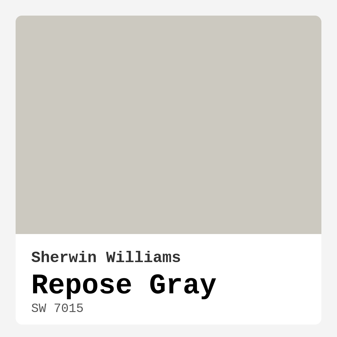
Color Preview & Key Details
| HEX Code | #CCC9C0 |
| RGB | 204, 201, 192 |
| LRV | 58% |
| Undertone | Yellow |
| Finish Options | Eggshell, Matte, Satin |
Imagine stepping into a room that feels effortlessly inviting, a space that welcomes you with open arms. It’s the kind of environment that immediately puts you at ease, allowing your worries to fade away. What if I told you that the secret to achieving this cozy atmosphere lies in the paint color you choose? Enter Repose Gray from Sherwin Williams, a color that perfectly balances warmth and neutrality, making it an ideal choice for any homeowner looking to create a beautiful, personalized space.
Repose Gray, with its color code SW 7015, is a soft, understated gray that whispers warmth rather than shouting for attention. This medium gray has an LRV (Light Reflectance Value) of 58%, meaning it reflects a moderate amount of light. In bright spaces, it radiates softness, enhancing the room without feeling stark or cold. In dimmer areas, it takes on a more muted appearance, creating an enveloping feel that’s just right for intimate settings like bedrooms or cozy reading nooks.
One of the remarkable aspects of Repose Gray is its warm undertone. Unlike many grays that lean cool, this hue embraces a touch of yellow, making it versatile and inviting. This characteristic allows it to blend seamlessly with various decor styles, from modern and farmhouse to contemporary and minimalist. Whether you’re revamping a living room, refreshing a home office, or setting the tone in a dining area, Repose Gray serves as a perfect backdrop, enhancing the beauty of your furnishings and fixtures without overshadowing them.
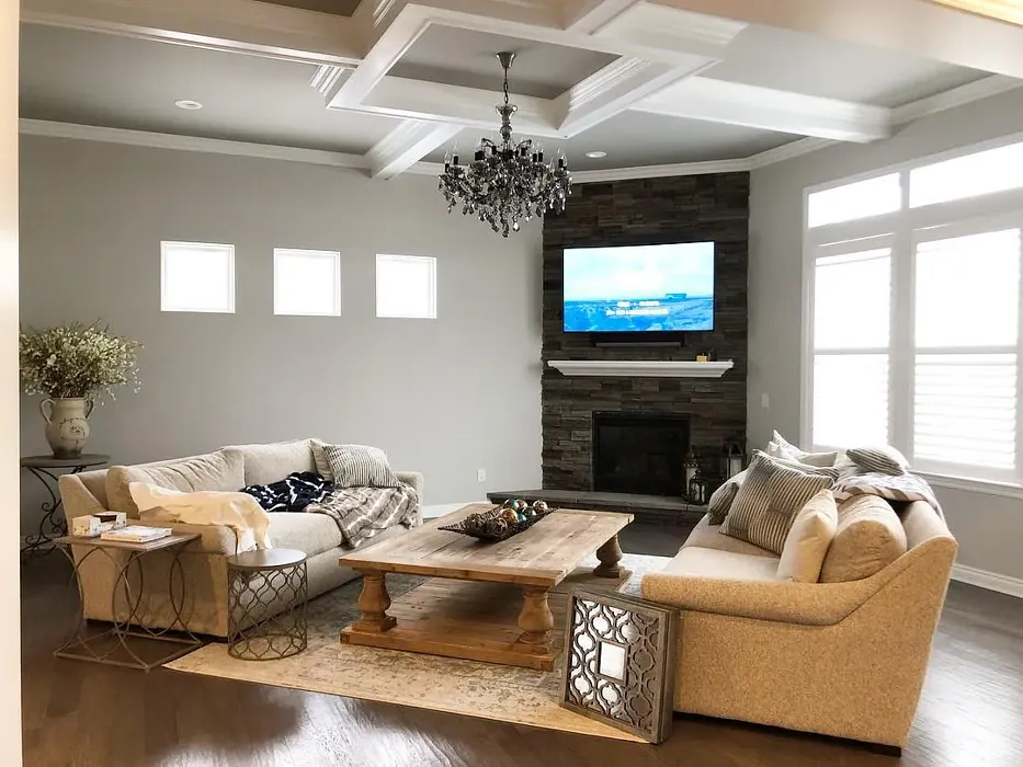
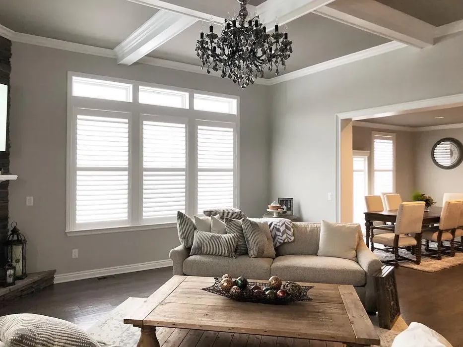
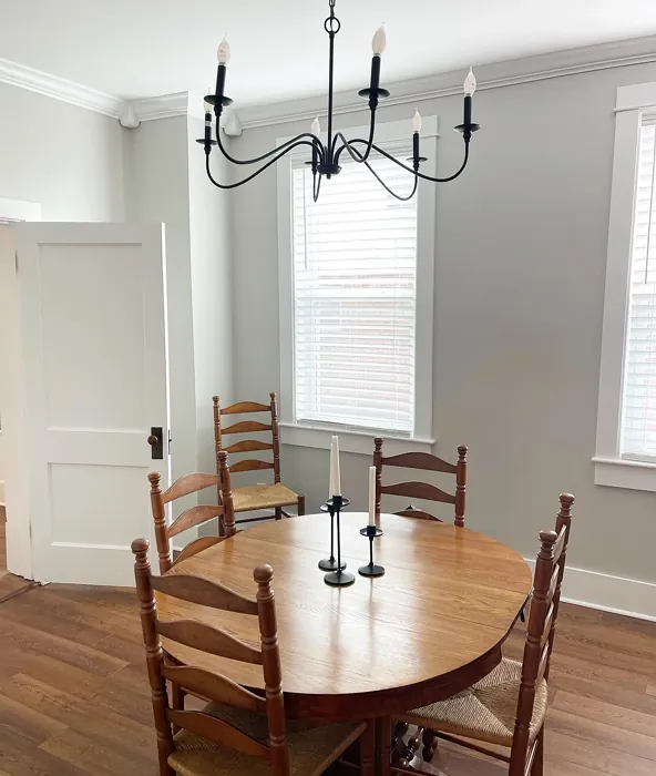
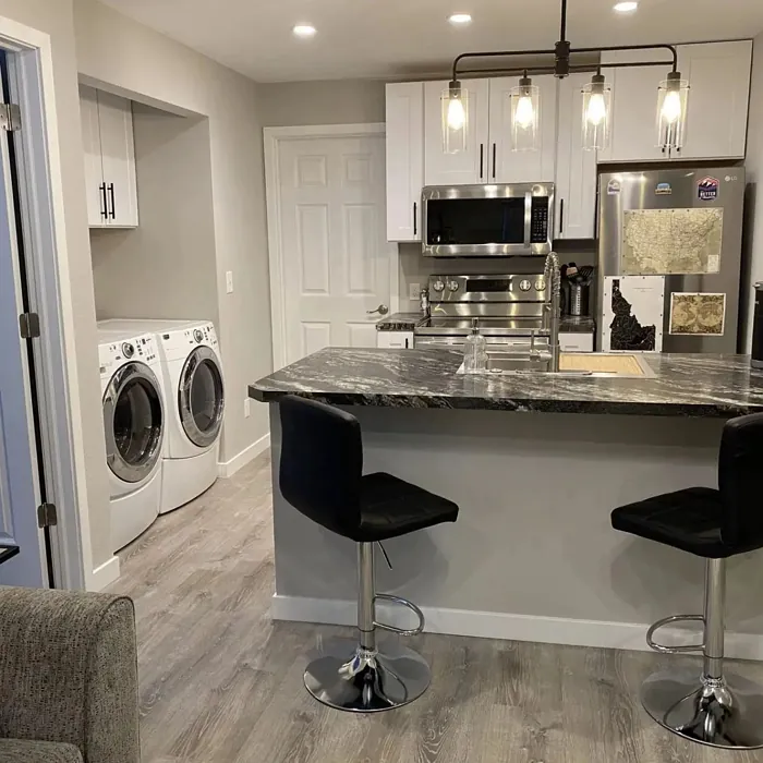
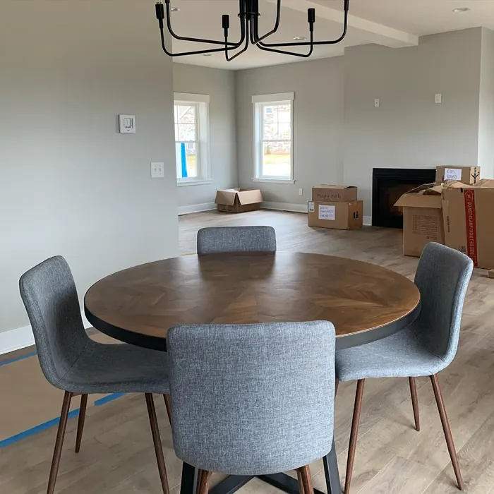
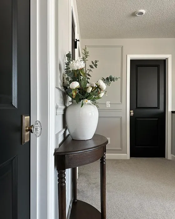
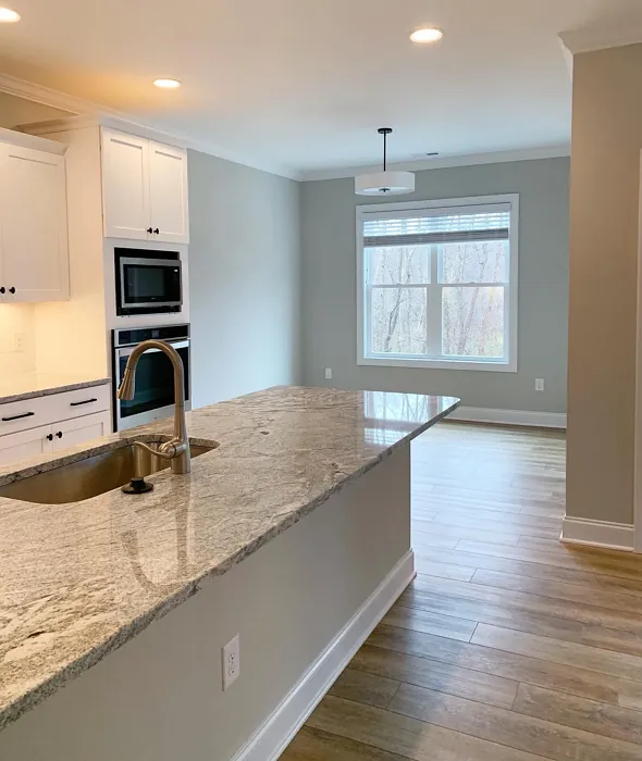
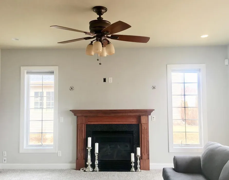
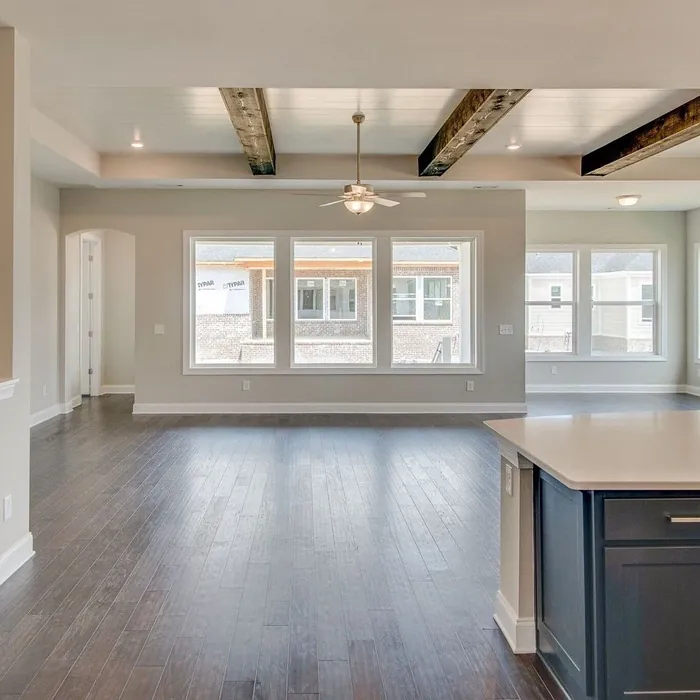
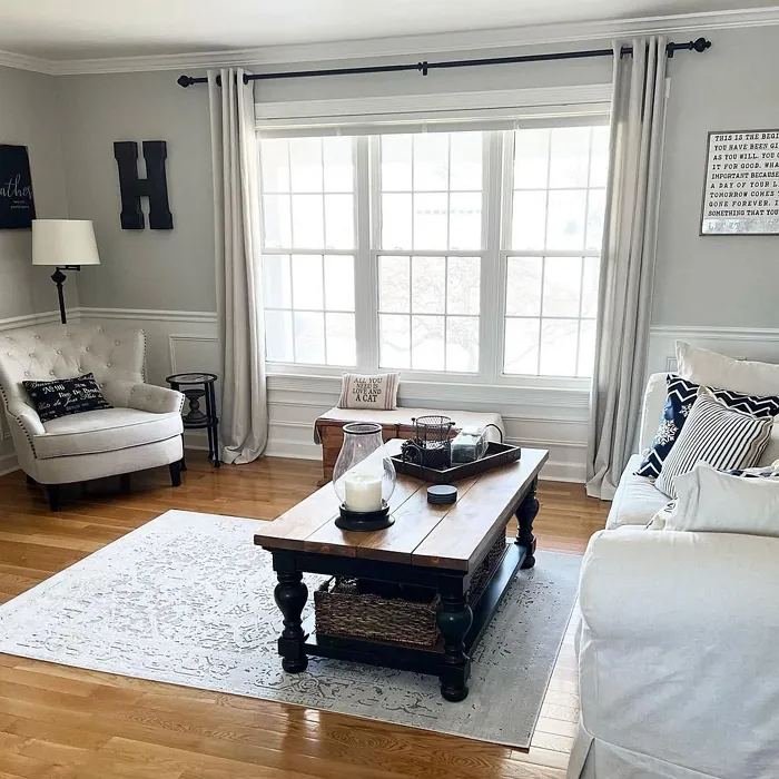
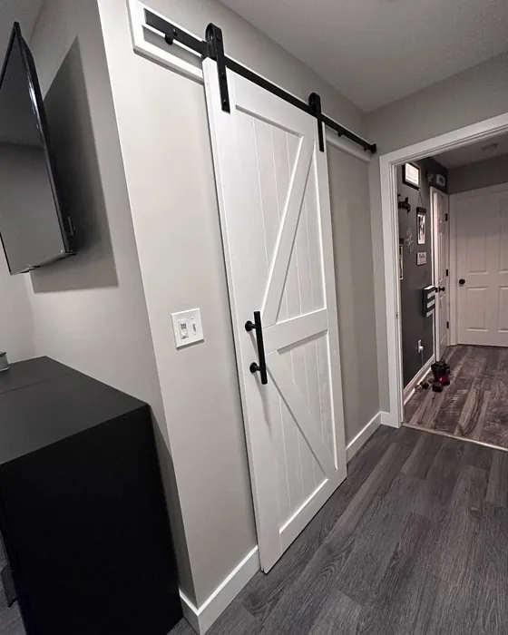
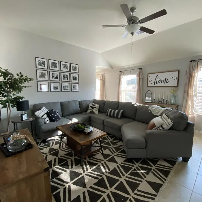
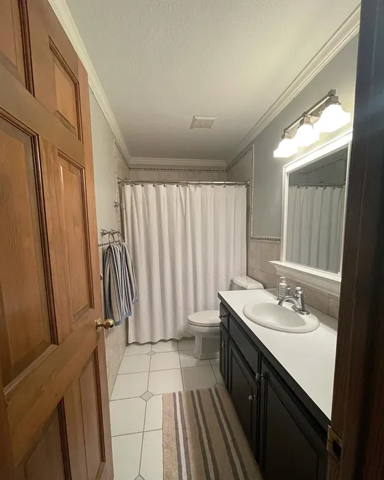
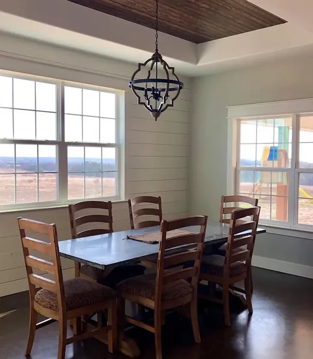
Now, let’s talk about practical applications. If you’re considering painting your living room, Repose Gray is a fantastic choice. It creates a serene atmosphere while providing enough depth to maintain interest. Pair it with white trim, such as Sherwin Williams’ White Dove, for a crisp contrast that elevates the overall aesthetic. You can also mix it with pops of color through decor items like cushions, artwork, or rugs, making your space feel vibrant without overwhelming it.
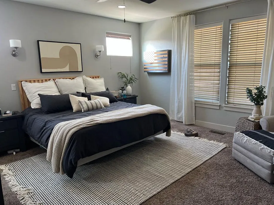
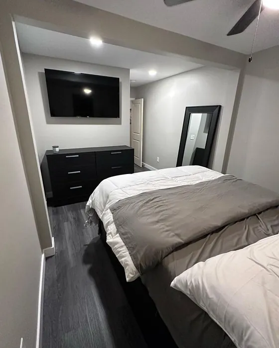
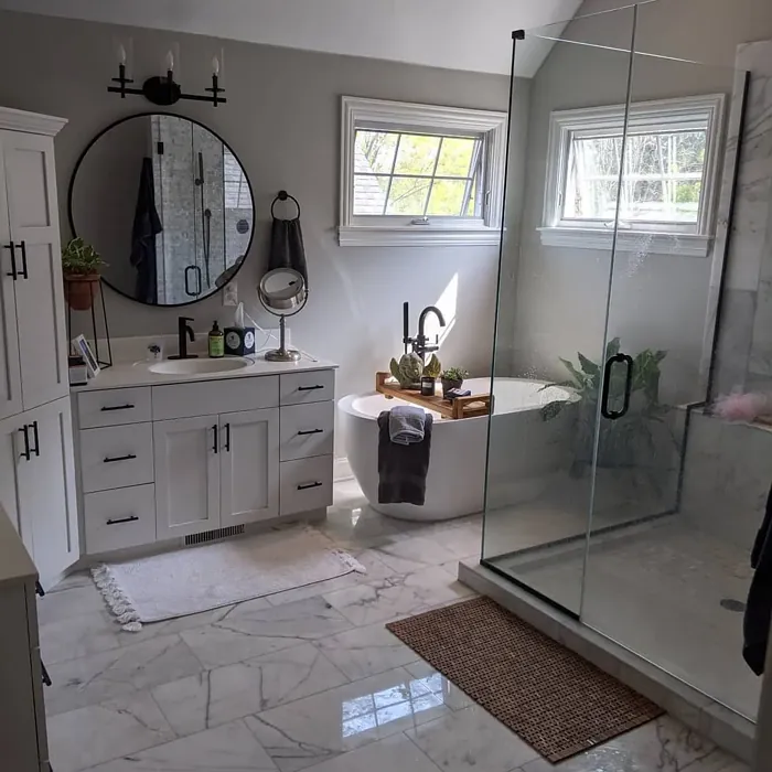
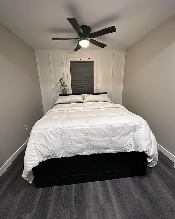
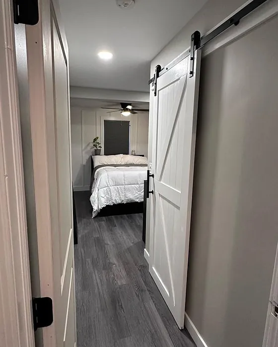
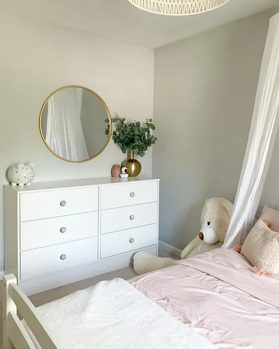
In bedrooms, Repose Gray works wonders to create a calming retreat. Its warm undertones can soothe the senses, making it an excellent choice for a space meant for relaxation. Imagine waking up in a room painted this lovely gray, with the morning light filtering through the windows, casting soft shadows on the walls. For those who love layering textures, consider using heavier fabrics like velvet or linen in your bedding, which will complement the muted elegance of the color.
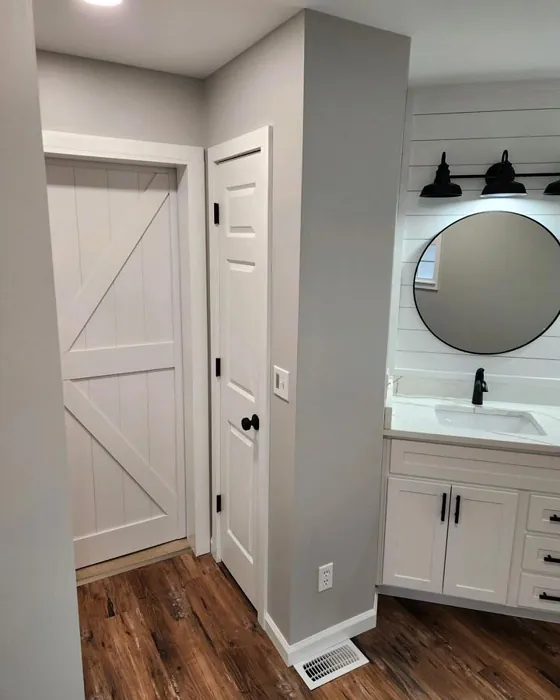
What about smaller rooms, you ask? Rest assured, Repose Gray is a standout option for compact spaces. Its warm undertones can create an illusion of openness, especially when paired with adequate lighting. Use this color in hallways or small bedrooms to make them feel larger and more inviting. A little trick? If you find the room lacking in natural light, strategically placed mirrors can help bounce that light around, enhancing the gray’s soft, welcoming vibe.
You may wonder how Repose Gray compares to other popular grays like Agreeable Gray or Mindful Gray. While these colors are undoubtedly lovely, Repose Gray stands out with its unique warmth. It strikes a perfect balance, making it suitable for various lighting conditions and decor styles. If you’re after a gray that feels contemporary yet cozy, this might just be your best bet.
Let’s touch on its performance. Repose Gray is not only easy to apply—thanks to its beginner-friendly formula—but it’s also highly washable and scuff-resistant. If you’re tackling your project yourself, you’ll find that it spreads beautifully, whether you’re using a roller or a brush. Plus, with low VOC levels, you can paint with peace of mind, knowing that you’re contributing to a healthier indoor air quality.
When it comes to complementary shades, consider pairing Repose Gray with colors like SW 9640, SW 6540, or even deeper hues like SW 6171 for a striking contrast. The beauty of this gray is that it can adapt to various palettes, allowing you to create a look that’s uniquely yours.
Now, about those undertones. The subtle yellow undertone in Repose Gray is essential to its character. It’s what gives the color depth and complexity, making it feel alive rather than flat. When you’re testing this color in your home, observe it next to your existing furniture and decor. You might find that what initially seemed like a simple gray transforms into a warm, inviting hue that ties your space together beautifully.
In terms of finishes, you have options. Repose Gray is available in eggshell, satin, and matte finishes, allowing you to choose the right sheen for your project. An eggshell finish works well for most interior walls, providing a slight sheen that’s easy to clean. Satin can be perfect for areas that might see more wear and tear, while a matte finish can offer a more subdued, sophisticated look.
If you’re still unsure, don’t hesitate to sample the paint first. Purchase a small container and paint a patch on your wall. Observe how it interacts with the light at different times of the day. You’ll be amazed at how colors can shift and change based on your surroundings.
In conclusion, Repose Gray is more than just a paint color; it’s a versatile canvas for your home. Whether you’re looking to create a serene bedroom, a cozy living space, or a sophisticated home office, this warm gray can do it all. Its inviting nature combined with practicality makes it a top contender for your next painting project. So grab that paintbrush and get ready to transform your space into a beautiful haven that reflects your personal style. You won’t regret it.
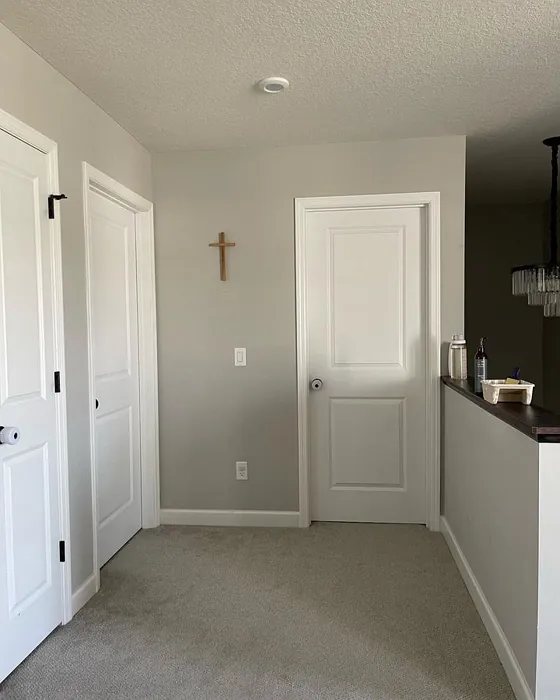
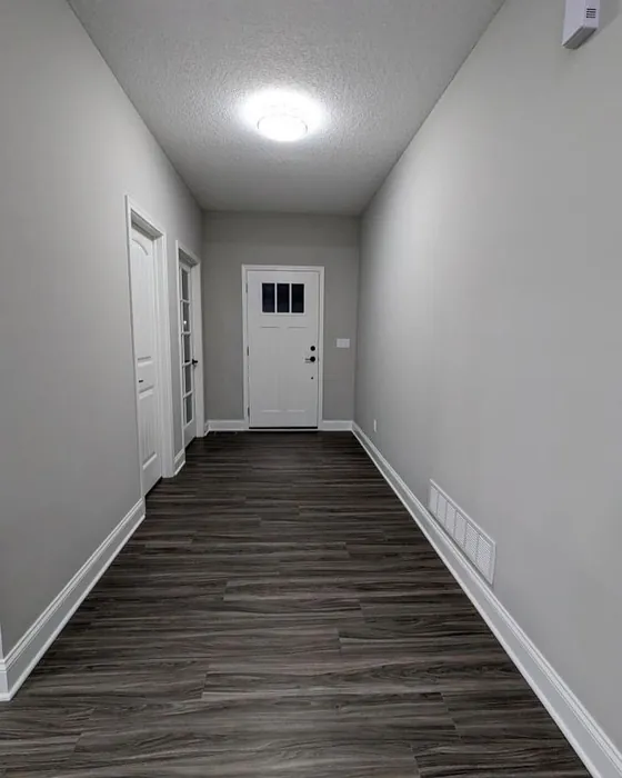
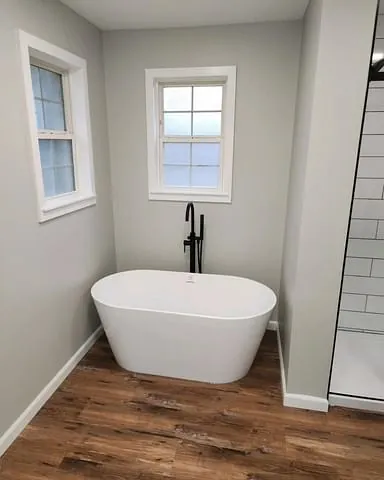
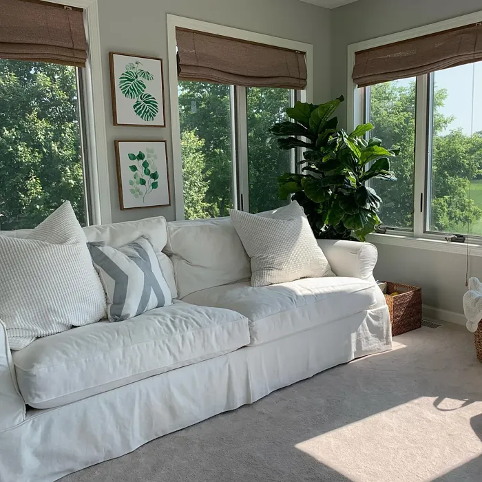
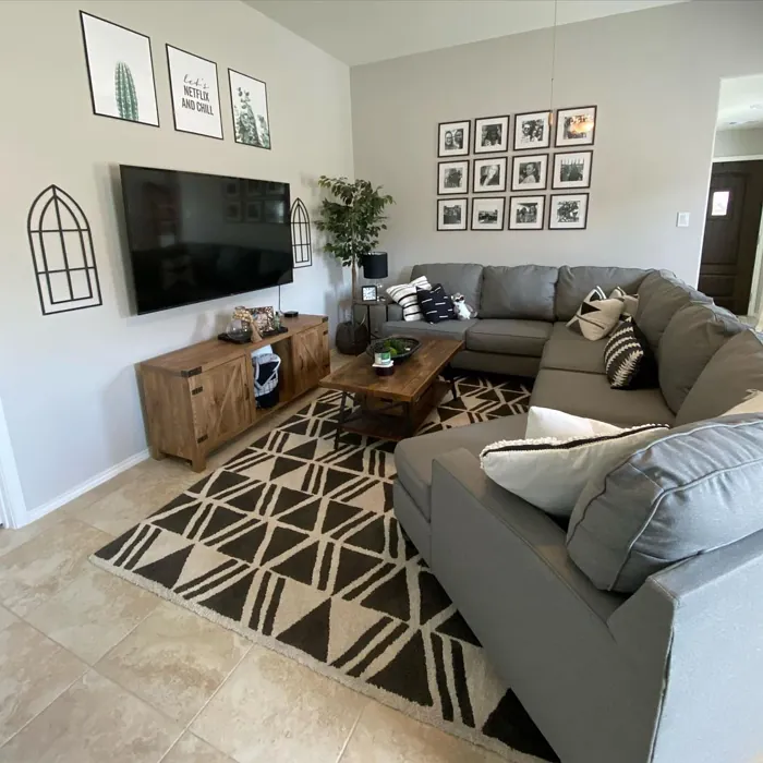
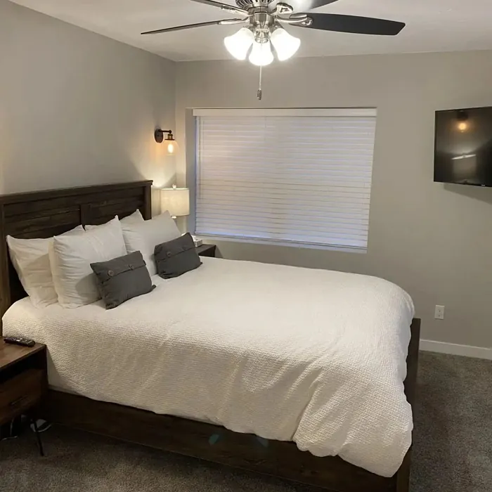
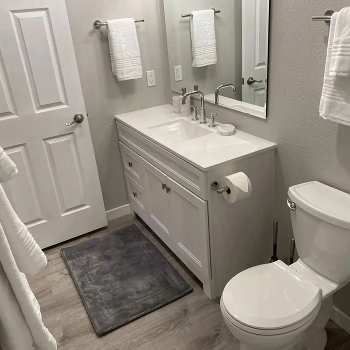
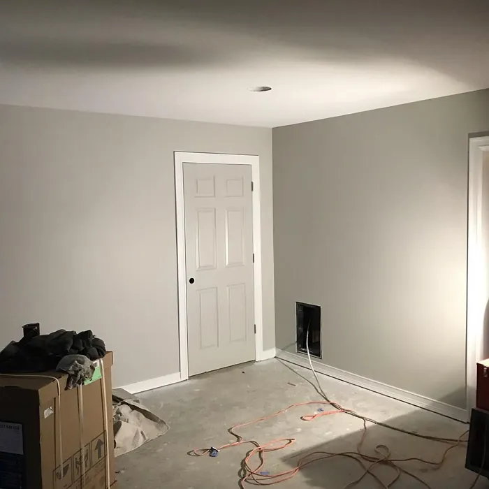
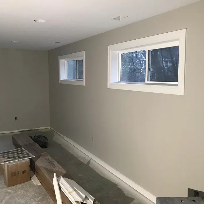
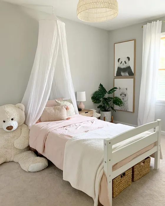
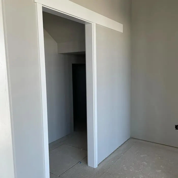
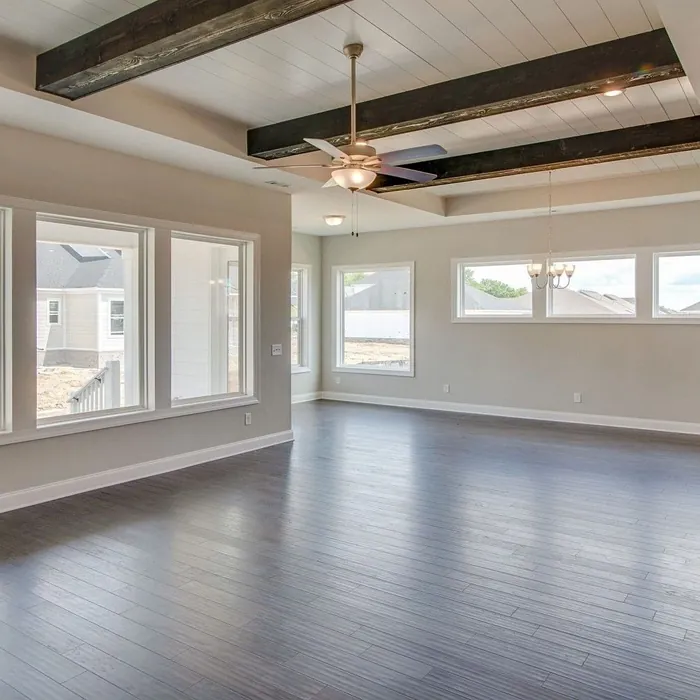
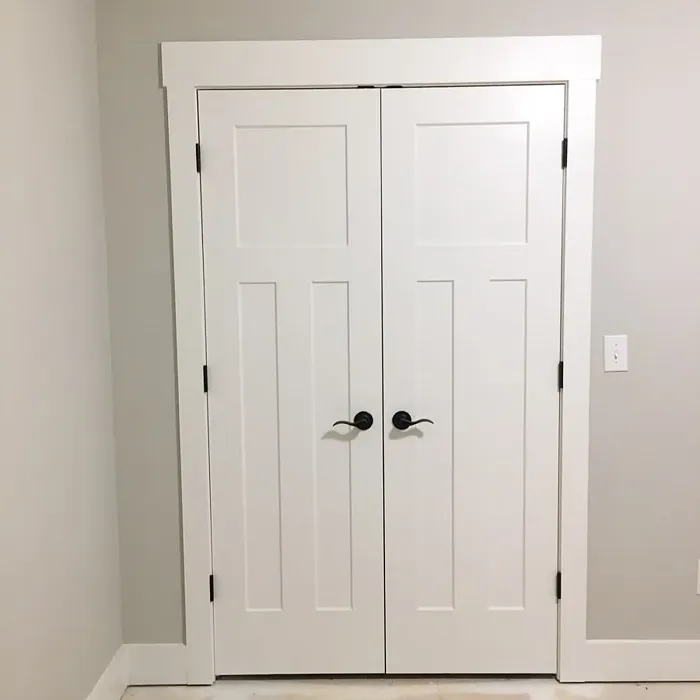
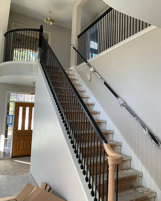
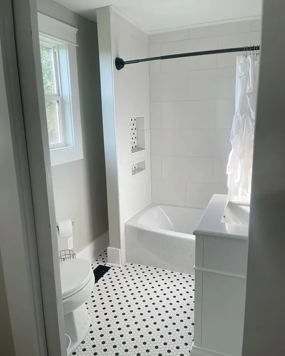
Real Room Photo of Repose Gray SW 7015
Undertones of Repose Gray ?
The undertones of Repose Gray are a key aspect of its character, leaning towards Yellow. These subtle underlying hues are what give the color its depth and complexity. For example, a gray with a blue undertone will feel cooler and more modern, while one with a brown undertone will feel warmer and more traditional. It’s essential to test this paint in your home and observe it next to your existing furniture, flooring, and decor to see how these undertones interact and reveal themselves throughout the day.
HEX value: #CCC9C0
RGB code: 204, 201, 192
Is Repose Gray Cool or Warm?
This color leans toward the warm side of the gray spectrum, making it particularly inviting. It works well in both natural and artificial lighting, maintaining its warmth throughout the day, which can be particularly comforting in a living room or bedroom.
Understanding Color Properties and Interior Design Tips
Hue refers to a specific position on the color wheel, measured in degrees from 0 to 360. Each degree represents a different pure color:
- 0° represents red
- 120° represents green
- 240° represents blue
Saturation describes the intensity or purity of a color and is expressed as a percentage:
- At 0%, the color appears completely desaturated—essentially a shade of gray
- At 100%, the color is at its most vivid and vibrant
Lightness indicates how light or dark a color is, also expressed as a percentage:
- 0% lightness results in black
- 100% lightness results in white
Using Warm Colors in Interior Design
Warm hues—such as reds, oranges, yellows, warm beiges, and greiges—are excellent choices for creating inviting and energetic spaces. These colors are particularly well-suited for:
- Kitchens, living rooms, and bathrooms, where warmth enhances comfort and sociability
- Large rooms, where warm tones can help reduce the sense of emptiness and make the space feel more intimate
For example:
- Warm beige shades provide a cozy, inviting atmosphere, ideal for living rooms, bedrooms, and hallways.
- Warm greige (a mix of beige and gray) offers the warmth of beige with the modern appeal of gray, making it a versatile backdrop for dining areas, bedrooms, and living spaces.
However, be mindful when using warm light tones in rooms with limited natural light. These shades may appear muted or even take on an unpleasant yellowish tint. To avoid a dull or flat appearance:
- Add depth by incorporating richer tones like deep greens, charcoal, or chocolate brown
- Use textured elements such as curtains, rugs, or cushions to bring dimension to the space
Pro Tip: Achieving Harmony with Warm and Cool Color Balance
To create a well-balanced and visually interesting interior, mix warm and cool tones strategically. This contrast adds depth and harmony to your design.
- If your walls feature warm hues, introduce cool-colored accents such as blue or green furniture, artwork, or accessories to create contrast.
- For a polished look, consider using a complementary color scheme, which pairs colors opposite each other on the color wheel (e.g., red with green, orange with blue).
This thoughtful mix not only enhances visual appeal but also creates a space that feels both dynamic and cohesive.
Light Temperature Affects on Repose Gray
Natural Light
Natural daylight changes in color temperature as the sun moves across the sky. At sunrise and sunset, the light tends to have a warm, golden tone with a color temperature around 2000 Kelvin (K). As the day progresses and the sun rises higher, the light becomes cooler and more neutral. Around midday, especially when the sky is clear, natural light typically reaches its peak brightness and shifts to a cooler tone, ranging from 5500 to 6500 Kelvin. This midday light is close to what we perceive as pure white or daylight-balanced light.
These shifts in natural light can significantly influence how colors appear in a space, which is why designers often consider both the time of day and the orientation of windows when planning interior color schemes.
Artificial Light
When choosing artificial lighting, pay close attention to the color temperature, measured in Kelvin (K). This determines how warm or cool the light will appear. Lower temperatures, around 2700K, give off a warm, yellow glow often used in living rooms or bedrooms. Higher temperatures, above 5000K, create a cool, bluish light similar to daylight, commonly used in kitchens, offices, or task areas.
Use the slider to see how lighting temperature can affect the appearance of a surface or color throughout a space.


4800K
LRV of Repose Gray
The Light Reflectance Value (LRV) of Repose Gray is 58%, which places it in the Medium category. This means it Reflects a moderate amount of light. Understanding a paint’s LRV is crucial for predicting how it will look in your space. A higher LRV indicates a lighter color that reflects more light, making rooms feel larger and brighter. A lower LRV signifies a darker color that absorbs more light, creating a cozier, more intimate atmosphere. Always consider the natural and artificial lighting in your room when selecting a paint color based on its LRV.
Detailed Review of Repose Gray
Additional Paint Characteristics
Ideal Rooms
Bedroom, Dining Room, Hallway, Home Office, Living Room
Decor Styles
Contemporary, Farmhouse, Minimalist, Modern, Transitional
Coverage
Good (1–2 Coats), Touch-Up Friendly
Ease of Application
Beginner Friendly, Brush Smooth, Fast-Drying, Roller-Ready
Washability
Highly Washable, Washable
VOC Level
Low VOC
Best Use
Accent Wall, Furniture, Interior Walls, Trim
Room Suitability
Bedroom, Dining Room, Hallway, Home Office, Living Room
Tone Tag
Muted, Neutral, Warm
Finish Type
Eggshell, Matte, Satin
Paint Performance
Low Odor, Quick Drying, Scuff Resistant
Use Cases
Best for Open Concept, Best for Rentals, Best for Small Spaces, Classic Favorite
Mood
Calm, Cozy, Inviting
Trim Pairing
Complements Cool Trim, Matches Pure White, Pairs with White Dove
Repose Gray is a standout choice for anyone looking to refresh their space with a contemporary yet cozy vibe. Its balanced undertones make it adaptable to both warm and cool palettes, which is a boon for decorators. When applied, it tends to reflect light beautifully, adding dimension to walls without overwhelming the room. Whether you’re painting a large open concept area or a small nook, this color maintains its elegant presence. However, it’s essential to test it in your specific lighting conditions, as it can shift slightly based on the time of day and surrounding colors. Overall, Repose Gray is a timeless color that promises to enhance your home’s aesthetic without being overpowering.
Pros & Cons of SW 7015 Repose Gray
Pros
Cons
Colors that go with Sherwin Williams Repose Gray
FAQ on SW 7015 Repose Gray
How does Repose Gray compare to other grays?
Repose Gray is unique due to its warm undertones, making it a more inviting choice compared to cooler grays. Unlike some grays that can feel stark, Repose Gray offers a soft, comforting ambiance. It stands out among popular options like Agreeable Gray and Mindful Gray by striking a balance that works well in various lighting and with different decor styles. If you’re after a gray that feels both contemporary and cozy, Repose Gray is a great pick.
Is Repose Gray suitable for small rooms?
Absolutely! Repose Gray is a fantastic choice for small rooms because its warm undertones can create a sense of openness. When paired with adequate lighting, it can make a compact space feel larger and more inviting. It’s versatile enough to work in areas that need a touch of warmth without overwhelming the senses, making it ideal for a cozy bedroom or a welcoming hallway.
Comparisons Repose Gray with other colors
Repose Gray SW 7015 vs Light French Gray SW 0055
| Attribute | Repose Gray SW 7015 | Light French Gray SW 0055 |
|---|---|---|
| Color Name | Repose Gray SW 7015 | Light French Gray SW 0055 |
| Color | ||
| Hue | Grey | Grey |
| Brightness | Medium | Medium |
| RGB | 204, 201, 192 | 194, 192, 187 |
| LRV | 58% | 53% |
| Finish Type | Eggshell, Matte, Satin | Eggshell, Matte, Satin |
| Finish Options | Eggshell, Matte, Satin | Eggshell, Matte, Satin |
| Ideal Rooms | Bedroom, Dining Room, Hallway, Home Office, Living Room | Bedroom, Dining Room, Home Office, Kitchen, Living Room |
| Decor Styles | Contemporary, Farmhouse, Minimalist, Modern, Transitional | Contemporary, Farmhouse, Modern, Scandinavian, Transitional |
| Coverage | Good (1–2 Coats), Touch-Up Friendly | Good (1–2 Coats), Touch-Up Friendly |
| Ease of Application | Beginner Friendly, Brush Smooth, Fast-Drying, Roller-Ready | Beginner Friendly, Brush Smooth, Roller-Ready |
| Washability | Highly Washable, Washable | Highly Washable, Washable |
| Room Suitability | Bedroom, Dining Room, Hallway, Home Office, Living Room | Bedroom, Dining Room, Home Office, Kitchen, Living Room |
| Tone | Muted, Neutral, Warm | Balanced, Muted, Neutral, Warm |
| Paint Performance | Low Odor, Quick Drying, Scuff Resistant | Easy Touch-Up, High Coverage, Low Odor |
Repose Gray SW 7015 vs Wordly Gray SW 7043
| Attribute | Repose Gray SW 7015 | Wordly Gray SW 7043 |
|---|---|---|
| Color Name | Repose Gray SW 7015 | Wordly Gray SW 7043 |
| Color | ||
| Hue | Grey | Grey |
| Brightness | Medium | Medium |
| RGB | 204, 201, 192 | 206, 198, 187 |
| LRV | 58% | 58% |
| Finish Type | Eggshell, Matte, Satin | Eggshell, Satin |
| Finish Options | Eggshell, Matte, Satin | Eggshell, Flat, Satin |
| Ideal Rooms | Bedroom, Dining Room, Hallway, Home Office, Living Room | Bedroom, Home Office, Kitchen, Living Room |
| Decor Styles | Contemporary, Farmhouse, Minimalist, Modern, Transitional | Minimalist, Modern, Scandi, Transitional |
| Coverage | Good (1–2 Coats), Touch-Up Friendly | Good (1–2 Coats) |
| Ease of Application | Beginner Friendly, Brush Smooth, Fast-Drying, Roller-Ready | Beginner Friendly, Brush Smooth, Fast-Drying, Roller-Ready |
| Washability | Highly Washable, Washable | Highly Washable, Washable |
| Room Suitability | Bedroom, Dining Room, Hallway, Home Office, Living Room | Bedroom, Dining Room, Home Office, Living Room |
| Tone | Muted, Neutral, Warm | Muted, Neutral, Warm |
| Paint Performance | Low Odor, Quick Drying, Scuff Resistant | Easy Touch-Up, Low Odor, Scuff Resistant |
Repose Gray SW 7015 vs Illusive Green SW 9164
| Attribute | Repose Gray SW 7015 | Illusive Green SW 9164 |
|---|---|---|
| Color Name | Repose Gray SW 7015 | Illusive Green SW 9164 |
| Color | ||
| Hue | Grey | Grey |
| Brightness | Medium | Medium |
| RGB | 204, 201, 192 | 146, 148, 141 |
| LRV | 58% | 24% |
| Finish Type | Eggshell, Matte, Satin | Eggshell, Matte, Satin |
| Finish Options | Eggshell, Matte, Satin | Eggshell, Matte, Satin |
| Ideal Rooms | Bedroom, Dining Room, Hallway, Home Office, Living Room | Bedroom, Dining Room, Home Office, Living Room, Nursery |
| Decor Styles | Contemporary, Farmhouse, Minimalist, Modern, Transitional | Coastal, Minimalist, Modern, Rustic, Scandinavian |
| Coverage | Good (1–2 Coats), Touch-Up Friendly | Good (1–2 Coats), Touch-Up Friendly |
| Ease of Application | Beginner Friendly, Brush Smooth, Fast-Drying, Roller-Ready | Beginner Friendly, Brush Smooth, Fast-Drying, Roller-Ready |
| Washability | Highly Washable, Washable | Highly Washable, Washable, Wipeable |
| Room Suitability | Bedroom, Dining Room, Hallway, Home Office, Living Room | Bedroom, Dining Room, Home Office, Living Room, Nursery |
| Tone | Muted, Neutral, Warm | Balanced, Earthy, Muted |
| Paint Performance | Low Odor, Quick Drying, Scuff Resistant | Easy Touch-Up, Low Odor, Quick Drying, Scuff Resistant |
Repose Gray SW 7015 vs Fawn Brindle SW 7640
| Attribute | Repose Gray SW 7015 | Fawn Brindle SW 7640 |
|---|---|---|
| Color Name | Repose Gray SW 7015 | Fawn Brindle SW 7640 |
| Color | ||
| Hue | Grey | Grey |
| Brightness | Medium | Medium |
| RGB | 204, 201, 192 | 167, 160, 148 |
| LRV | 58% | 24% |
| Finish Type | Eggshell, Matte, Satin | Eggshell, Matte |
| Finish Options | Eggshell, Matte, Satin | Eggshell, Matte, Satin |
| Ideal Rooms | Bedroom, Dining Room, Hallway, Home Office, Living Room | Bedroom, Dining Room, Hallway, Home Office, Living Room |
| Decor Styles | Contemporary, Farmhouse, Minimalist, Modern, Transitional | Bohemian, Minimalist, Modern Farmhouse, Transitional |
| Coverage | Good (1–2 Coats), Touch-Up Friendly | Good (1–2 Coats) |
| Ease of Application | Beginner Friendly, Brush Smooth, Fast-Drying, Roller-Ready | Brush Smooth, Fast-Drying, Roller-Ready |
| Washability | Highly Washable, Washable | Stain Resistant, Washable |
| Room Suitability | Bedroom, Dining Room, Hallway, Home Office, Living Room | Bedroom, Dining Room, Home Office, Living Room |
| Tone | Muted, Neutral, Warm | Earthy, Neutral, Warm |
| Paint Performance | Low Odor, Quick Drying, Scuff Resistant | Easy Touch-Up, Fade Resistant, Low Odor |
Repose Gray SW 7015 vs Balanced Beige SW 7037
| Attribute | Repose Gray SW 7015 | Balanced Beige SW 7037 |
|---|---|---|
| Color Name | Repose Gray SW 7015 | Balanced Beige SW 7037 |
| Color | ||
| Hue | Grey | Grey |
| Brightness | Medium | Medium |
| RGB | 204, 201, 192 | 192, 178, 162 |
| LRV | 58% | 44% |
| Finish Type | Eggshell, Matte, Satin | Eggshell, Matte, Satin |
| Finish Options | Eggshell, Matte, Satin | Eggshell, Matte, Satin |
| Ideal Rooms | Bedroom, Dining Room, Hallway, Home Office, Living Room | Bedroom, Dining Room, Home Office, Kitchen, Living Room |
| Decor Styles | Contemporary, Farmhouse, Minimalist, Modern, Transitional | Contemporary, Minimalist, Modern Farmhouse, Rustic, Transitional |
| Coverage | Good (1–2 Coats), Touch-Up Friendly | Good (1–2 Coats), Touch-Up Friendly |
| Ease of Application | Beginner Friendly, Brush Smooth, Fast-Drying, Roller-Ready | Beginner Friendly, Brush Smooth, Roller-Ready |
| Washability | Highly Washable, Washable | Washable, Wipeable |
| Room Suitability | Bedroom, Dining Room, Hallway, Home Office, Living Room | Bedroom, Dining Room, Hallway, Kitchen, Living Room |
| Tone | Muted, Neutral, Warm | Balanced, Earthy, Warm |
| Paint Performance | Low Odor, Quick Drying, Scuff Resistant | Easy Touch-Up, High Coverage, Low Odor |
Repose Gray SW 7015 vs Mushroom SW 9587
| Attribute | Repose Gray SW 7015 | Mushroom SW 9587 |
|---|---|---|
| Color Name | Repose Gray SW 7015 | Mushroom SW 9587 |
| Color | ||
| Hue | Grey | Grey |
| Brightness | Medium | Medium |
| RGB | 204, 201, 192 | 208, 199, 183 |
| LRV | 58% | 24% |
| Finish Type | Eggshell, Matte, Satin | Eggshell, Satin |
| Finish Options | Eggshell, Matte, Satin | Eggshell, Flat, Matte, Satin |
| Ideal Rooms | Bedroom, Dining Room, Hallway, Home Office, Living Room | Bedroom, Dining Room, Hallway, Home Office, Living Room |
| Decor Styles | Contemporary, Farmhouse, Minimalist, Modern, Transitional | Bohemian, Contemporary, Modern Farmhouse, Traditional |
| Coverage | Good (1–2 Coats), Touch-Up Friendly | Good (1–2 Coats) |
| Ease of Application | Beginner Friendly, Brush Smooth, Fast-Drying, Roller-Ready | Beginner Friendly, Brush Smooth, Roller-Ready |
| Washability | Highly Washable, Washable | Highly Washable, Washable |
| Room Suitability | Bedroom, Dining Room, Hallway, Home Office, Living Room | Bedroom, Dining Room, Home Office, Living Room |
| Tone | Muted, Neutral, Warm | Earthy, Neutral, Warm |
| Paint Performance | Low Odor, Quick Drying, Scuff Resistant | Easy Touch-Up, Long Lasting, Low Odor, Scuff Resistant |
Repose Gray SW 7015 vs Silver Strand SW 7057
| Attribute | Repose Gray SW 7015 | Silver Strand SW 7057 |
|---|---|---|
| Color Name | Repose Gray SW 7015 | Silver Strand SW 7057 |
| Color | ||
| Hue | Grey | Grey |
| Brightness | Medium | Medium |
| RGB | 204, 201, 192 | 200, 203, 196 |
| LRV | 58% | 66% |
| Finish Type | Eggshell, Matte, Satin | Eggshell, Satin |
| Finish Options | Eggshell, Matte, Satin | Eggshell, Matte, Satin |
| Ideal Rooms | Bedroom, Dining Room, Hallway, Home Office, Living Room | Bedroom, Dining Room, Hallway, Home Office, Living Room |
| Decor Styles | Contemporary, Farmhouse, Minimalist, Modern, Transitional | Coastal, Minimalist, Modern, Traditional, Transitional |
| Coverage | Good (1–2 Coats), Touch-Up Friendly | Good (1–2 Coats), Touch-Up Friendly |
| Ease of Application | Beginner Friendly, Brush Smooth, Fast-Drying, Roller-Ready | Beginner Friendly, Brush Smooth, Roller-Ready |
| Washability | Highly Washable, Washable | Highly Washable, Washable |
| Room Suitability | Bedroom, Dining Room, Hallway, Home Office, Living Room | Bathroom, Bedroom, Home Office, Kitchen, Living Room |
| Tone | Muted, Neutral, Warm | Balanced, Neutral, Warm |
| Paint Performance | Low Odor, Quick Drying, Scuff Resistant | Easy Touch-Up, High Coverage, Low Odor |
Repose Gray SW 7015 vs Cadet SW 9143
| Attribute | Repose Gray SW 7015 | Cadet SW 9143 |
|---|---|---|
| Color Name | Repose Gray SW 7015 | Cadet SW 9143 |
| Color | ||
| Hue | Grey | Grey |
| Brightness | Medium | Medium |
| RGB | 204, 201, 192 | 145, 153, 156 |
| LRV | 58% | 12% |
| Finish Type | Eggshell, Matte, Satin | Eggshell, Matte, Satin |
| Finish Options | Eggshell, Matte, Satin | Eggshell, Matte, Satin |
| Ideal Rooms | Bedroom, Dining Room, Hallway, Home Office, Living Room | Bathroom, Bedroom, Hallway, Home Office, Kitchen, Living Room |
| Decor Styles | Contemporary, Farmhouse, Minimalist, Modern, Transitional | Coastal, Industrial, Minimalist, Modern, Scandinavian |
| Coverage | Good (1–2 Coats), Touch-Up Friendly | Good (1–2 Coats), Touch-Up Friendly |
| Ease of Application | Beginner Friendly, Brush Smooth, Fast-Drying, Roller-Ready | Beginner Friendly, Brush Smooth, Roller-Ready |
| Washability | Highly Washable, Washable | Washable, Wipeable |
| Room Suitability | Bedroom, Dining Room, Hallway, Home Office, Living Room | Bathroom, Bedroom, Hallway, Home Office, Living Room |
| Tone | Muted, Neutral, Warm | Balanced, Cool, Muted |
| Paint Performance | Low Odor, Quick Drying, Scuff Resistant | Easy Touch-Up, High Coverage, Low Odor |
Repose Gray SW 7015 vs Dovetail SW 7018
| Attribute | Repose Gray SW 7015 | Dovetail SW 7018 |
|---|---|---|
| Color Name | Repose Gray SW 7015 | Dovetail SW 7018 |
| Color | ||
| Hue | Grey | Grey |
| Brightness | Medium | Medium |
| RGB | 204, 201, 192 | 144, 138, 131 |
| LRV | 58% | 24% |
| Finish Type | Eggshell, Matte, Satin | Eggshell, Matte, Satin |
| Finish Options | Eggshell, Matte, Satin | Eggshell, Matte, Satin |
| Ideal Rooms | Bedroom, Dining Room, Hallway, Home Office, Living Room | Bedroom, Dining Room, Hallway, Home Office, Living Room |
| Decor Styles | Contemporary, Farmhouse, Minimalist, Modern, Transitional | Minimalist, Modern Farmhouse, Rustic, Transitional |
| Coverage | Good (1–2 Coats), Touch-Up Friendly | Good (1–2 Coats), Touch-Up Friendly |
| Ease of Application | Beginner Friendly, Brush Smooth, Fast-Drying, Roller-Ready | Beginner Friendly, Brush Smooth, Roller-Ready |
| Washability | Highly Washable, Washable | Washable, Wipeable |
| Room Suitability | Bedroom, Dining Room, Hallway, Home Office, Living Room | Bedroom, Dining Room, Home Office, Living Room |
| Tone | Muted, Neutral, Warm | Earthy, Neutral, Warm |
| Paint Performance | Low Odor, Quick Drying, Scuff Resistant | Easy Touch-Up, Fade Resistant, Low Odor |
Repose Gray SW 7015 vs Morning Fog SW 6255
| Attribute | Repose Gray SW 7015 | Morning Fog SW 6255 |
|---|---|---|
| Color Name | Repose Gray SW 7015 | Morning Fog SW 6255 |
| Color | ||
| Hue | Grey | Grey |
| Brightness | Medium | Medium |
| RGB | 204, 201, 192 | 168, 174, 177 |
| LRV | 58% | 40% |
| Finish Type | Eggshell, Matte, Satin | Eggshell, Matte |
| Finish Options | Eggshell, Matte, Satin | Eggshell, Matte, Satin |
| Ideal Rooms | Bedroom, Dining Room, Hallway, Home Office, Living Room | Bathroom, Bedroom, Home Office, Kitchen, Living Room |
| Decor Styles | Contemporary, Farmhouse, Minimalist, Modern, Transitional | Coastal, Minimalist, Modern, Scandinavian |
| Coverage | Good (1–2 Coats), Touch-Up Friendly | Good (1–2 Coats), Touch-Up Friendly |
| Ease of Application | Beginner Friendly, Brush Smooth, Fast-Drying, Roller-Ready | Beginner Friendly, Fast-Drying, Roller-Ready |
| Washability | Highly Washable, Washable | Highly Washable, Washable |
| Room Suitability | Bedroom, Dining Room, Hallway, Home Office, Living Room | Bedroom, Home Office, Living Room, Nursery |
| Tone | Muted, Neutral, Warm | Cool, Muted, Neutral |
| Paint Performance | Low Odor, Quick Drying, Scuff Resistant | Easy Touch-Up, Low Odor, Quick Drying |
Official Page of Sherwin Williams Repose Gray SW 7015