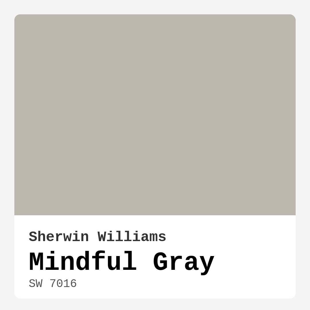
Color Preview & Key Details
| HEX Code | #BCB7AD |
| RGB | 188, 183, 173 |
| LRV | 22% |
| Undertone | Red |
| Finish Options | Eggshell, Matte, Satin |
Imagine walking into a room that whispers tranquility, a space where your mind can unwind and your body can relax. You might not realize it, but the color on those walls plays a pivotal role in creating that atmosphere. Enter Mindful Gray, a color that has become a beloved choice for homeowners and designers alike, thanks to its remarkable ability to bring balance and calm to any interior.
Mindful Gray, from the Sherwin Williams palette, is coded as SW 7016, and it’s much more than just another shade of gray. It’s a beautifully nuanced color that sits perfectly between warm and cool tones, allowing it to blend seamlessly into a variety of decor styles. With its hex code #BCB7AD and RGB value of 188, 183, 173, this medium-dark gray offers a serene backdrop, making it an ideal choice for spaces meant for relaxation and focus.
Let’s take a closer look at why Mindful Gray might be the perfect shade for your next home project. First off, its understated elegance makes it incredibly versatile. Whether you’re designing a modern living room, a transitional dining area, or a minimalist home office, this color can adapt beautifully. Its soft, tranquil quality not only enhances the aesthetic of a room but also contributes to a grounding ambiance.
You might wonder how Mindful Gray behaves under different lighting conditions. This paint has a Light Reflectance Value (LRV) of 22%, which means it reflects very little light. In natural light, it tends to appear lighter and airier, while in the glow of artificial lighting, it takes on a cozy, subdued feel. This adaptability is one of its strongest features, allowing you to create the mood you desire, depending on the time of day or the atmosphere you’re aiming for.
One of the most appealing aspects of Mindful Gray is its undertone. It leans towards red, which adds depth and complexity to the color. This subtle undertone allows it to harmonize beautifully with both warm and cool decor elements, making it an excellent choice if you enjoy mixing styles. Imagine pairing it with crisp white trim for a fresh, contemporary look or contrasting it with deeper jewel tones for a touch of drama. The key is to test it in your space, observing how it interacts with your existing furniture and decor throughout the day.
Now, let’s talk about application. Mindful Gray is incredibly user-friendly, making it a favorite among both seasoned painters and DIY novices. It glides on smoothly, whether you choose to apply it with a brush or roller, and it typically requires only one to two coats for complete coverage. Plus, if you ever need to touch up, you’ll find that it blends seamlessly, maintaining that polished finish you desire.
Another highlight is its washability. Life happens, and stains can occur, especially in high-traffic areas. Mindful Gray is scrubbable, meaning you won’t have to worry about those inevitable marks and smudges ruining your beautiful walls. And if you’re concerned about health and environmental impact, you’ll appreciate that this paint has a low VOC level, making it a safer choice for your home.
When it comes to choosing the right rooms for Mindful Gray, the possibilities are virtually endless. This color shines in living rooms, bedrooms, home offices, and dining rooms. Think about creating a serene retreat in your bedroom or a calming atmosphere in your home office where productivity meets tranquility.
If you’re considering Mindful Gray for an accent wall, you’re onto something special. It works wonderfully as a statement piece without overwhelming the room. Pair it with lighter colors for contrast, and you’ll find it adds depth and visual interest, creating a stunning focal point.
While Mindful Gray has countless benefits, it’s essential to acknowledge its few limitations. It may not suit very dark or bright furnishings, as it can sometimes get lost or appear flat against them. To counter this, ensure your space has good lighting and mix in brighter decor elements to keep the energy up.
As you explore colors that complement Mindful Gray, consider pairing it with hues like White Dove or Pure White for a crisp contrast. Metallics, especially brass fixtures, can also add a touch of elegance and warmth, creating a beautiful balance against the gray backdrop.
For those looking to explore lighter or darker shades, you might also consider colors like SW 7671 or SW 7017 for a subtle change in tone, or go bolder with SW 7640 or SW 9597 for a deeper, richer experience.
If you’re still on the fence about Mindful Gray, remember that its calming, inviting nature makes it a classic favorite. It’s a timeless choice that suits a range of decor styles, from Scandinavian to modern farmhouse, and everything in between.
Creating an inviting space isn’t just about aesthetics; it’s about feeling at home. Mindful Gray embodies that feeling, providing a backdrop that allows your personality and decor to shine. So, whether you’re embarking on a full home makeover or simply refreshing a room, this color is worth serious consideration.
In the end, color is more than just paint on a wall; it’s about creating an atmosphere that resonates with who you are. Mindful Gray has that unique ability to ground you while still leaving room for creativity and expression. So grab that paintbrush, and let’s transform your space into a sanctuary of calm and beauty.
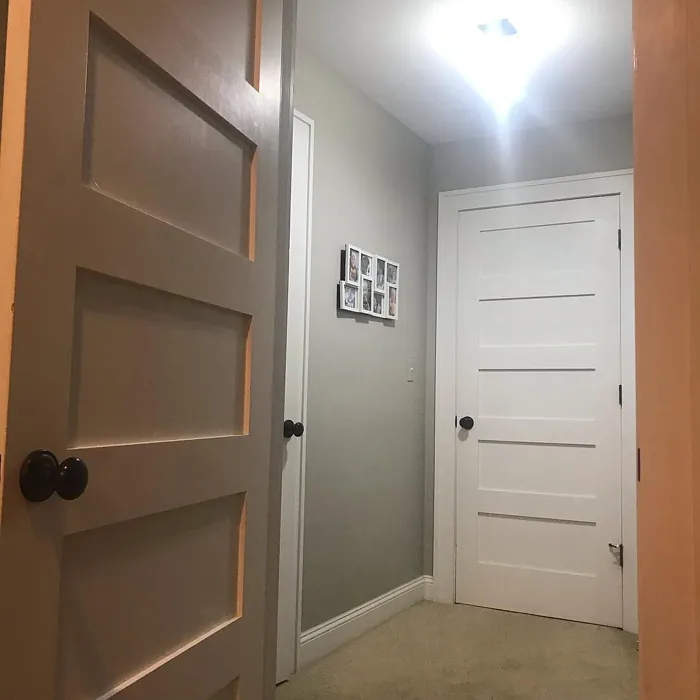
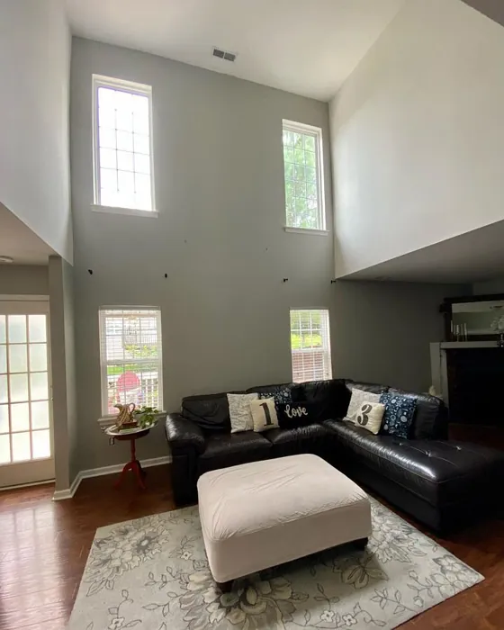
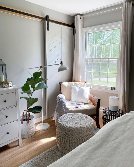
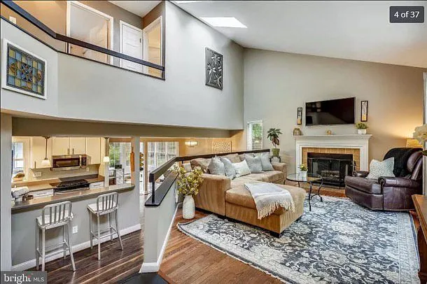
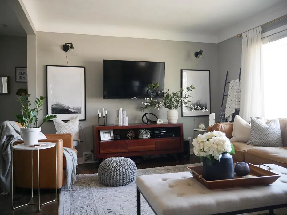
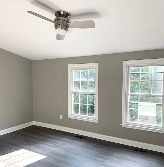
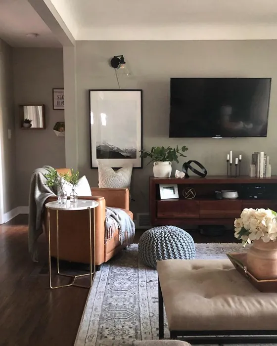
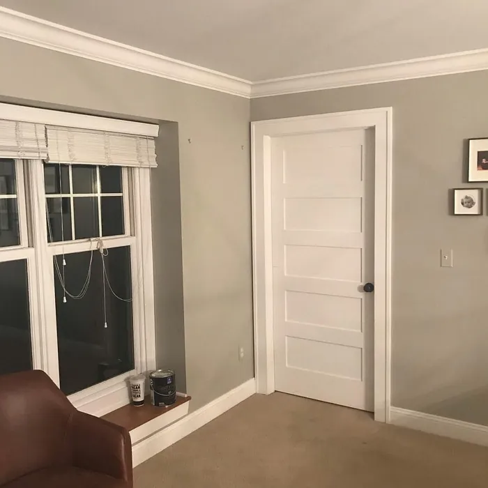
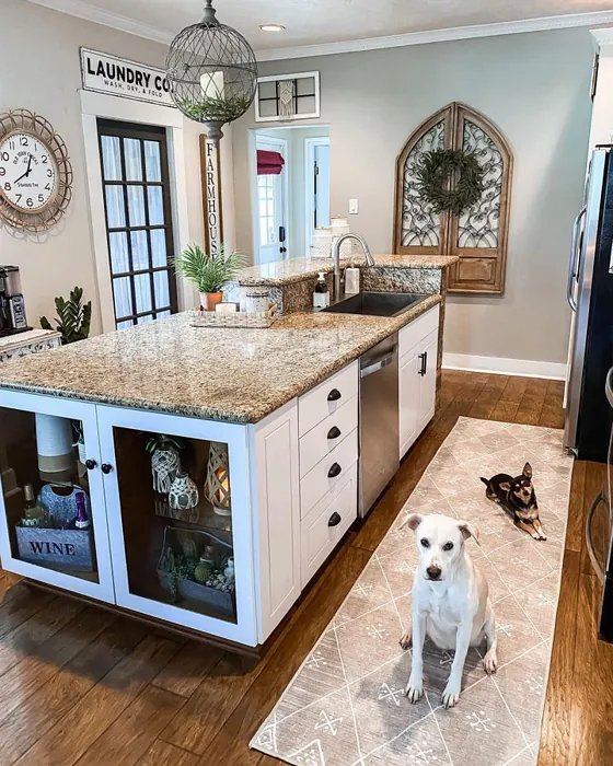
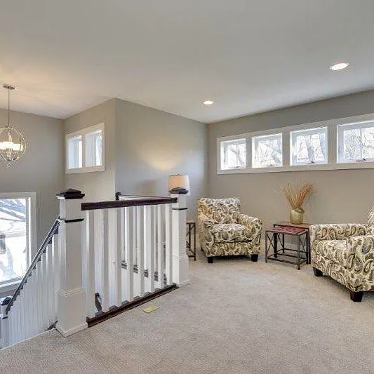
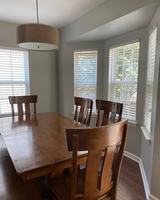
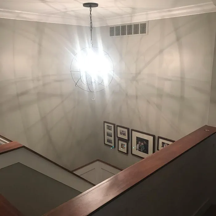
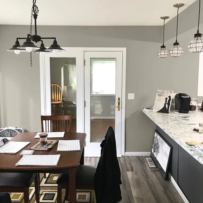
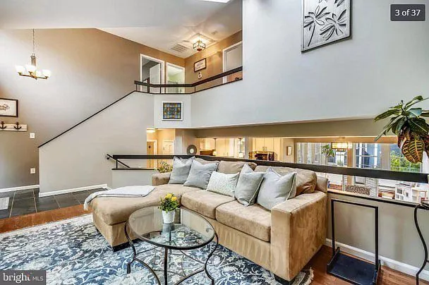
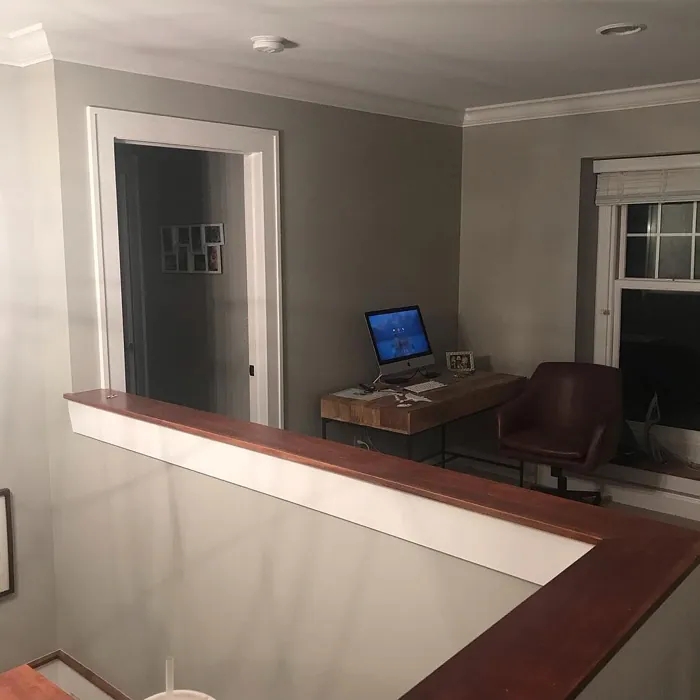
Real Room Photo of Mindful Gray SW 7016
Undertones of Mindful Gray ?
The undertones of Mindful Gray are a key aspect of its character, leaning towards Red. These subtle underlying hues are what give the color its depth and complexity. For example, a gray with a blue undertone will feel cooler and more modern, while one with a brown undertone will feel warmer and more traditional. It’s essential to test this paint in your home and observe it next to your existing furniture, flooring, and decor to see how these undertones interact and reveal themselves throughout the day.
HEX value: #BCB7AD
RGB code: 188, 183, 173
Is Mindful Gray Cool or Warm?
This shade leans toward a balanced profile, with characteristics that make it feel warm without being too cozy, nor too cold. It’s perfect for creating an inviting space that feels calm and restful.
Understanding Color Properties and Interior Design Tips
Hue refers to a specific position on the color wheel, measured in degrees from 0 to 360. Each degree represents a different pure color:
- 0° represents red
- 120° represents green
- 240° represents blue
Saturation describes the intensity or purity of a color and is expressed as a percentage:
- At 0%, the color appears completely desaturated—essentially a shade of gray
- At 100%, the color is at its most vivid and vibrant
Lightness indicates how light or dark a color is, also expressed as a percentage:
- 0% lightness results in black
- 100% lightness results in white
Using Warm Colors in Interior Design
Warm hues—such as reds, oranges, yellows, warm beiges, and greiges—are excellent choices for creating inviting and energetic spaces. These colors are particularly well-suited for:
- Kitchens, living rooms, and bathrooms, where warmth enhances comfort and sociability
- Large rooms, where warm tones can help reduce the sense of emptiness and make the space feel more intimate
For example:
- Warm beige shades provide a cozy, inviting atmosphere, ideal for living rooms, bedrooms, and hallways.
- Warm greige (a mix of beige and gray) offers the warmth of beige with the modern appeal of gray, making it a versatile backdrop for dining areas, bedrooms, and living spaces.
However, be mindful when using warm light tones in rooms with limited natural light. These shades may appear muted or even take on an unpleasant yellowish tint. To avoid a dull or flat appearance:
- Add depth by incorporating richer tones like deep greens, charcoal, or chocolate brown
- Use textured elements such as curtains, rugs, or cushions to bring dimension to the space
Pro Tip: Achieving Harmony with Warm and Cool Color Balance
To create a well-balanced and visually interesting interior, mix warm and cool tones strategically. This contrast adds depth and harmony to your design.
- If your walls feature warm hues, introduce cool-colored accents such as blue or green furniture, artwork, or accessories to create contrast.
- For a polished look, consider using a complementary color scheme, which pairs colors opposite each other on the color wheel (e.g., red with green, orange with blue).
This thoughtful mix not only enhances visual appeal but also creates a space that feels both dynamic and cohesive.
Light Temperature Affects on Mindful Gray
Natural Light
Natural daylight changes in color temperature as the sun moves across the sky. At sunrise and sunset, the light tends to have a warm, golden tone with a color temperature around 2000 Kelvin (K). As the day progresses and the sun rises higher, the light becomes cooler and more neutral. Around midday, especially when the sky is clear, natural light typically reaches its peak brightness and shifts to a cooler tone, ranging from 5500 to 6500 Kelvin. This midday light is close to what we perceive as pure white or daylight-balanced light.
These shifts in natural light can significantly influence how colors appear in a space, which is why designers often consider both the time of day and the orientation of windows when planning interior color schemes.
Artificial Light
When choosing artificial lighting, pay close attention to the color temperature, measured in Kelvin (K). This determines how warm or cool the light will appear. Lower temperatures, around 2700K, give off a warm, yellow glow often used in living rooms or bedrooms. Higher temperatures, above 5000K, create a cool, bluish light similar to daylight, commonly used in kitchens, offices, or task areas.
Use the slider to see how lighting temperature can affect the appearance of a surface or color throughout a space.


4800K
LRV of Mindful Gray
The Light Reflectance Value (LRV) of Mindful Gray is 22%, which places it in the Medium Dark category. This means it reflects very little light. Understanding a paint’s LRV is crucial for predicting how it will look in your space. A higher LRV indicates a lighter color that reflects more light, making rooms feel larger and brighter. A lower LRV signifies a darker color that absorbs more light, creating a cozier, more intimate atmosphere. Always consider the natural and artificial lighting in your room when selecting a paint color based on its LRV.
Detailed Review of Mindful Gray
Additional Paint Characteristics
Ideal Rooms
Bedroom, Dining Room, Home Office, Living Room
Decor Styles
Minimalist, Modern, Scandinavian, Transitional
Coverage
Good (1–2 Coats), Touch-Up Friendly
Ease of Application
Beginner Friendly, Brush Smooth, Roller-Ready
Washability
Scrubbable, Washable
VOC Level
Low VOC
Best Use
Accent Wall, Interior Walls, Open Concept Spaces
Room Suitability
Bedroom, Dining Room, Home Office, Living Room
Tone Tag
Balanced, Muted, Neutral
Finish Type
Eggshell, Matte, Satin
Paint Performance
Easy Touch-Up, High Coverage, Low Odor
Use Cases
Best for Modern Farmhouse, Best for Rentals, Classic Favorite
Mood
Calm, Grounding, Inviting
Trim Pairing
Complements Brass Fixtures, Matches Pure White, Pairs with White Dove
Mindful Gray is a standout choice for homeowners looking to create a calm and inviting atmosphere. Its gentle undertones allow it to harmonize beautifully with both warm and cool decor elements. When applied, it tends to shift slightly based on the lighting, giving it a dynamic quality that can brighten up a room during the day and lend a cozy vibe in the evening. The consistency is smooth, making it easy to apply with either a brush or roller. It also performs well in terms of coverage, typically requiring only one to two coats for a flawless finish. Ideal for open spaces and smaller rooms alike, Mindful Gray adds depth without overwhelming the senses, making it a favorite among those seeking a tranquil environment.
Pros & Cons of SW 7016 Mindful Gray
Pros
Cons
Colors that go with Sherwin Williams Mindful Gray
FAQ on SW 7016 Mindful Gray
Can I use Mindful Gray in a dark room?
Absolutely! While Mindful Gray is versatile, it works best in spaces with some natural light to bring out its beautiful undertones. If you’re painting a dark room, consider pairing it with brighter furniture or decor to enhance the overall brightness.
Is Mindful Gray a good choice for an accent wall?
Yes, Mindful Gray can work wonderfully as an accent wall! Its balanced tone allows it to stand out without overpowering the rest of the room. Pair it with lighter colors to create a stunning contrast that adds depth and interest.
Comparisons Mindful Gray with other colors
Mindful Gray SW 7016 vs Repose Gray SW 7015
| Attribute | Mindful Gray SW 7016 | Repose Gray SW 7015 |
|---|---|---|
| Color Name | Mindful Gray SW 7016 | Repose Gray SW 7015 |
| Color | ||
| Hue | Grey | Grey |
| Brightness | Medium | Medium |
| RGB | 188, 183, 173 | 204, 201, 192 |
| LRV | 22% | 58% |
| Finish Type | Eggshell, Matte, Satin | Eggshell, Matte, Satin |
| Finish Options | Eggshell, Matte, Satin | Eggshell, Matte, Satin |
| Ideal Rooms | Bedroom, Dining Room, Home Office, Living Room | Bedroom, Dining Room, Hallway, Home Office, Living Room |
| Decor Styles | Minimalist, Modern, Scandinavian, Transitional | Contemporary, Farmhouse, Minimalist, Modern, Transitional |
| Coverage | Good (1–2 Coats), Touch-Up Friendly | Good (1–2 Coats), Touch-Up Friendly |
| Ease of Application | Beginner Friendly, Brush Smooth, Roller-Ready | Beginner Friendly, Brush Smooth, Fast-Drying, Roller-Ready |
| Washability | Scrubbable, Washable | Highly Washable, Washable |
| Room Suitability | Bedroom, Dining Room, Home Office, Living Room | Bedroom, Dining Room, Hallway, Home Office, Living Room |
| Tone | Balanced, Muted, Neutral | Muted, Neutral, Warm |
| Paint Performance | Easy Touch-Up, High Coverage, Low Odor | Low Odor, Quick Drying, Scuff Resistant |
Mindful Gray SW 7016 vs Light French Gray SW 0055
| Attribute | Mindful Gray SW 7016 | Light French Gray SW 0055 |
|---|---|---|
| Color Name | Mindful Gray SW 7016 | Light French Gray SW 0055 |
| Color | ||
| Hue | Grey | Grey |
| Brightness | Medium | Medium |
| RGB | 188, 183, 173 | 194, 192, 187 |
| LRV | 22% | 53% |
| Finish Type | Eggshell, Matte, Satin | Eggshell, Matte, Satin |
| Finish Options | Eggshell, Matte, Satin | Eggshell, Matte, Satin |
| Ideal Rooms | Bedroom, Dining Room, Home Office, Living Room | Bedroom, Dining Room, Home Office, Kitchen, Living Room |
| Decor Styles | Minimalist, Modern, Scandinavian, Transitional | Contemporary, Farmhouse, Modern, Scandinavian, Transitional |
| Coverage | Good (1–2 Coats), Touch-Up Friendly | Good (1–2 Coats), Touch-Up Friendly |
| Ease of Application | Beginner Friendly, Brush Smooth, Roller-Ready | Beginner Friendly, Brush Smooth, Roller-Ready |
| Washability | Scrubbable, Washable | Highly Washable, Washable |
| Room Suitability | Bedroom, Dining Room, Home Office, Living Room | Bedroom, Dining Room, Home Office, Kitchen, Living Room |
| Tone | Balanced, Muted, Neutral | Balanced, Muted, Neutral, Warm |
| Paint Performance | Easy Touch-Up, High Coverage, Low Odor | Easy Touch-Up, High Coverage, Low Odor |
Mindful Gray SW 7016 vs Wordly Gray SW 7043
| Attribute | Mindful Gray SW 7016 | Wordly Gray SW 7043 |
|---|---|---|
| Color Name | Mindful Gray SW 7016 | Wordly Gray SW 7043 |
| Color | ||
| Hue | Grey | Grey |
| Brightness | Medium | Medium |
| RGB | 188, 183, 173 | 206, 198, 187 |
| LRV | 22% | 58% |
| Finish Type | Eggshell, Matte, Satin | Eggshell, Satin |
| Finish Options | Eggshell, Matte, Satin | Eggshell, Flat, Satin |
| Ideal Rooms | Bedroom, Dining Room, Home Office, Living Room | Bedroom, Home Office, Kitchen, Living Room |
| Decor Styles | Minimalist, Modern, Scandinavian, Transitional | Minimalist, Modern, Scandi, Transitional |
| Coverage | Good (1–2 Coats), Touch-Up Friendly | Good (1–2 Coats) |
| Ease of Application | Beginner Friendly, Brush Smooth, Roller-Ready | Beginner Friendly, Brush Smooth, Fast-Drying, Roller-Ready |
| Washability | Scrubbable, Washable | Highly Washable, Washable |
| Room Suitability | Bedroom, Dining Room, Home Office, Living Room | Bedroom, Dining Room, Home Office, Living Room |
| Tone | Balanced, Muted, Neutral | Muted, Neutral, Warm |
| Paint Performance | Easy Touch-Up, High Coverage, Low Odor | Easy Touch-Up, Low Odor, Scuff Resistant |
Mindful Gray SW 7016 vs Illusive Green SW 9164
| Attribute | Mindful Gray SW 7016 | Illusive Green SW 9164 |
|---|---|---|
| Color Name | Mindful Gray SW 7016 | Illusive Green SW 9164 |
| Color | ||
| Hue | Grey | Grey |
| Brightness | Medium | Medium |
| RGB | 188, 183, 173 | 146, 148, 141 |
| LRV | 22% | 24% |
| Finish Type | Eggshell, Matte, Satin | Eggshell, Matte, Satin |
| Finish Options | Eggshell, Matte, Satin | Eggshell, Matte, Satin |
| Ideal Rooms | Bedroom, Dining Room, Home Office, Living Room | Bedroom, Dining Room, Home Office, Living Room, Nursery |
| Decor Styles | Minimalist, Modern, Scandinavian, Transitional | Coastal, Minimalist, Modern, Rustic, Scandinavian |
| Coverage | Good (1–2 Coats), Touch-Up Friendly | Good (1–2 Coats), Touch-Up Friendly |
| Ease of Application | Beginner Friendly, Brush Smooth, Roller-Ready | Beginner Friendly, Brush Smooth, Fast-Drying, Roller-Ready |
| Washability | Scrubbable, Washable | Highly Washable, Washable, Wipeable |
| Room Suitability | Bedroom, Dining Room, Home Office, Living Room | Bedroom, Dining Room, Home Office, Living Room, Nursery |
| Tone | Balanced, Muted, Neutral | Balanced, Earthy, Muted |
| Paint Performance | Easy Touch-Up, High Coverage, Low Odor | Easy Touch-Up, Low Odor, Quick Drying, Scuff Resistant |
Mindful Gray SW 7016 vs Fawn Brindle SW 7640
| Attribute | Mindful Gray SW 7016 | Fawn Brindle SW 7640 |
|---|---|---|
| Color Name | Mindful Gray SW 7016 | Fawn Brindle SW 7640 |
| Color | ||
| Hue | Grey | Grey |
| Brightness | Medium | Medium |
| RGB | 188, 183, 173 | 167, 160, 148 |
| LRV | 22% | 24% |
| Finish Type | Eggshell, Matte, Satin | Eggshell, Matte |
| Finish Options | Eggshell, Matte, Satin | Eggshell, Matte, Satin |
| Ideal Rooms | Bedroom, Dining Room, Home Office, Living Room | Bedroom, Dining Room, Hallway, Home Office, Living Room |
| Decor Styles | Minimalist, Modern, Scandinavian, Transitional | Bohemian, Minimalist, Modern Farmhouse, Transitional |
| Coverage | Good (1–2 Coats), Touch-Up Friendly | Good (1–2 Coats) |
| Ease of Application | Beginner Friendly, Brush Smooth, Roller-Ready | Brush Smooth, Fast-Drying, Roller-Ready |
| Washability | Scrubbable, Washable | Stain Resistant, Washable |
| Room Suitability | Bedroom, Dining Room, Home Office, Living Room | Bedroom, Dining Room, Home Office, Living Room |
| Tone | Balanced, Muted, Neutral | Earthy, Neutral, Warm |
| Paint Performance | Easy Touch-Up, High Coverage, Low Odor | Easy Touch-Up, Fade Resistant, Low Odor |
Mindful Gray SW 7016 vs Balanced Beige SW 7037
| Attribute | Mindful Gray SW 7016 | Balanced Beige SW 7037 |
|---|---|---|
| Color Name | Mindful Gray SW 7016 | Balanced Beige SW 7037 |
| Color | ||
| Hue | Grey | Grey |
| Brightness | Medium | Medium |
| RGB | 188, 183, 173 | 192, 178, 162 |
| LRV | 22% | 44% |
| Finish Type | Eggshell, Matte, Satin | Eggshell, Matte, Satin |
| Finish Options | Eggshell, Matte, Satin | Eggshell, Matte, Satin |
| Ideal Rooms | Bedroom, Dining Room, Home Office, Living Room | Bedroom, Dining Room, Home Office, Kitchen, Living Room |
| Decor Styles | Minimalist, Modern, Scandinavian, Transitional | Contemporary, Minimalist, Modern Farmhouse, Rustic, Transitional |
| Coverage | Good (1–2 Coats), Touch-Up Friendly | Good (1–2 Coats), Touch-Up Friendly |
| Ease of Application | Beginner Friendly, Brush Smooth, Roller-Ready | Beginner Friendly, Brush Smooth, Roller-Ready |
| Washability | Scrubbable, Washable | Washable, Wipeable |
| Room Suitability | Bedroom, Dining Room, Home Office, Living Room | Bedroom, Dining Room, Hallway, Kitchen, Living Room |
| Tone | Balanced, Muted, Neutral | Balanced, Earthy, Warm |
| Paint Performance | Easy Touch-Up, High Coverage, Low Odor | Easy Touch-Up, High Coverage, Low Odor |
Mindful Gray SW 7016 vs Mushroom SW 9587
| Attribute | Mindful Gray SW 7016 | Mushroom SW 9587 |
|---|---|---|
| Color Name | Mindful Gray SW 7016 | Mushroom SW 9587 |
| Color | ||
| Hue | Grey | Grey |
| Brightness | Medium | Medium |
| RGB | 188, 183, 173 | 208, 199, 183 |
| LRV | 22% | 24% |
| Finish Type | Eggshell, Matte, Satin | Eggshell, Satin |
| Finish Options | Eggshell, Matte, Satin | Eggshell, Flat, Matte, Satin |
| Ideal Rooms | Bedroom, Dining Room, Home Office, Living Room | Bedroom, Dining Room, Hallway, Home Office, Living Room |
| Decor Styles | Minimalist, Modern, Scandinavian, Transitional | Bohemian, Contemporary, Modern Farmhouse, Traditional |
| Coverage | Good (1–2 Coats), Touch-Up Friendly | Good (1–2 Coats) |
| Ease of Application | Beginner Friendly, Brush Smooth, Roller-Ready | Beginner Friendly, Brush Smooth, Roller-Ready |
| Washability | Scrubbable, Washable | Highly Washable, Washable |
| Room Suitability | Bedroom, Dining Room, Home Office, Living Room | Bedroom, Dining Room, Home Office, Living Room |
| Tone | Balanced, Muted, Neutral | Earthy, Neutral, Warm |
| Paint Performance | Easy Touch-Up, High Coverage, Low Odor | Easy Touch-Up, Long Lasting, Low Odor, Scuff Resistant |
Mindful Gray SW 7016 vs Silver Strand SW 7057
| Attribute | Mindful Gray SW 7016 | Silver Strand SW 7057 |
|---|---|---|
| Color Name | Mindful Gray SW 7016 | Silver Strand SW 7057 |
| Color | ||
| Hue | Grey | Grey |
| Brightness | Medium | Medium |
| RGB | 188, 183, 173 | 200, 203, 196 |
| LRV | 22% | 66% |
| Finish Type | Eggshell, Matte, Satin | Eggshell, Satin |
| Finish Options | Eggshell, Matte, Satin | Eggshell, Matte, Satin |
| Ideal Rooms | Bedroom, Dining Room, Home Office, Living Room | Bedroom, Dining Room, Hallway, Home Office, Living Room |
| Decor Styles | Minimalist, Modern, Scandinavian, Transitional | Coastal, Minimalist, Modern, Traditional, Transitional |
| Coverage | Good (1–2 Coats), Touch-Up Friendly | Good (1–2 Coats), Touch-Up Friendly |
| Ease of Application | Beginner Friendly, Brush Smooth, Roller-Ready | Beginner Friendly, Brush Smooth, Roller-Ready |
| Washability | Scrubbable, Washable | Highly Washable, Washable |
| Room Suitability | Bedroom, Dining Room, Home Office, Living Room | Bathroom, Bedroom, Home Office, Kitchen, Living Room |
| Tone | Balanced, Muted, Neutral | Balanced, Neutral, Warm |
| Paint Performance | Easy Touch-Up, High Coverage, Low Odor | Easy Touch-Up, High Coverage, Low Odor |
Mindful Gray SW 7016 vs Cadet SW 9143
| Attribute | Mindful Gray SW 7016 | Cadet SW 9143 |
|---|---|---|
| Color Name | Mindful Gray SW 7016 | Cadet SW 9143 |
| Color | ||
| Hue | Grey | Grey |
| Brightness | Medium | Medium |
| RGB | 188, 183, 173 | 145, 153, 156 |
| LRV | 22% | 12% |
| Finish Type | Eggshell, Matte, Satin | Eggshell, Matte, Satin |
| Finish Options | Eggshell, Matte, Satin | Eggshell, Matte, Satin |
| Ideal Rooms | Bedroom, Dining Room, Home Office, Living Room | Bathroom, Bedroom, Hallway, Home Office, Kitchen, Living Room |
| Decor Styles | Minimalist, Modern, Scandinavian, Transitional | Coastal, Industrial, Minimalist, Modern, Scandinavian |
| Coverage | Good (1–2 Coats), Touch-Up Friendly | Good (1–2 Coats), Touch-Up Friendly |
| Ease of Application | Beginner Friendly, Brush Smooth, Roller-Ready | Beginner Friendly, Brush Smooth, Roller-Ready |
| Washability | Scrubbable, Washable | Washable, Wipeable |
| Room Suitability | Bedroom, Dining Room, Home Office, Living Room | Bathroom, Bedroom, Hallway, Home Office, Living Room |
| Tone | Balanced, Muted, Neutral | Balanced, Cool, Muted |
| Paint Performance | Easy Touch-Up, High Coverage, Low Odor | Easy Touch-Up, High Coverage, Low Odor |
Mindful Gray SW 7016 vs Dovetail SW 7018
| Attribute | Mindful Gray SW 7016 | Dovetail SW 7018 |
|---|---|---|
| Color Name | Mindful Gray SW 7016 | Dovetail SW 7018 |
| Color | ||
| Hue | Grey | Grey |
| Brightness | Medium | Medium |
| RGB | 188, 183, 173 | 144, 138, 131 |
| LRV | 22% | 24% |
| Finish Type | Eggshell, Matte, Satin | Eggshell, Matte, Satin |
| Finish Options | Eggshell, Matte, Satin | Eggshell, Matte, Satin |
| Ideal Rooms | Bedroom, Dining Room, Home Office, Living Room | Bedroom, Dining Room, Hallway, Home Office, Living Room |
| Decor Styles | Minimalist, Modern, Scandinavian, Transitional | Minimalist, Modern Farmhouse, Rustic, Transitional |
| Coverage | Good (1–2 Coats), Touch-Up Friendly | Good (1–2 Coats), Touch-Up Friendly |
| Ease of Application | Beginner Friendly, Brush Smooth, Roller-Ready | Beginner Friendly, Brush Smooth, Roller-Ready |
| Washability | Scrubbable, Washable | Washable, Wipeable |
| Room Suitability | Bedroom, Dining Room, Home Office, Living Room | Bedroom, Dining Room, Home Office, Living Room |
| Tone | Balanced, Muted, Neutral | Earthy, Neutral, Warm |
| Paint Performance | Easy Touch-Up, High Coverage, Low Odor | Easy Touch-Up, Fade Resistant, Low Odor |
Official Page of Sherwin Williams Mindful Gray SW 7016