
Color Preview & Key Details
| HEX Code | #ACA79E |
| RGB | 172, 167, 158 |
| LRV | 24% |
| Undertone | Red |
| Finish Options | Eggshell, Matte, Satin |
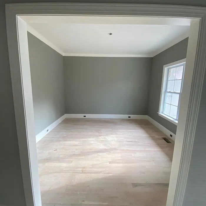
Imagine stepping into your home after a long day, greeted by a serene ambiance that instantly calms your senses. The walls, painted in a gorgeous muted gray, wrap around you like a cozy blanket. This isn’t just any gray; it’s Dorian Gray from Sherwin Williams, a sophisticated hue that brings warmth and elegance to any room. If you’re contemplating a change in your space, let’s dive into everything you need to know about this timeless color and how it can transform your home.
Dorian Gray, with its color code SW 7017, strikes a perfect balance between modern and classic design. It’s a medium-dark gray that reflects very little light, thanks to its Light Reflectance Value (LRV) of 24%. This means if you’re looking for a shade that creates intimacy and warmth, Dorian Gray is your go-to. Its subtle red undertones give it an inviting quality that can soften even the most contemporary decor.
You might be wondering how this color fits into your home. The beauty of Dorian Gray is its versatility. It works wonderfully in living rooms, bedrooms, dining rooms, home offices, and even hallways. Whether you’re aiming for a minimalist vibe or something more transitional, Dorian Gray adapts seamlessly, allowing your furniture and decor to shine while providing a chic backdrop.
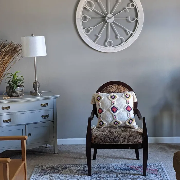
One of the standout features of Dorian Gray is its muted tone. It pairs beautifully with both warm and cool colors, making it a savvy choice for homeowners who love to mix and match. Think about adding pops of color through your decor—perhaps a vibrant art piece or colorful throw pillows. Dorian Gray won’t compete with those accents; instead, it will enhance their beauty.
When it comes to application, you’ll find Dorian Gray to be beginner-friendly. It’s roller-ready and brush smooth, making your DIY painting project a breeze. With good coverage, you’re likely to achieve that perfect finish with just one or two coats. Plus, it’s touch-up friendly, which means any accidental scuffs or marks can be easily remedied.
As you consider where to use Dorian Gray, think about the lighting in your space. This color truly shines in natural light, revealing its warm undertones and creating a cozy atmosphere. However, in dimmer settings, it can take on a deeper, moodier hue, which is perfect for creating a more intimate vibe. Be sure to test it in different lighting situations to see how it interacts throughout the day.
Now, let’s talk about the finishes. Dorian Gray comes in matte, eggshell, and satin options. If you’re looking for something sleek and modern, satin might be your best bet. For a more traditional feel, consider eggshell or matte. Each finish adds a different texture and feel to your space, so choose based on the mood you want to establish.
Decorating with Dorian Gray opens up a world of possibilities. It pairs beautifully with crisp white trim, especially with shades like White Dove, which creates a classic contrast that feels fresh and clean. If you have wooden accents or brass fixtures, Dorian Gray complements those tones beautifully, allowing them to stand out without overpowering the space.
If you’re still unsure whether Dorian Gray is the right fit for your home, let’s address a couple of common questions. First, is Dorian Gray suitable for small spaces? Absolutely! Its warm undertones can help create an inviting atmosphere without making the room feel cramped. Just balance it out with lighter accents to keep the space airy and open.
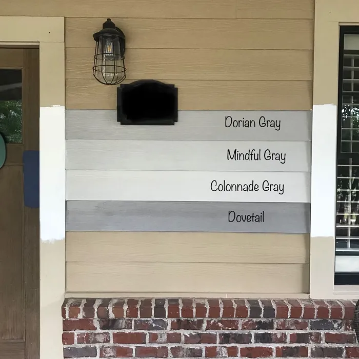
Next, how does Dorian Gray compare to other popular gray paints? While many grays can feel cold or sterile, Dorian Gray’s unique warmth sets it apart. Compared to well-known options like Revere Pewter, it offers a slightly deeper, richer look that can enhance your decor while maintaining a chic, modern feel.
But it’s not just about aesthetics—Dorian Gray also performs well in practical terms. It boasts low VOC levels, which means it’s better for indoor air quality, and it’s washable and wipeable, making maintenance easier. You won’t have to worry about scuffs ruining your beautiful walls; a simple wipe down can keep them looking fresh.
Consider how Dorian Gray can be used beyond just walls. It’s perfect for an accent wall, adding depth and dimension to your space. You might even paint furniture pieces in this color for a cohesive look. The possibilities are endless!
Throughout your design journey, remember that it’s essential to test paint colors in your home. Observe how Dorian Gray interacts with your existing decor, flooring, and natural light. The undertones will play a significant role in how the color feels in different contexts, making it crucial to see it in action.
In short, Dorian Gray is more than just a paint color; it’s a transformative element in your home that can elevate your space into a calming, sophisticated retreat. With its warm undertones and versatility, it’s a timeless choice that complements a variety of decor styles, from modern to transitional to even industrial.
So, if you’re ready to make a change in your home, consider giving Dorian Gray a try. You might find that it creates the inviting atmosphere you’ve been dreaming of, making every moment spent in your space a little more special. Happy decorating!
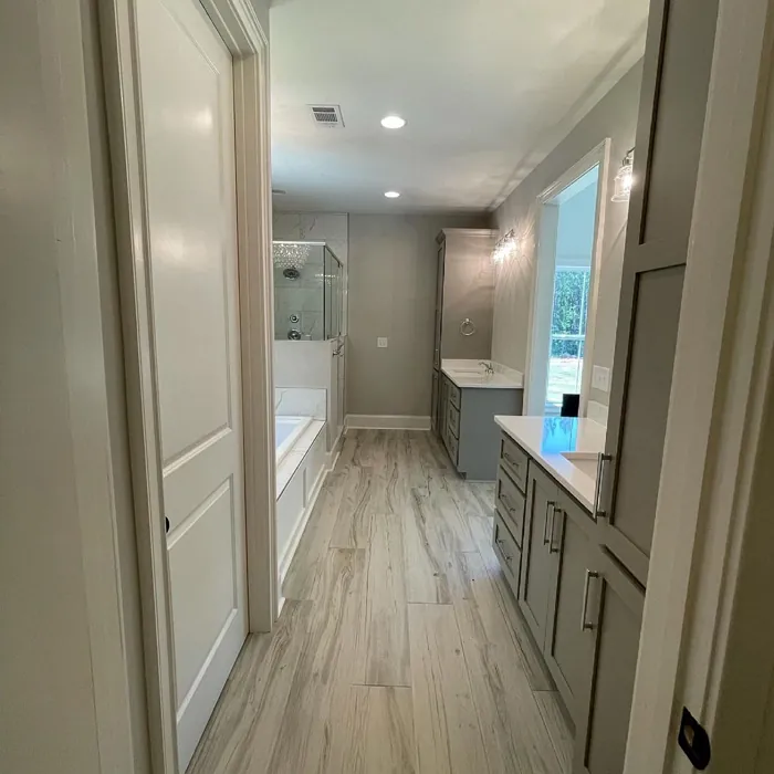
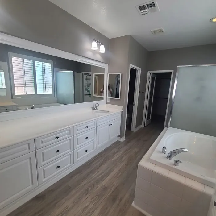
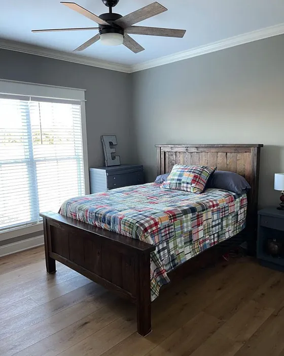
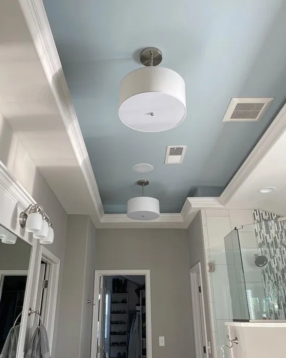
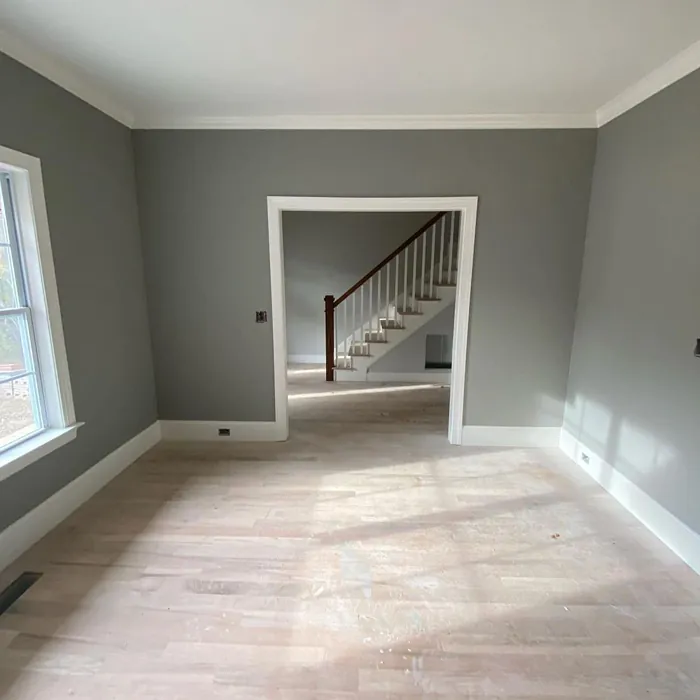
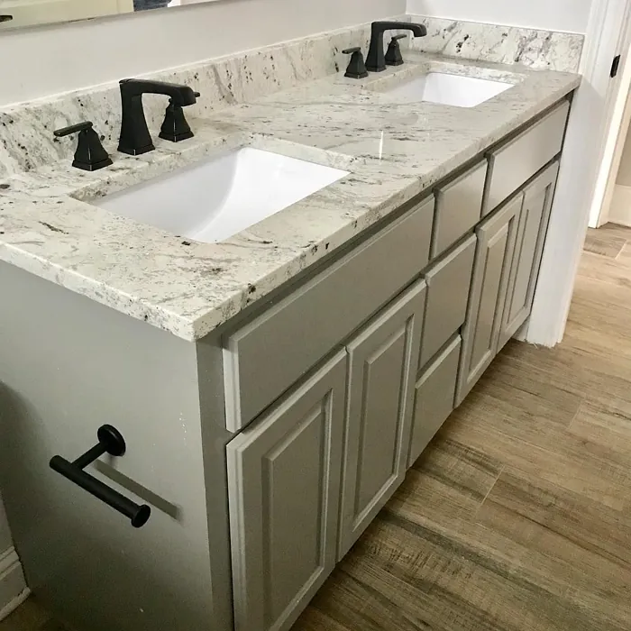
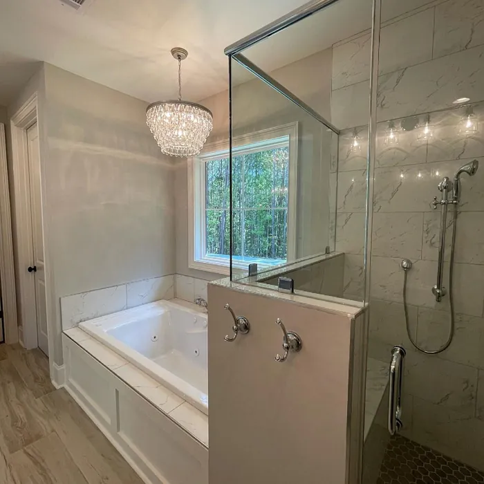
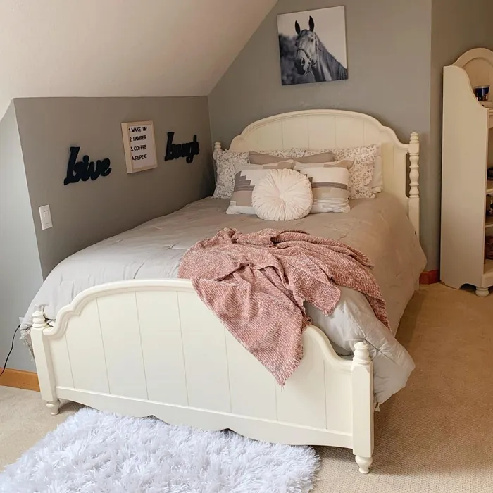
Real Room Photo of Dorian Gray SW 7017


Undertones of Dorian Gray ?
The undertones of Dorian Gray are a key aspect of its character, leaning towards Red. These subtle underlying hues are what give the color its depth and complexity. For example, a gray with a blue undertone will feel cooler and more modern, while one with a brown undertone will feel warmer and more traditional. It’s essential to test this paint in your home and observe it next to your existing furniture, flooring, and decor to see how these undertones interact and reveal themselves throughout the day.
HEX value: #ACA79E
RGB code: 172, 167, 158
Is Dorian Gray Cool or Warm?
This color leans towards the warm side of the spectrum, making it feel inviting and relaxed. It’s perfect for spaces where you want to promote a sense of comfort without overwhelming the senses.
Understanding Color Properties and Interior Design Tips
Hue refers to a specific position on the color wheel, measured in degrees from 0 to 360. Each degree represents a different pure color:
- 0° represents red
- 120° represents green
- 240° represents blue
Saturation describes the intensity or purity of a color and is expressed as a percentage:
- At 0%, the color appears completely desaturated—essentially a shade of gray
- At 100%, the color is at its most vivid and vibrant
Lightness indicates how light or dark a color is, also expressed as a percentage:
- 0% lightness results in black
- 100% lightness results in white
Using Warm Colors in Interior Design
Warm hues—such as reds, oranges, yellows, warm beiges, and greiges—are excellent choices for creating inviting and energetic spaces. These colors are particularly well-suited for:
- Kitchens, living rooms, and bathrooms, where warmth enhances comfort and sociability
- Large rooms, where warm tones can help reduce the sense of emptiness and make the space feel more intimate
For example:
- Warm beige shades provide a cozy, inviting atmosphere, ideal for living rooms, bedrooms, and hallways.
- Warm greige (a mix of beige and gray) offers the warmth of beige with the modern appeal of gray, making it a versatile backdrop for dining areas, bedrooms, and living spaces.
However, be mindful when using warm light tones in rooms with limited natural light. These shades may appear muted or even take on an unpleasant yellowish tint. To avoid a dull or flat appearance:
- Add depth by incorporating richer tones like deep greens, charcoal, or chocolate brown
- Use textured elements such as curtains, rugs, or cushions to bring dimension to the space
Pro Tip: Achieving Harmony with Warm and Cool Color Balance
To create a well-balanced and visually interesting interior, mix warm and cool tones strategically. This contrast adds depth and harmony to your design.
- If your walls feature warm hues, introduce cool-colored accents such as blue or green furniture, artwork, or accessories to create contrast.
- For a polished look, consider using a complementary color scheme, which pairs colors opposite each other on the color wheel (e.g., red with green, orange with blue).
This thoughtful mix not only enhances visual appeal but also creates a space that feels both dynamic and cohesive.

Light Temperature Affects on Dorian Gray
Natural Light
Natural daylight changes in color temperature as the sun moves across the sky. At sunrise and sunset, the light tends to have a warm, golden tone with a color temperature around 2000 Kelvin (K). As the day progresses and the sun rises higher, the light becomes cooler and more neutral. Around midday, especially when the sky is clear, natural light typically reaches its peak brightness and shifts to a cooler tone, ranging from 5500 to 6500 Kelvin. This midday light is close to what we perceive as pure white or daylight-balanced light.
These shifts in natural light can significantly influence how colors appear in a space, which is why designers often consider both the time of day and the orientation of windows when planning interior color schemes.
Artificial Light
When choosing artificial lighting, pay close attention to the color temperature, measured in Kelvin (K). This determines how warm or cool the light will appear. Lower temperatures, around 2700K, give off a warm, yellow glow often used in living rooms or bedrooms. Higher temperatures, above 5000K, create a cool, bluish light similar to daylight, commonly used in kitchens, offices, or task areas.
Use the slider to see how lighting temperature can affect the appearance of a surface or color throughout a space.


4800K
LRV of Dorian Gray
The Light Reflectance Value (LRV) of Dorian Gray is 24%, which places it in the Medium Dark category. This means it reflects very little light. Understanding a paint’s LRV is crucial for predicting how it will look in your space. A higher LRV indicates a lighter color that reflects more light, making rooms feel larger and brighter. A lower LRV signifies a darker color that absorbs more light, creating a cozier, more intimate atmosphere. Always consider the natural and artificial lighting in your room when selecting a paint color based on its LRV.
Detailed Review of Dorian Gray
Additional Paint Characteristics
Ideal Rooms
Bedroom, Dining Room, Hallway, Home Office, Living Room
Decor Styles
Contemporary, Industrial, Minimalist, Modern, Transitional
Coverage
Good (1–2 Coats), Touch-Up Friendly
Ease of Application
Beginner Friendly, Brush Smooth, Roller-Ready
Washability
Washable, Wipeable
VOC Level
Low VOC, Ultra Low VOC
Best Use
Accent Wall, Furniture, Interior Walls
Room Suitability
Bedroom, Dining Room, Hallway, Home Office, Living Room
Tone Tag
Balanced, Muted, Warm
Finish Type
Eggshell, Matte, Satin
Paint Performance
High Coverage, Low Odor, Scuff Resistant
Use Cases
Best for Low Light Rooms, Best for Modern Farmhouse, Classic Favorite
Mood
Calm, Inviting, Sophisticated
Trim Pairing
Complements Brass Fixtures, Good with Wood Trim, Pairs with White Dove
Dorian Gray is a fantastic choice for homeowners looking to add a touch of elegance to their interiors. Its muted tone makes it incredibly versatile, pairing well with both warm and cool colors. Ideal for spaces like living rooms and bedrooms, Dorian Gray creates a calming yet sophisticated atmosphere. Whether you’re aiming for a modern or traditional look, this color adapts beautifully, allowing your furniture and decor to take center stage. Additionally, its good coverage means you won’t have to worry about multiple coats, making your painting project smoother and quicker. Just be sure to test it in different lighting, as it can shift slightly based on the light throughout the day.
Pros & Cons of SW 7017 Dorian Gray
Pros
Cons
Colors that go with Sherwin Williams Dorian Gray
FAQ on SW 7017 Dorian Gray
Is Dorian Gray suitable for small spaces?
Absolutely! Dorian Gray can work wonders in small spaces. Its warm undertones help create an inviting atmosphere without making the room feel cramped. Just remember to balance it out with lighter accents or decor to keep the space feeling open and airy.
How does Dorian Gray compare to other gray paints?
Dorian Gray stands out from other grays due to its unique warm undertones. While some grays can feel cold or sterile, Dorian Gray adds a layer of warmth that makes it feel more welcoming. Compared to popular options like Revere Pewter, it’s slightly deeper, offering a richer look that can enhance your decor.
Comparisons Dorian Gray with other colors
Dorian Gray SW 7017 vs Repose Gray SW 7015
| Attribute | Dorian Gray SW 7017 | Repose Gray SW 7015 |
|---|---|---|
| Color Name | Dorian Gray SW 7017 | Repose Gray SW 7015 |
| Color | ||
| Hue | Grey | Grey |
| Brightness | Medium | Medium |
| RGB | 172, 167, 158 | 204, 201, 192 |
| LRV | 24% | 58% |
| Finish Type | Eggshell, Matte, Satin | Eggshell, Matte, Satin |
| Finish Options | Eggshell, Matte, Satin | Eggshell, Matte, Satin |
| Ideal Rooms | Bedroom, Dining Room, Hallway, Home Office, Living Room | Bedroom, Dining Room, Hallway, Home Office, Living Room |
| Decor Styles | Contemporary, Industrial, Minimalist, Modern, Transitional | Contemporary, Farmhouse, Minimalist, Modern, Transitional |
| Coverage | Good (1–2 Coats), Touch-Up Friendly | Good (1–2 Coats), Touch-Up Friendly |
| Ease of Application | Beginner Friendly, Brush Smooth, Roller-Ready | Beginner Friendly, Brush Smooth, Fast-Drying, Roller-Ready |
| Washability | Washable, Wipeable | Highly Washable, Washable |
| Room Suitability | Bedroom, Dining Room, Hallway, Home Office, Living Room | Bedroom, Dining Room, Hallway, Home Office, Living Room |
| Tone | Balanced, Muted, Warm | Muted, Neutral, Warm |
| Paint Performance | High Coverage, Low Odor, Scuff Resistant | Low Odor, Quick Drying, Scuff Resistant |
Dorian Gray SW 7017 vs Light French Gray SW 0055
| Attribute | Dorian Gray SW 7017 | Light French Gray SW 0055 |
|---|---|---|
| Color Name | Dorian Gray SW 7017 | Light French Gray SW 0055 |
| Color | ||
| Hue | Grey | Grey |
| Brightness | Medium | Medium |
| RGB | 172, 167, 158 | 194, 192, 187 |
| LRV | 24% | 53% |
| Finish Type | Eggshell, Matte, Satin | Eggshell, Matte, Satin |
| Finish Options | Eggshell, Matte, Satin | Eggshell, Matte, Satin |
| Ideal Rooms | Bedroom, Dining Room, Hallway, Home Office, Living Room | Bedroom, Dining Room, Home Office, Kitchen, Living Room |
| Decor Styles | Contemporary, Industrial, Minimalist, Modern, Transitional | Contemporary, Farmhouse, Modern, Scandinavian, Transitional |
| Coverage | Good (1–2 Coats), Touch-Up Friendly | Good (1–2 Coats), Touch-Up Friendly |
| Ease of Application | Beginner Friendly, Brush Smooth, Roller-Ready | Beginner Friendly, Brush Smooth, Roller-Ready |
| Washability | Washable, Wipeable | Highly Washable, Washable |
| Room Suitability | Bedroom, Dining Room, Hallway, Home Office, Living Room | Bedroom, Dining Room, Home Office, Kitchen, Living Room |
| Tone | Balanced, Muted, Warm | Balanced, Muted, Neutral, Warm |
| Paint Performance | High Coverage, Low Odor, Scuff Resistant | Easy Touch-Up, High Coverage, Low Odor |
Dorian Gray SW 7017 vs Wordly Gray SW 7043
| Attribute | Dorian Gray SW 7017 | Wordly Gray SW 7043 |
|---|---|---|
| Color Name | Dorian Gray SW 7017 | Wordly Gray SW 7043 |
| Color | ||
| Hue | Grey | Grey |
| Brightness | Medium | Medium |
| RGB | 172, 167, 158 | 206, 198, 187 |
| LRV | 24% | 58% |
| Finish Type | Eggshell, Matte, Satin | Eggshell, Satin |
| Finish Options | Eggshell, Matte, Satin | Eggshell, Flat, Satin |
| Ideal Rooms | Bedroom, Dining Room, Hallway, Home Office, Living Room | Bedroom, Home Office, Kitchen, Living Room |
| Decor Styles | Contemporary, Industrial, Minimalist, Modern, Transitional | Minimalist, Modern, Scandi, Transitional |
| Coverage | Good (1–2 Coats), Touch-Up Friendly | Good (1–2 Coats) |
| Ease of Application | Beginner Friendly, Brush Smooth, Roller-Ready | Beginner Friendly, Brush Smooth, Fast-Drying, Roller-Ready |
| Washability | Washable, Wipeable | Highly Washable, Washable |
| Room Suitability | Bedroom, Dining Room, Hallway, Home Office, Living Room | Bedroom, Dining Room, Home Office, Living Room |
| Tone | Balanced, Muted, Warm | Muted, Neutral, Warm |
| Paint Performance | High Coverage, Low Odor, Scuff Resistant | Easy Touch-Up, Low Odor, Scuff Resistant |
Dorian Gray SW 7017 vs Illusive Green SW 9164
| Attribute | Dorian Gray SW 7017 | Illusive Green SW 9164 |
|---|---|---|
| Color Name | Dorian Gray SW 7017 | Illusive Green SW 9164 |
| Color | ||
| Hue | Grey | Grey |
| Brightness | Medium | Medium |
| RGB | 172, 167, 158 | 146, 148, 141 |
| LRV | 24% | 24% |
| Finish Type | Eggshell, Matte, Satin | Eggshell, Matte, Satin |
| Finish Options | Eggshell, Matte, Satin | Eggshell, Matte, Satin |
| Ideal Rooms | Bedroom, Dining Room, Hallway, Home Office, Living Room | Bedroom, Dining Room, Home Office, Living Room, Nursery |
| Decor Styles | Contemporary, Industrial, Minimalist, Modern, Transitional | Coastal, Minimalist, Modern, Rustic, Scandinavian |
| Coverage | Good (1–2 Coats), Touch-Up Friendly | Good (1–2 Coats), Touch-Up Friendly |
| Ease of Application | Beginner Friendly, Brush Smooth, Roller-Ready | Beginner Friendly, Brush Smooth, Fast-Drying, Roller-Ready |
| Washability | Washable, Wipeable | Highly Washable, Washable, Wipeable |
| Room Suitability | Bedroom, Dining Room, Hallway, Home Office, Living Room | Bedroom, Dining Room, Home Office, Living Room, Nursery |
| Tone | Balanced, Muted, Warm | Balanced, Earthy, Muted |
| Paint Performance | High Coverage, Low Odor, Scuff Resistant | Easy Touch-Up, Low Odor, Quick Drying, Scuff Resistant |
Dorian Gray SW 7017 vs Fawn Brindle SW 7640
| Attribute | Dorian Gray SW 7017 | Fawn Brindle SW 7640 |
|---|---|---|
| Color Name | Dorian Gray SW 7017 | Fawn Brindle SW 7640 |
| Color | ||
| Hue | Grey | Grey |
| Brightness | Medium | Medium |
| RGB | 172, 167, 158 | 167, 160, 148 |
| LRV | 24% | 24% |
| Finish Type | Eggshell, Matte, Satin | Eggshell, Matte |
| Finish Options | Eggshell, Matte, Satin | Eggshell, Matte, Satin |
| Ideal Rooms | Bedroom, Dining Room, Hallway, Home Office, Living Room | Bedroom, Dining Room, Hallway, Home Office, Living Room |
| Decor Styles | Contemporary, Industrial, Minimalist, Modern, Transitional | Bohemian, Minimalist, Modern Farmhouse, Transitional |
| Coverage | Good (1–2 Coats), Touch-Up Friendly | Good (1–2 Coats) |
| Ease of Application | Beginner Friendly, Brush Smooth, Roller-Ready | Brush Smooth, Fast-Drying, Roller-Ready |
| Washability | Washable, Wipeable | Stain Resistant, Washable |
| Room Suitability | Bedroom, Dining Room, Hallway, Home Office, Living Room | Bedroom, Dining Room, Home Office, Living Room |
| Tone | Balanced, Muted, Warm | Earthy, Neutral, Warm |
| Paint Performance | High Coverage, Low Odor, Scuff Resistant | Easy Touch-Up, Fade Resistant, Low Odor |
Dorian Gray SW 7017 vs Balanced Beige SW 7037
| Attribute | Dorian Gray SW 7017 | Balanced Beige SW 7037 |
|---|---|---|
| Color Name | Dorian Gray SW 7017 | Balanced Beige SW 7037 |
| Color | ||
| Hue | Grey | Grey |
| Brightness | Medium | Medium |
| RGB | 172, 167, 158 | 192, 178, 162 |
| LRV | 24% | 44% |
| Finish Type | Eggshell, Matte, Satin | Eggshell, Matte, Satin |
| Finish Options | Eggshell, Matte, Satin | Eggshell, Matte, Satin |
| Ideal Rooms | Bedroom, Dining Room, Hallway, Home Office, Living Room | Bedroom, Dining Room, Home Office, Kitchen, Living Room |
| Decor Styles | Contemporary, Industrial, Minimalist, Modern, Transitional | Contemporary, Minimalist, Modern Farmhouse, Rustic, Transitional |
| Coverage | Good (1–2 Coats), Touch-Up Friendly | Good (1–2 Coats), Touch-Up Friendly |
| Ease of Application | Beginner Friendly, Brush Smooth, Roller-Ready | Beginner Friendly, Brush Smooth, Roller-Ready |
| Washability | Washable, Wipeable | Washable, Wipeable |
| Room Suitability | Bedroom, Dining Room, Hallway, Home Office, Living Room | Bedroom, Dining Room, Hallway, Kitchen, Living Room |
| Tone | Balanced, Muted, Warm | Balanced, Earthy, Warm |
| Paint Performance | High Coverage, Low Odor, Scuff Resistant | Easy Touch-Up, High Coverage, Low Odor |
Dorian Gray SW 7017 vs Mushroom SW 9587
| Attribute | Dorian Gray SW 7017 | Mushroom SW 9587 |
|---|---|---|
| Color Name | Dorian Gray SW 7017 | Mushroom SW 9587 |
| Color | ||
| Hue | Grey | Grey |
| Brightness | Medium | Medium |
| RGB | 172, 167, 158 | 208, 199, 183 |
| LRV | 24% | 24% |
| Finish Type | Eggshell, Matte, Satin | Eggshell, Satin |
| Finish Options | Eggshell, Matte, Satin | Eggshell, Flat, Matte, Satin |
| Ideal Rooms | Bedroom, Dining Room, Hallway, Home Office, Living Room | Bedroom, Dining Room, Hallway, Home Office, Living Room |
| Decor Styles | Contemporary, Industrial, Minimalist, Modern, Transitional | Bohemian, Contemporary, Modern Farmhouse, Traditional |
| Coverage | Good (1–2 Coats), Touch-Up Friendly | Good (1–2 Coats) |
| Ease of Application | Beginner Friendly, Brush Smooth, Roller-Ready | Beginner Friendly, Brush Smooth, Roller-Ready |
| Washability | Washable, Wipeable | Highly Washable, Washable |
| Room Suitability | Bedroom, Dining Room, Hallway, Home Office, Living Room | Bedroom, Dining Room, Home Office, Living Room |
| Tone | Balanced, Muted, Warm | Earthy, Neutral, Warm |
| Paint Performance | High Coverage, Low Odor, Scuff Resistant | Easy Touch-Up, Long Lasting, Low Odor, Scuff Resistant |
Dorian Gray SW 7017 vs Silver Strand SW 7057
| Attribute | Dorian Gray SW 7017 | Silver Strand SW 7057 |
|---|---|---|
| Color Name | Dorian Gray SW 7017 | Silver Strand SW 7057 |
| Color | ||
| Hue | Grey | Grey |
| Brightness | Medium | Medium |
| RGB | 172, 167, 158 | 200, 203, 196 |
| LRV | 24% | 66% |
| Finish Type | Eggshell, Matte, Satin | Eggshell, Satin |
| Finish Options | Eggshell, Matte, Satin | Eggshell, Matte, Satin |
| Ideal Rooms | Bedroom, Dining Room, Hallway, Home Office, Living Room | Bedroom, Dining Room, Hallway, Home Office, Living Room |
| Decor Styles | Contemporary, Industrial, Minimalist, Modern, Transitional | Coastal, Minimalist, Modern, Traditional, Transitional |
| Coverage | Good (1–2 Coats), Touch-Up Friendly | Good (1–2 Coats), Touch-Up Friendly |
| Ease of Application | Beginner Friendly, Brush Smooth, Roller-Ready | Beginner Friendly, Brush Smooth, Roller-Ready |
| Washability | Washable, Wipeable | Highly Washable, Washable |
| Room Suitability | Bedroom, Dining Room, Hallway, Home Office, Living Room | Bathroom, Bedroom, Home Office, Kitchen, Living Room |
| Tone | Balanced, Muted, Warm | Balanced, Neutral, Warm |
| Paint Performance | High Coverage, Low Odor, Scuff Resistant | Easy Touch-Up, High Coverage, Low Odor |
Dorian Gray SW 7017 vs Cadet SW 9143
| Attribute | Dorian Gray SW 7017 | Cadet SW 9143 |
|---|---|---|
| Color Name | Dorian Gray SW 7017 | Cadet SW 9143 |
| Color | ||
| Hue | Grey | Grey |
| Brightness | Medium | Medium |
| RGB | 172, 167, 158 | 145, 153, 156 |
| LRV | 24% | 12% |
| Finish Type | Eggshell, Matte, Satin | Eggshell, Matte, Satin |
| Finish Options | Eggshell, Matte, Satin | Eggshell, Matte, Satin |
| Ideal Rooms | Bedroom, Dining Room, Hallway, Home Office, Living Room | Bathroom, Bedroom, Hallway, Home Office, Kitchen, Living Room |
| Decor Styles | Contemporary, Industrial, Minimalist, Modern, Transitional | Coastal, Industrial, Minimalist, Modern, Scandinavian |
| Coverage | Good (1–2 Coats), Touch-Up Friendly | Good (1–2 Coats), Touch-Up Friendly |
| Ease of Application | Beginner Friendly, Brush Smooth, Roller-Ready | Beginner Friendly, Brush Smooth, Roller-Ready |
| Washability | Washable, Wipeable | Washable, Wipeable |
| Room Suitability | Bedroom, Dining Room, Hallway, Home Office, Living Room | Bathroom, Bedroom, Hallway, Home Office, Living Room |
| Tone | Balanced, Muted, Warm | Balanced, Cool, Muted |
| Paint Performance | High Coverage, Low Odor, Scuff Resistant | Easy Touch-Up, High Coverage, Low Odor |
Dorian Gray SW 7017 vs Dovetail SW 7018
| Attribute | Dorian Gray SW 7017 | Dovetail SW 7018 |
|---|---|---|
| Color Name | Dorian Gray SW 7017 | Dovetail SW 7018 |
| Color | ||
| Hue | Grey | Grey |
| Brightness | Medium | Medium |
| RGB | 172, 167, 158 | 144, 138, 131 |
| LRV | 24% | 24% |
| Finish Type | Eggshell, Matte, Satin | Eggshell, Matte, Satin |
| Finish Options | Eggshell, Matte, Satin | Eggshell, Matte, Satin |
| Ideal Rooms | Bedroom, Dining Room, Hallway, Home Office, Living Room | Bedroom, Dining Room, Hallway, Home Office, Living Room |
| Decor Styles | Contemporary, Industrial, Minimalist, Modern, Transitional | Minimalist, Modern Farmhouse, Rustic, Transitional |
| Coverage | Good (1–2 Coats), Touch-Up Friendly | Good (1–2 Coats), Touch-Up Friendly |
| Ease of Application | Beginner Friendly, Brush Smooth, Roller-Ready | Beginner Friendly, Brush Smooth, Roller-Ready |
| Washability | Washable, Wipeable | Washable, Wipeable |
| Room Suitability | Bedroom, Dining Room, Hallway, Home Office, Living Room | Bedroom, Dining Room, Home Office, Living Room |
| Tone | Balanced, Muted, Warm | Earthy, Neutral, Warm |
| Paint Performance | High Coverage, Low Odor, Scuff Resistant | Easy Touch-Up, Fade Resistant, Low Odor |
Official Page of Sherwin Williams Dorian Gray SW 7017