Color Preview & Key Details
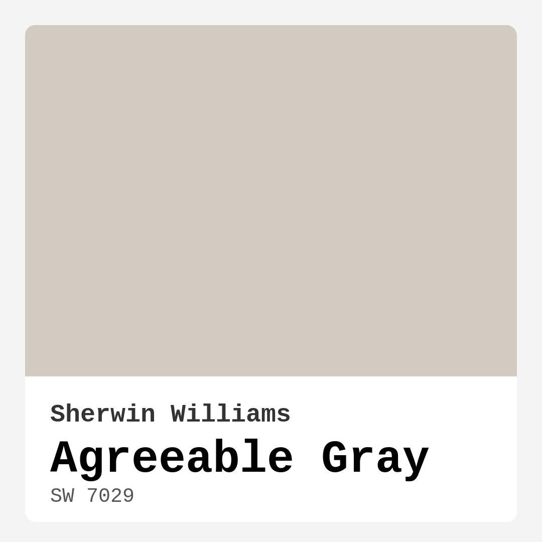
| HEX Code | #D1CBC1 |
| RGB | 209, 203, 193 |
| LRV | 60% |
| Undertone | Red |
| Finish Options | Eggshell, Flat, Matte, Satin |
Imagine stepping into a room that instantly puts you at ease, where the walls embrace you with a warm, welcoming hue. That’s the magic of Agreeable Gray, a color that has captured the hearts of homeowners and designers alike. This soft, warm gray from Sherwin Williams, with its subtle red undertones, brings a sophisticated yet cozy vibe to any space. It’s a color that feels both modern and timeless, making it a fantastic choice for various decor styles.
When considering a new paint color, it’s essential to think about not just how it looks on a swatch but how it interacts with your specific space. Agreeable Gray, with its light reflectance value (LRV) of 60%, is particularly adept at adapting to different lighting conditions. In bright, natural light, it appears airy and light, creating an open feel. As the day transitions to evening, this color softens, inviting you into a warm embrace. This dynamic quality makes it ideal not just for large, open areas but also for smaller rooms that need a touch of warmth without feeling cramped.
You might be wondering, where can I use Agreeable Gray? The answer is truly anywhere. It’s versatile enough to work in a living room, bedroom, kitchen, bathroom, or dining room. Its soothing nature makes it perfect for spaces meant for relaxation, like a bedroom, while its sophistication allows it to shine in more formal settings, such as a dining room. Home offices, too, benefit from its calming influence, helping you stay focused and productive.
Now, let’s talk about application. One of the best aspects of Agreeable Gray is how beginner-friendly it is. Its smooth application ensures that even if you’re a novice DIYer, you can achieve a professional finish. It covers well with just one to two coats, and because it’s touch-up friendly, you won’t have to worry about unsightly patches if you need to make repairs down the line. Plus, its low VOC level means you can paint without overwhelming your space with strong odors.
But, like any color, it’s crucial to consider the context in which you’re using it. The warm undertones of Agreeable Gray can sometimes come off as too warm in certain settings, especially if paired incorrectly with other colors. This is where testing comes into play. Grab a sample and paint a small section of your wall. Live with it for a few days, observing how it changes with the light at different times of the day. This will give you a better sense of how it interacts with your furniture and decor.
Speaking of decor, Agreeable Gray pairs beautifully with a range of colors. For a fresh, modern look, consider complementing it with crisp white trim, like Benjamin Moore’s White Dove. This creates a clean contrast that highlights the warmth of the gray. If you’re leaning toward a more rustic or farmhouse style, warm wood tones can enhance the inviting nature of this color. You could also explore bolder accents like navy blue or deep green, which play beautifully against the softness of Agreeable Gray.
But what about those who prefer lighter or darker shades? You’re in luck! If you want to stay in the same family but prefer something a tad lighter, consider shades like SW 9566 or SW 7014. On the flip side, if you’re drawn to something darker, shades such as SW 9591 or SW 7051 can add depth while still maintaining a sophisticated feel.
In terms of mood, Agreeable Gray exudes coziness and calmness. It’s the kind of color that makes you want to curl up with a good book or entertain friends over a glass of wine. It invites conversation and connection, making it perfect for living areas and dining spaces. Yet, it doesn’t overpower; instead, it provides a serene backdrop that allows your decor to shine.
Another point worth mentioning is how well Agreeable Gray performs in various lighting conditions. The adaptability of this color means it can suit both natural and artificial light beautifully. In bright daylight, it opens up and feels almost airy, while under softer evening lights, it takes on a cozy, muted tone that wraps around you. This ability to adapt is a significant advantage when planning your interior.
For those with rental properties or who frequently change their decor, Agreeable Gray is a reliable choice. It’s a designer favorite because it provides a classic backdrop that can easily transition with your evolving style. Whether you’re going from minimalistic to modern farmhouse, this color can adapt seamlessly to your changing tastes.
As a homeowner, making the right paint choice can be overwhelming, but Agreeable Gray simplifies the process. It’s not just a gray; it’s a warm, inviting hue that creates a perfect backdrop for your life. Whether you’re entertaining guests, enjoying family time, or relaxing after a long day, this color enhances your space without demanding attention.
To sum it all up, Agreeable Gray is a stunning choice for anyone looking to refresh their home. Its warm undertones, versatility, and adaptability across various lighting situations make it a go-to for both seasoned designers and DIY enthusiasts. Embracing this color means you’re not just painting walls; you’re enhancing the ambiance of your home, creating a space that’s not only beautiful but also profoundly inviting. So, grab that brush, and get ready to transform your space into a sanctuary of style and comfort!

Save this color to your Pinterest board to revisit when planning your room.
Real Room Photo of Agreeable Gray SW 7029


Real rooms painted with Agreeable Gray SW 7029 by Sherwin Williams. Lighting and photography can affect how colors appear — always test a sample swatch in your own space.
Undertones of Agreeable Gray ?
The undertones of Agreeable Gray are a key aspect of its character, leaning towards Red. These subtle underlying hues are what give the color its depth and complexity. For example, a gray with a blue undertone will feel cooler and more modern, while one with a brown undertone will feel warmer and more traditional. It’s essential to test this paint in your home and observe it next to your existing furniture, flooring, and decor to see how these undertones interact and reveal themselves throughout the day.
HEX value: #D1CBC1
RGB code: 209, 203, 193
Is Agreeable Gray Cool or Warm?
This color leans warm, offering a welcoming touch to both small and large spaces. It can create an inviting atmosphere, especially when paired with warm wood tones or soft textiles.
Understanding Color Properties and Interior Design Tips
Hue refers to a specific position on the color wheel, measured in degrees from 0 to 360. Each degree represents a different pure color:
- 0° represents red
- 120° represents green
- 240° represents blue
Saturation describes the intensity or purity of a color and is expressed as a percentage:
- At 0%, the color appears completely desaturated—essentially a shade of gray
- At 100%, the color is at its most vivid and vibrant
Lightness indicates how light or dark a color is, also expressed as a percentage:
- 0% lightness results in black
- 100% lightness results in white
Using Warm Colors in Interior Design
Warm hues—such as reds, oranges, yellows, warm beiges, and greiges—are excellent choices for creating inviting and energetic spaces. These colors are particularly well-suited for:
- Kitchens, living rooms, and bathrooms, where warmth enhances comfort and sociability
- Large rooms, where warm tones can help reduce the sense of emptiness and make the space feel more intimate
For example:
- Warm beige shades provide a cozy, inviting atmosphere, ideal for living rooms, bedrooms, and hallways.
- Warm greige (a mix of beige and gray) offers the warmth of beige with the modern appeal of gray, making it a versatile backdrop for dining areas, bedrooms, and living spaces.
However, be mindful when using warm light tones in rooms with limited natural light. These shades may appear muted or even take on an unpleasant yellowish tint. To avoid a dull or flat appearance:
- Add depth by incorporating richer tones like deep greens, charcoal, or chocolate brown
- Use textured elements such as curtains, rugs, or cushions to bring dimension to the space
Pro Tip: Achieving Harmony with Warm and Cool Color Balance
To create a well-balanced and visually interesting interior, mix warm and cool tones strategically. This contrast adds depth and harmony to your design.
- If your walls feature warm hues, introduce cool-colored accents such as blue or green furniture, artwork, or accessories to create contrast.
- For a polished look, consider using a complementary color scheme, which pairs colors opposite each other on the color wheel (e.g., red with green, orange with blue).
This thoughtful mix not only enhances visual appeal but also creates a space that feels both dynamic and cohesive.

Save this color to your Pinterest board to revisit when planning your room.
Light Temperature Affects on Agreeable Gray
Natural Light
Natural daylight changes in color temperature as the sun moves across the sky. At sunrise and sunset, the light tends to have a warm, golden tone with a color temperature around 2000 Kelvin (K). As the day progresses and the sun rises higher, the light becomes cooler and more neutral. Around midday, especially when the sky is clear, natural light typically reaches its peak brightness and shifts to a cooler tone, ranging from 5500 to 6500 Kelvin. This midday light is close to what we perceive as pure white or daylight-balanced light.
These shifts in natural light can significantly influence how colors appear in a space, which is why designers often consider both the time of day and the orientation of windows when planning interior color schemes.
Explore how this color transforms from sunrise through sunset as natural light changes throughout the day. Use the slider to simulate morning light, midday brightness, and warm afternoon tones.
North-facing rooms stay cooler throughout the day and benefit from warmer paint tones to compensate. South-facing rooms receive more direct sunlight, making even deeper shades more workable. East-facing rooms get bright morning light that fades by afternoon, while west-facing rooms glow warmly in the evening.
Artificial Light
When choosing artificial lighting, pay close attention to the color temperature, measured in Kelvin (K). This determines how warm or cool the light will appear. Lower temperatures, around 2700K, give off a warm, yellow glow often used in living rooms or bedrooms. Higher temperatures, above 5000K, create a cool, bluish light similar to daylight, commonly used in kitchens, offices, or task areas.
Use the slider to see how lighting temperature can affect the appearance of a surface or color throughout a space.
See how this color looks under different artificial light temperatures — from warm candlelight (2000K) to cool daylight (7000K). Move the slider to simulate your room's lighting conditions.


4800K
Keep in mind that natural light from windows, the warmth of lamps, and overhead lighting all affect how this color reads on your walls at different times of day. Always observe a sample swatch in your actual space before purchasing.
LRV of Agreeable Gray
The Light Reflectance Value (LRV) of Agreeable Gray is 60%, which places it in the Medium category. This means it Reflects a moderate amount of light. Understanding a paint’s LRV is crucial for predicting how it will look in your space. A higher LRV indicates a lighter color that reflects more light, making rooms feel larger and brighter. A lower LRV signifies a darker color that absorbs more light, creating a cozier, more intimate atmosphere. Always consider the natural and artificial lighting in your room when selecting a paint color based on its LRV.
Detailed Review of Agreeable Gray
Additional Paint Characteristics
Ideal Rooms
Bathroom, Bedroom, Dining Room, Home Office, Kitchen, Living Room
Decor Styles
Contemporary, Farmhouse, Minimalist, Modern, Transitional
Coverage
Good (1–2 Coats), Touch-Up Friendly
Ease of Application
Beginner Friendly, Brush Smooth, Roller-Ready
Washability
Washable, Wipeable
VOC Level
Low VOC, Ultra Low VOC
Best Use
Accent Wall, Interior Walls, Open Concept Spaces
Room Suitability
Bathroom, Bedroom, Dining Room, Kitchen, Living Room
Tone Tag
Muted, Neutral, Warm
Finish Type
Eggshell, Matte, Satin
Paint Performance
Easy Touch-Up, Fade Resistant, Low Odor
Use Cases
Best for Rentals, Classic Favorite, Designer Favorite
Mood
Calm, Cozy, Inviting
Trim Pairing
Complements Cool Trim, Good with Wood Trim, Pairs with White Dove
Agreeable Gray is an excellent choice for homeowners seeking a neutral backdrop that feels warm and inviting. Its versatility allows it to complement a range of decor styles, from modern to traditional. This color adapts beautifully to different lighting conditions, appearing lighter in daylight and more subdued in the evening, truly enhancing the mood of your space. The application process is smooth and hassle-free, providing good coverage with just a couple of coats. Whether you’re painting an accent wall or an entire room, you’ll appreciate how this color transforms the ambiance while maintaining a sophisticated edge. It’s a reliable choice for those looking to refresh their interiors without committing to a bold color.
Pros & Cons of SW 7029 Agreeable Gray
Pros
Cons
Colors that go with Sherwin Williams Agreeable Gray
FAQ on SW 7029 Agreeable Gray
Can I use Agreeable Gray in a small room?
Absolutely! Agreeable Gray is perfect for small spaces because its warm undertones can make a room feel cozy without being oppressive. It reflects light well, helping to keep the area feeling open and inviting. Just be cautious of your lighting and other colors in the room to ensure it doesn’t feel too dark.
How does Agreeable Gray perform in different lighting?
Agreeable Gray performs beautifully in various lighting environments. In bright, natural light, it appears light and airy, while under artificial lighting, it can take on a softer, more muted tone. This adaptability allows it to suit a range of rooms and design styles, making it a go-to choice for many homeowners.
Comparisons Agreeable Gray with other colors
Agreeable Gray SW 7029 vs Eider White SW 7014
| Attribute | Agreeable Gray SW 7029 | Eider White SW 7014 |
|---|---|---|
| Color Name | Agreeable Gray SW 7029 | Eider White SW 7014 |
| Color | ||
| Hue | Grey | Grey |
| Brightness | Light | Light |
| RGB | 209, 203, 193 | 226, 222, 216 |
| LRV | 60% | 73% |
| Finish Type | Eggshell, Matte, Satin | Eggshell, Matte, Satin |
| Finish Options | Eggshell, Flat, Matte, Satin | Eggshell, Matte, Satin |
| Ideal Rooms | Bathroom, Bedroom, Dining Room, Home Office, Kitchen, Living Room | Bathroom, Bedroom, Dining Room, Home Office, Kitchen, Living Room |
| Decor Styles | Contemporary, Farmhouse, Minimalist, Modern, Transitional | Farmhouse, Minimalist, Modern, Scandinavian, Transitional |
| Coverage | Good (1–2 Coats), Touch-Up Friendly | Good (1–2 Coats), Touch-Up Friendly |
| Ease of Application | Beginner Friendly, Brush Smooth, Roller-Ready | Beginner Friendly, Brush Smooth, Roller-Ready |
| Washability | Washable, Wipeable | Highly Washable, Washable |
| Room Suitability | Bathroom, Bedroom, Dining Room, Kitchen, Living Room | Bathroom, Bedroom, Dining Room, Kitchen, Living Room |
| Tone | Muted, Neutral, Warm | Creamy, Muted, Neutral, Warm |
| Paint Performance | Easy Touch-Up, Fade Resistant, Low Odor | Easy Touch-Up, High Coverage, Low Odor, Scuff Resistant |
Lighting conditions, wall orientation, and surrounding decor can significantly affect how these colors appear in your space. Always test a sample swatch before committing to a full application.
Agreeable Gray SW 7029 vs Drift of Mist SW 9166
| Attribute | Agreeable Gray SW 7029 | Drift of Mist SW 9166 |
|---|---|---|
| Color Name | Agreeable Gray SW 7029 | Drift of Mist SW 9166 |
| Color | ||
| Hue | Grey | Grey |
| Brightness | Light | Light |
| RGB | 209, 203, 193 | 220, 216, 208 |
| LRV | 60% | 65% |
| Finish Type | Eggshell, Matte, Satin | Eggshell, Matte, Satin |
| Finish Options | Eggshell, Flat, Matte, Satin | Eggshell, Matte, Satin |
| Ideal Rooms | Bathroom, Bedroom, Dining Room, Home Office, Kitchen, Living Room | Bathroom, Bedroom, Home Office, Kitchen, Living Room |
| Decor Styles | Contemporary, Farmhouse, Minimalist, Modern, Transitional | Coastal, Minimalist, Modern, Scandinavian |
| Coverage | Good (1–2 Coats), Touch-Up Friendly | Good (1–2 Coats), Touch-Up Friendly |
| Ease of Application | Beginner Friendly, Brush Smooth, Roller-Ready | Beginner Friendly, Brush Smooth, Fast-Drying, Roller-Ready |
| Washability | Washable, Wipeable | Washable, Wipeable |
| Room Suitability | Bathroom, Bedroom, Dining Room, Kitchen, Living Room | Bathroom, Bedroom, Home Office, Living Room |
| Tone | Muted, Neutral, Warm | Airy, Cool, Neutral |
| Paint Performance | Easy Touch-Up, Fade Resistant, Low Odor | Easy Touch-Up, Low Odor, Quick Drying, Scuff Resistant |
Lighting conditions, wall orientation, and surrounding decor can significantly affect how these colors appear in your space. Always test a sample swatch before committing to a full application.
Agreeable Gray SW 7029 vs Sanctuary SW 9583
| Attribute | Agreeable Gray SW 7029 | Sanctuary SW 9583 |
|---|---|---|
| Color Name | Agreeable Gray SW 7029 | Sanctuary SW 9583 |
| Color | ||
| Hue | Grey | Grey |
| Brightness | Light | Light |
| RGB | 209, 203, 193 | 230, 226, 217 |
| LRV | 60% | 24% |
| Finish Type | Eggshell, Matte, Satin | Eggshell, Matte, Satin |
| Finish Options | Eggshell, Flat, Matte, Satin | Eggshell, Matte, Satin |
| Ideal Rooms | Bathroom, Bedroom, Dining Room, Home Office, Kitchen, Living Room | Bedroom, Dining Room, Home Office, Living Room, Nursery |
| Decor Styles | Contemporary, Farmhouse, Minimalist, Modern, Transitional | Bohemian, Coastal, Modern Farmhouse, Scandinavian |
| Coverage | Good (1–2 Coats), Touch-Up Friendly | Good (1–2 Coats), Touch-Up Friendly |
| Ease of Application | Beginner Friendly, Brush Smooth, Roller-Ready | Beginner Friendly, Brush Smooth, Fast-Drying, Roller-Ready |
| Washability | Washable, Wipeable | Highly Washable, Washable, Wipeable |
| Room Suitability | Bathroom, Bedroom, Dining Room, Kitchen, Living Room | Bedroom, Home Office, Living Room, Nursery |
| Tone | Muted, Neutral, Warm | Earthy, Neutral, Soft, Warm |
| Paint Performance | Easy Touch-Up, Fade Resistant, Low Odor | Easy Touch-Up, Low Odor, Quick Drying, Scuff Resistant |
Lighting conditions, wall orientation, and surrounding decor can significantly affect how these colors appear in your space. Always test a sample swatch before committing to a full application.
Agreeable Gray SW 7029 vs Snowbound SW 7004
| Attribute | Agreeable Gray SW 7029 | Snowbound SW 7004 |
|---|---|---|
| Color Name | Agreeable Gray SW 7029 | Snowbound SW 7004 |
| Color | ||
| Hue | Grey | Grey |
| Brightness | Light | Light |
| RGB | 209, 203, 193 | 237, 234, 229 |
| LRV | 60% | 83% |
| Finish Type | Eggshell, Matte, Satin | Eggshell, Matte, Satin |
| Finish Options | Eggshell, Flat, Matte, Satin | Eggshell, Matte, Satin |
| Ideal Rooms | Bathroom, Bedroom, Dining Room, Home Office, Kitchen, Living Room | Bathroom, Bedroom, Dining Room, Hallway, Home Office, Kitchen, Living Room, Nursery |
| Decor Styles | Contemporary, Farmhouse, Minimalist, Modern, Transitional | Farmhouse, Minimalist, Modern, Scandinavian, Transitional |
| Coverage | Good (1–2 Coats), Touch-Up Friendly | Good (1–2 Coats), Touch-Up Friendly |
| Ease of Application | Beginner Friendly, Brush Smooth, Roller-Ready | Beginner Friendly, Brush Smooth, Fast-Drying, Roller-Ready |
| Washability | Washable, Wipeable | Washable, Wipeable |
| Room Suitability | Bathroom, Bedroom, Dining Room, Kitchen, Living Room | Bathroom, Bedroom, Dining Room, Hallway, Home Office, Kitchen, Living Room |
| Tone | Muted, Neutral, Warm | Airy, Crisp, Neutral, Warm |
| Paint Performance | Easy Touch-Up, Fade Resistant, Low Odor | High Coverage, Low Odor, Quick Drying |
Lighting conditions, wall orientation, and surrounding decor can significantly affect how these colors appear in your space. Always test a sample swatch before committing to a full application.
Agreeable Gray SW 7029 vs Pure White SW 7005
| Attribute | Agreeable Gray SW 7029 | Pure White SW 7005 |
|---|---|---|
| Color Name | Agreeable Gray SW 7029 | Pure White SW 7005 |
| Color | ||
| Hue | Grey | Grey |
| Brightness | Light | Light |
| RGB | 209, 203, 193 | 237, 236, 230 |
| LRV | 60% | 84% |
| Finish Type | Eggshell, Matte, Satin | Eggshell, Satin, Semi-Gloss |
| Finish Options | Eggshell, Flat, Matte, Satin | Eggshell, Flat, Matte, Satin, Semi-Gloss |
| Ideal Rooms | Bathroom, Bedroom, Dining Room, Home Office, Kitchen, Living Room | Bathroom, Bedroom, Dining Room, Entryway, Hallway, Home Office, Kitchen, Living Room, Nursery |
| Decor Styles | Contemporary, Farmhouse, Minimalist, Modern, Transitional | Bohemian, Eclectic, Farmhouse, Minimalist, Modern, Traditional |
| Coverage | Good (1–2 Coats), Touch-Up Friendly | Good (1–2 Coats), Touch-Up Friendly |
| Ease of Application | Beginner Friendly, Brush Smooth, Roller-Ready | Beginner Friendly, Brush Smooth, Fast-Drying, Roller-Ready |
| Washability | Washable, Wipeable | Highly Washable, Washable |
| Room Suitability | Bathroom, Bedroom, Dining Room, Kitchen, Living Room | Bathroom, Bedroom, Dining Room, Entryway, Hallway, Home Office, Kitchen, Living Room, Nursery |
| Tone | Muted, Neutral, Warm | Crisp, Neutral, Warm |
| Paint Performance | Easy Touch-Up, Fade Resistant, Low Odor | Easy Touch-Up, High Coverage, Low Odor, Quick Drying |
Lighting conditions, wall orientation, and surrounding decor can significantly affect how these colors appear in your space. Always test a sample swatch before committing to a full application.
Agreeable Gray SW 7029 vs Crushed Ice SW 7647
| Attribute | Agreeable Gray SW 7029 | Crushed Ice SW 7647 |
|---|---|---|
| Color Name | Agreeable Gray SW 7029 | Crushed Ice SW 7647 |
| Color | ||
| Hue | Grey | Grey |
| Brightness | Light | Light |
| RGB | 209, 203, 193 | 214, 211, 204 |
| LRV | 60% | 66% |
| Finish Type | Eggshell, Matte, Satin | Eggshell, Matte, Satin |
| Finish Options | Eggshell, Flat, Matte, Satin | Eggshell, Matte, Satin |
| Ideal Rooms | Bathroom, Bedroom, Dining Room, Home Office, Kitchen, Living Room | Bathroom, Bedroom, Dining Room, Home Office, Living Room |
| Decor Styles | Contemporary, Farmhouse, Minimalist, Modern, Transitional | Farmhouse, Minimalist, Modern, Scandinavian, Transitional |
| Coverage | Good (1–2 Coats), Touch-Up Friendly | Good (1–2 Coats), Touch-Up Friendly |
| Ease of Application | Beginner Friendly, Brush Smooth, Roller-Ready | Beginner Friendly, Brush Smooth, Roller-Ready |
| Washability | Washable, Wipeable | Stain Resistant, Washable |
| Room Suitability | Bathroom, Bedroom, Dining Room, Kitchen, Living Room | Bathroom, Bedroom, Dining Room, Hallway, Home Office, Living Room |
| Tone | Muted, Neutral, Warm | Muted, Neutral, Warm |
| Paint Performance | Easy Touch-Up, Fade Resistant, Low Odor | High Coverage, Low Odor, Quick Drying |
Lighting conditions, wall orientation, and surrounding decor can significantly affect how these colors appear in your space. Always test a sample swatch before committing to a full application.
Agreeable Gray SW 7029 vs Origami White SW 7636
| Attribute | Agreeable Gray SW 7029 | Origami White SW 7636 |
|---|---|---|
| Color Name | Agreeable Gray SW 7029 | Origami White SW 7636 |
| Color | ||
| Hue | Grey | Grey |
| Brightness | Light | Light |
| RGB | 209, 203, 193 | 229, 226, 218 |
| LRV | 60% | 83% |
| Finish Type | Eggshell, Matte, Satin | Eggshell, Matte |
| Finish Options | Eggshell, Flat, Matte, Satin | Eggshell, Matte, Satin |
| Ideal Rooms | Bathroom, Bedroom, Dining Room, Home Office, Kitchen, Living Room | Bedroom, Dining Room, Entryway, Hallway, Home Office, Kitchen, Living Room |
| Decor Styles | Contemporary, Farmhouse, Minimalist, Modern, Transitional | Minimalist, Modern, Scandinavian, Traditional, Transitional |
| Coverage | Good (1–2 Coats), Touch-Up Friendly | Good (1–2 Coats), Touch-Up Friendly |
| Ease of Application | Beginner Friendly, Brush Smooth, Roller-Ready | Beginner Friendly, Brush Smooth, Roller-Ready |
| Washability | Washable, Wipeable | Washable, Wipeable |
| Room Suitability | Bathroom, Bedroom, Dining Room, Kitchen, Living Room | Bedroom, Dining Room, Home Office, Kitchen, Living Room |
| Tone | Muted, Neutral, Warm | Airy, Neutral, Warm |
| Paint Performance | Easy Touch-Up, Fade Resistant, Low Odor | Easy Touch-Up, Low Odor, Quick Drying |
Lighting conditions, wall orientation, and surrounding decor can significantly affect how these colors appear in your space. Always test a sample swatch before committing to a full application.
Agreeable Gray SW 7029 vs Spare White SW 6203
| Attribute | Agreeable Gray SW 7029 | Spare White SW 6203 |
|---|---|---|
| Color Name | Agreeable Gray SW 7029 | Spare White SW 6203 |
| Color | ||
| Hue | Grey | Grey |
| Brightness | Light | Light |
| RGB | 209, 203, 193 | 228, 228, 221 |
| LRV | 60% | 75% |
| Finish Type | Eggshell, Matte, Satin | Eggshell, Matte |
| Finish Options | Eggshell, Flat, Matte, Satin | Eggshell, Matte, Satin |
| Ideal Rooms | Bathroom, Bedroom, Dining Room, Home Office, Kitchen, Living Room | Bedroom, Dining Room, Home Office, Kitchen, Living Room, Nursery |
| Decor Styles | Contemporary, Farmhouse, Minimalist, Modern, Transitional | Farmhouse, Minimalist, Modern, Scandinavian, Transitional |
| Coverage | Good (1–2 Coats), Touch-Up Friendly | Good (1–2 Coats), Primer Recommended, Touch-Up Friendly |
| Ease of Application | Beginner Friendly, Brush Smooth, Roller-Ready | Beginner Friendly, Brush Smooth, Fast-Drying, Roller-Ready |
| Washability | Washable, Wipeable | Washable, Wipeable |
| Room Suitability | Bathroom, Bedroom, Dining Room, Kitchen, Living Room | Bedroom, Dining Room, Home Office, Kitchen, Living Room |
| Tone | Muted, Neutral, Warm | Creamy, Neutral, Warm |
| Paint Performance | Easy Touch-Up, Fade Resistant, Low Odor | Easy Touch-Up, Low Odor, Quick Drying |
Lighting conditions, wall orientation, and surrounding decor can significantly affect how these colors appear in your space. Always test a sample swatch before committing to a full application.
Agreeable Gray SW 7029 vs Mountain Air SW 6224
| Attribute | Agreeable Gray SW 7029 | Mountain Air SW 6224 |
|---|---|---|
| Color Name | Agreeable Gray SW 7029 | Mountain Air SW 6224 |
| Color | ||
| Hue | Grey | Grey |
| Brightness | Light | Light |
| RGB | 209, 203, 193 | 216, 224, 223 |
| LRV | 60% | 66% |
| Finish Type | Eggshell, Matte, Satin | Eggshell, Satin |
| Finish Options | Eggshell, Flat, Matte, Satin | Eggshell, Matte, Satin |
| Ideal Rooms | Bathroom, Bedroom, Dining Room, Home Office, Kitchen, Living Room | Bedroom, Hallway, Home Office, Living Room, Nursery |
| Decor Styles | Contemporary, Farmhouse, Minimalist, Modern, Transitional | Coastal, Minimalist, Modern, Scandinavian |
| Coverage | Good (1–2 Coats), Touch-Up Friendly | Good (1–2 Coats), Touch-Up Friendly |
| Ease of Application | Beginner Friendly, Brush Smooth, Roller-Ready | Beginner Friendly, Brush Smooth, Fast-Drying, Roller-Ready |
| Washability | Washable, Wipeable | Highly Washable, Washable |
| Room Suitability | Bathroom, Bedroom, Dining Room, Kitchen, Living Room | Bedroom, Home Office, Living Room, Nursery |
| Tone | Muted, Neutral, Warm | Airy, Cool, Muted |
| Paint Performance | Easy Touch-Up, Fade Resistant, Low Odor | Easy Touch-Up, Low Odor, Quick Drying, Scuff Resistant |
Lighting conditions, wall orientation, and surrounding decor can significantly affect how these colors appear in your space. Always test a sample swatch before committing to a full application.
Agreeable Gray SW 7029 vs Incredible White SW 7028
| Attribute | Agreeable Gray SW 7029 | Incredible White SW 7028 |
|---|---|---|
| Color Name | Agreeable Gray SW 7029 | Incredible White SW 7028 |
| Color | ||
| Hue | Grey | Grey |
| Brightness | Light | Light |
| RGB | 209, 203, 193 | 227, 222, 215 |
| LRV | 60% | 75% |
| Finish Type | Eggshell, Matte, Satin | Eggshell, Matte, Satin |
| Finish Options | Eggshell, Flat, Matte, Satin | Eggshell, Flat, Matte, Satin |
| Ideal Rooms | Bathroom, Bedroom, Dining Room, Home Office, Kitchen, Living Room | Bathroom, Bedroom, Dining Room, Home Office, Kitchen, Living Room, Nursery |
| Decor Styles | Contemporary, Farmhouse, Minimalist, Modern, Transitional | Farmhouse, Minimalist, Modern, Rustic, Scandinavian, Traditional |
| Coverage | Good (1–2 Coats), Touch-Up Friendly | Good (1–2 Coats), Touch-Up Friendly |
| Ease of Application | Beginner Friendly, Brush Smooth, Roller-Ready | Beginner Friendly, Brush Smooth, Fast-Drying, Roller-Ready |
| Washability | Washable, Wipeable | Scrubbable, Washable |
| Room Suitability | Bathroom, Bedroom, Dining Room, Kitchen, Living Room | Bathroom, Bedroom, Dining Room, Home Office, Kitchen, Living Room, Nursery |
| Tone | Muted, Neutral, Warm | Crisp, Neutral, Warm |
| Paint Performance | Easy Touch-Up, Fade Resistant, Low Odor | Easy Touch-Up, Low Odor, Quick Drying, Scuff Resistant |
Lighting conditions, wall orientation, and surrounding decor can significantly affect how these colors appear in your space. Always test a sample swatch before committing to a full application.
Official Page of Sherwin Williams Agreeable Gray SW 7029