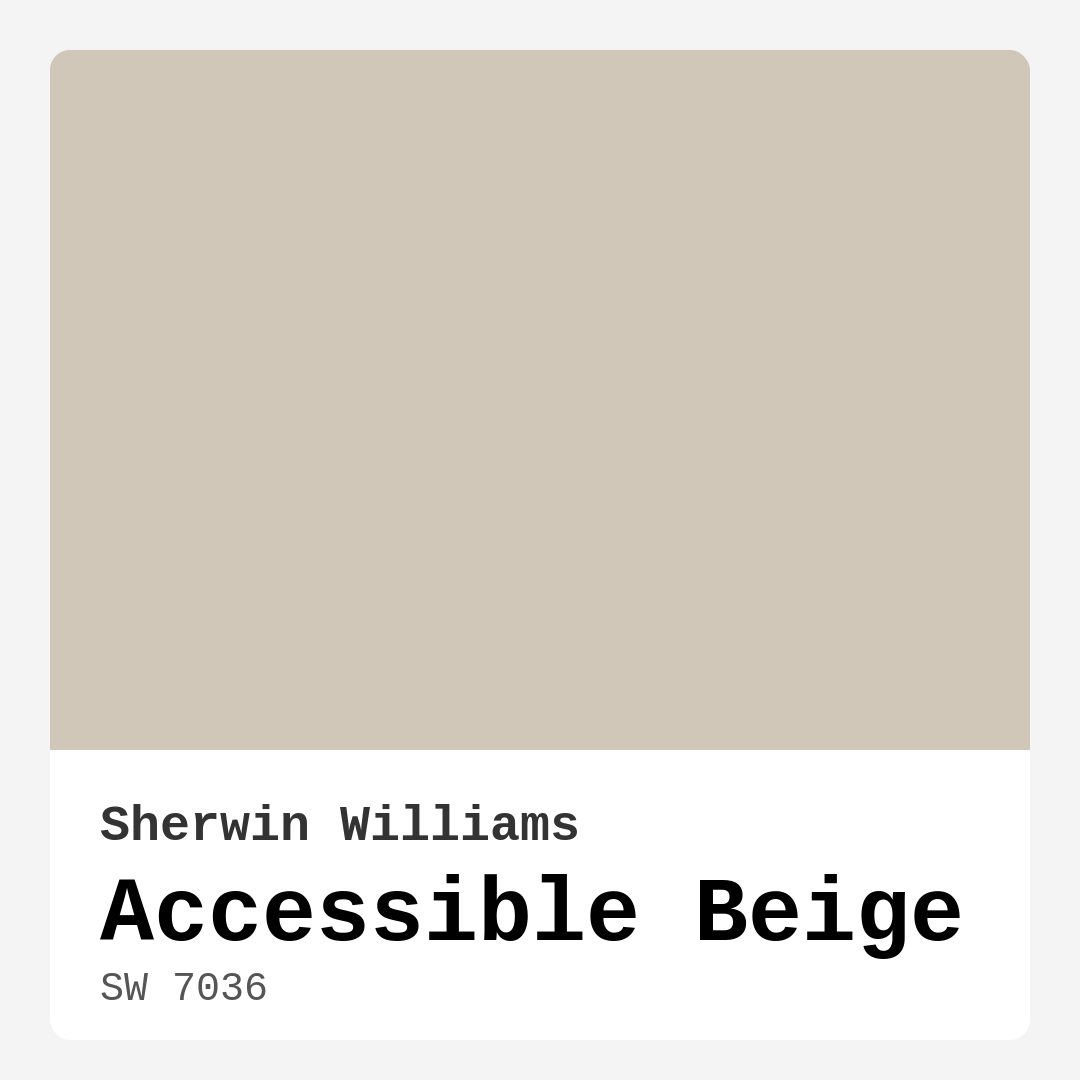
Color Preview & Key Details
| HEX Code | #D1C7B8 |
| RGB | 209, 199, 184 |
| LRV | 58% |
| Undertone | Red |
| Finish Options | Eggshell, Matte, Satin |
Imagine stepping into a warm, inviting room where every detail feels perfectly curated, and the ambiance instantly puts you at ease. That sensation can often come down to one crucial element: color. Today, let’s talk about one of my all-time favorite paint colors, Sherwin Williams’ Accessible Beige (SW 7036). It’s a shade that beautifully balances between beige and gray, offering a versatility that can suit a wide variety of styles and spaces.
Accessible Beige is what the design world calls a “greige,” a delightful mix of gray and beige. This means it carries the warmth of beige while still having the modern edge that gray brings. At a Light Reflectance Value (LRV) of 58%, it reflects a moderate amount of light, making it a fantastic option for both bright and dimly lit rooms. You’ll find that it brightens spaces without feeling stark or cold. Instead, it wraps your walls in a cozy embrace, creating an inviting atmosphere that welcomes friends, family, and you every day.
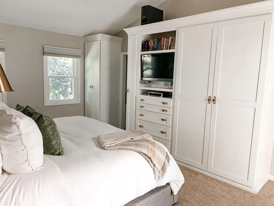
What I love about Accessible Beige is its adaptability. This hue can effortlessly transition from one room to another, making it perfect for creating a seamless flow throughout your home. Whether it’s the living room, a cozy bedroom, a contemporary kitchen, or a sophisticated dining room, this color can elevate the mood of your interiors. It pairs beautifully with various decor styles, including modern farmhouse, transitional, bohemian, contemporary, and traditional. So, no matter your aesthetic, Accessible Beige might just be the ideal backdrop.
Now, let’s talk about its undertones. They lean towards red, which is essential to note. This warmth lends depth and invites a softer feel compared to cooler neutrals. If your home features rustic wood accents or warm metals like brass, Accessible Beige will harmonize beautifully, enhancing those elements rather than competing with them. It’s important to test this paint in your space to see how it interacts with your existing decor. Bring home a sample, and watch how it reacts throughout the day. Under natural light, it glows warmly, while in the evening light, it takes on a cozy, intimate vibe.
When considering new paint, you might have questions about how it stacks up against other neutrals. Accessible Beige stands out from colors like Agreeable Gray or Revere Pewter. While those shades are also well-loved, they can lean cooler, while Accessible Beige retains a welcoming warmth. This makes it an ideal choice for anyone wanting a classic neutral that doesn’t stray too far from a homey feeling.
If you’re worried about how this color might suit smaller spaces, let me reassure you: it works wonders. Its warm hue helps create an inviting atmosphere, making rooms feel more spacious and cozy. The trick is to pair it with lighter furniture and decor to maintain an airy feel. For a touch of depth, consider incorporating darker accents in your design scheme. This can create dimension without overwhelming a smaller area.
Accessibility isn’t just about the paint itself; it’s about how easy it is to apply. Accessible Beige is beginner-friendly, making it a great choice whether you’re tackling a DIY project or hiring a pro. The coverage is good, typically requiring only one to two coats for a flawless finish. You’ll find it rolls on smoothly and dries evenly, making the entire process a breeze. And with its washability and low VOC levels, you can feel good about your choice, knowing it’s a healthier option for your home.
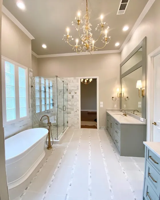
Let’s not forget about the versatility of finishes. Accessible Beige comes in various options: matte, eggshell, and satin. The finish you choose can significantly affect the look and feel of the room. A matte finish creates a soft, understated elegance, while eggshell adds a hint of sheen that can elevate the overall aesthetic. Satin offers durability, especially in areas like kitchens and bathrooms where moisture is a concern.
When it comes to pairing colors, Accessible Beige plays well with many shades. It’s particularly stunning alongside crisp whites like White Dove, which can brighten up trim and moldings without clashing. You can also complement this beige with warmer hues for accents, creating a cohesive and inviting color palette. Think soft blues or muted greens, which can add a refreshing touch while still feeling grounded.
Now, if you’re concerned about how Accessible Beige might appear in different lighting conditions, here’s the scoop: it adapts beautifully. In natural light, it reveals its true warmth, creating a soft glow that can make spaces feel larger and more welcoming. In dimmer light, it retains its charm without becoming too dark or oppressive. This adaptability makes it an excellent choice for rooms with varying light sources throughout the day.
While there’s a lot to love about Accessible Beige, every color has its considerations. One potential downside is that it may not align with very modern or industrial themes. If your heart is set on a stark, ultra-modern look, you might find this hue leaning a bit too warm. Additionally, in low light, it can appear darker than anticipated, so it’s essential to consider your room’s lighting before committing.
When you’re ready to take the plunge, start by testing a small section of your wall. Observe how it interacts with your furniture, flooring, and decor over the course of the day. This step is crucial in ensuring it’s the right fit for your space. Remember, colors can look vastly different in the paint store compared to your home, so give it the chance to shine in the environment it’s meant to live in.
In conclusion, Accessible Beige by Sherwin Williams is a versatile, warm, and inviting color that can transform your home into a serene retreat. Its adaptability across various styles and spaces makes it a timeless choice for anyone looking to refresh their interiors. Whether you’re aiming for a cozy living room, a restful bedroom, or a welcoming kitchen, this hue has the potential to make your home feel both stylish and inviting. So why not consider Accessible Beige for your next project? It’s more than just a color; it’s a pathway to creating a beautiful, personalized space that feels like home.
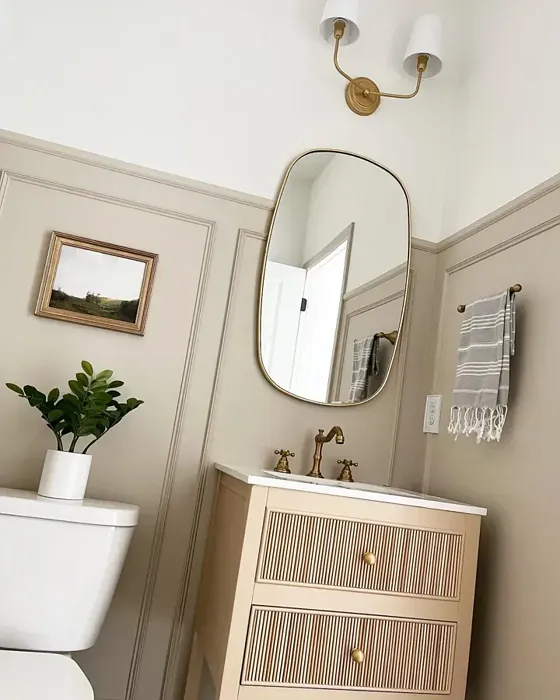
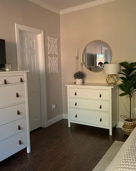
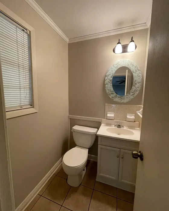
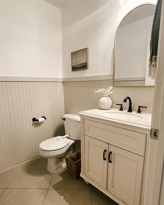
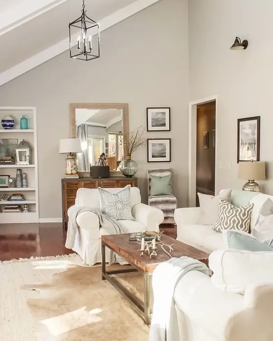
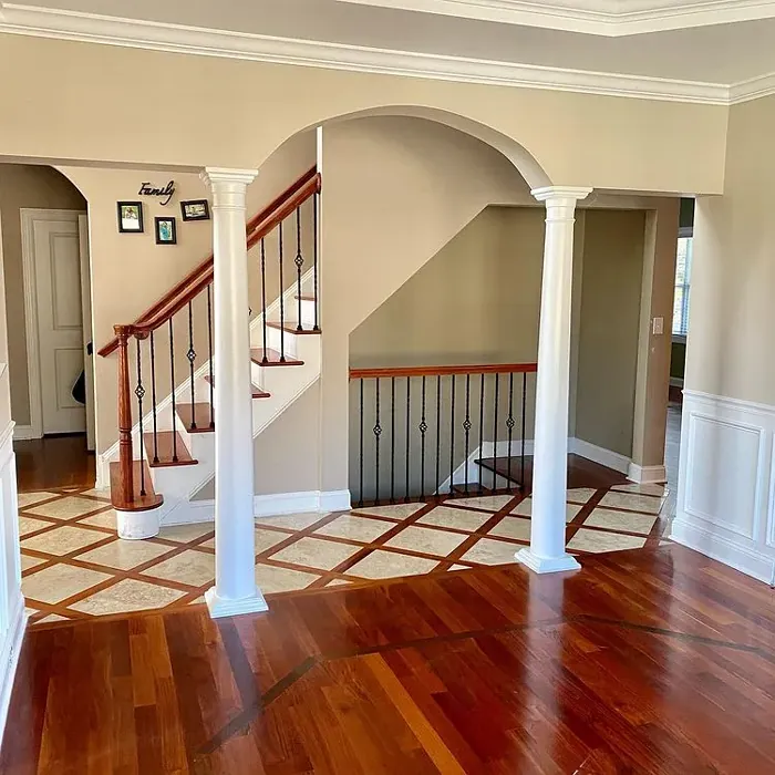
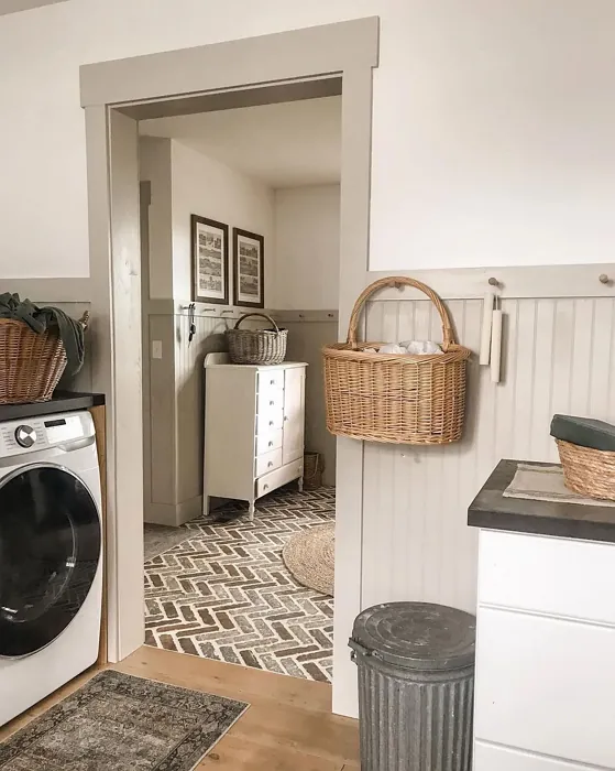
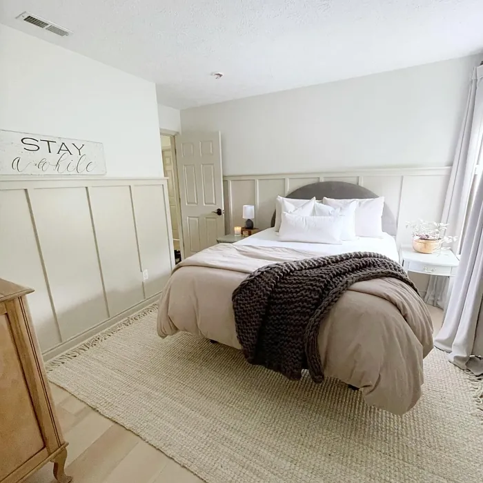
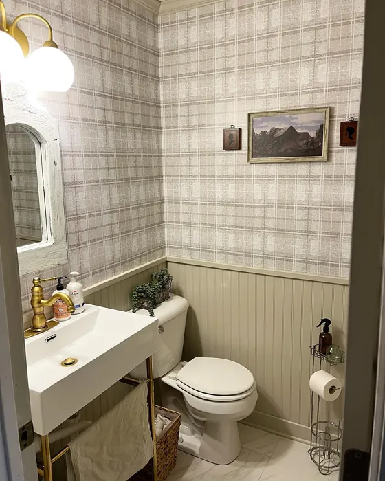
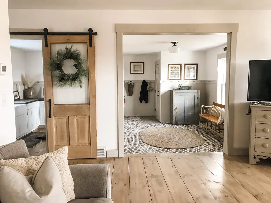
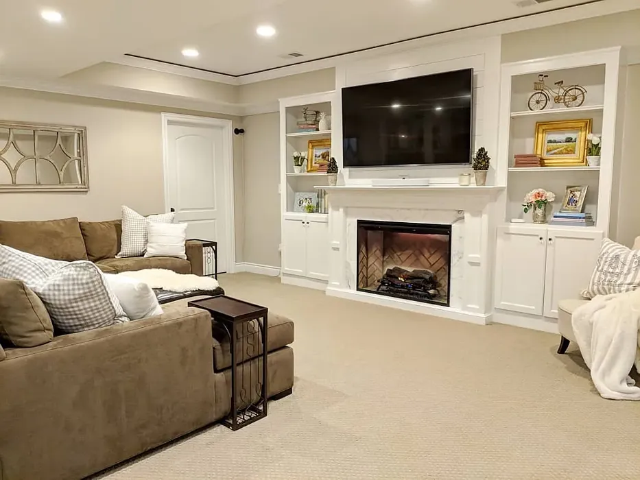
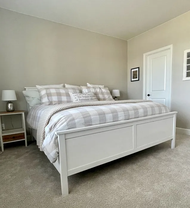
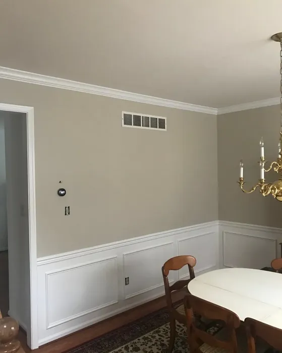
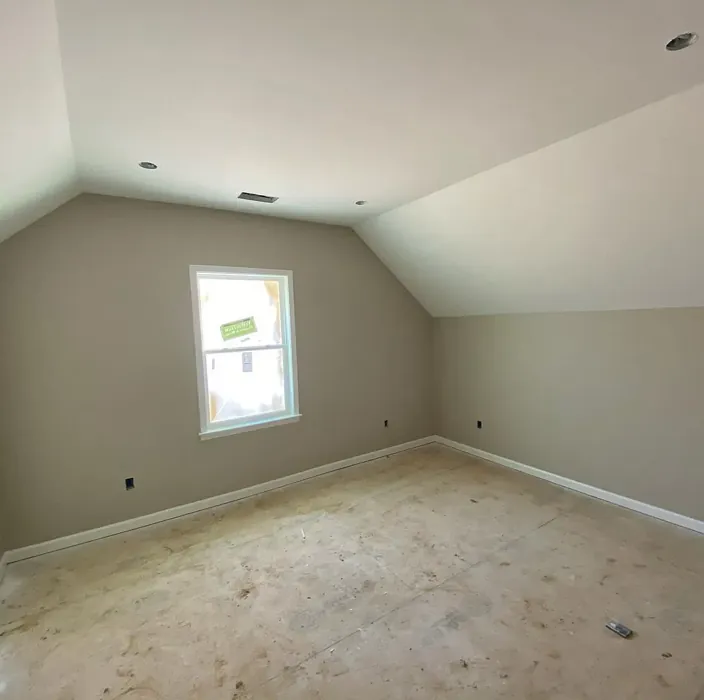
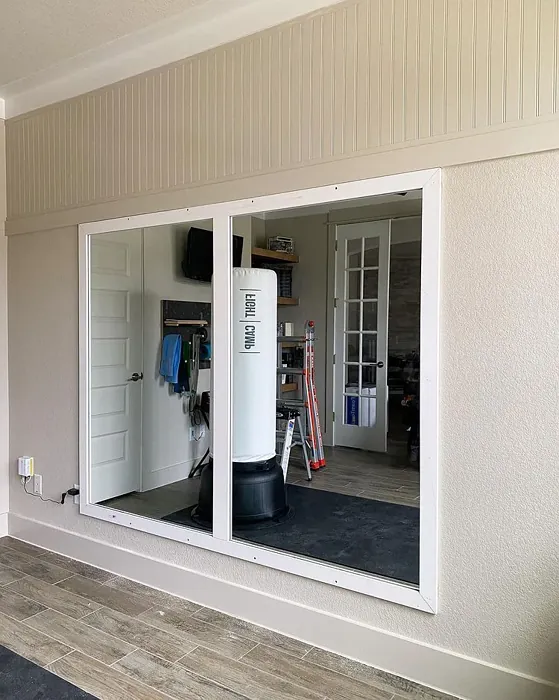
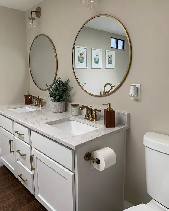
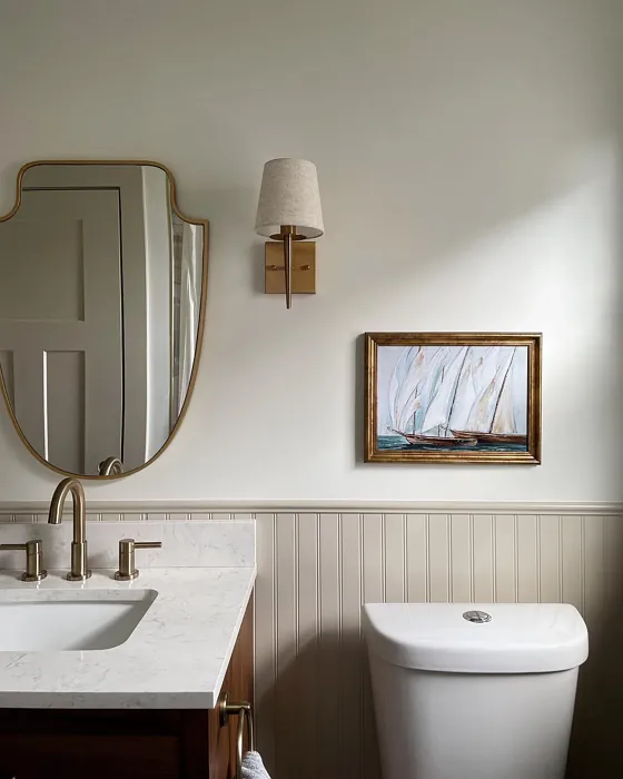
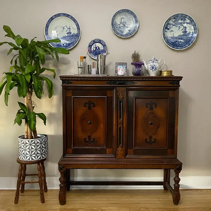
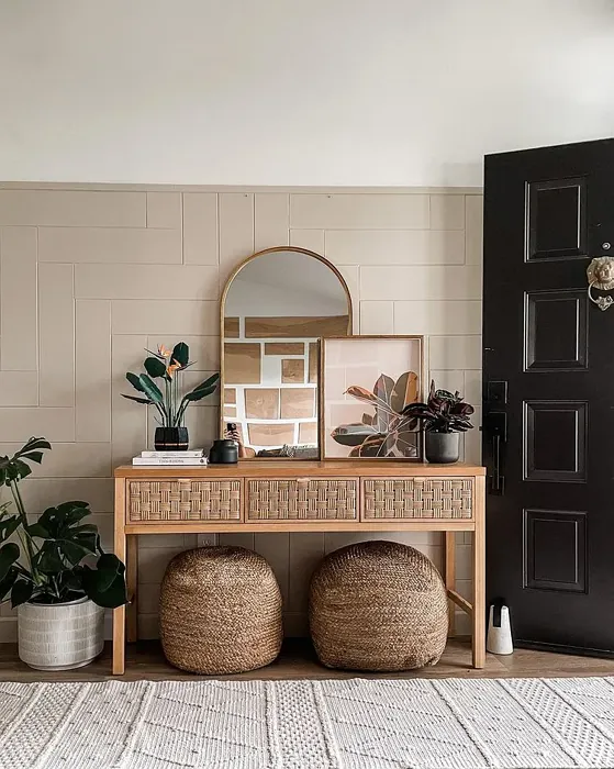
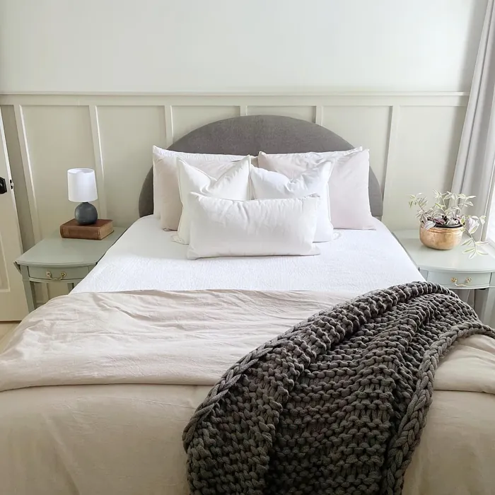
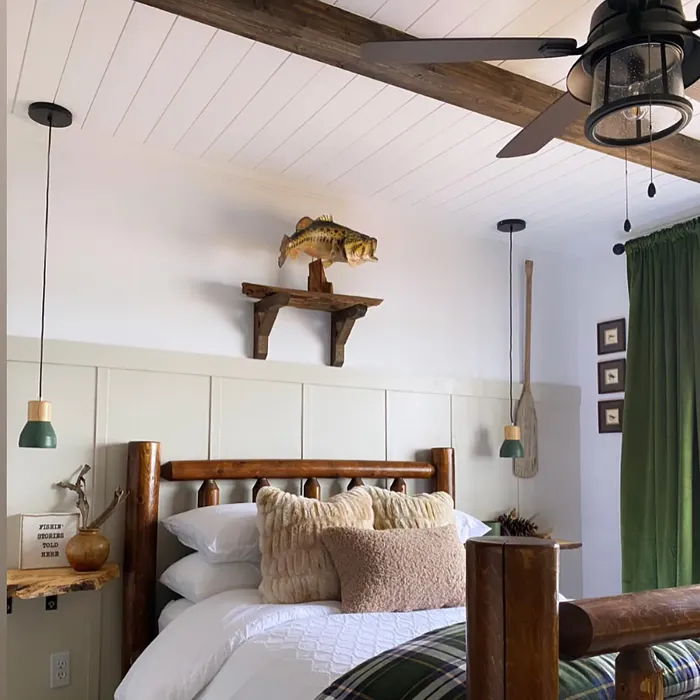
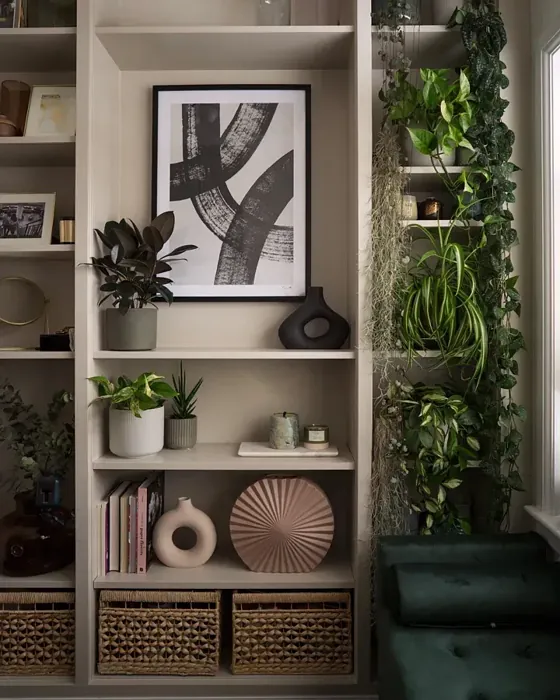
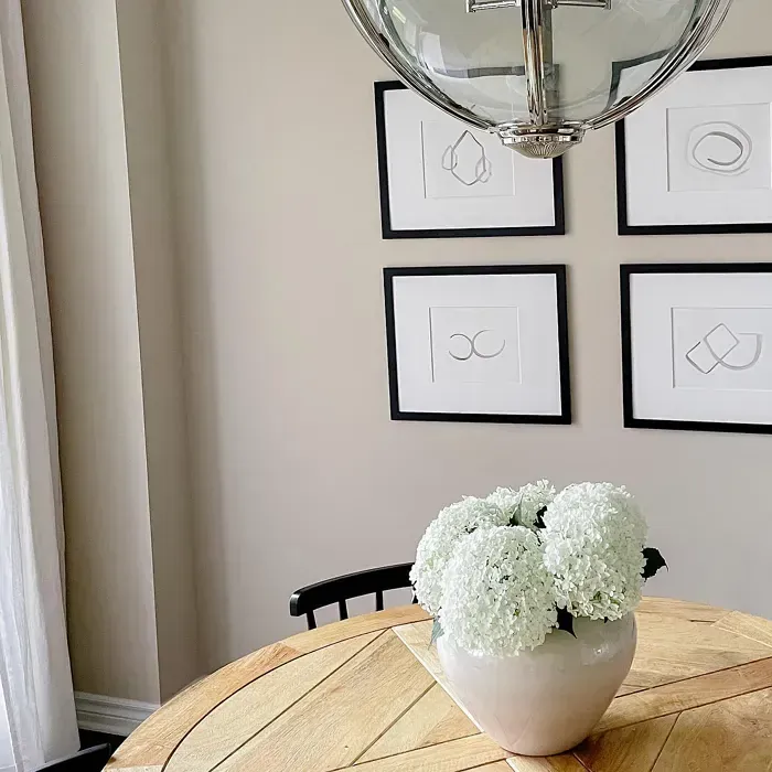
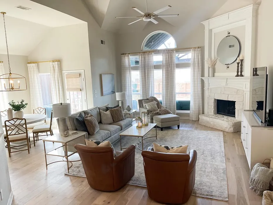
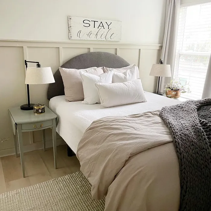
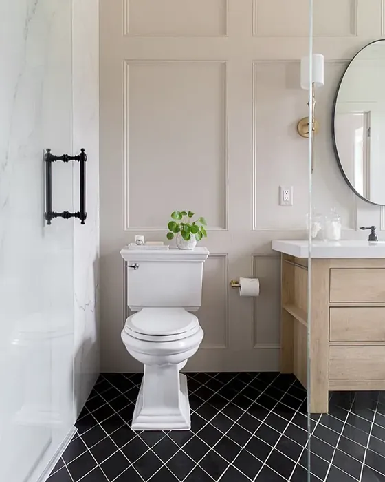
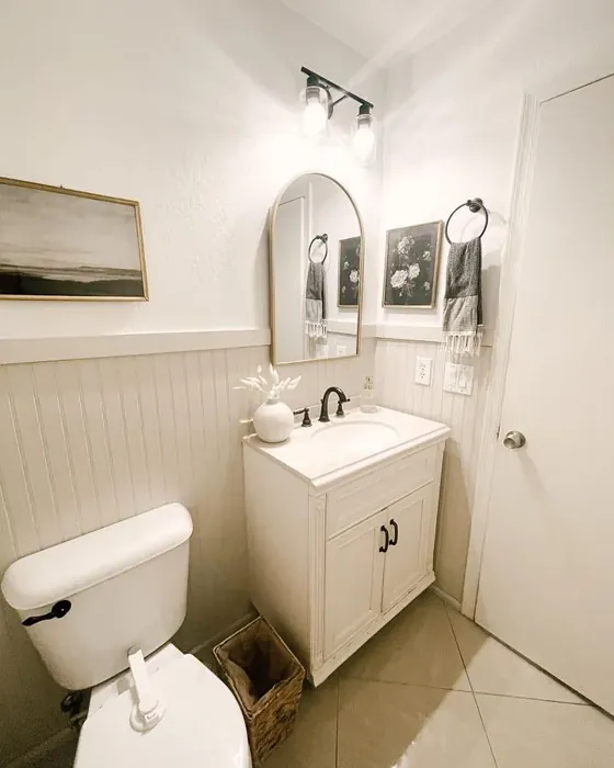
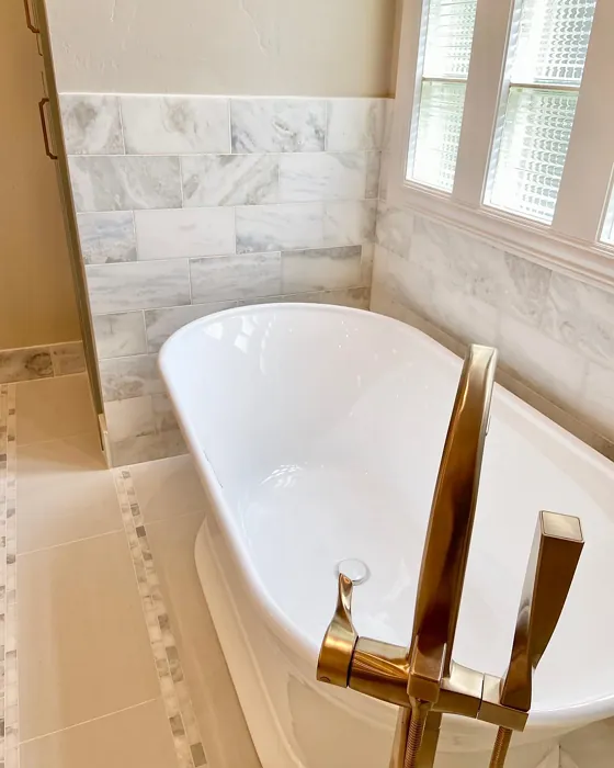
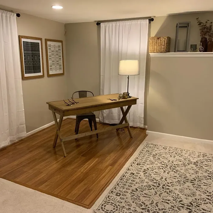
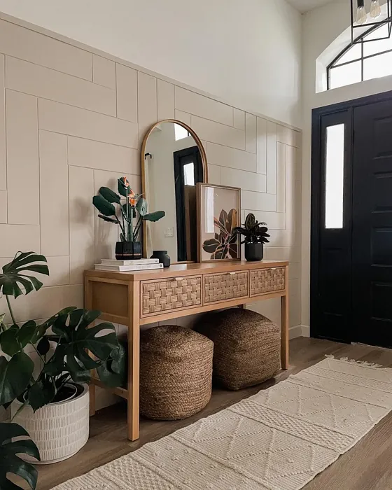
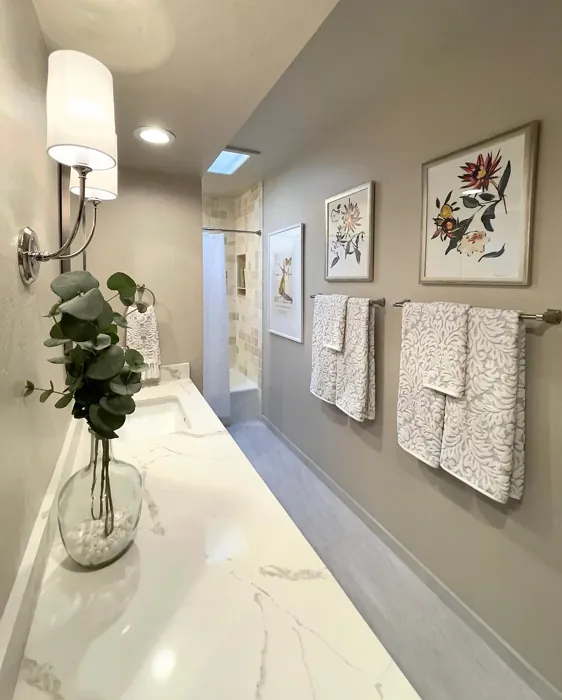
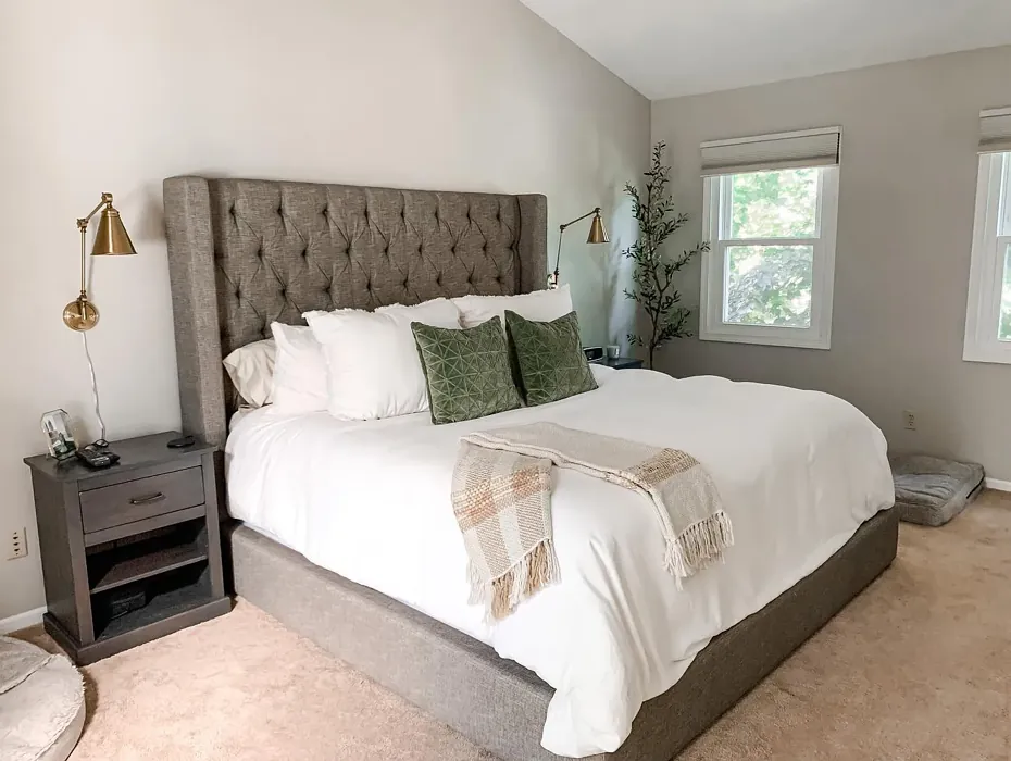
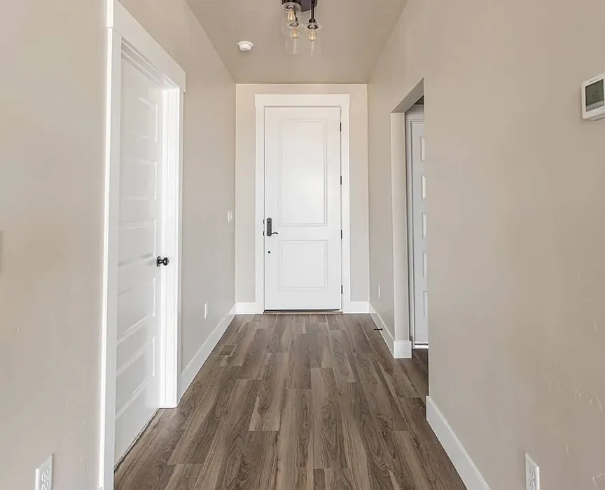
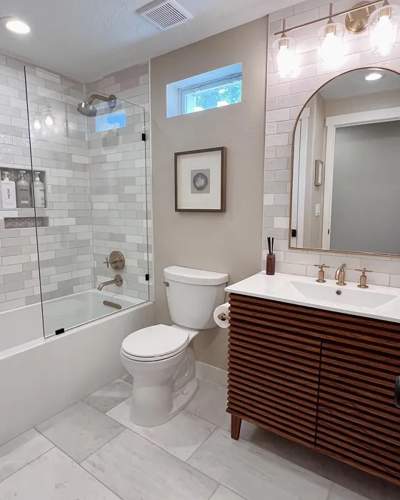
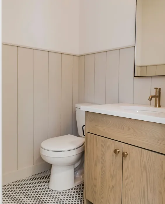
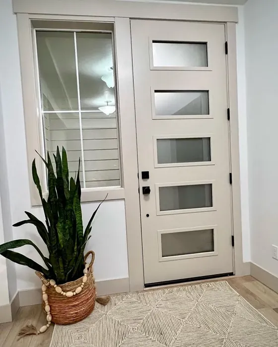
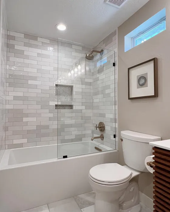
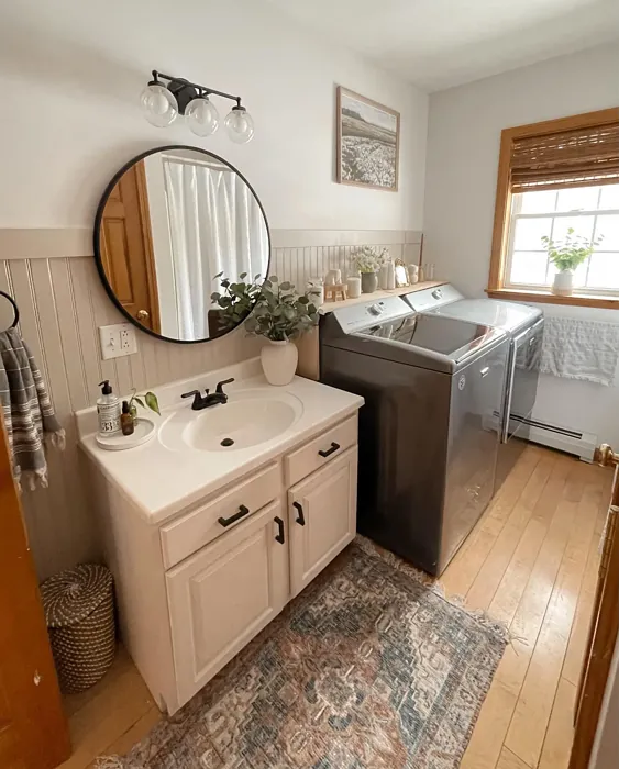
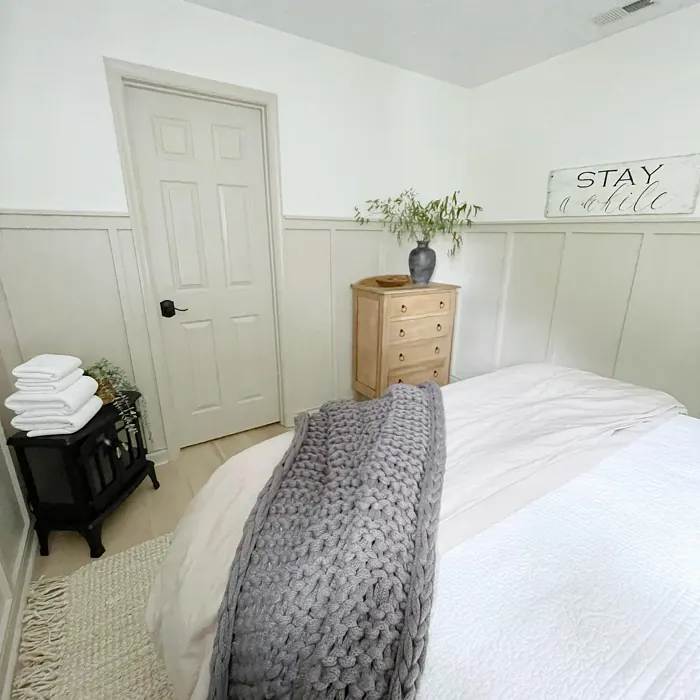
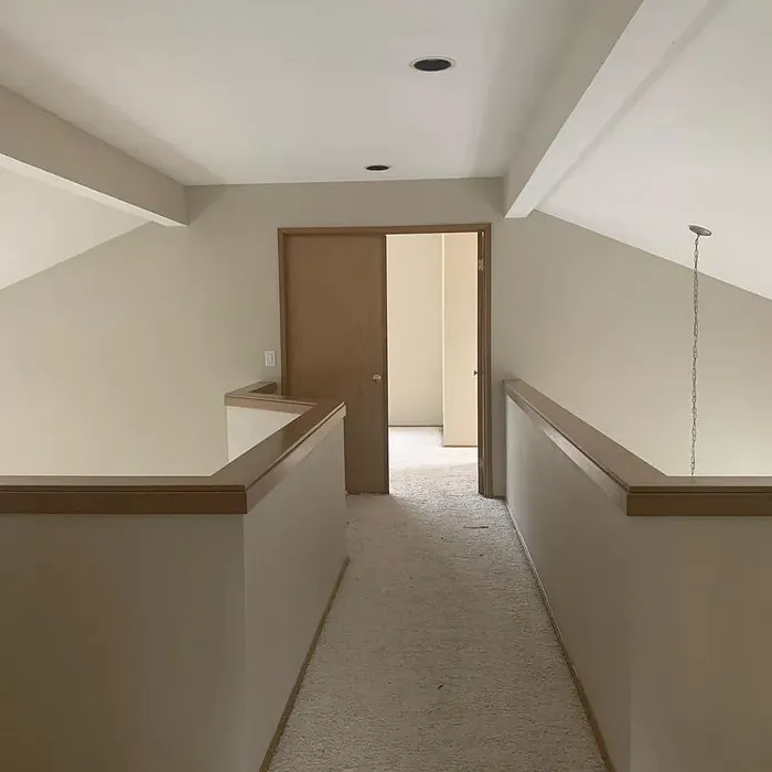
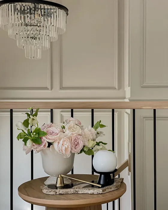
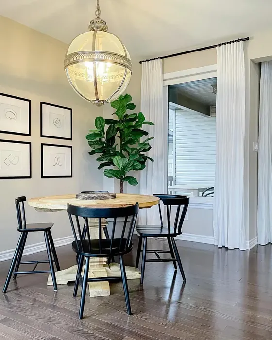
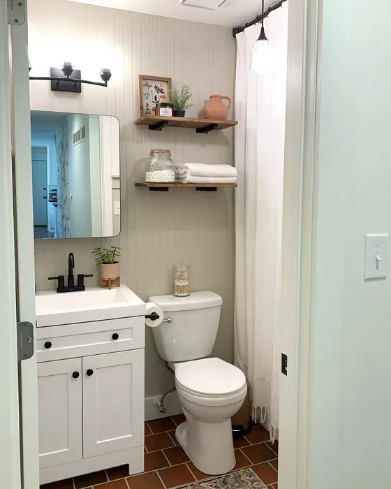
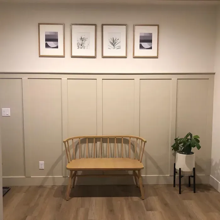
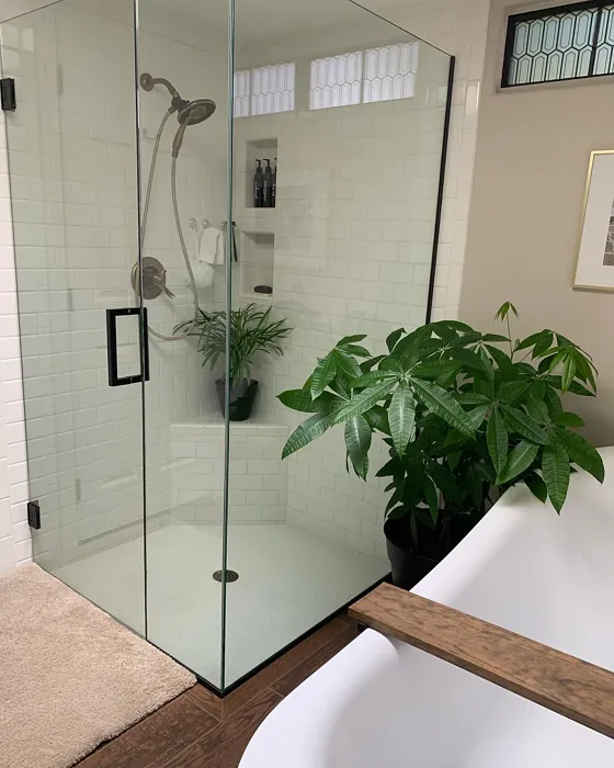
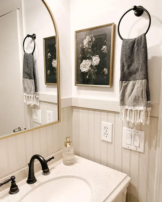
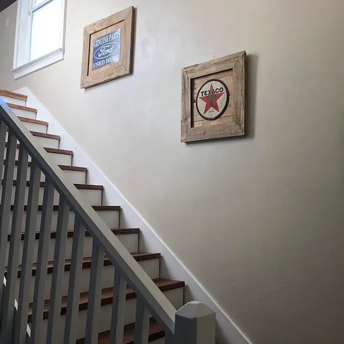
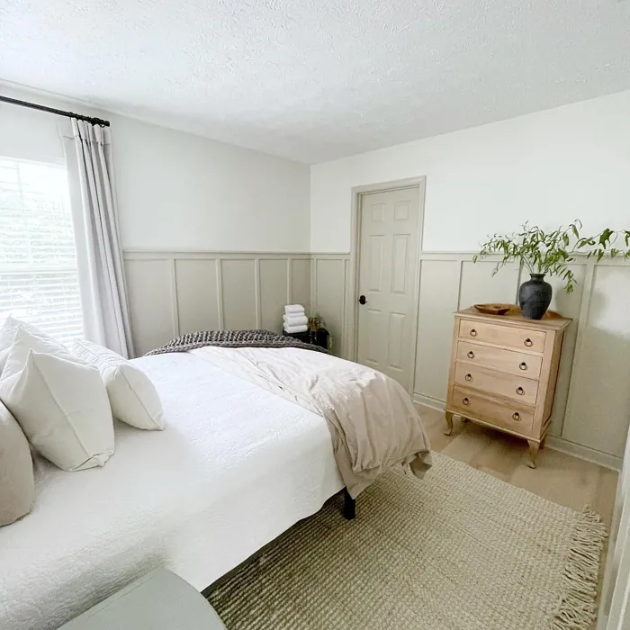
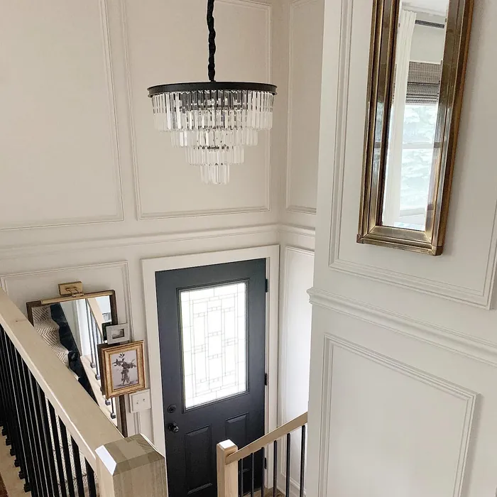
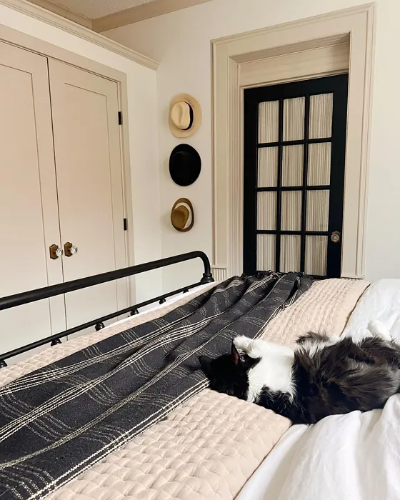
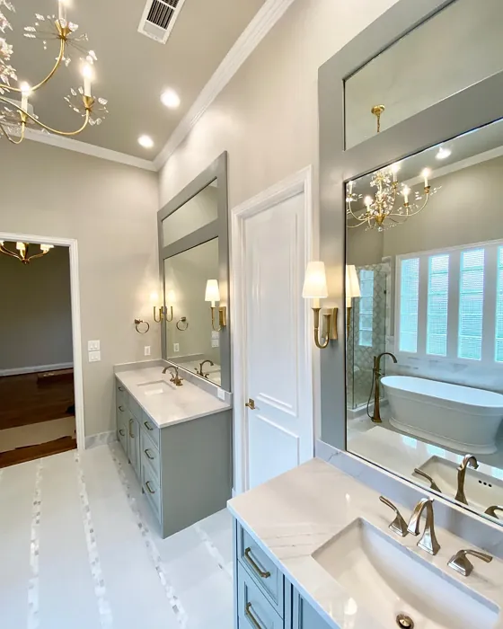
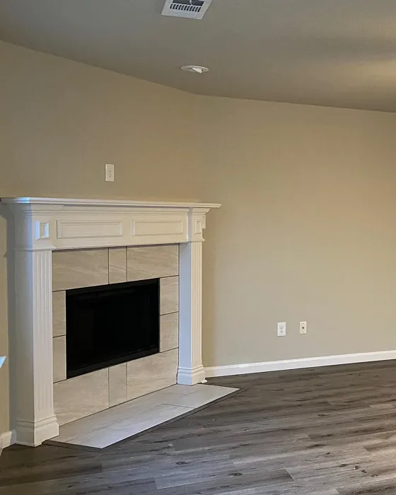
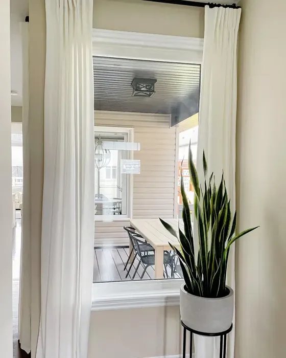
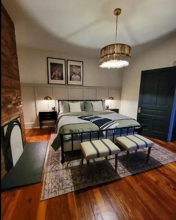
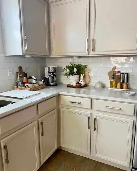
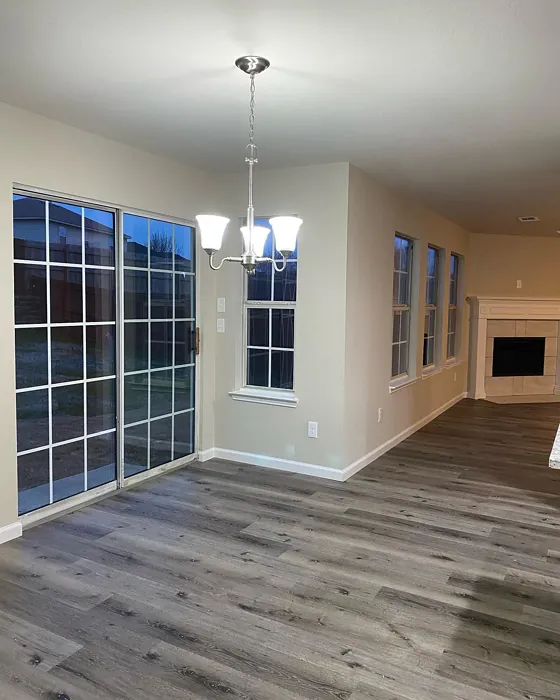
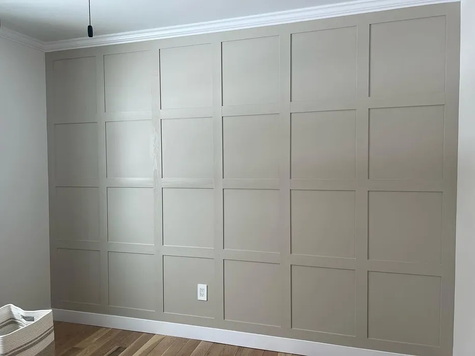
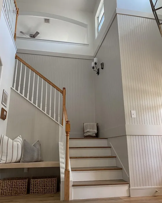
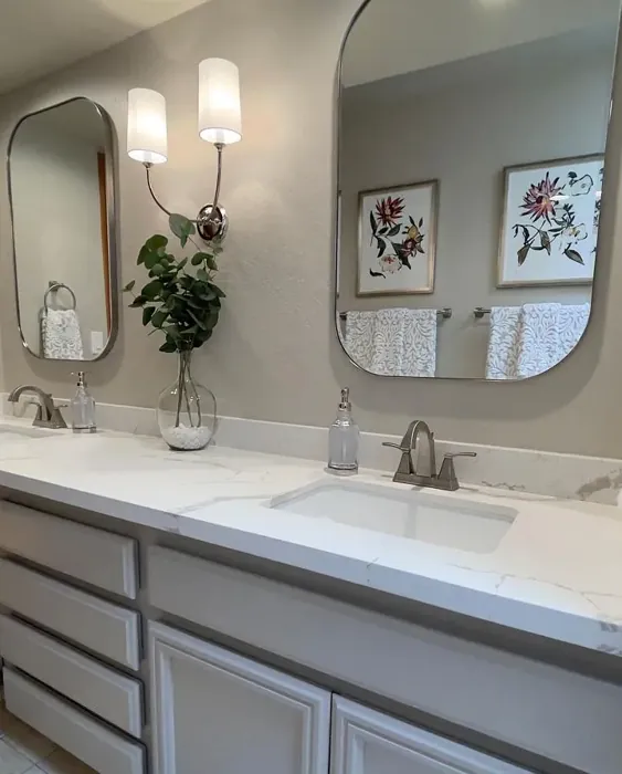
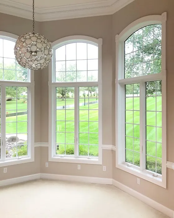
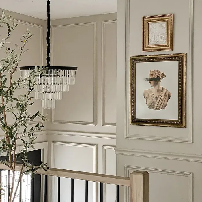
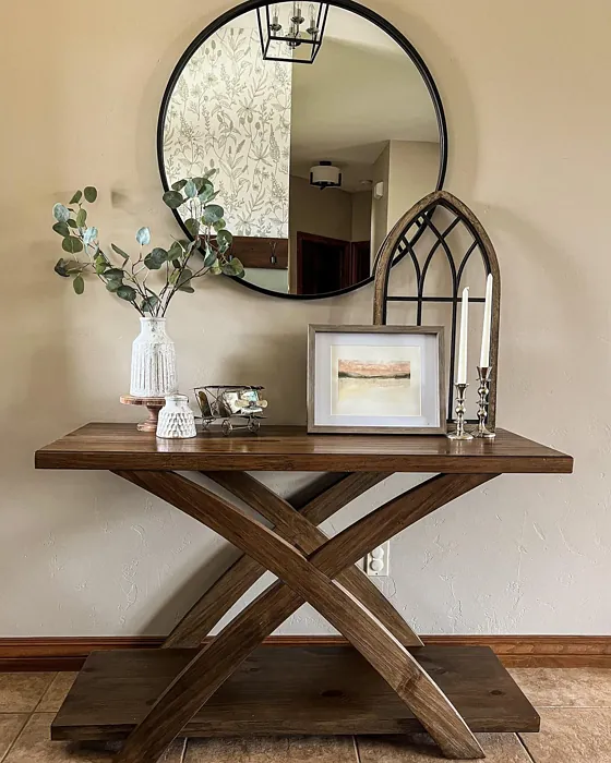
Real Room Photo of Accessible Beige SW 7036


Undertones of Accessible Beige ?
The undertones of Accessible Beige are a key aspect of its character, leaning towards Red. These subtle underlying hues are what give the color its depth and complexity. For example, a gray with a blue undertone will feel cooler and more modern, while one with a brown undertone will feel warmer and more traditional. It’s essential to test this paint in your home and observe it next to your existing furniture, flooring, and decor to see how these undertones interact and reveal themselves throughout the day.
HEX value: #D1C7B8
RGB code: 209, 199, 184
Is Accessible Beige Cool or Warm?
This paint color is firmly in the warm category, making it ideal for creating inviting spaces. The warm beige tones work well to soften the edges of a room, providing a cozy atmosphere that feels welcoming. It’s perfect for spaces where you want to foster conversation and relaxation, such as living rooms and bedrooms.
Understanding Color Properties and Interior Design Tips
Hue refers to a specific position on the color wheel, measured in degrees from 0 to 360. Each degree represents a different pure color:
- 0° represents red
- 120° represents green
- 240° represents blue
Saturation describes the intensity or purity of a color and is expressed as a percentage:
- At 0%, the color appears completely desaturated—essentially a shade of gray
- At 100%, the color is at its most vivid and vibrant
Lightness indicates how light or dark a color is, also expressed as a percentage:
- 0% lightness results in black
- 100% lightness results in white
Using Warm Colors in Interior Design
Warm hues—such as reds, oranges, yellows, warm beiges, and greiges—are excellent choices for creating inviting and energetic spaces. These colors are particularly well-suited for:
- Kitchens, living rooms, and bathrooms, where warmth enhances comfort and sociability
- Large rooms, where warm tones can help reduce the sense of emptiness and make the space feel more intimate
For example:
- Warm beige shades provide a cozy, inviting atmosphere, ideal for living rooms, bedrooms, and hallways.
- Warm greige (a mix of beige and gray) offers the warmth of beige with the modern appeal of gray, making it a versatile backdrop for dining areas, bedrooms, and living spaces.
However, be mindful when using warm light tones in rooms with limited natural light. These shades may appear muted or even take on an unpleasant yellowish tint. To avoid a dull or flat appearance:
- Add depth by incorporating richer tones like deep greens, charcoal, or chocolate brown
- Use textured elements such as curtains, rugs, or cushions to bring dimension to the space
Pro Tip: Achieving Harmony with Warm and Cool Color Balance
To create a well-balanced and visually interesting interior, mix warm and cool tones strategically. This contrast adds depth and harmony to your design.
- If your walls feature warm hues, introduce cool-colored accents such as blue or green furniture, artwork, or accessories to create contrast.
- For a polished look, consider using a complementary color scheme, which pairs colors opposite each other on the color wheel (e.g., red with green, orange with blue).
This thoughtful mix not only enhances visual appeal but also creates a space that feels both dynamic and cohesive.
Light Temperature Affects on Accessible Beige
Natural Light
Natural daylight changes in color temperature as the sun moves across the sky. At sunrise and sunset, the light tends to have a warm, golden tone with a color temperature around 2000 Kelvin (K). As the day progresses and the sun rises higher, the light becomes cooler and more neutral. Around midday, especially when the sky is clear, natural light typically reaches its peak brightness and shifts to a cooler tone, ranging from 5500 to 6500 Kelvin. This midday light is close to what we perceive as pure white or daylight-balanced light.
These shifts in natural light can significantly influence how colors appear in a space, which is why designers often consider both the time of day and the orientation of windows when planning interior color schemes.
Artificial Light
When choosing artificial lighting, pay close attention to the color temperature, measured in Kelvin (K). This determines how warm or cool the light will appear. Lower temperatures, around 2700K, give off a warm, yellow glow often used in living rooms or bedrooms. Higher temperatures, above 5000K, create a cool, bluish light similar to daylight, commonly used in kitchens, offices, or task areas.
Use the slider to see how lighting temperature can affect the appearance of a surface or color throughout a space.


4800K
LRV of Accessible Beige
The Light Reflectance Value (LRV) of Accessible Beige is 58%, which places it in the Medium category. This means it Reflects a moderate amount of light. Understanding a paint’s LRV is crucial for predicting how it will look in your space. A higher LRV indicates a lighter color that reflects more light, making rooms feel larger and brighter. A lower LRV signifies a darker color that absorbs more light, creating a cozier, more intimate atmosphere. Always consider the natural and artificial lighting in your room when selecting a paint color based on its LRV.
Detailed Review of Accessible Beige
Additional Paint Characteristics
Ideal Rooms
Bedroom, Dining Room, Home Office, Kitchen, Living Room
Decor Styles
Bohemian, Contemporary, Modern Farmhouse, Traditional, Transitional
Coverage
Good (1–2 Coats), Touch-Up Friendly
Ease of Application
Beginner Friendly, Brush Smooth, Roller-Ready
Washability
Highly Washable, Washable
VOC Level
Low VOC
Best Use
Accent Wall, Interior Walls, Open Concept Spaces
Room Suitability
Bedroom, Dining Room, Home Office, Kitchen, Living Room
Tone Tag
Earthy, Neutral, Warm
Finish Type
Eggshell, Matte, Satin
Paint Performance
Easy Touch-Up, Fade Resistant, High Coverage, Low Odor
Use Cases
Best for Modern Farmhouse, Best for Open Concept, Best for Rentals, Classic Favorite
Mood
Cozy, Grounding, Inviting, Warm
Trim Pairing
Complements Brass Fixtures, Pairs with White Dove, Works with Warm Trim
Accessible Beige is a fantastic choice for homeowners looking to add warmth and versatility to their interiors. This paint color adapts beautifully to various lighting conditions, enhancing its charm throughout the day. In natural light, it presents a soft beige tone, while in the evening, it takes on a cozier, more intimate feel. It’s a great backdrop for furniture and decor, allowing other colors and textures to shine without overpowering them.
The application process is smooth, and it provides decent coverage, typically requiring only one to two coats for a flawless finish. Whether you’re a DIY enthusiast or hiring a professional, you’ll find that Accessible Beige goes on easily and dries uniformly. This paint color truly embodies the spirit of modern living, making it a go-to option for any renovation or new build. If you’re after a serene yet stylish ambiance, Accessible Beige is worth considering.
Pros & Cons of SW 7036 Accessible Beige
Pros
Cons
Colors that go with Sherwin Williams Accessible Beige
FAQ on SW 7036 Accessible Beige
How does Accessible Beige compare to other neutral colors?
Accessible Beige stands out among other neutral colors like Agreeable Gray or Revere Pewter due to its warm undertones. While some neutrals can lean cooler or even stark, Accessible Beige maintains a cozy vibe that complements various styles. This makes it an ideal choice for those who want a welcoming atmosphere without straying too far from a classic neutral palette. It harmonizes beautifully with both warm and cool accent colors, making it a flexible option for any room.
Is Accessible Beige suitable for small spaces?
Absolutely! Accessible Beige is a fantastic choice for small spaces. Its warm tone helps to create an inviting atmosphere, making rooms feel more spacious and cozy. The LRV of 57 ensures that it reflects enough light to avoid feeling claustrophobic. Pair it with lighter furniture and decor for an airy feel, or use darker accents to create depth without overwhelming the space. It’s a versatile neutral that can elevate the charm of any small area.
Comparisons Accessible Beige with other colors
Accessible Beige SW 7036 vs Jogging Path SW 7638
| Attribute | Accessible Beige SW 7036 | Jogging Path SW 7638 |
|---|---|---|
| Color Name | Accessible Beige SW 7036 | Jogging Path SW 7638 |
| Color | ||
| Hue | Greige | Greige |
| Brightness | Medium | Medium |
| RGB | 209, 199, 184 | 192, 185, 169 |
| LRV | 58% | 15% |
| Finish Type | Eggshell, Matte, Satin | Eggshell, Matte |
| Finish Options | Eggshell, Matte, Satin | Eggshell, Matte, Satin |
| Ideal Rooms | Bedroom, Dining Room, Home Office, Kitchen, Living Room | Bedroom, Dining Room, Hallway, Home Office, Kitchen, Living Room |
| Decor Styles | Bohemian, Contemporary, Modern Farmhouse, Traditional, Transitional | Modern, Rustic, Scandinavian, Transitional |
| Coverage | Good (1–2 Coats), Touch-Up Friendly | Good (1–2 Coats), Touch-Up Friendly |
| Ease of Application | Beginner Friendly, Brush Smooth, Roller-Ready | Beginner Friendly, Brush Smooth, Fast-Drying, Roller-Ready |
| Washability | Highly Washable, Washable | Washable, Wipeable |
| Room Suitability | Bedroom, Dining Room, Home Office, Kitchen, Living Room | Bedroom, Dining Room, Home Office, Living Room |
| Tone | Earthy, Neutral, Warm | Balanced, Earthy, Muted, Warm |
| Paint Performance | Easy Touch-Up, Fade Resistant, High Coverage, Low Odor | Easy Touch-Up, Fade Resistant, Low Odor |
Accessible Beige SW 7036 vs Antler Velvet SW 9111
| Attribute | Accessible Beige SW 7036 | Antler Velvet SW 9111 |
|---|---|---|
| Color Name | Accessible Beige SW 7036 | Antler Velvet SW 9111 |
| Color | ||
| Hue | Greige | Greige |
| Brightness | Medium | Medium |
| RGB | 209, 199, 184 | 192, 173, 150 |
| LRV | 58% | 6% |
| Finish Type | Eggshell, Matte, Satin | Eggshell, Matte |
| Finish Options | Eggshell, Matte, Satin | Eggshell, Matte, Satin |
| Ideal Rooms | Bedroom, Dining Room, Home Office, Kitchen, Living Room | Bedroom, Dining Room, Home Office, Living Room, Nursery |
| Decor Styles | Bohemian, Contemporary, Modern Farmhouse, Traditional, Transitional | Contemporary, Modern Farmhouse, Rustic, Transitional |
| Coverage | Good (1–2 Coats), Touch-Up Friendly | Good (1–2 Coats) |
| Ease of Application | Beginner Friendly, Brush Smooth, Roller-Ready | Beginner Friendly, Brush Smooth, Fast-Drying, Roller-Ready |
| Washability | Highly Washable, Washable | Scrubbable, Washable, Wipeable |
| Room Suitability | Bedroom, Dining Room, Home Office, Kitchen, Living Room | Bedroom, Dining Room, Home Office, Living Room |
| Tone | Earthy, Neutral, Warm | Earthy, Muted, Warm |
| Paint Performance | Easy Touch-Up, Fade Resistant, High Coverage, Low Odor | Easy Touch-Up, High Coverage, Low Odor, Quick Drying |
Accessible Beige SW 7036 vs Perfect Greige SW 6073
| Attribute | Accessible Beige SW 7036 | Perfect Greige SW 6073 |
|---|---|---|
| Color Name | Accessible Beige SW 7036 | Perfect Greige SW 6073 |
| Color | ||
| Hue | Greige | Greige |
| Brightness | Medium | Medium |
| RGB | 209, 199, 184 | 183, 171, 159 |
| LRV | 58% | 38% |
| Finish Type | Eggshell, Matte, Satin | Eggshell, Matte, Satin |
| Finish Options | Eggshell, Matte, Satin | Eggshell, Matte, Satin |
| Ideal Rooms | Bedroom, Dining Room, Home Office, Kitchen, Living Room | Bathroom, Bedroom, Dining Room, Entryway, Home Office, Kitchen, Living Room |
| Decor Styles | Bohemian, Contemporary, Modern Farmhouse, Traditional, Transitional | Contemporary, Farmhouse, Modern, Traditional, Transitional |
| Coverage | Good (1–2 Coats), Touch-Up Friendly | Good (1–2 Coats), Touch-Up Friendly |
| Ease of Application | Beginner Friendly, Brush Smooth, Roller-Ready | Beginner Friendly, Brush Smooth, Roller-Ready |
| Washability | Highly Washable, Washable | Highly Washable, Washable |
| Room Suitability | Bedroom, Dining Room, Home Office, Kitchen, Living Room | Bedroom, Dining Room, Home Office, Kitchen, Living Room |
| Tone | Earthy, Neutral, Warm | Muted, Neutral, Warm |
| Paint Performance | Easy Touch-Up, Fade Resistant, High Coverage, Low Odor | Easy Touch-Up, Low Odor, Scuff Resistant |
Accessible Beige SW 7036 vs Analytical Gray SW 7051
| Attribute | Accessible Beige SW 7036 | Analytical Gray SW 7051 |
|---|---|---|
| Color Name | Accessible Beige SW 7036 | Analytical Gray SW 7051 |
| Color | ||
| Hue | Greige | Greige |
| Brightness | Medium | Medium |
| RGB | 209, 199, 184 | 191, 182, 167 |
| LRV | 58% | 60% |
| Finish Type | Eggshell, Matte, Satin | Eggshell, Matte, Satin |
| Finish Options | Eggshell, Matte, Satin | Eggshell, Matte, Satin |
| Ideal Rooms | Bedroom, Dining Room, Home Office, Kitchen, Living Room | Bedroom, Dining Room, Hallway, Home Office, Living Room |
| Decor Styles | Bohemian, Contemporary, Modern Farmhouse, Traditional, Transitional | Farmhouse, Modern, Scandinavian, Transitional |
| Coverage | Good (1–2 Coats), Touch-Up Friendly | Good (1–2 Coats) |
| Ease of Application | Beginner Friendly, Brush Smooth, Roller-Ready | Beginner Friendly, Brush Smooth, Roller-Ready |
| Washability | Highly Washable, Washable | Highly Washable, Washable |
| Room Suitability | Bedroom, Dining Room, Home Office, Kitchen, Living Room | Bedroom, Dining Room, Home Office, Living Room |
| Tone | Earthy, Neutral, Warm | Balanced, Neutral, Warm |
| Paint Performance | Easy Touch-Up, Fade Resistant, High Coverage, Low Odor | Easy Touch-Up, High Coverage, Low Odor |
Accessible Beige SW 7036 vs Relaxed Khaki SW 6149
| Attribute | Accessible Beige SW 7036 | Relaxed Khaki SW 6149 |
|---|---|---|
| Color Name | Accessible Beige SW 7036 | Relaxed Khaki SW 6149 |
| Color | ||
| Hue | Greige | Greige |
| Brightness | Medium | Medium |
| RGB | 209, 199, 184 | 200, 187, 163 |
| LRV | 58% | 40% |
| Finish Type | Eggshell, Matte, Satin | Eggshell, Matte, Satin |
| Finish Options | Eggshell, Matte, Satin | Eggshell, Matte, Satin |
| Ideal Rooms | Bedroom, Dining Room, Home Office, Kitchen, Living Room | Bedroom, Dining Room, Home Office, Kitchen, Living Room |
| Decor Styles | Bohemian, Contemporary, Modern Farmhouse, Traditional, Transitional | Contemporary, Modern Farmhouse, Rustic, Traditional |
| Coverage | Good (1–2 Coats), Touch-Up Friendly | Good (1–2 Coats), Touch-Up Friendly |
| Ease of Application | Beginner Friendly, Brush Smooth, Roller-Ready | Beginner Friendly, Brush Smooth, Roller-Ready |
| Washability | Highly Washable, Washable | Washable, Wipeable |
| Room Suitability | Bedroom, Dining Room, Home Office, Kitchen, Living Room | Bedroom, Dining Room, Home Office, Living Room |
| Tone | Earthy, Neutral, Warm | Earthy, Muted, Warm |
| Paint Performance | Easy Touch-Up, Fade Resistant, High Coverage, Low Odor | Easy Touch-Up, Low Odor, Scuff Resistant |
Accessible Beige SW 7036 vs Sage SW 2860
| Attribute | Accessible Beige SW 7036 | Sage SW 2860 |
|---|---|---|
| Color Name | Accessible Beige SW 7036 | Sage SW 2860 |
| Color | ||
| Hue | Greige | Greige |
| Brightness | Medium | Medium |
| RGB | 209, 199, 184 | 179, 174, 149 |
| LRV | 58% | 24% |
| Finish Type | Eggshell, Matte, Satin | Eggshell, Matte, Satin |
| Finish Options | Eggshell, Matte, Satin | Eggshell, Matte, Satin |
| Ideal Rooms | Bedroom, Dining Room, Home Office, Kitchen, Living Room | Bathroom, Bedroom, Home Office, Kitchen, Living Room |
| Decor Styles | Bohemian, Contemporary, Modern Farmhouse, Traditional, Transitional | Bohemian, Farmhouse, Modern, Rustic, Traditional |
| Coverage | Good (1–2 Coats), Touch-Up Friendly | Good (1–2 Coats), Touch-Up Friendly |
| Ease of Application | Beginner Friendly, Brush Smooth, Roller-Ready | Beginner Friendly, Brush Smooth, Roller-Ready |
| Washability | Highly Washable, Washable | Highly Washable, Washable |
| Room Suitability | Bedroom, Dining Room, Home Office, Kitchen, Living Room | Bathroom, Bedroom, Dining Room, Kitchen, Living Room |
| Tone | Earthy, Neutral, Warm | Earthy, Muted, Warm |
| Paint Performance | Easy Touch-Up, Fade Resistant, High Coverage, Low Odor | Easy Touch-Up, Fade Resistant, Low Odor |
Accessible Beige SW 7036 vs Worn Khaki SW 9527
| Attribute | Accessible Beige SW 7036 | Worn Khaki SW 9527 |
|---|---|---|
| Color Name | Accessible Beige SW 7036 | Worn Khaki SW 9527 |
| Color | ||
| Hue | Greige | Greige |
| Brightness | Medium | Medium |
| RGB | 209, 199, 184 | 166, 156, 129 |
| LRV | 58% | 38% |
| Finish Type | Eggshell, Matte, Satin | Eggshell, Matte, Satin |
| Finish Options | Eggshell, Matte, Satin | Eggshell, Matte, Satin |
| Ideal Rooms | Bedroom, Dining Room, Home Office, Kitchen, Living Room | Bedroom, Dining Room, Hallway, Home Office, Kitchen, Living Room |
| Decor Styles | Bohemian, Contemporary, Modern Farmhouse, Traditional, Transitional | Bohemian, Eclectic, Modern Farmhouse, Rustic, Transitional |
| Coverage | Good (1–2 Coats), Touch-Up Friendly | Good (1–2 Coats), Touch-Up Friendly |
| Ease of Application | Beginner Friendly, Brush Smooth, Roller-Ready | Beginner Friendly, Brush Smooth, Roller-Ready |
| Washability | Highly Washable, Washable | Washable, Wipeable |
| Room Suitability | Bedroom, Dining Room, Home Office, Kitchen, Living Room | Bedroom, Dining Room, Home Office, Kitchen, Living Room |
| Tone | Earthy, Neutral, Warm | Earthy, Neutral, Warm |
| Paint Performance | Easy Touch-Up, Fade Resistant, High Coverage, Low Odor | Easy Touch-Up, High Coverage, Low Odor, Quick Drying |
Accessible Beige SW 7036 vs Smokey Taupe 983
| Attribute | Accessible Beige SW 7036 | Smokey Taupe 983 |
|---|---|---|
| Color Name | Accessible Beige SW 7036 | Smokey Taupe 983 |
| Color | ||
| Hue | Greige | Greige |
| Brightness | Medium | Medium |
| RGB | 209, 199, 184 | 205, 196, 181 |
| LRV | 58% | 54.53% |
| Finish Type | Eggshell, Matte, Satin | Eggshell, Matte, Satin |
| Finish Options | Eggshell, Matte, Satin | Eggshell, Matte, Satin |
| Ideal Rooms | Bedroom, Dining Room, Home Office, Kitchen, Living Room | Bedroom, Dining Room, Entryway, Home Office, Living Room |
| Decor Styles | Bohemian, Contemporary, Modern Farmhouse, Traditional, Transitional | Contemporary, Minimalist, Modern Farmhouse, Rustic, Transitional |
| Coverage | Good (1–2 Coats), Touch-Up Friendly | Good (1–2 Coats), High Hide, Touch-Up Friendly |
| Ease of Application | Beginner Friendly, Brush Smooth, Roller-Ready | Beginner Friendly, Brush Smooth, Fast-Drying, Roller-Ready |
| Washability | Highly Washable, Washable | Highly Washable, Stain Resistant, Washable |
| Room Suitability | Bedroom, Dining Room, Home Office, Kitchen, Living Room | Bedroom, Dining Room, Entryway, Home Office, Living Room |
| Tone | Earthy, Neutral, Warm | Balanced, Earthy, Muted, Warm |
| Paint Performance | Easy Touch-Up, Fade Resistant, High Coverage, Low Odor | Easy Touch-Up, High Coverage, Low Odor, Quick Drying, Scuff Resistant |
Accessible Beige SW 7036 vs Pashmina AF-100
| Attribute | Accessible Beige SW 7036 | Pashmina AF-100 |
|---|---|---|
| Color Name | Accessible Beige SW 7036 | Pashmina AF-100 |
| Color | ||
| Hue | Greige | Greige |
| Brightness | Medium | Medium |
| RGB | 209, 199, 184 | 187, 178, 161 |
| LRV | 58% | 44.20% |
| Finish Type | Eggshell, Matte, Satin | Eggshell, Matte, Satin |
| Finish Options | Eggshell, Matte, Satin | Eggshell, Matte, Satin |
| Ideal Rooms | Bedroom, Dining Room, Home Office, Kitchen, Living Room | Bedroom, Hallway, Home Office, Living Room |
| Decor Styles | Bohemian, Contemporary, Modern Farmhouse, Traditional, Transitional | Bohemian, Modern, Rustic, Traditional |
| Coverage | Good (1–2 Coats), Touch-Up Friendly | Good (1–2 Coats), Touch-Up Friendly |
| Ease of Application | Beginner Friendly, Brush Smooth, Roller-Ready | Beginner Friendly, Brush Smooth, Roller-Ready |
| Washability | Highly Washable, Washable | Scrubbable, Stain Resistant, Washable |
| Room Suitability | Bedroom, Dining Room, Home Office, Kitchen, Living Room | Bedroom, Dining Room, Home Office, Living Room |
| Tone | Earthy, Neutral, Warm | Earthy, Neutral, Warm |
| Paint Performance | Easy Touch-Up, Fade Resistant, High Coverage, Low Odor | Easy Touch-Up, High Coverage, Low Odor, Scuff Resistant |
Accessible Beige SW 7036 vs Spanish Olive 1509
| Attribute | Accessible Beige SW 7036 | Spanish Olive 1509 |
|---|---|---|
| Color Name | Accessible Beige SW 7036 | Spanish Olive 1509 |
| Color | ||
| Hue | Greige | Greige |
| Brightness | Medium | Medium |
| RGB | 209, 199, 184 | 197, 195, 174 |
| LRV | 58% | 52.54% |
| Finish Type | Eggshell, Matte, Satin | Eggshell, Matte, Satin |
| Finish Options | Eggshell, Matte, Satin | Eggshell, Matte, Satin |
| Ideal Rooms | Bedroom, Dining Room, Home Office, Kitchen, Living Room | Bedroom, Dining Room, Home Office, Kitchen, Living Room |
| Decor Styles | Bohemian, Contemporary, Modern Farmhouse, Traditional, Transitional | Bohemian, Contemporary, Modern Farmhouse, Rustic, Traditional |
| Coverage | Good (1–2 Coats), Touch-Up Friendly | Good (1–2 Coats), Touch-Up Friendly |
| Ease of Application | Beginner Friendly, Brush Smooth, Roller-Ready | Beginner Friendly, Brush Smooth, Roller-Ready |
| Washability | Highly Washable, Washable | Highly Washable, Washable |
| Room Suitability | Bedroom, Dining Room, Home Office, Kitchen, Living Room | Bathroom, Bedroom, Dining Room, Kitchen, Living Room |
| Tone | Earthy, Neutral, Warm | Earthy, Muted, Warm |
| Paint Performance | Easy Touch-Up, Fade Resistant, High Coverage, Low Odor | Easy Touch-Up, Fade Resistant, Low Odor, Stain Resistant |
Official Page of Sherwin Williams Accessible Beige SW 7036