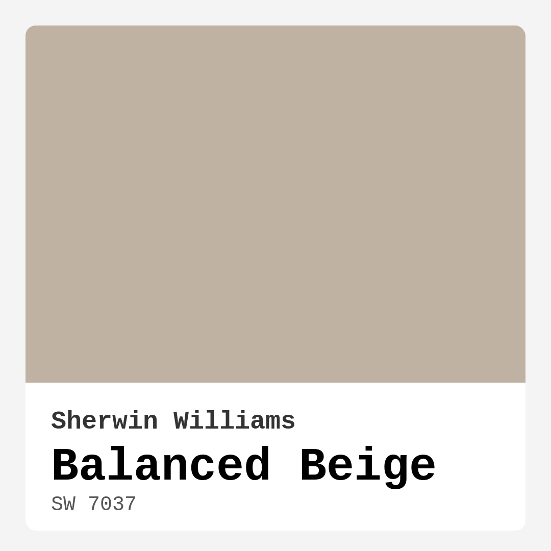
Color Preview & Key Details
| HEX Code | #C0B2A2 |
| RGB | 192, 178, 162 |
| LRV | 44% |
| Undertone | Red |
| Finish Options | Eggshell, Matte, Satin |
Imagine walking into a room that instantly wraps you in warmth, a space that feels both inviting and sophisticated. That’s the magic of Balanced Beige, a stunning shade by Sherwin Williams that strikes the perfect balance between comfort and elegance. This color isn’t just paint; it’s a transformative experience that can redefine your home.
So, what makes Balanced Beige so special? For starters, it’s a beautifully soft, earthy hue that effortlessly blends warm and cool tones. Its versatility allows it to adapt to various decor styles, from modern farmhouse to contemporary minimalism. Whether you’re creating a cozy reading nook or a sophisticated dining area, this shade has got you covered.
Let’s dive deeper into its personality. With a color code of SW 7037 and an LRV (Light Reflectance Value) of 44%, Balanced Beige reflects a moderate amount of light. This means that in well-lit spaces, it brightens up the room, giving it an airy feel. In the evening, when the natural light fades, it transforms into a warm, enveloping hue that invites you to relax and unwind. This dynamic quality is what makes Balanced Beige a favorite among homeowners and designers alike.
One of the standout features of this color is its adaptability. The undertones lean slightly toward red, adding depth and warmth that can harmonize beautifully with both warm woods and cool metals. This balance allows you to play with a variety of accent colors, making it easy to showcase your personal style. Think of pairing it with soft blues or rich greens for a tranquil vibe, or go bold with deep reds and golds for a more dramatic effect.
If you’re considering this color for your home, think about the rooms where it would shine. Balanced Beige is perfect for living rooms, bedrooms, kitchens, and dining rooms. It works beautifully in hallways too, creating a seamless flow from one space to another. Its neutral nature means it won’t overpower your furniture or decor but will instead create a harmonious backdrop that enhances your existing style.
Now, let’s talk about application. You don’t need to be a seasoned pro to get great results. Balanced Beige is beginner-friendly, requiring just one to two coats for excellent coverage. Use a high-quality roller for large areas and a brush for those tricky corners. And don’t forget the painter’s tape for clean lines! If you’re making a significant color change, consider priming the surface first to enhance the richness of the shade.
One thing to keep in mind is that while Balanced Beige is versatile, it does have its quirks. In smaller spaces with limited natural light, it can appear darker than intended. To keep those cozy corners feeling spacious, pair it with lighter trim and decor. Mirrors can also work wonders to reflect light and maintain an open feel.
When it comes to finishes, you have options! Whether you prefer a matte, eggshell, or satin finish, Balanced Beige shines in all of them. Each finish offers something unique, with matte giving a soft, muted look, and satin providing a slight sheen that adds sophistication.
Let’s not overlook the practical side. Balanced Beige is not only beautiful but also functional. It’s washable and wipeable, making it great for high-traffic areas or homes with kids and pets. Its low VOC (volatile organic compound) level means you can breathe easy, knowing that it’s a healthier choice for your space.
You might be wondering what colors complement Balanced Beige. The good news is that it pairs wonderfully with a variety of shades. Consider using shades like SW 7625 for a pop of warmth or SW 6540 for a touch of tranquility. If you’re looking for something more dramatic, shades like SW 9139 or SW 9660 can create striking contrasts that elevate your decor.
As with any color, testing is key. Grab some sample pots and paint swatches in your space. Observe how Balanced Beige interacts with your existing furniture, flooring, and decor throughout the day. The way the light plays off this color can be enchanting, so take your time to ensure it’s the right fit for your home.
The mood you create with Balanced Beige is undeniably cozy and inviting, making it a fantastic choice for open concept spaces where you want to maintain a cohesive flow. It’s also a classic favorite, standing the test of time while still feeling fresh and modern.
If you’re looking to achieve a serene environment, Balanced Beige is your go-to. It effortlessly promotes calmness and tranquility, making it especially suitable for bedrooms or home offices where focus and relaxation are key.
To sum it all up, Balanced Beige is not just paint; it’s a canvas for your life. It has the unique ability to adapt to various lighting conditions and decor styles, making it one of the most versatile colors in the Sherwin Williams lineup. Whether you’re going for a cozy farmhouse aesthetic or a sleek contemporary look, this shade provides a perfect backdrop.
So, are you ready to bring Balanced Beige into your home? It might just be the refreshing change your space needs. With its warm undertones and adaptable nature, it’s sure to create a beautiful environment that reflects your personal style and welcomes everyone who walks through your door. Happy decorating!
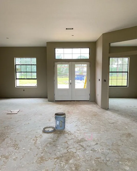
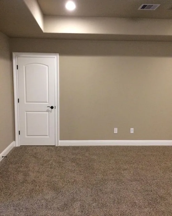
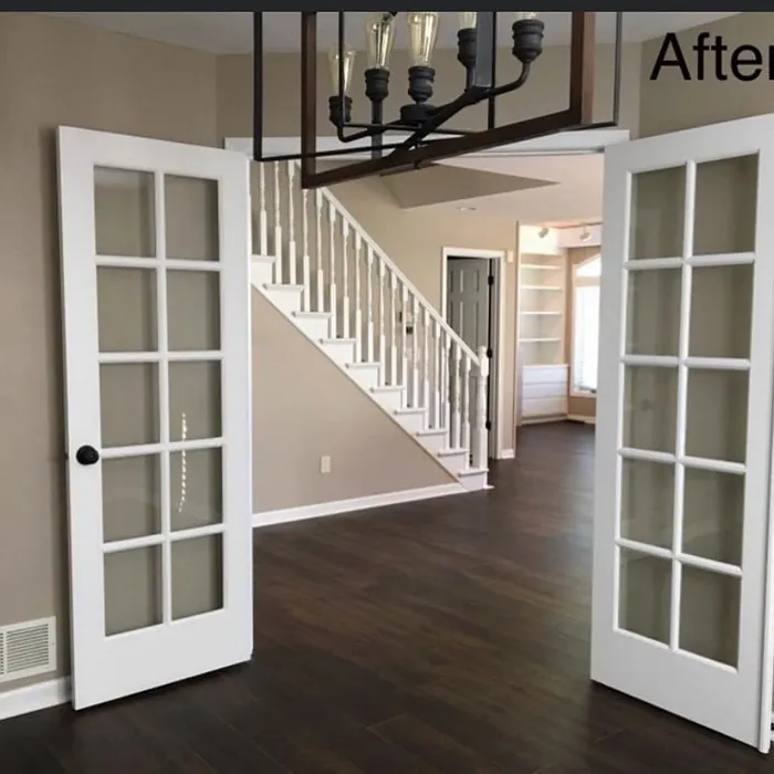
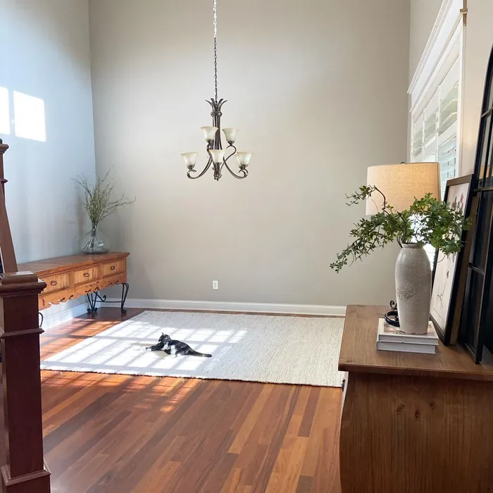
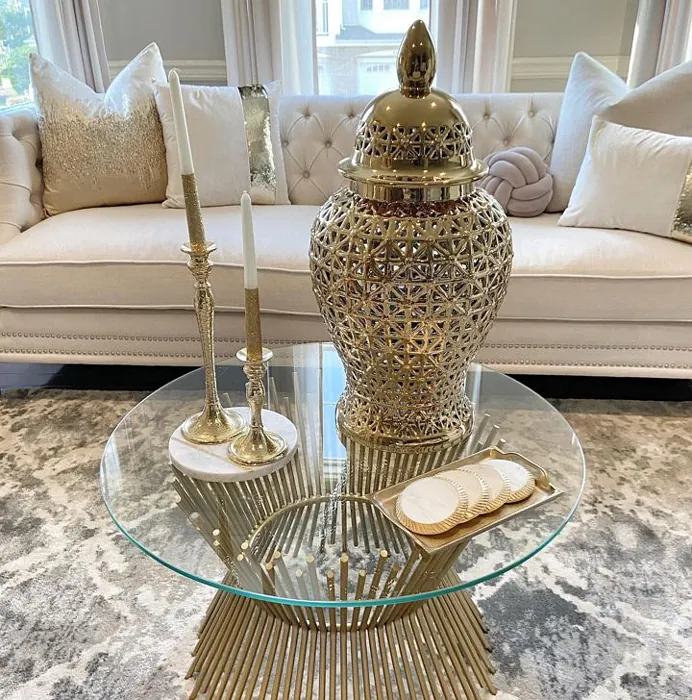
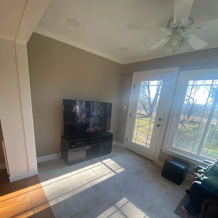
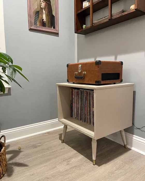
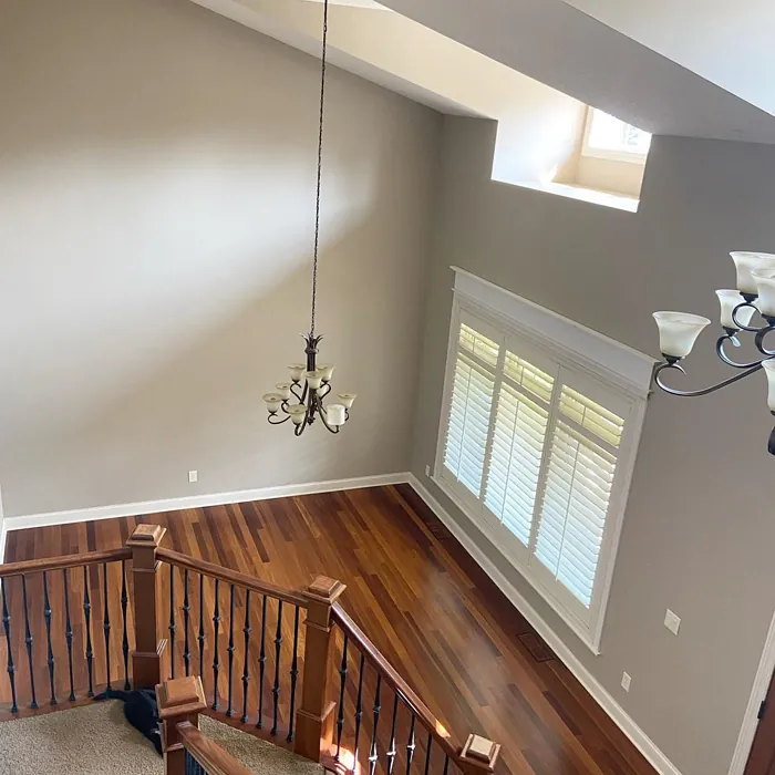
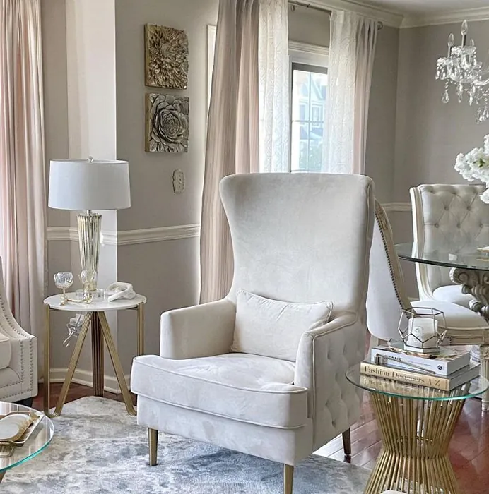
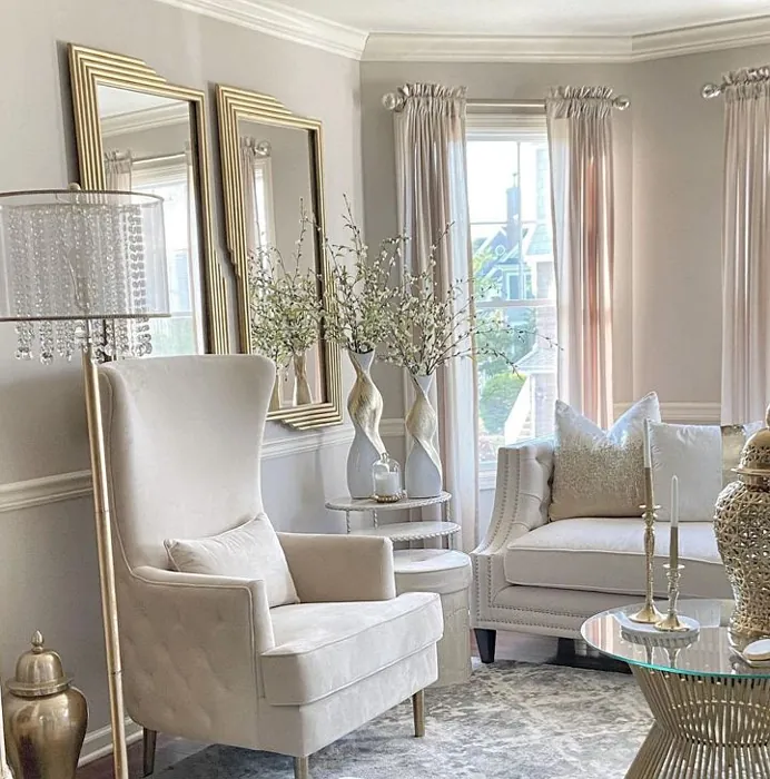
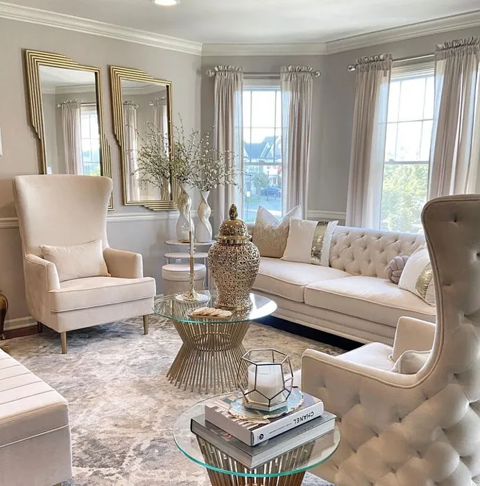
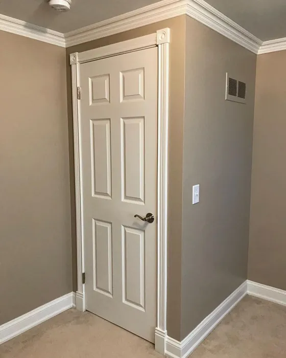
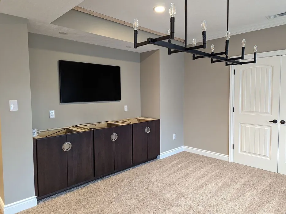
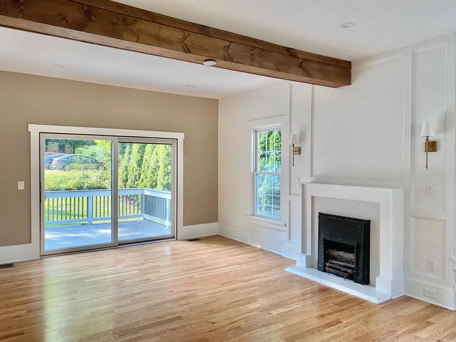
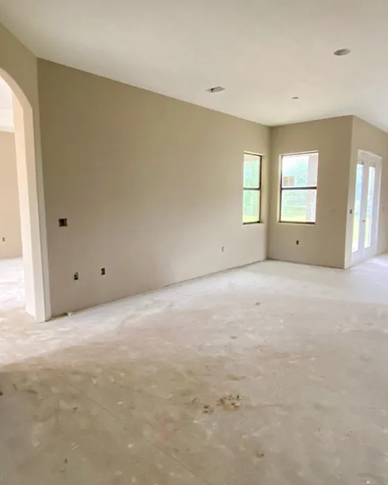
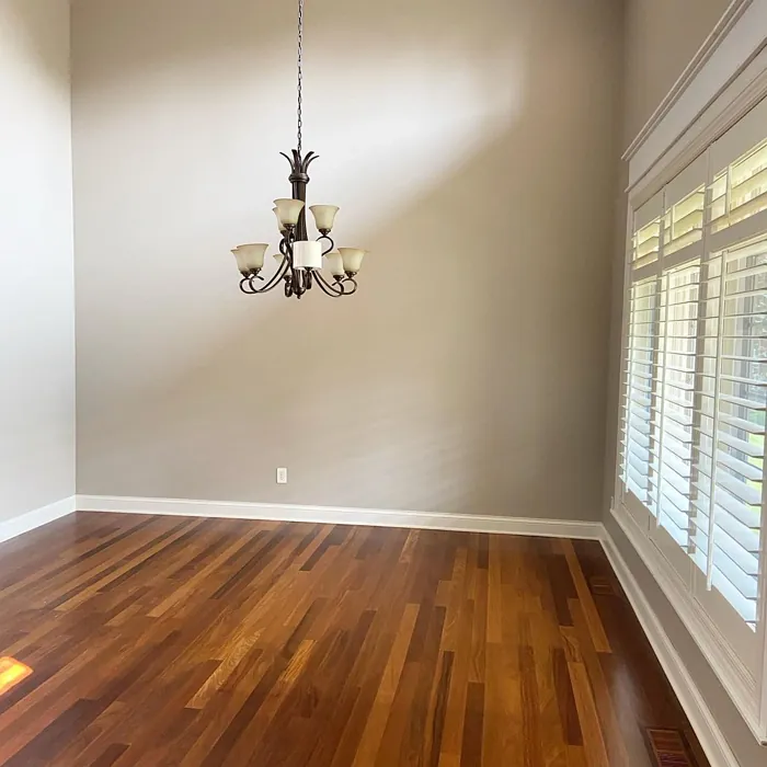
Real Room Photo of Balanced Beige SW 7037
Undertones of Balanced Beige ?
The undertones of Balanced Beige are a key aspect of its character, leaning towards Red. These subtle underlying hues are what give the color its depth and complexity. For example, a gray with a blue undertone will feel cooler and more modern, while one with a brown undertone will feel warmer and more traditional. It’s essential to test this paint in your home and observe it next to your existing furniture, flooring, and decor to see how these undertones interact and reveal themselves throughout the day.
HEX value: #C0B2A2
RGB code: 192, 178, 162
Is Balanced Beige Cool or Warm?
While predominantly warm, Balanced Beige’s cool undertones create a harmonious balance, allowing it to fit seamlessly into various color schemes. This quality makes it adaptable, whether you’re pairing it with warm woods or cool metals.
Understanding Color Properties and Interior Design Tips
Hue refers to a specific position on the color wheel, measured in degrees from 0 to 360. Each degree represents a different pure color:
- 0° represents red
- 120° represents green
- 240° represents blue
Saturation describes the intensity or purity of a color and is expressed as a percentage:
- At 0%, the color appears completely desaturated—essentially a shade of gray
- At 100%, the color is at its most vivid and vibrant
Lightness indicates how light or dark a color is, also expressed as a percentage:
- 0% lightness results in black
- 100% lightness results in white
Using Warm Colors in Interior Design
Warm hues—such as reds, oranges, yellows, warm beiges, and greiges—are excellent choices for creating inviting and energetic spaces. These colors are particularly well-suited for:
- Kitchens, living rooms, and bathrooms, where warmth enhances comfort and sociability
- Large rooms, where warm tones can help reduce the sense of emptiness and make the space feel more intimate
For example:
- Warm beige shades provide a cozy, inviting atmosphere, ideal for living rooms, bedrooms, and hallways.
- Warm greige (a mix of beige and gray) offers the warmth of beige with the modern appeal of gray, making it a versatile backdrop for dining areas, bedrooms, and living spaces.
However, be mindful when using warm light tones in rooms with limited natural light. These shades may appear muted or even take on an unpleasant yellowish tint. To avoid a dull or flat appearance:
- Add depth by incorporating richer tones like deep greens, charcoal, or chocolate brown
- Use textured elements such as curtains, rugs, or cushions to bring dimension to the space
Pro Tip: Achieving Harmony with Warm and Cool Color Balance
To create a well-balanced and visually interesting interior, mix warm and cool tones strategically. This contrast adds depth and harmony to your design.
- If your walls feature warm hues, introduce cool-colored accents such as blue or green furniture, artwork, or accessories to create contrast.
- For a polished look, consider using a complementary color scheme, which pairs colors opposite each other on the color wheel (e.g., red with green, orange with blue).
This thoughtful mix not only enhances visual appeal but also creates a space that feels both dynamic and cohesive.
Light Temperature Affects on Balanced Beige
Natural Light
Natural daylight changes in color temperature as the sun moves across the sky. At sunrise and sunset, the light tends to have a warm, golden tone with a color temperature around 2000 Kelvin (K). As the day progresses and the sun rises higher, the light becomes cooler and more neutral. Around midday, especially when the sky is clear, natural light typically reaches its peak brightness and shifts to a cooler tone, ranging from 5500 to 6500 Kelvin. This midday light is close to what we perceive as pure white or daylight-balanced light.
These shifts in natural light can significantly influence how colors appear in a space, which is why designers often consider both the time of day and the orientation of windows when planning interior color schemes.
Artificial Light
When choosing artificial lighting, pay close attention to the color temperature, measured in Kelvin (K). This determines how warm or cool the light will appear. Lower temperatures, around 2700K, give off a warm, yellow glow often used in living rooms or bedrooms. Higher temperatures, above 5000K, create a cool, bluish light similar to daylight, commonly used in kitchens, offices, or task areas.
Use the slider to see how lighting temperature can affect the appearance of a surface or color throughout a space.


4800K
LRV of Balanced Beige
The Light Reflectance Value (LRV) of Balanced Beige is 44%, which places it in the Medium category. This means it Reflects a moderate amount of light. Understanding a paint’s LRV is crucial for predicting how it will look in your space. A higher LRV indicates a lighter color that reflects more light, making rooms feel larger and brighter. A lower LRV signifies a darker color that absorbs more light, creating a cozier, more intimate atmosphere. Always consider the natural and artificial lighting in your room when selecting a paint color based on its LRV.
Detailed Review of Balanced Beige
Additional Paint Characteristics
Ideal Rooms
Bedroom, Dining Room, Home Office, Kitchen, Living Room
Decor Styles
Contemporary, Minimalist, Modern Farmhouse, Rustic, Transitional
Coverage
Good (1–2 Coats), Touch-Up Friendly
Ease of Application
Beginner Friendly, Brush Smooth, Roller-Ready
Washability
Washable, Wipeable
VOC Level
Low VOC, Ultra Low VOC
Best Use
Accent Wall, Interior Walls, Trim
Room Suitability
Bedroom, Dining Room, Hallway, Kitchen, Living Room
Tone Tag
Balanced, Earthy, Warm
Finish Type
Eggshell, Matte, Satin
Paint Performance
Easy Touch-Up, High Coverage, Low Odor
Use Cases
Best for Open Concept, Best for Small Spaces, Classic Favorite
Mood
Calm, Cozy, Inviting
Trim Pairing
Complements Cool Trim, Pairs with White Dove, Works with Warm Trim
Balanced Beige is a fantastic choice for anyone looking to create a warm and welcoming atmosphere in their home. The color has a unique ability to adapt to various lighting conditions, which means it can appear lighter or darker depending on the time of day. This versatility makes it a favorite among homeowners and designers alike. Its muted tone works beautifully in both natural light and artificial lighting, ensuring that your space always looks inviting. Plus, it pairs well with an array of accent colors, allowing you to showcase your personal style effortlessly. Whether you’re painting a large space or just an accent wall, Balanced Beige provides excellent coverage, often requiring just one to two coats for a perfect finish.
Pros & Cons of SW 7037 Balanced Beige
Pros
Cons
Colors that go with Sherwin Williams Balanced Beige
FAQ on SW 7037 Balanced Beige
What is the best way to apply Balanced Beige?
For the best results, use a high-quality roller for large surfaces and a brush for edges and corners. It’s beginner-friendly, so even if you’re not a pro, you’ll find it easy to work with. Make sure to use painter’s tape to achieve clean lines, and consider priming the surface if you’re making a significant color change. Applying two coats will enhance the richness of the color and ensure even coverage.
Can I use Balanced Beige in a small room?
Yes, you can use Balanced Beige in a small room, but be mindful of the lighting. In smaller spaces with limited natural light, the color might appear darker than intended. To keep the room feeling spacious, pair it with lighter trim and decor, and consider using mirrors to reflect light. This will help maintain an open and airy feel while still enjoying the warmth of the color.
Comparisons Balanced Beige with other colors
Balanced Beige SW 7037 vs Repose Gray SW 7015
| Attribute | Balanced Beige SW 7037 | Repose Gray SW 7015 |
|---|---|---|
| Color Name | Balanced Beige SW 7037 | Repose Gray SW 7015 |
| Color | ||
| Hue | Grey | Grey |
| Brightness | Medium | Medium |
| RGB | 192, 178, 162 | 204, 201, 192 |
| LRV | 44% | 58% |
| Finish Type | Eggshell, Matte, Satin | Eggshell, Matte, Satin |
| Finish Options | Eggshell, Matte, Satin | Eggshell, Matte, Satin |
| Ideal Rooms | Bedroom, Dining Room, Home Office, Kitchen, Living Room | Bedroom, Dining Room, Hallway, Home Office, Living Room |
| Decor Styles | Contemporary, Minimalist, Modern Farmhouse, Rustic, Transitional | Contemporary, Farmhouse, Minimalist, Modern, Transitional |
| Coverage | Good (1–2 Coats), Touch-Up Friendly | Good (1–2 Coats), Touch-Up Friendly |
| Ease of Application | Beginner Friendly, Brush Smooth, Roller-Ready | Beginner Friendly, Brush Smooth, Fast-Drying, Roller-Ready |
| Washability | Washable, Wipeable | Highly Washable, Washable |
| Room Suitability | Bedroom, Dining Room, Hallway, Kitchen, Living Room | Bedroom, Dining Room, Hallway, Home Office, Living Room |
| Tone | Balanced, Earthy, Warm | Muted, Neutral, Warm |
| Paint Performance | Easy Touch-Up, High Coverage, Low Odor | Low Odor, Quick Drying, Scuff Resistant |
Balanced Beige SW 7037 vs Light French Gray SW 0055
| Attribute | Balanced Beige SW 7037 | Light French Gray SW 0055 |
|---|---|---|
| Color Name | Balanced Beige SW 7037 | Light French Gray SW 0055 |
| Color | ||
| Hue | Grey | Grey |
| Brightness | Medium | Medium |
| RGB | 192, 178, 162 | 194, 192, 187 |
| LRV | 44% | 53% |
| Finish Type | Eggshell, Matte, Satin | Eggshell, Matte, Satin |
| Finish Options | Eggshell, Matte, Satin | Eggshell, Matte, Satin |
| Ideal Rooms | Bedroom, Dining Room, Home Office, Kitchen, Living Room | Bedroom, Dining Room, Home Office, Kitchen, Living Room |
| Decor Styles | Contemporary, Minimalist, Modern Farmhouse, Rustic, Transitional | Contemporary, Farmhouse, Modern, Scandinavian, Transitional |
| Coverage | Good (1–2 Coats), Touch-Up Friendly | Good (1–2 Coats), Touch-Up Friendly |
| Ease of Application | Beginner Friendly, Brush Smooth, Roller-Ready | Beginner Friendly, Brush Smooth, Roller-Ready |
| Washability | Washable, Wipeable | Highly Washable, Washable |
| Room Suitability | Bedroom, Dining Room, Hallway, Kitchen, Living Room | Bedroom, Dining Room, Home Office, Kitchen, Living Room |
| Tone | Balanced, Earthy, Warm | Balanced, Muted, Neutral, Warm |
| Paint Performance | Easy Touch-Up, High Coverage, Low Odor | Easy Touch-Up, High Coverage, Low Odor |
Balanced Beige SW 7037 vs Wordly Gray SW 7043
| Attribute | Balanced Beige SW 7037 | Wordly Gray SW 7043 |
|---|---|---|
| Color Name | Balanced Beige SW 7037 | Wordly Gray SW 7043 |
| Color | ||
| Hue | Grey | Grey |
| Brightness | Medium | Medium |
| RGB | 192, 178, 162 | 206, 198, 187 |
| LRV | 44% | 58% |
| Finish Type | Eggshell, Matte, Satin | Eggshell, Satin |
| Finish Options | Eggshell, Matte, Satin | Eggshell, Flat, Satin |
| Ideal Rooms | Bedroom, Dining Room, Home Office, Kitchen, Living Room | Bedroom, Home Office, Kitchen, Living Room |
| Decor Styles | Contemporary, Minimalist, Modern Farmhouse, Rustic, Transitional | Minimalist, Modern, Scandi, Transitional |
| Coverage | Good (1–2 Coats), Touch-Up Friendly | Good (1–2 Coats) |
| Ease of Application | Beginner Friendly, Brush Smooth, Roller-Ready | Beginner Friendly, Brush Smooth, Fast-Drying, Roller-Ready |
| Washability | Washable, Wipeable | Highly Washable, Washable |
| Room Suitability | Bedroom, Dining Room, Hallway, Kitchen, Living Room | Bedroom, Dining Room, Home Office, Living Room |
| Tone | Balanced, Earthy, Warm | Muted, Neutral, Warm |
| Paint Performance | Easy Touch-Up, High Coverage, Low Odor | Easy Touch-Up, Low Odor, Scuff Resistant |
Balanced Beige SW 7037 vs Illusive Green SW 9164
| Attribute | Balanced Beige SW 7037 | Illusive Green SW 9164 |
|---|---|---|
| Color Name | Balanced Beige SW 7037 | Illusive Green SW 9164 |
| Color | ||
| Hue | Grey | Grey |
| Brightness | Medium | Medium |
| RGB | 192, 178, 162 | 146, 148, 141 |
| LRV | 44% | 24% |
| Finish Type | Eggshell, Matte, Satin | Eggshell, Matte, Satin |
| Finish Options | Eggshell, Matte, Satin | Eggshell, Matte, Satin |
| Ideal Rooms | Bedroom, Dining Room, Home Office, Kitchen, Living Room | Bedroom, Dining Room, Home Office, Living Room, Nursery |
| Decor Styles | Contemporary, Minimalist, Modern Farmhouse, Rustic, Transitional | Coastal, Minimalist, Modern, Rustic, Scandinavian |
| Coverage | Good (1–2 Coats), Touch-Up Friendly | Good (1–2 Coats), Touch-Up Friendly |
| Ease of Application | Beginner Friendly, Brush Smooth, Roller-Ready | Beginner Friendly, Brush Smooth, Fast-Drying, Roller-Ready |
| Washability | Washable, Wipeable | Highly Washable, Washable, Wipeable |
| Room Suitability | Bedroom, Dining Room, Hallway, Kitchen, Living Room | Bedroom, Dining Room, Home Office, Living Room, Nursery |
| Tone | Balanced, Earthy, Warm | Balanced, Earthy, Muted |
| Paint Performance | Easy Touch-Up, High Coverage, Low Odor | Easy Touch-Up, Low Odor, Quick Drying, Scuff Resistant |
Balanced Beige SW 7037 vs Fawn Brindle SW 7640
| Attribute | Balanced Beige SW 7037 | Fawn Brindle SW 7640 |
|---|---|---|
| Color Name | Balanced Beige SW 7037 | Fawn Brindle SW 7640 |
| Color | ||
| Hue | Grey | Grey |
| Brightness | Medium | Medium |
| RGB | 192, 178, 162 | 167, 160, 148 |
| LRV | 44% | 24% |
| Finish Type | Eggshell, Matte, Satin | Eggshell, Matte |
| Finish Options | Eggshell, Matte, Satin | Eggshell, Matte, Satin |
| Ideal Rooms | Bedroom, Dining Room, Home Office, Kitchen, Living Room | Bedroom, Dining Room, Hallway, Home Office, Living Room |
| Decor Styles | Contemporary, Minimalist, Modern Farmhouse, Rustic, Transitional | Bohemian, Minimalist, Modern Farmhouse, Transitional |
| Coverage | Good (1–2 Coats), Touch-Up Friendly | Good (1–2 Coats) |
| Ease of Application | Beginner Friendly, Brush Smooth, Roller-Ready | Brush Smooth, Fast-Drying, Roller-Ready |
| Washability | Washable, Wipeable | Stain Resistant, Washable |
| Room Suitability | Bedroom, Dining Room, Hallway, Kitchen, Living Room | Bedroom, Dining Room, Home Office, Living Room |
| Tone | Balanced, Earthy, Warm | Earthy, Neutral, Warm |
| Paint Performance | Easy Touch-Up, High Coverage, Low Odor | Easy Touch-Up, Fade Resistant, Low Odor |
Balanced Beige SW 7037 vs Mushroom SW 9587
| Attribute | Balanced Beige SW 7037 | Mushroom SW 9587 |
|---|---|---|
| Color Name | Balanced Beige SW 7037 | Mushroom SW 9587 |
| Color | ||
| Hue | Grey | Grey |
| Brightness | Medium | Medium |
| RGB | 192, 178, 162 | 208, 199, 183 |
| LRV | 44% | 24% |
| Finish Type | Eggshell, Matte, Satin | Eggshell, Satin |
| Finish Options | Eggshell, Matte, Satin | Eggshell, Flat, Matte, Satin |
| Ideal Rooms | Bedroom, Dining Room, Home Office, Kitchen, Living Room | Bedroom, Dining Room, Hallway, Home Office, Living Room |
| Decor Styles | Contemporary, Minimalist, Modern Farmhouse, Rustic, Transitional | Bohemian, Contemporary, Modern Farmhouse, Traditional |
| Coverage | Good (1–2 Coats), Touch-Up Friendly | Good (1–2 Coats) |
| Ease of Application | Beginner Friendly, Brush Smooth, Roller-Ready | Beginner Friendly, Brush Smooth, Roller-Ready |
| Washability | Washable, Wipeable | Highly Washable, Washable |
| Room Suitability | Bedroom, Dining Room, Hallway, Kitchen, Living Room | Bedroom, Dining Room, Home Office, Living Room |
| Tone | Balanced, Earthy, Warm | Earthy, Neutral, Warm |
| Paint Performance | Easy Touch-Up, High Coverage, Low Odor | Easy Touch-Up, Long Lasting, Low Odor, Scuff Resistant |
Balanced Beige SW 7037 vs Silver Strand SW 7057
| Attribute | Balanced Beige SW 7037 | Silver Strand SW 7057 |
|---|---|---|
| Color Name | Balanced Beige SW 7037 | Silver Strand SW 7057 |
| Color | ||
| Hue | Grey | Grey |
| Brightness | Medium | Medium |
| RGB | 192, 178, 162 | 200, 203, 196 |
| LRV | 44% | 66% |
| Finish Type | Eggshell, Matte, Satin | Eggshell, Satin |
| Finish Options | Eggshell, Matte, Satin | Eggshell, Matte, Satin |
| Ideal Rooms | Bedroom, Dining Room, Home Office, Kitchen, Living Room | Bedroom, Dining Room, Hallway, Home Office, Living Room |
| Decor Styles | Contemporary, Minimalist, Modern Farmhouse, Rustic, Transitional | Coastal, Minimalist, Modern, Traditional, Transitional |
| Coverage | Good (1–2 Coats), Touch-Up Friendly | Good (1–2 Coats), Touch-Up Friendly |
| Ease of Application | Beginner Friendly, Brush Smooth, Roller-Ready | Beginner Friendly, Brush Smooth, Roller-Ready |
| Washability | Washable, Wipeable | Highly Washable, Washable |
| Room Suitability | Bedroom, Dining Room, Hallway, Kitchen, Living Room | Bathroom, Bedroom, Home Office, Kitchen, Living Room |
| Tone | Balanced, Earthy, Warm | Balanced, Neutral, Warm |
| Paint Performance | Easy Touch-Up, High Coverage, Low Odor | Easy Touch-Up, High Coverage, Low Odor |
Balanced Beige SW 7037 vs Cadet SW 9143
| Attribute | Balanced Beige SW 7037 | Cadet SW 9143 |
|---|---|---|
| Color Name | Balanced Beige SW 7037 | Cadet SW 9143 |
| Color | ||
| Hue | Grey | Grey |
| Brightness | Medium | Medium |
| RGB | 192, 178, 162 | 145, 153, 156 |
| LRV | 44% | 12% |
| Finish Type | Eggshell, Matte, Satin | Eggshell, Matte, Satin |
| Finish Options | Eggshell, Matte, Satin | Eggshell, Matte, Satin |
| Ideal Rooms | Bedroom, Dining Room, Home Office, Kitchen, Living Room | Bathroom, Bedroom, Hallway, Home Office, Kitchen, Living Room |
| Decor Styles | Contemporary, Minimalist, Modern Farmhouse, Rustic, Transitional | Coastal, Industrial, Minimalist, Modern, Scandinavian |
| Coverage | Good (1–2 Coats), Touch-Up Friendly | Good (1–2 Coats), Touch-Up Friendly |
| Ease of Application | Beginner Friendly, Brush Smooth, Roller-Ready | Beginner Friendly, Brush Smooth, Roller-Ready |
| Washability | Washable, Wipeable | Washable, Wipeable |
| Room Suitability | Bedroom, Dining Room, Hallway, Kitchen, Living Room | Bathroom, Bedroom, Hallway, Home Office, Living Room |
| Tone | Balanced, Earthy, Warm | Balanced, Cool, Muted |
| Paint Performance | Easy Touch-Up, High Coverage, Low Odor | Easy Touch-Up, High Coverage, Low Odor |
Balanced Beige SW 7037 vs Dovetail SW 7018
| Attribute | Balanced Beige SW 7037 | Dovetail SW 7018 |
|---|---|---|
| Color Name | Balanced Beige SW 7037 | Dovetail SW 7018 |
| Color | ||
| Hue | Grey | Grey |
| Brightness | Medium | Medium |
| RGB | 192, 178, 162 | 144, 138, 131 |
| LRV | 44% | 24% |
| Finish Type | Eggshell, Matte, Satin | Eggshell, Matte, Satin |
| Finish Options | Eggshell, Matte, Satin | Eggshell, Matte, Satin |
| Ideal Rooms | Bedroom, Dining Room, Home Office, Kitchen, Living Room | Bedroom, Dining Room, Hallway, Home Office, Living Room |
| Decor Styles | Contemporary, Minimalist, Modern Farmhouse, Rustic, Transitional | Minimalist, Modern Farmhouse, Rustic, Transitional |
| Coverage | Good (1–2 Coats), Touch-Up Friendly | Good (1–2 Coats), Touch-Up Friendly |
| Ease of Application | Beginner Friendly, Brush Smooth, Roller-Ready | Beginner Friendly, Brush Smooth, Roller-Ready |
| Washability | Washable, Wipeable | Washable, Wipeable |
| Room Suitability | Bedroom, Dining Room, Hallway, Kitchen, Living Room | Bedroom, Dining Room, Home Office, Living Room |
| Tone | Balanced, Earthy, Warm | Earthy, Neutral, Warm |
| Paint Performance | Easy Touch-Up, High Coverage, Low Odor | Easy Touch-Up, Fade Resistant, Low Odor |
Balanced Beige SW 7037 vs Morning Fog SW 6255
| Attribute | Balanced Beige SW 7037 | Morning Fog SW 6255 |
|---|---|---|
| Color Name | Balanced Beige SW 7037 | Morning Fog SW 6255 |
| Color | ||
| Hue | Grey | Grey |
| Brightness | Medium | Medium |
| RGB | 192, 178, 162 | 168, 174, 177 |
| LRV | 44% | 40% |
| Finish Type | Eggshell, Matte, Satin | Eggshell, Matte |
| Finish Options | Eggshell, Matte, Satin | Eggshell, Matte, Satin |
| Ideal Rooms | Bedroom, Dining Room, Home Office, Kitchen, Living Room | Bathroom, Bedroom, Home Office, Kitchen, Living Room |
| Decor Styles | Contemporary, Minimalist, Modern Farmhouse, Rustic, Transitional | Coastal, Minimalist, Modern, Scandinavian |
| Coverage | Good (1–2 Coats), Touch-Up Friendly | Good (1–2 Coats), Touch-Up Friendly |
| Ease of Application | Beginner Friendly, Brush Smooth, Roller-Ready | Beginner Friendly, Fast-Drying, Roller-Ready |
| Washability | Washable, Wipeable | Highly Washable, Washable |
| Room Suitability | Bedroom, Dining Room, Hallway, Kitchen, Living Room | Bedroom, Home Office, Living Room, Nursery |
| Tone | Balanced, Earthy, Warm | Cool, Muted, Neutral |
| Paint Performance | Easy Touch-Up, High Coverage, Low Odor | Easy Touch-Up, Low Odor, Quick Drying |
Official Page of Sherwin Williams Balanced Beige SW 7037