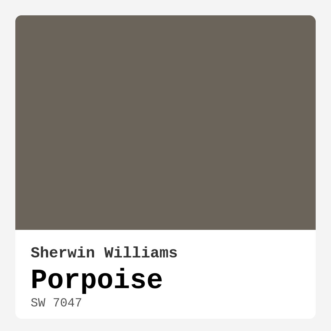
Color Preview & Key Details
| HEX Code | #6B645B |
| RGB | 107, 100, 91 |
| LRV | 30% |
| Undertone | Red |
| Finish Options | Eggshell, Satin, Semi-Gloss |
Picture this: you walk into a room that feels both sophisticated and inviting. The walls exude a warmth that wraps around you like a soft blanket, making you want to linger just a bit longer. That’s the magic of Porpoise, a stunning paint color from Sherwin Williams. With its rich warmth and earthy undertones, Porpoise is more than just a color; it’s an experience waiting to transform your space.
Let’s dive into why this color might just be the perfect fit for your next project. Porpoise, with color code SW 7047, is a warm beige-gray that strikes the perfect balance between elegance and comfort. It’s versatile enough to fit seamlessly into various decor styles, whether you’re going for a modern, industrial, Scandinavian, or transitional look.
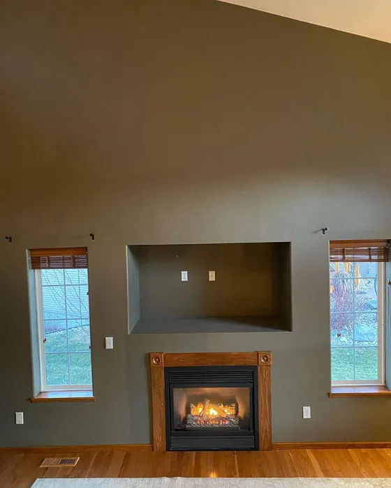
One of the standout features of Porpoise is its depth. This isn’t your average gray; it carries a subtle red undertone that adds character and warmth. This means that in a well-lit room, you’ll see its softer gray aspects, but when the lights dim, it deepens, creating a cozy, intimate ambiance. The Light Reflectance Value (LRV) of 30% tells us that it falls in the medium-dark range, reflecting very little light. This makes it ideal for spaces where you want to create a warm, inviting atmosphere, like living rooms, bedrooms, and dining areas.
Porpoise is perfect for a cozy nook where you can unwind after a long day. Imagine a home office bathed in this warm hue, encouraging creativity and focus without feeling sterile. It’s also an excellent choice for a dining room; the rich tone will enhance conversations over dinner, making every meal feel special. If you’re considering an accent wall, Porpoise could serve as a stunning backdrop for your favorite artwork or a statement piece of furniture.
When you’re deciding on a color, it’s crucial to think about how it will pair with your existing decor. With Porpoise’s warm undertones, it naturally complements a palette that includes whites, creams, and softer hues. Pairing it with crisp white trim, like White Dove, will create a fresh, clean contrast that elevates the entire look. If you’re drawn to metallics, Porpoise plays beautifully with brass fixtures, adding a touch of luxury without overwhelming your space.
Now, let’s talk about application. Porpoise is not just beautiful; it’s also user-friendly. It’s designed to be beginner-friendly, with good coverage that typically requires only one to two coats. Whether you’re rolling or brushing, it handles smoothly and dries quickly, making the painting process less daunting and more enjoyable. Plus, its washability means you can easily clean off scuffs, making it a smart choice for high-traffic areas. For areas that need a bit more durability, consider using a satin or semi-gloss finish; both will hold up nicely against the daily wear and tear of family life.
One thing to keep in mind is how Porpoise behaves in different lighting conditions. In spaces with ample natural light, it can feel light and airy, while in dim or darker corners, it deepens, which can sometimes catch you off guard. To counterbalance its darker appearance in low light, consider incorporating lighter accents or furniture. This will not only brighten up the space but also create a beautiful contrast that highlights Porpoise’s warmth.
Porpoise shines when paired with complementary shades. Think about adding accents in deep jewel tones or even soft pastels; colors like SW 7625 or SW 9140 create a sophisticated and inviting palette. These combinations will allow you to personalize your space while enhancing Porpoise’s warm qualities.
For those wondering if Porpoise is suitable for smaller spaces, the answer is a resounding yes! Its warm undertones can make a small area feel cozy and inviting. However, be mindful of how you light the space. In darker corners, it might appear a little deeper than you expect, so ensure you have a strategic lighting plan in place.
In terms of decor styles, Porpoise fits effortlessly into various themes. It works beautifully in modern farmhouse settings, where its earthy undertones can complement rustic wood elements. It also finds a home in open-concept designs, providing a grounding effect that helps delineate spaces without creating harsh divisions.
As with any paint color, testing Porpoise in your home is essential. Observe how it interacts with your existing furniture and decor throughout the day. The subtleties of its undertones will reveal themselves differently depending on the light and surrounding colors. You might find that it enhances the warmth of your wood flooring or beautifully offsets the cool tones in your artwork.
While Porpoise boasts many advantages, it’s worth noting a couple of considerations. In low-light settings, it can appear darker, which may not suit everyone’s preferences. Additionally, careful color pairing is essential; some accent colors may clash with its warm undertones, so it’s always a good idea to bring home swatches and see how they play together before committing.
In conclusion, Porpoise is a rich, versatile hue that can elevate any space. It creates a warm, inviting atmosphere that encourages relaxation and conversation. Whether you’re painting an entire room, an accent wall, or simply refreshing your trim, Porpoise delivers sophistication with a cozy touch. Its ease of application, washability, and adaptability to various decor styles make it an excellent choice for both novice and experienced DIYers alike.
So, are you ready to embrace the warmth of Porpoise in your home? This color might just be the key to unlocking a more inviting and stylish environment. Grab a sample, test it out, and watch your space transform into a haven you’ll love coming home to.
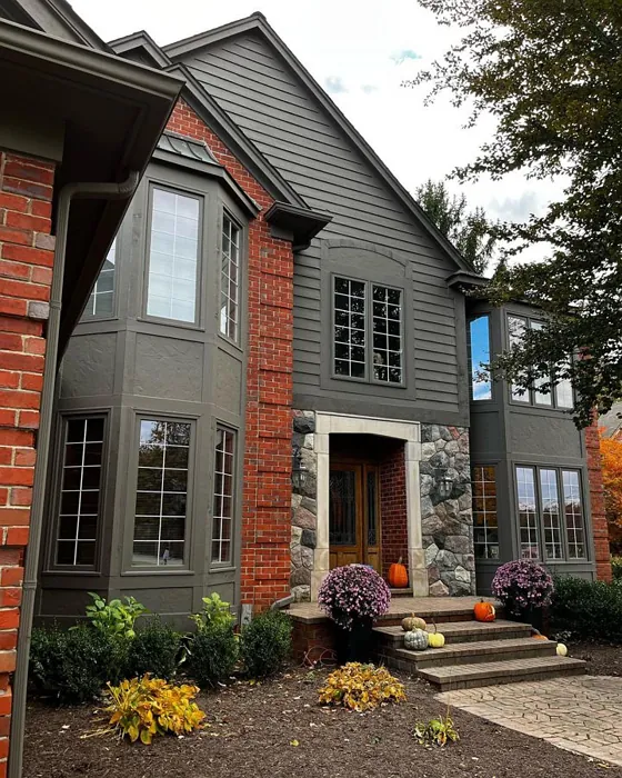
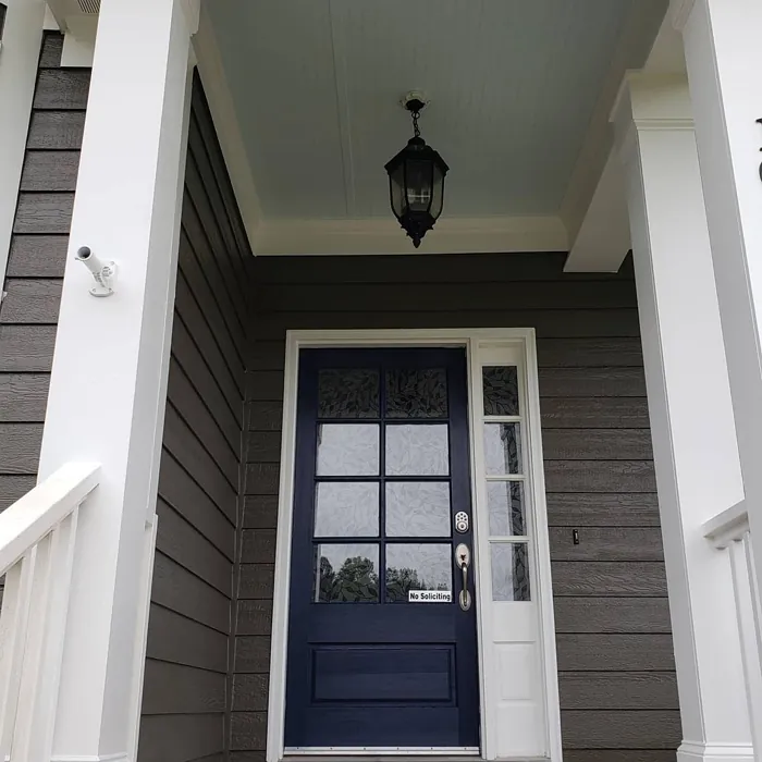
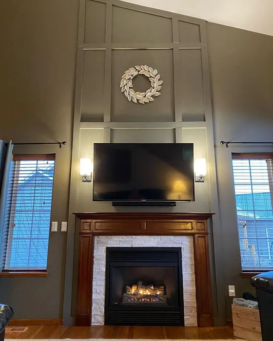
Real Room Photo of Porpoise SW 7047
Undertones of Porpoise ?
The undertones of Porpoise are a key aspect of its character, leaning towards Red. These subtle underlying hues are what give the color its depth and complexity. For example, a gray with a blue undertone will feel cooler and more modern, while one with a brown undertone will feel warmer and more traditional. It’s essential to test this paint in your home and observe it next to your existing furniture, flooring, and decor to see how these undertones interact and reveal themselves throughout the day.
HEX value: #6B645B
RGB code: 107, 100, 91
Is Porpoise Cool or Warm?
Porpoise is considered a warm paint color. This characteristic plays a huge role in the overall feel of a room. Warm colors, like this one, tend to create a cozy, inviting, and energetic atmosphere, making them great for social spaces like living rooms and dining rooms. In contrast, cool colors often evoke a sense of calm and serenity, which is why they are popular in bedrooms and bathrooms. The warmth of Porpoise means it will pair beautifully with corresponding decor elements.
Understanding Color Properties and Interior Design Tips
Hue refers to a specific position on the color wheel, measured in degrees from 0 to 360. Each degree represents a different pure color:
- 0° represents red
- 120° represents green
- 240° represents blue
Saturation describes the intensity or purity of a color and is expressed as a percentage:
- At 0%, the color appears completely desaturated—essentially a shade of gray
- At 100%, the color is at its most vivid and vibrant
Lightness indicates how light or dark a color is, also expressed as a percentage:
- 0% lightness results in black
- 100% lightness results in white
Using Warm Colors in Interior Design
Warm hues—such as reds, oranges, yellows, warm beiges, and greiges—are excellent choices for creating inviting and energetic spaces. These colors are particularly well-suited for:
- Kitchens, living rooms, and bathrooms, where warmth enhances comfort and sociability
- Large rooms, where warm tones can help reduce the sense of emptiness and make the space feel more intimate
For example:
- Warm beige shades provide a cozy, inviting atmosphere, ideal for living rooms, bedrooms, and hallways.
- Warm greige (a mix of beige and gray) offers the warmth of beige with the modern appeal of gray, making it a versatile backdrop for dining areas, bedrooms, and living spaces.
However, be mindful when using warm light tones in rooms with limited natural light. These shades may appear muted or even take on an unpleasant yellowish tint. To avoid a dull or flat appearance:
- Add depth by incorporating richer tones like deep greens, charcoal, or chocolate brown
- Use textured elements such as curtains, rugs, or cushions to bring dimension to the space
Pro Tip: Achieving Harmony with Warm and Cool Color Balance
To create a well-balanced and visually interesting interior, mix warm and cool tones strategically. This contrast adds depth and harmony to your design.
- If your walls feature warm hues, introduce cool-colored accents such as blue or green furniture, artwork, or accessories to create contrast.
- For a polished look, consider using a complementary color scheme, which pairs colors opposite each other on the color wheel (e.g., red with green, orange with blue).
This thoughtful mix not only enhances visual appeal but also creates a space that feels both dynamic and cohesive.
Light Temperature Affects on Porpoise
Natural Light
Natural daylight changes in color temperature as the sun moves across the sky. At sunrise and sunset, the light tends to have a warm, golden tone with a color temperature around 2000 Kelvin (K). As the day progresses and the sun rises higher, the light becomes cooler and more neutral. Around midday, especially when the sky is clear, natural light typically reaches its peak brightness and shifts to a cooler tone, ranging from 5500 to 6500 Kelvin. This midday light is close to what we perceive as pure white or daylight-balanced light.
These shifts in natural light can significantly influence how colors appear in a space, which is why designers often consider both the time of day and the orientation of windows when planning interior color schemes.
Artificial Light
When choosing artificial lighting, pay close attention to the color temperature, measured in Kelvin (K). This determines how warm or cool the light will appear. Lower temperatures, around 2700K, give off a warm, yellow glow often used in living rooms or bedrooms. Higher temperatures, above 5000K, create a cool, bluish light similar to daylight, commonly used in kitchens, offices, or task areas.
Use the slider to see how lighting temperature can affect the appearance of a surface or color throughout a space.


4800K
LRV of Porpoise
The Light Reflectance Value (LRV) of Porpoise is 30%, which places it in the Medium Dark category. This means it reflects very little light. Understanding a paint’s LRV is crucial for predicting how it will look in your space. A higher LRV indicates a lighter color that reflects more light, making rooms feel larger and brighter. A lower LRV signifies a darker color that absorbs more light, creating a cozier, more intimate atmosphere. Always consider the natural and artificial lighting in your room when selecting a paint color based on its LRV.
Detailed Review of Porpoise
Additional Paint Characteristics
Ideal Rooms
Bedroom, Dining Room, Hallway, Home Office, Living Room
Decor Styles
Industrial, Modern, Scandinavian, Transitional
Coverage
Good (1–2 Coats)
Ease of Application
Beginner Friendly, Brush Smooth, Fast-Drying, Roller-Ready
Washability
Highly Washable, Washable
VOC Level
Low VOC
Best Use
Accent Wall, Interior Walls, Trim
Room Suitability
Bedroom, Dining Room, Home Office, Living Room
Tone Tag
Earthy, Muted, Warm
Finish Type
Eggshell, Satin
Paint Performance
Easy Touch-Up, Fade Resistant, High Coverage, Low Odor
Use Cases
Best for Modern Farmhouse, Best for Open Concept, Classic Favorite
Mood
Cozy, Grounding, Inviting
Trim Pairing
Complements Brass Fixtures, Pairs with White Dove, Works with Warm Trim
Porpoise is a standout choice for anyone wanting to infuse their space with a touch of elegance. Its unique blend of gray with warm undertones makes it ideal for creating depth without being overwhelming. This color works beautifully in rooms where you want to foster conversation and relaxation, such as living rooms and bedrooms. When applied, Porpoise maintains its character, whether basking in natural light or cozy evening glow. It pairs well with various accent colors, making it adaptable across different decor styles. Homeowners will appreciate how easy it is to coordinate with furniture and artwork, giving you plenty of design flexibility.
Pros & Cons of SW 7047 Porpoise
Pros
Cons
Colors that go with Sherwin Williams Porpoise
FAQ on SW 7047 Porpoise
Is Porpoise suitable for small spaces?
Absolutely! Porpoise works well in small spaces due to its warm undertones, which can make the area feel more inviting. Just be mindful of the lighting; in darker corners, it may appear a bit deeper than expected. Pairing with lighter accents can help balance the space.
How does Porpoise hold up in high-traffic areas?
Porpoise is a durable choice for high-traffic areas, especially when applied with a satin or semi-gloss finish. Its washability means you can easily clean scuffs and marks, maintaining its elegant look over time. Just ensure to keep some paint on hand for quick touch-ups.
Comparisons Porpoise with other colors
Porpoise SW 7047 vs Griffin SW 7026
| Attribute | Porpoise SW 7047 | Griffin SW 7026 |
|---|---|---|
| Color Name | Porpoise SW 7047 | Griffin SW 7026 |
| Color | ||
| Hue | Beige | Beige |
| Brightness | Dark | Dark |
| RGB | 107, 100, 91 | 111, 100, 89 |
| LRV | 30% | 24% |
| Finish Type | Eggshell, Satin | Eggshell, Matte |
| Finish Options | Eggshell, Satin, Semi-Gloss | Eggshell, Matte, Satin |
| Ideal Rooms | Bedroom, Dining Room, Hallway, Home Office, Living Room | Bathroom, Bedroom, Dining Room, Home Office, Living Room |
| Decor Styles | Industrial, Modern, Scandinavian, Transitional | Contemporary, Modern, Rustic, Transitional |
| Coverage | Good (1–2 Coats) | Good (1–2 Coats), Touch-Up Friendly |
| Ease of Application | Beginner Friendly, Brush Smooth, Fast-Drying, Roller-Ready | Beginner Friendly, Brush Smooth, Roller-Ready |
| Washability | Highly Washable, Washable | Washable, Wipeable |
| Room Suitability | Bedroom, Dining Room, Home Office, Living Room | Bedroom, Dining Room, Home Office, Living Room |
| Tone | Earthy, Muted, Warm | Earthy, Muted, Warm |
| Paint Performance | Easy Touch-Up, Fade Resistant, High Coverage, Low Odor | Easy Touch-Up, Fade Resistant, Low Odor |
Porpoise SW 7047 vs Warm Stone SW 7032
| Attribute | Porpoise SW 7047 | Warm Stone SW 7032 |
|---|---|---|
| Color Name | Porpoise SW 7047 | Warm Stone SW 7032 |
| Color | ||
| Hue | Beige | Beige |
| Brightness | Dark | Dark |
| RGB | 107, 100, 91 | 136, 123, 108 |
| LRV | 30% | 58% |
| Finish Type | Eggshell, Satin | Eggshell, Matte, Satin |
| Finish Options | Eggshell, Satin, Semi-Gloss | Eggshell, Matte, Satin |
| Ideal Rooms | Bedroom, Dining Room, Hallway, Home Office, Living Room | Bedroom, Dining Room, Home Office, Kitchen, Living Room |
| Decor Styles | Industrial, Modern, Scandinavian, Transitional | Contemporary, Modern Farmhouse, Rustic, Transitional |
| Coverage | Good (1–2 Coats) | Good (1–2 Coats), Touch-Up Friendly |
| Ease of Application | Beginner Friendly, Brush Smooth, Fast-Drying, Roller-Ready | Beginner Friendly, Brush Smooth, Roller-Ready |
| Washability | Highly Washable, Washable | Washable, Wipeable |
| Room Suitability | Bedroom, Dining Room, Home Office, Living Room | Bedroom, Dining Room, Home Office, Living Room |
| Tone | Earthy, Muted, Warm | Earthy, Muted, Warm |
| Paint Performance | Easy Touch-Up, Fade Resistant, High Coverage, Low Odor | Easy Touch-Up, High Coverage, Low Odor, Quick Drying, Scuff Resistant |
Porpoise SW 7047 vs Black Fox SW 7020
| Attribute | Porpoise SW 7047 | Black Fox SW 7020 |
|---|---|---|
| Color Name | Porpoise SW 7047 | Black Fox SW 7020 |
| Color | ||
| Hue | Beige | Beige |
| Brightness | Dark | Dark |
| RGB | 107, 100, 91 | 79, 72, 66 |
| LRV | 30% | 5% |
| Finish Type | Eggshell, Satin | Eggshell, Matte, Satin |
| Finish Options | Eggshell, Satin, Semi-Gloss | Eggshell, Matte, Satin |
| Ideal Rooms | Bedroom, Dining Room, Hallway, Home Office, Living Room | Bedroom, Dining Room, Hallway, Home Office, Living Room |
| Decor Styles | Industrial, Modern, Scandinavian, Transitional | Bohemian, Industrial, Modern, Rustic, Transitional |
| Coverage | Good (1–2 Coats) | Good (1–2 Coats), Touch-Up Friendly |
| Ease of Application | Beginner Friendly, Brush Smooth, Fast-Drying, Roller-Ready | Brush Smooth, Fast-Drying, Roller-Ready |
| Washability | Highly Washable, Washable | Washable, Wipeable |
| Room Suitability | Bedroom, Dining Room, Home Office, Living Room | Bedroom, Dining Room, Hallway, Home Office, Living Room |
| Tone | Earthy, Muted, Warm | Deep, Earthy, Warm |
| Paint Performance | Easy Touch-Up, Fade Resistant, High Coverage, Low Odor | Easy Touch-Up, High Coverage, Low Odor |
Porpoise SW 7047 vs Anonymous SW 7046
| Attribute | Porpoise SW 7047 | Anonymous SW 7046 |
|---|---|---|
| Color Name | Porpoise SW 7047 | Anonymous SW 7046 |
| Color | ||
| Hue | Beige | Beige |
| Brightness | Dark | Dark |
| RGB | 107, 100, 91 | 129, 122, 110 |
| LRV | 30% | 22% |
| Finish Type | Eggshell, Satin | Eggshell, Matte, Satin |
| Finish Options | Eggshell, Satin, Semi-Gloss | Eggshell, Matte, Satin |
| Ideal Rooms | Bedroom, Dining Room, Hallway, Home Office, Living Room | Bathroom, Bedroom, Dining Room, Home Office, Living Room |
| Decor Styles | Industrial, Modern, Scandinavian, Transitional | Industrial, Modern, Rustic, Transitional |
| Coverage | Good (1–2 Coats) | Good (1–2 Coats), Touch-Up Friendly |
| Ease of Application | Beginner Friendly, Brush Smooth, Fast-Drying, Roller-Ready | Beginner Friendly, Brush Smooth, Roller-Ready |
| Washability | Highly Washable, Washable | Highly Washable, Washable |
| Room Suitability | Bedroom, Dining Room, Home Office, Living Room | Bedroom, Dining Room, Home Office, Living Room |
| Tone | Earthy, Muted, Warm | Balanced, Earthy, Muted |
| Paint Performance | Easy Touch-Up, Fade Resistant, High Coverage, Low Odor | Easy Touch-Up, Low Odor, Quick Drying |
Porpoise SW 7047 vs Virtual Taupe SW 7039
| Attribute | Porpoise SW 7047 | Virtual Taupe SW 7039 |
|---|---|---|
| Color Name | Porpoise SW 7047 | Virtual Taupe SW 7039 |
| Color | ||
| Hue | Beige | Beige |
| Brightness | Dark | Dark |
| RGB | 107, 100, 91 | 138, 122, 106 |
| LRV | 30% | 24% |
| Finish Type | Eggshell, Satin | Eggshell, Satin |
| Finish Options | Eggshell, Satin, Semi-Gloss | Eggshell, Flat, Matte, Satin, Semi-Gloss |
| Ideal Rooms | Bedroom, Dining Room, Hallway, Home Office, Living Room | Bedroom, Dining Room, Home Office, Living Room |
| Decor Styles | Industrial, Modern, Scandinavian, Transitional | Contemporary, Modern Farmhouse, Scandinavian, Transitional |
| Coverage | Good (1–2 Coats) | Good (1–2 Coats), Touch-Up Friendly |
| Ease of Application | Beginner Friendly, Brush Smooth, Fast-Drying, Roller-Ready | Brush Smooth, Fast-Drying, Roller-Ready |
| Washability | Highly Washable, Washable | Scrubbable, Washable |
| Room Suitability | Bedroom, Dining Room, Home Office, Living Room | Bedroom, Dining Room, Home Office, Living Room |
| Tone | Earthy, Muted, Warm | Earthy, Muted, Warm |
| Paint Performance | Easy Touch-Up, Fade Resistant, High Coverage, Low Odor | Easy Touch-Up, High Coverage, Low Odor |
Porpoise SW 7047 vs Polished Mahogany SW 2838
| Attribute | Porpoise SW 7047 | Polished Mahogany SW 2838 |
|---|---|---|
| Color Name | Porpoise SW 7047 | Polished Mahogany SW 2838 |
| Color | ||
| Hue | Beige | Beige |
| Brightness | Dark | Dark |
| RGB | 107, 100, 91 | 67, 39, 34 |
| LRV | 30% | 6% |
| Finish Type | Eggshell, Satin | Matte, Satin |
| Finish Options | Eggshell, Satin, Semi-Gloss | Eggshell, Matte, Satin |
| Ideal Rooms | Bedroom, Dining Room, Hallway, Home Office, Living Room | Bedroom, Dining Room, Home Office, Living Room |
| Decor Styles | Industrial, Modern, Scandinavian, Transitional | Bohemian, Contemporary, Industrial, Rustic, Traditional |
| Coverage | Good (1–2 Coats) | Good (1–2 Coats) |
| Ease of Application | Beginner Friendly, Brush Smooth, Fast-Drying, Roller-Ready | Beginner Friendly, Brush Smooth, Fast-Drying, Roller-Ready |
| Washability | Highly Washable, Washable | Washable, Wipeable |
| Room Suitability | Bedroom, Dining Room, Home Office, Living Room | Bedroom, Dining Room, Hallway, Home Office, Living Room |
| Tone | Earthy, Muted, Warm | Deep, Earthy, Warm |
| Paint Performance | Easy Touch-Up, Fade Resistant, High Coverage, Low Odor | High Coverage, Low Odor, Stain Resistant |
Porpoise SW 7047 vs Sealskin SW 7675
| Attribute | Porpoise SW 7047 | Sealskin SW 7675 |
|---|---|---|
| Color Name | Porpoise SW 7047 | Sealskin SW 7675 |
| Color | ||
| Hue | Beige | Beige |
| Brightness | Dark | Dark |
| RGB | 107, 100, 91 | 72, 66, 60 |
| LRV | 30% | 4% |
| Finish Type | Eggshell, Satin | Eggshell, Matte, Satin |
| Finish Options | Eggshell, Satin, Semi-Gloss | Eggshell, Matte, Satin |
| Ideal Rooms | Bedroom, Dining Room, Hallway, Home Office, Living Room | Bedroom, Dining Room, Home Office, Living Room |
| Decor Styles | Industrial, Modern, Scandinavian, Transitional | Bohemian, Contemporary, Industrial, Modern, Rustic |
| Coverage | Good (1–2 Coats) | Good (1–2 Coats), Touch-Up Friendly |
| Ease of Application | Beginner Friendly, Brush Smooth, Fast-Drying, Roller-Ready | Beginner Friendly, Brush Smooth, Roller-Ready |
| Washability | Highly Washable, Washable | Washable, Wipeable |
| Room Suitability | Bedroom, Dining Room, Home Office, Living Room | Bedroom, Dining Room, Home Office, Living Room |
| Tone | Earthy, Muted, Warm | Deep, Earthy, Warm |
| Paint Performance | Easy Touch-Up, Fade Resistant, High Coverage, Low Odor | Easy Touch-Up, Fade Resistant, High Coverage, Low Odor |
Porpoise SW 7047 vs Muddled Basil SW 7745
| Attribute | Porpoise SW 7047 | Muddled Basil SW 7745 |
|---|---|---|
| Color Name | Porpoise SW 7047 | Muddled Basil SW 7745 |
| Color | ||
| Hue | Beige | Beige |
| Brightness | Dark | Dark |
| RGB | 107, 100, 91 | 90, 82, 67 |
| LRV | 30% | 12% |
| Finish Type | Eggshell, Satin | Eggshell, Matte |
| Finish Options | Eggshell, Satin, Semi-Gloss | Eggshell, Matte, Satin |
| Ideal Rooms | Bedroom, Dining Room, Hallway, Home Office, Living Room | Bedroom, Dining Room, Home Office, Living Room |
| Decor Styles | Industrial, Modern, Scandinavian, Transitional | Bohemian, Contemporary, Industrial, Modern Farmhouse, Rustic |
| Coverage | Good (1–2 Coats) | Good (1–2 Coats) |
| Ease of Application | Beginner Friendly, Brush Smooth, Fast-Drying, Roller-Ready | Beginner Friendly, Brush Smooth, Fast-Drying, Roller-Ready |
| Washability | Highly Washable, Washable | Washable, Wipeable |
| Room Suitability | Bedroom, Dining Room, Home Office, Living Room | Bedroom, Dining Room, Home Office, Living Room |
| Tone | Earthy, Muted, Warm | Earthy, Muted, Warm |
| Paint Performance | Easy Touch-Up, Fade Resistant, High Coverage, Low Odor | High Coverage, Low Odor, Quick Drying, Scuff Resistant |
Porpoise SW 7047 vs Backdrop SW 7025
| Attribute | Porpoise SW 7047 | Backdrop SW 7025 |
|---|---|---|
| Color Name | Porpoise SW 7047 | Backdrop SW 7025 |
| Color | ||
| Hue | Beige | Beige |
| Brightness | Dark | Dark |
| RGB | 107, 100, 91 | 134, 122, 111 |
| LRV | 30% | 48% |
| Finish Type | Eggshell, Satin | Eggshell, Matte, Satin |
| Finish Options | Eggshell, Satin, Semi-Gloss | Eggshell, Matte, Satin |
| Ideal Rooms | Bedroom, Dining Room, Hallway, Home Office, Living Room | Bedroom, Dining Room, Home Office, Living Room |
| Decor Styles | Industrial, Modern, Scandinavian, Transitional | Bohemian, Modern Farmhouse, Scandinavian, Transitional |
| Coverage | Good (1–2 Coats) | Good (1–2 Coats), Touch-Up Friendly |
| Ease of Application | Beginner Friendly, Brush Smooth, Fast-Drying, Roller-Ready | Beginner Friendly, Brush Smooth, Fast-Drying, Roller-Ready |
| Washability | Highly Washable, Washable | Scrubbable, Washable |
| Room Suitability | Bedroom, Dining Room, Home Office, Living Room | Bedroom, Dining Room, Home Office, Living Room |
| Tone | Earthy, Muted, Warm | Earthy, Muted, Warm |
| Paint Performance | Easy Touch-Up, Fade Resistant, High Coverage, Low Odor | Easy Touch-Up, High Coverage, Low Odor, Stain Resistant |
Porpoise SW 7047 vs Mink SW 6004
| Attribute | Porpoise SW 7047 | Mink SW 6004 |
|---|---|---|
| Color Name | Porpoise SW 7047 | Mink SW 6004 |
| Color | ||
| Hue | Beige | Beige |
| Brightness | Dark | Dark |
| RGB | 107, 100, 91 | 132, 123, 119 |
| LRV | 30% | 10% |
| Finish Type | Eggshell, Satin | Eggshell, Matte, Satin |
| Finish Options | Eggshell, Satin, Semi-Gloss | Eggshell, Matte, Satin |
| Ideal Rooms | Bedroom, Dining Room, Hallway, Home Office, Living Room | Bedroom, Dining Room, Home Office, Living Room, Nursery |
| Decor Styles | Industrial, Modern, Scandinavian, Transitional | Bohemian, Contemporary, Modern Farmhouse, Rustic, Scandinavian |
| Coverage | Good (1–2 Coats) | Good (1–2 Coats), Touch-Up Friendly |
| Ease of Application | Beginner Friendly, Brush Smooth, Fast-Drying, Roller-Ready | Beginner Friendly, Brush Smooth, Roller-Ready |
| Washability | Highly Washable, Washable | Washable, Wipeable |
| Room Suitability | Bedroom, Dining Room, Home Office, Living Room | Bedroom, Dining Room, Home Office, Living Room, Nursery |
| Tone | Earthy, Muted, Warm | Earthy, Muted, Warm |
| Paint Performance | Easy Touch-Up, Fade Resistant, High Coverage, Low Odor | Easy Touch-Up, High Coverage, Low Odor |
Official Page of Sherwin Williams Porpoise SW 7047