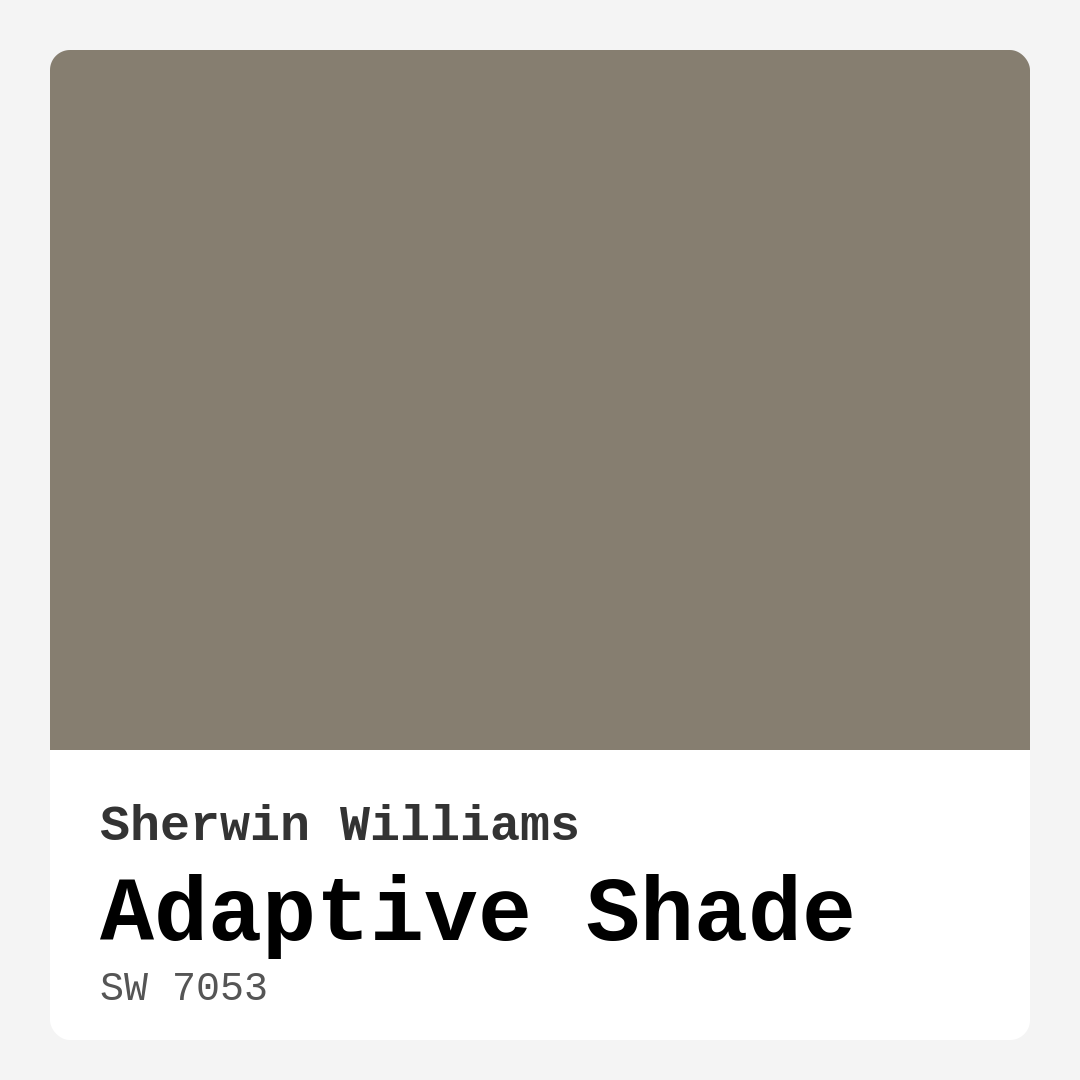
Color Preview & Key Details
| HEX Code | #867E70 |
| RGB | 134, 126, 112 |
| LRV | 59% |
| Undertone | Red |
| Finish Options | Eggshell, Matte, Satin |
Imagine stepping into a room that feels instantly warm, welcoming, and beautifully balanced. The walls are painted in a hue that seems to adapt to the light, creating a cozy atmosphere that invites relaxation and conversation. This is the magic of Adaptive Shade by Sherwin Williams, a versatile greige that has captured the hearts of homeowners and designers alike.
You’re probably wondering what makes this color stand out in a sea of neutrals. Adaptive Shade, with its color code SW 7053, strikes that perfect balance between warm and cool tones, making it an ideal backdrop for a variety of decor styles. Its soft, muted character lends itself beautifully to both modern and traditional spaces, creating a serene environment that feels both stylish and inviting.
One of the most impressive features of Adaptive Shade is its ability to adapt to different lighting conditions. In natural light, it radiates a soft warmth, brightening up the space without feeling overpowering. However, when the sun sets and artificial light takes over, the color reveals a more sophisticated, muted tone. This quality allows you to enjoy its beauty throughout the day, making any room feel dynamic and alive.
The undertone of Adaptive Shade leans towards red, which contributes to its inviting nature. Unlike some grays that can feel cold or sterile, this warm undertone adds depth and richness to the color. It’s essential to test the paint in your home to see how it interacts with your existing furnishings and decor. Pair it with lighter trim or furnishings to elevate its warmth, while darker elements can create a striking contrast that enhances its charm.
When it comes to application, Adaptive Shade is beginner friendly, making it a fantastic choice for DIY projects. It glides on smoothly, whether you’re using a roller or a brush, and dries quickly—perfect for those who want to refresh their space without a prolonged project. The paint’s washability and scrubbable nature means you won’t have to worry about stains marring your newly painted walls. With a low VOC level and eco-certification, you can feel good about using it in your home.
Now, let’s talk about where to use this color. Adaptive Shade is an excellent choice for various rooms, including living rooms, bedrooms, home offices, and dining areas. Its versatility shines in spaces where comfort and style are paramount. In a living room, for example, it can serve as a warm backdrop for family gatherings, while in a bedroom, it promotes a serene atmosphere conducive to relaxation.
Don’t shy away from using this hue in smaller spaces either. Adaptive Shade can create a cozy yet open feel, helping small areas appear larger—especially when paired with light fixtures or furnishings. Just remember, lighting plays a significant role in how this color manifests. In poorly lit spaces, it may appear darker, so consider the natural light available when making your decision.
What about finishes? Adaptive Shade looks stunning in eggshell or satin, especially in living areas or bedrooms where a soft sheen can enhance its depth. These finishes not only add aesthetic appeal but also durability, making them suitable for high-traffic areas. The subtle sheen reflects light beautifully without being gaudy, making your walls feel polished and inviting.
When considering complementary colors, Adaptive Shade pairs well with a variety of hues. For a harmonious look, consider lighter shades like White Dove or soft wood tones, which can accentuate the warmth of this greige. If you’re feeling adventurous, pair it with richer hues, like deep blues or greens, for an eye-catching contrast. This color’s adaptability means it seamlessly fits into any color scheme you have in mind.
In terms of performance, Adaptive Shade delivers good coverage with just one or two coats. It’s touch-up friendly, which means you can maintain that fresh look with minimal effort. The cozy, calm, and inviting mood it promotes makes it a popular choice among designers and homeowners alike.
If you find yourself drawn to colors like Benjamin Moore’s Revere Pewter or Sherwin-Williams’ Agreeable Gray, you’ll likely appreciate Adaptive Shade’s charm. It offers a similar warmth while standing out with its unique undertones.
Now, let’s address a couple of FAQs. Can Adaptive Shade be used in small spaces? Absolutely! It’s a fantastic choice for cozy nooks, creating a welcoming vibe without making the area feel cramped. Just be mindful of the lighting, as it can appear darker when natural light is limited.
What finishes are best for Adaptive Shade? The eggshell or satin finishes are particularly recommended, as they enhance the color’s depth and reflectivity. These finishes are not only aesthetically pleasing but also practical, ensuring your walls hold up well over time.
In summary, Adaptive Shade is more than just a color; it’s an experience. Its warm and earthy tone fosters a comforting environment while being highly adaptable to various decor styles. Whether you’re updating your home office, creating a tranquil bedroom retreat, or refreshing your living space, this versatile hue offers endless possibilities.
So, are you ready to transform your space with Adaptive Shade? With its ease of application, stunning adaptability, and inviting mood, you’re sure to fall in love with this timeless color that will beautifully enhance your home for years to come.
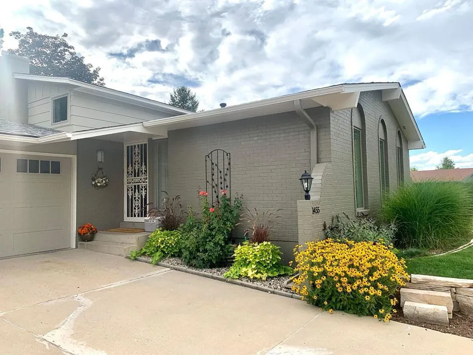
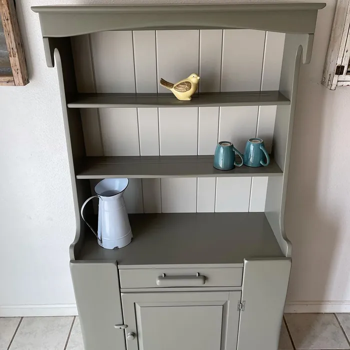
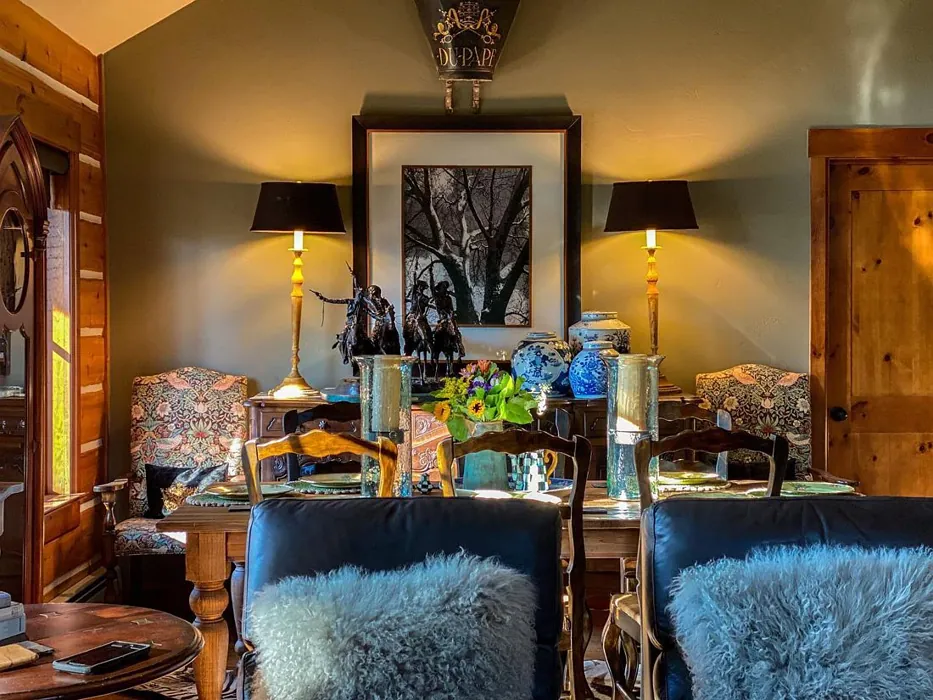
Real Room Photo of Adaptive Shade SW 7053


Undertones of Adaptive Shade ?
The undertones of Adaptive Shade are a key aspect of its character, leaning towards Red. These subtle underlying hues are what give the color its depth and complexity. For example, a gray with a blue undertone will feel cooler and more modern, while one with a brown undertone will feel warmer and more traditional. It’s essential to test this paint in your home and observe it next to your existing furniture, flooring, and decor to see how these undertones interact and reveal themselves throughout the day.
HEX value: #867E70
RGB code: 134, 126, 112
Is Adaptive Shade Cool or Warm?
Adaptive Shade is considered a warm paint color. This characteristic plays a huge role in the overall feel of a room. Warm colors, like this one, tend to create a cozy, inviting, and energetic atmosphere, making them great for social spaces like living rooms and dining rooms. In contrast, cool colors often evoke a sense of calm and serenity, which is why they are popular in bedrooms and bathrooms. The warmth of Adaptive Shade means it will pair beautifully with corresponding decor elements.
Understanding Color Properties and Interior Design Tips
Hue refers to a specific position on the color wheel, measured in degrees from 0 to 360. Each degree represents a different pure color:
- 0° represents red
- 120° represents green
- 240° represents blue
Saturation describes the intensity or purity of a color and is expressed as a percentage:
- At 0%, the color appears completely desaturated—essentially a shade of gray
- At 100%, the color is at its most vivid and vibrant
Lightness indicates how light or dark a color is, also expressed as a percentage:
- 0% lightness results in black
- 100% lightness results in white
Using Warm Colors in Interior Design
Warm hues—such as reds, oranges, yellows, warm beiges, and greiges—are excellent choices for creating inviting and energetic spaces. These colors are particularly well-suited for:
- Kitchens, living rooms, and bathrooms, where warmth enhances comfort and sociability
- Large rooms, where warm tones can help reduce the sense of emptiness and make the space feel more intimate
For example:
- Warm beige shades provide a cozy, inviting atmosphere, ideal for living rooms, bedrooms, and hallways.
- Warm greige (a mix of beige and gray) offers the warmth of beige with the modern appeal of gray, making it a versatile backdrop for dining areas, bedrooms, and living spaces.
However, be mindful when using warm light tones in rooms with limited natural light. These shades may appear muted or even take on an unpleasant yellowish tint. To avoid a dull or flat appearance:
- Add depth by incorporating richer tones like deep greens, charcoal, or chocolate brown
- Use textured elements such as curtains, rugs, or cushions to bring dimension to the space
Pro Tip: Achieving Harmony with Warm and Cool Color Balance
To create a well-balanced and visually interesting interior, mix warm and cool tones strategically. This contrast adds depth and harmony to your design.
- If your walls feature warm hues, introduce cool-colored accents such as blue or green furniture, artwork, or accessories to create contrast.
- For a polished look, consider using a complementary color scheme, which pairs colors opposite each other on the color wheel (e.g., red with green, orange with blue).
This thoughtful mix not only enhances visual appeal but also creates a space that feels both dynamic and cohesive.
Light Temperature Affects on Adaptive Shade
Natural Light
Natural daylight changes in color temperature as the sun moves across the sky. At sunrise and sunset, the light tends to have a warm, golden tone with a color temperature around 2000 Kelvin (K). As the day progresses and the sun rises higher, the light becomes cooler and more neutral. Around midday, especially when the sky is clear, natural light typically reaches its peak brightness and shifts to a cooler tone, ranging from 5500 to 6500 Kelvin. This midday light is close to what we perceive as pure white or daylight-balanced light.
These shifts in natural light can significantly influence how colors appear in a space, which is why designers often consider both the time of day and the orientation of windows when planning interior color schemes.
Artificial Light
When choosing artificial lighting, pay close attention to the color temperature, measured in Kelvin (K). This determines how warm or cool the light will appear. Lower temperatures, around 2700K, give off a warm, yellow glow often used in living rooms or bedrooms. Higher temperatures, above 5000K, create a cool, bluish light similar to daylight, commonly used in kitchens, offices, or task areas.
Use the slider to see how lighting temperature can affect the appearance of a surface or color throughout a space.


4800K
LRV of Adaptive Shade
The Light Reflectance Value (LRV) of Adaptive Shade is 59%, which places it in the Medium category. This means it Reflects a moderate amount of light. Understanding a paint’s LRV is crucial for predicting how it will look in your space. A higher LRV indicates a lighter color that reflects more light, making rooms feel larger and brighter. A lower LRV signifies a darker color that absorbs more light, creating a cozier, more intimate atmosphere. Always consider the natural and artificial lighting in your room when selecting a paint color based on its LRV.
Detailed Review of Adaptive Shade
Additional Paint Characteristics
Ideal Rooms
Bedroom, Dining Room, Home Office, Kitchen, Living Room
Decor Styles
Contemporary, Modern Farmhouse, Rustic, Transitional
Coverage
Good (1–2 Coats), Touch-Up Friendly
Ease of Application
Beginner Friendly, Brush Smooth, Fast-Drying, Roller-Ready
Washability
Scrubbable, Stain Resistant, Washable
VOC Level
Eco-Certified, Low VOC
Best Use
Accent Wall, Furniture, Interior Walls, Trim
Room Suitability
Bedroom, Dining Room, Home Office, Living Room
Tone Tag
Earthy, Muted, Neutral, Warm
Finish Type
Eggshell, Satin
Paint Performance
Easy Touch-Up, Low Odor, Quick Drying, Scuff Resistant
Use Cases
Best for Modern Farmhouse, Best for Small Spaces, Classic Favorite, Designer Favorite
Mood
Calm, Cozy, Grounding, Inviting
Trim Pairing
Complements Brass Fixtures, Good with Wood Trim, Pairs with White Dove
When it comes to choosing a paint color, Adaptive Shade truly stands out for its flexibility. This paint color works wonders in various lighting conditions, shifting gently from a warm taupe during the day to a cooler grayish tone at night. It can elegantly complement both light and dark furnishings, making it a fantastic choice for interiors that need a cohesive yet dynamic look. The finish options, including eggshell and satin, provide a subtle sheen that reflects light beautifully without being overpowering. Whether you’re looking to create a cozy nook or a sophisticated living area, Adaptive Shade delivers a calming effect that invites relaxation and conversation. Plus, it’s easy to apply and touch up, ensuring your walls keep looking fresh with minimal effort.
Pros & Cons of SW 7053 Adaptive Shade
Pros
Cons
Colors that go with Sherwin Williams Adaptive Shade
FAQ on SW 7053 Adaptive Shade
Can Adaptive Shade be used in small spaces?
Absolutely! Adaptive Shade is a great choice for small spaces as it provides a cozy yet open feel. Its balanced undertones help make the area feel larger, especially when paired with lighter trim or furnishings. Just be mindful of the lighting, as it can appear darker in low-light situations.
What finishes are best for Adaptive Shade?
Adaptive Shade looks stunning in eggshell or satin finishes, particularly in living rooms or bedrooms where a soft sheen can enhance the color depth. These finishes not only provide aesthetic appeal but also add durability, making them suitable for high-traffic areas.
Comparisons Adaptive Shade with other colors
Adaptive Shade SW 7053 vs Lauriston Stone SW 9593
| Attribute | Adaptive Shade SW 7053 | Lauriston Stone SW 9593 |
|---|---|---|
| Color Name | Adaptive Shade SW 7053 | Lauriston Stone SW 9593 |
| Color | ||
| Hue | Greige | Greige |
| Brightness | Dark | Dark |
| RGB | 134, 126, 112 | 134, 129, 114 |
| LRV | 59% | 48% |
| Finish Type | Eggshell, Satin | Eggshell, Matte, Satin |
| Finish Options | Eggshell, Matte, Satin | Eggshell, Matte, Satin |
| Ideal Rooms | Bedroom, Dining Room, Home Office, Kitchen, Living Room | Bathroom, Bedroom, Dining Room, Home Office, Kitchen, Living Room |
| Decor Styles | Contemporary, Modern Farmhouse, Rustic, Transitional | Minimalist, Modern, Rustic, Transitional |
| Coverage | Good (1–2 Coats), Touch-Up Friendly | Good (1–2 Coats), Touch-Up Friendly |
| Ease of Application | Beginner Friendly, Brush Smooth, Fast-Drying, Roller-Ready | Beginner Friendly, Brush Smooth, Roller-Ready |
| Washability | Scrubbable, Stain Resistant, Washable | Highly Washable, Washable |
| Room Suitability | Bedroom, Dining Room, Home Office, Living Room | Bathroom, Bedroom, Dining Room, Kitchen, Living Room |
| Tone | Earthy, Muted, Neutral, Warm | Earthy, Neutral, Warm |
| Paint Performance | Easy Touch-Up, Low Odor, Quick Drying, Scuff Resistant | Easy Touch-Up, Long Lasting, Low Odor |
Adaptive Shade SW 7053 vs Stampede 979
| Attribute | Adaptive Shade SW 7053 | Stampede 979 |
|---|---|---|
| Color Name | Adaptive Shade SW 7053 | Stampede 979 |
| Color | ||
| Hue | Greige | Greige |
| Brightness | Dark | Dark |
| RGB | 134, 126, 112 | 133, 122, 104 |
| LRV | 59% | 20.32% |
| Finish Type | Eggshell, Satin | Eggshell, Matte, Satin |
| Finish Options | Eggshell, Matte, Satin | Eggshell, Matte, Satin |
| Ideal Rooms | Bedroom, Dining Room, Home Office, Kitchen, Living Room | Bedroom, Dining Room, Home Office, Kitchen, Living Room |
| Decor Styles | Contemporary, Modern Farmhouse, Rustic, Transitional | Eclectic, Modern Farmhouse, Rustic, Traditional |
| Coverage | Good (1–2 Coats), Touch-Up Friendly | Good (1–2 Coats), Touch-Up Friendly |
| Ease of Application | Beginner Friendly, Brush Smooth, Fast-Drying, Roller-Ready | Beginner Friendly, Brush Smooth, Roller-Ready |
| Washability | Scrubbable, Stain Resistant, Washable | Washable, Wipeable |
| Room Suitability | Bedroom, Dining Room, Home Office, Living Room | Bedroom, Dining Room, Home Office, Living Room |
| Tone | Earthy, Muted, Neutral, Warm | Earthy, Muted, Warm |
| Paint Performance | Easy Touch-Up, Low Odor, Quick Drying, Scuff Resistant | Low Odor, Quick Drying, Scuff Resistant |
Official Page of Sherwin Williams Adaptive Shade SW 7053