
Color Preview & Key Details
| HEX Code | #434341 |
| RGB | 67, 67, 65 |
| LRV | 6% |
| Undertone | Yellow |
| Finish Options | Eggshell, Matte, Satin |
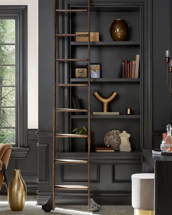
Imagine walking into a room that feels both cozy and sophisticated, where the walls whisper tales of elegance and modernity. You glance around, taking in the rich, deep hue that wraps the space in warmth. This striking backdrop doesn’t just serve as a wall; it’s an experience. That’s the magic of Iron Ore, a captivating color from Sherwin Williams that’s steadily gained popularity among home designers and decor enthusiasts alike.
Iron Ore, with its code SW 7069, is a deep charcoal gray that offers a unique blend of warmth and coolness, making it incredibly versatile. It has an LRV of just 6%, which means it doesn’t reflect much light, creating an intimate and inviting atmosphere in your space. This color isn’t just paint; it’s a statement—a bold choice that can redefine your home’s aesthetic.
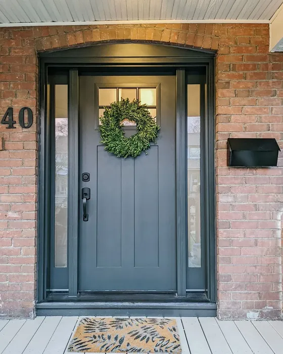
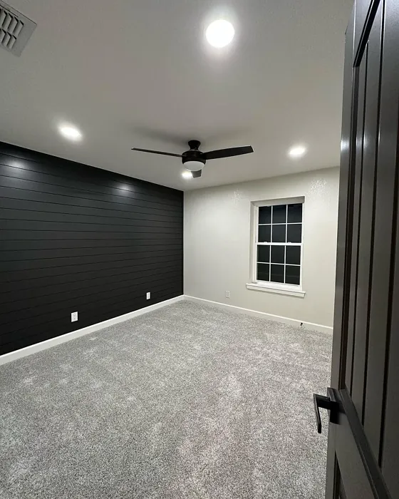
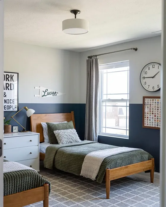
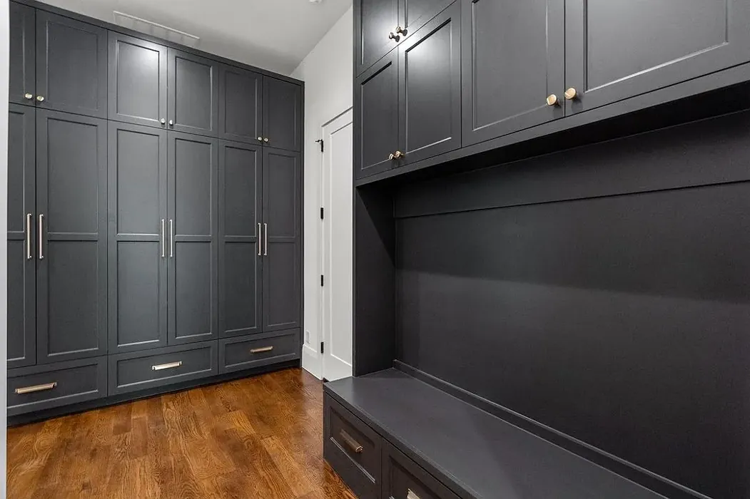
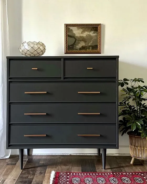
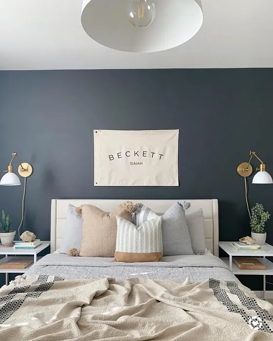
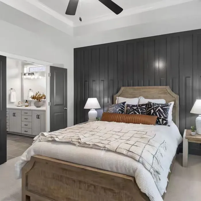
One of the most appealing aspects of Iron Ore is its adaptability. Whether your style leans towards modern, industrial, rustic, or contemporary, this shade can harmonize beautifully with your vision. It’s the kind of color that can be a striking focal point or a supportive backdrop, depending on how you choose to use it. You might find it stunning as an accent wall, where it can create a dramatic effect without overwhelming the room. Alternatively, consider it for an entire living space, where its depth will invite comfort and conversation.
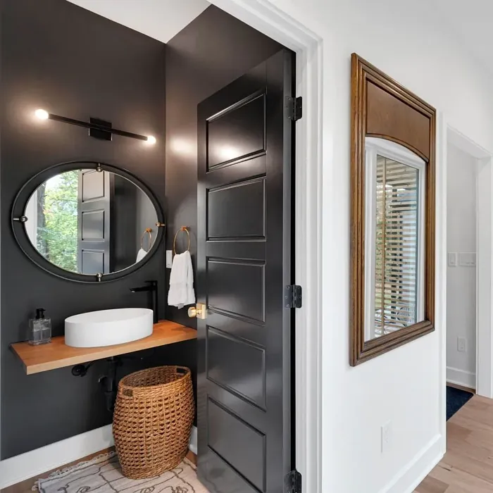
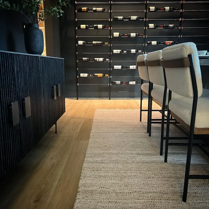
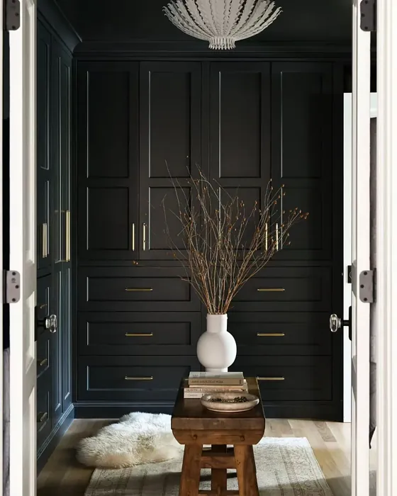
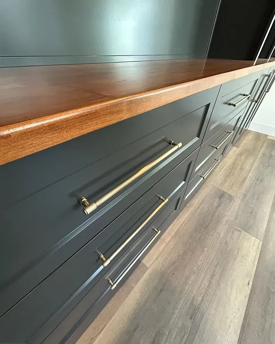
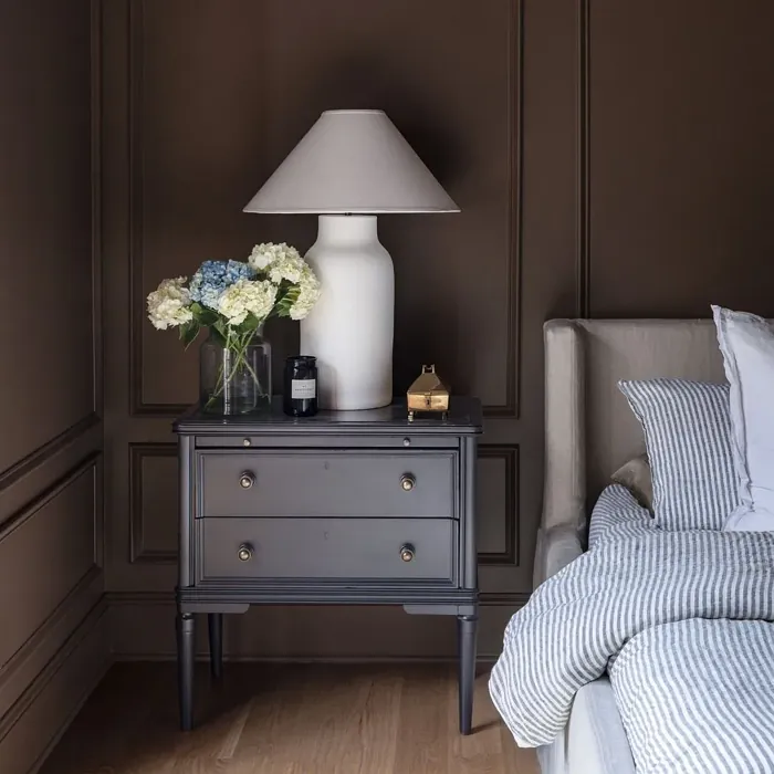
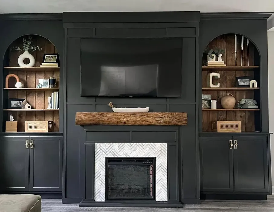
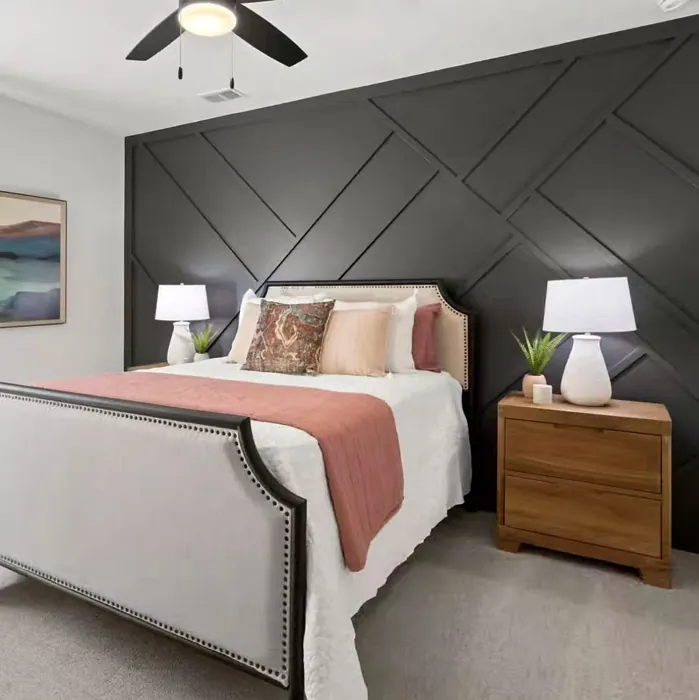
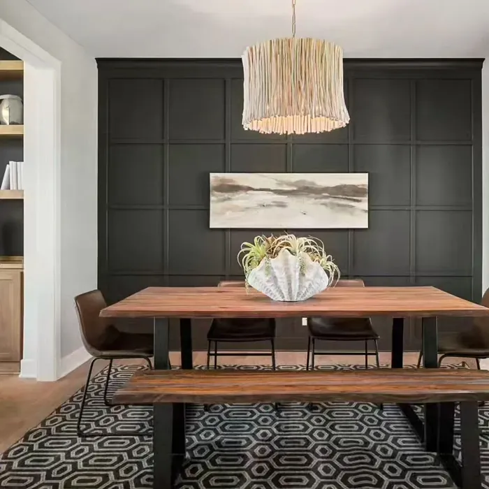
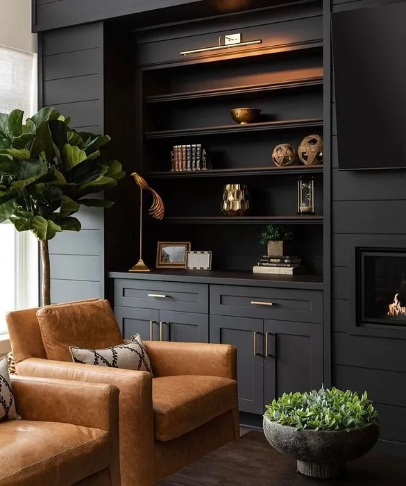
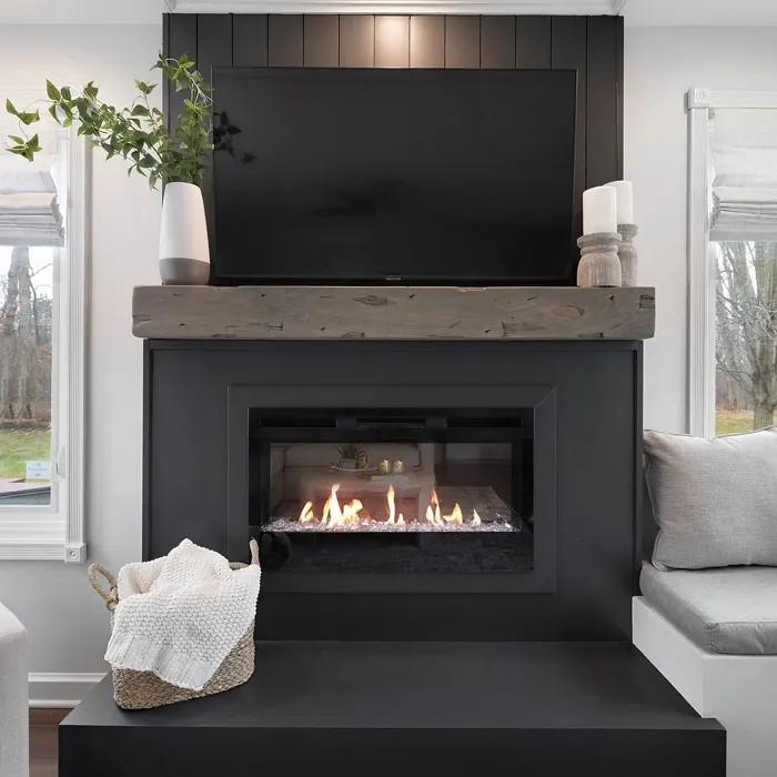
When you apply Iron Ore, you’ll notice its smooth finish enhances the wall texture, providing a richness that lighter colors can sometimes lack. Picture this: a cozy living room painted in Iron Ore, adorned with soft white furniture. The contrast creates a stunning visual dynamic that feels both chic and grounded. It’s this kind of versatility that makes Iron Ore a designer favorite.
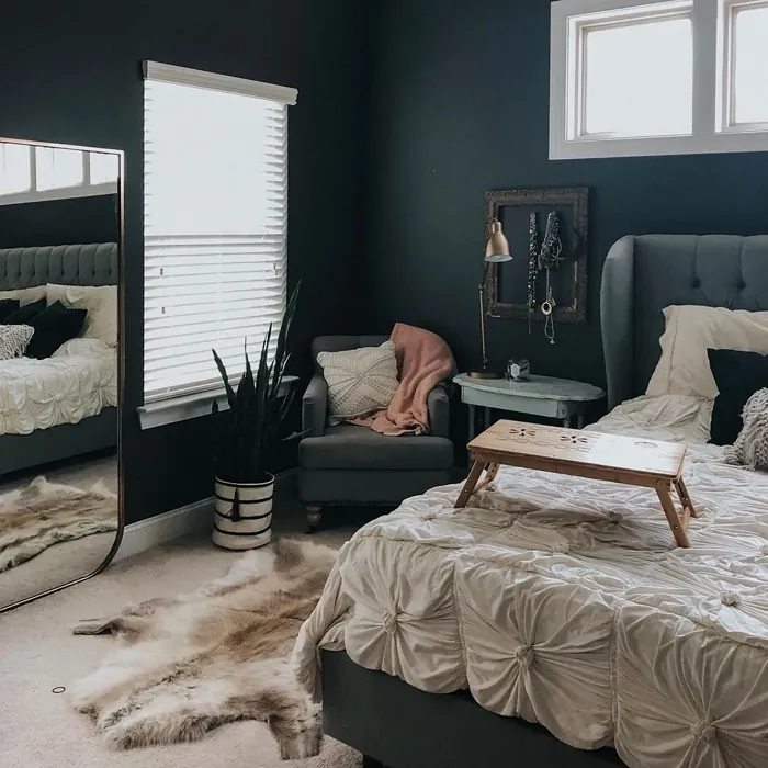
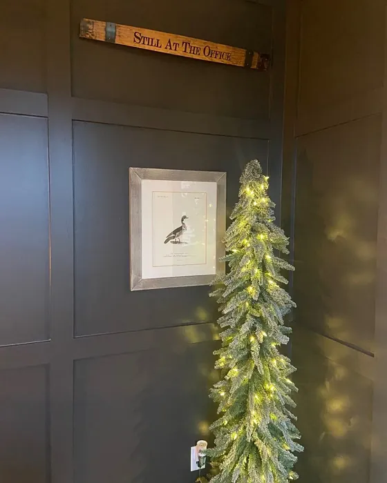
However, it’s essential to be mindful of the lighting in your space. In bright, natural light, Iron Ore reveals its softer side, showcasing a more slate-like quality that can brighten up your decor. In dimmer settings, it deepens into an alluring charcoal, adding drama and sophistication. This ability to shift with the light is one of the reasons it’s perfect for a variety of rooms, from living rooms to bedrooms, home offices to dining areas.
While the color is undeniably beautiful, it does come with some considerations. In smaller spaces, Iron Ore can feel a bit dark or enclosed if not balanced with lighter accents. If you’re thinking of using it in a cozy nook, pair it with light furnishings or vibrant decor items to maintain an open feel. Good lighting will be your best friend here, helping to ensure that the space feels inviting rather than cramped.
When it comes to decorating with Iron Ore, the color opens up a world of possibilities. It pairs beautifully with a range of complementary shades. Consider crisp whites like Pure White or Simply White for a modern look. If you’re leaning towards a warmer palette, soft beiges or muted golds can enhance its allure. For something more eclectic, vibrant colors like mustard yellow or teal can create a stunning contrast that invigorates the space.
Let’s talk about the undertones. Iron Ore features a subtle yellow undertone that adds depth to the color. This characteristic is crucial to understand because it influences how the color interacts with your existing decor. Testing the paint in your home is vital—observe how it looks next to your furniture, flooring, and other decorative elements at different times of the day. This way, you’ll truly appreciate its complexity and ensure it harmonizes with your overall design.
As for application, Iron Ore is roller-ready and brush smooth, making it easy to work with. You’ll find it dries quickly and offers excellent coverage—just one or two coats should do the trick. Plus, it’s highly washable, so maintaining its beauty over time is a breeze. With a low VOC level, you can enjoy a fresh, new look without the worry of overwhelming odors.
Now, I know you might be wondering about the best finishes to choose. Iron Ore looks stunning in matte, eggshell, or satin finishes. A matte finish can emphasize its deep, rich tones, while eggshell or satin can add a subtle sheen, enhancing the overall look. Choose what aligns with your vision and the feel you want for your space.
In terms of mood, Iron Ore creates an environment that is cozy and inviting. It exudes a sophisticated vibe that can ground a room, making it feel more intimate. This quality makes it an excellent choice for social spaces like living rooms and dining areas, where you want guests to feel comfortable and welcome.
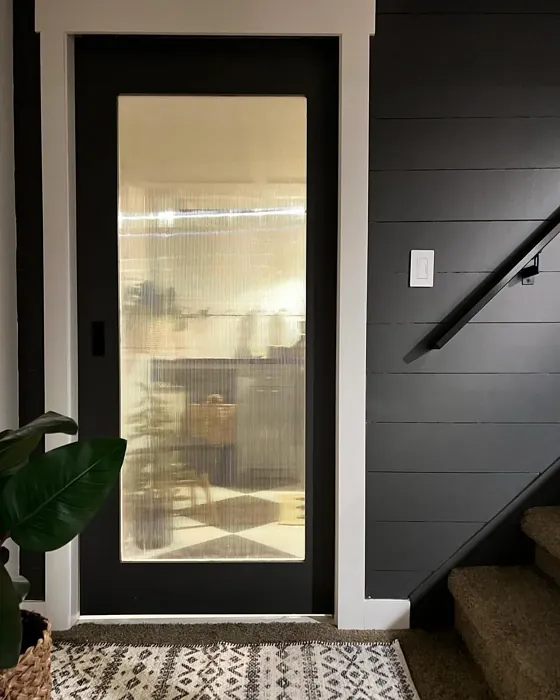
If you’re still on the fence about using Iron Ore in your home, consider the areas where it shines the most. It’s perfect for living rooms, bedrooms, home offices, dining rooms, and even entryways. It’s a color that works well with both warm and cool trim, making it incredibly versatile. Pair it with white dove for a soft contrast or go for a cooler white for a more modern edge.
In conclusion, Iron Ore is more than just a paint color; it’s an experience waiting to happen in your home. Its depth and complexity can transform any space into a sophisticated sanctuary, whether you’re looking to create a cozy retreat or an elegant entertaining area. With its versatile nature, you can mix and match it with a multitude of styles and shades to personalize your space.
As you embark on your decorating journey, remember to test the color in your environment, consider its interaction with light, and embrace its adaptability. With Iron Ore, you’re not just choosing a color; you’re setting the stage for memorable moments in your home. So, are you ready to let Iron Ore make a statement in your space?
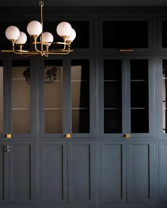
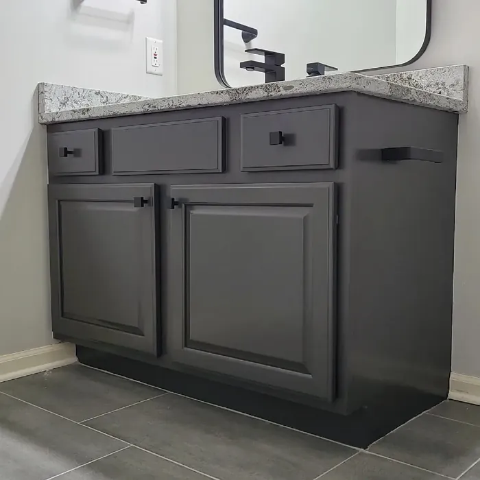
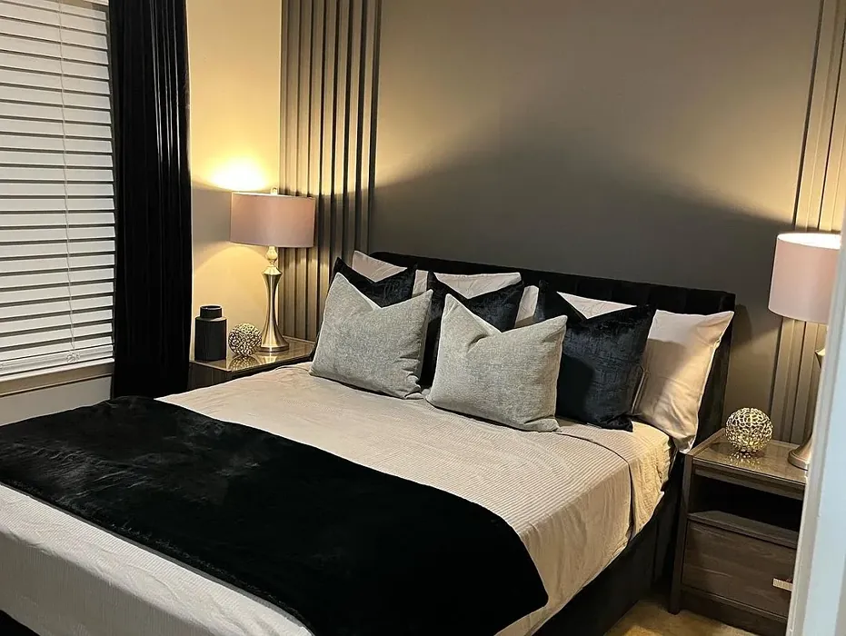
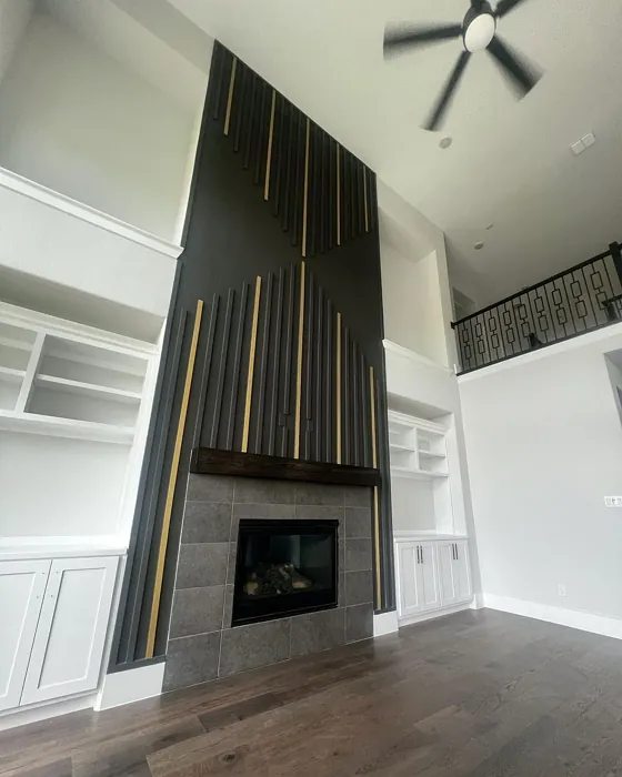
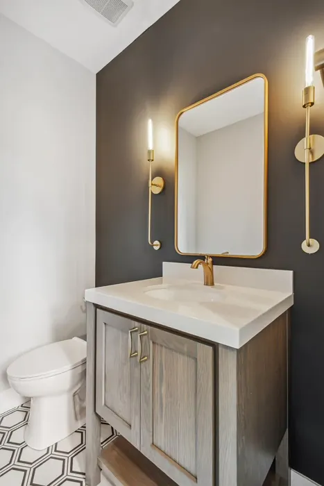
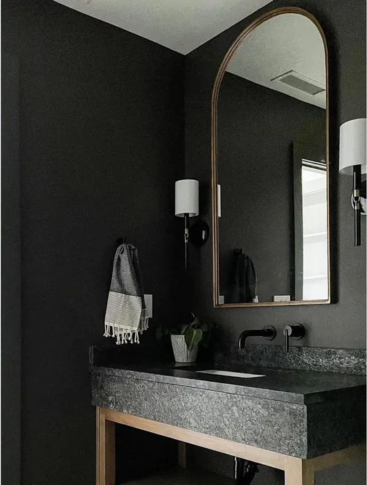
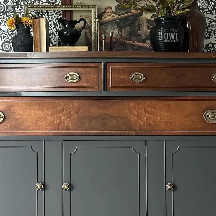
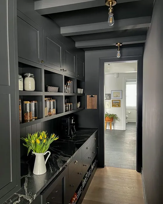
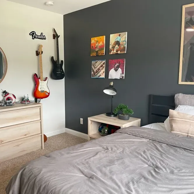
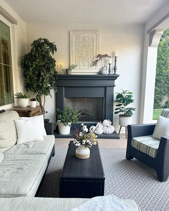
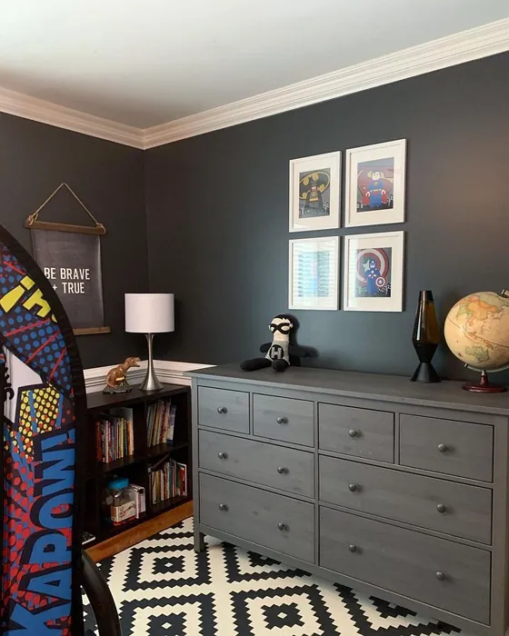
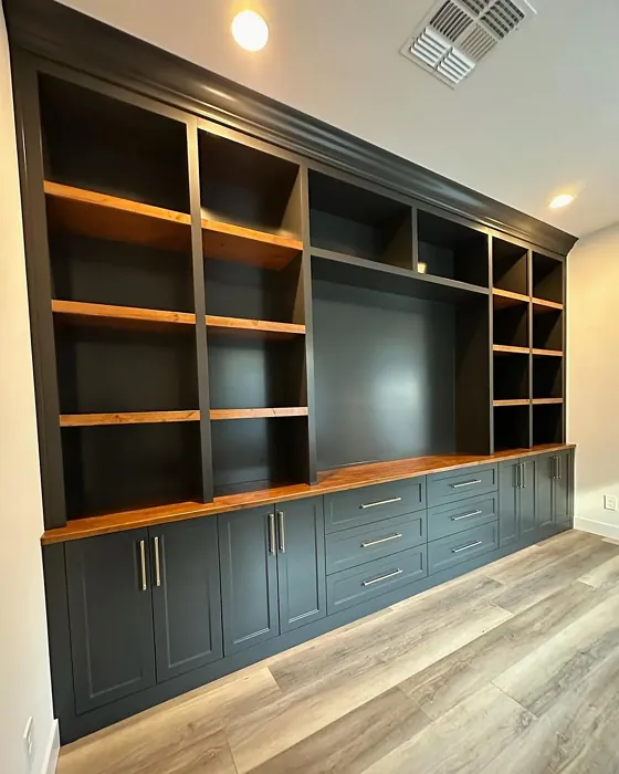
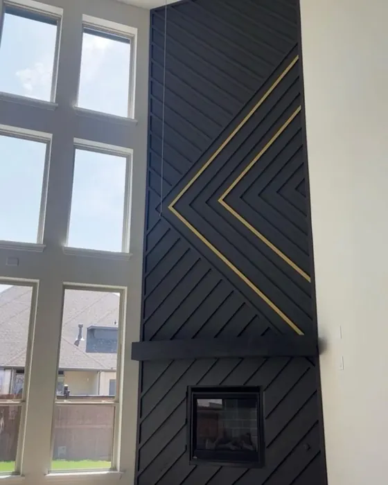
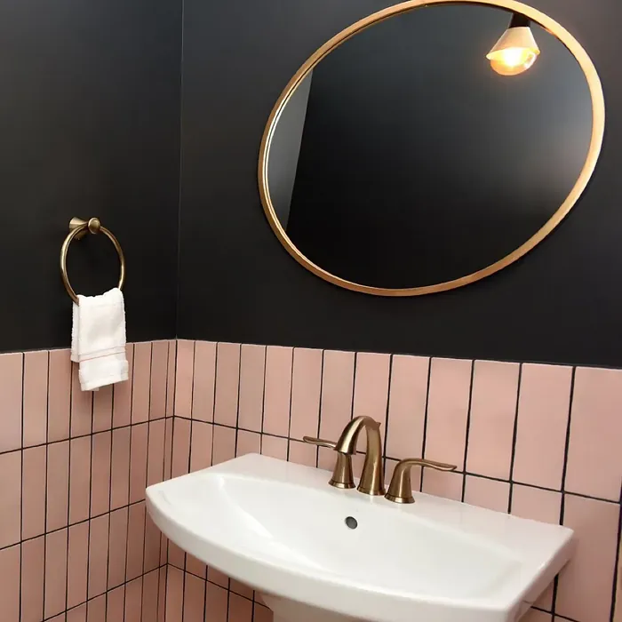
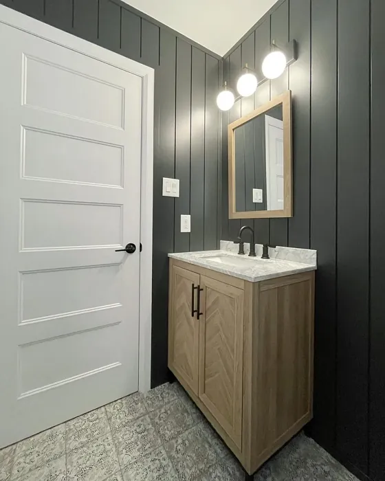
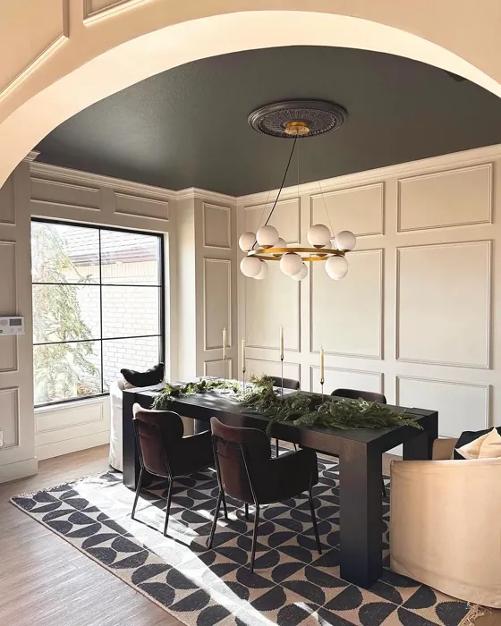
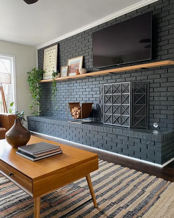
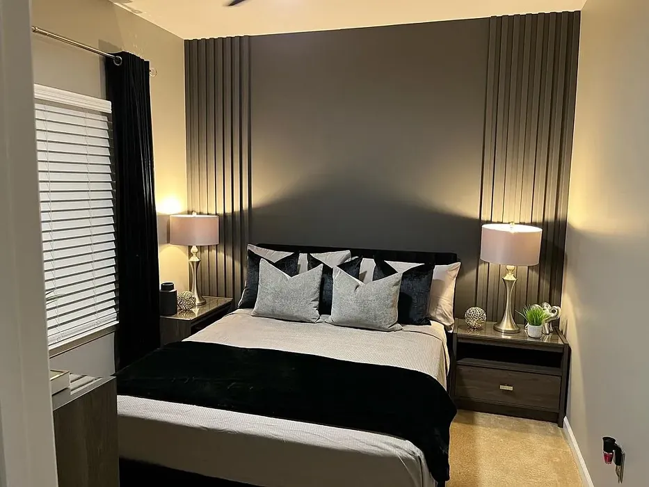
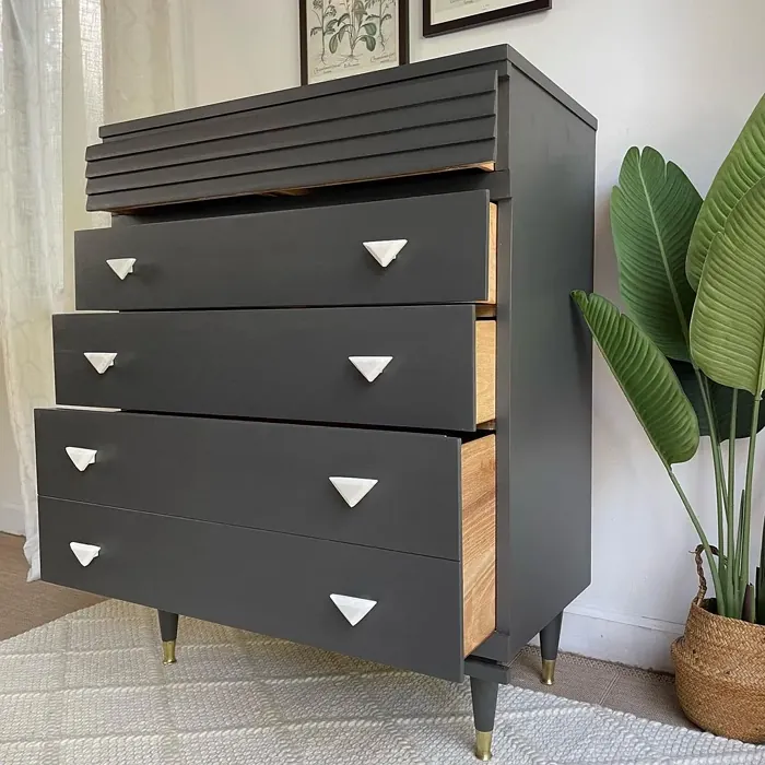
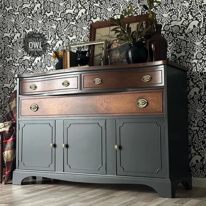
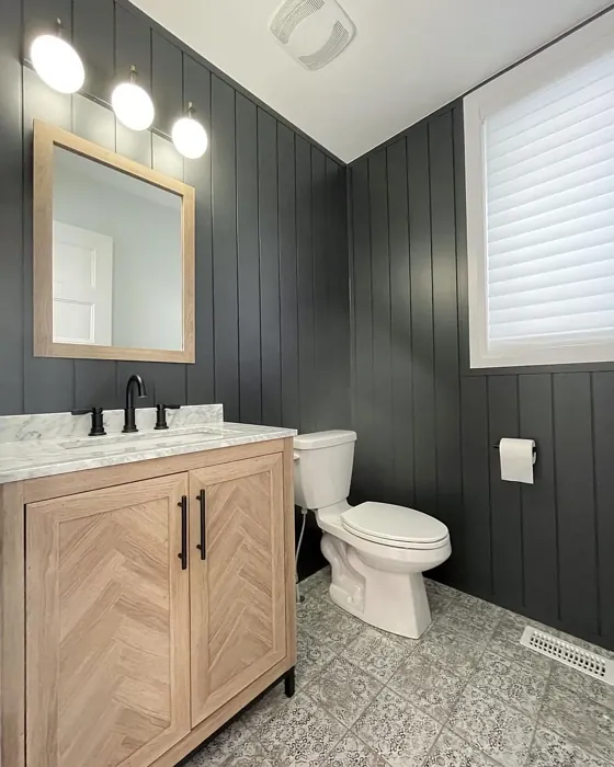
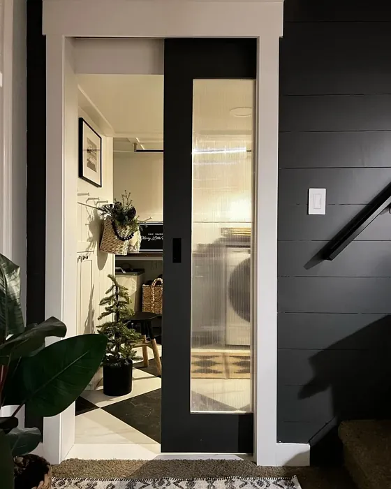
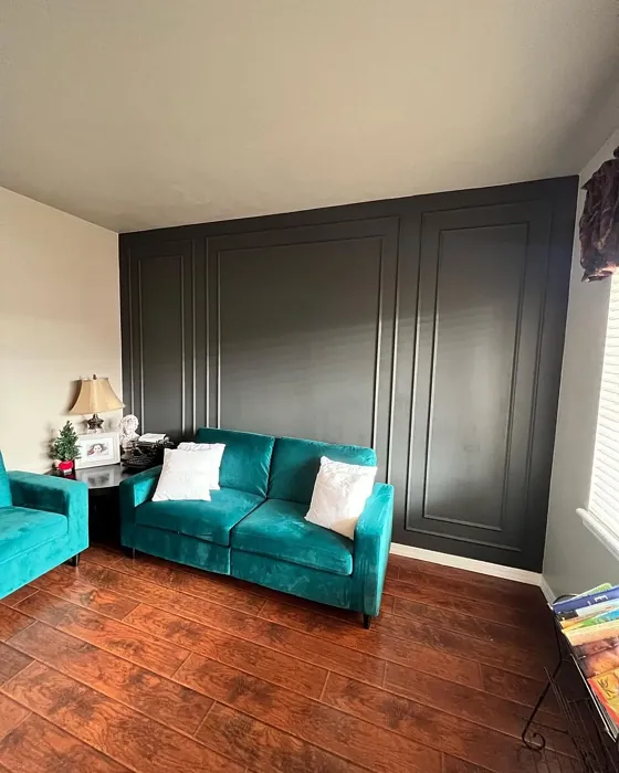
Real Room Photo of Iron Ore SW 7069


Undertones of Iron Ore ?
The undertones of Iron Ore are a key aspect of its character, leaning towards Yellow. These subtle underlying hues are what give the color its depth and complexity. For example, a gray with a blue undertone will feel cooler and more modern, while one with a brown undertone will feel warmer and more traditional. It’s essential to test this paint in your home and observe it next to your existing furniture, flooring, and decor to see how these undertones interact and reveal themselves throughout the day.
HEX value: #434341
RGB code: 67, 67, 65
Is Iron Ore Cool or Warm?
Iron Ore is considered a cool paint color. This characteristic plays a huge role in the overall feel of a room. Cool colors, like this one, tend to create a cozy, inviting, and energetic atmosphere, making them great for social spaces like living rooms and dining rooms. In contrast, warm colors often evoke a sense of calm and serenity, which is why they are popular in bedrooms and bathrooms. The coolth of Iron Ore means it will pair beautifully with corresponding decor elements.
Understanding Color Properties and Interior Design Tips
Hue refers to a specific position on the color wheel, measured in degrees from 0 to 360. Each degree represents a different pure color:
- 0° represents red
- 120° represents green
- 240° represents blue
Saturation describes the intensity or purity of a color and is expressed as a percentage:
- At 0%, the color appears completely desaturated—essentially a shade of gray
- At 100%, the color is at its most vivid and vibrant
Lightness indicates how light or dark a color is, also expressed as a percentage:
- 0% lightness results in black
- 100% lightness results in white
Using Warm Colors in Interior Design
Warm hues—such as reds, oranges, yellows, warm beiges, and greiges—are excellent choices for creating inviting and energetic spaces. These colors are particularly well-suited for:
- Kitchens, living rooms, and bathrooms, where warmth enhances comfort and sociability
- Large rooms, where warm tones can help reduce the sense of emptiness and make the space feel more intimate
For example:
- Warm beige shades provide a cozy, inviting atmosphere, ideal for living rooms, bedrooms, and hallways.
- Warm greige (a mix of beige and gray) offers the warmth of beige with the modern appeal of gray, making it a versatile backdrop for dining areas, bedrooms, and living spaces.
However, be mindful when using warm light tones in rooms with limited natural light. These shades may appear muted or even take on an unpleasant yellowish tint. To avoid a dull or flat appearance:
- Add depth by incorporating richer tones like deep greens, charcoal, or chocolate brown
- Use textured elements such as curtains, rugs, or cushions to bring dimension to the space
Pro Tip: Achieving Harmony with Warm and Cool Color Balance
To create a well-balanced and visually interesting interior, mix warm and cool tones strategically. This contrast adds depth and harmony to your design.
- If your walls feature warm hues, introduce cool-colored accents such as blue or green furniture, artwork, or accessories to create contrast.
- For a polished look, consider using a complementary color scheme, which pairs colors opposite each other on the color wheel (e.g., red with green, orange with blue).
This thoughtful mix not only enhances visual appeal but also creates a space that feels both dynamic and cohesive.
Light Temperature Affects on Iron Ore
Natural Light
Natural daylight changes in color temperature as the sun moves across the sky. At sunrise and sunset, the light tends to have a warm, golden tone with a color temperature around 2000 Kelvin (K). As the day progresses and the sun rises higher, the light becomes cooler and more neutral. Around midday, especially when the sky is clear, natural light typically reaches its peak brightness and shifts to a cooler tone, ranging from 5500 to 6500 Kelvin. This midday light is close to what we perceive as pure white or daylight-balanced light.
These shifts in natural light can significantly influence how colors appear in a space, which is why designers often consider both the time of day and the orientation of windows when planning interior color schemes.
Artificial Light
When choosing artificial lighting, pay close attention to the color temperature, measured in Kelvin (K). This determines how warm or cool the light will appear. Lower temperatures, around 2700K, give off a warm, yellow glow often used in living rooms or bedrooms. Higher temperatures, above 5000K, create a cool, bluish light similar to daylight, commonly used in kitchens, offices, or task areas.
Use the slider to see how lighting temperature can affect the appearance of a surface or color throughout a space.


4800K
LRV of Iron Ore
The Light Reflectance Value (LRV) of Iron Ore is 6%, which places it in the Dark colors category. This means it does not reflect light. Understanding a paint’s LRV is crucial for predicting how it will look in your space. A higher LRV indicates a lighter color that reflects more light, making rooms feel larger and brighter. A lower LRV signifies a darker color that absorbs more light, creating a cozier, more intimate atmosphere. Always consider the natural and artificial lighting in your room when selecting a paint color based on its LRV.
Detailed Review of Iron Ore
Additional Paint Characteristics
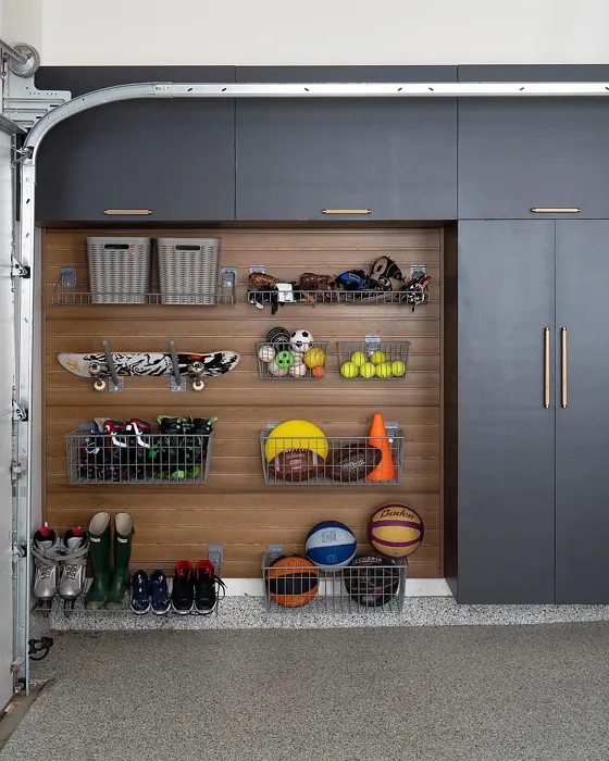
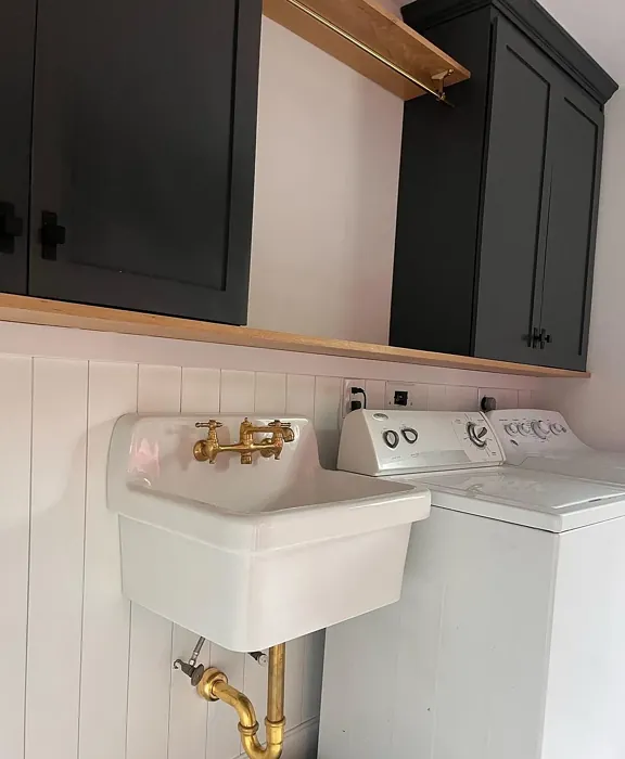
Ideal Rooms
Bedroom, Dining Room, Entryway, Home Office, Living Room
Decor Styles
Contemporary, Industrial, Minimalist, Modern, Rustic
Coverage
Good (1–2 Coats), High Hide
Ease of Application
Brush Smooth, Fast-Drying, Roller-Ready
Washability
Highly Washable, Washable
VOC Level
Low VOC
Best Use
Accent Wall, Furniture, Interior Walls, Trim
Room Suitability
Bedroom, Dining Room, Entryway, Home Office, Living Room
Tone Tag
Balanced, Deep, Muted, Warm
Finish Type
Eggshell, Matte, Satin
Paint Performance
Easy Touch-Up, High Coverage, Low Odor
Use Cases
Best for Low Light Rooms, Best for Modern Farmhouse, Classic Favorite, Designer Favorite
Mood
Cozy, Grounding, Inviting, Sophisticated
Trim Pairing
Complements Cool Trim, Matches Pure White, Pairs with White Dove, Works with Warm Trim
Iron Ore is a color that commands attention without overwhelming your space. Its depth provides a grounding effect, perfect for creating a cozy atmosphere. When applied, it offers a smooth finish that enhances the texture of your walls. The color’s versatility means it looks just as stunning in a bright, sunlit room as it does in a dimly lit area. You’ll find that it pairs beautifully with both warm and cool accents, making it a favorite among designers. Its ability to adapt to various decor styles—from industrial chic to soft contemporary—makes Iron Ore a standout choice for homeowners looking to make a bold statement without going overboard.
Pros & Cons of SW 7069 Iron Ore
Pros
Cons
Colors that go with Sherwin Williams Iron Ore
FAQ on SW 7069 Iron Ore
Can Iron Ore be used in small rooms?
Absolutely! While Iron Ore is a deep color, it can work beautifully in smaller spaces if balanced with lighter accents. Use it on an accent wall or pair it with lighter furnishings to maintain a sense of openness. Good lighting is key to ensuring the room feels inviting rather than cramped.
What colors pair well with Iron Ore?
Iron Ore pairs wonderfully with a variety of colors. For a modern look, consider whites like Pure White or Simply White. For a warmer palette, soft beige or muted golds can enhance its allure. Additionally, vibrant colors like mustard yellow or teal can create a striking contrast for a more eclectic feel.
Comparisons Iron Ore with other colors
Iron Ore SW 7069 vs Night Owl SW 7061
| Attribute | Iron Ore SW 7069 | Night Owl SW 7061 |
|---|---|---|
| Color Name | Iron Ore SW 7069 | Night Owl SW 7061 |
| Color | ||
| Hue | Grey | Grey |
| Brightness | Dark | Dark |
| RGB | 67, 67, 65 | 99, 101, 95 |
| LRV | 6% | 24% |
| Finish Type | Eggshell, Matte, Satin | Eggshell, Matte, Satin |
| Finish Options | Eggshell, Matte, Satin | Eggshell, Matte, Satin |
| Ideal Rooms | Bedroom, Dining Room, Entryway, Home Office, Living Room | Bedroom, Dining Room, Hallway, Home Office, Living Room |
| Decor Styles | Contemporary, Industrial, Minimalist, Modern, Rustic | Industrial, Minimalist, Modern, Rustic, Scandinavian |
| Coverage | Good (1–2 Coats), High Hide | Good (1–2 Coats), Touch-Up Friendly |
| Ease of Application | Brush Smooth, Fast-Drying, Roller-Ready | Beginner Friendly, Brush Smooth, Fast-Drying, Roller-Ready |
| Washability | Highly Washable, Washable | Scrubbable, Washable |
| Room Suitability | Bedroom, Dining Room, Entryway, Home Office, Living Room | Bedroom, Dining Room, Home Office, Living Room |
| Tone | Balanced, Deep, Muted, Warm | Balanced, Deep, Earthy, Muted |
| Paint Performance | Easy Touch-Up, High Coverage, Low Odor | Easy Touch-Up, Fade Resistant, High Coverage, Low Odor |
Iron Ore SW 7069 vs Urbane Bronze SW 7048
| Attribute | Iron Ore SW 7069 | Urbane Bronze SW 7048 |
|---|---|---|
| Color Name | Iron Ore SW 7069 | Urbane Bronze SW 7048 |
| Color | ||
| Hue | Grey | Grey |
| Brightness | Dark | Dark |
| RGB | 67, 67, 65 | 84, 80, 74 |
| LRV | 6% | 20% |
| Finish Type | Eggshell, Matte, Satin | Eggshell, Matte, Satin |
| Finish Options | Eggshell, Matte, Satin | Eggshell, Matte, Satin |
| Ideal Rooms | Bedroom, Dining Room, Entryway, Home Office, Living Room | Bedroom, Dining Room, Home Office, Living Room |
| Decor Styles | Contemporary, Industrial, Minimalist, Modern, Rustic | Contemporary, Industrial, Modern, Rustic, Transitional |
| Coverage | Good (1–2 Coats), High Hide | Good (1–2 Coats) |
| Ease of Application | Brush Smooth, Fast-Drying, Roller-Ready | Beginner Friendly, Brush Smooth, Roller-Ready |
| Washability | Highly Washable, Washable | Highly Washable, Washable |
| Room Suitability | Bedroom, Dining Room, Entryway, Home Office, Living Room | Bedroom, Dining Room, Home Office, Living Room |
| Tone | Balanced, Deep, Muted, Warm | Deep, Earthy, Warm |
| Paint Performance | Easy Touch-Up, High Coverage, Low Odor | Easy Touch-Up, Fade Resistant, High Coverage, Low Odor |
Iron Ore SW 7069 vs Succulent SW 9650
| Attribute | Iron Ore SW 7069 | Succulent SW 9650 |
|---|---|---|
| Color Name | Iron Ore SW 7069 | Succulent SW 9650 |
| Color | ||
| Hue | Grey | Grey |
| Brightness | Dark | Dark |
| RGB | 67, 67, 65 | 97, 108, 100 |
| LRV | 6% | 30% |
| Finish Type | Eggshell, Matte, Satin | Eggshell, Matte, Satin |
| Finish Options | Eggshell, Matte, Satin | Eggshell, Matte, Satin |
| Ideal Rooms | Bedroom, Dining Room, Entryway, Home Office, Living Room | Bathroom, Bedroom, Dining Room, Entryway, Kitchen, Living Room |
| Decor Styles | Contemporary, Industrial, Minimalist, Modern, Rustic | Bohemian, Contemporary, Eclectic, Minimalist, Modern Farmhouse |
| Coverage | Good (1–2 Coats), High Hide | Good (1–2 Coats), Touch-Up Friendly |
| Ease of Application | Brush Smooth, Fast-Drying, Roller-Ready | Beginner Friendly, Brush Smooth, Roller-Ready |
| Washability | Highly Washable, Washable | Highly Washable, Washable |
| Room Suitability | Bedroom, Dining Room, Entryway, Home Office, Living Room | Bathroom, Bedroom, Dining Room, Kitchen, Living Room |
| Tone | Balanced, Deep, Muted, Warm | Cool, Earthy, Muted |
| Paint Performance | Easy Touch-Up, High Coverage, Low Odor | Easy Touch-Up, Low Odor, Quick Drying, Scuff Resistant |
Iron Ore SW 7069 vs Grizzle Gray SW 7068
| Attribute | Iron Ore SW 7069 | Grizzle Gray SW 7068 |
|---|---|---|
| Color Name | Iron Ore SW 7069 | Grizzle Gray SW 7068 |
| Color | ||
| Hue | Grey | Grey |
| Brightness | Dark | Dark |
| RGB | 67, 67, 65 | 99, 101, 98 |
| LRV | 6% | 24% |
| Finish Type | Eggshell, Matte, Satin | Eggshell, Satin |
| Finish Options | Eggshell, Matte, Satin | Eggshell, Matte, Satin |
| Ideal Rooms | Bedroom, Dining Room, Entryway, Home Office, Living Room | Bedroom, Dining Room, Home Office, Living Room |
| Decor Styles | Contemporary, Industrial, Minimalist, Modern, Rustic | Industrial, Modern, Rustic, Scandinavian |
| Coverage | Good (1–2 Coats), High Hide | Good (1–2 Coats), Touch-Up Friendly |
| Ease of Application | Brush Smooth, Fast-Drying, Roller-Ready | Beginner Friendly, Brush Smooth, Roller-Ready |
| Washability | Highly Washable, Washable | Washable, Wipeable |
| Room Suitability | Bedroom, Dining Room, Entryway, Home Office, Living Room | Bedroom, Dining Room, Home Office, Living Room |
| Tone | Balanced, Deep, Muted, Warm | Balanced, Cool, Muted |
| Paint Performance | Easy Touch-Up, High Coverage, Low Odor | Easy Touch-Up, High Coverage, Low Odor |
Iron Ore SW 7069 vs Peppercorn SW 7674
| Attribute | Iron Ore SW 7069 | Peppercorn SW 7674 |
|---|---|---|
| Color Name | Iron Ore SW 7069 | Peppercorn SW 7674 |
| Color | ||
| Hue | Grey | Grey |
| Brightness | Dark | Dark |
| RGB | 67, 67, 65 | 88, 88, 88 |
| LRV | 6% | 10% |
| Finish Type | Eggshell, Matte, Satin | Eggshell, Matte, Satin |
| Finish Options | Eggshell, Matte, Satin | Eggshell, Matte, Satin |
| Ideal Rooms | Bedroom, Dining Room, Entryway, Home Office, Living Room | Bedroom, Dining Room, Home Office, Living Room |
| Decor Styles | Contemporary, Industrial, Minimalist, Modern, Rustic | Contemporary, Industrial, Minimalist, Modern |
| Coverage | Good (1–2 Coats), High Hide | Good (1–2 Coats), Touch-Up Friendly |
| Ease of Application | Brush Smooth, Fast-Drying, Roller-Ready | Beginner Friendly, Brush Smooth, Roller-Ready |
| Washability | Highly Washable, Washable | Highly Washable, Washable |
| Room Suitability | Bedroom, Dining Room, Entryway, Home Office, Living Room | Bedroom, Dining Room, Home Office, Living Room |
| Tone | Balanced, Deep, Muted, Warm | Balanced, Deep, Moody, Neutral |
| Paint Performance | Easy Touch-Up, High Coverage, Low Odor | Easy Touch-Up, Low Odor, Quick Drying, Scuff Resistant |
Iron Ore SW 7069 vs Slate Tile SW 7624
| Attribute | Iron Ore SW 7069 | Slate Tile SW 7624 |
|---|---|---|
| Color Name | Iron Ore SW 7069 | Slate Tile SW 7624 |
| Color | ||
| Hue | Grey | Grey |
| Brightness | Dark | Dark |
| RGB | 67, 67, 65 | 96, 110, 116 |
| LRV | 6% | 15% |
| Finish Type | Eggshell, Matte, Satin | Eggshell, Matte, Satin |
| Finish Options | Eggshell, Matte, Satin | Eggshell, Matte, Satin |
| Ideal Rooms | Bedroom, Dining Room, Entryway, Home Office, Living Room | Bathroom, Bedroom, Home Office, Kitchen, Living Room |
| Decor Styles | Contemporary, Industrial, Minimalist, Modern, Rustic | Industrial, Minimalist, Modern, Rustic |
| Coverage | Good (1–2 Coats), High Hide | Good (1–2 Coats) |
| Ease of Application | Brush Smooth, Fast-Drying, Roller-Ready | Beginner Friendly, Brush Smooth, Fast-Drying, Roller-Ready |
| Washability | Highly Washable, Washable | Scrubbable, Washable |
| Room Suitability | Bedroom, Dining Room, Entryway, Home Office, Living Room | Bathroom, Bedroom, Kitchen, Living Room |
| Tone | Balanced, Deep, Muted, Warm | Balanced, Cool, Muted |
| Paint Performance | Easy Touch-Up, High Coverage, Low Odor | Easy Touch-Up, High Coverage, Low Odor, Quick Drying |
Iron Ore SW 7069 vs Blustery Sky SW 9140
| Attribute | Iron Ore SW 7069 | Blustery Sky SW 9140 |
|---|---|---|
| Color Name | Iron Ore SW 7069 | Blustery Sky SW 9140 |
| Color | ||
| Hue | Grey | Grey |
| Brightness | Dark | Dark |
| RGB | 67, 67, 65 | 111, 132, 140 |
| LRV | 6% | 48% |
| Finish Type | Eggshell, Matte, Satin | Eggshell, Matte |
| Finish Options | Eggshell, Matte, Satin | Eggshell, Matte, Satin |
| Ideal Rooms | Bedroom, Dining Room, Entryway, Home Office, Living Room | Bedroom, Dining Room, Home Office, Living Room, Nursery |
| Decor Styles | Contemporary, Industrial, Minimalist, Modern, Rustic | Coastal, Modern Farmhouse, Scandinavian, Transitional |
| Coverage | Good (1–2 Coats), High Hide | Good (1–2 Coats), Touch-Up Friendly |
| Ease of Application | Brush Smooth, Fast-Drying, Roller-Ready | Beginner Friendly, Fast-Drying, Low Splatter, Roller-Ready |
| Washability | Highly Washable, Washable | Washable, Wipeable |
| Room Suitability | Bedroom, Dining Room, Entryway, Home Office, Living Room | Bedroom, Home Office, Living Room, Nursery |
| Tone | Balanced, Deep, Muted, Warm | Balanced, Cool, Muted |
| Paint Performance | Easy Touch-Up, High Coverage, Low Odor | Easy Touch-Up, Fade Resistant, Low Odor, Quick Drying |
Iron Ore SW 7069 vs Gauntlet Gray SW 7019
| Attribute | Iron Ore SW 7069 | Gauntlet Gray SW 7019 |
|---|---|---|
| Color Name | Iron Ore SW 7069 | Gauntlet Gray SW 7019 |
| Color | ||
| Hue | Grey | Grey |
| Brightness | Dark | Dark |
| RGB | 67, 67, 65 | 120, 115, 110 |
| LRV | 6% | 24% |
| Finish Type | Eggshell, Matte, Satin | Eggshell, Matte, Satin |
| Finish Options | Eggshell, Matte, Satin | Eggshell, Matte, Satin |
| Ideal Rooms | Bedroom, Dining Room, Entryway, Home Office, Living Room | Bedroom, Dining Room, Hallway, Home Office, Living Room |
| Decor Styles | Contemporary, Industrial, Minimalist, Modern, Rustic | Industrial, Modern, Rustic, Transitional |
| Coverage | Good (1–2 Coats), High Hide | Good (1–2 Coats), Touch-Up Friendly |
| Ease of Application | Brush Smooth, Fast-Drying, Roller-Ready | Beginner Friendly, Brush Smooth, Roller-Ready |
| Washability | Highly Washable, Washable | Scrubbable, Washable |
| Room Suitability | Bedroom, Dining Room, Entryway, Home Office, Living Room | Bedroom, Dining Room, Home Office, Living Room |
| Tone | Balanced, Deep, Muted, Warm | Dusty, Earthy, Muted, Warm |
| Paint Performance | Easy Touch-Up, High Coverage, Low Odor | Easy Touch-Up, High Coverage, Low Odor |
Iron Ore SW 7069 vs Cast Iron SW 6202
| Attribute | Iron Ore SW 7069 | Cast Iron SW 6202 |
|---|---|---|
| Color Name | Iron Ore SW 7069 | Cast Iron SW 6202 |
| Color | ||
| Hue | Grey | Grey |
| Brightness | Dark | Dark |
| RGB | 67, 67, 65 | 100, 100, 90 |
| LRV | 6% | 6% |
| Finish Type | Eggshell, Matte, Satin | Eggshell, Matte, Satin |
| Finish Options | Eggshell, Matte, Satin | Eggshell, Matte, Satin |
| Ideal Rooms | Bedroom, Dining Room, Entryway, Home Office, Living Room | Bedroom, Dining Room, Hallway, Home Office, Kitchen, Living Room |
| Decor Styles | Contemporary, Industrial, Minimalist, Modern, Rustic | Contemporary, Farmhouse, Industrial, Minimalist, Modern |
| Coverage | Good (1–2 Coats), High Hide | Good (1–2 Coats), High Hide, Touch-Up Friendly |
| Ease of Application | Brush Smooth, Fast-Drying, Roller-Ready | Beginner Friendly, Brush Smooth, Fast-Drying, Roller-Ready |
| Washability | Highly Washable, Washable | Highly Washable, Washable, Wipeable |
| Room Suitability | Bedroom, Dining Room, Entryway, Home Office, Living Room | Bedroom, Dining Room, Home Office, Kitchen, Living Room |
| Tone | Balanced, Deep, Muted, Warm | Balanced, Deep, Dusty, Earthy, Warm |
| Paint Performance | Easy Touch-Up, High Coverage, Low Odor | Easy Touch-Up, High Coverage, Low Odor, Stain Resistant |
Iron Ore SW 7069 vs Portsmouth SW 9644
| Attribute | Iron Ore SW 7069 | Portsmouth SW 9644 |
|---|---|---|
| Color Name | Iron Ore SW 7069 | Portsmouth SW 9644 |
| Color | ||
| Hue | Grey | Grey |
| Brightness | Dark | Dark |
| RGB | 67, 67, 65 | 118, 132, 130 |
| LRV | 6% | 12% |
| Finish Type | Eggshell, Matte, Satin | Eggshell, Satin |
| Finish Options | Eggshell, Matte, Satin | Eggshell, Flat, Matte, Satin |
| Ideal Rooms | Bedroom, Dining Room, Entryway, Home Office, Living Room | Bathroom, Bedroom, Home Office, Kitchen, Living Room |
| Decor Styles | Contemporary, Industrial, Minimalist, Modern, Rustic | Bohemian, Coastal, Modern Farmhouse, Scandinavian |
| Coverage | Good (1–2 Coats), High Hide | Good (1–2 Coats) |
| Ease of Application | Brush Smooth, Fast-Drying, Roller-Ready | Beginner Friendly, Brush Smooth, Roller-Ready |
| Washability | Highly Washable, Washable | Highly Washable, Washable |
| Room Suitability | Bedroom, Dining Room, Entryway, Home Office, Living Room | Bathroom, Bedroom, Kitchen, Living Room |
| Tone | Balanced, Deep, Muted, Warm | Cool, Earthy, Muted |
| Paint Performance | Easy Touch-Up, High Coverage, Low Odor | Easy Touch-Up, Low Odor, Scuff Resistant |
Official Page of Sherwin Williams Iron Ore SW 7069