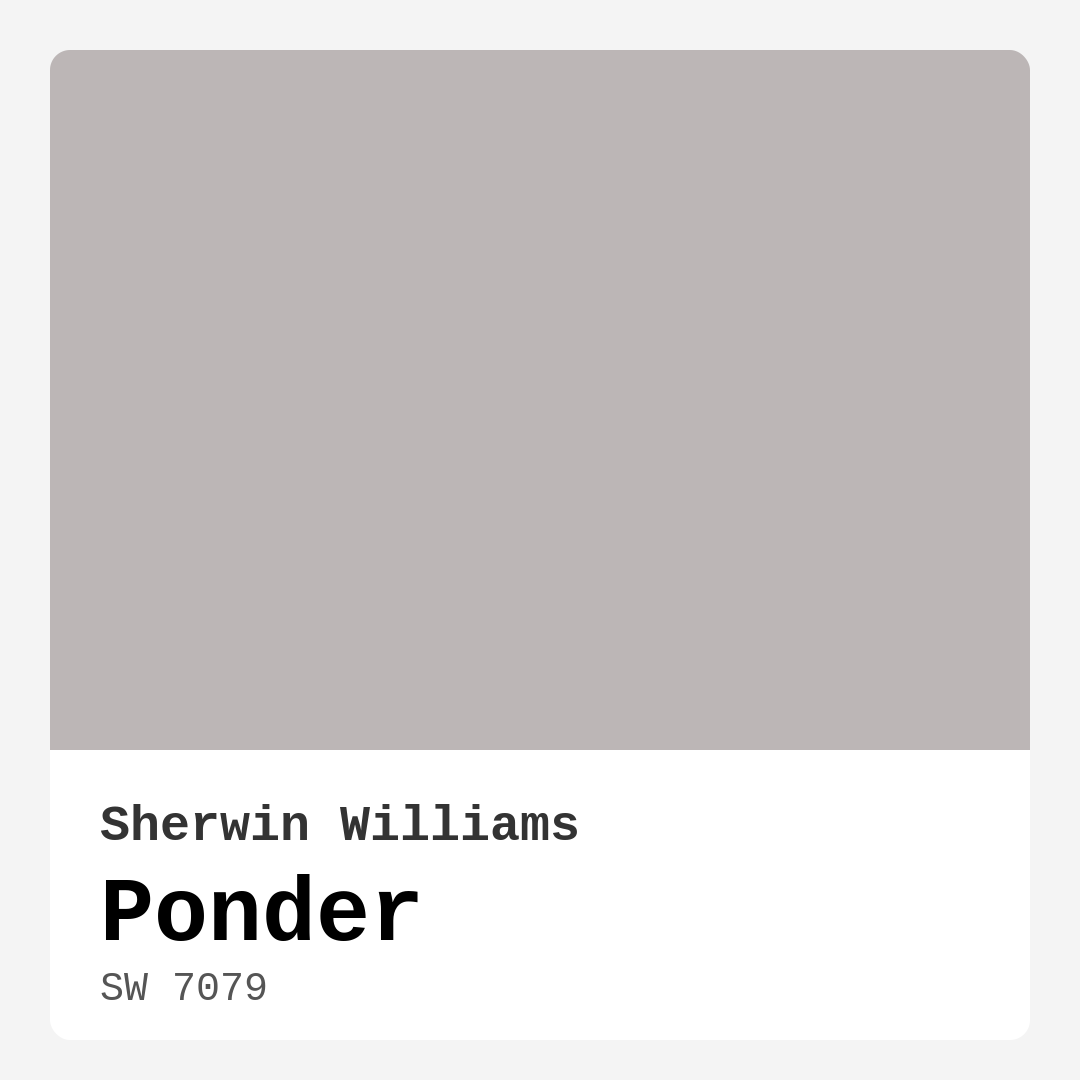
Color Preview & Key Details
| HEX Code | #BCB6B6 |
| RGB | 188, 182, 182 |
| LRV | 48% |
| Undertone | Red |
| Finish Options | Eggshell, Matte, Satin |
Imagine walking into a space that feels effortlessly serene, where every corner exudes warmth and tranquility. That’s the magic of Sherwin Williams’ Ponder (SW 7079). This soft, muted gray with a touch of purple undertone is like a gentle hug for your walls. It’s one of those colors that invites you in, making you feel right at home.
Choosing a paint color can be a bit overwhelming, can’t it? With countless options out there, it can be tricky to find one that genuinely resonates with your vision for your space. Ponder stands out in the sea of choices, not just for its aesthetic appeal, but for its versatility. Whether you’re revamping your living room, bedroom, or home office, this color works beautifully across various decor styles—from modern to Scandinavian and minimalist to transitional.
So, what makes Ponder such an appealing choice? Let’s dive into its unique attributes. First off, it has a Light Reflectance Value (LRV) of 48%. This means it reflects a moderate amount of light, creating an inviting atmosphere without being too stark or overwhelming. It’s just the right balance, allowing it to adapt to different lighting conditions. In brighter spaces, Ponder radiates a soft warmth, while in dimmer settings, it retains its calm quality, providing a soothing backdrop.
One of the standout features of Ponder is its undertone. With a red undertone, it adds depth and complexity that you won’t find in many other grays. This subtle warmth creates a cozy feeling, making your space feel inviting and lived-in. Imagine pairing it with some deep greens or muted blush tones; the combination can be nothing short of magical. It’s essential to test this paint in your home, as the undertones can shift depending on the natural light and surrounding decor. You might be surprised at how beautifully it interacts with your existing furnishings and flooring.
When it comes to application, Ponder is beginner-friendly. You’ll appreciate how smoothly it goes on, whether you’re using a roller or a brush. Generally, it provides good coverage, needing just one to two coats for a beautiful uniform finish. Plus, it’s touch-up friendly, so don’t worry too much about those little nicks and scratches that come with daily life. Choose between matte, eggshell, or satin finishes based on the vibe you want to create—matte for a more casual look, or eggshell/satin for something a bit more refined.
You might be wondering about its durability. Ponder’s finish is quite robust, making it suitable for high-traffic areas like living rooms and hallways. Just opt for an eggshell or satin finish for those spots. It’s also washable, so you can easily wipe off any marks or smudges that might occur, keeping your space looking fresh and clean.
Now, let’s talk about the rooms where Ponder truly shines. It’s particularly ideal for living rooms, bedrooms, home offices, and dining rooms. In a bedroom, it creates a calming retreat—perfect for unwinding after a long day. In a living room, it serves as a beautiful backdrop for your furniture and decor, allowing your personal style to take center stage without overwhelming the senses.
Ponder pairs beautifully with various trim colors, including White Dove, which is a favorite among designers. This pairing creates a clean, classic look that feels timeless. Furthermore, if you have brass fixtures or wood trim, Ponder complements these elements splendidly, enhancing the overall aesthetic without competing for attention.
If you’re feeling adventurous with your color palette, consider using Ponder as an accent wall. This can bring a cozy focal point to a room—whether behind a sofa, a bed, or even in a home office to create an inspiring workspace. The versatility in pairing allows you to play with complementary shades that can elevate your overall decor. Think about how lovely it would look alongside dusty greens or muted blushes, creating a harmonious and inviting environment.
For those of you living in smaller spaces, Ponder can work wonders. Its medium brightness means it won’t make your rooms feel cramped; instead, it can create an illusion of depth and comfort. Just remember, in smaller, low-light spaces, it might darken slightly, so testing it in your specific environment is key.
Now, if you’re considering using Ponder for exterior applications, keep in mind it’s primarily designed for interior spaces. However, you could use it in covered outdoor areas. Just remember to choose a paint specifically formulated for outdoor use for longevity against the elements.
Let’s not forget about sustainability. Ponder has a low VOC level, which means it’s a healthier choice for you and your home environment. It’s always nice to know that you’re making a responsible decision while creating a beautiful space.
So, is Ponder the right color for your project? If you’re leaning towards a warm, muted, and inviting aura in your home, then it’s definitely worth considering. It’s like the perfect backdrop that allows your style to shine, no matter what decor elements you choose to incorporate.
In conclusion, Ponder (SW 7079) is more than just a paint color; it’s a mood, a feeling, and a way to express your personality through your space. With its versatile nature, ease of application, and timeless appeal, it could very well be the color that transforms your home into a serene sanctuary. So grab that paintbrush, and let your walls reflect the calm, cozy vibe you’ve always dreamed of. Happy decorating!
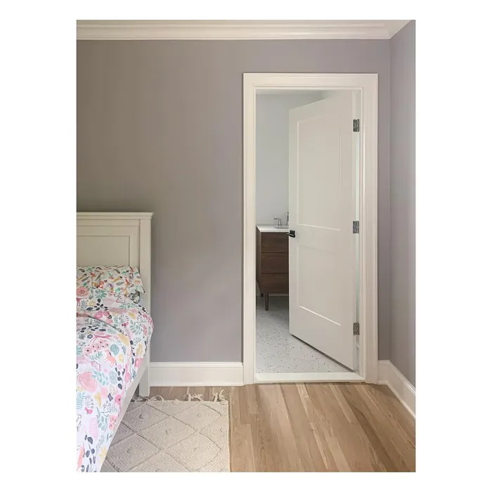
Real Room Photo of Ponder SW 7079
Undertones of Ponder ?
The undertones of Ponder are a key aspect of its character, leaning towards Red. These subtle underlying hues are what give the color its depth and complexity. For example, a gray with a blue undertone will feel cooler and more modern, while one with a brown undertone will feel warmer and more traditional. It’s essential to test this paint in your home and observe it next to your existing furniture, flooring, and decor to see how these undertones interact and reveal themselves throughout the day.
HEX value: #BCB6B6
RGB code: 188, 182, 182
Is Ponder Cool or Warm?
This color is predominantly warm, creating a cozy atmosphere. It works beautifully in spaces that aim for a welcoming vibe without overwhelming the senses.
Understanding Color Properties and Interior Design Tips
Hue refers to a specific position on the color wheel, measured in degrees from 0 to 360. Each degree represents a different pure color:
- 0° represents red
- 120° represents green
- 240° represents blue
Saturation describes the intensity or purity of a color and is expressed as a percentage:
- At 0%, the color appears completely desaturated—essentially a shade of gray
- At 100%, the color is at its most vivid and vibrant
Lightness indicates how light or dark a color is, also expressed as a percentage:
- 0% lightness results in black
- 100% lightness results in white
Using Warm Colors in Interior Design
Warm hues—such as reds, oranges, yellows, warm beiges, and greiges—are excellent choices for creating inviting and energetic spaces. These colors are particularly well-suited for:
- Kitchens, living rooms, and bathrooms, where warmth enhances comfort and sociability
- Large rooms, where warm tones can help reduce the sense of emptiness and make the space feel more intimate
For example:
- Warm beige shades provide a cozy, inviting atmosphere, ideal for living rooms, bedrooms, and hallways.
- Warm greige (a mix of beige and gray) offers the warmth of beige with the modern appeal of gray, making it a versatile backdrop for dining areas, bedrooms, and living spaces.
However, be mindful when using warm light tones in rooms with limited natural light. These shades may appear muted or even take on an unpleasant yellowish tint. To avoid a dull or flat appearance:
- Add depth by incorporating richer tones like deep greens, charcoal, or chocolate brown
- Use textured elements such as curtains, rugs, or cushions to bring dimension to the space
Pro Tip: Achieving Harmony with Warm and Cool Color Balance
To create a well-balanced and visually interesting interior, mix warm and cool tones strategically. This contrast adds depth and harmony to your design.
- If your walls feature warm hues, introduce cool-colored accents such as blue or green furniture, artwork, or accessories to create contrast.
- For a polished look, consider using a complementary color scheme, which pairs colors opposite each other on the color wheel (e.g., red with green, orange with blue).
This thoughtful mix not only enhances visual appeal but also creates a space that feels both dynamic and cohesive.
Light Temperature Affects on Ponder
Natural Light
Natural daylight changes in color temperature as the sun moves across the sky. At sunrise and sunset, the light tends to have a warm, golden tone with a color temperature around 2000 Kelvin (K). As the day progresses and the sun rises higher, the light becomes cooler and more neutral. Around midday, especially when the sky is clear, natural light typically reaches its peak brightness and shifts to a cooler tone, ranging from 5500 to 6500 Kelvin. This midday light is close to what we perceive as pure white or daylight-balanced light.
These shifts in natural light can significantly influence how colors appear in a space, which is why designers often consider both the time of day and the orientation of windows when planning interior color schemes.
Artificial Light
When choosing artificial lighting, pay close attention to the color temperature, measured in Kelvin (K). This determines how warm or cool the light will appear. Lower temperatures, around 2700K, give off a warm, yellow glow often used in living rooms or bedrooms. Higher temperatures, above 5000K, create a cool, bluish light similar to daylight, commonly used in kitchens, offices, or task areas.
Use the slider to see how lighting temperature can affect the appearance of a surface or color throughout a space.


4800K
LRV of Ponder
The Light Reflectance Value (LRV) of Ponder is 48%, which places it in the Medium category. This means it Reflects a moderate amount of light. Understanding a paint’s LRV is crucial for predicting how it will look in your space. A higher LRV indicates a lighter color that reflects more light, making rooms feel larger and brighter. A lower LRV signifies a darker color that absorbs more light, creating a cozier, more intimate atmosphere. Always consider the natural and artificial lighting in your room when selecting a paint color based on its LRV.
Detailed Review of Ponder
Additional Paint Characteristics
Ideal Rooms
Bedroom, Dining Room, Home Office, Living Room
Decor Styles
Minimalist, Modern, Scandinavian, Transitional
Coverage
Good (1–2 Coats), Touch-Up Friendly
Ease of Application
Beginner Friendly, Brush Smooth, Roller-Ready
Washability
Washable, Wipeable
VOC Level
Low VOC
Best Use
Accent Wall, Bedroom, Interior Walls, Living Room
Room Suitability
Bedroom, Dining Room, Home Office, Living Room
Tone Tag
Balanced, Muted, Warm
Finish Type
Eggshell, Matte, Satin
Paint Performance
Easy Touch-Up, Low Odor, Scuff Resistant
Use Cases
Best for Small Spaces, Classic Favorite, Designer Favorite
Mood
Calm, Cozy, Inviting
Trim Pairing
Complements Brass Fixtures, Good with Wood Trim, Pairs with White Dove
Ponder is a delightful choice for those looking to create a tranquil atmosphere in their home. Its gentle hue offers a sense of calm, making it ideal for spaces where relaxation is key, like bedrooms and living rooms. The color performs exceptionally well in natural light, casting a soft glow that enhances the space around it. When applying, you’ll find its coverage to be reliable, requiring just one to two coats for a uniform finish. The paint’s matte to eggshell finish options provide flexibility depending on your desired look, allowing you to choose something more refined or casual. Overall, Ponder stands out for its ability to harmonize with various styles while remaining inviting and warm.
Pros & Cons of SW 7079 Ponder
Pros
Cons
Colors that go with Sherwin Williams Ponder
FAQ on SW 7079 Ponder
Can Ponder be used in high-traffic areas?
Absolutely! Ponder’s durable finish, especially in eggshell or satin, makes it suitable for high-traffic areas like hallways or living rooms. Just ensure you select a finish that offers the right balance of washability and durability for your needs.
Is Ponder suitable for exteriors?
While Ponder is primarily designed for interior use, you can use it for covered outdoor areas. For exterior applications, consider a paint specifically formulated for outdoor conditions to ensure longevity against the elements.
Comparisons Ponder with other colors
Ponder SW 7079 vs Dusty Heather SW 9073
| Attribute | Ponder SW 7079 | Dusty Heather SW 9073 |
|---|---|---|
| Color Name | Ponder SW 7079 | Dusty Heather SW 9073 |
| Color | ||
| Hue | Purple | Purple |
| Brightness | Medium | Medium |
| RGB | 188, 182, 182 | 137, 144, 163 |
| LRV | 48% | 30% |
| Finish Type | Eggshell, Matte, Satin | Eggshell, Matte, Satin |
| Finish Options | Eggshell, Matte, Satin | Eggshell, Matte, Satin |
| Ideal Rooms | Bedroom, Dining Room, Home Office, Living Room | Bedroom, Home Office, Living Room, Nursery |
| Decor Styles | Minimalist, Modern, Scandinavian, Transitional | Modern, Rustic, Scandinavian, Transitional |
| Coverage | Good (1–2 Coats), Touch-Up Friendly | Good (1–2 Coats), Touch-Up Friendly |
| Ease of Application | Beginner Friendly, Brush Smooth, Roller-Ready | Beginner Friendly, Brush Smooth, Roller-Ready |
| Washability | Washable, Wipeable | Washable, Wipeable |
| Room Suitability | Bedroom, Dining Room, Home Office, Living Room | Bedroom, Home Office, Living Room, Nursery |
| Tone | Balanced, Muted, Warm | Cool, Dusty, Muted |
| Paint Performance | Easy Touch-Up, Low Odor, Scuff Resistant | Easy Touch-Up, High Coverage, Low Odor |
Ponder SW 7079 vs Chaise Mauve SW 6016
| Attribute | Ponder SW 7079 | Chaise Mauve SW 6016 |
|---|---|---|
| Color Name | Ponder SW 7079 | Chaise Mauve SW 6016 |
| Color | ||
| Hue | Purple | Purple |
| Brightness | Medium | Medium |
| RGB | 188, 182, 182 | 193, 178, 179 |
| LRV | 48% | 24% |
| Finish Type | Eggshell, Matte, Satin | Eggshell, Matte, Satin |
| Finish Options | Eggshell, Matte, Satin | Eggshell, Matte, Satin |
| Ideal Rooms | Bedroom, Dining Room, Home Office, Living Room | Bedroom, Dining Room, Home Office, Living Room, Nursery |
| Decor Styles | Minimalist, Modern, Scandinavian, Transitional | Eclectic, Minimalist, Modern, Transitional, Vintage |
| Coverage | Good (1–2 Coats), Touch-Up Friendly | Good (1–2 Coats) |
| Ease of Application | Beginner Friendly, Brush Smooth, Roller-Ready | Beginner Friendly, Brush Smooth, Fast-Drying, Roller-Ready |
| Washability | Washable, Wipeable | Highly Washable, Washable, Wipeable |
| Room Suitability | Bedroom, Dining Room, Home Office, Living Room | Bedroom, Dining Room, Home Office, Living Room, Nursery |
| Tone | Balanced, Muted, Warm | Balanced, Dusty, Muted, Warm |
| Paint Performance | Easy Touch-Up, Low Odor, Scuff Resistant | Easy Touch-Up, Fade Resistant, Low Odor, Quick Drying |
Ponder SW 7079 vs Vesper Violet SW 6542
| Attribute | Ponder SW 7079 | Vesper Violet SW 6542 |
|---|---|---|
| Color Name | Ponder SW 7079 | Vesper Violet SW 6542 |
| Color | ||
| Hue | Purple | Purple |
| Brightness | Medium | Medium |
| RGB | 188, 182, 182 | 153, 160, 178 |
| LRV | 48% | 24% |
| Finish Type | Eggshell, Matte, Satin | Eggshell, Satin |
| Finish Options | Eggshell, Matte, Satin | Eggshell, Flat, Satin |
| Ideal Rooms | Bedroom, Dining Room, Home Office, Living Room | Bedroom, Home Office, Living Room, Nursery |
| Decor Styles | Minimalist, Modern, Scandinavian, Transitional | Bohemian, Modern, Scandinavian, Transitional |
| Coverage | Good (1–2 Coats), Touch-Up Friendly | Good (1–2 Coats), Touch-Up Friendly |
| Ease of Application | Beginner Friendly, Brush Smooth, Roller-Ready | Beginner Friendly, Brush Smooth, Roller-Ready |
| Washability | Washable, Wipeable | Stain Resistant, Washable |
| Room Suitability | Bedroom, Dining Room, Home Office, Living Room | Bedroom, Home Office, Living Room, Nursery |
| Tone | Balanced, Muted, Warm | Cool, Dusty, Muted |
| Paint Performance | Easy Touch-Up, Low Odor, Scuff Resistant | Easy Touch-Up, Fade Resistant, Low Odor |
Ponder SW 7079 vs Moonlit Orchid SW 9153
| Attribute | Ponder SW 7079 | Moonlit Orchid SW 9153 |
|---|---|---|
| Color Name | Ponder SW 7079 | Moonlit Orchid SW 9153 |
| Color | ||
| Hue | Purple | Purple |
| Brightness | Medium | Medium |
| RGB | 188, 182, 182 | 148, 145, 148 |
| LRV | 48% | 15% |
| Finish Type | Eggshell, Matte, Satin | Eggshell, Matte |
| Finish Options | Eggshell, Matte, Satin | Eggshell, Matte, Satin |
| Ideal Rooms | Bedroom, Dining Room, Home Office, Living Room | Bedroom, Home Office, Living Room, Nursery |
| Decor Styles | Minimalist, Modern, Scandinavian, Transitional | Bohemian, Minimalist, Modern, Transitional |
| Coverage | Good (1–2 Coats), Touch-Up Friendly | Good (1–2 Coats), Touch-Up Friendly |
| Ease of Application | Beginner Friendly, Brush Smooth, Roller-Ready | Beginner Friendly, Brush Smooth, Roller-Ready |
| Washability | Washable, Wipeable | Spot Clean Only, Washable |
| Room Suitability | Bedroom, Dining Room, Home Office, Living Room | Bedroom, Home Office, Living Room, Nursery |
| Tone | Balanced, Muted, Warm | Balanced, Cool, Muted |
| Paint Performance | Easy Touch-Up, Low Odor, Scuff Resistant | Easy Touch-Up, High Coverage, Low Odor |
Ponder SW 7079 vs Thistle SW 6283
| Attribute | Ponder SW 7079 | Thistle SW 6283 |
|---|---|---|
| Color Name | Ponder SW 7079 | Thistle SW 6283 |
| Color | ||
| Hue | Purple | Purple |
| Brightness | Medium | Medium |
| RGB | 188, 182, 182 | 170, 142, 154 |
| LRV | 48% | 66% |
| Finish Type | Eggshell, Matte, Satin | Eggshell, Matte, Satin |
| Finish Options | Eggshell, Matte, Satin | Eggshell, Matte, Satin |
| Ideal Rooms | Bedroom, Dining Room, Home Office, Living Room | Bedroom, Dining Room, Home Office, Living Room, Nursery |
| Decor Styles | Minimalist, Modern, Scandinavian, Transitional | Bohemian, Modern, Scandinavian, Vintage |
| Coverage | Good (1–2 Coats), Touch-Up Friendly | Good (1–2 Coats), Touch-Up Friendly |
| Ease of Application | Beginner Friendly, Brush Smooth, Roller-Ready | Beginner Friendly, Brush Smooth, Fast-Drying, Roller-Ready |
| Washability | Washable, Wipeable | Spot Clean Only, Washable, Wipeable |
| Room Suitability | Bedroom, Dining Room, Home Office, Living Room | Bedroom, Home Office, Living Room, Nursery |
| Tone | Balanced, Muted, Warm | Dusty, Muted, Warm |
| Paint Performance | Easy Touch-Up, Low Odor, Scuff Resistant | Easy Touch-Up, Fade Resistant, Long Lasting, Low Odor |
Ponder SW 7079 vs Grape Mist SW 6548
| Attribute | Ponder SW 7079 | Grape Mist SW 6548 |
|---|---|---|
| Color Name | Ponder SW 7079 | Grape Mist SW 6548 |
| Color | ||
| Hue | Purple | Purple |
| Brightness | Medium | Medium |
| RGB | 188, 182, 182 | 197, 192, 201 |
| LRV | 48% | 24% |
| Finish Type | Eggshell, Matte, Satin | Eggshell, Matte |
| Finish Options | Eggshell, Matte, Satin | Eggshell, Matte, Satin |
| Ideal Rooms | Bedroom, Dining Room, Home Office, Living Room | Bedroom, Home Office, Living Room, Nursery |
| Decor Styles | Minimalist, Modern, Scandinavian, Transitional | Modern, Rustic, Scandinavian, Transitional |
| Coverage | Good (1–2 Coats), Touch-Up Friendly | Good (1–2 Coats), Touch-Up Friendly |
| Ease of Application | Beginner Friendly, Brush Smooth, Roller-Ready | Beginner Friendly, Brush Smooth, Roller-Ready |
| Washability | Washable, Wipeable | Washable, Wipeable |
| Room Suitability | Bedroom, Dining Room, Home Office, Living Room | Bedroom, Home Office, Living Room, Nursery |
| Tone | Balanced, Muted, Warm | Cool, Muted, Pastel |
| Paint Performance | Easy Touch-Up, Low Odor, Scuff Resistant | Easy Touch-Up, Fade Resistant, Low Odor |
Ponder SW 7079 vs Agapanthus SW 9066
| Attribute | Ponder SW 7079 | Agapanthus SW 9066 |
|---|---|---|
| Color Name | Ponder SW 7079 | Agapanthus SW 9066 |
| Color | ||
| Hue | Purple | Purple |
| Brightness | Medium | Medium |
| RGB | 188, 182, 182 | 187, 197, 222 |
| LRV | 48% | 15% |
| Finish Type | Eggshell, Matte, Satin | Eggshell, Matte, Satin |
| Finish Options | Eggshell, Matte, Satin | Eggshell, Matte, Satin |
| Ideal Rooms | Bedroom, Dining Room, Home Office, Living Room | Bedroom, Hallway, Home Office, Living Room, Nursery |
| Decor Styles | Minimalist, Modern, Scandinavian, Transitional | Coastal, Minimalist, Modern, Scandinavian |
| Coverage | Good (1–2 Coats), Touch-Up Friendly | Good (1–2 Coats), Touch-Up Friendly |
| Ease of Application | Beginner Friendly, Brush Smooth, Roller-Ready | Beginner Friendly, Brush Smooth, Roller-Ready |
| Washability | Washable, Wipeable | Washable, Wipeable |
| Room Suitability | Bedroom, Dining Room, Home Office, Living Room | Bedroom, Home Office, Living Room, Nursery |
| Tone | Balanced, Muted, Warm | Airy, Cool, Muted |
| Paint Performance | Easy Touch-Up, Low Odor, Scuff Resistant | Easy Touch-Up, Fade Resistant, Low Odor, Quick Drying |
Ponder SW 7079 vs Intuitive SW 6017
| Attribute | Ponder SW 7079 | Intuitive SW 6017 |
|---|---|---|
| Color Name | Ponder SW 7079 | Intuitive SW 6017 |
| Color | ||
| Hue | Purple | Purple |
| Brightness | Medium | Medium |
| RGB | 188, 182, 182 | 179, 163, 165 |
| LRV | 48% | 30% |
| Finish Type | Eggshell, Matte, Satin | Eggshell, Matte, Satin |
| Finish Options | Eggshell, Matte, Satin | Eggshell, Matte, Satin |
| Ideal Rooms | Bedroom, Dining Room, Home Office, Living Room | Bedroom, Dining Room, Home Office, Living Room, Nursery |
| Decor Styles | Minimalist, Modern, Scandinavian, Transitional | Minimalist, Modern, Scandinavian, Transitional |
| Coverage | Good (1–2 Coats), Touch-Up Friendly | Good (1–2 Coats) |
| Ease of Application | Beginner Friendly, Brush Smooth, Roller-Ready | Beginner Friendly, Brush Smooth, Roller-Ready |
| Washability | Washable, Wipeable | Washable, Wipeable |
| Room Suitability | Bedroom, Dining Room, Home Office, Living Room | Bedroom, Dining Room, Home Office, Living Room |
| Tone | Balanced, Muted, Warm | Balanced, Muted, Warm |
| Paint Performance | Easy Touch-Up, Low Odor, Scuff Resistant | Easy Touch-Up, Low Odor, Quick Drying |
Ponder SW 7079 vs Veiled Violet SW 6268
| Attribute | Ponder SW 7079 | Veiled Violet SW 6268 |
|---|---|---|
| Color Name | Ponder SW 7079 | Veiled Violet SW 6268 |
| Color | ||
| Hue | Purple | Purple |
| Brightness | Medium | Medium |
| RGB | 188, 182, 182 | 189, 181, 185 |
| LRV | 48% | 24% |
| Finish Type | Eggshell, Matte, Satin | Eggshell, Matte, Satin |
| Finish Options | Eggshell, Matte, Satin | Eggshell, Matte, Satin |
| Ideal Rooms | Bedroom, Dining Room, Home Office, Living Room | Bedroom, Home Office, Living Room, Nursery |
| Decor Styles | Minimalist, Modern, Scandinavian, Transitional | Bohemian, Minimalist, Modern, Transitional |
| Coverage | Good (1–2 Coats), Touch-Up Friendly | Good (1–2 Coats), Touch-Up Friendly |
| Ease of Application | Beginner Friendly, Brush Smooth, Roller-Ready | Beginner Friendly, Brush Smooth, Fast-Drying, Roller-Ready |
| Washability | Washable, Wipeable | Highly Washable, Washable |
| Room Suitability | Bedroom, Dining Room, Home Office, Living Room | Bedroom, Home Office, Living Room, Nursery |
| Tone | Balanced, Muted, Warm | Airy, Cool, Dusty, Muted |
| Paint Performance | Easy Touch-Up, Low Odor, Scuff Resistant | Easy Touch-Up, Fade Resistant, Low Odor, Quick Drying |
Ponder SW 7079 vs Gris Morado SW 9156
| Attribute | Ponder SW 7079 | Gris Morado SW 9156 |
|---|---|---|
| Color Name | Ponder SW 7079 | Gris Morado SW 9156 |
| Color | ||
| Hue | Purple | Purple |
| Brightness | Medium | Medium |
| RGB | 188, 182, 182 | 143, 138, 145 |
| LRV | 48% | 20% |
| Finish Type | Eggshell, Matte, Satin | Eggshell, Matte, Satin |
| Finish Options | Eggshell, Matte, Satin | Eggshell, Matte, Satin |
| Ideal Rooms | Bedroom, Dining Room, Home Office, Living Room | Bedroom, Dining Room, Home Office, Living Room |
| Decor Styles | Minimalist, Modern, Scandinavian, Transitional | Contemporary, Minimalist, Modern, Scandinavian |
| Coverage | Good (1–2 Coats), Touch-Up Friendly | Good (1–2 Coats), Touch-Up Friendly |
| Ease of Application | Beginner Friendly, Brush Smooth, Roller-Ready | Beginner Friendly, Brush Smooth, Fast-Drying, Roller-Ready |
| Washability | Washable, Wipeable | Washable, Wipeable |
| Room Suitability | Bedroom, Dining Room, Home Office, Living Room | Bedroom, Dining Room, Home Office, Living Room |
| Tone | Balanced, Muted, Warm | Cool, Muted, Sophisticated |
| Paint Performance | Easy Touch-Up, Low Odor, Scuff Resistant | Easy Touch-Up, Fade Resistant, Low Odor |
Official Page of Sherwin Williams Ponder SW 7079