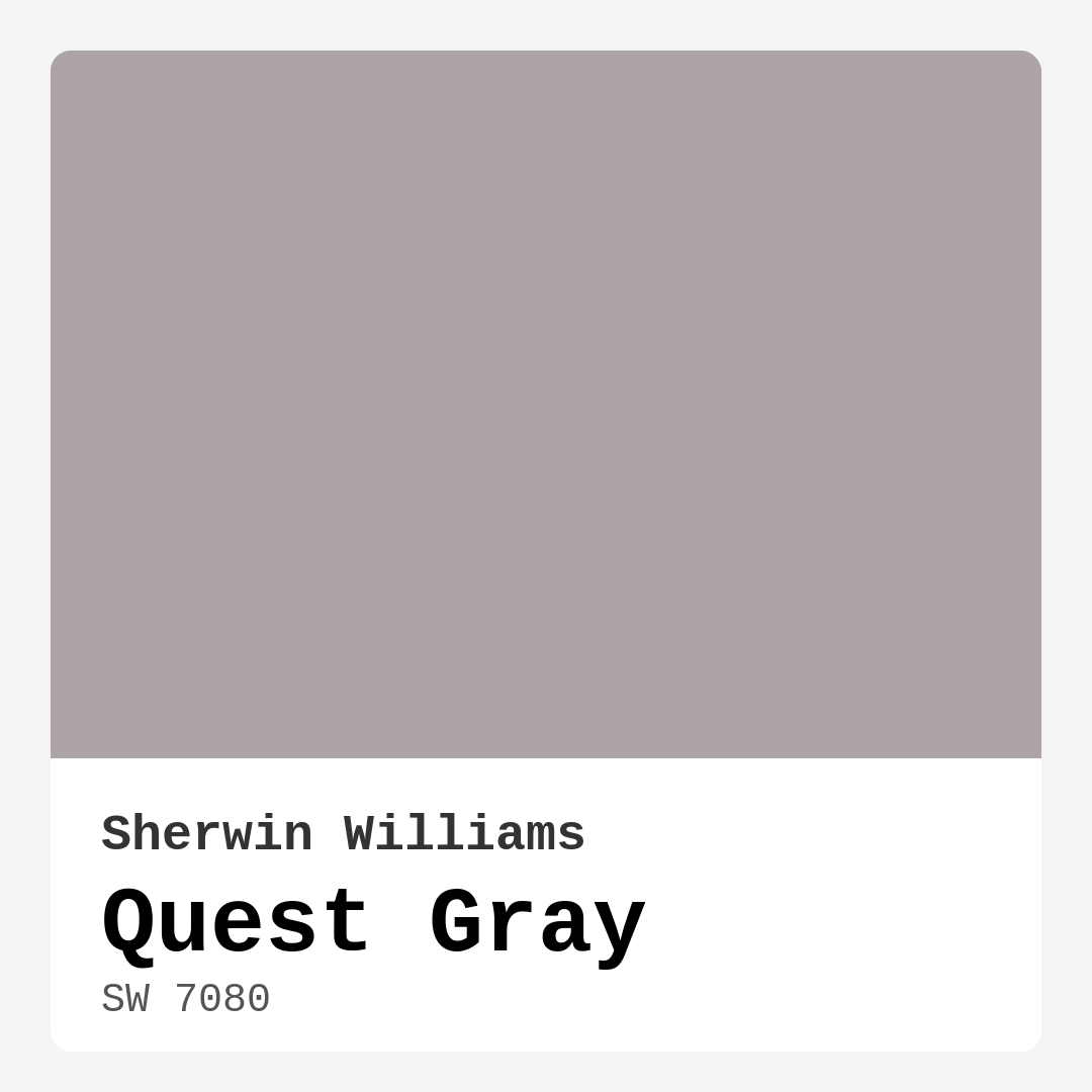
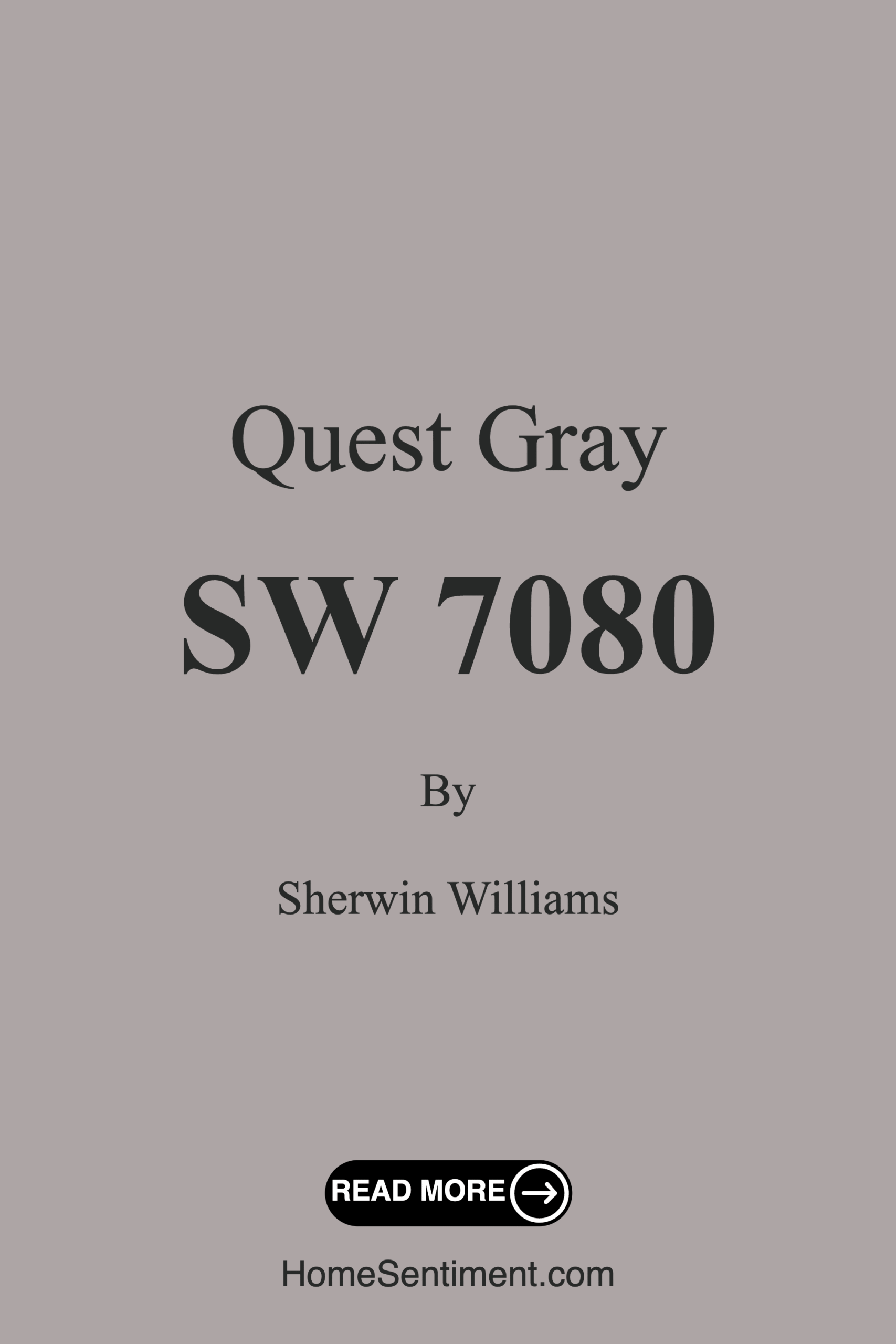
Color Preview & Key Details
| HEX Code | #ADA5A5 |
| RGB | 173, 165, 165 |
| LRV | 39% |
| Undertone | Red |
| Finish Options | Eggshell, Matte, Satin |
Imagine walking into a room that feels both inviting and serene. The colors around you create a sense of calm, making it the perfect space to unwind after a long day. That’s the magic of paint, and today, I want to introduce you to a color that embodies this very essence—Quest Gray by Sherwin Williams. This stunning hue is more than just a soft gray; it’s a versatile shade that can transform your home into a beautifully balanced retreat.
Quest Gray (SW 7080) is a sophisticated, muted gray that strikes a perfect balance between warmth and coolness. With its gentle undertones leaning toward red, it adds depth to any room without overwhelming the senses. As someone who’s spent years in the design world, I’ve seen how colors can create different moods, and Quest Gray does just that. It’s the kind of color that feels timeless and elegant, making it suitable for a variety of decor styles, whether you’re into modern, traditional, or even a cozy farmhouse vibe.
One of the standout features of Quest Gray is its adaptability. This soft tone works beautifully in various lighting conditions, shifting subtly from a lighter, airier feel in natural light to a deeper, richer tone under artificial lighting. This quality makes it perfect for spaces that see different light throughout the day, like living rooms or dining areas. Imagine hosting a dinner party where the walls subtly enhance the atmosphere as the sun sets. It’s all about creating the right mood, and Quest Gray helps you achieve just that.
When it comes to application, you’ll find Quest Gray to be beginner-friendly. It’s easy to work with, whether you’re using a brush or a roller, and its low VOC level means it won’t overwhelm your space with odors—a big plus during those painting sessions. You might need just one or two coats for full coverage, but keep in mind that it can appear darker in low-light areas. So, always test it out in your specific space to see how it interacts with your existing decor and lighting.
Let’s talk about the versatility of Quest Gray. This color thrives in multiple rooms. Whether it’s a serene bedroom retreat, a stylish living room, or even a chic kitchen, Quest Gray can elevate the vibe. It also works beautifully in bathrooms and dining rooms, creating a calm ambiance that encourages relaxation. If you’re considering a small space, Quest Gray is your friend here too. Its balanced undertones help create an illusion of depth, making those cozy areas feel more open and inviting.
Now, pairing colors can sometimes feel like a daunting task, but Quest Gray makes it easy. For a soothing palette, consider classic whites like White Dove or Simply White for trim. These lighter shades will complement the gray beautifully, adding a crisp and clean finish. If you’re drawn to bolder accents, deep blues or rich greens can create a striking contrast that feels modern and fresh. Warm wood tones work wonderfully with Quest Gray as well, adding an earthy touch that brings warmth into the space.
Let’s not forget about the various finishes available for Quest Gray. Whether you opt for a matte, eggshell, or satin finish, each choice brings its own character. For a casual, cozy setting, a matte finish might be just what you need. If you prefer a bit of sheen, eggshell or satin can add a touch of elegance, making it perfect for more formal areas in your home. No matter your choice, Quest Gray maintains its sophisticated charm.
Of course, every color has its pros and cons. Quest Gray shines with its versatility and ability to create a calming atmosphere. It’s easy to apply and touch up, making it a practical option for anyone looking to refresh their space. However, keep in mind that it may require multiple coats for full coverage, and in low-light conditions, it can appear darker than expected. So, always ensure you’re testing it in your home’s unique lighting.
The Light Reflectance Value (LRV) of Quest Gray is 39%, placing it firmly in the medium category. This means it reflects a moderate amount of light, which is crucial in understanding how a color will look in your space. A higher LRV reflects more light and makes a room feel larger, while a lower LRV absorbs more light, creating a cozy atmosphere. With Quest Gray, you get that perfect middle ground—creating a restful environment without feeling too dark or too bright.
As you think about incorporating Quest Gray into your home, consider the mood you want to create. This color promotes a calm, inviting atmosphere that can transform any space into a restful retreat. It’s particularly well-suited for areas where you want to unwind, like bedrooms or home offices, where focus and tranquility are key.
In conclusion, Quest Gray by Sherwin Williams is a color that truly deserves your attention. It’s not just about choosing a paint color; it’s about creating an environment that feels like home. Whether you’re painting a feature wall, updating a room, or refreshing your entire space, Quest Gray brings a sense of sophistication and harmony. With its adaptable nature, ease of application, and timeless appeal, it’s a choice that you’ll appreciate for years to come. So, grab your paintbrush and get ready to transform your home with this stunning hue. You might just find that it’s the perfect backdrop for all of life’s beautiful moments.
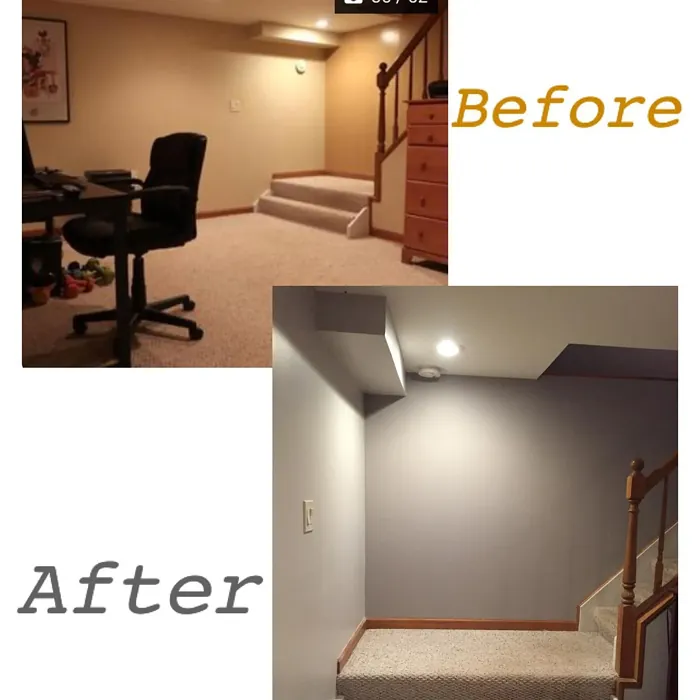
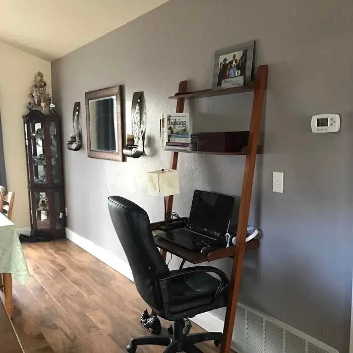
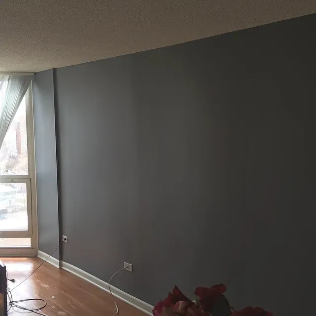
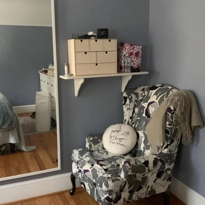
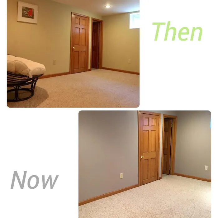
Real Room Photo of Quest Gray SW 7080
Undertones of Quest Gray ?
The undertones of Quest Gray are a key aspect of its character, leaning towards Red. These subtle underlying hues are what give the color its depth and complexity. For example, a gray with a blue undertone will feel cooler and more modern, while one with a brown undertone will feel warmer and more traditional. It’s essential to test this paint in your home and observe it next to your existing furniture, flooring, and decor to see how these undertones interact and reveal themselves throughout the day.
HEX value: #ADA5A5
RGB code: 173, 165, 165
Is Quest Gray Cool or Warm?
With its soft gray hue, Quest Gray tends to lean towards a cooler palette, but its warm undertones bring a balanced feel to the overall aesthetic. This duality allows it to work well in both sunny and shaded rooms, adapting beautifully to the light conditions throughout the day.
Understanding Color Properties and Interior Design Tips
Hue refers to a specific position on the color wheel, measured in degrees from 0 to 360. Each degree represents a different pure color:
- 0° represents red
- 120° represents green
- 240° represents blue
Saturation describes the intensity or purity of a color and is expressed as a percentage:
- At 0%, the color appears completely desaturated—essentially a shade of gray
- At 100%, the color is at its most vivid and vibrant
Lightness indicates how light or dark a color is, also expressed as a percentage:
- 0% lightness results in black
- 100% lightness results in white
Using Warm Colors in Interior Design
Warm hues—such as reds, oranges, yellows, warm beiges, and greiges—are excellent choices for creating inviting and energetic spaces. These colors are particularly well-suited for:
- Kitchens, living rooms, and bathrooms, where warmth enhances comfort and sociability
- Large rooms, where warm tones can help reduce the sense of emptiness and make the space feel more intimate
For example:
- Warm beige shades provide a cozy, inviting atmosphere, ideal for living rooms, bedrooms, and hallways.
- Warm greige (a mix of beige and gray) offers the warmth of beige with the modern appeal of gray, making it a versatile backdrop for dining areas, bedrooms, and living spaces.
However, be mindful when using warm light tones in rooms with limited natural light. These shades may appear muted or even take on an unpleasant yellowish tint. To avoid a dull or flat appearance:
- Add depth by incorporating richer tones like deep greens, charcoal, or chocolate brown
- Use textured elements such as curtains, rugs, or cushions to bring dimension to the space
Pro Tip: Achieving Harmony with Warm and Cool Color Balance
To create a well-balanced and visually interesting interior, mix warm and cool tones strategically. This contrast adds depth and harmony to your design.
- If your walls feature warm hues, introduce cool-colored accents such as blue or green furniture, artwork, or accessories to create contrast.
- For a polished look, consider using a complementary color scheme, which pairs colors opposite each other on the color wheel (e.g., red with green, orange with blue).
This thoughtful mix not only enhances visual appeal but also creates a space that feels both dynamic and cohesive.
Light Temperature Affects on Quest Gray
Natural Light
Natural daylight changes in color temperature as the sun moves across the sky. At sunrise and sunset, the light tends to have a warm, golden tone with a color temperature around 2000 Kelvin (K). As the day progresses and the sun rises higher, the light becomes cooler and more neutral. Around midday, especially when the sky is clear, natural light typically reaches its peak brightness and shifts to a cooler tone, ranging from 5500 to 6500 Kelvin. This midday light is close to what we perceive as pure white or daylight-balanced light.
These shifts in natural light can significantly influence how colors appear in a space, which is why designers often consider both the time of day and the orientation of windows when planning interior color schemes.
Artificial Light
When choosing artificial lighting, pay close attention to the color temperature, measured in Kelvin (K). This determines how warm or cool the light will appear. Lower temperatures, around 2700K, give off a warm, yellow glow often used in living rooms or bedrooms. Higher temperatures, above 5000K, create a cool, bluish light similar to daylight, commonly used in kitchens, offices, or task areas.
Use the slider to see how lighting temperature can affect the appearance of a surface or color throughout a space.


4800K
LRV of Quest Gray
The Light Reflectance Value (LRV) of Quest Gray is 39%, which places it in the Medium category. This means it Reflects a moderate amount of light. Understanding a paint’s LRV is crucial for predicting how it will look in your space. A higher LRV indicates a lighter color that reflects more light, making rooms feel larger and brighter. A lower LRV signifies a darker color that absorbs more light, creating a cozier, more intimate atmosphere. Always consider the natural and artificial lighting in your room when selecting a paint color based on its LRV.
Detailed Review of Quest Gray
Additional Paint Characteristics
Ideal Rooms
Bathroom, Bedroom, Dining Room, Home Office, Kitchen, Living Room
Decor Styles
Farmhouse, Industrial, Modern, Scandinavian, Traditional
Coverage
Good (1–2 Coats), Touch-Up Friendly
Ease of Application
Beginner Friendly, Brush Smooth, Roller-Ready
Washability
Washable, Wipeable
VOC Level
Low VOC
Best Use
Accent Wall, Interior Walls, Trim
Room Suitability
Bathroom, Bedroom, Dining Room, Kitchen, Living Room
Tone Tag
Balanced, Muted, Neutral
Finish Type
Eggshell, Satin
Paint Performance
Easy Touch-Up, Low Odor, Quick Drying
Use Cases
Best for Modern Farmhouse, Best for Rentals, Best for Small Spaces
Mood
Calm, Inviting, Restful
Trim Pairing
Complements Warm Trim, Pairs with White Dove
Quest Gray embodies a gentle sophistication that’s hard to ignore. Its soft undertones allow it to adapt beautifully to both natural and artificial lighting, making it an excellent choice for various rooms. Whether you’re looking to create a serene bedroom or a welcoming living room, this color has the ability to elevate your space. The balance of warmth and coolness makes it compatible with a wide range of decor styles, from modern to classic. Many users have praised its ability to create a calming atmosphere while still being stylish. Plus, it’s easy to pair with different accent colors for a polished look.
Pros & Cons of SW 7080 Quest Gray
Pros
Cons
Colors that go with Sherwin Williams Quest Gray
FAQ on SW 7080 Quest Gray
Can Quest Gray be used in small spaces?
Absolutely! Quest Gray is a great choice for small spaces. Its balanced undertones and moderate LRV help to create an illusion of depth without making the room feel confined. When paired with the right lighting and decor, it can make smaller areas feel more open and inviting.
What colors pair well with Quest Gray?
Quest Gray is incredibly versatile and pairs beautifully with a variety of colors. For a soothing palette, consider whites like White Dove or Simply White for trim. If you prefer bolder accents, deep blues or rich greens can create a striking contrast. Warm wood tones also complement Quest Gray nicely, adding warmth to the space.
Comparisons Quest Gray with other colors
Quest Gray SW 7080 vs Dusty Heather SW 9073
| Attribute | Quest Gray SW 7080 | Dusty Heather SW 9073 |
|---|---|---|
| Color Name | Quest Gray SW 7080 | Dusty Heather SW 9073 |
| Color | ||
| Hue | Purple | Purple |
| Brightness | Medium | Medium |
| RGB | 173, 165, 165 | 137, 144, 163 |
| LRV | 39% | 30% |
| Finish Type | Eggshell, Satin | Eggshell, Matte, Satin |
| Finish Options | Eggshell, Matte, Satin | Eggshell, Matte, Satin |
| Ideal Rooms | Bathroom, Bedroom, Dining Room, Home Office, Kitchen, Living Room | Bedroom, Home Office, Living Room, Nursery |
| Decor Styles | Farmhouse, Industrial, Modern, Scandinavian, Traditional | Modern, Rustic, Scandinavian, Transitional |
| Coverage | Good (1–2 Coats), Touch-Up Friendly | Good (1–2 Coats), Touch-Up Friendly |
| Ease of Application | Beginner Friendly, Brush Smooth, Roller-Ready | Beginner Friendly, Brush Smooth, Roller-Ready |
| Washability | Washable, Wipeable | Washable, Wipeable |
| Room Suitability | Bathroom, Bedroom, Dining Room, Kitchen, Living Room | Bedroom, Home Office, Living Room, Nursery |
| Tone | Balanced, Muted, Neutral | Cool, Dusty, Muted |
| Paint Performance | Easy Touch-Up, Low Odor, Quick Drying | Easy Touch-Up, High Coverage, Low Odor |
Quest Gray SW 7080 vs Chaise Mauve SW 6016
| Attribute | Quest Gray SW 7080 | Chaise Mauve SW 6016 |
|---|---|---|
| Color Name | Quest Gray SW 7080 | Chaise Mauve SW 6016 |
| Color | ||
| Hue | Purple | Purple |
| Brightness | Medium | Medium |
| RGB | 173, 165, 165 | 193, 178, 179 |
| LRV | 39% | 24% |
| Finish Type | Eggshell, Satin | Eggshell, Matte, Satin |
| Finish Options | Eggshell, Matte, Satin | Eggshell, Matte, Satin |
| Ideal Rooms | Bathroom, Bedroom, Dining Room, Home Office, Kitchen, Living Room | Bedroom, Dining Room, Home Office, Living Room, Nursery |
| Decor Styles | Farmhouse, Industrial, Modern, Scandinavian, Traditional | Eclectic, Minimalist, Modern, Transitional, Vintage |
| Coverage | Good (1–2 Coats), Touch-Up Friendly | Good (1–2 Coats) |
| Ease of Application | Beginner Friendly, Brush Smooth, Roller-Ready | Beginner Friendly, Brush Smooth, Fast-Drying, Roller-Ready |
| Washability | Washable, Wipeable | Highly Washable, Washable, Wipeable |
| Room Suitability | Bathroom, Bedroom, Dining Room, Kitchen, Living Room | Bedroom, Dining Room, Home Office, Living Room, Nursery |
| Tone | Balanced, Muted, Neutral | Balanced, Dusty, Muted, Warm |
| Paint Performance | Easy Touch-Up, Low Odor, Quick Drying | Easy Touch-Up, Fade Resistant, Low Odor, Quick Drying |
Quest Gray SW 7080 vs Vesper Violet SW 6542
| Attribute | Quest Gray SW 7080 | Vesper Violet SW 6542 |
|---|---|---|
| Color Name | Quest Gray SW 7080 | Vesper Violet SW 6542 |
| Color | ||
| Hue | Purple | Purple |
| Brightness | Medium | Medium |
| RGB | 173, 165, 165 | 153, 160, 178 |
| LRV | 39% | 24% |
| Finish Type | Eggshell, Satin | Eggshell, Satin |
| Finish Options | Eggshell, Matte, Satin | Eggshell, Flat, Satin |
| Ideal Rooms | Bathroom, Bedroom, Dining Room, Home Office, Kitchen, Living Room | Bedroom, Home Office, Living Room, Nursery |
| Decor Styles | Farmhouse, Industrial, Modern, Scandinavian, Traditional | Bohemian, Modern, Scandinavian, Transitional |
| Coverage | Good (1–2 Coats), Touch-Up Friendly | Good (1–2 Coats), Touch-Up Friendly |
| Ease of Application | Beginner Friendly, Brush Smooth, Roller-Ready | Beginner Friendly, Brush Smooth, Roller-Ready |
| Washability | Washable, Wipeable | Stain Resistant, Washable |
| Room Suitability | Bathroom, Bedroom, Dining Room, Kitchen, Living Room | Bedroom, Home Office, Living Room, Nursery |
| Tone | Balanced, Muted, Neutral | Cool, Dusty, Muted |
| Paint Performance | Easy Touch-Up, Low Odor, Quick Drying | Easy Touch-Up, Fade Resistant, Low Odor |
Quest Gray SW 7080 vs Moonlit Orchid SW 9153
| Attribute | Quest Gray SW 7080 | Moonlit Orchid SW 9153 |
|---|---|---|
| Color Name | Quest Gray SW 7080 | Moonlit Orchid SW 9153 |
| Color | ||
| Hue | Purple | Purple |
| Brightness | Medium | Medium |
| RGB | 173, 165, 165 | 148, 145, 148 |
| LRV | 39% | 15% |
| Finish Type | Eggshell, Satin | Eggshell, Matte |
| Finish Options | Eggshell, Matte, Satin | Eggshell, Matte, Satin |
| Ideal Rooms | Bathroom, Bedroom, Dining Room, Home Office, Kitchen, Living Room | Bedroom, Home Office, Living Room, Nursery |
| Decor Styles | Farmhouse, Industrial, Modern, Scandinavian, Traditional | Bohemian, Minimalist, Modern, Transitional |
| Coverage | Good (1–2 Coats), Touch-Up Friendly | Good (1–2 Coats), Touch-Up Friendly |
| Ease of Application | Beginner Friendly, Brush Smooth, Roller-Ready | Beginner Friendly, Brush Smooth, Roller-Ready |
| Washability | Washable, Wipeable | Spot Clean Only, Washable |
| Room Suitability | Bathroom, Bedroom, Dining Room, Kitchen, Living Room | Bedroom, Home Office, Living Room, Nursery |
| Tone | Balanced, Muted, Neutral | Balanced, Cool, Muted |
| Paint Performance | Easy Touch-Up, Low Odor, Quick Drying | Easy Touch-Up, High Coverage, Low Odor |
Quest Gray SW 7080 vs Thistle SW 6283
| Attribute | Quest Gray SW 7080 | Thistle SW 6283 |
|---|---|---|
| Color Name | Quest Gray SW 7080 | Thistle SW 6283 |
| Color | ||
| Hue | Purple | Purple |
| Brightness | Medium | Medium |
| RGB | 173, 165, 165 | 170, 142, 154 |
| LRV | 39% | 66% |
| Finish Type | Eggshell, Satin | Eggshell, Matte, Satin |
| Finish Options | Eggshell, Matte, Satin | Eggshell, Matte, Satin |
| Ideal Rooms | Bathroom, Bedroom, Dining Room, Home Office, Kitchen, Living Room | Bedroom, Dining Room, Home Office, Living Room, Nursery |
| Decor Styles | Farmhouse, Industrial, Modern, Scandinavian, Traditional | Bohemian, Modern, Scandinavian, Vintage |
| Coverage | Good (1–2 Coats), Touch-Up Friendly | Good (1–2 Coats), Touch-Up Friendly |
| Ease of Application | Beginner Friendly, Brush Smooth, Roller-Ready | Beginner Friendly, Brush Smooth, Fast-Drying, Roller-Ready |
| Washability | Washable, Wipeable | Spot Clean Only, Washable, Wipeable |
| Room Suitability | Bathroom, Bedroom, Dining Room, Kitchen, Living Room | Bedroom, Home Office, Living Room, Nursery |
| Tone | Balanced, Muted, Neutral | Dusty, Muted, Warm |
| Paint Performance | Easy Touch-Up, Low Odor, Quick Drying | Easy Touch-Up, Fade Resistant, Long Lasting, Low Odor |
Quest Gray SW 7080 vs Grape Mist SW 6548
| Attribute | Quest Gray SW 7080 | Grape Mist SW 6548 |
|---|---|---|
| Color Name | Quest Gray SW 7080 | Grape Mist SW 6548 |
| Color | ||
| Hue | Purple | Purple |
| Brightness | Medium | Medium |
| RGB | 173, 165, 165 | 197, 192, 201 |
| LRV | 39% | 24% |
| Finish Type | Eggshell, Satin | Eggshell, Matte |
| Finish Options | Eggshell, Matte, Satin | Eggshell, Matte, Satin |
| Ideal Rooms | Bathroom, Bedroom, Dining Room, Home Office, Kitchen, Living Room | Bedroom, Home Office, Living Room, Nursery |
| Decor Styles | Farmhouse, Industrial, Modern, Scandinavian, Traditional | Modern, Rustic, Scandinavian, Transitional |
| Coverage | Good (1–2 Coats), Touch-Up Friendly | Good (1–2 Coats), Touch-Up Friendly |
| Ease of Application | Beginner Friendly, Brush Smooth, Roller-Ready | Beginner Friendly, Brush Smooth, Roller-Ready |
| Washability | Washable, Wipeable | Washable, Wipeable |
| Room Suitability | Bathroom, Bedroom, Dining Room, Kitchen, Living Room | Bedroom, Home Office, Living Room, Nursery |
| Tone | Balanced, Muted, Neutral | Cool, Muted, Pastel |
| Paint Performance | Easy Touch-Up, Low Odor, Quick Drying | Easy Touch-Up, Fade Resistant, Low Odor |
Quest Gray SW 7080 vs Agapanthus SW 9066
| Attribute | Quest Gray SW 7080 | Agapanthus SW 9066 |
|---|---|---|
| Color Name | Quest Gray SW 7080 | Agapanthus SW 9066 |
| Color | ||
| Hue | Purple | Purple |
| Brightness | Medium | Medium |
| RGB | 173, 165, 165 | 187, 197, 222 |
| LRV | 39% | 15% |
| Finish Type | Eggshell, Satin | Eggshell, Matte, Satin |
| Finish Options | Eggshell, Matte, Satin | Eggshell, Matte, Satin |
| Ideal Rooms | Bathroom, Bedroom, Dining Room, Home Office, Kitchen, Living Room | Bedroom, Hallway, Home Office, Living Room, Nursery |
| Decor Styles | Farmhouse, Industrial, Modern, Scandinavian, Traditional | Coastal, Minimalist, Modern, Scandinavian |
| Coverage | Good (1–2 Coats), Touch-Up Friendly | Good (1–2 Coats), Touch-Up Friendly |
| Ease of Application | Beginner Friendly, Brush Smooth, Roller-Ready | Beginner Friendly, Brush Smooth, Roller-Ready |
| Washability | Washable, Wipeable | Washable, Wipeable |
| Room Suitability | Bathroom, Bedroom, Dining Room, Kitchen, Living Room | Bedroom, Home Office, Living Room, Nursery |
| Tone | Balanced, Muted, Neutral | Airy, Cool, Muted |
| Paint Performance | Easy Touch-Up, Low Odor, Quick Drying | Easy Touch-Up, Fade Resistant, Low Odor, Quick Drying |
Quest Gray SW 7080 vs Intuitive SW 6017
| Attribute | Quest Gray SW 7080 | Intuitive SW 6017 |
|---|---|---|
| Color Name | Quest Gray SW 7080 | Intuitive SW 6017 |
| Color | ||
| Hue | Purple | Purple |
| Brightness | Medium | Medium |
| RGB | 173, 165, 165 | 179, 163, 165 |
| LRV | 39% | 30% |
| Finish Type | Eggshell, Satin | Eggshell, Matte, Satin |
| Finish Options | Eggshell, Matte, Satin | Eggshell, Matte, Satin |
| Ideal Rooms | Bathroom, Bedroom, Dining Room, Home Office, Kitchen, Living Room | Bedroom, Dining Room, Home Office, Living Room, Nursery |
| Decor Styles | Farmhouse, Industrial, Modern, Scandinavian, Traditional | Minimalist, Modern, Scandinavian, Transitional |
| Coverage | Good (1–2 Coats), Touch-Up Friendly | Good (1–2 Coats) |
| Ease of Application | Beginner Friendly, Brush Smooth, Roller-Ready | Beginner Friendly, Brush Smooth, Roller-Ready |
| Washability | Washable, Wipeable | Washable, Wipeable |
| Room Suitability | Bathroom, Bedroom, Dining Room, Kitchen, Living Room | Bedroom, Dining Room, Home Office, Living Room |
| Tone | Balanced, Muted, Neutral | Balanced, Muted, Warm |
| Paint Performance | Easy Touch-Up, Low Odor, Quick Drying | Easy Touch-Up, Low Odor, Quick Drying |
Quest Gray SW 7080 vs Veiled Violet SW 6268
| Attribute | Quest Gray SW 7080 | Veiled Violet SW 6268 |
|---|---|---|
| Color Name | Quest Gray SW 7080 | Veiled Violet SW 6268 |
| Color | ||
| Hue | Purple | Purple |
| Brightness | Medium | Medium |
| RGB | 173, 165, 165 | 189, 181, 185 |
| LRV | 39% | 24% |
| Finish Type | Eggshell, Satin | Eggshell, Matte, Satin |
| Finish Options | Eggshell, Matte, Satin | Eggshell, Matte, Satin |
| Ideal Rooms | Bathroom, Bedroom, Dining Room, Home Office, Kitchen, Living Room | Bedroom, Home Office, Living Room, Nursery |
| Decor Styles | Farmhouse, Industrial, Modern, Scandinavian, Traditional | Bohemian, Minimalist, Modern, Transitional |
| Coverage | Good (1–2 Coats), Touch-Up Friendly | Good (1–2 Coats), Touch-Up Friendly |
| Ease of Application | Beginner Friendly, Brush Smooth, Roller-Ready | Beginner Friendly, Brush Smooth, Fast-Drying, Roller-Ready |
| Washability | Washable, Wipeable | Highly Washable, Washable |
| Room Suitability | Bathroom, Bedroom, Dining Room, Kitchen, Living Room | Bedroom, Home Office, Living Room, Nursery |
| Tone | Balanced, Muted, Neutral | Airy, Cool, Dusty, Muted |
| Paint Performance | Easy Touch-Up, Low Odor, Quick Drying | Easy Touch-Up, Fade Resistant, Low Odor, Quick Drying |
Quest Gray SW 7080 vs Gris Morado SW 9156
| Attribute | Quest Gray SW 7080 | Gris Morado SW 9156 |
|---|---|---|
| Color Name | Quest Gray SW 7080 | Gris Morado SW 9156 |
| Color | ||
| Hue | Purple | Purple |
| Brightness | Medium | Medium |
| RGB | 173, 165, 165 | 143, 138, 145 |
| LRV | 39% | 20% |
| Finish Type | Eggshell, Satin | Eggshell, Matte, Satin |
| Finish Options | Eggshell, Matte, Satin | Eggshell, Matte, Satin |
| Ideal Rooms | Bathroom, Bedroom, Dining Room, Home Office, Kitchen, Living Room | Bedroom, Dining Room, Home Office, Living Room |
| Decor Styles | Farmhouse, Industrial, Modern, Scandinavian, Traditional | Contemporary, Minimalist, Modern, Scandinavian |
| Coverage | Good (1–2 Coats), Touch-Up Friendly | Good (1–2 Coats), Touch-Up Friendly |
| Ease of Application | Beginner Friendly, Brush Smooth, Roller-Ready | Beginner Friendly, Brush Smooth, Fast-Drying, Roller-Ready |
| Washability | Washable, Wipeable | Washable, Wipeable |
| Room Suitability | Bathroom, Bedroom, Dining Room, Kitchen, Living Room | Bedroom, Dining Room, Home Office, Living Room |
| Tone | Balanced, Muted, Neutral | Cool, Muted, Sophisticated |
| Paint Performance | Easy Touch-Up, Low Odor, Quick Drying | Easy Touch-Up, Fade Resistant, Low Odor |
Official Page of Sherwin Williams Quest Gray SW 7080