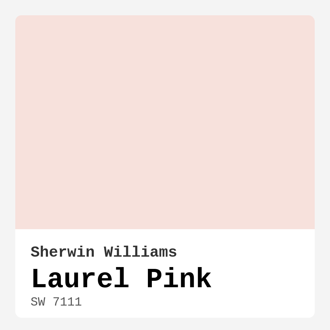
Color Preview & Key Details
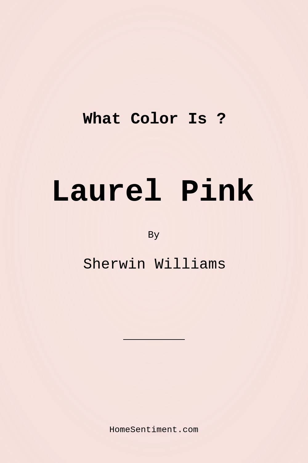
| HEX Code | #F7E1DC |
| RGB | 247, 225, 220 |
| LRV | 64% |
| Undertone | Red |
| Finish Options | Eggshell, Flat, Satin |
Imagine walking into a room that envelops you in warmth and comfort right from the moment you step through the door. You glance around and are greeted by soft, blush tones that exude tranquility. This is the magic of Laurel Pink by Sherwin Williams—a gentle, inviting hue that can transform your home into a serene retreat.
Laurel Pink (SW 7111) isn’t just a color; it’s an experience. With its light brightness and a delicate blush undertone, it strikes the perfect balance between playful and sophisticated. This paint color is perfect for a variety of spaces, from cozy bedrooms to lively living rooms. It adds that touch of warmth that makes a house feel like a home.
One of the first things you’ll notice about Laurel Pink is its versatility. It easily complements various decor styles, making it ideal whether your taste leans modern, vintage, shabby chic, or even Scandinavian. The soft undertones dance beautifully with natural light, providing a refreshing ambiance that can make any space feel larger and airier. With a light reflectance value (LRV) of 64%, it reflects a moderate amount of light, brightening the room without overwhelming it.
If you’re considering this hue for a small space, you’re making a wise choice. Not only does it help open up the area, but it also adds a cozy feel without closing off the room. Pair it with good lighting and thoughtful furnishings, and you’ll create an inviting environment that feels spacious and welcoming.
When it comes to application, Laurel Pink is beginner-friendly. Its smooth application and fast-drying properties mean that you can achieve a stunning finish in just one to two coats. Plus, it’s highly washable, which is a practical bonus for high-traffic areas or homes with kids and pets. You won’t have to stress about minor scuffs and marks ruining the aesthetic; a simple wipe will do the trick.
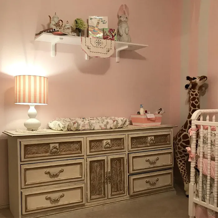
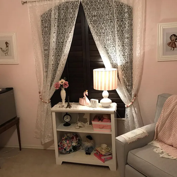
Now, let’s talk about its ideal rooms. Laurel Pink shines in bedrooms and nurseries, creating a peaceful space for rest and relaxation. It’s a gender-neutral option, making it a delightful choice for little ones’ rooms. Add playful accents and soft textiles, and you’ve got a nurturing environment that grows with your child.
In living rooms, Laurel Pink can be paired with whites or wooden accents for a fresh, modern touch. On the other hand, if you want to evoke a vintage vibe, consider layering it with floral patterns or eclectic decor. The color adapts beautifully to different styles, allowing you to express your personality through your space.
One thing to keep in mind is the color’s undertone—it’s leaning towards red. The subtle warmth this provides is essential for creating that inviting atmosphere we all desire in our homes. However, it’s crucial to test Laurel Pink in your space before committing. Observe how it interacts with your existing furniture and decor in various lighting conditions throughout the day. This way, you can truly appreciate its depth and complexity.
Speaking of lighting, Laurel Pink has an exceptional ability to change its appearance based on the light around it. In daylight, it feels airy and soft, while in the evening, it takes on a deeper, more romantic hue. This adaptability makes it a perfect choice for rooms used at different times of the day.
For those of you who appreciate a cohesive aesthetic, consider pairing Laurel Pink with complementary shades. Colors like SW 9675, SW 6497, and SW 6522 will enhance its warmth while maintaining a sophisticated palette. This creates an environment that feels harmonious and well-planned.
You might be wondering about its relationship with darker shades. While Laurel Pink can stand alone beautifully, it can also complement darker tones like SW 6603 and SW 6876. These combinations can add depth and contrast, making your design more dynamic and visually interesting.
Now, while the pros of Laurel Pink are numerous—like its warm and inviting nature, ease of application, and low VOC content—there are a few cons to consider. It may require two coats for full opacity, and it might not suit darker, more dramatic designs. If you’re looking for something bold and moody, Laurel Pink might not be your best bet. However, it excels in creating calm, serene spaces, which is perfect for those seeking a restful environment.
As an expert in home design, I can assure you that the choice of paint is crucial for achieving your desired mood and atmosphere. Laurel Pink’s cozy and calm vibe makes it a top contender for interiors focused on comfort and tranquility. Whether you’re refreshing a bedroom, transforming a nursery, or rethinking your living room, this shade has the potential to elevate your space.
In conclusion, Laurel Pink is more than just a color; it’s a way to create an inviting, peaceful sanctuary that reflects your personal style. Its versatility allows it to blend seamlessly with various decor styles while its warm undertones provide a comforting feel. So, as you plan your next home project, consider bringing Laurel Pink into your world. Your walls will thank you, and so will everyone who steps through your door. Whether you’re a seasoned designer or a DIY enthusiast, Laurel Pink is a choice that promises to deliver warmth, beauty, and a sense of home.
Real Room Photo of Laurel Pink SW 7111
Undertones of Laurel Pink ?
The undertones of Laurel Pink are a key aspect of its character, leaning towards Red. These subtle underlying hues are what give the color its depth and complexity. For example, a gray with a blue undertone will feel cooler and more modern, while one with a brown undertone will feel warmer and more traditional. It’s essential to test this paint in your home and observe it next to your existing furniture, flooring, and decor to see how these undertones interact and reveal themselves throughout the day.
HEX value: #F7E1DC
RGB code: 247, 225, 220
Is Laurel Pink Cool or Warm?
This color is predominantly warm, bringing a comforting feel to your interiors. It harmonizes well with warm neutrals and soft pastels, creating a cohesive aesthetic.
Understanding Color Properties and Interior Design Tips
Hue refers to a specific position on the color wheel, measured in degrees from 0 to 360. Each degree represents a different pure color:
- 0° represents red
- 120° represents green
- 240° represents blue
Saturation describes the intensity or purity of a color and is expressed as a percentage:
- At 0%, the color appears completely desaturated—essentially a shade of gray
- At 100%, the color is at its most vivid and vibrant
Lightness indicates how light or dark a color is, also expressed as a percentage:
- 0% lightness results in black
- 100% lightness results in white
Using Warm Colors in Interior Design
Warm hues—such as reds, oranges, yellows, warm beiges, and greiges—are excellent choices for creating inviting and energetic spaces. These colors are particularly well-suited for:
- Kitchens, living rooms, and bathrooms, where warmth enhances comfort and sociability
- Large rooms, where warm tones can help reduce the sense of emptiness and make the space feel more intimate
For example:
- Warm beige shades provide a cozy, inviting atmosphere, ideal for living rooms, bedrooms, and hallways.
- Warm greige (a mix of beige and gray) offers the warmth of beige with the modern appeal of gray, making it a versatile backdrop for dining areas, bedrooms, and living spaces.
However, be mindful when using warm light tones in rooms with limited natural light. These shades may appear muted or even take on an unpleasant yellowish tint. To avoid a dull or flat appearance:
- Add depth by incorporating richer tones like deep greens, charcoal, or chocolate brown
- Use textured elements such as curtains, rugs, or cushions to bring dimension to the space
Pro Tip: Achieving Harmony with Warm and Cool Color Balance
To create a well-balanced and visually interesting interior, mix warm and cool tones strategically. This contrast adds depth and harmony to your design.
- If your walls feature warm hues, introduce cool-colored accents such as blue or green furniture, artwork, or accessories to create contrast.
- For a polished look, consider using a complementary color scheme, which pairs colors opposite each other on the color wheel (e.g., red with green, orange with blue).
This thoughtful mix not only enhances visual appeal but also creates a space that feels both dynamic and cohesive.
Light Temperature Affects on Laurel Pink
Natural Light
Natural daylight changes in color temperature as the sun moves across the sky. At sunrise and sunset, the light tends to have a warm, golden tone with a color temperature around 2000 Kelvin (K). As the day progresses and the sun rises higher, the light becomes cooler and more neutral. Around midday, especially when the sky is clear, natural light typically reaches its peak brightness and shifts to a cooler tone, ranging from 5500 to 6500 Kelvin. This midday light is close to what we perceive as pure white or daylight-balanced light.
These shifts in natural light can significantly influence how colors appear in a space, which is why designers often consider both the time of day and the orientation of windows when planning interior color schemes.
Artificial Light
When choosing artificial lighting, pay close attention to the color temperature, measured in Kelvin (K). This determines how warm or cool the light will appear. Lower temperatures, around 2700K, give off a warm, yellow glow often used in living rooms or bedrooms. Higher temperatures, above 5000K, create a cool, bluish light similar to daylight, commonly used in kitchens, offices, or task areas.
Use the slider to see how lighting temperature can affect the appearance of a surface or color throughout a space.


4800K
LRV of Laurel Pink
The Light Reflectance Value (LRV) of Laurel Pink is 64%, which places it in the Medium category. This means it Reflects a moderate amount of light. Understanding a paint’s LRV is crucial for predicting how it will look in your space. A higher LRV indicates a lighter color that reflects more light, making rooms feel larger and brighter. A lower LRV signifies a darker color that absorbs more light, creating a cozier, more intimate atmosphere. Always consider the natural and artificial lighting in your room when selecting a paint color based on its LRV.
Detailed Review of Laurel Pink
Additional Paint Characteristics
Ideal Rooms
Bedroom, Dining Room, Home Office, Living Room, Nursery
Decor Styles
Modern, Scandinavian, Shabby Chic, Vintage
Coverage
Good (1–2 Coats), Touch-Up Friendly
Ease of Application
Beginner Friendly, Brush Smooth, Fast-Drying, Roller-Ready
Washability
Highly Washable, Washable, Wipeable
VOC Level
Eco-Certified, Low VOC
Best Use
Accent Wall, Bedroom, Interior Walls, Nursery
Room Suitability
Bedroom, Dining Room, Living Room, Nursery
Tone Tag
Muted, Pastel, Warm
Finish Type
Eggshell, Satin
Paint Performance
Easy Touch-Up, Low Odor, Quick Drying, Stain Resistant
Use Cases
Best for Rentals, Best for Small Spaces, Classic Favorite, Designer Favorite
Mood
Calm, Cozy, Inviting, Restful
Trim Pairing
Complements Brass Fixtures, Good with Wood Trim, Pairs with White Dove
Laurel Pink stands out for its versatility and charm. The soft blush undertones give a gentle warmth that can transform any room into a comforting oasis. Whether you’re looking to create a calming bedroom or a playful nursery, this color adapts beautifully to different styles. It’s particularly striking in spaces with natural light, where it can brighten up the room without overwhelming it. Application is smooth, and it dries evenly, requiring just one to two coats for a full finish. Pair it with whites or wooden accents for a modern touch, or go vintage with floral patterns for a more eclectic vibe. Overall, it’s a great choice for anyone wanting to add a hint of color without going overboard.
Pros & Cons of SW 7111 Laurel Pink
Pros
Cons
Colors that go with Sherwin Williams Laurel Pink
FAQ on SW 7111 Laurel Pink
Is Laurel Pink suitable for small spaces?
Absolutely! Laurel Pink is a fantastic choice for small spaces. Its light reflectance value helps to open up the area, making it feel larger and more inviting. The warm undertones add a cozy feel without closing off the room. Just ensure you complement it with good lighting and appropriate furnishings to maximize the effect.
Can I use Laurel Pink in a nursery?
Definitely! Laurel Pink is perfect for nurseries. Its soft, calming hue promotes a tranquil environment for your little one. Plus, it’s a gender-neutral option that can grow with your child. Pair it with playful accents and soft textiles for a delightful and nurturing space.
Comparisons Laurel Pink with other colors
Laurel Pink SW 7111 vs Malted Milk SW 6057
| Attribute | Laurel Pink SW 7111 | Malted Milk SW 6057 |
|---|---|---|
| Color Name | Laurel Pink SW 7111 | Malted Milk SW 6057 |
| Color | ||
| Hue | Pink | Pink |
| Brightness | Light | Light |
| RGB | 247, 225, 220 | 222, 202, 189 |
| LRV | 64% | 74% |
| Finish Type | Eggshell, Satin | Eggshell, Satin |
| Finish Options | Eggshell, Flat, Satin | Eggshell, Matte, Satin |
| Ideal Rooms | Bedroom, Dining Room, Home Office, Living Room, Nursery | Bedroom, Dining Room, Kitchen, Living Room, Nursery |
| Decor Styles | Modern, Scandinavian, Shabby Chic, Vintage | Coastal, Farmhouse, Modern, Scandinavian, Transitional |
| Coverage | Good (1–2 Coats), Touch-Up Friendly | Good (1–2 Coats), Touch-Up Friendly |
| Ease of Application | Beginner Friendly, Brush Smooth, Fast-Drying, Roller-Ready | Beginner Friendly, Brush Smooth, Fast-Drying, Roller-Ready |
| Washability | Highly Washable, Washable, Wipeable | Washable, Wipeable |
| Room Suitability | Bedroom, Dining Room, Living Room, Nursery | Bedroom, Dining Room, Kitchen, Living Room, Nursery |
| Tone | Muted, Pastel, Warm | Creamy, Neutral, Warm |
| Paint Performance | Easy Touch-Up, Low Odor, Quick Drying, Stain Resistant | High Coverage, Low Odor, Quick Drying |
Laurel Pink SW 7111 vs Intimate White SW 6322
| Attribute | Laurel Pink SW 7111 | Intimate White SW 6322 |
|---|---|---|
| Color Name | Laurel Pink SW 7111 | Intimate White SW 6322 |
| Color | ||
| Hue | Pink | Pink |
| Brightness | Light | Light |
| RGB | 247, 225, 220 | 240, 225, 216 |
| LRV | 64% | 75% |
| Finish Type | Eggshell, Satin | Eggshell, Matte, Satin |
| Finish Options | Eggshell, Flat, Satin | Eggshell, Matte, Satin |
| Ideal Rooms | Bedroom, Dining Room, Home Office, Living Room, Nursery | Bedroom, Hallway, Home Office, Living Room, Nursery |
| Decor Styles | Modern, Scandinavian, Shabby Chic, Vintage | Farmhouse, Minimalist, Modern, Traditional |
| Coverage | Good (1–2 Coats), Touch-Up Friendly | Good (1–2 Coats) |
| Ease of Application | Beginner Friendly, Brush Smooth, Fast-Drying, Roller-Ready | Beginner Friendly, Brush Smooth, Roller-Ready |
| Washability | Highly Washable, Washable, Wipeable | Highly Washable, Washable |
| Room Suitability | Bedroom, Dining Room, Living Room, Nursery | Bedroom, Hallway, Living Room, Nursery |
| Tone | Muted, Pastel, Warm | Creamy, Muted, Warm |
| Paint Performance | Easy Touch-Up, Low Odor, Quick Drying, Stain Resistant | Easy Touch-Up, Fade Resistant, Low Odor |
Laurel Pink SW 7111 vs Abalone Shell SW 6050
| Attribute | Laurel Pink SW 7111 | Abalone Shell SW 6050 |
|---|---|---|
| Color Name | Laurel Pink SW 7111 | Abalone Shell SW 6050 |
| Color | ||
| Hue | Pink | Pink |
| Brightness | Light | Light |
| RGB | 247, 225, 220 | 219, 199, 189 |
| LRV | 64% | 30% |
| Finish Type | Eggshell, Satin | Eggshell, Matte, Satin |
| Finish Options | Eggshell, Flat, Satin | Eggshell, Matte, Satin |
| Ideal Rooms | Bedroom, Dining Room, Home Office, Living Room, Nursery | Bedroom, Dining Room, Home Office, Living Room |
| Decor Styles | Modern, Scandinavian, Shabby Chic, Vintage | Coastal, Farmhouse, Minimalist, Modern, Traditional |
| Coverage | Good (1–2 Coats), Touch-Up Friendly | Good (1–2 Coats), Touch-Up Friendly |
| Ease of Application | Beginner Friendly, Brush Smooth, Fast-Drying, Roller-Ready | Beginner Friendly, Brush Smooth, Fast-Drying, Roller-Ready |
| Washability | Highly Washable, Washable, Wipeable | Washable, Wipeable |
| Room Suitability | Bedroom, Dining Room, Living Room, Nursery | Bedroom, Dining Room, Home Office, Living Room |
| Tone | Muted, Pastel, Warm | Balanced, Muted, Warm |
| Paint Performance | Easy Touch-Up, Low Odor, Quick Drying, Stain Resistant | Easy Touch-Up, Fade Resistant, Low Odor, Quick Drying |
Laurel Pink SW 7111 vs White Truffle SW 6029
| Attribute | Laurel Pink SW 7111 | White Truffle SW 6029 |
|---|---|---|
| Color Name | Laurel Pink SW 7111 | White Truffle SW 6029 |
| Color | ||
| Hue | Pink | Pink |
| Brightness | Light | Light |
| RGB | 247, 225, 220 | 215, 200, 194 |
| LRV | 64% | 48% |
| Finish Type | Eggshell, Satin | Eggshell, Satin |
| Finish Options | Eggshell, Flat, Satin | Eggshell, Flat, Matte, Satin |
| Ideal Rooms | Bedroom, Dining Room, Home Office, Living Room, Nursery | Bedroom, Dining Room, Hallway, Kitchen, Living Room |
| Decor Styles | Modern, Scandinavian, Shabby Chic, Vintage | Eclectic, Farmhouse, Modern, Traditional |
| Coverage | Good (1–2 Coats), Touch-Up Friendly | Good (1–2 Coats), Touch-Up Friendly |
| Ease of Application | Beginner Friendly, Brush Smooth, Fast-Drying, Roller-Ready | Beginner Friendly, Brush Smooth, Roller-Ready |
| Washability | Highly Washable, Washable, Wipeable | Washable, Wipeable |
| Room Suitability | Bedroom, Dining Room, Living Room, Nursery | Bedroom, Dining Room, Hallway, Living Room |
| Tone | Muted, Pastel, Warm | Earthy, Neutral, Warm |
| Paint Performance | Easy Touch-Up, Low Odor, Quick Drying, Stain Resistant | Easy Touch-Up, Low Odor, Scuff Resistant |
Laurel Pink SW 7111 vs Faint Coral SW 6329
| Attribute | Laurel Pink SW 7111 | Faint Coral SW 6329 |
|---|---|---|
| Color Name | Laurel Pink SW 7111 | Faint Coral SW 6329 |
| Color | ||
| Hue | Pink | Pink |
| Brightness | Light | Light |
| RGB | 247, 225, 220 | 238, 222, 213 |
| LRV | 64% | 66% |
| Finish Type | Eggshell, Satin | Eggshell, Matte, Satin |
| Finish Options | Eggshell, Flat, Satin | Eggshell, Matte, Satin |
| Ideal Rooms | Bedroom, Dining Room, Home Office, Living Room, Nursery | Bedroom, Dining Room, Hallway, Living Room, Nursery |
| Decor Styles | Modern, Scandinavian, Shabby Chic, Vintage | Bohemian, Coastal, Modern Farmhouse, Scandinavian, Vintage |
| Coverage | Good (1–2 Coats), Touch-Up Friendly | Good (1–2 Coats), Touch-Up Friendly |
| Ease of Application | Beginner Friendly, Brush Smooth, Fast-Drying, Roller-Ready | Beginner Friendly, Brush Smooth, Fast-Drying, Roller-Ready |
| Washability | Highly Washable, Washable, Wipeable | Washable, Wipeable |
| Room Suitability | Bedroom, Dining Room, Living Room, Nursery | Bedroom, Dining Room, Hallway, Living Room, Nursery |
| Tone | Muted, Pastel, Warm | Airy, Muted, Pastel, Warm |
| Paint Performance | Easy Touch-Up, Low Odor, Quick Drying, Stain Resistant | Easy Touch-Up, Low Odor, Quick Drying |
Laurel Pink SW 7111 vs Romance SW 6323
| Attribute | Laurel Pink SW 7111 | Romance SW 6323 |
|---|---|---|
| Color Name | Laurel Pink SW 7111 | Romance SW 6323 |
| Color | ||
| Hue | Pink | Pink |
| Brightness | Light | Light |
| RGB | 247, 225, 220 | 235, 207, 195 |
| LRV | 64% | 69% |
| Finish Type | Eggshell, Satin | Eggshell, Matte |
| Finish Options | Eggshell, Flat, Satin | Eggshell, Flat, Matte, Satin |
| Ideal Rooms | Bedroom, Dining Room, Home Office, Living Room, Nursery | Bedroom, Dining Room, Living Room, Nursery |
| Decor Styles | Modern, Scandinavian, Shabby Chic, Vintage | Bohemian, Modern, Shabby Chic, Vintage |
| Coverage | Good (1–2 Coats), Touch-Up Friendly | Good (1–2 Coats), Touch-Up Friendly |
| Ease of Application | Beginner Friendly, Brush Smooth, Fast-Drying, Roller-Ready | Beginner Friendly, Brush Smooth, Fast-Drying, Roller-Ready |
| Washability | Highly Washable, Washable, Wipeable | Washable, Wipeable |
| Room Suitability | Bedroom, Dining Room, Living Room, Nursery | Bedroom, Dining Room, Living Room, Nursery |
| Tone | Muted, Pastel, Warm | Pastel, Soft, Warm |
| Paint Performance | Easy Touch-Up, Low Odor, Quick Drying, Stain Resistant | Easy Touch-Up, Low Odor, Quick Drying |
Laurel Pink SW 7111 vs Innocence SW 6302
| Attribute | Laurel Pink SW 7111 | Innocence SW 6302 |
|---|---|---|
| Color Name | Laurel Pink SW 7111 | Innocence SW 6302 |
| Color | ||
| Hue | Pink | Pink |
| Brightness | Light | Light |
| RGB | 247, 225, 220 | 235, 209, 207 |
| LRV | 64% | 75% |
| Finish Type | Eggshell, Satin | Eggshell, Matte |
| Finish Options | Eggshell, Flat, Satin | Eggshell, Matte, Satin |
| Ideal Rooms | Bedroom, Dining Room, Home Office, Living Room, Nursery | Bedroom, Dining Room, Living Room, Nursery |
| Decor Styles | Modern, Scandinavian, Shabby Chic, Vintage | Bohemian, Modern Farmhouse, Scandinavian, Shabby Chic |
| Coverage | Good (1–2 Coats), Touch-Up Friendly | Good (1–2 Coats), Touch-Up Friendly |
| Ease of Application | Beginner Friendly, Brush Smooth, Fast-Drying, Roller-Ready | Beginner Friendly, Brush Smooth, Roller-Ready |
| Washability | Highly Washable, Washable, Wipeable | Washable, Wipeable |
| Room Suitability | Bedroom, Dining Room, Living Room, Nursery | Bedroom, Dining Room, Living Room, Nursery |
| Tone | Muted, Pastel, Warm | Pastel, Soft, Warm |
| Paint Performance | Easy Touch-Up, Low Odor, Quick Drying, Stain Resistant | Easy Touch-Up, Fade Resistant, Low Odor |
Laurel Pink SW 7111 vs Angelic SW 6602
| Attribute | Laurel Pink SW 7111 | Angelic SW 6602 |
|---|---|---|
| Color Name | Laurel Pink SW 7111 | Angelic SW 6602 |
| Color | ||
| Hue | Pink | Pink |
| Brightness | Light | Light |
| RGB | 247, 225, 220 | 242, 220, 215 |
| LRV | 64% | 75% |
| Finish Type | Eggshell, Satin | Eggshell, Satin |
| Finish Options | Eggshell, Flat, Satin | Eggshell, Flat, Matte, Satin |
| Ideal Rooms | Bedroom, Dining Room, Home Office, Living Room, Nursery | Bedroom, Dining Room, Home Office, Living Room, Nursery |
| Decor Styles | Modern, Scandinavian, Shabby Chic, Vintage | Bohemian, Farmhouse, Modern, Transitional |
| Coverage | Good (1–2 Coats), Touch-Up Friendly | Good (1–2 Coats), Touch-Up Friendly |
| Ease of Application | Beginner Friendly, Brush Smooth, Fast-Drying, Roller-Ready | Beginner Friendly, Brush Smooth, Roller-Ready |
| Washability | Highly Washable, Washable, Wipeable | Washable, Wipeable |
| Room Suitability | Bedroom, Dining Room, Living Room, Nursery | Bedroom, Home Office, Living Room, Nursery |
| Tone | Muted, Pastel, Warm | Airy, Pastel, Warm |
| Paint Performance | Easy Touch-Up, Low Odor, Quick Drying, Stain Resistant | Easy Touch-Up, Fade Resistant, Low Odor |
Laurel Pink SW 7111 vs Rosy Outlook SW 6316
| Attribute | Laurel Pink SW 7111 | Rosy Outlook SW 6316 |
|---|---|---|
| Color Name | Laurel Pink SW 7111 | Rosy Outlook SW 6316 |
| Color | ||
| Hue | Pink | Pink |
| Brightness | Light | Light |
| RGB | 247, 225, 220 | 235, 206, 203 |
| LRV | 64% | 45% |
| Finish Type | Eggshell, Satin | Eggshell, Matte, Satin |
| Finish Options | Eggshell, Flat, Satin | Eggshell, Matte, Satin |
| Ideal Rooms | Bedroom, Dining Room, Home Office, Living Room, Nursery | Bedroom, Home Office, Living Room, Nursery |
| Decor Styles | Modern, Scandinavian, Shabby Chic, Vintage | Bohemian, Cottage, Modern, Traditional |
| Coverage | Good (1–2 Coats), Touch-Up Friendly | Good (1–2 Coats), Touch-Up Friendly |
| Ease of Application | Beginner Friendly, Brush Smooth, Fast-Drying, Roller-Ready | Beginner Friendly, Brush Smooth, Roller-Ready |
| Washability | Highly Washable, Washable, Wipeable | Scuff Resistant, Washable, Wipeable |
| Room Suitability | Bedroom, Dining Room, Living Room, Nursery | Bedroom, Home Office, Living Room, Nursery |
| Tone | Muted, Pastel, Warm | Muted, Pastel, Warm |
| Paint Performance | Easy Touch-Up, Low Odor, Quick Drying, Stain Resistant | High Coverage, Low Odor, Quick Drying |
Laurel Pink SW 7111 vs Demure SW 6295
| Attribute | Laurel Pink SW 7111 | Demure SW 6295 |
|---|---|---|
| Color Name | Laurel Pink SW 7111 | Demure SW 6295 |
| Color | ||
| Hue | Pink | Pink |
| Brightness | Light | Light |
| RGB | 247, 225, 220 | 232, 212, 213 |
| LRV | 64% | 50% |
| Finish Type | Eggshell, Satin | Eggshell, Matte |
| Finish Options | Eggshell, Flat, Satin | Eggshell, Matte, Satin |
| Ideal Rooms | Bedroom, Dining Room, Home Office, Living Room, Nursery | Bedroom, Home Office, Living Room, Nursery |
| Decor Styles | Modern, Scandinavian, Shabby Chic, Vintage | Minimalist, Modern, Shabby Chic, Transitional |
| Coverage | Good (1–2 Coats), Touch-Up Friendly | Good (1–2 Coats), Touch-Up Friendly |
| Ease of Application | Beginner Friendly, Brush Smooth, Fast-Drying, Roller-Ready | Beginner Friendly, Brush Smooth, Roller-Ready |
| Washability | Highly Washable, Washable, Wipeable | Washable, Wipeable |
| Room Suitability | Bedroom, Dining Room, Living Room, Nursery | Bedroom, Home Office, Living Room, Nursery |
| Tone | Muted, Pastel, Warm | Muted, Pastel, Warm |
| Paint Performance | Easy Touch-Up, Low Odor, Quick Drying, Stain Resistant | Easy Touch-Up, Low Odor, Quick Drying |
Official Page of Sherwin Williams Laurel Pink SW 7111