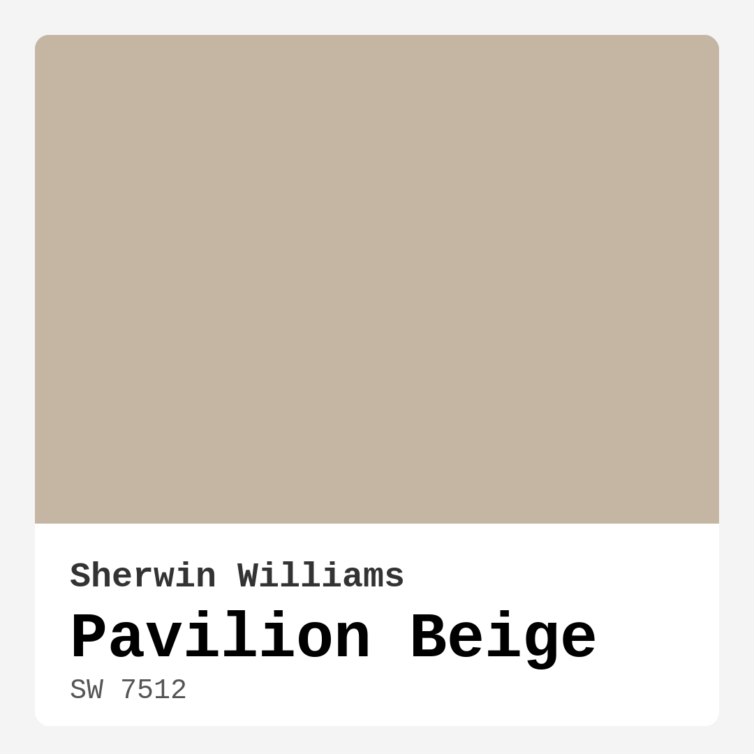
Color Preview & Key Details
| HEX Code | #C5B6A4 |
| RGB | 197, 182, 164 |
| LRV | 64% |
| Undertone | Red |
| Finish Options | Eggshell, Matte, Satin |
Imagine stepping into a space that feels both warm and welcoming, a place that effortlessly combines comfort with style. That’s the magic of Pavilion Beige from Sherwin Williams. This color has a way of wrapping around you like a cozy blanket, making it perfect for any room in your home. But how do you know if it’s the right choice for your project? Let’s dive into everything you need to know about this versatile hue.
Pavilion Beige, with the color code SW 7512, strikes a beautiful balance between cream and taupe. It’s a soft, warm neutral that’s designed to foster an inviting atmosphere without overwhelming your decor. With its subtly rich undertones, predominantly leaning towards red, this color adds depth and character to your walls. Whether you’re redesigning a living room or a cozy bedroom, Pavilion Beige can seamlessly integrate into your vision.
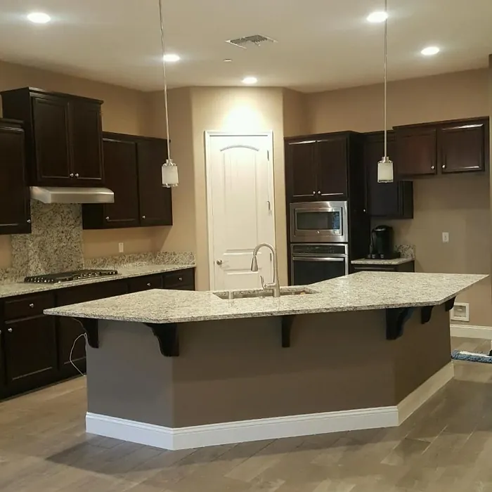
One of the best features of Pavilion Beige is its adaptability. It works wonderfully in various decor styles, including modern, traditional, transitional, and farmhouse. This flexibility makes it an ideal choice for homeowners looking to create a cohesive look throughout their spaces. Picture a modern farmhouse kitchen complemented by wood accents, or a traditional dining room that feels fresh and updated. Pavilion Beige can do it all.
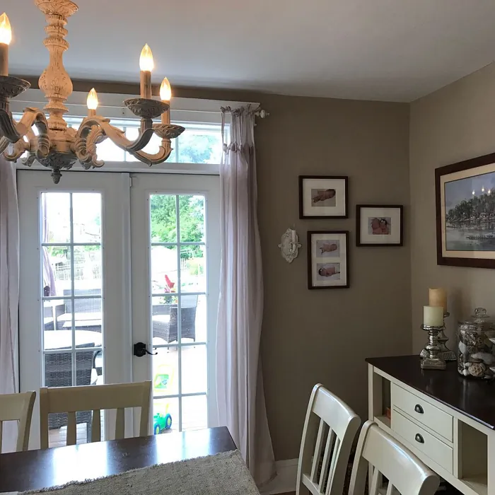
When you’re considering paint colors, it’s essential to think about the mood you want to create. Pavilion Beige brings a cozy, inviting vibe that feels restful and warm. It’s perfect for spaces where you want to unwind after a long day or entertain friends and family. Imagine a living room painted in this hue, filled with soft furniture and rich textures, creating an environment where conversation flows easily and laughter fills the air.
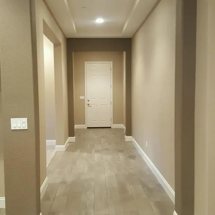
You might be wondering how this color performs in different lighting conditions. Pavilion Beige shines in both natural and artificial light. In daylight, it reflects a moderate amount of light thanks to its Light Reflectance Value (LRV) of 64%. This means it brightens up a room without becoming too harsh or overwhelming. Under artificial lighting, the color retains its warm, inviting quality, making your space feel like a haven no matter the time of day.
Now, let’s talk about application. Pavilion Beige is beginner-friendly, meaning even if you’re not a seasoned DIYer, you can achieve a smooth finish. It’s roller-ready and brush-smooth, allowing you to apply it with ease. Most users find that applying one to two coats yields excellent coverage, making touch-ups a breeze. And if you’re concerned about the environment, you’ll appreciate that this paint has a low VOC level, making it a healthier choice for your home.
While the positives are plentiful, it’s essential to consider potential drawbacks. Pavilion Beige can appear darker in small, poorly lit spaces, so keep that in mind if you’re working with a compact room. To enhance brightness, pair it with lighter accents or trim, which can help elevate the overall feel. Additionally, some users might find themselves leaning towards cooler neutrals, so it’s crucial to test this color in your space to see how it interacts with your existing decor.
If you’re looking to create a harmonious palette, Pavilion Beige pairs beautifully with a range of complementary shades. Think about incorporating colors like SW 7625 or SW 9139 for a pop of richness. For those softer touches, consider pairing it with whites like White Dove or natural wood tones that enhance its warmth. This color is a fantastic backdrop for showcasing artwork and decor, allowing those pieces to shine.
When it comes to specific rooms, Pavilion Beige is ideal for living rooms, bedrooms, dining rooms, and hallways. It can serve as a lovely accent wall in a larger space or a full-room color that wraps you in comfort. For an entryway, this hue can create a welcoming first impression, setting the tone for the rest of your home.
You might be asking yourself how Pavilion Beige compares with other neutrals out there. It’s unique in its warmth, sitting comfortably between cream and taupe while providing a softer, more inviting feel than cooler options like Revere Pewter or Balboa Mist. If you want a neutral that feels both timeless and modern, Pavilion Beige is a fantastic choice.
As you embark on your painting project, remember to test the color in your home. Observe it at different times of the day, in various lighting conditions. This will help you see how Pavilion Beige interacts with your existing furniture and decor. The undertones will reveal themselves differently throughout the day, so take your time with this step to ensure you’re making the right decision.
In terms of finishes, Pavilion Beige offers a variety of options. Choose from matte, eggshell, or satin, depending on the look you’re going for and the room’s function. A matte finish can give a cozy, rustic vibe, while an eggshell or satin finish can provide a slight sheen, making your walls easier to clean and maintain.
In conclusion, Pavilion Beige is more than just a paint color—it’s an invitation to create a beautiful, personalized space. Its warm undertones, versatility, and inviting nature make it an excellent choice for various rooms and decor styles. Whether you’re refreshing a single room or undertaking a whole-home makeover, this color can elevate your interior design while ensuring your home feels like a comforting retreat.
So, are you ready to embrace the warmth of Pavilion Beige? It’s a color that can transform your space into something extraordinary, creating an atmosphere that feels just right. Happy painting!
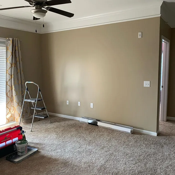
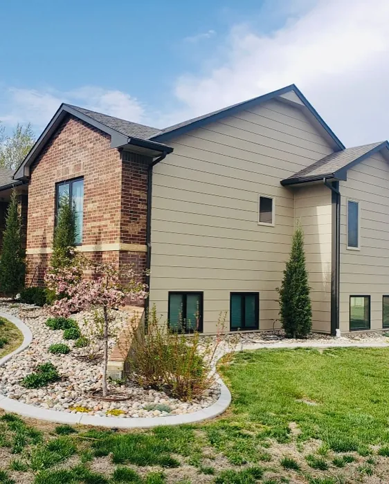
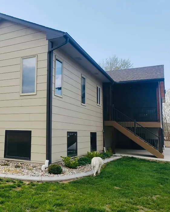
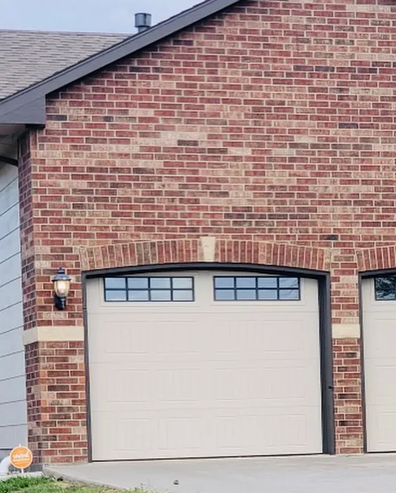
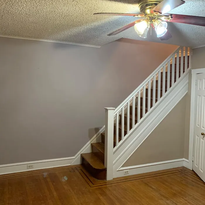
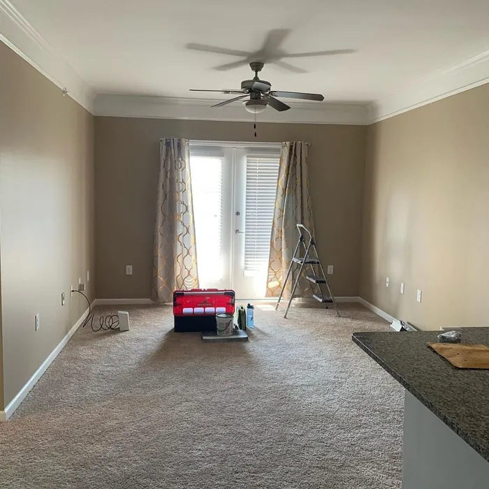
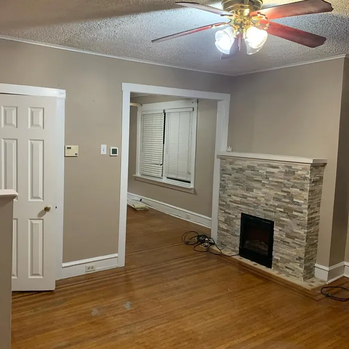
Real Room Photo of Pavilion Beige SW 7512


Undertones of Pavilion Beige ?
The undertones of Pavilion Beige are a key aspect of its character, leaning towards Red. These subtle underlying hues are what give the color its depth and complexity. For example, a gray with a blue undertone will feel cooler and more modern, while one with a brown undertone will feel warmer and more traditional. It’s essential to test this paint in your home and observe it next to your existing furniture, flooring, and decor to see how these undertones interact and reveal themselves throughout the day.
HEX value: #C5B6A4
RGB code: 197, 182, 164
Is Pavilion Beige Cool or Warm?
Pavilion Beige leans towards the warm side of the spectrum, giving off a cozy and inviting atmosphere. This warmth makes it particularly appealing for living spaces where comfort is key.
Understanding Color Properties and Interior Design Tips
Hue refers to a specific position on the color wheel, measured in degrees from 0 to 360. Each degree represents a different pure color:
- 0° represents red
- 120° represents green
- 240° represents blue
Saturation describes the intensity or purity of a color and is expressed as a percentage:
- At 0%, the color appears completely desaturated—essentially a shade of gray
- At 100%, the color is at its most vivid and vibrant
Lightness indicates how light or dark a color is, also expressed as a percentage:
- 0% lightness results in black
- 100% lightness results in white
Using Warm Colors in Interior Design
Warm hues—such as reds, oranges, yellows, warm beiges, and greiges—are excellent choices for creating inviting and energetic spaces. These colors are particularly well-suited for:
- Kitchens, living rooms, and bathrooms, where warmth enhances comfort and sociability
- Large rooms, where warm tones can help reduce the sense of emptiness and make the space feel more intimate
For example:
- Warm beige shades provide a cozy, inviting atmosphere, ideal for living rooms, bedrooms, and hallways.
- Warm greige (a mix of beige and gray) offers the warmth of beige with the modern appeal of gray, making it a versatile backdrop for dining areas, bedrooms, and living spaces.
However, be mindful when using warm light tones in rooms with limited natural light. These shades may appear muted or even take on an unpleasant yellowish tint. To avoid a dull or flat appearance:
- Add depth by incorporating richer tones like deep greens, charcoal, or chocolate brown
- Use textured elements such as curtains, rugs, or cushions to bring dimension to the space
Pro Tip: Achieving Harmony with Warm and Cool Color Balance
To create a well-balanced and visually interesting interior, mix warm and cool tones strategically. This contrast adds depth and harmony to your design.
- If your walls feature warm hues, introduce cool-colored accents such as blue or green furniture, artwork, or accessories to create contrast.
- For a polished look, consider using a complementary color scheme, which pairs colors opposite each other on the color wheel (e.g., red with green, orange with blue).
This thoughtful mix not only enhances visual appeal but also creates a space that feels both dynamic and cohesive.

Light Temperature Affects on Pavilion Beige
Natural Light
Natural daylight changes in color temperature as the sun moves across the sky. At sunrise and sunset, the light tends to have a warm, golden tone with a color temperature around 2000 Kelvin (K). As the day progresses and the sun rises higher, the light becomes cooler and more neutral. Around midday, especially when the sky is clear, natural light typically reaches its peak brightness and shifts to a cooler tone, ranging from 5500 to 6500 Kelvin. This midday light is close to what we perceive as pure white or daylight-balanced light.
These shifts in natural light can significantly influence how colors appear in a space, which is why designers often consider both the time of day and the orientation of windows when planning interior color schemes.
Artificial Light
When choosing artificial lighting, pay close attention to the color temperature, measured in Kelvin (K). This determines how warm or cool the light will appear. Lower temperatures, around 2700K, give off a warm, yellow glow often used in living rooms or bedrooms. Higher temperatures, above 5000K, create a cool, bluish light similar to daylight, commonly used in kitchens, offices, or task areas.
Use the slider to see how lighting temperature can affect the appearance of a surface or color throughout a space.


4800K
LRV of Pavilion Beige
The Light Reflectance Value (LRV) of Pavilion Beige is 64%, which places it in the Medium category. This means it Reflects a moderate amount of light. Understanding a paint’s LRV is crucial for predicting how it will look in your space. A higher LRV indicates a lighter color that reflects more light, making rooms feel larger and brighter. A lower LRV signifies a darker color that absorbs more light, creating a cozier, more intimate atmosphere. Always consider the natural and artificial lighting in your room when selecting a paint color based on its LRV.
Detailed Review of Pavilion Beige
Additional Paint Characteristics
Ideal Rooms
Bedroom, Dining Room, Entryway, Living Room
Decor Styles
Farmhouse, Modern, Traditional, Transitional
Coverage
Good (1–2 Coats), Touch-Up Friendly
Ease of Application
Beginner Friendly, Brush Smooth, Roller-Ready
Washability
Scrubbable, Washable
VOC Level
Low VOC
Best Use
Accent Wall, Interior Walls, Open Concept Spaces
Room Suitability
Bedroom, Dining Room, Hallway, Living Room
Tone Tag
Earthy, Neutral, Warm
Finish Type
Eggshell, Matte, Satin
Paint Performance
Easy Touch-Up, Low Odor, Scuff Resistant
Use Cases
Best for Modern Farmhouse, Best for Rentals, Classic Favorite
Mood
Cozy, Inviting, Restful
Trim Pairing
Complements Brass Fixtures, Good with Wood Trim, Pairs with White Dove
Pavilion Beige stands out as an incredibly versatile paint choice for your home. Its warm undertones lend a cozy vibe, making it ideal for spaces where you want to foster relaxation and comfort. Whether you’re painting a large open area or a more intimate setting, this color adapts seamlessly, enhancing both light and shadow play. Users often report that it pairs beautifully with a range of accent colors, allowing for creative freedom in your decorating choices. While it offers solid coverage, expect to apply two coats for the best results, especially on darker surfaces. Overall, Pavilion Beige is a reliable, stylish option that can elevate any room’s aesthetic.
Pros & Cons of SW 7512 Pavilion Beige
Pros
Cons
Colors that go with Sherwin Williams Pavilion Beige
FAQ on SW 7512 Pavilion Beige
Can Pavilion Beige be used in small rooms?
Absolutely! Pavilion Beige can work wonders in small rooms, as its warm tones help create an inviting and cozy atmosphere. However, be mindful of lighting; if the space lacks natural light, it might appear darker. To enhance brightness, consider pairing it with lighter accents or trim.
How does Pavilion Beige compare to other neutrals?
Pavilion Beige strikes a unique balance between cream and taupe, making it warmer than many grays or cool neutrals. Compared to other popular options like Revere Pewter, it offers a softer, more inviting feel. It’s perfect for those who want a neutral that feels both timeless and modern.
Comparisons Pavilion Beige with other colors
Pavilion Beige SW 7512 vs Bungalow Beige SW 7511
| Attribute | Pavilion Beige SW 7512 | Bungalow Beige SW 7511 |
|---|---|---|
| Color Name | Pavilion Beige SW 7512 | Bungalow Beige SW 7511 |
| Color | ||
| Hue | Beige | Beige |
| Brightness | Medium | Medium |
| RGB | 197, 182, 164 | 205, 191, 176 |
| LRV | 64% | 45% |
| Finish Type | Eggshell, Matte, Satin | Eggshell, Satin |
| Finish Options | Eggshell, Matte, Satin | Eggshell, Matte, Satin |
| Ideal Rooms | Bedroom, Dining Room, Entryway, Living Room | Bedroom, Dining Room, Hallway, Home Office, Living Room |
| Decor Styles | Farmhouse, Modern, Traditional, Transitional | Bohemian, Coastal, Modern Farmhouse, Rustic, Transitional |
| Coverage | Good (1–2 Coats), Touch-Up Friendly | Good (1–2 Coats), Touch-Up Friendly |
| Ease of Application | Beginner Friendly, Brush Smooth, Roller-Ready | Beginner Friendly, Brush Smooth, Roller-Ready |
| Washability | Scrubbable, Washable | Washable, Wipeable |
| Room Suitability | Bedroom, Dining Room, Hallway, Living Room | Bedroom, Dining Room, Hallway, Home Office, Living Room |
| Tone | Earthy, Neutral, Warm | Earthy, Neutral, Warm |
| Paint Performance | Easy Touch-Up, Low Odor, Scuff Resistant | Easy Touch-Up, Fade Resistant, Low Odor |
Pavilion Beige SW 7512 vs Shiitake SW 9173
| Attribute | Pavilion Beige SW 7512 | Shiitake SW 9173 |
|---|---|---|
| Color Name | Pavilion Beige SW 7512 | Shiitake SW 9173 |
| Color | ||
| Hue | Beige | Beige |
| Brightness | Medium | Medium |
| RGB | 197, 182, 164 | 200, 188, 171 |
| LRV | 64% | 24% |
| Finish Type | Eggshell, Matte, Satin | Eggshell, Matte, Satin |
| Finish Options | Eggshell, Matte, Satin | Eggshell, Matte, Satin |
| Ideal Rooms | Bedroom, Dining Room, Entryway, Living Room | Bedroom, Dining Room, Home Office, Kitchen, Living Room |
| Decor Styles | Farmhouse, Modern, Traditional, Transitional | Contemporary, Eclectic, Modern Farmhouse, Rustic, Traditional |
| Coverage | Good (1–2 Coats), Touch-Up Friendly | Good (1–2 Coats), Touch-Up Friendly |
| Ease of Application | Beginner Friendly, Brush Smooth, Roller-Ready | Beginner Friendly, Brush Smooth, Roller-Ready |
| Washability | Scrubbable, Washable | Highly Washable, Washable |
| Room Suitability | Bedroom, Dining Room, Hallway, Living Room | Bedroom, Dining Room, Home Office, Kitchen, Living Room |
| Tone | Earthy, Neutral, Warm | Earthy, Neutral, Warm |
| Paint Performance | Easy Touch-Up, Low Odor, Scuff Resistant | Easy Touch-Up, High Coverage, Low Odor, Scuff Resistant |
Pavilion Beige SW 7512 vs Malabar SW 9110
| Attribute | Pavilion Beige SW 7512 | Malabar SW 9110 |
|---|---|---|
| Color Name | Pavilion Beige SW 7512 | Malabar SW 9110 |
| Color | ||
| Hue | Beige | Beige |
| Brightness | Medium | Medium |
| RGB | 197, 182, 164 | 207, 190, 169 |
| LRV | 64% | 12% |
| Finish Type | Eggshell, Matte, Satin | Eggshell, Matte, Satin |
| Finish Options | Eggshell, Matte, Satin | Eggshell, Matte, Satin |
| Ideal Rooms | Bedroom, Dining Room, Entryway, Living Room | Bedroom, Dining Room, Home Office, Living Room, Nursery |
| Decor Styles | Farmhouse, Modern, Traditional, Transitional | Coastal, Farmhouse, Modern, Rustic, Traditional |
| Coverage | Good (1–2 Coats), Touch-Up Friendly | Good (1–2 Coats), Touch-Up Friendly |
| Ease of Application | Beginner Friendly, Brush Smooth, Roller-Ready | Beginner Friendly, Brush Smooth, Fast-Drying, Roller-Ready |
| Washability | Scrubbable, Washable | Washable, Wipeable |
| Room Suitability | Bedroom, Dining Room, Hallway, Living Room | Bedroom, Dining Room, Home Office, Living Room |
| Tone | Earthy, Neutral, Warm | Earthy, Neutral, Warm |
| Paint Performance | Easy Touch-Up, Low Odor, Scuff Resistant | Easy Touch-Up, High Coverage, Low Odor, Quick Drying |
Pavilion Beige SW 7512 vs Stone Lion SW 7507
| Attribute | Pavilion Beige SW 7512 | Stone Lion SW 7507 |
|---|---|---|
| Color Name | Pavilion Beige SW 7512 | Stone Lion SW 7507 |
| Color | ||
| Hue | Beige | Beige |
| Brightness | Medium | Medium |
| RGB | 197, 182, 164 | 179, 164, 145 |
| LRV | 64% | 48% |
| Finish Type | Eggshell, Matte, Satin | Eggshell, Matte |
| Finish Options | Eggshell, Matte, Satin | Eggshell, Matte, Satin |
| Ideal Rooms | Bedroom, Dining Room, Entryway, Living Room | Bedroom, Dining Room, Home Office, Kitchen, Living Room |
| Decor Styles | Farmhouse, Modern, Traditional, Transitional | Bohemian, Classic, Minimalist, Modern Farmhouse, Transitional |
| Coverage | Good (1–2 Coats), Touch-Up Friendly | Good (1–2 Coats), Touch-Up Friendly |
| Ease of Application | Beginner Friendly, Brush Smooth, Roller-Ready | Beginner Friendly, Fast-Drying, Low Splatter, Roller-Ready |
| Washability | Scrubbable, Washable | Washable, Wipeable |
| Room Suitability | Bedroom, Dining Room, Hallway, Living Room | Bedroom, Dining Room, Home Office, Kitchen, Living Room |
| Tone | Earthy, Neutral, Warm | Earthy, Muted, Neutral, Warm |
| Paint Performance | Easy Touch-Up, Low Odor, Scuff Resistant | Easy Touch-Up, Long Lasting, Low Odor, Scuff Resistant |
Pavilion Beige SW 7512 vs Kilim Beige SW 6106
| Attribute | Pavilion Beige SW 7512 | Kilim Beige SW 6106 |
|---|---|---|
| Color Name | Pavilion Beige SW 7512 | Kilim Beige SW 6106 |
| Color | ||
| Hue | Beige | Beige |
| Brightness | Medium | Medium |
| RGB | 197, 182, 164 | 215, 197, 174 |
| LRV | 64% | 47% |
| Finish Type | Eggshell, Matte, Satin | Eggshell, Matte |
| Finish Options | Eggshell, Matte, Satin | Eggshell, Matte, Satin |
| Ideal Rooms | Bedroom, Dining Room, Entryway, Living Room | Bedroom, Dining Room, Entryway, Home Office, Kitchen, Living Room |
| Decor Styles | Farmhouse, Modern, Traditional, Transitional | Bohemian, Modern Farmhouse, Rustic, Transitional |
| Coverage | Good (1–2 Coats), Touch-Up Friendly | Good (1–2 Coats), Touch-Up Friendly |
| Ease of Application | Beginner Friendly, Brush Smooth, Roller-Ready | Beginner Friendly, Brush Smooth, Roller-Ready |
| Washability | Scrubbable, Washable | Washable, Wipeable |
| Room Suitability | Bedroom, Dining Room, Hallway, Living Room | Bedroom, Dining Room, Home Office, Living Room |
| Tone | Earthy, Neutral, Warm | Earthy, Neutral, Warm |
| Paint Performance | Easy Touch-Up, Low Odor, Scuff Resistant | Easy Touch-Up, Low Odor, Scuff Resistant |
Pavilion Beige SW 7512 vs Naturel SW 7542
| Attribute | Pavilion Beige SW 7512 | Naturel SW 7542 |
|---|---|---|
| Color Name | Pavilion Beige SW 7512 | Naturel SW 7542 |
| Color | ||
| Hue | Beige | Beige |
| Brightness | Medium | Medium |
| RGB | 197, 182, 164 | 203, 192, 173 |
| LRV | 64% | 62% |
| Finish Type | Eggshell, Matte, Satin | Eggshell, Matte |
| Finish Options | Eggshell, Matte, Satin | Eggshell, Matte, Satin |
| Ideal Rooms | Bedroom, Dining Room, Entryway, Living Room | Bathroom, Bedroom, Dining Room, Home Office, Kitchen, Living Room |
| Decor Styles | Farmhouse, Modern, Traditional, Transitional | Bohemian, Minimalist, Modern Farmhouse, Rustic, Scandinavian |
| Coverage | Good (1–2 Coats), Touch-Up Friendly | Good (1–2 Coats), Touch-Up Friendly |
| Ease of Application | Beginner Friendly, Brush Smooth, Roller-Ready | Beginner Friendly, Brush Smooth, Roller-Ready |
| Washability | Scrubbable, Washable | Highly Washable, Washable |
| Room Suitability | Bedroom, Dining Room, Hallway, Living Room | Bathroom, Bedroom, Dining Room, Kitchen, Living Room |
| Tone | Earthy, Neutral, Warm | Earthy, Neutral, Warm |
| Paint Performance | Easy Touch-Up, Low Odor, Scuff Resistant | Easy Touch-Up, Low Odor, Scuff Resistant |
Pavilion Beige SW 7512 vs Tony Taupe SW 7038
| Attribute | Pavilion Beige SW 7512 | Tony Taupe SW 7038 |
|---|---|---|
| Color Name | Pavilion Beige SW 7512 | Tony Taupe SW 7038 |
| Color | ||
| Hue | Beige | Beige |
| Brightness | Medium | Medium |
| RGB | 197, 182, 164 | 177, 162, 144 |
| LRV | 64% | 48% |
| Finish Type | Eggshell, Matte, Satin | Eggshell, Satin |
| Finish Options | Eggshell, Matte, Satin | Eggshell, Matte, Satin |
| Ideal Rooms | Bedroom, Dining Room, Entryway, Living Room | Bedroom, Dining Room, Entryway, Home Office, Living Room |
| Decor Styles | Farmhouse, Modern, Traditional, Transitional | Contemporary, Farmhouse, Modern, Rustic, Transitional |
| Coverage | Good (1–2 Coats), Touch-Up Friendly | Good (1–2 Coats), Touch-Up Friendly |
| Ease of Application | Beginner Friendly, Brush Smooth, Roller-Ready | Beginner Friendly, Brush Smooth, Roller-Ready |
| Washability | Scrubbable, Washable | Washable, Wipeable |
| Room Suitability | Bedroom, Dining Room, Hallway, Living Room | Bedroom, Dining Room, Home Office, Kitchen, Living Room |
| Tone | Earthy, Neutral, Warm | Balanced, Earthy, Warm |
| Paint Performance | Easy Touch-Up, Low Odor, Scuff Resistant | Easy Touch-Up, Low Odor, Scuff Resistant |
Pavilion Beige SW 7512 vs Loggia SW 7506
| Attribute | Pavilion Beige SW 7512 | Loggia SW 7506 |
|---|---|---|
| Color Name | Pavilion Beige SW 7512 | Loggia SW 7506 |
| Color | ||
| Hue | Beige | Beige |
| Brightness | Medium | Medium |
| RGB | 197, 182, 164 | 196, 183, 165 |
| LRV | 64% | 48% |
| Finish Type | Eggshell, Matte, Satin | Eggshell, Matte, Satin |
| Finish Options | Eggshell, Matte, Satin | Eggshell, Matte, Satin |
| Ideal Rooms | Bedroom, Dining Room, Entryway, Living Room | Bedroom, Dining Room, Home Office, Living Room |
| Decor Styles | Farmhouse, Modern, Traditional, Transitional | Contemporary, Modern, Rustic, Transitional |
| Coverage | Good (1–2 Coats), Touch-Up Friendly | Good (1–2 Coats) |
| Ease of Application | Beginner Friendly, Brush Smooth, Roller-Ready | Beginner Friendly, Brush Smooth, Roller-Ready |
| Washability | Scrubbable, Washable | Washable, Wipeable |
| Room Suitability | Bedroom, Dining Room, Hallway, Living Room | Bedroom, Dining Room, Home Office, Living Room |
| Tone | Earthy, Neutral, Warm | Earthy, Neutral, Warm |
| Paint Performance | Easy Touch-Up, Low Odor, Scuff Resistant | Easy Touch-Up, Low Odor, Scuff Resistant |
Pavilion Beige SW 7512 vs Urban Putty SW 7532
| Attribute | Pavilion Beige SW 7512 | Urban Putty SW 7532 |
|---|---|---|
| Color Name | Pavilion Beige SW 7512 | Urban Putty SW 7532 |
| Color | ||
| Hue | Beige | Beige |
| Brightness | Medium | Medium |
| RGB | 197, 182, 164 | 207, 192, 171 |
| LRV | 64% | 48% |
| Finish Type | Eggshell, Matte, Satin | Eggshell, Matte |
| Finish Options | Eggshell, Matte, Satin | Eggshell, Matte, Satin |
| Ideal Rooms | Bedroom, Dining Room, Entryway, Living Room | Bedroom, Hallway, Home Office, Living Room |
| Decor Styles | Farmhouse, Modern, Traditional, Transitional | Farmhouse, Minimalist, Modern, Transitional |
| Coverage | Good (1–2 Coats), Touch-Up Friendly | Good (1–2 Coats), Touch-Up Friendly |
| Ease of Application | Beginner Friendly, Brush Smooth, Roller-Ready | Beginner Friendly, Brush Smooth, Fast-Drying, Roller-Ready |
| Washability | Scrubbable, Washable | Washable, Wipeable |
| Room Suitability | Bedroom, Dining Room, Hallway, Living Room | Bedroom, Dining Room, Home Office, Living Room |
| Tone | Earthy, Neutral, Warm | Earthy, Neutral, Warm |
| Paint Performance | Easy Touch-Up, Low Odor, Scuff Resistant | Easy Touch-Up, Low Odor, Quick Drying |
Pavilion Beige SW 7512 vs Sandbar SW 7547
| Attribute | Pavilion Beige SW 7512 | Sandbar SW 7547 |
|---|---|---|
| Color Name | Pavilion Beige SW 7512 | Sandbar SW 7547 |
| Color | ||
| Hue | Beige | Beige |
| Brightness | Medium | Medium |
| RGB | 197, 182, 164 | 203, 191, 173 |
| LRV | 64% | 12% |
| Finish Type | Eggshell, Matte, Satin | Eggshell, Satin |
| Finish Options | Eggshell, Matte, Satin | Eggshell, Matte, Satin |
| Ideal Rooms | Bedroom, Dining Room, Entryway, Living Room | Bedroom, Dining Room, Hallway, Home Office, Kitchen, Living Room |
| Decor Styles | Farmhouse, Modern, Traditional, Transitional | Coastal, Modern Farmhouse, Rustic, Scandinavian, Transitional |
| Coverage | Good (1–2 Coats), Touch-Up Friendly | Good (1–2 Coats) |
| Ease of Application | Beginner Friendly, Brush Smooth, Roller-Ready | Beginner Friendly, Brush Smooth, Roller-Ready |
| Washability | Scrubbable, Washable | Washable, Wipeable |
| Room Suitability | Bedroom, Dining Room, Hallway, Living Room | Bedroom, Dining Room, Hallway, Kitchen, Living Room |
| Tone | Earthy, Neutral, Warm | Earthy, Neutral, Warm |
| Paint Performance | Easy Touch-Up, Low Odor, Scuff Resistant | Easy Touch-Up, High Coverage, Low Odor |
Official Page of Sherwin Williams Pavilion Beige SW 7512