Color Preview & Key Details
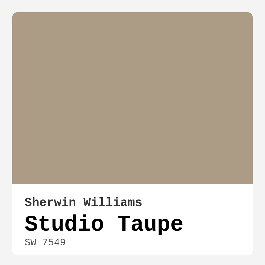
| HEX Code | #AD9C85 |
| RGB | 173, 156, 133 |
| LRV | 24% |
| Undertone | Red |
| Finish Options | Eggshell, Matte, Satin |
Imagine walking into a room that instantly wraps you in warmth and comfort, where the colors speak of sophistication yet feel incredibly inviting. That’s the magic of Studio Taupe by Sherwin Williams. With the color code SW 7549, this warm, earthy taupe might just be what your space has been missing.
Studio Taupe is more than just a paint color; it’s a versatile shade that can transform a variety of rooms into cozy, inviting environments. It blends beautifully between taupe and beige, allowing for a sense of calm that many homeowners crave. The key here is its unique character that shines through in any decor style, whether you lean towards modern, transitional, rustic, or farmhouse aesthetics.
Let’s talk about the specifics. Studio Taupe has a Light Reflectance Value (LRV) of 24%, placing it in the medium dark category. You’ll find that it reflects very little light, which can create a snug atmosphere, perfect for spaces where you want to unwind. This quality makes it particularly suitable for north-facing rooms that might otherwise feel cool and uninviting.
When applying Studio Taupe, you’ll appreciate how user-friendly it is. The paint goes on smoothly, making it a beginner-friendly option for those looking to tackle a DIY project. Whether you’re using a brush or a roller, you’ll find that it’s roller-ready and easy to work with. Plus, the finish options—matte, eggshell, and satin—allow for customization based on your room’s lighting and the mood you want to achieve.
Now, let’s discuss its undertones. Studio Taupe leans towards red, which adds depth and warmth. Color undertones can significantly influence how a paint appears in different lighting conditions. For instance, in natural light, you might see those soft beige undertones emerge, while artificial lighting can deepen the richness of the color, making it feel more intimate. This adaptability is one of Studio Taupe’s most appealing features.
You might wonder how this color fits into smaller spaces. The answer is simple: it can work wonders! Studio Taupe creates a cozy atmosphere that feels more expansive and intimate at the same time. If you’re concerned about it feeling too dark, just balance it with lighter decor or furnishings. This approach will keep the space inviting while still embracing the warmth of Studio Taupe.
Let’s not forget about what pairs well with this lovely hue. Studio Taupe shines alongside white trims, such as White Dove or Simply White, creating a classic contrast that feels fresh yet timeless. If you’re after a more rustic vibe, wood trim can beautifully complement those warm undertones, enhancing the overall aesthetic of your home. For added elegance, metallic accents in brass can make the space feel sophisticated without overshadowing the warmth of the taupe.
Now, where should you consider using this color? Studio Taupe is ideal for living rooms, bedrooms, dining rooms, and home offices. Its versatility allows it to serve as a main wall color or as an accent, seamlessly transitioning between spaces. You could even use it on an accent wall to add a touch of character without overwhelming the room.
One of the standout benefits of Studio Taupe is its washability. High-quality finishes make for easy maintenance, so you won’t have to worry too much about scuffs or stains. This is particularly important in family spaces or high-traffic areas where things can get a little messy. Plus, it’s low-VOC, giving you peace of mind if you’re conscious about air quality in your home.
To paint a fuller picture, Studio Taupe does have a few considerations to keep in mind. Because of its medium dark nature, it can appear even darker in low light situations. This is why it’s crucial to test the color in your space before committing. Paint a sample patch and observe how it interacts with your existing furniture and decor throughout the day. This will give you a clearer understanding of how the undertones reveal themselves in different lighting conditions.
For those who enjoy a touch of creativity, there are lighter and darker shades that complement Studio Taupe beautifully. Lighter options like SW 6079 or SW 7507 can provide a nice contrast, while darker shades such as SW 2827 or SW 6144 can create a striking, moody palette. The possibilities are endless, and part of the fun is experimenting with combinations until you find what feels just right.
When you step back and look at Studio Taupe as a whole, you’ll see that it’s a reliable choice for anyone wanting to elevate their interior aesthetics. It’s cozy and inviting, grounding the space while allowing your personal style to shine through. A color like this will not only enhance your home but also reflect your personality and taste.
As you consider your next home project, think of Studio Taupe as a canvas for your creativity. It’s warm, inviting, and versatile enough to work with a variety of decor styles. Whether you decide to paint an entire room or just an accent wall, you’ll be creating a space that feels both sophisticated and welcoming.
In the grand scheme of home decor, Studio Taupe stands out as an excellent choice for creating an inviting atmosphere. Its unique blend of warmth and neutrality makes it adaptable to any design vision you have. So, grab that paintbrush, put on your favorite playlist, and let Studio Taupe transform your home into a sanctuary of comfort and style. You won’t regret it!

Real Room Photo of Studio Taupe SW 7549


Undertones of Studio Taupe ?
The undertones of Studio Taupe are a key aspect of its character, leaning towards Red. These subtle underlying hues are what give the color its depth and complexity. For example, a gray with a blue undertone will feel cooler and more modern, while one with a brown undertone will feel warmer and more traditional. It’s essential to test this paint in your home and observe it next to your existing furniture, flooring, and decor to see how these undertones interact and reveal themselves throughout the day.
HEX value: #AD9C85
RGB code: 173, 156, 133
Is Studio Taupe Cool or Warm?
Studio Taupe is decidedly warm, providing a comforting backdrop that can soften harsh lighting. Its warmth makes it particularly suitable for north-facing rooms that may struggle with cooler tones. This quality helps create a snug environment that invites relaxation.
Understanding Color Properties and Interior Design Tips
Hue refers to a specific position on the color wheel, measured in degrees from 0 to 360. Each degree represents a different pure color:
- 0° represents red
- 120° represents green
- 240° represents blue
Saturation describes the intensity or purity of a color and is expressed as a percentage:
- At 0%, the color appears completely desaturated—essentially a shade of gray
- At 100%, the color is at its most vivid and vibrant
Lightness indicates how light or dark a color is, also expressed as a percentage:
- 0% lightness results in black
- 100% lightness results in white
Using Warm Colors in Interior Design
Warm hues—such as reds, oranges, yellows, warm beiges, and greiges—are excellent choices for creating inviting and energetic spaces. These colors are particularly well-suited for:
- Kitchens, living rooms, and bathrooms, where warmth enhances comfort and sociability
- Large rooms, where warm tones can help reduce the sense of emptiness and make the space feel more intimate
For example:
- Warm beige shades provide a cozy, inviting atmosphere, ideal for living rooms, bedrooms, and hallways.
- Warm greige (a mix of beige and gray) offers the warmth of beige with the modern appeal of gray, making it a versatile backdrop for dining areas, bedrooms, and living spaces.
However, be mindful when using warm light tones in rooms with limited natural light. These shades may appear muted or even take on an unpleasant yellowish tint. To avoid a dull or flat appearance:
- Add depth by incorporating richer tones like deep greens, charcoal, or chocolate brown
- Use textured elements such as curtains, rugs, or cushions to bring dimension to the space
Pro Tip: Achieving Harmony with Warm and Cool Color Balance
To create a well-balanced and visually interesting interior, mix warm and cool tones strategically. This contrast adds depth and harmony to your design.
- If your walls feature warm hues, introduce cool-colored accents such as blue or green furniture, artwork, or accessories to create contrast.
- For a polished look, consider using a complementary color scheme, which pairs colors opposite each other on the color wheel (e.g., red with green, orange with blue).
This thoughtful mix not only enhances visual appeal but also creates a space that feels both dynamic and cohesive.

Light Temperature Affects on Studio Taupe
Natural Light
Natural daylight changes in color temperature as the sun moves across the sky. At sunrise and sunset, the light tends to have a warm, golden tone with a color temperature around 2000 Kelvin (K). As the day progresses and the sun rises higher, the light becomes cooler and more neutral. Around midday, especially when the sky is clear, natural light typically reaches its peak brightness and shifts to a cooler tone, ranging from 5500 to 6500 Kelvin. This midday light is close to what we perceive as pure white or daylight-balanced light.
These shifts in natural light can significantly influence how colors appear in a space, which is why designers often consider both the time of day and the orientation of windows when planning interior color schemes.
Artificial Light
When choosing artificial lighting, pay close attention to the color temperature, measured in Kelvin (K). This determines how warm or cool the light will appear. Lower temperatures, around 2700K, give off a warm, yellow glow often used in living rooms or bedrooms. Higher temperatures, above 5000K, create a cool, bluish light similar to daylight, commonly used in kitchens, offices, or task areas.
Use the slider to see how lighting temperature can affect the appearance of a surface or color throughout a space.


4800K
LRV of Studio Taupe
The Light Reflectance Value (LRV) of Studio Taupe is 24%, which places it in the Medium Dark category. This means it reflects very little light. Understanding a paint’s LRV is crucial for predicting how it will look in your space. A higher LRV indicates a lighter color that reflects more light, making rooms feel larger and brighter. A lower LRV signifies a darker color that absorbs more light, creating a cozier, more intimate atmosphere. Always consider the natural and artificial lighting in your room when selecting a paint color based on its LRV.
Detailed Review of Studio Taupe
Additional Paint Characteristics
Ideal Rooms
Bedroom, Dining Room, Home Office, Living Room
Decor Styles
Farmhouse, Modern, Rustic, Transitional
Coverage
Good (1–2 Coats)
Ease of Application
Beginner Friendly, Brush Smooth, Roller-Ready
Washability
Highly Washable, Washable
VOC Level
Low VOC
Best Use
Accent Wall, Interior Walls, Trim
Room Suitability
Bedroom, Dining Room, Home Office, Living Room
Tone Tag
Earthy, Neutral, Warm
Finish Type
Eggshell, Matte, Satin
Paint Performance
Easy Touch-Up, Low Odor, Scuff Resistant
Use Cases
Best for Rentals, Best for Small Spaces, Designer Favorite
Mood
Cozy, Grounding, Inviting
Trim Pairing
Complements Brass Fixtures, Good with Wood Trim, Pairs with White Dove
Studio Taupe is a fantastic choice if you’re looking to create an inviting and cozy atmosphere in your home. The color strikes a perfect balance between warmth and neutrality, making it adaptable to both contemporary and traditional designs. It works beautifully as a main wall color or as an accent, providing a seamless transition between spaces. When applied, it boasts a smooth finish that enhances the room’s natural light without overpowering it. This color also pairs well with a variety of furnishings and decor accents, ensuring that your personal style shines through. Overall, Studio Taupe is a reliable option that promises to elevate your interior aesthetics.
Pros & Cons of SW 7549 Studio Taupe
Pros
Cons
Colors that go with Sherwin Williams Studio Taupe
FAQ on SW 7549 Studio Taupe
Can Studio Taupe be used in a small space?
Absolutely! Studio Taupe can work wonders in smaller rooms by creating a cozy and inviting atmosphere. Its warm undertones help to make the space feel more expansive while still being intimate. Just be mindful of natural light; in darker areas, it may appear a touch heavier, so pairing it with lighter decor can help balance the overall look.
What trims or accents pair well with Studio Taupe?
Studio Taupe pairs beautifully with white trim, like White Dove or Simply White, which can brighten the look and create a classic contrast. For a more rustic feel, consider wood trim that complements the warm undertones of the paint. Metallic accents in brass also work well, adding a touch of elegance and sophistication.
Comparisons Studio Taupe with other colors
Studio Taupe SW 7549 vs Repose Gray SW 7015
| Attribute | Studio Taupe SW 7549 | Repose Gray SW 7015 |
|---|---|---|
| Color Name | Studio Taupe SW 7549 | Repose Gray SW 7015 |
| Color | ||
| Hue | Grey | Grey |
| Brightness | Medium | Medium |
| RGB | 173, 156, 133 | 204, 201, 192 |
| LRV | 24% | 58% |
| Finish Type | Eggshell, Matte, Satin | Eggshell, Matte, Satin |
| Finish Options | Eggshell, Matte, Satin | Eggshell, Matte, Satin |
| Ideal Rooms | Bedroom, Dining Room, Home Office, Living Room | Bedroom, Dining Room, Hallway, Home Office, Living Room |
| Decor Styles | Farmhouse, Modern, Rustic, Transitional | Contemporary, Farmhouse, Minimalist, Modern, Transitional |
| Coverage | Good (1–2 Coats) | Good (1–2 Coats), Touch-Up Friendly |
| Ease of Application | Beginner Friendly, Brush Smooth, Roller-Ready | Beginner Friendly, Brush Smooth, Fast-Drying, Roller-Ready |
| Washability | Highly Washable, Washable | Highly Washable, Washable |
| Room Suitability | Bedroom, Dining Room, Home Office, Living Room | Bedroom, Dining Room, Hallway, Home Office, Living Room |
| Tone | Earthy, Neutral, Warm | Muted, Neutral, Warm |
| Paint Performance | Easy Touch-Up, Low Odor, Scuff Resistant | Low Odor, Quick Drying, Scuff Resistant |
Studio Taupe SW 7549 vs Light French Gray SW 0055
| Attribute | Studio Taupe SW 7549 | Light French Gray SW 0055 |
|---|---|---|
| Color Name | Studio Taupe SW 7549 | Light French Gray SW 0055 |
| Color | ||
| Hue | Grey | Grey |
| Brightness | Medium | Medium |
| RGB | 173, 156, 133 | 194, 192, 187 |
| LRV | 24% | 53% |
| Finish Type | Eggshell, Matte, Satin | Eggshell, Matte, Satin |
| Finish Options | Eggshell, Matte, Satin | Eggshell, Matte, Satin |
| Ideal Rooms | Bedroom, Dining Room, Home Office, Living Room | Bedroom, Dining Room, Home Office, Kitchen, Living Room |
| Decor Styles | Farmhouse, Modern, Rustic, Transitional | Contemporary, Farmhouse, Modern, Scandinavian, Transitional |
| Coverage | Good (1–2 Coats) | Good (1–2 Coats), Touch-Up Friendly |
| Ease of Application | Beginner Friendly, Brush Smooth, Roller-Ready | Beginner Friendly, Brush Smooth, Roller-Ready |
| Washability | Highly Washable, Washable | Highly Washable, Washable |
| Room Suitability | Bedroom, Dining Room, Home Office, Living Room | Bedroom, Dining Room, Home Office, Kitchen, Living Room |
| Tone | Earthy, Neutral, Warm | Balanced, Muted, Neutral, Warm |
| Paint Performance | Easy Touch-Up, Low Odor, Scuff Resistant | Easy Touch-Up, High Coverage, Low Odor |
Studio Taupe SW 7549 vs Wordly Gray SW 7043
| Attribute | Studio Taupe SW 7549 | Wordly Gray SW 7043 |
|---|---|---|
| Color Name | Studio Taupe SW 7549 | Wordly Gray SW 7043 |
| Color | ||
| Hue | Grey | Grey |
| Brightness | Medium | Medium |
| RGB | 173, 156, 133 | 206, 198, 187 |
| LRV | 24% | 58% |
| Finish Type | Eggshell, Matte, Satin | Eggshell, Satin |
| Finish Options | Eggshell, Matte, Satin | Eggshell, Flat, Satin |
| Ideal Rooms | Bedroom, Dining Room, Home Office, Living Room | Bedroom, Home Office, Kitchen, Living Room |
| Decor Styles | Farmhouse, Modern, Rustic, Transitional | Minimalist, Modern, Scandi, Transitional |
| Coverage | Good (1–2 Coats) | Good (1–2 Coats) |
| Ease of Application | Beginner Friendly, Brush Smooth, Roller-Ready | Beginner Friendly, Brush Smooth, Fast-Drying, Roller-Ready |
| Washability | Highly Washable, Washable | Highly Washable, Washable |
| Room Suitability | Bedroom, Dining Room, Home Office, Living Room | Bedroom, Dining Room, Home Office, Living Room |
| Tone | Earthy, Neutral, Warm | Muted, Neutral, Warm |
| Paint Performance | Easy Touch-Up, Low Odor, Scuff Resistant | Easy Touch-Up, Low Odor, Scuff Resistant |
Studio Taupe SW 7549 vs Illusive Green SW 9164
| Attribute | Studio Taupe SW 7549 | Illusive Green SW 9164 |
|---|---|---|
| Color Name | Studio Taupe SW 7549 | Illusive Green SW 9164 |
| Color | ||
| Hue | Grey | Grey |
| Brightness | Medium | Medium |
| RGB | 173, 156, 133 | 146, 148, 141 |
| LRV | 24% | 24% |
| Finish Type | Eggshell, Matte, Satin | Eggshell, Matte, Satin |
| Finish Options | Eggshell, Matte, Satin | Eggshell, Matte, Satin |
| Ideal Rooms | Bedroom, Dining Room, Home Office, Living Room | Bedroom, Dining Room, Home Office, Living Room, Nursery |
| Decor Styles | Farmhouse, Modern, Rustic, Transitional | Coastal, Minimalist, Modern, Rustic, Scandinavian |
| Coverage | Good (1–2 Coats) | Good (1–2 Coats), Touch-Up Friendly |
| Ease of Application | Beginner Friendly, Brush Smooth, Roller-Ready | Beginner Friendly, Brush Smooth, Fast-Drying, Roller-Ready |
| Washability | Highly Washable, Washable | Highly Washable, Washable, Wipeable |
| Room Suitability | Bedroom, Dining Room, Home Office, Living Room | Bedroom, Dining Room, Home Office, Living Room, Nursery |
| Tone | Earthy, Neutral, Warm | Balanced, Earthy, Muted |
| Paint Performance | Easy Touch-Up, Low Odor, Scuff Resistant | Easy Touch-Up, Low Odor, Quick Drying, Scuff Resistant |
Studio Taupe SW 7549 vs Fawn Brindle SW 7640
| Attribute | Studio Taupe SW 7549 | Fawn Brindle SW 7640 |
|---|---|---|
| Color Name | Studio Taupe SW 7549 | Fawn Brindle SW 7640 |
| Color | ||
| Hue | Grey | Grey |
| Brightness | Medium | Medium |
| RGB | 173, 156, 133 | 167, 160, 148 |
| LRV | 24% | 24% |
| Finish Type | Eggshell, Matte, Satin | Eggshell, Matte |
| Finish Options | Eggshell, Matte, Satin | Eggshell, Matte, Satin |
| Ideal Rooms | Bedroom, Dining Room, Home Office, Living Room | Bedroom, Dining Room, Hallway, Home Office, Living Room |
| Decor Styles | Farmhouse, Modern, Rustic, Transitional | Bohemian, Minimalist, Modern Farmhouse, Transitional |
| Coverage | Good (1–2 Coats) | Good (1–2 Coats) |
| Ease of Application | Beginner Friendly, Brush Smooth, Roller-Ready | Brush Smooth, Fast-Drying, Roller-Ready |
| Washability | Highly Washable, Washable | Stain Resistant, Washable |
| Room Suitability | Bedroom, Dining Room, Home Office, Living Room | Bedroom, Dining Room, Home Office, Living Room |
| Tone | Earthy, Neutral, Warm | Earthy, Neutral, Warm |
| Paint Performance | Easy Touch-Up, Low Odor, Scuff Resistant | Easy Touch-Up, Fade Resistant, Low Odor |
Studio Taupe SW 7549 vs Balanced Beige SW 7037
| Attribute | Studio Taupe SW 7549 | Balanced Beige SW 7037 |
|---|---|---|
| Color Name | Studio Taupe SW 7549 | Balanced Beige SW 7037 |
| Color | ||
| Hue | Grey | Grey |
| Brightness | Medium | Medium |
| RGB | 173, 156, 133 | 192, 178, 162 |
| LRV | 24% | 44% |
| Finish Type | Eggshell, Matte, Satin | Eggshell, Matte, Satin |
| Finish Options | Eggshell, Matte, Satin | Eggshell, Matte, Satin |
| Ideal Rooms | Bedroom, Dining Room, Home Office, Living Room | Bedroom, Dining Room, Home Office, Kitchen, Living Room |
| Decor Styles | Farmhouse, Modern, Rustic, Transitional | Contemporary, Minimalist, Modern Farmhouse, Rustic, Transitional |
| Coverage | Good (1–2 Coats) | Good (1–2 Coats), Touch-Up Friendly |
| Ease of Application | Beginner Friendly, Brush Smooth, Roller-Ready | Beginner Friendly, Brush Smooth, Roller-Ready |
| Washability | Highly Washable, Washable | Washable, Wipeable |
| Room Suitability | Bedroom, Dining Room, Home Office, Living Room | Bedroom, Dining Room, Hallway, Kitchen, Living Room |
| Tone | Earthy, Neutral, Warm | Balanced, Earthy, Warm |
| Paint Performance | Easy Touch-Up, Low Odor, Scuff Resistant | Easy Touch-Up, High Coverage, Low Odor |
Studio Taupe SW 7549 vs Mushroom SW 9587
| Attribute | Studio Taupe SW 7549 | Mushroom SW 9587 |
|---|---|---|
| Color Name | Studio Taupe SW 7549 | Mushroom SW 9587 |
| Color | ||
| Hue | Grey | Grey |
| Brightness | Medium | Medium |
| RGB | 173, 156, 133 | 208, 199, 183 |
| LRV | 24% | 24% |
| Finish Type | Eggshell, Matte, Satin | Eggshell, Satin |
| Finish Options | Eggshell, Matte, Satin | Eggshell, Flat, Matte, Satin |
| Ideal Rooms | Bedroom, Dining Room, Home Office, Living Room | Bedroom, Dining Room, Hallway, Home Office, Living Room |
| Decor Styles | Farmhouse, Modern, Rustic, Transitional | Bohemian, Contemporary, Modern Farmhouse, Traditional |
| Coverage | Good (1–2 Coats) | Good (1–2 Coats) |
| Ease of Application | Beginner Friendly, Brush Smooth, Roller-Ready | Beginner Friendly, Brush Smooth, Roller-Ready |
| Washability | Highly Washable, Washable | Highly Washable, Washable |
| Room Suitability | Bedroom, Dining Room, Home Office, Living Room | Bedroom, Dining Room, Home Office, Living Room |
| Tone | Earthy, Neutral, Warm | Earthy, Neutral, Warm |
| Paint Performance | Easy Touch-Up, Low Odor, Scuff Resistant | Easy Touch-Up, Long Lasting, Low Odor, Scuff Resistant |
Studio Taupe SW 7549 vs Silver Strand SW 7057
| Attribute | Studio Taupe SW 7549 | Silver Strand SW 7057 |
|---|---|---|
| Color Name | Studio Taupe SW 7549 | Silver Strand SW 7057 |
| Color | ||
| Hue | Grey | Grey |
| Brightness | Medium | Medium |
| RGB | 173, 156, 133 | 200, 203, 196 |
| LRV | 24% | 66% |
| Finish Type | Eggshell, Matte, Satin | Eggshell, Satin |
| Finish Options | Eggshell, Matte, Satin | Eggshell, Matte, Satin |
| Ideal Rooms | Bedroom, Dining Room, Home Office, Living Room | Bedroom, Dining Room, Hallway, Home Office, Living Room |
| Decor Styles | Farmhouse, Modern, Rustic, Transitional | Coastal, Minimalist, Modern, Traditional, Transitional |
| Coverage | Good (1–2 Coats) | Good (1–2 Coats), Touch-Up Friendly |
| Ease of Application | Beginner Friendly, Brush Smooth, Roller-Ready | Beginner Friendly, Brush Smooth, Roller-Ready |
| Washability | Highly Washable, Washable | Highly Washable, Washable |
| Room Suitability | Bedroom, Dining Room, Home Office, Living Room | Bathroom, Bedroom, Home Office, Kitchen, Living Room |
| Tone | Earthy, Neutral, Warm | Balanced, Neutral, Warm |
| Paint Performance | Easy Touch-Up, Low Odor, Scuff Resistant | Easy Touch-Up, High Coverage, Low Odor |
Studio Taupe SW 7549 vs Cadet SW 9143
| Attribute | Studio Taupe SW 7549 | Cadet SW 9143 |
|---|---|---|
| Color Name | Studio Taupe SW 7549 | Cadet SW 9143 |
| Color | ||
| Hue | Grey | Grey |
| Brightness | Medium | Medium |
| RGB | 173, 156, 133 | 145, 153, 156 |
| LRV | 24% | 12% |
| Finish Type | Eggshell, Matte, Satin | Eggshell, Matte, Satin |
| Finish Options | Eggshell, Matte, Satin | Eggshell, Matte, Satin |
| Ideal Rooms | Bedroom, Dining Room, Home Office, Living Room | Bathroom, Bedroom, Hallway, Home Office, Kitchen, Living Room |
| Decor Styles | Farmhouse, Modern, Rustic, Transitional | Coastal, Industrial, Minimalist, Modern, Scandinavian |
| Coverage | Good (1–2 Coats) | Good (1–2 Coats), Touch-Up Friendly |
| Ease of Application | Beginner Friendly, Brush Smooth, Roller-Ready | Beginner Friendly, Brush Smooth, Roller-Ready |
| Washability | Highly Washable, Washable | Washable, Wipeable |
| Room Suitability | Bedroom, Dining Room, Home Office, Living Room | Bathroom, Bedroom, Hallway, Home Office, Living Room |
| Tone | Earthy, Neutral, Warm | Balanced, Cool, Muted |
| Paint Performance | Easy Touch-Up, Low Odor, Scuff Resistant | Easy Touch-Up, High Coverage, Low Odor |
Studio Taupe SW 7549 vs Dovetail SW 7018
| Attribute | Studio Taupe SW 7549 | Dovetail SW 7018 |
|---|---|---|
| Color Name | Studio Taupe SW 7549 | Dovetail SW 7018 |
| Color | ||
| Hue | Grey | Grey |
| Brightness | Medium | Medium |
| RGB | 173, 156, 133 | 144, 138, 131 |
| LRV | 24% | 24% |
| Finish Type | Eggshell, Matte, Satin | Eggshell, Matte, Satin |
| Finish Options | Eggshell, Matte, Satin | Eggshell, Matte, Satin |
| Ideal Rooms | Bedroom, Dining Room, Home Office, Living Room | Bedroom, Dining Room, Hallway, Home Office, Living Room |
| Decor Styles | Farmhouse, Modern, Rustic, Transitional | Minimalist, Modern Farmhouse, Rustic, Transitional |
| Coverage | Good (1–2 Coats) | Good (1–2 Coats), Touch-Up Friendly |
| Ease of Application | Beginner Friendly, Brush Smooth, Roller-Ready | Beginner Friendly, Brush Smooth, Roller-Ready |
| Washability | Highly Washable, Washable | Washable, Wipeable |
| Room Suitability | Bedroom, Dining Room, Home Office, Living Room | Bedroom, Dining Room, Home Office, Living Room |
| Tone | Earthy, Neutral, Warm | Earthy, Neutral, Warm |
| Paint Performance | Easy Touch-Up, Low Odor, Scuff Resistant | Easy Touch-Up, Fade Resistant, Low Odor |
Official Page of Sherwin Williams Studio Taupe SW 7549