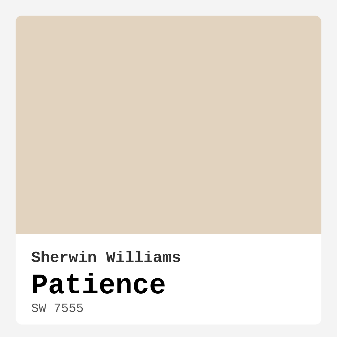
Color Preview & Key Details
| HEX Code | #E2D3BF |
| RGB | 226, 211, 191 |
| LRV | 45% |
| Undertone | Red |
| Finish Options | Eggshell, Matte, Satin |
Imagine walking into a space that instantly wraps you in warmth and tranquility, where the chaos of the outside world seems to fade away. That’s the magic of Sherwin Williams’ Patience (SW 7555). This soft, muted beige isn’t just a color; it’s a feeling, an atmosphere you can create with just a few strokes of a paintbrush.
Patience is a hue that evokes serenity, making it a top contender for transforming any room in your home. With its gentle warmth and understated elegance, it invites you to breathe a little deeper and relax a little more. Whether you’re revamping your living room, refreshing your bedroom, or even reimagining a nursery, Patience offers a versatile backdrop that can harmonize with various decor styles.
One of the standout features of this color is its flexibility. Patience is perfect for a modern farmhouse aesthetic, seamlessly blending with rustic wood elements and vintage accents. If you’re leaning more towards a coastal vibe, this beige pairs beautifully with soft blues and sandy whites, reminiscent of a serene beach retreat. It’s equally at home in a minimalistic setting, where its warm undertones provide a cozy contrast to sleek lines and modern furnishings. This versatility makes Patience an excellent choice for anyone looking to create a cohesive and inviting space.
When it comes to application, you’ll find that Patience is remarkably beginner-friendly. Its smooth texture allows for easy rolling and brushing, ensuring you achieve a professional look without the stress. The paint is also touch-up friendly, meaning you can maintain its beauty over time with minimal fuss. And let’s not forget about the washability factor. Patience is designed to be wiped down, making it practical for high-traffic areas or homes with little ones and pets.
With a Light Reflective Value (LRV) of 45%, Patience sits comfortably in the medium range, reflecting a moderate amount of light. This characteristic is crucial when considering how a color will behave in your space. In natural light, Patience shines with a soft glow, enhancing the warmth of your room. Under artificial lighting, it retains its inviting quality without appearing overly dominant—making it adaptable from dawn until dusk.
Let’s talk a bit about undertones. The subtle red undertones in Patience are what give this color its depth and complexity. Understanding how these undertones interact with your home’s existing elements is vital. For instance, in a room filled with natural light, those warm red tones can come alive, creating a rich, enveloping feel. Conversely, in dimly lit spaces, it might lean more towards a muted beige. This is why I always recommend testing a sample in your home. Observe how the color changes throughout the day and alongside your furniture and decor.
Now, you might be wondering, “Is Patience suitable for small rooms?” Absolutely! Its warm, light-reflective qualities can make smaller spaces feel more open and inviting. Just keep in mind that in very compact or dimly lit areas, testing a sample first ensures it meets your desired effect.
What about high-traffic areas? While Patience works well in many settings, applying a durable topcoat is a smart move. This will enhance the paint’s washability and resilience, ensuring it looks fresh even in bustling environments.
One of the joys of working with Patience is its ability to pair beautifully with various trim colors. For a classic look, consider going with something like White Dove. This pairing creates a crisp contrast that highlights the warmth of Patience. If you’re incorporating brass fixtures into your space, you’ll find that they complement this soft beige beautifully, adding a touch of sophistication.
You might also be curious about complementary shades. Patience works well with colors like SW 7625 or SW 9139, which can add depth and interest to your decor. Whether you’re looking to create a cohesive palette for a room or simply want to add a pop of color through accents, these shades can enhance the beauty of Patience without overshadowing it.
The practicality of Patience extends beyond aesthetics. With a low VOC formula, you can paint with peace of mind, knowing you’re creating a healthier environment for you and your family. Additionally, its fade-resistant quality ensures that the color will maintain its charm for years to come, making it a wise investment for your home.
So, where should you unleash the beauty of Patience? Let’s imagine your living room bathed in this warm hue, inviting you and your guests to relax and unwind. Picture a cozy bedroom, where the calming tones create a sanctuary for rest. Or envision a nurturing nursery, where the soft color envelops your little one in comfort. This shade is equally suited for a home office, promoting focus and tranquility as you work.
As you consider your options, remember that Patience is a classic favorite. It’s not just a momentary trend; it’s a timeless choice that can adapt and grow with your style over the years.
In conclusion, choosing Patience for your next home project is less about picking a color and more about creating an atmosphere. It’s about transforming your space into a haven of calm and inviting warmth, regardless of your personal style. With its versatility, ease of application, and inviting nature, Patience is undoubtedly a color that deserves your attention. So, why not take the plunge? Grab a sample and see how this beautiful shade can elevate your home into a serene escape.

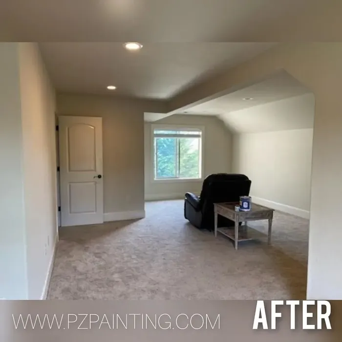
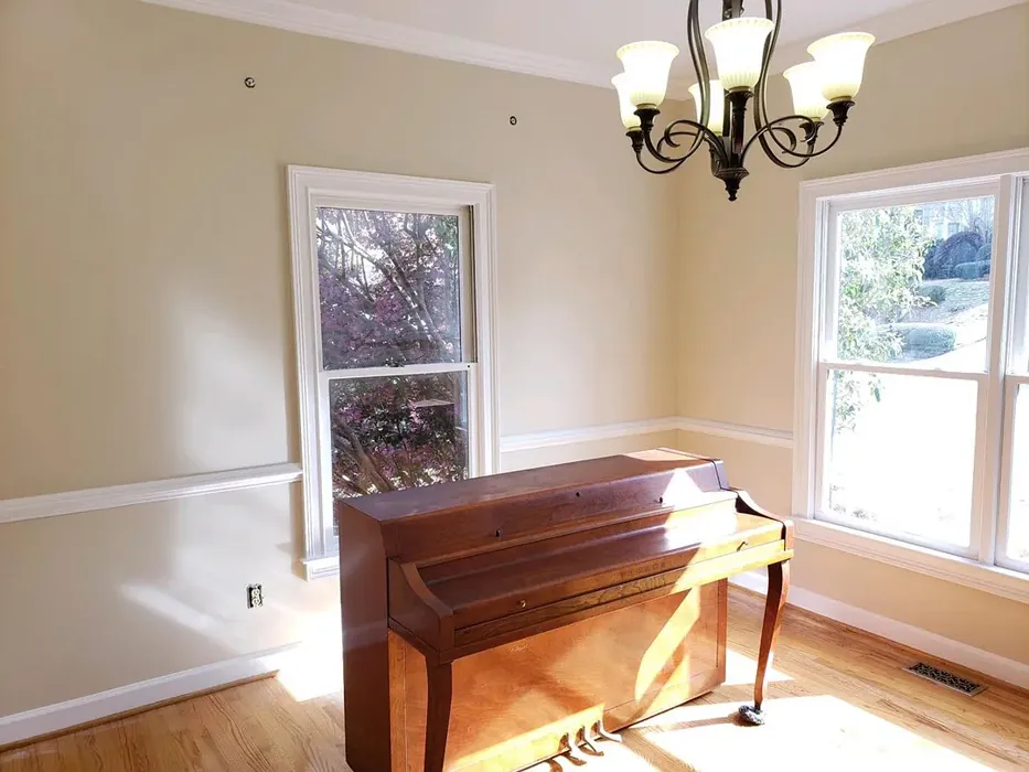
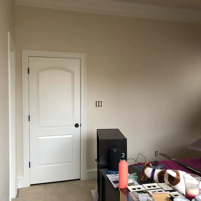
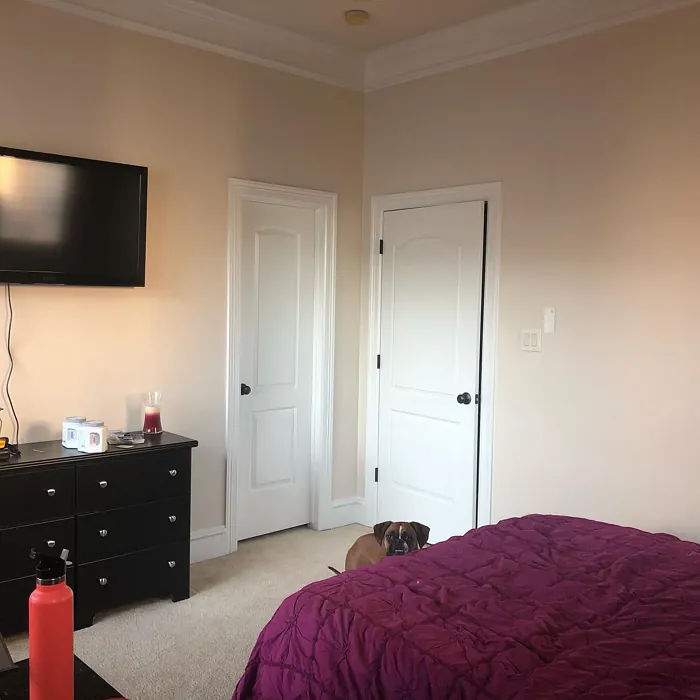
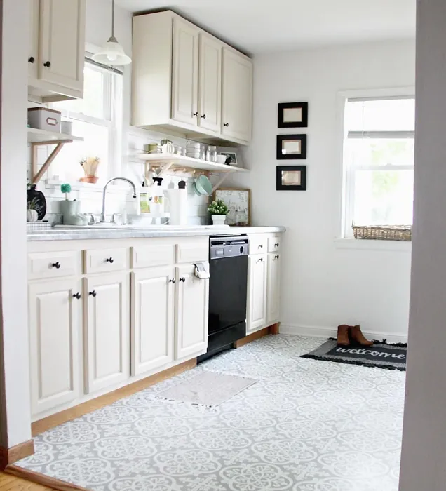
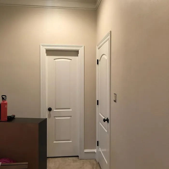
Real Room Photo of Patience SW 7555
Undertones of Patience ?
The undertones of Patience are a key aspect of its character, leaning towards Red. These subtle underlying hues are what give the color its depth and complexity. For example, a gray with a blue undertone will feel cooler and more modern, while one with a brown undertone will feel warmer and more traditional. It’s essential to test this paint in your home and observe it next to your existing furniture, flooring, and decor to see how these undertones interact and reveal themselves throughout the day.
HEX value: #E2D3BF
RGB code: 226, 211, 191
Is Patience Cool or Warm?
This paint leans warm, making it a cozy addition to any room while still remaining neutral enough to fit various decor preferences.
Understanding Color Properties and Interior Design Tips
Hue refers to a specific position on the color wheel, measured in degrees from 0 to 360. Each degree represents a different pure color:
- 0° represents red
- 120° represents green
- 240° represents blue
Saturation describes the intensity or purity of a color and is expressed as a percentage:
- At 0%, the color appears completely desaturated—essentially a shade of gray
- At 100%, the color is at its most vivid and vibrant
Lightness indicates how light or dark a color is, also expressed as a percentage:
- 0% lightness results in black
- 100% lightness results in white
Using Warm Colors in Interior Design
Warm hues—such as reds, oranges, yellows, warm beiges, and greiges—are excellent choices for creating inviting and energetic spaces. These colors are particularly well-suited for:
- Kitchens, living rooms, and bathrooms, where warmth enhances comfort and sociability
- Large rooms, where warm tones can help reduce the sense of emptiness and make the space feel more intimate
For example:
- Warm beige shades provide a cozy, inviting atmosphere, ideal for living rooms, bedrooms, and hallways.
- Warm greige (a mix of beige and gray) offers the warmth of beige with the modern appeal of gray, making it a versatile backdrop for dining areas, bedrooms, and living spaces.
However, be mindful when using warm light tones in rooms with limited natural light. These shades may appear muted or even take on an unpleasant yellowish tint. To avoid a dull or flat appearance:
- Add depth by incorporating richer tones like deep greens, charcoal, or chocolate brown
- Use textured elements such as curtains, rugs, or cushions to bring dimension to the space
Pro Tip: Achieving Harmony with Warm and Cool Color Balance
To create a well-balanced and visually interesting interior, mix warm and cool tones strategically. This contrast adds depth and harmony to your design.
- If your walls feature warm hues, introduce cool-colored accents such as blue or green furniture, artwork, or accessories to create contrast.
- For a polished look, consider using a complementary color scheme, which pairs colors opposite each other on the color wheel (e.g., red with green, orange with blue).
This thoughtful mix not only enhances visual appeal but also creates a space that feels both dynamic and cohesive.

Light Temperature Affects on Patience
Natural Light
Natural daylight changes in color temperature as the sun moves across the sky. At sunrise and sunset, the light tends to have a warm, golden tone with a color temperature around 2000 Kelvin (K). As the day progresses and the sun rises higher, the light becomes cooler and more neutral. Around midday, especially when the sky is clear, natural light typically reaches its peak brightness and shifts to a cooler tone, ranging from 5500 to 6500 Kelvin. This midday light is close to what we perceive as pure white or daylight-balanced light.
These shifts in natural light can significantly influence how colors appear in a space, which is why designers often consider both the time of day and the orientation of windows when planning interior color schemes.
Artificial Light
When choosing artificial lighting, pay close attention to the color temperature, measured in Kelvin (K). This determines how warm or cool the light will appear. Lower temperatures, around 2700K, give off a warm, yellow glow often used in living rooms or bedrooms. Higher temperatures, above 5000K, create a cool, bluish light similar to daylight, commonly used in kitchens, offices, or task areas.
Use the slider to see how lighting temperature can affect the appearance of a surface or color throughout a space.


4800K
LRV of Patience
The Light Reflectance Value (LRV) of Patience is 45%, which places it in the Medium category. This means it Reflects a moderate amount of light. Understanding a paint’s LRV is crucial for predicting how it will look in your space. A higher LRV indicates a lighter color that reflects more light, making rooms feel larger and brighter. A lower LRV signifies a darker color that absorbs more light, creating a cozier, more intimate atmosphere. Always consider the natural and artificial lighting in your room when selecting a paint color based on its LRV.
Detailed Review of Patience
Additional Paint Characteristics
Ideal Rooms
Bedroom, Dining Room, Home Office, Living Room, Nursery
Decor Styles
Bohemian, Coastal, Minimalist, Modern Farmhouse, Traditional
Coverage
Good (1–2 Coats), Touch-Up Friendly
Ease of Application
Beginner Friendly, Brush Smooth, Roller-Ready
Washability
Washable, Wipeable
VOC Level
Low VOC
Best Use
Accent Wall, Home Office, Interior Walls, Nursery
Room Suitability
Bedroom, Dining Room, Home Office, Living Room, Nursery
Tone Tag
Earthy, Neutral, Warm
Finish Type
Eggshell, Matte, Satin
Paint Performance
Easy Touch-Up, Fade Resistant, Low Odor
Use Cases
Best for Rentals, Best for Small Spaces, Classic Favorite
Mood
Calm, Inviting, Restful
Trim Pairing
Complements Brass Fixtures, Pairs with White Dove, Works with Warm Trim
When it comes to using Patience, you’ll find it to be a remarkable choice for achieving a calm and cohesive look in your home. The color applies smoothly, and its soft undertones make it adaptable to various lighting conditions, ensuring it retains its charm from morning to dusk. It’s particularly wonderful in spaces where you want to unwind, such as a cozy bedroom or a nurturing nursery.
One of the standout features of Patience is its versatility. Whether you’re aiming for a modern farmhouse vibe or a more traditional setting, this shade complements a wide range of styles. Plus, its easy application means even beginner DIYers can achieve professional-looking results. Just remember, while it generally offers good coverage, you might want to apply a second coat in areas with high traffic to ensure durability.
Pros & Cons of SW 7555 Patience
Pros
Cons
Colors that go with Sherwin Williams Patience
FAQ on SW 7555 Patience
Can I use Patience in a small room?
Absolutely! Patience is a fantastic choice for small rooms as its warm, light-reflective qualities can make the space feel more open and inviting. Just keep in mind that in very small or dimly lit areas, you might want to test a sample first to ensure it meets your desired effect.
Is Patience suitable for high-traffic areas?
While Patience works well in many settings, for high-traffic areas, consider applying a durable topcoat to improve its washability and resilience. This will help maintain its beauty even in busy environments, ensuring it looks fresh and inviting over time.
Comparisons Patience with other colors
Patience SW 7555 vs Natural Linen SW 9109
| Attribute | Patience SW 7555 | Natural Linen SW 9109 |
|---|---|---|
| Color Name | Patience SW 7555 | Natural Linen SW 9109 |
| Color | ||
| Hue | Beige | Beige |
| Brightness | Light | Light |
| RGB | 226, 211, 191 | 223, 211, 195 |
| LRV | 45% | 74% |
| Finish Type | Eggshell, Matte, Satin | Eggshell, Matte, Satin |
| Finish Options | Eggshell, Matte, Satin | Eggshell, Matte, Satin |
| Ideal Rooms | Bedroom, Dining Room, Home Office, Living Room, Nursery | Bedroom, Dining Room, Hallway, Home Office, Kitchen, Living Room |
| Decor Styles | Bohemian, Coastal, Minimalist, Modern Farmhouse, Traditional | Bohemian, Modern Farmhouse, Scandinavian, Transitional |
| Coverage | Good (1–2 Coats), Touch-Up Friendly | Good (1–2 Coats), Touch-Up Friendly |
| Ease of Application | Beginner Friendly, Brush Smooth, Roller-Ready | Beginner Friendly, Brush Smooth, Fast-Drying, Roller-Ready |
| Washability | Washable, Wipeable | Highly Washable, Washable, Wipeable |
| Room Suitability | Bedroom, Dining Room, Home Office, Living Room, Nursery | Bedroom, Dining Room, Home Office, Kitchen, Living Room |
| Tone | Earthy, Neutral, Warm | Earthy, Neutral, Warm |
| Paint Performance | Easy Touch-Up, Fade Resistant, Low Odor | Easy Touch-Up, Low Odor, Quick Drying, Scuff Resistant |
Patience SW 7555 vs Alabaster SW 7008
| Attribute | Patience SW 7555 | Alabaster SW 7008 |
|---|---|---|
| Color Name | Patience SW 7555 | Alabaster SW 7008 |
| Color | ||
| Hue | Beige | Beige |
| Brightness | Light | Light |
| RGB | 226, 211, 191 | 237, 234, 224 |
| LRV | 45% | 82% |
| Finish Type | Eggshell, Matte, Satin | Eggshell, Matte, Satin |
| Finish Options | Eggshell, Matte, Satin | Eggshell, Matte, Satin |
| Ideal Rooms | Bedroom, Dining Room, Home Office, Living Room, Nursery | Bathroom, Bedroom, Dining Room, Entryway, Home Office, Kitchen, Living Room, Nursery |
| Decor Styles | Bohemian, Coastal, Minimalist, Modern Farmhouse, Traditional | Coastal, Contemporary, Minimalist, Modern Farmhouse, Traditional, Transitional |
| Coverage | Good (1–2 Coats), Touch-Up Friendly | Good (1–2 Coats), Touch-Up Friendly |
| Ease of Application | Beginner Friendly, Brush Smooth, Roller-Ready | Beginner Friendly, Brush Smooth, Fast-Drying, Low Splatter, Roller-Ready |
| Washability | Washable, Wipeable | Washable, Wipeable |
| Room Suitability | Bedroom, Dining Room, Home Office, Living Room, Nursery | Bathroom, Bedroom, Dining Room, Hallway, Home Office, Kitchen, Living Room, Nursery |
| Tone | Earthy, Neutral, Warm | Creamy, Neutral, Warm |
| Paint Performance | Easy Touch-Up, Fade Resistant, Low Odor | Easy Touch-Up, High Coverage, Low Odor, Quick Drying |
Patience SW 7555 vs White Duck SW 7010
| Attribute | Patience SW 7555 | White Duck SW 7010 |
|---|---|---|
| Color Name | Patience SW 7555 | White Duck SW 7010 |
| Color | ||
| Hue | Beige | Beige |
| Brightness | Light | Light |
| RGB | 226, 211, 191 | 229, 223, 210 |
| LRV | 45% | 75% |
| Finish Type | Eggshell, Matte, Satin | Eggshell, Matte, Satin |
| Finish Options | Eggshell, Matte, Satin | Eggshell, Matte, Satin |
| Ideal Rooms | Bedroom, Dining Room, Home Office, Living Room, Nursery | Bedroom, Dining Room, Home Office, Kitchen, Living Room, Nursery |
| Decor Styles | Bohemian, Coastal, Minimalist, Modern Farmhouse, Traditional | Farmhouse, Modern, Scandinavian, Traditional, Transitional |
| Coverage | Good (1–2 Coats), Touch-Up Friendly | Good (1–2 Coats), Touch-Up Friendly |
| Ease of Application | Beginner Friendly, Brush Smooth, Roller-Ready | Beginner Friendly, Brush Smooth, Fast-Drying, Roller-Ready |
| Washability | Washable, Wipeable | Highly Washable, Washable |
| Room Suitability | Bedroom, Dining Room, Home Office, Living Room, Nursery | Bedroom, Dining Room, Home Office, Kitchen, Living Room |
| Tone | Earthy, Neutral, Warm | Creamy, Neutral, Warm |
| Paint Performance | Easy Touch-Up, Fade Resistant, Low Odor | Easy Touch-Up, Fade Resistant, Low Odor, Quick Drying |
Patience SW 7555 vs Greek Villa SW 7551
| Attribute | Patience SW 7555 | Greek Villa SW 7551 |
|---|---|---|
| Color Name | Patience SW 7555 | Greek Villa SW 7551 |
| Color | ||
| Hue | Beige | Beige |
| Brightness | Light | Light |
| RGB | 226, 211, 191 | 240, 236, 226 |
| LRV | 45% | 82% |
| Finish Type | Eggshell, Matte, Satin | Eggshell, Satin |
| Finish Options | Eggshell, Matte, Satin | Eggshell, Flat, Satin |
| Ideal Rooms | Bedroom, Dining Room, Home Office, Living Room, Nursery | Bedroom, Dining Room, Hallway, Home Office, Kitchen, Living Room |
| Decor Styles | Bohemian, Coastal, Minimalist, Modern Farmhouse, Traditional | Coastal, Minimalist, Modern Farmhouse, Traditional, Transitional |
| Coverage | Good (1–2 Coats), Touch-Up Friendly | Good (1–2 Coats), Touch-Up Friendly |
| Ease of Application | Beginner Friendly, Brush Smooth, Roller-Ready | Beginner Friendly, Brush Smooth, Roller-Ready |
| Washability | Washable, Wipeable | Washable, Wipeable |
| Room Suitability | Bedroom, Dining Room, Home Office, Living Room, Nursery | Bedroom, Dining Room, Hallway, Kitchen, Living Room |
| Tone | Earthy, Neutral, Warm | Creamy, Neutral, Warm |
| Paint Performance | Easy Touch-Up, Fade Resistant, Low Odor | Easy Touch-Up, High Coverage, Low Odor, Quick Drying |
Patience SW 7555 vs City Loft SW 7631
| Attribute | Patience SW 7555 | City Loft SW 7631 |
|---|---|---|
| Color Name | Patience SW 7555 | City Loft SW 7631 |
| Color | ||
| Hue | Beige | Beige |
| Brightness | Light | Light |
| RGB | 226, 211, 191 | 223, 218, 209 |
| LRV | 45% | 66% |
| Finish Type | Eggshell, Matte, Satin | Eggshell, Matte, Satin |
| Finish Options | Eggshell, Matte, Satin | Eggshell, Matte, Satin |
| Ideal Rooms | Bedroom, Dining Room, Home Office, Living Room, Nursery | Bedroom, Hallway, Home Office, Kitchen, Living Room |
| Decor Styles | Bohemian, Coastal, Minimalist, Modern Farmhouse, Traditional | Minimalist, Modern, Scandinavian, Transitional |
| Coverage | Good (1–2 Coats), Touch-Up Friendly | Good (1–2 Coats), Touch-Up Friendly |
| Ease of Application | Beginner Friendly, Brush Smooth, Roller-Ready | Beginner Friendly, Brush Smooth, Fast-Drying, Low Splatter, Roller-Ready |
| Washability | Washable, Wipeable | Highly Washable, Washable |
| Room Suitability | Bedroom, Dining Room, Home Office, Living Room, Nursery | Bedroom, Hallway, Home Office, Living Room |
| Tone | Earthy, Neutral, Warm | Balanced, Muted, Neutral, Warm |
| Paint Performance | Easy Touch-Up, Fade Resistant, Low Odor | Easy Touch-Up, High Coverage, Low Odor, Quick Drying, Scuff Resistant |
Patience SW 7555 vs Shoji White SW 7042
| Attribute | Patience SW 7555 | Shoji White SW 7042 |
|---|---|---|
| Color Name | Patience SW 7555 | Shoji White SW 7042 |
| Color | ||
| Hue | Beige | Beige |
| Brightness | Light | Light |
| RGB | 226, 211, 191 | 230, 223, 211 |
| LRV | 45% | 74% |
| Finish Type | Eggshell, Matte, Satin | Eggshell, Matte, Satin |
| Finish Options | Eggshell, Matte, Satin | Eggshell, Matte, Satin |
| Ideal Rooms | Bedroom, Dining Room, Home Office, Living Room, Nursery | Bedroom, Dining Room, Home Office, Living Room, Nursery |
| Decor Styles | Bohemian, Coastal, Minimalist, Modern Farmhouse, Traditional | Farmhouse, Japanese, Minimalist, Modern, Transitional |
| Coverage | Good (1–2 Coats), Touch-Up Friendly | Good (1–2 Coats), Touch-Up Friendly |
| Ease of Application | Beginner Friendly, Brush Smooth, Roller-Ready | Beginner Friendly, Brush Smooth, Roller-Ready |
| Washability | Washable, Wipeable | Washable, Wipeable |
| Room Suitability | Bedroom, Dining Room, Home Office, Living Room, Nursery | Bedroom, Dining Room, Home Office, Living Room, Nursery |
| Tone | Earthy, Neutral, Warm | Creamy, Neutral, Warm |
| Paint Performance | Easy Touch-Up, Fade Resistant, Low Odor | Easy Touch-Up, High Coverage, Low Odor |
Patience SW 7555 vs Neutral Ground SW 7568
| Attribute | Patience SW 7555 | Neutral Ground SW 7568 |
|---|---|---|
| Color Name | Patience SW 7555 | Neutral Ground SW 7568 |
| Color | ||
| Hue | Beige | Beige |
| Brightness | Light | Light |
| RGB | 226, 211, 191 | 226, 218, 202 |
| LRV | 45% | 40% |
| Finish Type | Eggshell, Matte, Satin | Eggshell, Matte, Satin |
| Finish Options | Eggshell, Matte, Satin | Eggshell, Matte, Satin |
| Ideal Rooms | Bedroom, Dining Room, Home Office, Living Room, Nursery | Bedroom, Dining Room, Hallway, Home Office, Kitchen, Living Room |
| Decor Styles | Bohemian, Coastal, Minimalist, Modern Farmhouse, Traditional | Farmhouse, Modern, Scandinavian, Traditional, Transitional |
| Coverage | Good (1–2 Coats), Touch-Up Friendly | Good (1–2 Coats) |
| Ease of Application | Beginner Friendly, Brush Smooth, Roller-Ready | Beginner Friendly, Brush Smooth, Roller-Ready |
| Washability | Washable, Wipeable | Highly Washable, Washable |
| Room Suitability | Bedroom, Dining Room, Home Office, Living Room, Nursery | Bedroom, Dining Room, Home Office, Kitchen, Living Room |
| Tone | Earthy, Neutral, Warm | Earthy, Neutral, Warm |
| Paint Performance | Easy Touch-Up, Fade Resistant, Low Odor | Easy Touch-Up, Low Odor, Quick Drying, Scuff Resistant |
Patience SW 7555 vs Limewash SW 9589
| Attribute | Patience SW 7555 | Limewash SW 9589 |
|---|---|---|
| Color Name | Patience SW 7555 | Limewash SW 9589 |
| Color | ||
| Hue | Beige | Beige |
| Brightness | Light | Light |
| RGB | 226, 211, 191 | 219, 213, 203 |
| LRV | 45% | 75% |
| Finish Type | Eggshell, Matte, Satin | Flat, Matte |
| Finish Options | Eggshell, Matte, Satin | Flat, Matte |
| Ideal Rooms | Bedroom, Dining Room, Home Office, Living Room, Nursery | Bedroom, Dining Room, Hallway, Kitchen, Living Room |
| Decor Styles | Bohemian, Coastal, Minimalist, Modern Farmhouse, Traditional | Bohemian, Contemporary, Modern Farmhouse, Rustic |
| Coverage | Good (1–2 Coats), Touch-Up Friendly | Good (1–2 Coats), Touch-Up Friendly |
| Ease of Application | Beginner Friendly, Brush Smooth, Roller-Ready | Beginner Friendly, Brush Smooth, Roller-Ready, Thin Formula |
| Washability | Washable, Wipeable | Washable, Wipeable |
| Room Suitability | Bedroom, Dining Room, Home Office, Living Room, Nursery | Bathroom, Bedroom, Dining Room, Kitchen, Living Room |
| Tone | Earthy, Neutral, Warm | Earthy, Muted, Warm |
| Paint Performance | Easy Touch-Up, Fade Resistant, Low Odor | Easy Touch-Up, Long Lasting, Low Odor |
Patience SW 7555 vs Creamy SW 7012
| Attribute | Patience SW 7555 | Creamy SW 7012 |
|---|---|---|
| Color Name | Patience SW 7555 | Creamy SW 7012 |
| Color | ||
| Hue | Beige | Beige |
| Brightness | Light | Light |
| RGB | 226, 211, 191 | 239, 232, 219 |
| LRV | 45% | 75% |
| Finish Type | Eggshell, Matte, Satin | Eggshell, Satin |
| Finish Options | Eggshell, Matte, Satin | Eggshell, Flat, Satin |
| Ideal Rooms | Bedroom, Dining Room, Home Office, Living Room, Nursery | Bedroom, Dining Room, Hallway, Home Office, Kitchen, Living Room |
| Decor Styles | Bohemian, Coastal, Minimalist, Modern Farmhouse, Traditional | Contemporary, Minimalist, Modern Farmhouse, Rustic, Traditional |
| Coverage | Good (1–2 Coats), Touch-Up Friendly | Good (1–2 Coats), Touch-Up Friendly |
| Ease of Application | Beginner Friendly, Brush Smooth, Roller-Ready | Beginner Friendly, Fast-Drying, Low Splatter |
| Washability | Washable, Wipeable | Washable, Wipeable |
| Room Suitability | Bedroom, Dining Room, Home Office, Living Room, Nursery | Bedroom, Dining Room, Hallway, Kitchen, Living Room |
| Tone | Earthy, Neutral, Warm | Creamy, Neutral, Warm |
| Paint Performance | Easy Touch-Up, Fade Resistant, Low Odor | High Coverage, Low Odor, Quick Drying |
Patience SW 7555 vs White Sesame SW 9586
| Attribute | Patience SW 7555 | White Sesame SW 9586 |
|---|---|---|
| Color Name | Patience SW 7555 | White Sesame SW 9586 |
| Color | ||
| Hue | Beige | Beige |
| Brightness | Light | Light |
| RGB | 226, 211, 191 | 227, 219, 205 |
| LRV | 45% | 75% |
| Finish Type | Eggshell, Matte, Satin | Eggshell, Matte, Satin |
| Finish Options | Eggshell, Matte, Satin | Eggshell, Matte, Satin |
| Ideal Rooms | Bedroom, Dining Room, Home Office, Living Room, Nursery | Bedroom, Home Office, Kitchen, Living Room, Nursery |
| Decor Styles | Bohemian, Coastal, Minimalist, Modern Farmhouse, Traditional | Minimalist, Modern Farmhouse, Rustic, Scandinavian, Transitional |
| Coverage | Good (1–2 Coats), Touch-Up Friendly | Good (1–2 Coats), Touch-Up Friendly |
| Ease of Application | Beginner Friendly, Brush Smooth, Roller-Ready | Beginner Friendly, Brush Smooth, Roller-Ready |
| Washability | Washable, Wipeable | Highly Washable, Washable |
| Room Suitability | Bedroom, Dining Room, Home Office, Living Room, Nursery | Bedroom, Dining Room, Home Office, Living Room, Nursery |
| Tone | Earthy, Neutral, Warm | Creamy, Earthy, Neutral, Warm |
| Paint Performance | Easy Touch-Up, Fade Resistant, Low Odor | Easy Touch-Up, High Coverage, Low Odor, Quick Drying |
Official Page of Sherwin Williams Patience SW 7555