Color Preview & Key Details
| HEX Code | #DFD9CF |
| RGB | 223, 217, 207 |
| LRV | 75% |
| Undertone | Red |
Imagine stepping into a room that instantly wraps you in a warm embrace, a hue that feels both familiar and inviting. That’s the magic of Egret White, a stunning paint color by Sherwin Williams that has captured the hearts of homeowners and designers alike. This soft, muted shade radiates warmth and calmness, making it an ideal choice for various spaces in your home. If you’re considering a new paint color, let’s dive into what makes Egret White such a fantastic option and see if it’s the right fit for your project.
Egret White, with its color code SW 7570, straddles that delicate line between cream and gray. It’s a beige hue that’s light enough to reflect a high amount of light, boasting a Light Reflectance Value (LRV) of 75%. This means it doesn’t just sit there; it actively enhances the brightness of a room, making even the smallest spaces feel airy and open. Picture it in a cozy living room or a serene bedroom, where it can transform your home into a haven of tranquility.
One of the standout features of Egret White is its versatility. Whether you’re drawn to a modern farmhouse aesthetic, crave that coastal vibe, or prefer a minimalist approach, this color adapts beautifully to various decor styles. It’s a classic choice that complements a wide range of accents and furnishings, making it perfect for anyone looking to create a cohesive look throughout their home.
When you think about color, it’s essential to consider how it interacts with light. In natural daylight, Egret White shines bright and airy, reflecting light in a way that opens up the space. Under artificial light, it retains that warmth, providing a soft, inviting glow. This adaptability means it can work wonders in any room, whether you’re brightening a dark hallway or creating a calming atmosphere in a bathroom.
One thing to keep in mind is the subtle undertone of red that Egret White possesses. This adds a layer of depth that can significantly affect how the color feels in your space. It’s crucial to test this paint in your home, observing how it looks next to existing furniture and decor. Colors can change throughout the day, influenced by the natural light streaming in or the warm glow of your lamps.
While Egret White is a favorite among many for its soft, warm character, it’s not without its considerations. Some may find that it requires a couple of coats for full coverage, particularly if you’re transitioning from a darker color. And while its muted hue is lovely, be aware that it might not suit everyone’s taste if you’re after something bolder or more vibrant.
However, let’s focus on the positives. Egret White is incredibly beginner-friendly to apply, giving you smooth coverage whether you’re using a brush or roller. This makes it an excellent choice for a weekend DIY project. Plus, its high washability means you won’t have to worry about pesky fingerprints or smudges in high-traffic areas. Choose a satin or eggshell finish for added durability, and you’ll be set for years to come.
Now, let’s talk about pairing options. Egret White works beautifully with various trim colors. For a seamless look, consider pairing it with Pure White or Simply White. If you want to introduce a bit of contrast, think about using black windows or warm wood trims, which highlight the softness of Egret White and add a bit of drama to your space.
If you’re looking to create a stunning accent wall, Egret White is a fantastic option. It beautifully complements bolder colors, making them pop while still maintaining a harmonious overall look. On the flip side, if you want to keep things understated, you can use it throughout a room for a soft, cohesive feel.
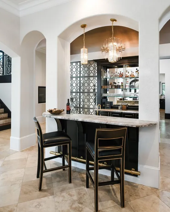
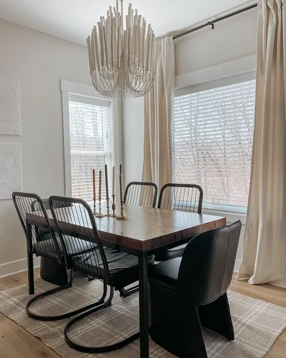
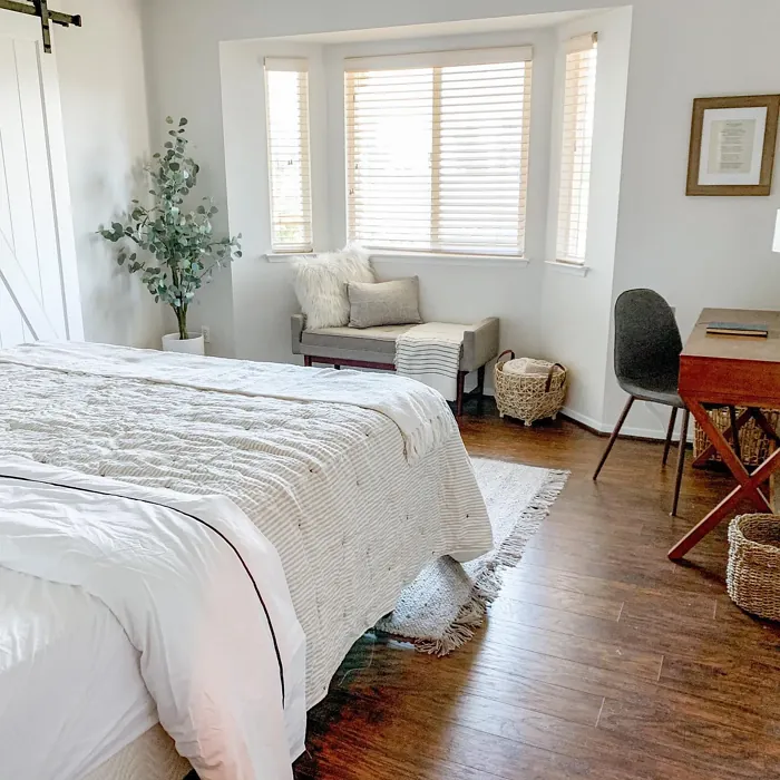
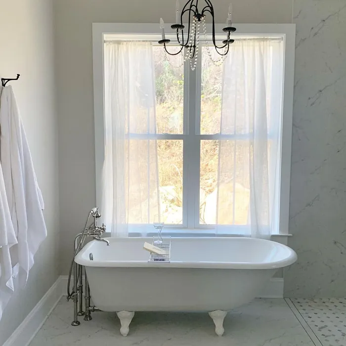
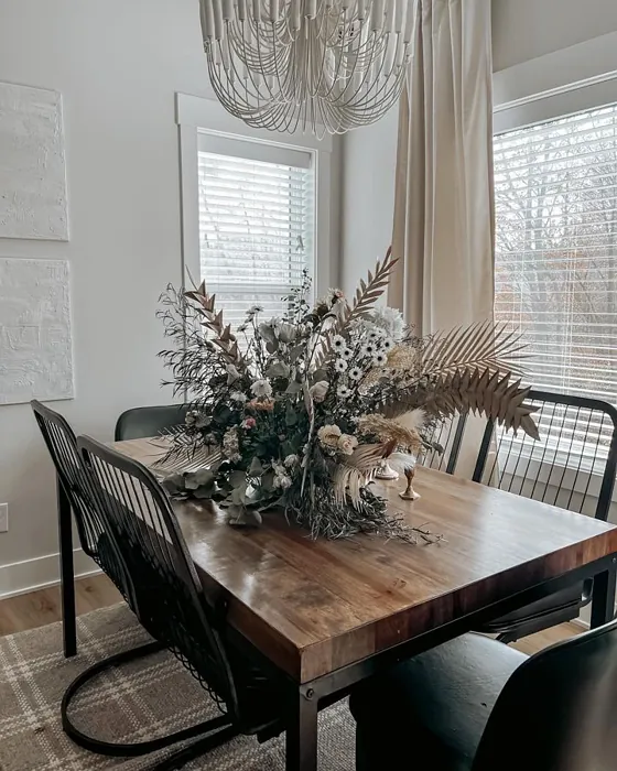
This color shines in various spaces. The living room becomes a warm gathering spot, the bedroom transforms into a serene retreat, the kitchen offers a fresh and inviting atmosphere, and the dining room becomes a cozy space for sharing meals and memories. Even in a home office, Egret White can create an environment conducive to focus and creativity.
Are you worried about maintaining its pristine appearance? Rest easy; Egret White is highly washable, making it suitable for high-traffic areas without sacrificing aesthetics. You can easily wipe away smudges and stains, keeping your space looking fresh. This makes it a perfect choice for families or anyone who entertains frequently.
As you think about your paint project, don’t forget to consider the surrounding colors. Lighter shades like SW 7028 or SW 7004 can create a layered look, while darker hues like SW 9606 or SW 7036 can add depth and contrast. There’s also a lovely range of complementary shades you might consider, such as SW 9639 or SW 9640, which can help you create a harmonious palette throughout your home.
Ultimately, choosing Egret White is about more than just a color; it’s about crafting an atmosphere. This warm, neutral, and soft hue evokes feelings of calm and coziness, perfect for creating inviting spaces.
So, is Egret White right for you? If you’re looking for a timeless color that enhances your home’s atmosphere while being versatile enough to fit various decor styles, I’d say it’s worth considering. Just remember to test it in your space, observe how it interacts with your lighting and furnishings, and enjoy the beautiful transformation it brings to your home.
With Egret White, you’re not just painting walls; you’re creating a welcoming environment that reflects your personal style and invites connection. And isn’t that what home is all about?
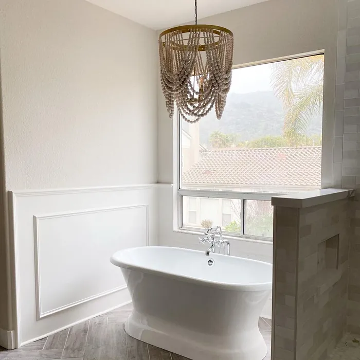
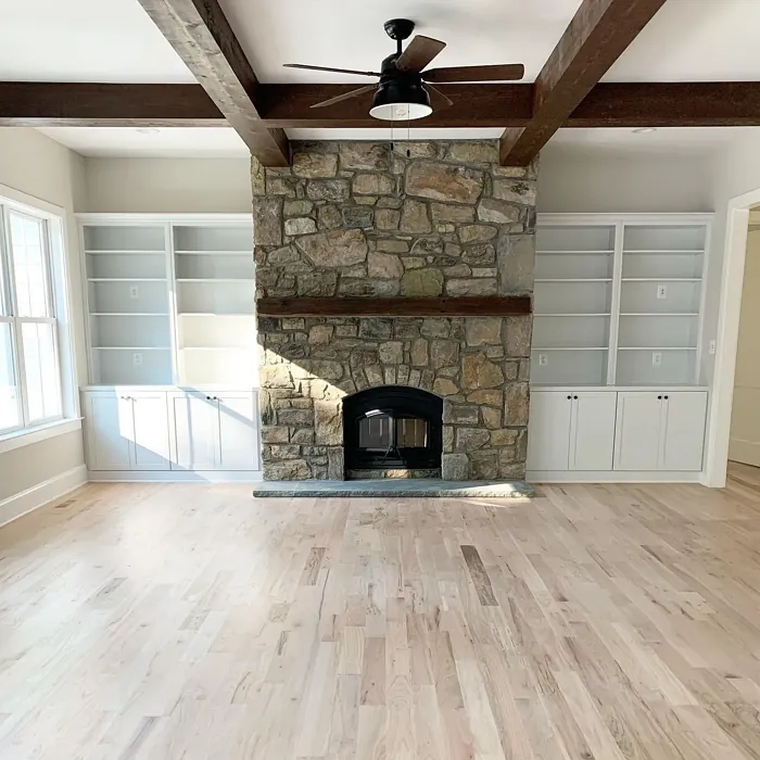
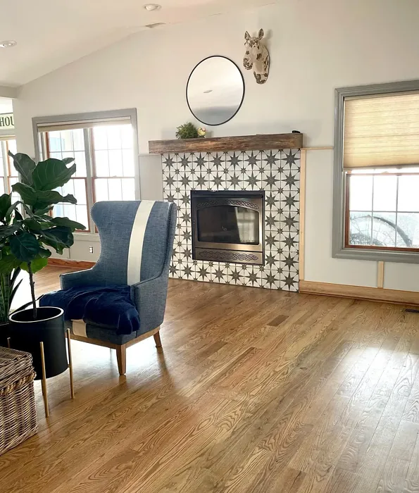
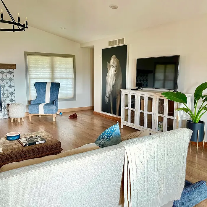
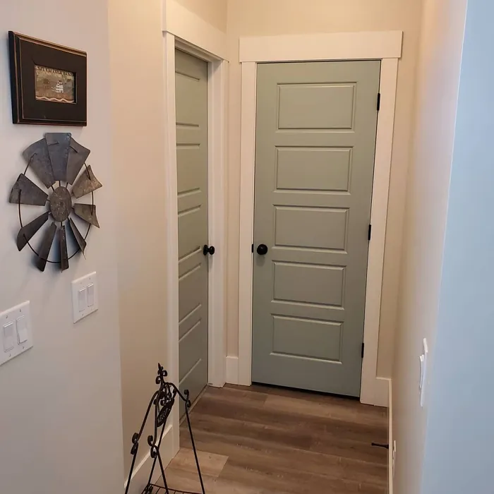
Real Room Photo of Egret White SW 7570

Undertones of Egret White ?
The undertones of Egret White are a key aspect of its character, leaning towards Red. These subtle underlying hues are what give the color its depth and complexity. For example, a gray with a blue undertone will feel cooler and more modern, while one with a brown undertone will feel warmer and more traditional. It’s essential to test this paint in your home and observe it next to your existing furniture, flooring, and decor to see how these undertones interact and reveal themselves throughout the day.
HEX value: #DFD9CF
RGB code: 223, 217, 207
Is Egret White Cool or Warm?
Egret White is primarily a warm color, but its balanced undertones keep it from feeling overly yellow. This warmth creates a welcoming environment that feels both cozy and refined, perfect for creating inviting living spaces.
Understanding Color Properties and Interior Design Tips
Hue refers to a specific position on the color wheel, measured in degrees from 0 to 360. Each degree represents a different pure color:
- 0° represents red
- 120° represents green
- 240° represents blue
Saturation describes the intensity or purity of a color and is expressed as a percentage:
- At 0%, the color appears completely desaturated—essentially a shade of gray
- At 100%, the color is at its most vivid and vibrant
Lightness indicates how light or dark a color is, also expressed as a percentage:
- 0% lightness results in black
- 100% lightness results in white
Using Warm Colors in Interior Design
Warm hues—such as reds, oranges, yellows, warm beiges, and greiges—are excellent choices for creating inviting and energetic spaces. These colors are particularly well-suited for:
- Kitchens, living rooms, and bathrooms, where warmth enhances comfort and sociability
- Large rooms, where warm tones can help reduce the sense of emptiness and make the space feel more intimate
For example:
- Warm beige shades provide a cozy, inviting atmosphere, ideal for living rooms, bedrooms, and hallways.
- Warm greige (a mix of beige and gray) offers the warmth of beige with the modern appeal of gray, making it a versatile backdrop for dining areas, bedrooms, and living spaces.
However, be mindful when using warm light tones in rooms with limited natural light. These shades may appear muted or even take on an unpleasant yellowish tint. To avoid a dull or flat appearance:
- Add depth by incorporating richer tones like deep greens, charcoal, or chocolate brown
- Use textured elements such as curtains, rugs, or cushions to bring dimension to the space
Pro Tip: Achieving Harmony with Warm and Cool Color Balance
To create a well-balanced and visually interesting interior, mix warm and cool tones strategically. This contrast adds depth and harmony to your design.
- If your walls feature warm hues, introduce cool-colored accents such as blue or green furniture, artwork, or accessories to create contrast.
- For a polished look, consider using a complementary color scheme, which pairs colors opposite each other on the color wheel (e.g., red with green, orange with blue).
This thoughtful mix not only enhances visual appeal but also creates a space that feels both dynamic and cohesive.

Light Temperature Affects on Egret White
Natural Light
Natural daylight changes in color temperature as the sun moves across the sky. At sunrise and sunset, the light tends to have a warm, golden tone with a color temperature around 2000 Kelvin (K). As the day progresses and the sun rises higher, the light becomes cooler and more neutral. Around midday, especially when the sky is clear, natural light typically reaches its peak brightness and shifts to a cooler tone, ranging from 5500 to 6500 Kelvin. This midday light is close to what we perceive as pure white or daylight-balanced light.
These shifts in natural light can significantly influence how colors appear in a space, which is why designers often consider both the time of day and the orientation of windows when planning interior color schemes.
Artificial Light
When choosing artificial lighting, pay close attention to the color temperature, measured in Kelvin (K). This determines how warm or cool the light will appear. Lower temperatures, around 2700K, give off a warm, yellow glow often used in living rooms or bedrooms. Higher temperatures, above 5000K, create a cool, bluish light similar to daylight, commonly used in kitchens, offices, or task areas.
Use the slider to see how lighting temperature can affect the appearance of a surface or color throughout a space.


4800K
LRV of Egret White
The Light Reflectance Value (LRV) of Egret White is 75%, which places it in the Light category. This means it Reflects a high amount of light. Understanding a paint’s LRV is crucial for predicting how it will look in your space. A higher LRV indicates a lighter color that reflects more light, making rooms feel larger and brighter. A lower LRV signifies a darker color that absorbs more light, creating a cozier, more intimate atmosphere. Always consider the natural and artificial lighting in your room when selecting a paint color based on its LRV.
Detailed Review of Egret White
Additional Paint Characteristics
Ideal Rooms
Bathroom, Bedroom, Dining Room, Home Office, Living Room
Room Suitability
Bathroom, Bedroom, Dining Room, Home Office, Kitchen, Living Room
Egret White is a versatile paint that beautifully transforms spaces. Its muted warmth makes it suitable for various decor styles, from modern farmhouse to coastal chic. Whether you’re looking to brighten a small room or create a calm retreat, this color adapts seamlessly. It reflects light wonderfully, enhancing the overall ambiance of your space. The application process is smooth, and it dries evenly, minimizing the risk of streaks. Overall, Egret White stands out as a timeless choice, ensuring that your rooms feel inviting and harmonious.
Pros & Cons of SW 7570 Egret White
Pros
Cons
Colors that go with Sherwin Williams Egret White
FAQ on SW 7570 Egret White
Can Egret White be used in high-traffic areas?
Yes, Egret White is highly washable, making it suitable for high-traffic areas. Its durability means you can easily wipe away smudges and stains without damaging the finish. Just ensure you choose a finish like satin or eggshell for added resilience.
What trim colors work well with Egret White?
Egret White pairs beautifully with various trim colors. For a classic look, consider using Pure White or Simply White for a seamless transition. If you prefer a touch of contrast, Black Windows or warm wood trims create a stunning combination that highlights the softness of Egret White.
Comparisons Egret White with other colors
Official Page of Sherwin Williams Egret White SW 7570