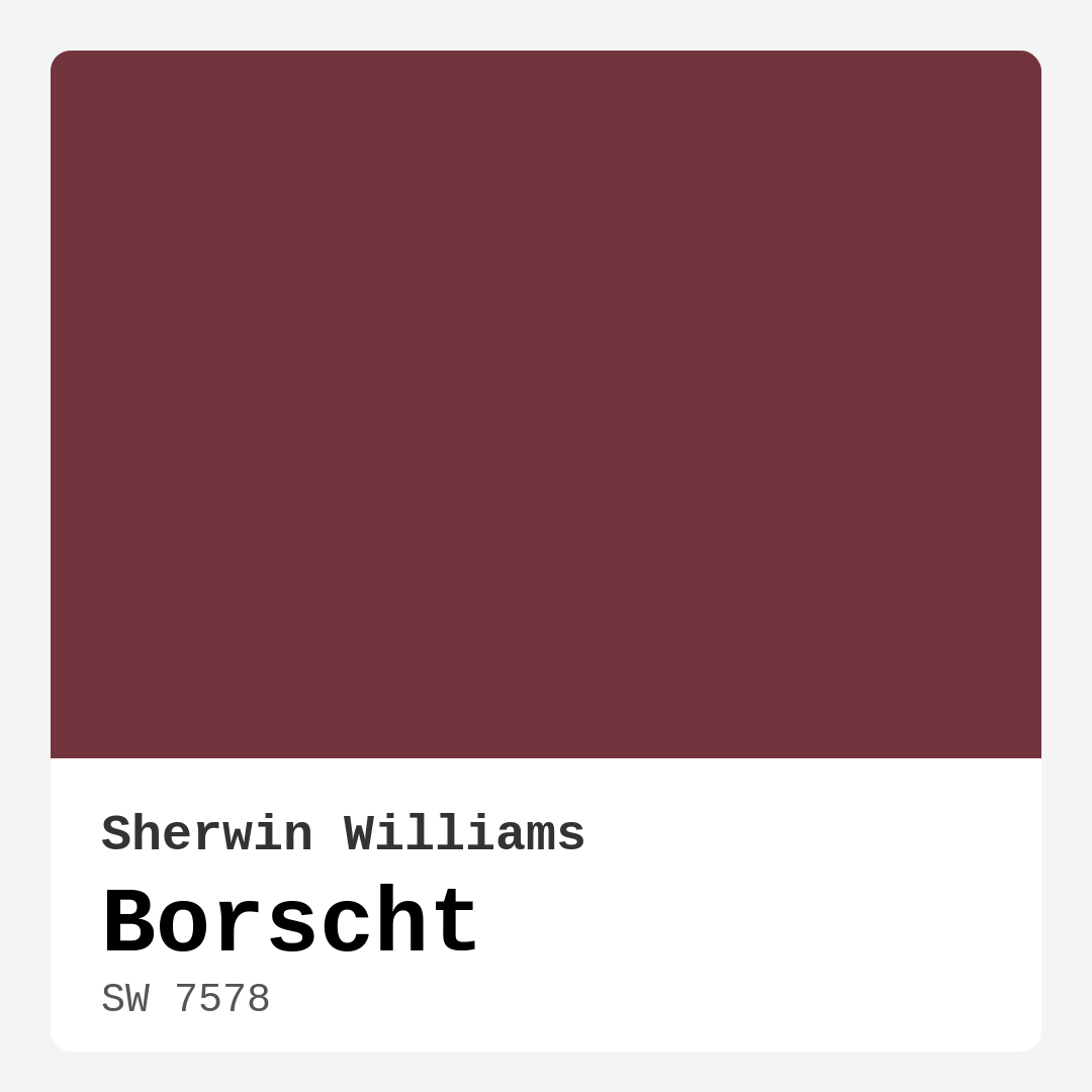
Color Preview & Key Details
| HEX Code | #72353D |
| RGB | 114, 53, 61 |
| LRV | 6% |
| Undertone | Red |
| Finish Options | Eggshell, Matte, Satin |
Imagine walking into your living room and being enveloped by a warm, rich hue that feels as comforting as a cozy blanket on a chilly evening. That’s the magic of Borscht, Sherwin Williams’ exquisite deep burgundy paint color. With its vibrant yet earthy tones, Borscht creates an inviting atmosphere that can transform any space into a sophisticated retreat.
Borscht (SW 7578) is not just a color; it’s a statement of style. The blend of earthy red and subtle brown tones, captured perfectly in its HEX code #72353D, adds depth and warmth to your interiors. This color has a low Light Reflectance Value (LRV) of just 6%, which means it absorbs light rather than reflects it. This quality makes Borscht a fantastic choice for creating cozy, intimate spaces. However, it’s essential to consider how light plays with this shade throughout the day. In natural daylight, Borscht radiates warmth, while in the evening, it takes on a more dramatic and elegant personality, enhancing the atmosphere of your home.
Using Borscht in your home can add a layer of sophistication that many colors simply can’t achieve. It pairs beautifully with both modern and traditional decor styles. Whether you’re leaning towards a rustic farmhouse look or a sleek, contemporary aesthetic, this paint color can adapt and enhance your design vision. Imagine it on an accent wall in your living room or as a stunning backdrop for your dining area. The versatility of Borscht allows it to shine in various settings, whether it’s in a vibrant bohemian space or a chic, modern office.
One of the standout features of Borscht is its ease of application. The paint goes on smoothly and provides excellent coverage, often requiring just one or two coats for a flawless finish. It’s beginner-friendly and works well with rollers and brushes alike, making it accessible for DIY enthusiasts. Plus, its low VOC formulation means you can paint without the overwhelming odors associated with many traditional paints. After all, you want your home to feel inviting, not to be filled with lingering chemical smells.
When considering where to use Borscht, think about rooms that thrive on warmth and coziness. It’s an ideal choice for living rooms, dining rooms, bedrooms, and home offices. This rich color invites conversation and creates a welcoming environment for gatherings or quiet evenings. In a bedroom, it can evoke a sense of tranquility, making it a perfect retreat at the end of a long day.
You might be wondering how Borscht can work in smaller rooms. While it’s true that deep colors can sometimes make a space feel more cramped, there are simple strategies to keep your spaces feeling open and airy. Pairing Borscht with lighter trim and ample lighting can create a sense of balance. Think about using mirrors to reflect light and expand the visual space; this will help you maintain that cozy ambiance without feeling boxed in.
Now, let’s talk about finishes. Borscht shines in matte and satin finishes. If you desire a softer, cozier look, go for the matte option; it will highlight the depth and richness of the color beautifully. However, if you’re looking for a subtle sheen that adds sophistication without being overpowering, satin is the way to go. This choice can elevate your space, making it feel polished yet warm.
When it comes to complementary shades, Borscht can play well with a variety of colors. Pair it with shades like White Dove for trim, which will create a striking contrast and bring brightness to the space. Brass fixtures can also harmonize beautifully with this deep hue, adding a touch of elegance and luxury. For those looking to layer colors, consider using complementary hues like SW 6224 or SW 9137 to create a palette that feels cohesive and thoughtfully designed.
A common question many homeowners have is how Borscht interacts with light. Given its low LRV, it doesn’t reflect much light, which is what contributes to its cozy feel. However, in well-lit spaces, this color can create a dynamic and inviting atmosphere. If your room lacks natural light, consider using bright lighting fixtures that can enhance the warmth of Borscht, making your space feel welcoming even in the evenings.
As with any color, it’s crucial to test Borscht in your space before committing. Paint samples on your walls and observe how they change throughout the day. This practice will help you appreciate the undertones, which lean warm and red, and how they interact with your existing furniture and decor. You might find that Borscht brings out the best in your wooden pieces or complements your textiles, creating a harmonious look.
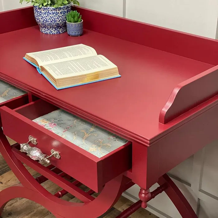
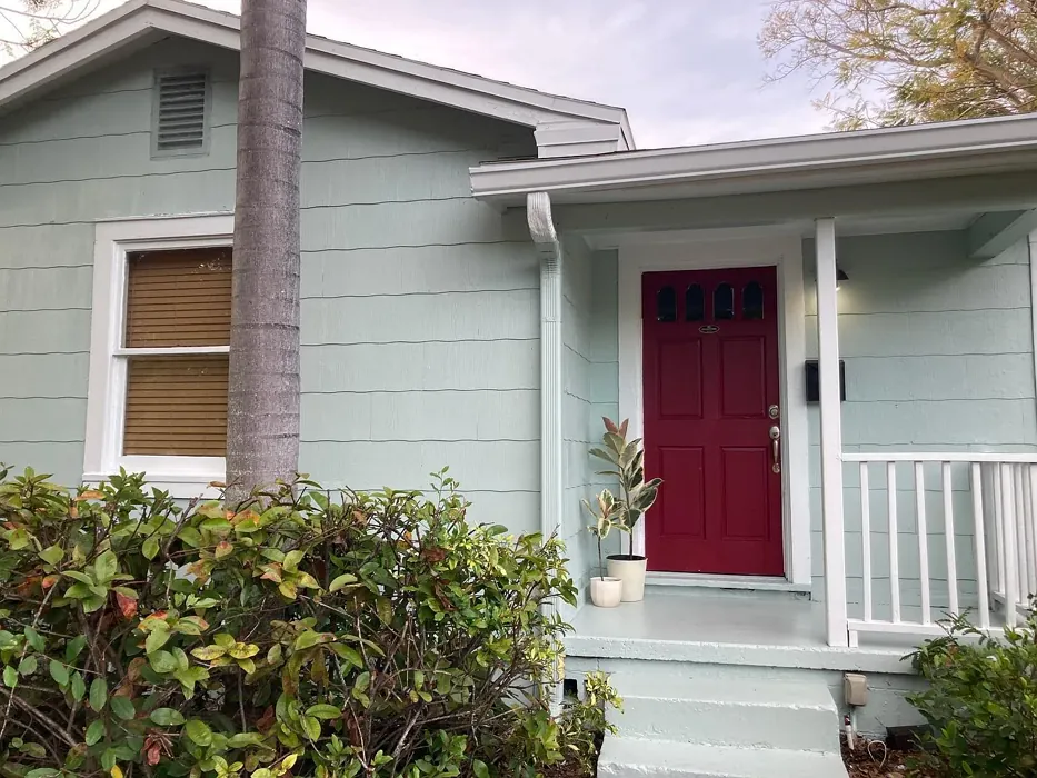
Finally, Borscht is not just limited to walls. Think about using this stunning shade on furniture or cabinetry for an unexpected pop of color. It’s a great choice for an accent piece that draws the eye and serves as a focal point in your room. Additionally, it can work beautifully on trim, giving your space a sophisticated touch without overwhelming the existing design.
In conclusion, Borscht is more than just a paint color; it’s a transformative element that can redefine your home’s aesthetic. Its warm, inviting nature makes it suitable for various decor styles, and its versatility allows it to shine in multiple applications. Whether you’re looking to create a cozy corner in your living room, a dramatic dining area, or a serene bedroom, Borscht can help you achieve that vision. So, why not take the plunge and experience the depth and richness of Borscht in your home? It just might be the perfect choice for your next project.
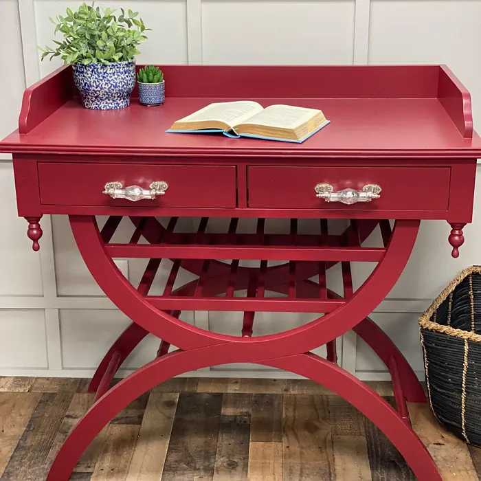
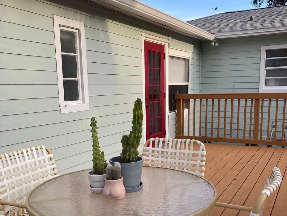
Real Room Photo of Borscht SW 7578
Undertones of Borscht ?
The undertones of Borscht are a key aspect of its character, leaning towards Red. These subtle underlying hues are what give the color its depth and complexity. For example, a gray with a blue undertone will feel cooler and more modern, while one with a brown undertone will feel warmer and more traditional. It’s essential to test this paint in your home and observe it next to your existing furniture, flooring, and decor to see how these undertones interact and reveal themselves throughout the day.
HEX value: #72353D
RGB code: 114, 53, 61
Is Borscht Cool or Warm?
Borscht is considered a warm paint color. This characteristic plays a huge role in the overall feel of a room. Warm colors, like this one, tend to create a cozy, inviting, and energetic atmosphere, making them great for social spaces like living rooms and dining rooms. In contrast, cool colors often evoke a sense of calm and serenity, which is why they are popular in bedrooms and bathrooms. The warmth of Borscht means it will pair beautifully with corresponding decor elements.
Understanding Color Properties and Interior Design Tips
Hue refers to a specific position on the color wheel, measured in degrees from 0 to 360. Each degree represents a different pure color:
- 0° represents red
- 120° represents green
- 240° represents blue
Saturation describes the intensity or purity of a color and is expressed as a percentage:
- At 0%, the color appears completely desaturated—essentially a shade of gray
- At 100%, the color is at its most vivid and vibrant
Lightness indicates how light or dark a color is, also expressed as a percentage:
- 0% lightness results in black
- 100% lightness results in white
Using Warm Colors in Interior Design
Warm hues—such as reds, oranges, yellows, warm beiges, and greiges—are excellent choices for creating inviting and energetic spaces. These colors are particularly well-suited for:
- Kitchens, living rooms, and bathrooms, where warmth enhances comfort and sociability
- Large rooms, where warm tones can help reduce the sense of emptiness and make the space feel more intimate
For example:
- Warm beige shades provide a cozy, inviting atmosphere, ideal for living rooms, bedrooms, and hallways.
- Warm greige (a mix of beige and gray) offers the warmth of beige with the modern appeal of gray, making it a versatile backdrop for dining areas, bedrooms, and living spaces.
However, be mindful when using warm light tones in rooms with limited natural light. These shades may appear muted or even take on an unpleasant yellowish tint. To avoid a dull or flat appearance:
- Add depth by incorporating richer tones like deep greens, charcoal, or chocolate brown
- Use textured elements such as curtains, rugs, or cushions to bring dimension to the space
Pro Tip: Achieving Harmony with Warm and Cool Color Balance
To create a well-balanced and visually interesting interior, mix warm and cool tones strategically. This contrast adds depth and harmony to your design.
- If your walls feature warm hues, introduce cool-colored accents such as blue or green furniture, artwork, or accessories to create contrast.
- For a polished look, consider using a complementary color scheme, which pairs colors opposite each other on the color wheel (e.g., red with green, orange with blue).
This thoughtful mix not only enhances visual appeal but also creates a space that feels both dynamic and cohesive.
Light Temperature Affects on Borscht
Natural Light
Natural daylight changes in color temperature as the sun moves across the sky. At sunrise and sunset, the light tends to have a warm, golden tone with a color temperature around 2000 Kelvin (K). As the day progresses and the sun rises higher, the light becomes cooler and more neutral. Around midday, especially when the sky is clear, natural light typically reaches its peak brightness and shifts to a cooler tone, ranging from 5500 to 6500 Kelvin. This midday light is close to what we perceive as pure white or daylight-balanced light.
These shifts in natural light can significantly influence how colors appear in a space, which is why designers often consider both the time of day and the orientation of windows when planning interior color schemes.
Artificial Light
When choosing artificial lighting, pay close attention to the color temperature, measured in Kelvin (K). This determines how warm or cool the light will appear. Lower temperatures, around 2700K, give off a warm, yellow glow often used in living rooms or bedrooms. Higher temperatures, above 5000K, create a cool, bluish light similar to daylight, commonly used in kitchens, offices, or task areas.
Use the slider to see how lighting temperature can affect the appearance of a surface or color throughout a space.


4800K
LRV of Borscht
The Light Reflectance Value (LRV) of Borscht is 6%, which places it in the Dark colors category. This means it does not reflect light. Understanding a paint’s LRV is crucial for predicting how it will look in your space. A higher LRV indicates a lighter color that reflects more light, making rooms feel larger and brighter. A lower LRV signifies a darker color that absorbs more light, creating a cozier, more intimate atmosphere. Always consider the natural and artificial lighting in your room when selecting a paint color based on its LRV.
Detailed Review of Borscht
Additional Paint Characteristics
Ideal Rooms
Bedroom, Dining Room, Home Office, Living Room
Decor Styles
Bohemian, Modern, Rustic, Traditional
Coverage
Good (1–2 Coats), Touch-Up Friendly
Ease of Application
Beginner Friendly, Brush Smooth, Roller-Ready
Washability
Washable, Wipeable
VOC Level
Low VOC
Best Use
Accent Wall, Furniture, Interior Walls, Trim
Room Suitability
Bedroom, Dining Room, Home Office, Living Room
Tone Tag
Deep, Earthy, Warm
Finish Type
Eggshell, Matte, Satin
Paint Performance
Easy Touch-Up, High Coverage, Low Odor
Use Cases
Best for Modern Farmhouse, Best for Open Concept, Best for Small Spaces
Mood
Cozy, Inviting, Sophisticated
Trim Pairing
Complements Brass Fixtures, Pairs with White Dove, Works with Warm Trim
Borscht is an exceptional choice for those looking to add depth and character to their interiors. The color’s rich, warm undertones make it perfect for creating a cozy ambiance, whether it’s in a spacious living area or an intimate dining room. When applying, you’ll find that it glides on smoothly, providing good coverage with just one or two coats. The finish enhances its depth, making your walls look sophisticated and inviting.
While it works wonderfully in a variety of lighting conditions, you’ll notice it transforms beautifully under different lights throughout the day. In daylight, it exudes a warm charm, while in the evening, it takes on a more dramatic tone, adding an elegant touch to your home. Overall, Borscht is not just a color; it’s a statement that can elevate your space effortlessly.
Pros & Cons of SW 7578 Borscht
Pros
Cons
Colors that go with Sherwin Williams Borscht
FAQ on SW 7578 Borscht
Can Borscht be used in small rooms?
Absolutely! While Borscht is a deep color, it can work beautifully in small spaces. To avoid making the room feel cramped, consider pairing it with lighter trim and ample lighting. Using mirrors can also help reflect light and expand the space visually.
What finishes work best with Borscht?
Borscht looks fantastic in both matte and satin finishes. A matte finish will highlight its depth and richness, while satin can add a subtle sheen that enhances its warm tones. Choose based on the mood you want to create – cozy and soft with matte, or slightly more polished with satin.
Comparisons Borscht with other colors
Borscht SW 7578 vs Cavern Clay SW 7701
| Attribute | Borscht SW 7578 | Cavern Clay SW 7701 |
|---|---|---|
| Color Name | Borscht SW 7578 | Cavern Clay SW 7701 |
| Color | ||
| Hue | Red | Red |
| Brightness | Dark | Dark |
| RGB | 114, 53, 61 | 172, 107, 83 |
| LRV | 6% | 30% |
| Finish Type | Eggshell, Matte, Satin | Eggshell, Matte, Satin |
| Finish Options | Eggshell, Matte, Satin | Eggshell, Matte, Satin |
| Ideal Rooms | Bedroom, Dining Room, Home Office, Living Room | Bedroom, Dining Room, Home Office, Kitchen, Living Room |
| Decor Styles | Bohemian, Modern, Rustic, Traditional | Bohemian, Contemporary, Modern Farmhouse, Rustic, Transitional |
| Coverage | Good (1–2 Coats), Touch-Up Friendly | Good (1–2 Coats), Touch-Up Friendly |
| Ease of Application | Beginner Friendly, Brush Smooth, Roller-Ready | Beginner Friendly, Brush Smooth, Roller-Ready |
| Washability | Washable, Wipeable | Washable, Wipeable |
| Room Suitability | Bedroom, Dining Room, Home Office, Living Room | Bedroom, Dining Room, Home Office, Kitchen, Living Room |
| Tone | Deep, Earthy, Warm | Earthy, Muted, Warm |
| Paint Performance | Easy Touch-Up, High Coverage, Low Odor | Easy Touch-Up, Low Odor, Scuff Resistant |
Borscht SW 7578 vs Burgundy SW 6300
| Attribute | Borscht SW 7578 | Burgundy SW 6300 |
|---|---|---|
| Color Name | Borscht SW 7578 | Burgundy SW 6300 |
| Color | ||
| Hue | Red | Red |
| Brightness | Dark | Dark |
| RGB | 114, 53, 61 | 99, 51, 62 |
| LRV | 6% | 6% |
| Finish Type | Eggshell, Matte, Satin | Eggshell, Matte, Satin |
| Finish Options | Eggshell, Matte, Satin | Eggshell, Matte, Satin |
| Ideal Rooms | Bedroom, Dining Room, Home Office, Living Room | Bedroom, Dining Room, Home Office, Living Room |
| Decor Styles | Bohemian, Modern, Rustic, Traditional | Contemporary, Rustic, Traditional, Vintage |
| Coverage | Good (1–2 Coats), Touch-Up Friendly | Good (1–2 Coats), Touch-Up Friendly |
| Ease of Application | Beginner Friendly, Brush Smooth, Roller-Ready | Beginner Friendly, Brush Smooth, Fast-Drying, Roller-Ready |
| Washability | Washable, Wipeable | Washable, Wipeable |
| Room Suitability | Bedroom, Dining Room, Home Office, Living Room | Bedroom, Dining Room, Home Office, Living Room |
| Tone | Deep, Earthy, Warm | Bold, Deep, Warm |
| Paint Performance | Easy Touch-Up, High Coverage, Low Odor | High Coverage, Low Odor, Quick Drying |
Borscht SW 7578 vs Rookwood Red SW 2802
| Attribute | Borscht SW 7578 | Rookwood Red SW 2802 |
|---|---|---|
| Color Name | Borscht SW 7578 | Rookwood Red SW 2802 |
| Color | ||
| Hue | Red | Red |
| Brightness | Dark | Dark |
| RGB | 114, 53, 61 | 98, 47, 45 |
| LRV | 6% | 6% |
| Finish Type | Eggshell, Matte, Satin | Eggshell, Matte, Satin |
| Finish Options | Eggshell, Matte, Satin | Eggshell, Matte, Satin |
| Ideal Rooms | Bedroom, Dining Room, Home Office, Living Room | Bedroom, Dining Room, Home Office, Living Room |
| Decor Styles | Bohemian, Modern, Rustic, Traditional | Arts and Crafts, Modern Farmhouse, Rustic, Traditional |
| Coverage | Good (1–2 Coats), Touch-Up Friendly | Good (1–2 Coats), Touch-Up Friendly |
| Ease of Application | Beginner Friendly, Brush Smooth, Roller-Ready | Beginner Friendly, Brush Smooth, Fast-Drying, Roller-Ready |
| Washability | Washable, Wipeable | Washable, Wipeable |
| Room Suitability | Bedroom, Dining Room, Home Office, Living Room | Bedroom, Dining Room, Living Room |
| Tone | Deep, Earthy, Warm | Deep, Earthy, Warm |
| Paint Performance | Easy Touch-Up, High Coverage, Low Odor | Easy Touch-Up, High Coverage, Low Odor |
Borscht SW 7578 vs Spiced Cider SW 7702
| Attribute | Borscht SW 7578 | Spiced Cider SW 7702 |
|---|---|---|
| Color Name | Borscht SW 7578 | Spiced Cider SW 7702 |
| Color | ||
| Hue | Red | Red |
| Brightness | Dark | Dark |
| RGB | 114, 53, 61 | 176, 120, 92 |
| LRV | 6% | 20% |
| Finish Type | Eggshell, Matte, Satin | Eggshell, Satin |
| Finish Options | Eggshell, Matte, Satin | Eggshell, Satin, Semi-Gloss |
| Ideal Rooms | Bedroom, Dining Room, Home Office, Living Room | Bedroom, Dining Room, Kitchen, Living Room |
| Decor Styles | Bohemian, Modern, Rustic, Traditional | Modern Farmhouse, Rustic, Traditional, Transitional |
| Coverage | Good (1–2 Coats), Touch-Up Friendly | Good (1–2 Coats), Touch-Up Friendly |
| Ease of Application | Beginner Friendly, Brush Smooth, Roller-Ready | Beginner Friendly, Brush Smooth, Roller-Ready |
| Washability | Washable, Wipeable | Scrubbable, Washable |
| Room Suitability | Bedroom, Dining Room, Home Office, Living Room | Bedroom, Dining Room, Kitchen, Living Room |
| Tone | Deep, Earthy, Warm | Earthy, Inviting, Warm |
| Paint Performance | Easy Touch-Up, High Coverage, Low Odor | Easy Touch-Up, High Coverage, Low Odor |
Borscht SW 7578 vs Carnelian SW 7580
| Attribute | Borscht SW 7578 | Carnelian SW 7580 |
|---|---|---|
| Color Name | Borscht SW 7578 | Carnelian SW 7580 |
| Color | ||
| Hue | Red | Red |
| Brightness | Dark | Dark |
| RGB | 114, 53, 61 | 87, 62, 62 |
| LRV | 6% | 20% |
| Finish Type | Eggshell, Matte, Satin | Eggshell, Satin |
| Finish Options | Eggshell, Matte, Satin | Eggshell, Matte, Satin |
| Ideal Rooms | Bedroom, Dining Room, Home Office, Living Room | Bedroom, Dining Room, Hallway, Home Office, Living Room |
| Decor Styles | Bohemian, Modern, Rustic, Traditional | Bohemian, Modern Farmhouse, Rustic, Traditional |
| Coverage | Good (1–2 Coats), Touch-Up Friendly | Good (1–2 Coats), Touch-Up Friendly |
| Ease of Application | Beginner Friendly, Brush Smooth, Roller-Ready | Beginner Friendly, Brush Smooth, Fast-Drying, Roller-Ready |
| Washability | Washable, Wipeable | Washable, Wipeable |
| Room Suitability | Bedroom, Dining Room, Home Office, Living Room | Bedroom, Dining Room, Home Office, Living Room |
| Tone | Deep, Earthy, Warm | Deep, Earthy, Warm |
| Paint Performance | Easy Touch-Up, High Coverage, Low Odor | Easy Touch-Up, Low Odor, Quick Drying |
Borscht SW 7578 vs Sommelier SW 7595
| Attribute | Borscht SW 7578 | Sommelier SW 7595 |
|---|---|---|
| Color Name | Borscht SW 7578 | Sommelier SW 7595 |
| Color | ||
| Hue | Red | Red |
| Brightness | Dark | Dark |
| RGB | 114, 53, 61 | 93, 55, 54 |
| LRV | 6% | 6% |
| Finish Type | Eggshell, Matte, Satin | Eggshell, Matte, Satin |
| Finish Options | Eggshell, Matte, Satin | Eggshell, Matte, Satin |
| Ideal Rooms | Bedroom, Dining Room, Home Office, Living Room | Bedroom, Dining Room, Home Office, Living Room |
| Decor Styles | Bohemian, Modern, Rustic, Traditional | Modern, Rustic, Traditional, Transitional |
| Coverage | Good (1–2 Coats), Touch-Up Friendly | Good (1–2 Coats), Touch-Up Friendly |
| Ease of Application | Beginner Friendly, Brush Smooth, Roller-Ready | Brush Smooth, Fast-Drying, Low Splatter, Roller-Ready |
| Washability | Washable, Wipeable | Washable, Wipeable |
| Room Suitability | Bedroom, Dining Room, Home Office, Living Room | Bedroom, Dining Room, Home Office, Living Room |
| Tone | Deep, Earthy, Warm | Deep, Earthy, Warm |
| Paint Performance | Easy Touch-Up, High Coverage, Low Odor | Easy Touch-Up, High Coverage, Low Odor, Scuff Resistant |
Borscht SW 7578 vs Sun Dried Tomato SW 7585
| Attribute | Borscht SW 7578 | Sun Dried Tomato SW 7585 |
|---|---|---|
| Color Name | Borscht SW 7578 | Sun Dried Tomato SW 7585 |
| Color | ||
| Hue | Red | Red |
| Brightness | Dark | Dark |
| RGB | 114, 53, 61 | 105, 43, 43 |
| LRV | 6% | 20% |
| Finish Type | Eggshell, Matte, Satin | Matte, Satin, Semi-Gloss |
| Finish Options | Eggshell, Matte, Satin | Matte, Satin, Semi-Gloss |
| Ideal Rooms | Bedroom, Dining Room, Home Office, Living Room | Dining Room, Home Office, Kitchen, Living Room |
| Decor Styles | Bohemian, Modern, Rustic, Traditional | Industrial, Mediterranean, Modern Farmhouse, Rustic |
| Coverage | Good (1–2 Coats), Touch-Up Friendly | Good (1–2 Coats), Touch-Up Friendly |
| Ease of Application | Beginner Friendly, Brush Smooth, Roller-Ready | Beginner Friendly, Brush Smooth, Roller-Ready |
| Washability | Washable, Wipeable | Washable, Wipeable |
| Room Suitability | Bedroom, Dining Room, Home Office, Living Room | Dining Room, Home Office, Kitchen, Living Room |
| Tone | Deep, Earthy, Warm | Bold, Earthy, Warm |
| Paint Performance | Easy Touch-Up, High Coverage, Low Odor | Easy Touch-Up, High Coverage, Low Odor |
Borscht SW 7578 vs Rustic Red SW 7593
| Attribute | Borscht SW 7578 | Rustic Red SW 7593 |
|---|---|---|
| Color Name | Borscht SW 7578 | Rustic Red SW 7593 |
| Color | ||
| Hue | Red | Red |
| Brightness | Dark | Dark |
| RGB | 114, 53, 61 | 112, 50, 41 |
| LRV | 6% | 12% |
| Finish Type | Eggshell, Matte, Satin | Matte, Satin |
| Finish Options | Eggshell, Matte, Satin | Matte, Satin, Semi-Gloss |
| Ideal Rooms | Bedroom, Dining Room, Home Office, Living Room | Bedroom, Dining Room, Hallway, Living Room |
| Decor Styles | Bohemian, Modern, Rustic, Traditional | Country, Farmhouse, Rustic, Traditional |
| Coverage | Good (1–2 Coats), Touch-Up Friendly | Good (1–2 Coats) |
| Ease of Application | Beginner Friendly, Brush Smooth, Roller-Ready | Beginner Friendly, Brush Smooth, Fast-Drying, Roller-Ready |
| Washability | Washable, Wipeable | Washable, Wipeable |
| Room Suitability | Bedroom, Dining Room, Home Office, Living Room | Bedroom, Dining Room, Living Room |
| Tone | Deep, Earthy, Warm | Deep, Earthy, Warm |
| Paint Performance | Easy Touch-Up, High Coverage, Low Odor | Easy Touch-Up, Low Odor, Quick Drying |
Borscht SW 7578 vs Roycroft Copper Red SW 2839
| Attribute | Borscht SW 7578 | Roycroft Copper Red SW 2839 |
|---|---|---|
| Color Name | Borscht SW 7578 | Roycroft Copper Red SW 2839 |
| Color | ||
| Hue | Red | Red |
| Brightness | Dark | Dark |
| RGB | 114, 53, 61 | 123, 55, 40 |
| LRV | 6% | 12% |
| Finish Type | Eggshell, Matte, Satin | Matte, Satin, Semi-Gloss |
| Finish Options | Eggshell, Matte, Satin | Matte, Satin, Semi-Gloss |
| Ideal Rooms | Bedroom, Dining Room, Home Office, Living Room | Bedroom, Dining Room, Entryway, Home Office, Living Room |
| Decor Styles | Bohemian, Modern, Rustic, Traditional | Arts and Crafts, Eclectic, Farmhouse, Rustic, Traditional |
| Coverage | Good (1–2 Coats), Touch-Up Friendly | Good (1–2 Coats), Touch-Up Friendly |
| Ease of Application | Beginner Friendly, Brush Smooth, Roller-Ready | Beginner Friendly, Brush Smooth, Roller-Ready |
| Washability | Washable, Wipeable | Stain Resistant, Washable |
| Room Suitability | Bedroom, Dining Room, Home Office, Living Room | Bedroom, Dining Room, Entryway, Home Office, Living Room |
| Tone | Deep, Earthy, Warm | Deep, Earthy, Warm |
| Paint Performance | Easy Touch-Up, High Coverage, Low Odor | Easy Touch-Up, High Coverage, Low Odor |
Borscht SW 7578 vs Rookwood Dark Red SW 2801
| Attribute | Borscht SW 7578 | Rookwood Dark Red SW 2801 |
|---|---|---|
| Color Name | Borscht SW 7578 | Rookwood Dark Red SW 2801 |
| Color | ||
| Hue | Red | Red |
| Brightness | Dark | Dark |
| RGB | 114, 53, 61 | 75, 41, 41 |
| LRV | 6% | 6% |
| Finish Type | Eggshell, Matte, Satin | Matte, Satin, Semi-Gloss |
| Finish Options | Eggshell, Matte, Satin | Matte, Satin, Semi-Gloss |
| Ideal Rooms | Bedroom, Dining Room, Home Office, Living Room | Bedroom, Dining Room, Home Office, Living Room |
| Decor Styles | Bohemian, Modern, Rustic, Traditional | Farmhouse, Modern, Rustic, Traditional |
| Coverage | Good (1–2 Coats), Touch-Up Friendly | Good (1–2 Coats) |
| Ease of Application | Beginner Friendly, Brush Smooth, Roller-Ready | Beginner Friendly, Brush Smooth, Roller-Ready |
| Washability | Washable, Wipeable | Highly Washable, Washable |
| Room Suitability | Bedroom, Dining Room, Home Office, Living Room | Bedroom, Dining Room, Home Office, Living Room |
| Tone | Deep, Earthy, Warm | Deep, Earthy, Warm |
| Paint Performance | Easy Touch-Up, High Coverage, Low Odor | Easy Touch-Up, High Coverage, Low Odor |
Official Page of Sherwin Williams Borscht SW 7578