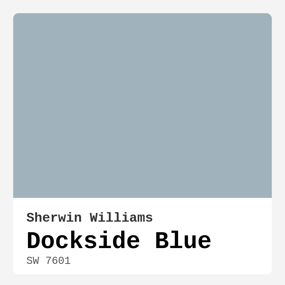
Color Preview & Key Details
| HEX Code | #A0B3BC |
| RGB | 160, 179, 188 |
| LRV | 15% |
| Undertone | Blue |
| Finish Options | Eggshell, Matte, Satin |
Imagine walking into a room that instantly soothes your soul — a space that feels like a gentle embrace, washed in tranquil hues reminiscent of coastal waters. That’s the magic of Dockside Blue, a serene and soft blue paint color by Sherwin-Williams. With its subtle hints of gray, this hue brings a refreshing vibe to your home, making it the ideal choice for anyone looking to create a calming atmosphere.
When you think about colors that uplift and rejuvenate, Dockside Blue should be at the top of your list. Its understated elegance works wonders across a variety of decor styles, from coastal to modern, Scandinavian to transitional. Whether you’re revamping your living room, bedroom, bathroom, or home office, Dockside Blue is versatile and applicable in almost any space.
Let’s talk about its characteristics. With a hex code of #A0B3BC and an RGB value of 160, 179, 188, Dockside Blue falls into the medium brightness category, reflecting very little light with an LRV of 15%. This means it’s a bit darker, which can create a cozy and intimate ambiance in your rooms. The color leans cool, making it a refreshing choice that can brighten up areas that might otherwise feel a bit dull or cramped.
One of the best aspects of Dockside Blue is how effortlessly it pairs with various trim colors. Whether you opt for a crisp white like White Dove or choose a bolder option, the contrast enhances the overall aesthetic while keeping the atmosphere inviting and calm. It’s also quite touch-up friendly, so should you accidentally scuff a wall or two, you’ve got a forgiving color that can be easily fixed.
Now, let’s address the practicality of application. Dockside Blue is beginner-friendly, applying smoothly with both brushes and rollers, making it an excellent choice for DIYers. You’ll appreciate its washability and wipeable nature, allowing for easy cleaning, which is vital in high-traffic areas or homes with children and pets. Being low VOC, it’s also a healthier option for your indoor air quality, so you can paint with peace of mind.
While the benefits are plenty, it’s essential to consider a couple of things before fully committing to Dockside Blue. In low-light conditions, it may appear darker than expected. If you’re working in a small room or an area with limited natural light, be sure to complement this color with lighter furnishings or decor to maintain that airy feel. Additionally, some users report needing multiple coats for full coverage, so be prepared for that during your project.
Now, where does Dockside Blue shine the most? Think about your living room, where it can create a serene backdrop for family gatherings. It’s equally stunning in bedrooms, offering a calming retreat at the end of the day. In bathrooms, it evokes a spa-like serenity, making your morning routine feel like a mini-vacation. And if you’re thinking of using it in a home office, imagine the focus and clarity it could inspire as you work in a space that feels both tranquil and inviting.
If you’re still on the fence, consider how Dockside Blue interacts with different lighting. In natural light, it’s soft and soothing, but under artificial light, it may take on a more muted and serene quality. This adaptability can significantly influence how the color feels at different times of the day, so don’t forget to test it in your space with your specific light sources.
When you look at complementary shades, Dockside Blue opens up a world of possibilities. Pair it with warmer colors like SW 0062 or cooler shades like SW 7077 for a sophisticated and balanced palette. It also works well with lighter shades like SW 6239 and SW 6226, should you want to create depth with a layered look.
If you’re looking for equivalent colors to explore, Sea Salt by Sherwin-Williams and Silver Mist by Benjamin Moore are excellent alternatives that offer similar calming vibes.
Now, what about small rooms? Can Dockside Blue work its magic there? Absolutely! This color can help create an illusion of depth and openness in smaller spaces, making them feel more expansive than they really are. Just remember to keep an eye on the lighting; darker areas might amplify its depth, but that can also add a unique character to the room.
What about exterior applications? While Dockside Blue is primarily recommended for interior use, it can transition to the outside as long as you select the appropriate finish and ensure it’s weather-resistant. Just know that sunlight exposure may alter its appearance over time, so always consult with your paint supplier for the best formulation.
As you consider Dockside Blue for your upcoming project, remember that color isn’t just about aesthetics; it’s about the mood you want to create in your home. This lovely blue not only calms but also invites. It’s a classic favorite that can be easily integrated into various decor styles, allowing you to express your personality while maintaining a serene, cohesive feel.
So go ahead and grab your paint swatches. Test Dockside Blue in different rooms, observe how it interacts with your existing decor, and let its cool undertones guide your design choices. You’re not just choosing a color; you’re creating an atmosphere that resonates with calmness and restfulness. With Dockside Blue, you’re sure to transform your space into a serene sanctuary that you and your loved ones will cherish for years to come.
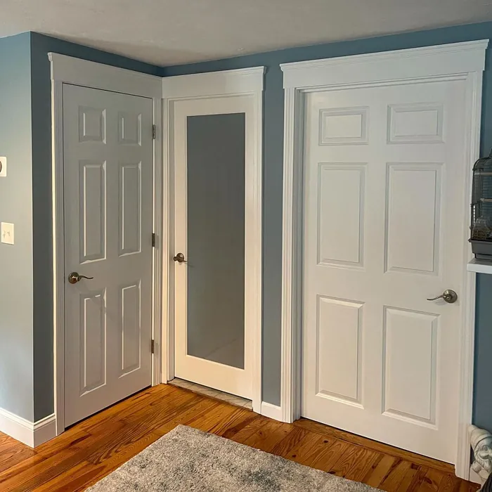
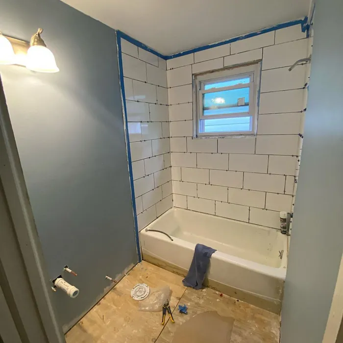
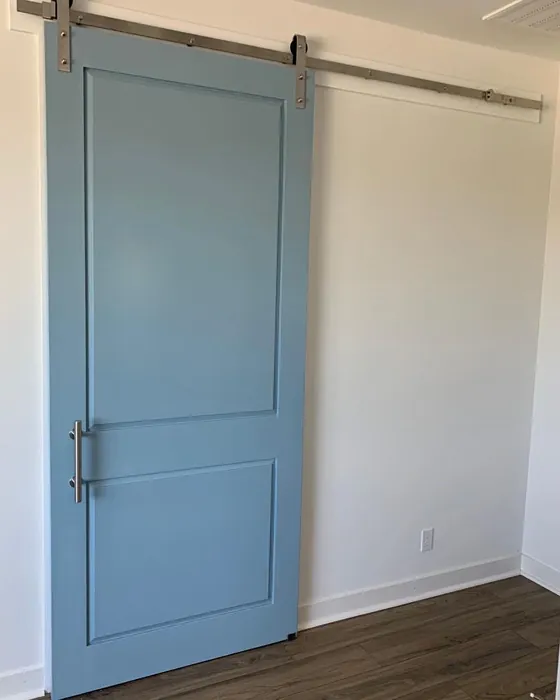
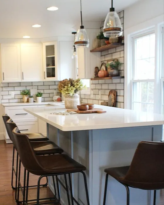
Real Room Photo of Dockside Blue SW 7601
Undertones of Dockside Blue ?
The undertones of Dockside Blue are a key aspect of its character, leaning towards Blue. These subtle underlying hues are what give the color its depth and complexity. For example, a gray with a blue undertone will feel cooler and more modern, while one with a brown undertone will feel warmer and more traditional. It’s essential to test this paint in your home and observe it next to your existing furniture, flooring, and decor to see how these undertones interact and reveal themselves throughout the day.
HEX value: #A0B3BC
RGB code: 160, 179, 188
Is Dockside Blue Cool or Warm?
This color leans towards the cool side of the spectrum, offering a refreshing look that can brighten up darker areas of your home.
Understanding Color Properties and Interior Design Tips
Hue refers to a specific position on the color wheel, measured in degrees from 0 to 360. Each degree represents a different pure color:
- 0° represents red
- 120° represents green
- 240° represents blue
Saturation describes the intensity or purity of a color and is expressed as a percentage:
- At 0%, the color appears completely desaturated—essentially a shade of gray
- At 100%, the color is at its most vivid and vibrant
Lightness indicates how light or dark a color is, also expressed as a percentage:
- 0% lightness results in black
- 100% lightness results in white
Using Warm Colors in Interior Design
Warm hues—such as reds, oranges, yellows, warm beiges, and greiges—are excellent choices for creating inviting and energetic spaces. These colors are particularly well-suited for:
- Kitchens, living rooms, and bathrooms, where warmth enhances comfort and sociability
- Large rooms, where warm tones can help reduce the sense of emptiness and make the space feel more intimate
For example:
- Warm beige shades provide a cozy, inviting atmosphere, ideal for living rooms, bedrooms, and hallways.
- Warm greige (a mix of beige and gray) offers the warmth of beige with the modern appeal of gray, making it a versatile backdrop for dining areas, bedrooms, and living spaces.
However, be mindful when using warm light tones in rooms with limited natural light. These shades may appear muted or even take on an unpleasant yellowish tint. To avoid a dull or flat appearance:
- Add depth by incorporating richer tones like deep greens, charcoal, or chocolate brown
- Use textured elements such as curtains, rugs, or cushions to bring dimension to the space
Pro Tip: Achieving Harmony with Warm and Cool Color Balance
To create a well-balanced and visually interesting interior, mix warm and cool tones strategically. This contrast adds depth and harmony to your design.
- If your walls feature warm hues, introduce cool-colored accents such as blue or green furniture, artwork, or accessories to create contrast.
- For a polished look, consider using a complementary color scheme, which pairs colors opposite each other on the color wheel (e.g., red with green, orange with blue).
This thoughtful mix not only enhances visual appeal but also creates a space that feels both dynamic and cohesive.
Light Temperature Affects on Dockside Blue
Natural Light
Natural daylight changes in color temperature as the sun moves across the sky. At sunrise and sunset, the light tends to have a warm, golden tone with a color temperature around 2000 Kelvin (K). As the day progresses and the sun rises higher, the light becomes cooler and more neutral. Around midday, especially when the sky is clear, natural light typically reaches its peak brightness and shifts to a cooler tone, ranging from 5500 to 6500 Kelvin. This midday light is close to what we perceive as pure white or daylight-balanced light.
These shifts in natural light can significantly influence how colors appear in a space, which is why designers often consider both the time of day and the orientation of windows when planning interior color schemes.
Artificial Light
When choosing artificial lighting, pay close attention to the color temperature, measured in Kelvin (K). This determines how warm or cool the light will appear. Lower temperatures, around 2700K, give off a warm, yellow glow often used in living rooms or bedrooms. Higher temperatures, above 5000K, create a cool, bluish light similar to daylight, commonly used in kitchens, offices, or task areas.
Use the slider to see how lighting temperature can affect the appearance of a surface or color throughout a space.


4800K
LRV of Dockside Blue
The Light Reflectance Value (LRV) of Dockside Blue is 15%, which places it in the Medium Dark category. This means it reflects very little light. Understanding a paint’s LRV is crucial for predicting how it will look in your space. A higher LRV indicates a lighter color that reflects more light, making rooms feel larger and brighter. A lower LRV signifies a darker color that absorbs more light, creating a cozier, more intimate atmosphere. Always consider the natural and artificial lighting in your room when selecting a paint color based on its LRV.
Detailed Review of Dockside Blue
Additional Paint Characteristics
Ideal Rooms
Bathroom, Bedroom, Home Office, Kitchen, Living Room
Decor Styles
Coastal, Modern, Scandinavian, Transitional
Coverage
Good (1–2 Coats), Touch-Up Friendly
Ease of Application
Beginner Friendly, Brush Smooth, Roller-Ready
Washability
Washable, Wipeable
VOC Level
Low VOC
Best Use
Accent Wall, Furniture, Interior Walls
Room Suitability
Bathroom, Bedroom, Home Office, Living Room
Tone Tag
Calm, Cool, Muted
Finish Type
Eggshell, Matte, Satin
Paint Performance
Easy Touch-Up, Low Odor, Quick Drying, Scuff Resistant
Use Cases
Best for Low Light Rooms, Best for Small Spaces, Classic Favorite
Mood
Calm, Inviting, Restful
Trim Pairing
Complements Cool Trim, Pairs with White Dove
Dockside Blue is a beautiful paint hue that effortlessly captures the essence of coastal living. It’s a versatile color that works well in numerous settings, from bedrooms to living rooms, creating a soothing backdrop that complements various decor styles. The paint applies smoothly, and its finish options, including eggshell and satin, provide flexibility depending on your desired look. The color holds up well under natural light, maintaining its serene qualities while adding a touch of sophistication. Whether you’re aiming for a relaxed coastal vibe or a modern aesthetic, Dockside Blue is a fantastic choice. Plus, it’s easy to pair with white trim or wooden accents, enhancing its visual appeal.
Pros & Cons of SW 7601 Dockside Blue
Pros
Cons
Colors that go with Sherwin Williams Dockside Blue
FAQ on SW 7601 Dockside Blue
Can Dockside Blue be used in a small room?
Absolutely! Dockside Blue can work beautifully in small spaces. Its cool tones help to create an illusion of depth and openness. Just be mindful of the lighting; in darker areas, it may appear a bit deeper than in well-lit rooms. Pair it with lighter furnishings or decor to keep the space feeling airy and inviting.
Is Dockside Blue suitable for exterior use?
While Dockside Blue is primarily recommended for interior spaces, it can be used for exterior applications if you select the right finish and ensure the paint is weather-resistant. Just remember that exposure to sunlight may alter its appearance over time, so be prepared for some color shifts. It’s best to consult with your paint supplier for the most suitable exterior formulation.
Comparisons Dockside Blue with other colors
Dockside Blue SW 7601 vs Dutch Tile Blue SW 0031
| Attribute | Dockside Blue SW 7601 | Dutch Tile Blue SW 0031 |
|---|---|---|
| Color Name | Dockside Blue SW 7601 | Dutch Tile Blue SW 0031 |
| Color | ||
| Hue | Blue | Blue |
| Brightness | Medium | Medium |
| RGB | 160, 179, 188 | 154, 171, 171 |
| LRV | 15% | 24% |
| Finish Type | Eggshell, Matte, Satin | Eggshell, Matte, Satin |
| Finish Options | Eggshell, Matte, Satin | Eggshell, Flat, Matte, Satin |
| Ideal Rooms | Bathroom, Bedroom, Home Office, Kitchen, Living Room | Bathroom, Bedroom, Dining Room, Hallway, Home Office, Kitchen, Living Room |
| Decor Styles | Coastal, Modern, Scandinavian, Transitional | Coastal, Modern Farmhouse, Scandinavian, Traditional, Transitional |
| Coverage | Good (1–2 Coats), Touch-Up Friendly | Good (1–2 Coats) |
| Ease of Application | Beginner Friendly, Brush Smooth, Roller-Ready | Beginner Friendly, Brush Smooth, Fast-Drying, Roller-Ready |
| Washability | Washable, Wipeable | Highly Washable, Washable |
| Room Suitability | Bathroom, Bedroom, Home Office, Living Room | Bathroom, Bedroom, Dining Room, Kitchen, Living Room |
| Tone | Calm, Cool, Muted | Balanced, Cool, Muted |
| Paint Performance | Easy Touch-Up, Low Odor, Quick Drying, Scuff Resistant | Easy Touch-Up, High Coverage, Low Odor, Quick Drying |
Dockside Blue SW 7601 vs Debonair SW 9139
| Attribute | Dockside Blue SW 7601 | Debonair SW 9139 |
|---|---|---|
| Color Name | Dockside Blue SW 7601 | Debonair SW 9139 |
| Color | ||
| Hue | Blue | Blue |
| Brightness | Medium | Medium |
| RGB | 160, 179, 188 | 144, 160, 166 |
| LRV | 15% | 30% |
| Finish Type | Eggshell, Matte, Satin | Eggshell, Matte, Satin |
| Finish Options | Eggshell, Matte, Satin | Eggshell, Matte, Satin |
| Ideal Rooms | Bathroom, Bedroom, Home Office, Kitchen, Living Room | Bedroom, Dining Room, Home Office, Living Room |
| Decor Styles | Coastal, Modern, Scandinavian, Transitional | Coastal, Industrial, Modern, Transitional |
| Coverage | Good (1–2 Coats), Touch-Up Friendly | Good (1–2 Coats) |
| Ease of Application | Beginner Friendly, Brush Smooth, Roller-Ready | Beginner Friendly, Brush Smooth, Roller-Ready |
| Washability | Washable, Wipeable | Washable, Wipeable |
| Room Suitability | Bathroom, Bedroom, Home Office, Living Room | Bedroom, Dining Room, Home Office, Living Room |
| Tone | Calm, Cool, Muted | Balanced, Cool, Muted |
| Paint Performance | Easy Touch-Up, Low Odor, Quick Drying, Scuff Resistant | Easy Touch-Up, Low Odor, Quick Drying |
Dockside Blue SW 7601 vs Stardew SW 9138
| Attribute | Dockside Blue SW 7601 | Stardew SW 9138 |
|---|---|---|
| Color Name | Dockside Blue SW 7601 | Stardew SW 9138 |
| Color | ||
| Hue | Blue | Blue |
| Brightness | Medium | Medium |
| RGB | 160, 179, 188 | 166, 178, 181 |
| LRV | 15% | 30% |
| Finish Type | Eggshell, Matte, Satin | Eggshell, Satin |
| Finish Options | Eggshell, Matte, Satin | Eggshell, Matte, Satin |
| Ideal Rooms | Bathroom, Bedroom, Home Office, Kitchen, Living Room | Bathroom, Bedroom, Home Office, Living Room, Nursery |
| Decor Styles | Coastal, Modern, Scandinavian, Transitional | Coastal, Farmhouse, Modern, Scandinavian |
| Coverage | Good (1–2 Coats), Touch-Up Friendly | Good (1–2 Coats) |
| Ease of Application | Beginner Friendly, Brush Smooth, Roller-Ready | Beginner Friendly, Brush Smooth, Roller-Ready |
| Washability | Washable, Wipeable | Highly Washable, Washable, Wipeable |
| Room Suitability | Bathroom, Bedroom, Home Office, Living Room | Bathroom, Bedroom, Home Office, Living Room |
| Tone | Calm, Cool, Muted | Calm, Cool, Muted |
| Paint Performance | Easy Touch-Up, Low Odor, Quick Drying, Scuff Resistant | Easy Touch-Up, High Coverage, Low Odor |
Dockside Blue SW 7601 vs Niebla Azul SW 9137
| Attribute | Dockside Blue SW 7601 | Niebla Azul SW 9137 |
|---|---|---|
| Color Name | Dockside Blue SW 7601 | Niebla Azul SW 9137 |
| Color | ||
| Hue | Blue | Blue |
| Brightness | Medium | Medium |
| RGB | 160, 179, 188 | 182, 195, 196 |
| LRV | 15% | 48% |
| Finish Type | Eggshell, Matte, Satin | Eggshell, Matte, Satin |
| Finish Options | Eggshell, Matte, Satin | Eggshell, Matte, Satin |
| Ideal Rooms | Bathroom, Bedroom, Home Office, Kitchen, Living Room | Bedroom, Home Office, Living Room, Nursery |
| Decor Styles | Coastal, Modern, Scandinavian, Transitional | Coastal, Modern, Scandinavian, Transitional |
| Coverage | Good (1–2 Coats), Touch-Up Friendly | Good (1–2 Coats), Touch-Up Friendly |
| Ease of Application | Beginner Friendly, Brush Smooth, Roller-Ready | Beginner Friendly, Brush Smooth, Roller-Ready |
| Washability | Washable, Wipeable | Highly Washable, Washable |
| Room Suitability | Bathroom, Bedroom, Home Office, Living Room | Bedroom, Home Office, Living Room, Nursery |
| Tone | Calm, Cool, Muted | Airy, Cool, Muted |
| Paint Performance | Easy Touch-Up, Low Odor, Quick Drying, Scuff Resistant | Easy Touch-Up, Fade Resistant, Low Odor, Scuff Resistant |
Dockside Blue SW 7601 vs Rain SW 6219
| Attribute | Dockside Blue SW 7601 | Rain SW 6219 |
|---|---|---|
| Color Name | Dockside Blue SW 7601 | Rain SW 6219 |
| Color | ||
| Hue | Blue | Blue |
| Brightness | Medium | Medium |
| RGB | 160, 179, 188 | 171, 190, 191 |
| LRV | 15% | 50% |
| Finish Type | Eggshell, Matte, Satin | Eggshell, Matte, Satin |
| Finish Options | Eggshell, Matte, Satin | Eggshell, Matte, Satin |
| Ideal Rooms | Bathroom, Bedroom, Home Office, Kitchen, Living Room | Bathroom, Bedroom, Home Office, Living Room, Nursery |
| Decor Styles | Coastal, Modern, Scandinavian, Transitional | Coastal, Minimalist, Modern, Scandinavian, Transitional |
| Coverage | Good (1–2 Coats), Touch-Up Friendly | Good (1–2 Coats), Touch-Up Friendly |
| Ease of Application | Beginner Friendly, Brush Smooth, Roller-Ready | Beginner Friendly, Brush Smooth, Fast-Drying, Roller-Ready |
| Washability | Washable, Wipeable | Scrubbable, Stain Resistant, Washable |
| Room Suitability | Bathroom, Bedroom, Home Office, Living Room | Bathroom, Bedroom, Home Office, Living Room, Nursery |
| Tone | Calm, Cool, Muted | Balanced, Cool, Muted |
| Paint Performance | Easy Touch-Up, Low Odor, Quick Drying, Scuff Resistant | Easy Touch-Up, Low Odor, Quick Drying, Stain Resistant |
Dockside Blue SW 7601 vs Morning at Sea SW 9634
| Attribute | Dockside Blue SW 7601 | Morning at Sea SW 9634 |
|---|---|---|
| Color Name | Dockside Blue SW 7601 | Morning at Sea SW 9634 |
| Color | ||
| Hue | Blue | Blue |
| Brightness | Medium | Medium |
| RGB | 160, 179, 188 | 130, 151, 155 |
| LRV | 15% | 50% |
| Finish Type | Eggshell, Matte, Satin | Eggshell, Matte |
| Finish Options | Eggshell, Matte, Satin | Eggshell, Matte, Satin |
| Ideal Rooms | Bathroom, Bedroom, Home Office, Kitchen, Living Room | Bathroom, Bedroom, Home Office, Living Room |
| Decor Styles | Coastal, Modern, Scandinavian, Transitional | Coastal, Minimalist, Modern, Scandinavian |
| Coverage | Good (1–2 Coats), Touch-Up Friendly | Good (1–2 Coats), Touch-Up Friendly |
| Ease of Application | Beginner Friendly, Brush Smooth, Roller-Ready | Beginner Friendly, Brush Smooth, Roller-Ready |
| Washability | Washable, Wipeable | Washable, Wipeable |
| Room Suitability | Bathroom, Bedroom, Home Office, Living Room | Bathroom, Bedroom, Home Office, Living Room |
| Tone | Calm, Cool, Muted | Airy, Cool, Muted |
| Paint Performance | Easy Touch-Up, Low Odor, Quick Drying, Scuff Resistant | Easy Touch-Up, Fade Resistant, Low Odor |
Dockside Blue SW 7601 vs Sleepy Blue SW 6225
| Attribute | Dockside Blue SW 7601 | Sleepy Blue SW 6225 |
|---|---|---|
| Color Name | Dockside Blue SW 7601 | Sleepy Blue SW 6225 |
| Color | ||
| Hue | Blue | Blue |
| Brightness | Medium | Medium |
| RGB | 160, 179, 188 | 188, 203, 206 |
| LRV | 15% | 50% |
| Finish Type | Eggshell, Matte, Satin | Eggshell, Matte, Satin |
| Finish Options | Eggshell, Matte, Satin | Eggshell, Matte, Satin |
| Ideal Rooms | Bathroom, Bedroom, Home Office, Kitchen, Living Room | Bedroom, Home Office, Living Room, Nursery |
| Decor Styles | Coastal, Modern, Scandinavian, Transitional | Coastal, Minimalist, Modern Farmhouse, Scandinavian |
| Coverage | Good (1–2 Coats), Touch-Up Friendly | Good (1–2 Coats) |
| Ease of Application | Beginner Friendly, Brush Smooth, Roller-Ready | Beginner Friendly, Brush Smooth, Fast-Drying, Roller-Ready |
| Washability | Washable, Wipeable | Highly Washable, Washable |
| Room Suitability | Bathroom, Bedroom, Home Office, Living Room | Bedroom, Home Office, Living Room, Nursery |
| Tone | Calm, Cool, Muted | Airy, Cool, Muted |
| Paint Performance | Easy Touch-Up, Low Odor, Quick Drying, Scuff Resistant | Easy Touch-Up, Low Odor, Quick Drying, Scuff Resistant |
Dockside Blue SW 7601 vs Lakeside SW 9683
| Attribute | Dockside Blue SW 7601 | Lakeside SW 9683 |
|---|---|---|
| Color Name | Dockside Blue SW 7601 | Lakeside SW 9683 |
| Color | ||
| Hue | Blue | Blue |
| Brightness | Medium | Medium |
| RGB | 160, 179, 188 | 173, 184, 192 |
| LRV | 15% | 24% |
| Finish Type | Eggshell, Matte, Satin | Eggshell, Matte, Satin |
| Finish Options | Eggshell, Matte, Satin | Eggshell, Matte, Satin |
| Ideal Rooms | Bathroom, Bedroom, Home Office, Kitchen, Living Room | Bathroom, Bedroom, Home Office, Living Room |
| Decor Styles | Coastal, Modern, Scandinavian, Transitional | Coastal, Minimalist, Modern, Rustic |
| Coverage | Good (1–2 Coats), Touch-Up Friendly | Good (1–2 Coats) |
| Ease of Application | Beginner Friendly, Brush Smooth, Roller-Ready | Beginner Friendly, Brush Smooth, Roller-Ready |
| Washability | Washable, Wipeable | Scrubbable, Washable |
| Room Suitability | Bathroom, Bedroom, Home Office, Living Room | Bathroom, Bedroom, Home Office, Living Room |
| Tone | Calm, Cool, Muted | Balanced, Cool, Muted |
| Paint Performance | Easy Touch-Up, Low Odor, Quick Drying, Scuff Resistant | Easy Touch-Up, Fade Resistant, High Coverage, Low Odor |
Dockside Blue SW 7601 vs Upward SW 6239
| Attribute | Dockside Blue SW 7601 | Upward SW 6239 |
|---|---|---|
| Color Name | Dockside Blue SW 7601 | Upward SW 6239 |
| Color | ||
| Hue | Blue | Blue |
| Brightness | Medium | Medium |
| RGB | 160, 179, 188 | 191, 201, 208 |
| LRV | 15% | 75% |
| Finish Type | Eggshell, Matte, Satin | Eggshell, Satin |
| Finish Options | Eggshell, Matte, Satin | Eggshell, Flat, Satin |
| Ideal Rooms | Bathroom, Bedroom, Home Office, Kitchen, Living Room | Bedroom, Dining Room, Home Office, Living Room, Nursery |
| Decor Styles | Coastal, Modern, Scandinavian, Transitional | Coastal, Minimalist, Modern, Scandinavian |
| Coverage | Good (1–2 Coats), Touch-Up Friendly | Good (1–2 Coats), Touch-Up Friendly |
| Ease of Application | Beginner Friendly, Brush Smooth, Roller-Ready | Beginner Friendly, Brush Smooth, Fast-Drying, Roller-Ready |
| Washability | Washable, Wipeable | Washable, Wipeable |
| Room Suitability | Bathroom, Bedroom, Home Office, Living Room | Bedroom, Home Office, Living Room, Nursery |
| Tone | Calm, Cool, Muted | Cool, Crisp, Muted |
| Paint Performance | Easy Touch-Up, Low Odor, Quick Drying, Scuff Resistant | High Coverage, Low Odor, Quick Drying |
Dockside Blue SW 7601 vs Aleutian SW 6241
| Attribute | Dockside Blue SW 7601 | Aleutian SW 6241 |
|---|---|---|
| Color Name | Dockside Blue SW 7601 | Aleutian SW 6241 |
| Color | ||
| Hue | Blue | Blue |
| Brightness | Medium | Medium |
| RGB | 160, 179, 188 | 152, 169, 183 |
| LRV | 15% | 24% |
| Finish Type | Eggshell, Matte, Satin | Eggshell, Matte, Satin |
| Finish Options | Eggshell, Matte, Satin | Eggshell, Matte, Satin |
| Ideal Rooms | Bathroom, Bedroom, Home Office, Kitchen, Living Room | Bathroom, Bedroom, Home Office, Kitchen, Living Room, Nursery |
| Decor Styles | Coastal, Modern, Scandinavian, Transitional | Coastal, Minimalist, Modern, Scandinavian, Transitional |
| Coverage | Good (1–2 Coats), Touch-Up Friendly | Good (1–2 Coats), Touch-Up Friendly |
| Ease of Application | Beginner Friendly, Brush Smooth, Roller-Ready | Beginner Friendly, Brush Smooth, Fast-Drying, Roller-Ready |
| Washability | Washable, Wipeable | Scrubbable, Stain Resistant, Washable |
| Room Suitability | Bathroom, Bedroom, Home Office, Living Room | Bathroom, Bedroom, Home Office, Living Room, Nursery |
| Tone | Calm, Cool, Muted | Airy, Balanced, Cool, Muted |
| Paint Performance | Easy Touch-Up, Low Odor, Quick Drying, Scuff Resistant | Easy Touch-Up, Fade Resistant, Low Odor, Quick Drying |
Official Page of Sherwin Williams Dockside Blue SW 7601