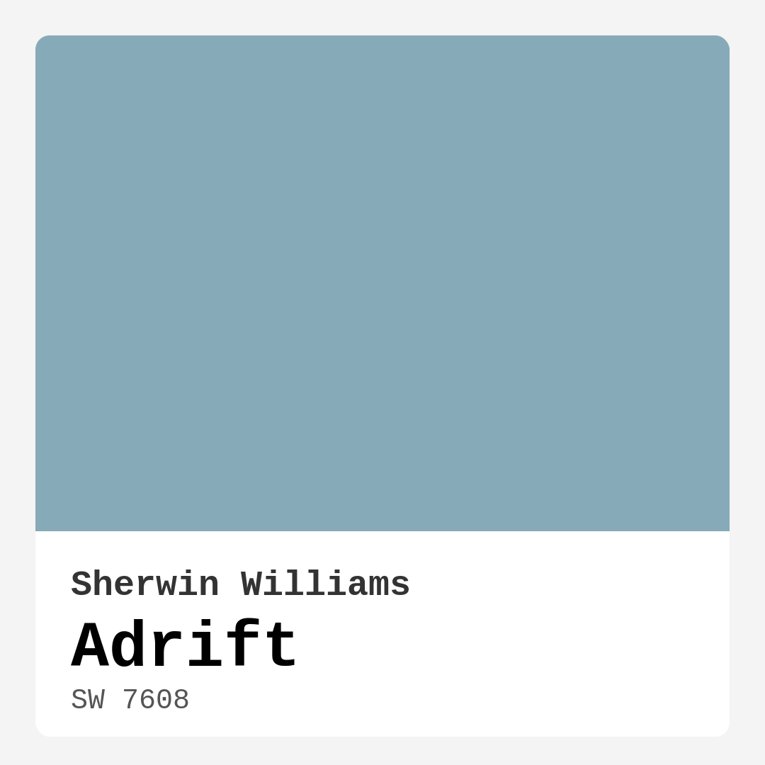
Color Preview & Key Details
| HEX Code | #87AAB9 |
| RGB | 135, 170, 185 |
| LRV | 48% |
| Undertone | Blue |
| Finish Options | Eggshell, Matte, Satin |
Imagine stepping into a room that instantly envelops you in calmness, where the soft blue tones mimic the gentle ebb and flow of coastal waters. That’s the magic of Sherwin Williams’ Adrift (SW 7608). It’s not just a color; it’s an experience waiting to unfold in your home. Whether you’re reimagining your bedroom, refreshing your living room, or crafting a serene bathroom retreat, Adrift offers a tranquil backdrop that speaks volumes.
Adrift is a serene, medium blue that translates effortlessly into various styles, from coastal charm to modern minimalism. With its light reflectance value (LRV) of 48%, it reflects just the right amount of light to keep a space feeling airy without overwhelming it. This makes it an ideal choice for both large and small rooms. If you’re contemplating a paint project, think about how Adrift can transform your space into a peaceful oasis that beckons relaxation.
One of the most appealing aspects of Adrift is its versatility. It seamlessly complements various decor styles, whether you lean toward the clean lines of Scandinavian design or the relaxed ambiance of coastal themes. Its soft, muted tone creates a soothing atmosphere, perfect for unwinding after a long day or enjoying lazy weekends at home. And if you’re concerned about how it will play with your existing decor, remember that the subtle blue undertones offer a refreshing yet neutral backdrop that can enhance the beauty of your furnishings.
Speaking of undertones, the blue in Adrift is distinct yet gentle. This color leans cool, creating a refreshing ambiance that feels modern and inviting. In natural light, Adrift can appear brighter and more vibrant, while in the cozy glow of evening lighting, it softens into a gentle hue that remains calm and composed. Testing a swatch in different lighting will give you a clearer picture of how it interacts with your space throughout the day.
You might be wondering about its application and maintenance. Adrift is a beginner-friendly paint, making it an excellent choice for DIY enthusiasts. It applies smoothly and dries evenly, reducing the worry of streaks or patchiness. Typically, you’ll need one to two coats for optimal coverage, which is manageable even for novice painters. Plus, its washable nature means that a quick wipe can keep those walls looking fresh and inviting.
When choosing paint, one often overlooks the importance of washability, but Adrift shines in this area. With its highly washable finish, you can maintain its serene appeal without the anxiety of scuffs or marks. This is especially beneficial in high-traffic areas or homes with children and pets.
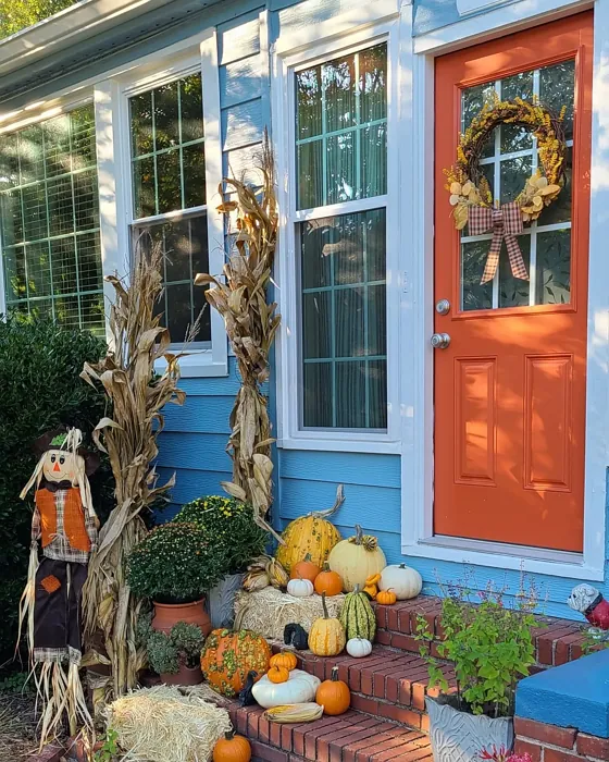
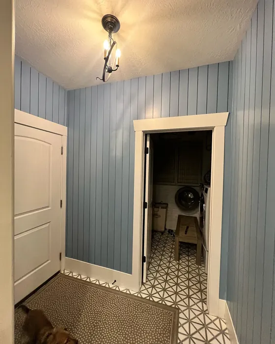
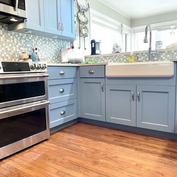
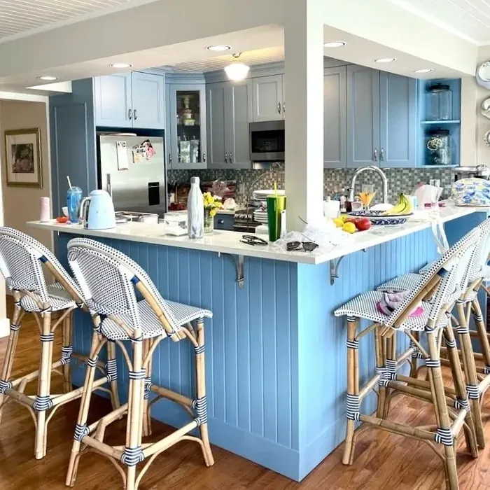
Think about where you want to use Adrift. It’s perfectly suited for bedrooms and bathrooms, where you want to evoke a sense of peace and tranquility. Imagine waking up in a cool blue-hued bedroom that feels like a gentle sea breeze. Or picture a bathroom where you can escape the chaos of daily life, surrounded by calming waves of color. Living rooms and home offices also benefit from Adrift’s refreshing qualities, creating spaces that feel inviting and focused.
You might be curious about how Adrift compares to other blue paints. It stands apart with its unique blend of soft blue and subtle green undertones. Unlike more traditional blue hues, Adrift is less saturated, allowing it to serve as a versatile backdrop for various design elements. This color is particularly favored for spaces aimed at relaxation, like bedrooms and bathrooms. Its calming quality can transform even the busiest of environments into restful retreats.
To make the most of this lovely hue, consider pairing it with complementary colors. Adrift teams beautifully with whites and creams, especially shades like White Dove, which can enhance its airy feel. You can also explore deeper shades for accents, such as SW 7609 or SW 7606, to create a dynamic and layered look. If you want to keep things light, lighter shades like SW 6514 can maintain that soft, inviting vibe.
For those of you who are renting or want to try something new without a long-term commitment, Adrift is an excellent choice. It’s a classic favorite that can adapt to changing decor styles, allowing you to refresh your space without feeling locked into a specific look.
When considering the right finish, both eggshell and satin finishes work exceptionally well with Adrift. The subtle sheen of these finishes will help to reflect light just enough to create that glowing effect while maintaining the soft softness of the color.
As you embark on your painting journey, don’t forget to test Adrift in your space. Paint a small swatch on your wall and observe how it changes throughout the day. Look at it in natural light, artificial light, and at night. This will help you appreciate the depth and character of the color as it interacts with your specific lighting conditions and furnishings.
In conclusion, Adrift is more than just a paint color; it’s an invitation to create a serene and inviting atmosphere in your home. Its tranquil blue tones, versatile applications, and calming essence make it a top choice for those looking to enhance their living spaces. Whether you’re aiming for a coastal retreat, a modern sanctuary, or a minimalist haven, Adrift’s gentle embrace can help you achieve your vision. So why not take the plunge? Transform your space with Adrift, and let that calm ocean breeze fill your home.
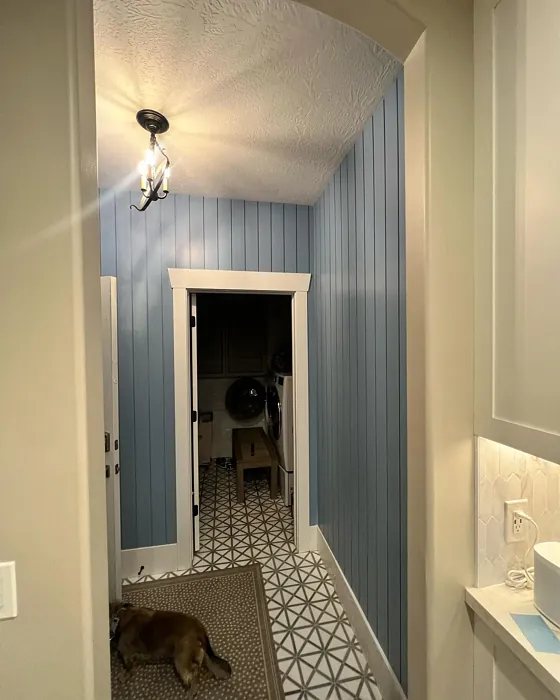
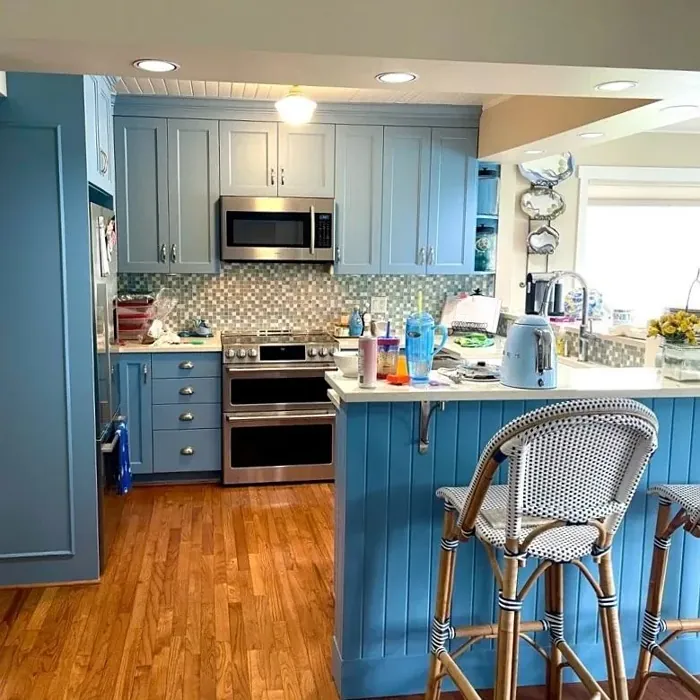
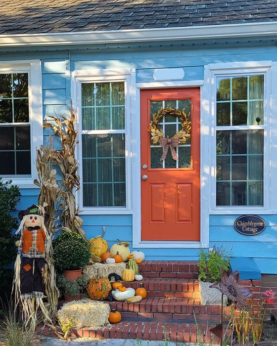
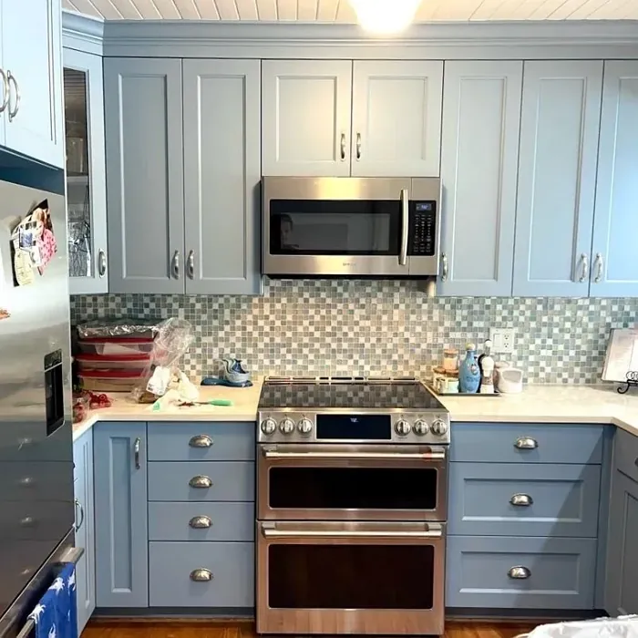
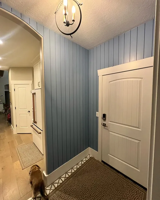
Real Room Photo of Adrift SW 7608
Undertones of Adrift ?
The undertones of Adrift are a key aspect of its character, leaning towards Blue. These subtle underlying hues are what give the color its depth and complexity. For example, a gray with a blue undertone will feel cooler and more modern, while one with a brown undertone will feel warmer and more traditional. It’s essential to test this paint in your home and observe it next to your existing furniture, flooring, and decor to see how these undertones interact and reveal themselves throughout the day.
HEX value: #87AAB9
RGB code: 135, 170, 185
Is Adrift Cool or Warm?
This color leans cool, creating a refreshing ambiance that’s perfect for spaces where you want to unwind and relax.
Understanding Color Properties and Interior Design Tips
Hue refers to a specific position on the color wheel, measured in degrees from 0 to 360. Each degree represents a different pure color:
- 0° represents red
- 120° represents green
- 240° represents blue
Saturation describes the intensity or purity of a color and is expressed as a percentage:
- At 0%, the color appears completely desaturated—essentially a shade of gray
- At 100%, the color is at its most vivid and vibrant
Lightness indicates how light or dark a color is, also expressed as a percentage:
- 0% lightness results in black
- 100% lightness results in white
Using Warm Colors in Interior Design
Warm hues—such as reds, oranges, yellows, warm beiges, and greiges—are excellent choices for creating inviting and energetic spaces. These colors are particularly well-suited for:
- Kitchens, living rooms, and bathrooms, where warmth enhances comfort and sociability
- Large rooms, where warm tones can help reduce the sense of emptiness and make the space feel more intimate
For example:
- Warm beige shades provide a cozy, inviting atmosphere, ideal for living rooms, bedrooms, and hallways.
- Warm greige (a mix of beige and gray) offers the warmth of beige with the modern appeal of gray, making it a versatile backdrop for dining areas, bedrooms, and living spaces.
However, be mindful when using warm light tones in rooms with limited natural light. These shades may appear muted or even take on an unpleasant yellowish tint. To avoid a dull or flat appearance:
- Add depth by incorporating richer tones like deep greens, charcoal, or chocolate brown
- Use textured elements such as curtains, rugs, or cushions to bring dimension to the space
Pro Tip: Achieving Harmony with Warm and Cool Color Balance
To create a well-balanced and visually interesting interior, mix warm and cool tones strategically. This contrast adds depth and harmony to your design.
- If your walls feature warm hues, introduce cool-colored accents such as blue or green furniture, artwork, or accessories to create contrast.
- For a polished look, consider using a complementary color scheme, which pairs colors opposite each other on the color wheel (e.g., red with green, orange with blue).
This thoughtful mix not only enhances visual appeal but also creates a space that feels both dynamic and cohesive.
Light Temperature Affects on Adrift
Natural Light
Natural daylight changes in color temperature as the sun moves across the sky. At sunrise and sunset, the light tends to have a warm, golden tone with a color temperature around 2000 Kelvin (K). As the day progresses and the sun rises higher, the light becomes cooler and more neutral. Around midday, especially when the sky is clear, natural light typically reaches its peak brightness and shifts to a cooler tone, ranging from 5500 to 6500 Kelvin. This midday light is close to what we perceive as pure white or daylight-balanced light.
These shifts in natural light can significantly influence how colors appear in a space, which is why designers often consider both the time of day and the orientation of windows when planning interior color schemes.
Artificial Light
When choosing artificial lighting, pay close attention to the color temperature, measured in Kelvin (K). This determines how warm or cool the light will appear. Lower temperatures, around 2700K, give off a warm, yellow glow often used in living rooms or bedrooms. Higher temperatures, above 5000K, create a cool, bluish light similar to daylight, commonly used in kitchens, offices, or task areas.
Use the slider to see how lighting temperature can affect the appearance of a surface or color throughout a space.


4800K
LRV of Adrift
The Light Reflectance Value (LRV) of Adrift is 48%, which places it in the Medium category. This means it Reflects a moderate amount of light. Understanding a paint’s LRV is crucial for predicting how it will look in your space. A higher LRV indicates a lighter color that reflects more light, making rooms feel larger and brighter. A lower LRV signifies a darker color that absorbs more light, creating a cozier, more intimate atmosphere. Always consider the natural and artificial lighting in your room when selecting a paint color based on its LRV.
Detailed Review of Adrift
Additional Paint Characteristics
Ideal Rooms
Bathroom, Bedroom, Home Office, Living Room
Decor Styles
Coastal, Minimalist, Modern, Scandinavian
Coverage
Good (1–2 Coats)
Ease of Application
Beginner Friendly, Brush Smooth, Roller-Ready
Washability
Highly Washable, Washable
VOC Level
Low VOC
Best Use
Accent Wall, Bathroom, Bedroom, Interior Walls
Room Suitability
Bathroom, Bedroom, Home Office, Living Room
Tone Tag
Airy, Cool, Muted
Finish Type
Eggshell, Satin
Paint Performance
Low Odor, Quick Drying, Stain Resistant
Use Cases
Best for Rentals, Best for Small Spaces, Classic Favorite
Mood
Calm, Inviting, Restful
Trim Pairing
Complements Cool Trim, Pairs with White Dove
Adrift is a fantastic choice if you’re looking for a color that feels fresh yet soothing. The soft blue hue is reminiscent of gentle ocean waves, making it an ideal backdrop for relaxation. When applied, it provides a gentle wash of color that enhances natural light beautifully, giving rooms an airy feel. This paint works well with both modern and traditional furnishings, making it versatile enough for various decor styles. It applies smoothly and dries evenly, ensuring that you won’t need to worry about streaks or uneven patches. The calming effect of Adrift can transform even the busiest of spaces into a peaceful retreat.
Pros & Cons of SW 7608 Adrift
Pros
Cons
Colors that go with Sherwin Williams Adrift
FAQ on SW 7608 Adrift
Can Adrift be used in small spaces?
Absolutely! Adrift is a great choice for small spaces. Its soft blue tone can make compact areas feel more open and airy. Just be sure to use adequate lighting to enhance its calming effect. Pairing it with lighter furnishings can also help maintain a spacious feel.
How does Adrift compare to other blue paints?
Adrift stands out with its unique blend of soft blue and subtle green undertones, setting it apart from more traditional blue hues. It’s less saturated than many blues, which allows for versatility in decor styles. This color is perfect for those looking for a serene backdrop that still feels fresh and modern. The calming quality makes it a favorite for bedrooms and bathrooms.
Comparisons Adrift with other colors
Adrift SW 7608 vs Dutch Tile Blue SW 0031
| Attribute | Adrift SW 7608 | Dutch Tile Blue SW 0031 |
|---|---|---|
| Color Name | Adrift SW 7608 | Dutch Tile Blue SW 0031 |
| Color | ||
| Hue | Blue | Blue |
| Brightness | Medium | Medium |
| RGB | 135, 170, 185 | 154, 171, 171 |
| LRV | 48% | 24% |
| Finish Type | Eggshell, Satin | Eggshell, Matte, Satin |
| Finish Options | Eggshell, Matte, Satin | Eggshell, Flat, Matte, Satin |
| Ideal Rooms | Bathroom, Bedroom, Home Office, Living Room | Bathroom, Bedroom, Dining Room, Hallway, Home Office, Kitchen, Living Room |
| Decor Styles | Coastal, Minimalist, Modern, Scandinavian | Coastal, Modern Farmhouse, Scandinavian, Traditional, Transitional |
| Coverage | Good (1–2 Coats) | Good (1–2 Coats) |
| Ease of Application | Beginner Friendly, Brush Smooth, Roller-Ready | Beginner Friendly, Brush Smooth, Fast-Drying, Roller-Ready |
| Washability | Highly Washable, Washable | Highly Washable, Washable |
| Room Suitability | Bathroom, Bedroom, Home Office, Living Room | Bathroom, Bedroom, Dining Room, Kitchen, Living Room |
| Tone | Airy, Cool, Muted | Balanced, Cool, Muted |
| Paint Performance | Low Odor, Quick Drying, Stain Resistant | Easy Touch-Up, High Coverage, Low Odor, Quick Drying |
Adrift SW 7608 vs Debonair SW 9139
| Attribute | Adrift SW 7608 | Debonair SW 9139 |
|---|---|---|
| Color Name | Adrift SW 7608 | Debonair SW 9139 |
| Color | ||
| Hue | Blue | Blue |
| Brightness | Medium | Medium |
| RGB | 135, 170, 185 | 144, 160, 166 |
| LRV | 48% | 30% |
| Finish Type | Eggshell, Satin | Eggshell, Matte, Satin |
| Finish Options | Eggshell, Matte, Satin | Eggshell, Matte, Satin |
| Ideal Rooms | Bathroom, Bedroom, Home Office, Living Room | Bedroom, Dining Room, Home Office, Living Room |
| Decor Styles | Coastal, Minimalist, Modern, Scandinavian | Coastal, Industrial, Modern, Transitional |
| Coverage | Good (1–2 Coats) | Good (1–2 Coats) |
| Ease of Application | Beginner Friendly, Brush Smooth, Roller-Ready | Beginner Friendly, Brush Smooth, Roller-Ready |
| Washability | Highly Washable, Washable | Washable, Wipeable |
| Room Suitability | Bathroom, Bedroom, Home Office, Living Room | Bedroom, Dining Room, Home Office, Living Room |
| Tone | Airy, Cool, Muted | Balanced, Cool, Muted |
| Paint Performance | Low Odor, Quick Drying, Stain Resistant | Easy Touch-Up, Low Odor, Quick Drying |
Adrift SW 7608 vs Stardew SW 9138
| Attribute | Adrift SW 7608 | Stardew SW 9138 |
|---|---|---|
| Color Name | Adrift SW 7608 | Stardew SW 9138 |
| Color | ||
| Hue | Blue | Blue |
| Brightness | Medium | Medium |
| RGB | 135, 170, 185 | 166, 178, 181 |
| LRV | 48% | 30% |
| Finish Type | Eggshell, Satin | Eggshell, Satin |
| Finish Options | Eggshell, Matte, Satin | Eggshell, Matte, Satin |
| Ideal Rooms | Bathroom, Bedroom, Home Office, Living Room | Bathroom, Bedroom, Home Office, Living Room, Nursery |
| Decor Styles | Coastal, Minimalist, Modern, Scandinavian | Coastal, Farmhouse, Modern, Scandinavian |
| Coverage | Good (1–2 Coats) | Good (1–2 Coats) |
| Ease of Application | Beginner Friendly, Brush Smooth, Roller-Ready | Beginner Friendly, Brush Smooth, Roller-Ready |
| Washability | Highly Washable, Washable | Highly Washable, Washable, Wipeable |
| Room Suitability | Bathroom, Bedroom, Home Office, Living Room | Bathroom, Bedroom, Home Office, Living Room |
| Tone | Airy, Cool, Muted | Calm, Cool, Muted |
| Paint Performance | Low Odor, Quick Drying, Stain Resistant | Easy Touch-Up, High Coverage, Low Odor |
Adrift SW 7608 vs Niebla Azul SW 9137
| Attribute | Adrift SW 7608 | Niebla Azul SW 9137 |
|---|---|---|
| Color Name | Adrift SW 7608 | Niebla Azul SW 9137 |
| Color | ||
| Hue | Blue | Blue |
| Brightness | Medium | Medium |
| RGB | 135, 170, 185 | 182, 195, 196 |
| LRV | 48% | 48% |
| Finish Type | Eggshell, Satin | Eggshell, Matte, Satin |
| Finish Options | Eggshell, Matte, Satin | Eggshell, Matte, Satin |
| Ideal Rooms | Bathroom, Bedroom, Home Office, Living Room | Bedroom, Home Office, Living Room, Nursery |
| Decor Styles | Coastal, Minimalist, Modern, Scandinavian | Coastal, Modern, Scandinavian, Transitional |
| Coverage | Good (1–2 Coats) | Good (1–2 Coats), Touch-Up Friendly |
| Ease of Application | Beginner Friendly, Brush Smooth, Roller-Ready | Beginner Friendly, Brush Smooth, Roller-Ready |
| Washability | Highly Washable, Washable | Highly Washable, Washable |
| Room Suitability | Bathroom, Bedroom, Home Office, Living Room | Bedroom, Home Office, Living Room, Nursery |
| Tone | Airy, Cool, Muted | Airy, Cool, Muted |
| Paint Performance | Low Odor, Quick Drying, Stain Resistant | Easy Touch-Up, Fade Resistant, Low Odor, Scuff Resistant |
Adrift SW 7608 vs Rain SW 6219
| Attribute | Adrift SW 7608 | Rain SW 6219 |
|---|---|---|
| Color Name | Adrift SW 7608 | Rain SW 6219 |
| Color | ||
| Hue | Blue | Blue |
| Brightness | Medium | Medium |
| RGB | 135, 170, 185 | 171, 190, 191 |
| LRV | 48% | 50% |
| Finish Type | Eggshell, Satin | Eggshell, Matte, Satin |
| Finish Options | Eggshell, Matte, Satin | Eggshell, Matte, Satin |
| Ideal Rooms | Bathroom, Bedroom, Home Office, Living Room | Bathroom, Bedroom, Home Office, Living Room, Nursery |
| Decor Styles | Coastal, Minimalist, Modern, Scandinavian | Coastal, Minimalist, Modern, Scandinavian, Transitional |
| Coverage | Good (1–2 Coats) | Good (1–2 Coats), Touch-Up Friendly |
| Ease of Application | Beginner Friendly, Brush Smooth, Roller-Ready | Beginner Friendly, Brush Smooth, Fast-Drying, Roller-Ready |
| Washability | Highly Washable, Washable | Scrubbable, Stain Resistant, Washable |
| Room Suitability | Bathroom, Bedroom, Home Office, Living Room | Bathroom, Bedroom, Home Office, Living Room, Nursery |
| Tone | Airy, Cool, Muted | Balanced, Cool, Muted |
| Paint Performance | Low Odor, Quick Drying, Stain Resistant | Easy Touch-Up, Low Odor, Quick Drying, Stain Resistant |
Adrift SW 7608 vs Morning at Sea SW 9634
| Attribute | Adrift SW 7608 | Morning at Sea SW 9634 |
|---|---|---|
| Color Name | Adrift SW 7608 | Morning at Sea SW 9634 |
| Color | ||
| Hue | Blue | Blue |
| Brightness | Medium | Medium |
| RGB | 135, 170, 185 | 130, 151, 155 |
| LRV | 48% | 50% |
| Finish Type | Eggshell, Satin | Eggshell, Matte |
| Finish Options | Eggshell, Matte, Satin | Eggshell, Matte, Satin |
| Ideal Rooms | Bathroom, Bedroom, Home Office, Living Room | Bathroom, Bedroom, Home Office, Living Room |
| Decor Styles | Coastal, Minimalist, Modern, Scandinavian | Coastal, Minimalist, Modern, Scandinavian |
| Coverage | Good (1–2 Coats) | Good (1–2 Coats), Touch-Up Friendly |
| Ease of Application | Beginner Friendly, Brush Smooth, Roller-Ready | Beginner Friendly, Brush Smooth, Roller-Ready |
| Washability | Highly Washable, Washable | Washable, Wipeable |
| Room Suitability | Bathroom, Bedroom, Home Office, Living Room | Bathroom, Bedroom, Home Office, Living Room |
| Tone | Airy, Cool, Muted | Airy, Cool, Muted |
| Paint Performance | Low Odor, Quick Drying, Stain Resistant | Easy Touch-Up, Fade Resistant, Low Odor |
Adrift SW 7608 vs Sleepy Blue SW 6225
| Attribute | Adrift SW 7608 | Sleepy Blue SW 6225 |
|---|---|---|
| Color Name | Adrift SW 7608 | Sleepy Blue SW 6225 |
| Color | ||
| Hue | Blue | Blue |
| Brightness | Medium | Medium |
| RGB | 135, 170, 185 | 188, 203, 206 |
| LRV | 48% | 50% |
| Finish Type | Eggshell, Satin | Eggshell, Matte, Satin |
| Finish Options | Eggshell, Matte, Satin | Eggshell, Matte, Satin |
| Ideal Rooms | Bathroom, Bedroom, Home Office, Living Room | Bedroom, Home Office, Living Room, Nursery |
| Decor Styles | Coastal, Minimalist, Modern, Scandinavian | Coastal, Minimalist, Modern Farmhouse, Scandinavian |
| Coverage | Good (1–2 Coats) | Good (1–2 Coats) |
| Ease of Application | Beginner Friendly, Brush Smooth, Roller-Ready | Beginner Friendly, Brush Smooth, Fast-Drying, Roller-Ready |
| Washability | Highly Washable, Washable | Highly Washable, Washable |
| Room Suitability | Bathroom, Bedroom, Home Office, Living Room | Bedroom, Home Office, Living Room, Nursery |
| Tone | Airy, Cool, Muted | Airy, Cool, Muted |
| Paint Performance | Low Odor, Quick Drying, Stain Resistant | Easy Touch-Up, Low Odor, Quick Drying, Scuff Resistant |
Adrift SW 7608 vs Lakeside SW 9683
| Attribute | Adrift SW 7608 | Lakeside SW 9683 |
|---|---|---|
| Color Name | Adrift SW 7608 | Lakeside SW 9683 |
| Color | ||
| Hue | Blue | Blue |
| Brightness | Medium | Medium |
| RGB | 135, 170, 185 | 173, 184, 192 |
| LRV | 48% | 24% |
| Finish Type | Eggshell, Satin | Eggshell, Matte, Satin |
| Finish Options | Eggshell, Matte, Satin | Eggshell, Matte, Satin |
| Ideal Rooms | Bathroom, Bedroom, Home Office, Living Room | Bathroom, Bedroom, Home Office, Living Room |
| Decor Styles | Coastal, Minimalist, Modern, Scandinavian | Coastal, Minimalist, Modern, Rustic |
| Coverage | Good (1–2 Coats) | Good (1–2 Coats) |
| Ease of Application | Beginner Friendly, Brush Smooth, Roller-Ready | Beginner Friendly, Brush Smooth, Roller-Ready |
| Washability | Highly Washable, Washable | Scrubbable, Washable |
| Room Suitability | Bathroom, Bedroom, Home Office, Living Room | Bathroom, Bedroom, Home Office, Living Room |
| Tone | Airy, Cool, Muted | Balanced, Cool, Muted |
| Paint Performance | Low Odor, Quick Drying, Stain Resistant | Easy Touch-Up, Fade Resistant, High Coverage, Low Odor |
Adrift SW 7608 vs Upward SW 6239
| Attribute | Adrift SW 7608 | Upward SW 6239 |
|---|---|---|
| Color Name | Adrift SW 7608 | Upward SW 6239 |
| Color | ||
| Hue | Blue | Blue |
| Brightness | Medium | Medium |
| RGB | 135, 170, 185 | 191, 201, 208 |
| LRV | 48% | 75% |
| Finish Type | Eggshell, Satin | Eggshell, Satin |
| Finish Options | Eggshell, Matte, Satin | Eggshell, Flat, Satin |
| Ideal Rooms | Bathroom, Bedroom, Home Office, Living Room | Bedroom, Dining Room, Home Office, Living Room, Nursery |
| Decor Styles | Coastal, Minimalist, Modern, Scandinavian | Coastal, Minimalist, Modern, Scandinavian |
| Coverage | Good (1–2 Coats) | Good (1–2 Coats), Touch-Up Friendly |
| Ease of Application | Beginner Friendly, Brush Smooth, Roller-Ready | Beginner Friendly, Brush Smooth, Fast-Drying, Roller-Ready |
| Washability | Highly Washable, Washable | Washable, Wipeable |
| Room Suitability | Bathroom, Bedroom, Home Office, Living Room | Bedroom, Home Office, Living Room, Nursery |
| Tone | Airy, Cool, Muted | Cool, Crisp, Muted |
| Paint Performance | Low Odor, Quick Drying, Stain Resistant | High Coverage, Low Odor, Quick Drying |
Adrift SW 7608 vs Aleutian SW 6241
| Attribute | Adrift SW 7608 | Aleutian SW 6241 |
|---|---|---|
| Color Name | Adrift SW 7608 | Aleutian SW 6241 |
| Color | ||
| Hue | Blue | Blue |
| Brightness | Medium | Medium |
| RGB | 135, 170, 185 | 152, 169, 183 |
| LRV | 48% | 24% |
| Finish Type | Eggshell, Satin | Eggshell, Matte, Satin |
| Finish Options | Eggshell, Matte, Satin | Eggshell, Matte, Satin |
| Ideal Rooms | Bathroom, Bedroom, Home Office, Living Room | Bathroom, Bedroom, Home Office, Kitchen, Living Room, Nursery |
| Decor Styles | Coastal, Minimalist, Modern, Scandinavian | Coastal, Minimalist, Modern, Scandinavian, Transitional |
| Coverage | Good (1–2 Coats) | Good (1–2 Coats), Touch-Up Friendly |
| Ease of Application | Beginner Friendly, Brush Smooth, Roller-Ready | Beginner Friendly, Brush Smooth, Fast-Drying, Roller-Ready |
| Washability | Highly Washable, Washable | Scrubbable, Stain Resistant, Washable |
| Room Suitability | Bathroom, Bedroom, Home Office, Living Room | Bathroom, Bedroom, Home Office, Living Room, Nursery |
| Tone | Airy, Cool, Muted | Airy, Balanced, Cool, Muted |
| Paint Performance | Low Odor, Quick Drying, Stain Resistant | Easy Touch-Up, Fade Resistant, Low Odor, Quick Drying |
Official Page of Sherwin Williams Adrift SW 7608