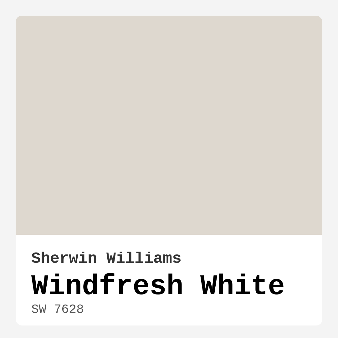
Color Preview & Key Details
| HEX Code | #DED8CF |
| RGB | 222, 216, 207 |
| LRV | 75% |
| Undertone | Red |
| Finish Options | Eggshell, Flat, Satin |
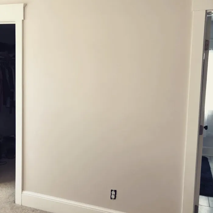
Imagine stepping into a room that immediately feels like a breath of fresh air, welcoming you with warmth and light. That’s the magic of Windfresh White, a delightful paint color from Sherwin Williams that can transform any space into a serene oasis. Whether you’re looking to refresh your living room, bedroom, or even your kitchen, this soft, airy hue is a fantastic choice for anyone wanting to create a tranquil environment.
Windfresh White, with its color code SW 7628, is not just another beige; it’s a nuanced blend that walks the line between warm and cool tones. With a Light Reflectance Value (LRV) of 75%, it reflects a significant amount of light, making it perfect for both small and large spaces. This paint color doesn’t just brighten up a room; it adds a sense of openness that can make any area feel larger and more inviting.
As you consider this color, it’s essential to pay attention to its undertones. Windfresh White leans toward a subtle red undertone, which gives it a unique depth and character. This isn’t just a flat beige; it’s a color that adapts beautifully to its surroundings. If you’re working with existing furniture or decor, testing Windfresh White in your space is crucial. It’s always fascinating to see how its undertones play off different elements in your room, revealing themselves at various times of the day.
Now, you might be wondering about the practical aspects of using Windfresh White. One of the standout features is its ease of application. Whether you’re a beginner or someone with more painting experience, this color goes on smoothly, thanks to its brush-smooth formula. It’s roller-ready, allowing you to cover walls quickly and efficiently, making your painting project less of a chore. Plus, with options for a flat, eggshell, or satin finish, you can choose the sheen that best matches your vision.
Windfresh White is also remarkably versatile. It fits beautifully into various decor styles, including modern, coastal, Scandinavian, minimalist, and farmhouse. Imagine a cozy farmhouse dining room or a sleek, modern living area; this color can complement both, offering flexibility that many homeowners crave.
When it comes to pairing Windfresh White with other colors, the possibilities are endless. For a crisp contrast, consider pairing it with a darker shade like SW 7632 or SW 7036 for trim or accents. If you’re leaning towards a more cohesive look, lighter shades such as SW 7021 or SW 7004 can create a serene gradient effect. For those who love a pop of color, consider introducing complementary hues like the soft blues of SW 9660 or SW 9640, which can beautifully enhance the lightness of Windfresh White.
You might be thinking about how Windfresh White would perform in your home, especially in terms of upkeep. One of its significant advantages is its washability; it’s both washable and wipeable, making it a practical choice for spaces that might see a bit more wear, like kitchens or bathrooms. The low VOC formula means it’s a healthier option for your indoor air quality, so you can feel good about your choice.
While Windfresh White is an excellent choice for various applications, keep in mind that it may require multiple coats for full coverage, especially if you’re applying it over a darker color. It’s also important to note that in low light, the color can appear slightly darker than it does in bright spaces. Testing a sample on your wall and observing it throughout the day will help you understand how light affects its appearance.
Let’s talk about those areas where Windfresh White shines the most. This color is perfect for living rooms, bedrooms, kitchens, bathrooms, and dining rooms. It creates a calm and inviting atmosphere, making it an ideal choice for spaces where you want to relax and unwind. If you’re considering selling your home, using Windfresh White can appeal to potential buyers looking for a fresh, updated look without the harshness of stark whites.
As you think about your project, consider how Windfresh White can be used in various applications within your home. It’s excellent for interior walls, but don’t shy away from using it on ceilings or as an accent wall to create a stunning focal point. The tranquility it brings is hard to match, and it can truly elevate the overall feel of your space.
Incorporating Windfresh White into your home can be a game-changer. It’s not just about choosing a paint color; it’s about setting a mood and creating an environment that reflects your personal style. With its soft, balanced tone, Windfresh White invites you to breathe a little easier and enjoy the beauty of your surroundings.
So, are you ready to embrace the soothing vibes of Windfresh White? This paint color is more than just a choice; it’s a pathway to a serene and inviting home. Take the plunge and see how this beautiful hue can enhance your spaces and bring a fresh perspective to your home decor. Remember, the right color can create not just a room, but a feeling — and with Windfresh White, that feeling is undeniably refreshing.
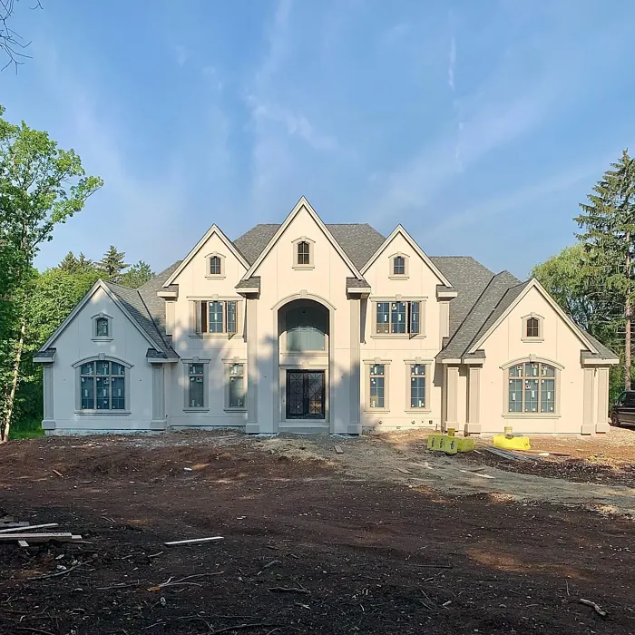
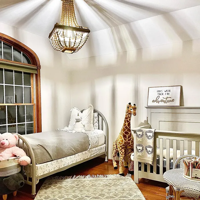
Real Room Photo of Windfresh White SW 7628
Undertones of Windfresh White ?
The undertones of Windfresh White are a key aspect of its character, leaning towards Red. These subtle underlying hues are what give the color its depth and complexity. For example, a gray with a blue undertone will feel cooler and more modern, while one with a brown undertone will feel warmer and more traditional. It’s essential to test this paint in your home and observe it next to your existing furniture, flooring, and decor to see how these undertones interact and reveal themselves throughout the day.
HEX value: #DED8CF
RGB code: 222, 216, 207
Is Windfresh White Cool or Warm?
This hue strikes a beautiful balance between warm and cool. While it has a soft warmth that can make a room feel cozy, it also retains a crispness that keeps spaces feeling open and airy. It’s a wonderful choice for creating a light-filled environment without the harshness of brighter whites.
Understanding Color Properties and Interior Design Tips
Hue refers to a specific position on the color wheel, measured in degrees from 0 to 360. Each degree represents a different pure color:
- 0° represents red
- 120° represents green
- 240° represents blue
Saturation describes the intensity or purity of a color and is expressed as a percentage:
- At 0%, the color appears completely desaturated—essentially a shade of gray
- At 100%, the color is at its most vivid and vibrant
Lightness indicates how light or dark a color is, also expressed as a percentage:
- 0% lightness results in black
- 100% lightness results in white
Using Warm Colors in Interior Design
Warm hues—such as reds, oranges, yellows, warm beiges, and greiges—are excellent choices for creating inviting and energetic spaces. These colors are particularly well-suited for:
- Kitchens, living rooms, and bathrooms, where warmth enhances comfort and sociability
- Large rooms, where warm tones can help reduce the sense of emptiness and make the space feel more intimate
For example:
- Warm beige shades provide a cozy, inviting atmosphere, ideal for living rooms, bedrooms, and hallways.
- Warm greige (a mix of beige and gray) offers the warmth of beige with the modern appeal of gray, making it a versatile backdrop for dining areas, bedrooms, and living spaces.
However, be mindful when using warm light tones in rooms with limited natural light. These shades may appear muted or even take on an unpleasant yellowish tint. To avoid a dull or flat appearance:
- Add depth by incorporating richer tones like deep greens, charcoal, or chocolate brown
- Use textured elements such as curtains, rugs, or cushions to bring dimension to the space
Pro Tip: Achieving Harmony with Warm and Cool Color Balance
To create a well-balanced and visually interesting interior, mix warm and cool tones strategically. This contrast adds depth and harmony to your design.
- If your walls feature warm hues, introduce cool-colored accents such as blue or green furniture, artwork, or accessories to create contrast.
- For a polished look, consider using a complementary color scheme, which pairs colors opposite each other on the color wheel (e.g., red with green, orange with blue).
This thoughtful mix not only enhances visual appeal but also creates a space that feels both dynamic and cohesive.

Light Temperature Affects on Windfresh White
Natural Light
Natural daylight changes in color temperature as the sun moves across the sky. At sunrise and sunset, the light tends to have a warm, golden tone with a color temperature around 2000 Kelvin (K). As the day progresses and the sun rises higher, the light becomes cooler and more neutral. Around midday, especially when the sky is clear, natural light typically reaches its peak brightness and shifts to a cooler tone, ranging from 5500 to 6500 Kelvin. This midday light is close to what we perceive as pure white or daylight-balanced light.
These shifts in natural light can significantly influence how colors appear in a space, which is why designers often consider both the time of day and the orientation of windows when planning interior color schemes.
Artificial Light
When choosing artificial lighting, pay close attention to the color temperature, measured in Kelvin (K). This determines how warm or cool the light will appear. Lower temperatures, around 2700K, give off a warm, yellow glow often used in living rooms or bedrooms. Higher temperatures, above 5000K, create a cool, bluish light similar to daylight, commonly used in kitchens, offices, or task areas.
Use the slider to see how lighting temperature can affect the appearance of a surface or color throughout a space.


4800K
LRV of Windfresh White
The Light Reflectance Value (LRV) of Windfresh White is 75%, which places it in the Light category. This means it Reflects a high amount of light. Understanding a paint’s LRV is crucial for predicting how it will look in your space. A higher LRV indicates a lighter color that reflects more light, making rooms feel larger and brighter. A lower LRV signifies a darker color that absorbs more light, creating a cozier, more intimate atmosphere. Always consider the natural and artificial lighting in your room when selecting a paint color based on its LRV.
Detailed Review of Windfresh White
Additional Paint Characteristics
Ideal Rooms
Bathroom, Bedroom, Dining Room, Home Office, Kitchen, Living Room
Decor Styles
Coastal, Farmhouse, Minimalist, Modern, Scandinavian
Coverage
Good (1–2 Coats)
Ease of Application
Beginner Friendly, Brush Smooth, Roller-Ready
Washability
Washable, Wipeable
VOC Level
Low VOC
Best Use
Accent Wall, Ceiling, Interior Walls
Room Suitability
Bathroom, Bedroom, Dining Room, Kitchen, Living Room
Tone Tag
Airy, Balanced, Warm
Finish Type
Eggshell, Satin
Paint Performance
Easy Touch-Up, High Coverage, Low Odor
Use Cases
Best for Rentals, Best for Selling Your Home, Classic Favorite
Mood
Calm, Inviting, Restful
Trim Pairing
Complements Cool Trim, Good with Wood Trim, Pairs with White Dove
Windfresh White is truly a versatile color that can transform any space into a tranquil oasis. Its HEX code #DED8CF reflects its soft and muted character, making it ideal for both large and small rooms. When applied, it offers a smooth finish that brightens up areas without overwhelming them. This paint is particularly effective in spaces that benefit from natural light, as it reflects light beautifully, enhancing the room’s overall atmosphere. Whether you’re painting an accent wall or refreshing a full room, Windfresh White provides excellent coverage and a clean look that pairs well with a variety of decor styles. It’s a solid choice for anyone looking to create a calm and inviting home environment.
Pros & Cons of SW 7628 Windfresh White
Pros
Cons
Colors that go with Sherwin Williams Windfresh White
FAQ on SW 7628 Windfresh White
Can Windfresh White be used in small spaces?
Absolutely! Windfresh White is an excellent choice for small spaces. Its light reflective quality helps to make rooms feel larger and more open. When paired with strategic lighting and well-chosen decor, it can create an inviting and airy atmosphere that enhances the sense of space.
How does Windfresh White compare to other whites?
Windfresh White stands out with its unique blend of warm and cool undertones. Unlike some stark whites, it offers a softer, more welcoming feel. It’s perfect for those who want a brightened space without the harshness often associated with pure whites. Additionally, its versatility allows it to pair beautifully with various styles and colors, making it a favorite among decorators.
Comparisons Windfresh White with other colors
Windfresh White SW 7628 vs Natural Linen SW 9109
| Attribute | Windfresh White SW 7628 | Natural Linen SW 9109 |
|---|---|---|
| Color Name | Windfresh White SW 7628 | Natural Linen SW 9109 |
| Color | ||
| Hue | Beige | Beige |
| Brightness | Light | Light |
| RGB | 222, 216, 207 | 223, 211, 195 |
| LRV | 75% | 74% |
| Finish Type | Eggshell, Satin | Eggshell, Matte, Satin |
| Finish Options | Eggshell, Flat, Satin | Eggshell, Matte, Satin |
| Ideal Rooms | Bathroom, Bedroom, Dining Room, Home Office, Kitchen, Living Room | Bedroom, Dining Room, Hallway, Home Office, Kitchen, Living Room |
| Decor Styles | Coastal, Farmhouse, Minimalist, Modern, Scandinavian | Bohemian, Modern Farmhouse, Scandinavian, Transitional |
| Coverage | Good (1–2 Coats) | Good (1–2 Coats), Touch-Up Friendly |
| Ease of Application | Beginner Friendly, Brush Smooth, Roller-Ready | Beginner Friendly, Brush Smooth, Fast-Drying, Roller-Ready |
| Washability | Washable, Wipeable | Highly Washable, Washable, Wipeable |
| Room Suitability | Bathroom, Bedroom, Dining Room, Kitchen, Living Room | Bedroom, Dining Room, Home Office, Kitchen, Living Room |
| Tone | Airy, Balanced, Warm | Earthy, Neutral, Warm |
| Paint Performance | Easy Touch-Up, High Coverage, Low Odor | Easy Touch-Up, Low Odor, Quick Drying, Scuff Resistant |
Windfresh White SW 7628 vs Alabaster SW 7008
| Attribute | Windfresh White SW 7628 | Alabaster SW 7008 |
|---|---|---|
| Color Name | Windfresh White SW 7628 | Alabaster SW 7008 |
| Color | ||
| Hue | Beige | Beige |
| Brightness | Light | Light |
| RGB | 222, 216, 207 | 237, 234, 224 |
| LRV | 75% | 82% |
| Finish Type | Eggshell, Satin | Eggshell, Matte, Satin |
| Finish Options | Eggshell, Flat, Satin | Eggshell, Matte, Satin |
| Ideal Rooms | Bathroom, Bedroom, Dining Room, Home Office, Kitchen, Living Room | Bathroom, Bedroom, Dining Room, Entryway, Home Office, Kitchen, Living Room, Nursery |
| Decor Styles | Coastal, Farmhouse, Minimalist, Modern, Scandinavian | Coastal, Contemporary, Minimalist, Modern Farmhouse, Traditional, Transitional |
| Coverage | Good (1–2 Coats) | Good (1–2 Coats), Touch-Up Friendly |
| Ease of Application | Beginner Friendly, Brush Smooth, Roller-Ready | Beginner Friendly, Brush Smooth, Fast-Drying, Low Splatter, Roller-Ready |
| Washability | Washable, Wipeable | Washable, Wipeable |
| Room Suitability | Bathroom, Bedroom, Dining Room, Kitchen, Living Room | Bathroom, Bedroom, Dining Room, Hallway, Home Office, Kitchen, Living Room, Nursery |
| Tone | Airy, Balanced, Warm | Creamy, Neutral, Warm |
| Paint Performance | Easy Touch-Up, High Coverage, Low Odor | Easy Touch-Up, High Coverage, Low Odor, Quick Drying |
Windfresh White SW 7628 vs White Duck SW 7010
| Attribute | Windfresh White SW 7628 | White Duck SW 7010 |
|---|---|---|
| Color Name | Windfresh White SW 7628 | White Duck SW 7010 |
| Color | ||
| Hue | Beige | Beige |
| Brightness | Light | Light |
| RGB | 222, 216, 207 | 229, 223, 210 |
| LRV | 75% | 75% |
| Finish Type | Eggshell, Satin | Eggshell, Matte, Satin |
| Finish Options | Eggshell, Flat, Satin | Eggshell, Matte, Satin |
| Ideal Rooms | Bathroom, Bedroom, Dining Room, Home Office, Kitchen, Living Room | Bedroom, Dining Room, Home Office, Kitchen, Living Room, Nursery |
| Decor Styles | Coastal, Farmhouse, Minimalist, Modern, Scandinavian | Farmhouse, Modern, Scandinavian, Traditional, Transitional |
| Coverage | Good (1–2 Coats) | Good (1–2 Coats), Touch-Up Friendly |
| Ease of Application | Beginner Friendly, Brush Smooth, Roller-Ready | Beginner Friendly, Brush Smooth, Fast-Drying, Roller-Ready |
| Washability | Washable, Wipeable | Highly Washable, Washable |
| Room Suitability | Bathroom, Bedroom, Dining Room, Kitchen, Living Room | Bedroom, Dining Room, Home Office, Kitchen, Living Room |
| Tone | Airy, Balanced, Warm | Creamy, Neutral, Warm |
| Paint Performance | Easy Touch-Up, High Coverage, Low Odor | Easy Touch-Up, Fade Resistant, Low Odor, Quick Drying |
Windfresh White SW 7628 vs Greek Villa SW 7551
| Attribute | Windfresh White SW 7628 | Greek Villa SW 7551 |
|---|---|---|
| Color Name | Windfresh White SW 7628 | Greek Villa SW 7551 |
| Color | ||
| Hue | Beige | Beige |
| Brightness | Light | Light |
| RGB | 222, 216, 207 | 240, 236, 226 |
| LRV | 75% | 82% |
| Finish Type | Eggshell, Satin | Eggshell, Satin |
| Finish Options | Eggshell, Flat, Satin | Eggshell, Flat, Satin |
| Ideal Rooms | Bathroom, Bedroom, Dining Room, Home Office, Kitchen, Living Room | Bedroom, Dining Room, Hallway, Home Office, Kitchen, Living Room |
| Decor Styles | Coastal, Farmhouse, Minimalist, Modern, Scandinavian | Coastal, Minimalist, Modern Farmhouse, Traditional, Transitional |
| Coverage | Good (1–2 Coats) | Good (1–2 Coats), Touch-Up Friendly |
| Ease of Application | Beginner Friendly, Brush Smooth, Roller-Ready | Beginner Friendly, Brush Smooth, Roller-Ready |
| Washability | Washable, Wipeable | Washable, Wipeable |
| Room Suitability | Bathroom, Bedroom, Dining Room, Kitchen, Living Room | Bedroom, Dining Room, Hallway, Kitchen, Living Room |
| Tone | Airy, Balanced, Warm | Creamy, Neutral, Warm |
| Paint Performance | Easy Touch-Up, High Coverage, Low Odor | Easy Touch-Up, High Coverage, Low Odor, Quick Drying |
Windfresh White SW 7628 vs City Loft SW 7631
| Attribute | Windfresh White SW 7628 | City Loft SW 7631 |
|---|---|---|
| Color Name | Windfresh White SW 7628 | City Loft SW 7631 |
| Color | ||
| Hue | Beige | Beige |
| Brightness | Light | Light |
| RGB | 222, 216, 207 | 223, 218, 209 |
| LRV | 75% | 66% |
| Finish Type | Eggshell, Satin | Eggshell, Matte, Satin |
| Finish Options | Eggshell, Flat, Satin | Eggshell, Matte, Satin |
| Ideal Rooms | Bathroom, Bedroom, Dining Room, Home Office, Kitchen, Living Room | Bedroom, Hallway, Home Office, Kitchen, Living Room |
| Decor Styles | Coastal, Farmhouse, Minimalist, Modern, Scandinavian | Minimalist, Modern, Scandinavian, Transitional |
| Coverage | Good (1–2 Coats) | Good (1–2 Coats), Touch-Up Friendly |
| Ease of Application | Beginner Friendly, Brush Smooth, Roller-Ready | Beginner Friendly, Brush Smooth, Fast-Drying, Low Splatter, Roller-Ready |
| Washability | Washable, Wipeable | Highly Washable, Washable |
| Room Suitability | Bathroom, Bedroom, Dining Room, Kitchen, Living Room | Bedroom, Hallway, Home Office, Living Room |
| Tone | Airy, Balanced, Warm | Balanced, Muted, Neutral, Warm |
| Paint Performance | Easy Touch-Up, High Coverage, Low Odor | Easy Touch-Up, High Coverage, Low Odor, Quick Drying, Scuff Resistant |
Windfresh White SW 7628 vs Shoji White SW 7042
| Attribute | Windfresh White SW 7628 | Shoji White SW 7042 |
|---|---|---|
| Color Name | Windfresh White SW 7628 | Shoji White SW 7042 |
| Color | ||
| Hue | Beige | Beige |
| Brightness | Light | Light |
| RGB | 222, 216, 207 | 230, 223, 211 |
| LRV | 75% | 74% |
| Finish Type | Eggshell, Satin | Eggshell, Matte, Satin |
| Finish Options | Eggshell, Flat, Satin | Eggshell, Matte, Satin |
| Ideal Rooms | Bathroom, Bedroom, Dining Room, Home Office, Kitchen, Living Room | Bedroom, Dining Room, Home Office, Living Room, Nursery |
| Decor Styles | Coastal, Farmhouse, Minimalist, Modern, Scandinavian | Farmhouse, Japanese, Minimalist, Modern, Transitional |
| Coverage | Good (1–2 Coats) | Good (1–2 Coats), Touch-Up Friendly |
| Ease of Application | Beginner Friendly, Brush Smooth, Roller-Ready | Beginner Friendly, Brush Smooth, Roller-Ready |
| Washability | Washable, Wipeable | Washable, Wipeable |
| Room Suitability | Bathroom, Bedroom, Dining Room, Kitchen, Living Room | Bedroom, Dining Room, Home Office, Living Room, Nursery |
| Tone | Airy, Balanced, Warm | Creamy, Neutral, Warm |
| Paint Performance | Easy Touch-Up, High Coverage, Low Odor | Easy Touch-Up, High Coverage, Low Odor |
Windfresh White SW 7628 vs Neutral Ground SW 7568
| Attribute | Windfresh White SW 7628 | Neutral Ground SW 7568 |
|---|---|---|
| Color Name | Windfresh White SW 7628 | Neutral Ground SW 7568 |
| Color | ||
| Hue | Beige | Beige |
| Brightness | Light | Light |
| RGB | 222, 216, 207 | 226, 218, 202 |
| LRV | 75% | 40% |
| Finish Type | Eggshell, Satin | Eggshell, Matte, Satin |
| Finish Options | Eggshell, Flat, Satin | Eggshell, Matte, Satin |
| Ideal Rooms | Bathroom, Bedroom, Dining Room, Home Office, Kitchen, Living Room | Bedroom, Dining Room, Hallway, Home Office, Kitchen, Living Room |
| Decor Styles | Coastal, Farmhouse, Minimalist, Modern, Scandinavian | Farmhouse, Modern, Scandinavian, Traditional, Transitional |
| Coverage | Good (1–2 Coats) | Good (1–2 Coats) |
| Ease of Application | Beginner Friendly, Brush Smooth, Roller-Ready | Beginner Friendly, Brush Smooth, Roller-Ready |
| Washability | Washable, Wipeable | Highly Washable, Washable |
| Room Suitability | Bathroom, Bedroom, Dining Room, Kitchen, Living Room | Bedroom, Dining Room, Home Office, Kitchen, Living Room |
| Tone | Airy, Balanced, Warm | Earthy, Neutral, Warm |
| Paint Performance | Easy Touch-Up, High Coverage, Low Odor | Easy Touch-Up, Low Odor, Quick Drying, Scuff Resistant |
Windfresh White SW 7628 vs Limewash SW 9589
| Attribute | Windfresh White SW 7628 | Limewash SW 9589 |
|---|---|---|
| Color Name | Windfresh White SW 7628 | Limewash SW 9589 |
| Color | ||
| Hue | Beige | Beige |
| Brightness | Light | Light |
| RGB | 222, 216, 207 | 219, 213, 203 |
| LRV | 75% | 75% |
| Finish Type | Eggshell, Satin | Flat, Matte |
| Finish Options | Eggshell, Flat, Satin | Flat, Matte |
| Ideal Rooms | Bathroom, Bedroom, Dining Room, Home Office, Kitchen, Living Room | Bedroom, Dining Room, Hallway, Kitchen, Living Room |
| Decor Styles | Coastal, Farmhouse, Minimalist, Modern, Scandinavian | Bohemian, Contemporary, Modern Farmhouse, Rustic |
| Coverage | Good (1–2 Coats) | Good (1–2 Coats), Touch-Up Friendly |
| Ease of Application | Beginner Friendly, Brush Smooth, Roller-Ready | Beginner Friendly, Brush Smooth, Roller-Ready, Thin Formula |
| Washability | Washable, Wipeable | Washable, Wipeable |
| Room Suitability | Bathroom, Bedroom, Dining Room, Kitchen, Living Room | Bathroom, Bedroom, Dining Room, Kitchen, Living Room |
| Tone | Airy, Balanced, Warm | Earthy, Muted, Warm |
| Paint Performance | Easy Touch-Up, High Coverage, Low Odor | Easy Touch-Up, Long Lasting, Low Odor |
Windfresh White SW 7628 vs Creamy SW 7012
| Attribute | Windfresh White SW 7628 | Creamy SW 7012 |
|---|---|---|
| Color Name | Windfresh White SW 7628 | Creamy SW 7012 |
| Color | ||
| Hue | Beige | Beige |
| Brightness | Light | Light |
| RGB | 222, 216, 207 | 239, 232, 219 |
| LRV | 75% | 75% |
| Finish Type | Eggshell, Satin | Eggshell, Satin |
| Finish Options | Eggshell, Flat, Satin | Eggshell, Flat, Satin |
| Ideal Rooms | Bathroom, Bedroom, Dining Room, Home Office, Kitchen, Living Room | Bedroom, Dining Room, Hallway, Home Office, Kitchen, Living Room |
| Decor Styles | Coastal, Farmhouse, Minimalist, Modern, Scandinavian | Contemporary, Minimalist, Modern Farmhouse, Rustic, Traditional |
| Coverage | Good (1–2 Coats) | Good (1–2 Coats), Touch-Up Friendly |
| Ease of Application | Beginner Friendly, Brush Smooth, Roller-Ready | Beginner Friendly, Fast-Drying, Low Splatter |
| Washability | Washable, Wipeable | Washable, Wipeable |
| Room Suitability | Bathroom, Bedroom, Dining Room, Kitchen, Living Room | Bedroom, Dining Room, Hallway, Kitchen, Living Room |
| Tone | Airy, Balanced, Warm | Creamy, Neutral, Warm |
| Paint Performance | Easy Touch-Up, High Coverage, Low Odor | High Coverage, Low Odor, Quick Drying |
Windfresh White SW 7628 vs White Sesame SW 9586
| Attribute | Windfresh White SW 7628 | White Sesame SW 9586 |
|---|---|---|
| Color Name | Windfresh White SW 7628 | White Sesame SW 9586 |
| Color | ||
| Hue | Beige | Beige |
| Brightness | Light | Light |
| RGB | 222, 216, 207 | 227, 219, 205 |
| LRV | 75% | 75% |
| Finish Type | Eggshell, Satin | Eggshell, Matte, Satin |
| Finish Options | Eggshell, Flat, Satin | Eggshell, Matte, Satin |
| Ideal Rooms | Bathroom, Bedroom, Dining Room, Home Office, Kitchen, Living Room | Bedroom, Home Office, Kitchen, Living Room, Nursery |
| Decor Styles | Coastal, Farmhouse, Minimalist, Modern, Scandinavian | Minimalist, Modern Farmhouse, Rustic, Scandinavian, Transitional |
| Coverage | Good (1–2 Coats) | Good (1–2 Coats), Touch-Up Friendly |
| Ease of Application | Beginner Friendly, Brush Smooth, Roller-Ready | Beginner Friendly, Brush Smooth, Roller-Ready |
| Washability | Washable, Wipeable | Highly Washable, Washable |
| Room Suitability | Bathroom, Bedroom, Dining Room, Kitchen, Living Room | Bedroom, Dining Room, Home Office, Living Room, Nursery |
| Tone | Airy, Balanced, Warm | Creamy, Earthy, Neutral, Warm |
| Paint Performance | Easy Touch-Up, High Coverage, Low Odor | Easy Touch-Up, High Coverage, Low Odor, Quick Drying |
Official Page of Sherwin Williams Windfresh White SW 7628