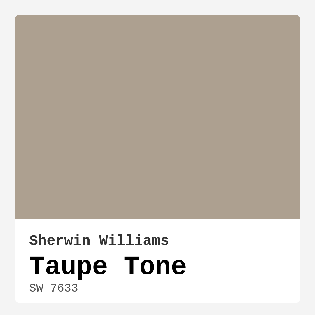
Color Preview & Key Details
| HEX Code | #ADA090 |
| RGB | 173, 160, 144 |
| LRV | 24% |
| Undertone | Red |
| Finish Options | Eggshell, Matte, Satin |
Imagine walking into a room that embraces you with warmth and sophistication. A space that feels cozy yet stylish, where every piece of furniture seems to belong perfectly. This is the magic of the right paint color, and today, let’s dive into a hue that embodies just that: Taupe Tone by Sherwin Williams.
Taupe Tone, with the color code SW 7633, is a beautifully balanced shade that strikes a perfect harmony between gray and brown. It’s not just a color; it’s an experience. This medium-dark hue has an LRV (Light Reflectance Value) of 24%, meaning it reflects very little light, creating an intimate atmosphere. Its warm undertones, leaning towards red, give it a depth that can soften harsh lighting, making it an ideal choice for any space that you want to feel welcoming.
You’ll find that Taupe Tone shines in various settings. Whether it’s your living room, bedroom, dining room, home office, or even the entryway, this color brings a sophisticated touch while maintaining a cozy vibe. It effortlessly complements different decor styles, from modern and rustic to transitional and contemporary. Imagine pairing it with sleek furniture and bold accents or, alternatively, rustic wooden pieces and vintage decor. The versatility is genuinely impressive.
When considering Taupe Tone, think about how it interacts with the light in your space. In natural light, it reveals its earthy undertones beautifully, creating a serene environment. Under artificial lighting, it maintains that warm quality, adapting seamlessly to different lighting conditions without losing its charm. However, it’s essential to note that in smaller spaces, Taupe Tone may appear darker, so balancing it with lighter trim and decor accents can enhance the feeling of openness. Adding mirrors or reflective surfaces can also help amplify light, ensuring that your cozy atmosphere doesn’t feel cramped.
Now, let’s talk about the practical side of Taupe Tone. One of the standout features of this paint is its ease of application. It’s beginner-friendly and can be applied smoothly using a brush, roller, or sprayer. You’ll find that it covers well, usually requiring just one to two coats for a flawless finish. That’s a significant advantage if you’re looking to refresh your space without dedicating an entire weekend to painting. Plus, its washability makes maintenance a breeze—perfect for high-traffic areas or homes with kids and pets.
When it comes to choosing the finish for your Taupe Tone walls, you have options. It’s available in Matte, Eggshell, and Satin finishes, allowing you to select the perfect sheen for your needs. Matte finishes work well for ceilings or low-traffic areas, while Eggshell and Satin are great for walls in living spaces that require durability and washability. Each finish brings a different character to the color, so consider how you want your space to feel.
Taupe Tone also pairs beautifully with a range of complementary shades. Think about teaming it with crisp whites, like White Dove, for trim and moldings to create a fresh contrast. You can also explore complementary hues like SW 7625 or SW 9139, which can enhance the warm, earthy feel of Taupe Tone. On the flip side, if you’re looking to create a more dramatic look, consider pairing it with darker shades like SW 0024 or SW 7550. The possibilities are endless!
As a designer with years of experience, I can confidently say that one of the most critical steps before committing to a color is seeing how it interacts with your existing decor. Taupe Tone’s undertones are key to its character, so take the time to test it in your home. Observe how it looks next to your furniture and flooring throughout the day, as colors can shift under varying light conditions.
While Taupe Tone is undeniably beautiful, it’s not without its considerations. In small rooms, it can feel more intense, so ensure you’ve got good lighting to prevent it from overwhelming the space. Additionally, keep in mind that availability may vary in some stores. However, once you get your hands on it, you’ll understand why it’s a classic favorite.
Think about the mood you want to set in your home. Taupe Tone exudes coziness and invites a grounding atmosphere. It can be the perfect backdrop for your daily life, providing a serene canvas that enhances your decor. Whether you’re curling up with a book in the living room or hosting a dinner party in your dining space, this color helps create an ambience that feels both stylish and homey.
If you’re renting or planning a temporary refresh, Taupe Tone is an excellent choice. It’s not only timeless but also versatile enough to adapt to changing trends without feeling outdated. Whether your style leans towards modern farmhouse or classic contemporary, this hue will serve you well for years to come.
In conclusion, Taupe Tone by Sherwin Williams is more than just a paint color; it’s a versatile, sophisticated choice that can transform any space into a warm, inviting haven. Its rich undertones, ease of application, and compatibility with various decor styles make it a top contender for your next home project. So, grab a sample and see how this beautiful hue can elevate your home. You might just find that it’s the perfect fit for the ambiance you’ve been dreaming of. Happy decorating!
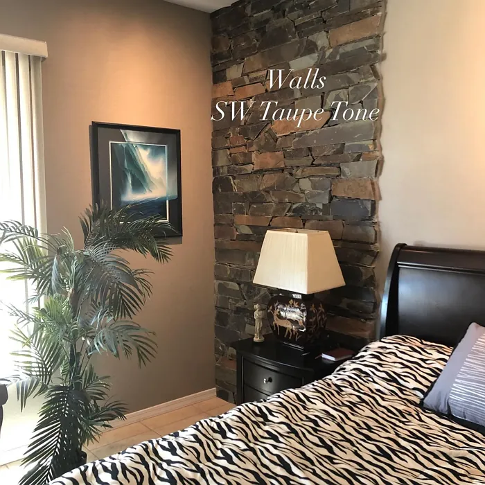
Real Room Photo of Taupe Tone SW 7633
Undertones of Taupe Tone ?
The undertones of Taupe Tone are a key aspect of its character, leaning towards Red. These subtle underlying hues are what give the color its depth and complexity. For example, a gray with a blue undertone will feel cooler and more modern, while one with a brown undertone will feel warmer and more traditional. It’s essential to test this paint in your home and observe it next to your existing furniture, flooring, and decor to see how these undertones interact and reveal themselves throughout the day.
HEX value: #ADA090
RGB code: 173, 160, 144
Is Taupe Tone Cool or Warm?
This color leans towards warm, making it an excellent choice for creating cozy environments. Its warmth enhances the overall ambiance, allowing for an inviting feel.
Understanding Color Properties and Interior Design Tips
Hue refers to a specific position on the color wheel, measured in degrees from 0 to 360. Each degree represents a different pure color:
- 0° represents red
- 120° represents green
- 240° represents blue
Saturation describes the intensity or purity of a color and is expressed as a percentage:
- At 0%, the color appears completely desaturated—essentially a shade of gray
- At 100%, the color is at its most vivid and vibrant
Lightness indicates how light or dark a color is, also expressed as a percentage:
- 0% lightness results in black
- 100% lightness results in white
Using Warm Colors in Interior Design
Warm hues—such as reds, oranges, yellows, warm beiges, and greiges—are excellent choices for creating inviting and energetic spaces. These colors are particularly well-suited for:
- Kitchens, living rooms, and bathrooms, where warmth enhances comfort and sociability
- Large rooms, where warm tones can help reduce the sense of emptiness and make the space feel more intimate
For example:
- Warm beige shades provide a cozy, inviting atmosphere, ideal for living rooms, bedrooms, and hallways.
- Warm greige (a mix of beige and gray) offers the warmth of beige with the modern appeal of gray, making it a versatile backdrop for dining areas, bedrooms, and living spaces.
However, be mindful when using warm light tones in rooms with limited natural light. These shades may appear muted or even take on an unpleasant yellowish tint. To avoid a dull or flat appearance:
- Add depth by incorporating richer tones like deep greens, charcoal, or chocolate brown
- Use textured elements such as curtains, rugs, or cushions to bring dimension to the space
Pro Tip: Achieving Harmony with Warm and Cool Color Balance
To create a well-balanced and visually interesting interior, mix warm and cool tones strategically. This contrast adds depth and harmony to your design.
- If your walls feature warm hues, introduce cool-colored accents such as blue or green furniture, artwork, or accessories to create contrast.
- For a polished look, consider using a complementary color scheme, which pairs colors opposite each other on the color wheel (e.g., red with green, orange with blue).
This thoughtful mix not only enhances visual appeal but also creates a space that feels both dynamic and cohesive.
Light Temperature Affects on Taupe Tone
Natural Light
Natural daylight changes in color temperature as the sun moves across the sky. At sunrise and sunset, the light tends to have a warm, golden tone with a color temperature around 2000 Kelvin (K). As the day progresses and the sun rises higher, the light becomes cooler and more neutral. Around midday, especially when the sky is clear, natural light typically reaches its peak brightness and shifts to a cooler tone, ranging from 5500 to 6500 Kelvin. This midday light is close to what we perceive as pure white or daylight-balanced light.
These shifts in natural light can significantly influence how colors appear in a space, which is why designers often consider both the time of day and the orientation of windows when planning interior color schemes.
Artificial Light
When choosing artificial lighting, pay close attention to the color temperature, measured in Kelvin (K). This determines how warm or cool the light will appear. Lower temperatures, around 2700K, give off a warm, yellow glow often used in living rooms or bedrooms. Higher temperatures, above 5000K, create a cool, bluish light similar to daylight, commonly used in kitchens, offices, or task areas.
Use the slider to see how lighting temperature can affect the appearance of a surface or color throughout a space.


4800K
LRV of Taupe Tone
The Light Reflectance Value (LRV) of Taupe Tone is 24%, which places it in the Medium Dark category. This means it reflects very little light. Understanding a paint’s LRV is crucial for predicting how it will look in your space. A higher LRV indicates a lighter color that reflects more light, making rooms feel larger and brighter. A lower LRV signifies a darker color that absorbs more light, creating a cozier, more intimate atmosphere. Always consider the natural and artificial lighting in your room when selecting a paint color based on its LRV.
Detailed Review of Taupe Tone
Additional Paint Characteristics
Ideal Rooms
Bedroom, Dining Room, Entryway, Home Office, Living Room
Decor Styles
Contemporary, Farmhouse, Modern, Rustic, Transitional
Coverage
Good (1–2 Coats), Touch-Up Friendly
Ease of Application
Beginner Friendly, Brush Smooth, Fast-Drying, Roller-Ready
Washability
Scrubbable, Washable
VOC Level
Low VOC
Best Use
Accent Wall, Furniture, Interior Walls
Room Suitability
Bedroom, Dining Room, Entryway, Home Office, Living Room
Tone Tag
Earthy, Neutral, Warm
Finish Type
Eggshell, Matte, Satin
Paint Performance
Easy Touch-Up, Low Odor, Scuff Resistant
Use Cases
Best for Modern Farmhouse, Best for Rentals, Classic Favorite
Mood
Cozy, Grounding, Inviting
Trim Pairing
Complements Cool Trim, Pairs with White Dove, Works with Warm Trim
Taupe Tone is a beautifully balanced shade that effortlessly complements a variety of interior styles. When applied, it exhibits a warm undertone that can soften harsh lighting, making it ideal for spaces where you want to create a comfortable atmosphere. The paint applies smoothly, and whether you’re using a brush, roller, or sprayer, you’ll find it easy to work with. It covers well, usually requiring only one to two coats for a flawless finish, which is a significant plus if you’re looking to refresh your space without a lengthy project. This shade pairs wonderfully with both light and dark furnishings, giving you the flexibility to play with different decor elements. It’s perfect for accent walls or as a whole-room color that invites warmth and a sense of relaxation.
Pros & Cons of SW 7633 Taupe Tone
Pros
Cons
Colors that go with Sherwin Williams Taupe Tone
FAQ on SW 7633 Taupe Tone
What types of finishes are available for Taupe Tone?
Taupe Tone is available in several finishes to suit your needs, including Matte, Eggshell, and Satin. Each finish offers a different sheen level, providing options whether you prefer a flat look or something with a bit of shine. Matte finishes work well for ceilings and low-traffic areas, while Eggshell and Satin are great for walls in living spaces where durability and washability are important.
Can I use Taupe Tone in a small room?
Absolutely! While Taupe Tone has a warm richness that may seem intense for small spaces, it can actually create a cozy atmosphere when paired with good lighting. To enhance the feel of openness, consider using lighter trim and decor accents to balance the warmth. Additionally, using mirrors or reflective surfaces can help amplify light, making the space feel larger while still enjoying the inviting hue of Taupe Tone.
Comparisons Taupe Tone with other colors
Taupe Tone SW 7633 vs Repose Gray SW 7015
| Attribute | Taupe Tone SW 7633 | Repose Gray SW 7015 |
|---|---|---|
| Color Name | Taupe Tone SW 7633 | Repose Gray SW 7015 |
| Color | ||
| Hue | Grey | Grey |
| Brightness | Medium | Medium |
| RGB | 173, 160, 144 | 204, 201, 192 |
| LRV | 24% | 58% |
| Finish Type | Eggshell, Matte, Satin | Eggshell, Matte, Satin |
| Finish Options | Eggshell, Matte, Satin | Eggshell, Matte, Satin |
| Ideal Rooms | Bedroom, Dining Room, Entryway, Home Office, Living Room | Bedroom, Dining Room, Hallway, Home Office, Living Room |
| Decor Styles | Contemporary, Farmhouse, Modern, Rustic, Transitional | Contemporary, Farmhouse, Minimalist, Modern, Transitional |
| Coverage | Good (1–2 Coats), Touch-Up Friendly | Good (1–2 Coats), Touch-Up Friendly |
| Ease of Application | Beginner Friendly, Brush Smooth, Fast-Drying, Roller-Ready | Beginner Friendly, Brush Smooth, Fast-Drying, Roller-Ready |
| Washability | Scrubbable, Washable | Highly Washable, Washable |
| Room Suitability | Bedroom, Dining Room, Entryway, Home Office, Living Room | Bedroom, Dining Room, Hallway, Home Office, Living Room |
| Tone | Earthy, Neutral, Warm | Muted, Neutral, Warm |
| Paint Performance | Easy Touch-Up, Low Odor, Scuff Resistant | Low Odor, Quick Drying, Scuff Resistant |
Taupe Tone SW 7633 vs Light French Gray SW 0055
| Attribute | Taupe Tone SW 7633 | Light French Gray SW 0055 |
|---|---|---|
| Color Name | Taupe Tone SW 7633 | Light French Gray SW 0055 |
| Color | ||
| Hue | Grey | Grey |
| Brightness | Medium | Medium |
| RGB | 173, 160, 144 | 194, 192, 187 |
| LRV | 24% | 53% |
| Finish Type | Eggshell, Matte, Satin | Eggshell, Matte, Satin |
| Finish Options | Eggshell, Matte, Satin | Eggshell, Matte, Satin |
| Ideal Rooms | Bedroom, Dining Room, Entryway, Home Office, Living Room | Bedroom, Dining Room, Home Office, Kitchen, Living Room |
| Decor Styles | Contemporary, Farmhouse, Modern, Rustic, Transitional | Contemporary, Farmhouse, Modern, Scandinavian, Transitional |
| Coverage | Good (1–2 Coats), Touch-Up Friendly | Good (1–2 Coats), Touch-Up Friendly |
| Ease of Application | Beginner Friendly, Brush Smooth, Fast-Drying, Roller-Ready | Beginner Friendly, Brush Smooth, Roller-Ready |
| Washability | Scrubbable, Washable | Highly Washable, Washable |
| Room Suitability | Bedroom, Dining Room, Entryway, Home Office, Living Room | Bedroom, Dining Room, Home Office, Kitchen, Living Room |
| Tone | Earthy, Neutral, Warm | Balanced, Muted, Neutral, Warm |
| Paint Performance | Easy Touch-Up, Low Odor, Scuff Resistant | Easy Touch-Up, High Coverage, Low Odor |
Taupe Tone SW 7633 vs Wordly Gray SW 7043
| Attribute | Taupe Tone SW 7633 | Wordly Gray SW 7043 |
|---|---|---|
| Color Name | Taupe Tone SW 7633 | Wordly Gray SW 7043 |
| Color | ||
| Hue | Grey | Grey |
| Brightness | Medium | Medium |
| RGB | 173, 160, 144 | 206, 198, 187 |
| LRV | 24% | 58% |
| Finish Type | Eggshell, Matte, Satin | Eggshell, Satin |
| Finish Options | Eggshell, Matte, Satin | Eggshell, Flat, Satin |
| Ideal Rooms | Bedroom, Dining Room, Entryway, Home Office, Living Room | Bedroom, Home Office, Kitchen, Living Room |
| Decor Styles | Contemporary, Farmhouse, Modern, Rustic, Transitional | Minimalist, Modern, Scandi, Transitional |
| Coverage | Good (1–2 Coats), Touch-Up Friendly | Good (1–2 Coats) |
| Ease of Application | Beginner Friendly, Brush Smooth, Fast-Drying, Roller-Ready | Beginner Friendly, Brush Smooth, Fast-Drying, Roller-Ready |
| Washability | Scrubbable, Washable | Highly Washable, Washable |
| Room Suitability | Bedroom, Dining Room, Entryway, Home Office, Living Room | Bedroom, Dining Room, Home Office, Living Room |
| Tone | Earthy, Neutral, Warm | Muted, Neutral, Warm |
| Paint Performance | Easy Touch-Up, Low Odor, Scuff Resistant | Easy Touch-Up, Low Odor, Scuff Resistant |
Taupe Tone SW 7633 vs Illusive Green SW 9164
| Attribute | Taupe Tone SW 7633 | Illusive Green SW 9164 |
|---|---|---|
| Color Name | Taupe Tone SW 7633 | Illusive Green SW 9164 |
| Color | ||
| Hue | Grey | Grey |
| Brightness | Medium | Medium |
| RGB | 173, 160, 144 | 146, 148, 141 |
| LRV | 24% | 24% |
| Finish Type | Eggshell, Matte, Satin | Eggshell, Matte, Satin |
| Finish Options | Eggshell, Matte, Satin | Eggshell, Matte, Satin |
| Ideal Rooms | Bedroom, Dining Room, Entryway, Home Office, Living Room | Bedroom, Dining Room, Home Office, Living Room, Nursery |
| Decor Styles | Contemporary, Farmhouse, Modern, Rustic, Transitional | Coastal, Minimalist, Modern, Rustic, Scandinavian |
| Coverage | Good (1–2 Coats), Touch-Up Friendly | Good (1–2 Coats), Touch-Up Friendly |
| Ease of Application | Beginner Friendly, Brush Smooth, Fast-Drying, Roller-Ready | Beginner Friendly, Brush Smooth, Fast-Drying, Roller-Ready |
| Washability | Scrubbable, Washable | Highly Washable, Washable, Wipeable |
| Room Suitability | Bedroom, Dining Room, Entryway, Home Office, Living Room | Bedroom, Dining Room, Home Office, Living Room, Nursery |
| Tone | Earthy, Neutral, Warm | Balanced, Earthy, Muted |
| Paint Performance | Easy Touch-Up, Low Odor, Scuff Resistant | Easy Touch-Up, Low Odor, Quick Drying, Scuff Resistant |
Taupe Tone SW 7633 vs Fawn Brindle SW 7640
| Attribute | Taupe Tone SW 7633 | Fawn Brindle SW 7640 |
|---|---|---|
| Color Name | Taupe Tone SW 7633 | Fawn Brindle SW 7640 |
| Color | ||
| Hue | Grey | Grey |
| Brightness | Medium | Medium |
| RGB | 173, 160, 144 | 167, 160, 148 |
| LRV | 24% | 24% |
| Finish Type | Eggshell, Matte, Satin | Eggshell, Matte |
| Finish Options | Eggshell, Matte, Satin | Eggshell, Matte, Satin |
| Ideal Rooms | Bedroom, Dining Room, Entryway, Home Office, Living Room | Bedroom, Dining Room, Hallway, Home Office, Living Room |
| Decor Styles | Contemporary, Farmhouse, Modern, Rustic, Transitional | Bohemian, Minimalist, Modern Farmhouse, Transitional |
| Coverage | Good (1–2 Coats), Touch-Up Friendly | Good (1–2 Coats) |
| Ease of Application | Beginner Friendly, Brush Smooth, Fast-Drying, Roller-Ready | Brush Smooth, Fast-Drying, Roller-Ready |
| Washability | Scrubbable, Washable | Stain Resistant, Washable |
| Room Suitability | Bedroom, Dining Room, Entryway, Home Office, Living Room | Bedroom, Dining Room, Home Office, Living Room |
| Tone | Earthy, Neutral, Warm | Earthy, Neutral, Warm |
| Paint Performance | Easy Touch-Up, Low Odor, Scuff Resistant | Easy Touch-Up, Fade Resistant, Low Odor |
Taupe Tone SW 7633 vs Balanced Beige SW 7037
| Attribute | Taupe Tone SW 7633 | Balanced Beige SW 7037 |
|---|---|---|
| Color Name | Taupe Tone SW 7633 | Balanced Beige SW 7037 |
| Color | ||
| Hue | Grey | Grey |
| Brightness | Medium | Medium |
| RGB | 173, 160, 144 | 192, 178, 162 |
| LRV | 24% | 44% |
| Finish Type | Eggshell, Matte, Satin | Eggshell, Matte, Satin |
| Finish Options | Eggshell, Matte, Satin | Eggshell, Matte, Satin |
| Ideal Rooms | Bedroom, Dining Room, Entryway, Home Office, Living Room | Bedroom, Dining Room, Home Office, Kitchen, Living Room |
| Decor Styles | Contemporary, Farmhouse, Modern, Rustic, Transitional | Contemporary, Minimalist, Modern Farmhouse, Rustic, Transitional |
| Coverage | Good (1–2 Coats), Touch-Up Friendly | Good (1–2 Coats), Touch-Up Friendly |
| Ease of Application | Beginner Friendly, Brush Smooth, Fast-Drying, Roller-Ready | Beginner Friendly, Brush Smooth, Roller-Ready |
| Washability | Scrubbable, Washable | Washable, Wipeable |
| Room Suitability | Bedroom, Dining Room, Entryway, Home Office, Living Room | Bedroom, Dining Room, Hallway, Kitchen, Living Room |
| Tone | Earthy, Neutral, Warm | Balanced, Earthy, Warm |
| Paint Performance | Easy Touch-Up, Low Odor, Scuff Resistant | Easy Touch-Up, High Coverage, Low Odor |
Taupe Tone SW 7633 vs Mushroom SW 9587
| Attribute | Taupe Tone SW 7633 | Mushroom SW 9587 |
|---|---|---|
| Color Name | Taupe Tone SW 7633 | Mushroom SW 9587 |
| Color | ||
| Hue | Grey | Grey |
| Brightness | Medium | Medium |
| RGB | 173, 160, 144 | 208, 199, 183 |
| LRV | 24% | 24% |
| Finish Type | Eggshell, Matte, Satin | Eggshell, Satin |
| Finish Options | Eggshell, Matte, Satin | Eggshell, Flat, Matte, Satin |
| Ideal Rooms | Bedroom, Dining Room, Entryway, Home Office, Living Room | Bedroom, Dining Room, Hallway, Home Office, Living Room |
| Decor Styles | Contemporary, Farmhouse, Modern, Rustic, Transitional | Bohemian, Contemporary, Modern Farmhouse, Traditional |
| Coverage | Good (1–2 Coats), Touch-Up Friendly | Good (1–2 Coats) |
| Ease of Application | Beginner Friendly, Brush Smooth, Fast-Drying, Roller-Ready | Beginner Friendly, Brush Smooth, Roller-Ready |
| Washability | Scrubbable, Washable | Highly Washable, Washable |
| Room Suitability | Bedroom, Dining Room, Entryway, Home Office, Living Room | Bedroom, Dining Room, Home Office, Living Room |
| Tone | Earthy, Neutral, Warm | Earthy, Neutral, Warm |
| Paint Performance | Easy Touch-Up, Low Odor, Scuff Resistant | Easy Touch-Up, Long Lasting, Low Odor, Scuff Resistant |
Taupe Tone SW 7633 vs Silver Strand SW 7057
| Attribute | Taupe Tone SW 7633 | Silver Strand SW 7057 |
|---|---|---|
| Color Name | Taupe Tone SW 7633 | Silver Strand SW 7057 |
| Color | ||
| Hue | Grey | Grey |
| Brightness | Medium | Medium |
| RGB | 173, 160, 144 | 200, 203, 196 |
| LRV | 24% | 66% |
| Finish Type | Eggshell, Matte, Satin | Eggshell, Satin |
| Finish Options | Eggshell, Matte, Satin | Eggshell, Matte, Satin |
| Ideal Rooms | Bedroom, Dining Room, Entryway, Home Office, Living Room | Bedroom, Dining Room, Hallway, Home Office, Living Room |
| Decor Styles | Contemporary, Farmhouse, Modern, Rustic, Transitional | Coastal, Minimalist, Modern, Traditional, Transitional |
| Coverage | Good (1–2 Coats), Touch-Up Friendly | Good (1–2 Coats), Touch-Up Friendly |
| Ease of Application | Beginner Friendly, Brush Smooth, Fast-Drying, Roller-Ready | Beginner Friendly, Brush Smooth, Roller-Ready |
| Washability | Scrubbable, Washable | Highly Washable, Washable |
| Room Suitability | Bedroom, Dining Room, Entryway, Home Office, Living Room | Bathroom, Bedroom, Home Office, Kitchen, Living Room |
| Tone | Earthy, Neutral, Warm | Balanced, Neutral, Warm |
| Paint Performance | Easy Touch-Up, Low Odor, Scuff Resistant | Easy Touch-Up, High Coverage, Low Odor |
Taupe Tone SW 7633 vs Cadet SW 9143
| Attribute | Taupe Tone SW 7633 | Cadet SW 9143 |
|---|---|---|
| Color Name | Taupe Tone SW 7633 | Cadet SW 9143 |
| Color | ||
| Hue | Grey | Grey |
| Brightness | Medium | Medium |
| RGB | 173, 160, 144 | 145, 153, 156 |
| LRV | 24% | 12% |
| Finish Type | Eggshell, Matte, Satin | Eggshell, Matte, Satin |
| Finish Options | Eggshell, Matte, Satin | Eggshell, Matte, Satin |
| Ideal Rooms | Bedroom, Dining Room, Entryway, Home Office, Living Room | Bathroom, Bedroom, Hallway, Home Office, Kitchen, Living Room |
| Decor Styles | Contemporary, Farmhouse, Modern, Rustic, Transitional | Coastal, Industrial, Minimalist, Modern, Scandinavian |
| Coverage | Good (1–2 Coats), Touch-Up Friendly | Good (1–2 Coats), Touch-Up Friendly |
| Ease of Application | Beginner Friendly, Brush Smooth, Fast-Drying, Roller-Ready | Beginner Friendly, Brush Smooth, Roller-Ready |
| Washability | Scrubbable, Washable | Washable, Wipeable |
| Room Suitability | Bedroom, Dining Room, Entryway, Home Office, Living Room | Bathroom, Bedroom, Hallway, Home Office, Living Room |
| Tone | Earthy, Neutral, Warm | Balanced, Cool, Muted |
| Paint Performance | Easy Touch-Up, Low Odor, Scuff Resistant | Easy Touch-Up, High Coverage, Low Odor |
Taupe Tone SW 7633 vs Dovetail SW 7018
| Attribute | Taupe Tone SW 7633 | Dovetail SW 7018 |
|---|---|---|
| Color Name | Taupe Tone SW 7633 | Dovetail SW 7018 |
| Color | ||
| Hue | Grey | Grey |
| Brightness | Medium | Medium |
| RGB | 173, 160, 144 | 144, 138, 131 |
| LRV | 24% | 24% |
| Finish Type | Eggshell, Matte, Satin | Eggshell, Matte, Satin |
| Finish Options | Eggshell, Matte, Satin | Eggshell, Matte, Satin |
| Ideal Rooms | Bedroom, Dining Room, Entryway, Home Office, Living Room | Bedroom, Dining Room, Hallway, Home Office, Living Room |
| Decor Styles | Contemporary, Farmhouse, Modern, Rustic, Transitional | Minimalist, Modern Farmhouse, Rustic, Transitional |
| Coverage | Good (1–2 Coats), Touch-Up Friendly | Good (1–2 Coats), Touch-Up Friendly |
| Ease of Application | Beginner Friendly, Brush Smooth, Fast-Drying, Roller-Ready | Beginner Friendly, Brush Smooth, Roller-Ready |
| Washability | Scrubbable, Washable | Washable, Wipeable |
| Room Suitability | Bedroom, Dining Room, Entryway, Home Office, Living Room | Bedroom, Dining Room, Home Office, Living Room |
| Tone | Earthy, Neutral, Warm | Earthy, Neutral, Warm |
| Paint Performance | Easy Touch-Up, Low Odor, Scuff Resistant | Easy Touch-Up, Fade Resistant, Low Odor |
Official Page of Sherwin Williams Taupe Tone SW 7633