
Color Preview & Key Details
| HEX Code | #585858 |
| RGB | 88, 88, 88 |
| LRV | 10% |
| Undertone | Red |
| Finish Options | Eggshell, Matte, Satin |
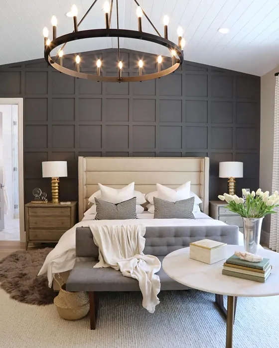
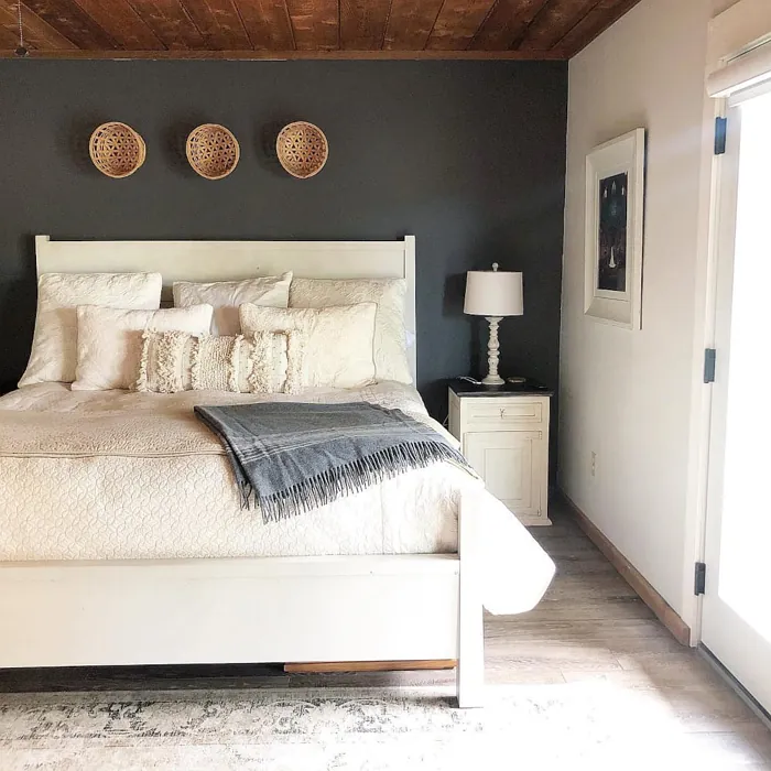
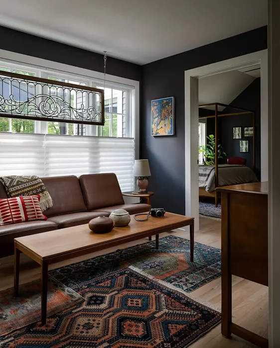
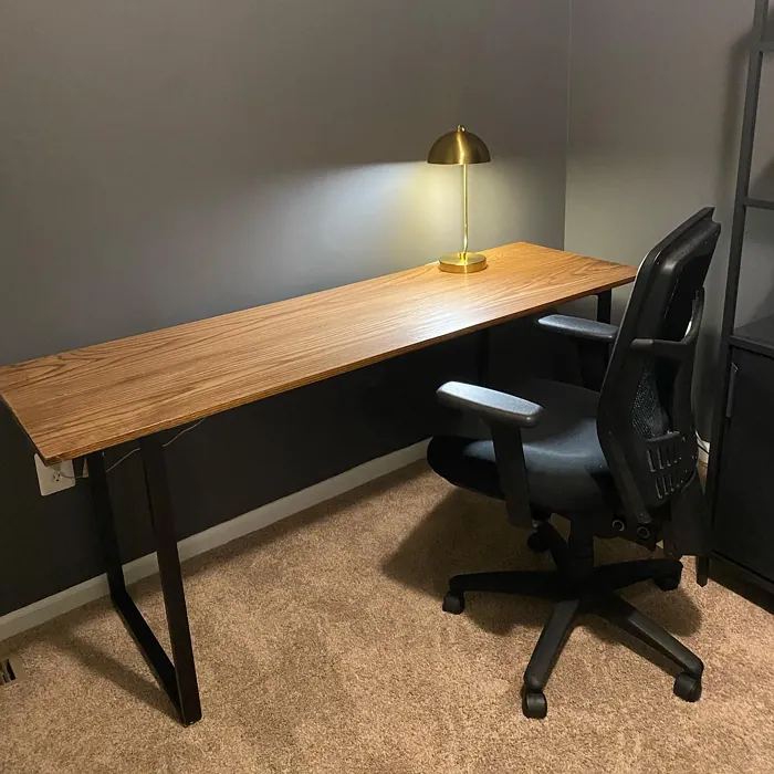
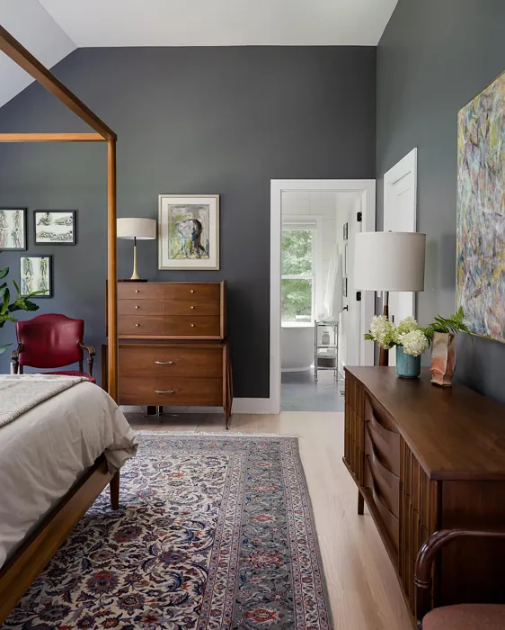
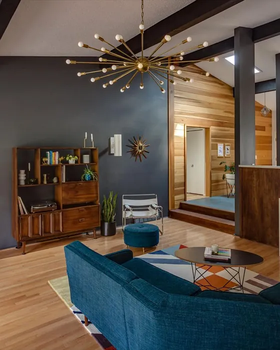
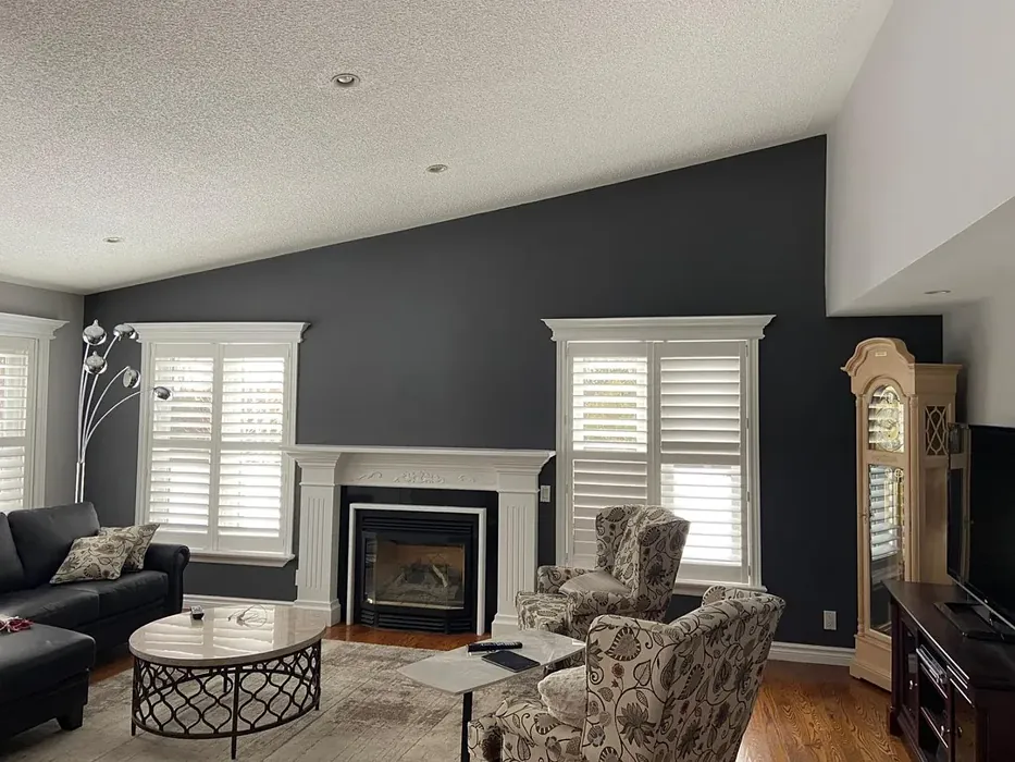
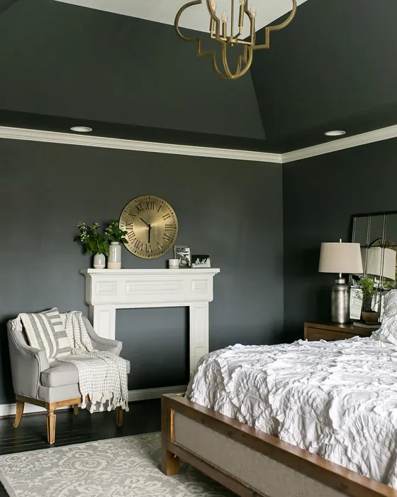
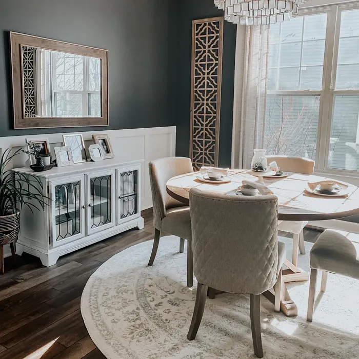
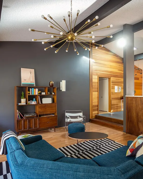
Imagine stepping into a living room that radiates warmth and sophistication, where the walls wrap you in a cozy embrace. That’s the magic of Sherwin Williams’ Peppercorn (SW 7674). This deep gray color doesn’t just sit on the walls; it transforms spaces, infusing them with a sense of elegance and modernity. Whether you’re rethinking your living room, bedroom, or even your home office, Peppercorn deserves a moment in your design spotlight.
Let’s dive into what makes Peppercorn such a special choice for homeowners looking to elevate their interiors. With an LRV of 10%, this color falls firmly in the “dark” category, which means it’s not about reflecting light but absorbing it, creating a warm, inviting atmosphere. Its rich hue hints at a subtle warmth, leaning toward red undertones that add depth and character. This isn’t just another gray; it’s a statement that brings life to your walls.
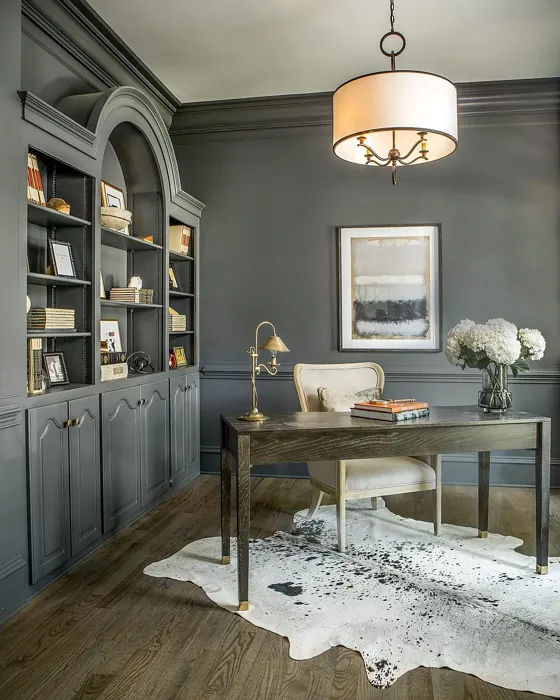
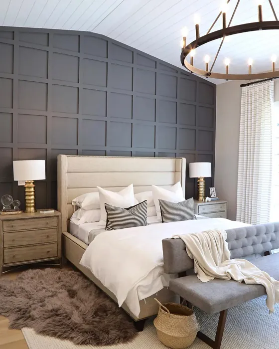
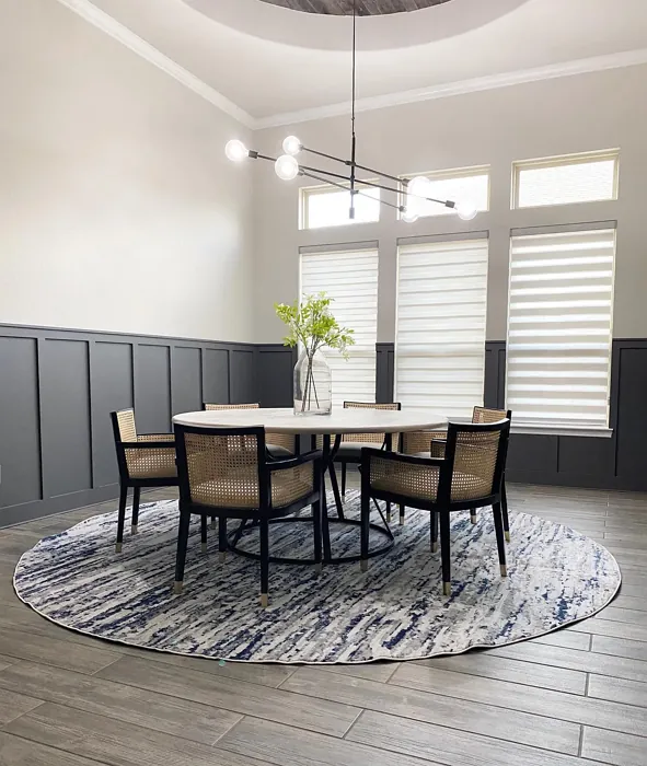
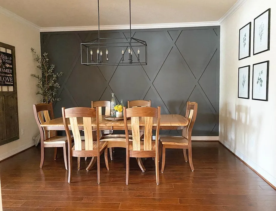
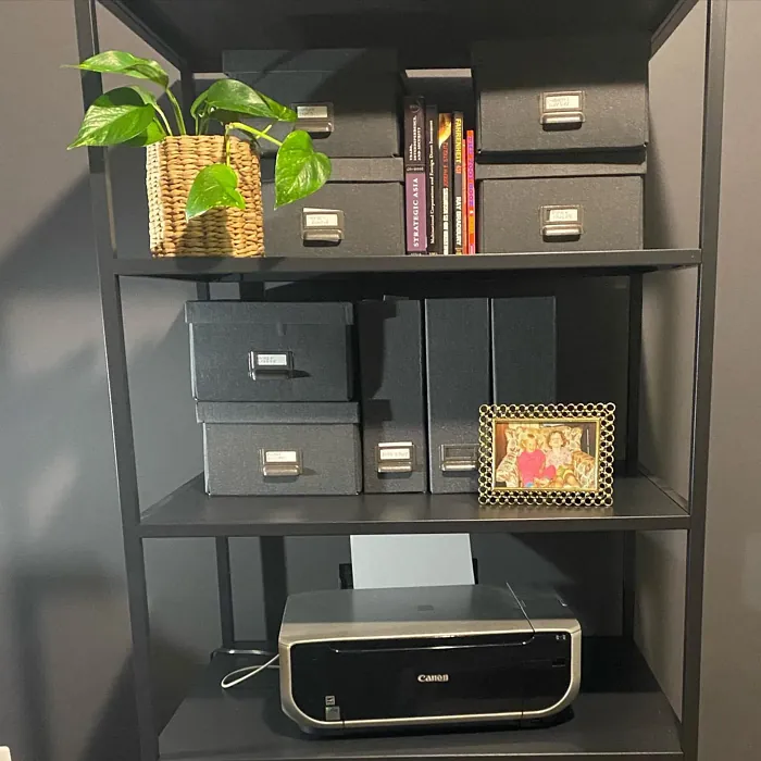
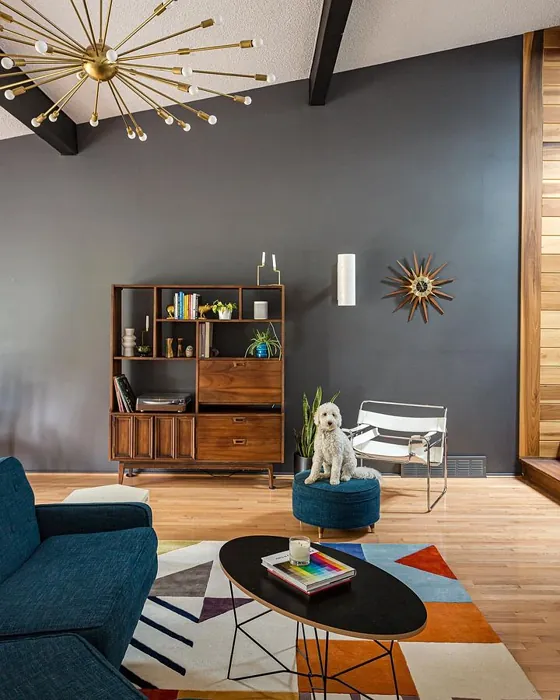
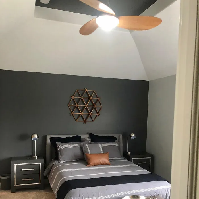
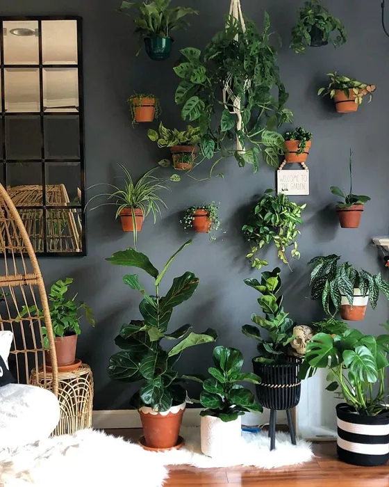
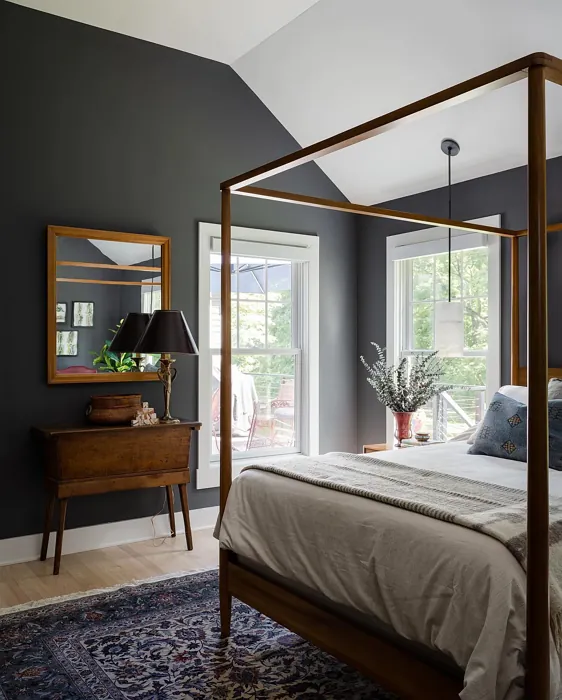
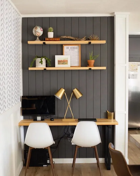
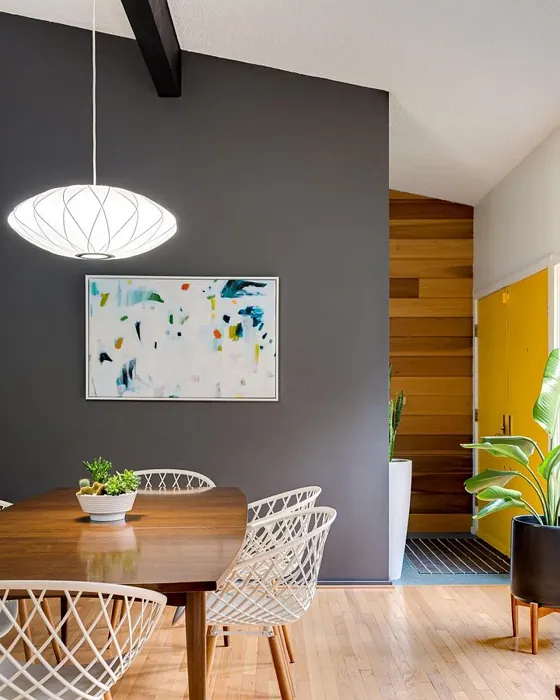
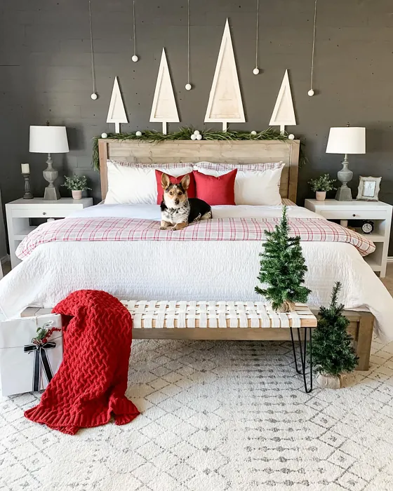
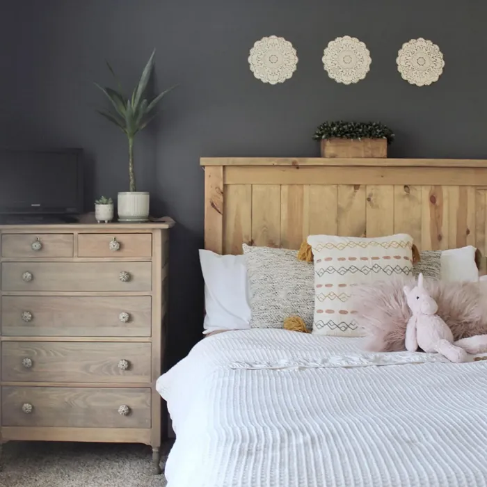
When considering Peppercorn, think about the spaces in your home where you want to create a cozy vibe. It’s perfect for a living room that feels both contemporary and warm, a bedroom that invites restful sleep, or a dining room where family gatherings become even more intimate. Imagine hosting a dinner party under the soft glow of candles with those deep walls enhancing the ambiance, making your guests feel right at home.
Now, let’s talk about application. One of the biggest selling points of Peppercorn is how easy it is to work with. Whether you’re a seasoned DIYer or a first-time painter, this color applies smoothly with minimal effort. It’s roller-ready and brush smooth, meaning you won’t spend hours trying to perfect your finish. And if you’re worried about touch-ups, Peppercorn is friendly in that department too. Just a couple of coats will typically do the trick, leaving you with a beautiful, consistent look.
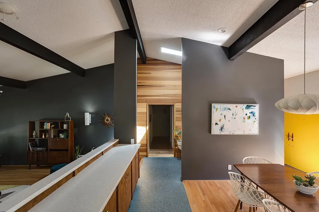
With its versatility, Peppercorn can adapt to various decor styles, from modern and industrial to contemporary and minimalist. Picture it as a backdrop for your favorite furniture pieces, letting your decor shine while still making an impact on its own. Pair it with white trim for a classic look, or throw in some brass fixtures for a touch of glam. You can even mix it with wood elements for a more rustic feel, creating a warm and inviting space that feels curated and personalized.
However, every color has its pros and cons, and Peppercorn is no exception. While it’s sophisticated and versatile, it can appear darker in smaller rooms. If you’re considering using it in a cozy nook, balance is essential. Lighter furnishings or accents can help brighten the space. Think about adding mirrors to reflect light and visually expand the area. The key is to find harmony between Peppercorn’s richness and the elements around it.
Lighting plays a significant role in how this color reveals itself. In bright natural light, Peppercorn can appear lighter and more dynamic, showcasing its complex hues beautifully. But in dim lighting, it takes on a more intimate, moody feel, perfect for creating cozy corners in your home. Always test the color in your space at different times of the day to see how it interacts with your existing furniture and decor.
Considering the undertones is crucial. The red undertones in Peppercorn lend a warmth that can make any room feel inviting. If you compare it with other gray paints, you’ll find that many can feel flat or cold. Peppercorn stands apart with its depth and character. It’s not just a neutral; it’s a transformative color that adds sophistication to any space.
For those wondering how Peppercorn compares to similar shades, it’s worth noting that it has a unique richness that sets it apart. It’s akin to Benjamin Moore’s Kendall Charcoal or Sherwin-Williams’ own Gauntlet Gray, but these shades often lack the warmth and inviting nature Peppercorn delivers. If you’re after something that feels more modern yet timeless, this is definitely the choice for you.
When it comes to finishes, you have options! Whether you prefer a matte, eggshell, or satin finish, Peppercorn can suit your style. A matte finish offers a soft, sophisticated look, while eggshell and satin can provide a slight sheen that adds a touch of polish. Think about the mood you want to create and choose a finish that complements it.
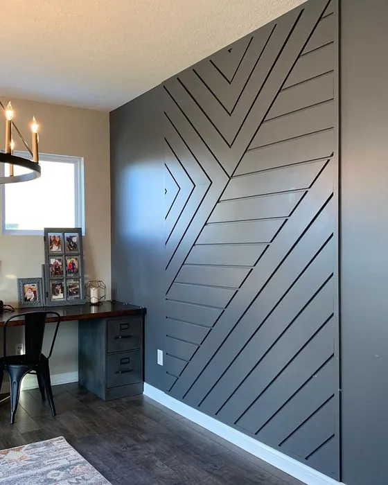
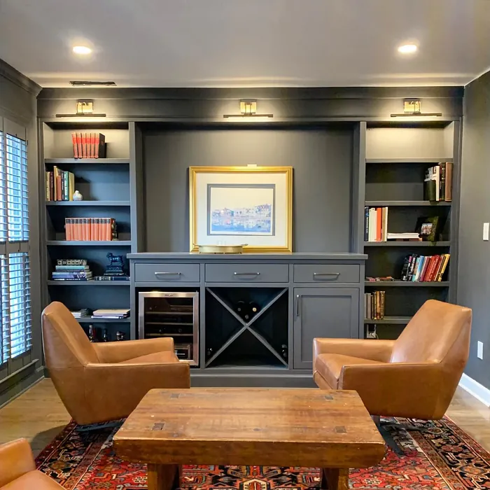
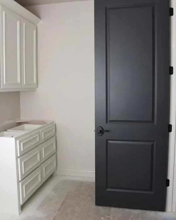
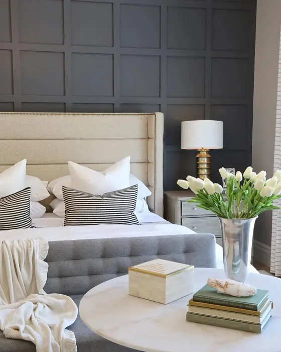
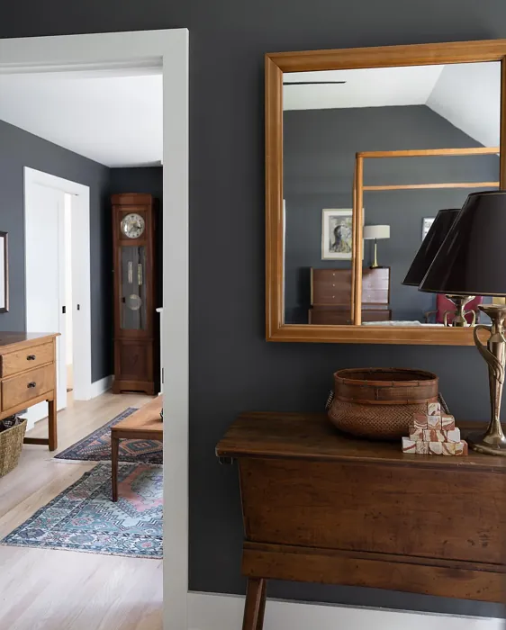
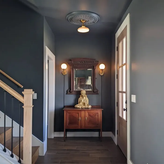
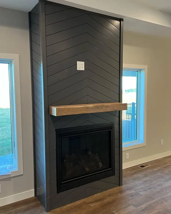
One of the reasons many designers favor Peppercorn is its adaptability. It works exceptionally well in open-concept spaces, where it can act as a unifying color that ties different areas together. Its rich depth makes it an excellent choice for accent walls, too. Imagine a bold Peppercorn accent wall behind your bed or sofa, creating a focal point that draws the eye and adds interest to the room.
And let’s not forget about washability. With Peppercorn, you’re choosing a paint that’s not only beautiful but practical too. It’s highly washable, making it easy to maintain a fresh look over time. Plus, it has a low VOC level, which is great for your indoor air quality—something to consider when making your home comfortable and safe.
In terms of complementary shades, consider pairing Peppercorn with lighter tones such as SW 6224 or SW 9137. These will contrast beautifully and brighten the overall look while still harmonizing with the richness of Peppercorn. It also works well with earthy greens and muted blues, giving you a palette that feels grounded and serene.
If you’re still on the fence about using Peppercorn, think about how it aligns with your overall vision for your home. Do you crave a sophisticated, cozy space that feels inviting yet modern? If so, Peppercorn might just be your perfect match.
In summary, Peppercorn is more than just a paint color; it’s a tool for creating a home that feels both stylish and comfortable. Its rich, warm undertones, adaptability across decor styles, and ease of application make it a top contender for any renovation project. So, why not take the plunge? Transform your space into a chic sanctuary that not only looks good but feels good. You won’t regret it.
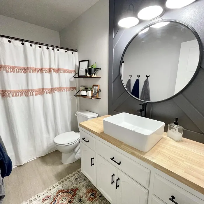
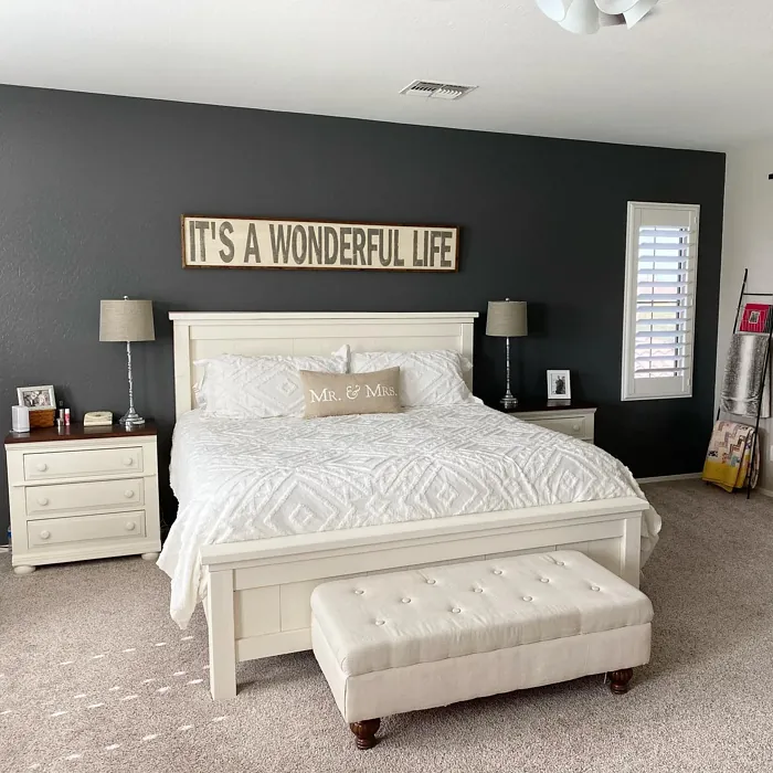
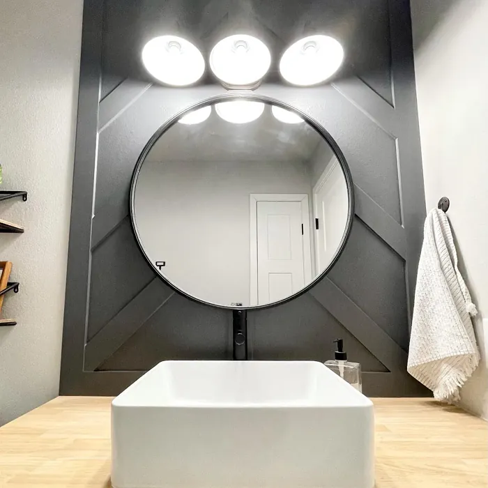
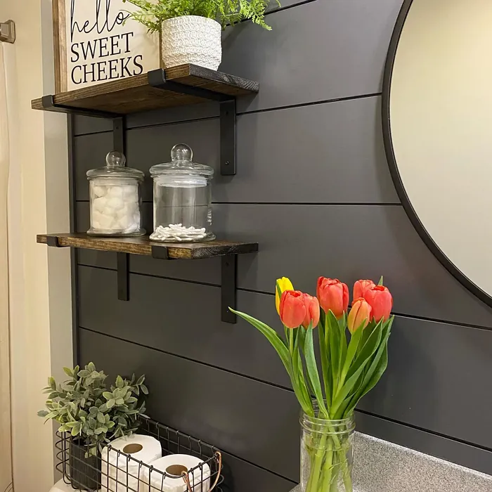
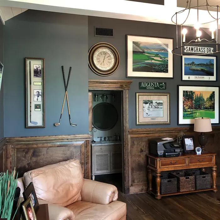
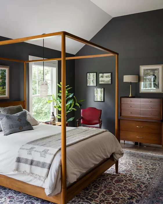
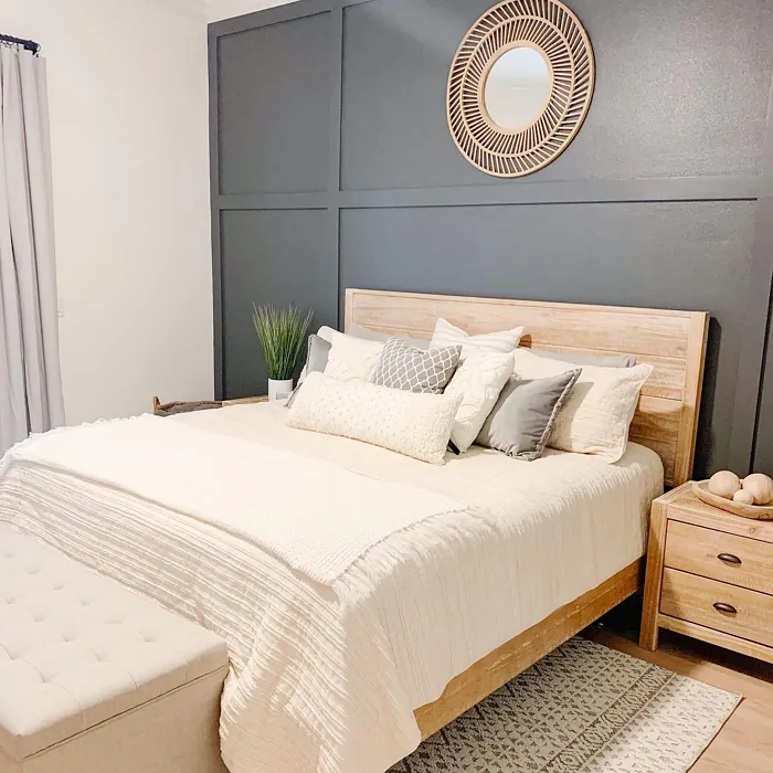
Real Room Photo of Peppercorn SW 7674


Undertones of Peppercorn ?
The undertones of Peppercorn are a key aspect of its character, leaning towards Red. These subtle underlying hues are what give the color its depth and complexity. For example, a gray with a blue undertone will feel cooler and more modern, while one with a brown undertone will feel warmer and more traditional. It’s essential to test this paint in your home and observe it next to your existing furniture, flooring, and decor to see how these undertones interact and reveal themselves throughout the day.
HEX value: #585858
RGB code: 88, 88, 88
Is Peppercorn Cool or Warm?
Peppercorn is considered a warm paint color. This characteristic plays a huge role in the overall feel of a room. Warm colors, like this one, tend to create a cozy, inviting, and energetic atmosphere, making them great for social spaces like living rooms and dining rooms. In contrast, cool colors often evoke a sense of calm and serenity, which is why they are popular in bedrooms and bathrooms. The warmth of Peppercorn means it will pair beautifully with corresponding decor elements.
Understanding Color Properties and Interior Design Tips
Hue refers to a specific position on the color wheel, measured in degrees from 0 to 360. Each degree represents a different pure color:
- 0° represents red
- 120° represents green
- 240° represents blue
Saturation describes the intensity or purity of a color and is expressed as a percentage:
- At 0%, the color appears completely desaturated—essentially a shade of gray
- At 100%, the color is at its most vivid and vibrant
Lightness indicates how light or dark a color is, also expressed as a percentage:
- 0% lightness results in black
- 100% lightness results in white
Using Warm Colors in Interior Design
Warm hues—such as reds, oranges, yellows, warm beiges, and greiges—are excellent choices for creating inviting and energetic spaces. These colors are particularly well-suited for:
- Kitchens, living rooms, and bathrooms, where warmth enhances comfort and sociability
- Large rooms, where warm tones can help reduce the sense of emptiness and make the space feel more intimate
For example:
- Warm beige shades provide a cozy, inviting atmosphere, ideal for living rooms, bedrooms, and hallways.
- Warm greige (a mix of beige and gray) offers the warmth of beige with the modern appeal of gray, making it a versatile backdrop for dining areas, bedrooms, and living spaces.
However, be mindful when using warm light tones in rooms with limited natural light. These shades may appear muted or even take on an unpleasant yellowish tint. To avoid a dull or flat appearance:
- Add depth by incorporating richer tones like deep greens, charcoal, or chocolate brown
- Use textured elements such as curtains, rugs, or cushions to bring dimension to the space
Pro Tip: Achieving Harmony with Warm and Cool Color Balance
To create a well-balanced and visually interesting interior, mix warm and cool tones strategically. This contrast adds depth and harmony to your design.
- If your walls feature warm hues, introduce cool-colored accents such as blue or green furniture, artwork, or accessories to create contrast.
- For a polished look, consider using a complementary color scheme, which pairs colors opposite each other on the color wheel (e.g., red with green, orange with blue).
This thoughtful mix not only enhances visual appeal but also creates a space that feels both dynamic and cohesive.
Light Temperature Affects on Peppercorn
Natural Light
Natural daylight changes in color temperature as the sun moves across the sky. At sunrise and sunset, the light tends to have a warm, golden tone with a color temperature around 2000 Kelvin (K). As the day progresses and the sun rises higher, the light becomes cooler and more neutral. Around midday, especially when the sky is clear, natural light typically reaches its peak brightness and shifts to a cooler tone, ranging from 5500 to 6500 Kelvin. This midday light is close to what we perceive as pure white or daylight-balanced light.
These shifts in natural light can significantly influence how colors appear in a space, which is why designers often consider both the time of day and the orientation of windows when planning interior color schemes.
Artificial Light
When choosing artificial lighting, pay close attention to the color temperature, measured in Kelvin (K). This determines how warm or cool the light will appear. Lower temperatures, around 2700K, give off a warm, yellow glow often used in living rooms or bedrooms. Higher temperatures, above 5000K, create a cool, bluish light similar to daylight, commonly used in kitchens, offices, or task areas.
Use the slider to see how lighting temperature can affect the appearance of a surface or color throughout a space.


4800K
LRV of Peppercorn
The Light Reflectance Value (LRV) of Peppercorn is 10%, which places it in the Dark colors category. This means it does not reflect light. Understanding a paint’s LRV is crucial for predicting how it will look in your space. A higher LRV indicates a lighter color that reflects more light, making rooms feel larger and brighter. A lower LRV signifies a darker color that absorbs more light, creating a cozier, more intimate atmosphere. Always consider the natural and artificial lighting in your room when selecting a paint color based on its LRV.
Detailed Review of Peppercorn
Additional Paint Characteristics
Ideal Rooms
Bedroom, Dining Room, Home Office, Living Room
Decor Styles
Contemporary, Industrial, Minimalist, Modern
Coverage
Good (1–2 Coats), Touch-Up Friendly
Ease of Application
Beginner Friendly, Brush Smooth, Roller-Ready
Washability
Highly Washable, Washable
VOC Level
Low VOC, Ultra Low VOC
Best Use
Accent Wall, Doors, Interior Walls, Trim
Room Suitability
Bedroom, Dining Room, Home Office, Living Room
Tone Tag
Balanced, Deep, Moody, Neutral
Finish Type
Eggshell, Matte, Satin
Paint Performance
Easy Touch-Up, Low Odor, Quick Drying, Scuff Resistant
Use Cases
Best for Modern Farmhouse, Best for Open Concept, Designer Favorite
Mood
Cozy, Inviting, Sophisticated
Trim Pairing
Complements Brass Fixtures, Good with Wood Trim, Pairs with White Dove
Peppercorn offers a stunningly rich gray that acts as a neutral backdrop while still providing depth to your walls. It’s perfect for creating a moody yet inviting space, making it a favorite among interior designers. This paint applies smoothly, requiring minimal effort for a beautiful finish. On its own or paired with lighter colors, Peppercorn can transform a room into a chic sanctuary. Whether you’re going for a bold statement or a subtle accent, this shade won’t disappoint. Plus, its versatility allows it to fit seamlessly into various decor styles, from modern to traditional. Just be prepared for a bit of drying time to achieve the perfect look.
Pros & Cons of SW 7674 Peppercorn
Pros
Cons
Colors that go with Sherwin Williams Peppercorn
FAQ on SW 7674 Peppercorn
Can I use Peppercorn in smaller rooms?
Absolutely! While Peppercorn is a deep color, it can work in smaller rooms if paired with lighter furnishings or accents. To prevent the space from feeling too closed in, consider using mirrors or light-colored decor to balance the look.
How does Peppercorn compare to other gray paints?
Peppercorn stands out due to its unique depth and sophistication. Unlike some grays that can feel flat, Peppercorn has rich undertones that give the color life. It’s perfect for those seeking a modern yet timeless look that sets it apart from standard gray options.
Comparisons Peppercorn with other colors
Peppercorn SW 7674 vs Night Owl SW 7061
| Attribute | Peppercorn SW 7674 | Night Owl SW 7061 |
|---|---|---|
| Color Name | Peppercorn SW 7674 | Night Owl SW 7061 |
| Color | ||
| Hue | Grey | Grey |
| Brightness | Dark | Dark |
| RGB | 88, 88, 88 | 99, 101, 95 |
| LRV | 10% | 24% |
| Finish Type | Eggshell, Matte, Satin | Eggshell, Matte, Satin |
| Finish Options | Eggshell, Matte, Satin | Eggshell, Matte, Satin |
| Ideal Rooms | Bedroom, Dining Room, Home Office, Living Room | Bedroom, Dining Room, Hallway, Home Office, Living Room |
| Decor Styles | Contemporary, Industrial, Minimalist, Modern | Industrial, Minimalist, Modern, Rustic, Scandinavian |
| Coverage | Good (1–2 Coats), Touch-Up Friendly | Good (1–2 Coats), Touch-Up Friendly |
| Ease of Application | Beginner Friendly, Brush Smooth, Roller-Ready | Beginner Friendly, Brush Smooth, Fast-Drying, Roller-Ready |
| Washability | Highly Washable, Washable | Scrubbable, Washable |
| Room Suitability | Bedroom, Dining Room, Home Office, Living Room | Bedroom, Dining Room, Home Office, Living Room |
| Tone | Balanced, Deep, Moody, Neutral | Balanced, Deep, Earthy, Muted |
| Paint Performance | Easy Touch-Up, Low Odor, Quick Drying, Scuff Resistant | Easy Touch-Up, Fade Resistant, High Coverage, Low Odor |
Peppercorn SW 7674 vs Urbane Bronze SW 7048
| Attribute | Peppercorn SW 7674 | Urbane Bronze SW 7048 |
|---|---|---|
| Color Name | Peppercorn SW 7674 | Urbane Bronze SW 7048 |
| Color | ||
| Hue | Grey | Grey |
| Brightness | Dark | Dark |
| RGB | 88, 88, 88 | 84, 80, 74 |
| LRV | 10% | 20% |
| Finish Type | Eggshell, Matte, Satin | Eggshell, Matte, Satin |
| Finish Options | Eggshell, Matte, Satin | Eggshell, Matte, Satin |
| Ideal Rooms | Bedroom, Dining Room, Home Office, Living Room | Bedroom, Dining Room, Home Office, Living Room |
| Decor Styles | Contemporary, Industrial, Minimalist, Modern | Contemporary, Industrial, Modern, Rustic, Transitional |
| Coverage | Good (1–2 Coats), Touch-Up Friendly | Good (1–2 Coats) |
| Ease of Application | Beginner Friendly, Brush Smooth, Roller-Ready | Beginner Friendly, Brush Smooth, Roller-Ready |
| Washability | Highly Washable, Washable | Highly Washable, Washable |
| Room Suitability | Bedroom, Dining Room, Home Office, Living Room | Bedroom, Dining Room, Home Office, Living Room |
| Tone | Balanced, Deep, Moody, Neutral | Deep, Earthy, Warm |
| Paint Performance | Easy Touch-Up, Low Odor, Quick Drying, Scuff Resistant | Easy Touch-Up, Fade Resistant, High Coverage, Low Odor |
Peppercorn SW 7674 vs Succulent SW 9650
| Attribute | Peppercorn SW 7674 | Succulent SW 9650 |
|---|---|---|
| Color Name | Peppercorn SW 7674 | Succulent SW 9650 |
| Color | ||
| Hue | Grey | Grey |
| Brightness | Dark | Dark |
| RGB | 88, 88, 88 | 97, 108, 100 |
| LRV | 10% | 30% |
| Finish Type | Eggshell, Matte, Satin | Eggshell, Matte, Satin |
| Finish Options | Eggshell, Matte, Satin | Eggshell, Matte, Satin |
| Ideal Rooms | Bedroom, Dining Room, Home Office, Living Room | Bathroom, Bedroom, Dining Room, Entryway, Kitchen, Living Room |
| Decor Styles | Contemporary, Industrial, Minimalist, Modern | Bohemian, Contemporary, Eclectic, Minimalist, Modern Farmhouse |
| Coverage | Good (1–2 Coats), Touch-Up Friendly | Good (1–2 Coats), Touch-Up Friendly |
| Ease of Application | Beginner Friendly, Brush Smooth, Roller-Ready | Beginner Friendly, Brush Smooth, Roller-Ready |
| Washability | Highly Washable, Washable | Highly Washable, Washable |
| Room Suitability | Bedroom, Dining Room, Home Office, Living Room | Bathroom, Bedroom, Dining Room, Kitchen, Living Room |
| Tone | Balanced, Deep, Moody, Neutral | Cool, Earthy, Muted |
| Paint Performance | Easy Touch-Up, Low Odor, Quick Drying, Scuff Resistant | Easy Touch-Up, Low Odor, Quick Drying, Scuff Resistant |
Peppercorn SW 7674 vs Grizzle Gray SW 7068
| Attribute | Peppercorn SW 7674 | Grizzle Gray SW 7068 |
|---|---|---|
| Color Name | Peppercorn SW 7674 | Grizzle Gray SW 7068 |
| Color | ||
| Hue | Grey | Grey |
| Brightness | Dark | Dark |
| RGB | 88, 88, 88 | 99, 101, 98 |
| LRV | 10% | 24% |
| Finish Type | Eggshell, Matte, Satin | Eggshell, Satin |
| Finish Options | Eggshell, Matte, Satin | Eggshell, Matte, Satin |
| Ideal Rooms | Bedroom, Dining Room, Home Office, Living Room | Bedroom, Dining Room, Home Office, Living Room |
| Decor Styles | Contemporary, Industrial, Minimalist, Modern | Industrial, Modern, Rustic, Scandinavian |
| Coverage | Good (1–2 Coats), Touch-Up Friendly | Good (1–2 Coats), Touch-Up Friendly |
| Ease of Application | Beginner Friendly, Brush Smooth, Roller-Ready | Beginner Friendly, Brush Smooth, Roller-Ready |
| Washability | Highly Washable, Washable | Washable, Wipeable |
| Room Suitability | Bedroom, Dining Room, Home Office, Living Room | Bedroom, Dining Room, Home Office, Living Room |
| Tone | Balanced, Deep, Moody, Neutral | Balanced, Cool, Muted |
| Paint Performance | Easy Touch-Up, Low Odor, Quick Drying, Scuff Resistant | Easy Touch-Up, High Coverage, Low Odor |
Peppercorn SW 7674 vs Iron Ore SW 7069
| Attribute | Peppercorn SW 7674 | Iron Ore SW 7069 |
|---|---|---|
| Color Name | Peppercorn SW 7674 | Iron Ore SW 7069 |
| Color | ||
| Hue | Grey | Grey |
| Brightness | Dark | Dark |
| RGB | 88, 88, 88 | 67, 67, 65 |
| LRV | 10% | 6% |
| Finish Type | Eggshell, Matte, Satin | Eggshell, Matte, Satin |
| Finish Options | Eggshell, Matte, Satin | Eggshell, Matte, Satin |
| Ideal Rooms | Bedroom, Dining Room, Home Office, Living Room | Bedroom, Dining Room, Entryway, Home Office, Living Room |
| Decor Styles | Contemporary, Industrial, Minimalist, Modern | Contemporary, Industrial, Minimalist, Modern, Rustic |
| Coverage | Good (1–2 Coats), Touch-Up Friendly | Good (1–2 Coats), High Hide |
| Ease of Application | Beginner Friendly, Brush Smooth, Roller-Ready | Brush Smooth, Fast-Drying, Roller-Ready |
| Washability | Highly Washable, Washable | Highly Washable, Washable |
| Room Suitability | Bedroom, Dining Room, Home Office, Living Room | Bedroom, Dining Room, Entryway, Home Office, Living Room |
| Tone | Balanced, Deep, Moody, Neutral | Balanced, Deep, Muted, Warm |
| Paint Performance | Easy Touch-Up, Low Odor, Quick Drying, Scuff Resistant | Easy Touch-Up, High Coverage, Low Odor |
Peppercorn SW 7674 vs Slate Tile SW 7624
| Attribute | Peppercorn SW 7674 | Slate Tile SW 7624 |
|---|---|---|
| Color Name | Peppercorn SW 7674 | Slate Tile SW 7624 |
| Color | ||
| Hue | Grey | Grey |
| Brightness | Dark | Dark |
| RGB | 88, 88, 88 | 96, 110, 116 |
| LRV | 10% | 15% |
| Finish Type | Eggshell, Matte, Satin | Eggshell, Matte, Satin |
| Finish Options | Eggshell, Matte, Satin | Eggshell, Matte, Satin |
| Ideal Rooms | Bedroom, Dining Room, Home Office, Living Room | Bathroom, Bedroom, Home Office, Kitchen, Living Room |
| Decor Styles | Contemporary, Industrial, Minimalist, Modern | Industrial, Minimalist, Modern, Rustic |
| Coverage | Good (1–2 Coats), Touch-Up Friendly | Good (1–2 Coats) |
| Ease of Application | Beginner Friendly, Brush Smooth, Roller-Ready | Beginner Friendly, Brush Smooth, Fast-Drying, Roller-Ready |
| Washability | Highly Washable, Washable | Scrubbable, Washable |
| Room Suitability | Bedroom, Dining Room, Home Office, Living Room | Bathroom, Bedroom, Kitchen, Living Room |
| Tone | Balanced, Deep, Moody, Neutral | Balanced, Cool, Muted |
| Paint Performance | Easy Touch-Up, Low Odor, Quick Drying, Scuff Resistant | Easy Touch-Up, High Coverage, Low Odor, Quick Drying |
Peppercorn SW 7674 vs Blustery Sky SW 9140
| Attribute | Peppercorn SW 7674 | Blustery Sky SW 9140 |
|---|---|---|
| Color Name | Peppercorn SW 7674 | Blustery Sky SW 9140 |
| Color | ||
| Hue | Grey | Grey |
| Brightness | Dark | Dark |
| RGB | 88, 88, 88 | 111, 132, 140 |
| LRV | 10% | 48% |
| Finish Type | Eggshell, Matte, Satin | Eggshell, Matte |
| Finish Options | Eggshell, Matte, Satin | Eggshell, Matte, Satin |
| Ideal Rooms | Bedroom, Dining Room, Home Office, Living Room | Bedroom, Dining Room, Home Office, Living Room, Nursery |
| Decor Styles | Contemporary, Industrial, Minimalist, Modern | Coastal, Modern Farmhouse, Scandinavian, Transitional |
| Coverage | Good (1–2 Coats), Touch-Up Friendly | Good (1–2 Coats), Touch-Up Friendly |
| Ease of Application | Beginner Friendly, Brush Smooth, Roller-Ready | Beginner Friendly, Fast-Drying, Low Splatter, Roller-Ready |
| Washability | Highly Washable, Washable | Washable, Wipeable |
| Room Suitability | Bedroom, Dining Room, Home Office, Living Room | Bedroom, Home Office, Living Room, Nursery |
| Tone | Balanced, Deep, Moody, Neutral | Balanced, Cool, Muted |
| Paint Performance | Easy Touch-Up, Low Odor, Quick Drying, Scuff Resistant | Easy Touch-Up, Fade Resistant, Low Odor, Quick Drying |
Peppercorn SW 7674 vs Gauntlet Gray SW 7019
| Attribute | Peppercorn SW 7674 | Gauntlet Gray SW 7019 |
|---|---|---|
| Color Name | Peppercorn SW 7674 | Gauntlet Gray SW 7019 |
| Color | ||
| Hue | Grey | Grey |
| Brightness | Dark | Dark |
| RGB | 88, 88, 88 | 120, 115, 110 |
| LRV | 10% | 24% |
| Finish Type | Eggshell, Matte, Satin | Eggshell, Matte, Satin |
| Finish Options | Eggshell, Matte, Satin | Eggshell, Matte, Satin |
| Ideal Rooms | Bedroom, Dining Room, Home Office, Living Room | Bedroom, Dining Room, Hallway, Home Office, Living Room |
| Decor Styles | Contemporary, Industrial, Minimalist, Modern | Industrial, Modern, Rustic, Transitional |
| Coverage | Good (1–2 Coats), Touch-Up Friendly | Good (1–2 Coats), Touch-Up Friendly |
| Ease of Application | Beginner Friendly, Brush Smooth, Roller-Ready | Beginner Friendly, Brush Smooth, Roller-Ready |
| Washability | Highly Washable, Washable | Scrubbable, Washable |
| Room Suitability | Bedroom, Dining Room, Home Office, Living Room | Bedroom, Dining Room, Home Office, Living Room |
| Tone | Balanced, Deep, Moody, Neutral | Dusty, Earthy, Muted, Warm |
| Paint Performance | Easy Touch-Up, Low Odor, Quick Drying, Scuff Resistant | Easy Touch-Up, High Coverage, Low Odor |
Peppercorn SW 7674 vs Cast Iron SW 6202
| Attribute | Peppercorn SW 7674 | Cast Iron SW 6202 |
|---|---|---|
| Color Name | Peppercorn SW 7674 | Cast Iron SW 6202 |
| Color | ||
| Hue | Grey | Grey |
| Brightness | Dark | Dark |
| RGB | 88, 88, 88 | 100, 100, 90 |
| LRV | 10% | 6% |
| Finish Type | Eggshell, Matte, Satin | Eggshell, Matte, Satin |
| Finish Options | Eggshell, Matte, Satin | Eggshell, Matte, Satin |
| Ideal Rooms | Bedroom, Dining Room, Home Office, Living Room | Bedroom, Dining Room, Hallway, Home Office, Kitchen, Living Room |
| Decor Styles | Contemporary, Industrial, Minimalist, Modern | Contemporary, Farmhouse, Industrial, Minimalist, Modern |
| Coverage | Good (1–2 Coats), Touch-Up Friendly | Good (1–2 Coats), High Hide, Touch-Up Friendly |
| Ease of Application | Beginner Friendly, Brush Smooth, Roller-Ready | Beginner Friendly, Brush Smooth, Fast-Drying, Roller-Ready |
| Washability | Highly Washable, Washable | Highly Washable, Washable, Wipeable |
| Room Suitability | Bedroom, Dining Room, Home Office, Living Room | Bedroom, Dining Room, Home Office, Kitchen, Living Room |
| Tone | Balanced, Deep, Moody, Neutral | Balanced, Deep, Dusty, Earthy, Warm |
| Paint Performance | Easy Touch-Up, Low Odor, Quick Drying, Scuff Resistant | Easy Touch-Up, High Coverage, Low Odor, Stain Resistant |
Peppercorn SW 7674 vs Portsmouth SW 9644
| Attribute | Peppercorn SW 7674 | Portsmouth SW 9644 |
|---|---|---|
| Color Name | Peppercorn SW 7674 | Portsmouth SW 9644 |
| Color | ||
| Hue | Grey | Grey |
| Brightness | Dark | Dark |
| RGB | 88, 88, 88 | 118, 132, 130 |
| LRV | 10% | 12% |
| Finish Type | Eggshell, Matte, Satin | Eggshell, Satin |
| Finish Options | Eggshell, Matte, Satin | Eggshell, Flat, Matte, Satin |
| Ideal Rooms | Bedroom, Dining Room, Home Office, Living Room | Bathroom, Bedroom, Home Office, Kitchen, Living Room |
| Decor Styles | Contemporary, Industrial, Minimalist, Modern | Bohemian, Coastal, Modern Farmhouse, Scandinavian |
| Coverage | Good (1–2 Coats), Touch-Up Friendly | Good (1–2 Coats) |
| Ease of Application | Beginner Friendly, Brush Smooth, Roller-Ready | Beginner Friendly, Brush Smooth, Roller-Ready |
| Washability | Highly Washable, Washable | Highly Washable, Washable |
| Room Suitability | Bedroom, Dining Room, Home Office, Living Room | Bathroom, Bedroom, Kitchen, Living Room |
| Tone | Balanced, Deep, Moody, Neutral | Cool, Earthy, Muted |
| Paint Performance | Easy Touch-Up, Low Odor, Quick Drying, Scuff Resistant | Easy Touch-Up, Low Odor, Scuff Resistant |
Official Page of Sherwin Williams Peppercorn SW 7674