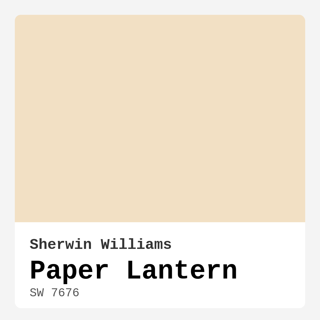
Color Preview & Key Details
| HEX Code | #F2E0C4 |
| RGB | 242, 224, 196 |
| LRV | 75% |
| Undertone | Red |
| Finish Options | Eggshell, Matte, Satin |
Imagine walking into a room that instantly wraps you in warmth and comfort, like a gentle hug from the sun on a cool morning. That’s the feeling you get with Sherwin Williams’ Paper Lantern, a lovely soft beige paint color that has a way of transforming spaces into inviting sanctuaries. This isn’t just paint; it’s an experience, a mood, and a versatile backdrop that caters to various decor styles.
Let’s dive deeper into why Paper Lantern might just be the perfect choice for your next home project. With its hex code #F2E0C4 and an LRV of 75%, this hue reflects a significant amount of light, making rooms feel more spacious and airy. Picture how it will look in your living room, bedroom, or even your home office. The gentle glow it emits can brighten your day and create a cozy atmosphere that welcomes you home.
One of the standout features of Paper Lantern is its warm undertone. Leaning slightly towards red, this undertone adds depth and character, creating a subtle richness that can be easily paired with both warm and cool accents. It’s like the secret ingredient in a recipe, enhancing everything without overpowering it. This quality makes it an excellent fit for a variety of styles, from modern farmhouse to transitional and even bohemian.
When you think about where to use Paper Lantern, the possibilities are nearly endless. It shines in a living room, inviting conversation and relaxation. In a bedroom, it fosters a soothing environment perfect for winding down after a long day. Picture it in a nursery—soft, welcoming, and nurturing. It can even elevate a dining room, bringing a touch of elegance without feeling stuffy.
Now, let’s talk about the practical side of applying this lovely shade. Paper Lantern is beginner-friendly, gliding on smoothly with a brush or roller. You won’t find yourself wrestling with the paint; it’s designed to be easy to work with. And if you’re concerned about coverage, rest easy. Generally, it provides good coverage with just one to two coats, though you may want to apply an extra layer if you’re transitioning from a darker hue.
Fast-drying and touch-up friendly, this paint makes your project efficient and hassle-free. You can layer coats quickly without long waits between applications, which is great if you’re on a tight schedule. Plus, it’s wipeable and washable—perfect for homes with kids or pets. Just keep in mind that lighter shades can show dirt a bit more easily, so consider this when deciding on your spaces. If you plan to use it in a high-traffic area, adding a protective top coat will enhance its durability.
One of the common concerns when selecting paint is how it behaves under different lighting conditions. In natural light, Paper Lantern takes on a glowing quality that enhances its warmth, making your spaces feel bright and cheerful. It embraces the sun, filtering through like gentle rays on a summer afternoon. In artificial light, it retains that cozy charm, but may appear softer. Always be sure to test a swatch in your specific lighting to see how it interacts with your furniture and decor throughout the day.
You might be wondering how this color pairs with other shades. The beauty of Paper Lantern is its versatility. It complements whites and creams beautifully, especially shades like White Dove. It also works harmoniously with brass fixtures, adding a touch of warmth to your space. If you’re looking for complimentary colors to create a layered, sophisticated look, consider shades like SW 9070 or SW 6523. These will enhance the warmth of Paper Lantern while maintaining a cohesive palette.
When it comes to decor styles, you can’t go wrong with this hue. It fits seamlessly into modern farmhouse aesthetics, where its warmth plays nicely with rustic elements. It also shines in Scandinavian designs, providing that cozy, inviting feel synonymous with this style. Whether you lean towards a more traditional look or a contemporary vibe, Paper Lantern can adapt to meet your vision.
As an expert home designer, I always emphasize the importance of understanding color undertones. Paper Lantern’s red undertone is what gives it that inviting warmth but testing it in your space is crucial. How it looks against your existing furniture, flooring, and decor will reveal its true character. Remember, color is dynamic and can change based on the elements around it.
For those of you who may still be undecided, consider this: Paper Lantern is not just a classic choice; it’s a timeless one. It’s perfect for rentals as it allows you to create a personalized touch without a permanent commitment. It’s favored among designers for its adaptability and elegance.
While this lovely hue has so many advantages, it’s essential to weigh the pros and cons. The pros include its warm and inviting character, versatility for various decor styles, smooth application, and eco-friendly low VOC levels. On the flip side, keep in mind that it may require multiple coats for optimal vibrancy, especially if you’re covering a darker shade, and lighter shades can show dirt more easily.
In conclusion, choosing a paint color like Paper Lantern is about more than just aesthetics. It’s about creating a mood, a feeling, and a sense of belonging in your home. Its warmth and versatility can turn any room into a cozy haven where you feel at ease. So, if you’re looking to refresh your space with a soothing, elegant color, give Paper Lantern a try. It might just be the perfect fit for your home’s personality and your own. Now, grab that sample can, and let’s get painting!
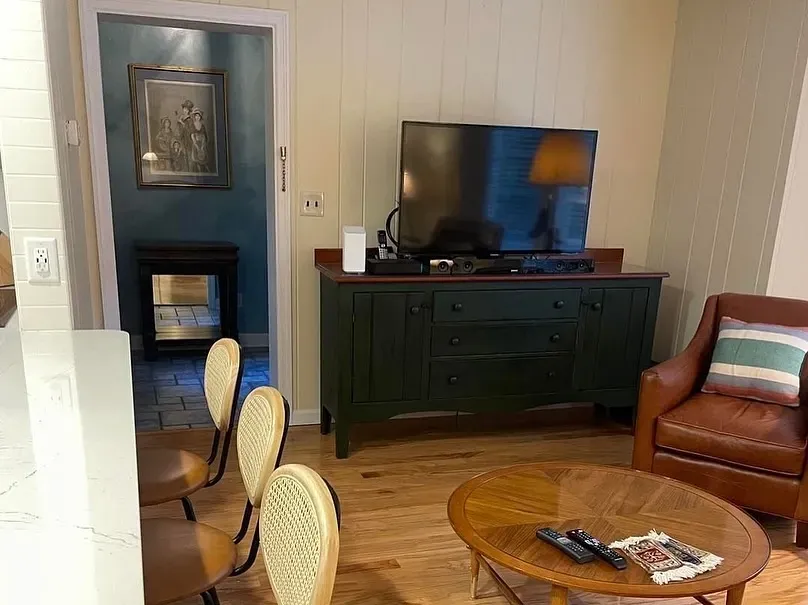
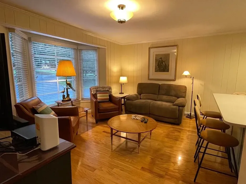
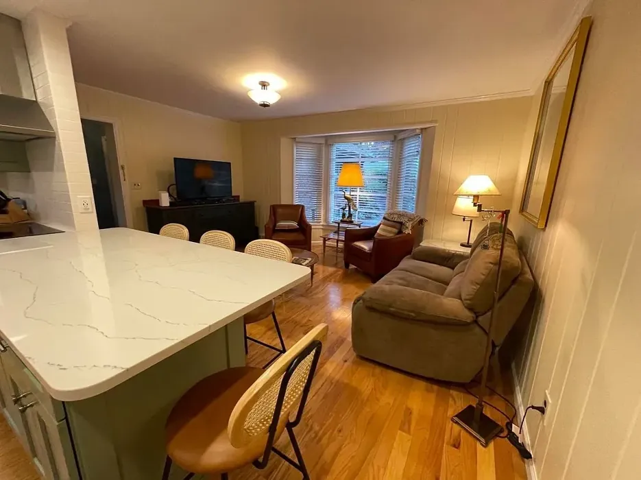
Real Room Photo of Paper Lantern SW 7676
Undertones of Paper Lantern ?
The undertones of Paper Lantern are a key aspect of its character, leaning towards Red. These subtle underlying hues are what give the color its depth and complexity. For example, a gray with a blue undertone will feel cooler and more modern, while one with a brown undertone will feel warmer and more traditional. It’s essential to test this paint in your home and observe it next to your existing furniture, flooring, and decor to see how these undertones interact and reveal themselves throughout the day.
HEX value: #F2E0C4
RGB code: 242, 224, 196
Is Paper Lantern Cool or Warm?
Paper Lantern is decidedly warm, with its beige and peach tones creating a welcoming and comforting atmosphere. This warmth makes it ideal for spaces where relaxation and comfort are key, like bedrooms and living rooms.
Understanding Color Properties and Interior Design Tips
Hue refers to a specific position on the color wheel, measured in degrees from 0 to 360. Each degree represents a different pure color:
- 0° represents red
- 120° represents green
- 240° represents blue
Saturation describes the intensity or purity of a color and is expressed as a percentage:
- At 0%, the color appears completely desaturated—essentially a shade of gray
- At 100%, the color is at its most vivid and vibrant
Lightness indicates how light or dark a color is, also expressed as a percentage:
- 0% lightness results in black
- 100% lightness results in white
Using Warm Colors in Interior Design
Warm hues—such as reds, oranges, yellows, warm beiges, and greiges—are excellent choices for creating inviting and energetic spaces. These colors are particularly well-suited for:
- Kitchens, living rooms, and bathrooms, where warmth enhances comfort and sociability
- Large rooms, where warm tones can help reduce the sense of emptiness and make the space feel more intimate
For example:
- Warm beige shades provide a cozy, inviting atmosphere, ideal for living rooms, bedrooms, and hallways.
- Warm greige (a mix of beige and gray) offers the warmth of beige with the modern appeal of gray, making it a versatile backdrop for dining areas, bedrooms, and living spaces.
However, be mindful when using warm light tones in rooms with limited natural light. These shades may appear muted or even take on an unpleasant yellowish tint. To avoid a dull or flat appearance:
- Add depth by incorporating richer tones like deep greens, charcoal, or chocolate brown
- Use textured elements such as curtains, rugs, or cushions to bring dimension to the space
Pro Tip: Achieving Harmony with Warm and Cool Color Balance
To create a well-balanced and visually interesting interior, mix warm and cool tones strategically. This contrast adds depth and harmony to your design.
- If your walls feature warm hues, introduce cool-colored accents such as blue or green furniture, artwork, or accessories to create contrast.
- For a polished look, consider using a complementary color scheme, which pairs colors opposite each other on the color wheel (e.g., red with green, orange with blue).
This thoughtful mix not only enhances visual appeal but also creates a space that feels both dynamic and cohesive.
Light Temperature Affects on Paper Lantern
Natural Light
Natural daylight changes in color temperature as the sun moves across the sky. At sunrise and sunset, the light tends to have a warm, golden tone with a color temperature around 2000 Kelvin (K). As the day progresses and the sun rises higher, the light becomes cooler and more neutral. Around midday, especially when the sky is clear, natural light typically reaches its peak brightness and shifts to a cooler tone, ranging from 5500 to 6500 Kelvin. This midday light is close to what we perceive as pure white or daylight-balanced light.
These shifts in natural light can significantly influence how colors appear in a space, which is why designers often consider both the time of day and the orientation of windows when planning interior color schemes.
Artificial Light
When choosing artificial lighting, pay close attention to the color temperature, measured in Kelvin (K). This determines how warm or cool the light will appear. Lower temperatures, around 2700K, give off a warm, yellow glow often used in living rooms or bedrooms. Higher temperatures, above 5000K, create a cool, bluish light similar to daylight, commonly used in kitchens, offices, or task areas.
Use the slider to see how lighting temperature can affect the appearance of a surface or color throughout a space.


4800K
LRV of Paper Lantern
The Light Reflectance Value (LRV) of Paper Lantern is 75%, which places it in the Light category. This means it Reflects a high amount of light. Understanding a paint’s LRV is crucial for predicting how it will look in your space. A higher LRV indicates a lighter color that reflects more light, making rooms feel larger and brighter. A lower LRV signifies a darker color that absorbs more light, creating a cozier, more intimate atmosphere. Always consider the natural and artificial lighting in your room when selecting a paint color based on its LRV.
Detailed Review of Paper Lantern
Additional Paint Characteristics
Ideal Rooms
Bedroom, Dining Room, Home Office, Living Room, Nursery
Decor Styles
Bohemian, Coastal, Modern Farmhouse, Scandinavian, Transitional
Coverage
Good (1–2 Coats), Touch-Up Friendly
Ease of Application
Beginner Friendly, Brush Smooth, Fast-Drying, Roller-Ready
Washability
Washable, Wipeable
VOC Level
Eco-Certified, Low VOC
Best Use
Accent Wall, Furniture, Interior Walls
Room Suitability
Bedroom, Dining Room, Home Office, Living Room, Nursery
Tone Tag
Creamy, Muted, Warm
Finish Type
Eggshell, Matte
Paint Performance
Easy Touch-Up, Fade Resistant, Low Odor, Quick Drying
Use Cases
Best for Low Light Rooms, Best for Rentals, Classic Favorite, Designer Favorite
Mood
Cozy, Inviting, Warm
Trim Pairing
Complements Brass Fixtures, Pairs with White Dove, Works with Warm Trim
Applying Paper Lantern is a delightful experience thanks to its smooth application and excellent coverage. This paint glides on effortlessly with a brush or roller, providing a consistent finish without fuss. You’ll appreciate how quickly it dries, allowing you to layer coats without long waits. Its warm undertones are particularly effective in creating an inviting atmosphere, making rooms feel bright and cheerful. When it comes to versatility, it pairs beautifully with both warm and cool accents, making it a fantastic choice for various decor styles. Just be prepared for a couple of coats for optimal vibrancy, especially if you’re transitioning from a darker shade. Overall, Paper Lantern is a fantastic option for those looking to refresh their space with a soothing, elegant color.
Pros & Cons of SW 7676 Paper Lantern
Pros
Cons
Colors that go with Sherwin Williams Paper Lantern
FAQ on SW 7676 Paper Lantern
Can I use Paper Lantern in high-traffic areas?
While Paper Lantern is a beautiful choice, it’s best suited for lower traffic areas like bedrooms or living rooms. If you’re considering it for high-traffic spaces, consider adding a protective top coat to increase durability.
How does Paper Lantern work in different lighting conditions?
Paper Lantern shines in natural light, reflecting warmth and brightness. In artificial light, it retains its cozy feel, though it may appear softer. Always test a swatch in your specific lighting to see how it transforms the space.
Comparisons Paper Lantern with other colors
Paper Lantern SW 7676 vs Natural Linen SW 9109
| Attribute | Paper Lantern SW 7676 | Natural Linen SW 9109 |
|---|---|---|
| Color Name | Paper Lantern SW 7676 | Natural Linen SW 9109 |
| Color | ||
| Hue | Beige | Beige |
| Brightness | Light | Light |
| RGB | 242, 224, 196 | 223, 211, 195 |
| LRV | 75% | 74% |
| Finish Type | Eggshell, Matte | Eggshell, Matte, Satin |
| Finish Options | Eggshell, Matte, Satin | Eggshell, Matte, Satin |
| Ideal Rooms | Bedroom, Dining Room, Home Office, Living Room, Nursery | Bedroom, Dining Room, Hallway, Home Office, Kitchen, Living Room |
| Decor Styles | Bohemian, Coastal, Modern Farmhouse, Scandinavian, Transitional | Bohemian, Modern Farmhouse, Scandinavian, Transitional |
| Coverage | Good (1–2 Coats), Touch-Up Friendly | Good (1–2 Coats), Touch-Up Friendly |
| Ease of Application | Beginner Friendly, Brush Smooth, Fast-Drying, Roller-Ready | Beginner Friendly, Brush Smooth, Fast-Drying, Roller-Ready |
| Washability | Washable, Wipeable | Highly Washable, Washable, Wipeable |
| Room Suitability | Bedroom, Dining Room, Home Office, Living Room, Nursery | Bedroom, Dining Room, Home Office, Kitchen, Living Room |
| Tone | Creamy, Muted, Warm | Earthy, Neutral, Warm |
| Paint Performance | Easy Touch-Up, Fade Resistant, Low Odor, Quick Drying | Easy Touch-Up, Low Odor, Quick Drying, Scuff Resistant |
Paper Lantern SW 7676 vs Alabaster SW 7008
| Attribute | Paper Lantern SW 7676 | Alabaster SW 7008 |
|---|---|---|
| Color Name | Paper Lantern SW 7676 | Alabaster SW 7008 |
| Color | ||
| Hue | Beige | Beige |
| Brightness | Light | Light |
| RGB | 242, 224, 196 | 237, 234, 224 |
| LRV | 75% | 82% |
| Finish Type | Eggshell, Matte | Eggshell, Matte, Satin |
| Finish Options | Eggshell, Matte, Satin | Eggshell, Matte, Satin |
| Ideal Rooms | Bedroom, Dining Room, Home Office, Living Room, Nursery | Bathroom, Bedroom, Dining Room, Entryway, Home Office, Kitchen, Living Room, Nursery |
| Decor Styles | Bohemian, Coastal, Modern Farmhouse, Scandinavian, Transitional | Coastal, Contemporary, Minimalist, Modern Farmhouse, Traditional, Transitional |
| Coverage | Good (1–2 Coats), Touch-Up Friendly | Good (1–2 Coats), Touch-Up Friendly |
| Ease of Application | Beginner Friendly, Brush Smooth, Fast-Drying, Roller-Ready | Beginner Friendly, Brush Smooth, Fast-Drying, Low Splatter, Roller-Ready |
| Washability | Washable, Wipeable | Washable, Wipeable |
| Room Suitability | Bedroom, Dining Room, Home Office, Living Room, Nursery | Bathroom, Bedroom, Dining Room, Hallway, Home Office, Kitchen, Living Room, Nursery |
| Tone | Creamy, Muted, Warm | Creamy, Neutral, Warm |
| Paint Performance | Easy Touch-Up, Fade Resistant, Low Odor, Quick Drying | Easy Touch-Up, High Coverage, Low Odor, Quick Drying |
Paper Lantern SW 7676 vs White Duck SW 7010
| Attribute | Paper Lantern SW 7676 | White Duck SW 7010 |
|---|---|---|
| Color Name | Paper Lantern SW 7676 | White Duck SW 7010 |
| Color | ||
| Hue | Beige | Beige |
| Brightness | Light | Light |
| RGB | 242, 224, 196 | 229, 223, 210 |
| LRV | 75% | 75% |
| Finish Type | Eggshell, Matte | Eggshell, Matte, Satin |
| Finish Options | Eggshell, Matte, Satin | Eggshell, Matte, Satin |
| Ideal Rooms | Bedroom, Dining Room, Home Office, Living Room, Nursery | Bedroom, Dining Room, Home Office, Kitchen, Living Room, Nursery |
| Decor Styles | Bohemian, Coastal, Modern Farmhouse, Scandinavian, Transitional | Farmhouse, Modern, Scandinavian, Traditional, Transitional |
| Coverage | Good (1–2 Coats), Touch-Up Friendly | Good (1–2 Coats), Touch-Up Friendly |
| Ease of Application | Beginner Friendly, Brush Smooth, Fast-Drying, Roller-Ready | Beginner Friendly, Brush Smooth, Fast-Drying, Roller-Ready |
| Washability | Washable, Wipeable | Highly Washable, Washable |
| Room Suitability | Bedroom, Dining Room, Home Office, Living Room, Nursery | Bedroom, Dining Room, Home Office, Kitchen, Living Room |
| Tone | Creamy, Muted, Warm | Creamy, Neutral, Warm |
| Paint Performance | Easy Touch-Up, Fade Resistant, Low Odor, Quick Drying | Easy Touch-Up, Fade Resistant, Low Odor, Quick Drying |
Paper Lantern SW 7676 vs Greek Villa SW 7551
| Attribute | Paper Lantern SW 7676 | Greek Villa SW 7551 |
|---|---|---|
| Color Name | Paper Lantern SW 7676 | Greek Villa SW 7551 |
| Color | ||
| Hue | Beige | Beige |
| Brightness | Light | Light |
| RGB | 242, 224, 196 | 240, 236, 226 |
| LRV | 75% | 82% |
| Finish Type | Eggshell, Matte | Eggshell, Satin |
| Finish Options | Eggshell, Matte, Satin | Eggshell, Flat, Satin |
| Ideal Rooms | Bedroom, Dining Room, Home Office, Living Room, Nursery | Bedroom, Dining Room, Hallway, Home Office, Kitchen, Living Room |
| Decor Styles | Bohemian, Coastal, Modern Farmhouse, Scandinavian, Transitional | Coastal, Minimalist, Modern Farmhouse, Traditional, Transitional |
| Coverage | Good (1–2 Coats), Touch-Up Friendly | Good (1–2 Coats), Touch-Up Friendly |
| Ease of Application | Beginner Friendly, Brush Smooth, Fast-Drying, Roller-Ready | Beginner Friendly, Brush Smooth, Roller-Ready |
| Washability | Washable, Wipeable | Washable, Wipeable |
| Room Suitability | Bedroom, Dining Room, Home Office, Living Room, Nursery | Bedroom, Dining Room, Hallway, Kitchen, Living Room |
| Tone | Creamy, Muted, Warm | Creamy, Neutral, Warm |
| Paint Performance | Easy Touch-Up, Fade Resistant, Low Odor, Quick Drying | Easy Touch-Up, High Coverage, Low Odor, Quick Drying |
Paper Lantern SW 7676 vs City Loft SW 7631
| Attribute | Paper Lantern SW 7676 | City Loft SW 7631 |
|---|---|---|
| Color Name | Paper Lantern SW 7676 | City Loft SW 7631 |
| Color | ||
| Hue | Beige | Beige |
| Brightness | Light | Light |
| RGB | 242, 224, 196 | 223, 218, 209 |
| LRV | 75% | 66% |
| Finish Type | Eggshell, Matte | Eggshell, Matte, Satin |
| Finish Options | Eggshell, Matte, Satin | Eggshell, Matte, Satin |
| Ideal Rooms | Bedroom, Dining Room, Home Office, Living Room, Nursery | Bedroom, Hallway, Home Office, Kitchen, Living Room |
| Decor Styles | Bohemian, Coastal, Modern Farmhouse, Scandinavian, Transitional | Minimalist, Modern, Scandinavian, Transitional |
| Coverage | Good (1–2 Coats), Touch-Up Friendly | Good (1–2 Coats), Touch-Up Friendly |
| Ease of Application | Beginner Friendly, Brush Smooth, Fast-Drying, Roller-Ready | Beginner Friendly, Brush Smooth, Fast-Drying, Low Splatter, Roller-Ready |
| Washability | Washable, Wipeable | Highly Washable, Washable |
| Room Suitability | Bedroom, Dining Room, Home Office, Living Room, Nursery | Bedroom, Hallway, Home Office, Living Room |
| Tone | Creamy, Muted, Warm | Balanced, Muted, Neutral, Warm |
| Paint Performance | Easy Touch-Up, Fade Resistant, Low Odor, Quick Drying | Easy Touch-Up, High Coverage, Low Odor, Quick Drying, Scuff Resistant |
Paper Lantern SW 7676 vs Shoji White SW 7042
| Attribute | Paper Lantern SW 7676 | Shoji White SW 7042 |
|---|---|---|
| Color Name | Paper Lantern SW 7676 | Shoji White SW 7042 |
| Color | ||
| Hue | Beige | Beige |
| Brightness | Light | Light |
| RGB | 242, 224, 196 | 230, 223, 211 |
| LRV | 75% | 74% |
| Finish Type | Eggshell, Matte | Eggshell, Matte, Satin |
| Finish Options | Eggshell, Matte, Satin | Eggshell, Matte, Satin |
| Ideal Rooms | Bedroom, Dining Room, Home Office, Living Room, Nursery | Bedroom, Dining Room, Home Office, Living Room, Nursery |
| Decor Styles | Bohemian, Coastal, Modern Farmhouse, Scandinavian, Transitional | Farmhouse, Japanese, Minimalist, Modern, Transitional |
| Coverage | Good (1–2 Coats), Touch-Up Friendly | Good (1–2 Coats), Touch-Up Friendly |
| Ease of Application | Beginner Friendly, Brush Smooth, Fast-Drying, Roller-Ready | Beginner Friendly, Brush Smooth, Roller-Ready |
| Washability | Washable, Wipeable | Washable, Wipeable |
| Room Suitability | Bedroom, Dining Room, Home Office, Living Room, Nursery | Bedroom, Dining Room, Home Office, Living Room, Nursery |
| Tone | Creamy, Muted, Warm | Creamy, Neutral, Warm |
| Paint Performance | Easy Touch-Up, Fade Resistant, Low Odor, Quick Drying | Easy Touch-Up, High Coverage, Low Odor |
Paper Lantern SW 7676 vs Neutral Ground SW 7568
| Attribute | Paper Lantern SW 7676 | Neutral Ground SW 7568 |
|---|---|---|
| Color Name | Paper Lantern SW 7676 | Neutral Ground SW 7568 |
| Color | ||
| Hue | Beige | Beige |
| Brightness | Light | Light |
| RGB | 242, 224, 196 | 226, 218, 202 |
| LRV | 75% | 40% |
| Finish Type | Eggshell, Matte | Eggshell, Matte, Satin |
| Finish Options | Eggshell, Matte, Satin | Eggshell, Matte, Satin |
| Ideal Rooms | Bedroom, Dining Room, Home Office, Living Room, Nursery | Bedroom, Dining Room, Hallway, Home Office, Kitchen, Living Room |
| Decor Styles | Bohemian, Coastal, Modern Farmhouse, Scandinavian, Transitional | Farmhouse, Modern, Scandinavian, Traditional, Transitional |
| Coverage | Good (1–2 Coats), Touch-Up Friendly | Good (1–2 Coats) |
| Ease of Application | Beginner Friendly, Brush Smooth, Fast-Drying, Roller-Ready | Beginner Friendly, Brush Smooth, Roller-Ready |
| Washability | Washable, Wipeable | Highly Washable, Washable |
| Room Suitability | Bedroom, Dining Room, Home Office, Living Room, Nursery | Bedroom, Dining Room, Home Office, Kitchen, Living Room |
| Tone | Creamy, Muted, Warm | Earthy, Neutral, Warm |
| Paint Performance | Easy Touch-Up, Fade Resistant, Low Odor, Quick Drying | Easy Touch-Up, Low Odor, Quick Drying, Scuff Resistant |
Paper Lantern SW 7676 vs Limewash SW 9589
| Attribute | Paper Lantern SW 7676 | Limewash SW 9589 |
|---|---|---|
| Color Name | Paper Lantern SW 7676 | Limewash SW 9589 |
| Color | ||
| Hue | Beige | Beige |
| Brightness | Light | Light |
| RGB | 242, 224, 196 | 219, 213, 203 |
| LRV | 75% | 75% |
| Finish Type | Eggshell, Matte | Flat, Matte |
| Finish Options | Eggshell, Matte, Satin | Flat, Matte |
| Ideal Rooms | Bedroom, Dining Room, Home Office, Living Room, Nursery | Bedroom, Dining Room, Hallway, Kitchen, Living Room |
| Decor Styles | Bohemian, Coastal, Modern Farmhouse, Scandinavian, Transitional | Bohemian, Contemporary, Modern Farmhouse, Rustic |
| Coverage | Good (1–2 Coats), Touch-Up Friendly | Good (1–2 Coats), Touch-Up Friendly |
| Ease of Application | Beginner Friendly, Brush Smooth, Fast-Drying, Roller-Ready | Beginner Friendly, Brush Smooth, Roller-Ready, Thin Formula |
| Washability | Washable, Wipeable | Washable, Wipeable |
| Room Suitability | Bedroom, Dining Room, Home Office, Living Room, Nursery | Bathroom, Bedroom, Dining Room, Kitchen, Living Room |
| Tone | Creamy, Muted, Warm | Earthy, Muted, Warm |
| Paint Performance | Easy Touch-Up, Fade Resistant, Low Odor, Quick Drying | Easy Touch-Up, Long Lasting, Low Odor |
Paper Lantern SW 7676 vs Creamy SW 7012
| Attribute | Paper Lantern SW 7676 | Creamy SW 7012 |
|---|---|---|
| Color Name | Paper Lantern SW 7676 | Creamy SW 7012 |
| Color | ||
| Hue | Beige | Beige |
| Brightness | Light | Light |
| RGB | 242, 224, 196 | 239, 232, 219 |
| LRV | 75% | 75% |
| Finish Type | Eggshell, Matte | Eggshell, Satin |
| Finish Options | Eggshell, Matte, Satin | Eggshell, Flat, Satin |
| Ideal Rooms | Bedroom, Dining Room, Home Office, Living Room, Nursery | Bedroom, Dining Room, Hallway, Home Office, Kitchen, Living Room |
| Decor Styles | Bohemian, Coastal, Modern Farmhouse, Scandinavian, Transitional | Contemporary, Minimalist, Modern Farmhouse, Rustic, Traditional |
| Coverage | Good (1–2 Coats), Touch-Up Friendly | Good (1–2 Coats), Touch-Up Friendly |
| Ease of Application | Beginner Friendly, Brush Smooth, Fast-Drying, Roller-Ready | Beginner Friendly, Fast-Drying, Low Splatter |
| Washability | Washable, Wipeable | Washable, Wipeable |
| Room Suitability | Bedroom, Dining Room, Home Office, Living Room, Nursery | Bedroom, Dining Room, Hallway, Kitchen, Living Room |
| Tone | Creamy, Muted, Warm | Creamy, Neutral, Warm |
| Paint Performance | Easy Touch-Up, Fade Resistant, Low Odor, Quick Drying | High Coverage, Low Odor, Quick Drying |
Paper Lantern SW 7676 vs White Sesame SW 9586
| Attribute | Paper Lantern SW 7676 | White Sesame SW 9586 |
|---|---|---|
| Color Name | Paper Lantern SW 7676 | White Sesame SW 9586 |
| Color | ||
| Hue | Beige | Beige |
| Brightness | Light | Light |
| RGB | 242, 224, 196 | 227, 219, 205 |
| LRV | 75% | 75% |
| Finish Type | Eggshell, Matte | Eggshell, Matte, Satin |
| Finish Options | Eggshell, Matte, Satin | Eggshell, Matte, Satin |
| Ideal Rooms | Bedroom, Dining Room, Home Office, Living Room, Nursery | Bedroom, Home Office, Kitchen, Living Room, Nursery |
| Decor Styles | Bohemian, Coastal, Modern Farmhouse, Scandinavian, Transitional | Minimalist, Modern Farmhouse, Rustic, Scandinavian, Transitional |
| Coverage | Good (1–2 Coats), Touch-Up Friendly | Good (1–2 Coats), Touch-Up Friendly |
| Ease of Application | Beginner Friendly, Brush Smooth, Fast-Drying, Roller-Ready | Beginner Friendly, Brush Smooth, Roller-Ready |
| Washability | Washable, Wipeable | Highly Washable, Washable |
| Room Suitability | Bedroom, Dining Room, Home Office, Living Room, Nursery | Bedroom, Dining Room, Home Office, Living Room, Nursery |
| Tone | Creamy, Muted, Warm | Creamy, Earthy, Neutral, Warm |
| Paint Performance | Easy Touch-Up, Fade Resistant, Low Odor, Quick Drying | Easy Touch-Up, High Coverage, Low Odor, Quick Drying |
Official Page of Sherwin Williams Paper Lantern SW 7676