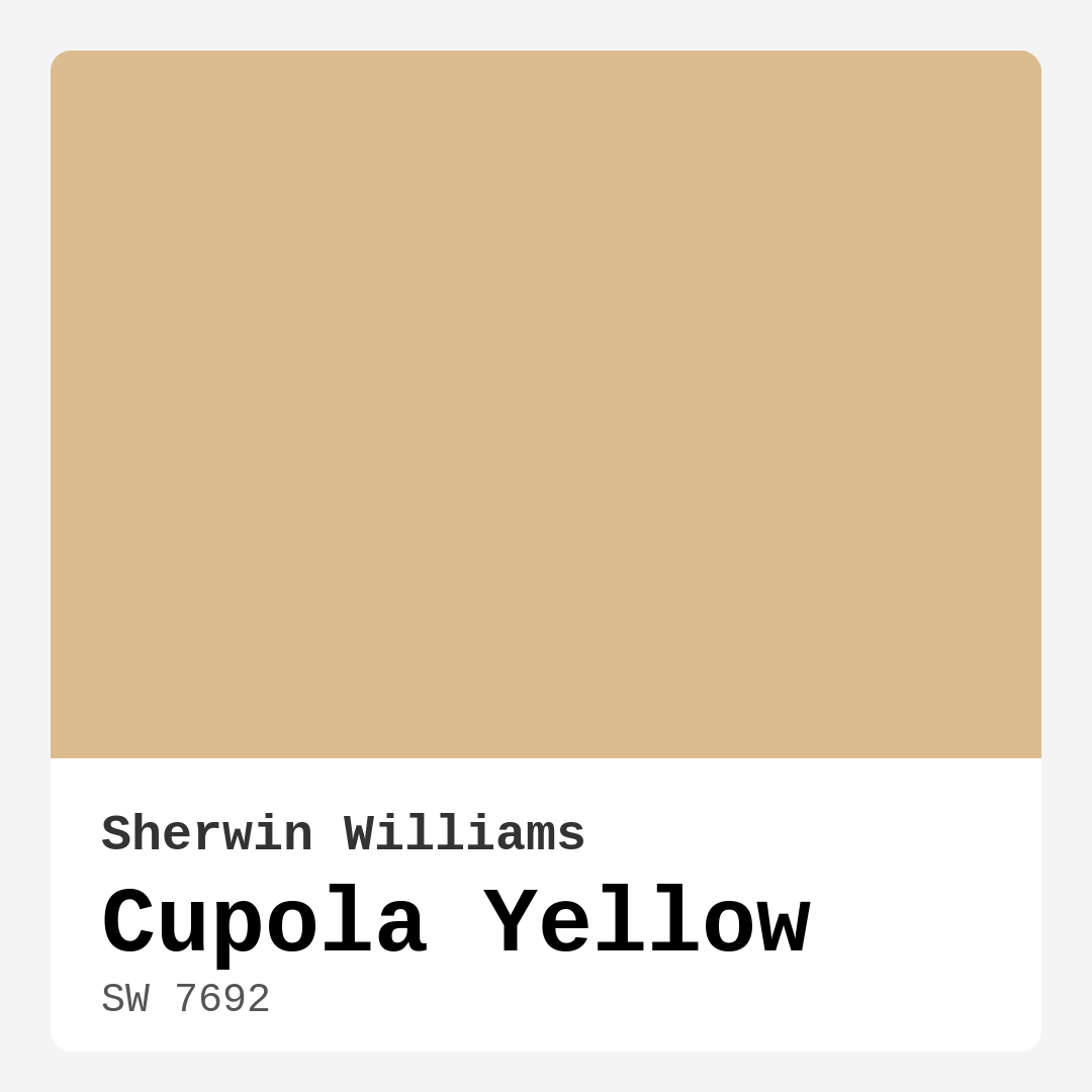
Color Preview & Key Details
| HEX Code | #DCBC8E |
| RGB | 220, 188, 142 |
| LRV | 75% |
| Undertone | Red |
| Finish Options | Eggshell, Satin, Semi-Gloss |
Have you ever walked into a room and felt an instant sense of warmth and comfort? That’s the magic of color at play. Today, let’s chat about a particular shade that can effortlessly transform your space into a welcoming haven: Cupola Yellow from Sherwin Williams. This soft, sun-kissed hue radiates cheerfulness and warmth, making it a perfect choice for those looking to add a touch of brightness to their home.
Picture this: you’ve just stepped into your living room, the sun is streaming through the windows, and the walls are painted in this delightful shade. You can almost feel the energy shift, making the space feel inviting and lively. Cupola Yellow is all about creating those moments. Its gentle golden undertone brings a cozy vibe that makes anyone feel right at home.
One of the best features of Cupola Yellow is its versatility. It harmonizes beautifully with a range of decor styles. Whether you’re going for a rustic farmhouse feel, a breezy coastal vibe, or a sleek modern aesthetic, this color can adapt to your vision. It pairs wonderfully with white trim, enhancing the overall brightness while adding a touch of elegance. Imagine how stunning it would look next to brass fixtures or warm wood accents—just the right amount of charm to elevate your space.
Now, let’s talk about where you might want to use Cupola Yellow. This color shines in areas where you gather, like the living room and kitchen, and it can make dining rooms more inviting. It’s also a fantastic choice for entryways, instantly welcoming guests as they step through your door. The warmth of this hue sets the tone for your home, making everything feel more accessible and friendly.
When considering this shade, you might wonder how it performs in various lighting conditions. Cupola Yellow is known for its adaptability. In natural light, it reflects beautifully, brightening your space and energizing the atmosphere. But when evening rolls around and the artificial lights come on, it maintains that soft warmth, wrapping you in a cozy embrace. It’s this quality that makes it a reliable choice across different rooms and times of day.
A key factor to consider when choosing a paint color is its Light Reflectance Value (LRV). With a solid LRV of 75%, Cupola Yellow falls into the light category. This means it reflects a high amount of light, which can help make smaller spaces feel larger and more open. If you’re working with a room that doesn’t receive much natural light, this color can work wonders in brightening things up. Just remember, the more light in the room, the more vibrant this hue will appear.
As you contemplate whether Cupola Yellow is the right fit for your project, it’s also essential to think about the application process. Thankfully, this paint is beginner-friendly, making it a great choice if you’re looking to DIY. It goes on smoothly with both rollers and brushes, and the fast-drying formula means you won’t be waiting around all day to see the finished result. Plus, with low VOC levels, you’re making a healthier choice for your home and the environment.
While Cupola Yellow comes with a laundry list of benefits, it’s also important to be aware of its potential downsides. For one, lighter colors can show dirt more easily, so you might need to keep a cloth handy for quick touch-ups. Moreover, while this shade works beautifully in many contexts, it might not be the best fit for very modern or minimalist designs that lean towards cooler tones.
If you’re still feeling unsure, testing the color in your space is a must. Colors can look different depending on the light and what they’re paired with. You might find that Cupola Yellow complements your existing decor beautifully, or perhaps it will inspire you to make some changes to bring out its best qualities.
Consider pairing it with complementary colors for a stunning effect. Shades like soft blues or muted greens can create a balanced palette that feels fresh and inviting. If you want to create a more subdued look, you might think about using lighter shades like SW 6128 or SW 6127 as accents. These can help tone down the vibrancy while still keeping the overall feel light and airy.
Cupola Yellow also boasts excellent washability. It’s a paint that can handle everyday life, making it a smart choice for high-traffic areas. Whether it’s a few fingerprints or the inevitable splatters that come with family living, you can easily wipe it down without fear of damaging the finish.
Incorporating Cupola Yellow into your home is like inviting sunshine indoors. Whether you choose to go all-in with a full room or use it as an accent wall, you’re sure to see the positive shift in your space. Its cozy, inviting, and cheerful vibe can work wonders for your mood and your home’s overall ambiance.
As you make your decision, remember that the most important thing is how a color makes you feel. Cupola Yellow is about warmth, light, and joy. It embodies the spirit of sunny days, perfect for creating spaces where memories are made and stories are shared. So grab that paintbrush, and let the cheerful glow of Cupola Yellow transform your home into the welcoming sanctuary you’ve always envisioned.

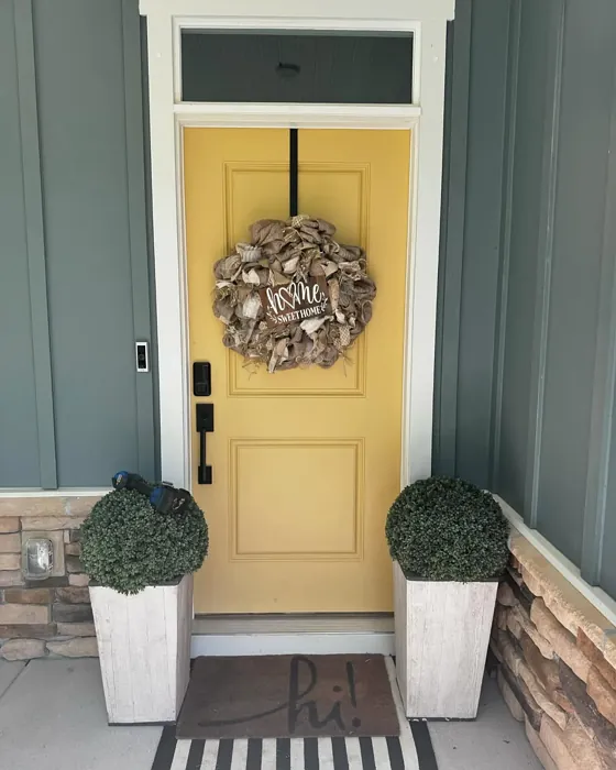
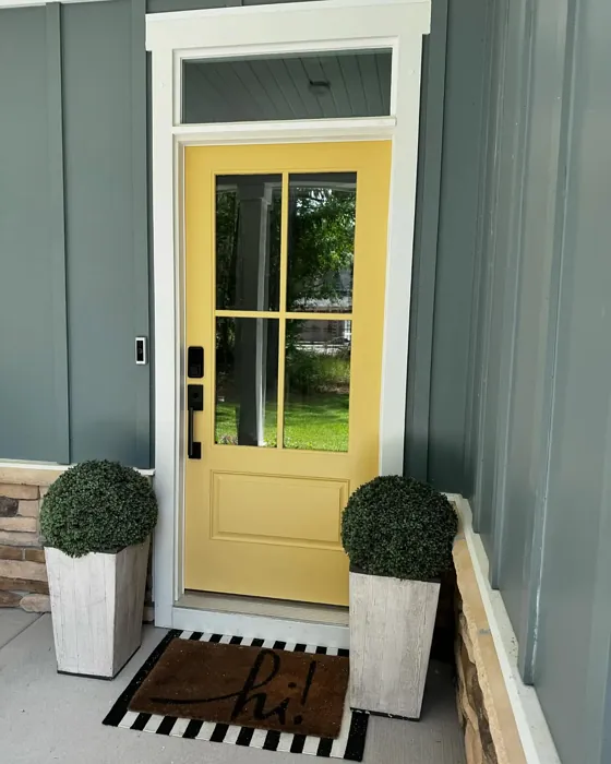
Real Room Photo of Cupola Yellow SW 7692
Undertones of Cupola Yellow ?
The undertones of Cupola Yellow are a key aspect of its character, leaning towards Red. These subtle underlying hues are what give the color its depth and complexity. For example, a gray with a blue undertone will feel cooler and more modern, while one with a brown undertone will feel warmer and more traditional. It’s essential to test this paint in your home and observe it next to your existing furniture, flooring, and decor to see how these undertones interact and reveal themselves throughout the day.
HEX value: #DCBC8E
RGB code: 220, 188, 142
Is Cupola Yellow Cool or Warm?
This shade is decidedly warm, radiating a sense of comfort and cheer. It can soften the harshness of cooler colors in a room, balancing the overall palette beautifully.
Understanding Color Properties and Interior Design Tips
Hue refers to a specific position on the color wheel, measured in degrees from 0 to 360. Each degree represents a different pure color:
- 0° represents red
- 120° represents green
- 240° represents blue
Saturation describes the intensity or purity of a color and is expressed as a percentage:
- At 0%, the color appears completely desaturated—essentially a shade of gray
- At 100%, the color is at its most vivid and vibrant
Lightness indicates how light or dark a color is, also expressed as a percentage:
- 0% lightness results in black
- 100% lightness results in white
Using Warm Colors in Interior Design
Warm hues—such as reds, oranges, yellows, warm beiges, and greiges—are excellent choices for creating inviting and energetic spaces. These colors are particularly well-suited for:
- Kitchens, living rooms, and bathrooms, where warmth enhances comfort and sociability
- Large rooms, where warm tones can help reduce the sense of emptiness and make the space feel more intimate
For example:
- Warm beige shades provide a cozy, inviting atmosphere, ideal for living rooms, bedrooms, and hallways.
- Warm greige (a mix of beige and gray) offers the warmth of beige with the modern appeal of gray, making it a versatile backdrop for dining areas, bedrooms, and living spaces.
However, be mindful when using warm light tones in rooms with limited natural light. These shades may appear muted or even take on an unpleasant yellowish tint. To avoid a dull or flat appearance:
- Add depth by incorporating richer tones like deep greens, charcoal, or chocolate brown
- Use textured elements such as curtains, rugs, or cushions to bring dimension to the space
Pro Tip: Achieving Harmony with Warm and Cool Color Balance
To create a well-balanced and visually interesting interior, mix warm and cool tones strategically. This contrast adds depth and harmony to your design.
- If your walls feature warm hues, introduce cool-colored accents such as blue or green furniture, artwork, or accessories to create contrast.
- For a polished look, consider using a complementary color scheme, which pairs colors opposite each other on the color wheel (e.g., red with green, orange with blue).
This thoughtful mix not only enhances visual appeal but also creates a space that feels both dynamic and cohesive.
Light Temperature Affects on Cupola Yellow
Natural Light
Natural daylight changes in color temperature as the sun moves across the sky. At sunrise and sunset, the light tends to have a warm, golden tone with a color temperature around 2000 Kelvin (K). As the day progresses and the sun rises higher, the light becomes cooler and more neutral. Around midday, especially when the sky is clear, natural light typically reaches its peak brightness and shifts to a cooler tone, ranging from 5500 to 6500 Kelvin. This midday light is close to what we perceive as pure white or daylight-balanced light.
These shifts in natural light can significantly influence how colors appear in a space, which is why designers often consider both the time of day and the orientation of windows when planning interior color schemes.
Artificial Light
When choosing artificial lighting, pay close attention to the color temperature, measured in Kelvin (K). This determines how warm or cool the light will appear. Lower temperatures, around 2700K, give off a warm, yellow glow often used in living rooms or bedrooms. Higher temperatures, above 5000K, create a cool, bluish light similar to daylight, commonly used in kitchens, offices, or task areas.
Use the slider to see how lighting temperature can affect the appearance of a surface or color throughout a space.


4800K
LRV of Cupola Yellow
The Light Reflectance Value (LRV) of Cupola Yellow is 75%, which places it in the Light category. This means it Reflects a high amount of light. Understanding a paint’s LRV is crucial for predicting how it will look in your space. A higher LRV indicates a lighter color that reflects more light, making rooms feel larger and brighter. A lower LRV signifies a darker color that absorbs more light, creating a cozier, more intimate atmosphere. Always consider the natural and artificial lighting in your room when selecting a paint color based on its LRV.
Detailed Review of Cupola Yellow
Additional Paint Characteristics
Ideal Rooms
Dining Room, Entryway, Home Office, Kitchen, Living Room
Decor Styles
Coastal, Farmhouse, Modern, Traditional
Coverage
Good (1–2 Coats)
Ease of Application
Beginner Friendly, Brush Smooth, Fast-Drying, Roller-Ready
Washability
Scrubbable, Washable, Wipeable
VOC Level
Eco-Certified, Low VOC
Best Use
Accent Wall, Ceiling, Interior Walls, Trim
Room Suitability
Dining Room, Entryway, Kitchen, Living Room
Tone Tag
Creamy, Earthy, Warm
Finish Type
Eggshell, Satin
Paint Performance
Easy Touch-Up, Fade Resistant, Low Odor, Quick Drying
Use Cases
Best for Rentals, Best for Small Spaces, Designer Favorite
Mood
Brightening, Cozy, Inviting
Trim Pairing
Complements Brass Fixtures, Good with Wood Trim, Pairs with White Dove
When you apply Cupola Yellow, you’re not just painting a wall; you’re transforming the space into a warm embrace. This color works beautifully in both natural and artificial light, shifting slightly to enhance the room’s mood throughout the day. It pairs well with a variety of decor styles, from rustic farmhouse to sleek modern aesthetics. The eggnog-like warmth of Cupola Yellow makes it a standout choice for kitchens and living areas, where a lively atmosphere is desired. It’s also an excellent choice for accent walls, adding just the right pop of color without overwhelming the senses. Overall, this paint offers a delightful blend of brightness and comfort, making it a top pick for any home.
Pros & Cons of SW 7692 Cupola Yellow
Pros
Cons
Colors that go with Sherwin Williams Cupola Yellow
FAQ on SW 7692 Cupola Yellow
How does Cupola Yellow compare to other yellows?
Cupola Yellow stands out from other yellows due to its soft, warm undertone. Unlike brighter or more saturated yellows, it offers a gentle glow that feels cozy and inviting. This makes it an excellent choice for creating warm spaces without overwhelming brightness, fitting perfectly in homes that emphasize comfort and charm.
Is Cupola Yellow suitable for small rooms?
Absolutely! Cupola Yellow can work wonders in small rooms by making them feel larger and more open. Its light-reflective quality helps to create an airy atmosphere, while its warmth adds an inviting touch. Just be mindful of the amount of natural light the room receives, as it can enhance the color’s effect significantly.
Comparisons Cupola Yellow with other colors
Cupola Yellow SW 7692 vs Hearts of Palm SW 6415
| Attribute | Cupola Yellow SW 7692 | Hearts of Palm SW 6415 |
|---|---|---|
| Color Name | Cupola Yellow SW 7692 | Hearts of Palm SW 6415 |
| Color | ||
| Hue | Yellow | Yellow |
| Brightness | Medium | Medium |
| RGB | 220, 188, 142 | 207, 194, 145 |
| LRV | 75% | 75% |
| Finish Type | Eggshell, Satin | Eggshell, Matte, Satin |
| Finish Options | Eggshell, Satin, Semi-Gloss | Eggshell, Matte, Satin |
| Ideal Rooms | Dining Room, Entryway, Home Office, Kitchen, Living Room | Bathroom, Bedroom, Dining Room, Home Office, Kitchen, Living Room |
| Decor Styles | Coastal, Farmhouse, Modern, Traditional | Bohemian, Coastal, Eclectic, Modern Farmhouse, Tropical |
| Coverage | Good (1–2 Coats) | Good (1–2 Coats), Touch-Up Friendly |
| Ease of Application | Beginner Friendly, Brush Smooth, Fast-Drying, Roller-Ready | Beginner Friendly, Brush Smooth, Roller-Ready |
| Washability | Scrubbable, Washable, Wipeable | Scrubbable, Washable |
| Room Suitability | Dining Room, Entryway, Kitchen, Living Room | Bathroom, Bedroom, Dining Room, Home Office, Kitchen, Living Room |
| Tone | Creamy, Earthy, Warm | Earthy, Muted, Warm |
| Paint Performance | Easy Touch-Up, Fade Resistant, Low Odor, Quick Drying | Easy Touch-Up, Low Odor, Scuff Resistant |
Cupola Yellow SW 7692 vs Blonde SW 6128
| Attribute | Cupola Yellow SW 7692 | Blonde SW 6128 |
|---|---|---|
| Color Name | Cupola Yellow SW 7692 | Blonde SW 6128 |
| Color | ||
| Hue | Yellow | Yellow |
| Brightness | Medium | Medium |
| RGB | 220, 188, 142 | 220, 189, 146 |
| LRV | 75% | 64% |
| Finish Type | Eggshell, Satin | Eggshell, Satin |
| Finish Options | Eggshell, Satin, Semi-Gloss | Eggshell, Matte, Satin |
| Ideal Rooms | Dining Room, Entryway, Home Office, Kitchen, Living Room | Bedroom, Dining Room, Home Office, Kitchen, Living Room |
| Decor Styles | Coastal, Farmhouse, Modern, Traditional | Bohemian, Coastal, Modern Farmhouse, Scandinavian, Transitional |
| Coverage | Good (1–2 Coats) | Good (1–2 Coats), Touch-Up Friendly |
| Ease of Application | Beginner Friendly, Brush Smooth, Fast-Drying, Roller-Ready | Beginner Friendly, Fast-Drying, Roller-Ready |
| Washability | Scrubbable, Washable, Wipeable | Highly Washable, Washable |
| Room Suitability | Dining Room, Entryway, Kitchen, Living Room | Bedroom, Dining Room, Home Office, Kitchen, Living Room, Nursery |
| Tone | Creamy, Earthy, Warm | Earthy, Neutral, Warm |
| Paint Performance | Easy Touch-Up, Fade Resistant, Low Odor, Quick Drying | Easy Touch-Up, Fade Resistant, Low Odor, Quick Drying |
Cupola Yellow SW 7692 vs Ruskin Room Green SW 0042
| Attribute | Cupola Yellow SW 7692 | Ruskin Room Green SW 0042 |
|---|---|---|
| Color Name | Cupola Yellow SW 7692 | Ruskin Room Green SW 0042 |
| Color | ||
| Hue | Yellow | Yellow |
| Brightness | Medium | Medium |
| RGB | 220, 188, 142 | 172, 161, 125 |
| LRV | 75% | 24% |
| Finish Type | Eggshell, Satin | Eggshell, Matte |
| Finish Options | Eggshell, Satin, Semi-Gloss | Eggshell, Flat, Matte, Satin |
| Ideal Rooms | Dining Room, Entryway, Home Office, Kitchen, Living Room | Bedroom, Dining Room, Home Office, Living Room |
| Decor Styles | Coastal, Farmhouse, Modern, Traditional | Farmhouse, Modern, Rustic, Traditional |
| Coverage | Good (1–2 Coats) | Good (1–2 Coats), Touch-Up Friendly |
| Ease of Application | Beginner Friendly, Brush Smooth, Fast-Drying, Roller-Ready | Beginner Friendly, Brush Smooth, Roller-Ready |
| Washability | Scrubbable, Washable, Wipeable | Scrubbable, Washable |
| Room Suitability | Dining Room, Entryway, Kitchen, Living Room | Bedroom, Dining Room, Home Office, Living Room |
| Tone | Creamy, Earthy, Warm | Earthy, Muted, Warm |
| Paint Performance | Easy Touch-Up, Fade Resistant, Low Odor, Quick Drying | Easy Touch-Up, High Coverage, Low Odor |
Cupola Yellow SW 7692 vs Bosc Pear SW 6390
| Attribute | Cupola Yellow SW 7692 | Bosc Pear SW 6390 |
|---|---|---|
| Color Name | Cupola Yellow SW 7692 | Bosc Pear SW 6390 |
| Color | ||
| Hue | Yellow | Yellow |
| Brightness | Medium | Medium |
| RGB | 220, 188, 142 | 192, 144, 86 |
| LRV | 75% | 60% |
| Finish Type | Eggshell, Satin | Satin, Semi-Gloss |
| Finish Options | Eggshell, Satin, Semi-Gloss | Flat, Satin, Semi-Gloss |
| Ideal Rooms | Dining Room, Entryway, Home Office, Kitchen, Living Room | Bedroom, Dining Room, Home Office, Kitchen, Living Room |
| Decor Styles | Coastal, Farmhouse, Modern, Traditional | Modern Farmhouse, Rustic, Traditional, Transitional |
| Coverage | Good (1–2 Coats) | Good (1–2 Coats) |
| Ease of Application | Beginner Friendly, Brush Smooth, Fast-Drying, Roller-Ready | Beginner Friendly, Brush Smooth, Fast-Drying, Roller-Ready |
| Washability | Scrubbable, Washable, Wipeable | Highly Washable, Washable |
| Room Suitability | Dining Room, Entryway, Kitchen, Living Room | Bedroom, Dining Room, Home Office, Living Room |
| Tone | Creamy, Earthy, Warm | Balanced, Earthy, Warm |
| Paint Performance | Easy Touch-Up, Fade Resistant, Low Odor, Quick Drying | Easy Touch-Up, High Coverage, Low Odor, Quick Drying |
Cupola Yellow SW 7692 vs Lemongrass SW 7732
| Attribute | Cupola Yellow SW 7692 | Lemongrass SW 7732 |
|---|---|---|
| Color Name | Cupola Yellow SW 7692 | Lemongrass SW 7732 |
| Color | ||
| Hue | Yellow | Yellow |
| Brightness | Medium | Medium |
| RGB | 220, 188, 142 | 200, 189, 152 |
| LRV | 75% | 48% |
| Finish Type | Eggshell, Satin | Eggshell, Matte, Satin |
| Finish Options | Eggshell, Satin, Semi-Gloss | Eggshell, Matte, Satin |
| Ideal Rooms | Dining Room, Entryway, Home Office, Kitchen, Living Room | Bathroom, Bedroom, Home Office, Kitchen, Living Room, Nursery |
| Decor Styles | Coastal, Farmhouse, Modern, Traditional | Bohemian, Modern Farmhouse, Scandinavian, Transitional |
| Coverage | Good (1–2 Coats) | Good (1–2 Coats) |
| Ease of Application | Beginner Friendly, Brush Smooth, Fast-Drying, Roller-Ready | Beginner Friendly, Brush Smooth, Roller-Ready |
| Washability | Scrubbable, Washable, Wipeable | Highly Washable, Washable |
| Room Suitability | Dining Room, Entryway, Kitchen, Living Room | Bedroom, Home Office, Kitchen, Living Room |
| Tone | Creamy, Earthy, Warm | Earthy, Muted, Warm |
| Paint Performance | Easy Touch-Up, Fade Resistant, Low Odor, Quick Drying | Easy Touch-Up, Low Odor, Scuff Resistant |
Cupola Yellow SW 7692 vs Garden Sage SW 7736
| Attribute | Cupola Yellow SW 7692 | Garden Sage SW 7736 |
|---|---|---|
| Color Name | Cupola Yellow SW 7692 | Garden Sage SW 7736 |
| Color | ||
| Hue | Yellow | Yellow |
| Brightness | Medium | Medium |
| RGB | 220, 188, 142 | 177, 165, 132 |
| LRV | 75% | 24% |
| Finish Type | Eggshell, Satin | Eggshell, Matte, Satin |
| Finish Options | Eggshell, Satin, Semi-Gloss | Eggshell, Matte, Satin |
| Ideal Rooms | Dining Room, Entryway, Home Office, Kitchen, Living Room | Bedroom, Dining Room, Home Office, Kitchen, Living Room, Nursery |
| Decor Styles | Coastal, Farmhouse, Modern, Traditional | Bohemian, Cottage, Minimalist, Modern Farmhouse, Traditional |
| Coverage | Good (1–2 Coats) | Good (1–2 Coats), Touch-Up Friendly |
| Ease of Application | Beginner Friendly, Brush Smooth, Fast-Drying, Roller-Ready | Beginner Friendly, Brush Smooth, Roller-Ready |
| Washability | Scrubbable, Washable, Wipeable | Highly Washable, Washable |
| Room Suitability | Dining Room, Entryway, Kitchen, Living Room | Bedroom, Dining Room, Home Office, Kitchen, Living Room |
| Tone | Creamy, Earthy, Warm | Balanced, Earthy, Muted, Warm |
| Paint Performance | Easy Touch-Up, Fade Resistant, Low Odor, Quick Drying | Easy Touch-Up, Fade Resistant, Low Odor |
Cupola Yellow SW 7692 vs Tassel SW 6369
| Attribute | Cupola Yellow SW 7692 | Tassel SW 6369 |
|---|---|---|
| Color Name | Cupola Yellow SW 7692 | Tassel SW 6369 |
| Color | ||
| Hue | Yellow | Yellow |
| Brightness | Medium | Medium |
| RGB | 220, 188, 142 | 198, 136, 74 |
| LRV | 75% | 45% |
| Finish Type | Eggshell, Satin | Matte, Satin |
| Finish Options | Eggshell, Satin, Semi-Gloss | Matte, Satin, Semi-Gloss |
| Ideal Rooms | Dining Room, Entryway, Home Office, Kitchen, Living Room | Bedroom, Dining Room, Home Office, Living Room |
| Decor Styles | Coastal, Farmhouse, Modern, Traditional | Bohemian, Modern Farmhouse, Rustic, Transitional |
| Coverage | Good (1–2 Coats) | Good (1–2 Coats) |
| Ease of Application | Beginner Friendly, Brush Smooth, Fast-Drying, Roller-Ready | Beginner Friendly, Brush Smooth, Fast-Drying, Roller-Ready |
| Washability | Scrubbable, Washable, Wipeable | Scrubbable, Washable |
| Room Suitability | Dining Room, Entryway, Kitchen, Living Room | Bedroom, Dining Room, Home Office, Living Room |
| Tone | Creamy, Earthy, Warm | Earthy, Inviting, Warm |
| Paint Performance | Easy Touch-Up, Fade Resistant, Low Odor, Quick Drying | Easy Touch-Up, Low Odor, Quick Drying, Scuff Resistant |
Cupola Yellow SW 7692 vs Sunflower SW 6678
| Attribute | Cupola Yellow SW 7692 | Sunflower SW 6678 |
|---|---|---|
| Color Name | Cupola Yellow SW 7692 | Sunflower SW 6678 |
| Color | ||
| Hue | Yellow | Yellow |
| Brightness | Medium | Medium |
| RGB | 220, 188, 142 | 227, 154, 51 |
| LRV | 75% | 75% |
| Finish Type | Eggshell, Satin | Eggshell, Satin |
| Finish Options | Eggshell, Satin, Semi-Gloss | Eggshell, Satin, Semi-Gloss |
| Ideal Rooms | Dining Room, Entryway, Home Office, Kitchen, Living Room | Dining Room, Entryway, Home Office, Kitchen, Living Room |
| Decor Styles | Coastal, Farmhouse, Modern, Traditional | Bohemian, Eclectic, Modern Farmhouse, Traditional |
| Coverage | Good (1–2 Coats) | Good (1–2 Coats), Touch-Up Friendly |
| Ease of Application | Beginner Friendly, Brush Smooth, Fast-Drying, Roller-Ready | Beginner Friendly, Brush Smooth, Fast-Drying, Roller-Ready |
| Washability | Scrubbable, Washable, Wipeable | Highly Washable, Washable |
| Room Suitability | Dining Room, Entryway, Kitchen, Living Room | Dining Room, Entryway, Kitchen, Living Room |
| Tone | Creamy, Earthy, Warm | Bold, Earthy, Warm |
| Paint Performance | Easy Touch-Up, Fade Resistant, Low Odor, Quick Drying | Fade Resistant, High Coverage, Quick Drying |
Cupola Yellow SW 7692 vs Bee's Wax SW 7682
| Attribute | Cupola Yellow SW 7692 | Bee's Wax SW 7682 |
|---|---|---|
| Color Name | Cupola Yellow SW 7692 | Bee's Wax SW 7682 |
| Color | ||
| Hue | Yellow | Yellow |
| Brightness | Medium | Medium |
| RGB | 220, 188, 142 | 234, 191, 134 |
| LRV | 75% | 50% |
| Finish Type | Eggshell, Satin | Eggshell, Matte, Satin |
| Finish Options | Eggshell, Satin, Semi-Gloss | Eggshell, Matte, Satin |
| Ideal Rooms | Dining Room, Entryway, Home Office, Kitchen, Living Room | Bedroom, Dining Room, Entryway, Kitchen, Living Room |
| Decor Styles | Coastal, Farmhouse, Modern, Traditional | Bohemian, Coastal, Modern Farmhouse, Traditional, Transitional |
| Coverage | Good (1–2 Coats) | Good (1–2 Coats), Touch-Up Friendly |
| Ease of Application | Beginner Friendly, Brush Smooth, Fast-Drying, Roller-Ready | Beginner Friendly, Brush Smooth, Roller-Ready |
| Washability | Scrubbable, Washable, Wipeable | Washable, Wipeable |
| Room Suitability | Dining Room, Entryway, Kitchen, Living Room | Bedroom, Dining Room, Entryway, Kitchen, Living Room |
| Tone | Creamy, Earthy, Warm | Creamy, Earthy, Warm |
| Paint Performance | Easy Touch-Up, Fade Resistant, Low Odor, Quick Drying | Easy Touch-Up, High Coverage, Low Odor |
Cupola Yellow SW 7692 vs Downing Straw SW 2813
| Attribute | Cupola Yellow SW 7692 | Downing Straw SW 2813 |
|---|---|---|
| Color Name | Cupola Yellow SW 7692 | Downing Straw SW 2813 |
| Color | ||
| Hue | Yellow | Yellow |
| Brightness | Medium | Medium |
| RGB | 220, 188, 142 | 202, 171, 125 |
| LRV | 75% | 48% |
| Finish Type | Eggshell, Satin | Eggshell, Matte, Satin |
| Finish Options | Eggshell, Satin, Semi-Gloss | Eggshell, Matte, Satin |
| Ideal Rooms | Dining Room, Entryway, Home Office, Kitchen, Living Room | Bedroom, Dining Room, Home Office, Kitchen, Living Room |
| Decor Styles | Coastal, Farmhouse, Modern, Traditional | Contemporary, Eclectic, Modern Farmhouse, Rustic, Traditional |
| Coverage | Good (1–2 Coats) | Good (1–2 Coats), Touch-Up Friendly |
| Ease of Application | Beginner Friendly, Brush Smooth, Fast-Drying, Roller-Ready | Beginner Friendly, Brush Smooth, Roller-Ready |
| Washability | Scrubbable, Washable, Wipeable | Washable, Wipeable |
| Room Suitability | Dining Room, Entryway, Kitchen, Living Room | Bedroom, Dining Room, Home Office, Kitchen, Living Room |
| Tone | Creamy, Earthy, Warm | Earthy, Muted, Warm |
| Paint Performance | Easy Touch-Up, Fade Resistant, Low Odor, Quick Drying | Easy Touch-Up, High Coverage, Low Odor |
Official Page of Sherwin Williams Cupola Yellow SW 7692